· fonts · 11 min read
17 Best Fonts for Ebook Cover in 2026
Discover the best fonts for ebook cover design. Get 17 standout picks that stay legible in small thumbnails and every genre. Download free and premium options.
Most readers will never see your ebook cover at full size. They see a tiny rectangle in a store grid, maybe two inches wide. Your design has to work at that scale.
That’s why the best font for ebook cover work is not the prettiest one. It’s the one that still reads when you shrink it to thumbnail size.
What Makes a Great Font for an Ebook Cover?
Three things matter most when you choose book cover title fonts, whether you are working on romance book cover fonts, fantasy book cover fonts, or a nonfiction title:
- Legibility at small size. Thin strokes, tight spacing, and overly decorative letterforms collapse when the cover is reduced. If you cannot read the title as a thumbnail, buyers won’t either.
- Contrast. The title needs to stand out from the background. Light text on a light cover or dark text on a dark cover disappears.
- Genre fit. A gothic display face on a sweet romance cover sends the wrong signal. The font should set the mood before the reader processes the words.
This affects clicks because buyers browse in grids and scan dozens of covers in seconds. A title that reads instantly earns the click. A title that needs a squint gets scrolled past. That applies to fonts for Kindle book covers and every other store: the thumbnail is your first impression, and often the only one.
So what font should you use for a book title on a cover? One that matches the genre, has strong contrast, and stays readable when small. The 17 options below are sorted by those criteria.
Check the license too. If your cover will be sold, the font must be cleared for commercial use. “Free to download” does not always mean “free to use on a product you sell,” so confirm the terms on the product page before you commit.
17 Best Fonts for Ebook Cover
Here are 17 picks grouped by the mood they bring to a cover. Each links to its Creative Fabrica page, with the genres it suits, tips for thumbnails, and pairing ideas. Always test any font at thumbnail size before you commit, because a font that looks great full size can fail in a grid. Pairing notes appear under each pick, and the genre guide near the end helps you narrow the list.
Best Script Fonts for Romance and Contemporary Ebook Covers
Script fonts for book covers are the usual choice for romance, women’s fiction, and light fantasy. They add warmth and intimacy that a plain serif can’t. The tradeoff is legibility: scripts need a larger size, a heavier weight, and open letter spacing to survive as a thumbnail.
Should you use script on a book cover at all? Yes for romance and children’s genres. For thriller or nonfiction, usually no, since a script can signal the wrong category.
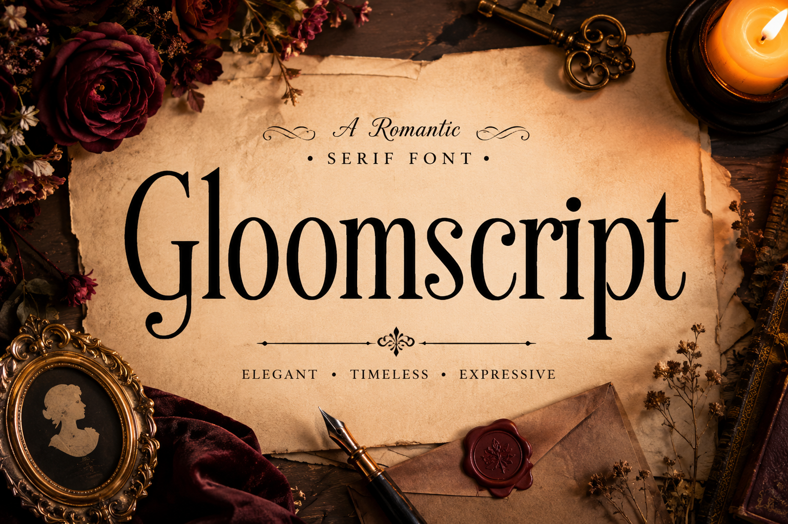
1. Gloomscript
Gloomscript leans toward a darker, more atmospheric kind of script. It suits romance with a hint of mystery or a contemporary novel with a brooding tone. Test it on a light or mid-tone background and pair it with a clean sans-serif for the author name and subtitle.
Best for: contemporary romance, dark romance, women’s fiction.
2. Romance Script

Romance Script is a flowing script that fits love stories. Keep the background simple, such as a solid color or gradient, and bump the size up so the title holds at thumbnail scale. Pair it with a light serif for the subtitle and a clean sans for the author name.
Best for: romance novels, contemporary love stories, women’s fiction.
3. Enchanted Script
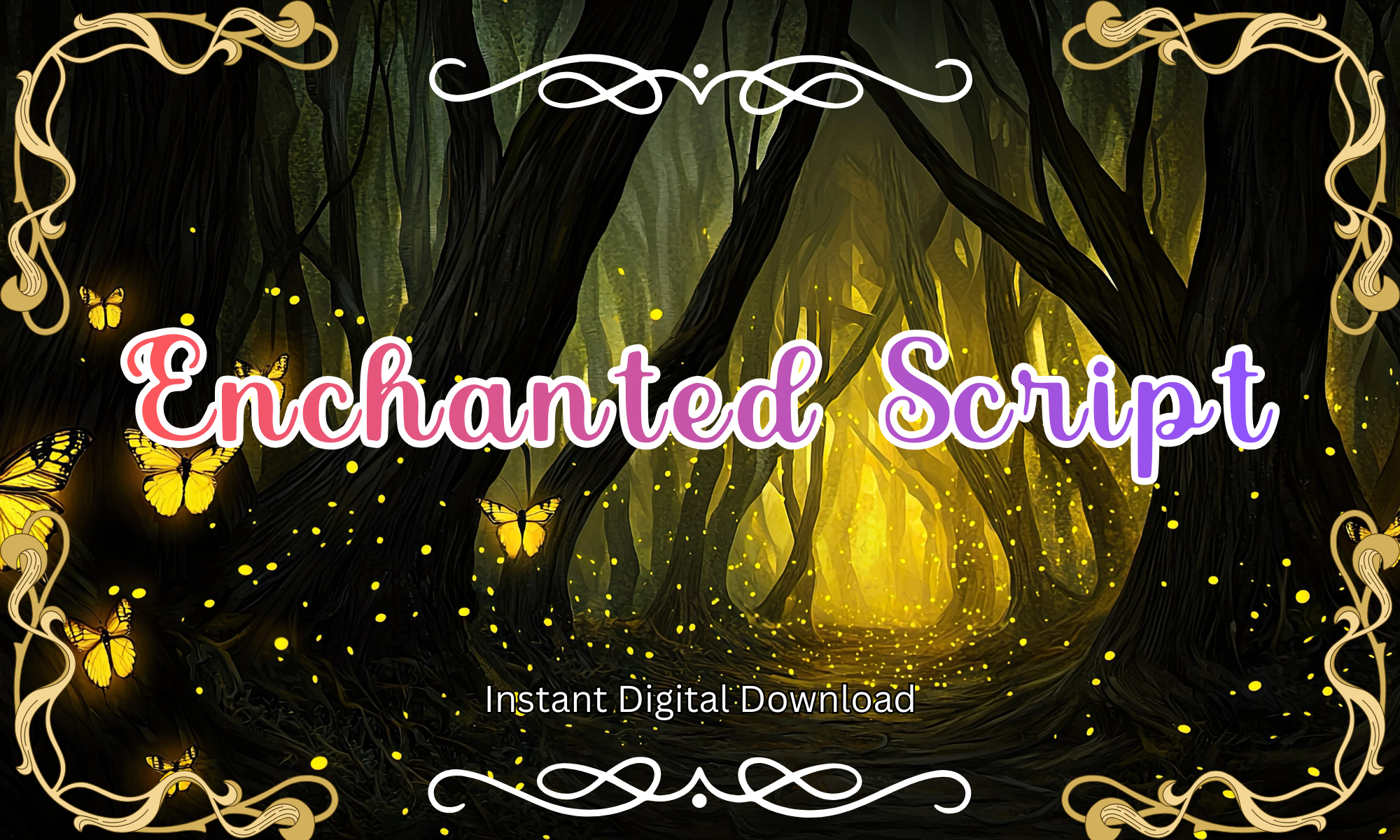
Enchanted Script suggests a storybook feel, which makes it a candidate for paranormal romance or fairy tale retellings. With any decorative script, fine details can get lost when the cover shrinks, so use a short title, open the letter spacing, and try light text on a dark background.
Best for: paranormal romance, fairy tale retellings, light fantasy.
4. Love Note Script
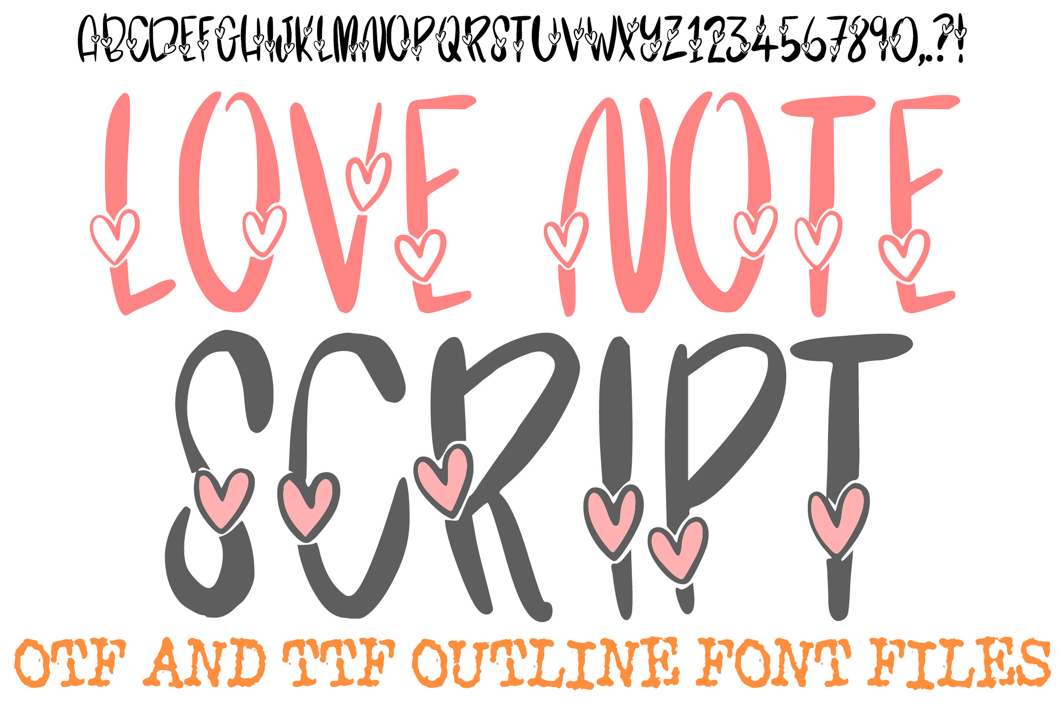
Love Note Script points to a casual, handwritten look. That fits lighter contemporary romance, where the cover should feel approachable rather than dramatic. Use a larger point size, avoid busy backgrounds, and pair it with a geometric sans-serif for the author name.
Best for: contemporary romance, romantic comedy, young adult.
5. Slumber Script
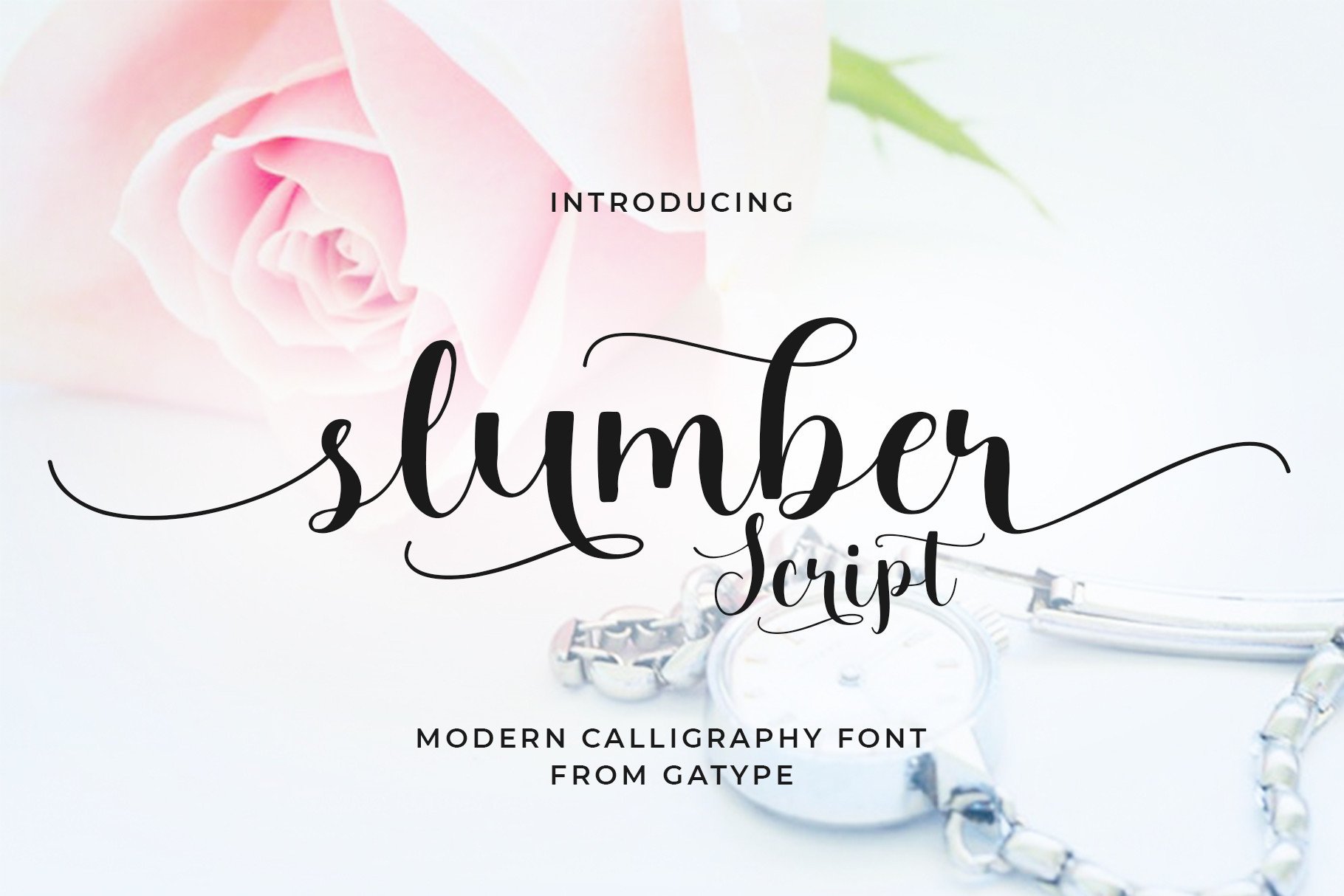
Slumber Script suggests a soft, calm mood that suits cozy romance or gentle fantasy. Give it strong contrast and a muted solid or gradient background rather than detailed artwork. A simple serif works well for the subtitle.
Best for: cozy romance, gentle fantasy, women’s fiction.
6. Rangga Script
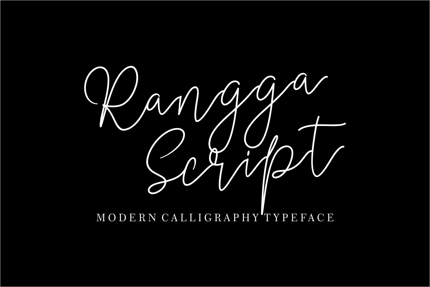
Rangga Script is a pick for romance with a stronger, more dramatic tone. Keep the title to two or three words, check it at small size, and pair it with a minimal sans-serif for the author name and any tagline.
Best for: dramatic romance, contemporary fiction, bold women’s fiction.
7. Alegant Script

Alegant Script aims for a refined, polished look. It suits romance with a more sophisticated or literary tone, and lifestyle nonfiction such as wedding guides. Make sure the contrast is good, and pair it with a classic serif for the subtitle and a simple sans for the author name.
Best for: literary romance, sophisticated women’s fiction, lifestyle nonfiction.
8. Romantic Essentials
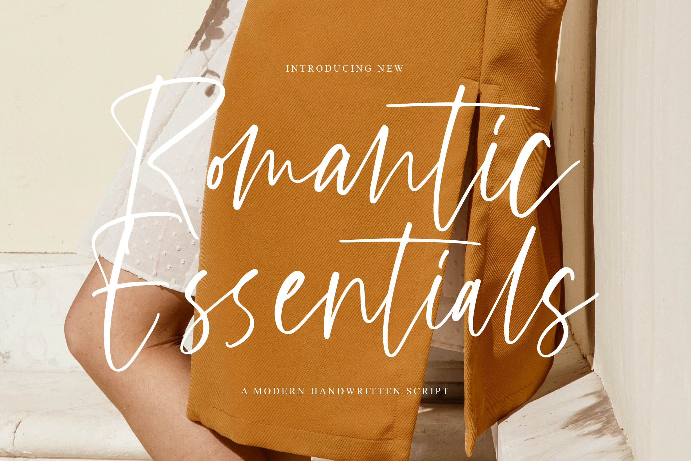
Romantic Essentials is a romance-oriented option for designers who want flexibility. If the product page lists several styles, use the bolder ones for thumbnails and skip the thinnest. Use it for the title and a simple sans-serif from your system fonts for the author name.
Best for: romance series, women’s fiction, contemporary love stories.
Best Fantasy, Gothic and Dark Display Fonts for Ebook Covers
For fantasy, horror, or the paranormal, you need fonts with weight and atmosphere. These gothic fonts for book covers and dark display faces read best at a larger size on darker backgrounds.
9. ShadowForge
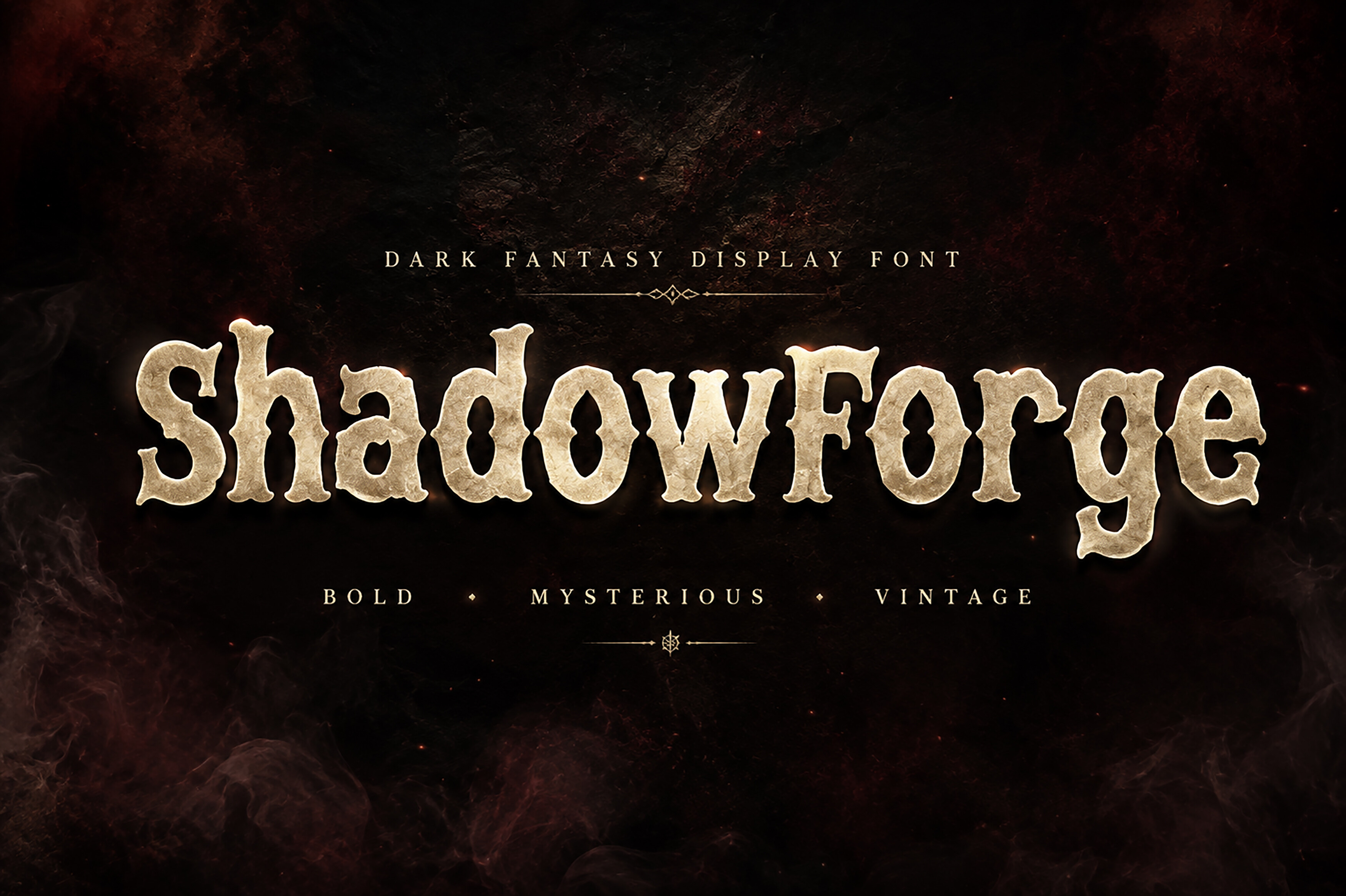
ShadowForge has a dark, forged-metal feel that suits epic or dark fantasy and covers that should feel ancient and powerful. Keep the title short, try a dark or moody background, and pair it with a clean serif for the subtitle.
Best for: epic fantasy, dark fantasy, horror.
10. Witchora
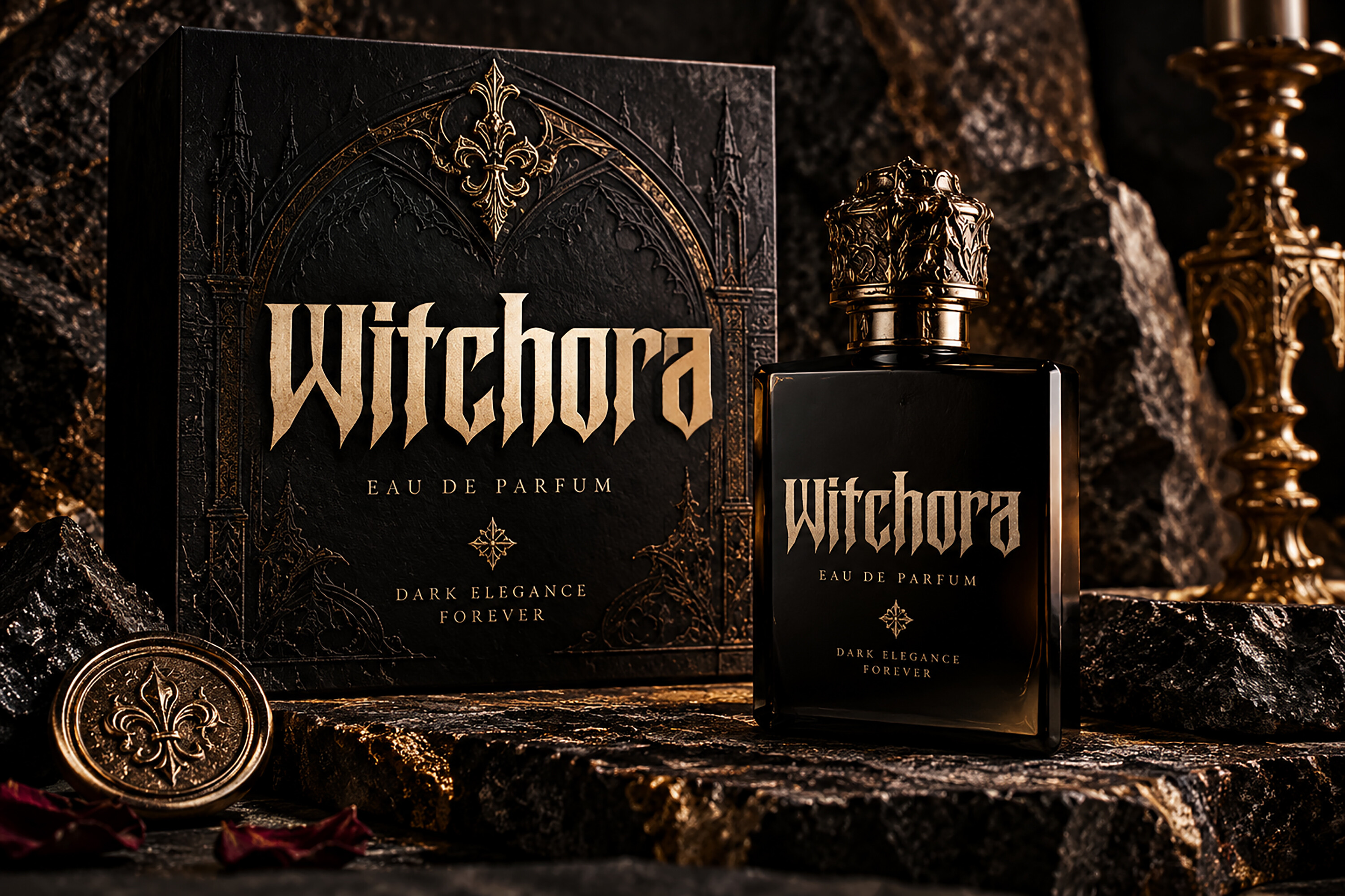
Witchora brings a mystical, gothic mood that fits witchy fantasy, paranormal romance, or supernatural horror. Fine details can disappear at small sizes, so use a short title on a simple dark background with light text. Pair it with a minimal sans-serif for the author name.
Best for: witchy fantasy, paranormal romance, supernatural horror.
11. Halther
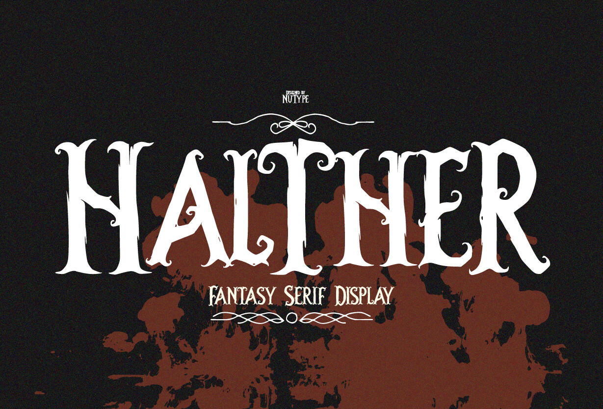
Halther is a pick for covers that should feel gritty and unpolished, such as horror or dark fantasy. Use it on a dark or mid-tone background, keep the title to a few words, and pair it with a simple serif for the subtitle.
Best for: horror, dark fantasy, gritty thriller.
12. Whitcher
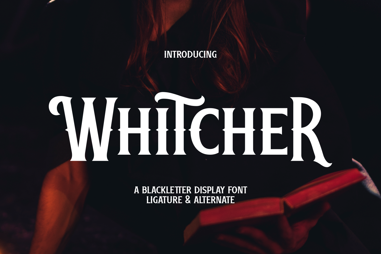
Whitcher is an ornate, gothic choice for medieval or dark-fantasy covers. If the letterforms are condensed, as the style suggests, it can help fit a longer title into a vertical space. Use a dark background and pair it with a simple sans-serif for the author name.
Best for: dark fantasy, gothic horror, medieval fantasy.
Best General Title and Decorative Fonts for Ebook Covers
Not every cover needs a script or a gothic face. These general title and decorative fonts work across several genres, including nonfiction, thriller, and lighthearted covers.
13. Book Cover Font
Book Cover Font, from Goliatte Studio, is named for the job. It is a general-purpose title option for literary fiction or nonfiction. Use it for the title and pair it with a simple sans-serif or serif for the subtitle and author name.
Best for: literary fiction, nonfiction, general title use. By: Goliatte Studio
14. Manstein
Manstein suits nonfiction, business books, and thrillers that need to feel sharp and direct. Pair it with a light serif for the subtitle to add warmth, and check the title at thumbnail size before you finalize.
Best for: nonfiction, thriller, business books.
15. Quantine
Quantine sits between elegant and modern, a fit for literary fiction, memoir, or polished nonfiction. It’s a middle ground if you want something more interesting than a plain sans without a full display face. Pair it with a simple sans-serif for the author name.
Best for: literary fiction, memoir, sophisticated nonfiction.
16. Fall Ember
Fall Ember suggests a warm, autumnal feel for cozy fiction or seasonal nonfiction. If the lettering is textured, keep the background simple so the texture isn’t lost. Pair it with a clean serif for the subtitle and a sans-serif for the author name.
Best for: cozy fiction, seasonal nonfiction, warm-toned covers.
17. Funplex
Funplex is a playful pick for children’s books, lighthearted nonfiction, or any cover that should feel fun and accessible. Pair it with a simple sans-serif for the author name and any tagline.
Best for: children’s books, lighthearted nonfiction, playful covers.
How to Use Fonts on Your Ebook Cover
How many fonts should you use on an ebook cover? Two, three at most: one decorative or expressive font for the title, and one simple font for the subtitle and author name. More than that and the cover looks cluttered.
Hierarchy matters. The title should be the largest element. The subtitle should be noticeably smaller, and the author name sits at the bottom in a clean, readable size. If all three are the same size, the reader doesn’t know where to look first.
Pairing rule. What font pairs well with a decorative title font? A simple serif or sans-serif. With a script title, use a clean sans-serif for the supporting text. With a gothic display face, a light serif works well. The supporting font should stay quiet.
Thumbnail test. Before you finalize the design, shrink it to the size it will have in a store grid. Can you still read the title? If not, increase the size, simplify the background, or switch to a bolder font. Check color contrast too.
If your title is long, look for a condensed face. It gives you more room without shrinking the type.
Software. You can design your cover in Canva, Photoshop, Illustrator, or Affinity. To install a font, download the file, extract the .ttf or .otf file, and install it. On Windows, right-click the file and select Install. On Mac, double-click it and click Install Font. The font then appears in your software’s font list. If it doesn’t show up, restart the program. Some apps only read the font list at launch.
When you export the cover, preview the final file at the smallest size your store displays. Do this after every change to the title, because a small shift in size or color can change how the whole cover reads.
How to Choose the Right Font for Your Genre
A quick genre-by-genre breakdown using the 17 fonts above:
- Romance and women’s fiction: Start with the script section. Gloomscript, Romance Script, Enchanted Script, and Romantic Essentials are strong candidates. Alegant Script suits a more refined tone.
- Fantasy and gothic: ShadowForge, Witchora, Halther, and Whitcher cover the range from epic to dark.
- Thriller and horror: Halther and ShadowForge fit here. Manstein is an option for a cleaner, more modern thriller look.
- Nonfiction: Book Cover Font, Manstein, and Quantine are the most neutral choices.
- Children’s and playful: Funplex is the obvious pick. Slumber Script can work for a softer, storybook feel.
If a cover sits between two genres, such as paranormal romance, choose the font for the stronger signal. Readers in that genre scan for it first, and your description can carry the second.
Licensing. Are these fonts free for commercial use on a book cover? Every font has its own license terms, so check the license on the product page before you use one on a cover you plan to sell. Look specifically for “commercial use” in the terms. If the license is unclear, contact the seller or Creative Fabrica support before you publish.
Where to Download Fonts for Ebook Covers
Creative Fabrica is the source for all 17 fonts in this list, so you can compare book cover title fonts in one place. Check each product page for pricing and license details.
If you are looking for free fonts for book covers, Google Fonts, DaFont, and Font Squirrel are good places to start. Their selection of decorative and display fonts may be smaller, and you still need to check each font’s license. Whatever source you use, keep a record of where each font came from and which license applies. If a store or buyer asks later, you can answer in a minute.
For more font recommendations, design tips, and tutorials, check out the FontPro blog.