· fonts · 15 min read
28 Best Stencil Fonts in 2026
Best stencil fonts for posters, packaging, crafts and logos: military, industrial, spray, grunge and script stencil typefaces. Download on Creative Fabrica.

Stencil fonts keep showing up everywhere. Streetwear drops, coffee bag labels, tactical gear, Cricut vinyl projects, poster walls that need to hit you before you finish reading the headline. They work because the gaps create instant visual tension. You recognize the style before you even parse the letters.
This list breaks down 28 stencil fonts into four working groups: military classics, modern industrial faces, elegant script and serif stencils, and grunge or spray types. Pick the group that matches what you are building, then check the bridges before you commit to a cut or print run.
What Makes a Good Stencil Font?
A stencil font is not just a typeface with holes punched in it. The gaps are the entire design problem. A bridge is the thin connection that keeps the inside of a letter attached to the outer shape. Without it, an O, A, B, or R falls apart the moment you try to cut, spray, or laser it.
Readability is the second thing that separates a usable stencil from a decorative one. A good stencil keeps stroke weight consistent, opens counters wide enough to stay legible, and holds together at small sizes. If a face looks sharp at 120 pt but dissolves into a blob at 12 pt, it is a display font. That is fine for a poster headline, but it will not work as a label or a logo mark.
The category splits into four practical families. Military and army stencils carry regulation, crate, and tactical energy. Industrial stencil fonts feel cleaner and more brand-ready. Script, serif, and decorative stencils add elegance where you would not expect it. Grunge, spray, and vintage stencils bring texture and street style to the table. For real physical stencils (vinyl cutting, spray paint, laser), always test at final size before you commit.
Note: this selection is based on Creative Fabrica listings and editorial picks. Weights, formats, and license terms can change, so check the product page before purchase.
Military & Army Stencil Fonts
This is the classic lane. Supply crates, unit markings, bootcamp posters, tactical apparel. These faces have hard edges, bold strokes, and bridges built to survive actual use. If you want a stencil that looks like it was stamped onto a wooden crate in 1987, start here.
1. Stencil Army
Stencil Army is the one that shows up most often in Creative Fabrica search results, and for good reason. It nails the regulation look without overthinking it. Strong verticals, reliable bridge width, and a direct style that survives vinyl cutting, screen printing, and poster work. It is the safe first pick when you need a military stencil font that will not surprise you.
Best for: tactical apparel, unit patches, Cricut vinyl decals. By: GraphicsNinja
2. Military Stencil
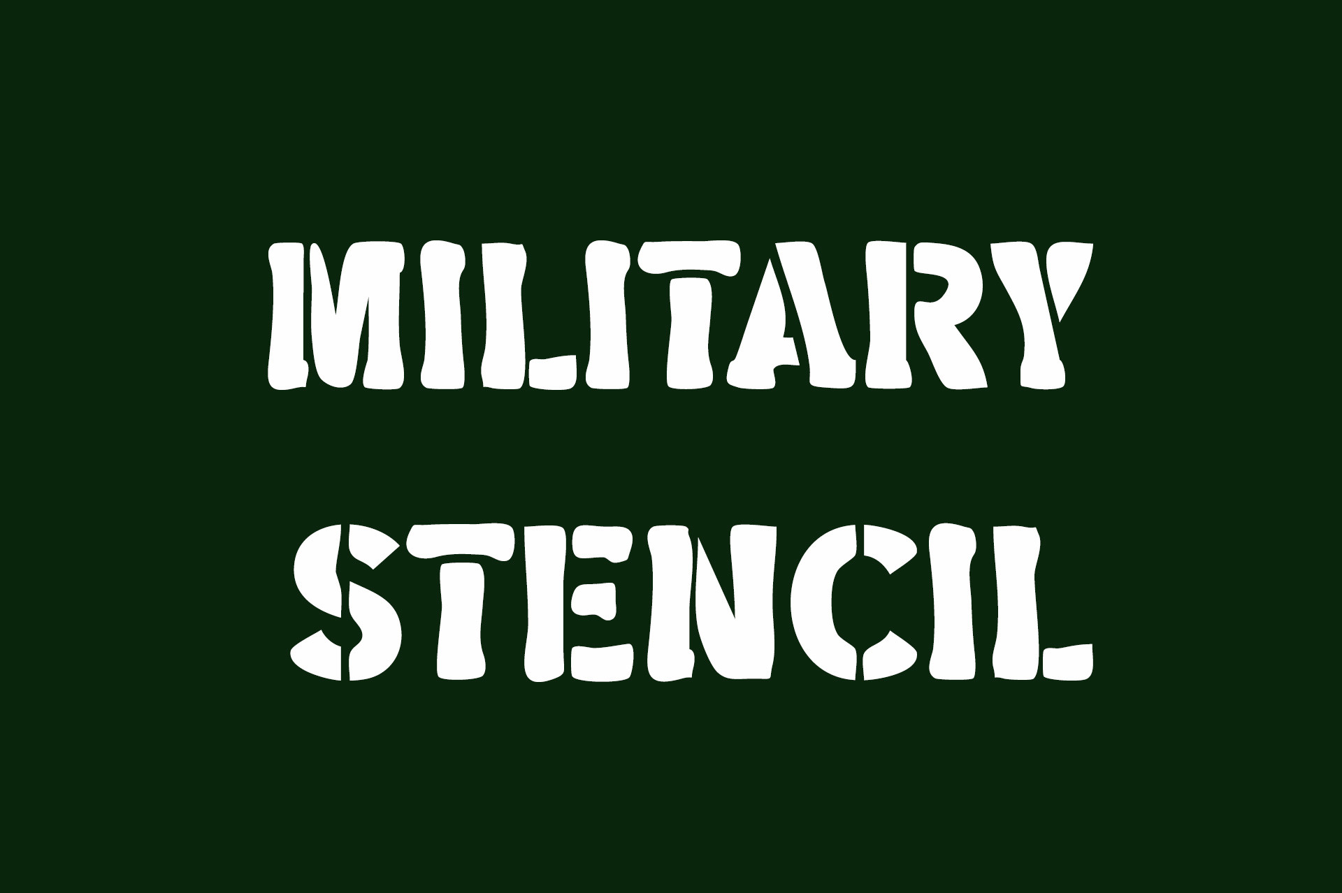
Military Stencil leans into the crate-marking look with upright, compact letterforms that stay easy to read. It feels official without extra decoration, which makes it useful for labels, badges, and quick brand marks where you need authority but not drama.
Best for: supply labels, military-themed logos, stencil posters. By: Vladimir Carrer
3. Army Force

Army Force cranks the weight up. The stencil structure feels less like a printed label and more like a stamp pressed into something. That extra heft gives headlines real punch, especially on busy backgrounds where a lighter face would get lost.
Best for: poster headlines, tactical brand marks, event flyers. By: turz74347
4. Armybold

Armybold is for when the stencil needs to hit first and ask questions later. Thick strokes, blunt terminals, a solid industrial presence. It is less subtle than a classic army stencil, but that is the point. The type carries the design rather than supporting it.
Best for: bold logos, gym apparel, large-format signage. By: OWPictures
5. Armygedon

Armygedon keeps the stencil gaps but gives the whole thing a modern sans feel. The shapes are crisp with a slightly aggressive rhythm. It sits in that sweet spot between regulation and contemporary display, which makes it a natural fit for streetwear, gaming, and action sports graphics.
Best for: streetwear graphics, gaming posters, sports team marks. By: StringLabs
6. Bootcamp

Bootcamp brings training-ground energy to the stencil category. It feels like chalked instructions on a gym wall, or the kind of equipment tag you would find in a drill sergeant’s office. Practical, recognizable, and it gives you a military stencil vibe without going full camouflage.
Best for: bootcamp events, fitness apparel, training posters. By: DonMarciano
7. Military Residence

Military Residence takes the classic look and cleans it up. The stencil identity stays intact, but the edges are softened just enough for branding and packaging work. It is the pick for when you want military energy without the supply-crate feel. Think tactical brand that also sells candles.
Best for: modern tactical brands, packaging labels, logo marks. By: anamalmusyaffaCreative
8. Gunsman

Gunsman mixes tactical military energy with a western flavor. The letterforms have a rugged, frontier quality that makes it stand out in the army stencil space. It works well for outdoor brands, barbershop signs, and themed apparel where you want that crossroads-of-genres feeling.
Best for: western-themed logos, outdoor apparel, barbershop signage. By: Flawless And Co
9. Negative Space Army Stencil

This one plays with the gaps in a smarter way. The bridges are not just functional connections; they become part of the visual idea, creating a layered look that feels designed rather than stamped. It adds a creative twist to the military stencil formula that most faces in this category do not attempt.
Best for: creative posters, brand experiments, display typography. By: squeebcreative
Download Negative Space Army Stencil
10. Varsity Army

Varsity Army blends collegiate lettering with military structure. The result has a sporty, team-like energy that still reads as a stencil. It is a fun pick for sports teams, campus brands, and apparel that needs a tougher, more structured look than a standard varsity face would give you.
Best for: sports apparel, team logos, campus merch. By: fana studio
Modern & Industrial Stencil Fonts
This is the cleaner side of the family. These faces are built for branding, packaging, logos, and signage, where the stencil structure should feel intentional rather than utilitarian. You will notice tighter proportions, even bridges, and a general sense that the designer made deliberate choices about where the gaps go.
11. Stencora

Stencora has a polished, brand-ready feel that makes it easy to drop into a logo without it looking too loud. The letterforms are clean and confident, with a structure that holds up at multiple sizes. If you want an industrial stencil font that still feels current and not stuck in a warehouse, this is a strong starting point.
Best for: brand logos, packaging, modern signage. By: Bundle
12. Iron Crate Stencil

Iron Crate Stencil leans into shipping crates, factory labels, and heavy equipment. It has an industrial character that feels stamped, practical, and a little weathered. This is the kind of face that works well for coffee brands and tool companies where you want the packaging to feel like it came out of a workshop.
Best for: coffee packaging, tool brands, crate-style labels. By: Soho Studio
13. Coutline Stencil Typeface

Coutline Stencil Typeface has shown up in design roundups for good reason. The bridges are refined, the shapes are controlled, and the overall look feels like a brand system rather than a single display face. It is the stencil font to reach for when you want something that looks premium and intentional.
Best for: premium branding, logo design, editorial covers. By: CreatypeStudio
Download Coutline Stencil Typeface
14. Strike Stencil

Strike Stencil has a forward-leaning energy that makes it feel active rather than static. The stencil gaps are clear, but the overall rhythm gives the face a sense of motion. When a design needs urgency or momentum, this is the modern stencil font to test first.
Best for: sports posters, campaign graphics, event branding. By: SiapGraph
15. Biggie Stencil

The name says it all. Big, bold, hard to ignore. The wide forms and heavy structure make it ideal for headlines that need to fill space and command attention. It is a practical workhorse for posters, banners, and social graphics where subtlety is not the goal.
Best for: large headlines, banner ads, social graphics. By: Pretty Glyphs
16. Sukima Stencil

Sukima Stencil takes a minimalist approach. The shapes are simple, the gaps are controlled, and the overall feel is calm rather than loud. That restraint makes it useful for modern branding where the stencil structure should add character without overwhelming the message. It is the quiet option in this group.
Best for: minimal logos, app branding, clean packaging. By: DesignByPlatform
17. Fontuna Stencil
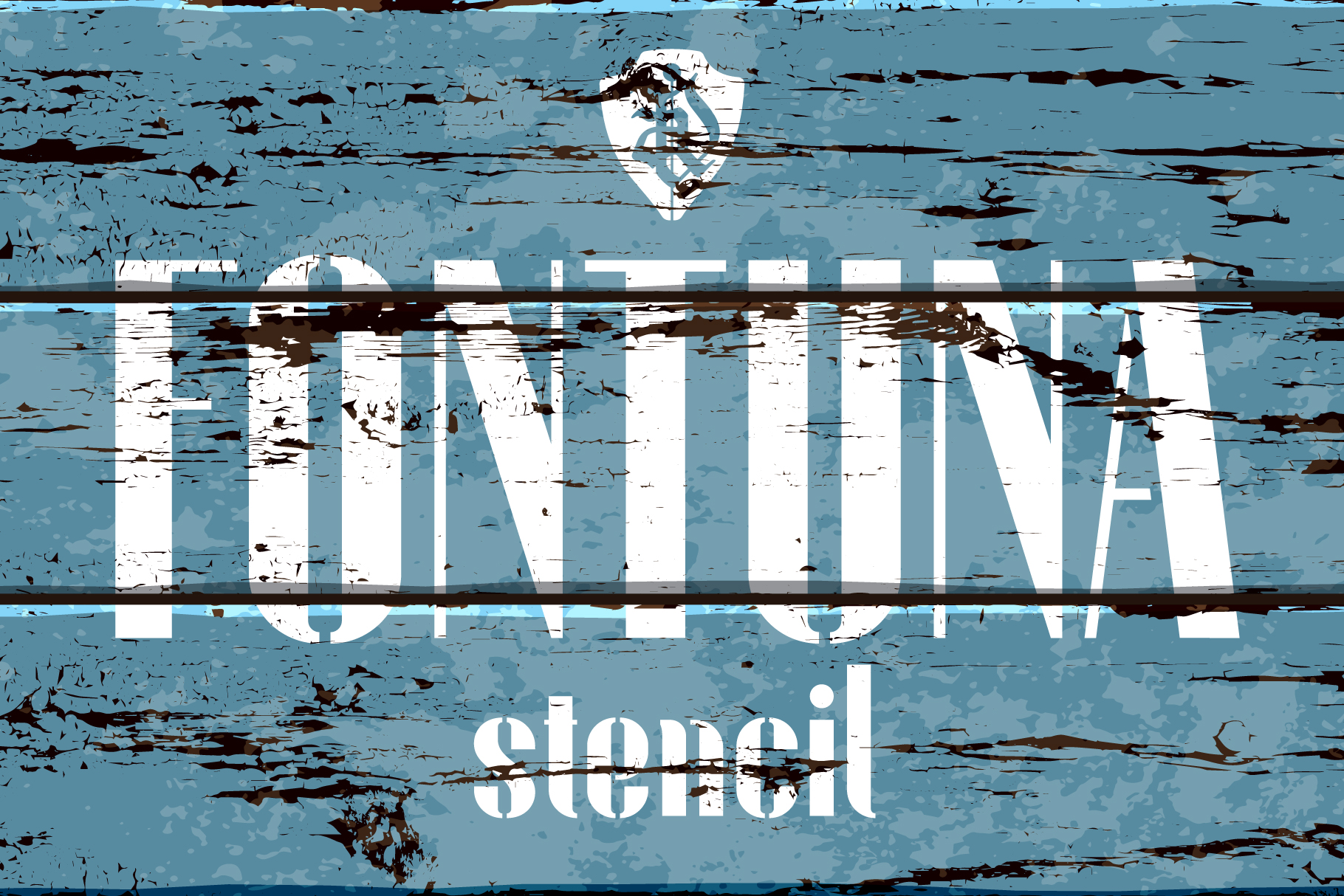
Fontuna Stencil adds a softer, more refined impression to the modern stencil group. It keeps the structural gaps but gives the letterforms an elegance that works well in packaging and hospitality contexts. If you want a stencil font with a premium feel that does not scream “industrial,” this is worth a look.
Best for: premium packaging, hospitality branding, lifestyle logos. By: NREY
18. Liberty Stencil

Liberty Stencil has an American industrial character. The sturdy shape feels like it belongs on a workshop sign or a product label in a hardware store. It is less delicate than a minimalist stencil and more grounded than a pure military face. That balance makes it useful when you want strength without full tactical styling.
Best for: workshop signage, product labels, American-style branding. By: Brown Cupple Fonts
19. Mango Stencil

Mango Stencil is the friendlier end of the modern stencil spectrum. It keeps the stencil identity but softens the edges enough to feel approachable. That makes it a good fit for casual brands, food packaging, kids products, and craft projects where the design should feel warm rather than hard.
Best for: food packaging, casual branding, craft labels. By: KC Production
Script, Serif & Decorative Stencil Fonts
This is the unexpected side of the category. A stencil does not have to look like a military crate. With the right bridges, a script or serif can keep its elegance while still working as a cut or painted template. These faces show up on wine labels, wedding invitations, and boutique packaging, places where you would never expect to see a stencil.
20. Afraty Stencil

Afraty Stencil is a rare script-stencil hybrid, and it is one of the most popular script stencils on Creative Fabrica. The flowing letterforms keep the stencil gaps, giving the face a handmade, crafted feel that works beautifully on wedding invitations, boutique branding, and decorative labels. It proves that stencils can be romantic.
Best for: wedding invitations, boutique logos, decorative labels. By: Digital Typeface Studio
21. Angel Stencil

Angel Stencil is an elegant serif stencil with a graceful, refined look. The serif details soften the stencil structure, making it feel more like a premium label face than a utilitarian mark. It works well on wine packaging, spa branding, and high-end craft products where you want the stencil to feel like a design choice rather than a constraint.
Best for: wine labels, spa branding, premium packaging. By: Sigit Dwipa
22. Stencil Blackletter

Stencil Blackletter combines gothic letterforms with stencil gaps, creating a face that feels both old-world and street-ready. The dense shapes and sharp details make it stand out in tattoo flash, streetwear, and music album art. It suits darker, more dramatic projects where you want the type to feel like it has history.
Best for: tattoo flash, streetwear, album covers. By: Wow Magic
23. Bams Stencil

Bams Stencil is a decorative face with a playful, graphic character. It does not try to imitate a military template. Instead, it uses the stencil idea to create a fun, eye-catching display face. It is a good choice for posters, party invitations, and lighter craft projects where the tone should be upbeat.
Best for: party posters, invitations, playful branding. By: GraphicsBam Fonts
24. Abcd Stencil

Abcd Stencil has a playful, educational character that makes it feel approachable. The shapes are simple enough for kids projects, but the stencil structure keeps them from looking like a basic alphabet font. It is useful for classroom materials, children’s products, and friendly craft labels where you want structure without stiffness.
Best for: classroom crafts, kids products, playful labels. By: riki.studio
Grunge, Spray & Vintage Stencil Fonts
This group is about texture. Wear, paint, street energy, the kind of visual noise that makes a design feel lived-in. These faces suit posters, merch, music covers, and any project where you want the type to look like it has been outside for a while. If you are hunting for a spray stencil font, start here.
25. Stencil Grunge

Stencil Grunge is a distressed stencil font with a worn, painted feel. The texture gives it an immediate street-style character, while the stencil structure keeps the letterforms readable. It is a strong pick for posters, band merch, and vintage graphics where you want the type to look like it was spray-painted on a wall and then weathered.
Best for: band posters, distressed merch, vintage graphics. By: mardanimirza12
26. Black Stencil

Black Stencil is a bold street stencil font with a hard, high-contrast look. It feels like paint on a wall, with a strong presence that works well for urban branding and graphic design. It reads as confident and a little rebellious, which is exactly the energy you want for street-level projects.
Best for: urban posters, streetwear, bold graphic design. By: Patlot Digital.Studio
27. Stencil Grandma

Stencil Grandma has a warm, handmade vintage feel. It looks less like a factory stencil and more like a personal, nostalgic craft mark. That makes it a great fit for farm brands, handmade products, family businesses, and Cricut projects where the design should feel cozy and personal rather than corporate.
Best for: farm branding, handmade labels, cozy craft projects. By: FreshTypeINK
28. Stencil Force

Stencil Force sits between clean modern stencils and textured grunge faces. It has a punchy, energetic look that gives it flexibility across streetwear, event posters, and bold brand marks. If you want a controlled spray stencil font that does not go full chaos, this is a good final test.
Best for: streetwear, event posters, bold brand marks. By: HipFonts
How to Choose the Right Stencil Font
Start with the task. If you need stencil fonts for Cricut, vinyl, or spray paint, check the bridges first. Letters like O, A, B, and R should keep inner parts attached, and the cut path should not create loose pieces. Digital design gives you more freedom, but readability still matters even on screen.
Match the character to the brand. Military and army stencils suit tactical, sports, and equipment projects. Modern and industrial stencil fonts work well for logos, packaging, and signage. Script, serif, and decorative stencils fit premium craft, wine, and boutique brands. Grunge and spray stencils suit streetwear, music, and posters.
Pair with care. A stencil font works well with a monospace face for a utilitarian feel, or with a humanist serif for contrast. Test the final size, especially for small or curved work. A stencil that looks great at 72 pt can turn to mush at 14 pt, and that is where most projects fail.
FAQ
Can I cut these stencil fonts on a Cricut?
Yes, but choose faces with clear bridges. Load the OTF or TTF file into Cricut Design Space, then test a letter like O or A at final size before cutting a full project. If the inner counter detaches, the font is not cut-safe at that size.
Are stencil fonts good for logos?
Yes, especially for brands with an industrial, tactical, or craft character. Check readability at small sizes, because stencil gaps can close up when the type gets tiny. A stencil logo that works at 200 px wide might look like a smudge at 32 px.
What is the difference between military and modern stencil fonts?
Military faces use regulation proportions and sturdy bridges. They look like they were stamped by hand. Modern faces use cleaner geometry, thinner bridges, and more brand-friendly sizes. They look like they were designed in a studio. Both work, but they signal different things about a brand.
Try Studio AI on Your Own Design
Want to see a font in a real design before downloading it? Creative Fabrica Studio is a browser-based tool with AI features — test fonts on your own text, generate matching graphics, remove backgrounds, and export finished designs for print or social media.
Try Studio AI Free →Conclusion
You now have 28 stencil fonts spanning four distinct directions, from army classics to elegant serif stencils. Pick the group that matches your task, test the bridges at your actual working size, and download the face that fits on Creative Fabrica. The right stencil font should feel like an obvious choice once you see it in context.