· fonts · 14 min read
24 Best Fonts for Posters for Bold, Eye-Catching Designs in 2026
Discover 24 best fonts for posters, from bold display and vintage grunge to stencil and serif styles. Download options for eye-catching designs in 2026.
A poster has one job. It needs to stop a person moving and make them read. The right typography for posters can do that in a single glance. The wrong one gets lost in a hallway, a feed, or a festival crowd.
I have made enough posters to know that the typeface decides whether the piece feels intentional or forgettable. That is why I split the 24 best fonts for posters into five practical groups. Each group has a different job. Bold display fonts create impact for concerts and promos. Condensed sans-serifs pack long headlines into tight spaces. Vintage and grunge styles add worn texture for retro events. Stencil fonts bring industrial or military energy. Serif display faces suit elegant, theatrical, or premium posters.
The five groups are not strict boxes. Some fonts can move between them, but the grouping helps you choose faster.
What Makes a Great Font for Posters?
The best font for a poster depends on where it will be seen. A concert poster font should shout from across a street. A gallery poster can be quieter, more refined, and more deliberate. They share a few key traits.
They need thick, bold strokes. Thin letterforms can look elegant on screen, but they often disappear when printed large or viewed from a distance. For print poster typography, a heavier weight gives the letters more presence.
The silhouette should be clear. A good display face has a strong outline, even when reduced to a thumbnail. If the letters blur together at small size, they will likely fail at poster size. I usually test the headline at 10% zoom before I trust it.
Limit the number of typefaces. A common rule is one or two fonts, maybe three at most. Pair a bold display headline with a condensed sans for details and a clean serif or sans for fine print.
Sans-serif fonts are usually safer for posters viewed from a distance. Serif fonts work well when the poster needs elegance, tradition, or a premium feel. Cursive or highly experimental faces can be fun, but they are riskier for legibility.
Tip: If you choose between a free poster font and a premium display face, check the license before printing. Many free fonts allow personal use only, while commercial poster work may need a broader license.
Bold Display / Impact Fonts for Posters
This group is for concert poster fonts, sports announcements, promo campaigns, and any design that needs maximum visual impact. These eye-catching fonts favor heavy forms, strong contrast, and uppercase energy. I would start here if the poster needs to be read from across a room.
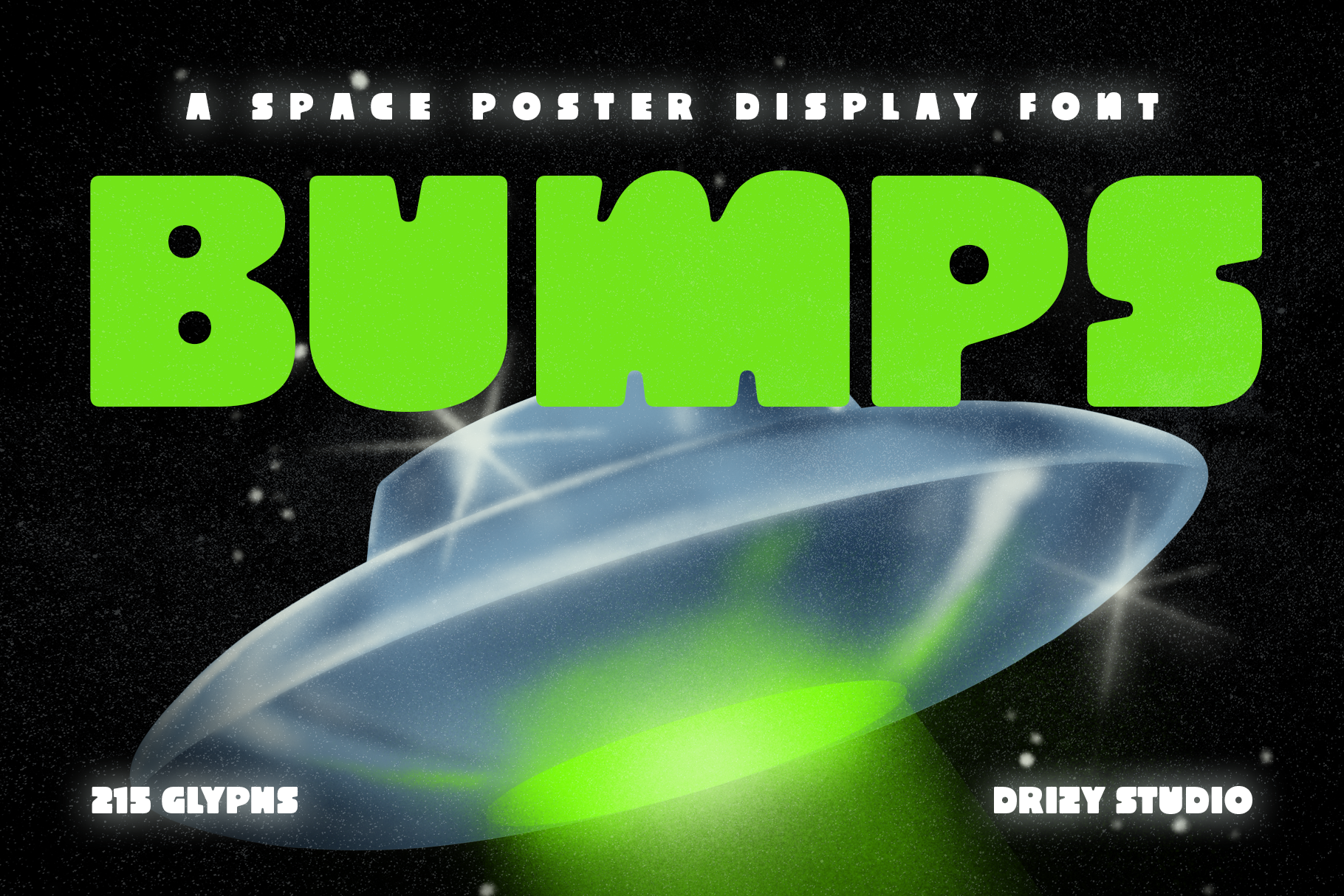
1. Bumps
Bumps is an ultra-chunky, bubbly display font with a retro-futuristic sci-fi feel. The rounded weight gives it a playful punch, while the 215-glyph set covers headlines, numbers, and short promotional copy. I like it for posters that need to feel loud without looking harsh.
Best for: concert posters, promo campaigns, street-style graphics. By: Drizy Studio
2. Sokata
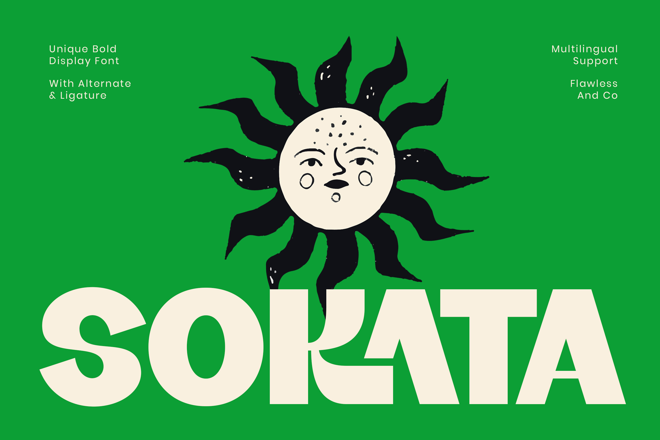
Sokata is a bold, playful, contemporary display font that works well when a poster needs friendly energy rather than hard-edged aggression. It sits comfortably next to bright color blocks, simple icons, or bold photography. It is a good pick when the event feels more community than arena.
Best for: event posters, retail promos, social media announcements. By: Flawless And Co
3. Morne
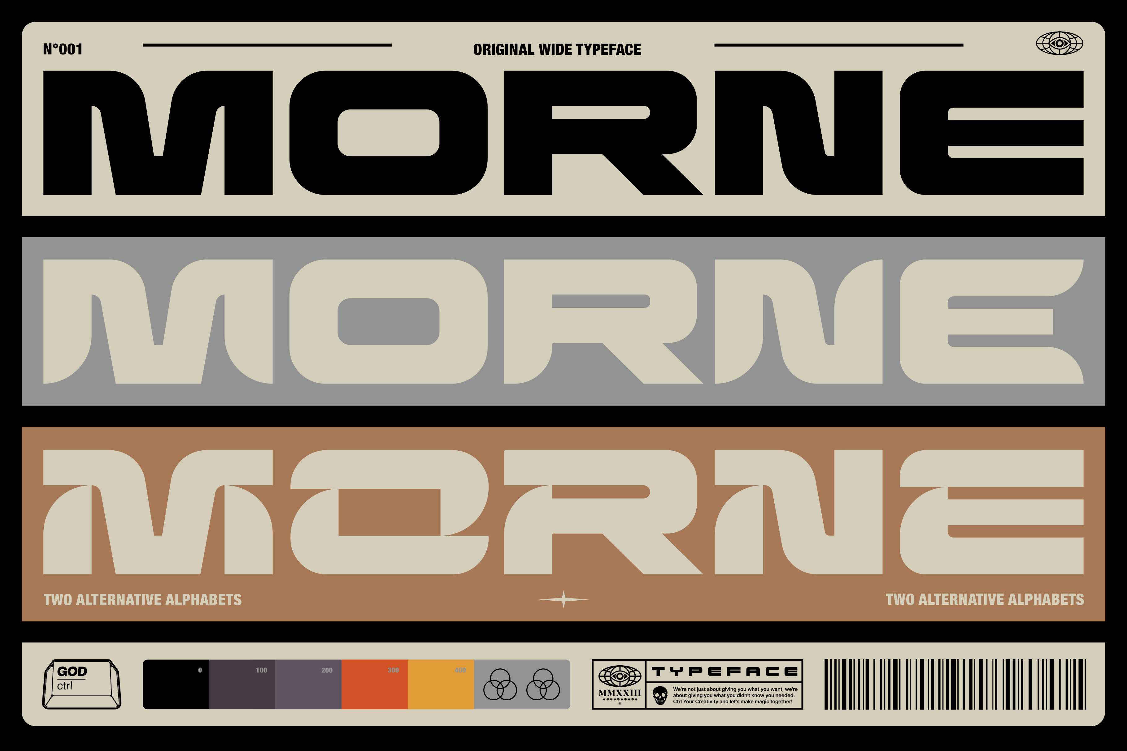
Morne is a wide, heavy display font with a confident blocky presence. It includes three alternate styles for each letter and number, which makes it useful when you want to add variation without switching typefaces. Multilingual and punctuation support help it handle real event copy.
Best for: bold headlines, multilingual events, large-format print. By: God Control
4. Western Saturday
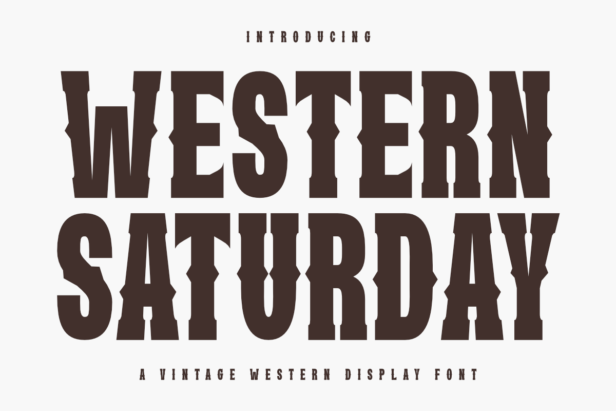
Western Saturday has a tall, condensed, heavy slab-serif construction with a frontier mood. It skips the clean sans look, and that is part of its appeal. The rugged letterforms suit themed events, saloon nights, rodeos, and any poster that needs a cowboy edge.
Best for: western events, themed festivals, retro saloon promos. By: Almairatype Studio
5. Nitro Nova
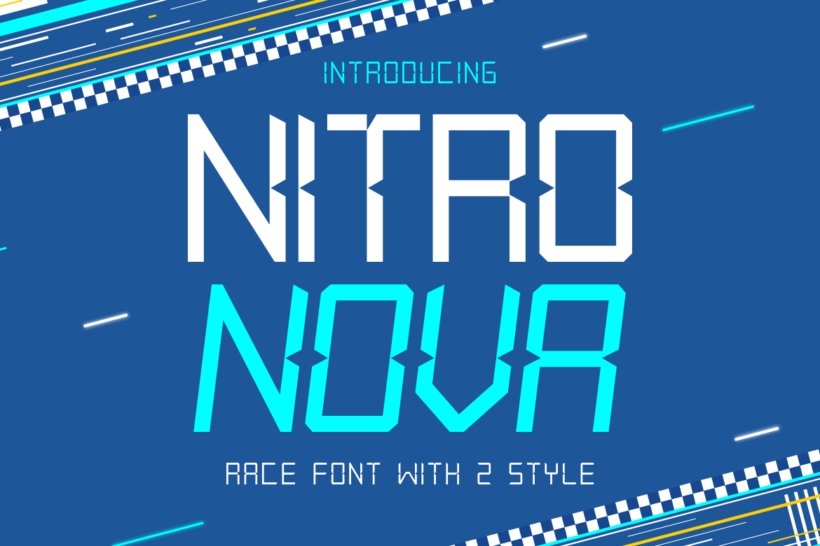
Nitro Nova is a sharp-angled, modern geometric display font with a racing and motorsport feel. The aggressive angles give it speed, while the clean structure keeps it usable for headlines, banners, and digital event graphics. I would use it when the poster needs to feel fast, technical, and a little dangerous.
Best for: race posters, gaming promos, tech events. By: putracetol
6. Americlant
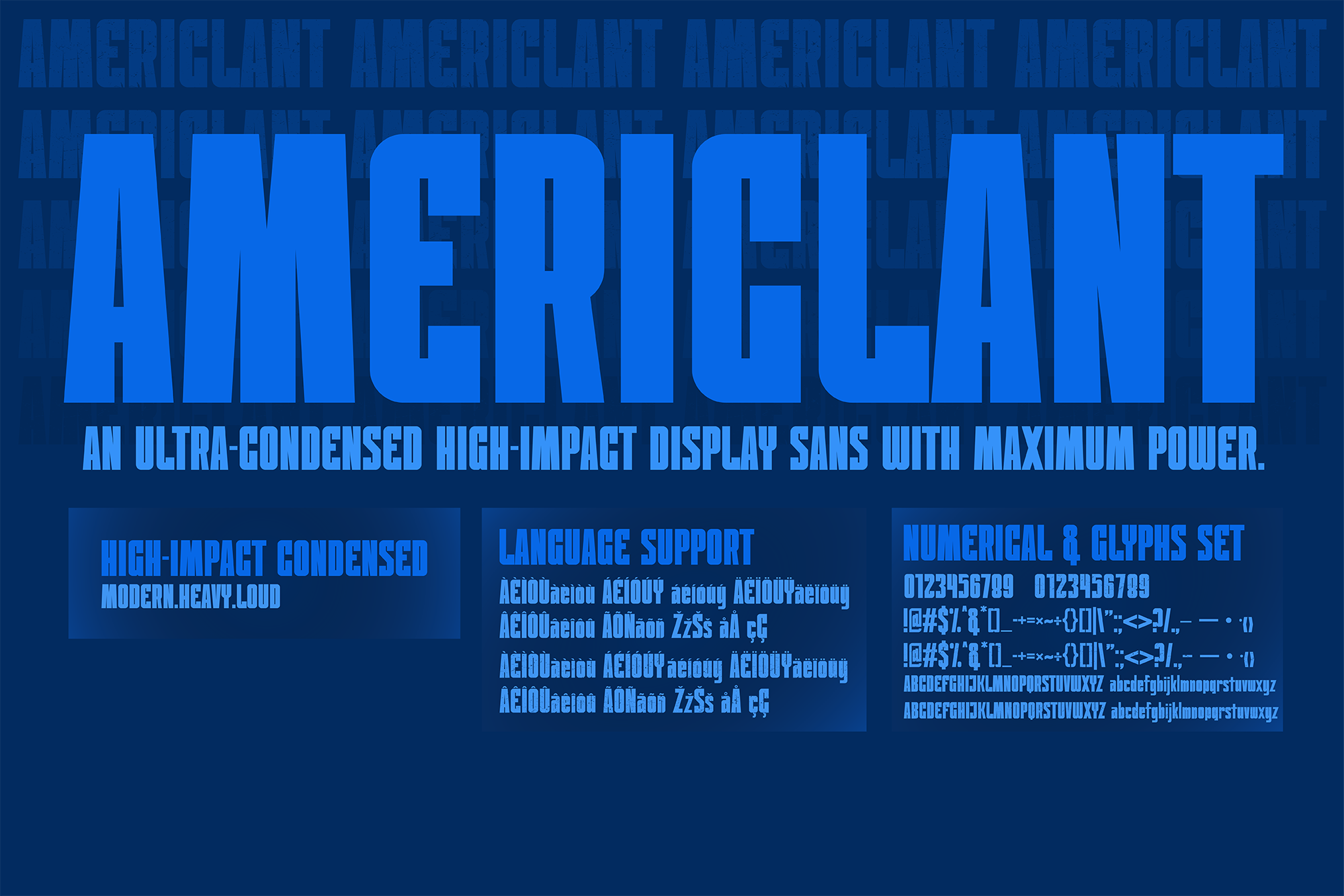
Americlant is an ultra-condensed display sans serif with a tight, punchy rhythm. It comes in two styles: a clean Regular and a textured Grunch variant that leans into grunge. That makes it useful for dense headlines and street-style posters that need both impact and character.
Best for: dense headlines, street posters, promo banners. By: TINY GRAPHIX
7. Poster Power
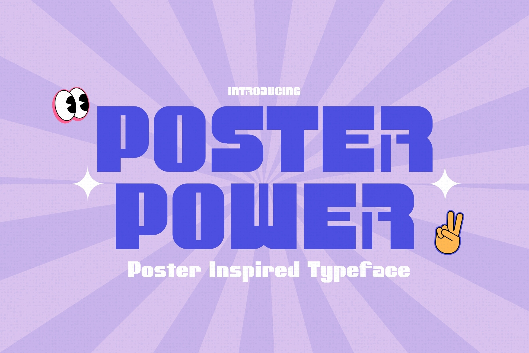
Poster Power is a vintage-event-poster-inspired sans serif with a direct nod to classic promo design. The name alone tells you its job, but the letterforms do the work too. It feels energetic and familiar, which helps it fit music, sports, and community event graphics.
Best for: event posters, concert announcements, retro promos. By: HipFonts
Condensed / Impact Sans-Serif Fonts for Posters
Condensed and impact sans-serif fonts are useful when the headline is long, the space is tight, or the design needs a dense urban look. They let you fit more characters per line without sacrificing readability. I use this group when the type has to do a lot of work and the layout has little room to breathe.
8. Mechora
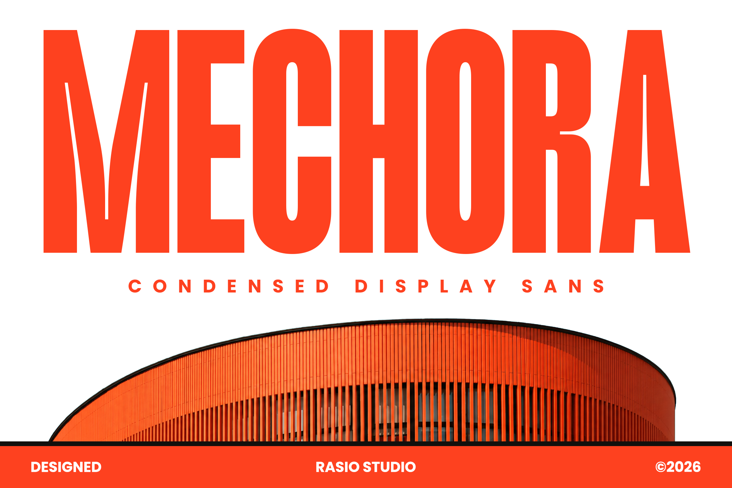
Mechora is a tall, architectural condensed display sans with narrow tracking. The vertical emphasis makes it ideal for stacked headlines, where the type can climb the poster without crowding the image. It has a structured, almost industrial feel. I like it for posters where the headline is the main visual.
Best for: dense headlines, urban posters, sports announcements. By: product.rasiostudio
9. Dooze
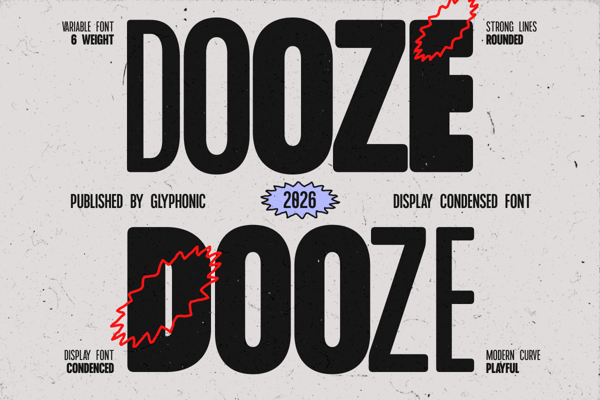
Dooze is a true variable font with six weights, which makes it one of the most flexible choices in this list. Strong lines and playful curves let you build a full hierarchy from one file, from a heavy headline to lighter supporting text.
Best for: event hierarchy, playful promos, multi-weight layouts. By: Glyphonic
10. Raceday
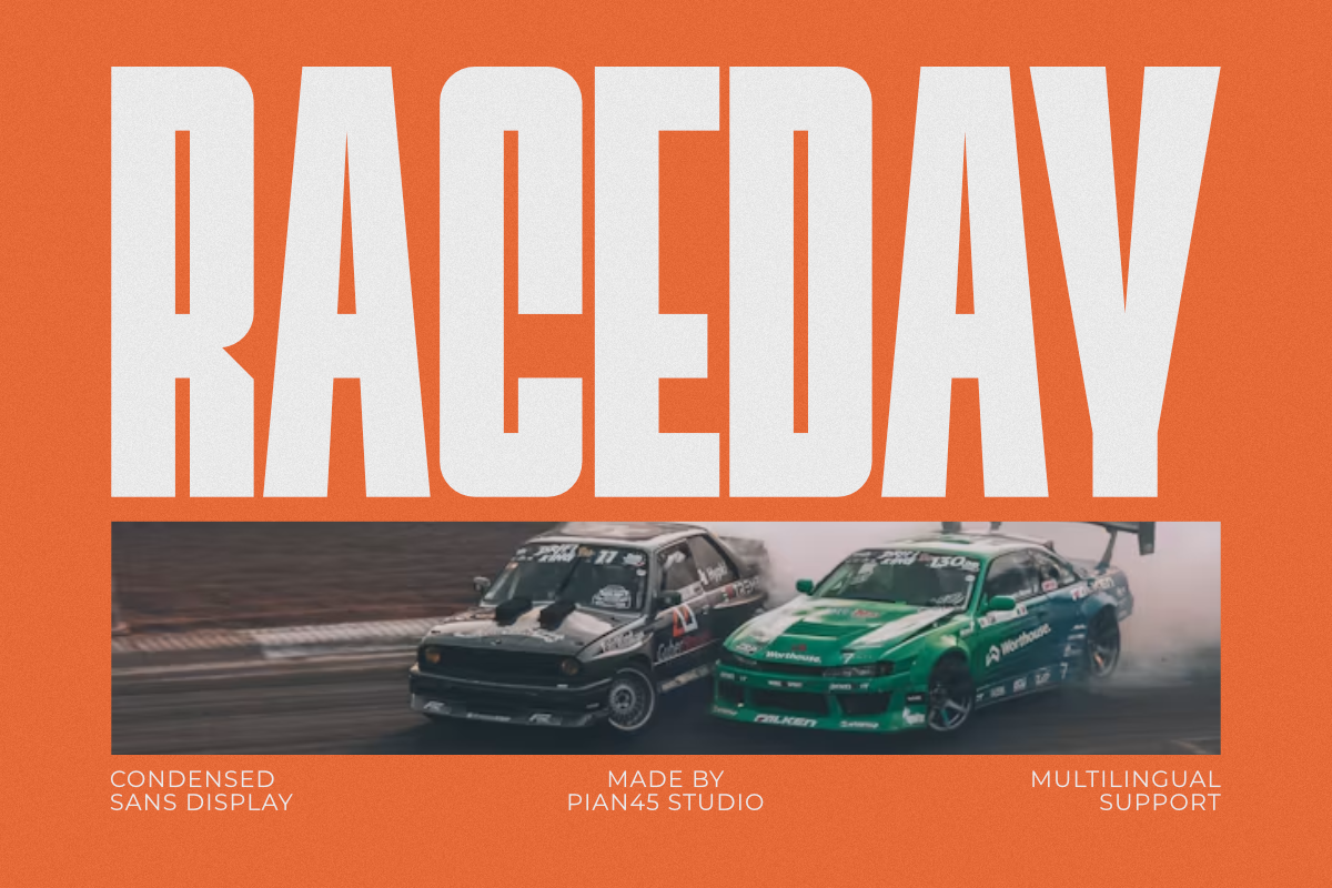
Raceday is a modern condensed sans display font with a clear motorsport lean. It is all-caps only, so it works best for short, punchy headlines rather than long paragraphs. Full multilingual support makes it practical for international event copy. I would keep the copy short and let the caps do the talking.
Best for: sports posters, race graphics, motorsport events. By: Pian45
11. Primate
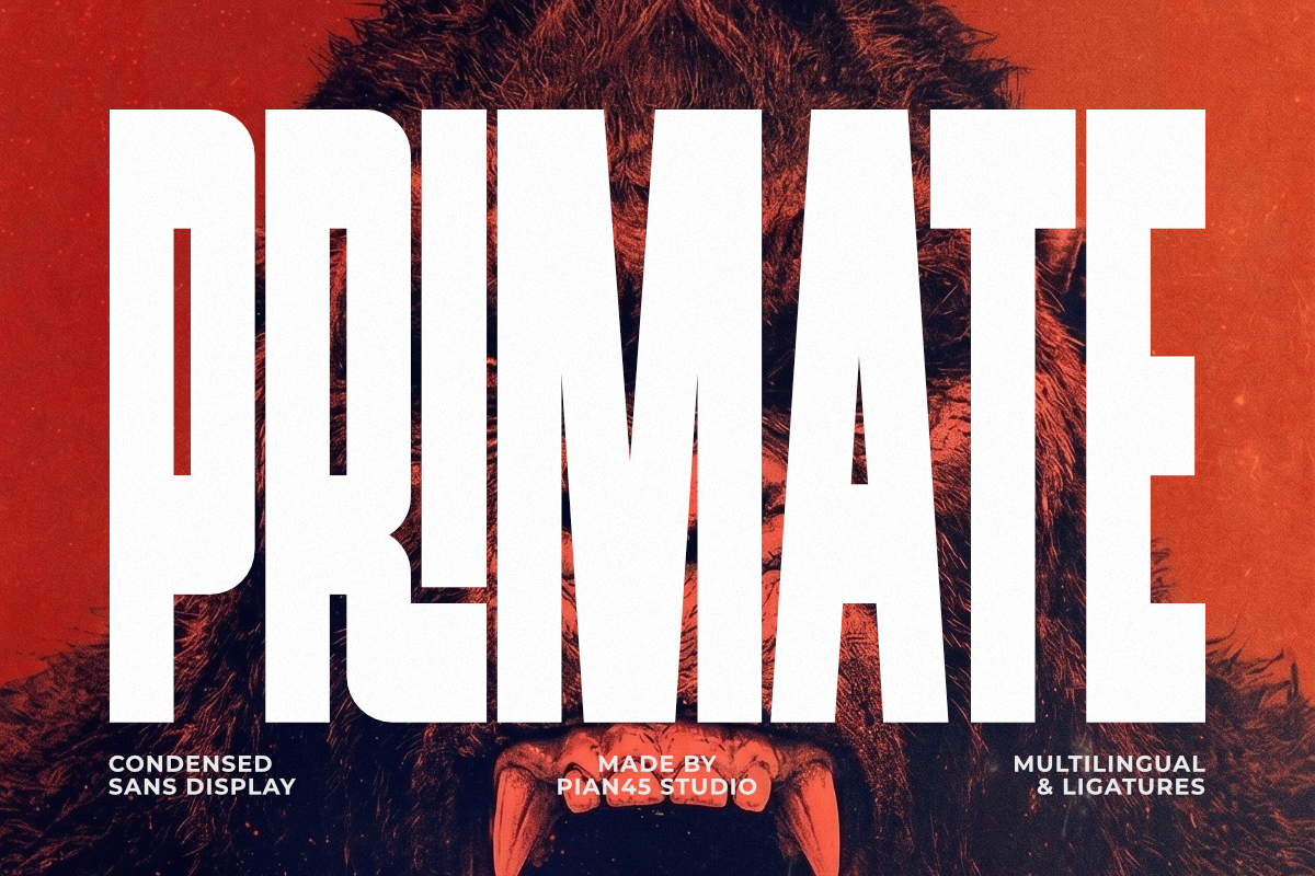
Primate shares the same condensed construction family as Raceday, but it leans into a monster, horror, and gaming mood. It is also all-caps only, so use it for titles, banners, and short phrases where the theme matters more than body copy.
Best for: gaming posters, horror events, monster-themed promos. By: Pian45
12. Naturalis
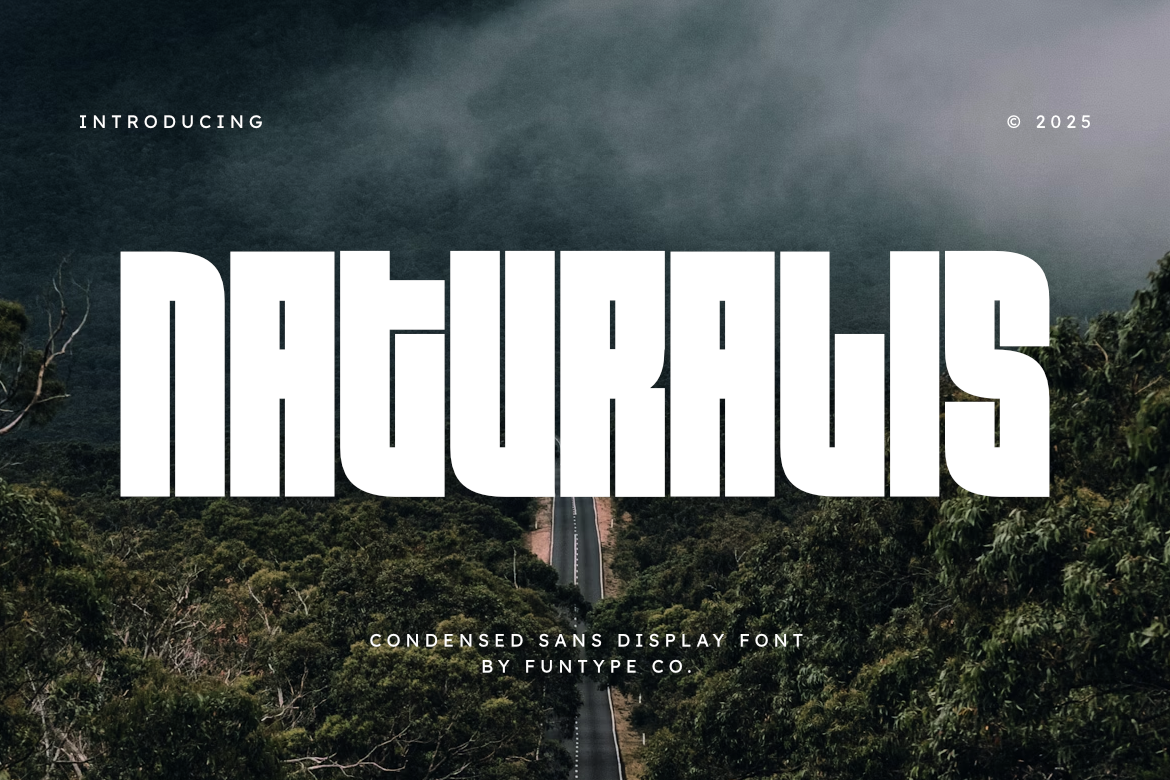
Naturalis is a bold condensed sans with a neutral, workhorse character. It does not try to be too decorative, which makes it a safe choice for large-format print posters, retail signage, and event details that need to stay clean.
Best for: large-format print, retail posters, clean event layouts. By: Funtype Co.
Vintage / Retro / Grunge Fonts for Posters
Vintage poster fonts, retro faces, and grunge styles add texture, age, and attitude. They work well for festivals, garage bands, outdoor adventures, and any design that needs a worn, lived-in feel instead of a polished corporate look. I find this group the most fun to play with, but also the easiest to overdo. The trick is to use texture as support, not as the whole design.
13. Sport Grunge
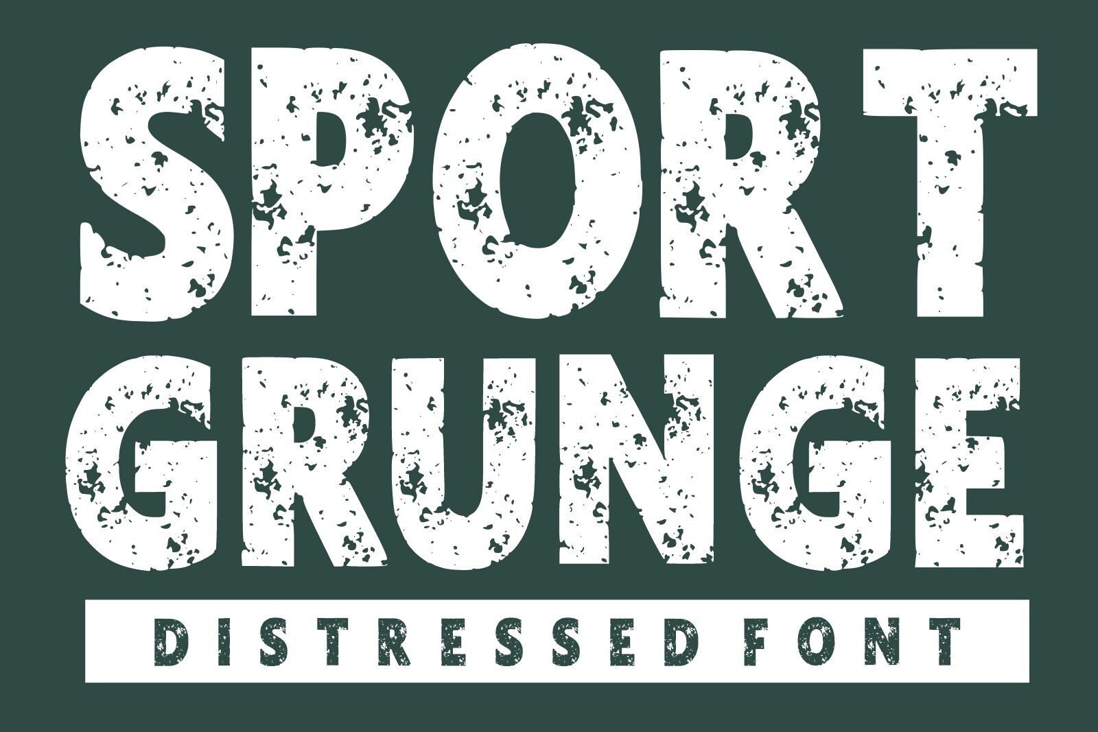
Sport Grunge blends distressed texture with an athletic, vintage sports-poster feel. The worn edges give it energy without needing heavy color or complex layout tricks. It is a strong pick for team announcements, retro sports nights, and gym-themed graphics. I would pair it with a simple background so the texture stays readable.
Best for: sports posters, vintage team promos, gym events. By: mardanimirza12
14. College Retro
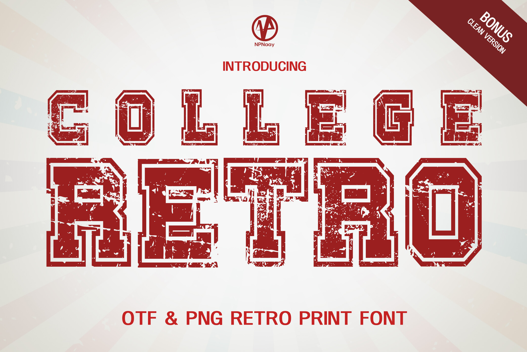
College Retro points to varsity and campus poster energy. The name suggests a classic collegiate look, useful for team events, campus nights, and retro sports graphics. Keep the layout simple so the type can carry the mood.
Best for: campus events, varsity posters, retro team nights. By: NPNaay
15. Adventure Retro
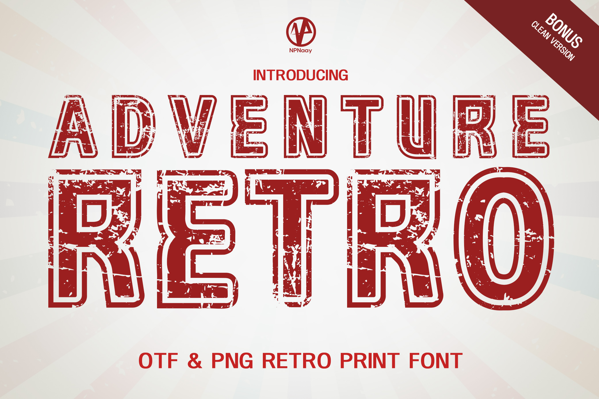
Adventure Retro leans into outdoor and expedition themes. It suits travel posters, hiking events, festival promos, and any design that wants a nostalgic sense of movement. I like it for posters that should feel like a trip, not a press release.
Best for: outdoor events, travel posters, festival promos. By: NPNaay
16. Vintage Detective
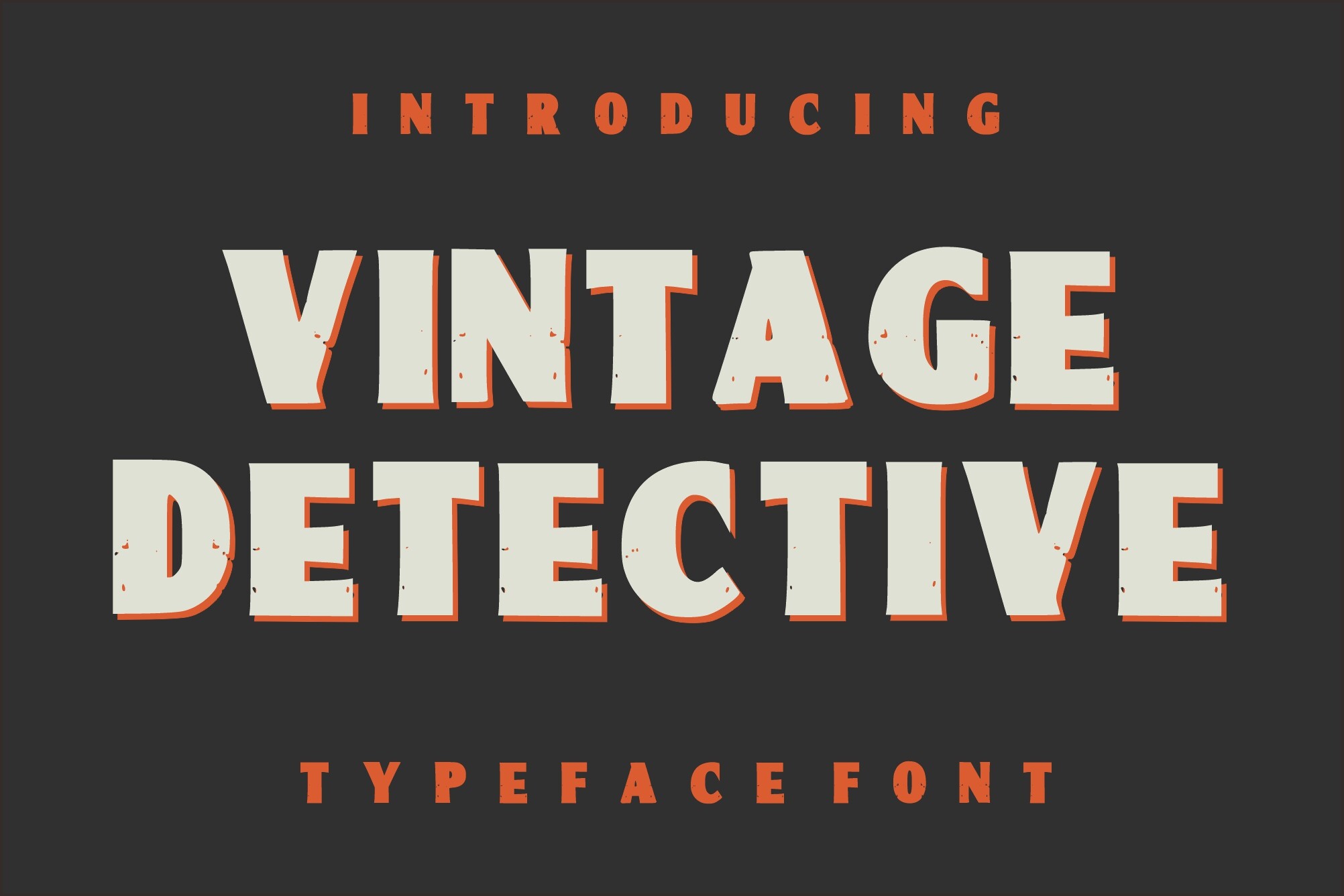
Vintage Detective is a heavy-texture grunge display font inspired by college typography. The distressed surface gives it a worn, vintage character that can work for music, street, and event posters. Use it when you want texture without a literal theme. It can also suit film or theater posters with a noir edge.
Best for: retro events, music posters, street-style graphics. By: Dreamspace.studio
17. Grunge Distressed
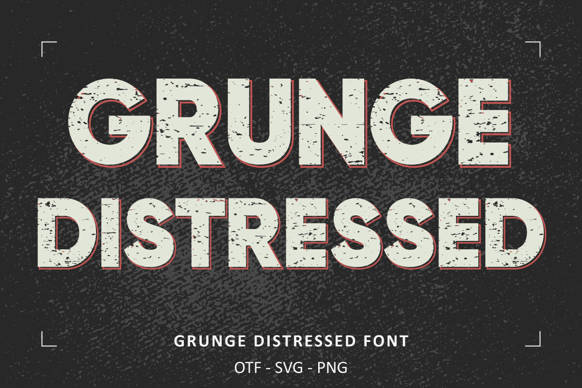
Grunge Distressed is a vintage grunge display face with a worn, textured look. It is a straightforward choice for posters that need a raw, used feel. The distressed character works well when the image is simple and the headline does most of the talking. I would not stack it over a busy photo.
Best for: festival posters, street promos, distressed event graphics. By: Font Craft Studio
18. Cardigan
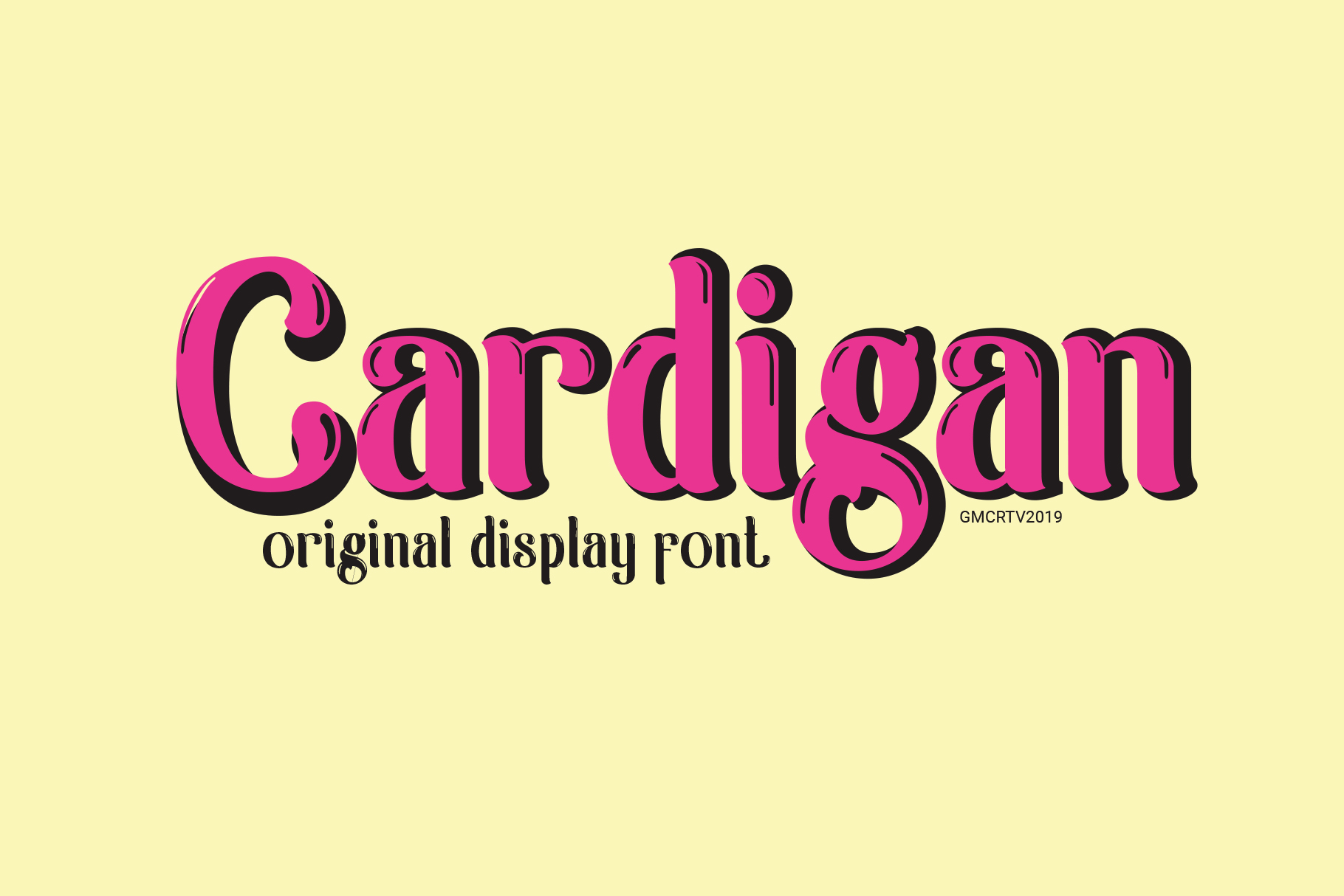
Cardigan is the mood outlier in this group. It is a sophisticated, hand-drawn retro face inspired by a retro swimming pool poster. It leans into charm instead of rough grunge texture. That makes it better for elegant summer promos, boutique events, and designs that need a softer, more inviting feel.
Best for: boutique events, summer promos, elegant retro posters. By: Gumacreative
Stencil / Military Fonts for Posters
Stencil fonts for posters bring a cut-out, industrial, or military-inspired look. They work well for street graphics, industrial themes, veterans events, and designs that need a hard, utilitarian edge. I use them when the poster needs to feel direct, functional, and a little blunt. I also keep the copy short because stencil shapes can get busy fast.
19. Stencil Army
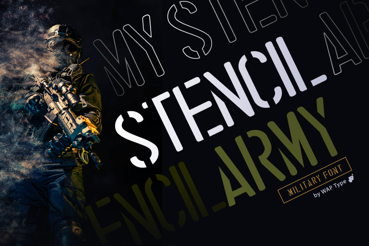
Stencil Army is a strong thematic match for military and veterans-related poster work. The cut stencil shapes create a direct, no-nonsense look that suits announcements, tribute graphics, and industrial event designs. I would keep the layout clean so the stencil shapes stay clear.
Best for: veterans events, military posters, industrial graphics. By: WAP
20. Military Stencil
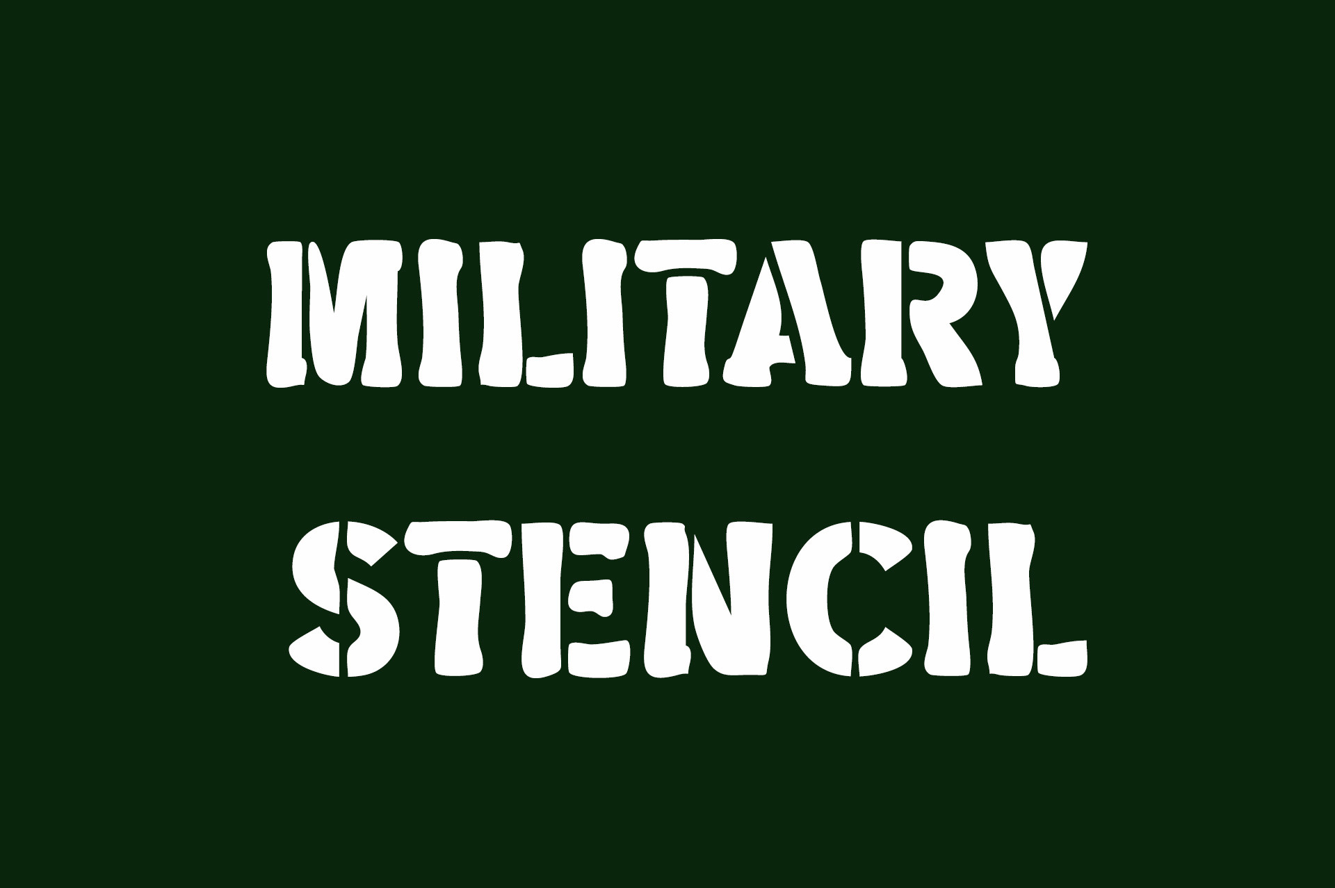
Military Stencil fits the stencil category through its name and visual direction. It suits street-style posters, industrial branding, and designs that need a utilitarian feel without a lot of decoration. Keep the background simple so the cut shapes stay readable. It is a practical choice when the theme is already obvious.
Best for: street posters, industrial branding, military-inspired promos. By: Vladimir Carrer
21. Wobbly Army Stencil
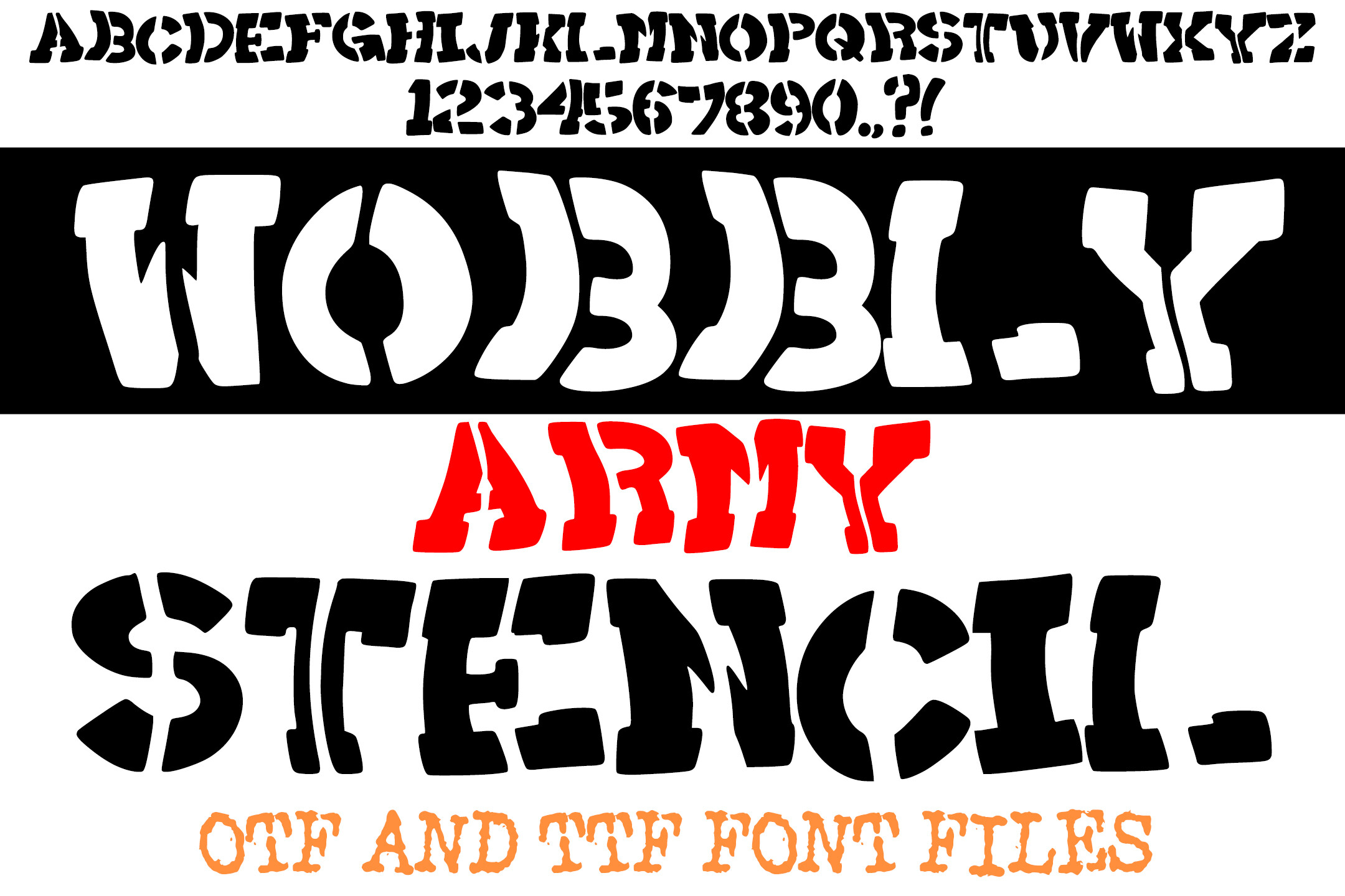
Wobbly Army Stencil is explicitly designed with poster use in mind. It is caps-only and has a limited punctuation set, so it is best for headlines, short phrases, and visual statements. The wobbly stencil shapes add a handmade, street-ready edge.
Best for: street posters, industrial events, bold headline graphics. By: squeebcreative
Serif Display Fonts for Posters
Serif display fonts are for elegant, theatrical, and premium posters. They trade raw impact for refinement, making them useful when the event or brand needs a more polished, classic, or luxurious feel. I reach for them when the poster should feel like an invitation, not an ad.
22. Velvet Angel
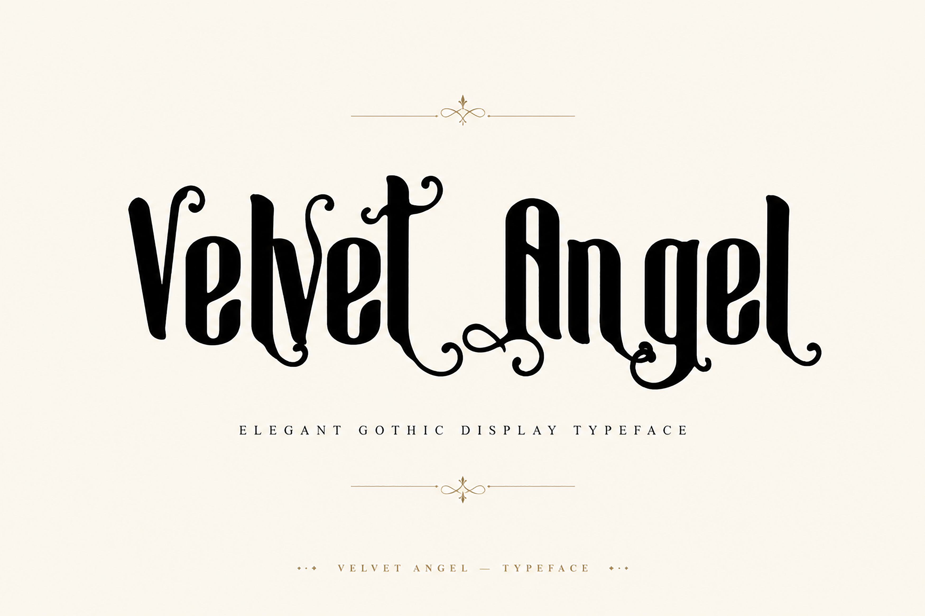
Velvet Angel is a dramatic gothic-vintage ornamental serif. The decorative details give it a theatrical presence, which makes it useful for elegant event posters, gallery announcements, and premium brand graphics. Note that it is available as an OTF file, so check compatibility before use.
Best for: elegant events, theatrical posters, premium brand graphics. By: T.D. House
23. Glorious Copper
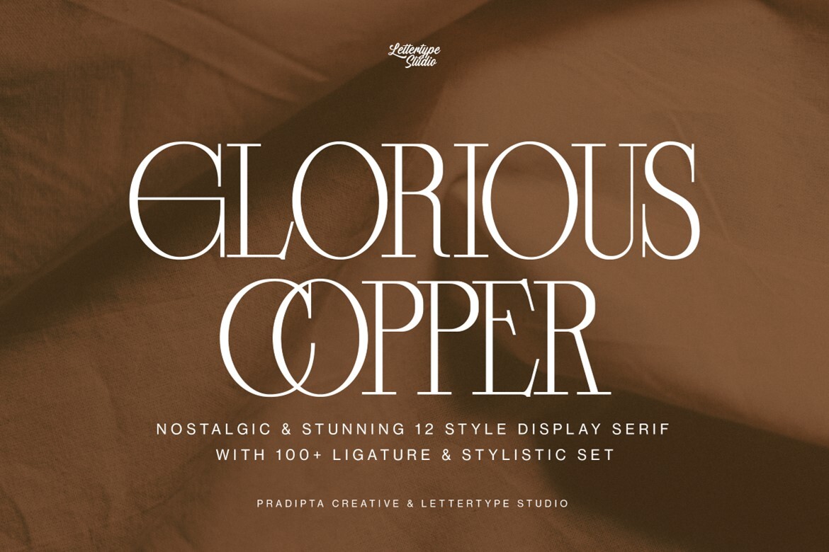
Glorious Copper is a nostalgic display serif with a rich feature set. It includes 12 styles and more than 100 ligatures or stylistic sets, giving you a lot of room to customize classic and vintage poster layouts. I like it when the design has room for small typographic details.
Best for: vintage posters, classic event layouts, premium serif designs. By: pradiptacreative
24. Falcon
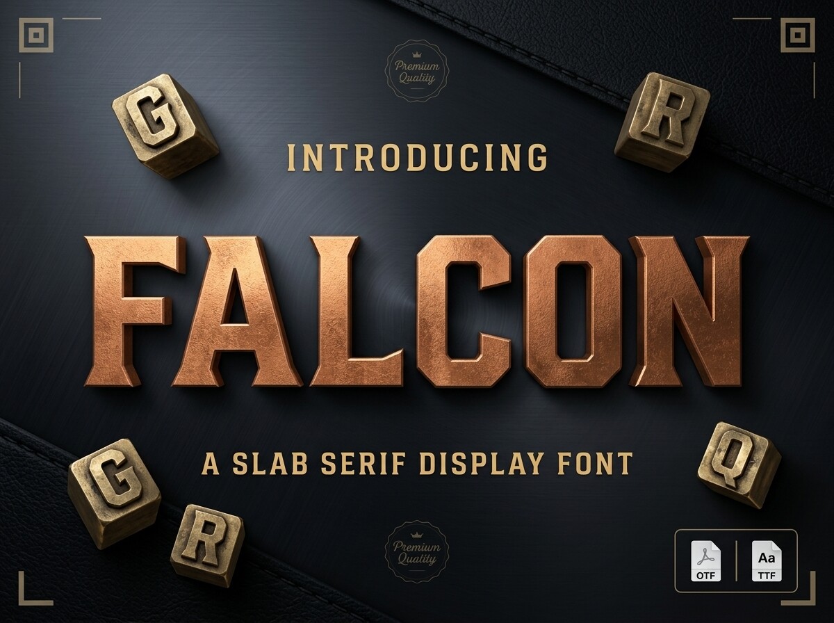
Falcon is a slab serif with a blocky, chamfered, rugged construction. It skips delicate ornamentation, which makes it a good fit for outdoor, industrial, and adventure-themed posters that still need a serif structure. It is a good bridge between a serif and a heavier display face.
Best for: outdoor posters, industrial events, rugged brand graphics. By: greenvill
How to Use Poster Fonts in Your Design Projects
Start with the message, not the font. Decide what the viewer must read first, second, and third. A strong poster usually needs a headline, a subheading, and a small amount of detail.
Use a bold display face like Bumps or Poster Power for the main title. Pair it with a condensed sans like Naturalis or Mechora for details. For an elegant tone, combine a serif display face with a clean sans for body text.
Test the design at real size. Zoom out on screen or print a small proof. If the main message is hard to read, increase the weight, reduce the copy, or choose a simpler face. I also check the poster in grayscale to confirm the hierarchy still holds without color.
Use size and weight to create hierarchy. A common starting guide is:
| Element | Suggested size |
|---|---|
| Title | 85pt |
| Subheadings | 36pt |
| Body text | 24pt |
| Captions | 18pt |
For distance viewing, use 30pt at 6 feet, 48pt at 10 feet, 60pt at 12 feet, and 72pt at 14 feet.
For print, A1 posters can use 18 to 20pt body text and 48 to 72pt headlines. A2 posters can use 14 to 16pt body text and 36 to 48pt headlines. Digital social posters need bold contrast and short lines.
Install the fonts before final layout. On a desktop, download the file and install it to system fonts, then restart Canva, Photoshop, Illustrator, or Procreate if needed. In Canva, you can also upload a custom font.
Tip: For caps-only faces like Raceday, Primate, and Wobbly Army Stencil, plan short uppercase phrases. Do not rely on lowercase or long punctuation-heavy sentences.
Tips for Choosing the Right Poster Font
Check the license before you commit. Creative Fabrica fonts are available through subscription or single-purchase licensing that typically covers commercial poster and print use, but confirm the exact scope on the product page. Free poster fonts from Google Fonts or DaFont may allow personal use only.
Match the file format to your workflow. Most desktop tools handle TTF and OTF files well, but Velvet Angel is noted as OTF-only, so test it before finalizing. Variable fonts like Dooze can simplify hierarchy, but support varies by tool.
Check language support too. A font may look perfect in English but lack accents, diacritics, or another script. Preview the full text before export. If you are using a template, replace the placeholder text with your actual copy before judging the font.
Let image and color do some work. High contrast helps legibility. Solid color blocks, drop shadows, or outlines can protect type over busy photos. Print files need 300 DPI, while digital posters usually need 72 DPI.
Where to Download Fonts for Posters
Creative Fabrica is the main source for these fonts. It offers subscription and single-purchase options, practical for designers, print shops, and small businesses needing poster design fonts. Browse product pages above for previews, license details, and download options.
If you also want free poster fonts or event poster fonts, Google Fonts and DaFont are useful, but always check the license. I keep a folder of licensed fonts by project type so I do not have to hunt before a deadline. For more typography guides, see the FontPro blog.