· fonts · 15 min read
14 Best Fonts for Coffee Shop Menu in 2026
Discover the best fonts for coffee shop menu design. Pick readable, warm type that suits boards, cafe menus, and print. Download free and premium options.

The type on your coffee shop menu does more than list drinks. It sets the mood before the first sip. A warm script on a chalkboard board makes a place feel like a neighborhood hangout. A tight sans-serif on a sleek menu board says “we take espresso seriously.” Either way, the font shapes how fast a customer orders and how they feel about the price before they even see it.
Here are 14 fonts I would actually use on a cafe menu, broken down by style. You will find handwritten scripts, vintage typewriters, clean sans-serifs, and display headers. Each one has a specific job on the menu, and I will tell you which job it is.
What Makes a Great Font for a Coffee Shop Menu?
A coffee shop menu font has to pull off two things simultaneously: it needs to look like your brand, and it needs to stay readable when a customer is standing in line with a phone in one hand and a half-decided order in their head. If the type is too thin, too decorative, or set too small, the menu becomes a puzzle. Nobody wants to solve a puzzle when they are just trying to get a latte.
The best fonts for coffee shop menu design balance character with clarity. Here is what that looks like in practice:
- Readability: The type should stay clear from a few feet away, in low light, and on a small printed card. If a customer has to squint, you have a problem.
- Brand character: The font should match the cafe vibe. A craft roastery wants something different from a minimalist espresso bar. The type should feel like it belongs in that specific space.
- Hierarchy: The cafe name, section titles, drink names, descriptions, and prices should be easy to separate at a glance. If everything looks the same size and weight, the menu feels flat.
Menus are read in seconds, not studied like a book. A customer walks in, scans the board, finds their drink, checks the price, and places the order. The whole process should take maybe ten seconds. If the type slows that down, the menu feels frustrating. If the type feels warm and clear, it can make the coffee seem better before the cup even arrives.
So what is the best font for a coffee shop menu? The practical answer is a pairing. Use one expressive font for the cafe name, section titles, and specials. Use a clean sans-serif or serif for drink names, descriptions, and prices. This keeps the menu attractive without making it hard to read.
Aim for two or three fonts on one menu. More than that can feel busy, especially on a small board or a QR menu that renders on a phone screen. If you are unsure where to start, pick one strong coffee shop branding font for the header and one neutral font for everything else.
| Menu element | Font role | Example from this list |
|---|---|---|
| Cafe name | Expressive header | Coffee Shop Script, Braventro |
| Section titles | Medium display or script | Daily Coffee, Bakery Roast |
| Drink names | Clean body | Hermano, Bagine |
| Descriptions and prices | Readable body | Aruna, Classic Typewriter |
Best Script and Handwritten Fonts for Coffee Shop Menus
Handwritten fonts for cafe menu design are where the warmth lives. They make a menu feel like someone actually wrote it, which is a small thing but it matters. A script header on a cafe menu says “this is a human place, not a corporate chain.”
Use them for the cafe name, a “Specials” section, or a short accent line like “Fresh Brew.” Keep them short and large. Long paragraphs in script become a mess fast. Do not use script for the whole menu. I have seen it done, and it is painful to read.
1. Coffee Shop Script
Coffee Shop Script is a casual script made for cafe branding. The letterforms are relaxed and friendly enough for a logo, a menu header, or a chalkboard accent. It feels personal without tipping into the “hard to read” territory.
Use it for the cafe name or a short banner, then pair it with a clean sans-serif for drink names and prices.
Best for: cafe logos, menu headers, specials banners. By: dailymiracledigitals
2. Barney Coffee Shop

Barney Coffee Shop has a friendly, informal character that suits neighborhood cafes. The letterforms feel hand-drawn and approachable, like a regular who knows your order and does not need you to repeat it.
Use it for the cafe name, a welcome line, or a short section title. Keep it large, and let a neutral body font carry the details.
Best for: neighborhood cafe menus, friendly headers, social posts. By: BitongType
3. Roastery Handmade

Roastery Handmade leans into the craft side of coffee. It feels handmade, rustic, and specific enough for roasters, small-batch cafes, and packaging. If your cafe roasts in-house or wants that “we grind our own beans” energy, this is a strong pick.
Use it for headers, bag labels, and a short menu title. Pair it with a simple sans-serif or typewriter font for descriptions and prices.
Best for: craft roasters, packaging, rustic menu headers. By: cocodesign
4. Daily Coffee

Daily Coffee is a relaxed script that feels easy and familiar. It suits cafes that want a soft, everyday tone rather than a formal or dramatic look. Think “your local spot” rather than “the fancy place on the corner.”
Try it for section titles, daily specials, or a printed menu header. Keep the body text in a clean font so customers can find prices quickly.
Best for: section headers, cafe social posts, daily specials. By: Typia Nesia
5. Early Coffee

Early Coffee has a warm brush-style feel that works well for morning menus. It feels friendly and a little playful, like a cafe that opens before the city wakes up and serves the night shift and the early birds alike.
Use it for accent words like “Fresh Brew” or “Morning Menu.” A clean sans-serif below it will keep the board readable from a few feet away.
Best for: morning menus, accent headlines, friendly cafe branding. By: The Gelato
Best Serif, Slab, and Typewriter Fonts for Coffee Shop Menus
Serif, slab, and typewriter fonts give a menu a vintage coffee shop feel. They make a small cafe look established, like a place that has been brewing the same way for years. There is something comforting about a menu that looks like it has history.
Typewriter fonts for menus also pair well with simple sans-serif type, which keeps the layout from feeling too old-fashioned. The combination of a worn typewriter for descriptions and a clean sans-serif for prices is a classic that works every time.
6. Western Typewriter
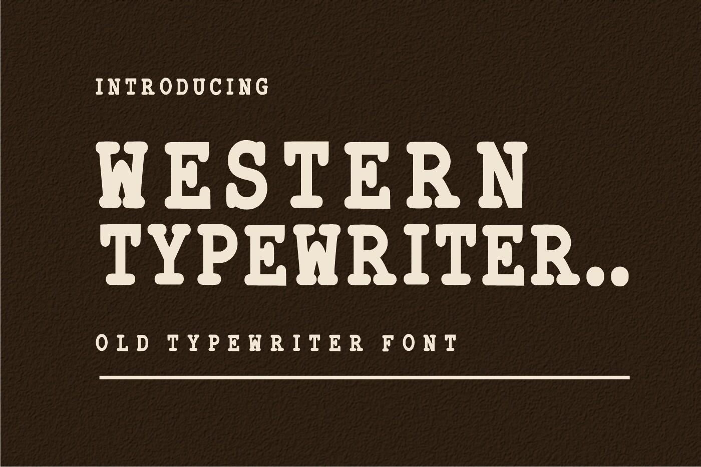
Western Typewriter brings a rustic, old-menu feel to a coffee shop layout. The letterforms have a worn, mechanical charm that works well for vintage coffee fonts and heritage-style branding. It can make a simple menu feel like it belongs in a small town cafe with a wood counter and a dog sleeping under the table.
Use it for drink descriptions, a short intro line, or a “House Blend” section. Keep the size large enough for low light, and pair it with a clean sans-serif for prices.
Best for: rustic menus, vintage descriptions, heritage cafe branding. By: WNIdesign
7. Braventro

Braventro is a retro serif display font with a confident, classic look. It suits cafe signage, menu covers, and large headers that need to feel established. The style has enough structure to stay readable when set large, while still carrying a vintage coffee shop personality.
Use it for the cafe name, a menu cover, or a bold section title. Pair it with a neutral body font so the details do not compete with the header.
Best for: retro headers, signage, menu covers. By: Retro
8. Classic Typewriter
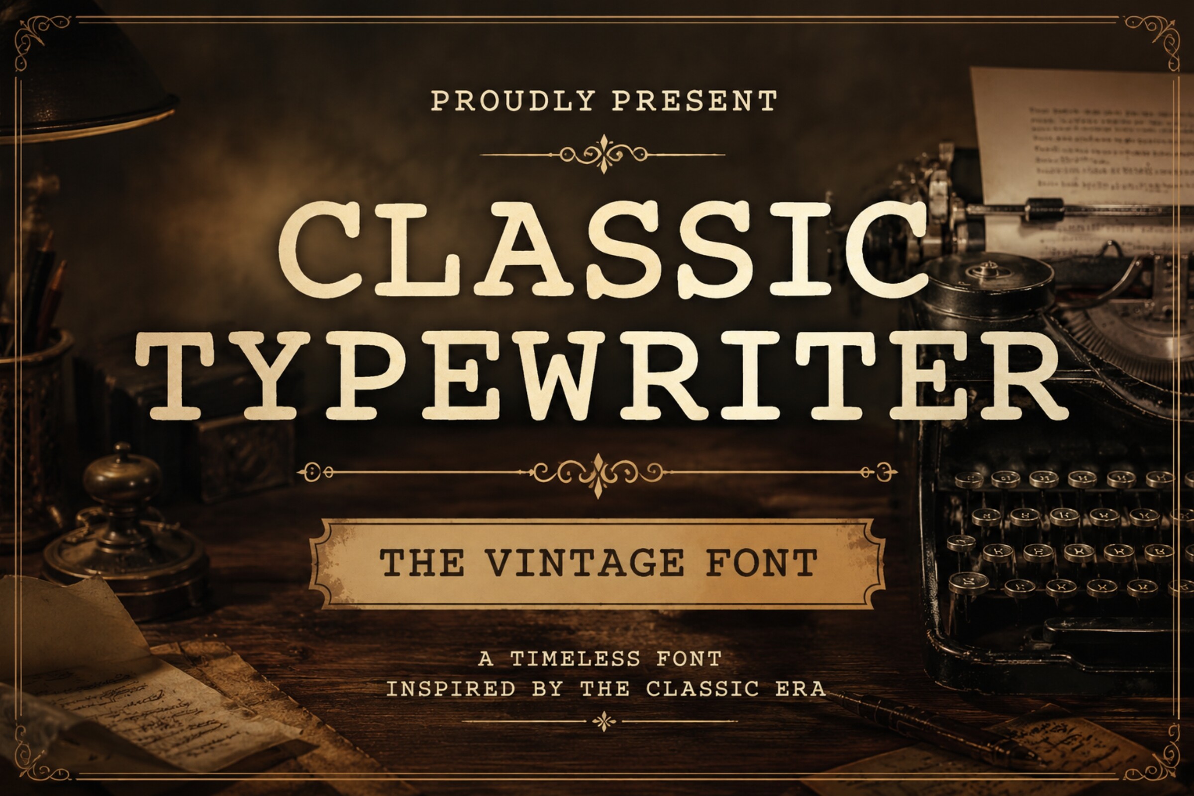
Classic Typewriter is a cleaner take on the typewriter style. It feels like a daily specials sheet or an old order pad, which makes it useful for menus that want a vintage tone without heavy decoration. The letterforms stay legible in short paragraphs and price lists, which is where most typewriter fonts start to fall apart.
Use it for descriptions, daily specials, and a short intro paragraph. A simple sans-serif can handle prices and drink names if you want a sharper contrast.
Best for: daily specials, menu descriptions, vintage price lists. By: Dreamspace.studio
9. Prince of Village

Prince of Village has a rustic serif charm that feels farm-fresh and handmade. It suits cafes that serve pastries, local goods, or a small menu with a village-style identity. The type gives a menu a cozy, artisan feel without turning into a full script.
Use it for headers, a bakery section, or a short brand statement. Pair it with a clean sans-serif or typewriter font for the rest of the menu.
Best for: farm-style cafes, bakery menus, rustic headers. By: TypeFactory
Best Clean Sans-Serif Fonts for Coffee Shop Menu Text
Clean sans-serif fonts are the workhorses of coffee shop menu design. They handle prices, descriptions, and small text without asking the customer to slow down. Modern minimalist cafes often choose sans-serif type because it keeps the board calm, clear, and easy to read from a distance.
If your cafe is the kind of place with concrete floors, exposed brick, and a single espresso machine, a clean sans-serif is probably the right call for the body text.
10. Hermano
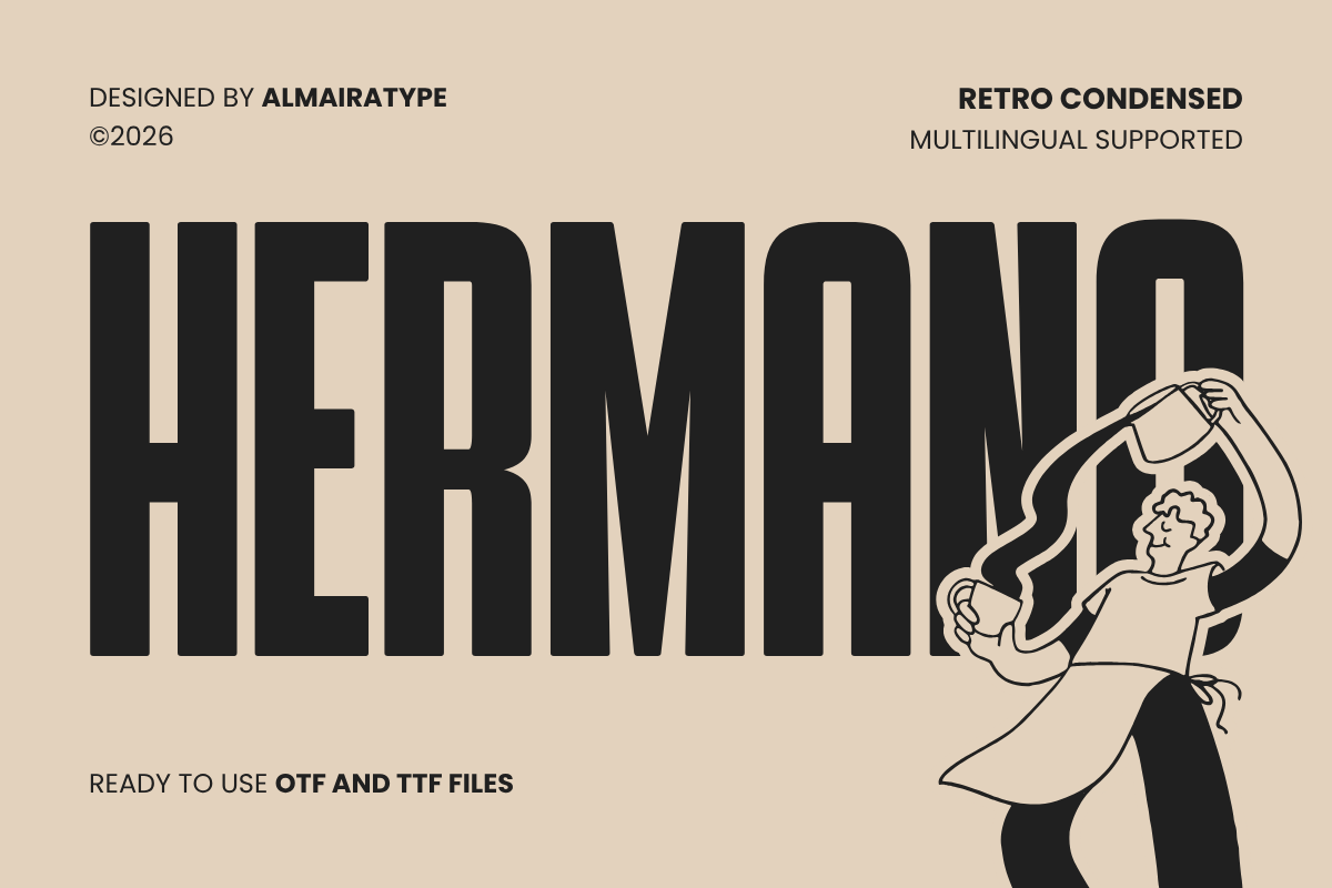
Hermano is a modern sans-serif that feels current and organized. It works well for cafes that want a clean, minimal look without feeling cold. The letterforms are sturdy enough for menu boards and digital screens, where clarity matters more than decoration.
Use it for drink names, prices, and short descriptions. It pairs well with a script or display font for the cafe name and section titles.
Best for: modern cafe menus, menu boards, digital menus. By: Almairatype Studio
11. Bagine

Bagine is a clean sans-serif with a practical, menu-ready structure. It is the kind of font that helps a layout stay tidy when there are many items, sizes, and prices. The type does not try to be the star, which is exactly what you want in the body of a cafe menu.
Use it for drink names, add-ons, and price columns. A bold weight can mark section titles, while a regular weight keeps the details easy to scan.
Best for: menu items, prices, clean hierarchy. By: pandekastudio
12. Aruna

Aruna is a versatile sans-serif that can carry both print and digital menus. It feels neutral enough for a minimalist cafe and flexible enough for a busier layout with multiple sections. The type works well when you need one font that can handle headers, body text, and small notes without looking out of place.
Use it for a full menu system, from the cover to the price list. If you add a script font for the cafe name, Aruna can keep the rest of the design balanced.
Best for: print menus, QR menus, all-purpose cafe type. By: dwisastudio
Best Display and Vintage Header Fonts for Coffee Shop Menus
Display and vintage header fonts are for the big moments: the cafe name, the menu cover, and a short headline that sets the tone. Use them large and short. When a display font is used for too much text, it becomes decorative instead of readable, and your menu starts to look like a poster rather than a menu.
13. Bakery Roast

Bakery Roast is a vintage display font that feels at home in a coffee and bakery menu. It has a warm, classic look that suits headers like “Coffee and Pastries” or a cafe name with a bakery side. The style is strong enough to stand out on a printed cover or a wall board.
Use it for the main header, a bakery section, or a short promotional line. Keep the body text in a clean serif or sans-serif so the menu stays easy to read.
Best for: cafe-bakery menus, vintage headers, menu covers. By: CalligraphyFonts
14. Sunny Dinner

Sunny Dinner is a cheerful display font with a bright, inviting feel. It suits brunch cafes, daytime menus, and brands that want a friendly, upbeat look. The letterforms have enough personality to make a header memorable without becoming hard to read at large sizes.
Use it for the cafe name, a brunch header, or a short line about the day’s menu. Pair it with a clean sans-serif for drink names and prices.
Best for: brunch cafes, cheerful headers, daytime menus. By: Helotype
How to Use Fonts in Your Coffee Shop Menu
Start with one expressive font and one neutral font. The expressive font can be a script, vintage display, or typewriter style for the cafe name and section titles. The neutral font handles drink names, descriptions, and prices. If you want a third font, use it only for a small accent, such as a “New” tag or a handwritten note.
Build the hierarchy with size and weight. The cafe name should be the largest element on the menu. Section titles should be next, then drink names, descriptions, and prices. Do not make prices too large. They should be visible, but they should not compete with the drink name. A good rule is to keep prices at 70 to 90 percent of the drink name size.
For a coffee shop menu board, choose fonts for menu boards that stay readable from two or three meters. Use a large size, high contrast, and bold weights where needed. On a chalkboard, prefer thick strokes and simple letterforms. Thin scripts can disappear in chalk or low light, and you do not want your “Flat White” to look like a smudge.
You can build the menu in Canva, Adobe Illustrator, Photoshop, or even Word. Install the font on your computer first. On Windows, right-click the font file and choose Install. On Mac, double-click the file and choose Install Font. Then open your design app and select the font from the type menu.
Tip: test the menu on a phone screen and on paper. A QR menu may look sharp on a bright screen, but a printed menu needs enough contrast for a dim cafe. If it looks fine on your laptop but disappears under the warm pendant lights in your shop, adjust the weight or size before you print.
Tips for Choosing the Right Coffee Shop Menu Font
First, define the brand character. Is your cafe cozy, craft, vintage, or modern? A small neighborhood cafe may want handwritten fonts for cafe menu, while a minimalist espresso bar may do better with a clean sans-serif. The font should match the space, the menu, and the price point. A $6 latte deserves a different type treatment than a $3 drip coffee.
Test the design in real conditions. Print a sample at the final size and read it under the same lighting you use in the shop. If a customer has to lean in to read a description, the font is too small or the weight is too light. A simple test is to ask a friend to read the menu without looking at your notes. If they hesitate on any line, adjust the size, spacing, or font weight.
Check the license before you buy. A cafe menu, signage, and packaging are commercial uses, even if the cafe is small. Some fonts are free for commercial use, while others require a paid license or subscription. Read the license on the product page before you download. This is one of those things that is easy to forget and expensive to fix later.
Also check language support. If your menu uses multiple languages, make sure the font supports the needed characters, diacritics, and symbols. For a QR menu, confirm that the font works in your web setup or design tool. If you are using a web font, check performance and compatibility. A font that looks great in Illustrator but renders as a blank box on a phone screen is not doing its job.
If you choose a vintage typewriter font, pair it with a simple sans-serif such as Montserrat or Roboto. You can also use one of the clean fonts above, like Hermano or Bagine, for a more modern contrast. The typewriter carries the personality, and the sans-serif keeps things legible.
Try Studio AI on Your Own Design
Want to see a font in a real design before downloading it? Creative Fabrica Studio is a browser-based tool with AI features — test fonts on your own text, generate matching graphics, remove backgrounds, and export finished designs for print or social media.
Try Studio AI Free →Where to Download Coffee Shop Fonts
Creative Fabrica is a good starting point for coffee shop fonts, cafe menu fonts, and coffee menu font ideas. You can preview the type before buying, compare styles, and choose between free and premium options. Many fonts include commercial use, but always check the specific license for menus, signage, and packaging.
For more coffee shop branding fonts and typography guides, visit the FontPro blog. You can also look at free font libraries such as Google Fonts, DaFont, and Font Squirrel for additional options. Just remember to verify the license before using a font in a cafe menu, wall board, or printed menu. A free font that is only licensed for personal use will not cover your cafe signage, no matter how much you love the letterforms.