· fonts · 14 min read
17 Best Fonts for Body Text in 2026
Pick a body text font that stays readable for paragraphs: 17 serif and sans-serif picks with previews. What makes body type work well, plus pairing tips for 2026.

Body text makes up about 90% of most layouts. It gets the least attention.
If your paragraphs feel tiring to read, the problem is almost never the message. It is the body text font. A good one disappears. Readers notice ideas, not letterforms. That is the whole job.
The best good fonts for body text prioritize calm rhythm, clear shapes, and comfortable spacing over decorative flair. In this list, I picked 17 serif and sans-serif options for articles, books, documentation, email, and long-form reading. Each one comes with a preview, a short note on where it fits best, and a download link.
Note: All 17 fonts below are from Creative Fabrica. My use-case notes are based on the visible style of each typeface. The listings state a commercial licence is included, but check the terms on the product page before use.
What Makes a Great Body Text Font?
A body text font has one job: keep the reader moving. It should not ask for attention. The letters need to be distinct enough to avoid confusion, but neutral enough to fade into the background.
When you are choosing readable fonts for paragraphs, the details matter more than the overall “vibe.” Here is what I look at:
X-height. A taller x-height makes lowercase letters feel larger and more open. This helps a lot at small sizes, where a short x-height can make text look cramped and muddy.
Open apertures. Letters like c, e, s, and a should not close up into tight shapes. At 14px on screen or 9pt in print, a closed aperture turns into a blob. You will not even notice it happening until you are already squinting.
Moderate stroke contrast. If thick and thin strokes differ too much, the page looks noisy. On screen, it can shimmer. In print on cheap paper, the thin strokes just vanish.
Clear letterforms. I, l, and 1 should be easy to tell apart. o and 0 should not blend. This sounds obvious, but I still see it fail in production documents more than I would like.
Spacing. Good tracking between words and lines prevents the eye from stumbling. A font with several weights and a true italic gives you room to create hierarchy without pulling in a second typeface.
This is why the best fonts for body text are not always the most characterful. A display face can be memorable. Body type should be dependable. If you ask what makes a font readable in long paragraphs, the answer is consistency: even rhythm, clear shapes, and spacing that lets the eye glide.
Serif vs. sans-serif. The old rule that serif is for print and sans-serif is for screens is weaker now. Rendering quality, hinting, and size matter more. A well built serif body font can work on a phone. A clean sans-serif body font can work in a book. I always test any candidate on a real paragraph at the size I will actually use, not just a big sample on a white background.
Best Serif Fonts for Body Text
Serif faces bring a familiar rhythm to long reading. They are a traditional choice for books, journals, magazines, and editorial copy. The small feet at the ends of strokes can help the eye track across the line, especially in dense columns.
The best serif fonts for body text feel calm, not ornamental. They should support paragraphs without turning every sentence into a design statement.
1. Eristone
Eristone has a classic book serif feel. The rhythm is steady enough for long chapters, essays, and editorial paragraphs. It reads like a dependable book body font, not a display face trying to do too much.
I find it works well when the text needs to feel traditional but still modern enough for digital reading. It is the kind of serif you set and forget.
Best for: novels, essays, editorial body copy. By: Subectype
2. Hesay Verso

Hesay Verso is a refined serif with a light editorial polish. It suits magazine layouts, feature articles, and print spreads where the text needs to feel elegant but still easy to read.
There is a difference between “designed” and “merely set,” and this font lives in the first camp. The body copy feels intentional without being showy.
Best for: magazines, feature articles, print editorial layouts. By: Gracetypestudio
3. Acthirey
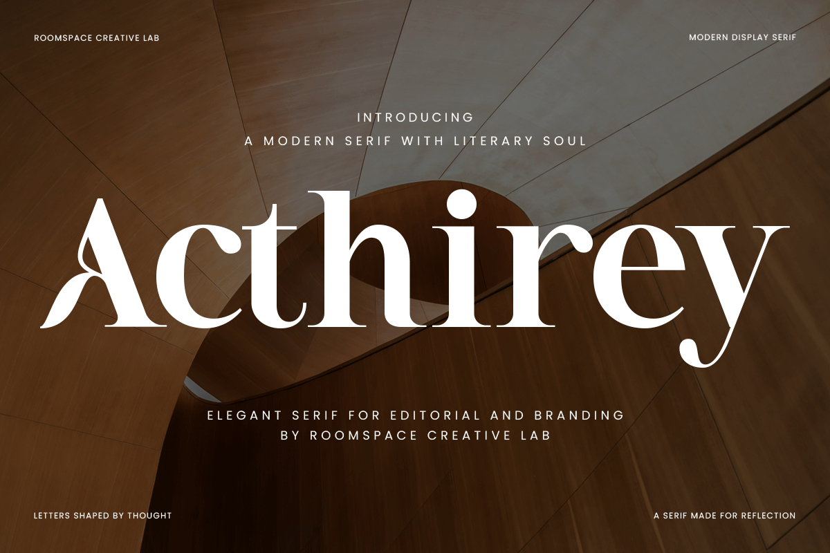
Acthirey feels elegant and composed. The soft serif structure works well for lifestyle content, book spreads, and long-form reading. It has enough personality to feel crafted, but not so much that it distracts from the sentence.
It also works in brochures and print pieces that need a softer editorial voice. If your project is somewhere between a novel and a lifestyle magazine, this is a good middle ground.
Best for: lifestyle blogs, book layouts, long-form reading. By: roomspace
4. Mastins

Mastins is a sturdy serif with a practical, print-ready character. It fits reports, documentation, manuals, and any project where the body text needs to look solid at small sizes and in dense columns.
The solid structure helps when the page is packed and the reader needs to stay oriented. I think of it as the workhorse of the serif group here.
Best for: reports, documentation, print body text. By: Graphicxell
5. Cartin

Cartin leans toward clarity. It works well for articles, study materials, and instructional pages where the reader needs to absorb a lot of information without visual strain.
When the content is information-heavy, the design should stay out of the way. Cartin does that. It is not the most interesting serif in this list, but it is one of the most reliable.
Best for: articles, educational materials, instructional pages. By: Perfectype
6. Newsprint

Newsprint brings a newspaper-style serif character to columns, headlines, and article layouts. It is a good choice when you want the body text to feel editorial and familiar, like a broadsheet or a news feature.
It gives columns a newsroom feel without making the text look dated. The name is a bit on the nose, but the execution is clean.
Best for: newspaper columns, news features, editorial layouts. By: Wow Magic
7. The Bilstein Editorial
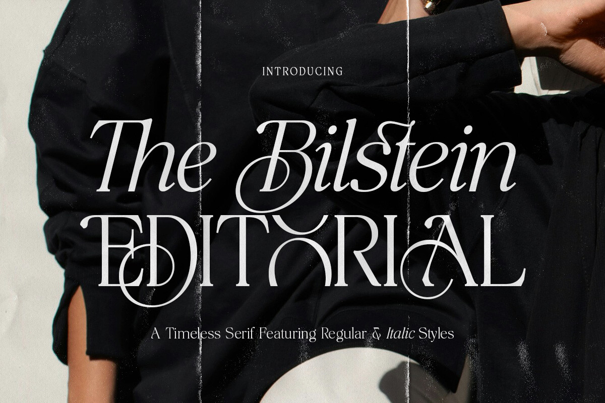
The Bilstein Editorial is built for magazine body text. It has an editorial confidence that works in feature stories, interviews, and print layouts where the copy needs to feel polished and intentional.
If your magazine layout needs body text that feels confident and refined without being stiff, this is a strong option. It carries itself well in longer feature pieces.
Best for: magazine body text, feature stories, print layouts. By: Pista Mova
Download The Bilstein Editorial
8. Gramon

Gramon has a Garamond-style old-style feel. It gives the text a literary, classic look that suits novels, poetry, and traditional book layouts where a quiet, historical serif tone is the goal.
It works best when you want a literary atmosphere without relying on decorative details. The personality is in the proportions, not in extra flourishes.
Best for: novels, poetry, classic book layouts. By: Taboja Studio
Best Sans-Serif Fonts for Body Text
Sans-serif faces are the natural choice for screens, interfaces, documentation, and email. Their clean shapes stay legible at small sizes, which is why legible fonts matter on lower-resolution displays.
A good sans-serif body font should feel calm and even. Enough spacing to keep long paragraphs comfortable. No sharp edges that make the eye catch.
9. Meramizue

Meramizue is a clean sans-serif with a straightforward, website-friendly look. It suits blogs, product pages, and content sites where the body text needs to feel modern without adding visual noise.
When a page has lots of content and the design needs to stay quiet, this is the kind of face that does the job. It is not trying to be anything other than a good reading font.
Best for: websites, blogs, content pages. By: Mightyfire
10. Lemondy

Lemondy has a friendly, approachable tone. It works well for lighter content: lifestyle pages, community sites, email. The text should feel warm and easy, and this font delivers that without being too casual.
It is a good option when the brand voice is relaxed but the text still needs to be clear. Not every project needs a cold, corporate sans.
Best for: lifestyle content, community sites, email. By: Rasiorise Studio
11. Soysun

Soysun is a warm humanist sans-serif that feels comfortable on long pages. Its softer structure makes it a good option for articles, help centers, and reading-heavy layouts that need a calm screen presence.
I reach for humanist sans-serifs when the reader is likely to spend time on the page rather than skim quickly. The slightly organic shapes keep things from feeling mechanical over 2,000 words.
Best for: long articles, help centers, reading-heavy layouts. By: Maulana Creative
12. Itagi Sans

Itagi Sans is a modern sans-serif with a UI-ready feel. It works well for interfaces, documentation, dashboards, and product pages where the body text needs to stay clear and functional.
It is useful for product interfaces where labels, help text, and body copy all need to feel related. One typeface covering all three roles keeps the system tight.
Best for: UI text, documentation, product pages. By: pekotype
13. Zariantz Grotesk Variable

Zariantz Grotesk Variable is a flexible grotesk built around variable font technology. That flexibility is useful when you need one typeface to cover body text, captions, and light display moments in the same project.
For design systems that need consistent text at multiple levels, a variable font cuts down on file weight and keeps the visual language unified. It is a practical option for teams that want fewer moving parts.
Best for: flexible typography, UI systems, multi-level text. By: unio.creativesolutions
Download Zariantz Grotesk Variable
14. Emord

Emord is a neutral workhorse sans-serif. It does not try to be loud, which is exactly what many documents need.
It suits reports, internal tools, and general web copy where clarity matters more than character. It is the kind of face you can use across many projects without it becoming a statement. Sometimes that is the point.
Best for: reports, internal tools, general web copy. By: Arterfak Project
15. Friary Pro

Friary Pro has a professional, business-like tone. It fits corporate documents, proposals, reports, and client-facing PDFs where the body text should look polished, trustworthy, and easy to scan.
If the reader expects a clean, corporate, and dependable presentation, this is a safe bet. It does not surprise you, and in a business context, that is a feature.
Best for: business documents, proposals, client-facing PDFs. By: Webhance
16. Caelisa

Caelisa is a soft sans-serif with a gentle, lifestyle-friendly feel. It works well for blogs, newsletters, and brand pages that want a relaxed tone without losing readability in longer paragraphs.
It is useful when the content is personal, but the layout still needs a professional base. The softness stays in the letterforms, not in the legibility.
Best for: lifestyle blogs, newsletters, brand pages. By: TypeFactory
17. Bomstad

Bomstad is a versatile sans-serif that can move between body text and supporting labels. It is a practical choice for websites, apps, and mixed layouts where one typeface needs to do several jobs.
If you want one typeface to cover most text roles without looking out of place in any of them, this is a good all-round pick. Versatility is not the same as being forgettable, and Bomstad manages both.
Best for: websites, apps, mixed layouts. By: Foxtype
How to Choose and Pair a Body Text Font
Start with the medium. A website body font, a book body font, and an email font face different constraints. Screen projects need clear rendering at 16px or larger. Print projects need stable small-size behavior, especially in the 9pt to 11pt range. Email projects need safe fallbacks and simple hierarchy.
Once you know the medium, test the font on real copy. Paste two or three paragraphs from your actual content, not a sample sentence. Set the size you plan to use.
For web, guides suggest 16px to 18px for body text, with a line-height around 1.5 to 1.7. Keep line length between 45 and 75 characters. If the eye skips around or you find yourself re-reading the same line, the font or the spacing is not working.
Pairing. A calm body font works well with a more expressive display or heading font. Most guides suggest a serif plus sans-serif pairing, but the real rule is contrast: one face should carry the message, the other should organize it.
For most documents, two fonts are enough. A third is usually a sign that the hierarchy is unclear. If you need three, step back and ask whether the structure is the problem, not the type.
If you are unsure whether body text should be serif or sans-serif, choose based on the reading environment. There is no single best font for body text. The right one depends on the medium, the size, and the content. Serif can feel warmer in print and long editorial pages. Sans-serif can feel cleaner on screens and in interfaces. In 2026, the quality of the typeface matters more than the category. A good serif body font can work online. A good sans-serif body font can work in print.
Body Text in Print vs on Screen
Print rewards serif faces that have a quiet, traditional rhythm. For books and magazines, test a short page at real size. If the text is 9pt to 11pt, thin strokes can disappear on cheap paper. Always check a physical proof before you commit to a full run.
A book body font should survive dense columns, page turns, and long reading sessions. If it looks fine on screen but falls apart in print, it is not the right choice for that project.
Screen behavior is different. Resolution, DPI, dark mode, and device size all affect how a font renders. Sans-serif body fonts often stay stable on lower-resolution displays, but a well hinted serif can also work well online. Always test on a phone, not just a desktop. I have seen too many “perfect” layouts that turn to mush on a 5-inch screen.
Email and PDF add another layer. Fonts may need to be embedded, and fallback stacks matter when a reader opens the file on a different device. System fonts are a useful context here, even if they are not the final choice. If your body text breaks when the font is missing, the layout is too dependent on one typeface. Build in a fallback that is at least in the same family.
Try Studio AI on Your Own Design
Want to see a font in a real design before downloading it? Creative Fabrica Studio is a browser-based tool with AI features — test fonts on your own text, generate matching graphics, remove backgrounds, and export finished designs for print or social media.
Try Studio AI Free →Where to Download Body Text Fonts
Creative Fabrica is the main source for the 17 fonts in this list. You can preview each typeface, see the product details, and check the license terms before downloading. The listings for these fonts state that a commercial licence is included, but you should still review the terms on the product page. That is especially important for client work, print runs, ebooks, or any project where usage rights matter.
If you are looking for free alternatives, Google Fonts, DaFont, and Font Squirrel are common places to browse. Fonts like Inter, Merriweather, and Lora are often mentioned as readable options for body text. Always check the license, because free does not always mean free for every commercial use.
For more font comparisons, pairing ideas, and practical typography notes, see the FontPro blog.