· fonts · 14 min read
26 Best Modern Fonts in 2026
The best modern fonts: clean sans serifs, luxury serifs, smooth scripts, futuristic and display picks for logos, branding and web. Download on Creative Fabrica.

A modern font decides whether your brand feels current or stuck in 2016. That is a harsh way to put it, but it is true. The typeface you pick for your logo has to survive as a 32 pixel social avatar, a storefront sign, an app icon, and a headline on a landing page. If it falls apart in any of those contexts, it is not ready.
The 26 fonts below cover five directions: clean sans, luxury serif, smooth script, futuristic, and display. I pulled them from Creative Fabrica listings, so check each product page for available weights, file formats, and license terms before you commit.
What Makes a Font Look Modern in 2026?
There is no single formula. A modern font in 2026 is built on clean shapes, open counters, and proportions that hold up at both large and small sizes. The best ones avoid noisy details that date quickly.
Scale is the first test I run. Type your brand name in the font, then shrink it to the size of an Instagram avatar. If the letterforms blur together, crowd, or lose their personality when reduced, the font is not ready for a full brand system.
Longevity is the second test. If a font feels aggressively 2026, it will probably look dated by 2028. I look for restrained uniqueness: a slightly softer terminal, a distinctive lowercase a, a confident x height. Those small details give the typeface identity without turning it into a costume.
Pairing matters too. A modern font system usually runs one sans for UI and body text, one serif or script for accent, and one display face for campaign moments. Keep the accents restrained. A brand with three loud fonts feels busy, not modern.
Best Modern Sans Serif Fonts
Modern sans serifs are the workhorses of contemporary branding. They carry logos, interfaces, packaging, and social templates without fighting the message. These six balance neutrality with enough shape to feel current rather than default.
1. Little Chailos
Little Chailos is a clean sans with a calm, professional feel. The letterforms are simple, the spacing is stable, and it does not try to be anything it is not. That makes it useful for brand marks, web headers, and packaging that needs to look current without effort. The free listing is a good starting point, but check the license before commercial use.
Best for: logos, web headers, and simple packaging. By: Mantype Studio
2. Beloger

Beloger has a crisp, confident structure that feels right for modern fonts for logos. The shapes are clean, but the rhythm gives it a little more personality than a generic geometric sans. It suits brands that want to look professional and current without reaching for something flashy.
Best for: logos, business cards, and social templates. By: Auliacreative
3. Shotare

Shotare is a modern sans serif built for screens. The open forms and even weight make it easy to read in UI labels, buttons, and short web copy. If your brand lives online, this is a practical choice. I would use it for navigation, buttons, and short support copy where clarity beats decoration.
Best for: web design, interfaces, and app text. By: IqsiartStudio
4. Gares Modern Sans

Gares Modern Sans is a versatile workhorse. It has a neutral base with enough structure to feel designed rather than default. That makes it useful for full brand systems where you need headings, body text, and labels to feel related without one element overpowering the others.
Best for: brand systems, websites, and packaging. By: 177Studio
5. Gakero

Gakero brings a friendlier tone to the modern sans serif category. The letterforms feel approachable without becoming soft or childish. That is a hard balance to strike, and Gakero handles it well. It is a good fit for consumer products, community focused brands, and anything that needs warmth and clarity in the same mark.
Best for: friendly logos, packaging, and social posts. By: SayStudio
6. Azimo

Azimo is a minimal modern sans with a quiet, confident presence. It strips away extra decoration and lets spacing, color, and layout do the heavy lifting. That makes it useful when you need a clean base for a logo or a simple digital product. If your brand identity is built on negative space and restraint, this is a strong option.
Best for: minimal branding, web UI, and app icons. By: ajiwaluyo88
Best Modern Serif Fonts
Modern serif fonts add polish without falling into old-fashioned territory. These luxury and editorial picks work well for premium brands, beauty packaging, magazines, and any project that needs a more refined voice.
7. Lovine
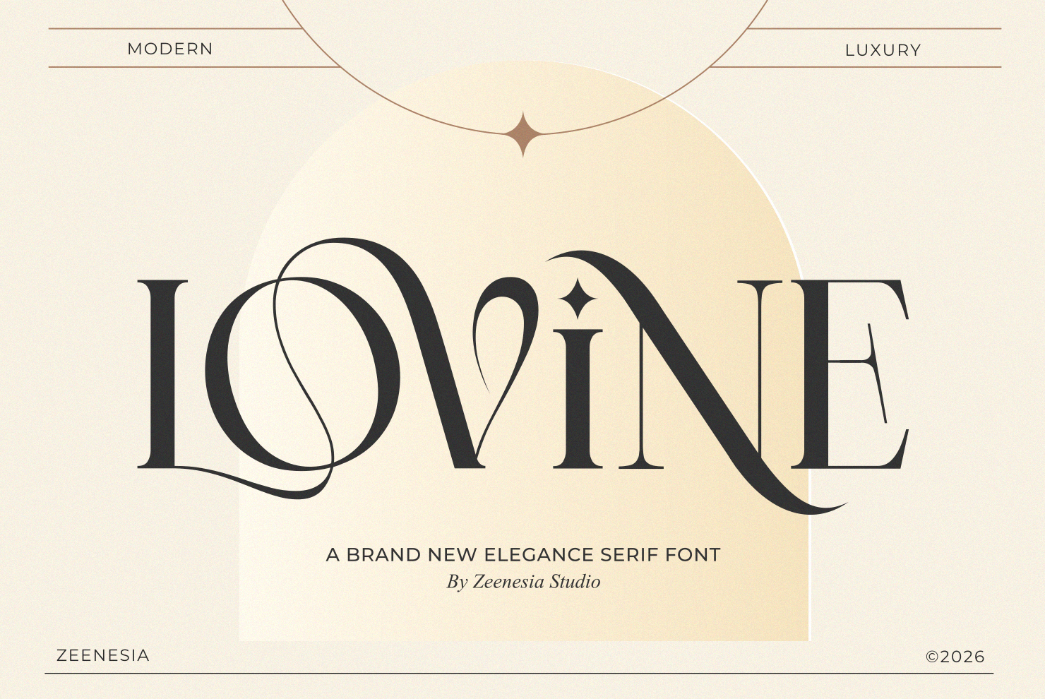
Lovine is a modern luxury serif with high contrast and a smooth, elegant line. It feels expensive without being fussy. The details are refined, but the overall shape stays contemporary. I find it works especially well for short brand names in beauty, fashion, and premium service contexts.
Best for: luxury logos, beauty packaging, and editorial headlines. By: zeenesia
8. Mermare

Mermare is an elegant modern serif for branding that wants to feel considered and calm. Its proportions are clean, and the terminals give it a soft touch that keeps it from feeling cold or corporate. It suits brands that need a premium look with a human side.
Best for: brand identity, packaging, and website headings. By: product.rasiostudio
9. Auretha

Auretha is a refined modern serif with a premium, almost couture feel. The letterforms are delicate but still solid enough for headlines and short brand names. If you want a modern serif font that reads as expensive at a glance, this is a strong option. It is the kind of face you see on high-end invitation suites and fashion lookbooks.
Best for: premium branding, fashion labels, and invitation design. By: Glyphonic
10. Romelle
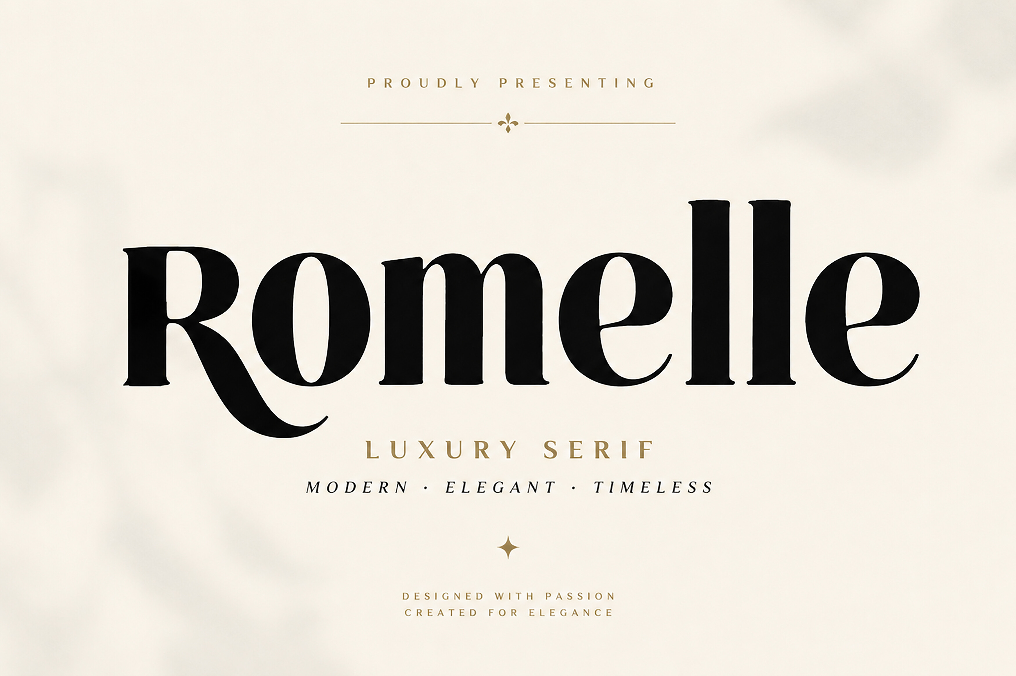
Romelle is a modern serif for packaging and fashion projects. It has a clean, confident structure with enough elegance to feel special on a label, box, or lookbook cover. It works well when the brand needs to look polished but not overly ornate. I would reach for it on product labels where a clean premium look matters more than maximum decoration.
Best for: packaging, fashion branding, and product labels. By: Bundle
11. Nedogta

Nedogta is a contemporary serif for headlines that need character. It has a strong presence and a slightly editorial edge, which makes it useful for titles, campaign posters, and brand moments that need to stand out. It is not a body text font, and that is fine. It earns attention where it counts.
Best for: headlines, posters, and campaign titles. By: qrdesignstd
12. Portiso

Portiso is a modern serif for editorial design. Its shapes are clean and confident, with a rhythm that works well in magazines, blogs, and long form web content. If you want a serif that feels current in a news or culture context, this is a useful pick. It reads well at body sizes, which is not always the case with modern serifs.
Best for: editorial layouts, blogs, and magazine covers. By: Qweera Studio
Best Modern Script Fonts
Modern script fonts add warmth and a personal touch. They are useful for personal brands, social media, weddings, and logos that need to feel human. The picks below stay smooth and readable rather than overly decorative.
13. Evelyne

Evelyne is one of the most popular modern script fonts on Creative Fabrica, and for good reason. It has a smooth, confident flow that feels familiar but still fresh. The letterforms are easy to read, which helps when you use the font for short brand names or social captions. It is a safe choice when you need a script that reads easily at small sizes.
Best for: personal branding, social media, and wedding invitations. By: Letterafa Studio
14. Salmon Fresh

Salmon Fresh is a fresh modern script for social media and casual brand work. It has a light, upbeat energy that feels current without relying on heavy decoration. It is a good choice when you want a script that looks easy and friendly rather than formal.
Best for: social posts, lifestyle brands, and short headlines. By: Natural Ink
15. Madelyn Heart

Madelyn Heart is a romantic modern script with a playful detail that gives it instant charm. It feels warm and personal, which makes it useful for brands that want a softer, more emotional tone. Use it where the message should feel intimate, not corporate. Greeting cards, love brands, and personal logos all benefit from that kind of warmth.
Best for: love brands, personal logos, and greeting cards. By: HansCo
16. Solivara

Solivara is a smooth modern script for logos that need a human touch. Its lines are fluid but controlled, so it does not feel messy at small sizes. That is a common problem with scripts, and Solivara handles it well. It works for brands that want elegance with a relaxed, contemporary edge.
Best for: logos, beauty branding, and short brand names. By: basyar
17. Rosela

Rosela is a modern calligraphy script with a clean, contemporary feel. It balances handwritten charm with enough structure to look professional. That makes it useful for brands that want a script without the risk of looking like a dated flourish. It sits in a nice middle ground between formal calligraphy and casual handwriting.
Best for: brand marks, invitations, and social overlays. By: Infontree
Best Futuristic Fonts
Futuristic fonts are built for tech, gaming, AI products, and digital brands that need a forward looking identity. They can be sharp, angular, or sleek, but the best ones still keep the brand name readable. That is the line between “cool” and “unreadable.”
18. Thryvexor

Thryvexor is a sharp tech font with a strong, angular presence. It feels engineered and confident, which makes it useful for brands that want a serious digital edge. Use it for short names and headlines where the style can carry the message. It is not a body text font, and it does not need to be.
Best for: tech logos, gaming brands, and app icons. By: Retro
19. Bitmark

Bitmark is a digital futuristic font with a clean, data inspired look. Its forms feel precise and modern, making it a good fit for software brands, dashboards, and products that need to sound technical. It works best when the brand name is short. Long names in this style tend to get lost in the detail.
Best for: SaaS brands, tech packaging, and interface titles. By: Typia Nesia
20. Cyber Circuit

Cyber Circuit is a cyberpunk futuristic font with a bold, electric feel. It is designed to stand out, which makes it useful for gaming, music, and digital culture projects. Keep it to headlines or short labels so the style does not overwhelm the message. This one is loud by design, and that is the point.
Best for: gaming titles, event posters, and tech visuals. By: Raholco
21. Bagion

Bagion is a futuristic display font with a strong, sculptural shape. It feels bold enough for posters and campaign titles, but its clean edges keep it from looking cluttered. It is a good pick when you need a tech inspired font that still feels modern rather than retro. It gives tech projects a bold, sculptural presence without the usual angular overload.
Best for: display headlines, tech posters, and brand campaigns. By: pandekastudio
22. Gemi

Gemi is a sleek futuristic font for tech brands that want a polished, minimal look. Its lines are smooth and confident, giving it a premium digital feel without heavy decoration. It works well for short brand names and modern interface titles. If you want something that feels like a well-designed app icon in typeface form, this is close.
Best for: tech branding, app logos, and product titles. By: TypeFactory
Best Modern Display Fonts
Modern display fonts are for moments that need maximum character. They are not always the best choice for long text, but they can make a logo, poster, or headline impossible to ignore. Use them sparingly and they will do a lot of work.
23. Spaceship2100

Spaceship2100 has a space age modern display feel that is playful yet strong. It works well for brands that want a retro future look without turning the design into a full costume. The free listing is a good starting point, but check the license before commercial use.
Best for: posters, playful tech brands, and event titles. By: Freebies
24. Neo Libero

Neo Libero is a bold modern display font with a confident, contemporary edge. It has enough weight to carry a headline, but its shapes stay clean enough for branding work. It is a strong option when you need a display font that feels current and energetic. The headline needs to hit hard, and this one does.
Best for: headlines, brand campaigns, and social covers. By: Whymore
25. Super Modern

Super Modern is a direct, on the nose pick for anyone searching for modern fonts. Its headline shapes are bold and confident, with a clean structure that keeps the design readable. It is useful when the project needs a simple, strong statement. Sometimes the most obvious choice is the right one.
Best for: headlines, posters, and bold brand marks. By: mardanimirza12
26. Veloura

Veloura is a sleek modern display font with a smooth, premium feel. Its shapes are polished enough for branding, but still expressive enough to stand out in a headline. It is a good choice when you want a display font that feels elegant rather than loud. It sits in a useful gap between “too quiet” and “too much.”
Best for: brand titles, posters, and premium campaigns. By: nihadmekdad
How to Pick the Right Modern Font
Start with the job. If you need a full brand system, a modern sans serif font is usually the safest base. If the brand is premium, a modern serif font can add polish. If the message needs warmth, a script helps. If the product is tech, gaming, or AI, futuristic fonts and display type can create the right energy.
Tip: Type your brand name in the font, then shrink it to the size of a social avatar. If it is still readable, the font has a good chance of working across your brand.
Do not chase the loudest trend. A font that feels very 2026 may look dated in two years. Look for restrained details, stable proportions, and a style that can live for five or more years. That is the difference between a trendy font and a modern font.
If you are unsure, test two fonts side by side in your actual brand name. Not a placeholder. Your real name, in your real context. A good modern font should still feel right after a year of use, not just on the first day.
Try Studio AI on Your Own Design
Want to see a font in a real design before downloading it? Creative Fabrica Studio is a browser-based tool with AI features — test fonts on your own text, generate matching graphics, remove backgrounds, and export finished designs for print or social media.
Try Studio AI Free →Where to Download Modern Fonts
Creative Fabrica is a practical place to find modern fonts for logos, branding, and web design. You can preview the typeface, check the included weights, and see the license before you download. For a full brand project, paid fonts often give you more uniqueness than a widely used free option.
If you are starting a small project, free fonts from Google Fonts, such as Inter or Manrope, can be a good first test. But for a brand that needs to stand out, a licensed font from Creative Fabrica gives you more control over how you look.
Before you download, compare the product page with your actual use case. A font may include a logo license but not a packaging license, or it may limit the number of users. Reading the license once saves a lot of stress later. You can also use the preview to check how the font behaves in a real layout before committing. That small check can prevent a costly rebrand down the road.
For more font recommendations and design resources, browse the FontPro blog.