· fonts · 13 min read
18 Best Back to School Fonts for Teachers, Students, and Classroom Projects in 2026
Discover the best back to school fonts for classroom signs, planners, and printables. Chalkboard, handwriting, playful, and varsity styles with download links.
Back to school season is when a classroom starts to feel like a classroom. The right school fonts make a door sign feel welcoming, a worksheet feel friendly, and a first day shirt feel full of spirit. If you’re looking for the best back to school fonts for 2026, you want type that reads well from the back row, prints cleanly, and fits the project.
This list brings together 18 back to school fonts for teachers, students, parents, and printable sellers. I grouped them the way I would for a classroom project: start with the mood, then match the font to the job. The picks cover chalkboard and classroom styles, pencil and notebook handwriting, playful kids school fonts, and varsity or collegiate faces for spirit merch. Each entry includes a quick look at the style, the best projects for it, and a download link.
What Makes a Great Back to School Font?
Readability comes first. A classroom font should be easy to scan from a desk, a hallway, or a bulletin board. Clear letter shapes matter more than serif or sans. Look for distinguishable characters, especially I, l, and 1, plus O and 0. Even spacing helps young readers and makes worksheets feel calmer.
The tone should feel friendly, not childish. Teacher fonts and classroom fonts work best when they feel like a helpful adult wrote them, or like a confident student did. A playful headline can carry the energy. The body text should stay simple. For early learners, handwriting fonts for school and penmanship styles can feel familiar and low pressure.
Clean shapes also matter for print and cut projects. Rough chalk edges, sketchy strokes, or crayon texture may look great on a poster, but they can be difficult to cut on a Cricut. For classroom signs, desk labels, and printables, choose a style with solid outlines and open counters. The best back to school fonts need to survive a printer, a laminator, a classroom wall, and sometimes a cutting mat.
A good school font also sets the tone. It can make a worksheet feel like a friendly note instead of a test.
Best Chalkboard and Classroom Fonts
Chalkboard fonts are the classic choice for classroom door signs, welcome posters, and bulletin boards. They bring the feel of a real classroom without needing a blackboard. Rough chalk and sketch styles are usually better for print, posters, and wall displays than for Cricut projects. If you plan to cut vinyl, test a small word first.
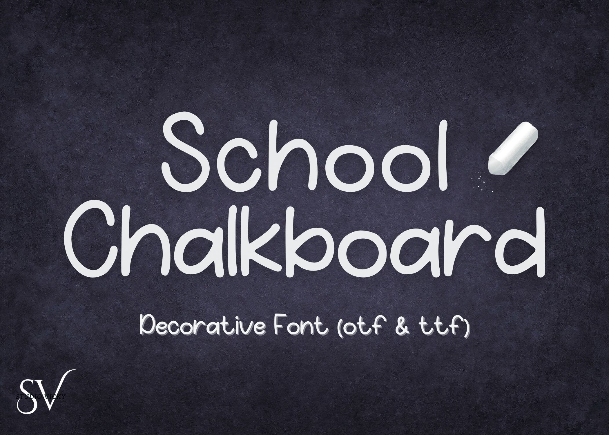
1. School Chalkboard
School Chalkboard has the look of classic chalk lettering, with a steady hand and enough personality for a classroom door sign. It feels like the kind of type you would see on a welcome board, a subject header, or a hallway display. The style is familiar enough for students and teachers, but still decorative enough to make a simple sign feel finished.
Best for: classroom door signs, welcome posters, chalkboard style bulletin boards. By: Victoria Gates
2. Chalkfield
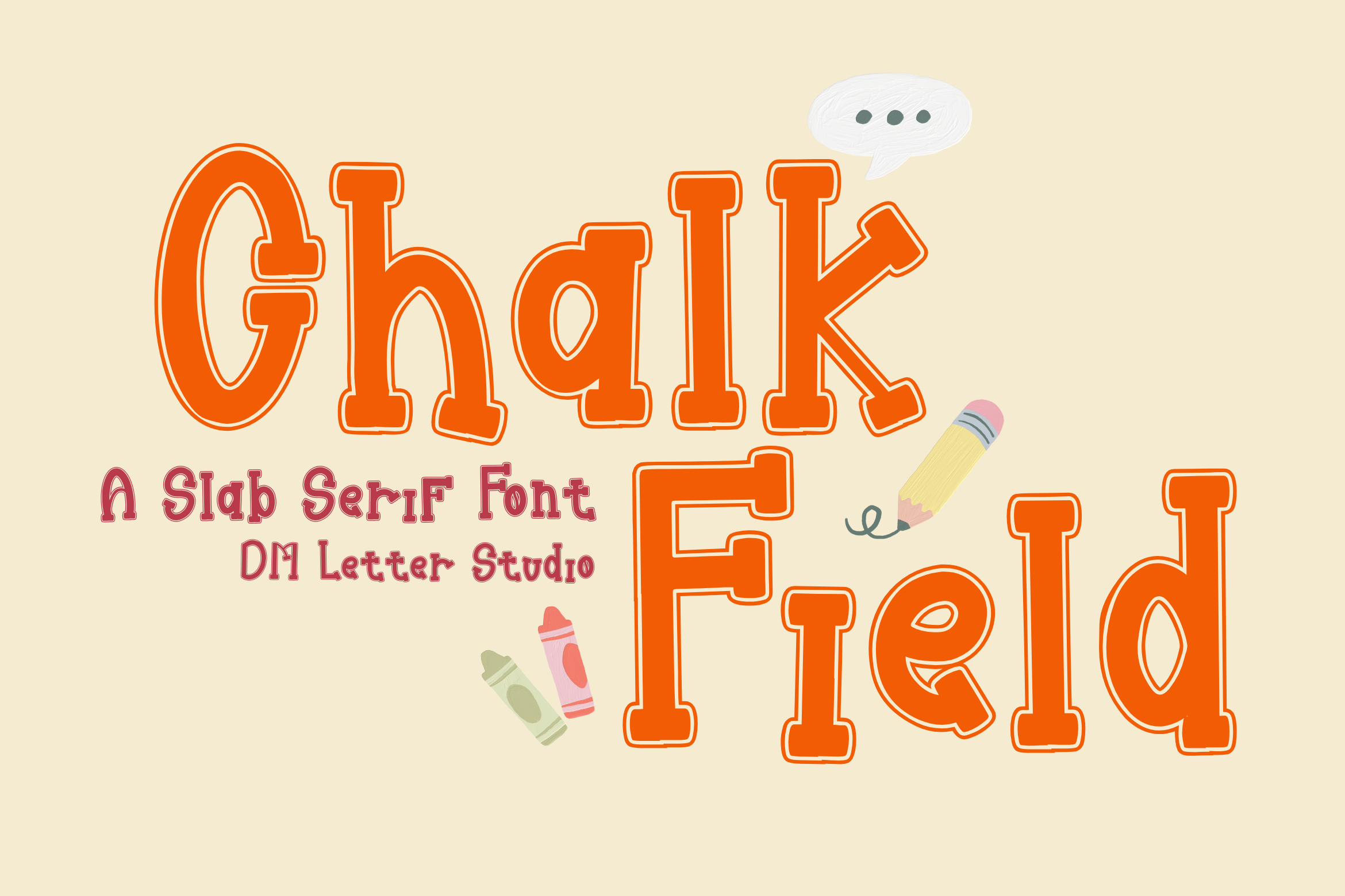
Chalkfield leans into a textured chalk feel, so it is a strong pick for school posters and seasonal displays. It has a handmade quality that suits back to school announcements, classroom rules, and wall art. It is the type of face that can turn a plain sheet of paper into something that feels like it belongs on a classroom wall.
Best for: school posters, back to school announcements, chalk style wall art. By: dmletter31
3. Chalk Board
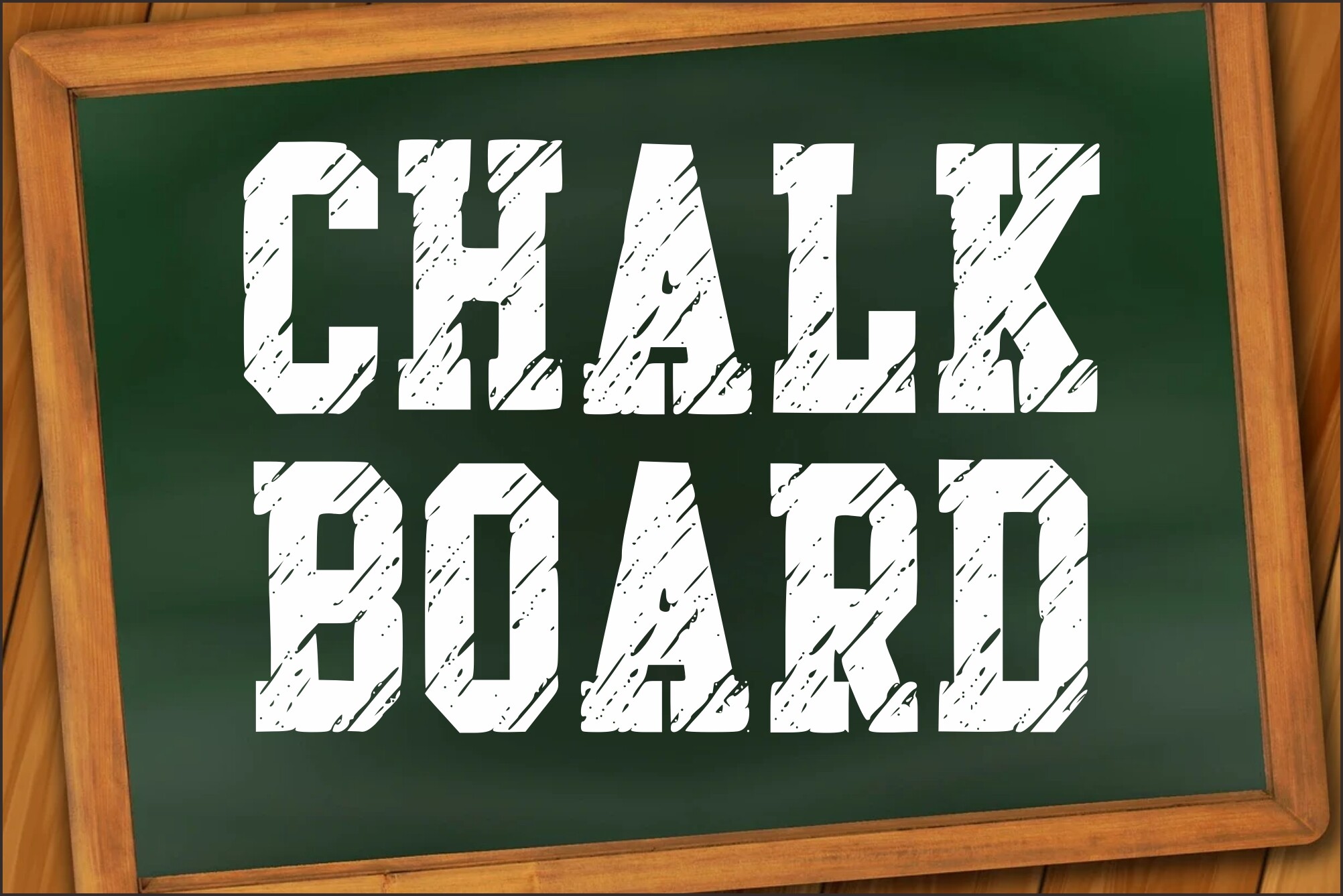
Chalk Board is a separate product from School Chalkboard. Its hand drawn chalk lettering is a good fit for bulletin boards and display headers. The style feels informal and teacher made, which helps it sit naturally in a classroom.
Best for: bulletin boards, display headers, classroom announcements. By: Dreamspace.studio
4. Teacher Marker
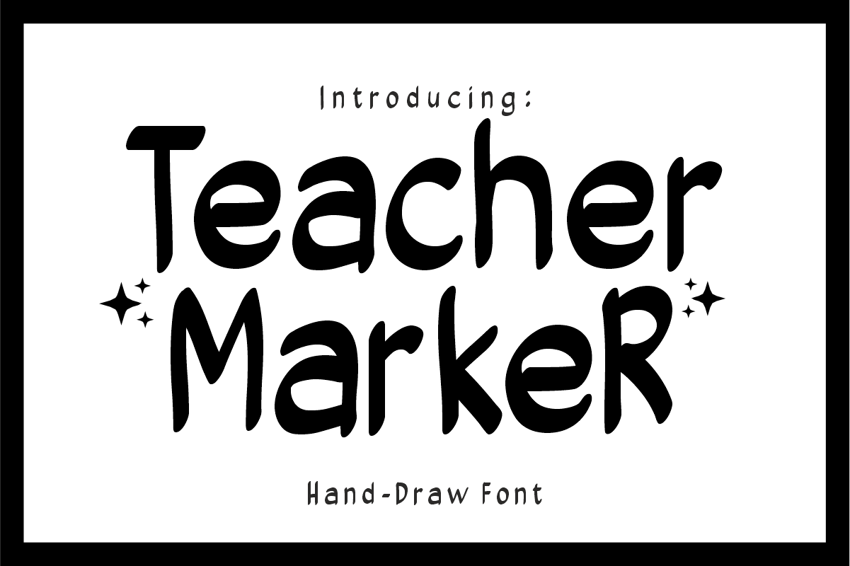
Teacher Marker brings a marker pen feel to school projects. It is useful for worksheets, labels, and quick classroom headers. This is a practical teacher font when you want something that feels handwritten without becoming hard to read.
Best for: worksheets, desk labels, classroom headers. By: Sahira Studio
Best Pencil and Notebook Handwriting Fonts
Pencil and notebook handwriting fonts are the workhorses of school printables. They suit planners, worksheets, notebook covers, and pages that need to feel handwritten. Penmanship styles are especially useful for early elementary materials. Casual notebook faces work well for journals, study guides, and printable planners.
5. Teachers Pencil
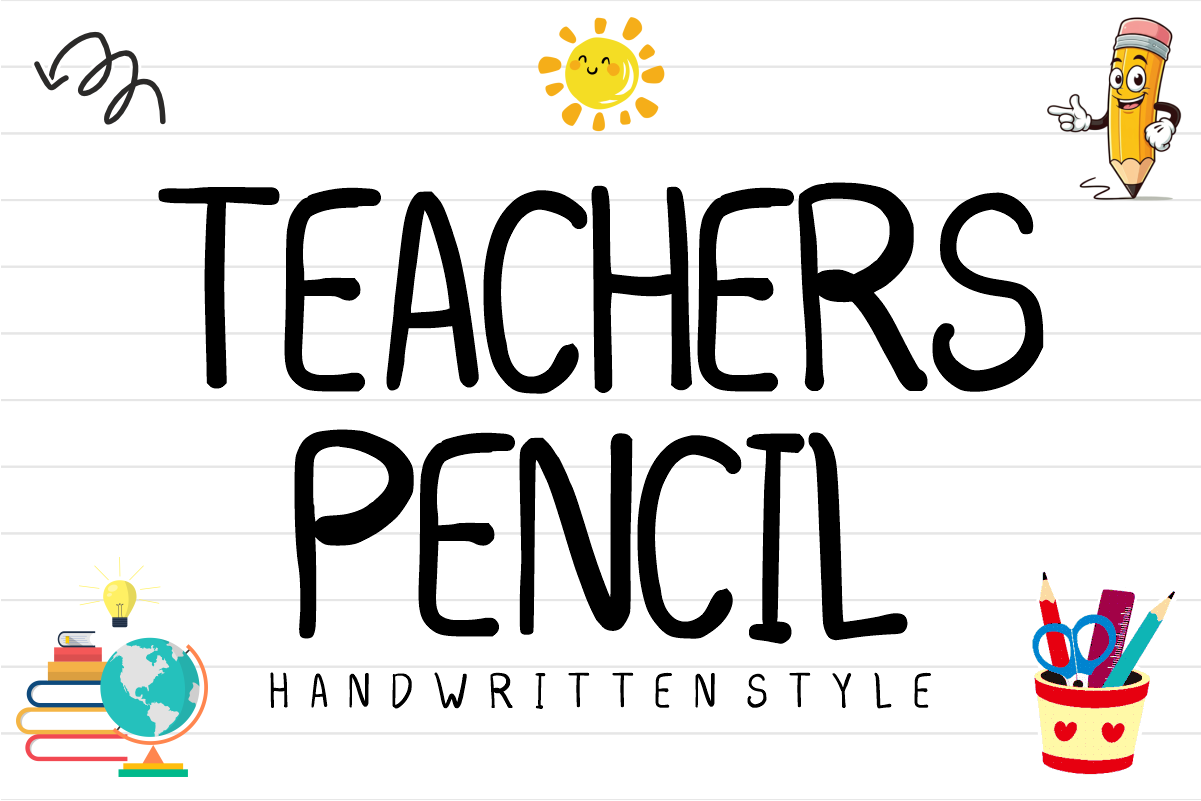
Teachers Pencil has a pencil drawn feel that fits worksheets, practice pages, and classroom handouts. It looks like a teacher filled in a template by hand, which makes the material feel approachable. It is a safe choice when the page needs to feel personal but still orderly.
Best for: worksheets, practice pages, teacher handouts. By: anamalmusyaffaCreative
6. Pencil Parade
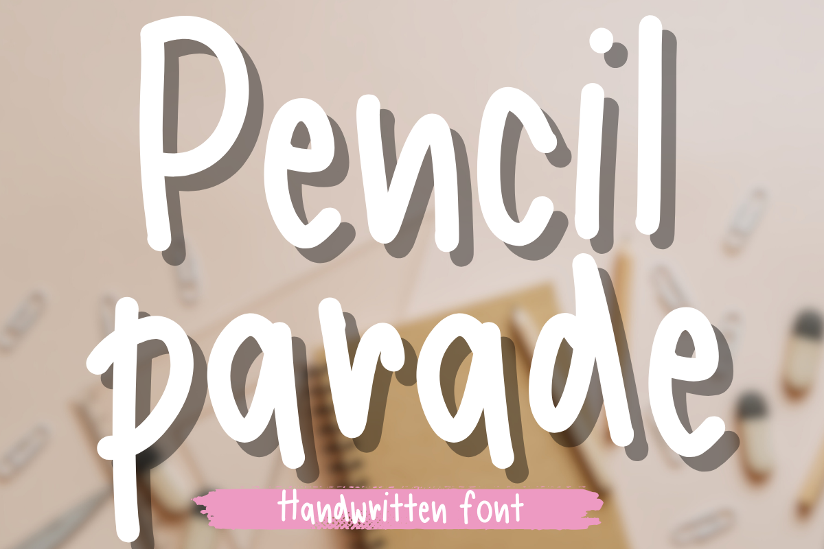
Pencil Parade is a playful pencil style that works well for school printables and lighthearted classroom pages. It has a cheerful, handmade feel that can make a simple sheet look more inviting. This is a good choice when you want a pencil mood for headers, labels, or small decorative text.
Best for: school printables, classroom labels, playful headers. By: Petal Pixels
7. School Wonderful
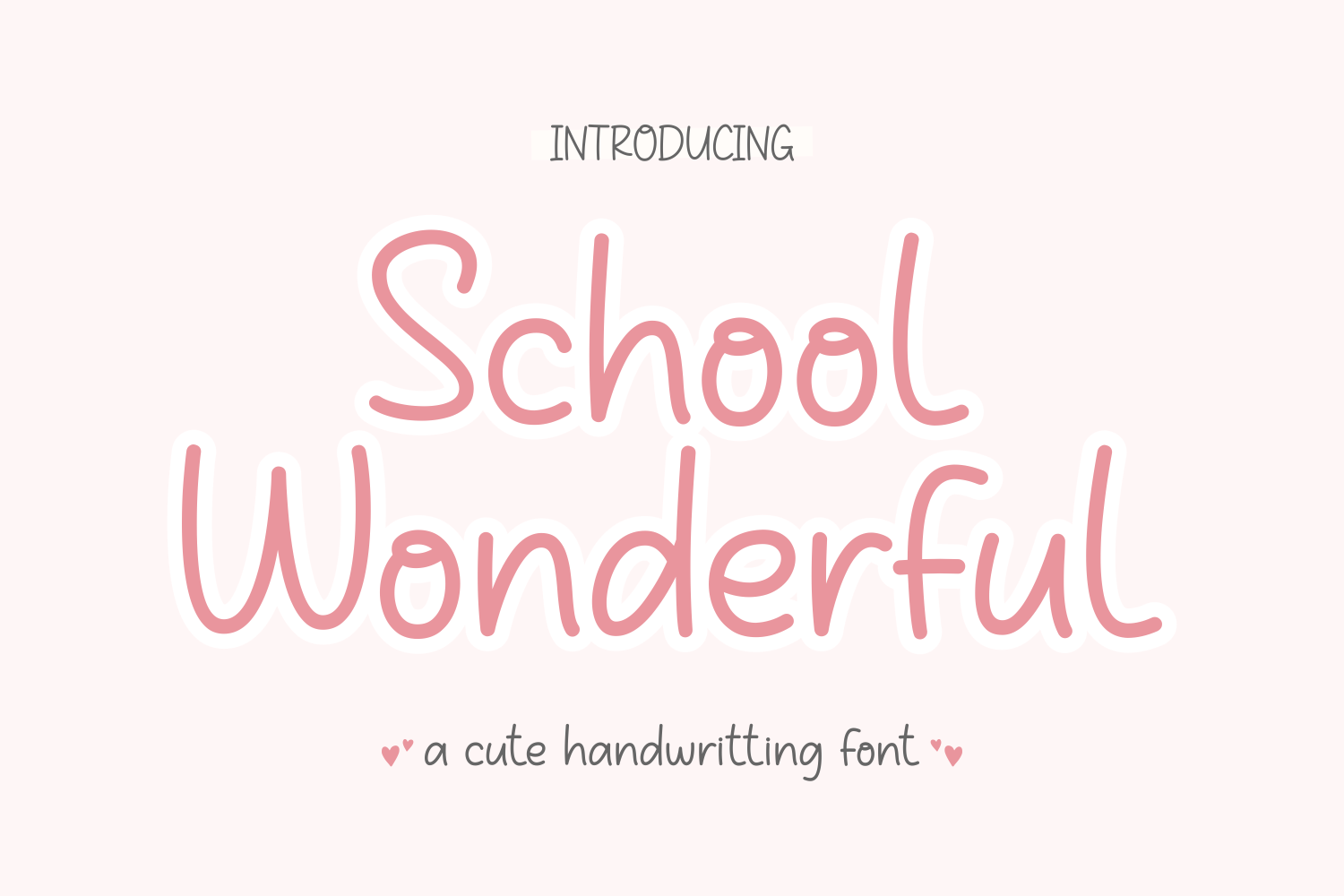
School Wonderful has a friendly handwritten look that feels positive and easy to use. It suits back to school titles, planner pages, and classroom displays that need warmth. It is clear enough for short phrases and headers.
Best for: back to school titles, planner pages, classroom displays. By: Wakhamm (7NTypes)
8. Notebook Handwriting
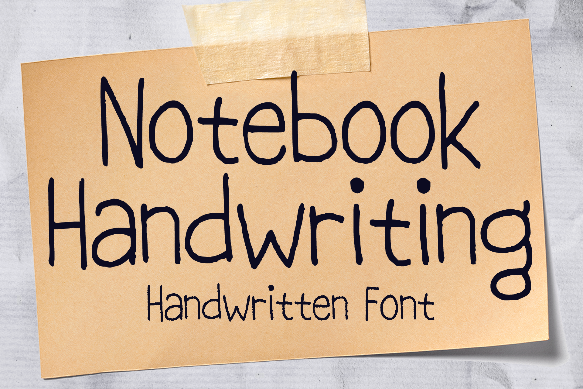
Notebook Handwriting has a natural notebook style that feels like real pen on paper. It is a strong pick for journal pages, study notes, and printable planners that should feel personal. It is a good one for planner pages that should feel like notes, not a worksheet.
Best for: journal pages, study notes, printable planners. By: MVMET
9. Writing Notebook
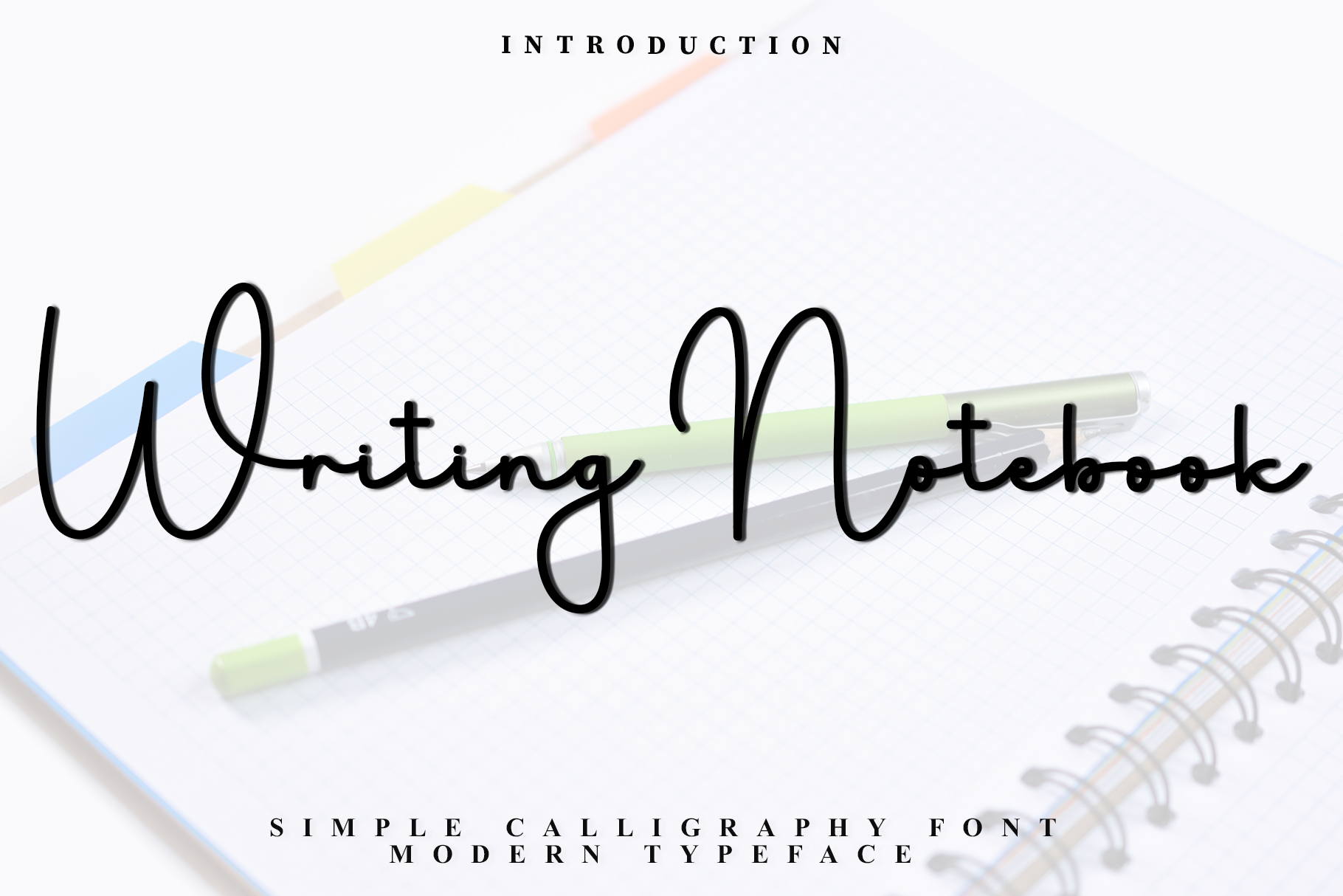
Writing Notebook is a casual handwriting font for planners and journals. It has a relaxed, everyday feel that suits to do lists, class schedules, and personal notes. It feels like a schedule written in the margin of a notebook.
Best for: planners, journals, class schedules. By: FreshTypeINK
10. Scribble Writing
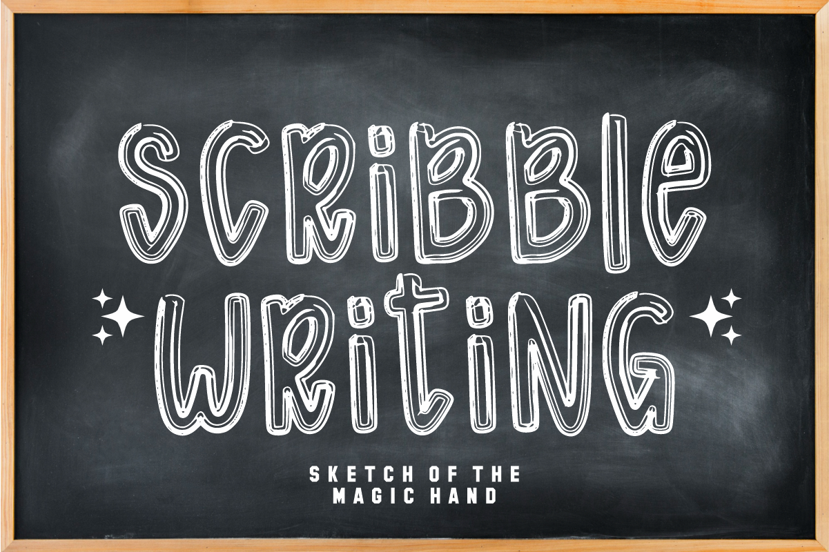
Scribble Writing has a scribbled, kid style feel that works well for early learning pages and playful school projects. It looks like a child practiced writing with a little extra energy. Use it for short phrases where the charm matters more than dense text.
Best for: early learning pages, stickers, simple posters. By: KiddoCraft
Best Playful Kids School Fonts
Playful kids school fonts make invitations, first day posters, and classroom decorations feel fun. They work best for headings, short phrases, stickers, and shirts. For younger students, these faces can carry the energy of the project while a simpler font handles the details.
11. Kids School
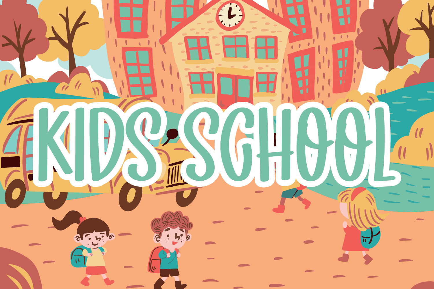
Kids School is a fun display font for kids school projects and bright classroom headers. It has a bouncy, friendly feel that suits welcome signs, party invitations, and simple posters. It works best when the phrase is short and the mood is upbeat.
Best for: kids school projects, welcome signs, party invitations. By: Brilian
12. School Children
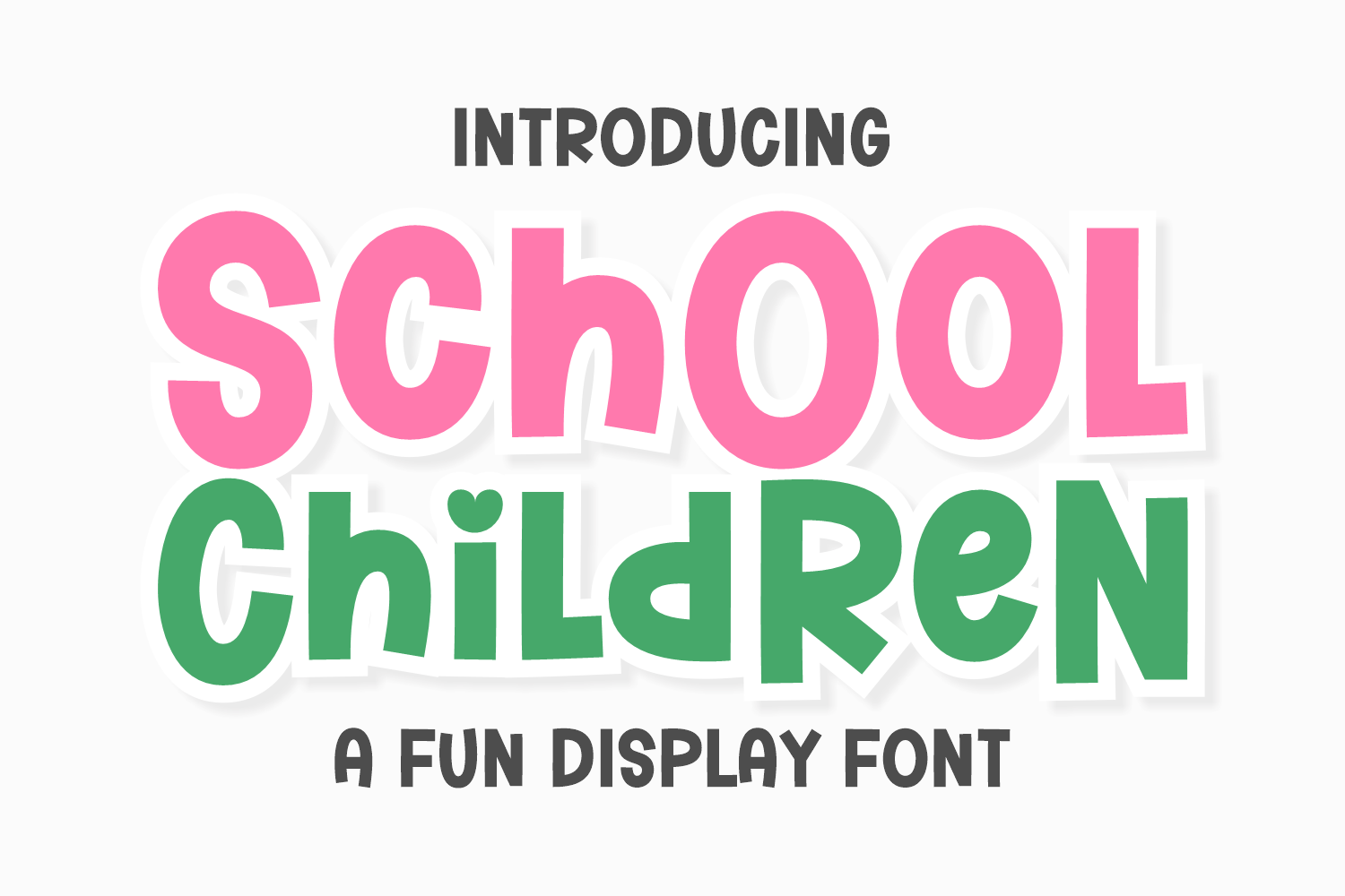
School Children has a cheerful look that fits children’s school designs and early learning materials. It feels bright and welcoming, so it is a good match for classroom labels, activity sheets, and seasonal printables. The style works well when you want a friendly face that still looks neat.
Best for: children’s school designs, activity sheets, classroom labels. By: Riman (7NTypes)
13. School Coming
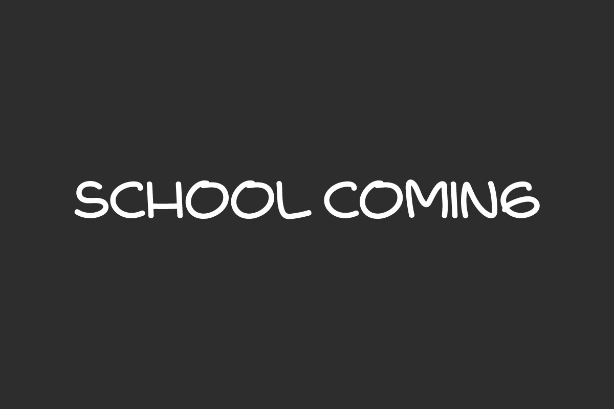
School Coming is a playful back to school title font with a lot of personality. It suits announcements, door decorations, and social media graphics for the first week of school. The style is best for headlines and short phrases, where it can feel exciting without becoming hard to read.
Best for: back to school titles, door decorations, social graphics. By: vintype
14. Chunky Kid
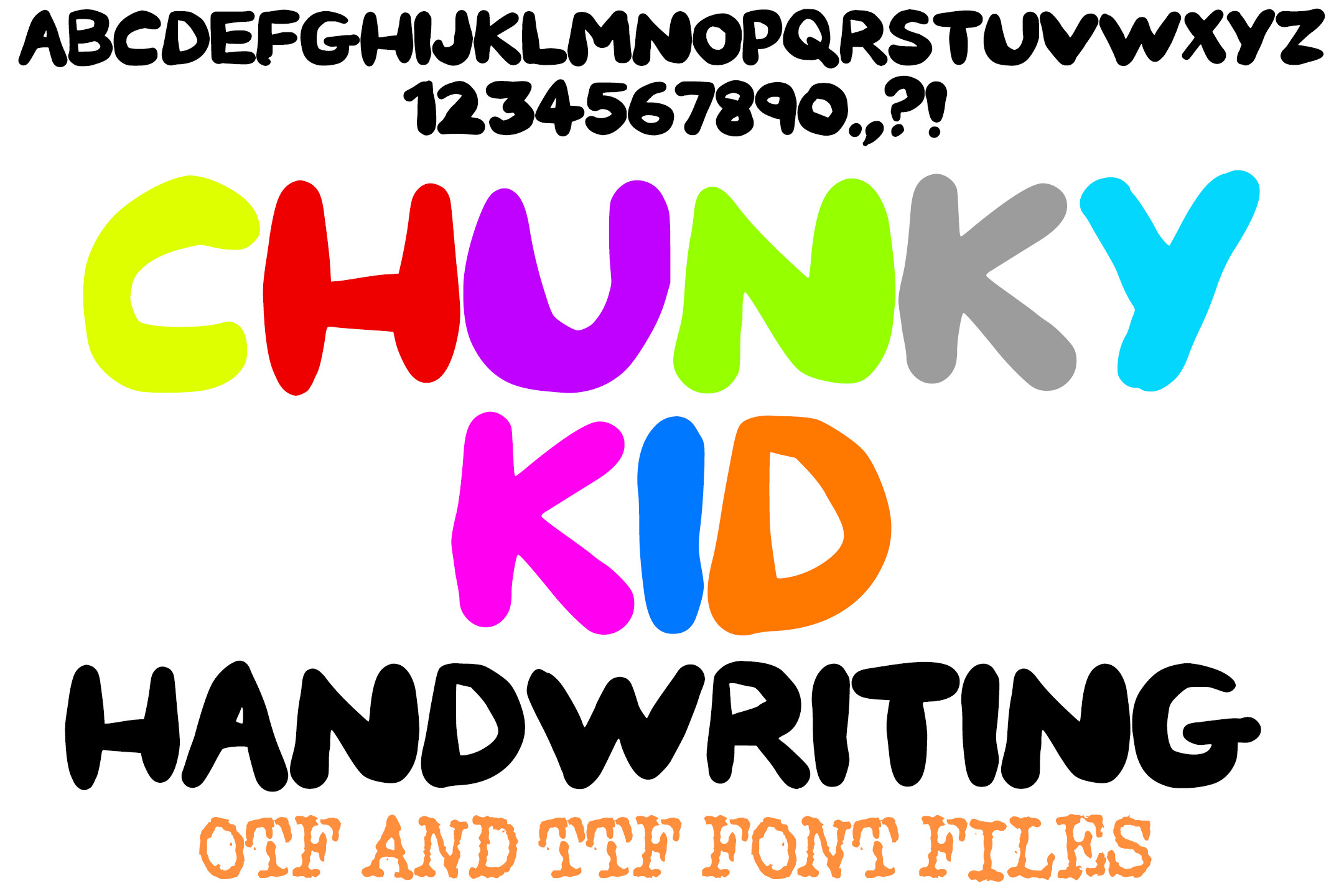
Chunky Kid is a bold, chunky font for kids posters and high energy school designs. It is aimed at headings, stickers, and first day shirts, where a heavy, friendly look is the point. Check the preview at your intended size before using it on a busy bulletin board.
Best for: kids posters, stickers, first day shirts. By: squeebcreative
15. Campus Bold
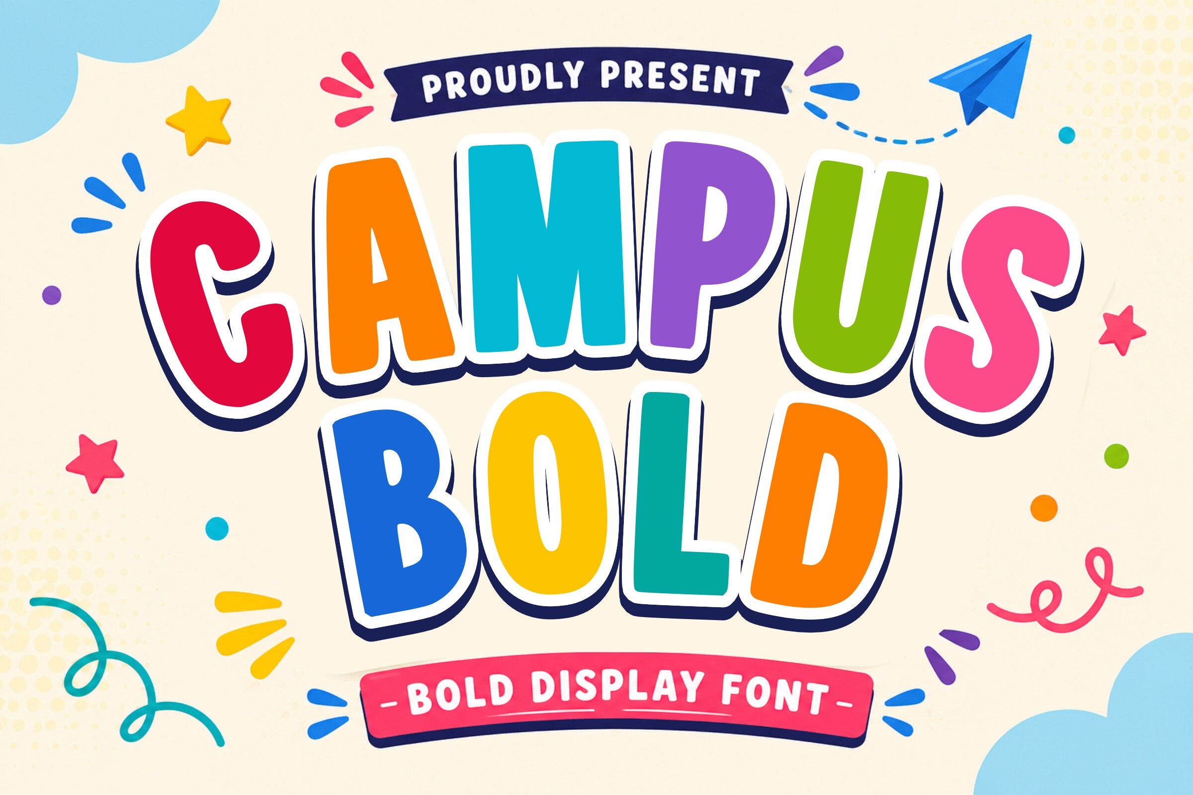
Campus Bold is a bold campus style display font with a confident, school spirit feel. It suits headers, posters, and designs that need a bit of campus energy. If you want true athletic lettering for team style shirts, see the varsity picks below.
Best for: school event posters, display headers, spirit graphics. By: 29Graphic
16. Play Kids
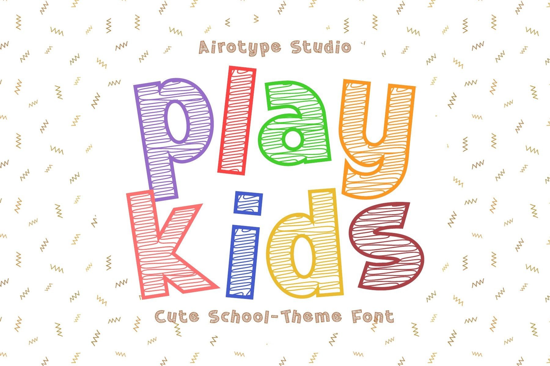
Play Kids is a rounded, playful font for early learning materials and friendly school designs. It has a soft, approachable feel, so it works well for labels, simple posters, and pages aimed at younger students. It is a good fit for pages that should feel friendly but not too busy.
Best for: early learning materials, labels, simple posters. By: airotype
Best Varsity and Collegiate Fonts
Varsity fonts and collegiate faces bring school spirit to the table. They suit spirit shirts, team posters, college themed merch, and designs that need an athletic look. These faces work best when the message is short and the design is bold.
17. Varsity Edge
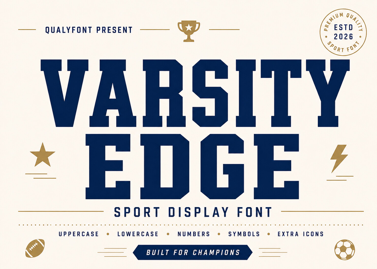
Varsity Edge is an athletic varsity font for school spirit shirts and team style graphics. It has the classic look of sports lettering, so it is a strong pick for first day shirts, pep rally posters, and school merch. The style works best with short words and bold layouts.
Best for: school spirit shirts, team posters, school merch. By: Tivza Studio
18. Project Varsity
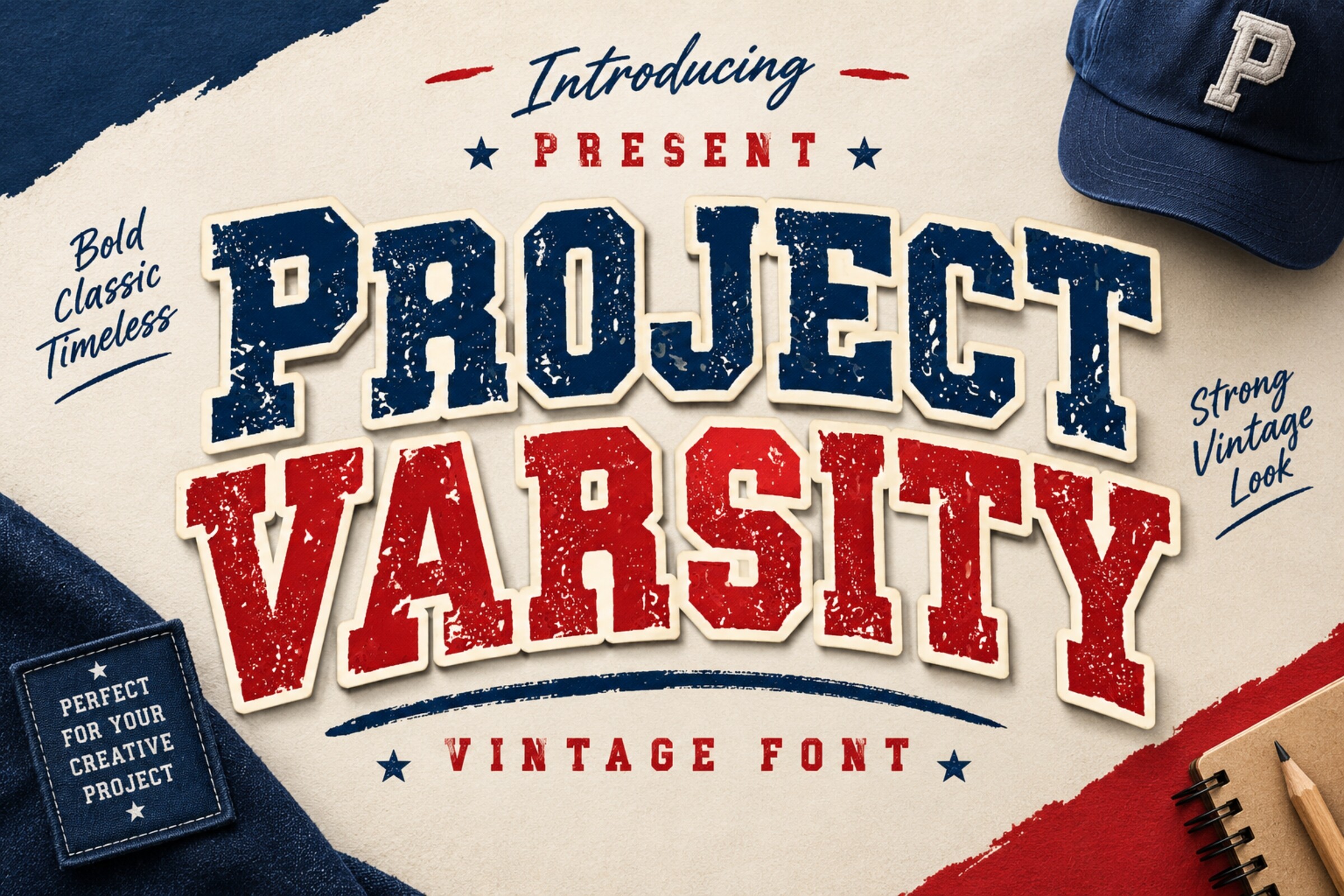
Project Varsity is a collegiate block font for school merch and spirit designs. It has a clean, athletic structure that suits names, years, and short phrases on shirts, mugs, and posters. The style is a good fit when you want a varsity feel that still looks organized.
Best for: school merch, spirit designs, collegiate posters. By: riki.studio
How to Use Back to School Fonts in Your Projects
Start with one expressive font for the headline and one plain, readable font for the body. If you’re using a playful school headline font, pair it with a clean sans-serif such as Open Sans, Source Sans 3, Atkinson Hyperlegible, or Lexend. Keep the total number of fonts to two or three so the project feels intentional rather than busy.
For classroom posters and bulletin boards, choose chalkboard fonts or bold display faces for the main title. Then use a simple text font for dates, names, and instructions. If the poster needs to be read from across the room, increase the headline size and keep the body text at least 12 to 14 points. Wider line spacing, around 1.5, helps worksheets and handouts feel easier to read. Avoid italics for dense text.
In Canva, Word, or Google Docs, install the font on your computer first, then restart the app and search for the font name in the font menu. In Canva, you can also upload fonts where supported. In Cricut Design Space, upload the font file and use it for text that will be cut. For Cricut fonts for school, clean outlines cut more reliably than rough chalk, sketch, or crayon textures. If you’re not sure, cut a test word before making the full sign.
Tip: If a chalkboard font looks great in a poster but has rough edges in Cricut Design Space, use it for print only and switch to a cleaner outline for cutting.
Good project ideas include desk name tags, classroom planners, back to school invitations, first day shirts, teacher gift cards, and supply drive flyers. The same font family can carry a whole classroom set. That makes the materials feel consistent from the door sign to the worksheet.
Tips for Choosing the Right School Fonts
Check the license before you use a font in a product you sell. Many free school fonts are personal use only. Commercial use may require a paid license or a subscription. If you’re selling printables on Etsy, making teacher gifts, or producing school merch, read the license on the product page carefully. This is especially important for fonts for school printables and fonts for teacher gifts, where the design becomes part of a finished product.
Test the font in your actual software. A face that looks good in a preview may behave differently in Canva, Word, Google Docs, or Cricut Design Space. Check how it renders at small sizes, how it looks in bold or uppercase, and whether the file installs without errors. If you’re cutting vinyl, make a test piece before committing to a full classroom set.
Keep readability in mind for young learners. Playful kids school fonts are great for headings, but they are not always the best choice for dense worksheet text. Handwriting and penmanship styles can work well for early elementary pages. A plain sans-serif is often safer for longer reading passages. No single dyslexia friendly font works for every student, so focus on clear shapes, generous spacing, and a calm layout.
Finally, do not mix too many styles. Two or three fonts are usually enough: one for the headline, one for the body, and maybe one for small labels. A consistent set of school fonts makes your classroom materials look professional and easier to use.
Where to Download School Fonts
Creative Fabrica is the main source for the fonts in this list. You can browse the product pages, preview the style, check the license, and download the files you need. Keep a small library organized by project type: chalkboard, handwriting, playful display, and varsity.
If you’re building a broader typography library, Google Fonts, DaFont, and Font Squirrel are also common places to find free and open typefaces. They can be great for body text, simple labels, and everyday classroom documents. For the specific back to school styles in this list, the Creative Fabrica links above are the fastest way to get started. More font guides are available on the FontPro blog.