· fonts · 10 min read
12 Best Fonts for Funeral Poster in 2026
Find the best font for a funeral poster. Twelve serif, condensed and slab picks for memorial posters and welcome signs that read from a distance.

What Makes a Great Font for a Funeral Poster?
A funeral poster is read standing up, often from a few meters away. The name, dates and one short line need to land at a glance, and there is little room for decoration. Every word does work.
So what is the best font for a funeral poster? There is no single answer. A clear serif for the name, paired with a quiet supporting face for the dates, is a sound starting point, and the twelve picks below are organized around that idea.
Three properties matter most. Readable fonts from a distance depend on stroke weight, letter proportions and spacing. Thin or cramped type can simply disappear at size. A clear hierarchy puts the name first, the dates second, and a short line third. The character of the type should match the tone of the service.
A poster is different from an invitation, an announcement or an order of service. It is large format, carries little text, usually includes a photo, and is seen from a distance rather than held in the hand.
One honest note: none of the fonts here is marketed on Creative Fabrica as a funeral or memorial typeface. They are general serif, condensed sans and slab faces, and some are pitched for sports, packaging, magazines or signage. That is stated plainly where it applies.
Designing the Poster First: Name, Dates and Photo
Before choosing a font, map the poster. The name is the largest element, with the birth and death dates below it. A short line, such as “In loving memory” or “Celebrating the life of,” adds context. A photo anchors the layout.
Keep the hierarchy simple: name, then dates, then the line. Use no more than two fonts, one for the name and one for the dates and line. If a script is used, keep it to the name or a short line, never the dates, time or address.
For text over photo on a memorial poster, a dark overlay or a translucent panel keeps the type legible. Place the text in a calm area of the photo, not over the face. Light text on a dark background is worth checking on a test print.
A welcome sign needs even fewer words: the name, the dates and a short greeting. A poster on an easel is read from two or three meters, while a welcome sign is read on the move.
For a traditional tone, Garamond, Baskerville and Palatino are common reference points, named here as general guides, not as part of this list.
12 Best Fonts for Funeral Poster
The list is organized by typeface style: serif for the name, condensed fonts for posters used here for the dates and short line, and slab or heavy display for welcome signs. Each entry gives the style, a suggested role, and a practical note on tribute poster typography. Roles are suggestions, not facts.
Best Serif Fonts for the Name on a Memorial Poster
1. Boldside Display
A retro serif with thick letterforms, this display face carries a bold, vintage character. The heavy strokes could suit the name on a memorial poster. The retro tone is worth checking against the service’s mood before committing.
Best for: the name on a tribute poster, large display text. By: Creative Fabrica
2. Bold Dignify
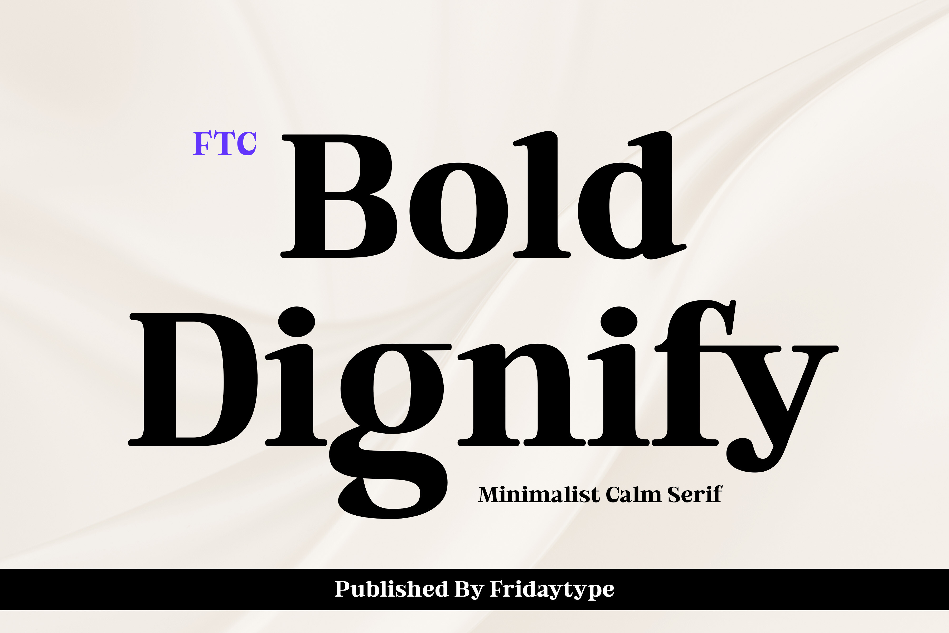
A serif font described as meant for headlines, Bold Dignify is the most direct fit for the name and headline on a funeral poster. Its headline role makes it a reasonable choice for the largest text on the layout.
Best for: the name on a memorial poster, headline text. By: Creative Fabrica
3. Reverse Contrast
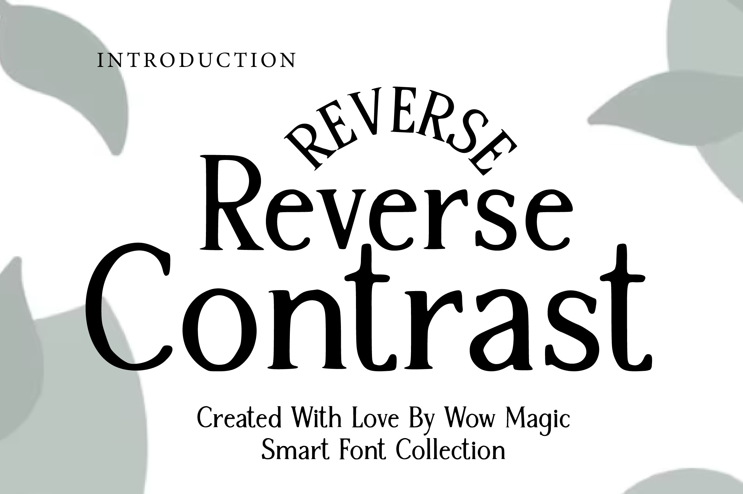
A serif display face with a reverse-contrast structure, Reverse Contrast is positioned in its listing for magazine headlines, packaging and book covers, not for memorial work. The inverted contrast is unusual for a traditional service, so it may suit a quieter, more contemporary tribute better. It could work for the name alone. Test the tone on a preview before use.
Best for: a distinctive name, display headlines. By: Creative Fabrica
4. Heroeau Elegant
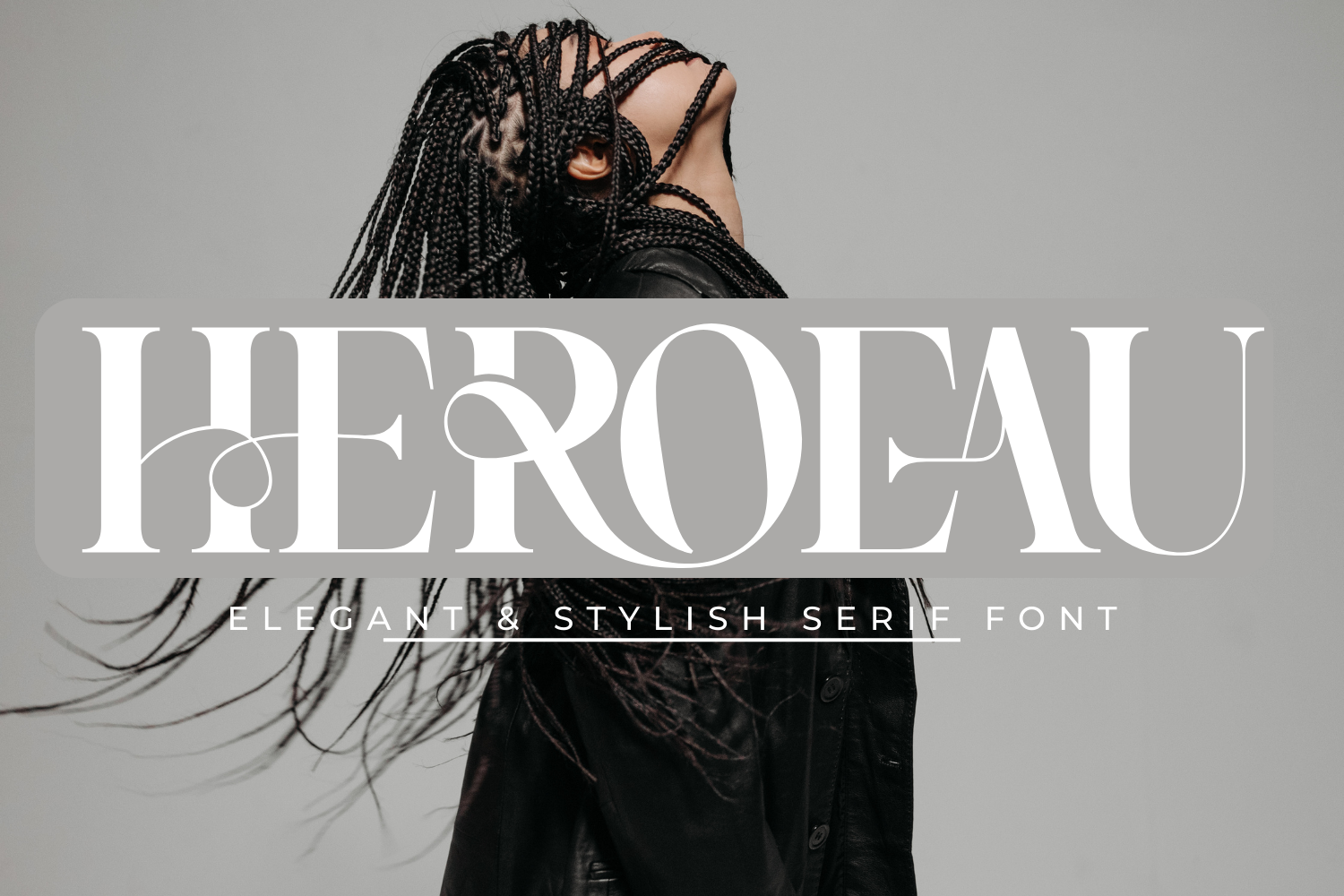
A display-style face with contrasting lines and curved terminals, Heroeau Elegant leans toward logos, invitations and quotes, with positive reviews noted. The thin lines are worth checking at large size and over a photo, where they may lose clarity.
Best for: the name on a tribute poster, a short quote. By: Creative Fabrica
Best Condensed Sans Fonts for Dates and Short Lines
5. Maxcond
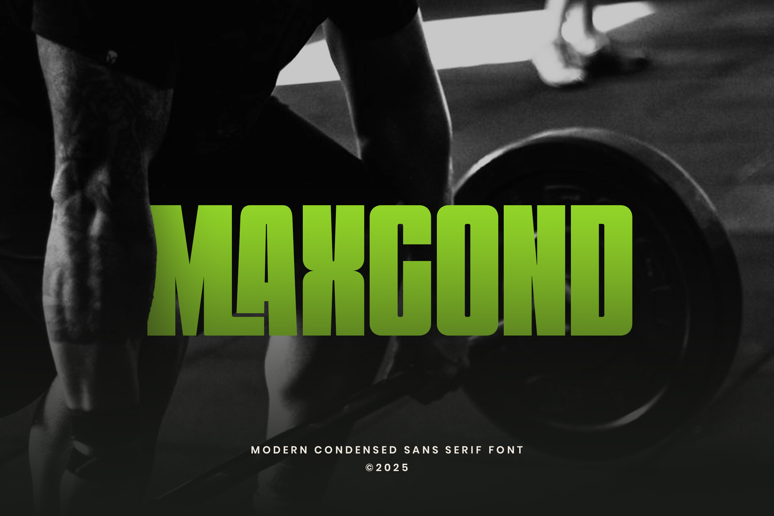
A condensed sans serif pitched for sports, fitness, posters, headlines and branding, Maxcond has a sports-oriented positioning that may not match a somber tone, so use it with care. The narrow letterforms could suit a date line, since condensed type generally fits more text in a tight space.
Best for: a date line, short service details. By: Creative Fabrica
6. Densa
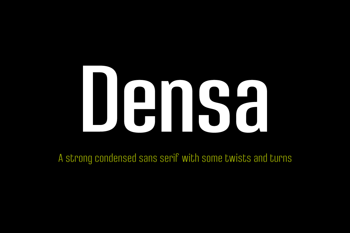
A condensed sans with unconventional display endings, Densa comes as a family of 8 styles, and its listing suits display use on posters. The unusual endings may give it a nonstandard character, so the tone is worth checking. With eight styles, it may offer enough variety to build a small hierarchy from one family.
Best for: dates and short lines, a two-weight hierarchy. By: Creative Fabrica
7. Nopsan
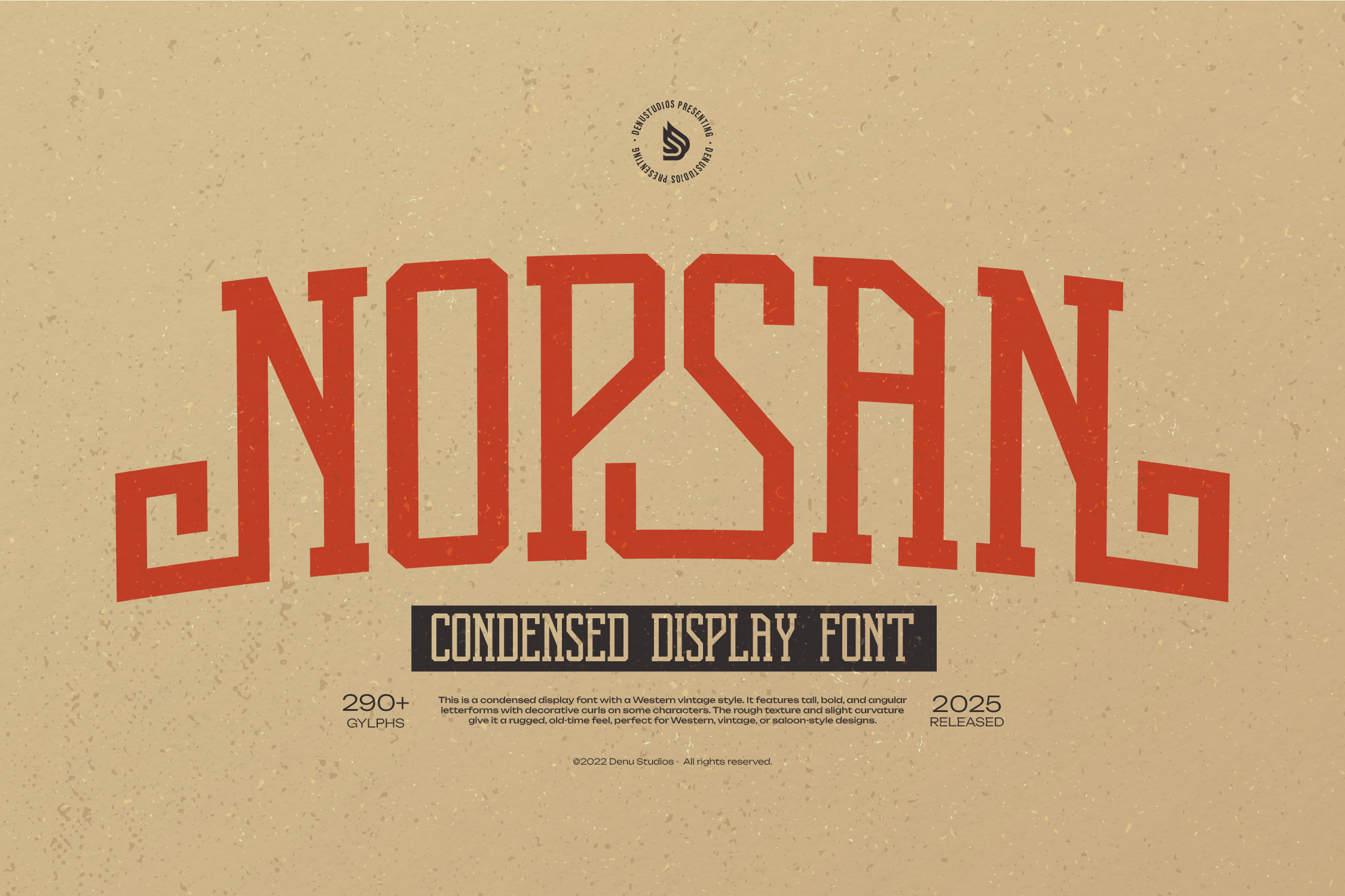
A condensed font, Nopsan is listed as suitable for projects such as posters and other print work. The listing offers little detail beyond that, so the style is worth checking on the product page before use.
Best for: a date line, short service details. By: Creative Fabrica
8. Condena
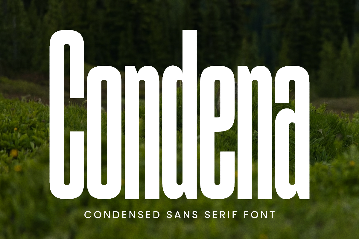
A slim condensed sans, Condena is listed as amplifying impact in poster arts and magazine layouts. The slim weight and impact language are worth checking for a somber tone. The thin strokes may need a test print to confirm legibility at distance.
Best for: a short line, condensed poster text. By: Creative Fabrica
Best Slab and Heavy Display Fonts for Welcome Signs
9. Ionicara Slab
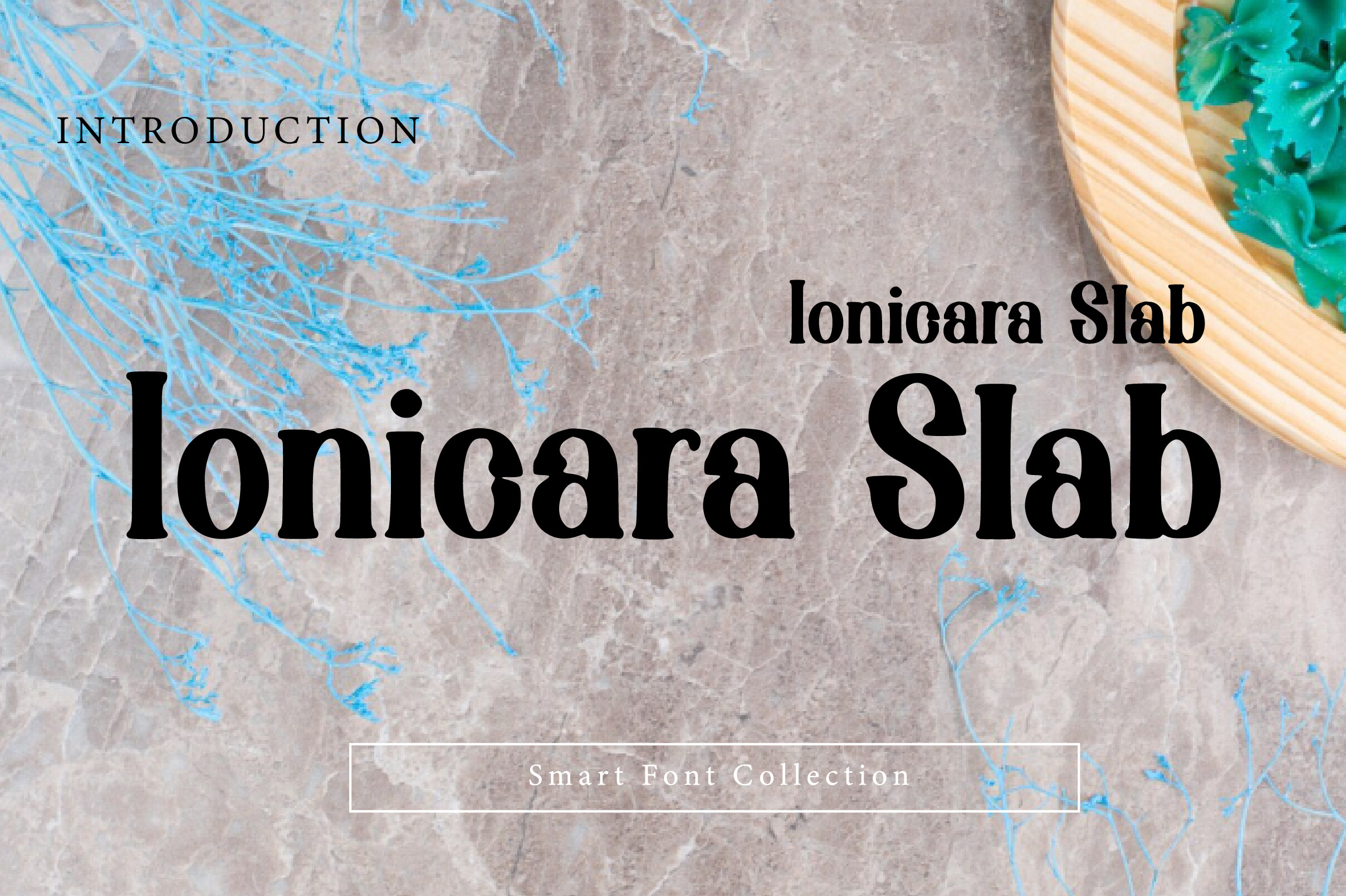
A bold slab serif display font, Ionicara Slab lists signage among its uses. The blocky, sturdy letterforms could suit a welcome sign or large lettering read from a few meters. Subscription-only, so check the product page before downloading.
Best for: a welcome sign, large display lettering. By: Creative Fabrica
10. Fatrix
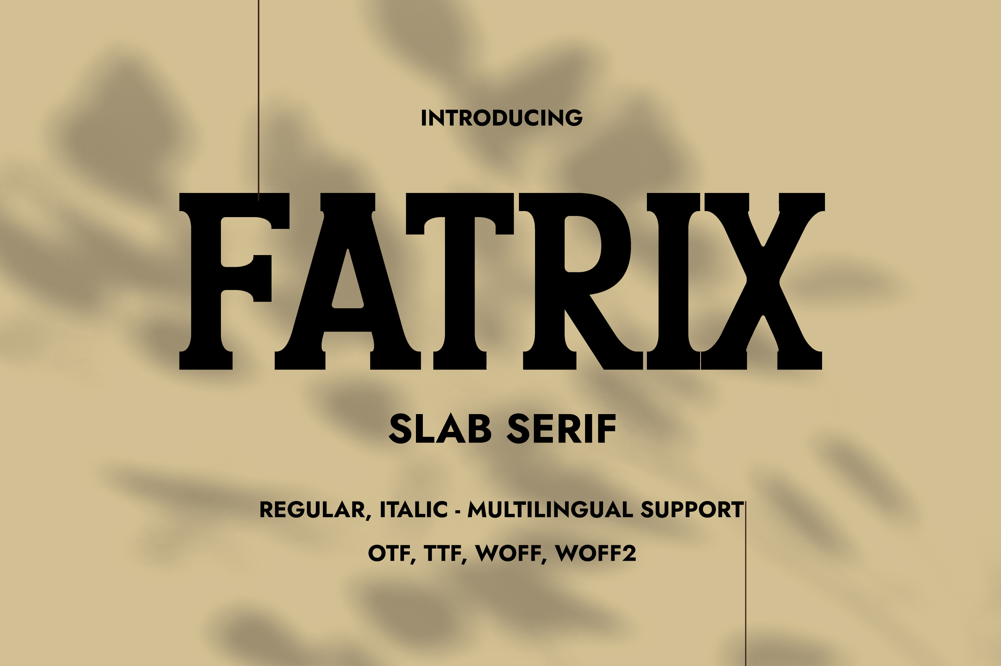
A bold slab serif with a sturdy, heavy build, Fatrix has a weighty character worth checking for a somber tone. The heavy structure may be better kept to short lines rather than long text, and could work for a welcome sign where one strong line carries the message.
Best for: a welcome sign, a single strong line. By: Creative Fabrica
11. Stuffing
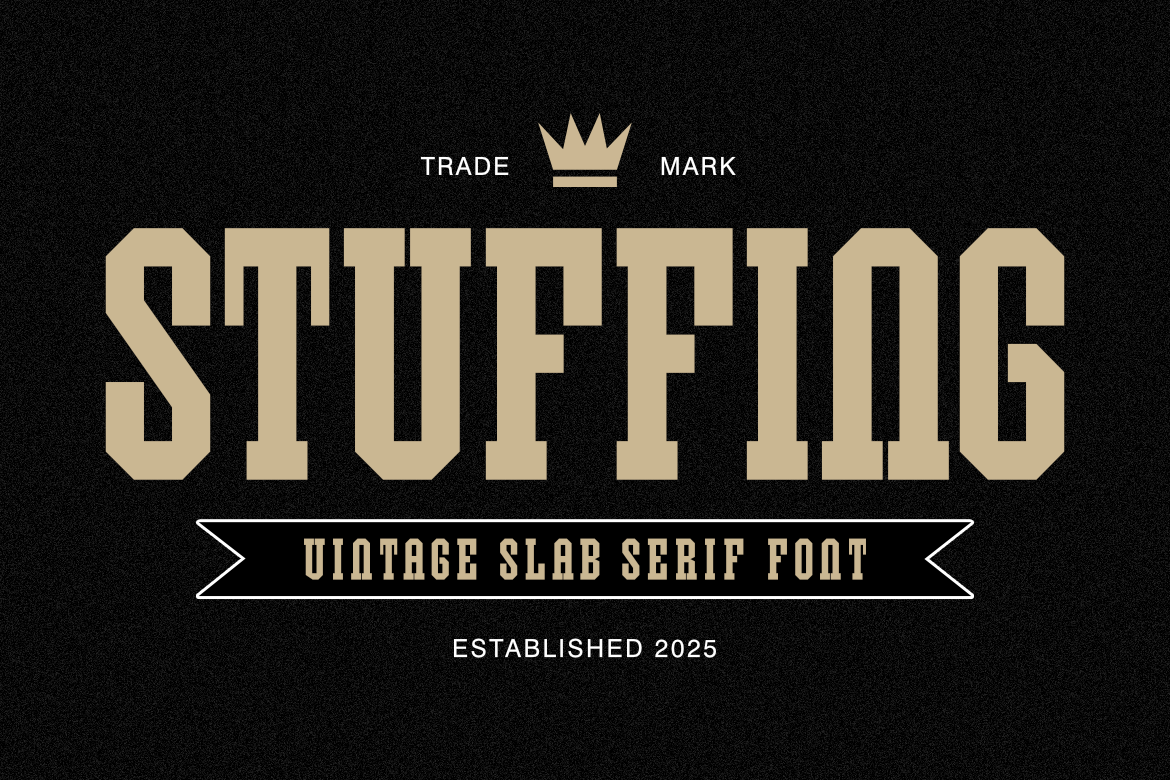
A vintage slab serif with thick, powerful serifs and a weighty structure, Stuffing is tied to traditional American signage. The vintage sign character may lean closer to celebration than mourning, so it could work as a celebration of life poster font rather than a traditional memorial.
Best for: a celebration of life poster, a short line. By: Creative Fabrica
12. Bensa
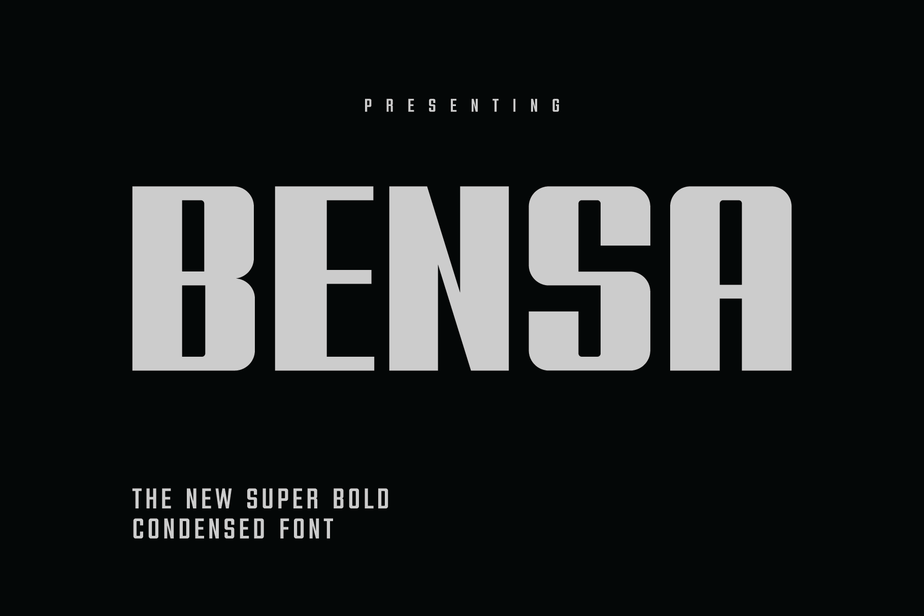
A super bold condensed sans serif designed to make an impact, Bensa is among the loudest options in this list, going by its listing. For a somber poster it may suit a single word or one line at an informal service. Use it sparingly.
Best for: a single word, one short line. By: Creative Fabrica
How to Set Type on a Funeral Poster
Size and scale: the name is the largest element, the dates sit at roughly half to a third of the name size, and the memory line is smaller still. These are general guides, not rules. A common rule of thumb for headlines is 16 pt or larger on a standard page, scaled up in proportion to the poster format. Check proportions by shrinking the layout on screen and viewing it from a distance.
Distance: a poster on an easel is read from two or three meters, so thin strokes and tight spacing lose clarity first. If the name can be read at that distance on a reduced printout, the size is probably adequate.
Contrast over a photo: use a dark overlay or a light panel, and choose a calm area of the image, away from the face. Avoid thin lines over a busy background. Dark text on a light or cream area remains the standard choice. Light text on a dark area or over a photo is worth checking on a test print before the full-size poster is made.
Spacing: leave room between lines, and add tracking for large capitals. Do not stretch a condensed face artificially.
Number of fonts: one for the name, one for the dates and line. Two is the usual limit, three at most.
Script: a script font can be used for the name or a short line, but not for the dates, time or address, where clarity matters most.
Serif or sans-serif: a serif for the name suits a traditional service, and a condensed sans for the dates and line adds contrast. Both are valid. The choice follows the tone of the service.
Alignment: center short poster text. Left-align service details if there are several lines.
Format and print: common sizes for large format memorial poster fonts are A2, A1, 18x24 in and 24x36 in. Use a high-resolution photo for large format, and export to PDF with fonts outlined or embedded.
Software: Canva, Word, Illustrator and Photoshop all handle this layout.
Test print: print a fragment at 100 percent or a reduced poster, and view it from a few meters. Thin lines and light text on dark areas are the first things to check. Check the name and dates for typos, and have a second person read it.
How to Choose the Right Font for Your Poster
By situation: a traditional service suits serif fonts for memorial posters, a serif for the name with a calm supporting face. A celebration of life can be softer, where a slab or condensed face may work. The font for a funeral welcome sign needs short text in a large display face. A tribute board with photos needs little text. These roles are suggestions, not facts.
Licensing: six of the twelve fonts (Boldside Display, Bold Dignify, Reverse Contrast, Maxcond, Ionicara Slab and Fatrix) are subscription-only on Creative Fabrica. For the rest, the listing does not state the status, so check the product page. Whether the fonts are free for commercial use is not confirmed here either. If a print shop or a bureau prints the poster on request, review the terms for commercial use fonts for printed posters on the page. Free fonts are not confirmed in this list.
For Nopsan and the fonts with caveats, open the product page and check a preview of the name, the dates and the line “In loving memory” before buying.
Where to Download Fonts for a Funeral Poster
Creative Fabrica is the main source for these funeral poster fonts. Six of them are listed as subscription-only, and for the others the product page is the place to confirm availability and terms. Google Fonts, DaFont and Font Squirrel are additional places to look for free options, named here as plain text. For more on choosing a memorial poster font and pairing typefaces, see the FontPro blog.