· fonts · 11 min read
17 Best Fonts for Teachers to Use on Worksheets, Handouts and Bulletin Boards in 2026
Find readable fonts for students, chalkboard headings and tracing picks. 17 Creative Fabrica options for worksheets, handouts and bulletin boards.
What Makes a Great Font for Teachers to Use in the Classroom?
Every week, teachers build materials from scratch: worksheets, handouts, slides, bulletin boards, name tags. The font choice either makes a student’s job easier or adds friction to something that should be simple.
A solid classroom font setup does a few things well. Body text stays clear and easy to read. Headings get a friendly, approachable character. And the whole thing sticks to two fonts per material, one for reading, one for display.
The 17 picks below come from Creative Fabrica. They are not a test, and previews are not available here, so check each product page before downloading. The roles assigned to each font are suggestions, not standards. The listings do not make accessibility or dyslexia claims, so treat these as design choices and test with your own students.
Body Text vs. Display: Choosing a Font Students Can Actually Read
Reading a worksheet is a different task from reading a headline. For the main text, design guides and blogs tend to point toward plain, neutral faces. Open Sans comes up often as a general workhorse. Source Sans 3 gets mentioned for slides and digital materials. Guides describe Atkinson Hyperlegible as built for legibility, and some link it to low vision. Guides describe Lexend as designed to reduce visual stress and support reading fluency. Comic Neue is a simple, friendly face for early readers. Lato is a common pick for handouts. Check the license and what your software includes before using any of them.
For size and spacing, many design guides suggest 12 to 14 pt as a starting point for handouts, with 1.2 to 1.5 line spacing. Do not tighten letter spacing, especially for younger readers. A test printout on the school copier is a good habit. A font that looks clean on a screen can clog or thin out on a classroom printer, and you will not catch that until the whole class gets a blurry copy.
Chalk, comic and playful display faces work well for headings, signs and bulletin boards. They are not the right choice for long paragraphs, where a simple text face keeps the words readable.
17 Best Fonts for Teachers to Use
These 17 Creative Fabrica fonts cover headings, labels, bulletin boards and handwriting practice. They are not meant for running body text. The set breaks down like this: 5 handwritten or chalk fonts, 4 sans-serif or playful display fonts, 1 label set, and 7 tracing or handwriting-practice fonts. Chalk, comic and playful display fonts suit headings and signs, not paragraphs. Tracing fonts suit practice sheets only, not running text.
Best Handwritten and Chalk Fonts for Headings and Bulletin Boards
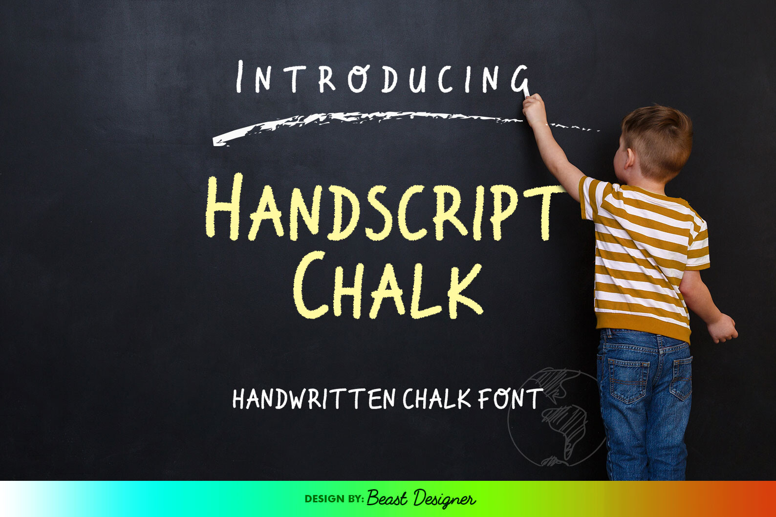
1. Handscript Chalk
A handwritten script that mimics classic chalkboard writing. The listing suggests school-themed designs, menus, invitations and quotes. Because it is a script, it could suit a poster title or a chalkboard-style board heading, but not a paragraph of instructions. The listing summary does not mention subscription terms, so check the license on the product page.
Best for: poster titles, chalkboard-style board headings By: Creative Fabrica
2. Rounded Chalk
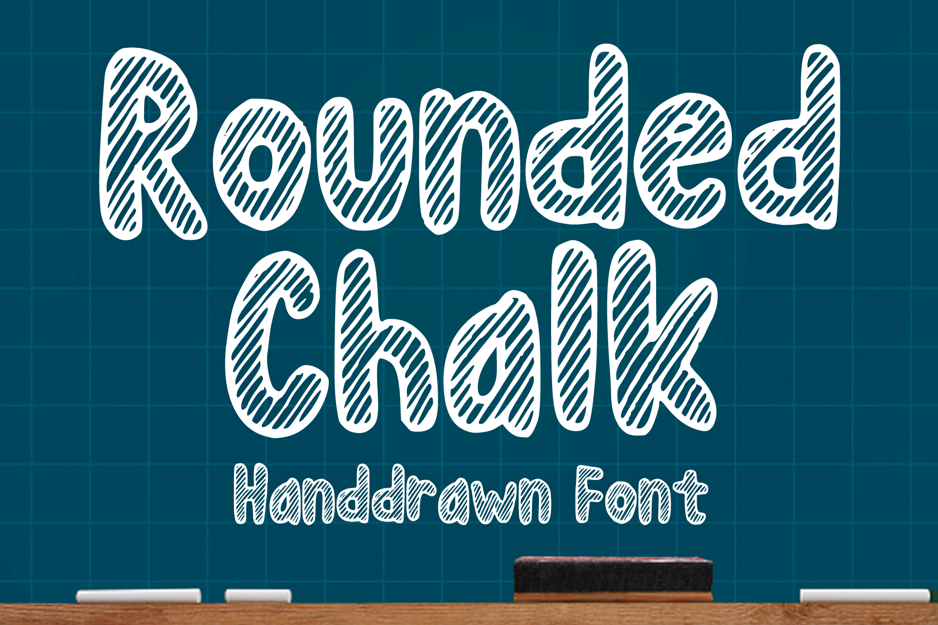
The listing describes a fun and playful handwritten font with a chalk texture. It names no specific use, and the listing gives little detail beyond that. Check the listing and preview on the product page before deciding. It is subscription-gated, so confirm the license terms too.
Best for: chalkboard-style headings By: Creative Fabrica
3. Learn Notes
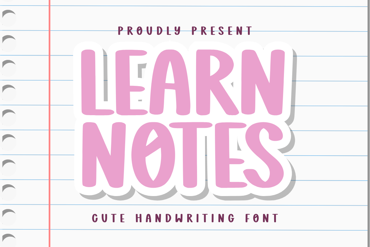
A playful rounded handwriting font. The listing centers its pitch on stickers, planners and school supplies, and it is subscription-only. It could suit labels or worksheet headings where a friendly handwritten feel is wanted. Treat the school-supplies angle as the seller’s positioning and check the preview first.
Best for: labels, worksheet headings By: Creative Fabrica
4. Classmate
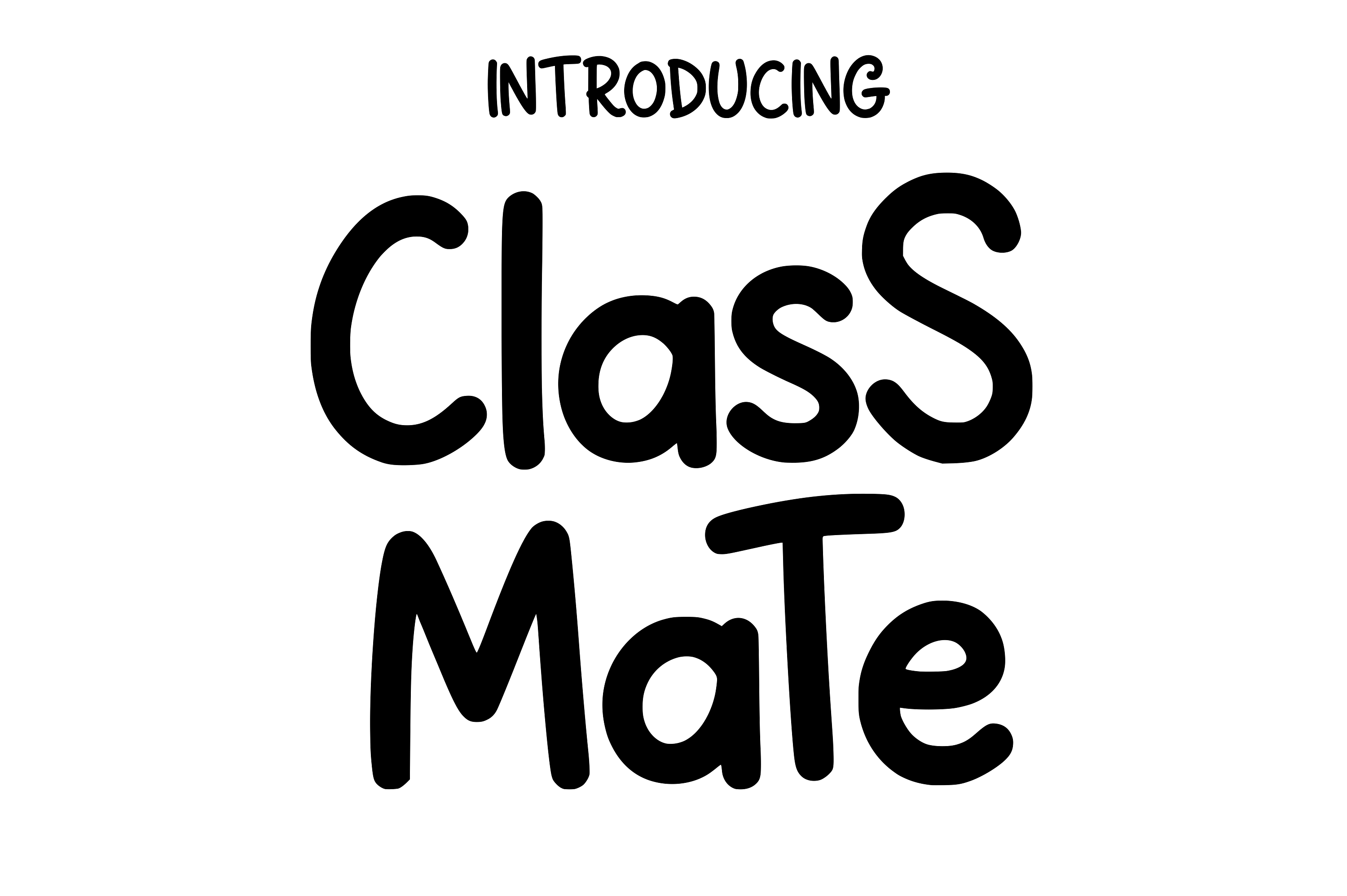
A lively rounded handwritten font. The listing points to children’s designs and school merchandise, which suggests products rather than worksheets. It is subscription-only. It could suit a friendly board caption or a label, worth testing. Check the preview and the subscription terms on the product page before building a set around it.
Best for: board captions, labels By: Creative Fabrica
5. School Present
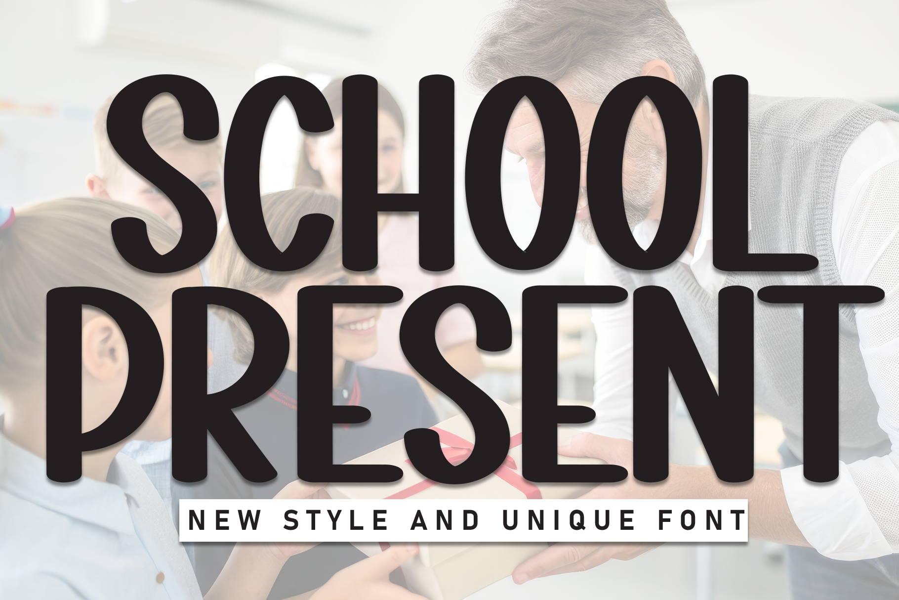
A handwritten display font. The listing pitches it for children’s books, posters and branding, and it is subscription-only. The poster use could suit a classroom sign or a board heading, worth testing for a display role. Check the preview and the subscription terms before choosing it for a whole board.
Best for: classroom signs, board headings By: Creative Fabrica
Best Playful Sans-Serif and Display Fonts for Worksheets and Classroom Decor
6. Learning Teacher
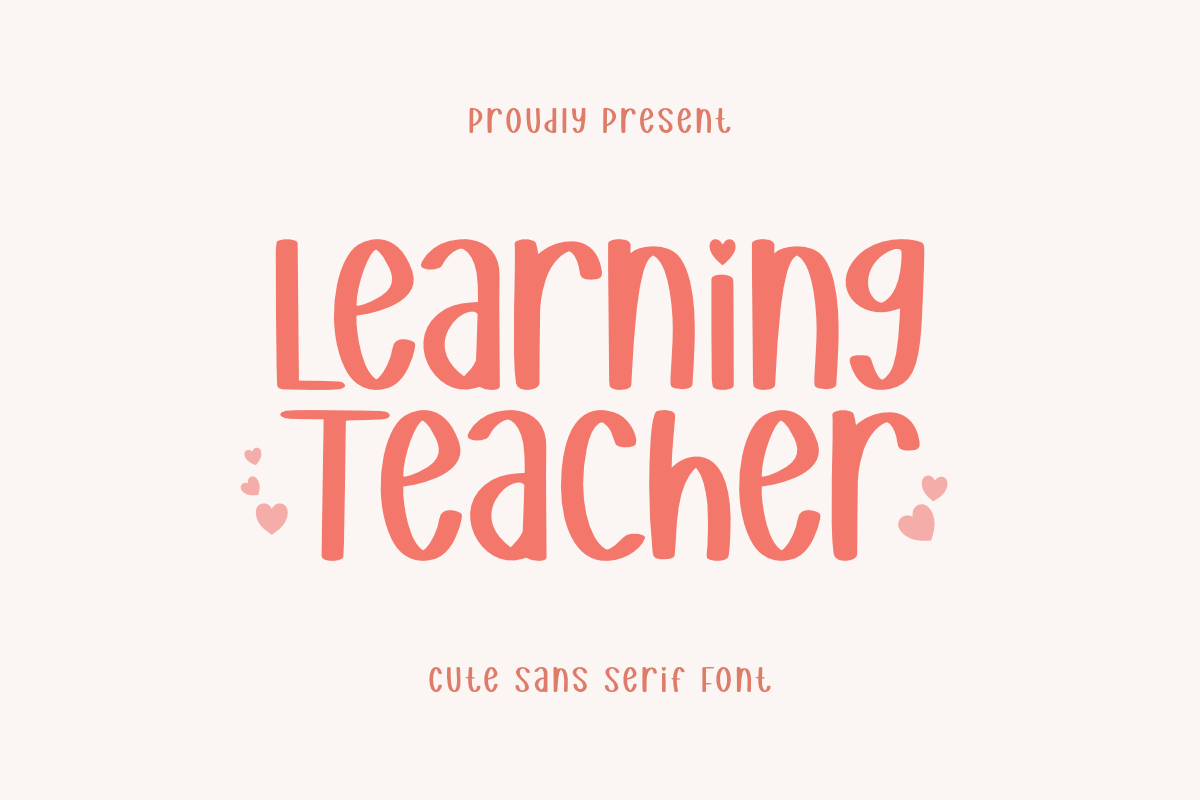
A playful sans serif. The listing calls it a cute and friendly vibe for designs and says little about classroom use. The name alone does not show it fits a class, so check the preview on the product page. The listing summary does not say whether it needs a subscription, so check the license there too.
Best for: worksheet headings By: Creative Fabrica
7. School Font
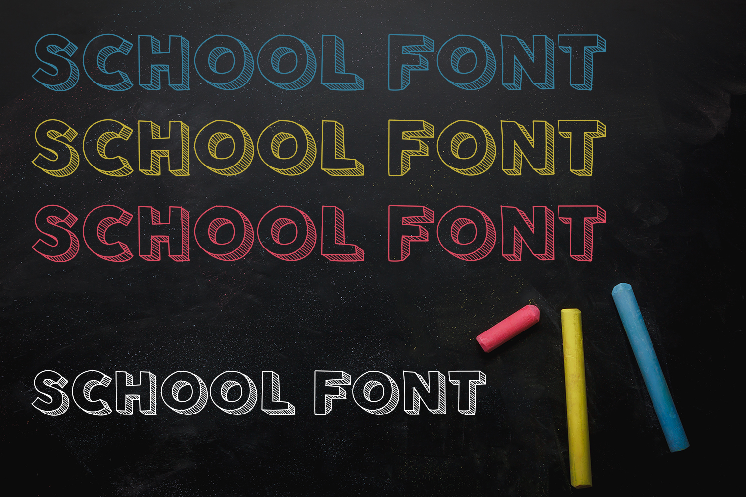
A playful sans serif aimed at kids and school projects. The listing says it is subscription-gated. It could suit worksheet headings where a rounded, approachable look is wanted, worth testing. Check the preview, and confirm the subscription terms before planning a full set of materials around it.
Best for: worksheet headings By: Creative Fabrica
8. Comic Student
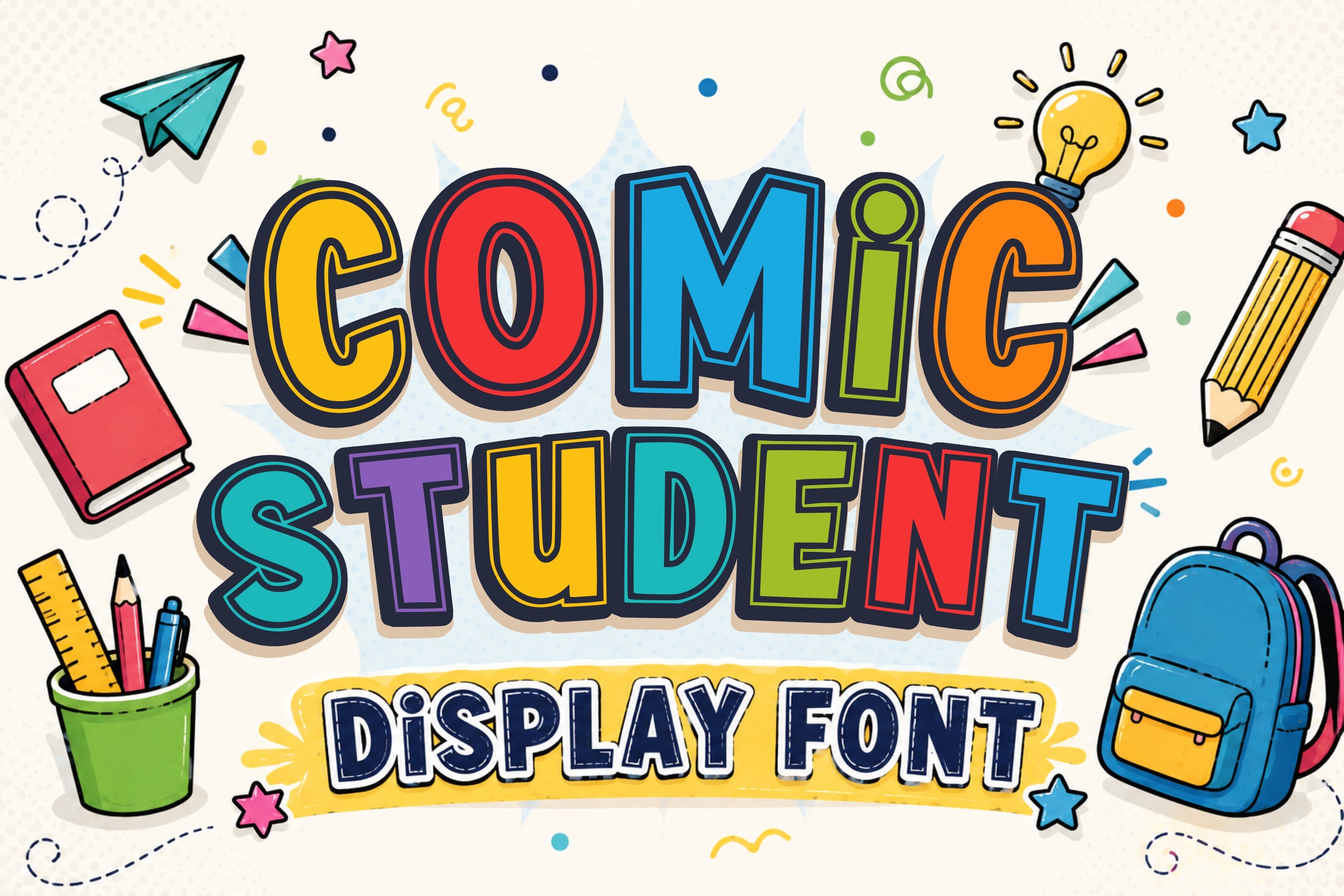
A bold comic-style display face. The listing recommends school-themed designs, educational materials and classroom decorations, and it is subscription-only. It could suit headings and decor, not paragraphs. This is a separate face from Comic Neue. Check the preview and the subscription terms before using it across a unit.
Best for: headings, classroom decor By: Creative Fabrica
9. School Poster
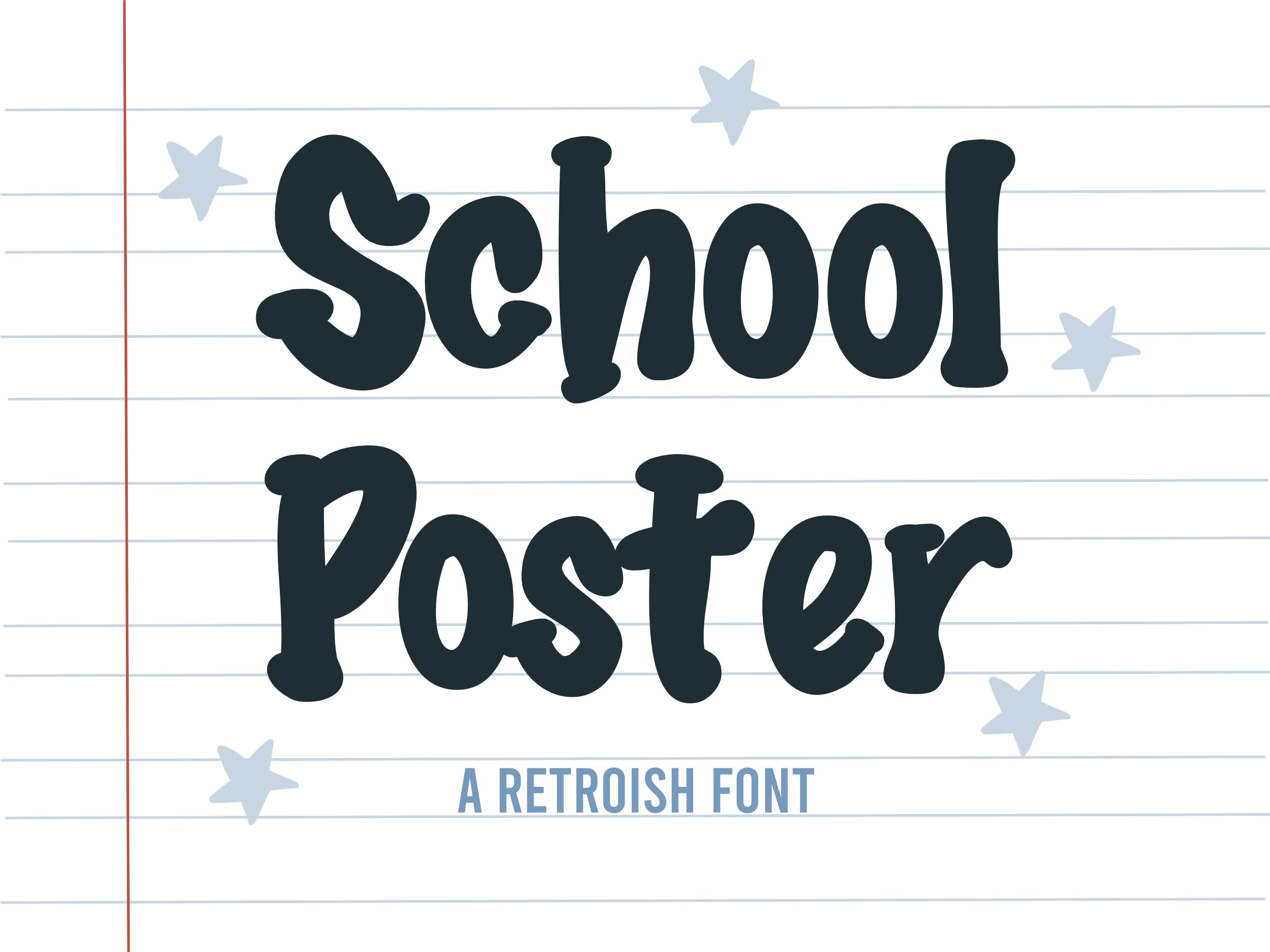
A hand-drawn display face that evokes decorative classroom bulletin board lettering. The listing says it is subscription-only. It could suit a bulletin board title, where a hand-drawn display look is the goal. Because the listing is short on detail, check the preview and the subscription terms before using it on a real board.
Best for: bulletin board titles By: Creative Fabrica
Best Font Set for Labels and Name Tags
10. Abcd Ref Crayon Shape
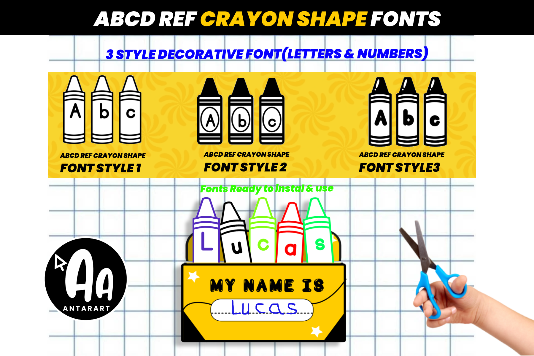
The only label set in this group. The listing says it has three crayon-themed styles with uppercase, lowercase and numerals 0-9, suited to classroom decor, name tags, bulletin boards, posters and worksheets. It is subscription-only. It could suit name tags and board captions. Check the product page for the full character set.
Best for: name tags, bulletin board captions By: Creative Fabrica
Download Abcd Ref Crayon Shape
Best Tracing and Dotted Fonts for Handwriting Practice Sheets
These seven picks are handwriting-practice faces per their listings. They do not claim to teach correct letter formation or match any curriculum. Age wording appears only where the listing states it.
11. Tracing Pro
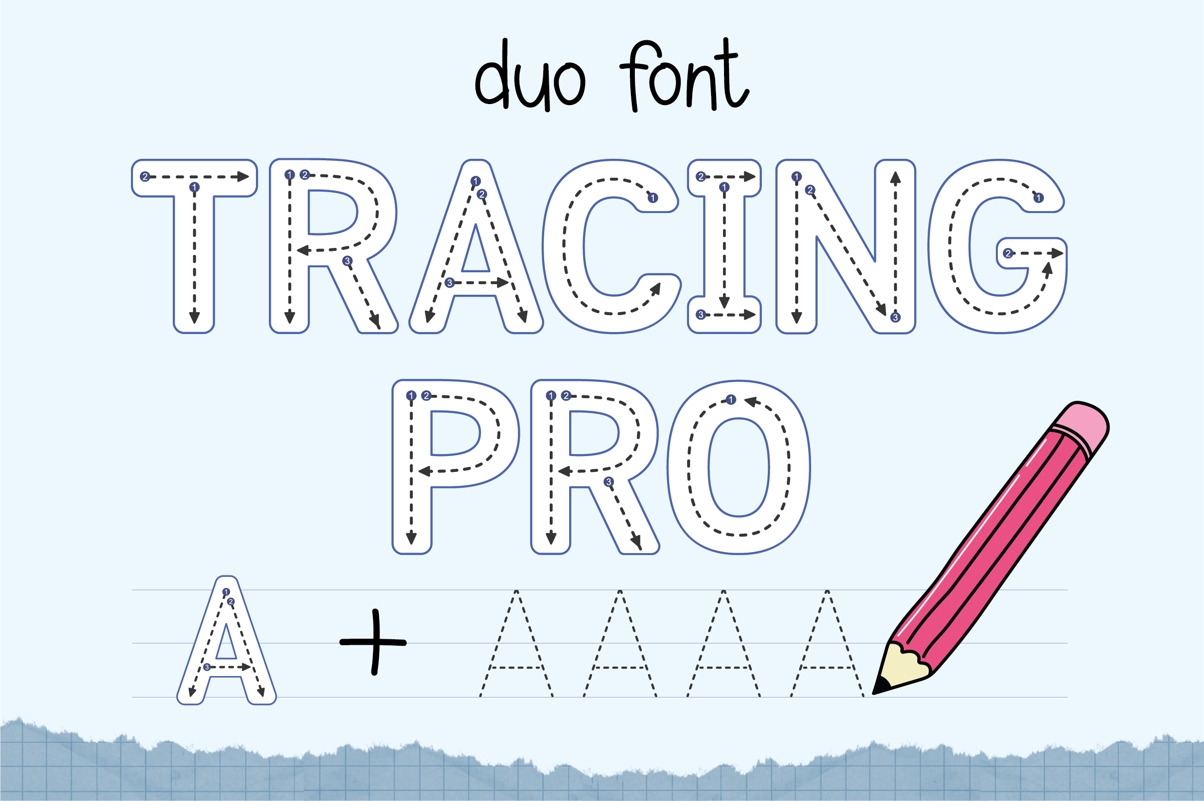
A dotted-line font for lettering and handwriting practice. The listing says it is ideal for kids and beginners, and it is subscription-only. It could suit practice lines on a writing sheet, worth testing. The listing makes no claim about teaching letter formation, so check the preview before printing a sheet for students.
Best for: handwriting practice lines By: Creative Fabrica
12. Abcd Ref Tracing Lined
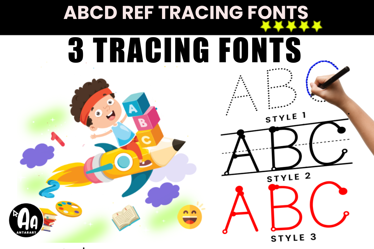
The listing says it has three styles: dotted, lined with beginning dots, and unlined with beginning dots. It is aimed at PreK through 2nd grade. It could suit guided practice lines, and the beginning dots are a stated feature of the styles. Check the product page for license terms.
Best for: guided practice lines By: Creative Fabrica
Download Abcd Ref Tracing Lined
13. Dot Tracing
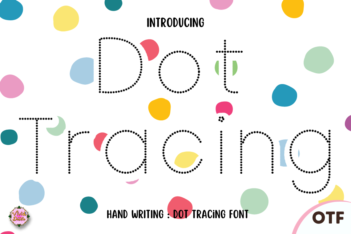
Dotted letter outlines. The listing says they are for motor skills and letter recognition, and it is subscription-gated. It could suit practice lines on a writing sheet, worth testing. The listing summary names no grade level, so check the preview and the subscription terms before printing a class set.
Best for: handwriting practice lines By: Creative Fabrica
14. Abcd Ref Dashed Arrows Numbers
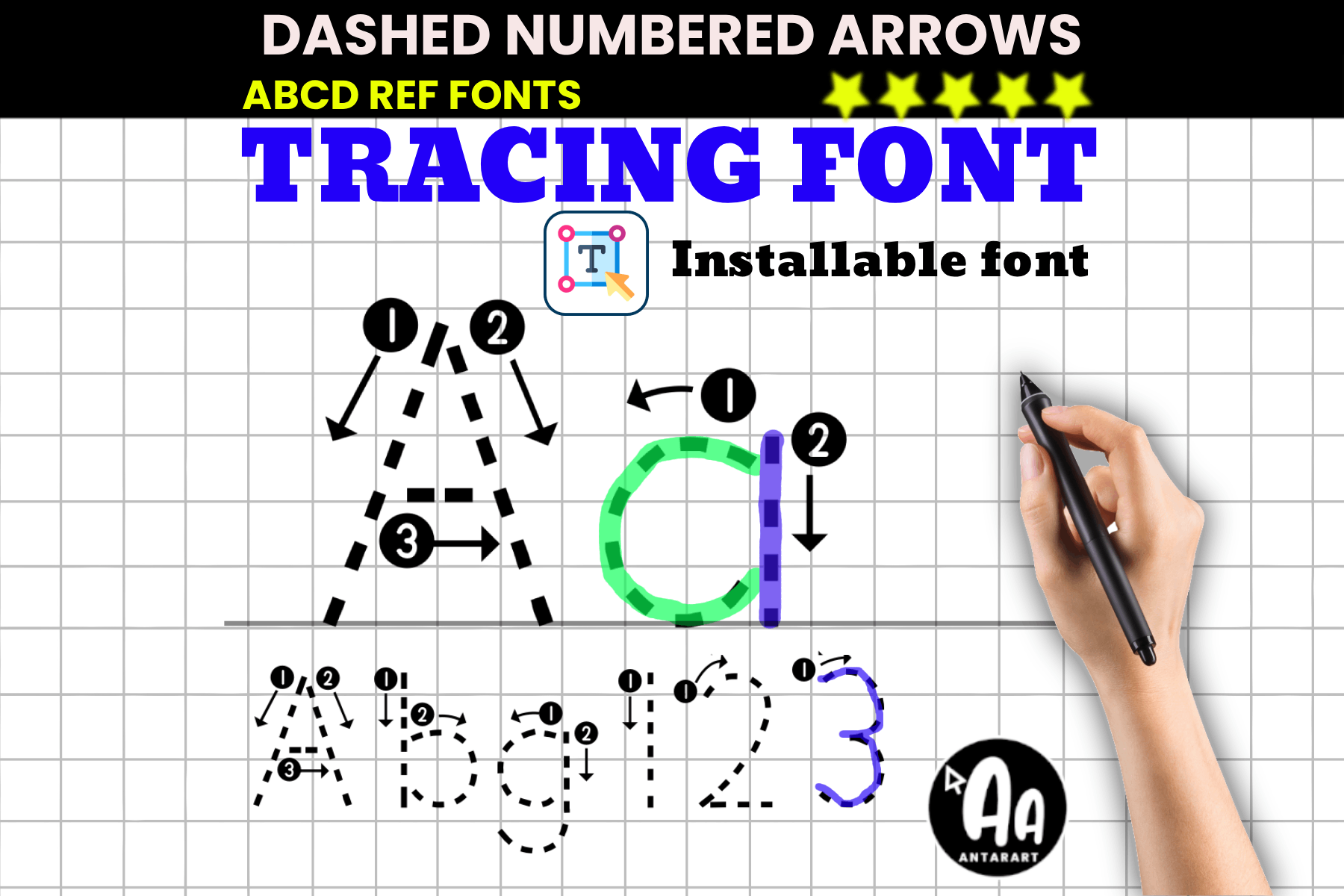
Dotted letters with directional arrows, plus uppercase, lowercase and numerals 0-9. The listing says it does not support Spanish, so check the characters on a bilingual worksheet before printing. The arrows are a listing feature only. It could suit practice lines. Check the product page for license terms.
Best for: practice lines with numbers By: Creative Fabrica
Download Abcd Ref Dashed Arrows Numbers
15. Abc Dashed
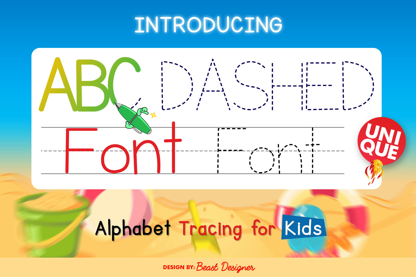
The listing says dashed lines act as friendly guides for young learners. It does not say which characters are included, so check whether numerals are in the set. The listing gives little detail, so check the listing and preview. The summary does not mention subscription terms either, so check the license.
Best for: guided practice lines By: Creative Fabrica
16. Tracing Fun

The listing says it has three styles: Regular, Outline Dotted with Arrow, and Dotted with Arrow, aimed at kindergarten writing. The Regular style could suit a worksheet title face, as a display role. The listing summary does not mention subscription terms, so check the license on the product page.
Best for: practice lines, worksheet titles By: Creative Fabrica
17. Dotted
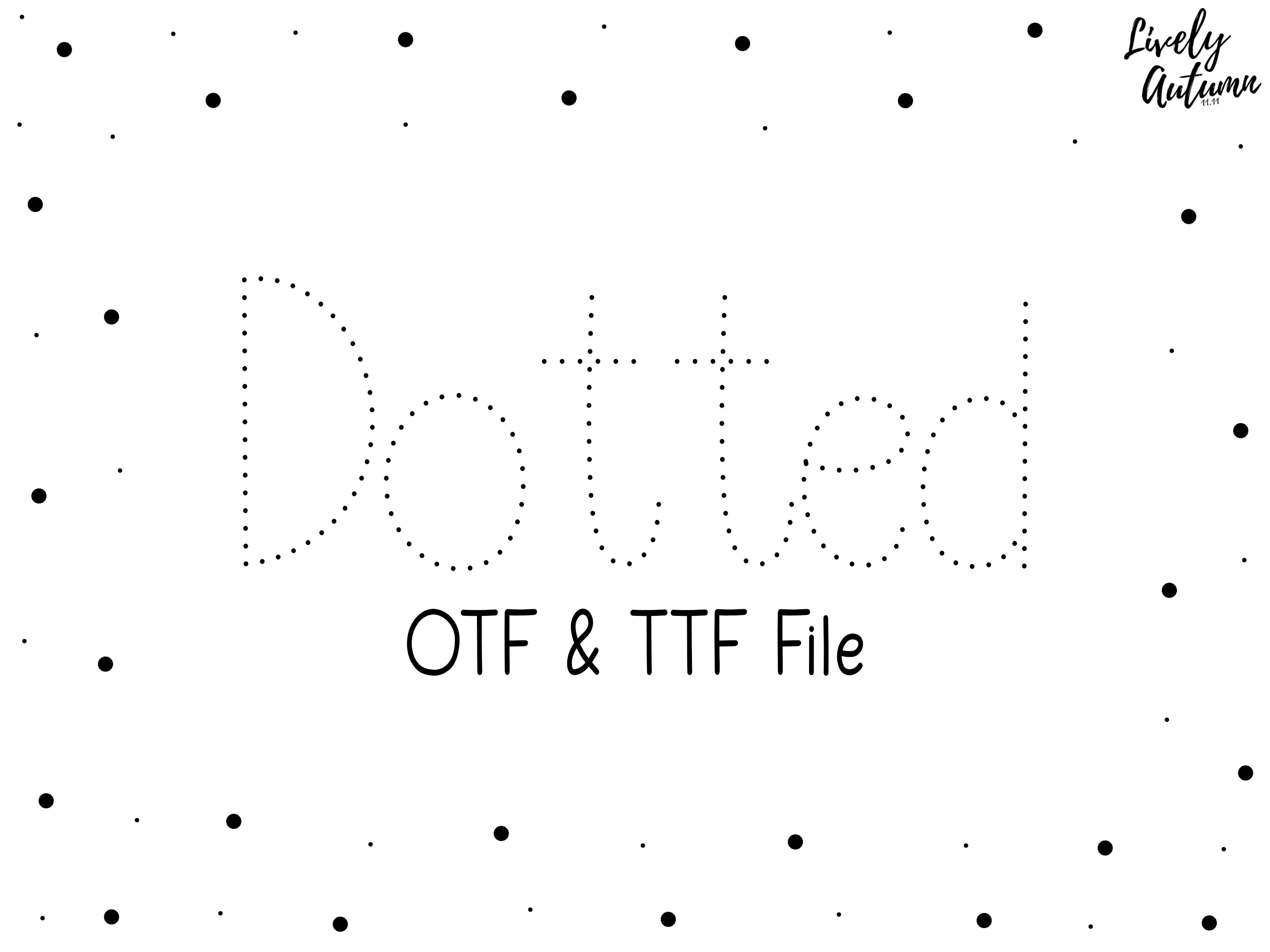
A dotted sans-serif handwriting font. The listing names no age or use, and it gives little detail. The listing places it in Creative Fabrica’s free font collection, so check the license and any commercial-use terms on the product page. Free collection placement does not replace reading the terms.
Best for: handwriting practice lines By: Creative Fabrica
How to Set Up Worksheets, Slides and Bulletin Boards
A few simple rules keep materials consistent across a unit or a term.
- Worksheet: a Creative Fabrica display face for the title, a plain text face for the tasks.
- Slide: a large display heading with a simple text body.
- Bulletin board: a display or chalk face for the title, a plain face for the captions.
- Labels and name tags: short names in a label or rounded face.
- Practice sheet: a tracing face only for the practice lines, a plain face for any instructions.
Keep the same sizes for the same roles, and do not mix several decorative faces on one page.
Software matters. In Canva, Google Docs, Google Slides, Word and Cricut Design Space, installing your own fonts depends on the program and your plan, so check. Do not assume a font you own in one app is available in another.
Before printing a whole class set, make a test printout on the school copier and look at the smallest text. That is where problems hide.
How to Choose the Right Font for Your Classroom Materials
Match the font to the job. A worksheet title wants a friendly display face. A handout for older students wants a clean text face. A slide wants a large heading and a simple body. A bulletin board wants a display or chalk face for the title. Name tags want a short, rounded face. A practice sheet wants a tracing face for the lines.
On licensing, the listings say these require a subscription: Rounded Chalk, Learn Notes, Classmate, School Present, School Font, Comic Student, School Poster, Abcd Ref Crayon Shape, Tracing Pro and Dot Tracing. For Dotted, the listing places it in the free font collection, so check the commercial-use terms. For the rest, check the license on the product page. If you sell worksheets or handouts on a marketplace, check the license for sold materials separately. The listings do not state commercial-use terms, so read them first. No listing here claims a font is dyslexia-friendly.
For the four fonts with thin listings, open the product page and confirm the link leads to the right product. A good test is to type a real task, print a copy, and show it to a student or a colleague. If it reads cleanly at arm’s length, it will probably work in the classroom.
Where to Download Fonts for Teachers
Creative Fabrica is the main source for the picks in this list. For body text, you can also look at Google Fonts, DaFont and Font Squirrel, and check the license for each face. More font guides and comparisons live on the FontPro blog.