· fonts · 12 min read
19 Best Chalkboard Fonts for Menus, Signs, and Weddings in 2026
Chalkboard fonts for menus, signs, and weddings: handwritten, slab, display, and vintage chalk styles, plus pairing and readability tips.
You are designing a cafe menu, a sidewalk A-frame, or a wedding welcome board, and you need a chalkboard font that looks warm and handmade but still reads clearly at a glance. That is the tension at the heart of every chalkboard typeface. The best chalkboard fonts mimic the soft, slightly uneven texture of real chalk on a dark surface, yet they hold enough structure to survive print, screen, and small sizes.
This list covers chalkboard fonts for menus, chalkboard fonts for weddings, chalkboard sign fonts, and classroom or craft projects. You will find handwritten styles, slab serifs, textured display faces, and vintage chalk looks. Whether your workflow is Canva, Illustrator, Procreate, or Cricut Design Space, the goal is the same: find a chalkboard lettering font that matches the mood without turning your layout into visual noise.
What Makes a Great Chalkboard Font?
A chalkboard font should look like someone actually drew it with a stick of chalk. Slightly uneven strokes, soft edges, a little grain. That is what gives it the casual, crafty tone that works on menus, blackboard signs, and wedding boards.
But there is a catch. The letterforms need enough weight and open counters to stay visible on a dark background. Thin, wispy strokes can look charming in a large heading, then vanish completely at 10pt on a printed menu or a small A-frame sign. Plenty of chalk fonts look gorgeous in a 72pt sample and fall apart the moment you shrink them.
The style matters just as much as the texture. A rounded handwritten chalk font feels friendly and informal. A slab or serif chalk style feels more structured and can carry a classic diner or vintage shop mood. A display chalk font with heavy texture is perfect for a single word on a poster, but it will overwhelm a long list of prices.
So what is the best chalkboard font? It depends on what you are making. A rustic cafe menu needs something different from a wedding seating chart or a classroom schedule. The picks below are grouped by style so you can match the font to the job first.
If you are wondering what fonts look like chalk handwriting, start with the handwritten group. For a sturdier blackboard feel, move to the serif and slab picks. For posters and single-line titles, the display group is built for impact, and the vintage group covers retro menus and decorative boards. Mixing upper and lowercase letters usually helps a board feel natural, so preview a real headline, a short accent line, and a small list before you commit.
Best Handwritten Chalkboard Fonts
Handwritten chalkboard fonts are the closest digital match to real chalk handwriting. They shine on welcome boards, menu accents, and decorative phrases where you want a personal, friendly feel. Use them for headings or short lines, and let a simpler font handle the details.
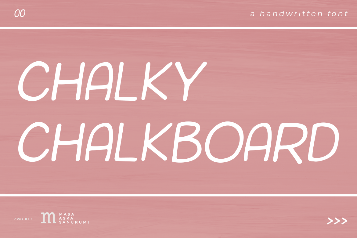
1. Chalky Chalkboard
The name says it all: a chalky, handwritten take on the blackboard look. It suits menu headings, cafe signs, or a friendly classroom poster where the tone should feel relaxed rather than formal.
Best for: Menu headings, cafe signs, classroom posters. By: Masa Aska Sanurumi
2. Chalkboard by Graphue
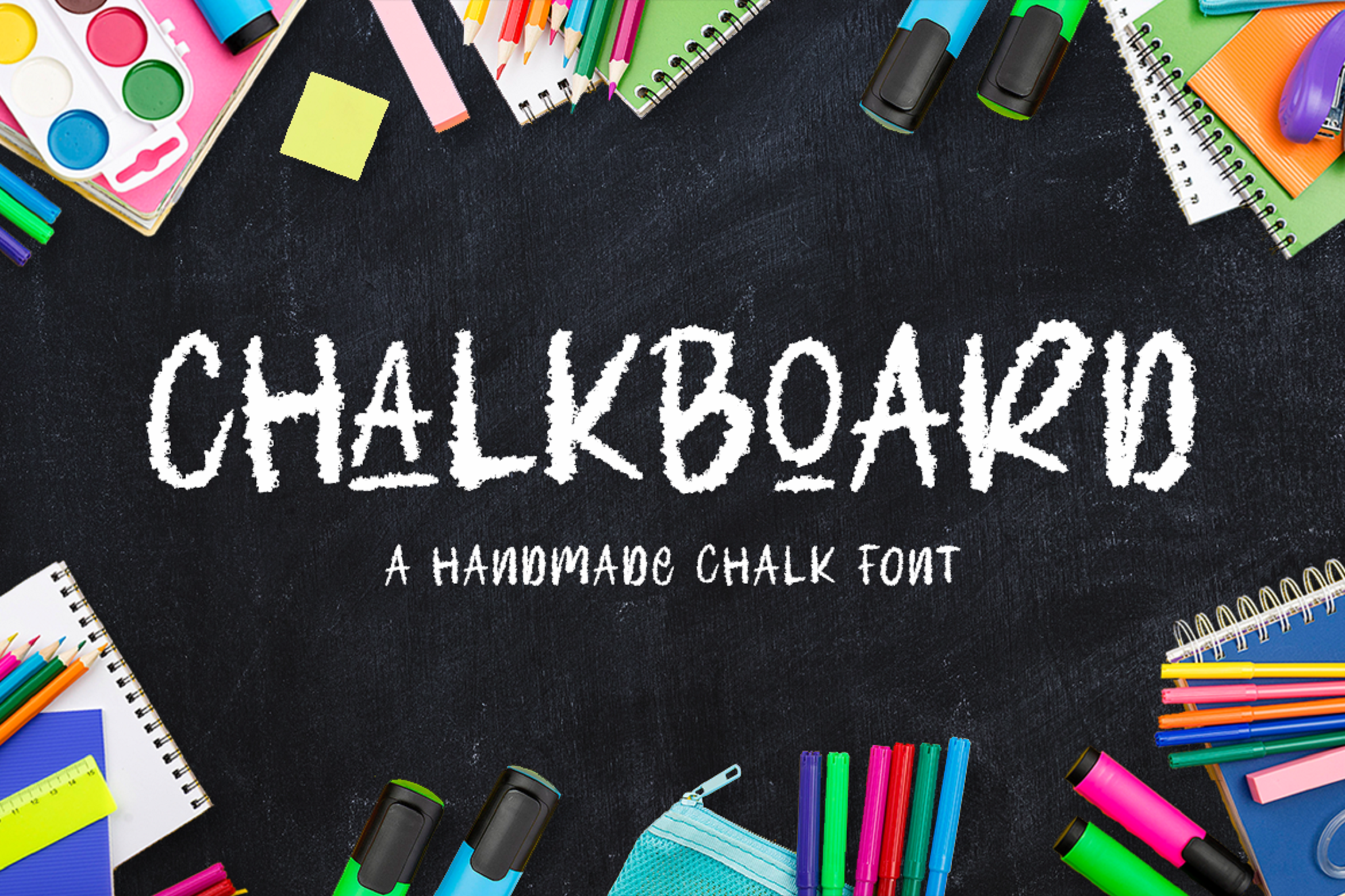
This handwritten chalk style is a good fit for welcome boards, small menu accents, and casual signage where the type should feel personal. Check the preview on the product page to see how it handles your own text. Designer name matters here, since several fonts share the plain name Chalkboard.
Best for: Welcome boards, menu accents, casual signage. By: Graphue
Download Chalkboard by Graphue
3. Farmhouse Chalkboard
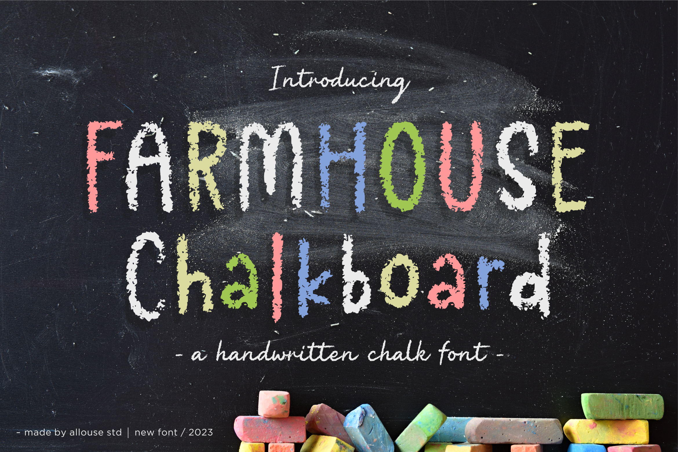
The name points to the farmhouse aesthetic, with a homey, country-style mood. That makes it a natural fit for farm shop signs, coffee menus, and seasonal boards.
Best for: Farm shop signs, coffee menus, seasonal boards. By: allouse.studio
4. Chalkboard by Black line
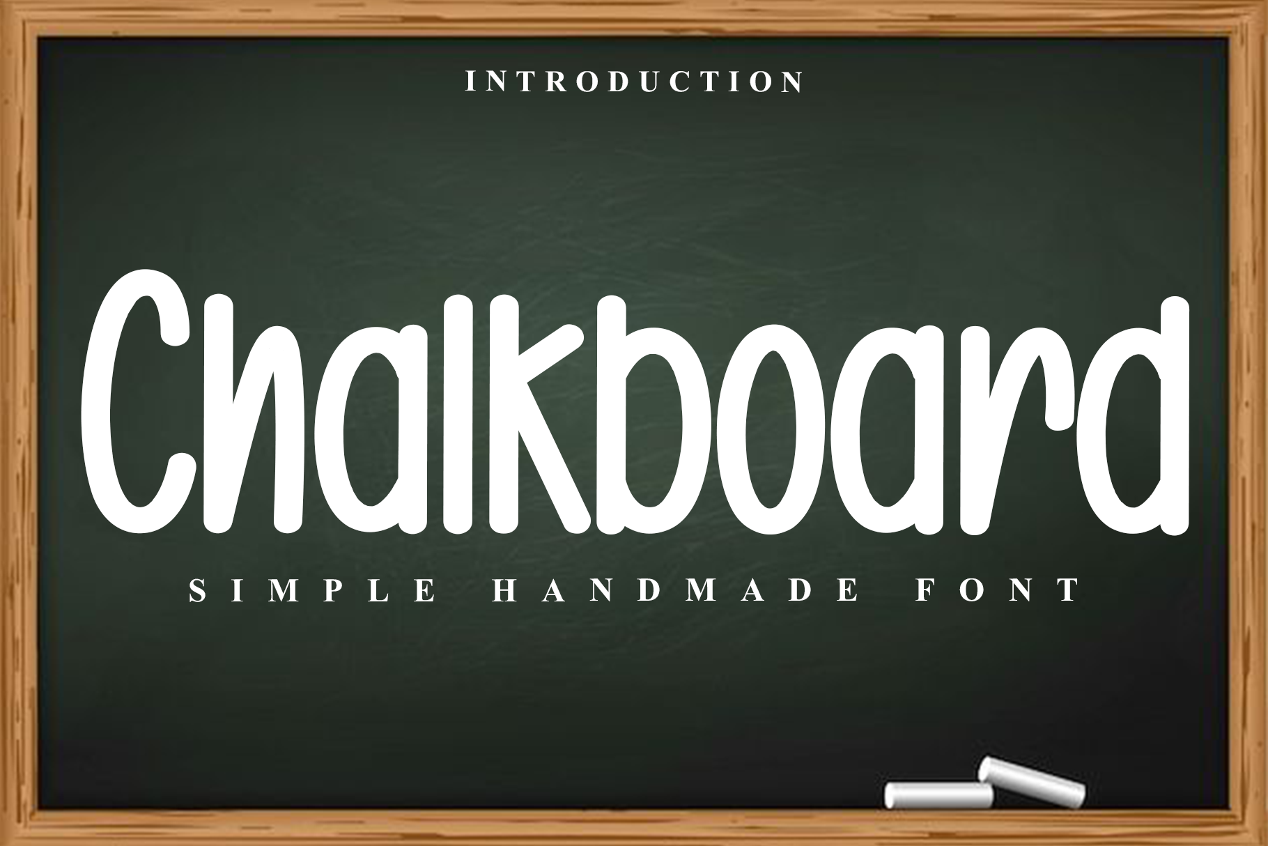
A handwritten chalk option for boards where a friendly, casual tone is the goal. It is a good fit for menu sections, event signs, and casual headings.
Best for: Menu sections, event signs, casual headings. By: Black line
Download Chalkboard by Black line
Best Serif and Slab Chalkboard Fonts
Serif and slab chalkboard fonts add structure to the chalk look. They are useful when your sign or menu needs a sturdier, more traditional feel. The cleaner letterforms help when the text carries more information, like a full menu list or a shop sign with multiple lines.
5. Chalkboard Sketch
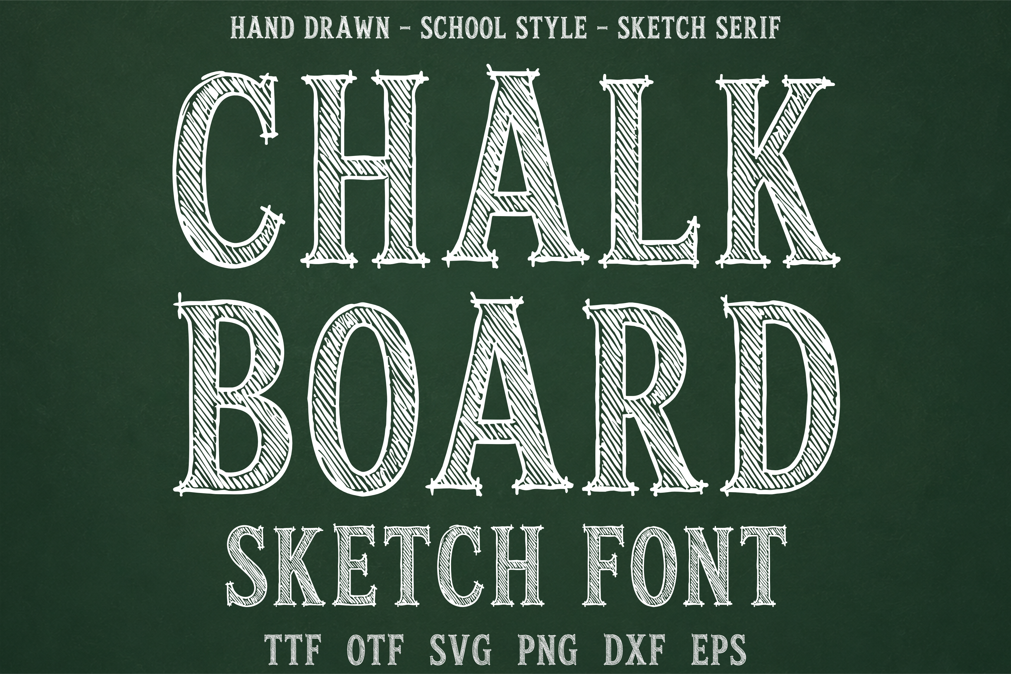
A sketch-style chalk face from the serif group, aimed at a handmade look with a bit more formality than a loose script. It suits sign headings, vintage-style menus, and display text.
Best for: Sign headings, vintage menus, display text. By: wtl.typography
6. Chalkboard by Minimalistartstudio
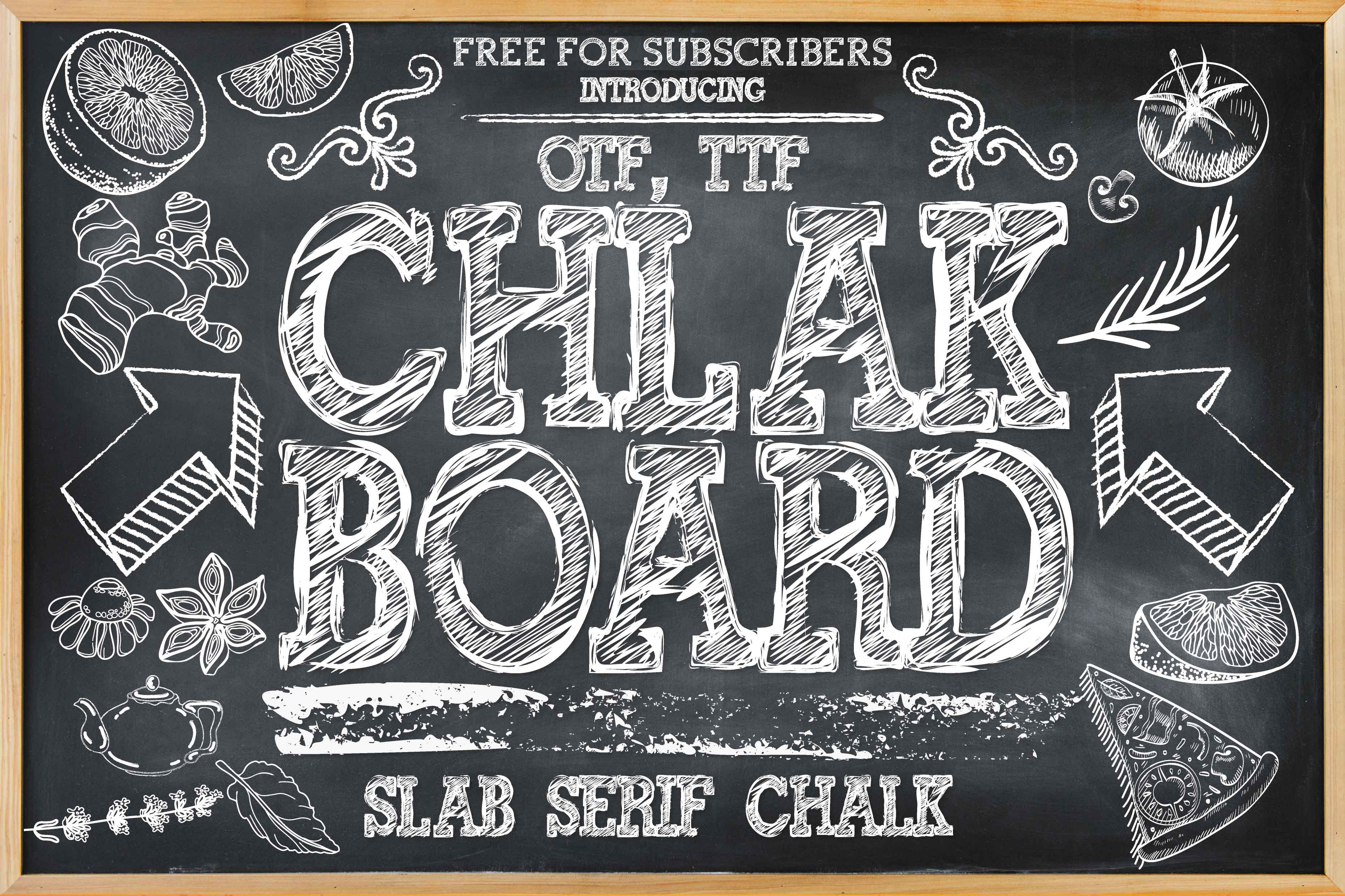
A serif chalk style that suits menu titles, event headings, and signage needing more structure than a loose script. If your board carries a lot of text, a serif like this is worth previewing.
Best for: Menu titles, event headings, signage. By: Minimalistartstudio
Download Chalkboard by Minimalistartstudio
7. Blackboard Slab
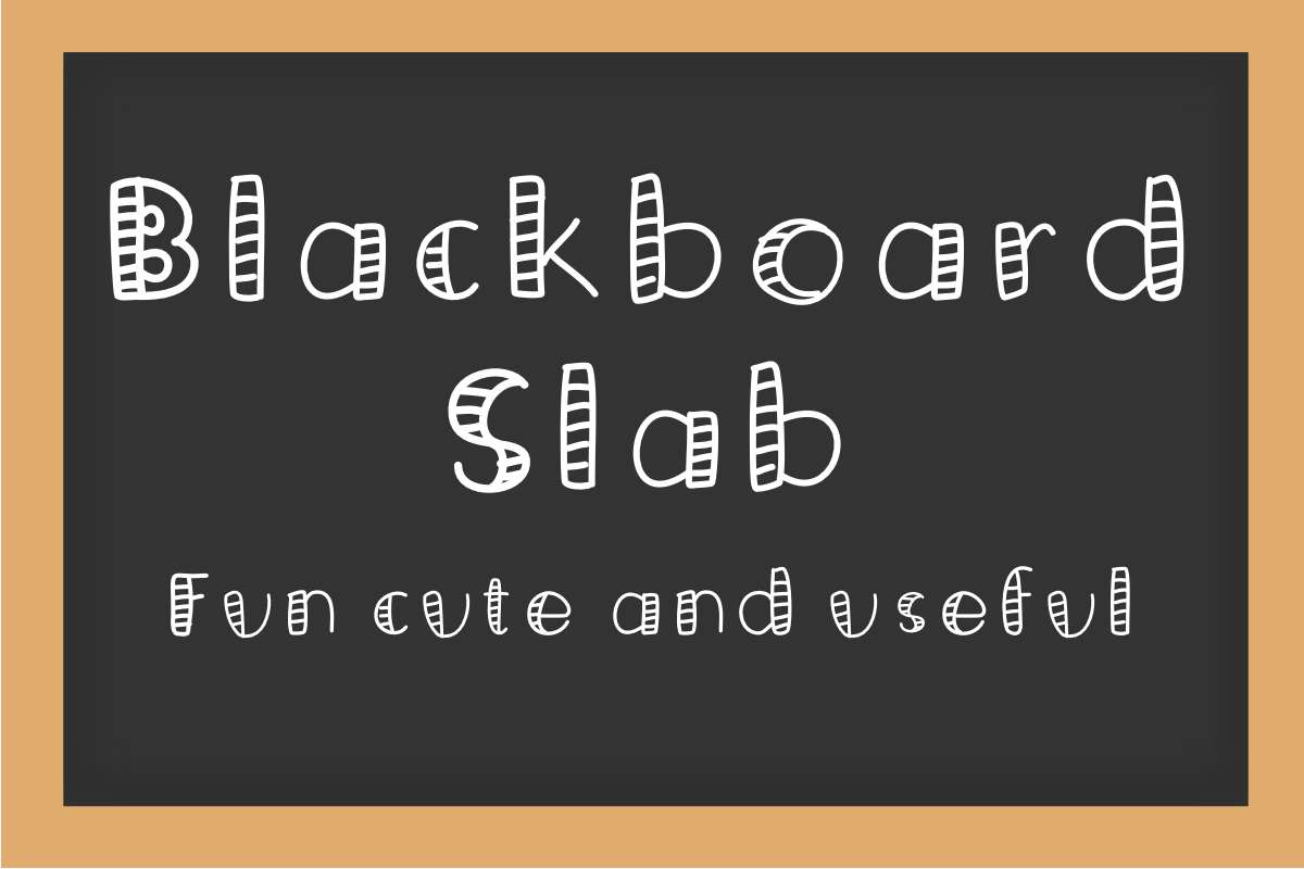
A slab-style blackboard font, which usually means a sturdy, classic presence. It suits a shop sign or a diner menu, where you want chalk character without a loose handwritten feel.
Best for: Shop signs, diner menus, classic headings. By: AtelierJaru
Best Chalk Texture Display Fonts
Chalk texture display fonts are built for impact. Posters, banners, event titles, single-word headings. The chalk effect is front and center, which is great for a hero moment but too busy for long paragraphs. Reserve these for larger text.
8. Miss Chalkboard
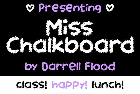
A decorative chalk display style that adds personality to a title. It suits wedding accents, party signs, and short phrases that need a friendly, hand-drawn feel.
Best for: Wedding accents, party signs, short phrases. By: Dadiomouse
9. Chalk Zone
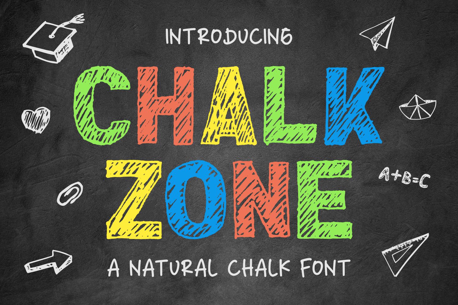
A chalk display style built for headlines. It suits banners, event titles, and sign headings where you want the type to draw attention.
Best for: Banners, event titles, sign headings. By: goodjavastudio
10. Chalk Notes
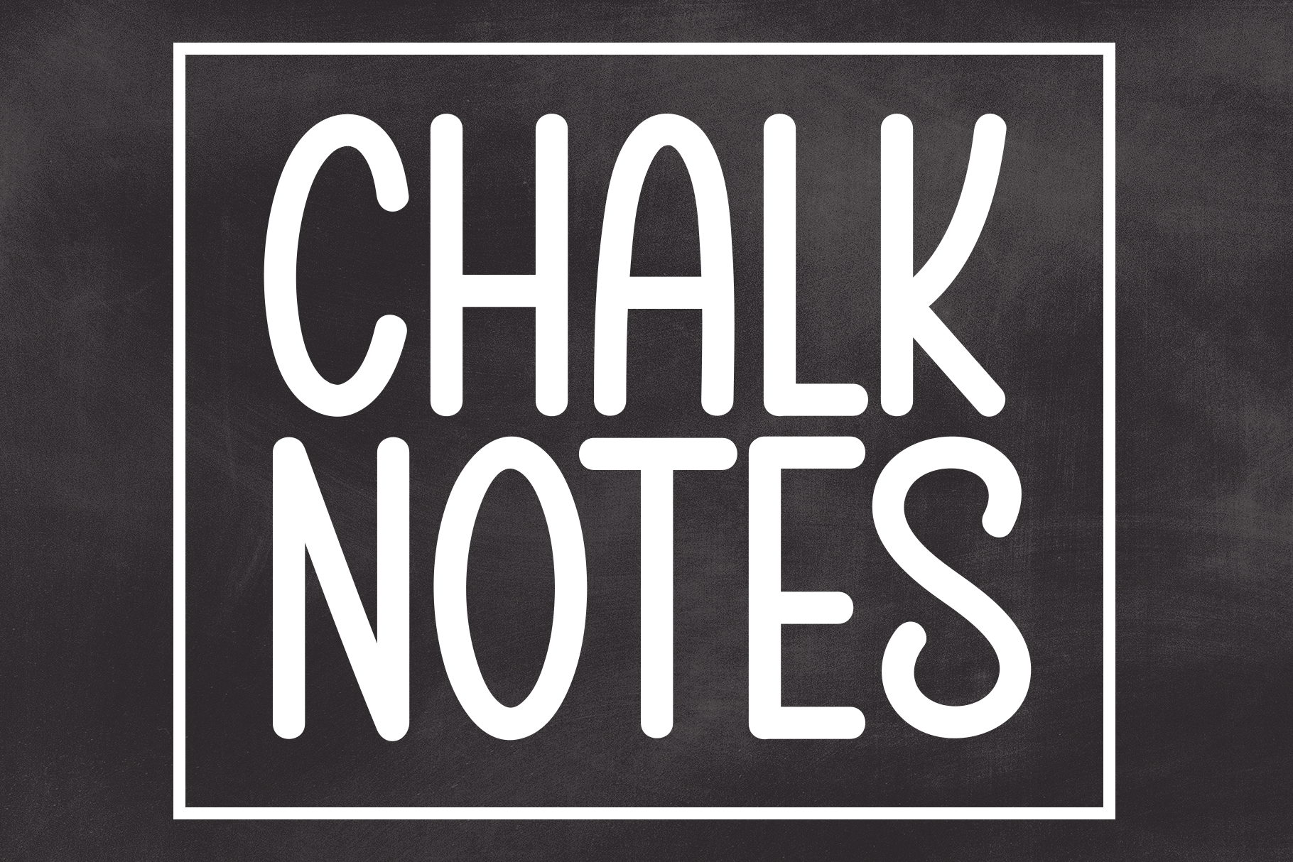
The name suggests a quick message jotted on a board. It suits classroom posters, schedule boards, and short menu notes with a friendly chalk look.
Best for: Classroom posters, schedule boards, menu notes. By: Robbots stores
11. Chalk Times
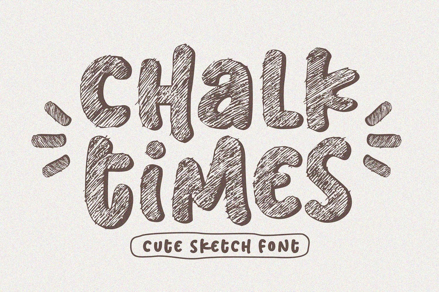
A serif-leaning chalk display style that pairs a classic type feel with a chalk theme. It suits vintage menus, event headings, and sign titles with a slightly formal tone.
Best for: Vintage menus, event headings, sign titles. By: Subectype
12. Chalk Dream
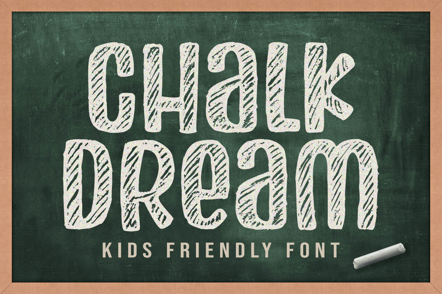
The name suggests a dreamy, whimsical mood, a natural match for romantic projects. It suits wedding accents, gift cards, and decorative headings.
Best for: Wedding accents, gift cards, decorative headings. By: Orenari
13. Chalk Perio
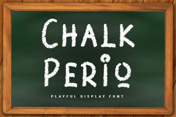
A decorative chalk display style that suits posters, event boards, and sign accents. Decorative faces like this work best used sparingly, as an accent.
Best for: Posters, event boards, sign accents. By: Prioritype
14. Two Chalk
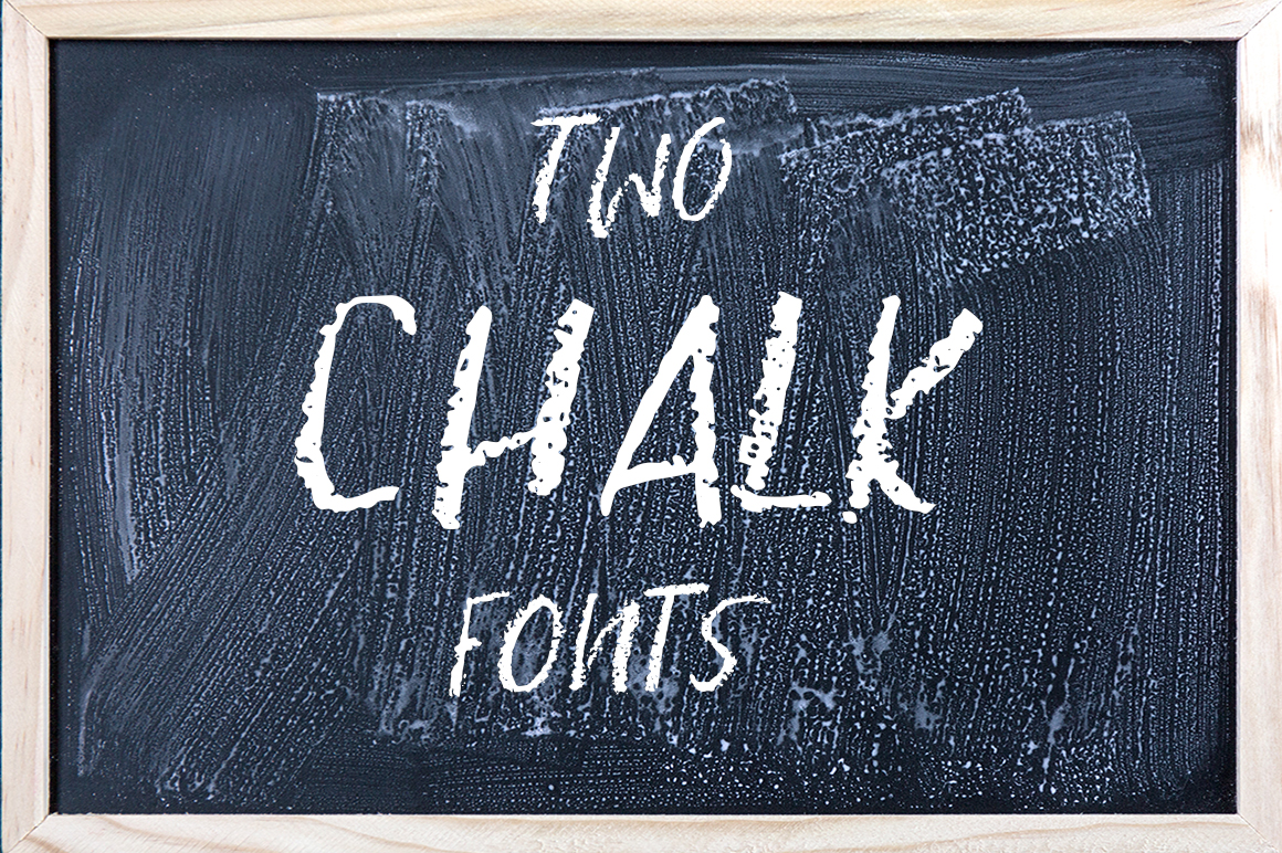
A playful chalk display style that adds character to creative headings and short phrases. It suits event signs, party boards, and decorative titles.
Best for: Event signs, party boards, decorative titles. By: Ana Babi
Best Vintage and Decorative Chalk Fonts
Vintage and decorative chalk fonts bring a retro, hand-crafted feel to a project. They suit wedding signs, greeting cards, vintage menus, and decorative boards where you want more personality than a plain chalk style provides. These often work best as accents, paired with a simple text font for the details.
15. Vintage Chalk
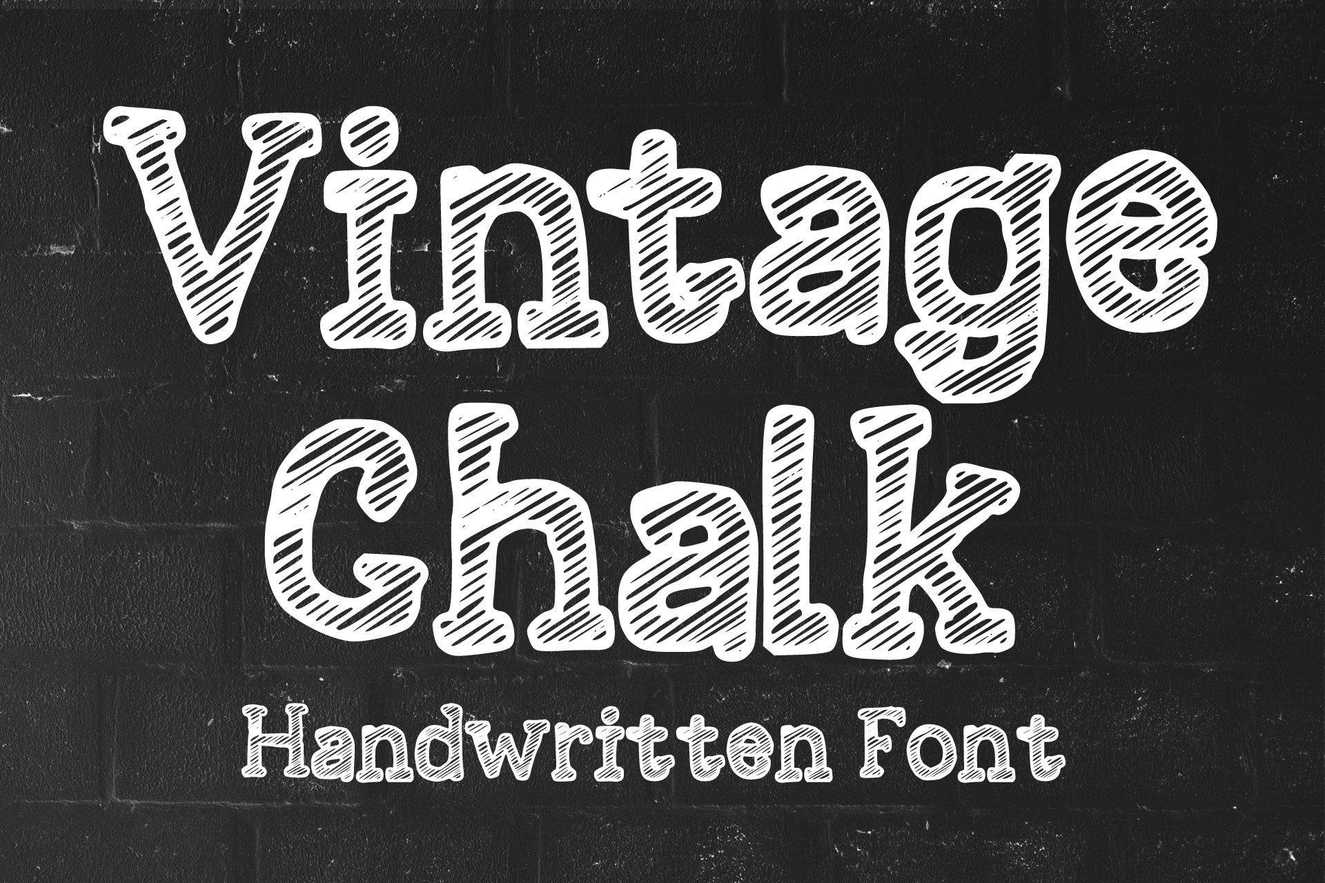
A vintage chalk font with a nostalgic angle. It suits retro menus, cafe boards, and event accents where you want a classic chalk look.
Best for: Retro menus, cafe boards, event accents. By: MVMET
16. Chalk and Eraser
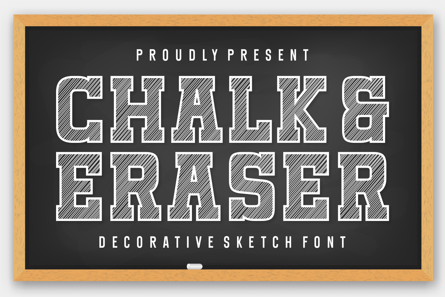
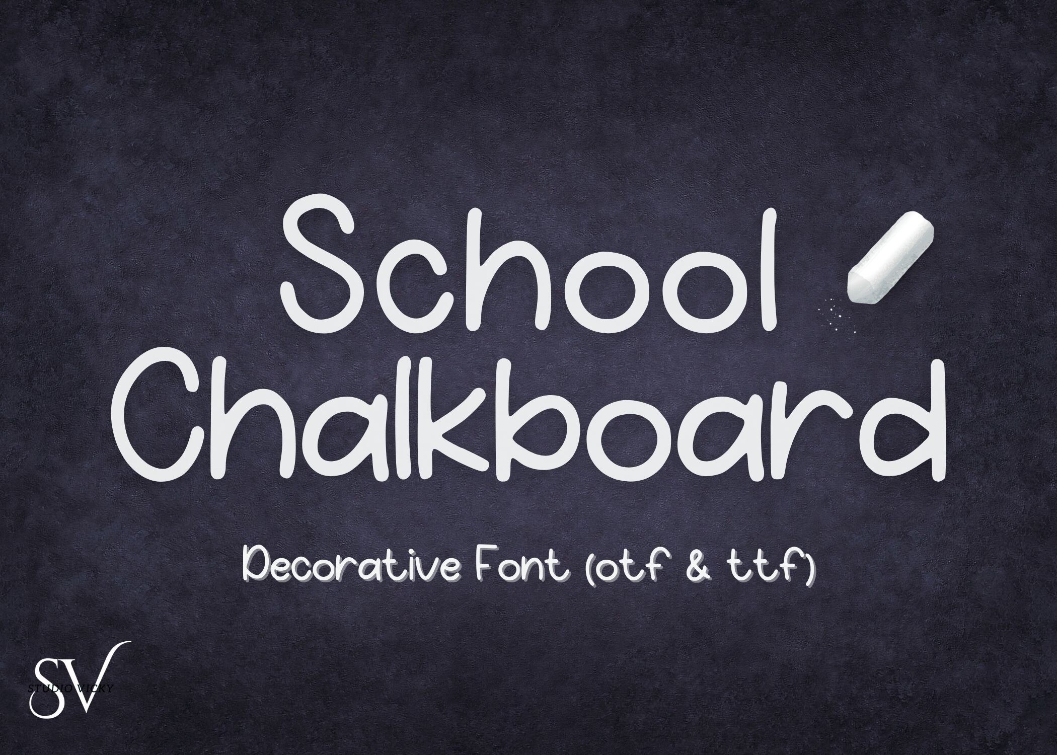
The name points to a playful, classroom-friendly feel. It suits school posters, casual event boards, and short headings.
Best for: School posters, casual event boards, short headings. By: Jasm (7NTypes)
17. Retro Chalkboard
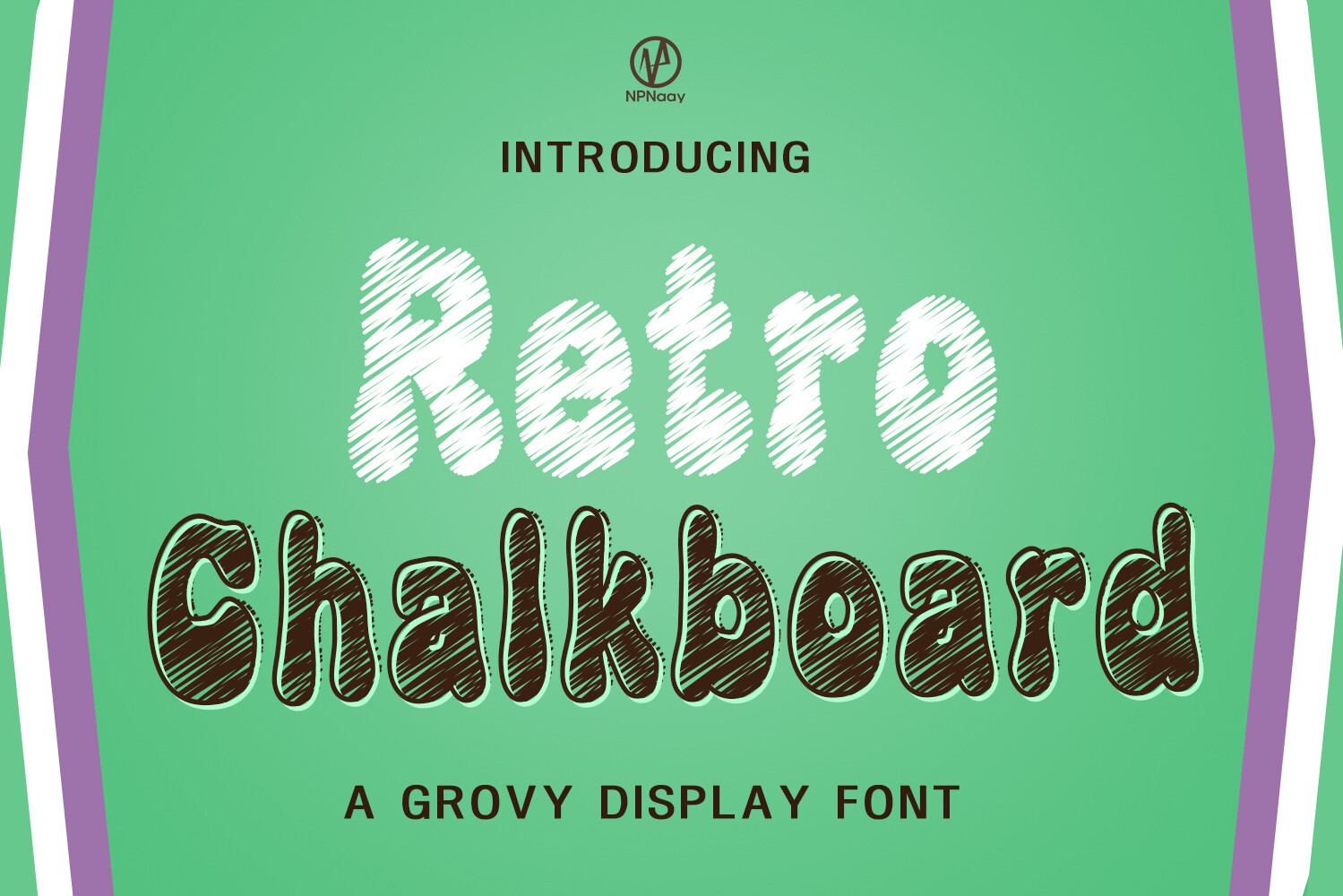
A retro take on the chalkboard look with a nostalgic feel. It suits vintage menus, shop signs, and decorative headings.
Best for: Vintage menus, shop signs, decorative headings. By: NPNaay
18. Chalk Brush
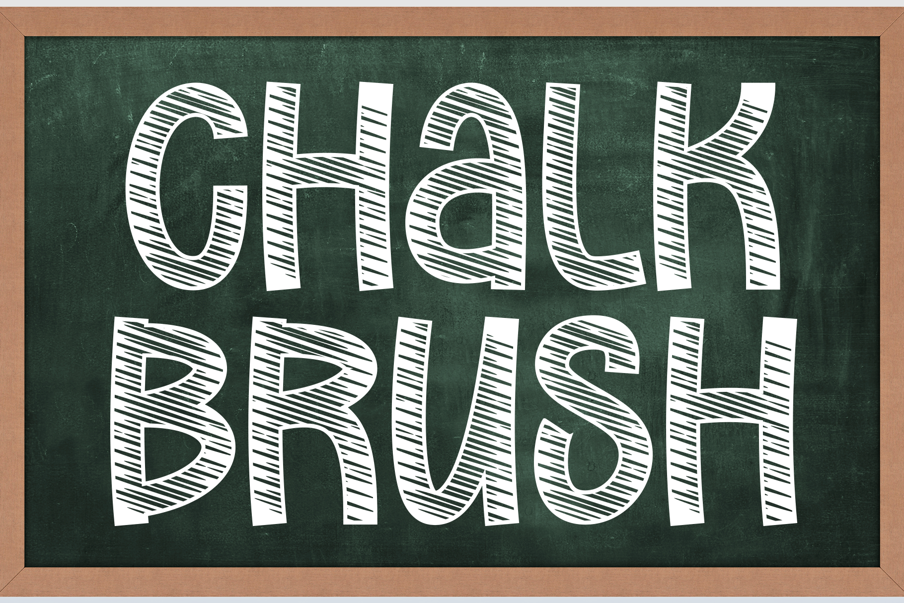
A brush-inspired chalk style that suits decorative titles and short display lines. It works for wedding accents, event boards, and sign headings.
Best for: Wedding accents, event boards, sign headings. By: Creativewhitee
19. Chalkboard by StringLabs
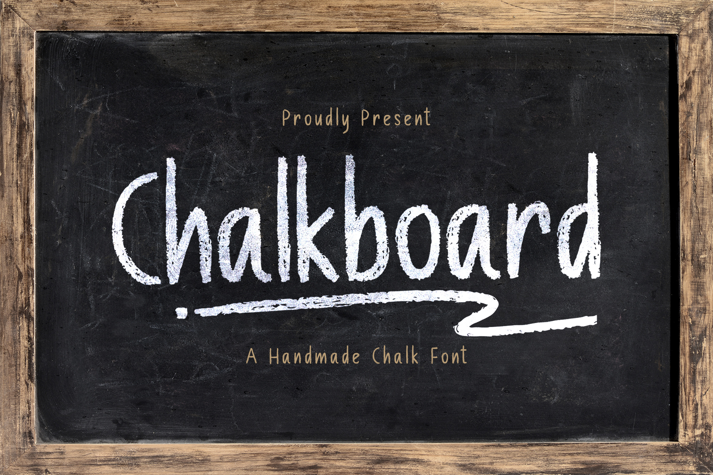
A chalkboard style for menus, event signs, and casual boards where you want a straightforward, friendly tone. Again, the designer name is the clearest way to find the right product page.
Best for: Menus, event signs, casual boards. By: StringLabs
Download Chalkboard by StringLabs
How to Use Chalkboard Fonts in Your Projects
Menus are probably the most common use case. Use a chalk style for dish names, section titles, and special offers. Then switch to a simple sans or serif for prices and descriptions. Build hierarchy through size and spacing, not by stacking more decorative fonts on top of each other.
For signs and A-frame boards, keep the message short and the type large. Chalkboard sign fonts work best when the text is light on a dark background, with enough contrast for people to read from a few steps away. If someone has to squint, the font is too thin or the size is too small.
Wedding projects are another strong fit. Chalkboard fonts for weddings can handle welcome signs, bar menus, seating charts, and schedule boards. A handwritten chalk font is especially useful for names, table numbers, and short romantic phrases. A cleaner font can carry the longer details like times and locations.
Classrooms and school materials benefit from chalkboard fonts too. Posters, schedules, and covers all look more inviting with a chalk style than with a standard sans. Are chalk-style fonts readable at small sizes? Some are, but many are not, which is why the readability check below matters for worksheets and printed handouts.
Commercial work is its own question. Are chalkboard fonts good for commercial use? That depends entirely on the license attached to each product, so confirm it on the product page before you put a font on a client menu, an Etsy listing, or merchandise.
Pairing tip: Choose one chalkboard font for the headline or accent, then add a plain sans or restrained serif for body text. If you are not sure what font pairs well with a chalkboard font, start with a neutral sans. Two or three typefaces maximum.
Readability check: Strong chalk texture can look great in a large heading, but it may turn into noise at small sizes or in print. Always test the type at the real size you plan to use. Menu prices, seating names, and small sign details are where chalk fonts tend to break down.
For software, chalkboard fonts for Canva and chalkboard fonts for Cricut generally work once the font is installed on your system. After installing the font file, restart Canva, Photoshop, Illustrator, Procreate, or Cricut Design Space so the app can pick up the new font. For Cricut projects, simpler solid stroke styles tend to cut more cleanly than very rough, speckled textures, so a small test cut before the real project is a good idea.
Tips for Choosing the Right Chalkboard Font
Choosing the right chalkboard font is less about the name and more about the project mood. A farmhouse cafe, a retro shop, a wedding, and a classroom all call for different chalk styles. Look at the preview in context, not just in a large sample, and ask whether the letterforms stay clear when the text gets smaller.
Licensing is the other big factor. Some chalk fonts are for personal use only, while others allow commercial use. If you plan to sell the work, use it for client menus, create Etsy products, make merchandise, or build a brand, check the license on the product page before you download or publish. This is where people get caught off guard, so it is worth the extra minute.
Compatibility is usually straightforward. Fonts in OTF or TTF format typically work in Canva, Illustrator, and Cricut Design Space after you install them, but check the product page for the file formats included.
Finally, choose by mood, not by label. Several chalkboard fonts share simple names, so the designer name is often the clearest way to tell them apart. Fonts that share a name can look very different. Judge the style, texture, and letterforms first, and let the name be the last thing you check.
Where to Download Chalkboard Fonts
Creative Fabrica is the main source for the chalkboard fonts in this list. Each entry above links to the specific product page, where you can preview the style and check the license before downloading.
If you are looking for more options, Google Fonts, DaFont, and Font Squirrel can also be useful places to browse. Just check the license before using a font in a client project, a product you sell, or a brand identity.
The best chalkboard font is the one that fits your project, not the one with the flashiest name. Start with the style group that matches your mood, test the type at real size, and keep the layout simple. A warm chalk heading, a clean supporting font, and a little contrast will make menus, signs, and wedding boards feel handmade without becoming hard to read. For more font ideas and practical typography guides, visit the FontPro blog.