· fonts · 10 min read
17 Best Fonts for Funeral Slideshow in 2026
Seventeen Creative Fabrica fonts for a funeral slideshow, grouped by serif, script, and sans-serif style, with notes on on-screen readability and licensing.
What Makes a Great Font for a Funeral Slideshow?
A funeral slideshow moves through time. Mourners cannot rewind to re-read a line, so the font has to be legible at a glance, whether someone is sitting in the back row of a hall or watching a live stream on a phone.
Three properties matter most here. On-screen readability comes first: a moderate weight, clear contrast, and stroke thickness that survives video compression keep letters from flickering or vanishing on a projector. A clear hierarchy comes second. The name, dates, and captions need distinct sizes and weights so the eye knows what to read first. Third, the tone should match the service, whether that is traditional, reflective, or a celebration of life.
This differs from print in a meaningful way. A printed program can be held and re-read. A slideshow cannot. Text often sits over photographs, and the screen itself changes how letters render compared to paper.
A note on this list: no font here is positioned by Creative Fabrica for funeral, memorial, or slideshow use. These are general serif, script, and sans-serif typefaces, many aimed at luxury branding, packaging, editorial layouts, or film titles. They are not made for mourning materials.
Planning the On-Screen Text First
Before choosing a font, map the words. A title card carries the name, dates, and one short line. Captions over photos should be rare and brief. A quote or poem gets its own frame. A final card offers a simple thank you.
Timing is critical. Text must stay on screen long enough for the room to read every word. Keep word count low per frame, then test by reading the line aloud and adding a pause. As a general guideline only, tribute slideshows often run about five to ten minutes with roughly 25 to 40 photos, though lengths vary widely.
Contrast over photos is a common problem. A dark gradient or semi-transparent panel behind the text, placed in a calm area of the frame and away from faces, improves legibility. Leave safe margins so a projector does not crop the edges.
Two fonts are usually enough: one for the title and name, one for captions and dates. A script works only for a name or a short line, never for dates or body text. Familiar families like Garamond, Baskerville, or Palatino suit traditional tones, while Montserrat or Lato feel contemporary.
17 Best Fonts for Funeral Slideshow
This list is grouped by type: serif for titles and name cards, script for short dedications, and sans-serif for captions and dates. Each entry notes the style, a suggested role, and a practical tip. Suitability is a judgment, not a fact.
Best Serif Fonts for Titles and Name Cards
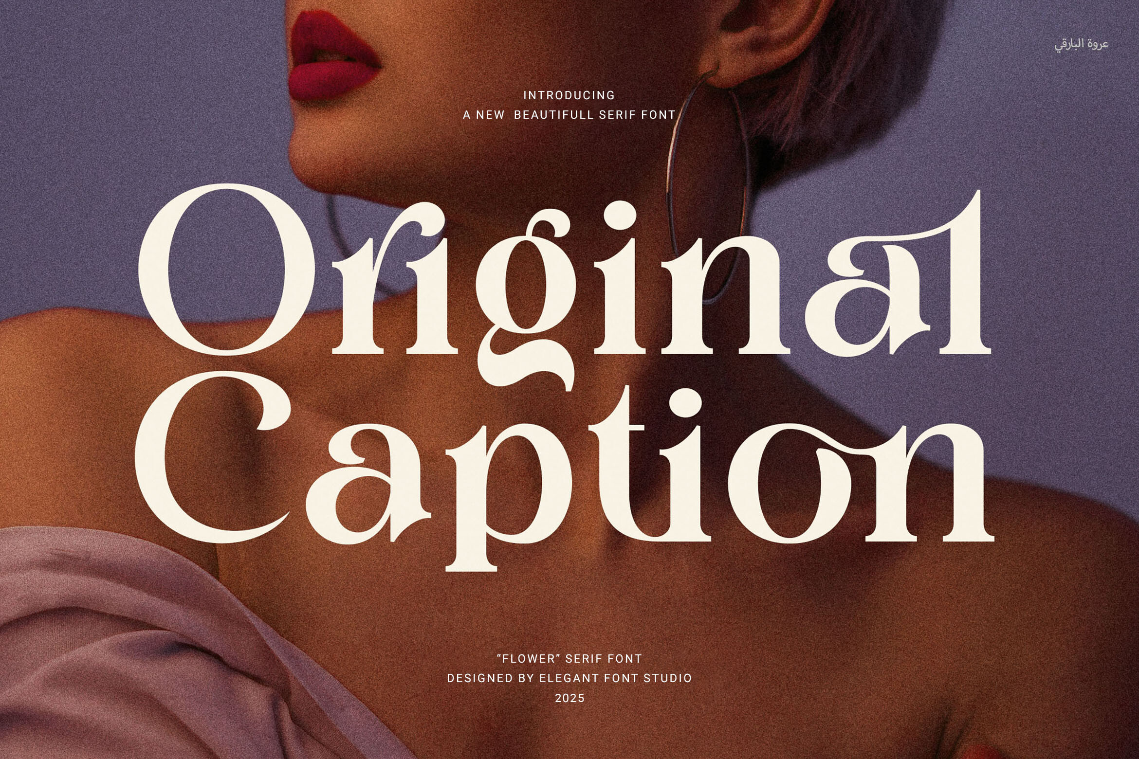
1. Original Caption
Original Caption is an elegant serif with a clean finish. Functional ligatures and smooth letter spacing support legibility. The page targets logos, headlines, editorial layouts, and social visuals, and does not mention slideshows. Its tidy spacing could suit a title card, and the ligatures may help letters stay connected on screen.
Best for: title cards, name displays, short dedications. By: Creative Fabrica
2. Time Craft
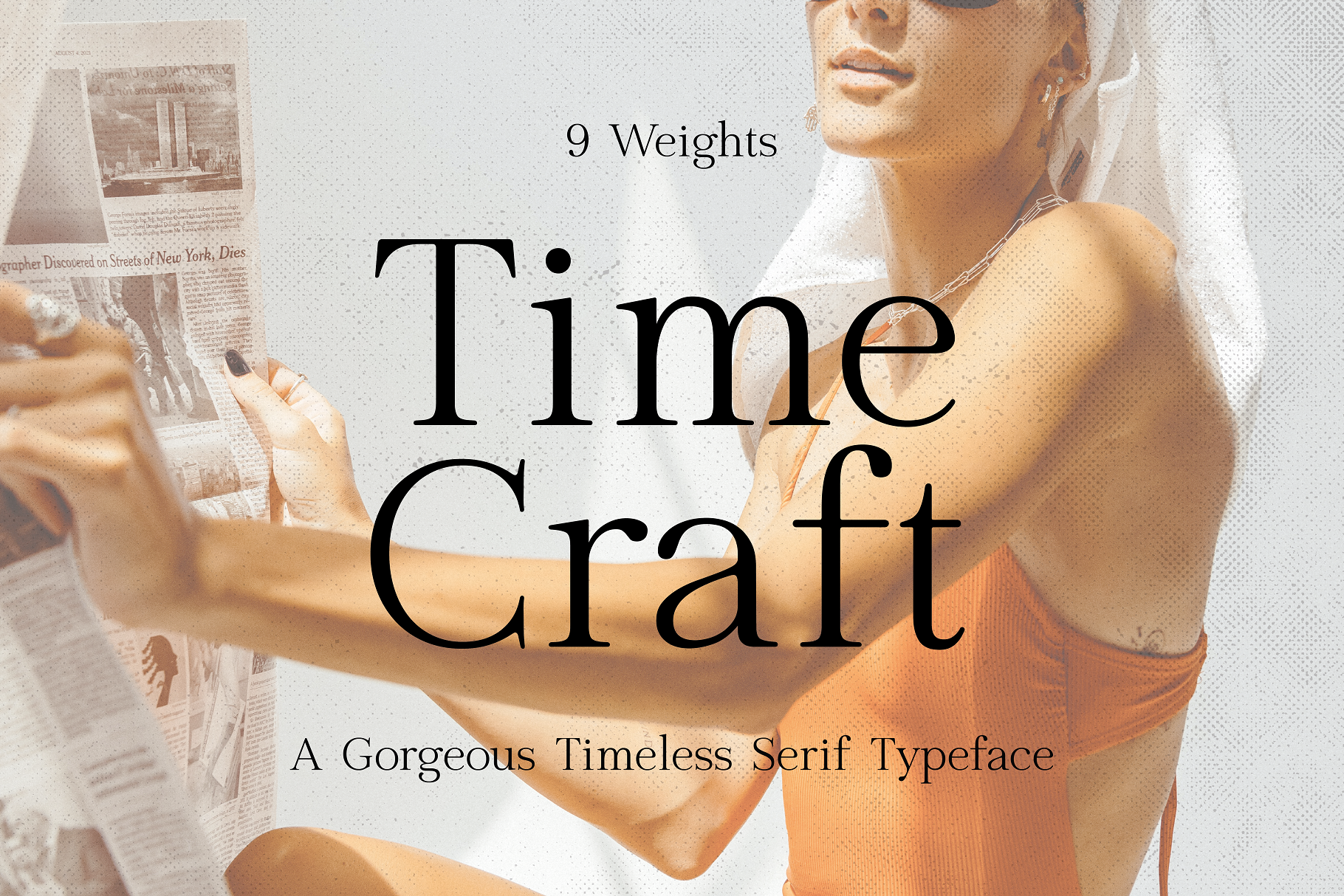
Time Craft is a refined serif with balanced proportions, pitched at headlines and luxury branding. It is subscription-only. The even letterforms could work for a name card where calm, even spacing matters. Test it on a large screen to confirm the proportions hold.
Best for: name cards, title lines. By: Creative Fabrica
3. Moniko
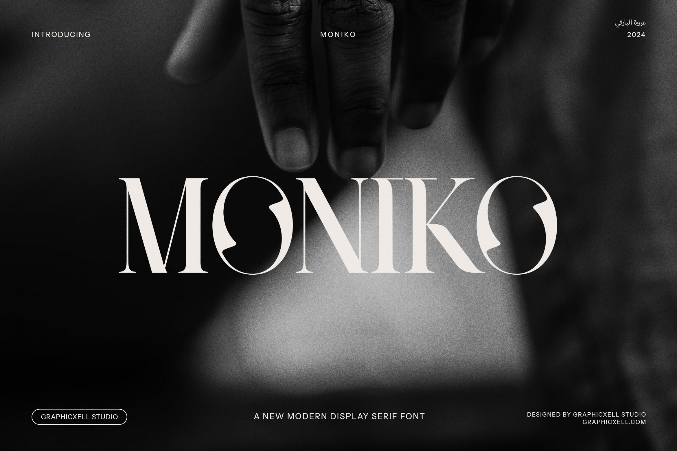
Moniko is an elegant serif with vintage-inspired detailing, aimed at luxury branding and packaging, and it is subscription-only. The vintage character may suit a traditional or reflective tone, though the commercial positioning means the mood should be checked against the service. Worth testing for a name card.
Best for: name cards, traditional tone. By: Creative Fabrica
4. Celgin
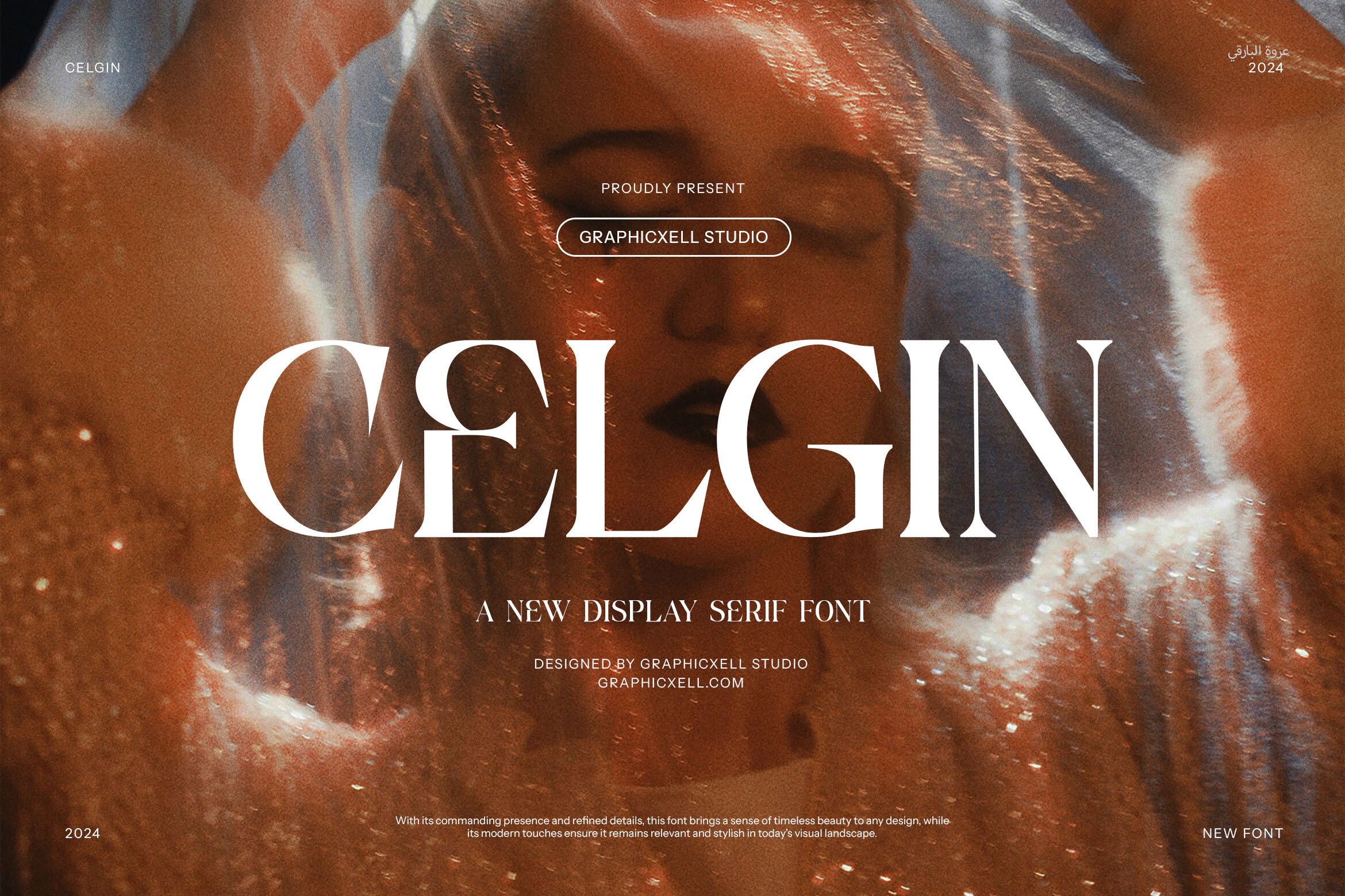
Celgin is a vintage serif with soft curves and sharp edges, used for invitations, posters, and branding. The soft curves could give a gentle feel to a title, while the sharp edges are worth checking after video compression, since fine strokes can thin on screen. Test on a projector before the service.
Best for: title cards, invitation-style titles. By: Creative Fabrica
5. Thoca
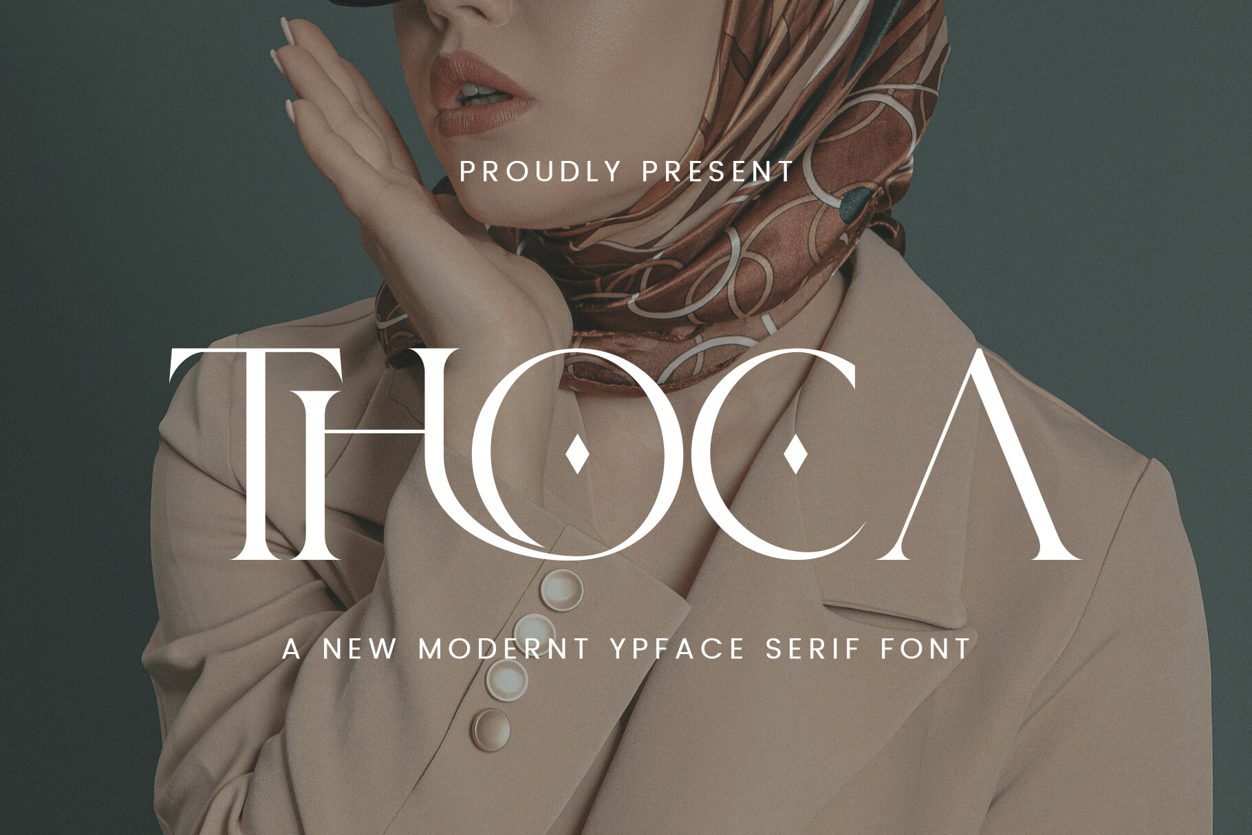
Thoca is a serif blending vintage and contemporary styling, and it is subscription-based. Details are limited, so review the preview carefully. It may offer a middle ground between classic and modern for a title.
Best for: title cards. By: Creative Fabrica
6. Magich
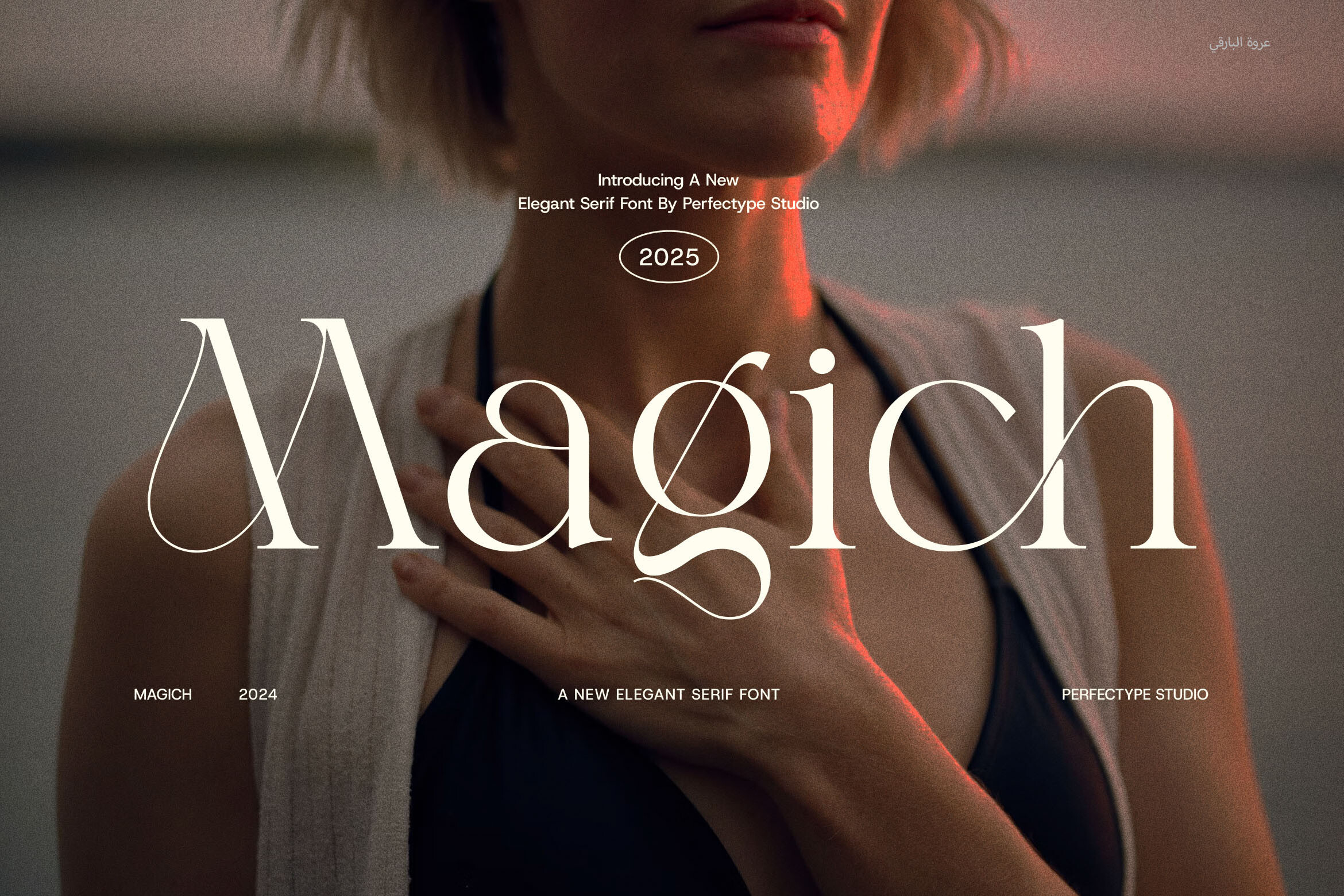
Magich is a serif for luxury packaging and editorial work, with sharp serifs, smooth curves, ligatures, and stylistic alternates. The sharp serifs are worth checking on screen, as fine points can soften in compression. It could suit a formal title card.
Best for: formal titles, name cards. By: Creative Fabrica
7. Flogst
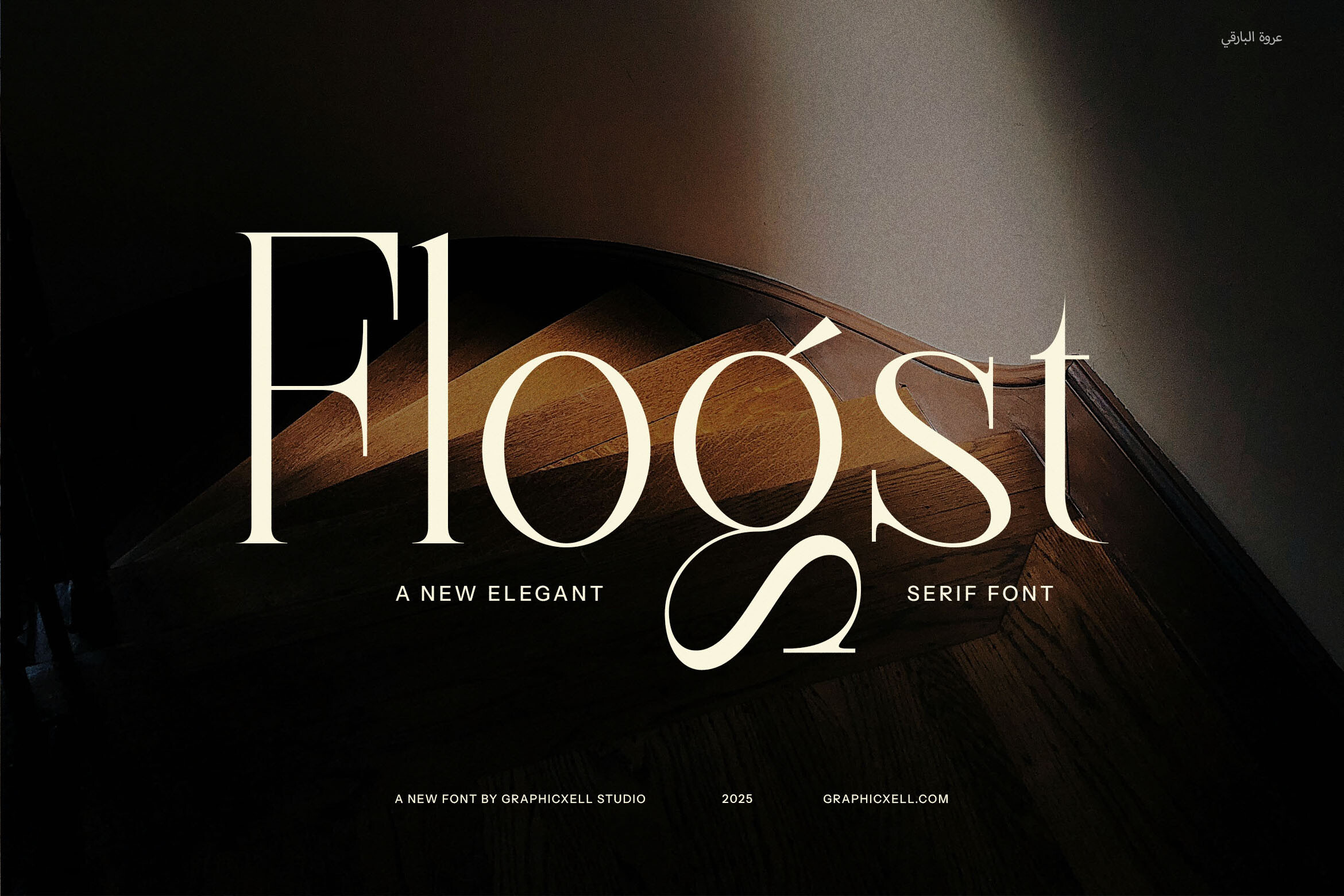
Flogst is suited to elegant magazine headlines, with ligatures and stylish alternates that give a fluid feel. Details are limited. The fluid character may suit a short, expressive line rather than dense captions.
Best for: short lines, headings. By: Creative Fabrica
8. Nauget
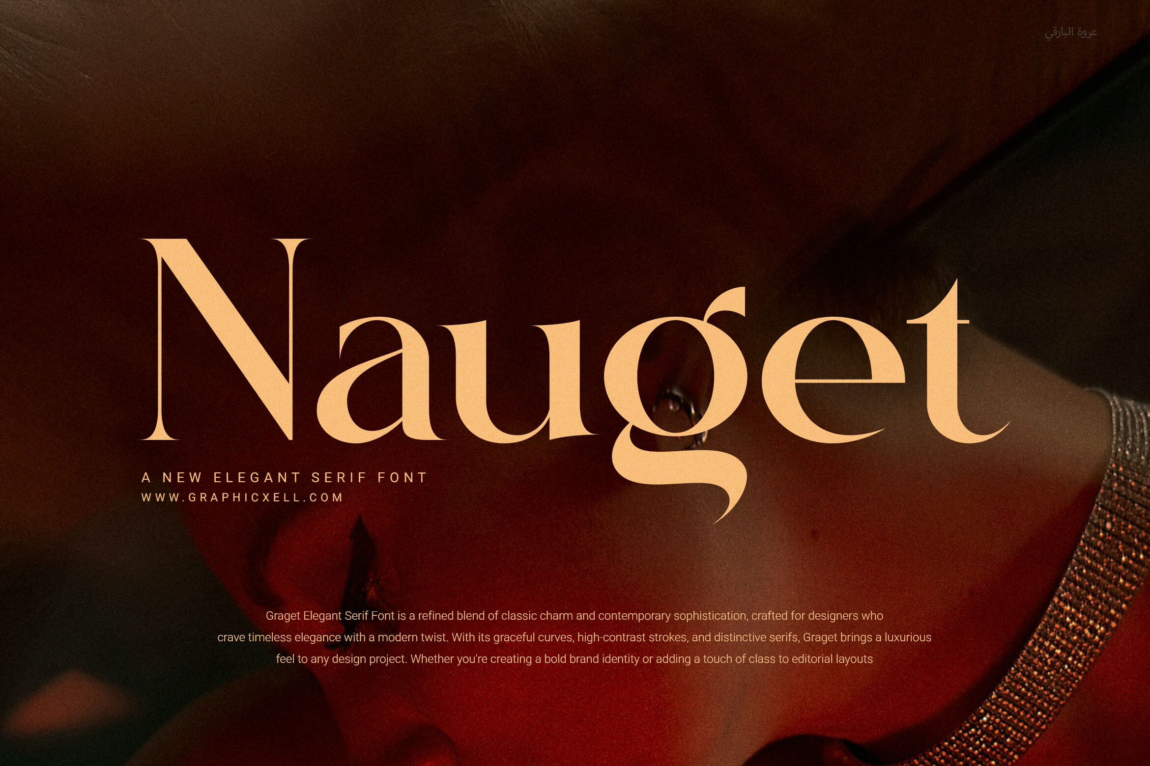
Nauget is positioned as bold enough for titles yet clean enough for longer text. This makes it a candidate to handle both a title and captions in one family, simplifying the pairing. The range could reduce the need for a second font.
Best for: titles plus captions, one-family use. By: Creative Fabrica
9. Aostora
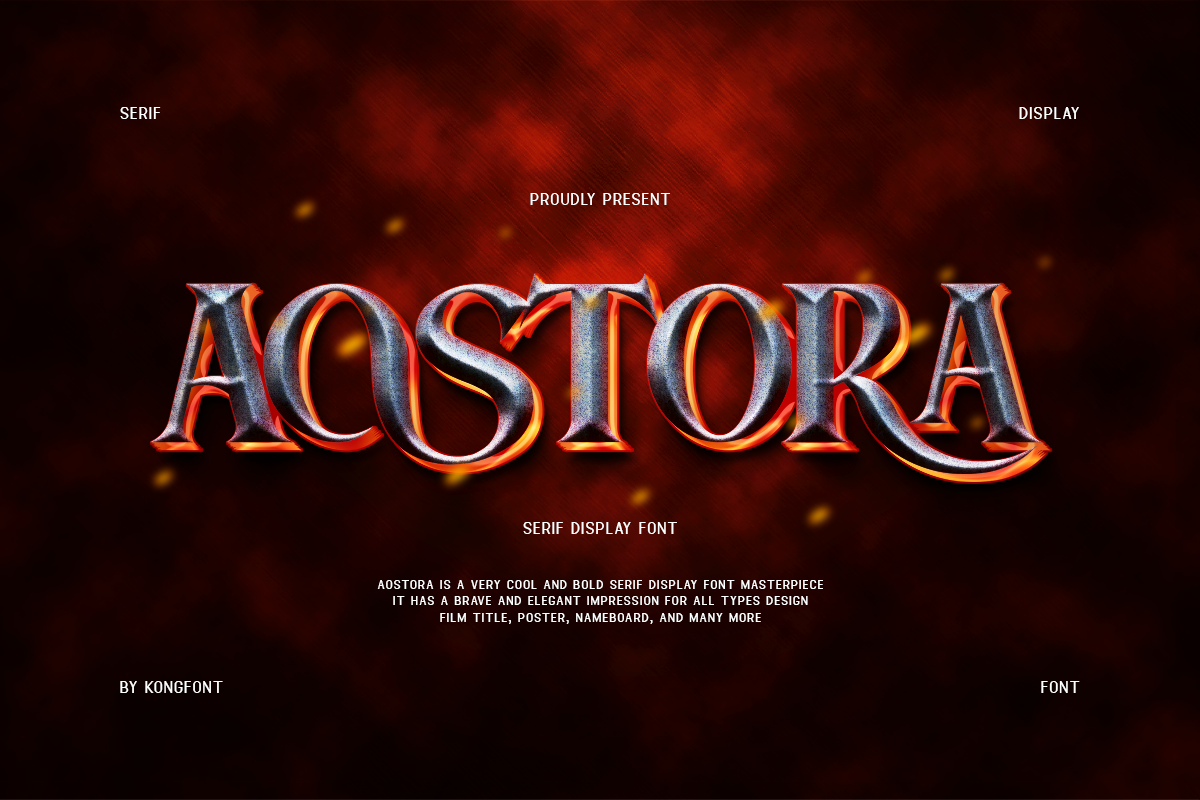
Aostora is a serif film font pairing classic serif shapes with a cinematic feel, pitched at vintage movie titles and posters, and it is subscription-only. The cinematic tone leans toward a film credit rather than a service, though it may fit a celebration of life. Worth testing for that context.
Best for: celebration of life, title card. By: Creative Fabrica
10. Dramatize
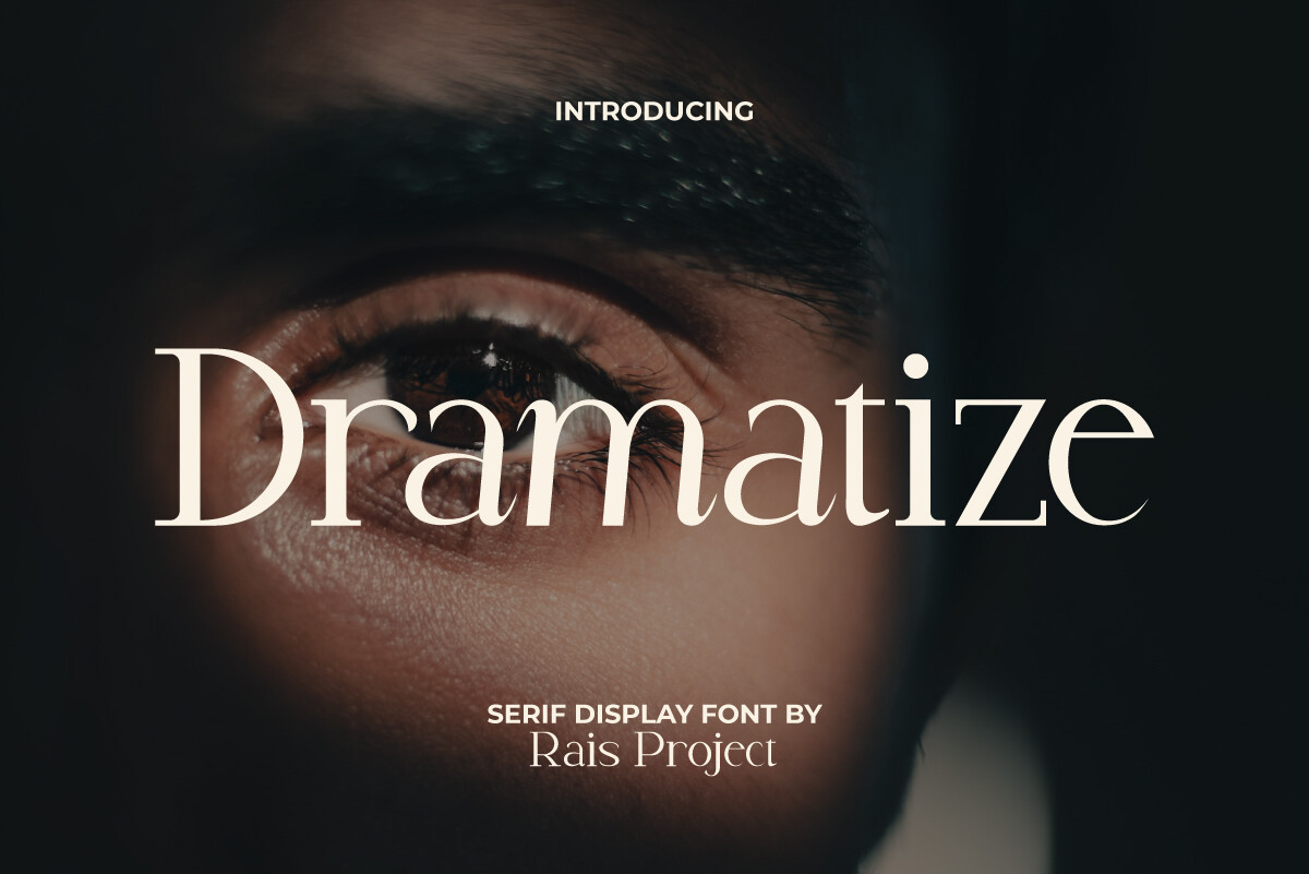
Dramatize is a modern serif display font giving a film-like, dramatic title impression. The dramatic tone should be checked against the service, as it reads more like a title than body text. It could work for a single title frame only.
Best for: single title frame. By: Creative Fabrica
Best Script Fonts for Short Dedications and Quotes
11. Notebooked
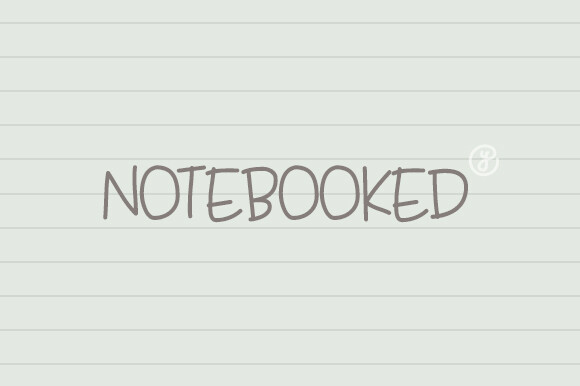
Notebooked is a script with soft, flowing lines and slight imperfections, aimed at love letters and memory-driven projects. This makes it the closest in this list to a memorial use. It could suit a short dedication line. Do not set long captions in a script on screen, as legibility drops.
Best for: short dedications, quote lines. By: Creative Fabrica
12. Grateful Easter
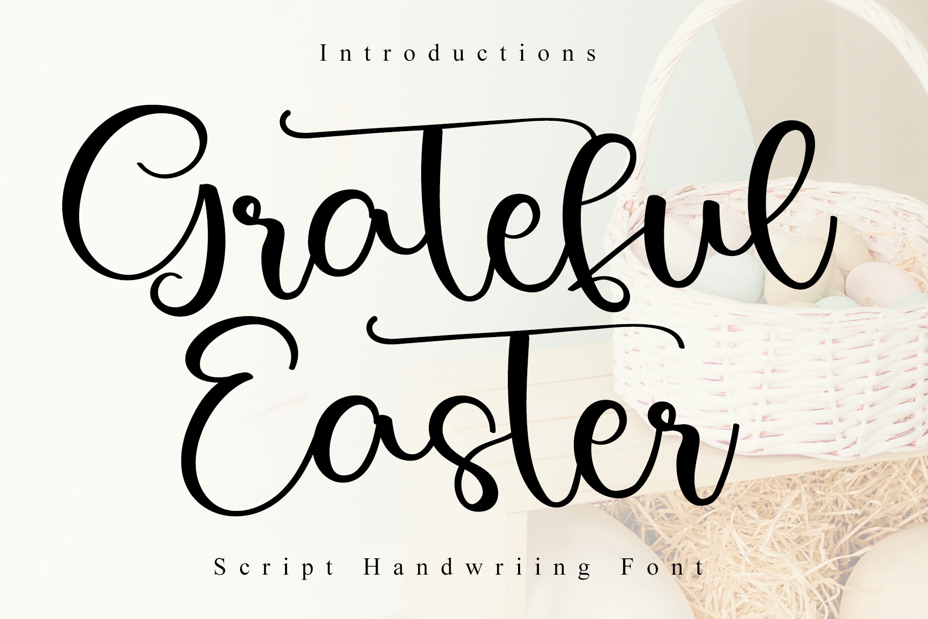
Grateful Easter is a handwritten script combining vintage elegance with heartwarming character, with delicate flourishes and natural variations, for sentimental stationery, and it is subscription-only. The name refers to Easter, which does not describe the style itself. The delicate flourishes are worth checking on video, as fine lines can thin. It may suit a short, warm line.
Best for: short warm lines. By: Creative Fabrica
13. False Memory
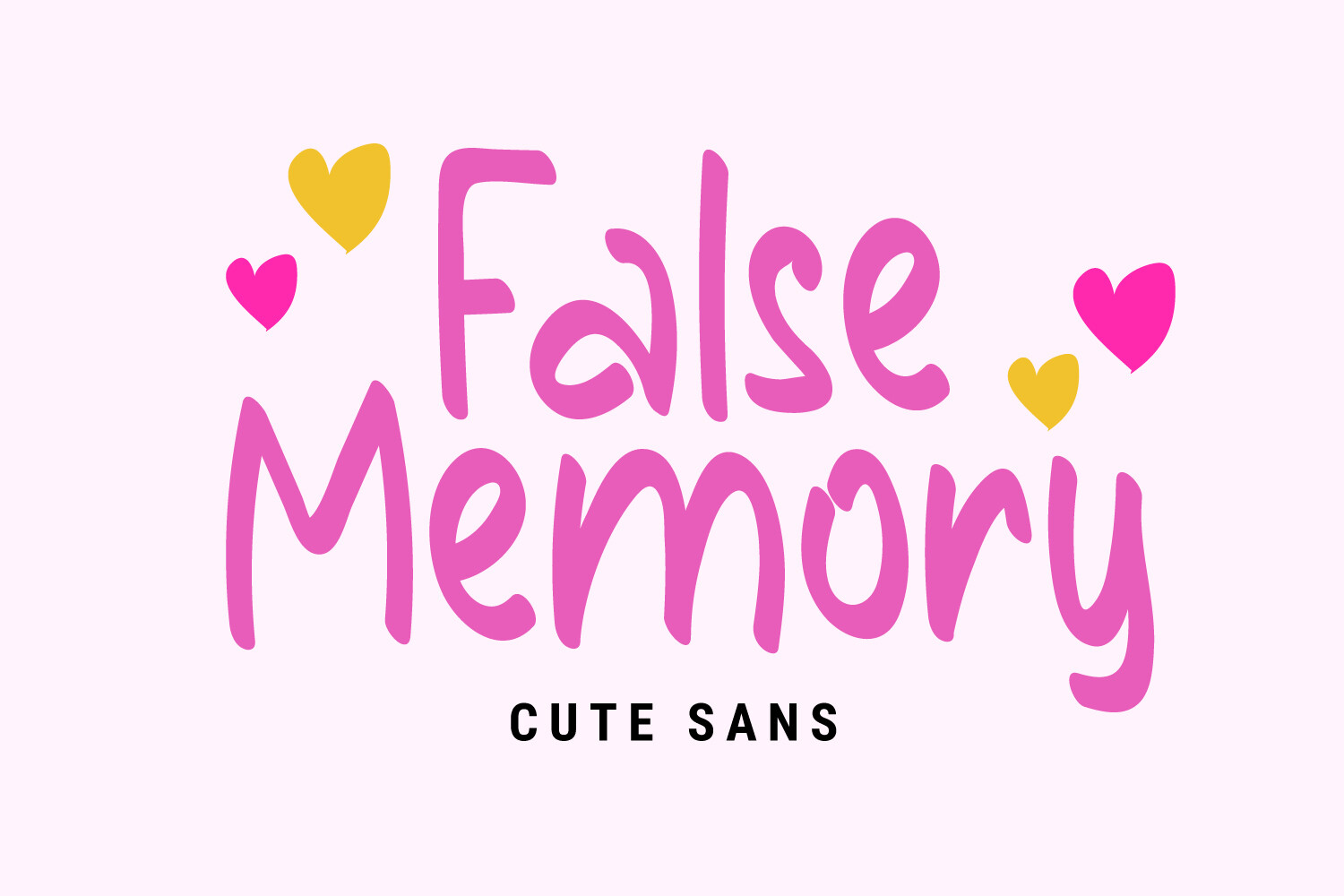
False Memory is a charming, endearing handwritten display font aimed at wedding invitations and heartfelt notes. Its character is playful rather than solemn. It may fit a celebration of life slideshow more than a traditional service. Use it for a name or a single line only.
Best for: celebration of life, name line. By: Creative Fabrica
Best Sans-Serif Fonts for Captions and Dates
14. Viscomo
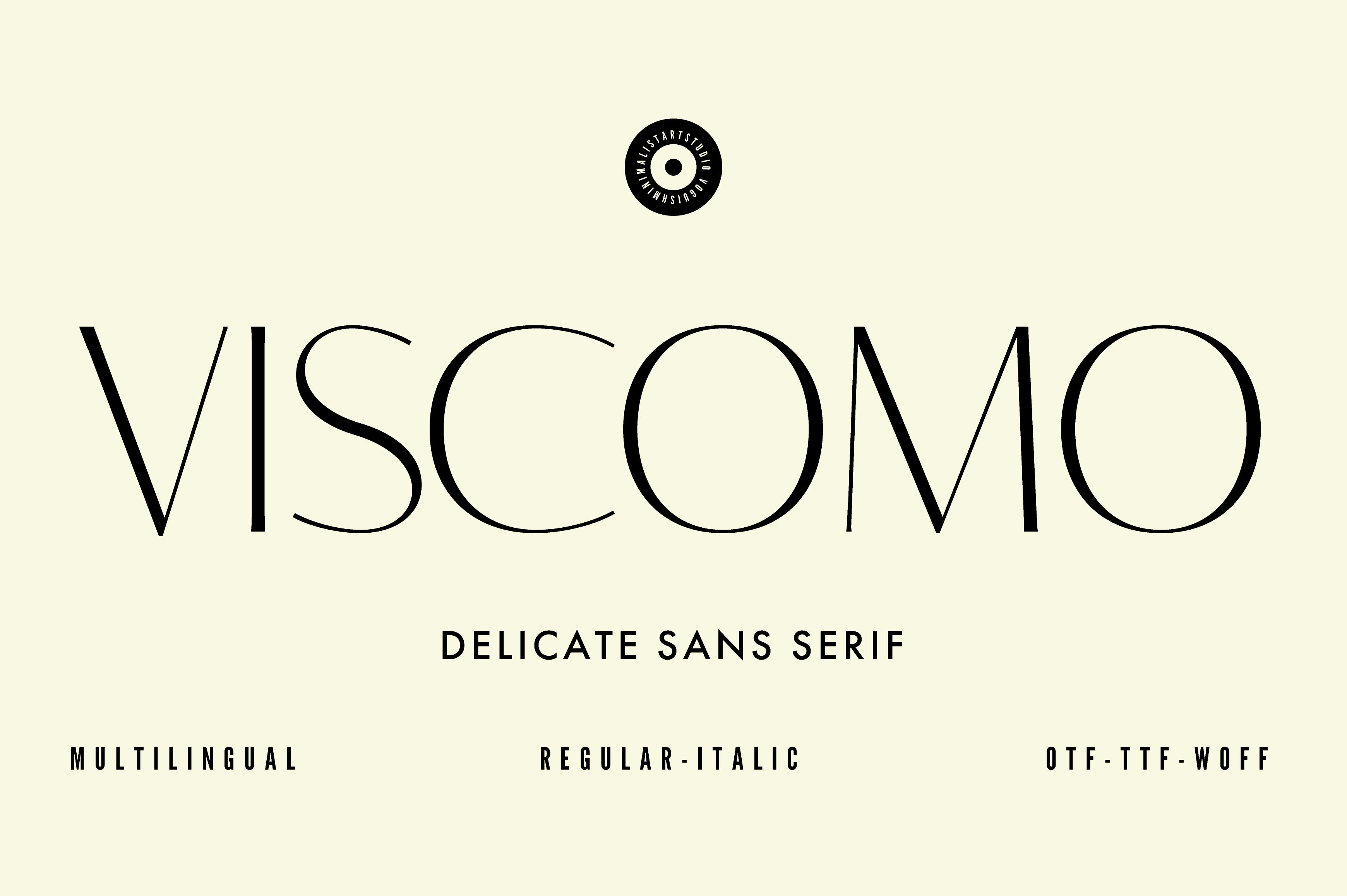
Viscomo is a minimalist, modern sans serif whose readability is presented as ensuring clear communication. The clean forms could suit captions and dates, where clarity is the priority. A simple sans keeps the lower text from competing with the title.
Best for: captions, dates. By: Creative Fabrica
15. Moderan
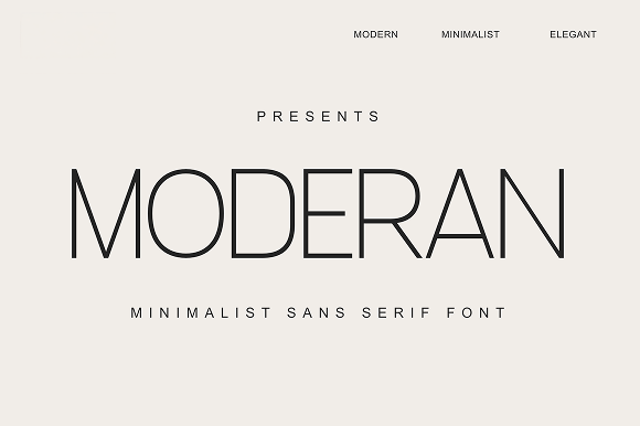
Moderan is a minimalist sans serif with Regular and Italic styles, offering modern elegance with effortless simplicity. The Italic style could serve a quote or a softer caption line. The two styles allow a light hierarchy within one family.
Best for: captions, quotes. By: Creative Fabrica
16. Codex
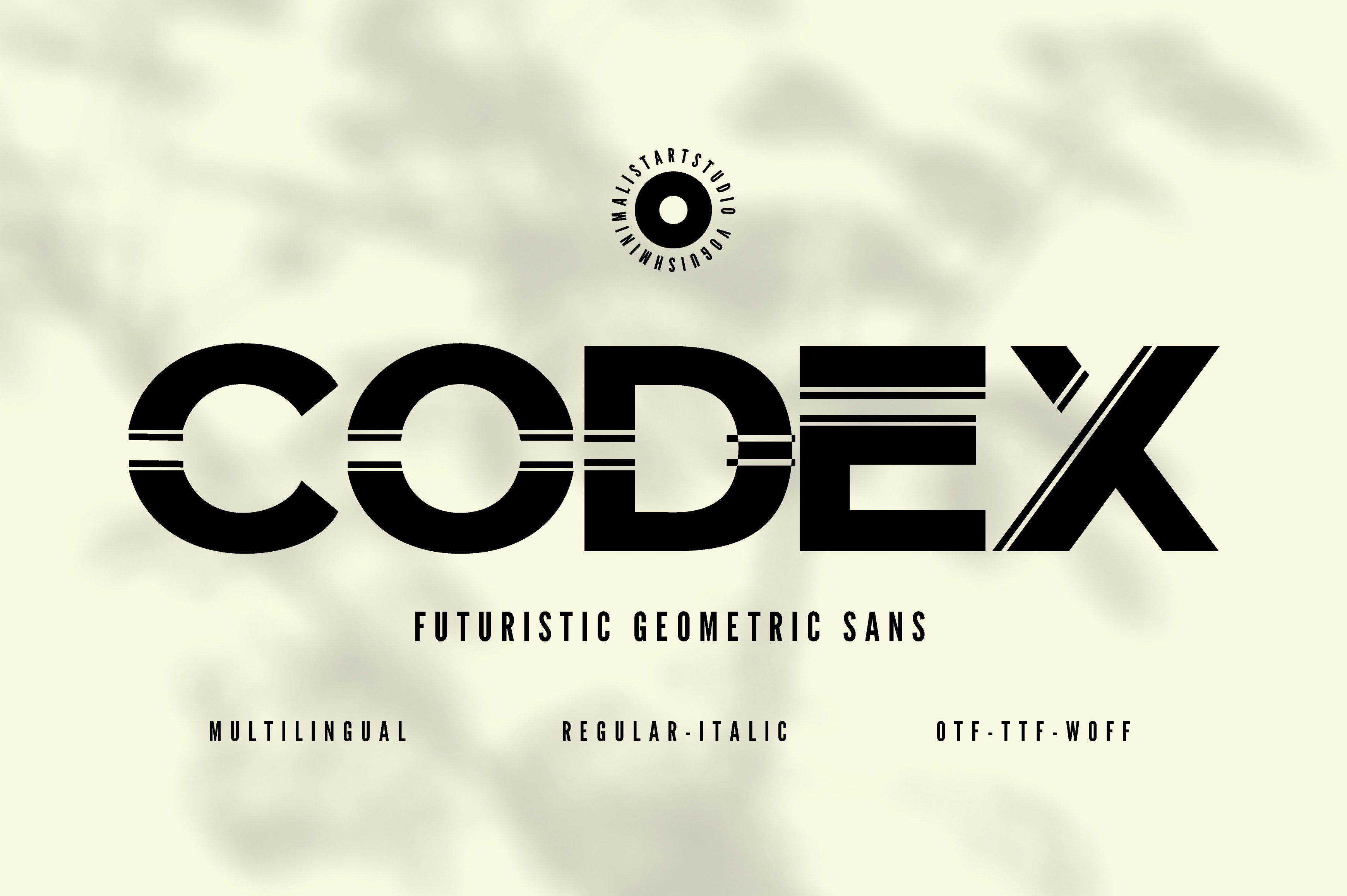
Codex is a geometric minimalist sans serif that is easy to read at headline and body sizes, with 600+ glyphs, multiple weights, and alternates. The weight range supports a clear hierarchy, and the body-size readability makes it a strong candidate for captions and dates. It could pair with a serif title.
Best for: captions, dates, hierarchy. By: Creative Fabrica
17. Dernn
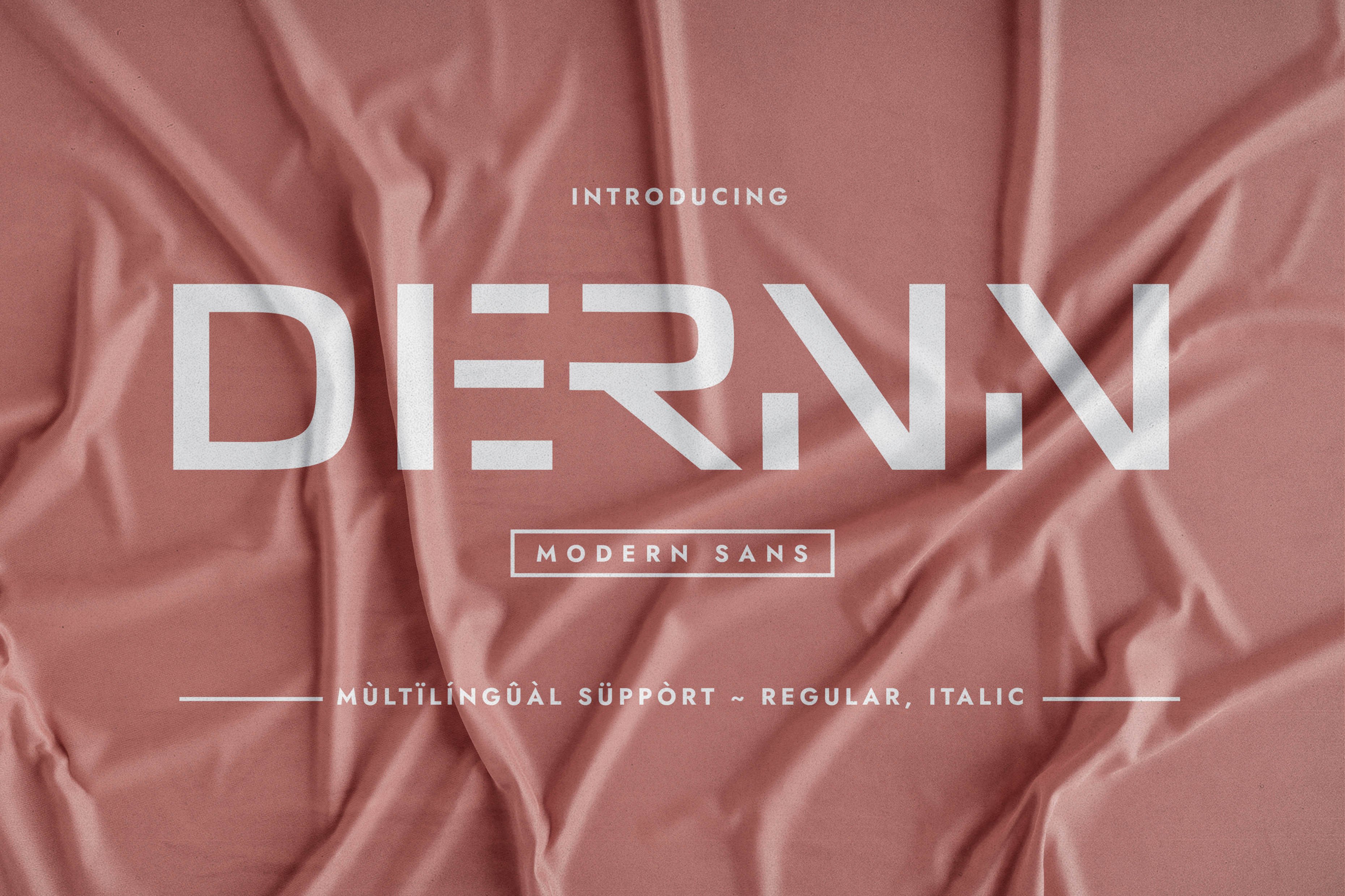
Dernn is a modern, simple, clean, minimalistic sans serif, and the listing leans toward display and poster use. That makes it better for large lines than for long captions. It could work for a bold, single-line statement rather than dense text.
Best for: large lines, single statements. By: Creative Fabrica
How to Set Text in a Funeral Slideshow
Size is driven by distance. The name should be the largest element, dates smaller, and a memory line smaller still. Check the layout on the actual screen or projector from the back row before the service.
For contrast over photos, use a dark gradient or a semi-transparent panel, and place light text on a dark area. Avoid putting thin strokes or flourishes over a busy background.
Keep movement gentle. A slow fade in and out is calmer than sharp effects, and letters should not be animated one by one. Give the viewer time to read.
Pair one font for titles and one for captions, rarely three. Add line spacing between lines and a little tracking for large capitals, and do not stretch a font artificially.
In PowerPoint or Google Slides, confirm the font is installed on the playback computer, or export to a video or PDF. In Canva, CapCut, iMovie, Premiere Pro, or DaVinci Resolve, verify the font is available in the editing and playback environment. Export to MP4 or MOV and review on the venue screen. Have a second person check names and dates for typos, and keep a backup copy on a USB drive.
How to Choose the Right Font for Your Slideshow
Match the font to the situation. A traditional service often suits a serif for the name with a calm delivery. A celebration of life may allow a softer script or a cinematic serif. An online stream on a small screen benefits from a simple, larger sans-serif. A short tribute with quotes can pair a serif title with a clean caption font.
On licensing: five of these fonts are confirmed subscription-only, Time Craft, Moniko, Thoca, Aostora, and Grateful Easter. The rest have no stated status, so check the product page. For video, live streams, or public posts, review the commercial use and video terms. Free fonts in this list are not confirmed.
For fonts with limited details, open the page and preview the name, dates, and a line such as In loving memory before buying.
A few practical questions come up often. There is no single best font, but a readable serif for the name and a clean sans-serif for captions is a reasonable starting point. Whether to use serif or sans-serif depends on the tone, but a serif name with sans-serif captions is a common starting point. Text should stay on screen long enough to read, so keep lines short. To make text readable over photos, add a dark gradient or panel and avoid thin strokes. A script can be used for the name or a short line, but not for dates. And these fonts are not confirmed free for commercial use, so check each page.
Where to Download Fonts for a Funeral Slideshow
Creative Fabrica is the primary source for the fonts above. Five of them are subscription-only or subscription-based, as noted in the licensing section. For additional options, Google Fonts, DaFont, and Font Squirrel are mentioned here by name only as additional sources of free typefaces. For more typography guidance, visit the FontPro blog.