· fonts · 11 min read
14 Best Decorative Fonts for Invitations, Branding, and Headlines in 2026
A hand-picked guide to decorative fonts, from ornate serifs and Victorian swashes to floral and gothic display styles, with tips on where each style works best.
You know that moment when a plain invitation just sits there, looking like a form letter, and you need it to feel like something special? That is where decorative fonts earn their place. They are display faces for short, high impact text, where ornament, swirls, and expressive letterforms set the mood before anyone reads the words. This guide covers decorative fonts for invitations, branding, labels, and headlines, grouped by style so you can match the typeface to the project in front of you.
What Are Decorative Fonts and When Should You Use Them?
Decorative fonts are expressive display fonts that use ornament, swashes, flourishes, or unusual letter shapes to create a strong visual personality. They work best in short phrases, titles, logos, labels, invitations, posters, covers, and packaging. The point is to give the most important words a memorable shape, not to replace every line of text.
Think of them as the accent in a design. A decorative display font can make a wedding invitation feel ceremonial, a craft label feel handmade, or a brand mark feel distinctive. But that same strength is the limit. When the letterforms are busy, long paragraphs become hard to read, especially at small sizes.
When choosing from the best decorative fonts, start with the mood you need. A flourish font may suit a romantic event, while a gothic decorative font may fit a game poster or dark themed merch. A floral font can soften a brand, and a vintage ornate font can add heritage. For invitations, ornate serif and flourish styles are a safe starting point.
Then test the face at the size where it will actually appear. If the details disappear on a phone screen or a small label, the style is too heavy for that job.
Ornate Serif / Swash / Flourish Fonts
Ornate serif and swash styles lean on classic serif structure with added curls, flourishes, and decorative details. They are a natural fit for wedding stationery, luxury branding, and headline lockups that need a polished, ceremonial feel. The key is restraint in layout: let the type do the decorating.
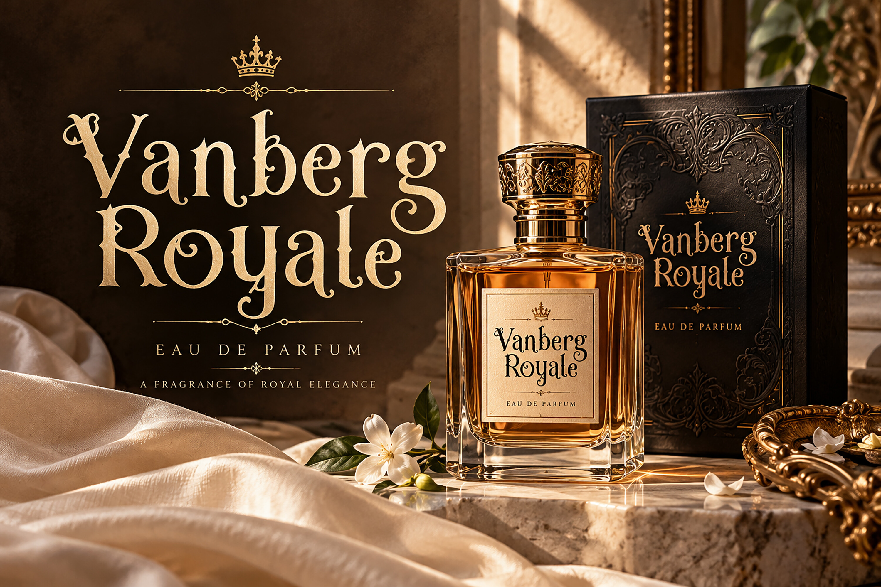
1. Vanberg Royale
Going by the name and the ornate serif group, Vanberg Royale looks aimed at formal, elegant display work. That makes it a sensible candidate to preview for titles where a polished tone matters. Pair it with a simple body font and keep the phrase short so any decorative detail stays clear.
Best for: wedding stationery, luxury branding, headlines. By: BILLI
2. Regal Flourish
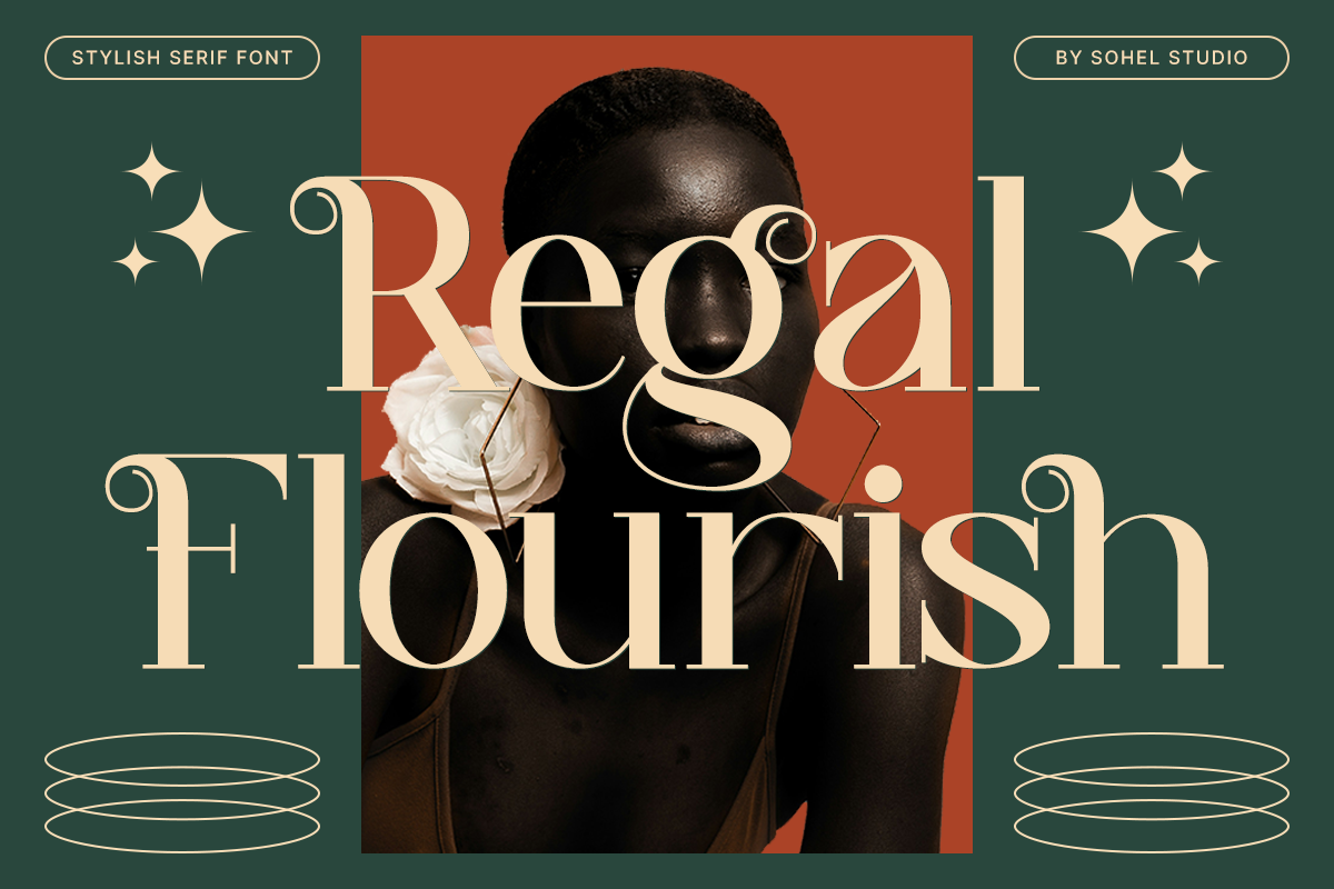
The name Regal Flourish and its place in the swash group suggest a classic, ornamental direction. Preview it for short titles and announcements, and leave clean space around the type so the decoration has room to show.
Best for: event announcements, luxury labels, headline lockups. By: Sohel Studio
3. Restrained Flourish
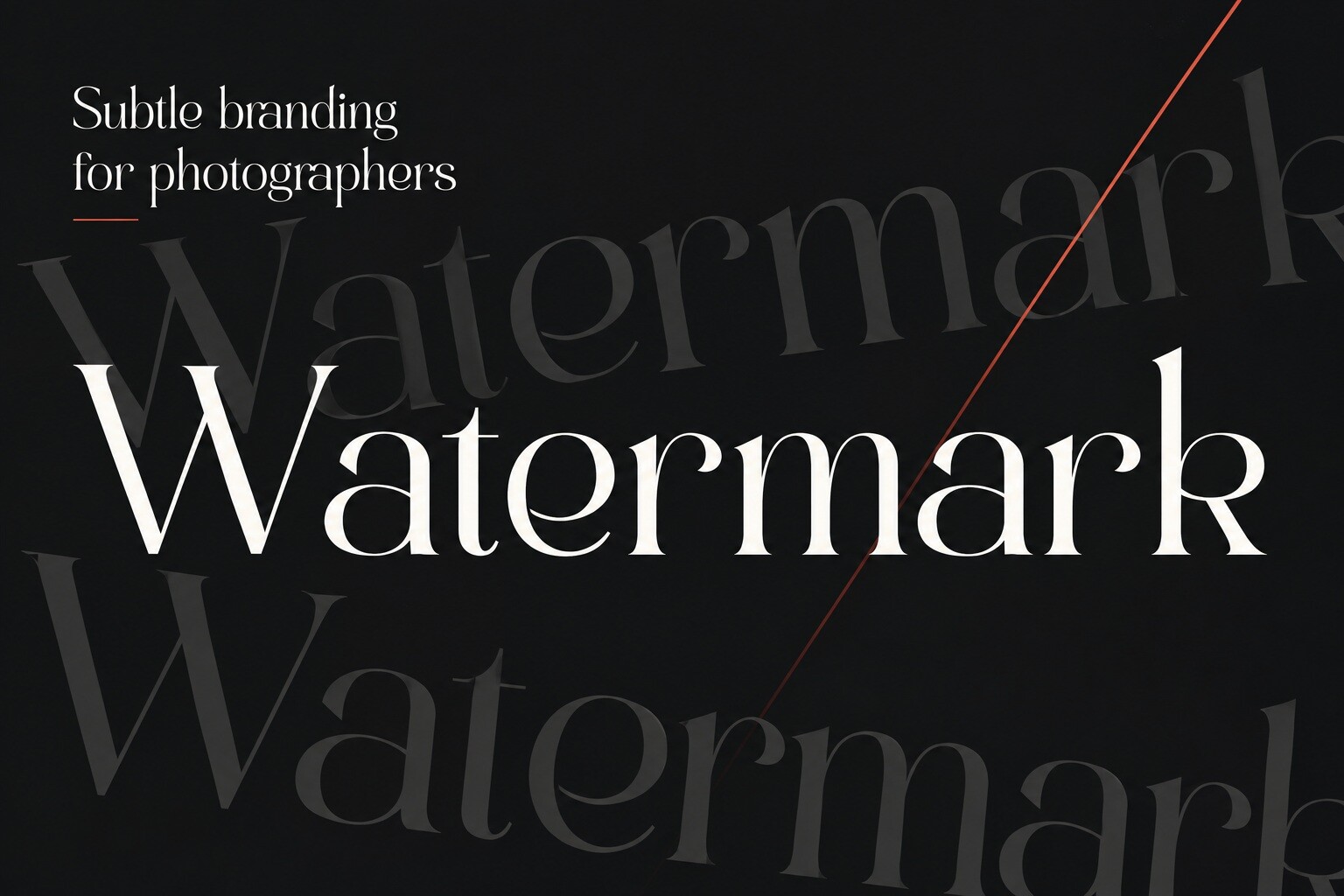
The name points to a more measured take on flourish styling. If that is accurate, it could suit projects that want elegance without crowding the layout. Check the preview closely and test it at a smaller size before you commit.
Best for: understated invitations, elegant labels, refined branding. By: PixelBrush Supply
4. Magnolia Muse
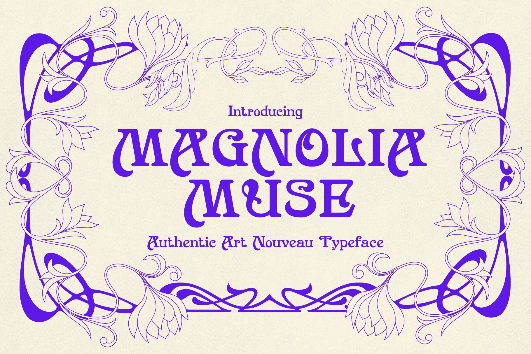
The soft, floral sounding name hints at a romantic display style, though the preview image is the real test. It may fit botanical or event projects that need a gentle headline. Keep the phrase short and give the letters room.
Best for: floral branding, event titles, romantic stationery. By: HipFonts
Victorian / Vintage Ornate Fonts
Victorian and vintage ornate fonts draw on the look of old posters, antique labels, and heritage branding. They are useful when a project needs a sense of age, tradition, or nostalgic charm. These styles work best as display faces for short titles, packaging accents, and decorative headings that set a vintage mood.
5. Heritage Ornate
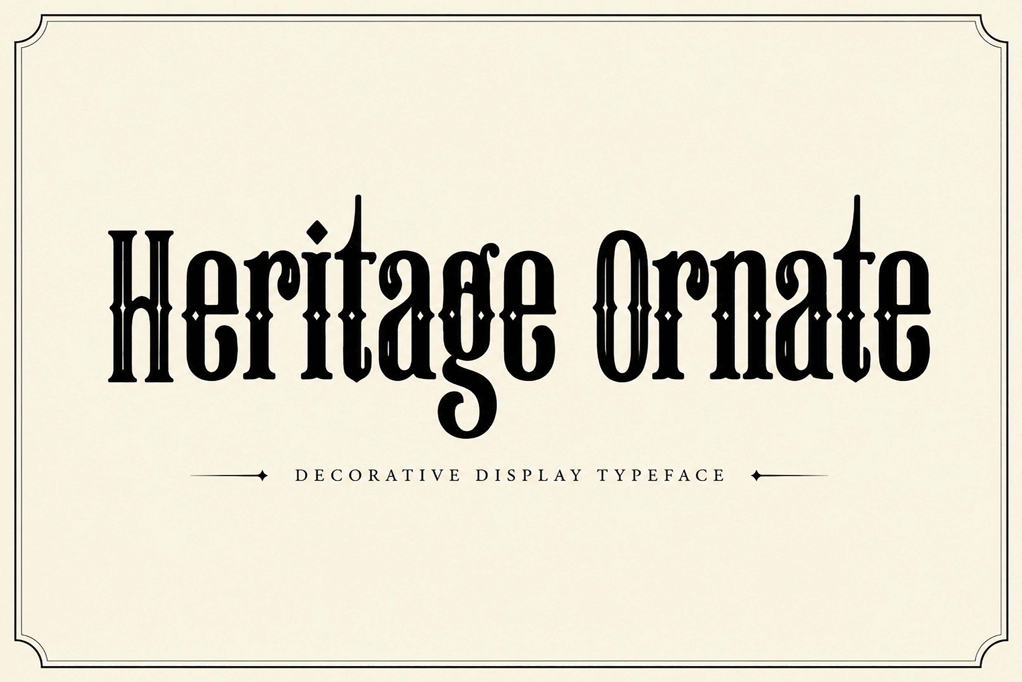
The name and the vintage ornate grouping suggest a traditional, old world look. Judge it from the preview for labels, posters, or brand titles. Keep supporting text in a plain face so the ornament stays the focus.
Best for: vintage labels, heritage branding, poster headlines. By: Wow Magic
6. Old Vintage Victorian Iii
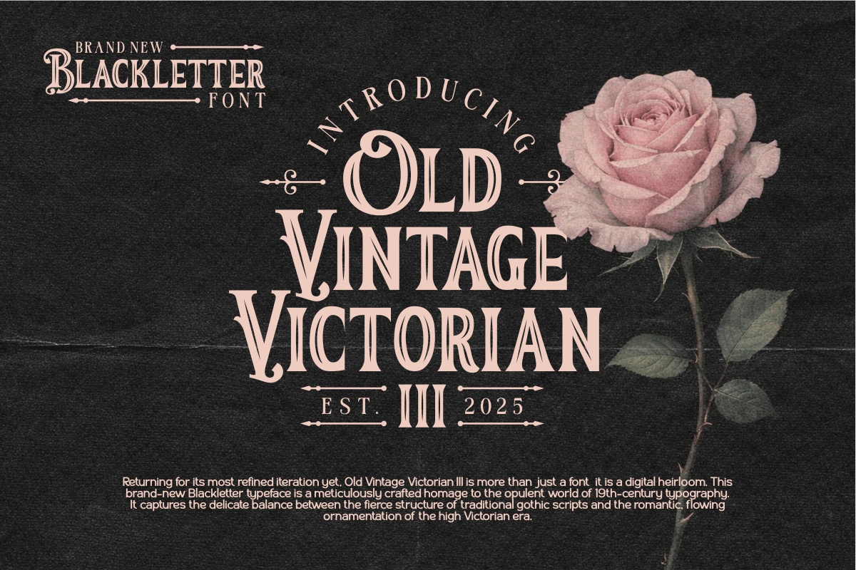
The name is blunt about its intent: an antique, Victorian inspired look. It is a candidate for vintage poster or label styling, with short titles and no second busy display font beside it.
Best for: vintage packaging, antique style labels, decorative headings. By: Eko Kurniawan
Download Old Vintage Victorian Iii
7. Fancy Old Swirl
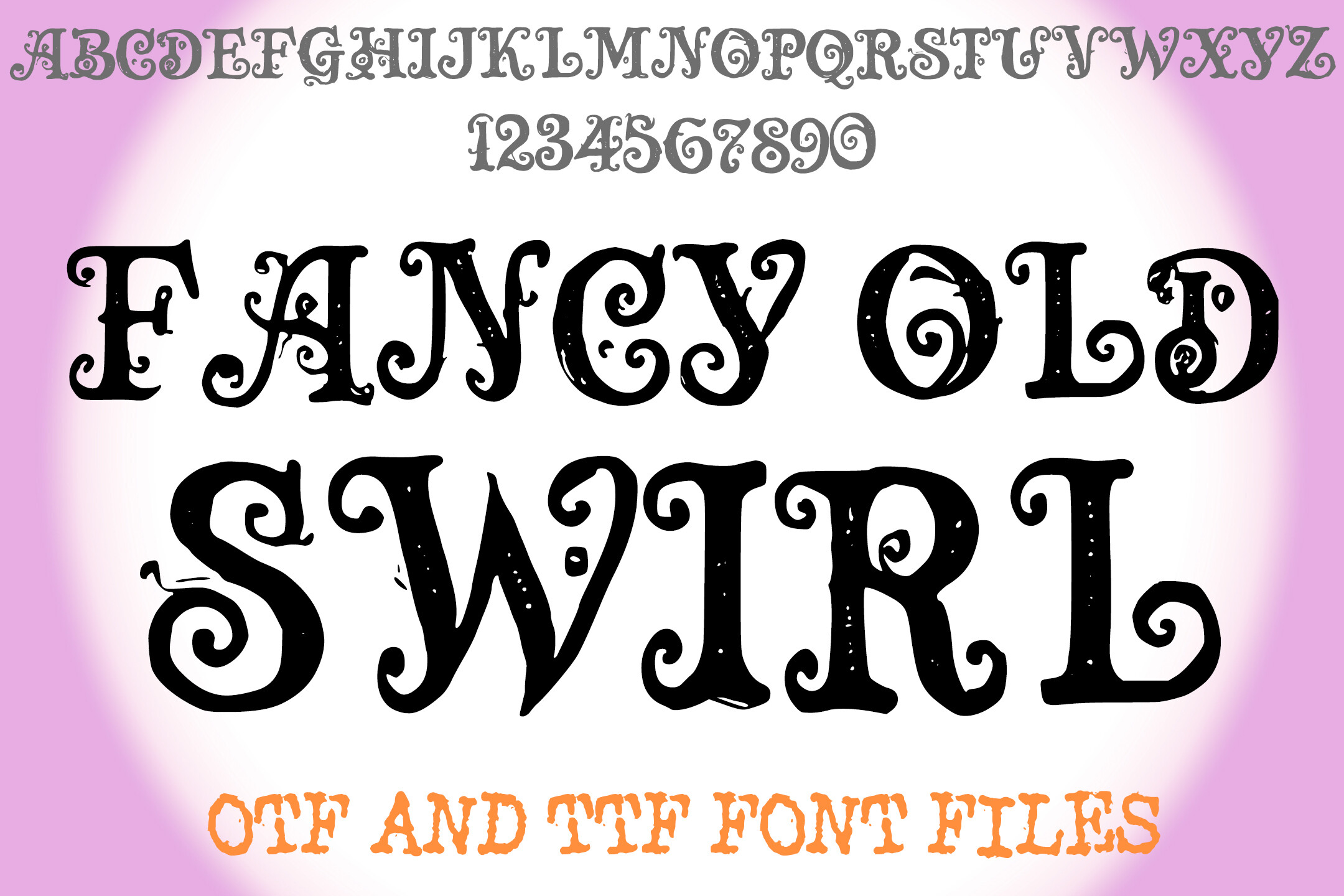
The name suggests swirling, old fashioned decoration. Check the preview to see whether it fits an ornamental heading, and pair it with a simple background and clean body font.
Best for: decorative titles, vintage packaging, ornamental headings. By: squeebcreative
8. Elvaroque
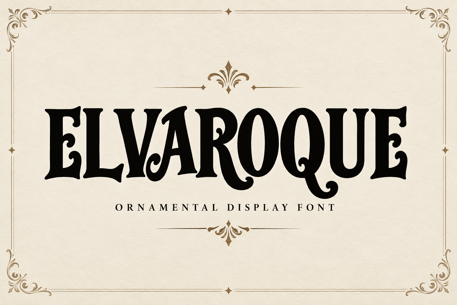
Elvaroque is an unusual name, and beyond its place in the vintage ornate group there is little to infer, so let the preview image guide you. Whatever its character turns out to be, keep the phrase short and give the letterforms space.
Best for: dramatic titles, vintage inspired branding, display headings. By: Colourful
Whimsical / Floral Decorative Fonts
Whimsical and floral decorative fonts bring a lighter, more playful tone to a design. They are a good fit for greeting cards, children’s party invitations, craft projects, and packaging that needs a friendly, decorative feel. These styles work best when the phrase is short and the layout has room for the letterforms to move.
9. Whimsical Swirl
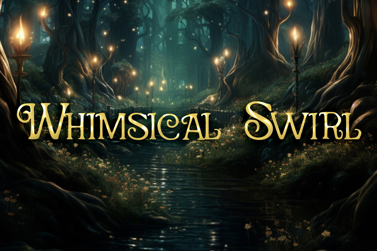
The name suggests a light, playful tone. It may suit cards or party invitations. Keep the surrounding design simple so it does not compete with other decorative elements.
Best for: children’s party invitations, crafty greeting cards, playful packaging. By: Heidi Vargas-Smith
10. Floral Ornament
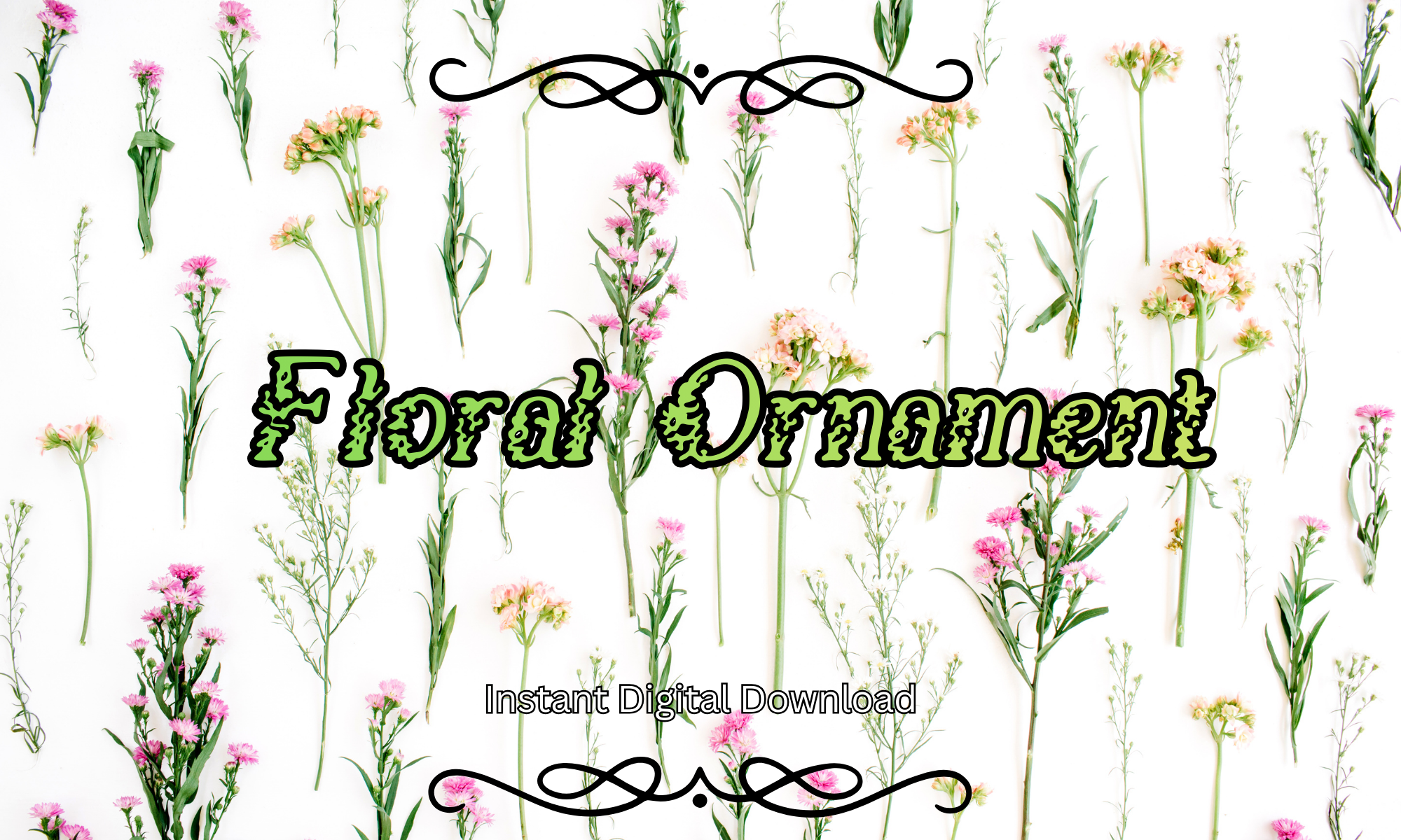
The name points to a floral, ornamental theme that could bring a botanical touch to a short title or label. Pair it with a neutral body font and check the preview to see how the floral details read.
Best for: floral labels, botanical branding, decorative titles. By: Pamlico Creations
11. Florentica
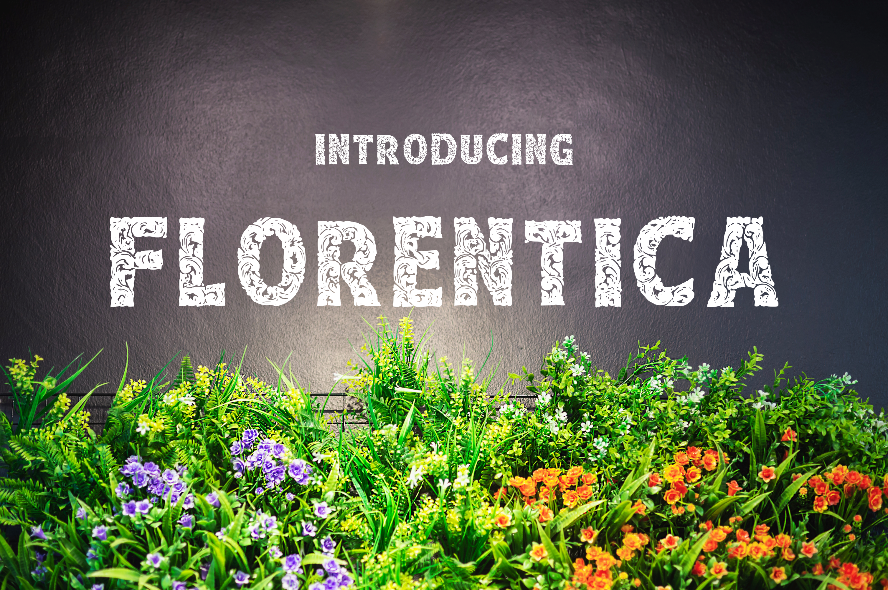
The name hints at a floral inspired display style. It may work where a layout needs softening and the title needs a distinctive shape. A clean background and a simple supporting font will keep it readable.
Best for: elegant invitations, artisan packaging, refined brand titles. By: YuningArt Studio
Fantasy / Gothic Decorative Fonts
Fantasy and gothic decorative fonts lean into darker, more dramatic moods. They are useful for game titles, themed posters, book covers, and merch that needs a strong visual identity. These styles work best as display faces for short, high impact phrases where the letterforms can carry the atmosphere.
12. Wicked Knots
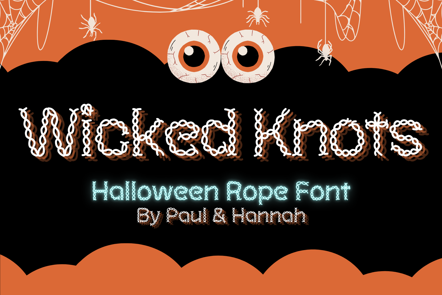
The name suggests a darker, fantasy leaning mood. Look at the preview to confirm, then keep the phrase short and the contrast against the background strong.
Best for: game titles, dark themed posters, fantasy merch. By: paul.hannah6395
13. Thornstar
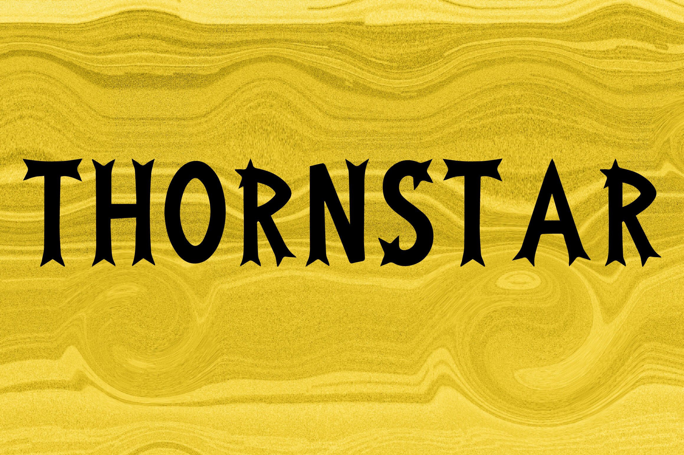
The name and group suggest a dramatic, fantasy flavored display style. Pair it with a clean body font so the main message stays easy to read, and judge the actual letter shapes from the preview.
Best for: dark fantasy covers, gothic event posters, dramatic branding. By: MOMAT THIRTYONE
14. Rune Fate
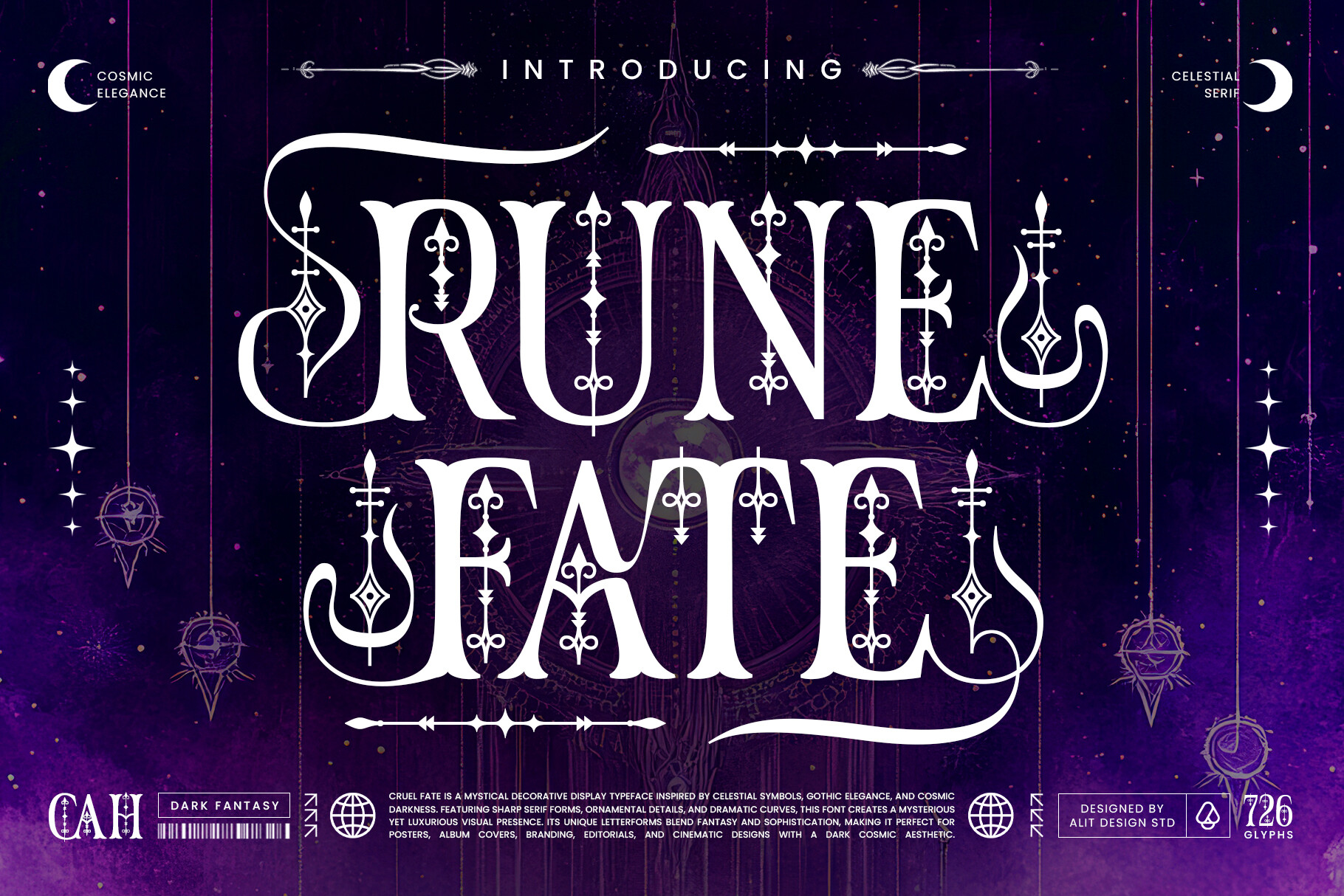
The name evokes runes and fantasy, which hints at a themed display style. Keep the phrase short and test the contrast on both light and dark backgrounds.
Best for: fantasy game titles, themed merch, dramatic headlines. By: Alit Design
How to Use Decorative Fonts in Your Projects
Decorative fonts are most effective when they have a clear job to do. Use them for headlines, logos, labels, invitations, covers, posters, and short brand phrases. Avoid long body text, because the decorative details can blur together when the size gets small.
A simple rule: one decorative font per design. If you need a second typeface, choose a neutral sans serif or a plain serif for the body text. This keeps the decorative face as the star and makes the rest of the layout easier to read. Keeping the total to two or three fonts is a common rule of thumb.
Create strong size contrast between the display text and the supporting text. A large decorative headline with a small, clean caption often works better than two similar sized faces fighting for attention. Add enough leading and tracking so the letterforms do not feel cramped.
Test the design at the size where it will actually be seen. Check a phone screen, a small label, and a printed proof if you can. If the details disappear, try a larger size, a simpler phrase, or a less busy decorative font.
For Canva, custom font uploads depend on your plan, so check what yours allows, then type your short phrase and adjust size and spacing. For Cricut Design Space, install the font on your computer first and restart the app, after which it should appear in the font list. Adobe Illustrator is another option for working with decorative display fonts in vector layouts.
Can a decorative font handle body text? In most cases, no. Paragraphs set in ornate letterforms tire the eye quickly, and a neutral sans serif is the common safe choice for reading, especially on screens. The same logic answers the pairing question: let one decorative face lead and give it a plain partner.
If you are working on invitations, labels, or branding, the decorative font should carry the mood, while the supporting font carries the information. For invitations specifically, the ornate serif and flourish group above is a reasonable place to start your comparison, since those styles tend to read as formal. Judge each one by its preview before you settle.
Tip: When using decorative fonts for invitations, keep the names and event details in a readable face. Let the decorative font handle the title, date, or a single accent word.
Tips for Choosing the Right Decorative Font
Start with the mood of the project before you look at the font list. A wedding invitation, a craft label, a brand logo, and a game poster all need different levels of ornament. If the project feels formal, look at ornate fonts. If it feels playful, look at floral fonts. If it feels dark or dramatic, gothic decorative fonts may be the right direction.
Test the font with real text, not just a sample word. Type the actual title, name, or label you plan to use. This reveals spacing issues, awkward letter combinations, and readability problems that a simple preview may hide.
Check the license on each product page before you use a font in a commercial project. Licenses can cover personal use, commercial use, merch, web use, or logo use, and the terms can differ from one font to another. If you are selling a product, building a brand, or using the typeface in a logo, read the conditions carefully and keep a record of the license.
Also check the file format and your software. OTF and TTF are common choices, and most design tools work with one or both. If you need Cyrillic, diacritics, or special characters, test the font with your exact text before finalizing the design.
When in doubt, choose the face that still reads clearly after you remove the background, color, and extra graphics. If you are unsure whether a decorative font is the right fit, compare it against a neutral sans serif. If the decorative face still reads clearly at a small size and the design feels balanced, it is likely a good match. If the layout feels noisy, simplify the phrase or choose a more restrained style.
Where to Download Decorative Fonts
Creative Fabrica is a practical starting point for finding decorative fonts, ornate fonts, fancy fonts, flourish fonts, Victorian fonts, floral fonts, and fantasy fonts in one place. You can browse the font categories, preview the style, and download the file for your project. For the fonts in this guide, use the product page to check the license terms before you download.
You can also explore other resources such as Google Fonts, DaFont, and Font Squirrel, but always check the license before using a font in a commercial project. Free fonts are often limited to personal use, so the terms matter as much as the style.
A good decorative font should feel right in the first few seconds, but the license and readability tests are what make it safe for real use. If you want more practical typography guides, font pairings, and design resources, visit the FontPro blog. The goal is simple: find a decorative font that fits the mood, test it at real size, and use it where it can shine.