· fonts · 12 min read
21 Best Cool Fonts for Logos, Posters, and Vinyl Projects in 2026
Discover the best cool fonts for logos, posters, and vinyl cutting projects. Find bold, graffiti, futuristic, and retro styles ready to download today.
You stare at a blank canvas. The brief says “make it pop” or “give it edge” and you have no idea what that means in practice. That is where cool fonts come in. One expressive typeface can turn a plain t-shirt into something people photograph, a poster into a conversation starter, or a logo into the thing people remember about your brand.
This round-up covers bold display faces, gritty street styles, futuristic looks, brush and script lettering, and worn-in retro styles. Some suit logos and social media graphics. Others are worth considering for vinyl cutting on shirts, stickers, and decals. The fonts are grouped by vibe, so you can skip ahead to the mood you need, whether you are building a brand identity or prepping a batch of heat transfer for your next drop.
What Makes a Font Cool?
Cool is not a rule. It is a reaction. A font feels cool when it has a strong personality and a clear point of view. You spot it instantly because of one standout detail: a heavy slant, a broken edge, a sharp terminal, or a confident rhythm that refuses to blend into the background.
But personality alone will not save a design. The typeface has to fit the mood of the project. The same face that screams energy on a concert poster might feel out of place on a calm wellness brand. Context does a lot of the work here.
Readability is the quiet ingredient that separates cool from chaotic. A great expressive font still lets people read the message at the size you plan to print or display it. Pick a face that grabs attention but keeps the words legible in your real layout. A quick test helps: type your actual headline, shrink it to the smallest size it will appear at, and squint. If the message still comes through, the font is doing its job. If it turns into a smudge, try a simpler cousin from the same style group.
Bold Display and Sports Fonts for Cool Headlines
These faces are built for impact. Dense shapes and strong silhouettes tend to work best when the headline is the whole point: team merch, gym posters, and bold brand marks that have to read from across the room.
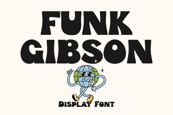
1. Funk Gibson
Funk Gibson belongs to the bold display group, a style made for headlines that need real presence. Display faces like this are usually at their best at large sizes, so check the preview and test it at the scale you plan to use.
Best for: large poster headlines, bold logo wordmarks, sports themed graphics. By: Prioritype
2. Energize
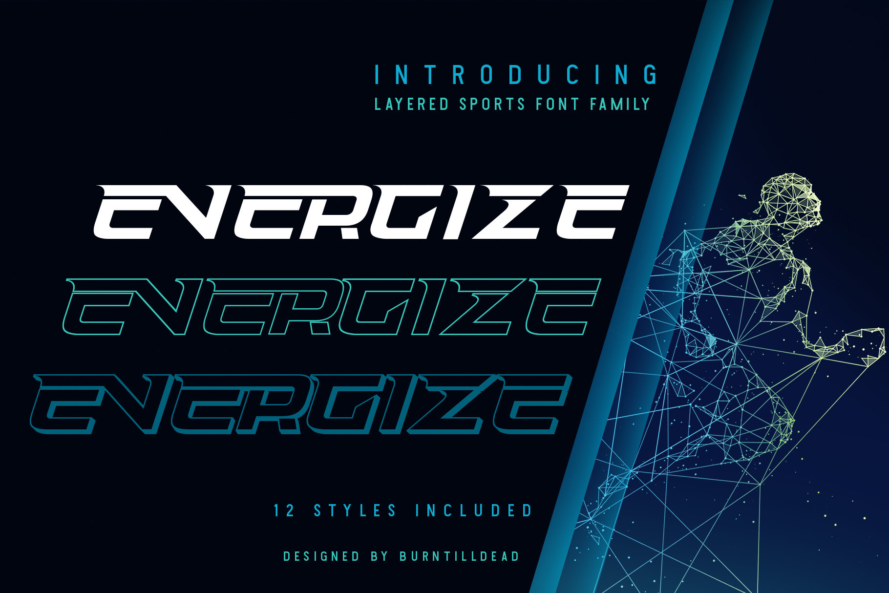
Energize is a bold display pick with an energetic name and a style that suits active themes. A short slogan or a single bold word is where this kind of face usually shines.
Best for: fitness and sports posters, energetic brand headlines, bold social media banners. By: Burntilldead
3. Sports Heroes
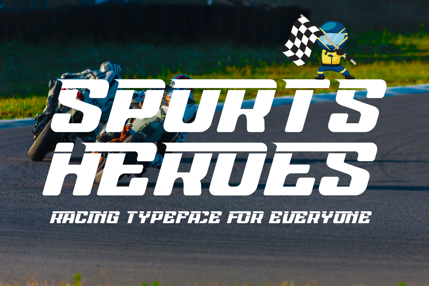
Sports Heroes is a sports style display font, aimed at team names, event titles, and anything that needs a competitive feel. Faces in this group often translate well to merchandise where a strong shape reads at a glance.
Best for: team and league graphics, sports event posters, bold merch headlines. By: 177Studio
4. Roughnut
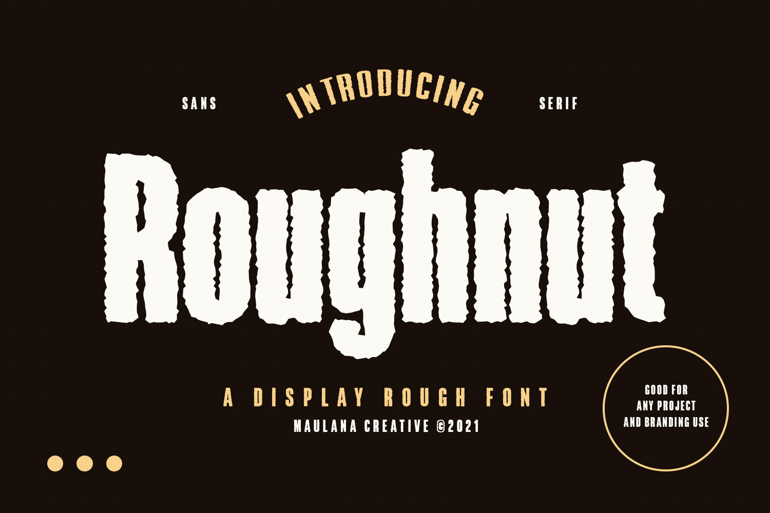
Roughnut sits in the rough, bold display corner, where a little grit gives a headline character. It is a natural fit for edgy brands and street inspired designs that should not look too polished.
Best for: grunge inspired posters, edgy brand wordmarks, bold sticker text. By: Maulana Creative
Graffiti and Street Fonts for Urban Designs
Street culture runs on attitude. These cool graffiti fonts borrow the spirit of tags and wall lettering. They suit urban brands, streetwear drops, and designs that want to feel like they belong on a sidewalk, not in a boardroom.
5. Nasty Graffiti
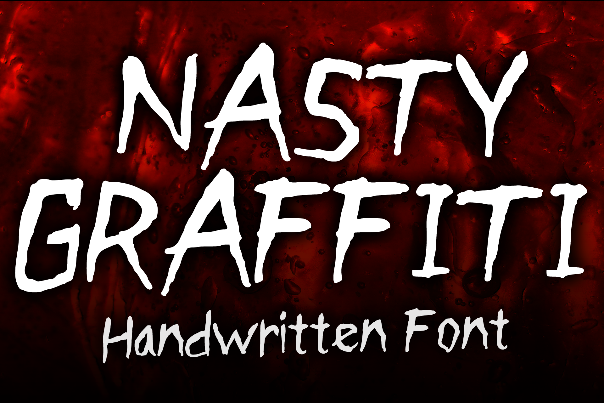
Nasty Graffiti is a graffiti style font, built for a raw, tag inspired mood. That makes it a strong candidate for urban and streetwear projects that want a rebellious tone.
Best for: streetwear logos, urban poster headlines, bold sticker text. By: MVMET
6. Black Drop
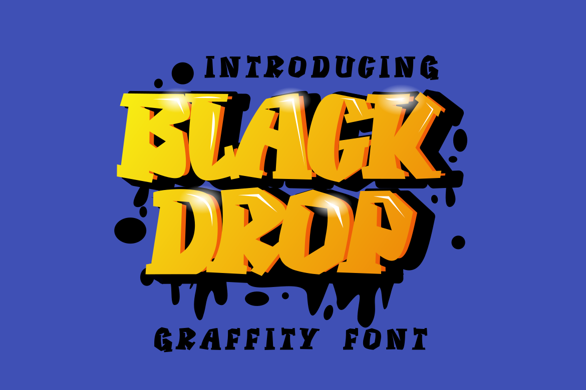
Black Drop is a street style font that leans toward the darker, moodier side of urban design. It suits edgy brands and nightlife themes where the type should feel intentional.
Best for: edgy brand wordmarks, event and nightlife posters, bold social media graphics. By: GFRcreative
7. Street Wolfker
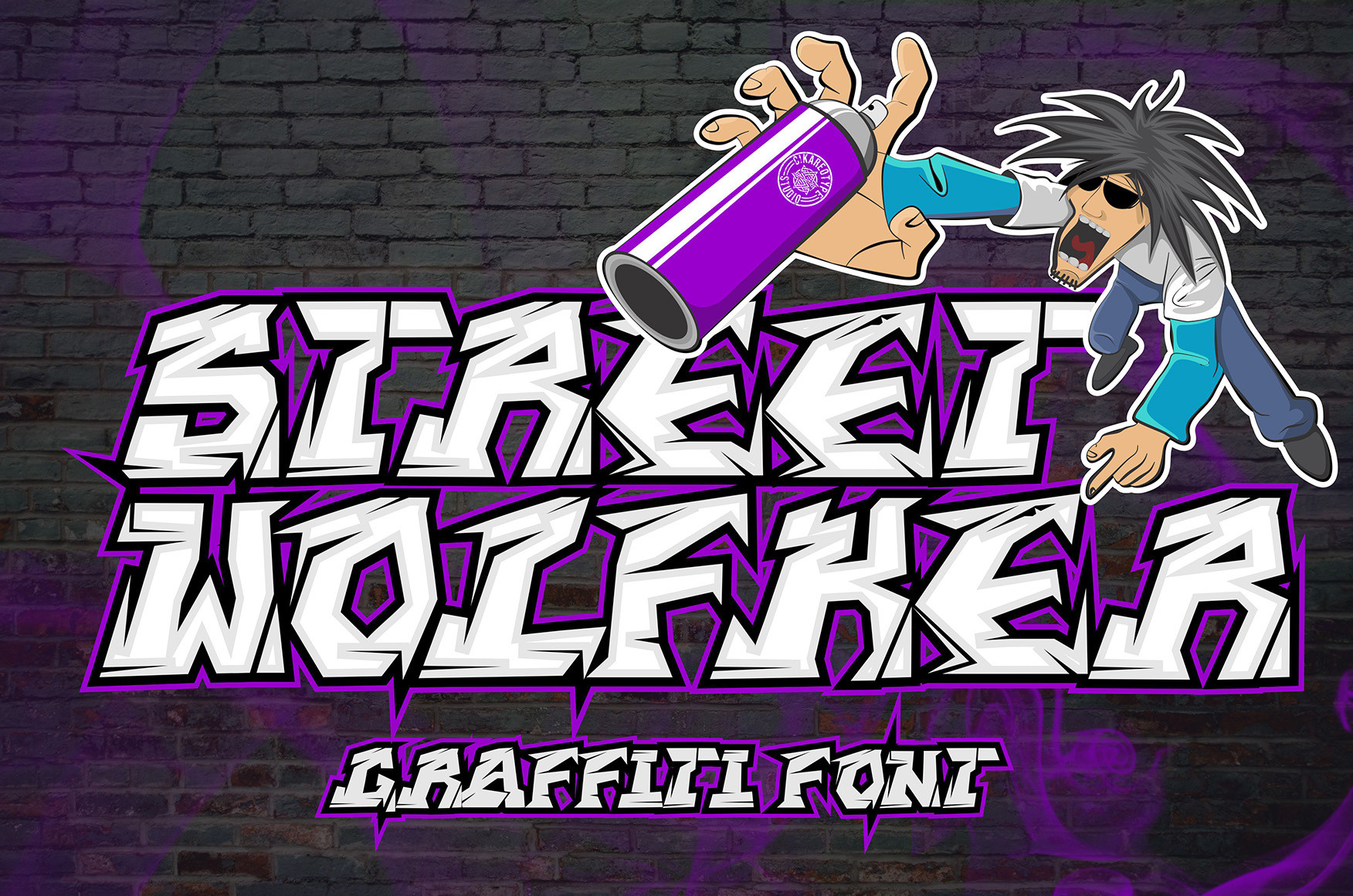
Street Wolfker is another street style option, with a name and look that point toward rugged, urban energy. It fits streetwear and alternative designs that want an unpolished attitude.
Best for: streetwear merch, urban brand marks, bold poster headlines. By: Cikareotype
8. Karnival
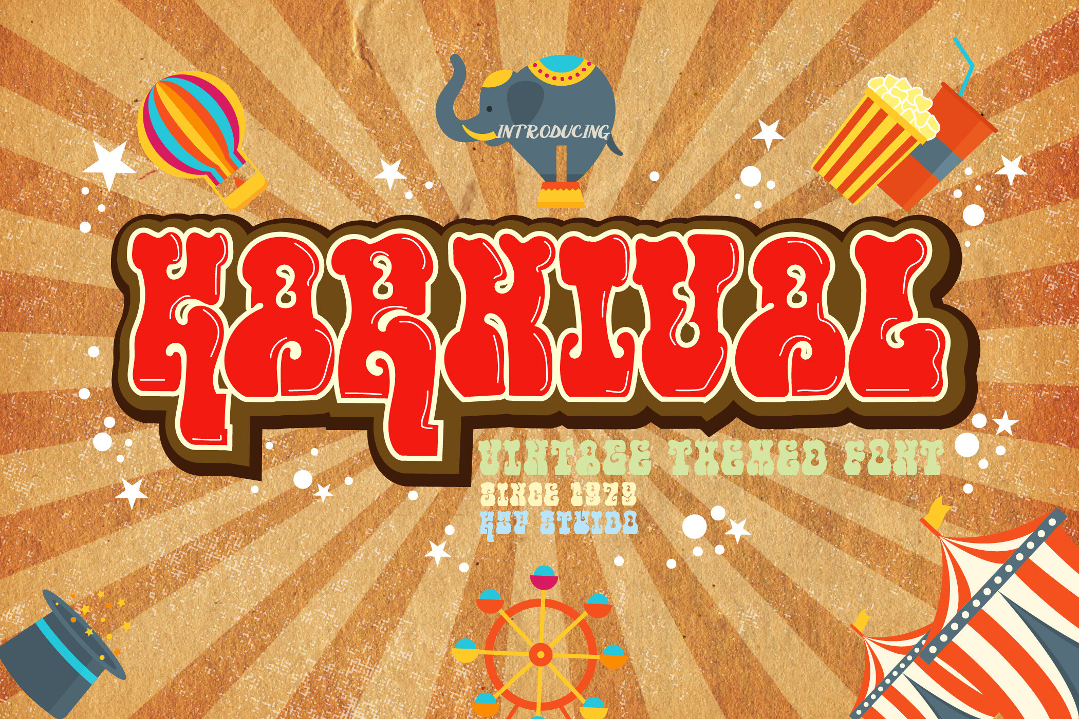
Karnival mixes street energy with a display font personality. The name suggests festivals and showmanship, which makes it worth a look for event branding and projects that want to feel loud and fun.
Best for: festival and event posters, bold brand headlines, playful streetwear text. By: KtwoP
Futuristic and Sci-Fi Fonts for Tech and Gaming
If your project lives in a digital or sci fi world, this is your toolkit. Geometry, angular cuts, and a high tech mood define these futuristic fonts, which suit gaming, music, and anything that should feel like it comes from the future.
9. Kosmonaut
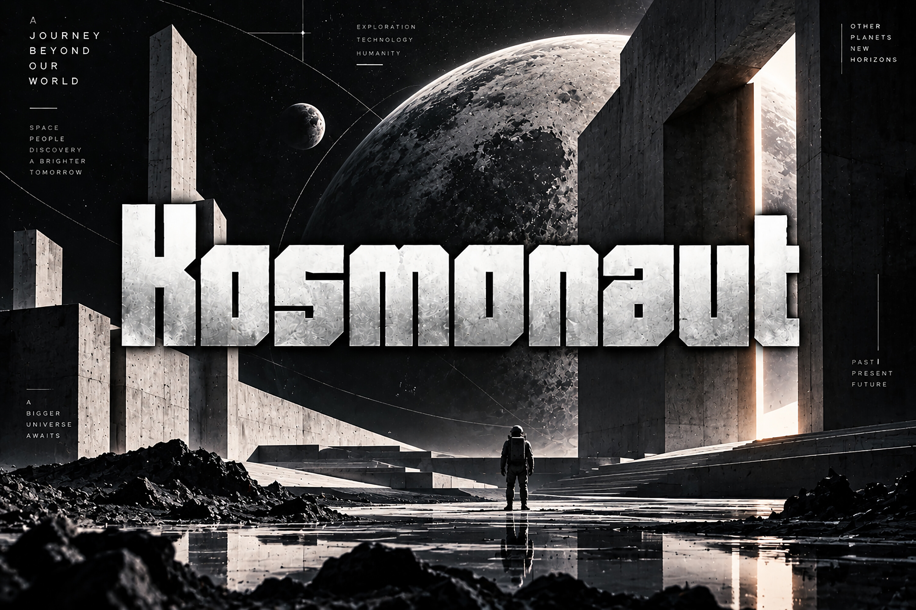
Kosmonaut is a futuristic font with a space inspired name. It is a natural candidate for tech and sci fi themes that want a forward looking tone.
Best for: sci fi posters, tech brand wordmarks, gaming graphics. By: BILLI
10. Metazord
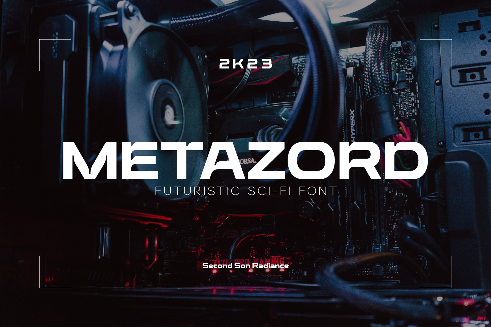
Metazord is a sci-fi display font, the kind of style that suits gaming titles and science fiction branding where the headline should feel otherworldly.
Best for: gaming logos, sci fi event posters, bold tech headlines. By: Typocracy Studio
11. Meteor Impact

Meteor Impact is a futuristic display font whose name suggests force and motion. It is worth testing for action themed and high energy designs.
Best for: action and gaming posters, energetic brand marks, bold social media banners. By: Pamlico Creations
12. Matrix Squadron
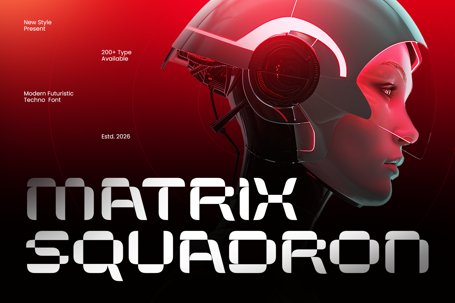
Matrix Squadron is a sci-fi font with a digital, cyber flavored name. It slots easily into gaming and tech inspired projects that want to feel programmed.
Best for: cyber themed graphics, gaming logos, tech inspired posters. By: Umitype
13. Voltrex
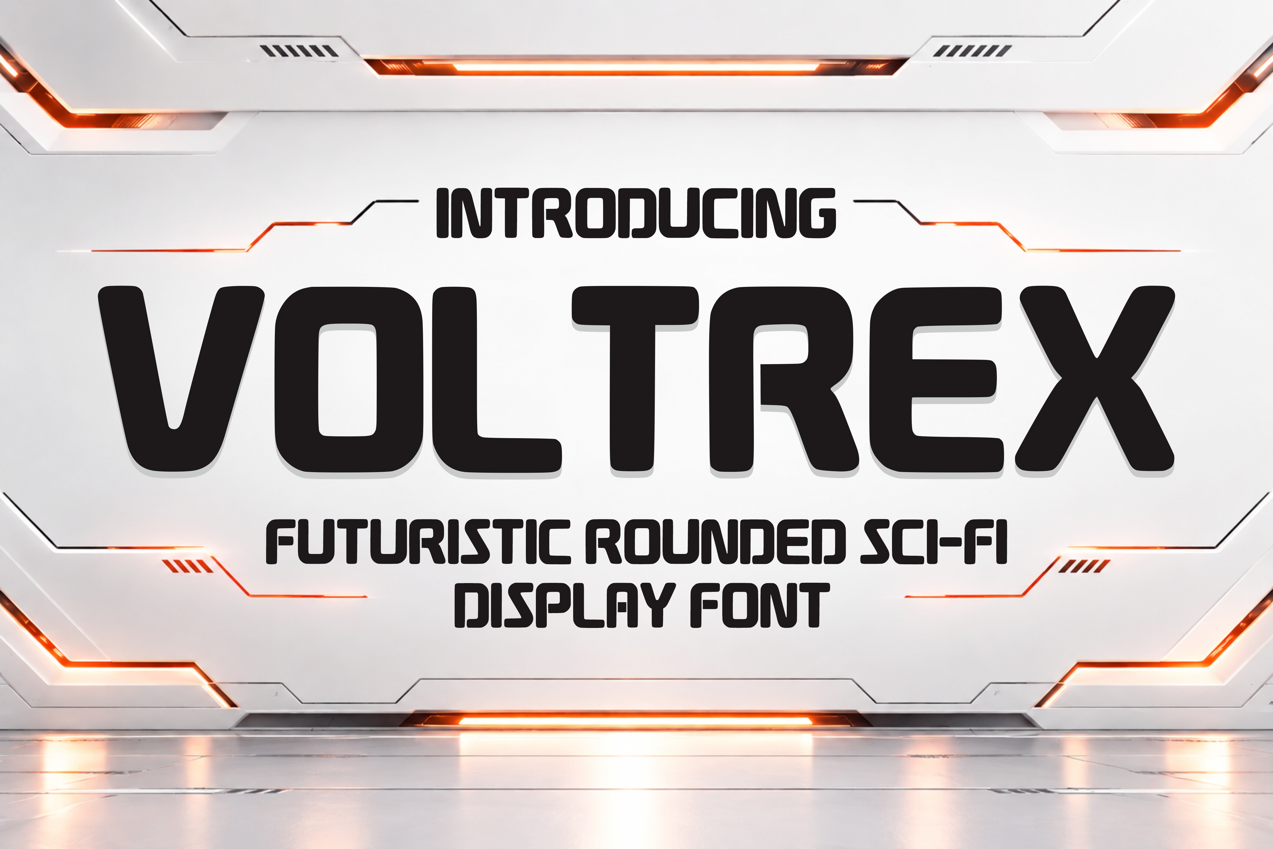
Voltrex is a futuristic font with an electric sounding name. It is a good candidate for tech branding and high energy designs that need a current, modern feel.
Best for: tech brand wordmarks, futuristic posters, bold gaming headlines. By: Soho Studio
Script and Brush Fonts with Attitude
Scripts and brush faces add a human, handmade touch. These cool script fonts bring movement and personality that suit personal brands, social media, and designs that should feel less corporate and more personal.
14. Crunchy
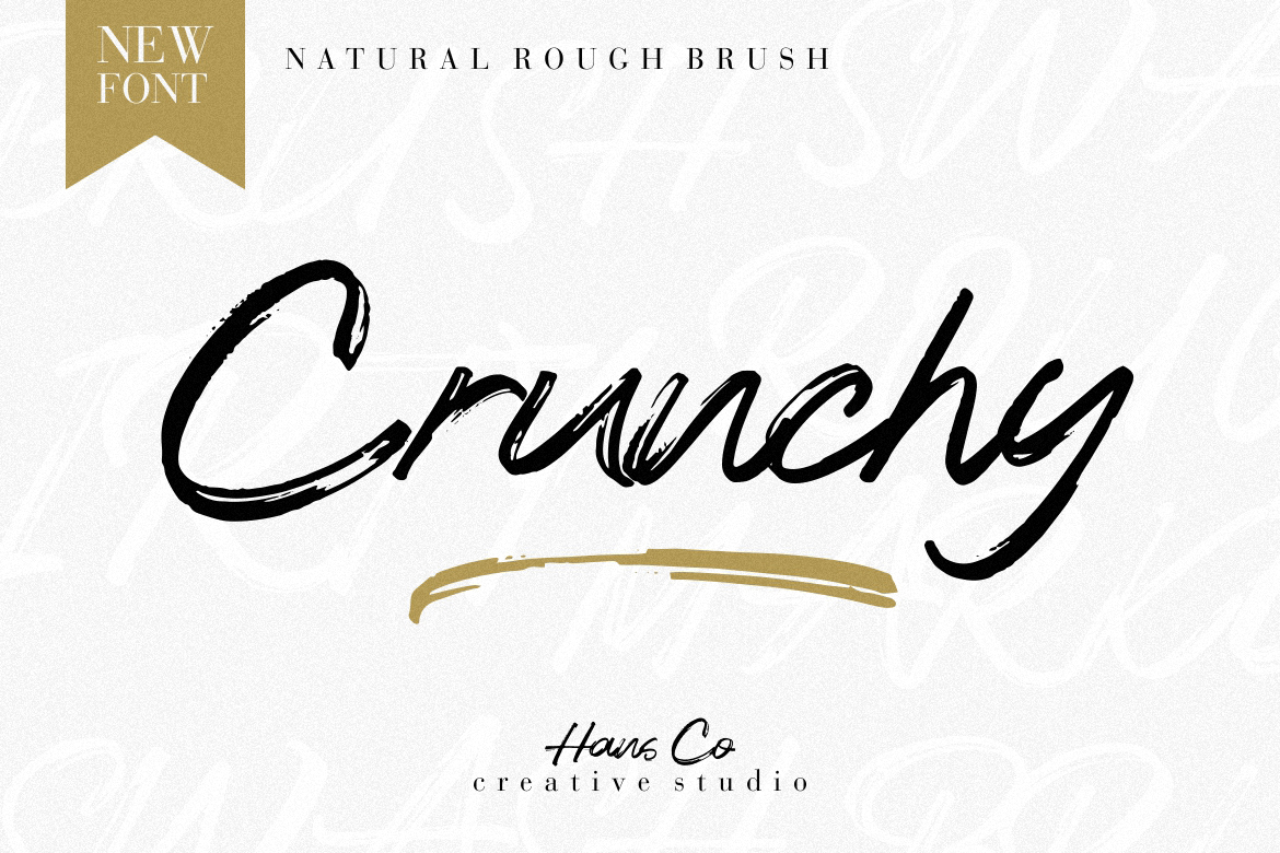
Crunchy is a brush style font, which usually means a hand painted feel that contrasts nicely with the clean sans serifs most brands default to. It suits creative brands and casual designs.
Best for: personal brand logos, casual social media graphics, handwritten style headlines. By: HansCo
15. Siren Song
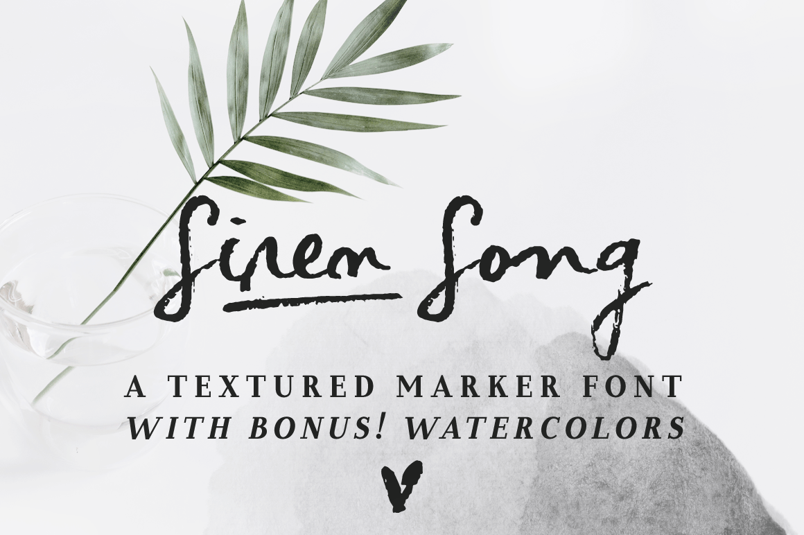
Siren Song is a script style font. Scripts like this tend to suit designs that want a touch of drama and expression, a good choice when you want type to sing a little rather than shout.
Best for: expressive brand wordmarks, elegant poster headlines, social media quotes. By: anasfonts
16. Astonish
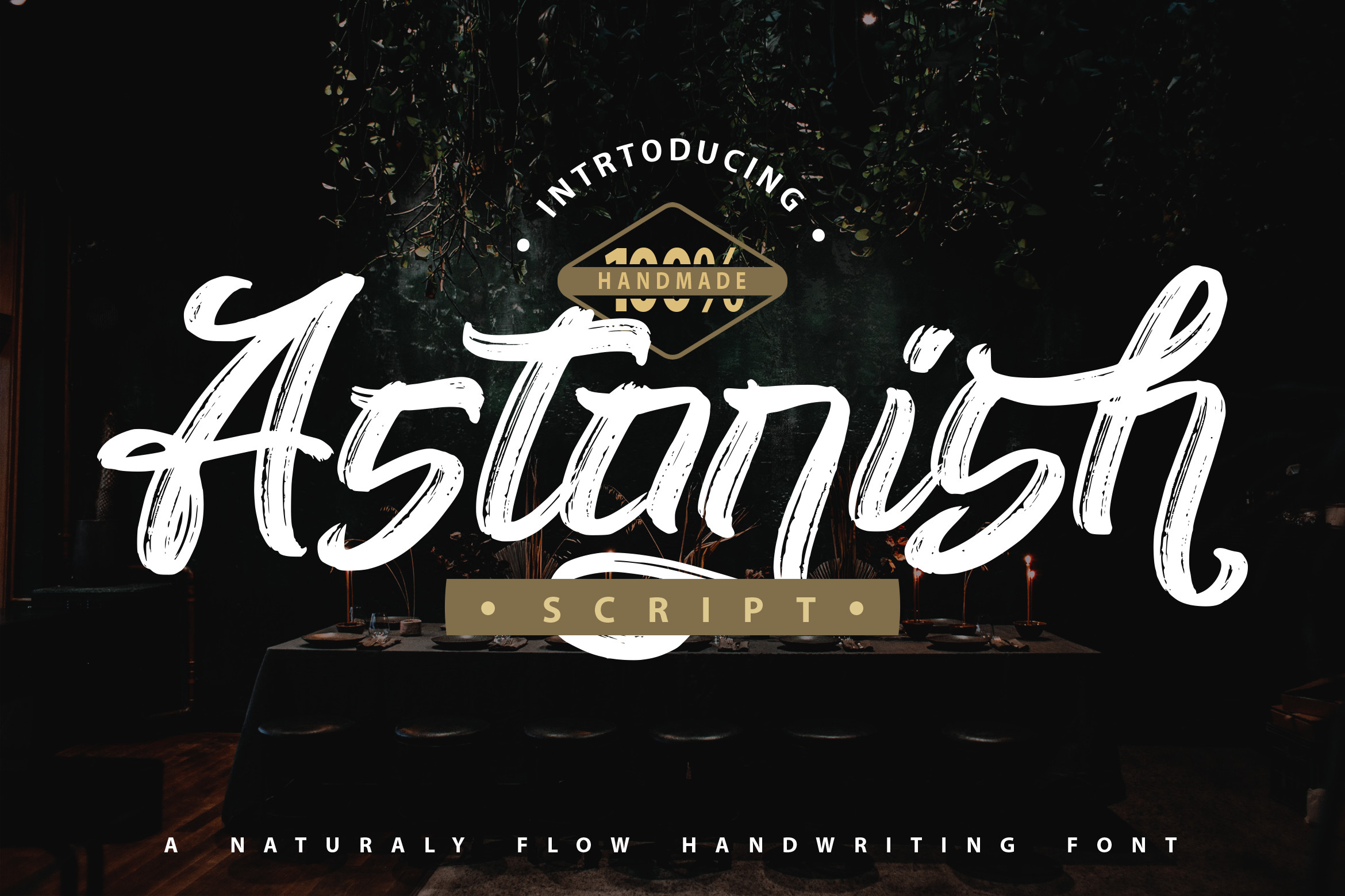
Astonish combines script and brush styling. That blend is a fit for personal brands and spontaneous, lively designs that want a headline with a bit of surprise.
Best for: personal brand marks, bold social media headlines, expressive poster text. By: Vunira
Retro, Grunge, and Blackletter Fonts for Vintage Edge
Nostalgia is a powerful design tool. These retro grunge fonts and vintage styled faces bring a worn-in, lived-in mood that suits music, merch, and any project that wants a touch of history or edge.
17. Okay Retro
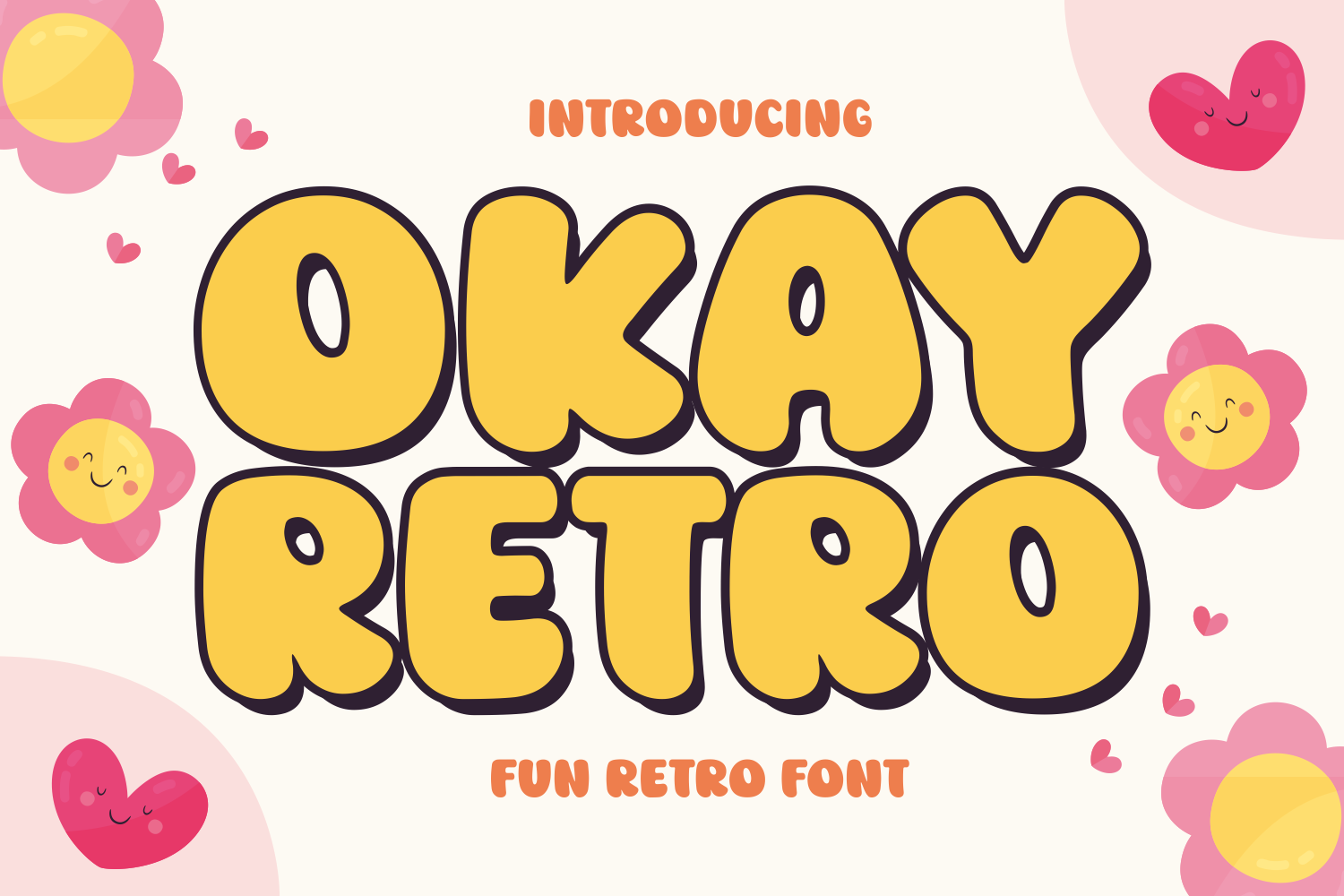
Okay Retro is a retro style font. The look suits throwback branding and posters with a playful, old school vibe.
Best for: retro brand wordmarks, vintage style posters, nostalgic merch text. By: Ade (7NTypes)
18. Xanthe
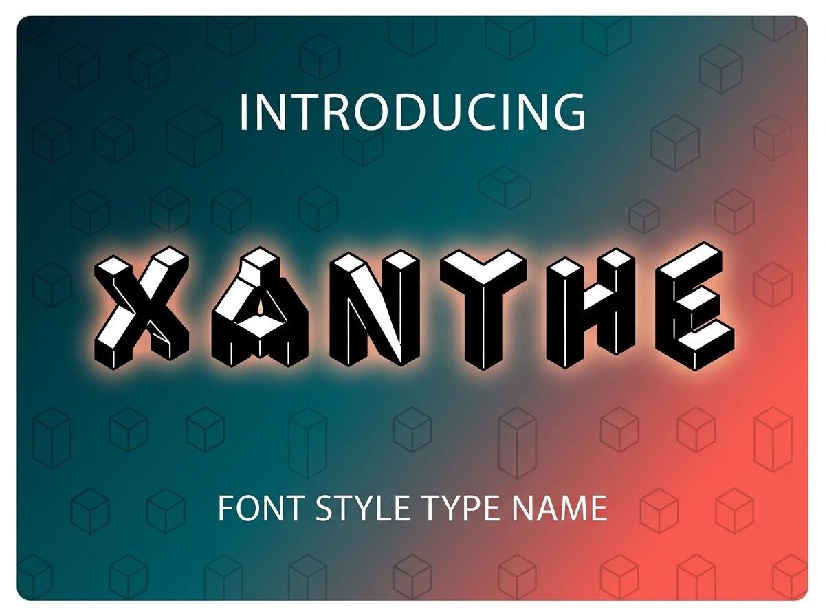
Xanthe is a vintage style font, a fit for retro labels and old school branding that should feel collected rather than brand new.
Best for: vintage label designs, retro brand marks, nostalgic poster headlines. By: Raholco
19. Gladolia
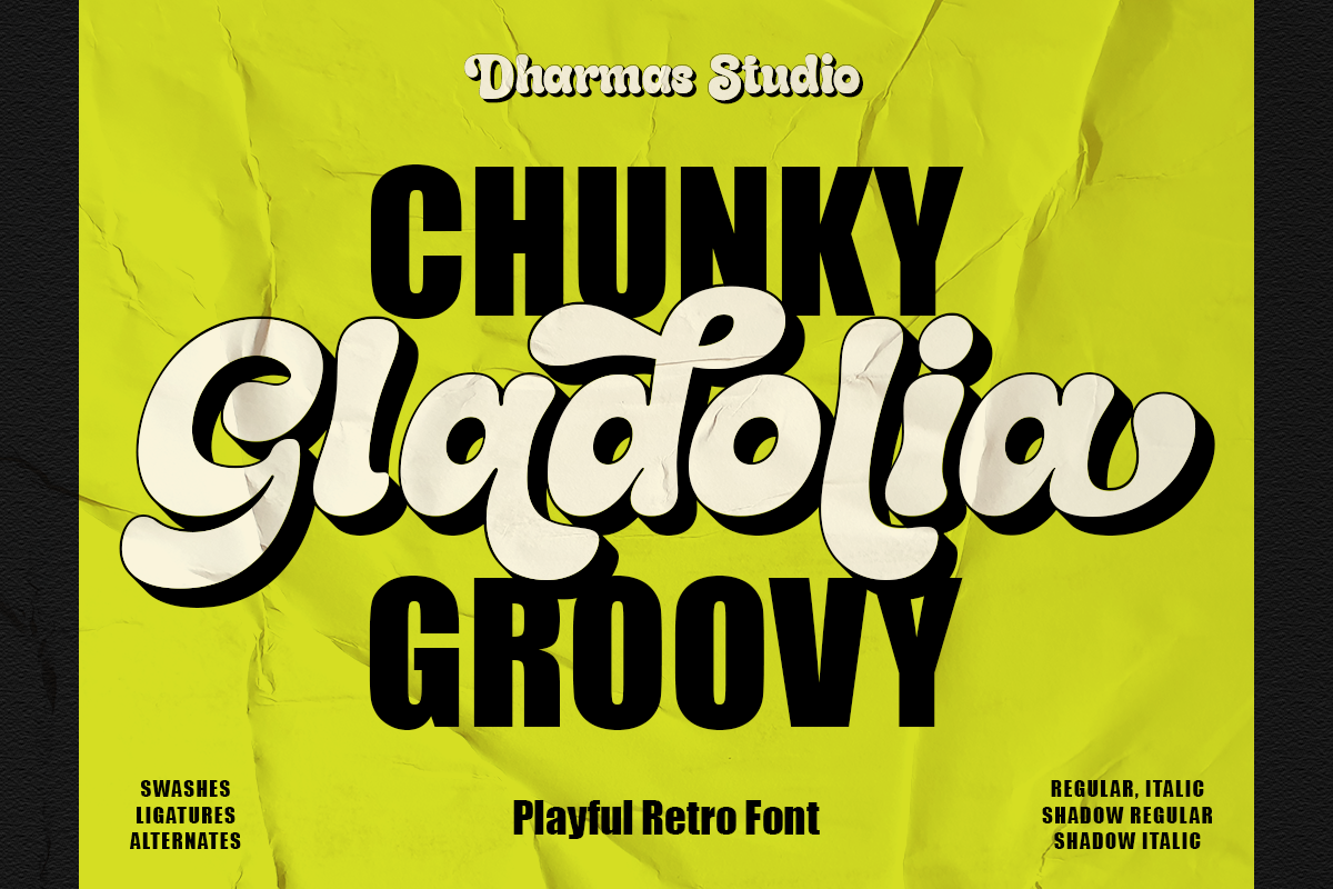
Gladolia is a retro decorative font. Decorative retro faces suit projects that want a touch of old world charm with a modern twist, best kept to headlines and short phrases.
Best for: decorative retro headlines, vintage brand wordmarks, stylized poster text. By: Dharmas Studio
20. Crash and Burn
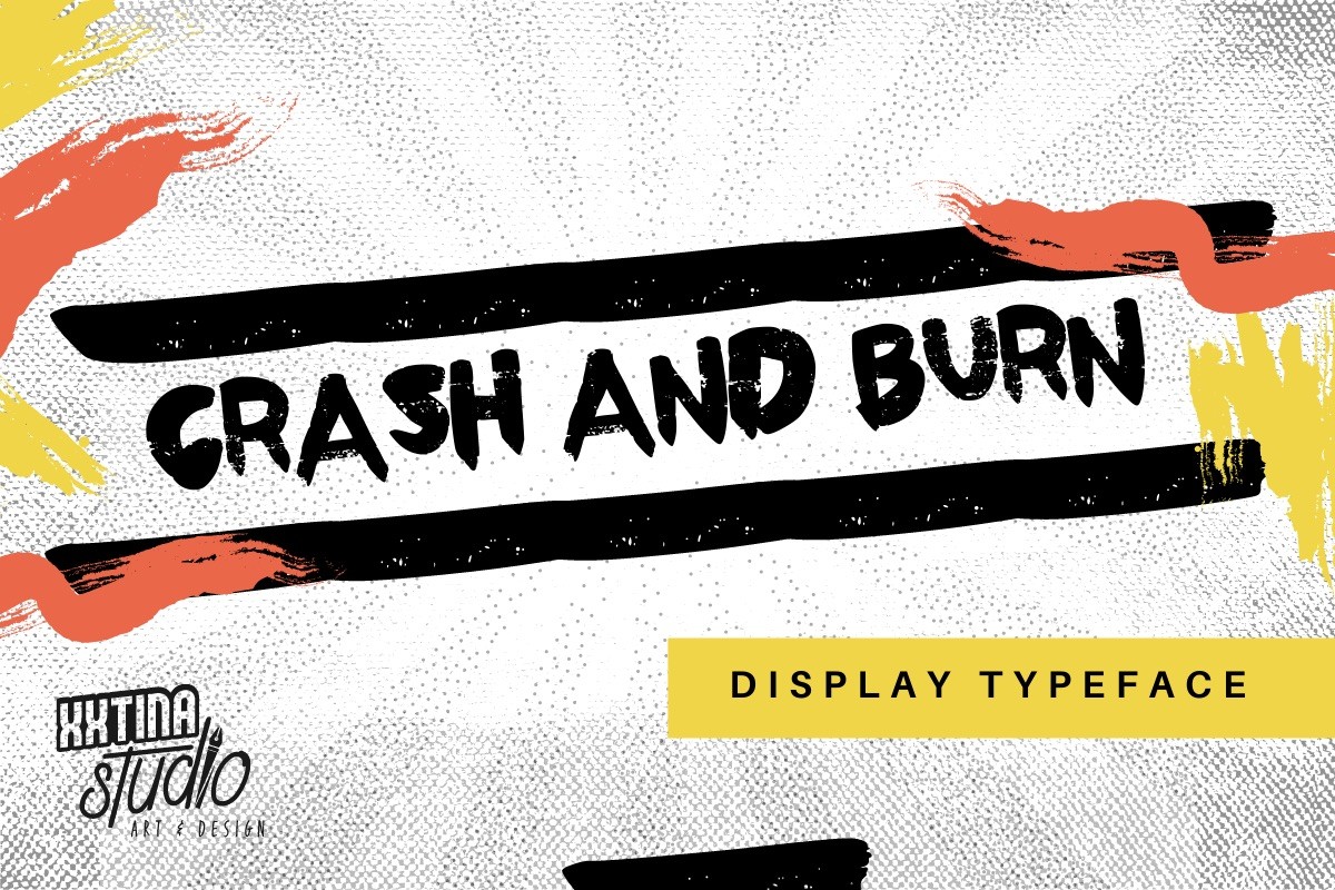
Crash and Burn is a grunge style font, and the name alone signals attitude. It is worth a look for edgy music branding and street inspired designs.
Best for: music and band logos, edgy poster headlines, bold grunge merch text. By: The Tenacious Type Studio
21. Woliy
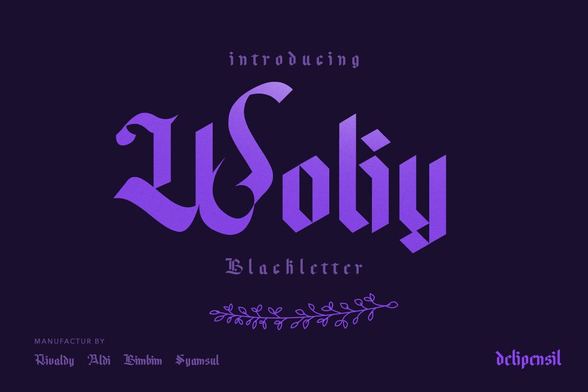
Woliy is a retro grunge font, mixing nostalgia with a rougher edge. That makes it a candidate for designs that want to feel both old and a bit rebellious.
Best for: retro grunge posters, edgy brand wordmarks, vintage style merch text. By: delipensil
How to Use Cool Fonts in Logos, Posters, and Social Media
The best cool fonts for logos stay simple enough to shrink. When you design a logo mark, test your type at a small size and in a single color. If the letterforms clog together or lose detail, the face is doing too much. Pick one statement font to carry the personality, then let a calm, simple typeface handle the supporting text. That contrast builds a clear hierarchy.
For posters, lean into the big and bold. Expressive faces tend to shine at large sizes, especially when the headline has room to breathe. Pair a dense display face with a clean body font so the message reads from a distance. On t-shirts, thicker strokes and simpler shapes generally transfer better, because fine detail can get lost in print.
On social media, always check readability on a phone. A decorative font that looks great on a desktop can turn to mush in a small feed image. Use the expressive face for short headlines only, and keep the rest of the text in a highly legible sans serif or serif. Trying pairings in Canva or Illustrator before you commit helps you see what works together.
Using Cool Fonts for Vinyl Cutting
If you are cutting cool fonts for vinyl, especially with Cricut or Silhouette, a few rules keep your project from turning into a weeding nightmare. Start with faces that have thick, simple shapes. Avoid hairline strokes, ultra light weights, and tiny interior details, because thin bits tear and are frustrating to weed.
Heavily rough or textured edges can also be tricky. The cut lines get busy and small pieces can come apart. In general, block sans serifs, monoline faces, and scripts with solid, connected strokes tend to cut more cleanly. With a script, weld the connected letters in Cricut Design Space or Silhouette Studio so the word cuts as one piece instead of a pile of fragments.
Add a little letter spacing to give the blade room to work, and consider a slight offset to thicken thin areas. Minimum sizes vary by material, machine, and blade. As a very rough starting point from one vendor’s guidance, some makers suggest roughly 0.5 inches for adhesive vinyl, 0.75 inches for heat transfer vinyl, and about 1 inch for puff vinyl, but treat these as approximate. The safest habit is a test cut on scrap vinyl at your final size before the real job.
Tips for Choosing the Right Cool Font
Before you use any font on products you sell, a logo, or merch, check the license on the product page. Terms vary by designer and marketplace, so read what is covered. Look at commercial use, merchandise and resale rights, embedding, how many users or devices are allowed, and whether logos and trademarks are included. Keep your license file with the project, and contact the designer if anything is unclear. This is general guidance, not legal advice.
Also check compatibility with your software. Many fonts install in tools like Canva, Illustrator, Photoshop, Cricut Design Space, and Silhouette Studio, but support can differ by file format and platform. If a design depends on a specific symbol or language, verify that the font supports it before you build around it.
One last note on screens. Decorative cool fonts are more readable in print and at large sizes than in small on-screen text. Use them for headlines and short phrases, not paragraphs. Keep the expressive type where it shines, and your design stays both striking and easy to read.
Where to Download Cool Fonts
Creative Fabrica is a handy place to browse styles by category, with previews and licensing information on each product page. Google Fonts and DaFont are other well-known sources if you want to explore more options before committing to a purchase.
Whichever direction you go, the goal is the same: find a face that fits the mood of your project and still reads clearly. Grab a few, test them at the sizes you will actually use, and let the one that feels right win. For more typeface tips and project ideas, keep an eye on the FontPro blog.