· fonts · 14 min read
20 Best Bold Display Fonts for Designers in 2026
Discover the 20 best bold display fonts for logos, posters, branding, and social media. Free and premium options for every style. Download now.
What Makes a Great Bold Display Font?
A great bold display font does one job well: it grabs attention and holds it, whether that’s from across a room or during the half-second before someone scrolls past your post on social media platforms like Instagram. That’s the core difference between a display font and a body font. Body text is set small, often 9-12pt, and needs to stay readable across paragraphs. A display font is built for headlines, logos, posters, and hero sections, where personality matters more than long-form comfort.
“Bold” isn’t one look, and that’s easy to forget when you’re scrolling through font shops. Some of the fonts below are geometric sans-serifs built for tech branding. Others lean retro, decorative, serif, or experimentally modern. What ties them together is a few shared traits: real visual weight, readability that holds up at large sizes, and a character that actually fits the brand it’s paired with. Picking the right one starts with matching the mood of the font to the mood of the project, not just grabbing the heaviest weight in the list.
Best Bold Sans-Serif Display Fonts
Bold sans-serif fonts are the most versatile pick for modern branding and digital design. They read cleanly on screens, scale well from a business card to a billboard, and pair easily with almost any body font. If you need bold display fonts for logos or headline-heavy web design, this is usually where to start.
1. Bletro
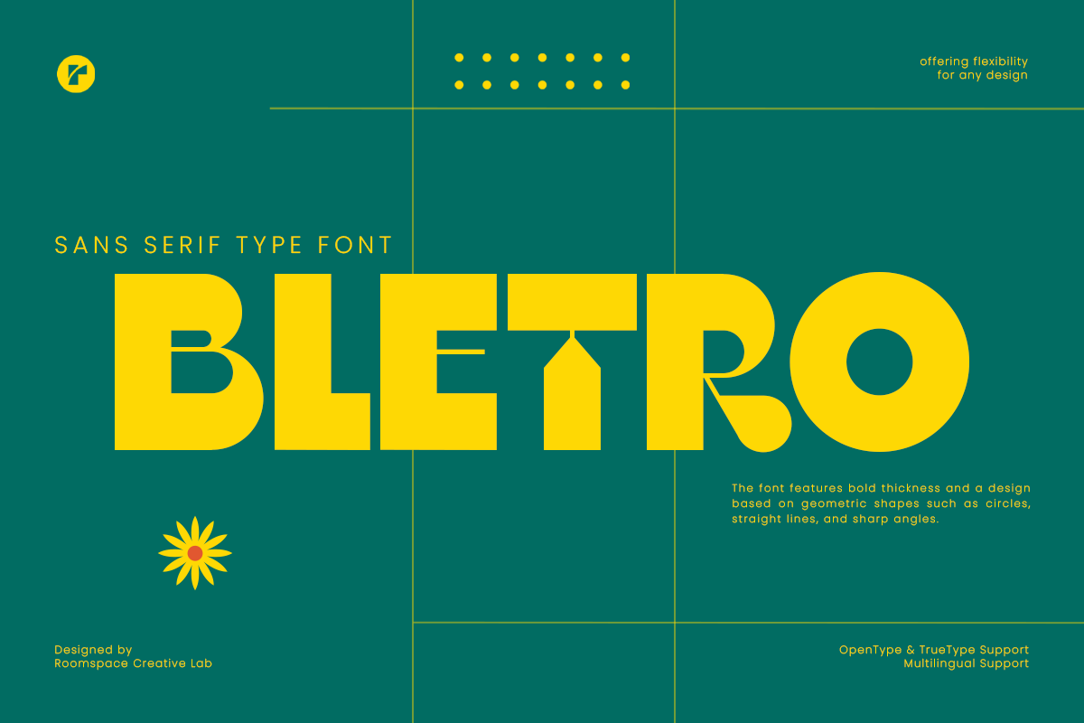
Bletro is a clean, architectural grotesk with sharp angles and a confident, no-nonsense structure. It sits right at the intersection of modern and retro, which makes it flexible enough for both a startup logo and a vintage-inspired poster.
The sharp cuts in the letterforms give it real presence in tech branding and product packaging, where you want a headline that feels engineered rather than decorative.
Best for: tech logos, packaging design, headline typography. By: roomspace
2. Benzin
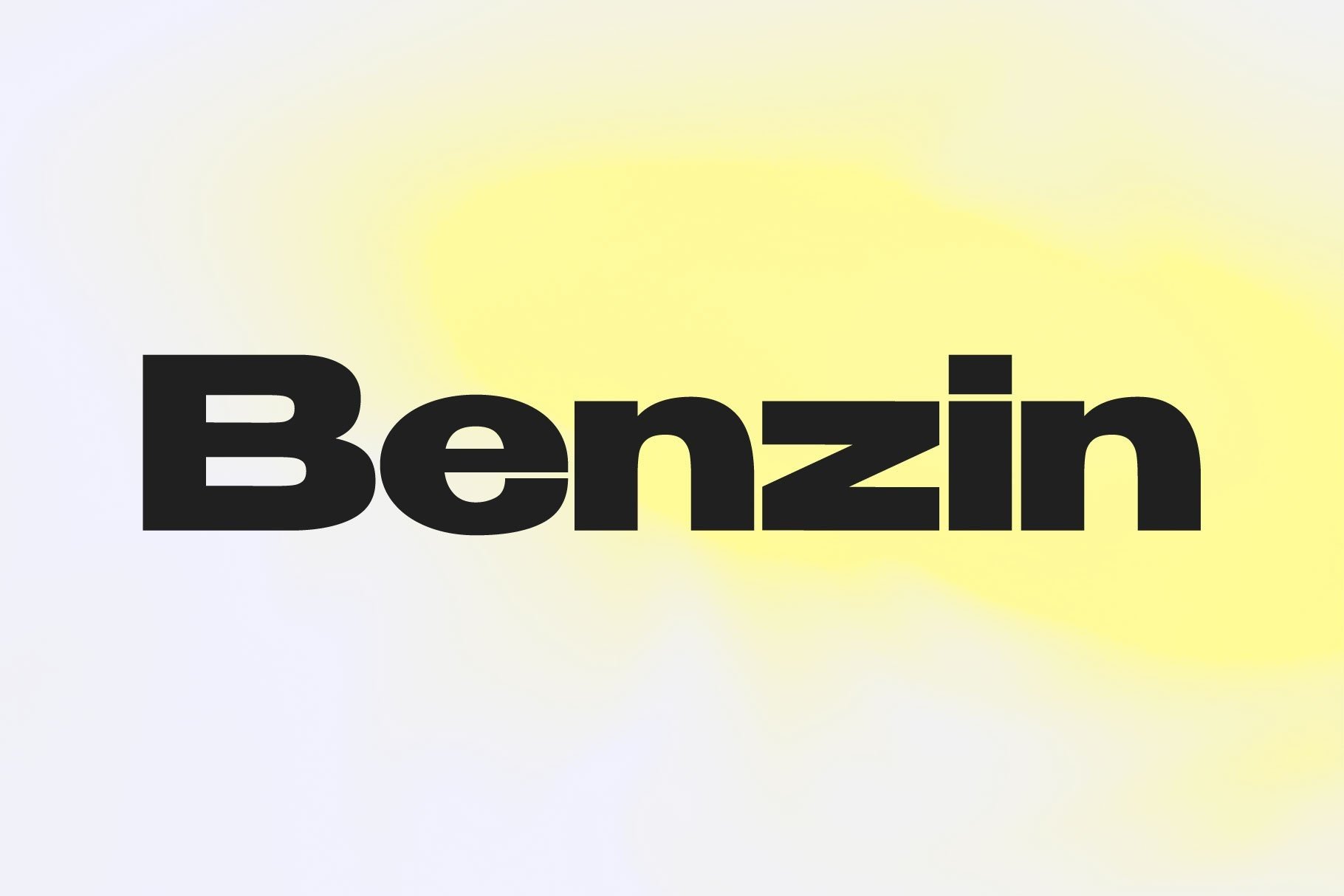
Benzin is a compressed, industrial grotesk with constructivist roots. It reads fast and hits hard, which is exactly why it works so well for anything that needs to feel powerful and in motion.
What sets Benzin apart from most bold display fonts on this list is that it actually ships as a 5-weight family with weight-specific kerning built in, so it functions as a real text system rather than a single showy headline face. That makes it one of the more practical heavy display fonts here, capable of handling both a hero headline and supporting text in the same layout.
Best for: editorial headlines, automotive branding, sports graphics. By: supremat
3. Slizo
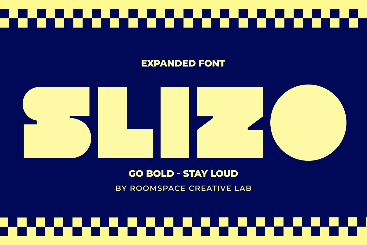
Slizo comes from the same designer as Bletro, but the personality is different. Where Bletro is angular and tight, Slizo stretches wide and expressive, with a confident, street-ready attitude.
It’s a strong choice when you want a bold headline font that feels current rather than corporate, especially for youth-driven or music-adjacent brands.
Best for: streetwear branding, album covers, sports team identities. By: roomspace
4. Gegola
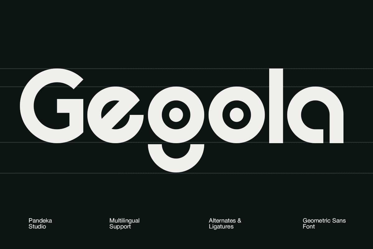
Gegola is the first of three fonts from pandekastudio featured in this list, and it sets a distinctly architectural tone. Every letterform feels modular and deliberate, like it was built from structural components rather than drawn freehand.
Combine that with multilingual support and stylistic alternates, and you get a font that looks engineered and trustworthy right out of the box, exactly the vibe most fintech and tech brands are chasing.
Best for: fintech branding, tech product logos, structured headlines. By: pandekastudio
5. Focus Grotesk
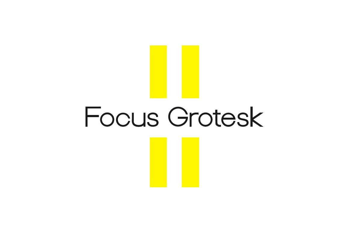
Focus Grotesk is the workhorse of this section. It has a handmade quality to its geometry that keeps it from feeling too mechanical, and it’s built to double as both a display and a body font.
It’s the most restrained, corporate-friendly option among the bold sans-serifs here, and that’s the point. When a project needs the headline and body copy to feel like they belong to the same family instead of fighting each other, this is the one I’d reach for first.
Best for: editorial layouts, UI headlines, corporate branding. By: designova
6. Boldum
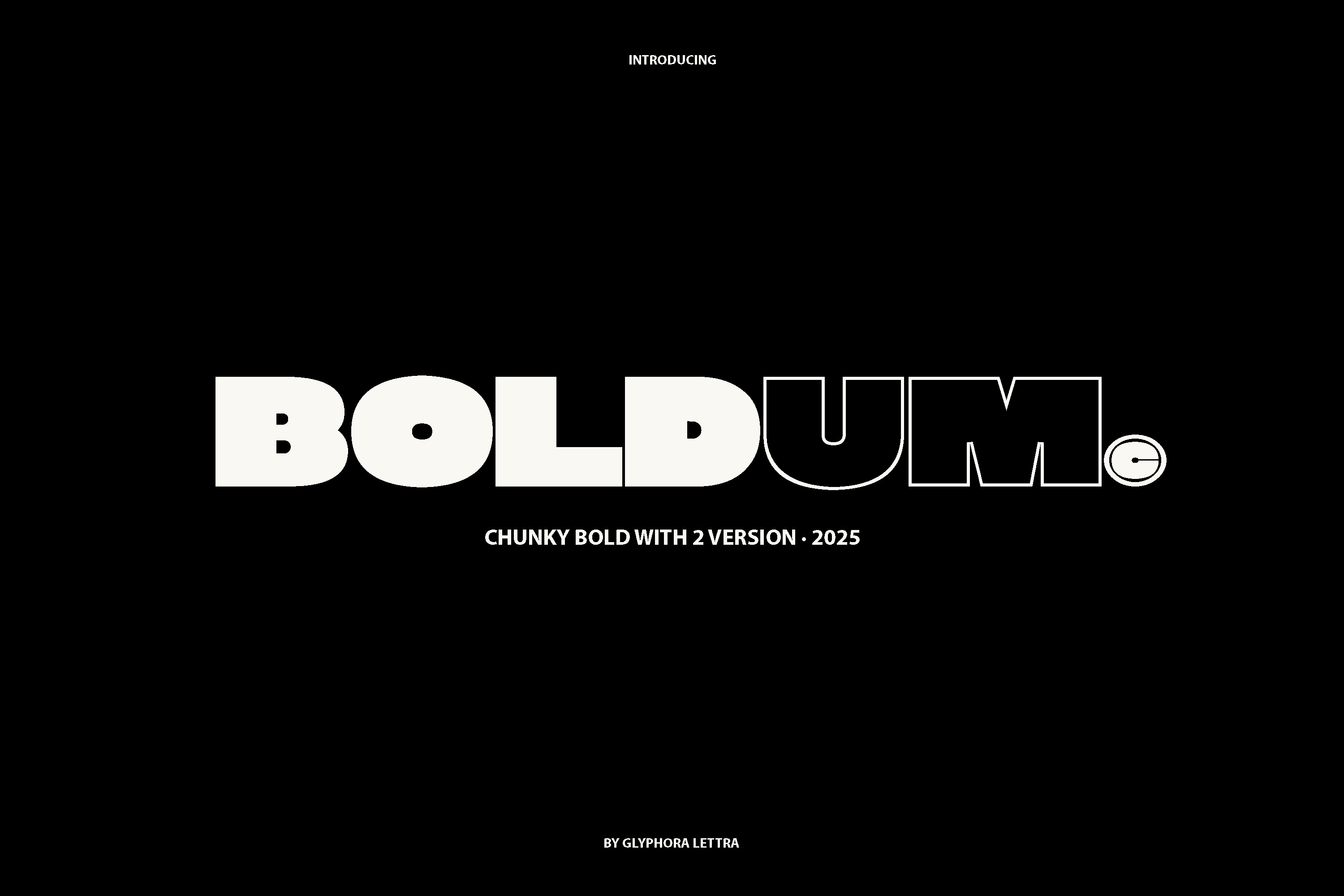
Boldum is massive without feeling aggressive. The rounded details soften what would otherwise be a very heavy geometric sans, giving it an approachable, friendly weight instead of a harsh one.
It manages to look confident without tipping into intimidating, which is harder to pull off than it sounds. Good pick when a brand needs to feel approachable at scale, packaging and posters aimed at a broad audience especially.
Best for: consumer packaging, friendly brand identities, poster headlines. By: Glyphora Lettra
Best Retro & Vintage Bold Fonts
Vintage-inspired bold type keeps resurfacing in modern branding, packaging, and merch, and for good reason. Retro bold fonts carry built-in nostalgia that instantly signals character and craft, which is exactly what a lot of food, beverage, and lifestyle brands are chasing right now.
7. Retrofans
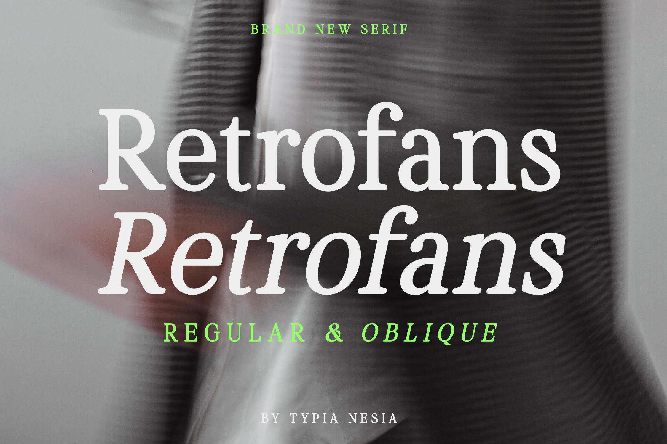
Retrofans channels the bold, chunky lettering of 70s and 80s sports merchandise. It comes with a Regular and an Oblique style, giving it a bit more range than a single-weight retro font.
Slap it on a poster or a concert flyer and it instantly feels like it stepped out of a vintage varsity jacket.
Best for: posters, sports merch, nostalgic branding. By: Typia Nesia
8. Chunky Retro
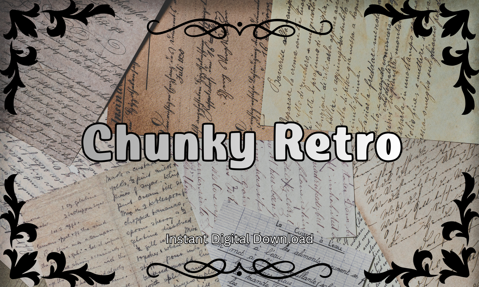
Chunky Retro has a thick, rounded shape that feels straight out of a mid-century diner sign or a neon storefront. It leans playful rather than aggressive, which is what gives it such strong packaging and menu appeal.
It’s also built with crafters in mind. Chunky Retro is explicitly Cricut and Silhouette compatible, with a commercial license included, so it works just as well cut from vinyl as it does printed on a menu.
Best for: menu design, packaging, Cricut and Silhouette craft projects. By: Pamlico Creations
9. Retro Bold
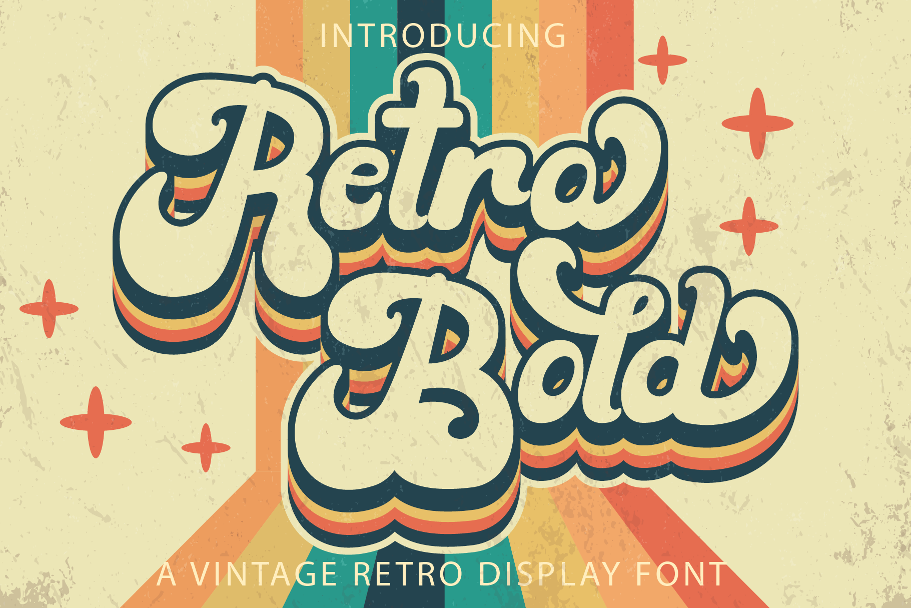
Retro Bold stands apart from the rest of this section because it’s technically a script font, not a discrete letterform bold. The connected, handwritten letterforms give it a looser, more personal retro feel than a classic block-letter vintage face.
If you want the nostalgic weight of retro type but with a friendlier, more casual flow, this is the one to reach for instead of a stiffer vintage sans.
Best for: vintage-style logos, packaging labels, casual retro branding. By: Densu Creative
10. Classic Bold
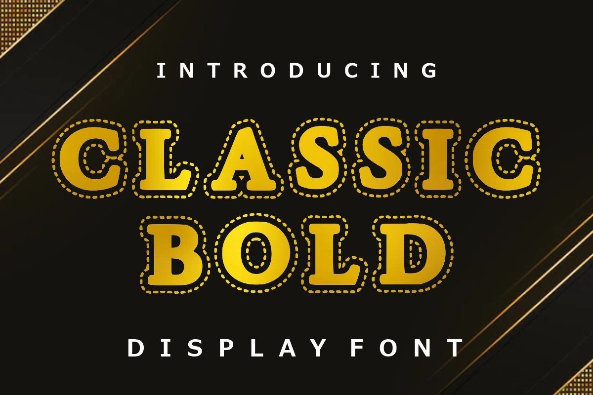
Classic Bold carries heavy, well-proportioned serifs that feel timeless rather than trendy. It’s the kind of vintage font that reads as established and trustworthy, not gimmicky.
Reach for it when you want vintage charm without the vintage baggage, premium packaging, monogram work, anything that needs to look established rather than trendy.
Best for: premium packaging, monograms, sporting event branding. By: Infinity art Studio
Best Decorative Bold Fonts
Sometimes bold isn’t just about weight, it’s about personality. Decorative bold fonts add texture, dimension, or a distinct visual gimmick on top of a heavy structure, and they’re best used when a project needs to feel unmistakably unique rather than simply strong.
11. Bold Rust
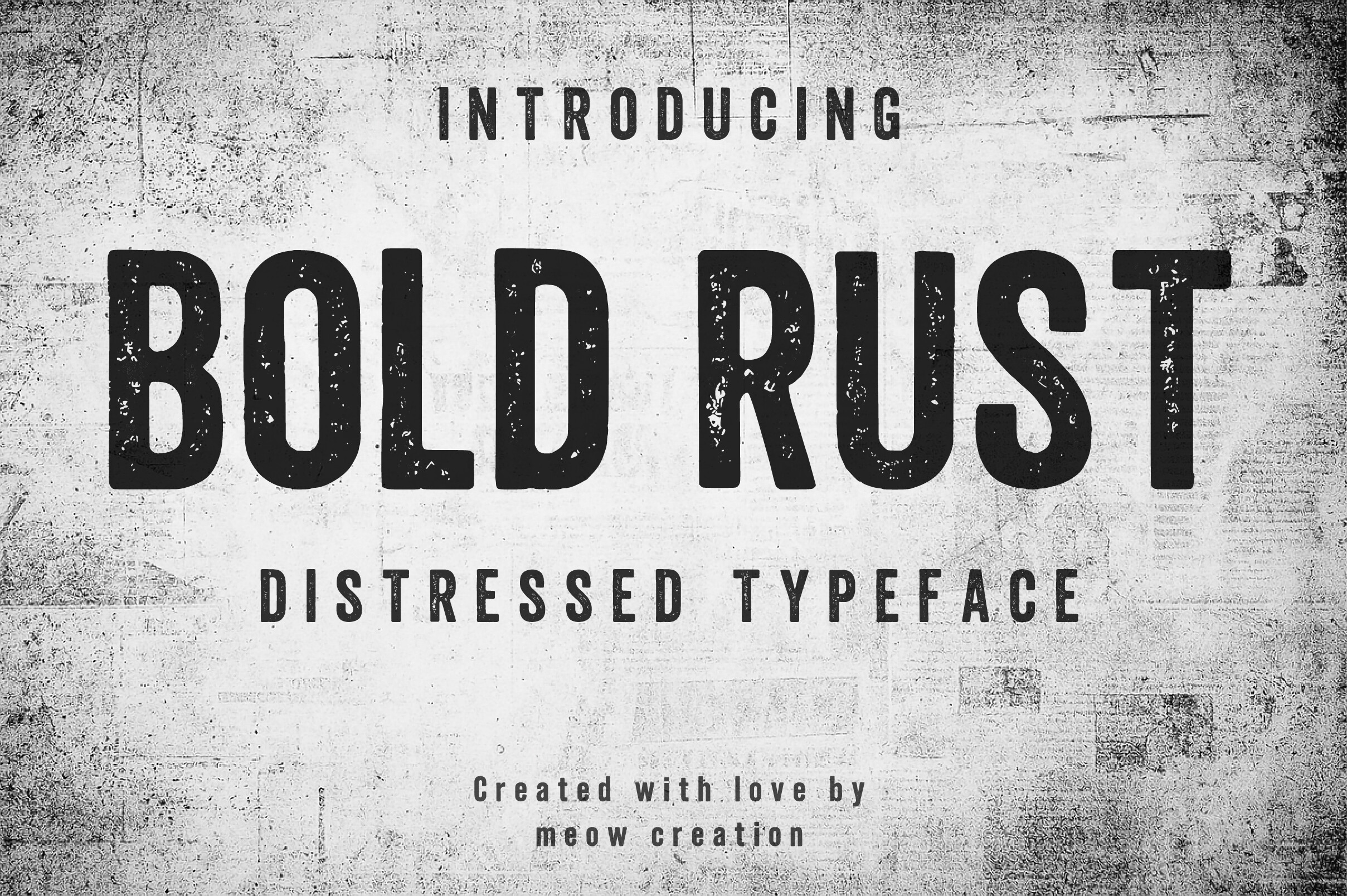
Bold Rust builds an aged, corroded texture directly into the letterforms, so the distressing feels baked in rather than added as an afterthought. It’s a heavy display font that looks like it’s been through something.
It’s the obvious pick for brutalist, industrial-leaning designs, anything trying to evoke old machinery, tools, or urban decay without faking the texture in post.
Best for: industrial branding, t-shirt graphics, signage with grit. By: Meow Creation
12. Boldstrom
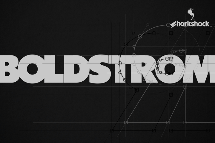
Boldstrom is a dense, decorative display font built to hold its own on a poster. The letterforms stay legible even when scaled down, which isn’t always true of heavily stylized bold fonts.
If you need a chunky font for posters that won’t fall apart at a smaller size, Boldstrom is a dependable option that doesn’t ask you to compromise on readability.
Best for: event posters, flyers, standout headline typography. By: Sharkshock
13. Juicy Snap
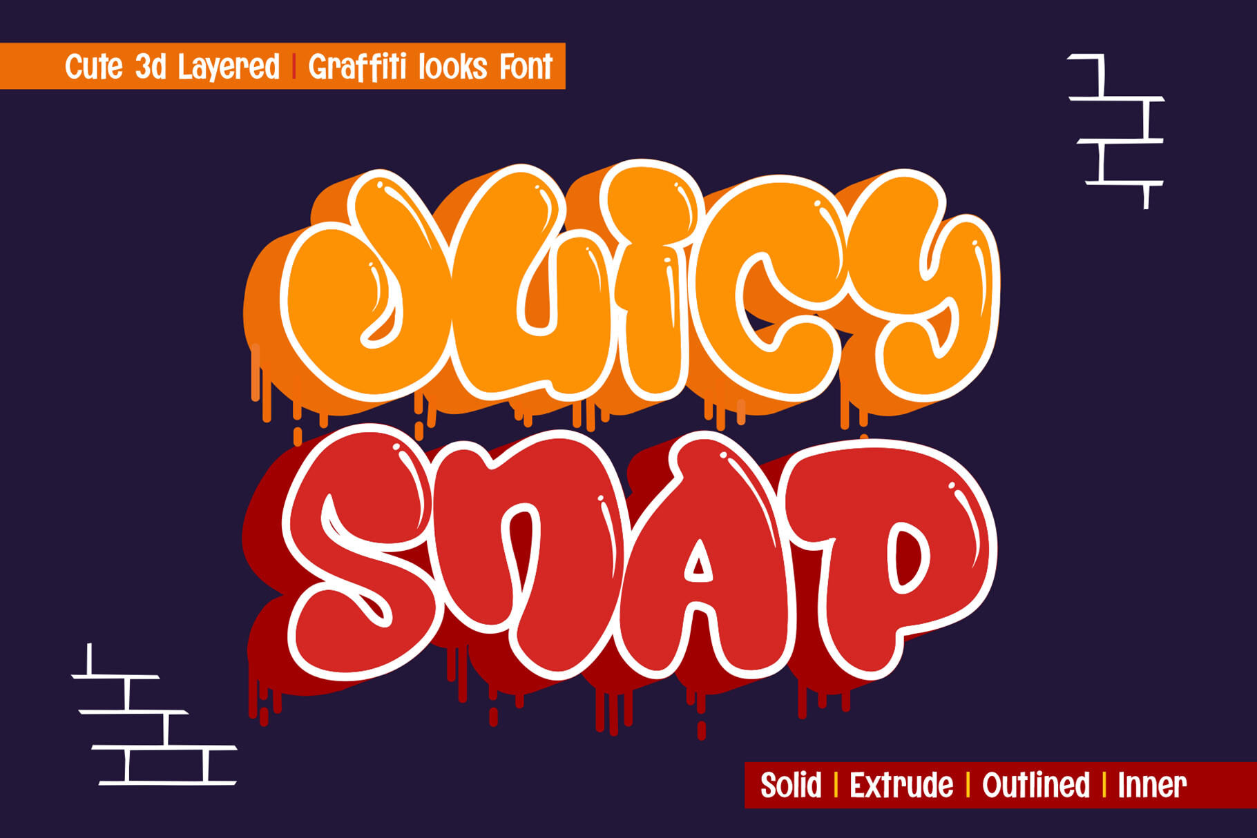
Juicy Snap has a lively, organic feel that leans into graffiti-style lettering. What makes it genuinely different from other decorative bold fonts is its 4-layer build system, extrude, outline, solid, and inner shadow, which lets you stack layers to create real 3D depth without extra software work.
It’s actually fun to work with, and that flexibility is a big part of why it does so well on food branding and playful packaging, where a little dimension helps a design pop off the shelf.
Best for: food and beverage branding, farmers market packaging, playful street-style graphics. By: sipanji figuree
14. Bold Outline
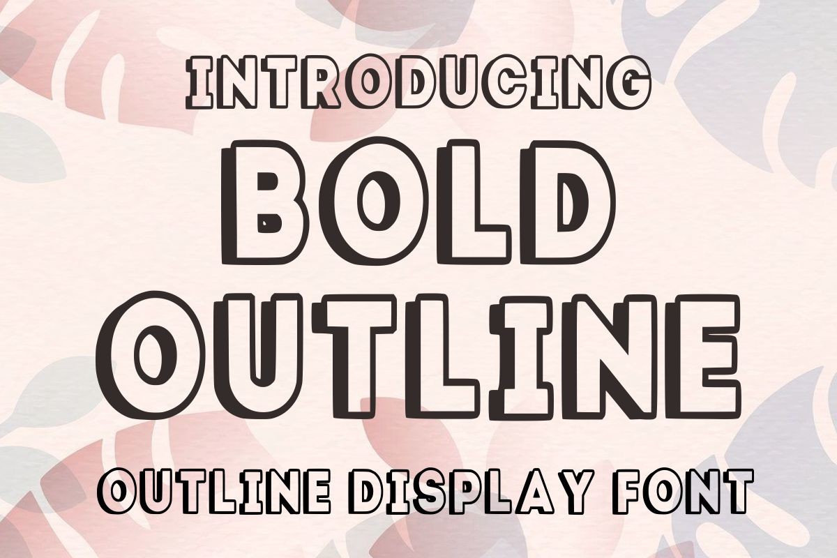
Bold Outline takes the solid weight of a classic bold display font and hollows it into a stroke-based outline. It works as its own standalone style, or layered directly over a filled bold font for a doubled-up effect.
That’s more versatile than most decorative fonts get. It can act as an accent layer just as easily as it can carry a headline on its own.
Best for: craft projects, presentation titles, greeting cards. By: Infinity art Studio
Best Bold Serif Display Fonts
Bold serif fonts carry a sense of authority that sans-serifs often can’t match. They’re rooted in editorial and print tradition, which makes them a strong choice whenever a brand wants to feel established, credible, or a little dramatic.
15. Chunk
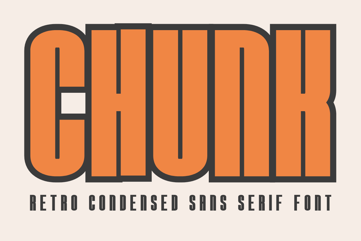
Chunk is a condensed, retro-signage-inspired display font with thick strokes and smooth curves, closer to a heavy bold sans than a true serif. Its almost mechanical geometry gives it a strong, structural presence at large sizes.
It’s worth being precise here: Chunk is not the same font as Chunky Display later in this list, despite the similar name. Chunk is angular and structural with no softening, which makes it a great fit for movie posters and newspaper-style headlines.
It’s also built for makers, with Cricut and Silhouette compatibility that extends its use beyond screen and print into cut vinyl and stickers.
Best for: movie posters, newspaper headlines, t-shirt and sticker design. By: CraftedType Studio
16. Chunky Display
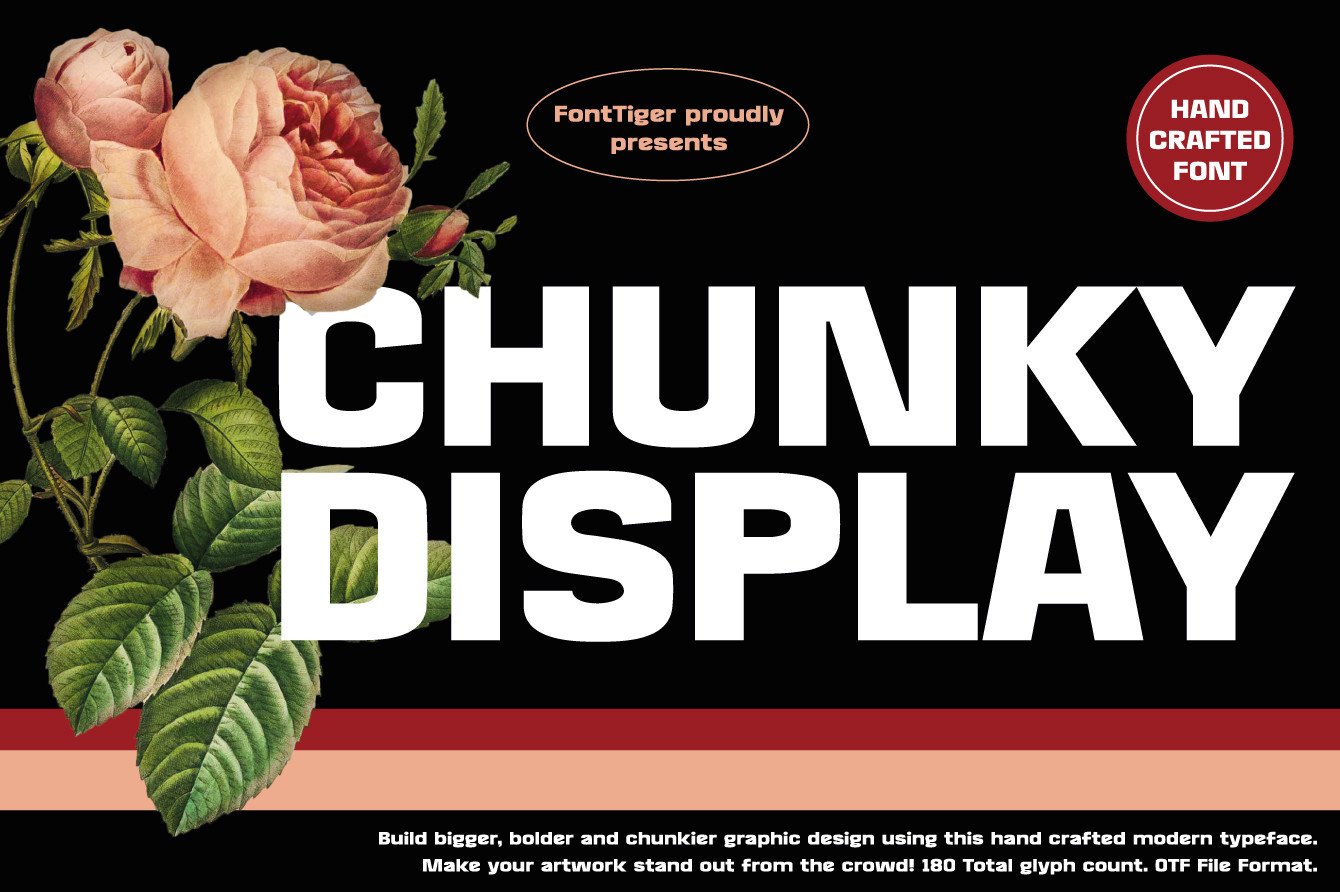
Chunky Display is a separate font from Chunk, made by a different designer, and it reads noticeably softer. The serifs here are plumper and more rounded, which gives it a friendlier, more approachable weight.
Both fonts carry heavy strokes, but Chunky Display’s softness makes it the better fit for advertising and kid-focused branding, where Chunk’s sharper edges would feel too severe.
Best for: advertising headlines, children’s brand packaging, casual display type. By: FontTiger
17. Otha
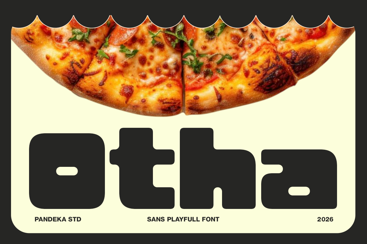
Otha is the second pandekastudio font on this list, and it takes a completely different direction from Gegola’s architectural precision. Otha is rounded, playful, and poster-ready, with a heavier visual weight that makes a statement rather than a structure.
It ships in 4 styles, Regular, Outline, Oblique, and Oblique Outline, with multilingual support built in. That range makes it a solid choice for restaurant and food branding that wants a bold, fun voice without taking itself too seriously.
Best for: restaurant branding, food packaging, children’s product labels. By: pandekastudio
Best Modern Bold Display Fonts
Modern bold display fonts push past classic proportions. They experiment with negative space, unusual letter shapes, and optical tricks that make them feel distinctly contemporary rather than rooted in a specific era.
18. Fablo
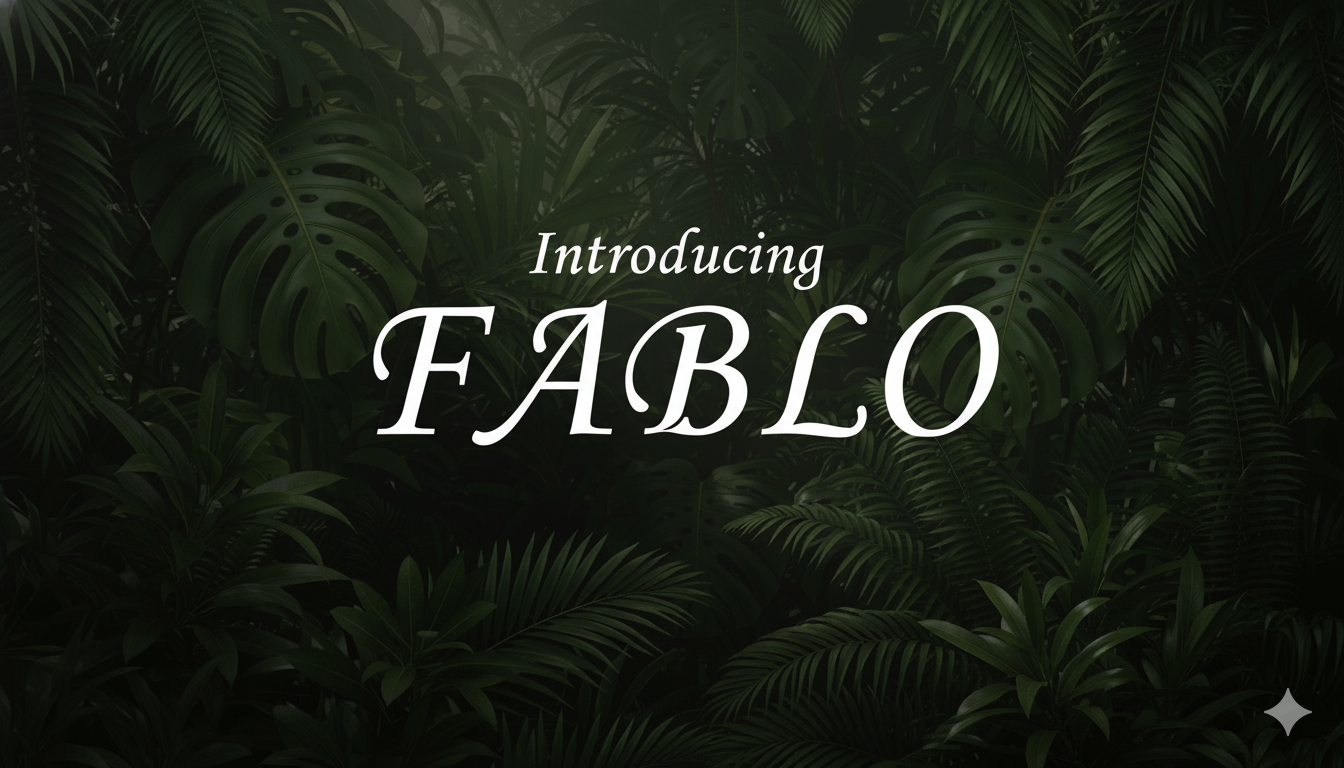
Fablo has clean lines and confident, artistic letter shapes that give it a high-fashion feel. There’s an understated luxury to it, the kind of bold display font that doesn’t need to shout to look expensive.
It works well anywhere restraint is part of the appeal, luxury branding, editorial titles, the kind of design where saying less is what makes it feel expensive.
Best for: luxury branding, editorial titles, digital hero graphics. By: lawboomer
19. High Octane
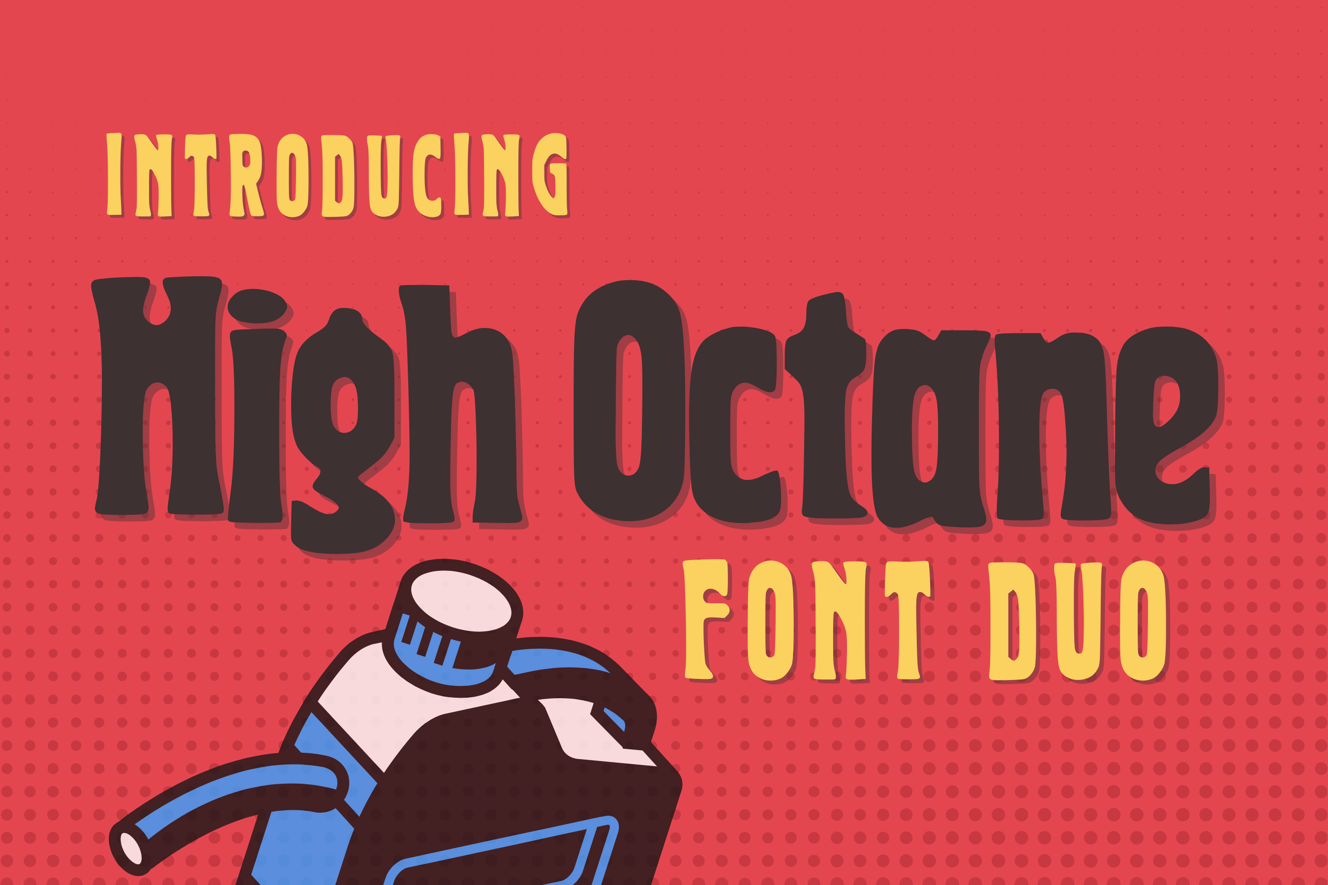
High Octane leans into motion. The slanted, energetic letterforms and distinctive per-letter detailing give it a real sense of speed, which is exactly the point.
It’s built for automotive branding, sports posters, and gaming graphics, anywhere the whole message is energy and speed.
Best for: automotive branding, sports posters, gaming and esports graphics. By: The Tenacious Type Studio
20. Sogea
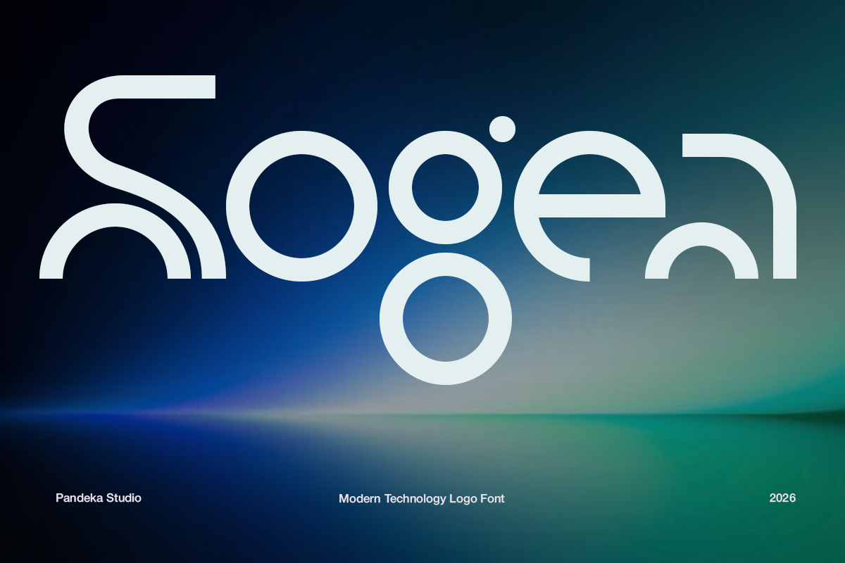
Sogea closes out the pandekastudio trio, and it’s the most refined of the three. Where Gegola is architectural and Otha is playful, Sogea is sleek and minimalist, with elegant proportions that feel closer to fashion typography than a typical bold display font.
It ships in a single Regular style, but with more than 24 languages supported, it’s a real global option, useful for tech, AI, and premium branding that would rather look polished than loud.
Best for: tech and AI branding, fashion and beauty logos, premium corporate identity. By: pandekastudio
How to Use Bold Display Fonts in Your Designs
If there’s one rule I repeat every time someone asks me how to use bold fonts in design, it’s this: use one bold display font per layout. Let it dominate the headline, and support it with a quiet, neutral font for body copy. Two bold display fonts fighting for attention on the same page almost always breaks the visual hierarchy.
Pairing matters just as much as the font itself. A heavy display font usually needs a lighter, simpler partner, for example High Octane with a clean sans like Inter, or Bletro with a classic serif like Garamond for body text. The contrast in weight is what makes the pairing work.
Bold display fonts also have a size floor. They’re designed to live at 48pt and up, where their character reads clearly. Push them into long paragraphs or small captions and they lose the impact they’re built for. A dark or simple background also helps a heavy font read cleanly, while busy backgrounds fight against it.
For getting these fonts into your actual workflow: Figma and Adobe Illustrator handle them natively (convert to outlines before exporting for print), Canva Pro lets you upload custom fonts through the Brand Kit, and Cricut Design Space supports OTF and TTF uploads directly, which is exactly how outline-friendly fonts like Bold Outline or Cricut-tested picks like Chunky Retro and Chunk get used for vinyl and merch projects.
Decorative fonts like Bold Rust or Juicy Snap work best in small doses, think accent words or a single headline, rather than filling entire sections of text.
Tips for Choosing the Right Bold Font
Match the style to the job. Retro bold fonts suit nostalgia-driven brands, modern bold fonts suit tech and forward-looking products, and bold serif fonts lend authority to anything that wants to feel established.
Check the license before you commit to a project. Most Creative Fabrica fonts include commercial licensing, but the personal-versus-commercial line is about purpose and profit, not price, so it’s worth confirming the specific license details on each product page before using a font for client or for-profit work.
Test readability across sizes. Some decorative bold fonts lose clarity below 36pt, so check how a font looks small before locking it into a design that needs to scale down.
Every font on this list works across the standard design toolkit: Adobe Illustrator, Photoshop, Figma, and Canva, plus Cricut Design Space for craft-friendly options in OTF or TTF format.
And resist the urge to combine two display fonts on one layout. I’ve seen it tried plenty of times, and it never works, they just end up competing for attention instead of building a clear hierarchy.
Where to Download Bold Display Fonts
Creative Fabrica is the primary source for the fonts featured in this article, and most come with commercial-use licensing, many included in an All Access subscription. If you’re after free bold display fonts, Google Fonts offers open-license (OFL) options, though the bold, characterful styles are harder to find there. DaFont has a huge free library, but licensing varies font by font, so check carefully before commercial use. Font Squirrel is a safer bet if you specifically want fonts pre-verified for free commercial use.
If you found a style you like above, the fastest way to get it into your next project is to browse the full Creative Fabrica font collection and download it directly, or check the FontPro blog for more font pairing guides and inspiration.