· fonts · 13 min read
11 Best Easter Fonts for Cards, Invitations, and Crafts in 2027
Browse hand-picked Easter fonts for cards, invitations, egg decorating, church flyers, and seasonal crafts, with tips on pairing, palettes, and licensing.
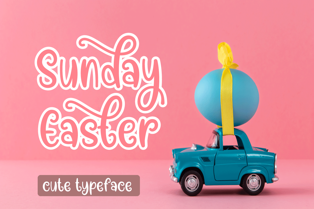
Easter is one of the busiest seasons for cards, invitations, and small craft projects. Whether you are making a brunch invitation, decorating eggs, or preparing a church flyer, the right typeface can set the mood before anyone reads a single word. A warm script can feel personal, a playful display style can feel festive, and a clean sans-serif can keep details easy to read. This list of best easter fonts brings together options for both religious and secular projects, so you can choose a tone that fits your audience. You will also find practical notes on pairing, palettes, easter fonts for Cricut, Canva use, and licensing.
What Makes a Great Easter Font?
A great Easter font does more than look seasonal. It carries the feeling of the project. For a family card, you want warmth. For an egg hunt invitation, you want energy. For a church announcement, you want calm and clarity.
First, look for a friendly mood. Rounded forms, soft curves, and a light touch of playfulness work well for spring letters. The style should feel inviting without becoming noisy. If a font looks too busy, it can distract from the message on a small card or a pastel background.
Second, check readability. Easter designs often use soft colors, and light text on light backgrounds can disappear quickly. A good easter font should stay clear at a small size, on a phone screen, and in print.
Third, consider flexibility. Many projects need one expressive headline and one simple caption. A font that works for a greeting, a short label, and a small note saves time across cards, gift tags, and social posts.
Finally, match the tone. Easter can be religious, family focused, or playful. If you are asking what is the best font for Easter cards, the answer depends on tone: script or handwritten for personal cards, calm readable styles for religious ones. A bold display face can suit a kids’ egg hunt.
Where Easter Fonts Work Best
Easter fonts for invitations, cards, and crafts show up in many places. Here is where they work best:
- Greeting cards and postcards: a script or handwritten style makes a short message feel personal, while a display face can make the front cover feel festive.
- Invitations: brunch, egg hunt, and family dinner invites benefit from a readable headline plus a simple body font for details.
- Egg decorating: vinyl decals, stickers, and labels tend to work best with simple, sturdy lettering that is easy to cut and handle.
- Church and community flyers: these pieces work best with calm, readable styles that respect the message while still feeling seasonal.
- Social media posts and stories: short headlines need to stay clear on a small screen, so choose a style that remains visible in a thumbnail.
- Printables: name cards, banners, gift tags, and classroom sheets often need a mix of decorative and practical lettering.
- Easter baskets and gift tags: small labels call for compact, legible type that does not crowd the tag.
- Cookie and bakery packaging: cake toppers, boxes, and window signs can use playful display styles when the details remain easy to read.
The font should support the project, not fight it.
Best Script and Handwritten Easter Fonts
Script and handwritten styles are the natural choice for personal Easter messages. They work well for cards, signatures, and invitations where the tone should feel warm and human. The picks below lean toward friendly easter script fonts, from soft and gentle to playful and bright.
1. Sunday Easter
Sunday Easter is a script style pick that feels warm and personal. The name suggests a gentle, Sunday morning tone, and the style suits short greetings where you want a hand lettered feel.
For cards, it can carry a simple seasonal message or a short blessing. It may also suit captions, signatures, and small labels.
Best for: greeting cards, short captions, hand lettered style headers. By: Halo Whimsy Creative
2. Well Hello Easter
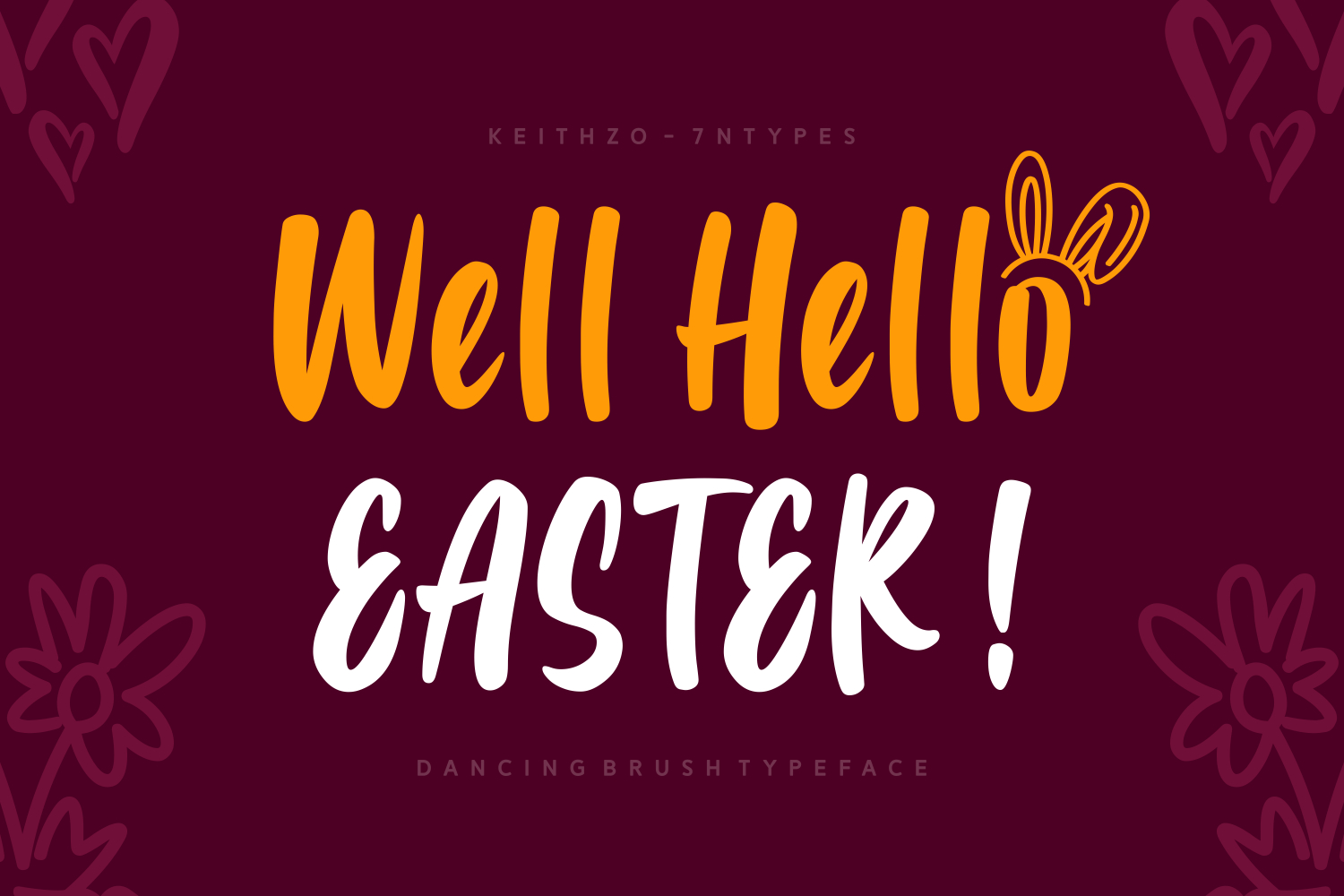
Well Hello Easter has a friendly, conversational feel that suits casual greetings and social posts. As a handwritten style, it can make a short phrase feel like a quick note from a friend. That makes it a good choice when you want cute easter fonts that stay approachable and light.
It works well for invitations, story text, and small labels where the tone matters more than formality.
Best for: casual invitations, social media posts, gift tag labels. By: Keithzo (7NTypes)
3. Grateful Easter
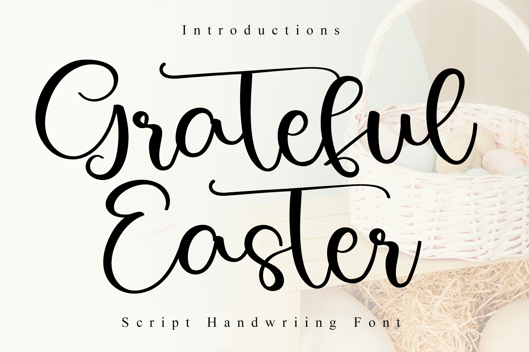
Grateful Easter suggests a thankful, warm tone, and that makes it a useful option when you need easter fonts for cards that focus on appreciation. The script style can feel sincere without being overly formal, which helps when you want a message to sound personal and gentle.
Because the name leans into gratitude, it can also work for calmer church materials when the design needs a soft, readable greeting.
Best for: family cards, appreciation notes, gentle church announcements. By: 21Design
4. Easter Magician
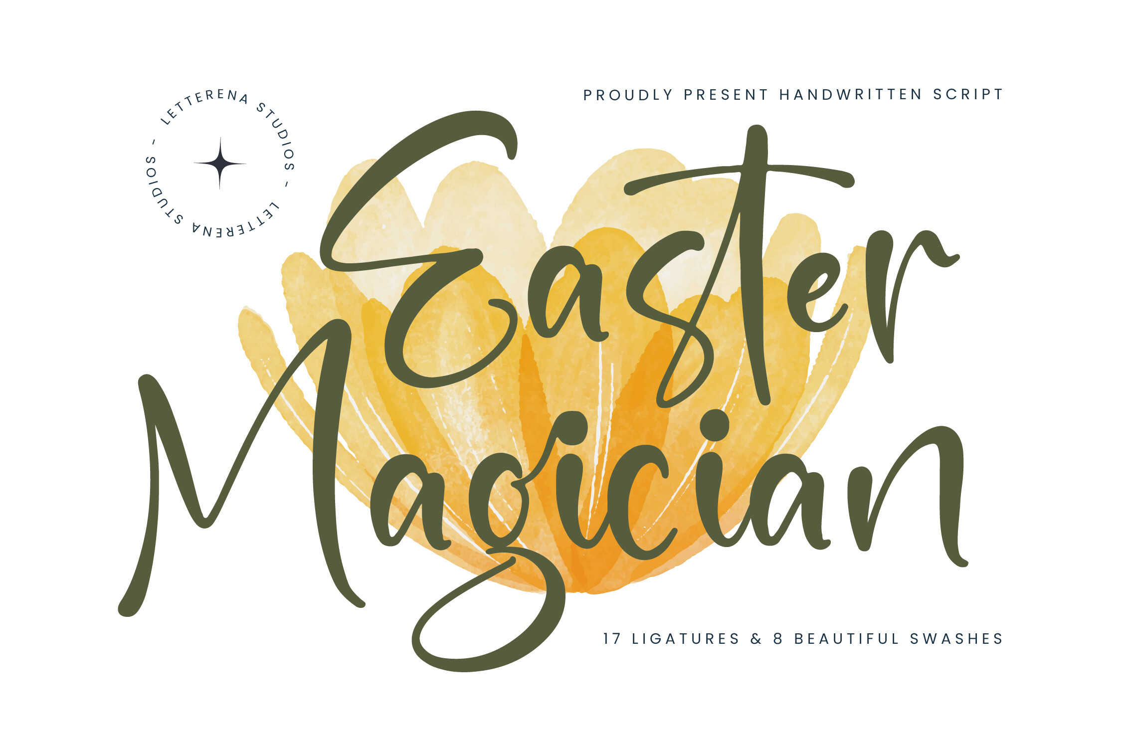
Easter Magician has a playful script feel that suits lighthearted projects and children’s events. The name suggests a sense of surprise, and the style may add a little sparkle to an invitation or a party headline.
Consider it for party invitations, classroom headers, or short captions. Keep supporting text simple so the playful style does not compete with the details.
Best for: kids’ party invitations, playful headlines, social media captions. By: Letterena Studios
5. Easter Lamb
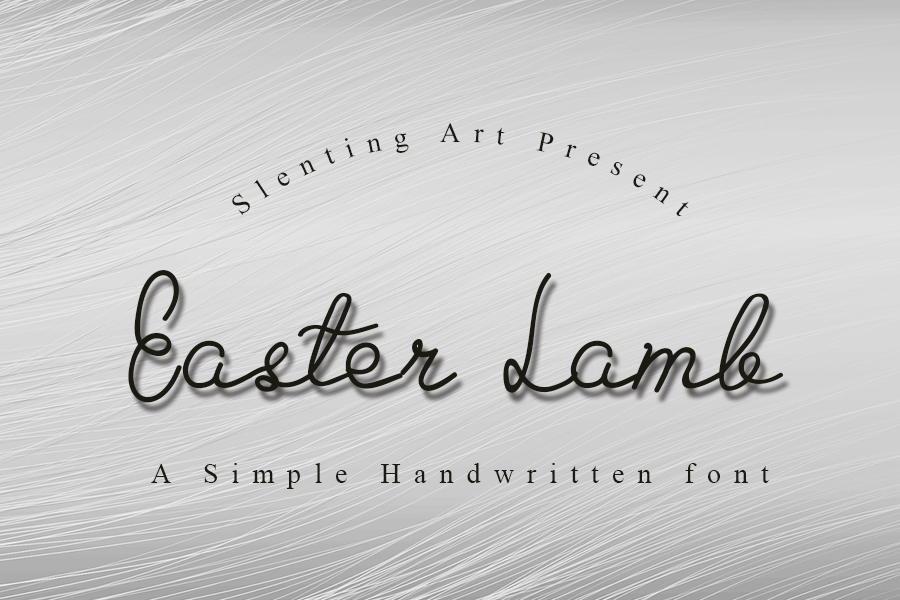
Easter Lamb carries a soft, traditional feel that connects to the familiar Easter image of the lamb. The handwritten style suggests calm and warmth, which makes it a good option for spring cards and gentle seasonal messages.
It may also suit church announcements or community pieces that need a respectful tone. Pair it with a clean body font for short details.
Best for: spring cards, gentle church announcements, seasonal gift tags. By: Slenting Art
Best Display and Playful Easter Fonts
Display and playful styles are the workhorses for headlines, stickers, and party projects. They are the best choice when you need a font to grab attention on a poster, a banner, or a vinyl decal. The picks below lean toward bold, cheerful easter lettering.
6. Easter Dreaming
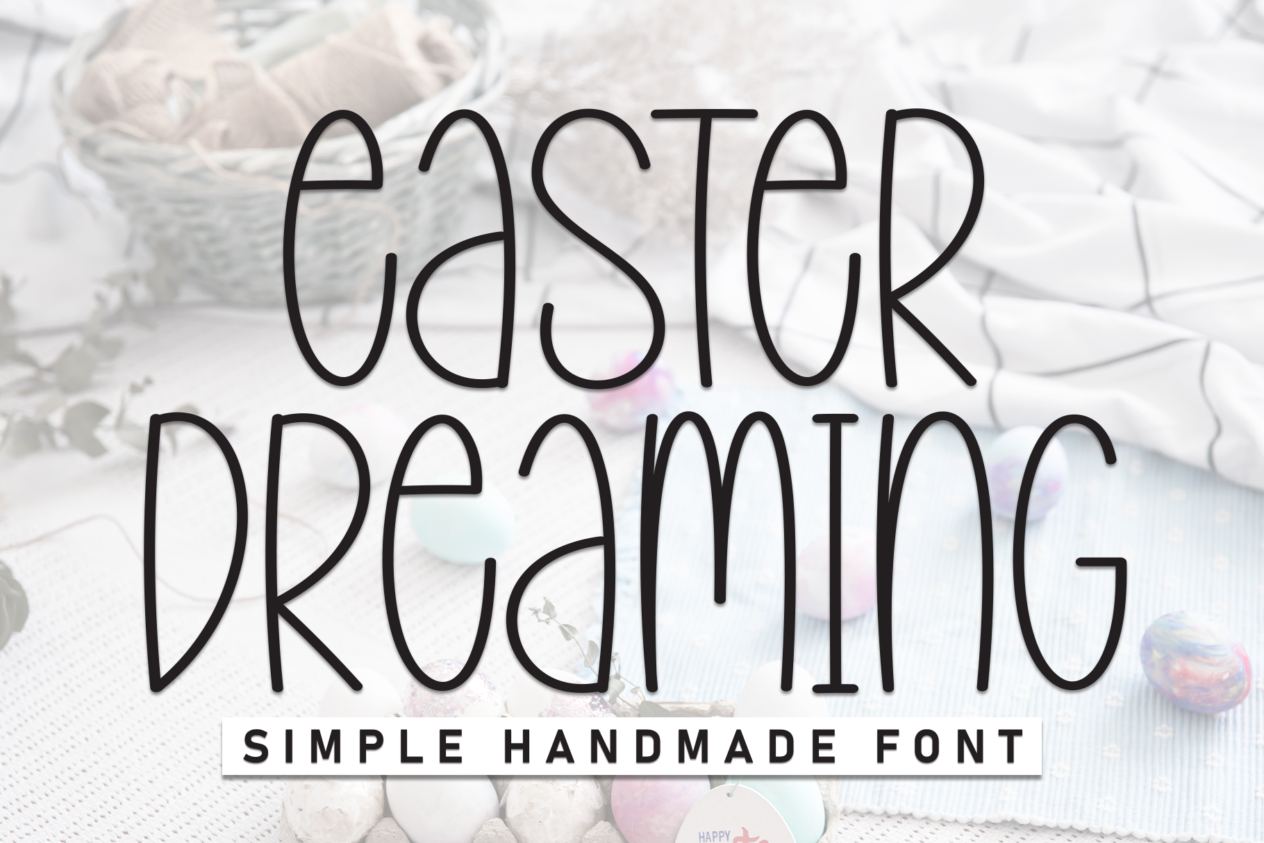
Easter Dreaming has a playful display feel that suits bright spring headlines. The name suggests a light, imaginative mood, and the style can add a sense of wonder to a banner or a social post.
Consider it for post headlines, event banners, and short labels.
Best for: post headlines, event banners, printable headers. By: Robbots stores
7. Eggstra Fun
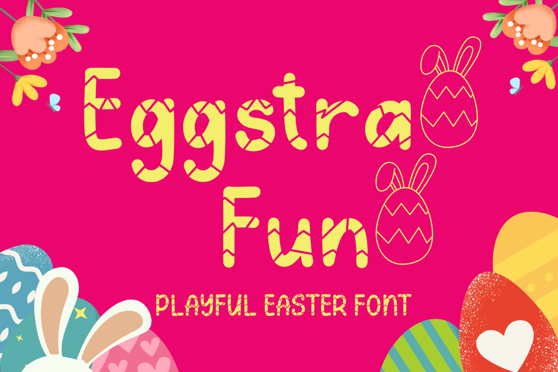
Eggstra Fun is a playful display option that fits egg hunts, classroom sheets, and kids’ printables. The name leans into a lighthearted pun, and the style can make a simple invitation feel more energetic.
It may work for egg hunt invitations, activity sheets, and small party labels, or a short bakery sign.
Best for: egg hunt invitations, kids’ printables, classroom sheets. By: AEN Creative Studio
8. Easter Egg
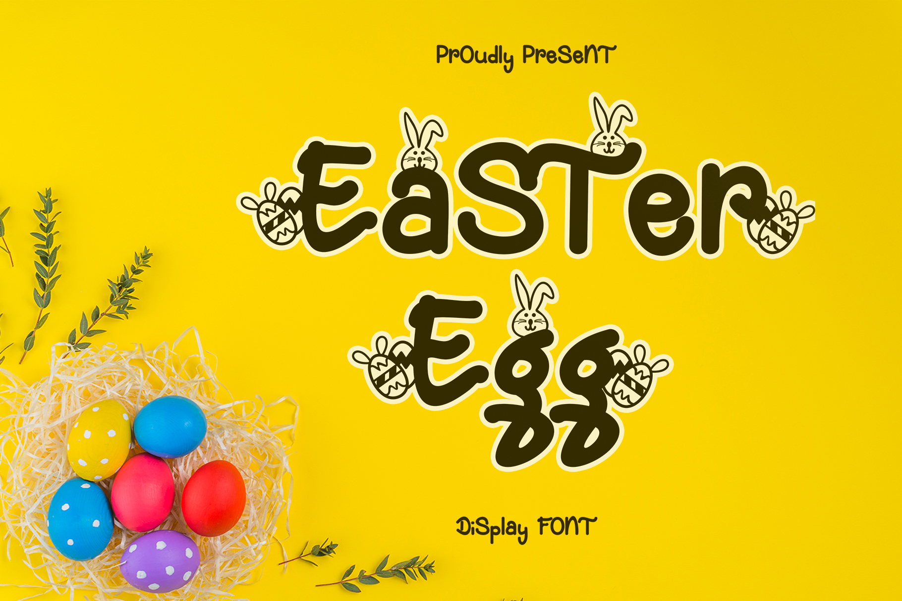
Easter Egg is a cheerful display pick that connects directly to one of the most recognizable Easter symbols. The name suggests a fun, seasonal mood, and the style may suit stickers, labels, and short decorative headlines.
Use it for egg decorating labels, gift tags, and small decals where simple, sturdy lettering helps. Check the preview on the product page at the size you plan to use.
Best for: egg decorating labels, gift tags, vinyl decals. By: Arkrist Letter Studio
Best Decorative and Sans-Serif Easter Fonts
Decorative and sans-serif styles bring a cleaner structure to Easter designs. They are useful when you need readability for posters, packaging, store promotions, or any project where the message must be clear at a glance. The picks below offer a more organized look.
9. Blockton Easter
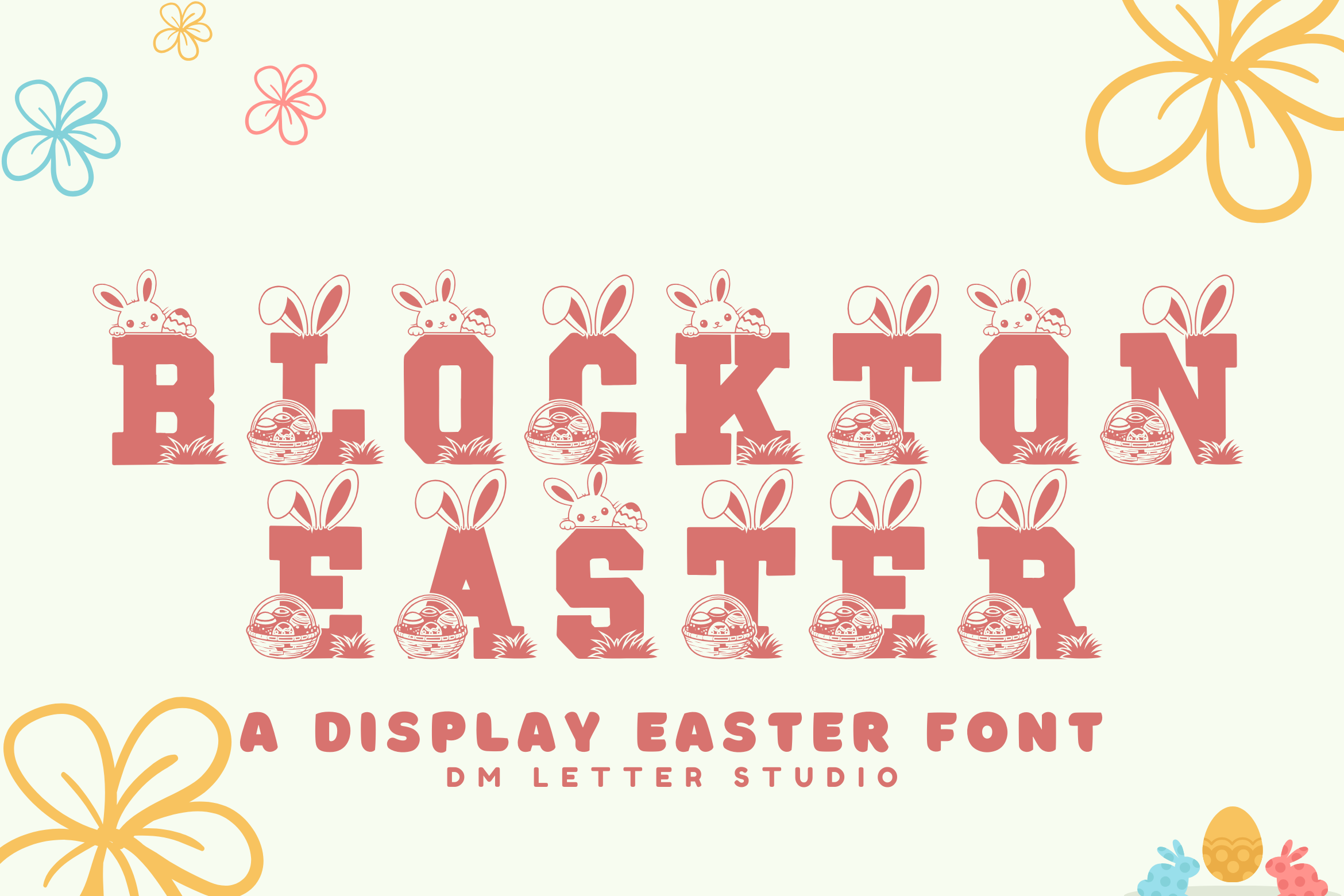
Blockton Easter suggests a blocky, structured direction, which makes it worth a look for posters and banners that need a strong headline. Check the preview to see how it reads from a distance.
Consider it for a banner or a short promotional message.
Best for: posters, banners, store promotions. By: Sharon (DmStudio)
10. Pastel Palooza
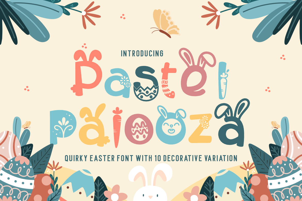
Pastel Palooza connects naturally to soft spring colors and gentle seasonal palettes. The name suggests a light, cheerful mood, and the style can help a design feel fresh without needing heavy decoration.
Consider it for gift tags, card headers, and social posts where the color palette does a lot of the work.
Best for: pastel palettes, gift tags, spring card headers. By: putracetol
11. Happy Easter
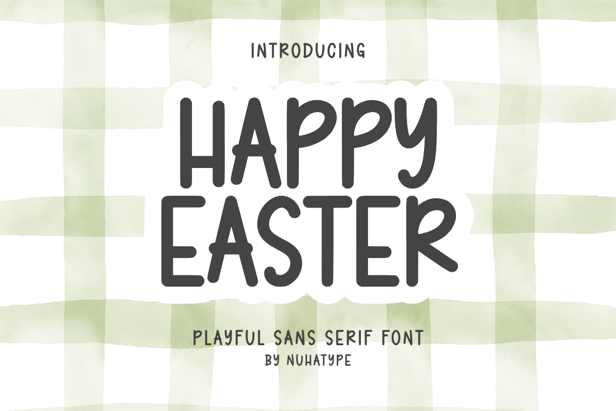
Happy Easter is a straightforward decorative option that suits greetings, cards, and short social posts. The name makes the intent clear, and the style can bring a cheerful tone to a simple layout.
Consider it for greeting cards, post headlines, and small labels.
Best for: greetings, cards, social posts. By: Nuhatype
Choosing Pastel Palettes and Font Pairings for Easter
Color and type work together, and Easter is a season where soft palettes can make or break a design. The most common choices are pink, lavender, mint, lemon yellow, and sky blue. These colors feel springtime and work well for spring fonts, cards, invitations, and social posts. For calmer or more religious pieces, cream and beige can provide a quieter background that lets the lettering feel respectful.
Contrast is the first rule. Light text on a pastel background can disappear quickly, especially in print or on a phone screen. If your background is soft, use a darker shade for the text. A deep plum, forest green, navy, or warm brown can keep the design gentle while still readable.
Pairing is the second rule. A strong approach is to use one expressive font for the headline and one simple font for the body. A script or display style can carry the greeting, while a clean sans-serif or simple serif can handle names, times, and details. Two fonts are usually enough. If you add a third, make sure it only appears in a tiny accent, such as a date or a small label.
For a playful egg hunt, a bold display headline with a simple sans-serif body can feel energetic. For a church flyer, a soft script headline with a readable serif body can feel warm and grounded.
How to Use Easter Fonts in Your Projects
Once you choose a font, the next step is making it work in your actual project. A few practical habits can save you time and avoid surprises.
- For Cricut and vinyl work, check the lettering before you cut. Thin lines and tiny details can be harder to weed, especially on curved egg surfaces. For egg decals, simpler shapes are usually easier to work with, so test cut a spare piece first. If you are using Cricut Design Space, check the current Cricut help pages for how to add fonts, then confirm the letters look right before you send the project to the machine. Material and cutting results vary, so a small test is always worth it.
- For Canva, custom font availability can depend on your plan and the current rules in the app. If you are using easter fonts for Canva, check the current Canva help pages before you plan a project around a specific upload. If the font does not appear, test a backup style early so you are not stuck at the last minute.
- For installation on Windows or Mac, the basic process is similar: download the font, unzip the file, install it, and restart the program you are using. After that, the font should appear in your design app. If it does not, try restarting the app or checking that the file installed correctly.
- For size, keep headlines large enough to read at a glance. Captions should not be too small, especially for print, stories, and labels that will be viewed on a phone. A quick test on a thumbnail can reveal problems before you finish the design.
- For church and community materials, choose calm, readable styles and avoid overly cartoonish lettering. The tone should feel respectful, even if the design is seasonal. For secular kids’ events, you can be bolder and more playful, as long as the details remain clear.
- For print, do a test print before you commit to a batch. Check the colors, the contrast, and the spacing. If you are ordering from a print shop, ask for a proof when possible.
Tips for Choosing the Right Easter Font
Choosing the right Easter font is partly about taste and partly about practical checks. Before you finalize a design, run through these questions.
Licensing is the first one. If you plan to sell cards, printables, packaging, or store products, check the license on each product page before you use the font commercially. Personal and commercial terms can differ. Keep a record of where you got the font and what the license allows.
Software compatibility is the second check. Make sure the font works in the tools you plan to use, such as Canva, Cricut Design Space, Illustrator, Photoshop, Procreate, or Word. Check the product page and each app’s current help pages, since support can change.
Legibility is the third check. Shrink the design to a small size and look at it on a phone. Then view it in black and white. If the letters still hold together, the font is likely to work in print and on screen. If they blur together, choose a simpler style or increase the size.
Tone is the fourth check. If you are asking what is the best font for Easter cards, the answer depends on tone: script or handwritten for personal cards, calm readable styles for religious ones. A playful egg hunt can handle bold, cute easter fonts. The best font is the one that matches the audience, not just the season.
Timing is the fifth check. Easter falls in late March or April, depending on the year, and the projects around it take time. Printing, ordering materials, shipping, and school or church mailings all need lead time. Starting several weeks ahead, even from this autumn, gives you room to test fonts, fix layout issues, and avoid a last minute rush.
Where to Download Easter Fonts
You can find these Easter fonts on Creative Fabrica, where each product page shows the preview, the designer, and the license details. That is the best place to check what is included before you download. If you are browsing for more seasonal options, the FontPro blog has additional font roundups and practical design tips.
You can also look at other sources, such as Google Fonts and DaFont, for extra inspiration or backup styles. Just remember to check the license before using any font in a commercial project.