· fonts · 12 min read
14 Best Spring Fonts in 2026
Discover the best spring fonts for Easter cards, garden parties, packaging and social posts: floral letters, blossom scripts, Easter fonts and clean picks.
The best spring fonts feel light and fresh: flowers tucked into letters, blossom scripts that dance along the baseline, and cheerful Easter faces for cards and egg hunts. Here are 14 spring fonts from Creative Fabrica, plus pairing, color and Cricut tips.
What Makes a Font Feel Like Spring?
Spring type feels lighter. It has soft curves, open spacing, and a little movement, like petals opening or a brush lifting off the page. The best spring fonts often lean into that feeling with floral details, blossom scripts, and friendly display letters.
You will see them in Easter cards, garden party invitations, baby shower announcements, spring sale banners, packaging, social posts, and craft projects. The trap is making everything floral. A good spring layout usually pairs one decorative display face with a clean text face.
The decorative font carries the mood. It can be a monogram wrapped in flowers, a swashy script, or a cute Easter headline. The clean face handles dates, addresses, product copy, and anything that needs to be read quickly.
If you are wondering what fonts look like spring, think pastel design fonts, airy scripts, and friendly display letters. They should feel seasonal, not stiff. For a quick project, choose a floral or blossom headline font, add a simple sans for text, and keep the palette soft: mint, lavender, peach, and pale yellow.
There is a fine line between seasonal and noisy. The goal is a design that feels fresh for a few weeks, not one that looks like a sticker sheet.
Floral & Botanical Spring Fonts
Floral and botanical spring fonts put flowers, leaves, and stems into the letterforms. They work best when used large, where the details can breathe. I think of monograms, wedding invitations, garden party fonts, planner stickers, and Cricut crafts.
If you want flower fonts that feel decorative without becoming noisy, start here. Keep the text short. The details reward size and white space. I like these faces when the project needs a little romance but still has to stay readable.
1. Floria
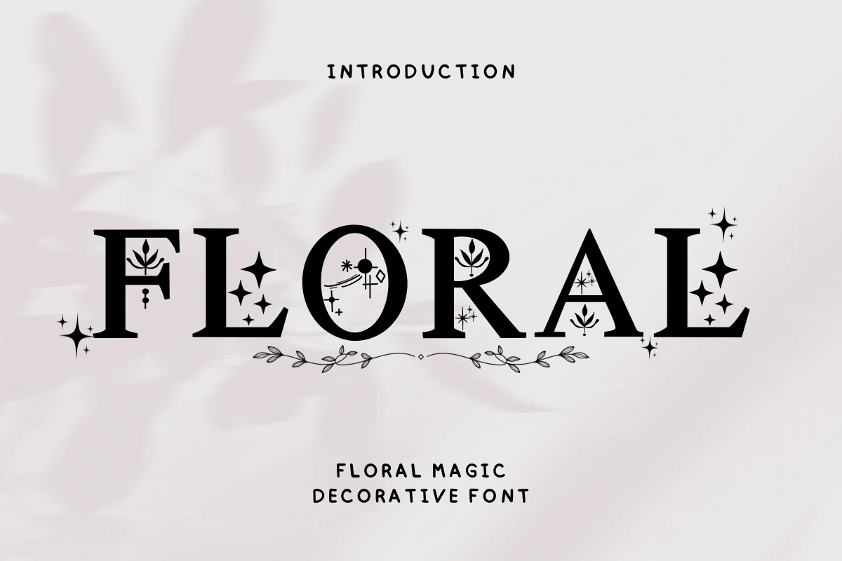
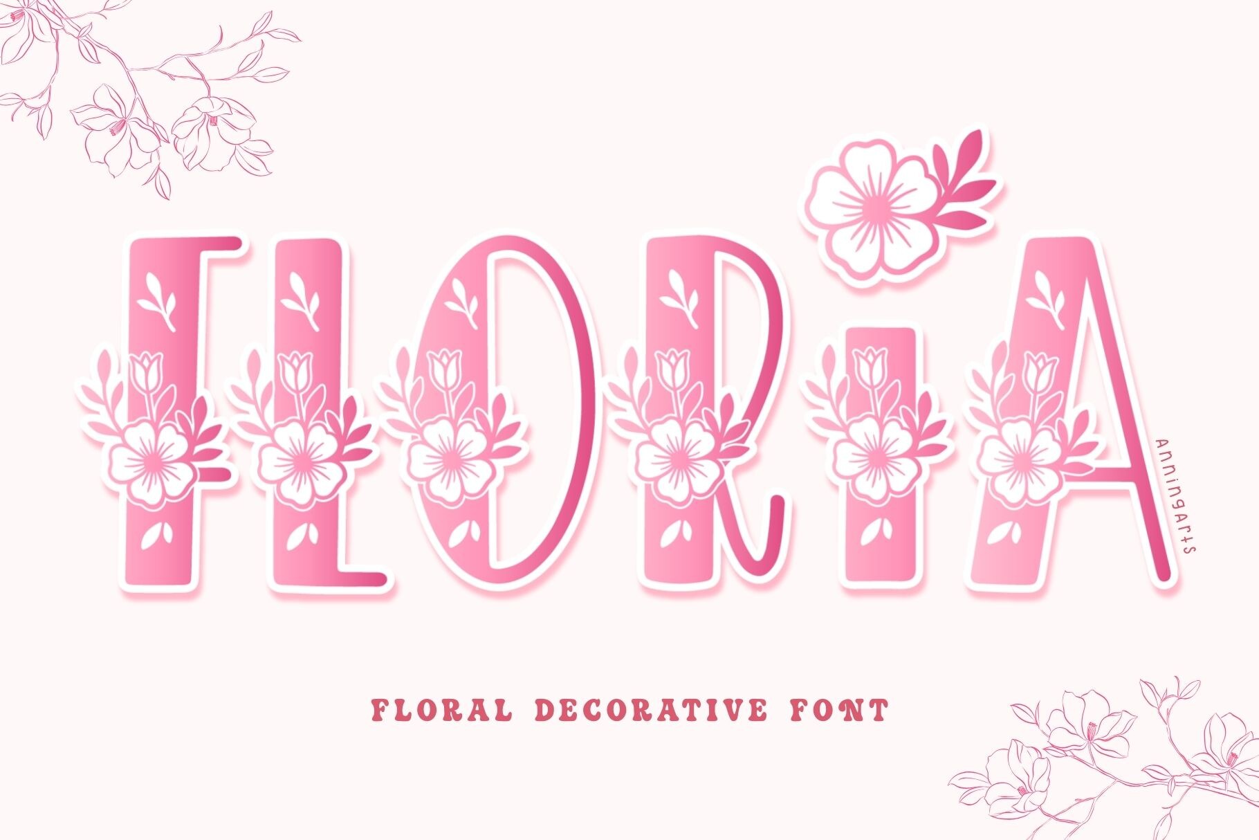
Floria is a floral decorative font where each character is wrapped in flower illustrations. The result feels ornamental and romantic, like a small bouquet around the letters. I like it for monograms or short headlines where the floral details can be seen clearly.
Best for: monograms, wedding invitations, garden party logos. By: AnningArts
2. Spring Day
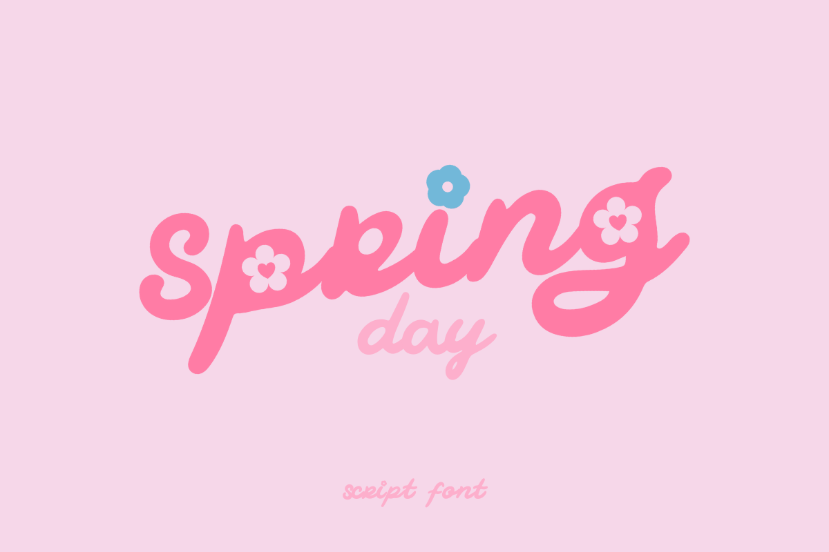
This cute script font has floral and botanical motifs, giving it a soft, friendly feel. It works well when you want a spring greeting card, planner sticker, or nursery print that feels sweet but not overly formal. The letterforms stay readable enough for short phrases, while the botanical touches add seasonal charm.
Best for: spring greeting cards, planner stickers, nursery prints. By: Babymimiart
3. Blooming Season
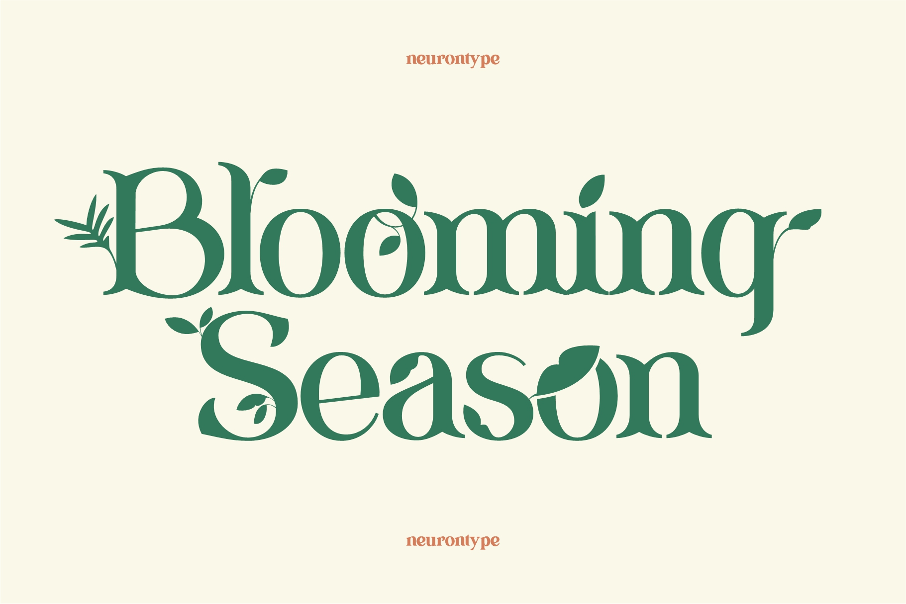
Blooming Season brings cute characters and flower-themed elements to the page. It is designed for spring crafting projects, so it suits labels, tags, and small-decorative text where a playful mood matters. For Easter fonts for cricut, this is a useful pick when you want something friendly enough for kids’ garden labels and craft projects.
Best for: spring crafts, Cricut projects, kids’ garden labels. By: nurrontype
4. Floral Spring
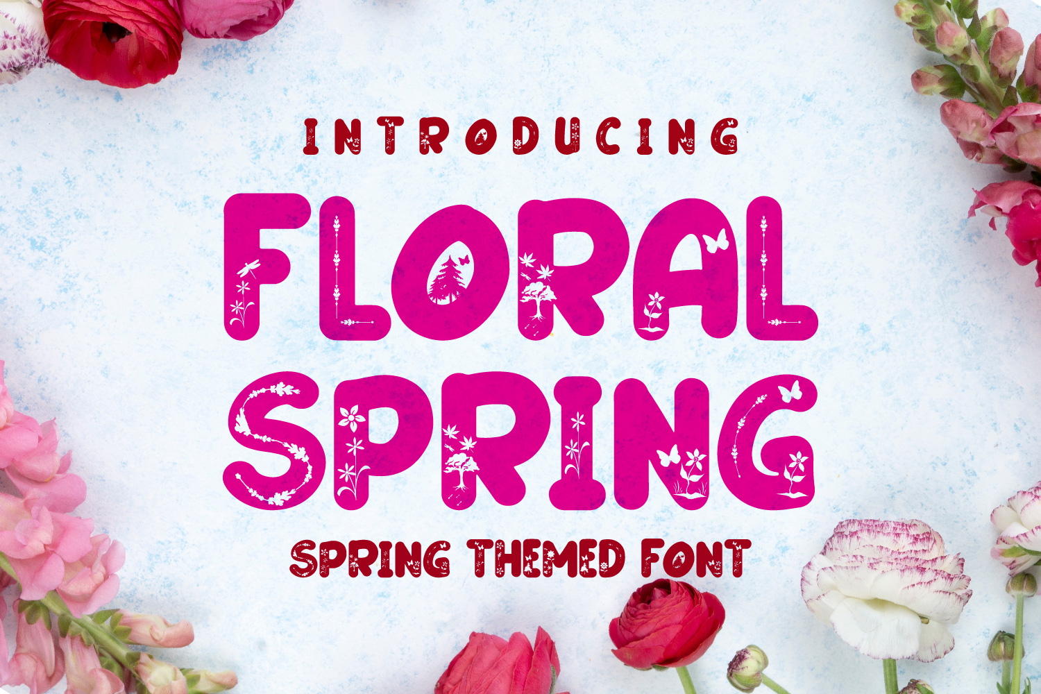
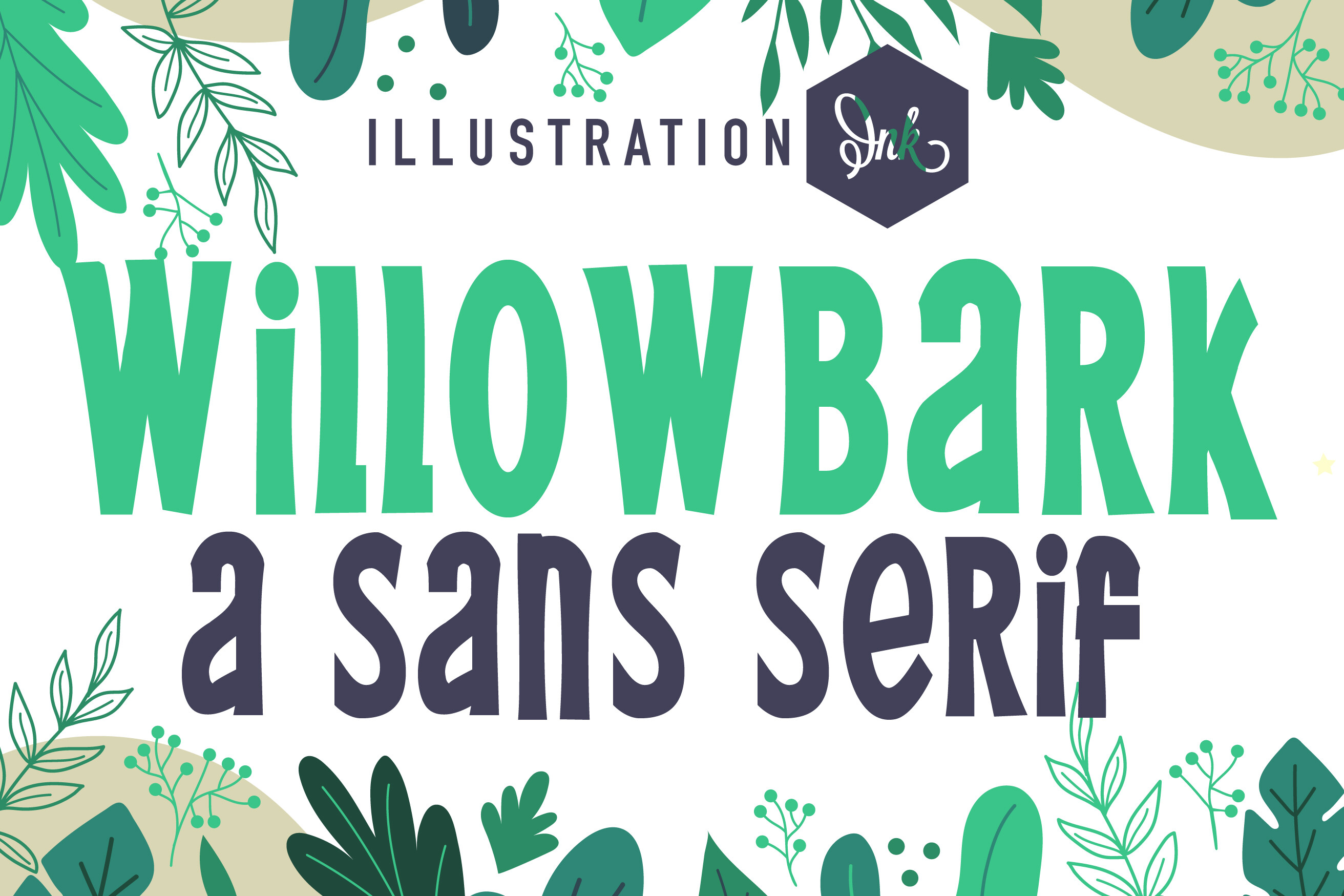
Floral Spring is a bold, thick-lettered, jolly display font. It has more punch than the softer faces in this list, which makes it useful when a spring design needs to stand out. It can carry a sale banner, a flower shop sign, or a bold headline without losing its cheerful character.
Best for: spring sale banners, flower shop signs, bold headlines. By: Mahesa Design
Fresh Spring Script Fonts
Fresh spring script fonts feel like blossom fonts with a lighter touch. They are ideal for invitations, beauty packaging, spring wedding font pairings, and social posts that need a romantic but modern look. If you are planning a spring wedding, our best wedding fonts guide has more pairing ideas.
These scripts are the middle ground between a full floral display and a plain sans. They give the layout a soft edge without covering the message.
5. Cherry Blossom Script
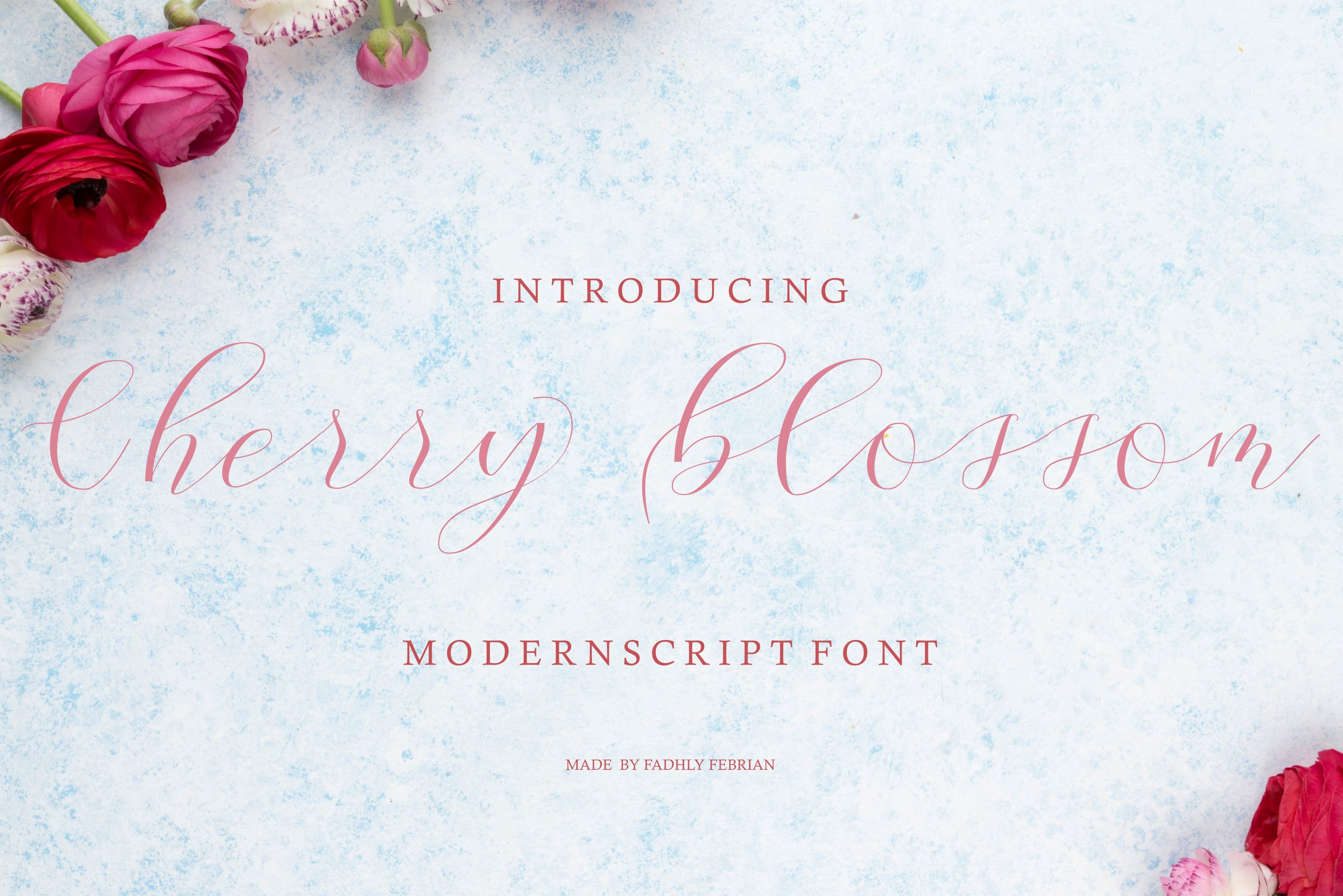
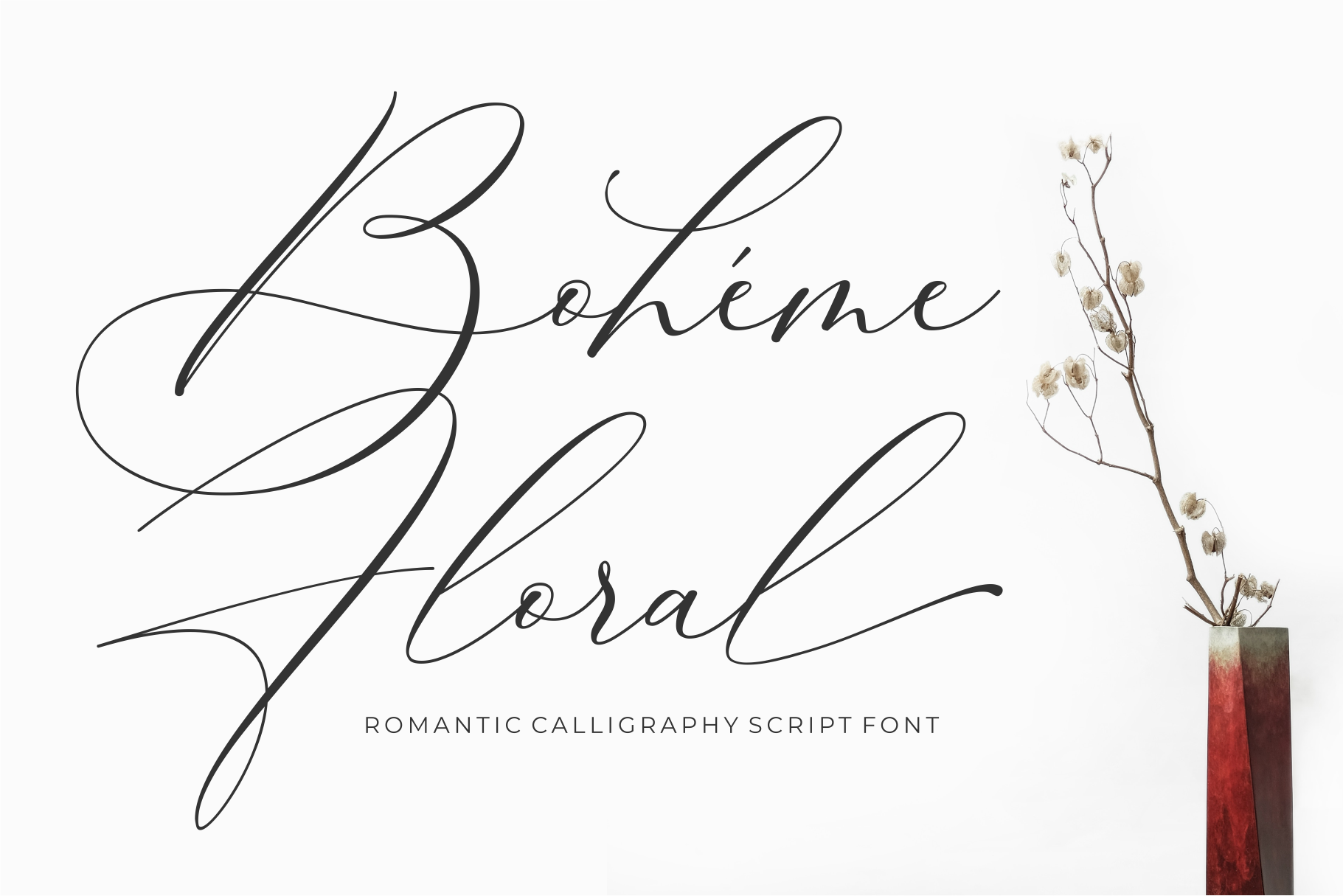
Cherry Blossom Script is a romantic, sweet calligraphy typeface with characters that dance along the baseline. It has a flowing, expressive feel that suits spring wedding invites, beauty packaging, and luxury social posts. The movement gives it a hand-lettered quality without requiring a full calligraphy setup.
Best for: spring wedding invites, beauty packaging, luxury social posts. By: fadhly febrian
Download Cherry Blossom Script
6. Blossom Script
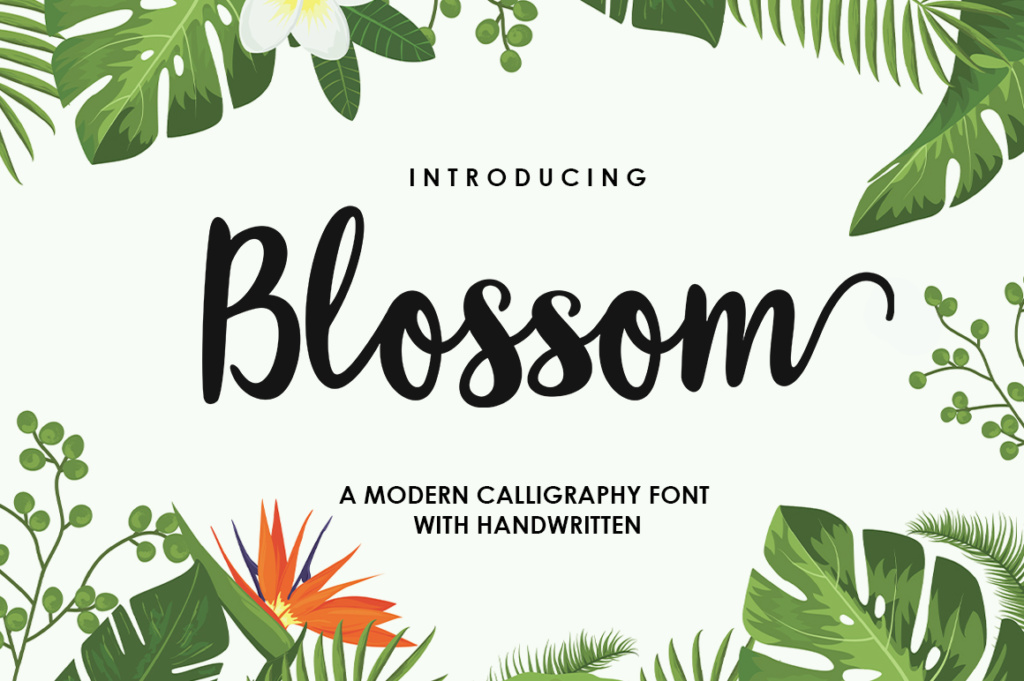
Blossom Script is a modern script typeface with alternate characters, including initial and end swashes. That makes it flexible for logos, headlines with swashes, and boutique branding. You can keep it clean for a simple wordmark or add decorative endings for a more polished, seasonal look.
Best for: logos, headlines with swashes, boutique branding. By: Samrenal
7. Spring Flower
Spring Flower is a light handwritten font with a unique feel. It reads casual and fresh, which works well for quotes, stationery, and light spring branding. It is a good choice when you want a script that feels personal, but not so ornate that it competes with the message.
Best for: quotes, stationery, light spring branding. By: AV Type
8. Spring Blossom
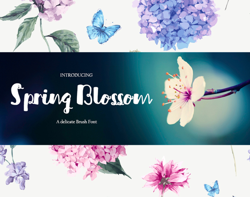
Spring Blossom is a playful brush font with a relaxed, hand-painted energy. It suits garden party flyers, farmers market signs, and casual posts where the design should feel friendly and approachable. It is less formal than calligraphy, which makes it a good match for community events and small business announcements.
Best for: garden party flyers, farmers market signs, casual posts. By: KreationsKreations
Easter Fonts for Cards, Crafts and Egg Hunts
Easter fonts for cards, crafts, and egg hunts should feel festive, but not childish unless the project is for kids. These picks cover cute display faces, handwritten scripts, and vintage-inspired options. If you need one safe pick for Easter cards, a flowing script like Wishes Easter or a bright handwritten face like Happy Easter will usually work well.
I keep Easter type in two lanes: playful for kids and events, elegant for cards and programs.
9. Easter
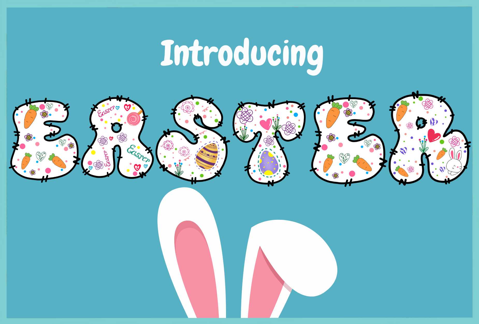
This quirky display font fills each letter with tiny Easter-themed elements, from bunnies to eggs and flowers. It has a busy, storybook charm that works best at a larger size. It is a strong choice for Easter egg hunt signs, kids’ crafts, and basket tags where the detail becomes part of the decoration.
Best for: Easter egg hunt signs, kids’ crafts, basket tags. By: Itme_digitalart
10. Wonderful Easter
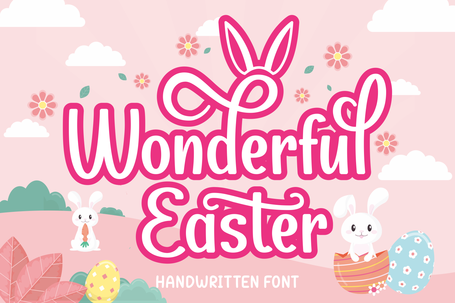
Wonderful Easter is a chic, playful display font that feels polished enough for branding and fun enough for seasonal projects. It is suggested for logos, T-shirt printing, and sport designs, so it can move beyond a single holiday card. For Easter shirts or family event branding, it gives a clean, upbeat look without leaning too hard on cartoons.
Best for: Easter shirts, logos, family event branding. By: Rydmaker (7NTypes)
11. Happy Easter
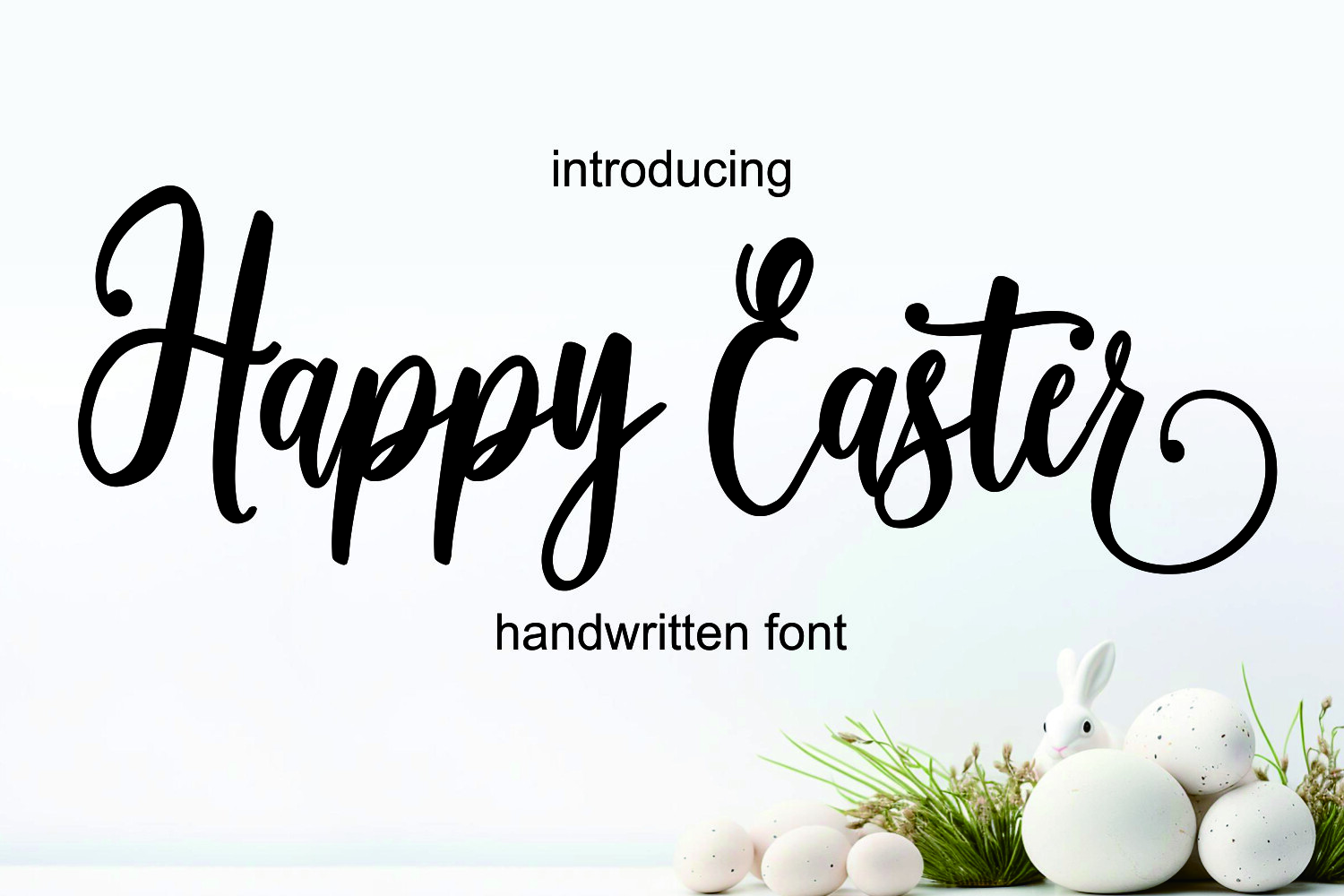
Happy Easter is a bright, festive font with a script handwritten style. It feels celebratory and easy to read, which makes it useful for Easter greeting cards, brunch invitations, and social posts. The handwritten energy keeps the design warm, while the script shape helps it feel more finished than a plain marker face.
Best for: Easter greeting cards, brunch invitations, social posts. By: Lisna.Craft
12. Wishes Easter
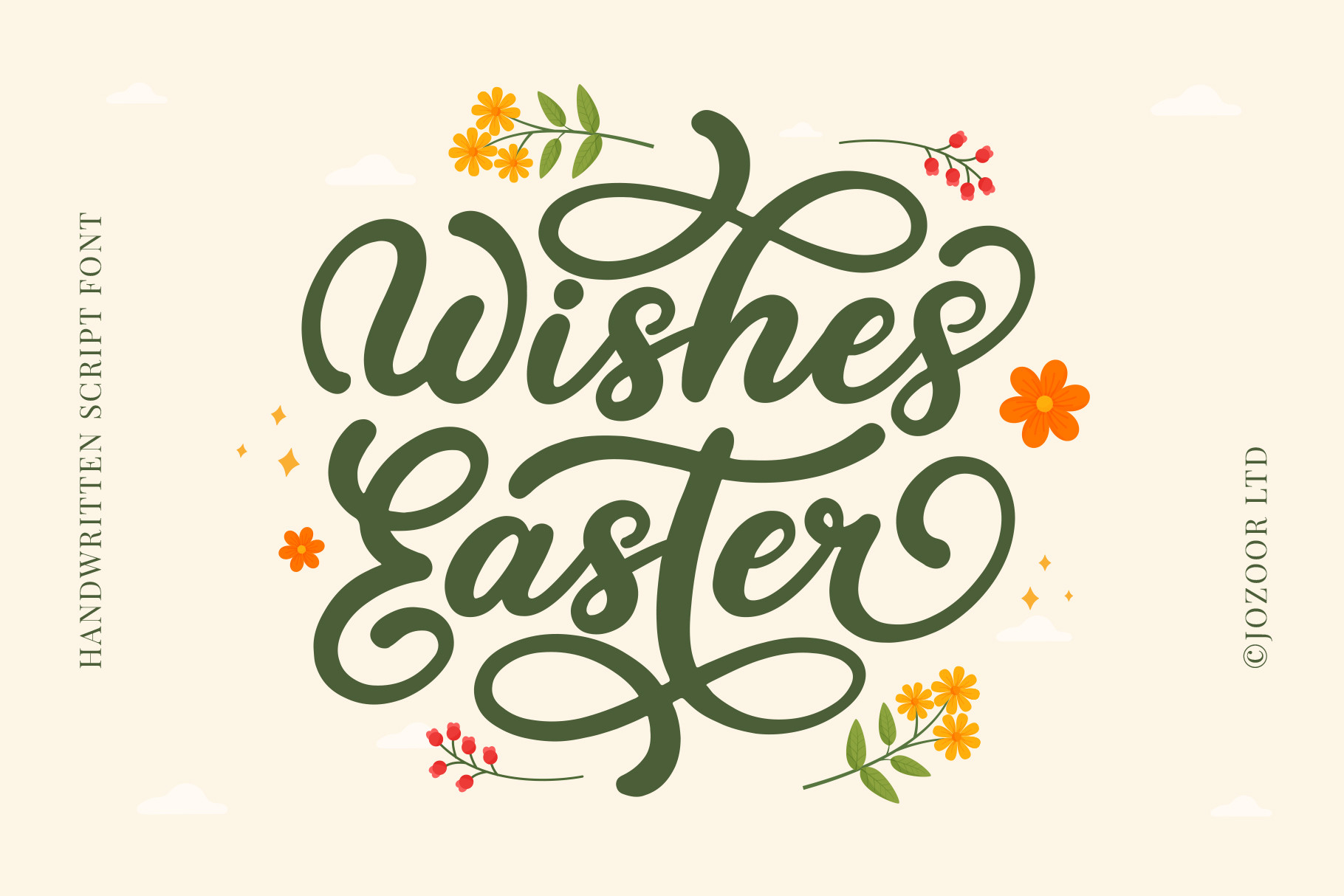
Wishes Easter is a stylish, delicate, vintage-feeling flowing script font. It has a softer, more elegant mood than the playful display faces above. That makes it a good fit for elegant Easter cards, church event programs, and vintage labels where the design should feel refined rather than loud.
Best for: elegant Easter cards, church event programs, vintage labels. By: Jozoor
Playful & Minimal Spring Fonts
Every spring palette needs balance. One playful display face can carry the fun, while a clean sans keeps the details readable. These two picks help you avoid an all-decorative layout that looks cute at first glance but gets tiring to read.
This is where the layout gets its breathing room.
13. Spring Script
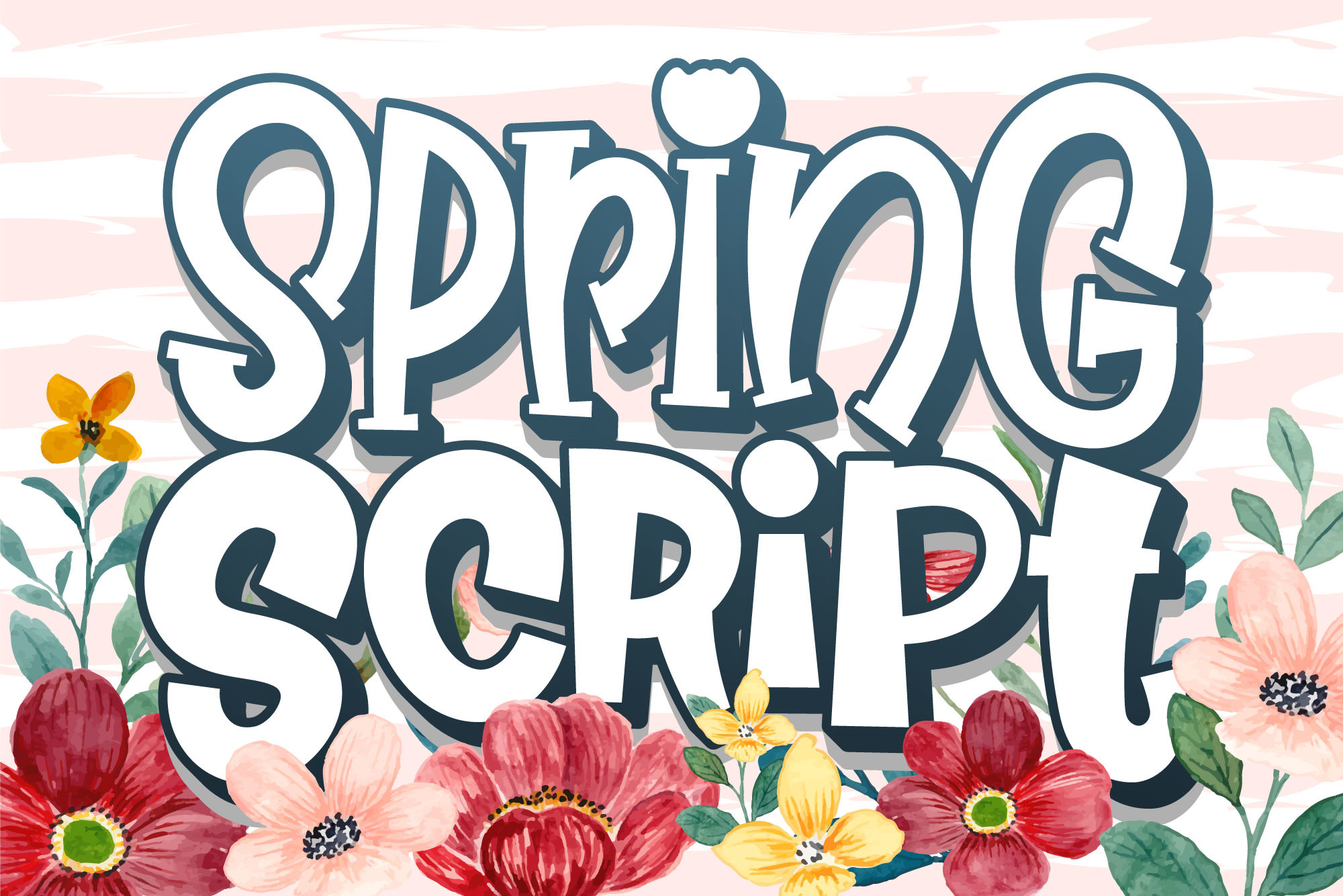
Spring Script is a fun, quirky, informal display font suggested for cartoon titles, designs, and subtitles. It has a loose, friendly energy that works well for kids’ spring projects and playful social captions. Use it for short text only, where the personality can shine without hurting legibility.
Best for: cartoon titles, kids’ spring projects, fun subtitles. By: Nobu Collections
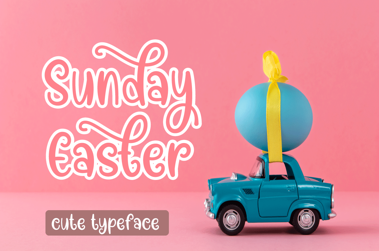
14. Today Easter
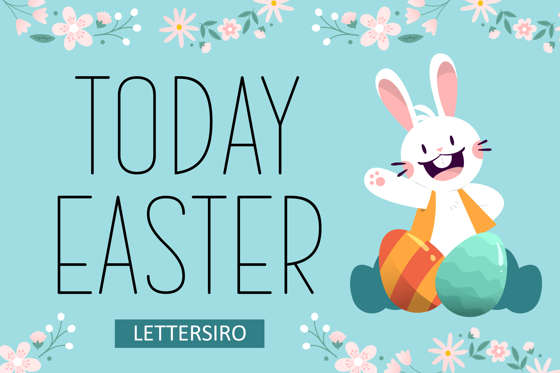
Today Easter is a minimal, neat sans serif font. It is the quiet partner in a spring layout, handling body text, product details, dates, and small labels. Pair it with a floral or script headline and the design stays seasonal without becoming hard to read.
Best for: body text pairing, minimal packaging, clean spring posts. By: Lettersiro Co.
How to Use Spring Fonts in Cards, Packaging and Posts
Start with one decorative spring font for the headline and one clean face for the rest. I keep this rule simple because spring designs can get busy fast. If your headline is a floral font, a blossom script, or an Easter display face, keep the supporting text simple. Today Easter works well for body text pairing, but a neutral sans from Google Fonts can also keep the layout balanced.
Pastel palettes are natural for spring, but contrast matters. Mint, lavender, peach, and pale yellow look fresh, yet pastel text on a white background can disappear. For cards and packaging, use a darker shade for small text or place pastel letters on a soft-colored background. This is especially important for labels, tags, and product packaging.
I also keep a small color test. Put the smallest label text in the lightest color you plan to use, then squint. If it fades, darken it. If you are designing packaging, our best fonts for packaging guide covers more layout and readability tips.
Floral fonts are usually display faces, not body text. They can be charming in a monogram, a logo, or a short headline, but they often lose clarity at small sizes. If you are wondering whether floral fonts are readable for body text, the short answer is: usually not. Use them large, and let a clean sans carry the details.
Swashes and alternate characters can make a spring script feel more custom. In Adobe Illustrator or Photoshop, open the Glyphs panel to access alternates, initial swashes, and end swashes. This is useful for boutique branding, invitations, and social posts where a single decorative letter can elevate the whole design. If you want more options, see our best handwritten fonts guide.
For spring fonts for Cricut, install the font on your computer and use it in Cricut Design Space. Connected script letters often need to be welded so they cut as one piece. For Canva, you can upload spring fonts through Brand Kit if you have a Pro account.
Note: Color fonts do not always work everywhere. Some platforms flatten color, so check the final export before sending a file to print or a craft machine.
Tip: Build a spring template kit. Save a card layout, social post frame, and packaging label with a chosen pairing. When Easter or a garden party comes up, you can swap words and colors instead of starting from scratch. This is helpful if you create seasonal products, because font choice becomes part of your brand rhythm. It makes it easier to keep spring designs consistent across cards, posts, and packaging.
Tips for Choosing the Right Spring Font
Match the font to the occasion. For a kids’ Easter egg hunt, choose a playful display face with bunnies, eggs, or flowers. For a spring wedding, choose a softer calligraphy or script. For a spring sale, choose a bold display font that can stand out on a banner or sign.
Check legibility at the smallest size you will use. A floral font may look beautiful in a large monogram, but it can become a tangle on a basket tag. If the text is under 12 points, test it on screen and in print.
Keep the pairing simple. Two fonts are usually enough: one decorative spring font for the headline and one clean face for details. Adding a third font can make the design feel busy when the letters already contain flowers or swashes.
Confirm the license before selling products. I would not skip this. If you plan to sell Easter or spring products made with these fonts, check the license on the product page. Some commercial uses may require an extended license for packaging, merchandise, or print runs.
Build your spring collection early. The best spring fonts are often chosen in winter, when you can test them, save them, and prepare templates for Easter, garden parties, baby showers, and spring sales. A font kit saves time for the season.
Where to Download Spring Fonts
Creative Fabrica is the main source for the spring fonts in this list, with a large mix of floral fonts, Easter fonts, and spring script fonts. For a free clean sans to pair with them, Google Fonts is a good place to start. For more font recommendations and seasonal design resources, browse the FontPro blog.