· fonts · 14 min read
21 Best Elegant Fonts for Invitations in 2026
Discover 21 elegant fonts for wedding and event invitations, from romantic calligraphy to refined serif and monogram styles, with free and premium downloads.
An invitation is the first thing guests see. The typeface can set the mood before the venue, date, or dress code even lands. If you are designing wedding invitations, anniversary cards, engagement save the dates, or formal event stationery, the right elegant fonts for invitations should feel refined, readable, and easy to print.
A beautiful invitation can still feel off if the type is too thin for the paper, too busy for the layout, or too playful for the occasion. That is why this list groups 21 options from Creative Fabrica by job. You can match the font to names, body details, or monogram accents.
What Makes a Great Elegant Font for Invitations?
A great elegant invitation font does more than look pretty. It needs to survive small sizes, paper texture, and actual use. For script and calligraphy fonts for invitations, strokes should flow without collapsing into a blur. For elegant serif fonts, letterforms should have enough contrast to feel formal, but not so thin that inkjet printing eats the detail.
The font also sets the tone. A flowing romantic script can make a wedding invitation feel intimate. A high contrast serif can make a gala, anniversary dinner, or corporate event feel polished. A monogram font can turn initials into a quiet brand for the suite.
There is no single best font for elegant invitations. The best choice depends on the role the font plays. The invitation designs that feel most confident in 2026 use restraint. Instead of heavy swashes, designers pair one expressive font with one calm companion. That is why the best font for elegant invitations is usually a small system: a script for names, a serif or clean sans for details, and a monogram for accents.
If you are choosing between serif and script for a formal invitation, think about hierarchy. Script suits focal lines, while serif suits information. Balanced together, they keep the invitation elegant and readable.
21 Best Elegant Fonts for Invitations
These 21 elegant fonts for invitations are split into three practical groups: Script & Calligraphy, Elegant Serif, and Monogram & Decorative Accents. The script section is best for names, save the date cards, and envelope lettering. The serif section works well for dates, venues, RSVP lines, and other details. The monogram section is for initials, seals, and small decorative moments. Browse by the role you need the font to play.
Script & Calligraphy Elegant Fonts
Romantic, handwritten styles are the classic choice for invitation names, save the date cards, and calligraphic envelopes. These script fonts for wedding invitations and other formal events bring warmth, movement, and a personal touch to the most important lines.
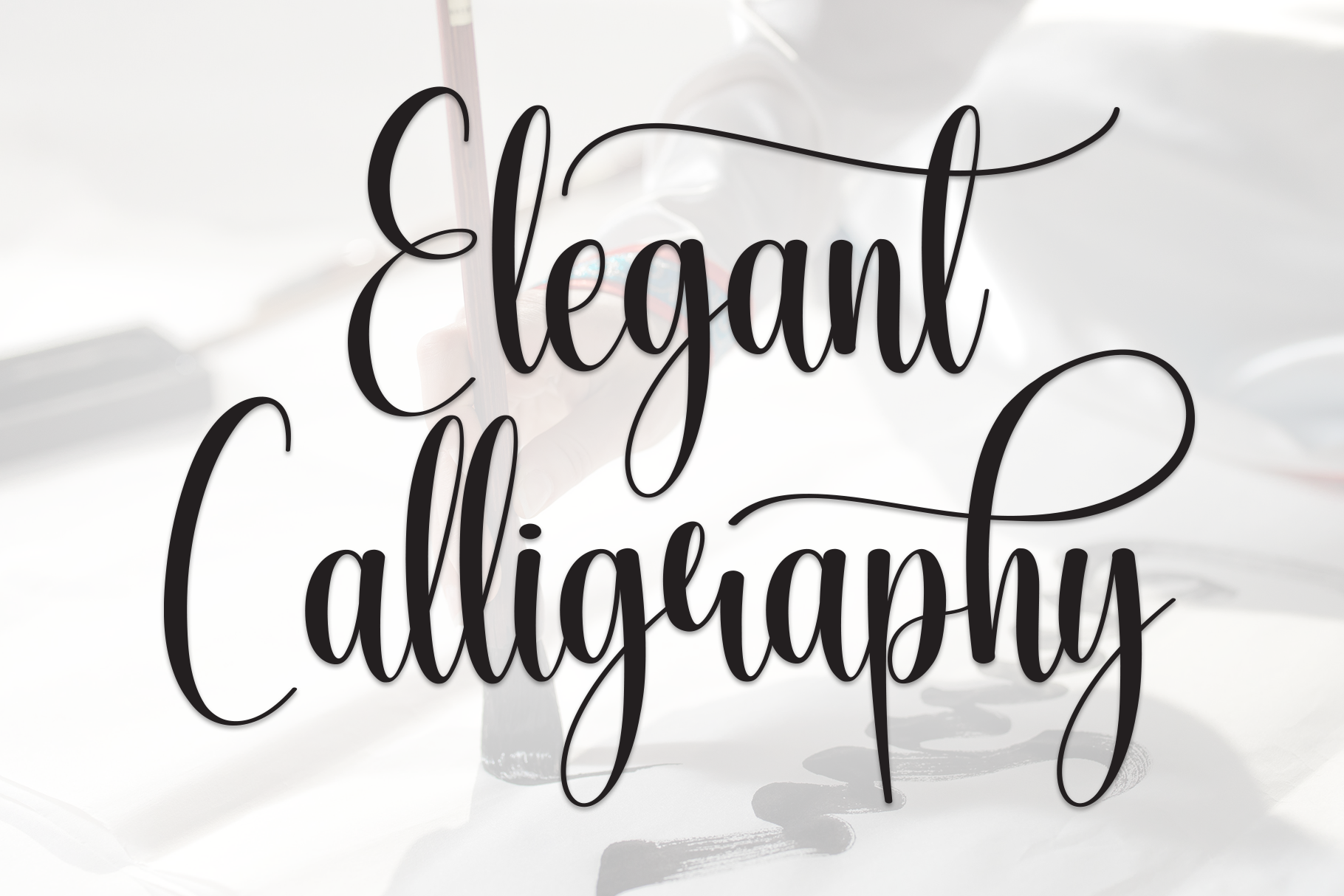
1. Elegant Calligraphy
This flowing script has a soft, romantic feel that suits names and short focal lines. I like it when the invitation needs to feel personal without becoming overly ornate. The open curves keep the lettering warm, but the shapes stay clean enough for a formal suite.
Best for: couple names, save the date headlines, envelope accents. By: Roronoa zoro.S.P.D
2. Vienna Romance
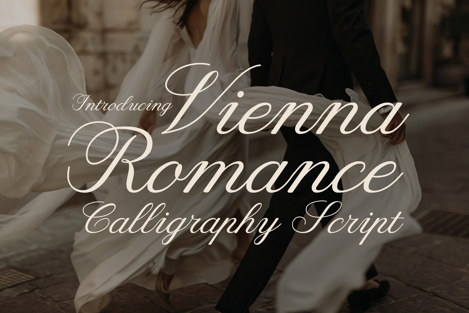
Vienna Romance leans into old world romance with graceful, flowing letterforms. It works well when the invitation suite needs a warm, classic feel for names or a short poetic line. If the design is leaning toward traditional, this is a good place to start.
Best for: wedding names, anniversary invitations, decorative headers. By: HipFonts
3. Bettrisia Script
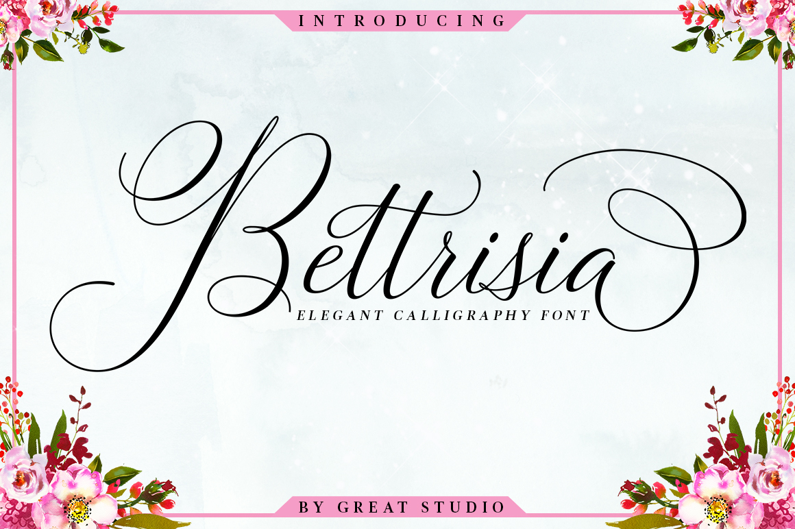
Bettrisia Script feels polished and composed. The clean hand lettered look stays readable on paper, which matters when the script should feel refined rather than playful. It is a good fit for formal invitations where the type needs to stay calm.
Best for: formal event titles, RSVP cards, elegant envelopes. By: Great Studio
4. Symphonie Calligraphy
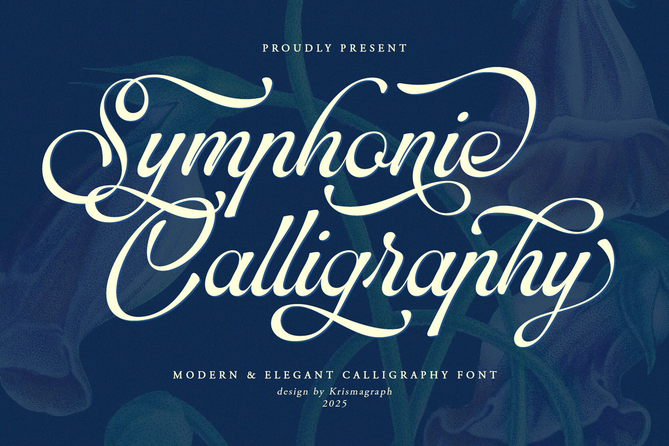
Symphonie Calligraphy has a musical, fluid quality that suits romantic headlines and short phrases. Its connected strokes create a sense of movement, which is helpful when you want the invitation to feel hand finished. I would use it for a name line or a short phrase that should feel expressive but not crowded.
Best for: event names, save the dates, romantic accents. By: krismagraph
Download Symphonie Calligraphy
5. Amelia Rose
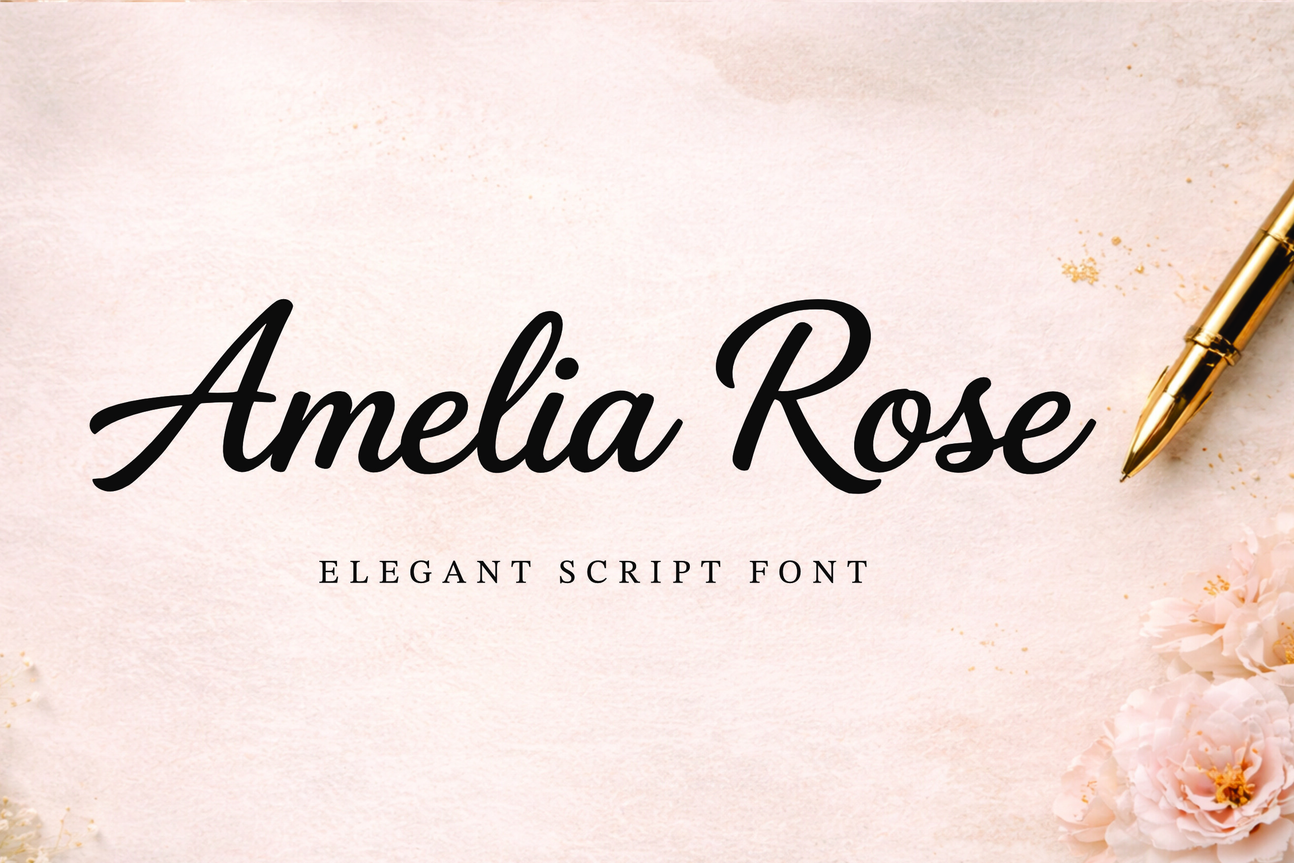
Amelia Rose is delicate and airy, with a light touch that suits soft wedding stationery. It works nicely for names or a short line where the design should feel gentle, romantic, and understated. If the suite is floral or pastel, this script can keep the mood soft.
Best for: wedding names, save the date cards, floral layouts. By: basyar
6. Malibu Signature
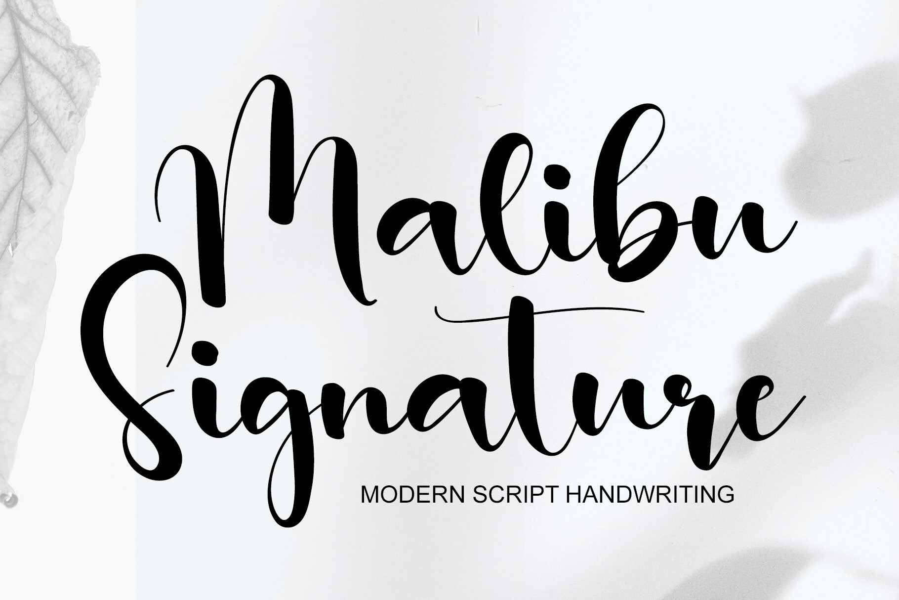
Malibu Signature has a confident, signature style that feels personal and modern. It is a good option for names, short event titles, or a designer style accent that still stays elegant. It works when you want a little personality without pushing into casual territory.
Best for: name lines, modern invitations, signature style details. By: 21Design
7. Dellanor Script
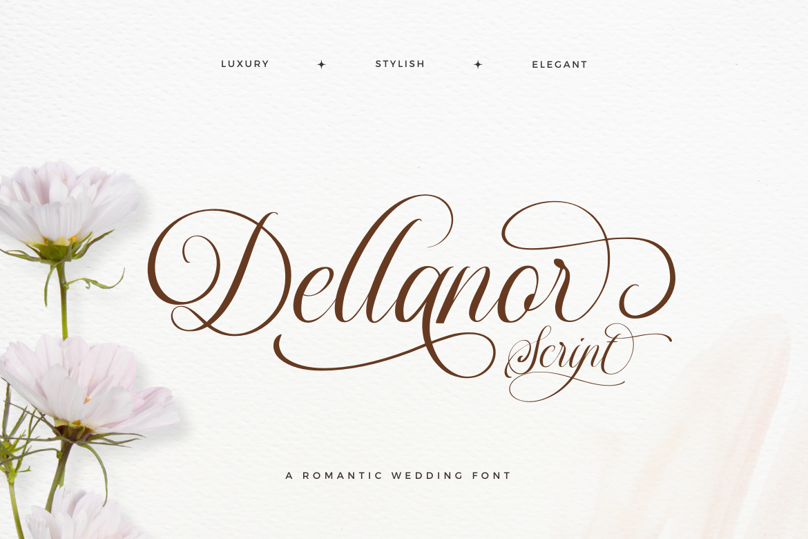
Dellanor Script balances elegance with clarity, making it useful for both names and short supporting lines. Its steady rhythm helps the lettering stay legible even when the design includes paper texture or delicate borders. That makes it a practical pick for a full invitation suite.
Best for: formal invitations, event titles, envelope addressing. By: jinanstd
8. Seabright Script
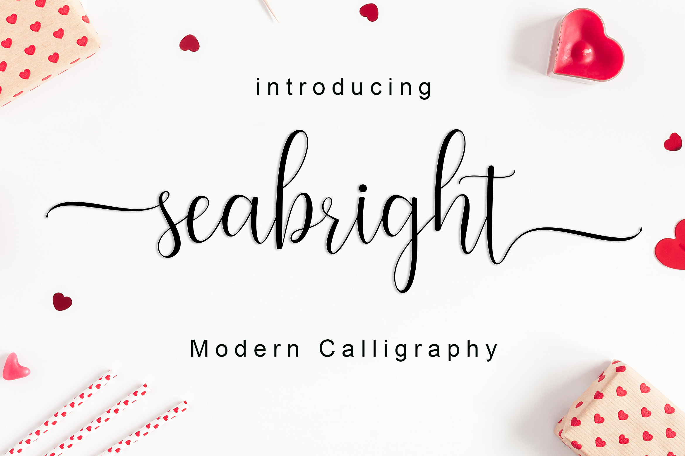
Seabright Script brings a breezy, romantic feel to wedding stationery and other light formal designs. Its relaxed curves suit coastal weddings, garden parties, or any invitation that should feel warm and effortless. It is a good match for designs that need romance without heavy ornament.
Best for: coastal weddings, garden events, romantic save the dates. By: Amarlettering
9. Swan Empress
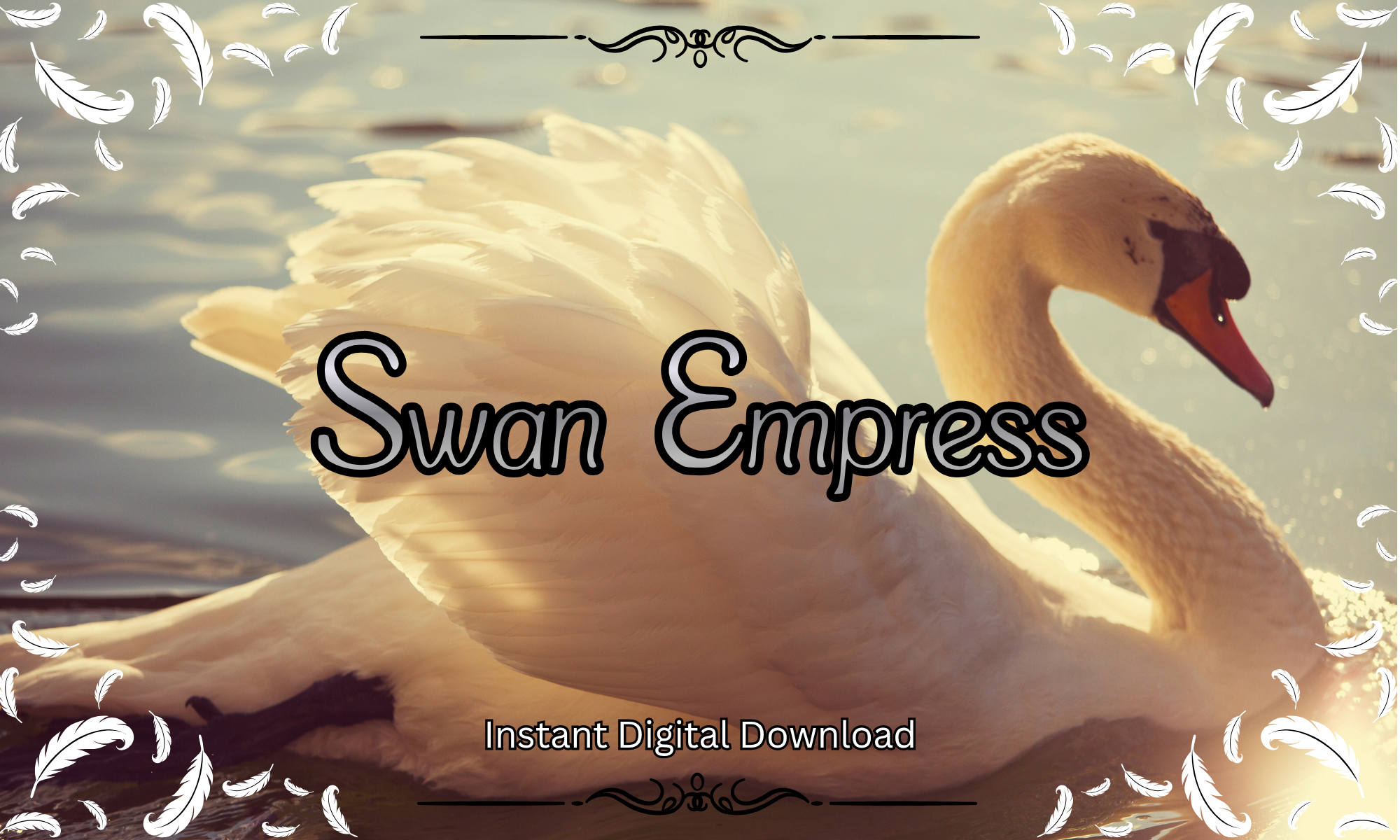
Swan Empress is more decorative than the softer scripts in this list, with flourished details that suit a grander invitation. It works best for short names or titles where the extra ornament can shine without hurting readability. I would not use it for long lines, but it can make a name line feel special.
Best for: grand wedding names, formal headers, decorative accents. By: Pamlico Creations
10. Sondra Script
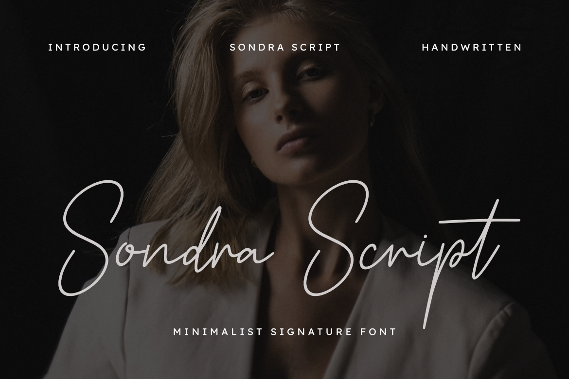
Sondra Script has a graceful, balanced shape that feels both classic and easy to use. It is a safe choice for invitation lettering when you want a romantic script that does not compete with the rest of the design. If you are unsure, this is the kind of script that is hard to overdo.
Best for: invitation names, elegant envelopes, simple suites. By: Hyperactype
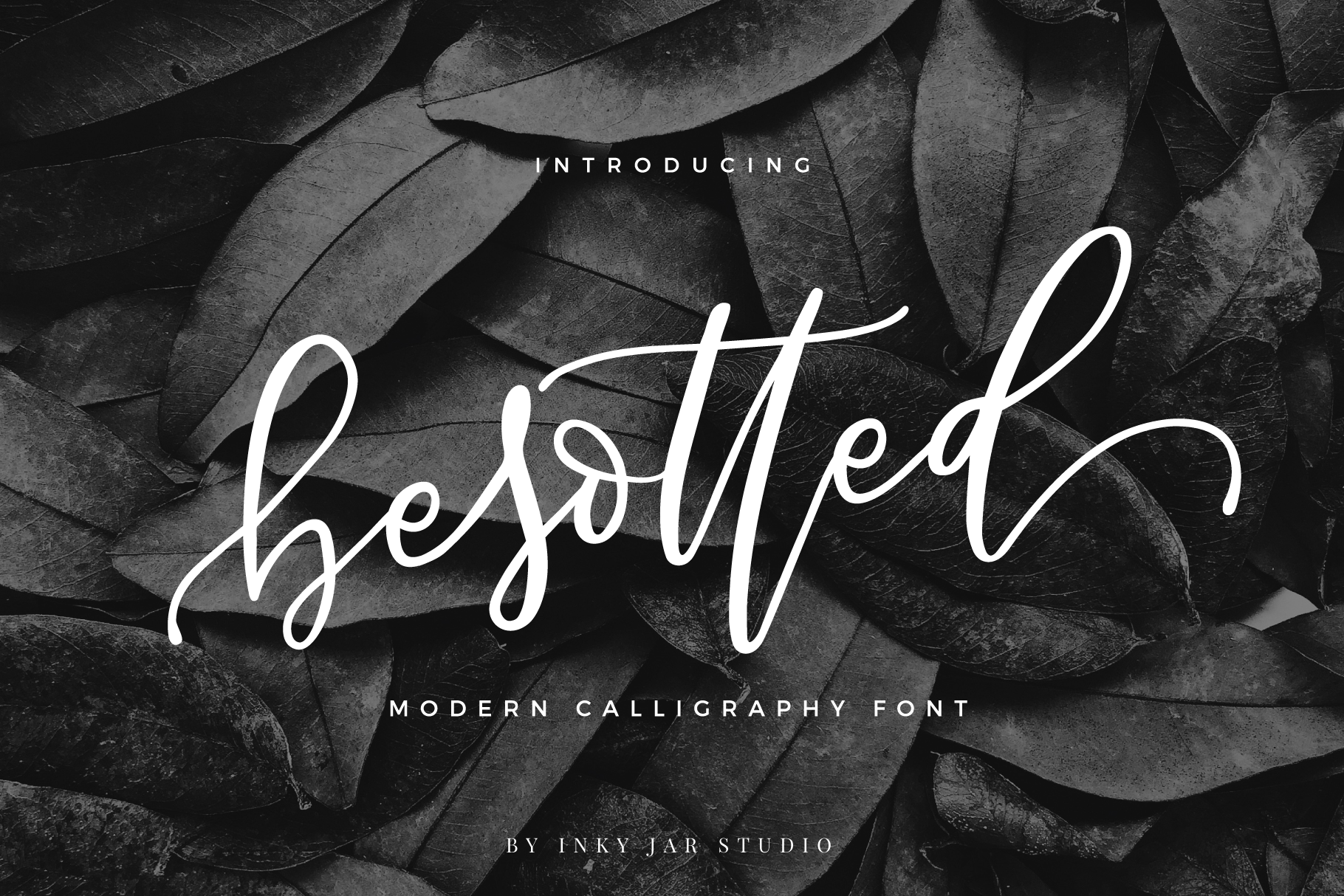
11. Black Pen Script
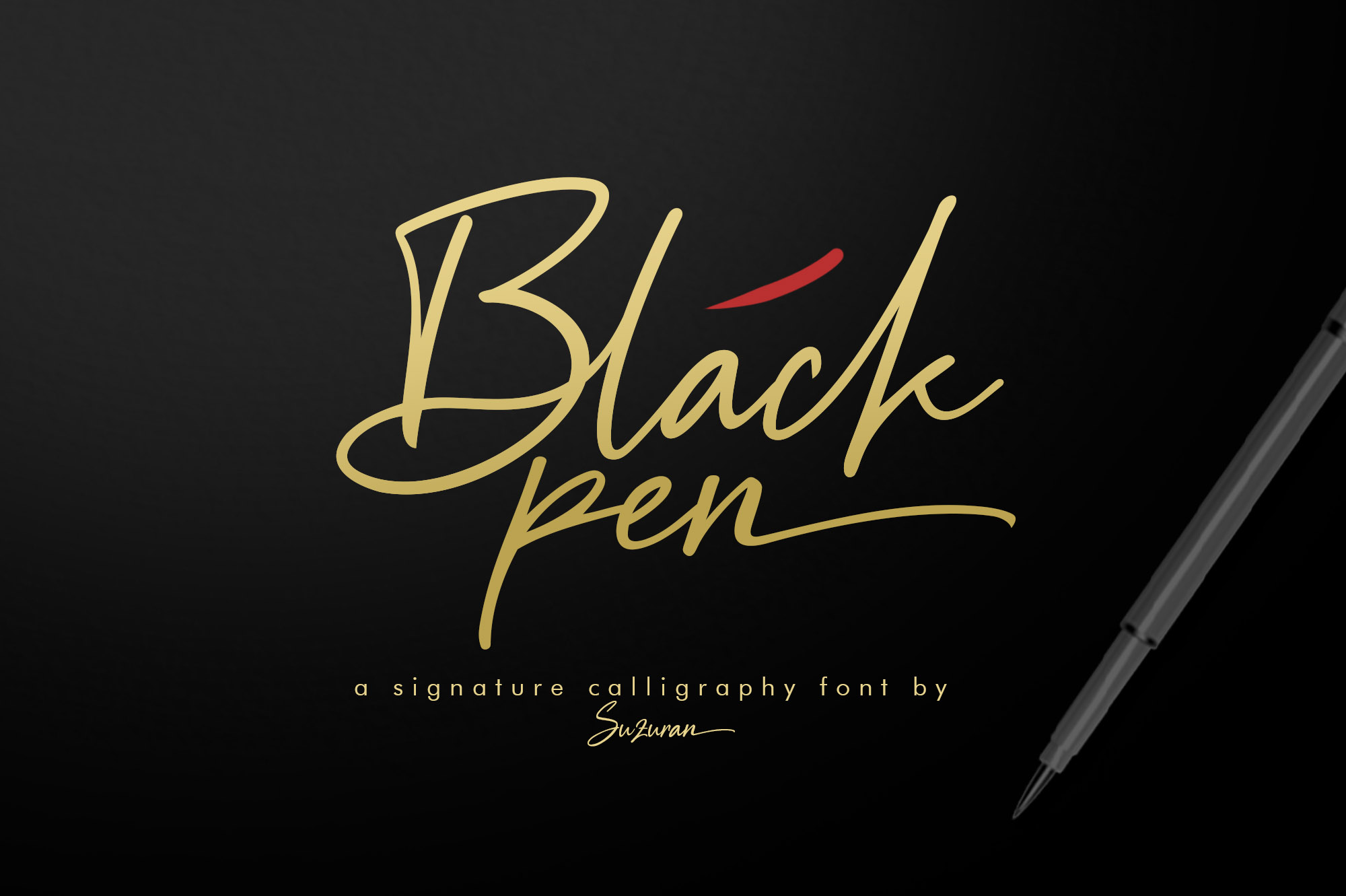
Black Pen Script is bolder and more expressive than the delicate scripts above. Its ink pen character gives the lettering weight and personality, which helps it stand out on cream stock or textured paper. It works well when the invitation needs a stronger statement line.
Best for: statement names, bold invitations, hand lettered accents. By: suzurantype
12. Bellinda – Modern Calligraphy
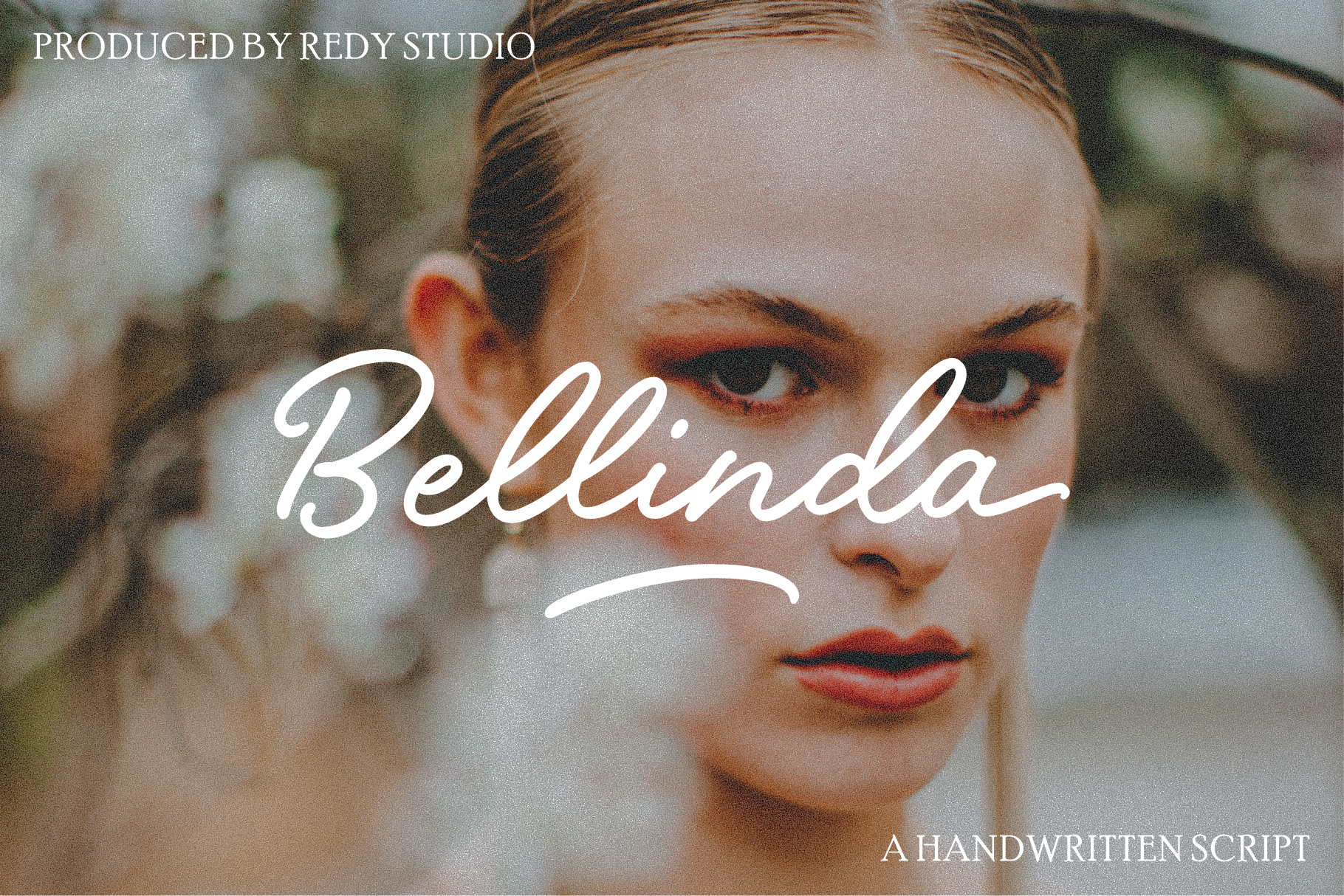
Bellinda – Modern Calligraphy offers a cleaner, more contemporary take on script. Its minimal spacing and controlled strokes make it a good fit for modern invitations that still need a romantic, handwritten feel. It is a good option for minimalist suites that want warmth without clutter.
Best for: modern weddings, minimalist suites, contemporary save the dates. By: RedyStudio
Download Bellinda – Modern Calligraphy
13. Nikahan Script
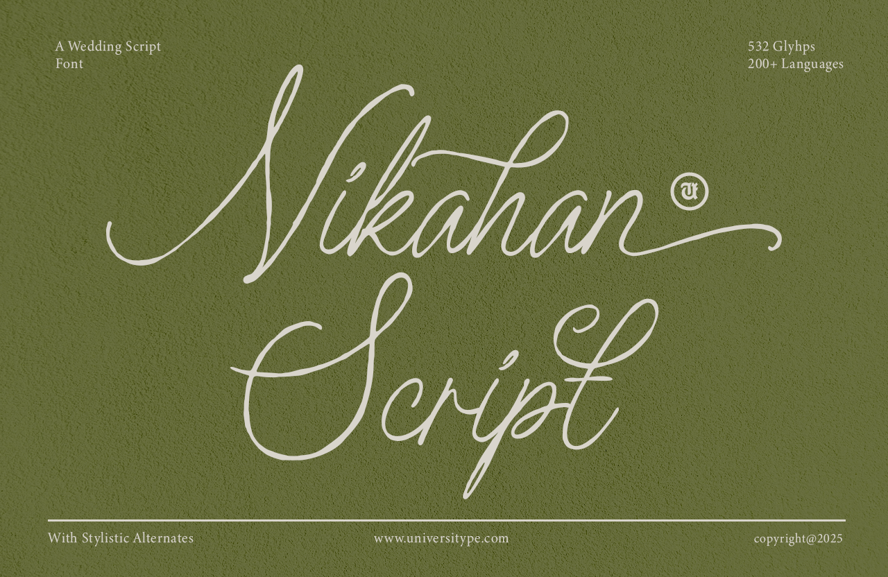
Nikahan Script has a refined, ceremonial quality that suits wedding invitations and other milestone events. Its elegant curves feel special enough for a main name line, while still keeping the overall design easy to read. It works when the invitation needs a formal, celebratory tone.
Best for: wedding names, milestone events, formal save the dates. By: Universitype
Elegant Serif Fonts for Invitations
Elegant serif fonts are the workhorses of formal invitations. They keep dates, times, addresses, and RSVP details clear while adding a traditional, polished feel to the layout. I usually reach for a serif when the script has done its job and the design needs information that is easy to scan.
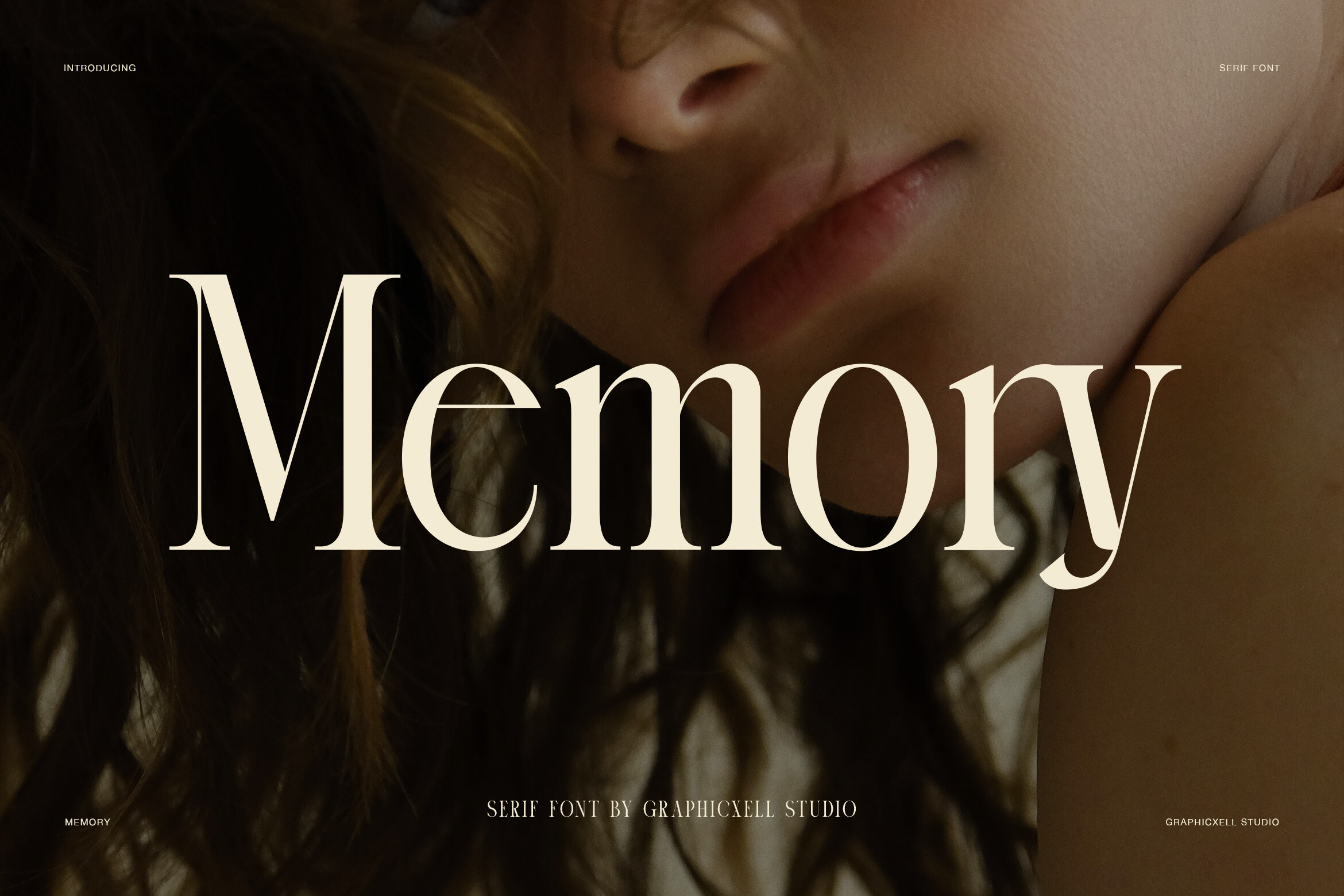
14. Bezoria – Elegant Serif
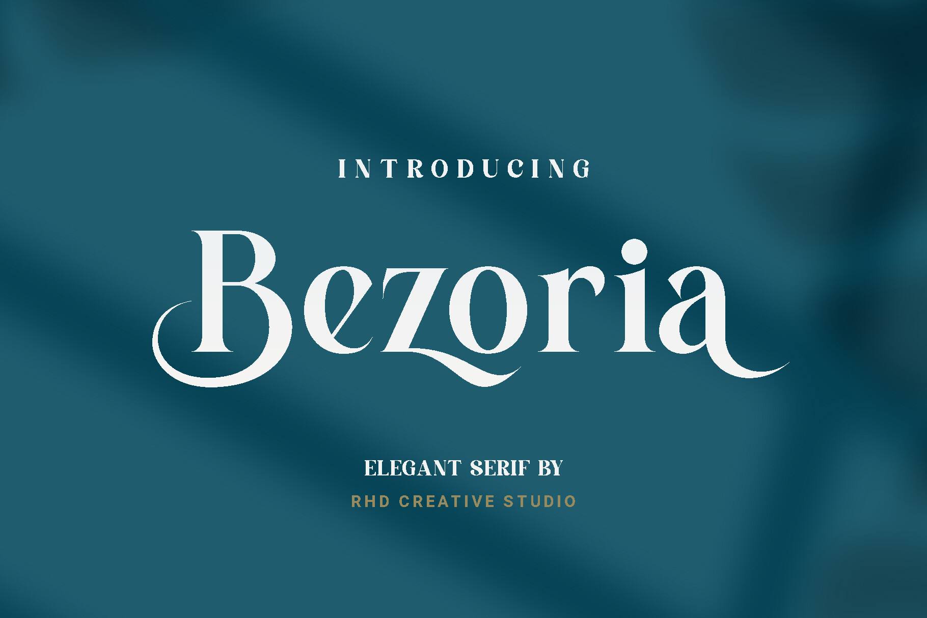
Bezoria – Elegant Serif is a refined choice for invitation body text. Its clean structure and formal tone make it easy to pair with a romantic script for names or event titles. It is a good companion when the details need to stay neat and readable.
Best for: invitation details, RSVP cards, formal body copy. By: RHD Creative Studio
Download Bezoria – Elegant Serif
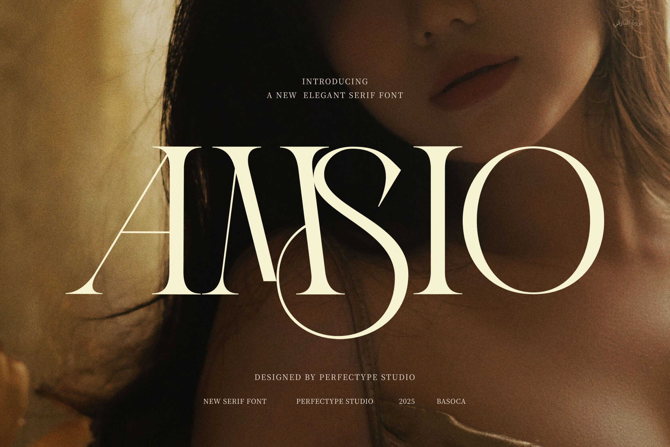
15. Aureline Castelo – Elegant Serif Typeface
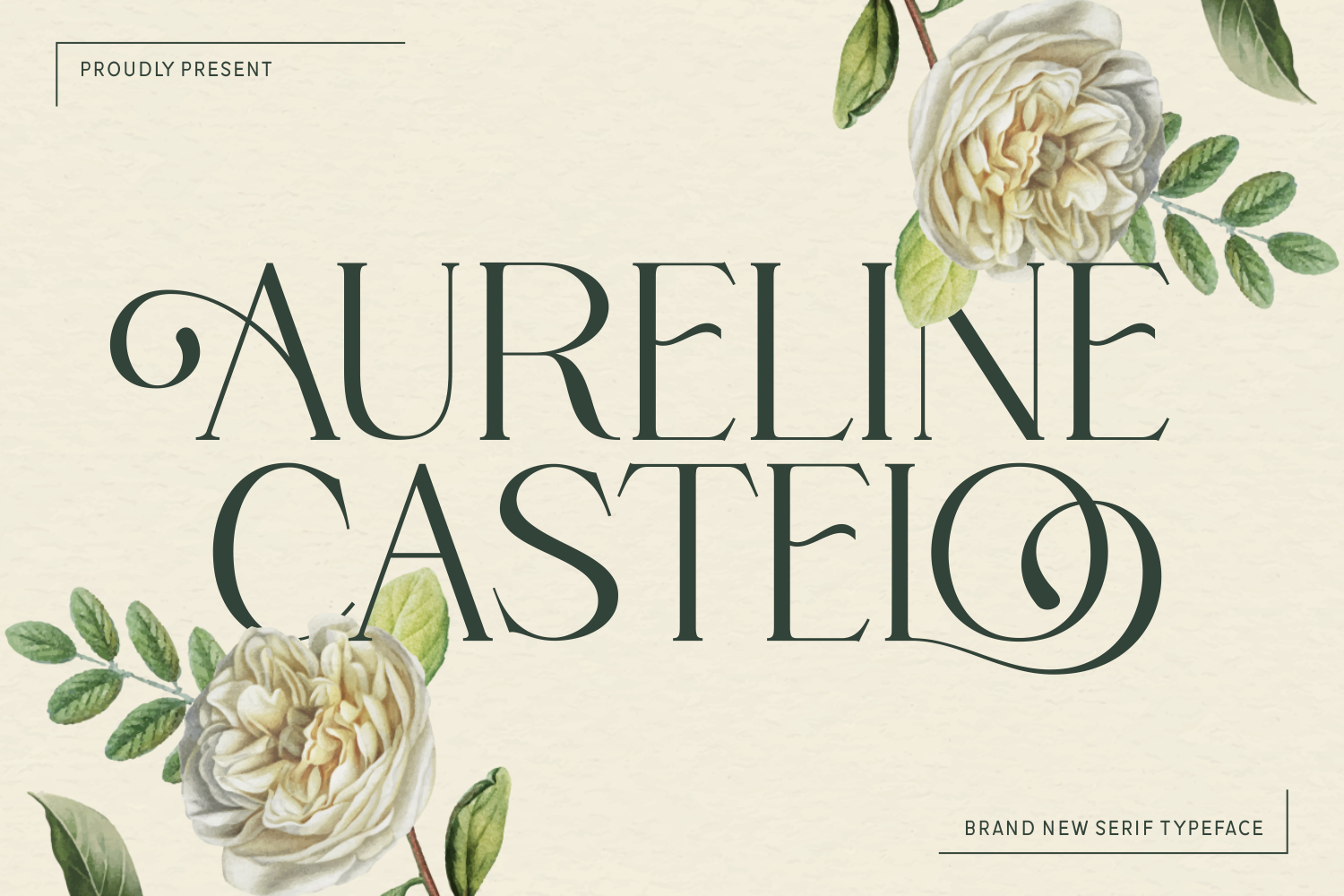
Aureline Castelo – Elegant Serif Typeface brings a classic, ready to use look to formal invitations. It is a dependable option for structured details, especially when the design needs a traditional serif presence. If the suite is leaning classic, this one fits naturally.
Best for: formal invitations, event details, classic stationery. By: Creative Fabrica Fonts
Download Aureline Castelo – Elegant Serif Typeface
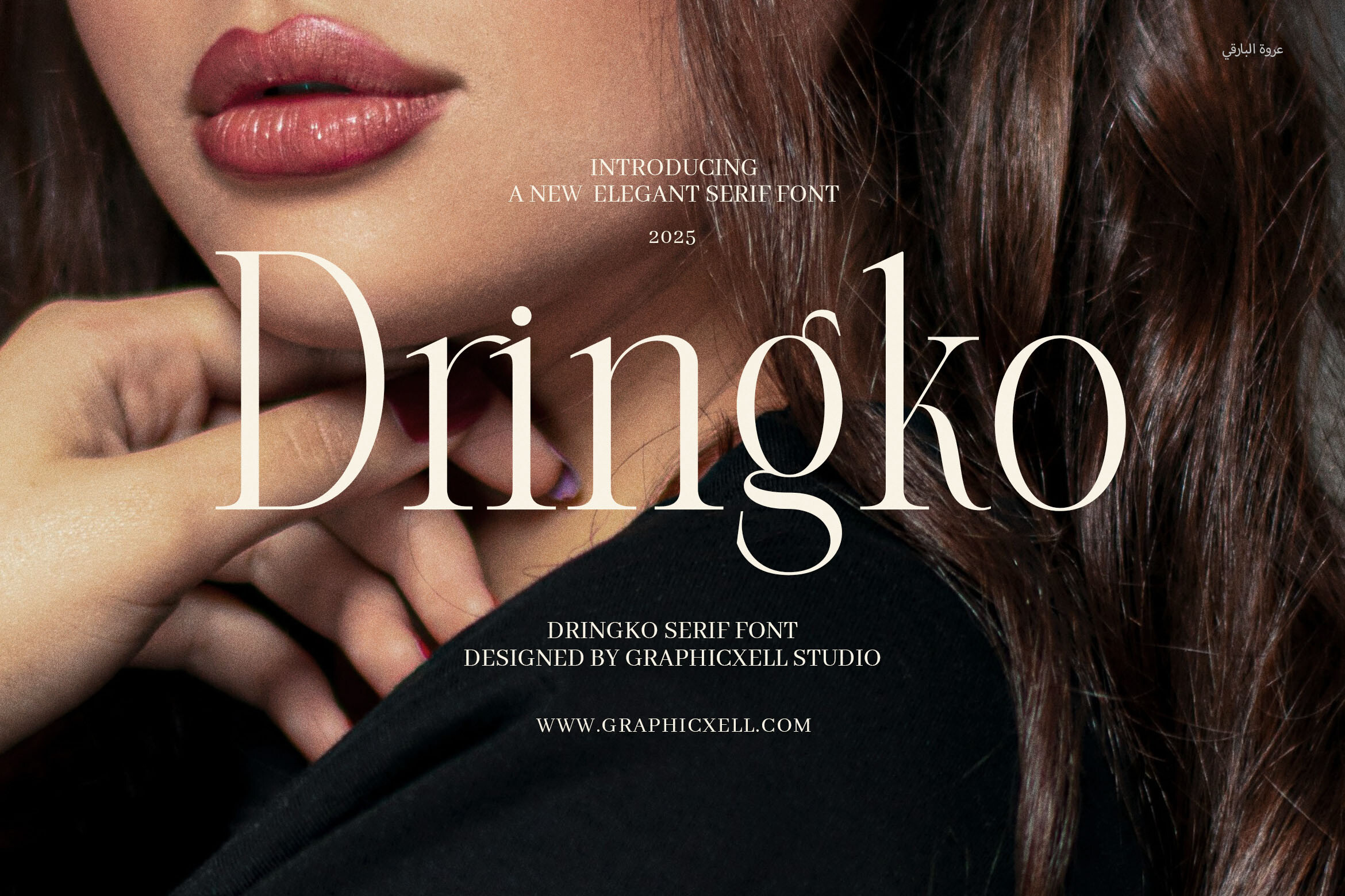
16. Luxena
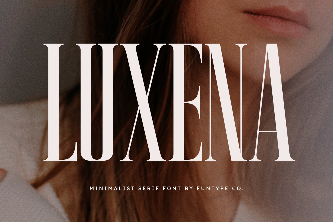
Luxena has a luxury feel that works well for upscale invitations and premium event stationery. Its polished letterforms can carry a refined look without needing heavy decoration or extra graphic elements. It works when the design should feel elevated but still clean.
Best for: luxury weddings, gala invitations, premium details. By: Funtype Co.
17. Royal Fortune
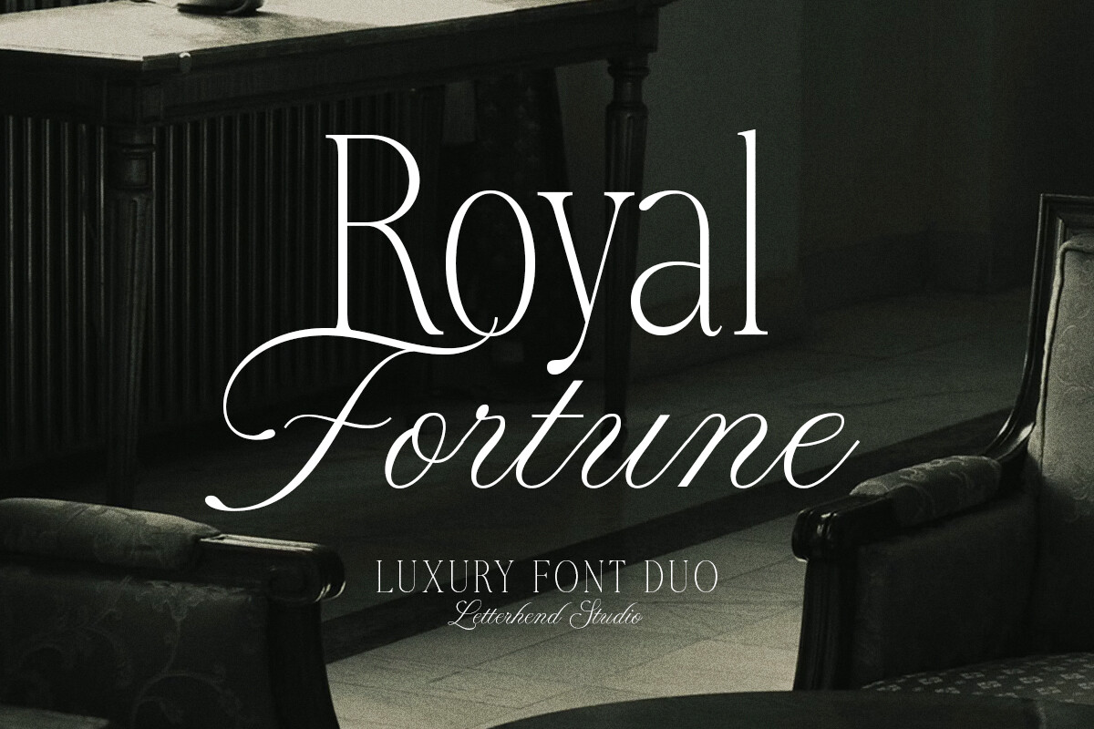
Royal Fortune feels regal and structured, making it a strong choice for formal headers and ceremonial invitations. It suits designs that need a sense of occasion, from weddings to milestone anniversaries. I would use it for headers or short lines that need a formal presence.
Best for: formal headers, anniversary invitations, regal suites. By: letterhend
18. Adelite
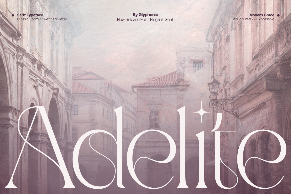
Adelite offers a modern elegant serif look that pairs well with both classic and contemporary invitation designs. It is useful when you want a refined body font that feels current rather than overly traditional. It can keep the details crisp without making the suite feel stiff.
Best for: modern wedding stationery fonts, event details, clean layouts. By: Glyphonic
Monogram & Decorative Accent Fonts
Monogram fonts for wedding and other formal suites are not meant for full sentences. They shine when used for initials, wax seals, envelope accents, and small design details that tie an invitation suite together. I like these for the small moments that make a suite feel finished.
19. Aventine Floral Line Monogram
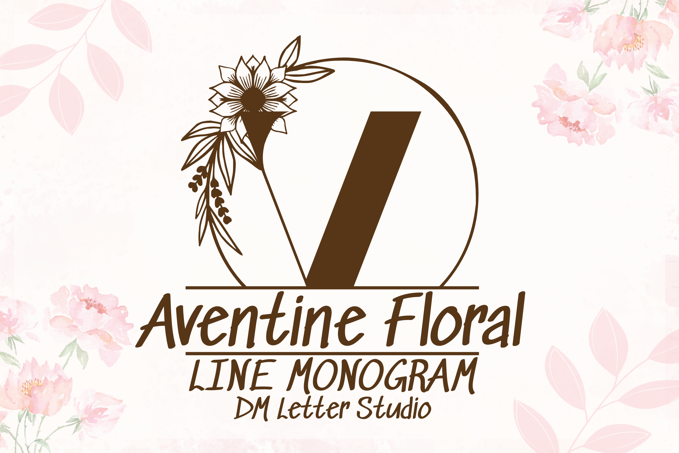
Aventine Floral Line Monogram turns initials into a soft floral mark. It is ideal for wedding monograms, save the date seals, and delicate envelope accents where a few letters can carry the whole design. It works especially well when the suite already has a floral direction.
Best for: wedding initials, floral seals, envelope accents. By: Sharon (DmStudio)
Download Aventine Floral Line Monogram
20. Delicate Laurel Monogram
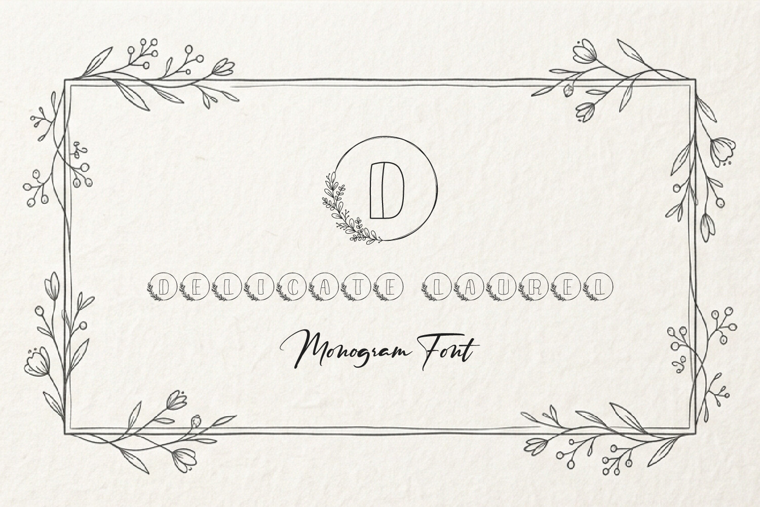
Delicate Laurel Monogram uses a classic laurel wreath shape to frame initials in a refined way. It works well for formal invitations, anniversary cards, and any suite that needs a quiet, ceremonial accent. It is a good pick for seals or small envelope details.
Best for: formal monograms, anniversary cards, seal designs. By: The Kazis Kraft
Download Delicate Laurel Monogram
21. Angelia Monogram
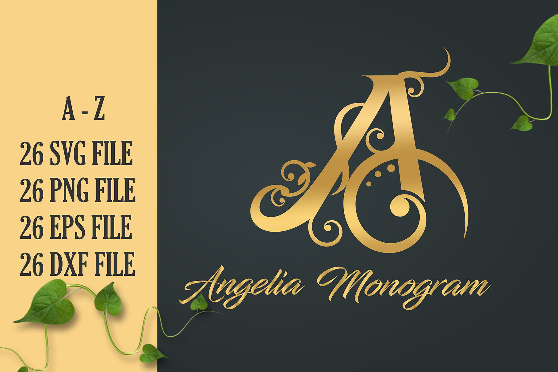
Angelia Monogram is a compact, elegant option for initials and small decorative marks. It suits invitation seals, ribbon details, and envelope corners where a monogram needs to feel polished without taking over the design. It is a good choice when the accent should stay small and neat.
Best for: invitation seals, ribbon details, envelope corners. By: Cikareotype
How to Use Elegant Fonts in Your Invitation Designs
Start with a clear hierarchy. I usually put a script or calligraphy font on the names, event title, or a short emotional line. Then I use a serif or clean sans for practical details: date, time, venue, RSVP, and directions. This invitation font pairing keeps the design expressive and readable.
If you want a simple answer for what font pairs well with a script font on wedding invitations, choose a calm serif for the details. The script carries the mood. The serif carries the information.
Limit the suite to two fonts: one decorative, one readable. A monogram can act as a third visual element without adding another body typeface.
Avoid pairing two script fonts unless you are a professional designer. Two handwritten styles can compete for attention and make the invitation feel busy. A safer approach is one decorative font plus one neutral font, with a monogram for initials.
Font size matters. For printed invitations, keep script fonts at about 14pt or larger so flourishes stay legible. RSVP and logistics text should stay in a simple, clean font at 9 to 12pt. Use 1.4 to 1.6 line spacing for body copy, and prefer dark gray on cream over light gray on white, especially on textured stock.
To install these fonts, download the file from the product page, then install it on your computer. On Windows, right click it and choose Install. On Mac, open it with Font Book. Once installed, it should appear in Canva, Adobe Illustrator, Photoshop, and most other design apps. For Canva, you can also upload custom fonts if supported. For Cricut Design Space or Silhouette Studio, install the font before importing text.
Tip: Print a small test sheet before ordering a full run. Check the script at your planned size, and make sure thin strokes do not disappear on your paper.
Tips for Choosing the Right Elegant Font for Invitations
Before you commit to a font, check the license. I would not skip this step if you are selling invitations on Etsy, creating print on demand products, or offering design services. A font that is free for personal use may not allow you to sell the finished product. Basic commercial font licenses commonly cap usage around 5,000 product units sold, while extended licenses can raise that cap to roughly 250,000 units. If unsure, read the license before building a full suite.
Using a font without proper commercial licensing can lead to a DMCA takedown. Repeat violations can lead to permanent shop suspension. For small businesses, that risk is worth avoiding. This is the fastest way to protect your shop before a listing goes live. If you use Creative Fabrica, its standard license covers print on demand products, digital downloads, physical products, and social media marketing, with one subscription giving access to 20,000+ fonts under commercial use.
Also test the font in your actual workflow. If you are designing in Canva, make sure it appears after installation or upload. If you are using Adobe Illustrator or Photoshop, check that the file opens without missing font warnings. For Cricut or Silhouette projects, confirm the letterforms cut cleanly.
Finally, print a proof. Screen previews can hide small readability problems. Check the date, time, and address at normal reading distance. If the script is too thin, increase the size or choose a bolder companion.
Where to Download Elegant Fonts for Invitations
Every font in this list is available through Creative Fabrica, where you can preview the style, check the license, and download the file. You can also compare styles side by side before deciding which font fits your invitation suite. If you want more free or low cost options for basic body text, Google Fonts and DaFont are also worth exploring. For more typography ideas, browse the FontPro blog.