· fonts · 15 min read
20 Best Handwritten Fonts for Every Creative Project in 2026
Discover the 20 best handwritten fonts for logos, branding, social media, and more. Casual, brush, and playful styles — free and premium options included.
Designers and brands are reaching for handwritten fonts right now, and not just for aesthetic reasons. Picking the right one is not about finding what looks pretty in a preview. It is about finding the one that carries the right mood, reads cleanly at your actual use size, and holds up in context: on a label, a poster, an Instagram Story, a logo.
This list covers 20 of the best handwritten fonts across three categories: casual pen-and-ink styles, bold brush lettering, and playful decorative picks. Two of them are completely free. All are available on Creative Fabrica with commercial licenses included.
What Makes a Great Handwritten Font?
A great handwritten font is not a calligraphy font, and it is not just a script with a slight lean. The best ones simulate what actually happens when a real person writes: irregular letterforms, variable stroke weight, subtle baseline drift. That organic imperfection is the whole point. It is what makes a font feel personal rather than printed.
Handwriting fonts build trust in a way that polished sans-serifs cannot. Studies in branding consistently show that handwritten elements signal authenticity and human attention. In 2026, that signal carries real weight. When a food brand puts a handwritten font on its labels, or a small studio uses one in its logo, they are communicating that real humans made this, and that message lands.
That said, handwritten fonts are not always the right call. They struggle at small sizes, especially heavily textured brush scripts. They read poorly in body copy; never use them for long paragraphs. And stacking two handwritten fonts in one design creates visual noise almost immediately. Use them for headlines, accents, logos, and short display text, then pair with a clean sans-serif or serif for everything else.
Best Casual Handwritten Fonts — Pen & Ink Styles
Pen-and-ink handwritten fonts are the workhorses of this category. They feel personal without being loud: the right choice for journaling aesthetics, product labels, personal branding, and any project where you want handwritten warmth without the drama of a brush script.
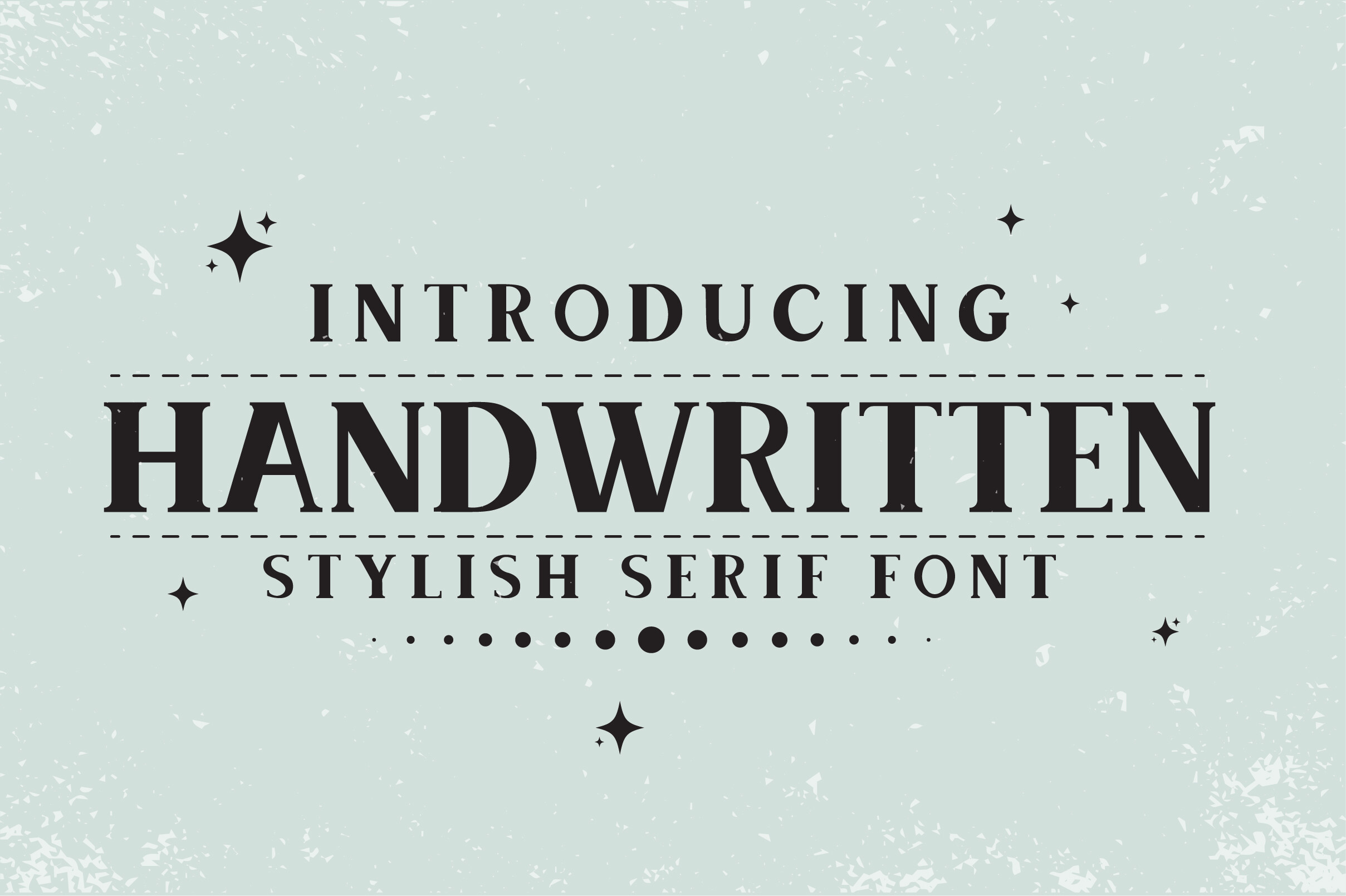
1. Handwritten
This is a casual handwriting font that leans into natural imperfection without going overboard. The letterforms tilt in both directions with slight irregularity, giving it a fun, slightly playful character. It is unpretentious and genuine: the kind of font that looks like someone actually wrote it, which is exactly what makes it work for DIY projects and informal branding.
Best for: DIY projects, children’s brands, informal labels, greeting cards. By: BlackCraft
2. Tall Handwritten
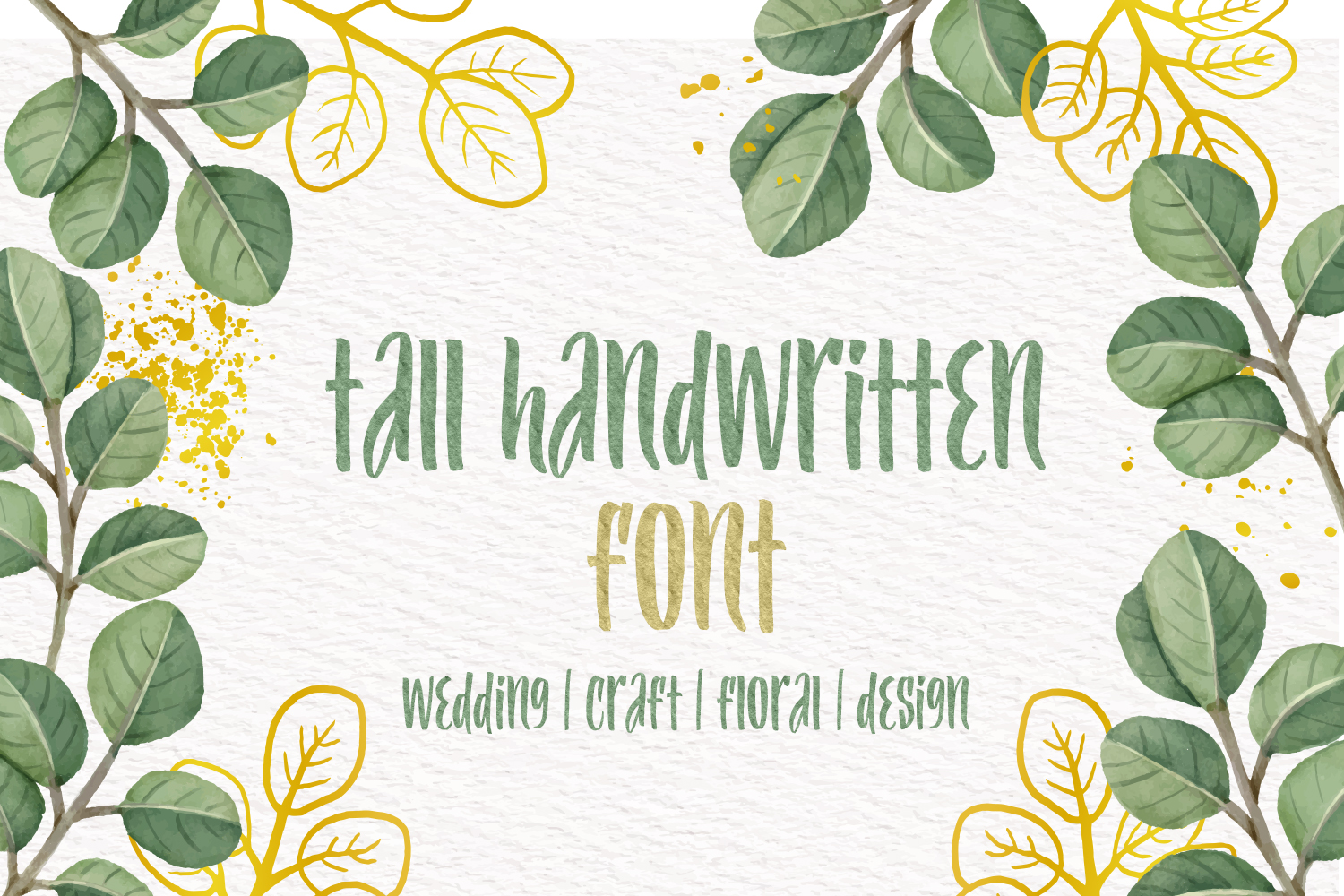
Most handwritten fonts spread horizontally. Tall Handwritten goes the other way. The narrow, elongated letterforms give it an editorial quality that reads well in vertical layouts and tall poster compositions. It keeps the warmth of a handwritten feel while adding a quiet elegance that most pen-style fonts miss.
Best for: posters, packaging, vertical layouts, fashion branding, wedding stationery. By: OWPictures
3. Simple Handwritten
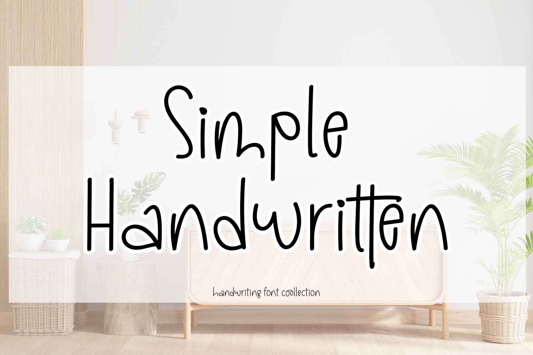
By Creatype Designer, this font does exactly what the name promises. No swashes, no flourishes, no extra decoration. The letterforms are clean and deliberately minimal, which makes it one of the most versatile picks in this category. When you need handwritten warmth without personality getting in the way of the content, this is the one to reach for.
Best for: product labels, blogs, photo captions, DIY craft projects. By: Creatype Designer
4. Clearty
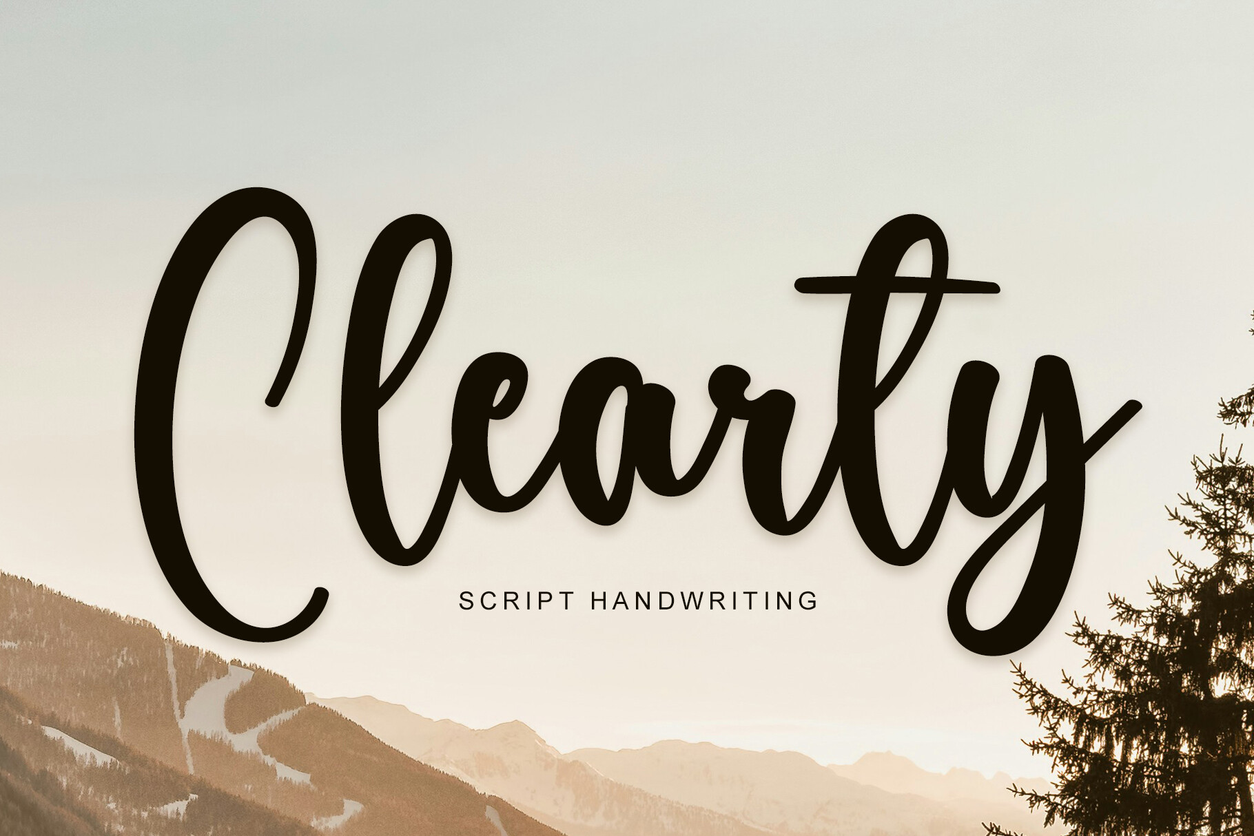
Clearty is built around one priority: readability. The letterforms are open and well-spaced, which means it holds up at smaller point sizes where most handwritten fonts start to fall apart. It has a modern handwritten mood without sacrificing clarity. A solid choice when your text actually needs to be read rather than just look like handwriting.
Best for: quotes, journaling aesthetics, small-size text blocks, personal branding. By: YanStudio
5. Simple Handwriting
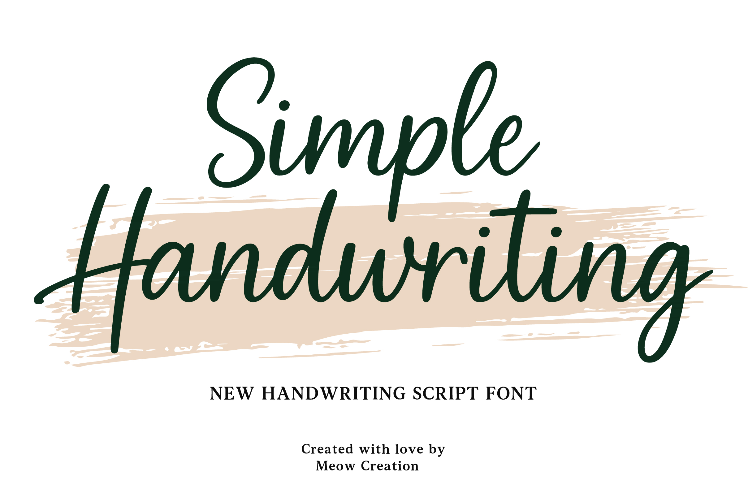
Do not confuse this with font #3. Simple Handwriting by Meow Creation is a different font from a different designer with a noticeably different feel. Where Creatype Designer’s Simple Handwritten is clean and neutral, this 2026 release from Meow Creation is warmer and more casual: the lines are clean but the personality leans approachable and journal-style. It is a natural fit for Instagram Stories and note-aesthetic content.
Best for: Instagram Stories, journaling aesthetic, note-style content, greeting cards. By: Meow Creation
6. Stylish Handwriting
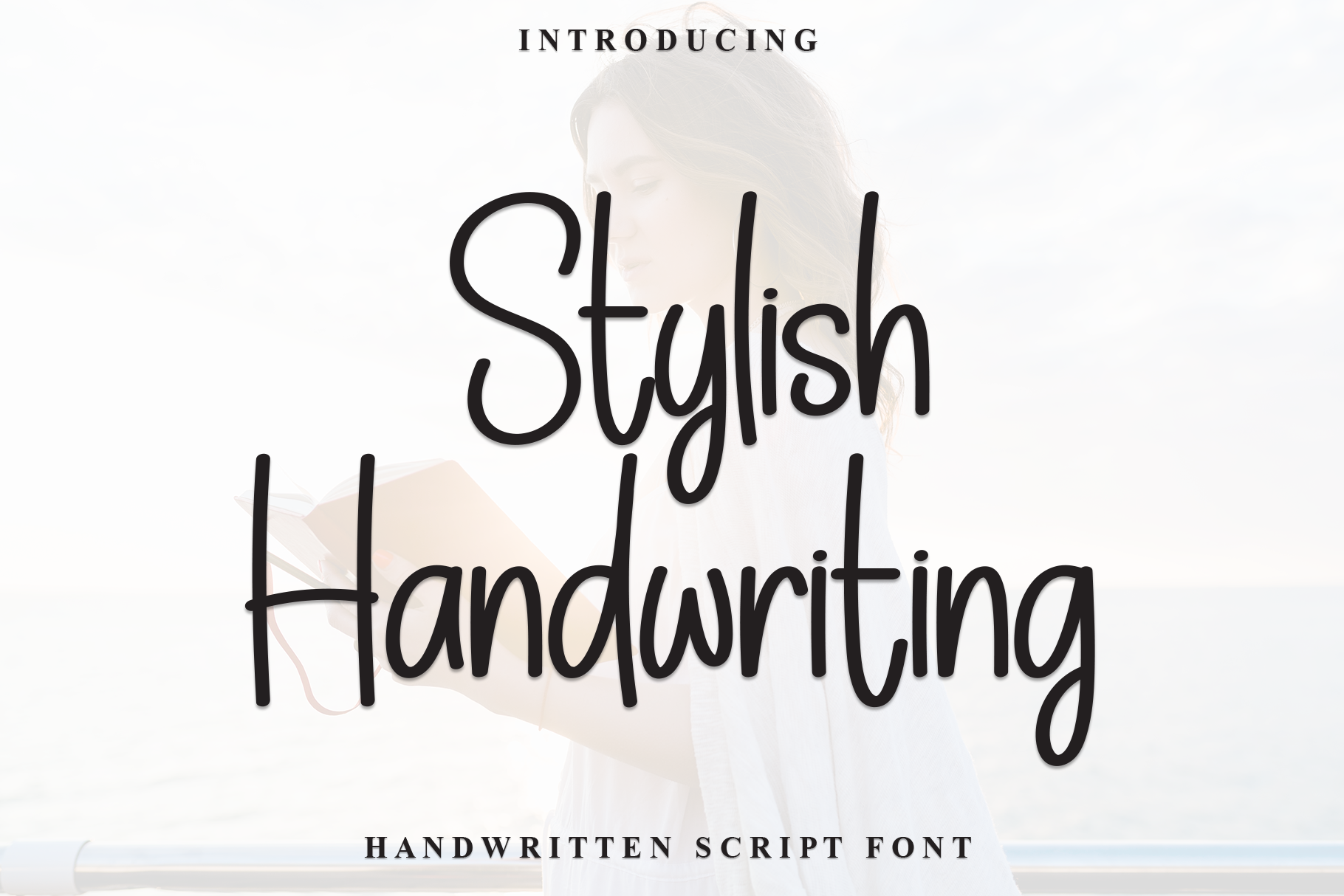
This font occupies an interesting middle ground: it has the genuine feel of everyday handwriting but with a deliberate composure that makes it work in professional contexts too. The letterforms are balanced and intentional rather than spontaneous. If you want a font that looks like a thoughtful person’s handwriting rather than a quick note, Stylish Handwriting lands there consistently.
Best for: personal branding, small studio logos, signature-style work, upscale stationery. By: Robbots Stores
7. Modern Hand Flow
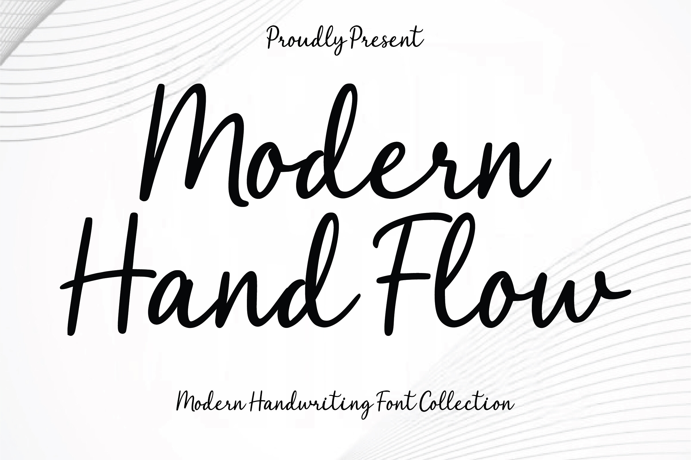
The defining feature here is movement. The transitions between letters are smooth and fluid, creating a sense of flow that most static handwriting fonts do not have. It has a contemporary sensibility that pairs naturally with wellness and beauty brands: the kind of font that makes packaging feel hand-crafted without feeling rustic.
Best for: wellness brands, beauty packaging, lifestyle blogs, social media graphics. By: Aura Design
8. Neat Handwriting
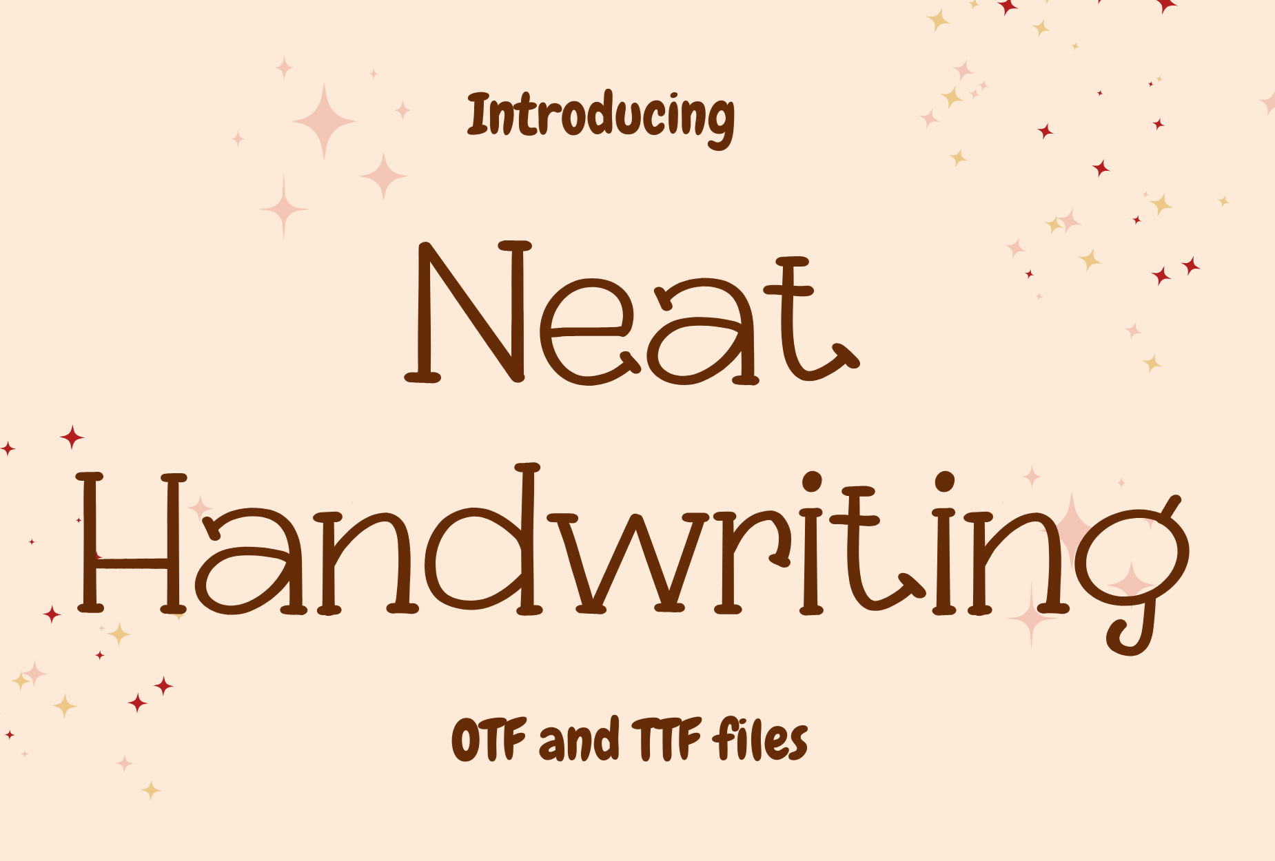
This is the “neat notebook” pick of the bunch. Where most handwritten fonts lean into some level of chaos, Neat Handwriting by Candygirl Art keeps things orderly and structured: even lines, upright letterforms, tidy penmanship. It is the best option when you want the handwritten look without any visual unpredictability, perfect for menus, educational materials, and clean recipe layouts.
Best for: menus, price tags, educational materials, personal planners. By: Candygirl Art
Best Brush Lettering Fonts
Brush lettering fonts are built for impact. The textured strokes, bold weights, and expressive forms make them ideal for logos, poster headlines, merchandise, and anywhere you need handwritten energy at large sizes. Here are ten that cover everything from airy and feminine to raw and punk.
9. Brush It On
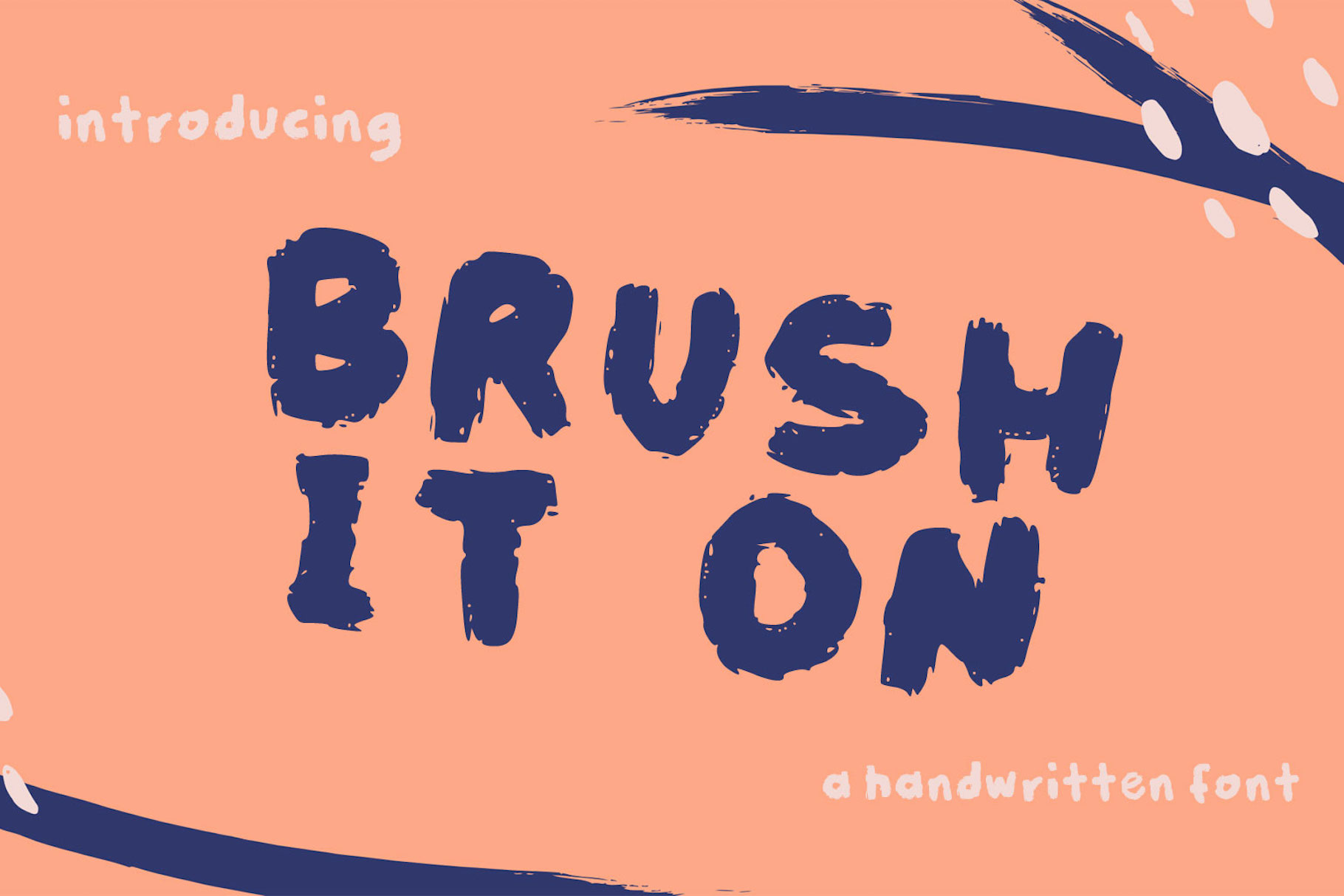
Brush It On earns its place at the top of this category because it feels like a real brush in a real hand. The dry brush tip and textured strokes give every letter a raw, tactile quality that digital tools usually sand away. It works exceptionally well on dark backgrounds, where the texture pops and the street-style energy comes through cleanly.
Best for: street style brands, art brands, dark-background designs, expressive headlines. By: lunarctic
10. Bucky
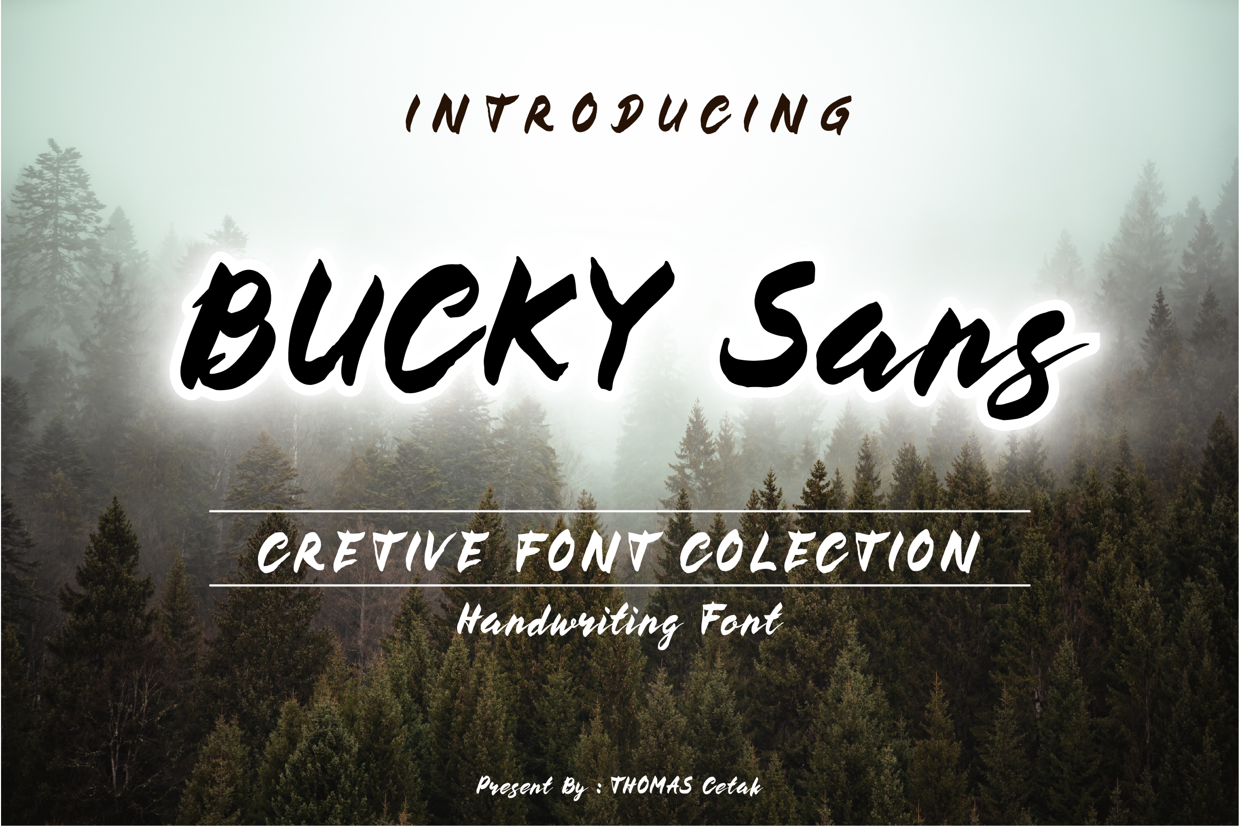
Bucky has the kind of confident, wide brush stroke that makes a logo immediately recognizable. It is assertive and full of personality: not subtle, not reserved. Sports logos, barbershop signage, craft beer labels: anything that needs character and presence rather than elegance. It reads as bold without becoming illegible, which is harder to pull off than it looks.
Best for: sports logos, barbershops, craft beer branding, casual signage. By: thomascetak
11. Starstuck
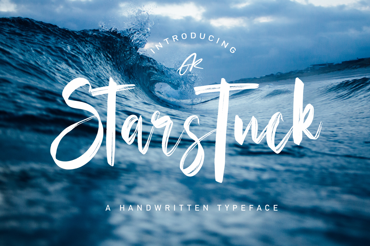
The dynamic tilt of Starstuck gives it an energy that feels like momentum. It is expressive and lively without crossing into chaotic. Event posters, music graphics, social media content that needs to stop the scroll: this font has the forward lean and visual force to do that work. A brush script for when you need the design to feel like it is moving.
Best for: event branding, music posters, social media content, entertainment graphics. By: Arendxstudio
12. Bebrush
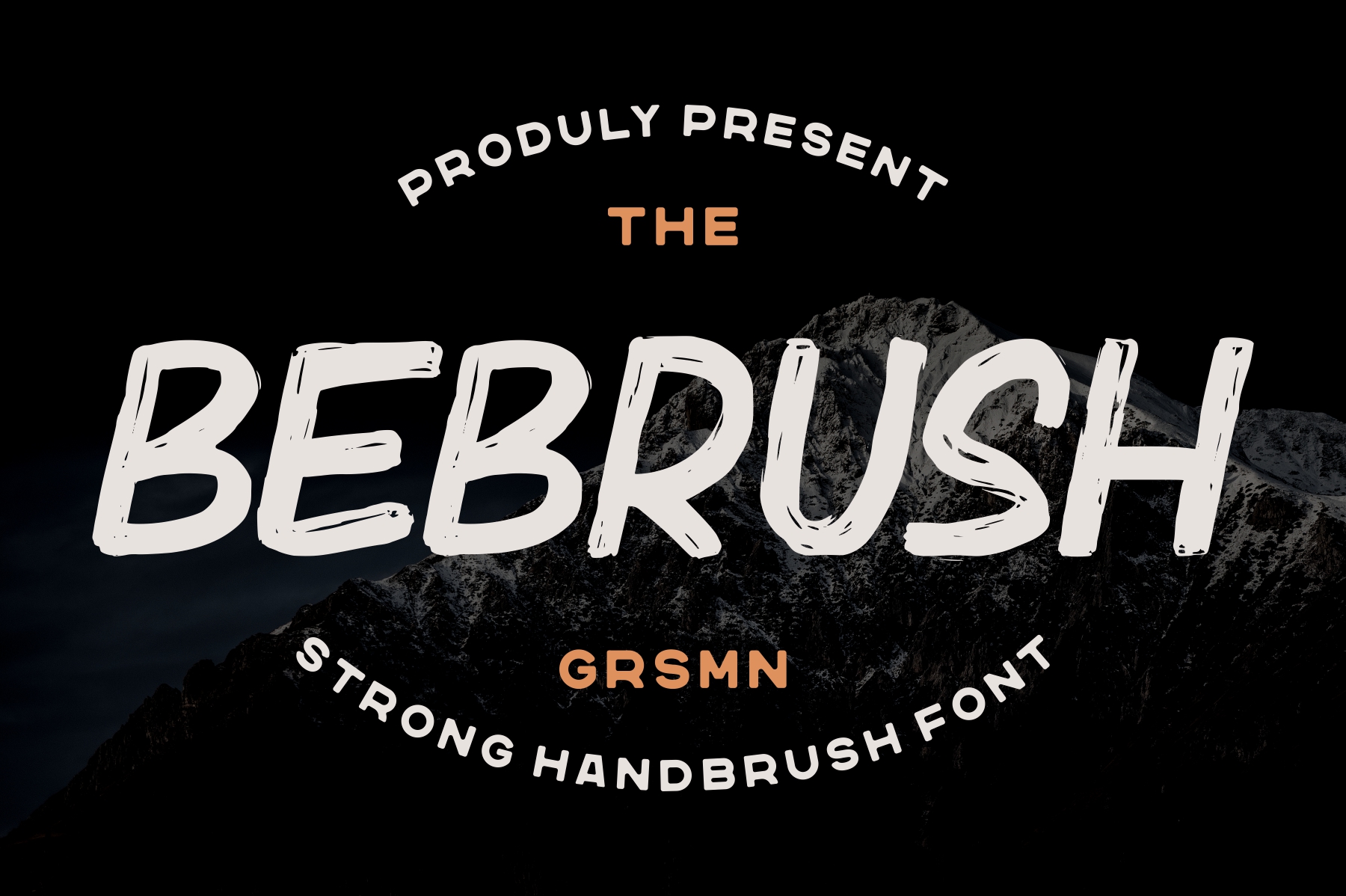
Bebrush is the quiet one in the brush category. The strokes are lightweight and airy, which makes it feel more like a whisper than a shout. That restraint is a real strength for brands that want brush lettering texture without the heaviness: floral studios, candle makers, organic skincare brands. It adds artisan quality without overwhelming the rest of the design.
Best for: floral brands, candle labels, organic cosmetics, logo design. By: Garisman Studio
13. Famous Brush
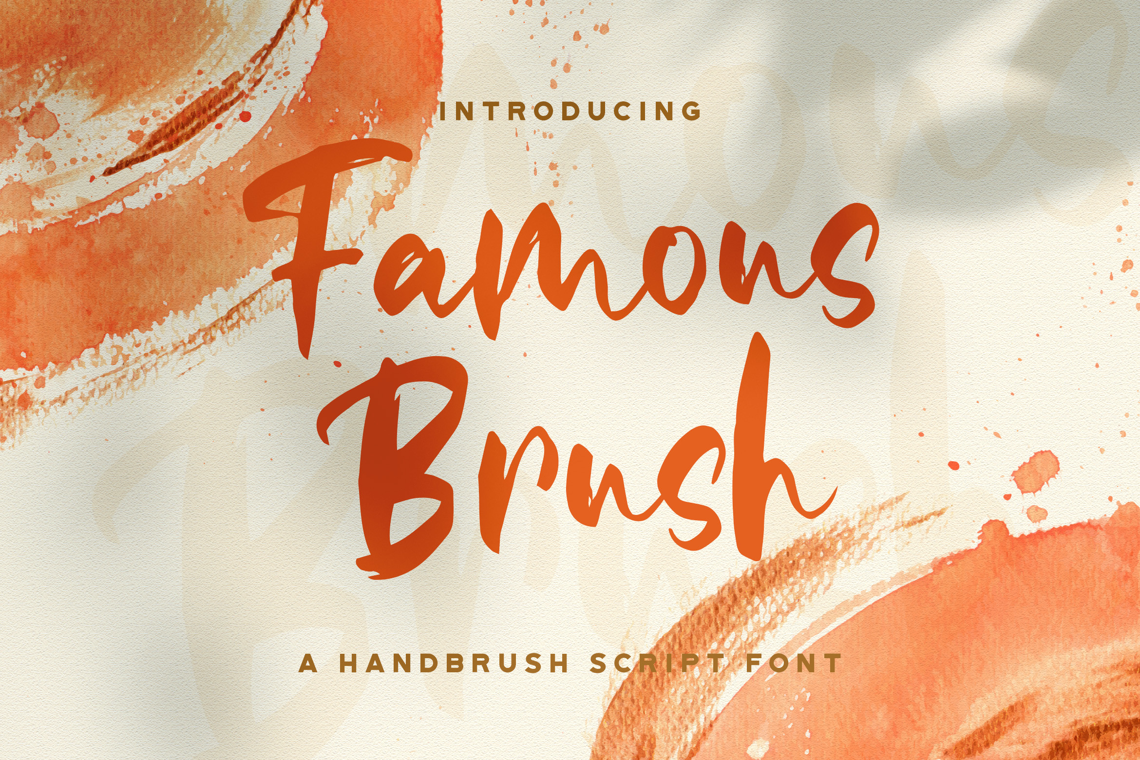
Famous Brush hits the sweet spot between bold and legible. It is polished enough to carry a brand headline confidently, but the letterforms stay open enough to work as a subheader too. Lifestyle brands and food bloggers who want a brush font that does not sacrifice readability will find this one does the heavy lifting without the guesswork.
Best for: lifestyle brands, food blogs, headers and subheaders, event posters. By: StringLabs
14. Hand Brush
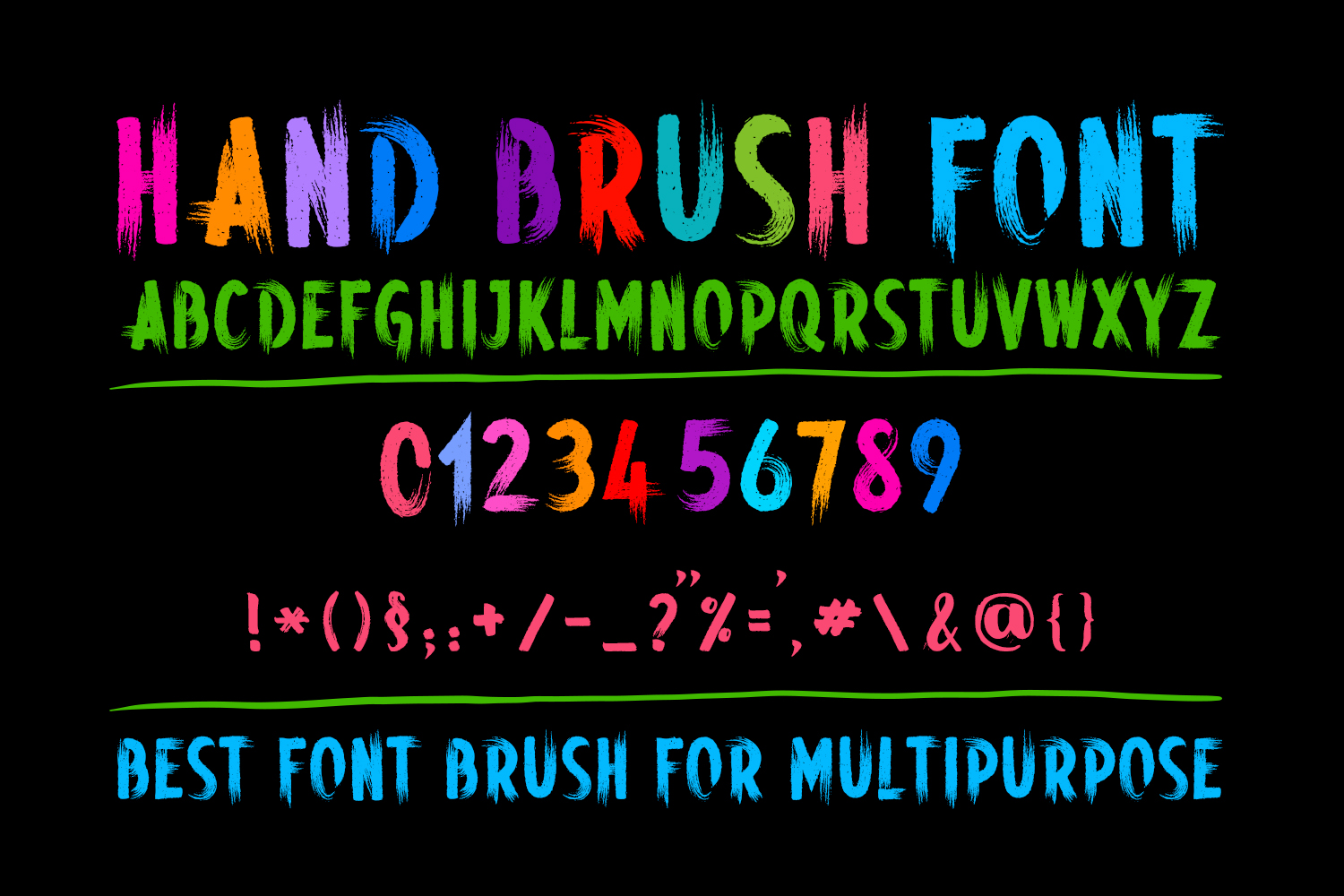
From the same designer as Tall Handwritten (#2), Hand Brush shows OWPictures working in a completely different register. Where Tall Handwritten is elegant and elongated, Hand Brush is textured and tactile. The stroke weight varies subtly from letter to letter, giving it a genuine “just written” quality. That naturalness makes it an excellent choice for packaging and product labels where authenticity is part of the brand message.
Best for: packaging, greeting cards, product labels, rustic branding. By: OWPictures
15. Rawk Brush
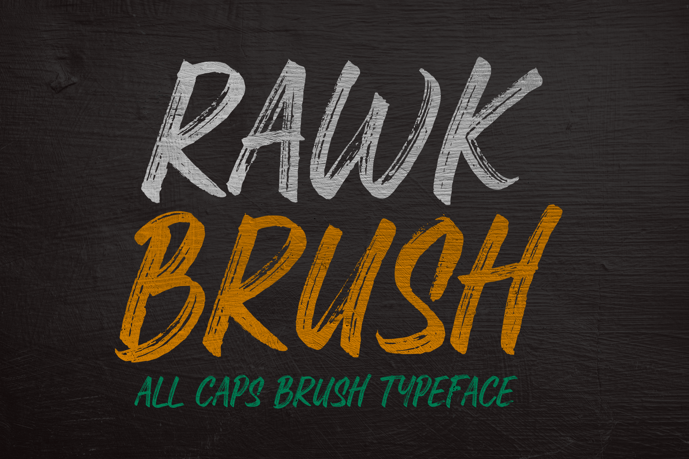
Rawk Brush is the roughest font in this entire list, and it is designed to be. The heavy strokes are deliberately ragged, the texture is intentionally harsh, and the energy is unmistakably punk. In 2026, that kind of deliberate imperfection reads as a design statement: a clear signal that this brand is not algorithmically smoothed. If your audience gravitates toward rock music, streetwear, or edgy branding, this font earns immediate credibility.
Best for: rock music events, band merchandise, streetwear, edgy branding. By: hptypework
16. Brushberry
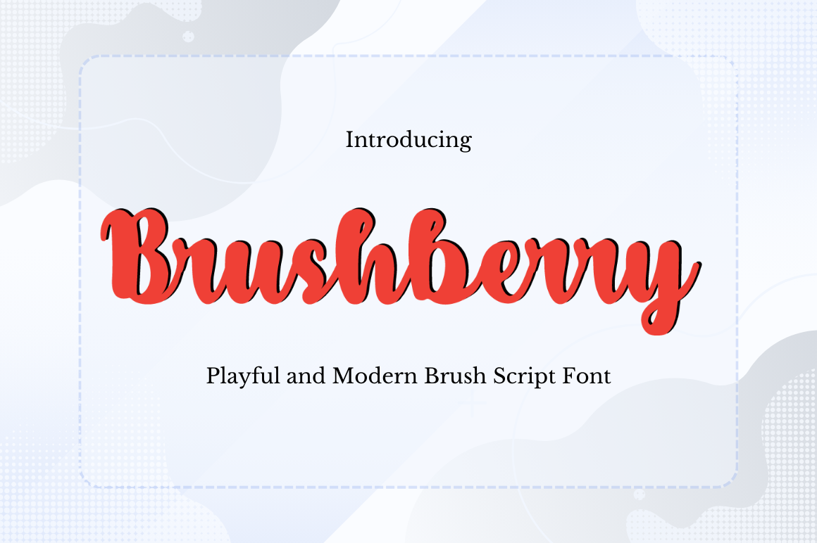
Brushberry is a free download on Creative Fabrica, which makes it an easy pick to test before committing to a direction. The soft, rounded forms and warm organic brushwork give it a natural, berry-like character that works well for food branding. Farm market labels, jam jars, cozy cafe signage: anywhere you want brush script energy with a gentle, approachable personality rather than a loud one.
Best for: food branding, jams, farm markets, cozy cafes, feminine branding. By: Arzaq’s Studio
17. Billjones
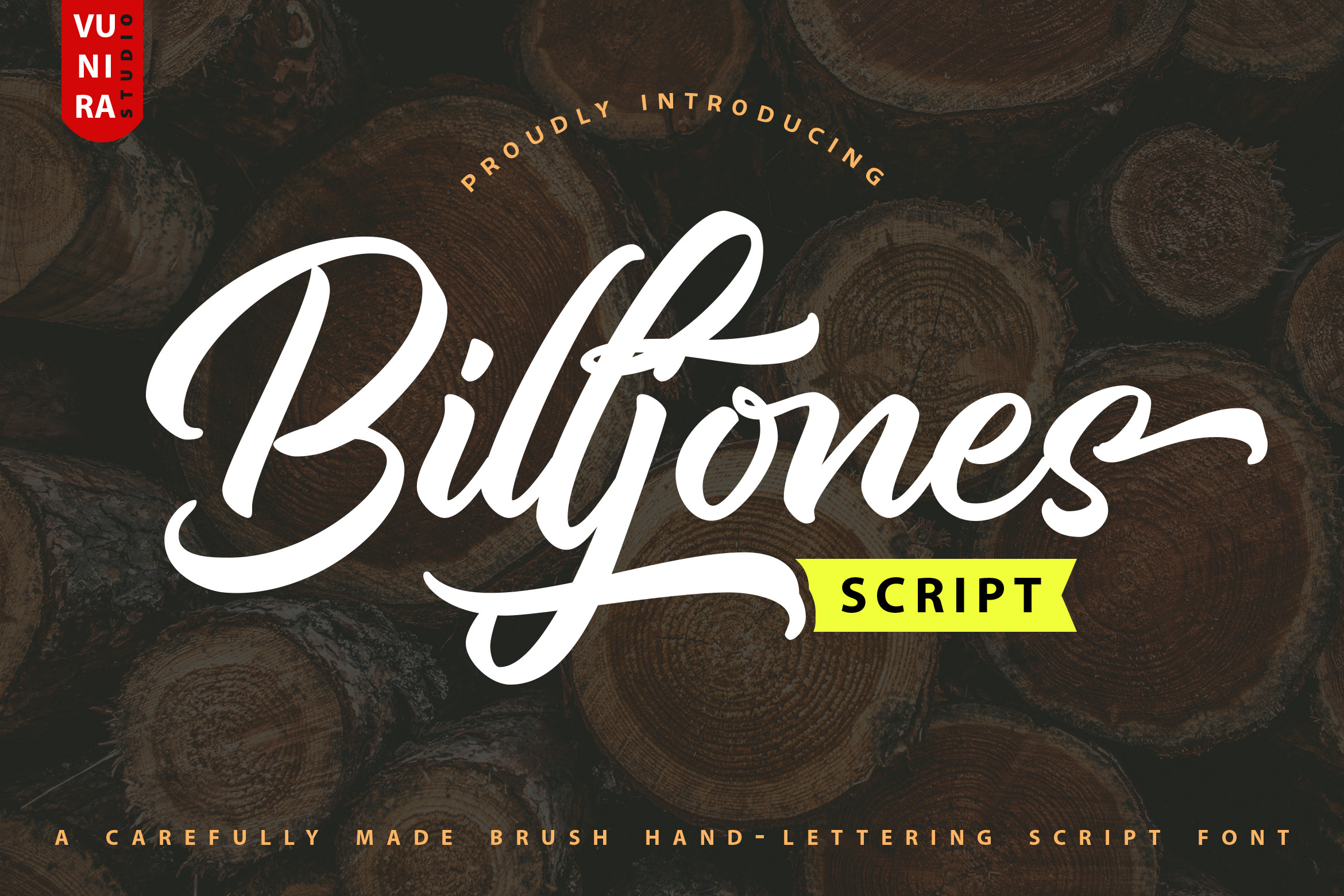
Billjones feels like someone signed their name with genuine confidence and a good brush pen. The energetic serifs, uneven baseline, and calligraphic quality give it a premium hand-lettering character that holds up at large sizes. This is a logotype font: the kind of thing you set once, large, and let it carry the entire composition. Wedding stationery, luxury brand identities, bold statement headers.
Best for: logos, large headers, bold statement pieces, luxury stationery. By: Vunira
18. Paint Brush Script
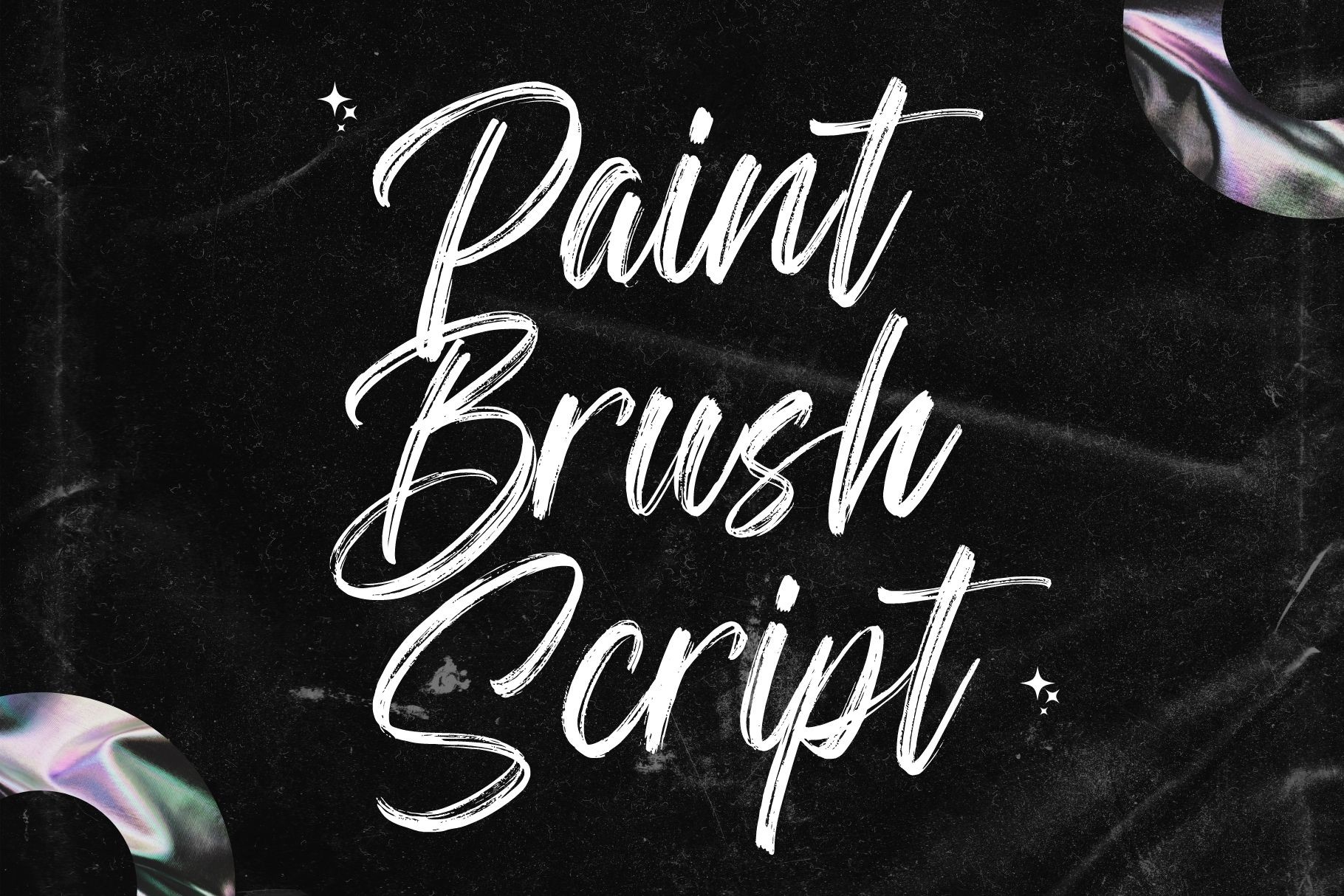
This one uses a wider, paint-loaded brush rather than a fine script tip, and the difference shows. The strokes are bolder, the texture reads like actual paint, and the script ligatures add a flowing quality that keeps it from feeling heavy. For large-scale display work: book covers, oversized posters, artisan packaging, Paint Brush Script has the visual weight to command attention.
Best for: posters, book covers, large-scale display, artisan packaging. By: Sigit Dwipa
Best Playful & Decorative Handwritten Fonts
When the project calls for personality first and convention second, this is your category. These fonts have character and mood built in: the right picks for youth brands, seasonal campaigns, and any project where the font itself is part of the visual concept.
19. Kingsford
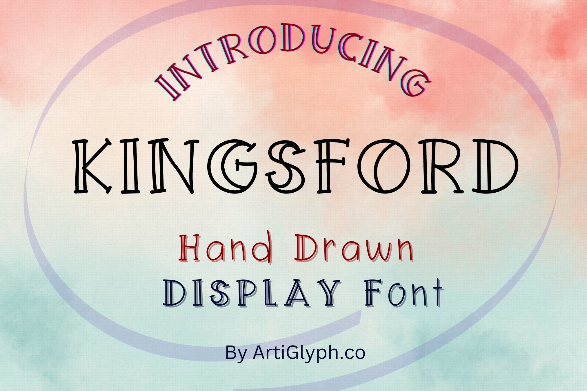
Kingsford brings graffiti lettering into a font format without losing its street energy. The strokes are bold and confident, and there are elements of urban hand-lettering in the form of each character that give it a genuine edge. It is not subtle, and it should not be. Youth brand merch, street-inspired apparel, bold social media graphics: this is the font for when you want the design to feel like it belongs on a wall, not a corporate brochure.
Best for: youth brands, merchandise, street-inspired designs, bold social media graphics. By: ARTify
20. Matcha Mint
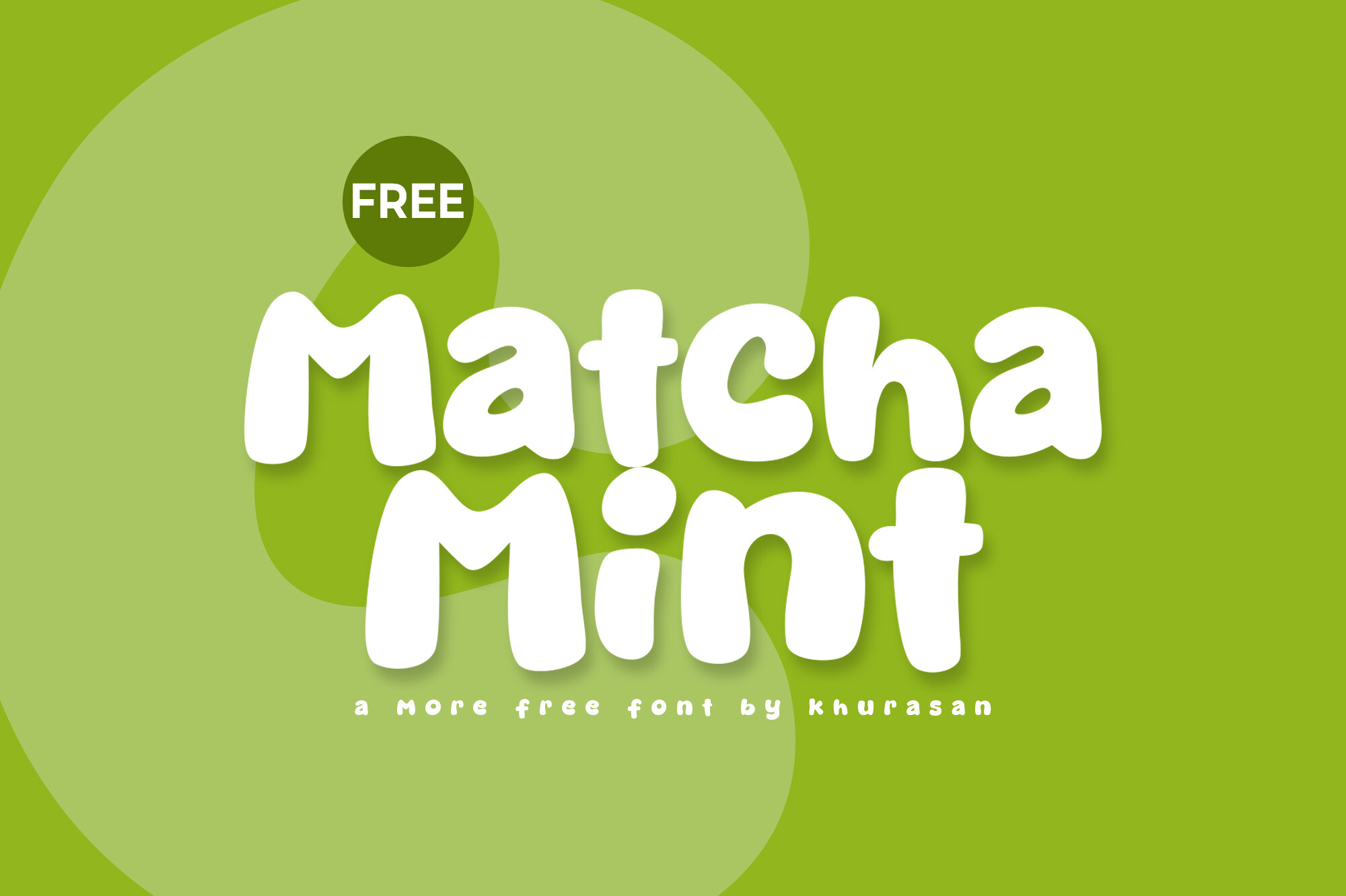
Released in June 2026, Matcha Mint is the freshest font in this list and it is available as a free download. The delicate brushwork and softcore aesthetic place it squarely in the current design moment: light, playful, and modern without trying too hard. Wellness brands, beauty packaging, and cafe menus will get a lot of mileage from this one. It is the kind of font that makes everything feel a little more considered.
Best for: wellness brands, beauty packaging, food brands, minimalist cafe menus. By: Khurasan
How to Use Handwritten Fonts in Your Designs
The most reliable pairing rule for handwritten fonts is also the simplest: one handwritten font, one clean secondary. For modern and casual work, pair a handwritten headline with a sans-serif body. For luxury or formal contexts, try a handwritten accent with a serif for the supporting text. Mixing two handwritten fonts in a single design almost always creates visual noise, so resist the temptation.
Size matters more with handwritten fonts than with most other categories. Brush scripts with heavy texture should sit at 48px or larger on desktop; below that, the strokes merge and the font loses definition. Pen-style handwritten fonts are more forgiving and can read at 24 to 32px. For any text that users actually need to read, 16px is the minimum and a clean secondary font is the better choice.
Different tools handle handwritten fonts differently. In Canva, stick to display applications: large text on Stories, Reels covers, poster headers. In Adobe Illustrator, converting text to outlines helps with texture-heavy brush fonts that sometimes render inconsistently across systems. For Procreate, brush scripts layer well with illustration work. If you are cutting files on a Cricut or laser cutter, choose handwritten fonts with clearly defined outlines and avoid extremely thin strokes that will not cut cleanly.
For packaging and product labels, handwritten fonts work hardest when they carry the brand name or a short tagline rather than descriptive body copy. Keep the handwritten element to one line if possible. Pair it with a legible secondary font for ingredients, instructions, or any information the customer actually needs to read.
Tips for Choosing the Right Handwritten Font
Licensing is the first thing to check, not the last. Free handwritten fonts fall into roughly two buckets: open commercial licenses (Google Fonts is the clearest example, covering logos, print, and web use) and personal-use-only licenses (common on DaFont, where the default is often personal use unless the listing explicitly says otherwise). Creative Fabrica fonts include commercial licenses by default, covering print-on-demand, apparel, and client work. If you are selling products, creating merch, or working for clients, verify the license before you fall in love with a font.
Readability testing is worth doing before you commit. Set a few words at your intended display size and step back. Does the texture flatten out? Do similar letterforms start to look identical? The fonts that hold up at your actual use size are the ones worth buying. Decorative fonts look great at 200px in a preview and can become unreadable at 24px in real applications.
Match the font’s mood to the brand’s mood. This sounds obvious but it is easy to get wrong. Casual handwritten fonts work for friendly, accessible brands. Brush scripts with heavy texture read as bold, confident, or edgy. Airy lightweight scripts like Bebrush or Matcha Mint signal artisan and natural. A mismatch between the font’s energy and the brand’s personality will feel off even if the reader cannot articulate why.
If you need multilingual support or web embedding, check for OpenType features and character set coverage before purchasing. Most fonts on Creative Fabrica cover standard Latin characters. Some include extended language support. If you need Cyrillic, Arabic, or other scripts, filter by that requirement first rather than retrofitting a font that was not built for it.
Where to Download Handwritten Fonts
Creative Fabrica is the most practical source for premium handwritten fonts with clear commercial licensing. The All Access subscription gives you unlimited downloads across the entire library, and every font includes a commercial license covering client work, print-on-demand, and digital products. It is the platform most professional designers and crafters use when they need reliable licensing without tracking down individual font agreements. You can browse the full collection at Creative Fabrica.
Google Fonts is the strongest free option, and the licensing is genuinely open. Dancing Script, Caveat, Kalam, and Pacifico are all available at no cost with licenses that explicitly cover logos, print, and web use. The selection is smaller than commercial platforms but the legal clarity is hard to beat for commercial projects on a tight budget.
DaFont has one of the largest libraries of handwritten and brush fonts online, but the licensing is inconsistent. A significant portion of the fonts default to personal use only. Before using anything from DaFont on a client project, a paid product, or merchandise, open the font’s listing and read the license file. DaFont handwritten fonts is a great browsing resource, but verify before you download.
Font Squirrel takes a different approach: every font in its library has been vetted specifically for commercial use. The selection is curated rather than exhaustive, but if you need a handwritten font with a clean commercial license and you do not want to dig through licensing fine print, Font Squirrel is worth checking. For everything else, the FontPro blog has ongoing coverage of new font releases and design resources worth bookmarking.