· fonts · 11 min read
17 Best Fonts for Funeral Order of Service in 2026
A practical guide to choosing a font for a funeral order of service, with 17 serif, script and sans picks for hymns, readings and tributes.
What Makes a Great Font for a Funeral Order of Service?
A guest holds the order of service in their hands while the ceremony unfolds. They follow the hymns and readings in real time, looking for the next line. The font should help them find it quickly and never pull attention from the moment.
That is the job of the best font for a funeral order of service: clarity under quiet, practical conditions. Three properties matter most.
- Clear distinction between section headings, hymn titles, and reading text, so a guest can see where they are in the service at a glance.
- Readability when reading aloud, standing, or in dim light, for guests of every age.
- A restrained character that matches the tone of the service and lets the words do the work.
An order of service is not an invitation, an announcement, or a brochure. It is a working document with text to be read and sung, not just a name, date, and venue. The typography has to follow the sequence of the ceremony.
One honest note before the list: none of the fonts below is positioned on Creative Fabrica as a funeral or memorial face. They are general serif, script, and sans designs, and several are pitched at luxury branding, wedding stationery, or fashion. They could suit this use, but they were not made for it.
Reading the Running Order: Where Each Font Does Its Work
Before choosing a font, map the document. The cover carries the name, dates of life, and possibly a photograph. Inside, the running order lists the welcome, hymns, readings, eulogy, tributes, committal, and closing words. Hymn titles and verse numbers sit under their section heading, and readings include the name of the person reading. The final page holds words of thanks and details of the wake or a collection.
This points to three type levels:
- An accent for the name
- A structural face for section headings
- A reading face for everything else
Keep it to two fonts, three at most: one serif or sans for reading, one contrasting face for headings, and a script reserved for the name alone. Anything more looks busy.
The exact running order depends on whether the service is religious or civil, so confirm it with the funeral director or celebrant before setting type. Garamond, Baskerville, and Palatino are common reference points for body text, and Lato or Helvetica for a cleaner look. These names are general guides, not facts about any font in this list.
17 Best Fonts for Funeral Order of Service
This selection is organised by the role each font plays in the document. Only the details listed on each product page are stated as fact. The suggested roles are opinions, worth testing on a printed sample.
Best Serif Fonts for the Cover and Section Headings
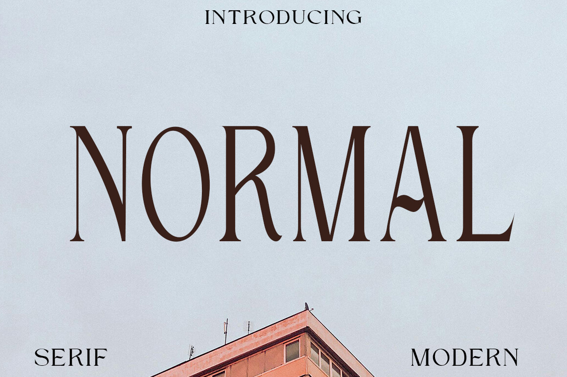
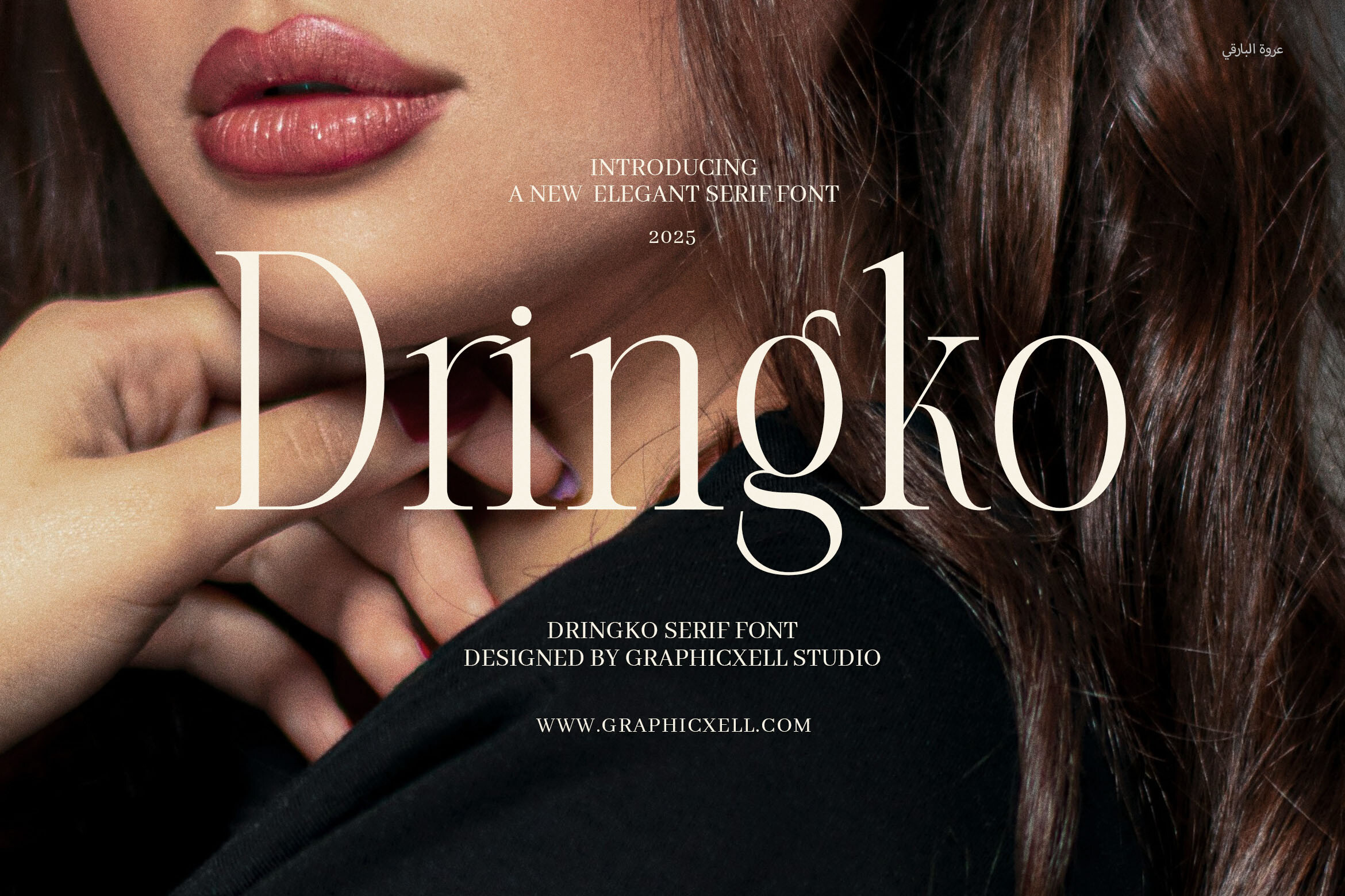
1. Dringko
Dringko is an elegant serif aimed at luxury logos, high-end branding, and packaging. It is subscription-only on Creative Fabrica.
Its positioning is commercial rather than editorial, so it could suit the cover name or section headings, where a formal tone is useful. It is not described as a body text face.
Best for: cover name, section headings. By: Creative Fabrica
2. Rigena
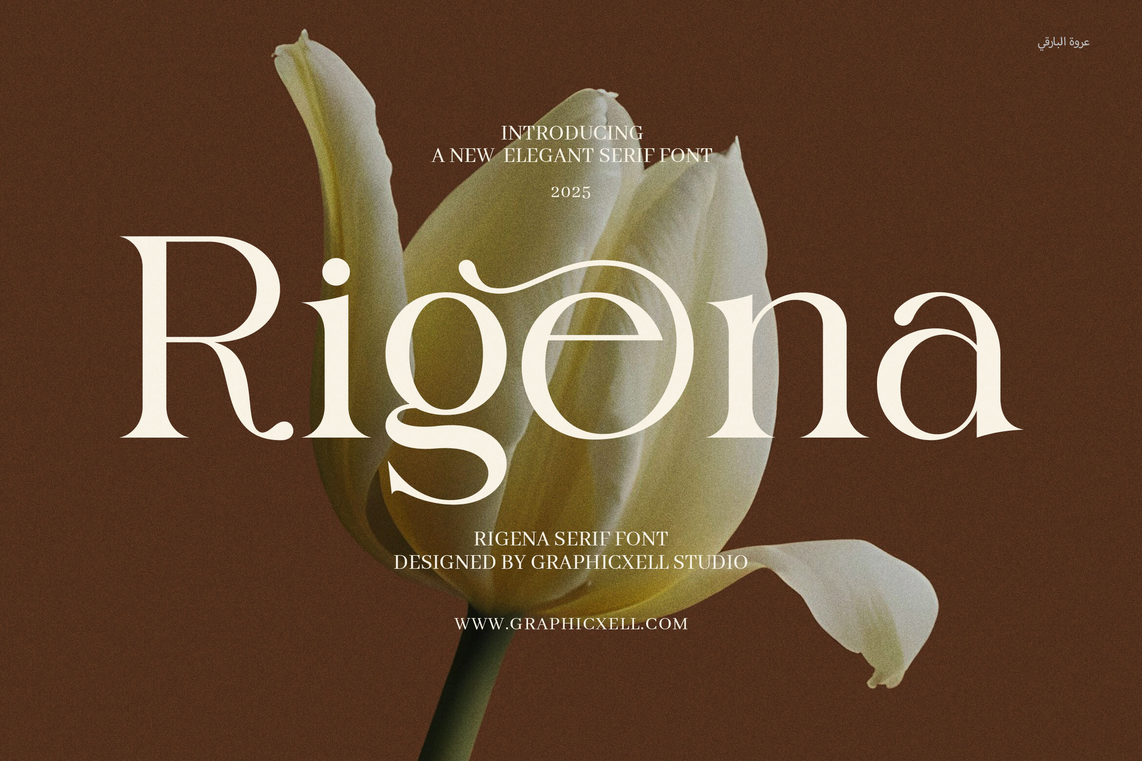
The listing calls Rigena an elegant high-contrast-style serif for luxury branding, and notes it can be converted to a webfont. It is subscription-only.
With details this sparse, check the style on the product page before deciding whether it suits a cover or heading role.
Best for: cover name, section headings. By: Creative Fabrica
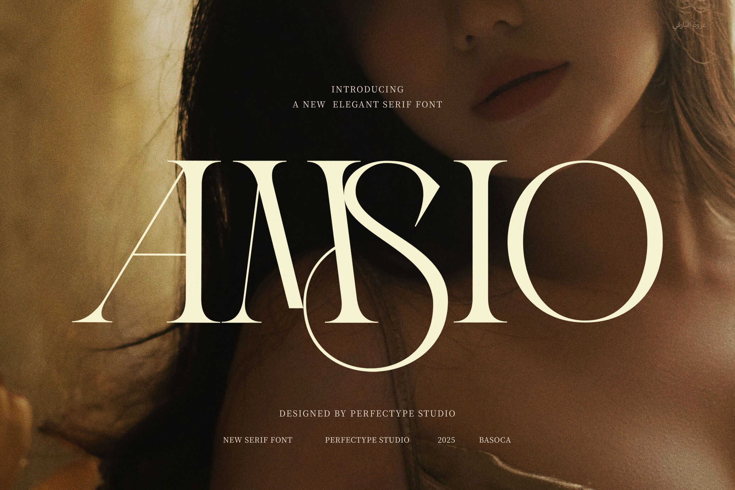
3. Groch
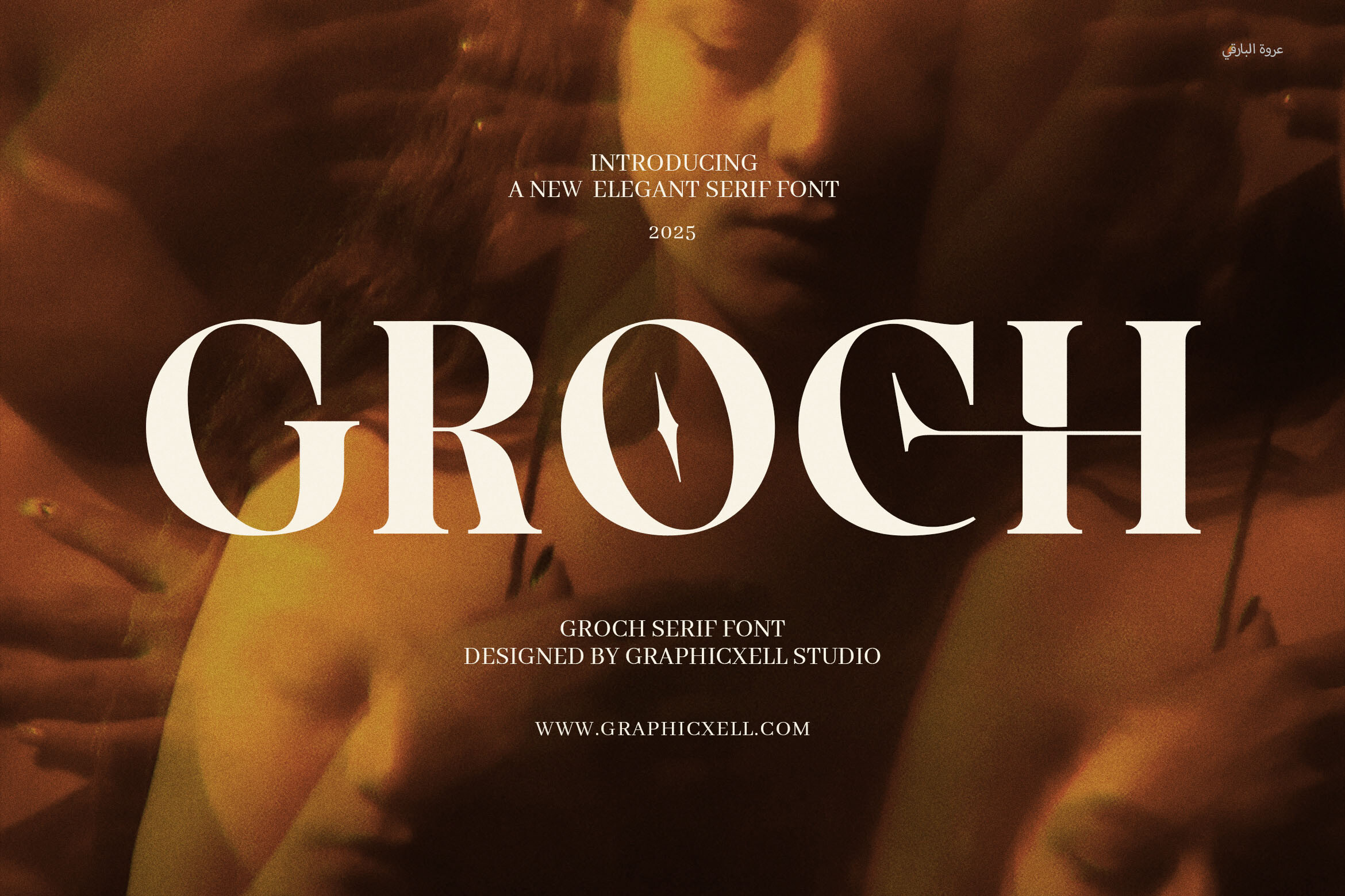
Groch is an elegant serif that blends traditional serifs with cleaner modern lines. It was listed in May 2025 and is subscription-only.
The mix of classical and contemporary character could suit section headings and hymn titles. It is not described as a long-text face, so test it on short lines first.
Best for: section headings, hymn titles. By: Creative Fabrica
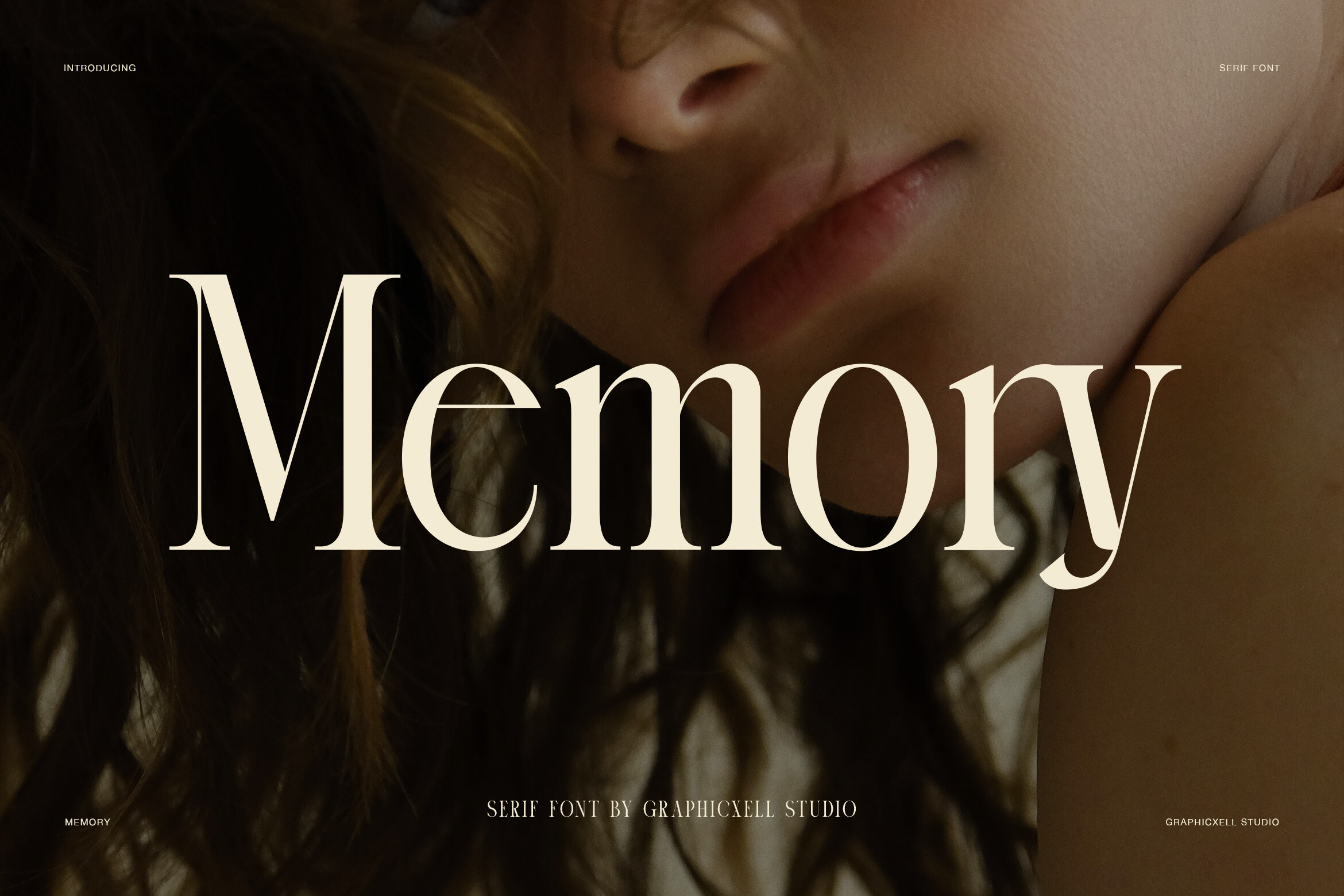
4. Merilo
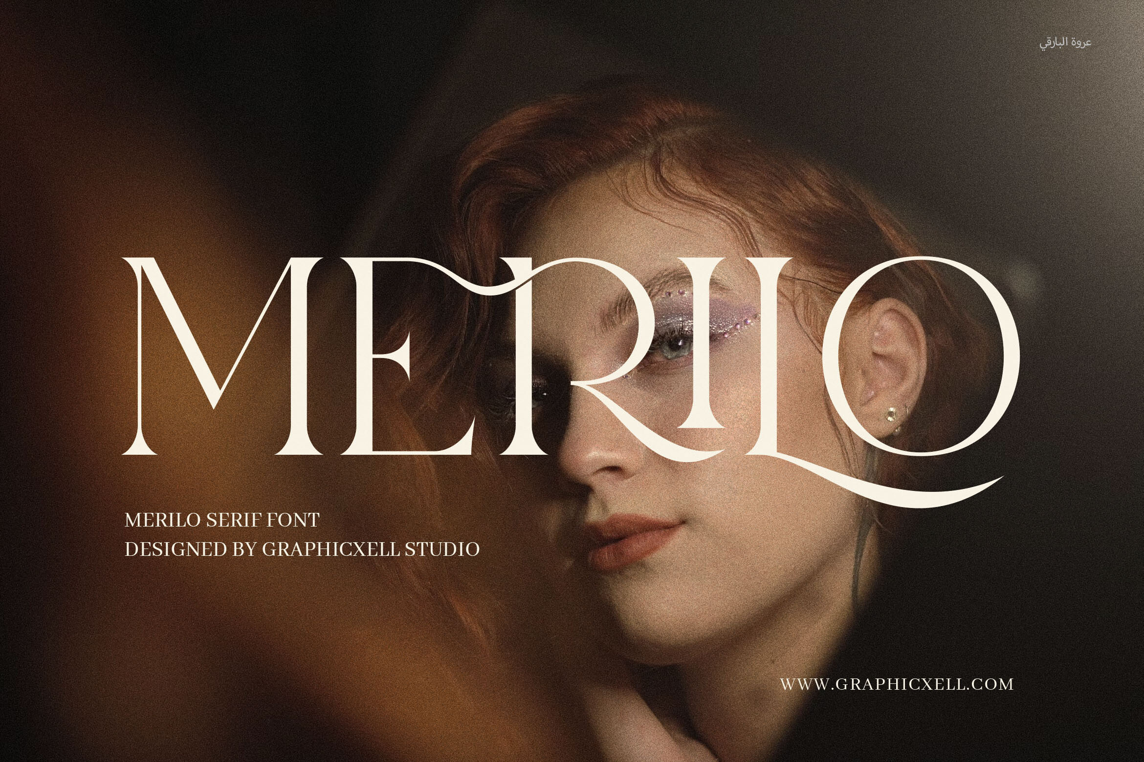
Merilo is an elegant serif mixing classical and contemporary traits, aimed at upscale branding and editorial layouts. It is subscription-only.
The editorial mention hints at multi-line composition, but it is not confirmed as a long-text reading face. It could suit the cover or headings. Print a test before assigning it to readings.
Best for: cover, section headings. By: Creative Fabrica
5. Monte
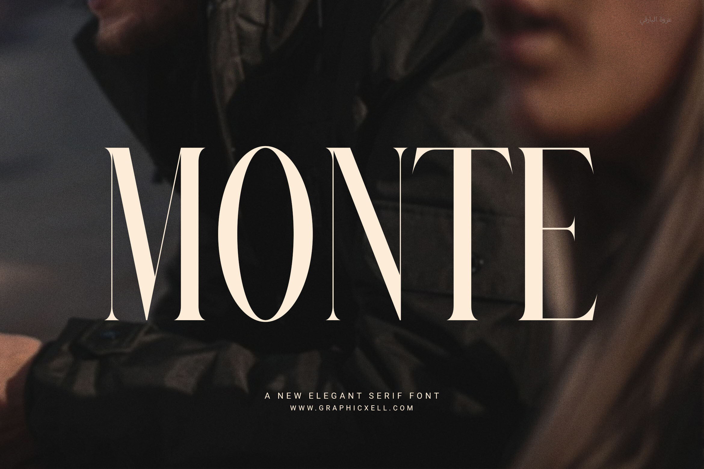
The listing describes Monte as an elegant serif for luxury and boutique use, and notes it includes ligatures. The licence status is not stated, so check the product page.
Ligatures are worth a look in names and short headings. A printed test will show how they render in hymn titles.
Best for: cover name, short headings. By: Creative Fabrica
6. Elient
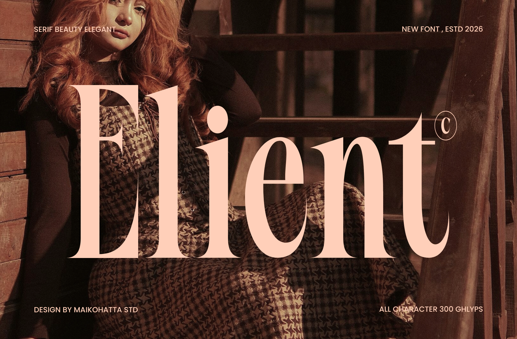
The available description for Elient is minimal: an elegant fashion serif.
With so little data and a fashion positioning, review the style on the product page and judge whether it fits a solemn, restrained document.
Best for: cover name. By: Creative Fabrica
Best Script Fonts for the Name on the Cover
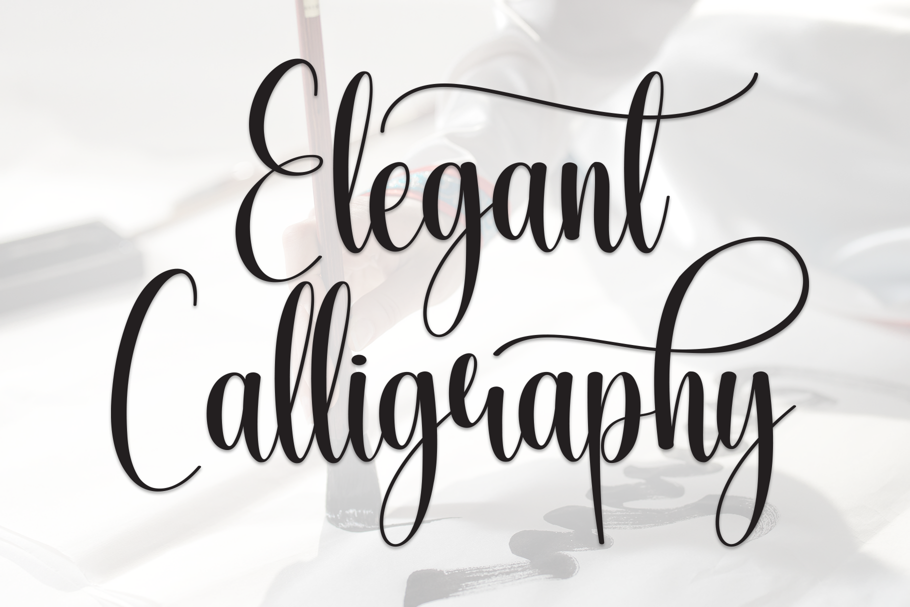
7. Calligraphy Script
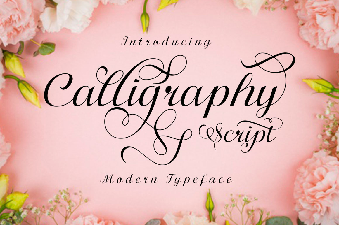
Calligraphy Script is a brush-lettering style with thick and thin stroke contrast, aimed at wedding and luxury work. It is PUA encoded for alternates and swashes, which may be hard to reach in programs such as Canva or Word.
Check the thin strokes on a printed test. It suits the cover name or a short line only, not hymn text or dates.
Best for: cover name, short line. By: Creative Fabrica
8. Alianda Script
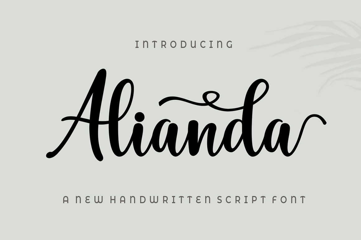
Alianda Script is a modern calligraphy font with many swashy, swirly embellishments. That much decoration calls for care, as it can draw the eye from the very name it highlights.
Use it for the name or a short phrase on the cover, and avoid it for hymn titles, readings, or details.
Best for: cover name, short phrase. By: Creative Fabrica
9. Straight Script
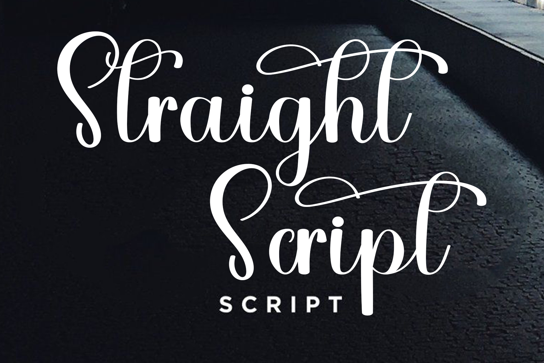
Straight Script is an upright calligraphy style with looping flourishes, pitched at wedding stationery and branding. The upright form may give a more restrained impression than a slanted script.
It could suit the name on the cover. Given the wedding positioning, a printed test is sensible.
Best for: cover name. By: Creative Fabrica
10. Artistic Script
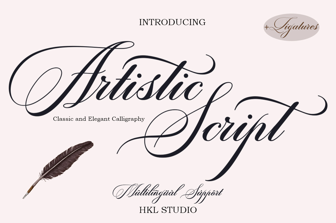
Artistic Script is a classic decorative copper-script style calligraphy. Its traditional character could suit a formal tone for the name or a short quote on the cover.
Keep it to a single line rather than any longer text in the service sheet.
Best for: cover name, short quote. By: Creative Fabrica
Best Sans-Serif Fonts for Service Details, Readings and Tributes
11. Etisite
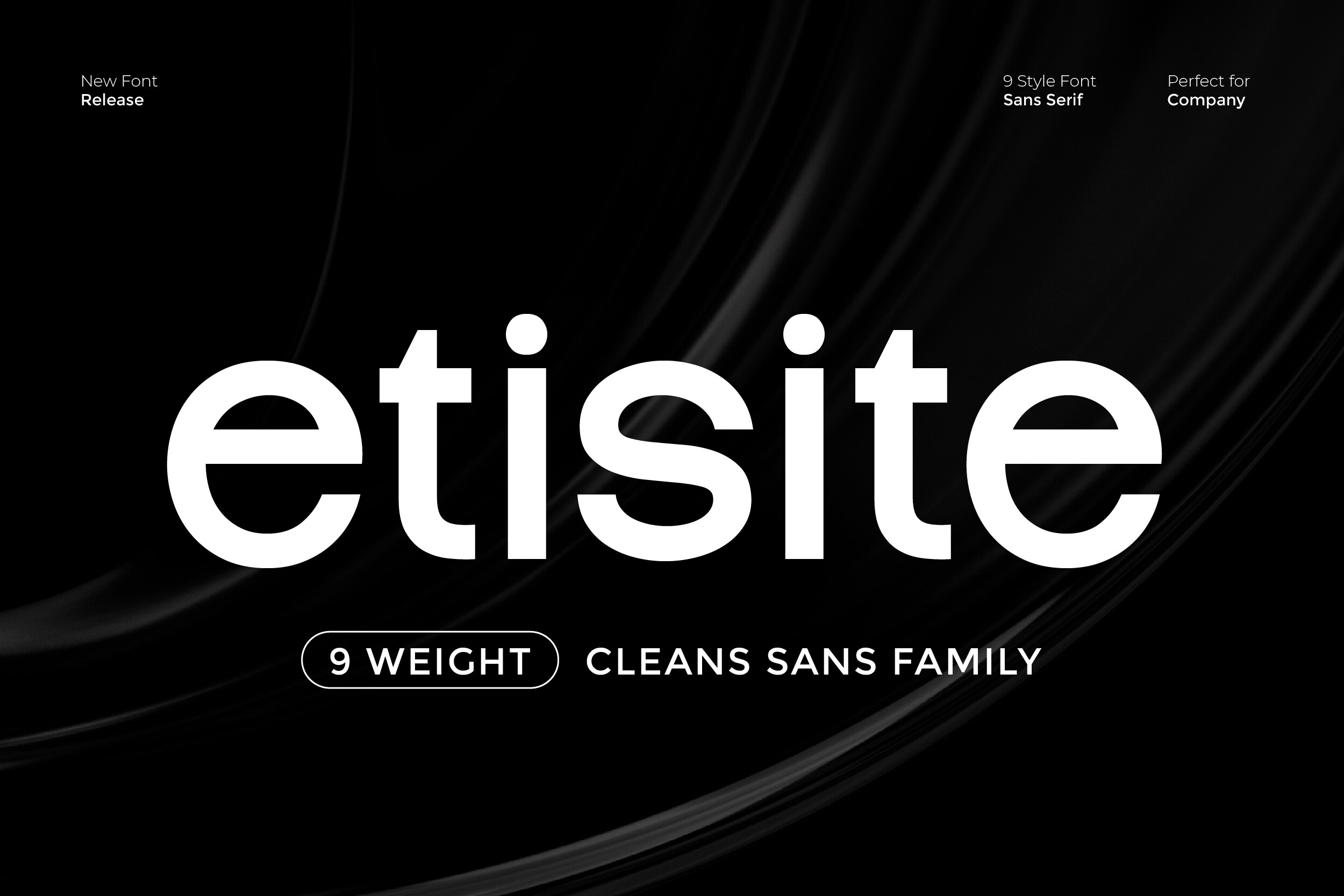
Etisite is a sans serif family pitched for clarity and a modern professional look. Its minimalist structure supports readability for headlines and body text. It is subscription-only.
Of the sans options here, its listing speaks most directly to both headlines and body text, which makes it a sensible candidate for service details and reading text. Still test it on paper.
Best for: service details, reading text. By: Creative Fabrica
12. Ramous
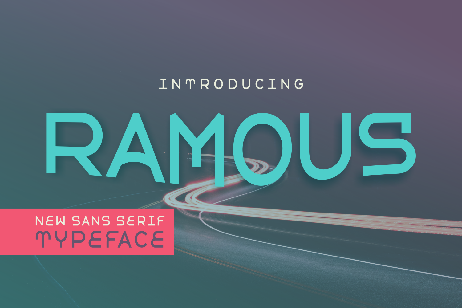
The listing describes Ramous as a striking sans serif with strong readability and a clean, modern feel. The licence status is not stated, so check the product page.
The description is brief, so confirm sizing and long-text performance on a printed test before assigning it to readings.
Best for: service details, reading text. By: Creative Fabrica
13. Refinity
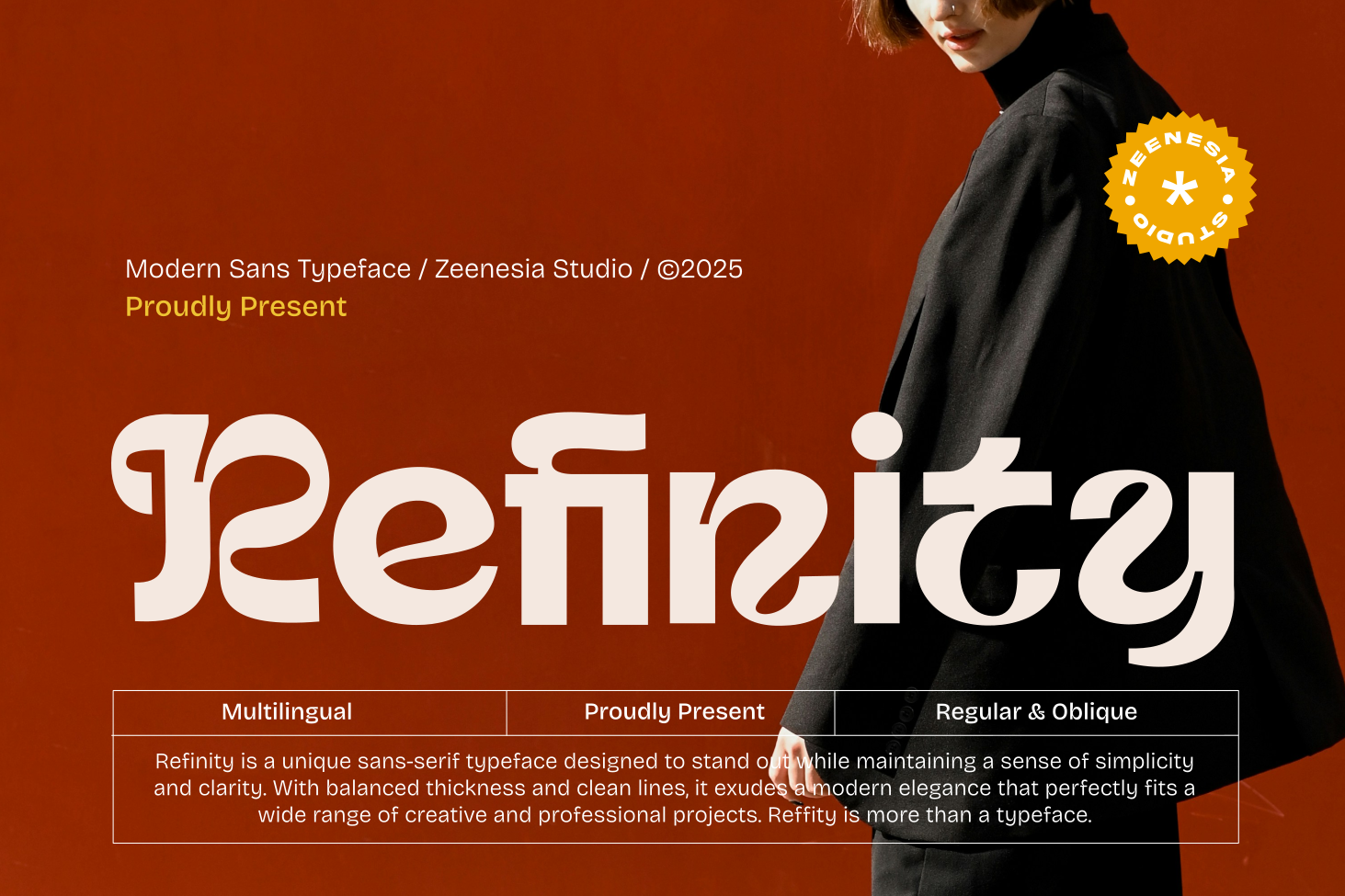
Refinity is a sleek sans serif with clean lines and balanced proportions, aimed at branding and interfaces rather than printed text. The licence status is not stated.
It could suit short detail lines. Print a test before using it for anything longer.
Best for: service details, short lines. By: Creative Fabrica
14. Simplemade
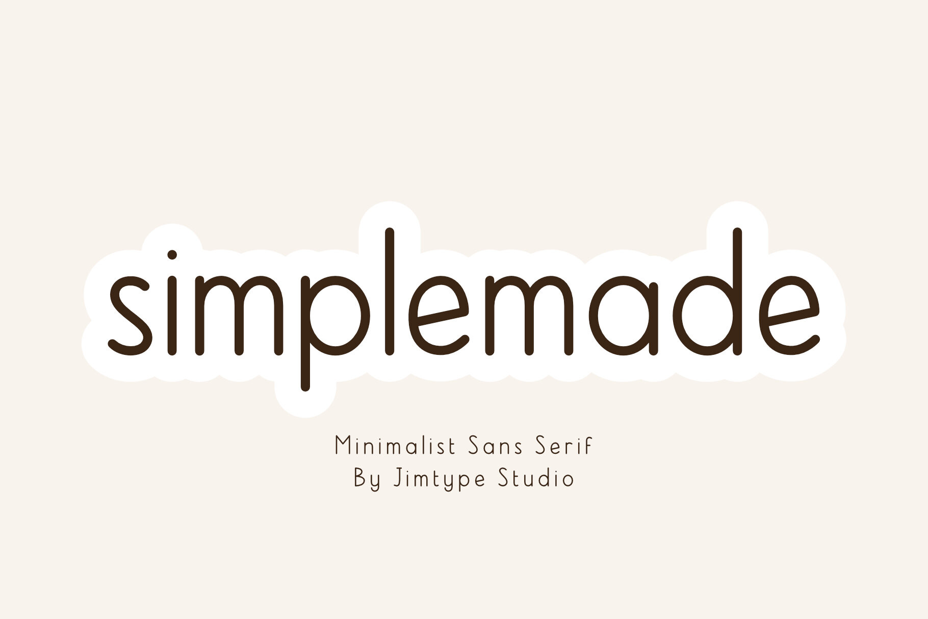
Simplemade is a monoline sans serif with a farmhouse feel, aimed at Cricut crafters and minimalist projects. The even stroke weight gives a calm, quiet look.
Its informal character suits a celebration of life more than a traditional service. It is not recommended for long reading passages.
Best for: celebration of life details. By: Creative Fabrica
15. Comfortable
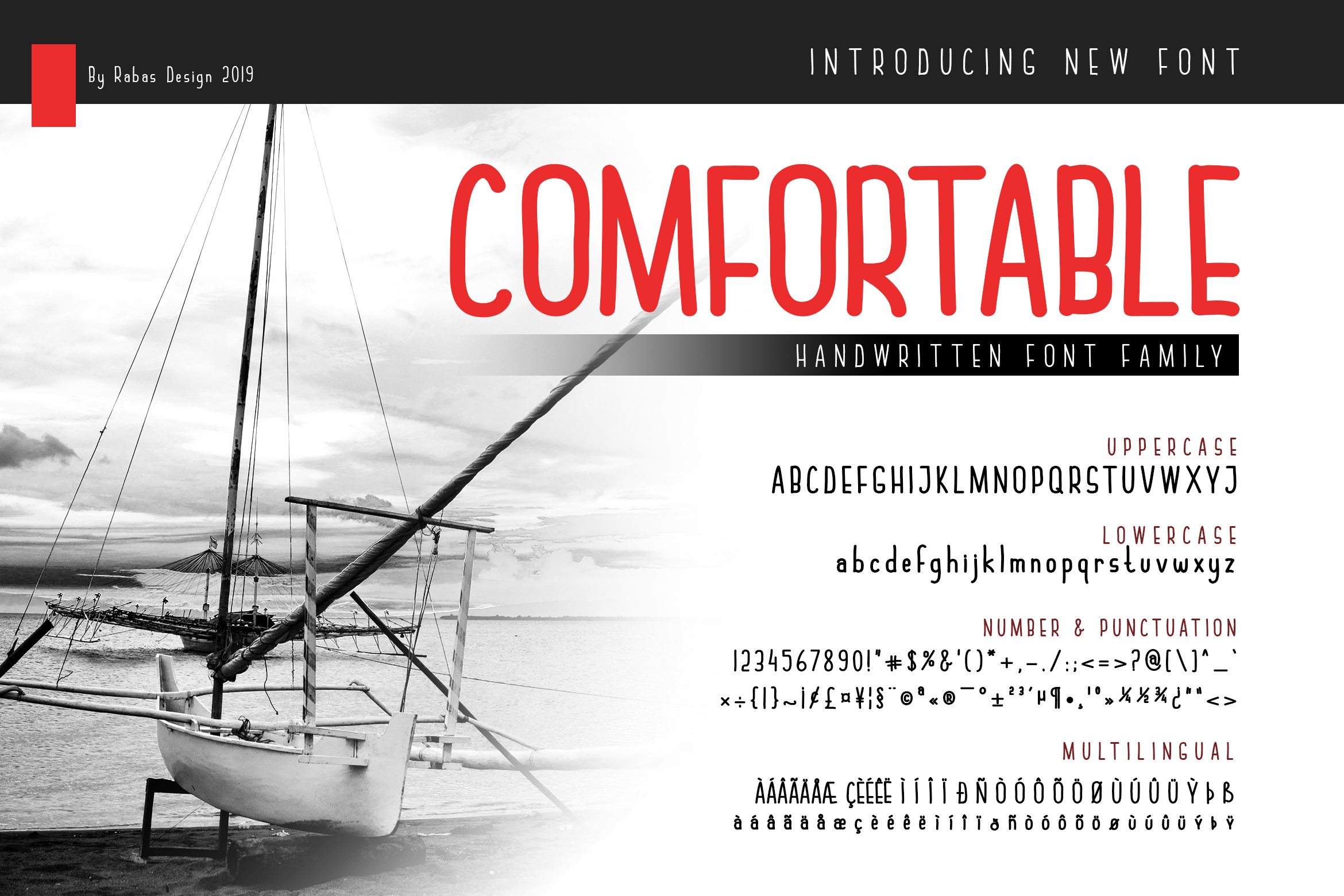
Comfortable is a simple sans serif with a timeless look. The description is brief, so review the specific character on the product page.
Its plain nature could suit detail lines and signatures, where a quiet, neutral tone is appropriate.
Best for: service details, signatures. By: Creative Fabrica
16. Simpler
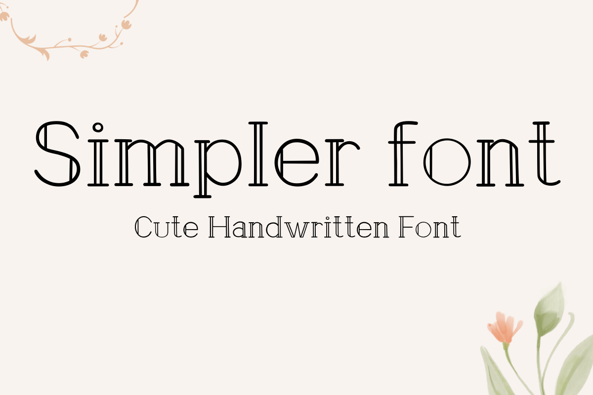
Simpler is marketed as easy to read, with a clean casual design suited to notes, cards, and invitations. That casual character fits short detail lines or an informal celebration of life better than a traditional service.
For a formal church service, it may feel too relaxed.
Best for: short detail lines, informal service. By: Creative Fabrica
17. Clean Notes
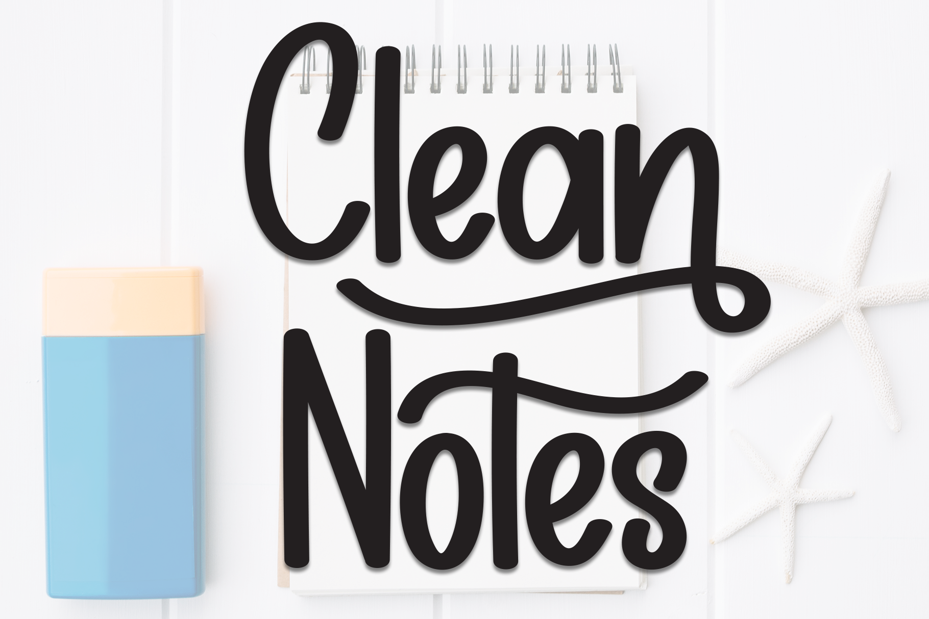
Clean Notes is a casual display face with clean structure. The listing says it is better suited to headlines than long text, the only font here with that limit stated directly.
Use it for section headings only, not for readings or hymn text.
Best for: section headings only. By: Creative Fabrica
How to Set Type in a Funeral Order of Service
Give every section heading one consistent style, with the same size, weight, and register throughout. “Hymn”, “Reading”, and “Eulogy” should look like parts of one system. Set hymn titles and verse numbers in bold or italic rather than a different font, and put the name of the person reading on a small separate line.
For readings and poems, body text of around 10 to 12 pt is a general guideline, and some guides suggest 12 to 13 pt or larger for older readers. Leave generous line spacing. Left-align long texts, and centre short lines and verses if preferred.
If hymn texts are printed, give each verse room and check that none breaks awkwardly across a page. Count the space hymns and readings need before choosing a face.
On the cover, set the name and dates larger, alongside a photograph, using the same two-font set that runs through the inside pages.
Use dark text on a white or cream background. If the cover is light or coloured, check contrast on a printed sample, and check thin script strokes and high-contrast serifs on paper too.
A folded A5 sheet gives four pages, and a small booklet gives eight or more. With four pages, space for hymns and readings is tight, so a compact face helps.
You can typeset in Canva, Word, Publisher, or Illustrator. Print a full-size test and ask a second family member to read it for names, dates, and hymn numbers.
How to Choose the Right Font for Your Order of Service
The right choice depends on the kind of service. These are suggestions, not facts about any one font.
- Traditional church service: a serif for headings, a restrained script or serif for the name, and a serif or sans for readings.
- Civil service or celebration of life: a softer, cleaner sans with a light script.
- Short crematorium service: a four-page sheet with as few fonts as possible.
On licensing, only Dringko, Rigena, Groch, Merilo, and Etisite are listed as subscription-only on Creative Fabrica. For the other twelve, the status is not stated, so check each product page. A family printing at home and a funeral director printing by order both need to review the terms before use. No free font has been confirmed in this list.
For Rigena, Monte, Elient, and Ramous, where the listings say little, look at real sample lines such as “Hymn”, “Reading”, and “Eulogy” before deciding.
A few questions come up often. The best font for a funeral order of service balances a clear body face with a restrained heading face, chosen for the tone of the service. Serif or sans-serif can both work, depending on the formality. A script font belongs on the name or a short line, not on hymns or readings. Around 10 to 12 pt is a common starting size for body text, and two fonts are usually enough, three at most.
Where to Download Fonts for a Funeral Order of Service
Creative Fabrica is the primary source for the fonts in this list, and several are available through a subscription. Free collections such as Google Fonts, DaFont, and Font Squirrel can also be explored, though none of the fonts above has been confirmed as free.
More practical typography guides are available on the FontPro blog.