· fonts · 11 min read
14 Best Fonts for Funeral Booklets in 2026
14 fonts for funeral booklets, grouped by role: body text, headings, covers and order of service details, with notes on fit and licensing.
What Makes a Great Font for a Funeral Booklet?
A funeral booklet is read slowly. Often in a quiet room. And then it is often kept as a memory. The font choices in that small document shape how comfortably a reader moves through prayers, readings, hymns, and personal notes. A calm, legible order of service booklet font can make the whole service feel steadier for everyone in the room.
A good font for funeral program layouts needs to do a few specific things. It has to stay readable across several pages, not just one. It should create a clear visual difference between a section heading and the body text below it. And it should hold a consistent, restrained character from the cover all the way to the final page.
Readers may include older relatives. Lighting in a chapel or hall is often soft. The booklet is often kept afterward, so readable fonts for long text matter far more than decorative effect.
One honest note before the list: none of the fonts below is positioned on Creative Fabrica as a funeral or memorial typeface. This is a general selection pulled from publishing, editorial, and wedding categories. Some are best for body text, while others are safer only for a cover name or a single short line.
14 Best Fonts for Funeral Booklets
The list is organized by the role each font can play in a multi-page memorial booklet. Each entry includes the style, likely use, and a practical note about where it fits and where it does not. The goal is to support a clear choice of font for funeral program pages without mixing too many voices into one small document.
Best Serif Fonts for Body Text and Section Headings
Serif fonts for funeral booklets are often the safest starting point for long text. Classic names such as Garamond, Baskerville, and Palatino are commonly cited as reference points for printed reading. The options below are not funeral-specific, but their publishing roles make them useful in this context.
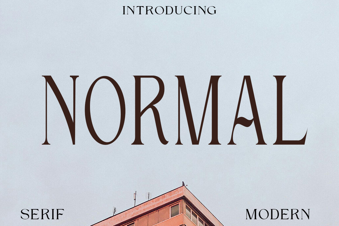
1. Normal
Normal is a serif built for long texts. Its proportions are described as suited to articles, books, and official documents, which makes it a direct candidate for the body of a funeral booklet. It can carry prayers, readings, biographies, and thank-you notes without competing with the message.
Best for: body text, section pages, memorial booklet typography. By: Creative Fabrica
2. Old Column
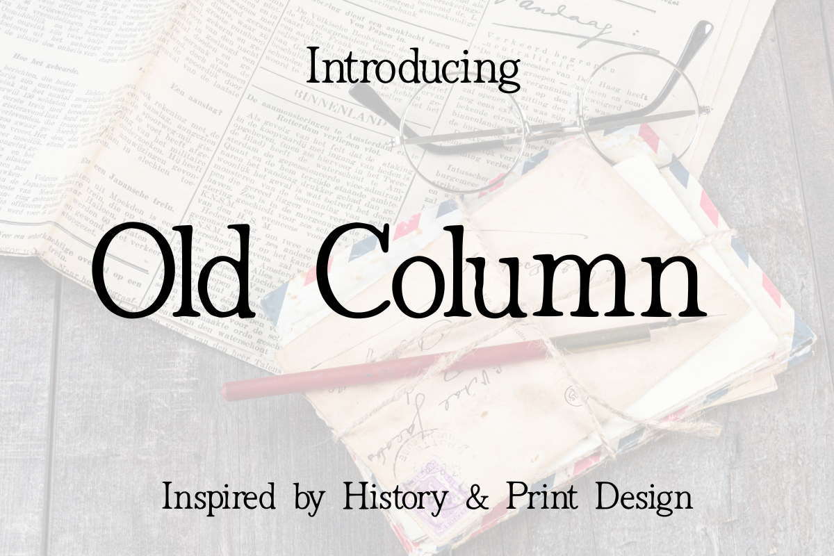
Old Column is a classic serif inspired by traditional printing and architecture. It is aimed at editorial layouts, book covers, and vintage branding, so it can give a booklet a formal, structured feel. One practical note: it is subscription-only, which matters when preparing a print-ready file on a tight deadline.
Best for: section headings, cover titles, formal program pages. By: Creative Fabrica
3. Creators Type
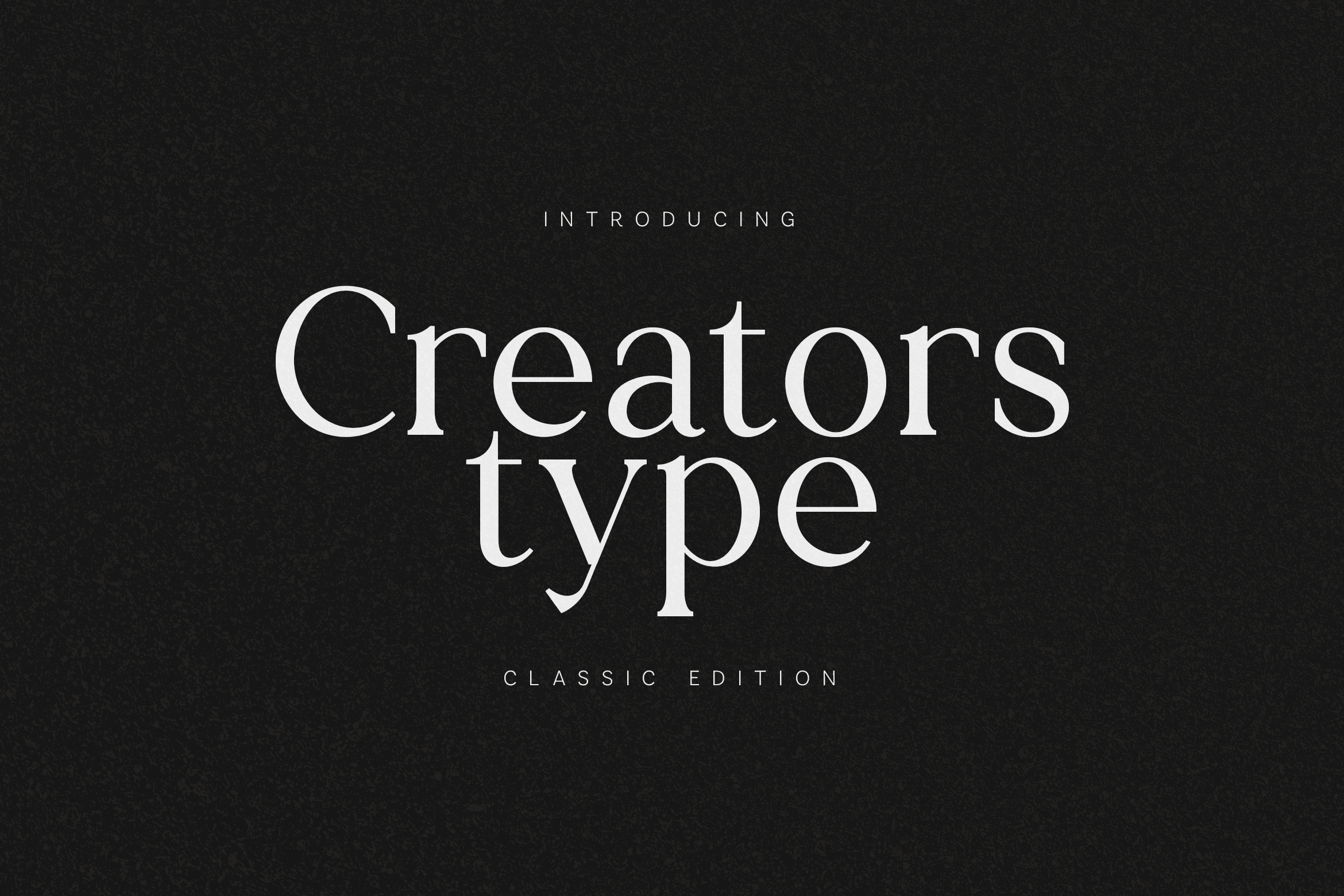
Creators Type is a serif for long-form headlines, publishing, and book covers. It blends traditional typography with a modern feel, which can help a memorial booklet avoid looking dated. It is subscription-only.
Best for: section headings, cover name, program titles. By: Creative Fabrica
4. Smalling
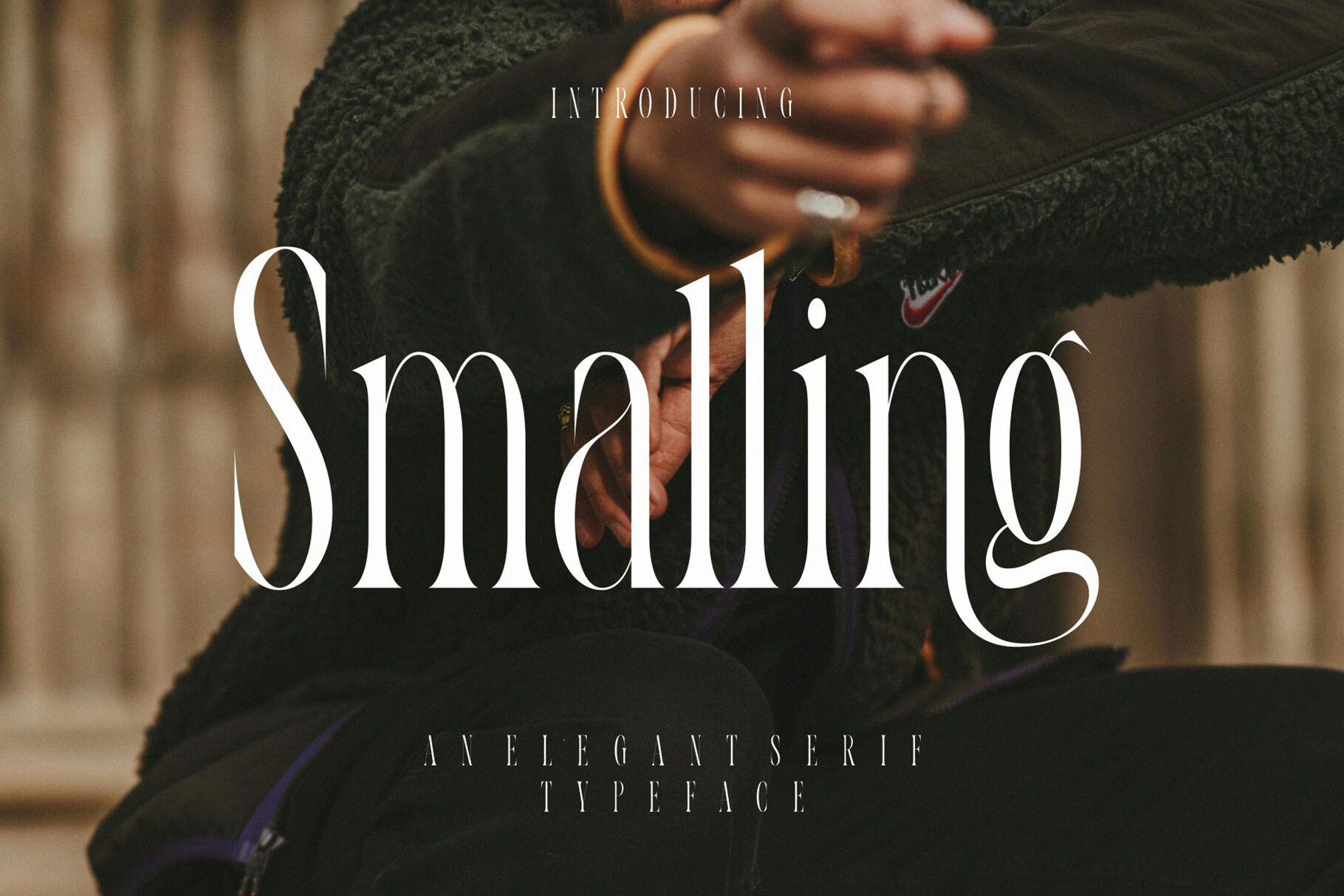
Smalling is an elegant ligature serif described as evoking fresh blooms and timeless elegance. Small caps are not mentioned in the available details, so they should not be assumed for that role. It is better suited to a name, a short heading, or a cover accent than to full pages of reading text.
Best for: cover name, short headings, quiet accents. By: Creative Fabrica
Best Script Fonts for a Name, Quote or Thank-You Line
Script fonts can add a personal touch, but they should not carry the service details. In a funeral booklet, elegant fonts for memorial programs should be reserved for the person’s name, a short quote, or a thank-you line. Great Vibes is a familiar example of this approach, but the options below are positioned mainly for weddings, invitations, or branding.
5. Elegant Script
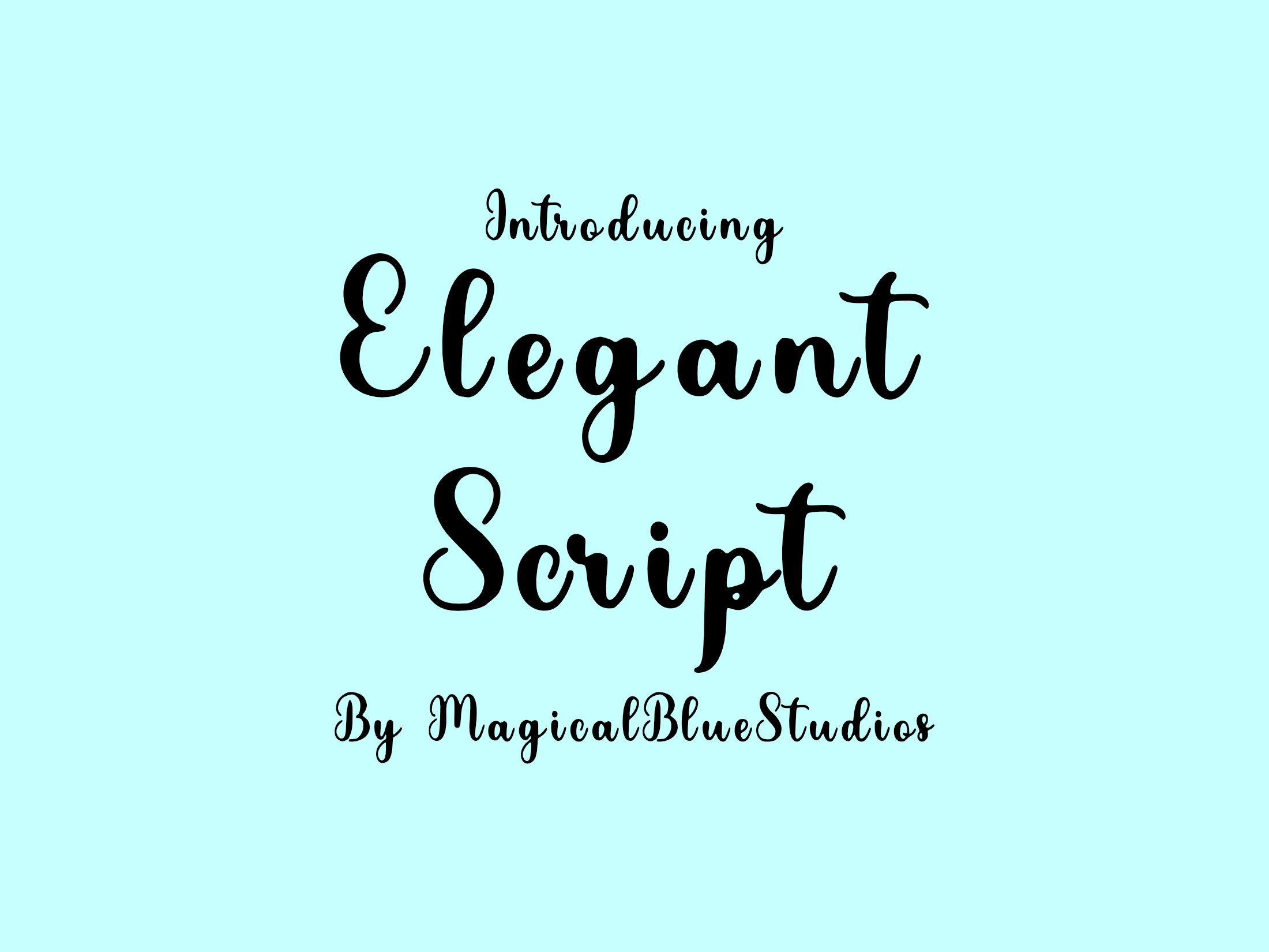
Elegant Script is marketed for wedding invitations and calligraphy fans, and it is Cricut and Silhouette compatible. It is subscription-only, so plan for access before adding it to a print file. For a funeral booklet, it is safest on the cover name or a single short line, not on dates or addresses.
Best for: cover name, short quote, personal accent. By: Creative Fabrica
6. Script Autography
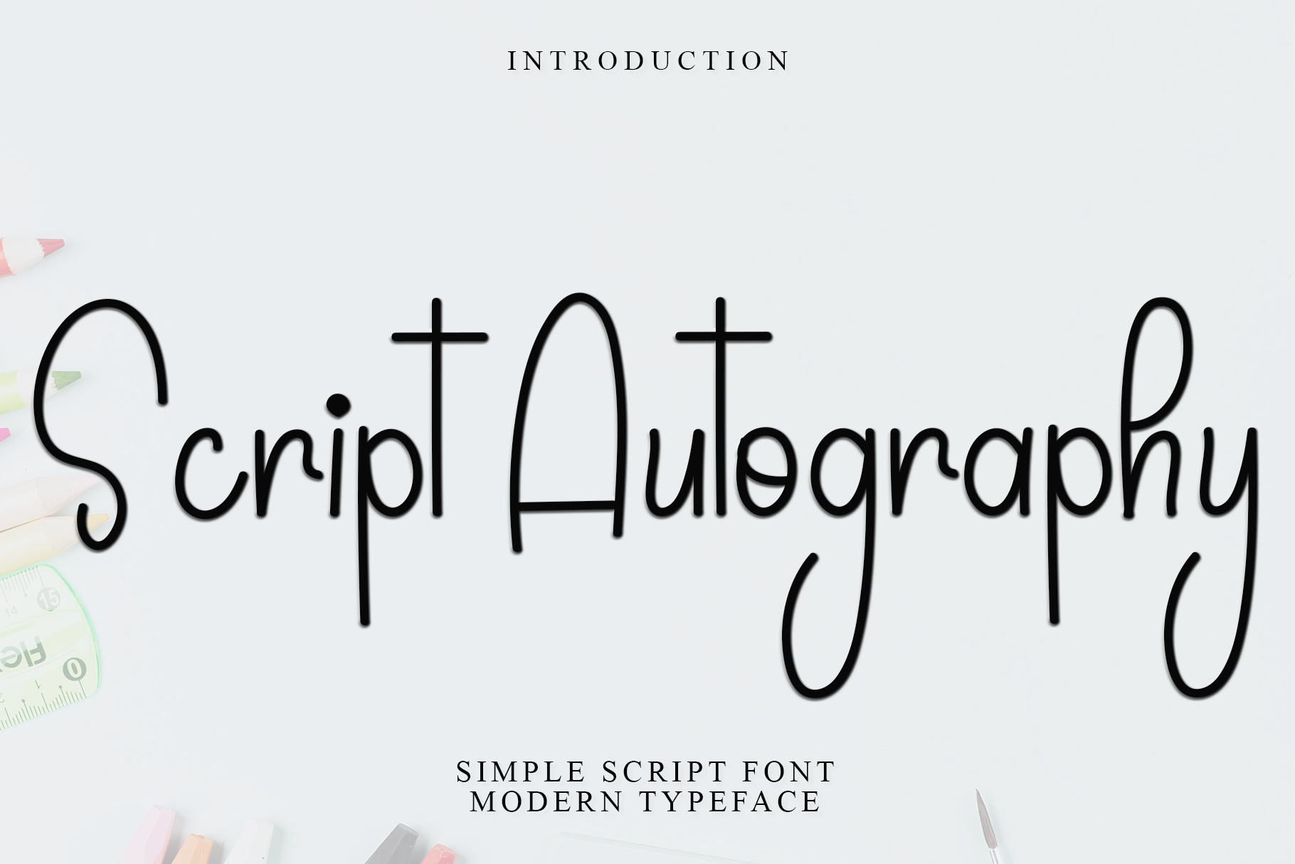
Script Autography is a signature-style script positioned for wedding stationery, photography watermarks, and boutique branding. It is suggested for thank-you notes, which makes it a cautious option for a closing line in a memorial booklet. It should not be used for readings, times, or contact details.
Best for: thank-you line, signature-style accent, closing note. By: Creative Fabrica
7. Signascripta
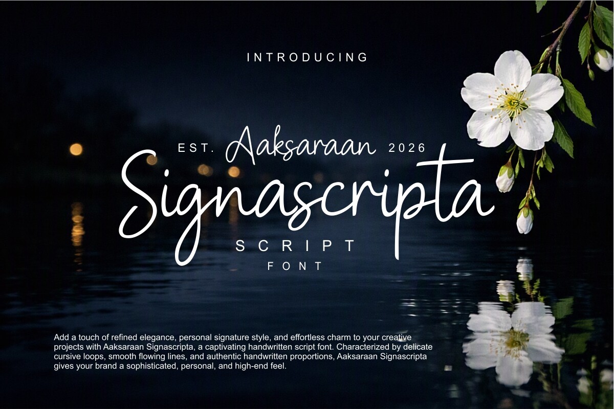
Signascripta is recommended for wedding invitations, photography watermarks, and signature logotypes. Its positioning points to branding and signature use rather than body copy. In a funeral booklet, it could work only for a very short name or monogram, and even then only if the overall design remains restrained.
Best for: short name, monogram, cover accent. By: Creative Fabrica
8. Nikahan Script
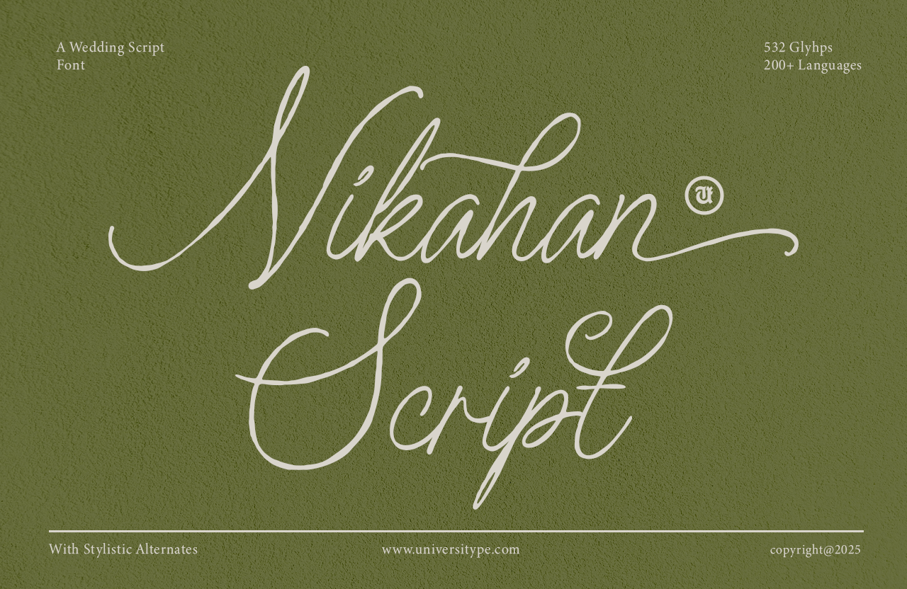
Nikahan Script is a romantic wedding script pitched for invitations, save-the-dates, and programs. Its tone is celebratory, so it needs careful handling in a funeral booklet. If the ceremony is very personal and the name is the only scripted element, it may be considered. But a more neutral script is usually the safer choice here.
Best for: cover name, short dedication, personal accent. By: Creative Fabrica
9. Old String
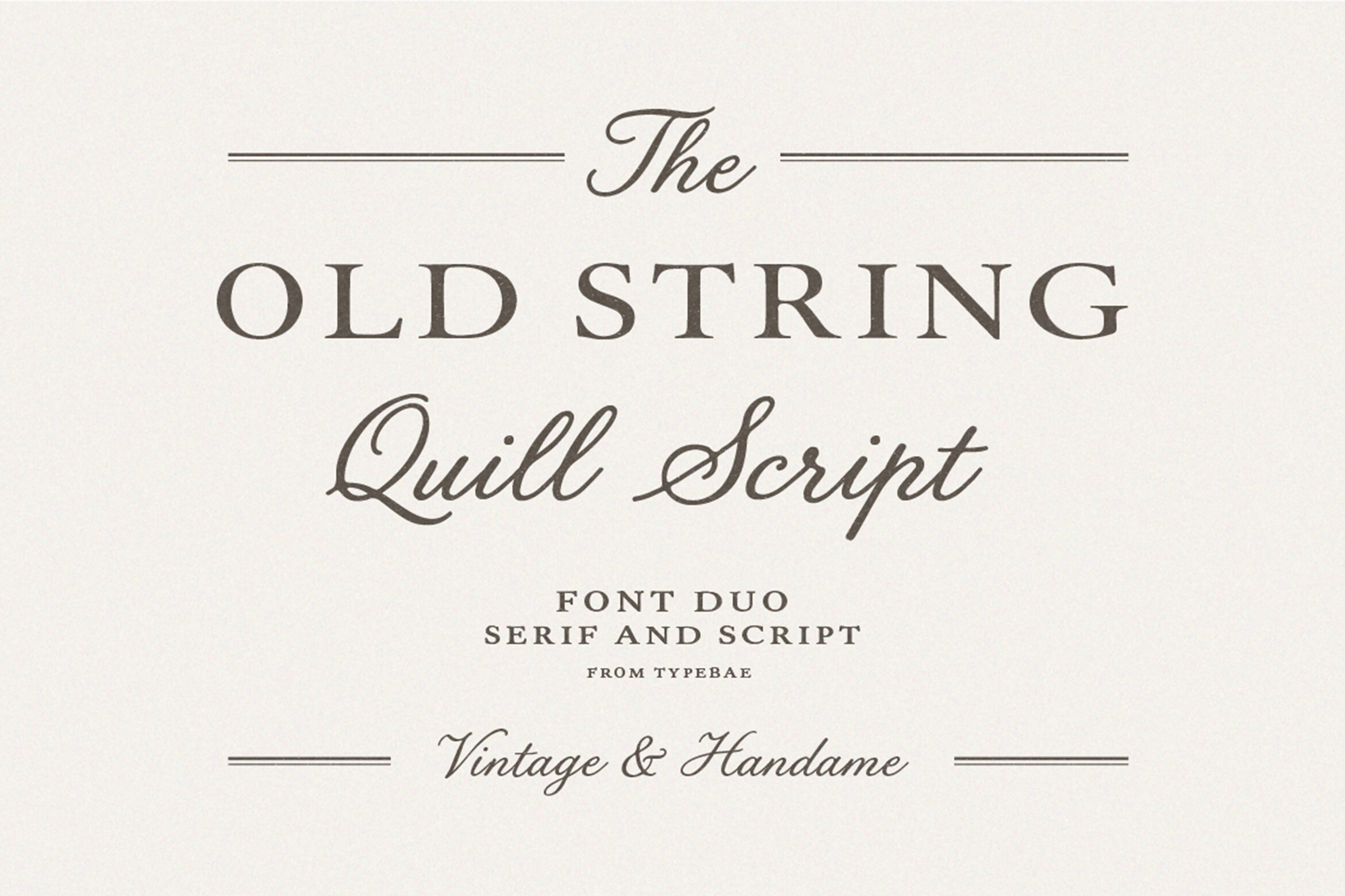
Old String pairs a vintage serif with a quill-style script. It suits invitations and branding more than long text, so its place in a funeral booklet is limited. It may be useful for a cover title or a short dedication, but it should not be used for the order of service or practical details.
Best for: cover title, short dedication, decorative accent. By: Creative Fabrica
Best Sans-Serif Fonts for Order of Service and Details
Sans-serif fonts are useful as funeral program booklet fonts for the practical pages. They can carry the order of service, times, location, photo captions, and contact information, which is where fonts for order of service details matter most. Montserrat and Lato are often named as clean reference choices, while the options below bring a modern, structured feel.
10. Remillo
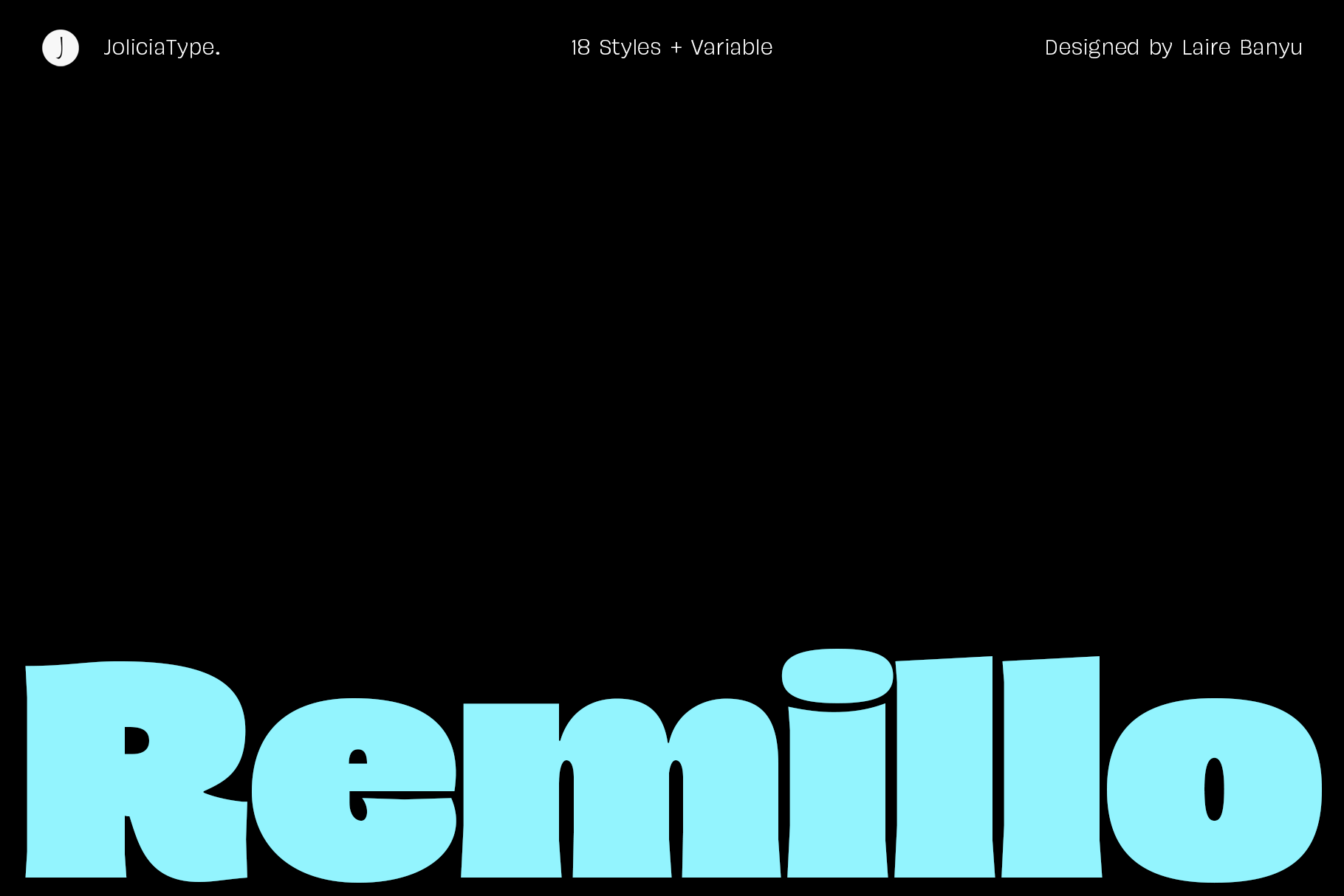
Remillo is a humanist sans serif with 18 styles plus 1 variable font. Its heavy weights suit headings. The range is useful for a multi-page booklet because one family can help build a clear hierarchy. It is subscription-only.
Best for: order of service, headings, photo captions. By: Creative Fabrica
11. Freyca
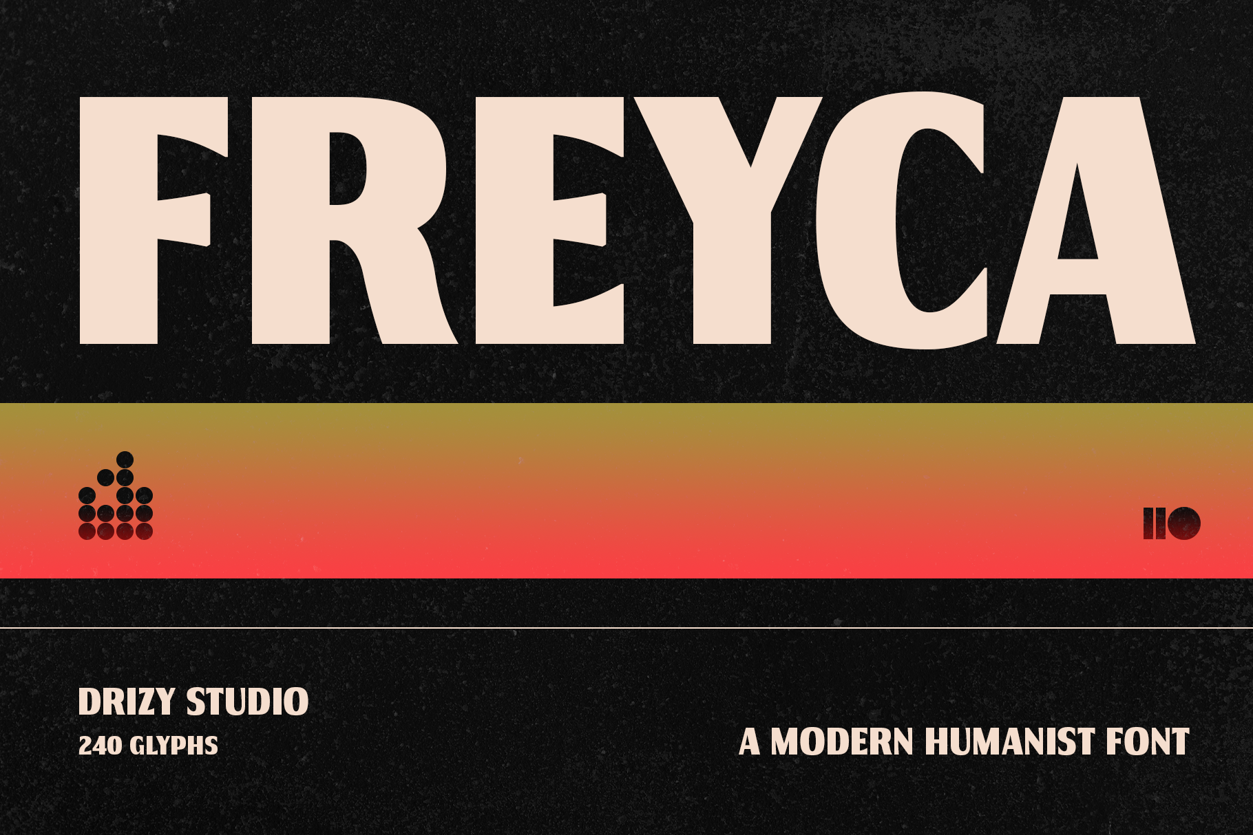
Freyca is a modern humanist font with a sophisticated, wide-bodied architecture. It is subscription-only. Its wide-bodied structure may suit service details, section labels, and short headings, but judge it on a printed proof.
Best for: service details, section labels, short headings. By: Creative Fabrica
12. HU Basic Sans
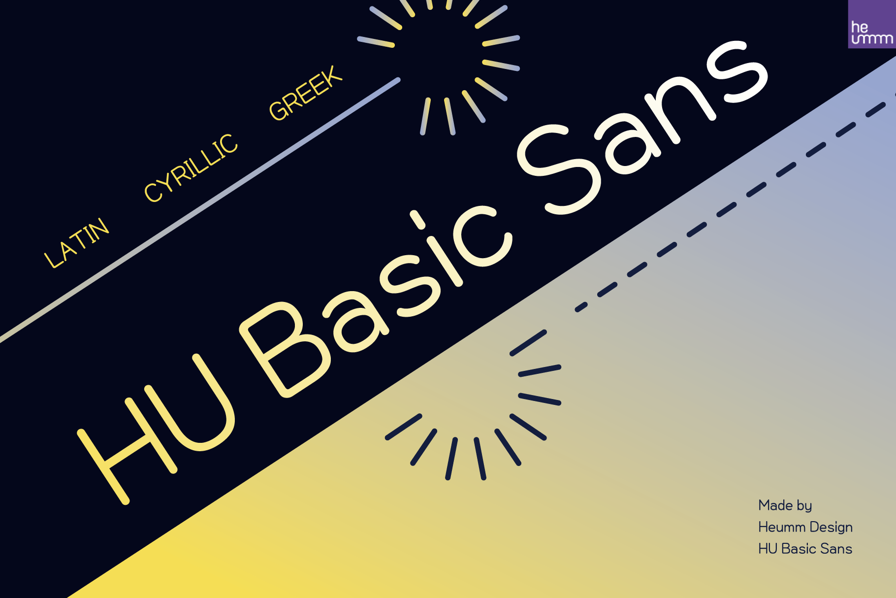
HU Basic Sans is a clean and modern sans serif. It is not labeled humanist in the available snippet, so it should be judged on its clean structure rather than assumed warmth. It can support a funeral booklet with simple, readable details, especially when paired with a serif for longer passages.
Best for: practical details, captions, service schedule. By: Creative Fabrica
Display Fonts for the Cover Only
Display fonts can make a cover stand out, but they should not be used for the body of a memorial booklet. The two options below are decorative or bold in character. They are included with a warning: they are not recommended as the main choice for a traditional funeral booklet.
13. Fablewhim
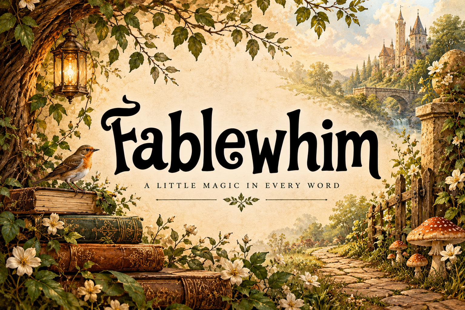
Fablewhim is a decorative storybook-style serif for book titles and covers. It is more whimsical than traditional, so it is likely too playful for most funeral use. It may fit only a very informal or child-centered farewell, and even then it should be used with care and limited to the cover.
Best for: cover title only, informal farewell. By: Creative Fabrica
14. Based Book
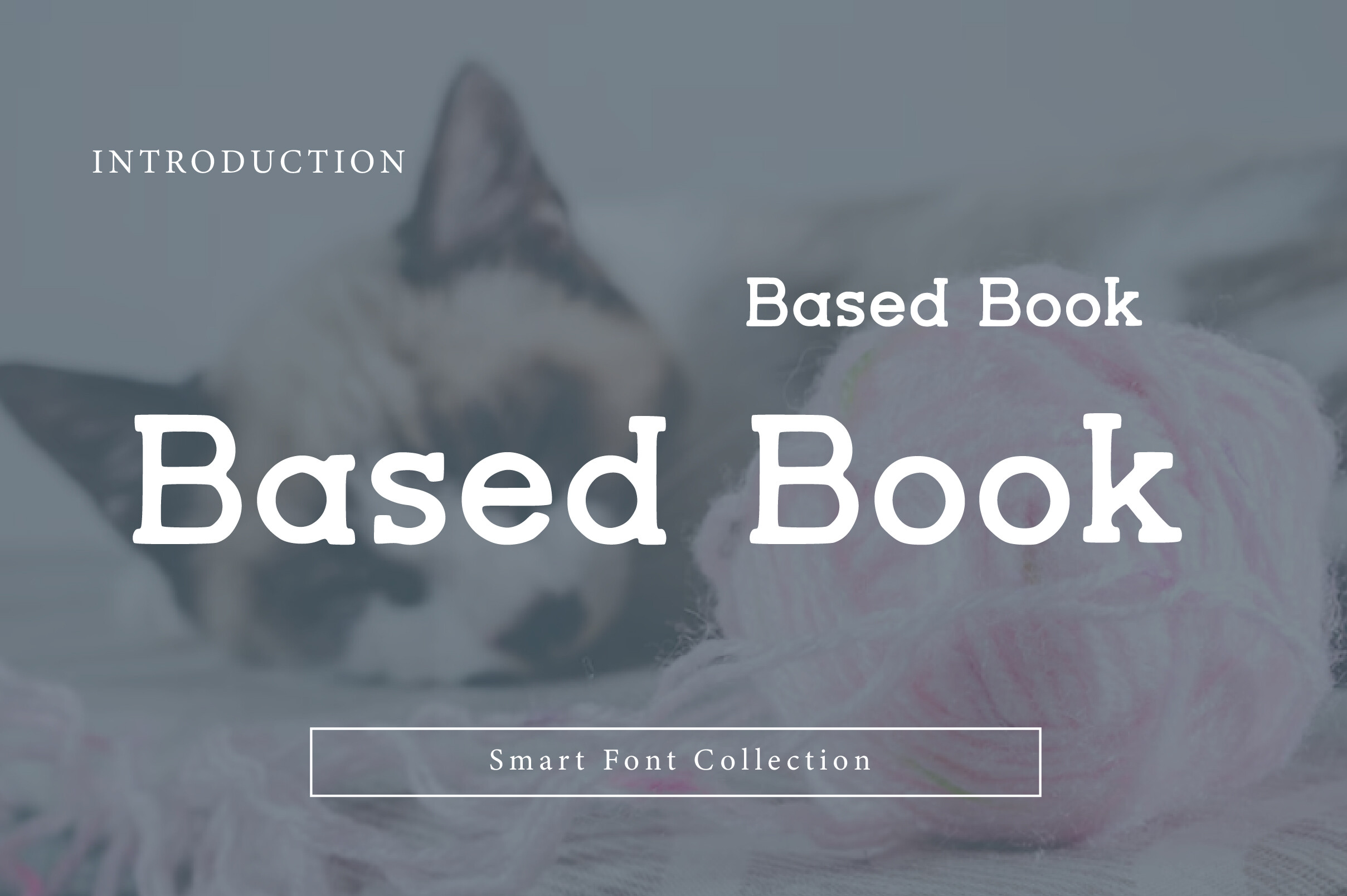
Based Book is a bold, friendly serif display font aimed at book covers and headlines, not running text. Its strong presence can make a cover stand out, but it is not suited to pages of readings or biographical notes. If used, keep it to the title and pair it with a quieter body font.
Best for: cover headline, bold title, display accent. By: Creative Fabrica
How to Set Type in a Multi-Page Funeral Booklet
A multi-page funeral booklet needs a simple system. The cover may use one font for the name and one for the title. Section headings should use the same style on every page. Body text should remain consistent, and captions should be smaller but still clear.
A common pairing is a serif for readings, biographies, and prayers, plus a sans-serif for the order of service, times, and practical details. A script can be added only for the name or a short quote. Keeping the layout to two fonts, and rarely three, helps the booklet feel calm rather than busy.
For size, body text around 10 to 12 pt is a common starting point for printed booklets. Headings can begin at 16 pt or larger. If the audience includes older readers, choose the larger end of the range. These are guidelines, not rules, and the final test is always a real proof.
Consistency matters more than variety. Use the same heading style, line spacing, and margins across all pages. Dark gray or black text on white or cream paper is usually easier to read. Avoid light gray on cream, thin scripts at small sizes, and decorative fonts for dates.
Before printing, make a proof at the actual booklet size. Check the gutter, because text near the spine can become hard to read. Verify names, dates, hymn titles, and contact details. If the file will be sent to a printer, embed the fonts or export a print-ready PDF.
Common tools include Canva, Microsoft Word, and Adobe Illustrator. If a font does not appear after installation, restart the design app. For a funeral booklet, the software matters less than the type choices and the proof.
How to Choose the Right Font for Your Booklet
If the question is what the best font for a funeral booklet is, the answer depends on the page. For body text, a serif built for long reading is the safest starting point. For the order of service, a clean sans-serif can make times and locations easier to scan. For the cover name, a script or elegant serif can add a personal note.
For a short four-page booklet, choose one serif for the body and one sans-serif for details. A script is optional. For a longer booklet with a biography, photos, and thank-you notes, a readable serif becomes more important, because the reader will spend more time on the page.
For a traditional service, lean toward classic serif fonts for funeral booklets and a restrained sans-serif for the schedule. For a secular memorial ceremony, a modern sans-serif can carry more of the layout, while a serif still helps with longer passages. The tone should match the family, not a trend.
Licensing is part of the decision. Some fonts in this list are subscription-only, including Old Column, Creators Type, Elegant Script, Remillo, and Freyca. No free option in this list is confirmed. If a funeral home prints booklets for clients, check the Creative Fabrica license before commercial use.
A font for obituary or a single announcement may work differently from a font for funeral program booklet pages. A booklet needs hierarchy, consistency, and print readiness. If the choice is unclear, choose the quieter option and test it in a real layout.
Where to Download Fonts for Funeral Booklets
Creative Fabrica is the primary source for the fonts in this list. Check the license details on each product page. A subscription may be needed for some fonts, so review access before adding a font to a print project.
When looking for commercial use fonts for printed booklets, read the license carefully. The license may cover personal use, client work, or printed materials, but the terms can differ. When in doubt, use the information on the Creative Fabrica product page.
Other font sources such as Google Fonts, DaFont, and Font Squirrel can be useful for free or open options, but they are not linked here. For this specific selection, the Creative Fabrica product pages are the reliable place to download the fonts named above.
For more typography guidance, see the FontPro blog. A funeral booklet is a small document, but the type choices shape how it is read, remembered, and kept.