· fonts · 11 min read
18 Best Fonts for Funeral Programs in 2026
The best fonts for funeral programs, orders of service, memorial cards and posters: serif picks for the name, readable faces for hymns and readings, and scripts used sparingly.
What Makes a Great Funeral Font?
A funeral program is read in a hard moment, often at a distance and in poor light. The name, the dates, the order of hymns and readings — every line has to be legible on the first glance. Decoration comes last; clarity and a calm tone come first.
So what is the best font for a funeral program? There is no single answer. A clear serif for the name, paired with a quiet sans or readable serif for the details, is a sound starting point. The eighteen picks below are organized around that idea, and they cover every part of a memorial set: the program or order of service itself, invitations and announcements, posters and welcome signs, booklets, and memorial slideshows.
Three properties matter most. Readability depends on stroke weight, letter proportions and spacing — thin or cramped type disappears at size. Hierarchy puts the name first, the dates second, everything else third. And the character of the type should match the tone of the service: a traditional church funeral and a celebration of life accept very different letterforms.
One honest note: none of these typefaces is marketed as a funeral or memorial font. They are general serifs, sans serifs, scripts and display faces, chosen for letterforms that suit restrained, formal work. That is stated plainly where it applies. Several are subscription-only on Creative Fabrica — that is noted per font, because it matters when you are preparing a print-ready file on a deadline.
Best Serif Fonts for the Name and Cover
These carry the largest text on the page: the name on the program cover, the title of an order of service, the headline of a memorial poster.
1. Bold Dignify
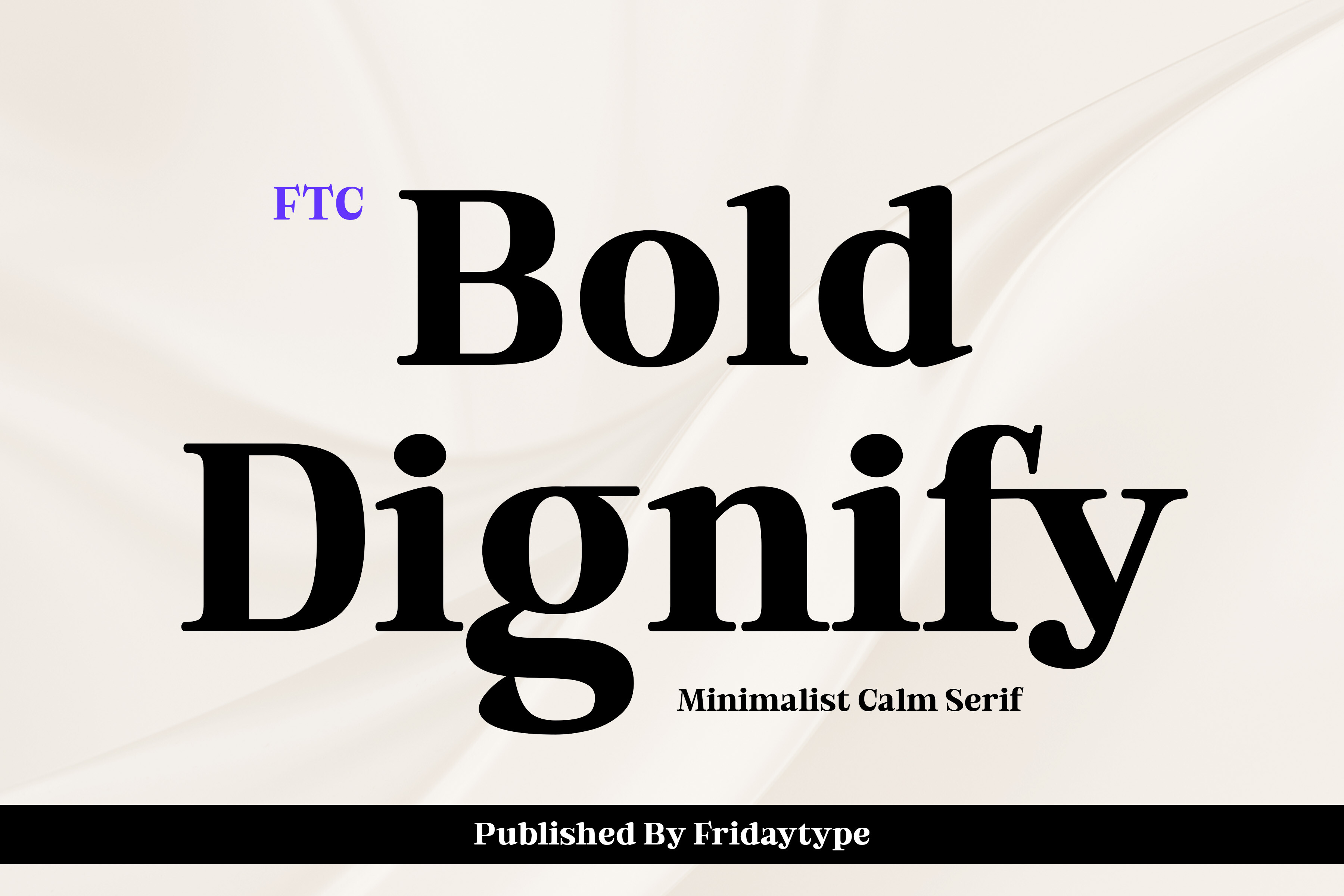
A serif font described as meant for headlines, Bold Dignify is the most direct fit for the name on a program cover or poster. Its headline role makes it a reasonable choice for the largest text on any memorial layout.
Best for: the name on a program cover or memorial poster. By: Creative Fabrica
2. Boldside Display
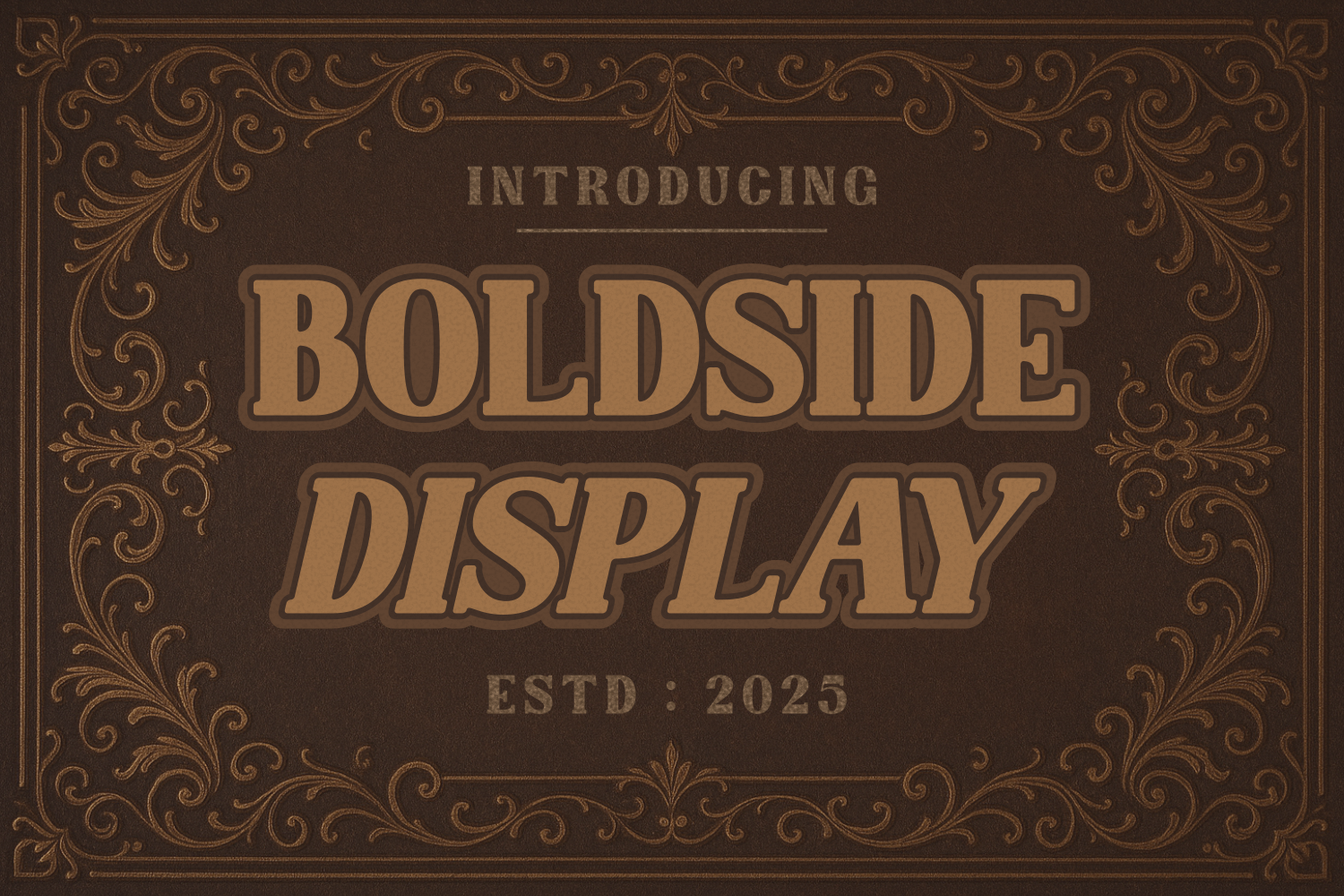
A retro serif with thick letterforms, this display face carries a bold, vintage character. The heavy strokes suit the name on a memorial poster or a large tribute card. The retro tone is worth checking against the service’s mood before committing.
Best for: the name on a tribute poster, large display text. By: Creative Fabrica
3. Dringko
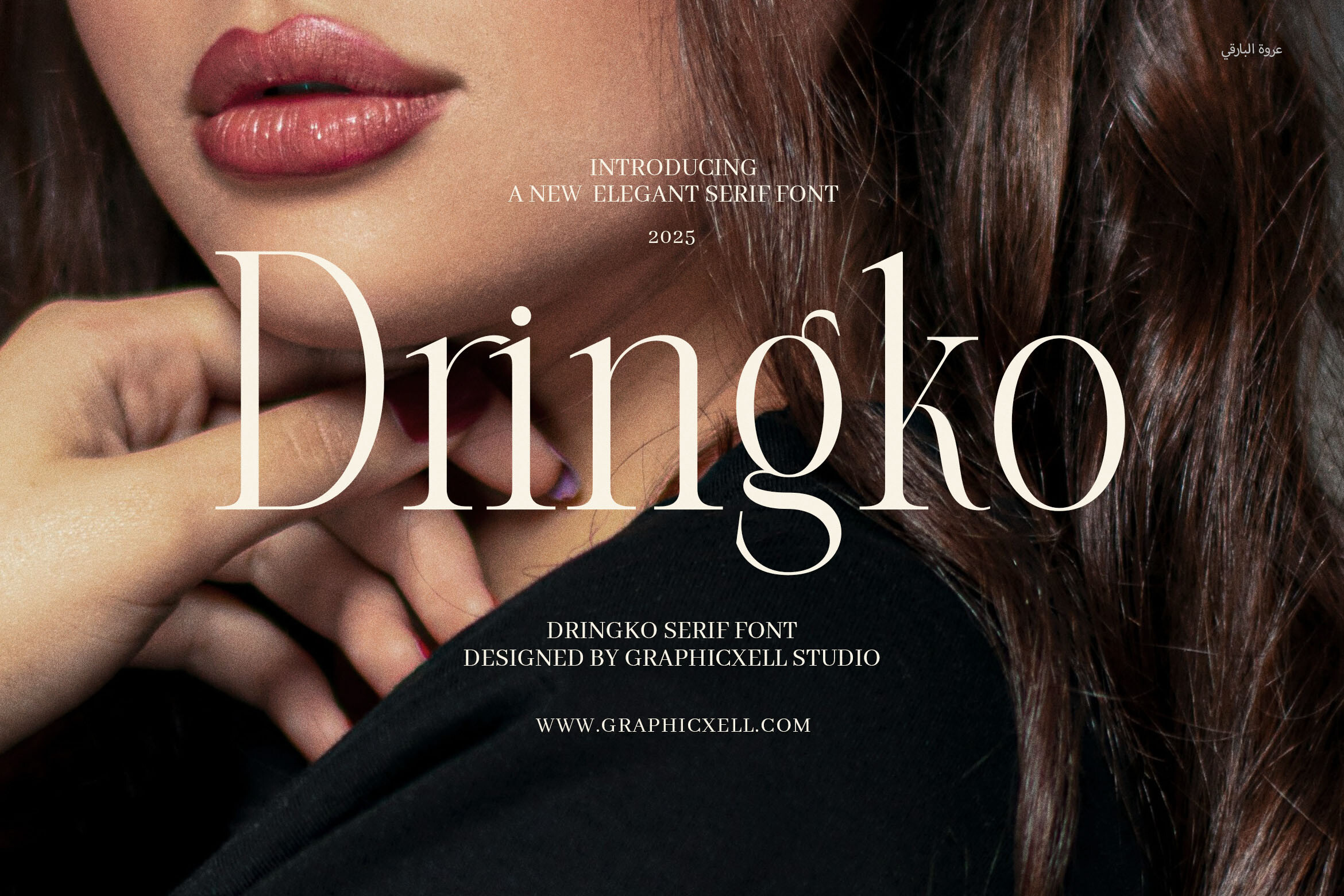
Dringko is an elegant serif aimed at luxury logos, high-end branding, and packaging. Its positioning is commercial rather than editorial, so it suits the cover name or section headings, where a formal tone is useful. It is not described as a body text face.
Best for: cover name, section headings on an order of service. By: Creative Fabrica
4. Classical Premiera
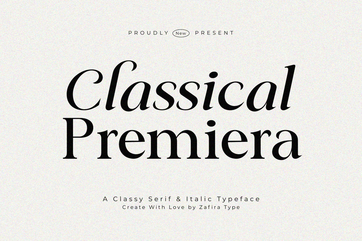
Classical Premiera comes in Regular and Italic styles and is described as formal and stylish. Having both styles is useful: Regular for the name and body, Italic for a short quote or verse on the cover.
Best for: the name and a short quote on a formal program. By: Creative Fabrica
5. Old Column
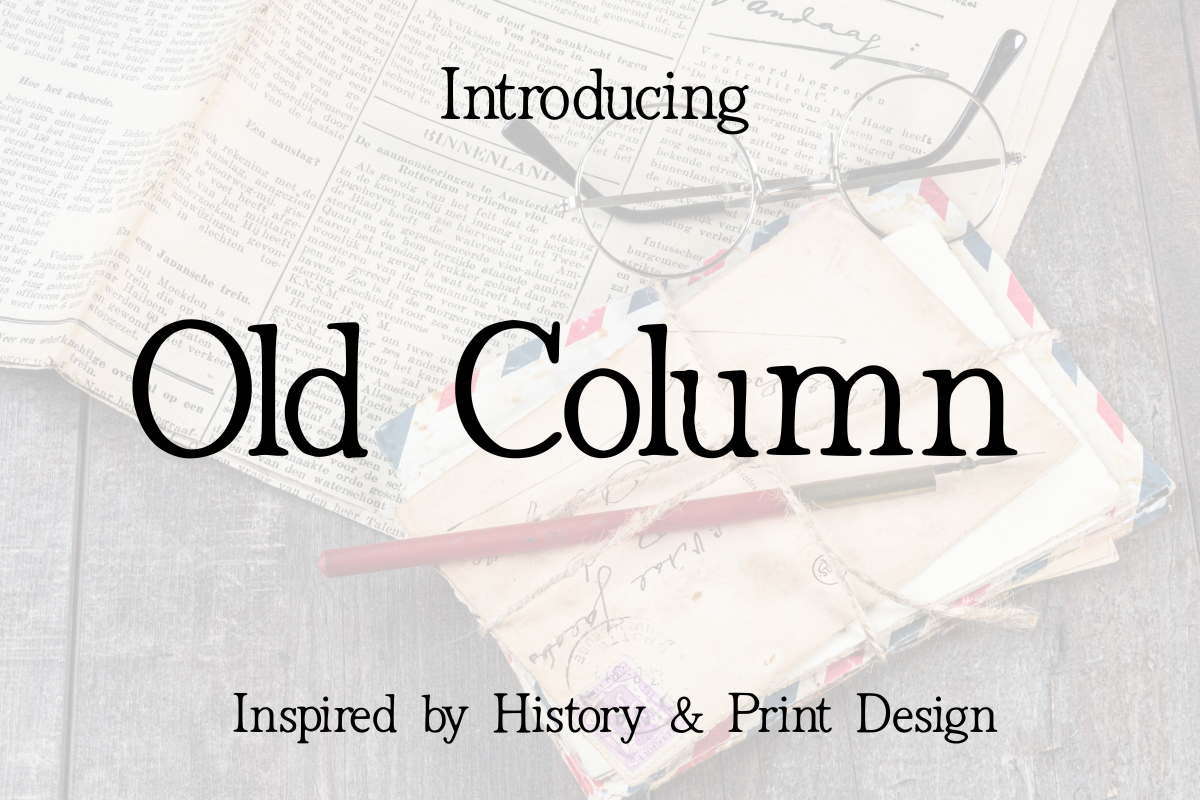
Old Column is a classic serif inspired by traditional printing and architecture, aimed at editorial layouts and book covers. It gives a program or booklet a formal, structured feel, from the cover title down to section pages.
Best for: cover titles, section headings, formal program pages. By: Creative Fabrica
Best Fonts for the Order of Service and Readings
These are working text faces: hymn titles, readings, the running order, times and addresses. This is where readability earns its keep.
6. Normal
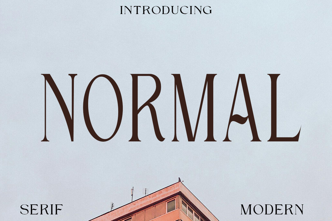
Normal is a serif built for long texts. Its proportions are described as suited to articles, books, and official documents, which makes it a direct candidate for the body of a funeral program or booklet. It can carry prayers, readings, biographies, and thank-you notes without competing with the message.
Best for: body text: readings, hymns, biography pages. By: Creative Fabrica
7. Etisite
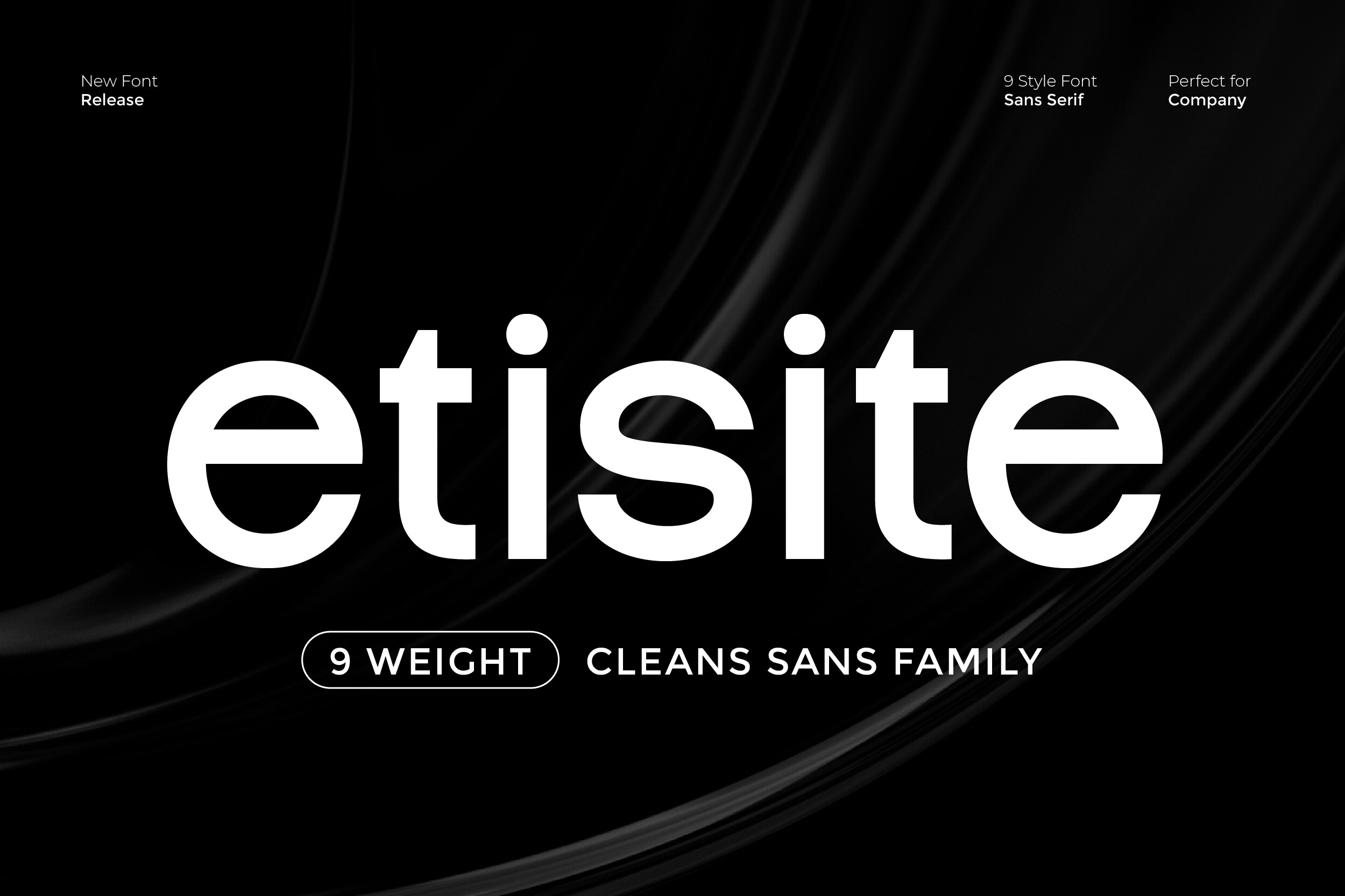
Etisite is a sans serif family pitched for clarity and a modern professional look. Its minimalist structure supports readability for both headlines and body text, which makes it a sensible candidate for service details and reading text. Still, test it on paper before the print run.
Best for: service details, the running order, reading text. By: Creative Fabrica
8. Bufing
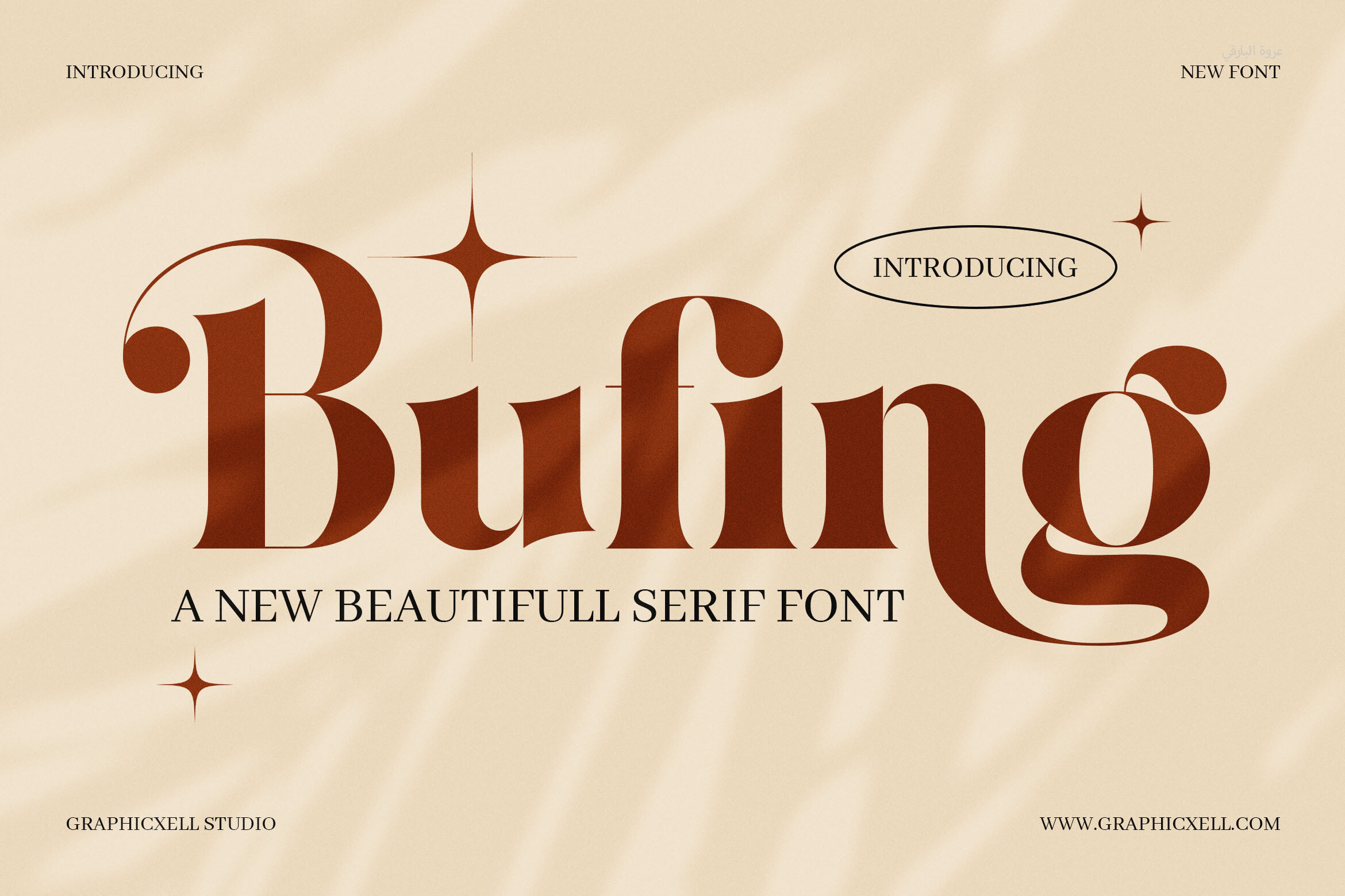
A classic-look serif recommended for headlines and body text, with magazine layouts mentioned in its listing. That dual role makes it a candidate for the main text of a program, where one font carries both a heading and the supporting line beneath it.
Best for: program body text and headings in one family. By: Creative Fabrica
9. Remillo
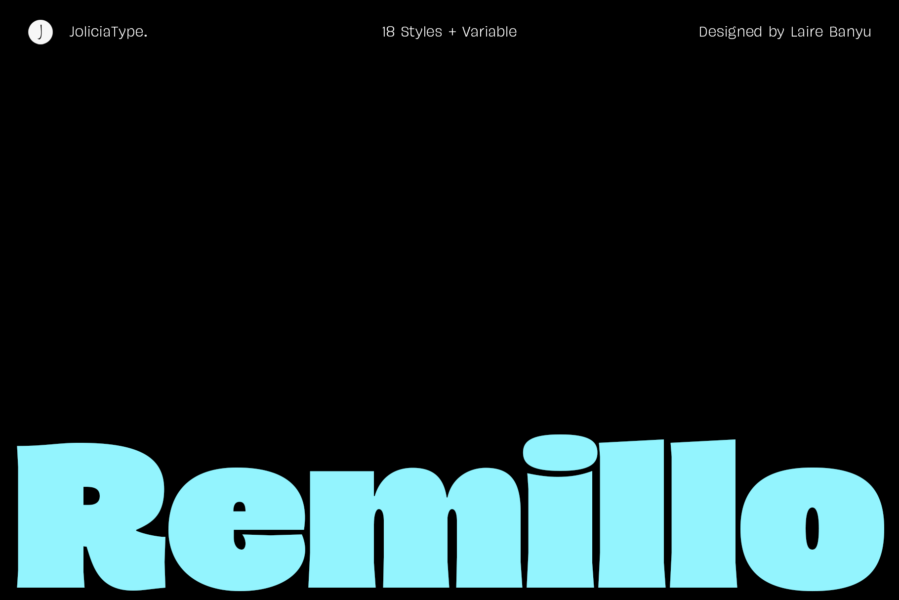
Remillo is a humanist sans serif with 18 styles plus a variable font. The range is useful for a multi-page program or booklet, because one family can build a clear hierarchy: heavy weights for headings, lighter ones for the order of service and photo captions.
Best for: order of service, headings, photo captions. By: Creative Fabrica
10. Brosse
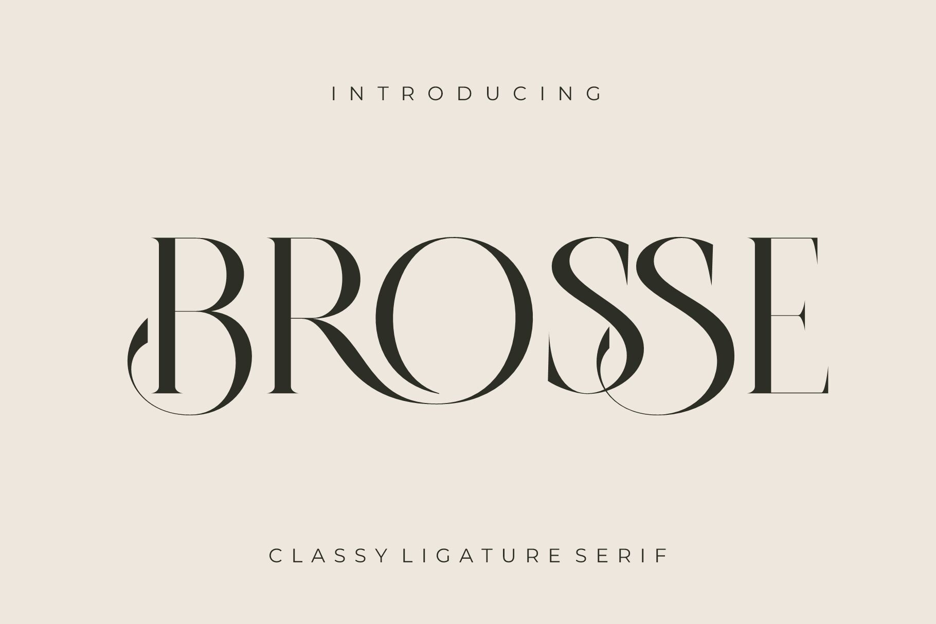
A ligature serif with a classic look. Its Creative Fabrica listing names brochures and booklets among its uses, which makes it one of the most directly format-relevant picks here. It offers a free trial with 10 free downloads — a trial period, not a permanently free font.
Best for: booklet text, panels of a folded program. By: Creative Fabrica
Best Script Fonts — Name or One Short Line Only
Scripts bring warmth, but on a funeral program they have one job: the name, or a single short line. Never the dates, times or addresses.
11. Calligraphy Script
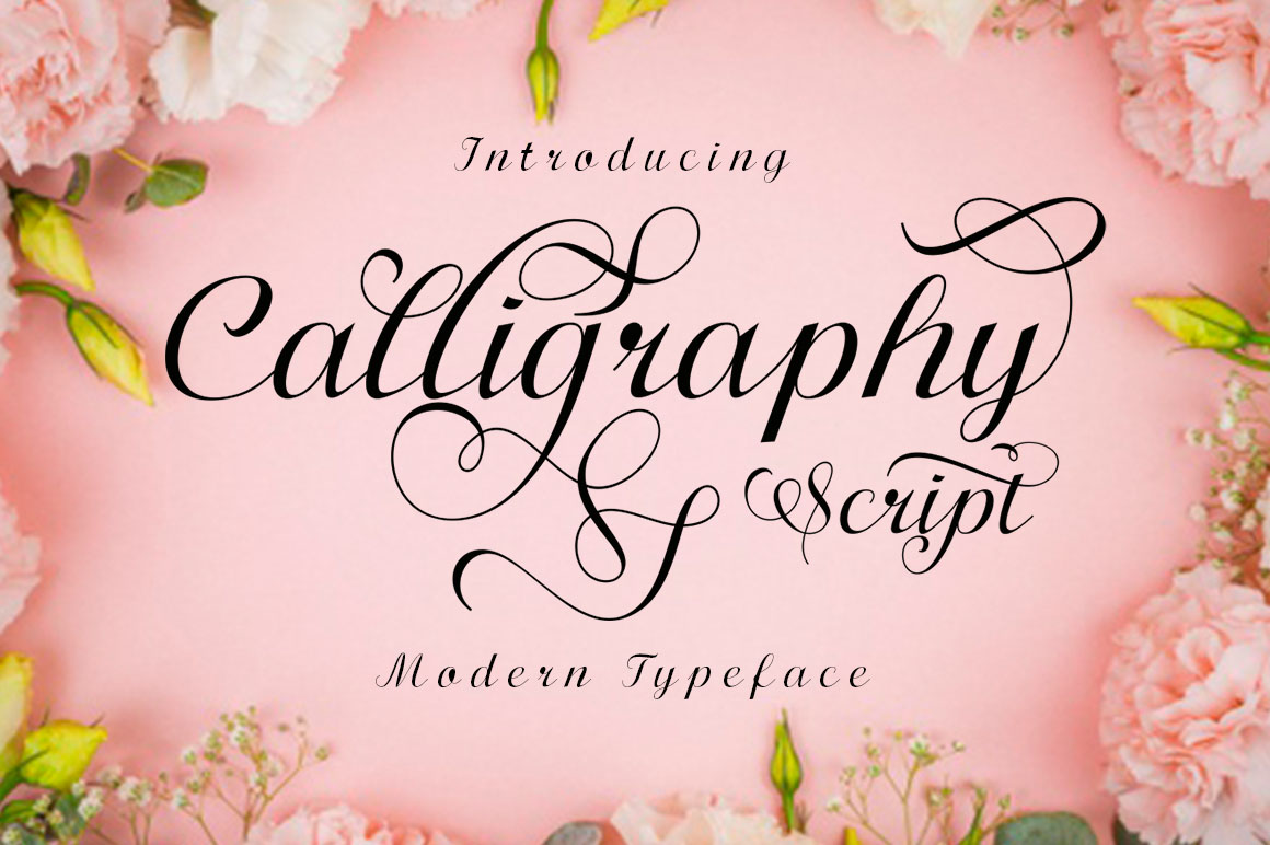
A brush-lettering style with thick and thin stroke contrast, PUA encoded for alternates and swashes (which may be hard to reach in Canva or Word). It suits the cover name or a short line only. Check the thin strokes on a printed test.
Best for: the cover name, one short line. By: Creative Fabrica
12. Elegant Script
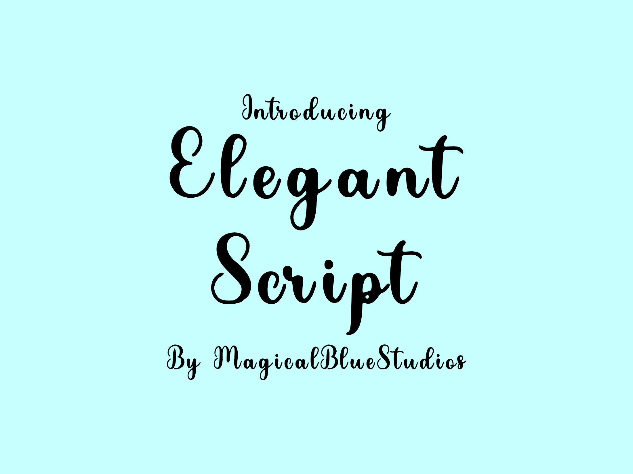
Marketed for wedding invitations and calligraphy fans, Cricut and Silhouette compatible. On a funeral program it is safest on the cover name or a single short line — not on dates or addresses. It is subscription-only, so plan access before adding it to a print file.
Best for: cover name, a short quote, personal accent. By: Creative Fabrica
13. Gresilya
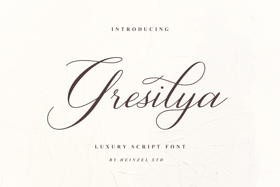
A script described as classy, elegant, and modern. It suits the deceased’s name or a brief service line; keep the date, time, and venue in a separate readable typeface.
Best for: a name line, a short service line. By: Creative Fabrica
14. Notebooked
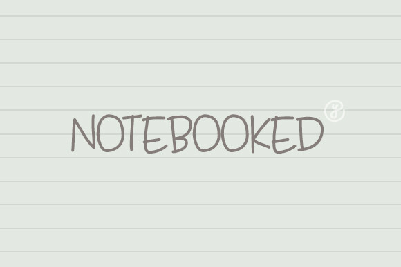
A script with soft, flowing lines and slight imperfections, aimed at love letters and memory-driven projects — the closest thing to a memorial-purpose script in this list. It suits a short dedication line. Do not set long captions in a script; legibility drops fast.
Best for: short dedications, quote lines, slideshow titles. By: Creative Fabrica
Best Fonts for Posters, Welcome Signs and Memorial Slideshows
Large format and screens have their own rules: fewer words, heavier type, and strokes that survive distance or video compression.
15. Ionicara Slab
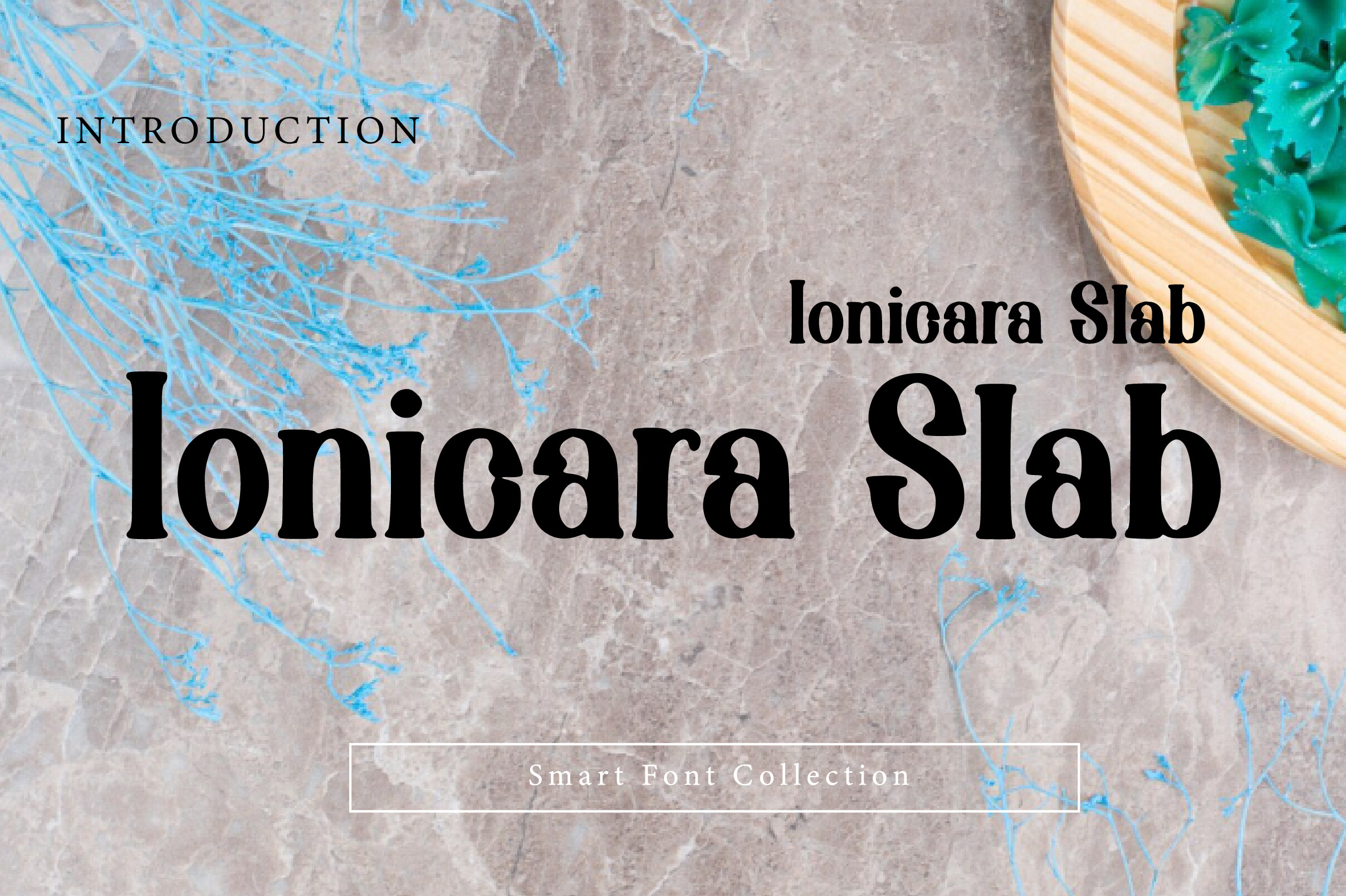
A bold slab serif display font whose listing includes signage. The blocky, sturdy letterforms suit a welcome sign or large lettering read from a few meters.
Best for: welcome signs, large display lettering. By: Creative Fabrica
16. Densa
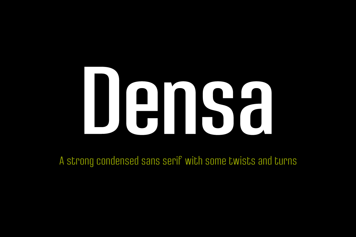
A condensed sans with unconventional display endings, as a family of 8 styles. Narrow letterforms fit more text in a tight space — dates and short lines on a poster — and the style range can build a small hierarchy from one family.
Best for: dates and short lines on posters, a two-weight hierarchy. By: Creative Fabrica
17. Aostora
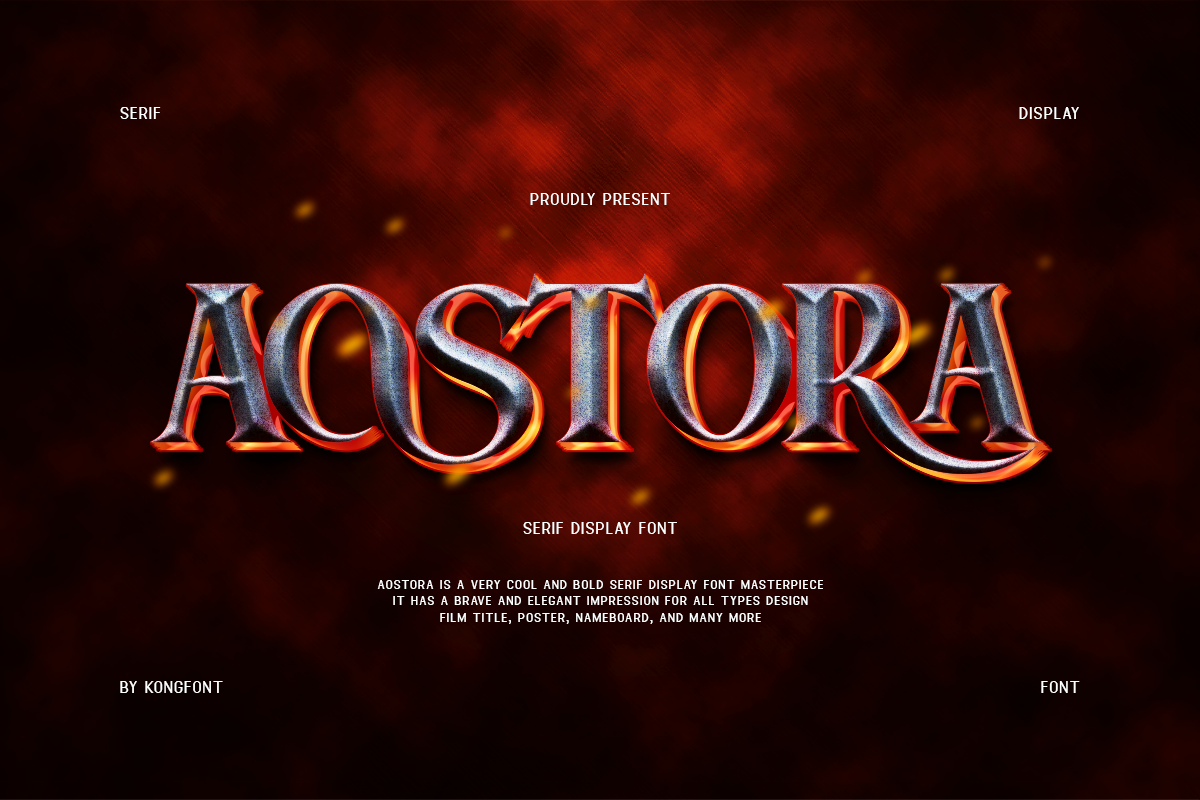
A serif film font pairing classic serif shapes with a cinematic feel. The cinematic tone leans toward a film credit rather than a service, though it may fit a celebration of life slideshow title card.
Best for: celebration of life slideshow, title cards. By: Creative Fabrica
18. Codex
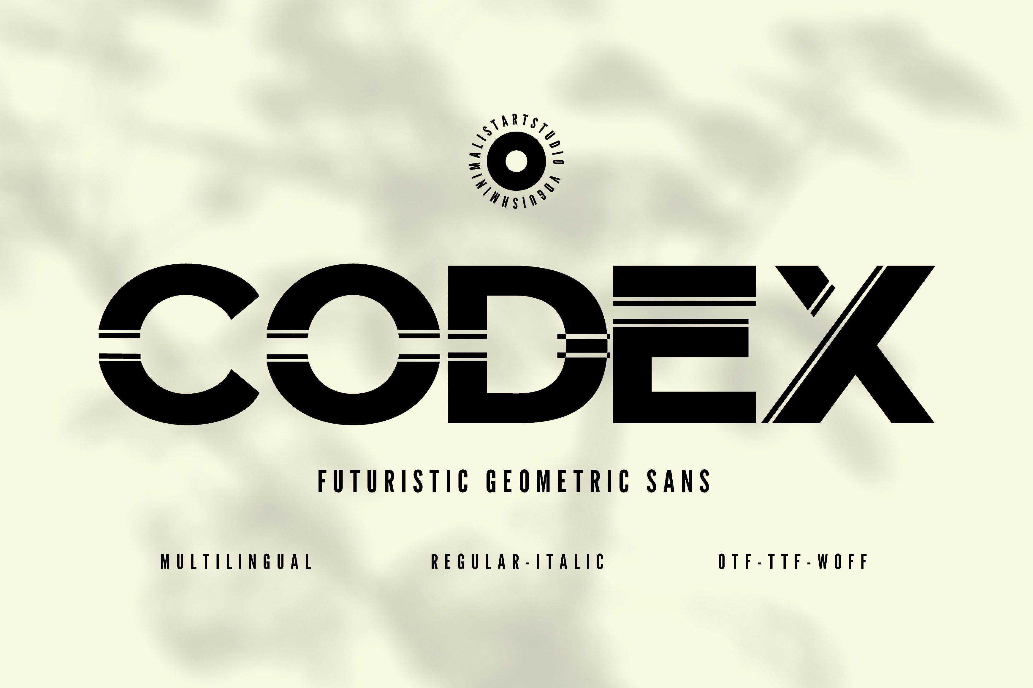
A geometric minimalist sans serif, easy to read at headline and body sizes, with 600+ glyphs and multiple weights. The weight range supports a clear hierarchy, and body-size readability makes it a strong candidate for slideshow captions and dates under a serif title.
Best for: slideshow captions, dates, hierarchy in one family. By: Creative Fabrica
Quick Comparison
| Font | Style | Best for |
|---|---|---|
| Bold Dignify | serif, headline | name on cover or poster |
| Boldside Display | retro serif display | tribute poster name |
| Dringko | elegant serif | cover name, section headings |
| Classical Premiera | serif + italic | name and short quote |
| Old Column | classic serif | cover title, section pages |
| Normal | text serif | readings, hymns, biography |
| Etisite | sans family | service details, reading text |
| Bufing | serif, dual role | program body and headings |
| Remillo | humanist sans, 18 styles | order of service, captions |
| Brosse | ligature serif | booklet and panel text |
| Calligraphy Script | brush script | cover name only |
| Elegant Script | script | cover name, short quote |
| Gresilya | modern script | name line, service line |
| Notebooked | soft script | dedications, slideshow titles |
| Ionicara Slab | slab serif | welcome signs, large lettering |
| Densa | condensed sans, 8 styles | poster dates, short lines |
| Aostora | cinematic serif | slideshow title cards |
| Codex | geometric sans | captions, dates, hierarchy |
Choosing by Format
Funeral program or order of service. A serif for the name (Bold Dignify, Dringko), a readable serif or sans for the running order (Normal, Etisite, Remillo). Two families maximum. Hymn titles can take the heavier weight of the body family; readings stay in the regular weight.
Invitation or announcement. Quieter than a wedding invitation, more personal than a notice. The name in a serif or restrained script (Classical Premiera, Gresilya), the time, place and address in a clean sans. Light text on a dark background is worth checking on a test print.
Memorial poster or welcome sign. Read standing up, from two or three meters. Heavy serif or slab letterforms for the name (Boldside Display, Ionicara Slab), condensed sans for the dates (Densa). No more than two fonts. If text sits over a photo, use a dark overlay or translucent panel, and keep type away from the face.
Funeral booklet or brochure. Multi-page work: a structured serif for covers and section pages (Old Column), a text face for prayers and readings (Normal, Brosse). One family with many weights (Remillo) keeps a long document unified without switching typefaces.
Memorial slideshow. Screens compress fine strokes, so favor solid letterforms: a serif title (Aostora for a celebration of life) with geometric sans captions and dates (Codex). Scripts only for a single dedication line (Notebooked). Test on the actual projector — compression thins delicate lines.
How to Set Type on a Funeral Program
Keep the hierarchy simple: name first, dates second, a short line such as “In loving memory” third. Use no more than two fonts — one for the name, one for everything else. If a script is used, keep it to the name or one short line, never the dates, time or address.
Print a test before the run. Thin strokes that look fine on screen can vanish on paper; reverse video (light on dark) can fill in. Check the letter i and other narrow letters at final size. For a traditional tone, Garamond, Baskerville and Palatino are common reference points, named here as general guides, not as part of this list.
FAQ
What font is used for funeral programs? Traditional funeral programs lean on classic serifs — Garamond, Baskerville, Palatino — for the name, with a quiet serif or sans for the details. The picks above follow the same logic with current Creative Fabrica typefaces.
What is the best font for an order of service? A readable text face: Normal or Brosse for full-reading text, Etisite or Remillo when one family must cover headings and details alike. Keep the cover name in a separate, larger serif.
Can I use a script font on a funeral program? Yes, but only for the name or one short line. Scripts fail fast on dates, times and addresses, where every character must be unambiguous.
Are there free fonts for funeral programs? Yes — Google Fonts (EB Garamond, Cormorant), DaFont and Font Squirrel are legitimate free sources, named here as plain text. Among the picks above, Brosse has a free trial and some listings include a free tier; the rest are mostly subscription-only on Creative Fabrica.
What size should the name be on a memorial poster? Large enough to read from the distance people will stand at — on an easel, that is two to three meters. Print one line at final size and check from across the room before committing.
Try Studio AI on Your Own Design
Want to see a font in a real design before downloading it? Creative Fabrica Studio is a browser-based tool with AI features — test fonts on your own text, generate matching graphics, remove backgrounds, and export finished designs for print or social media.
Try Studio AI Free →Where to Download Fonts for Funeral Programs
Creative Fabrica is the main source for these picks; several are subscription-only, and for the others the product page is the place to confirm availability and terms. Google Fonts, DaFont and Font Squirrel are additional places to look for free options, named here as plain text. Download links on this page are affiliate links: FontPro may earn a commission at no extra cost to you. For more on pairing typefaces for formal print, see the FontPro blog.