· fonts · 13 min read
22 Best Serif Fonts for UI Design in 2026
The best serif fonts for UI design in 2026: slab, modern and editorial serifs that stay readable on screens. Download for dashboards, apps and websites.

Serif typefaces are showing up in product interfaces again. Not as a decorative afterthought, but as a deliberate choice. After a decade of geometric sans defaults, designers are reaching for serifs to add warmth and editorial confidence to dashboards, apps, and landing pages.
The problem? Not every serif survives a 14px label or a dark mode toggle. Some look gorgeous in a specimen sheet and fall apart the moment you drop them into a real data card.
This list covers 22 serif fonts that hold up on screen, grouped by slab, modern, and editorial styles. I picked these based on stroke contrast, x-height, and how they behave at small sizes. If a font made it here, it passed the “does it still read at 14px” test.
What Makes a Serif Font Work in UI?
A serif can look stunning in a type specimen and still be useless in a real interface. The gap between the two usually comes down to a few specific screen behaviors.
Stroke contrast. High contrast serifs have thin hairlines that vanish on low DPI screens. At 14px or 16px, those hairlines just disappear. A readable serif for UI keeps the difference between thick and thin strokes low or moderate. Letters stay solid. No ghosting.
X-height and counters. A tall x-height gives lowercase letters more visual mass, which matters in dense UI layouts. Open counters in letters like a, e, g, and o prevent them from closing up at small sizes. If a face looks crisp at 48px but turns mushy at 12px, it is probably too decorative for interface text.
Serif shape. Slab serifs have thick, blocky terminals that anchor letters and reduce visual noise. Thin, sharp serifs look refined in large headlines but often need display sizes to work. For dashboards, cards, and navigation, a slab or low contrast modern serif is the safer bet.
The real test. Type a button label. A table header. A form field. A short paragraph. Check it at the final size, on light and dark backgrounds, next to your sans body font. If the serif still reads cleanly after that, it belongs in your product. If not, it belongs in a poster.
Best Slab Serif Fonts for UI
Slab serifs are the most forgiving group for UI work. Their thick, even serifs create a stable baseline that helps in data views, cards, badges, and interface labels.
Use them when you want a serif that feels grounded rather than decorative. They are the workhorses of this list.
1. Berry
Berry is a friendly slab serif with rounded edges and a confident, approachable tone. It feels less formal than a book serif, which is exactly what you want when the interface needs warmth without losing clarity. The sturdy serifs keep it stable in cards, labels, and small interface accents.
Best for: product cards, badge labels, friendly app headers. By: v.derkach.work
2. Stixuits

Stixuits is a clean slab serif with a tidy, functional look. It avoids heavy ornamentation and keeps letterforms open, which helps it stay readable in interface components. The free listing is a useful starting point, but check the license terms before using it in a commercial product.
Best for: dashboard labels, clean data cards, utility interfaces. By: Freebies
3. Canvas

Canvas is a minimal slab serif built for clarity. Its even strokes and compact structure make it a good fit for dashboards, metric cards, and dense UI layouts where a serif needs to behave like a workhorse. It reads calm and organized, which helps when the interface is already busy.
Best for: data dashboards, metric labels, clean web UI. By: Minimalist Eyes
4. Varsity Senior

Varsity Senior brings a college athletic vibe to slab serif design. The bold, blocky letterforms have a badge-ready energy that makes it a strong choice for sports apps, team dashboards, and playful product branding. It is not a quiet typeface. That personality can be exactly what a UI needs.
Best for: sports UI, badge headers, team score cards. By: Riman (7NTypes)
5. Varsity Heaven

Varsity Heaven offers another varsity-style slab serif with a slightly different rhythm. It keeps the athletic, badge-like character while feeling a bit more relaxed than a classic college face. If you are comparing it with Varsity Senior, test both in the same button and card layout before deciding.
Best for: sports apps, badge labels, casual team UI. By: riki.studio
6. Brande

Brande is a sturdy slab serif with a confident brand-platform feel. Its letterforms are solid enough for headlines but controlled enough to work in interface accents where a serif needs to look dependable. It suits products that want a warm, crafted identity without drifting into decorative territory.
Best for: brand platforms, product headers, confident UI accents. By: Minimalistartstudio
7. Atraks

Atraks is a low contrast slab serif that leans toward web interfaces. Its even weight and clear structure make it a practical option for labels, cards, and short UI copy. It sits comfortably next to a clean sans body font without creating visual tension, which is more than I can say for some of the fancier options out there.
Best for: web interfaces, card labels, readable UI headings. By: Maulana Creative
Best Modern Serif Fonts for UI
Modern serifs sit between classic elegance and screen practicality. They usually have controlled stroke contrast, a contemporary letterform rhythm, and enough personality for hero sections, product branding, and landing pages.
These UI serif fonts work best when the interface needs a designed feel, not just a neutral one. Think of them as the voice of your product, not the body text.
8. Black Mogan

Black Mogan is a popular modern serif with a strong, editorial presence. Its bold weight and confident curves make it a good fit for hero sections, landing pages, and product pages that need a memorable first impression. It works best when the surrounding UI stays simple, so the type can carry the mood.
Best for: hero sections, landing pages, bold product branding. By: Flawless And Co
9. Marquis - Elegant Modern Serif

Marquis - Elegant Modern Serif is a refined face for premium product branding. Its elegant proportions and smooth terminals give it a polished look that suits fashion, beauty, and lifestyle interfaces. This one is less about dense UI text and more about high-end headlines.
Best for: premium branding, fashion UI, elegant landing headers. By: roomspace
Download Marquis - Elegant Modern Serif
10. Things
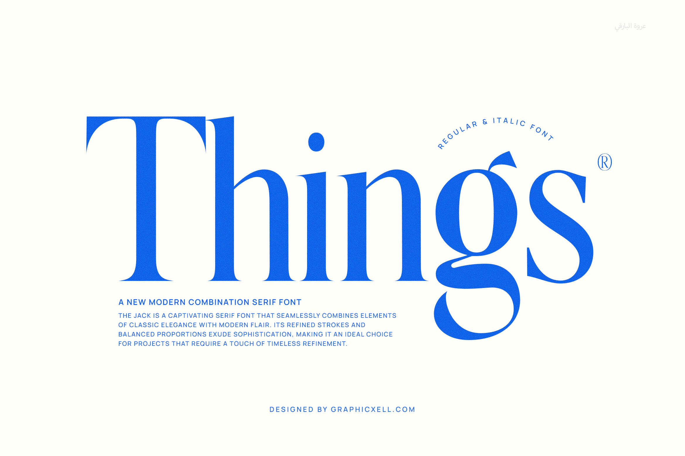
Things is a modern serif with a distinct headline personality. Its letterforms have enough character to stand out in a UI without becoming hard to read. It works well for product names, section titles, and short interface copy that needs a bit more attitude than a neutral sans.
Best for: UI headlines, product names, expressive section titles. By: Graphicxell
11. Paris

Paris is a chic modern serif with a fashion-forward feel. Its refined details and elegant rhythm make it a strong option for fashion landing pages, boutique storefronts, and lifestyle apps that need a polished editorial tone. Keep it to display sizes and key headlines so the UI stays clean.
Best for: fashion UI, chic landing pages, lifestyle branding. By: Perfectype
12. Seravique

Seravique is a fresh modern serif with a clean, contemporary structure. It feels current enough for web design and product interfaces while still keeping the warmth that serif fonts bring to a screen. It is a good choice when you want a modern serif that does not look like a default template.
Best for: web design, product UI, modern landing pages. By: Colourful
13. Rethena Font

Rethena Font is a modern serif typeface built for systematic use. Its range and consistent structure make it useful when a UI needs more than one weight or a flexible type system. It can handle headlines, interface accents, and short body-like copy while keeping a cohesive feel across the product.
Best for: type systems, interface headlines, multi-weight UI. By: RagamKata Studio
14. Milgraph
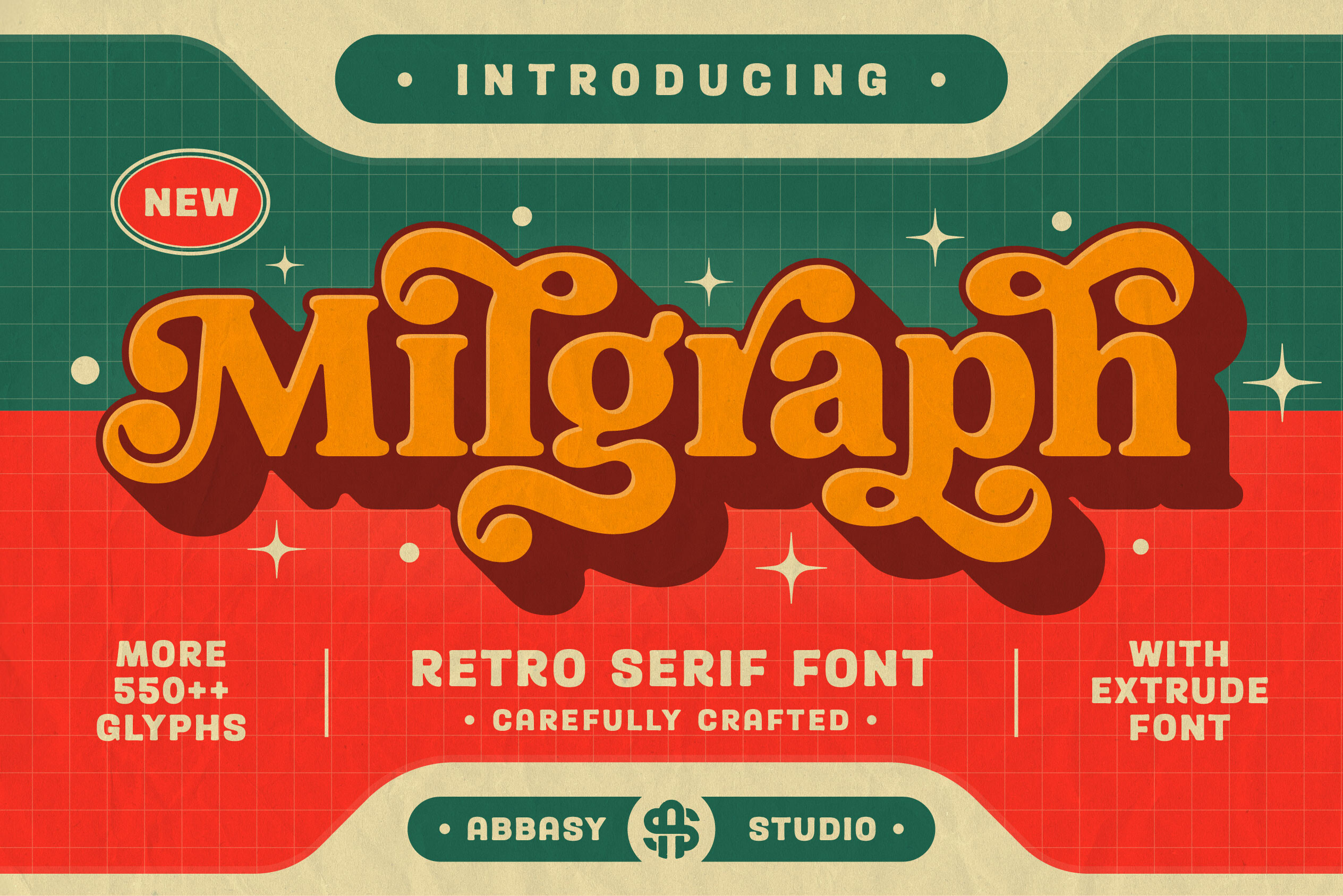
Milgraph is a retro modern serif with a playful, graphic edge. It is not the most neutral face on this list, but that is its strength. It works well for UI accents, promotional cards, and product moments where a serif needs to add personality without taking over the interface.
Best for: UI accents, promo cards, retro product branding. By: abbasystudio
15. Fresh Mango

Fresh Mango is a friendly modern serif with a warm, approachable tone. Its rounded details and relaxed letterforms make it a good fit for landing pages, lifestyle products, and interfaces that want to feel welcoming. It is especially useful when a UI needs a serif that feels human rather than corporate.
Best for: landing pages, lifestyle UI, friendly product branding. By: Shakira Studio
Best Editorial Serif Fonts for UI
Editorial serifs are the display side of UI typography. They are built for large headlines, magazine-style landing pages, and hero moments where a serif can set the tone.
Use them at display sizes only. Not for dense body text, not for small labels. If you drop an editorial serif into a 14px form field, you will regret it.
16. The Avenue Editorial

The Avenue Editorial has a strong magazine character with a confident headline presence. Its letterforms feel editorial and composed, making it a good fit for hero sections, feature pages, and UI moments that need a premium storytelling tone. It works best when paired with a simple sans for the supporting text.
Best for: editorial heroes, feature headlines, premium landing pages. By: Zane Studio
17. Alerigue

Alerigue is an expressive editorial serif with a bold visual voice. It brings a magazine-like drama to UI headlines, making it useful for landing pages that need a strong opening statement. Like most editorial serifs, it should be reserved for large sizes where its details can breathe.
Best for: expressive headlines, magazine style UI, landing heroes. By: Black Junst
18. Svara

Svara is a refined editorial serif with a delicate, polished feel. Its clean proportions make it a good option for large UI headlines that need elegance without excessive decoration. It is a strong choice for premium brands, lifestyle products, and editorial landing pages.
Best for: large UI headlines, premium branding, editorial pages. By: product.rasiostudio
19. Resquel
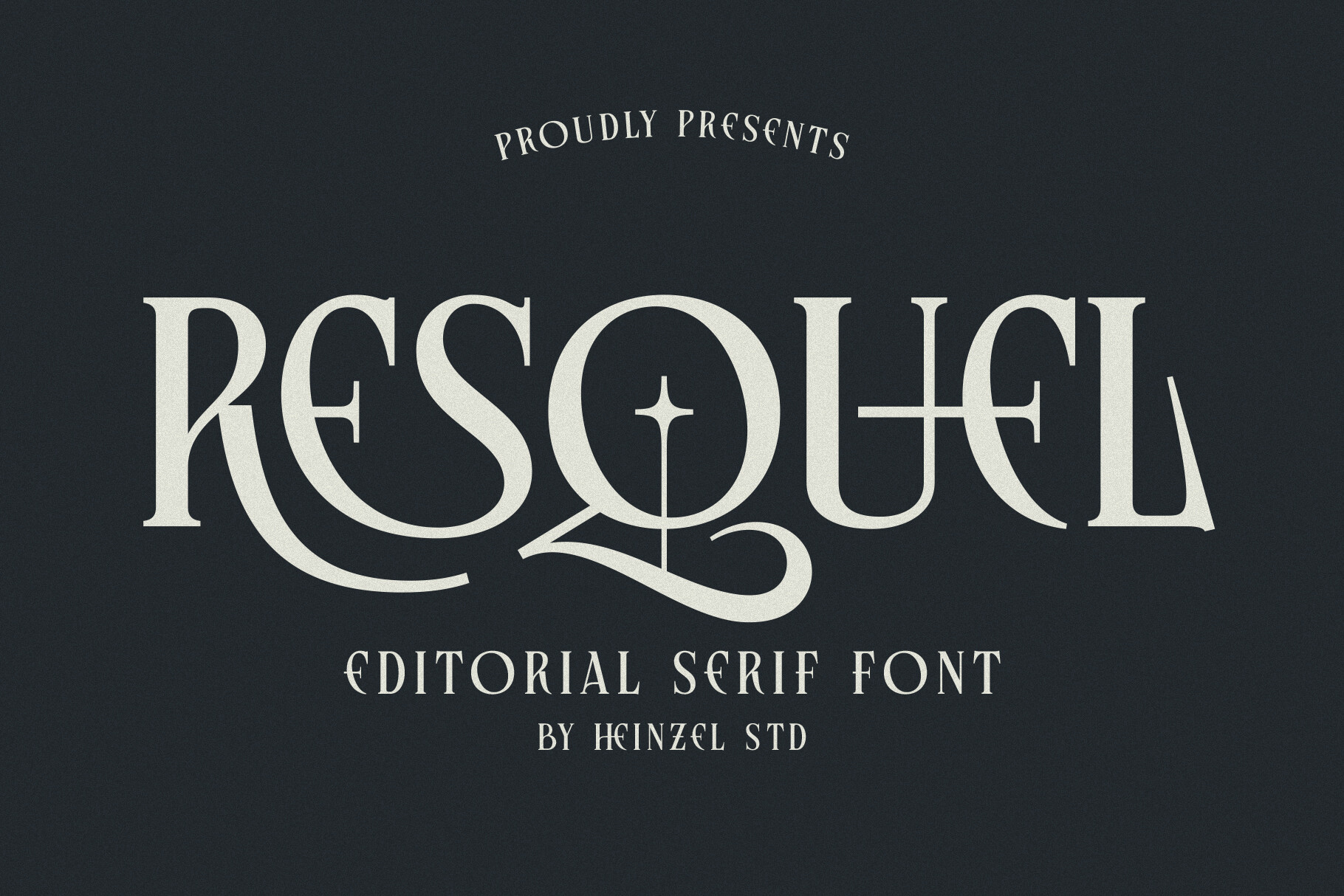
Resquel is an editorial serif with a confident, landing-page personality. Its letterforms have enough presence to anchor a hero section while still feeling structured for web use. It suits products that want a serif with character, especially when the design leans toward storytelling or brand-led pages.
Best for: landing pages, brand heroes, editorial UI accents. By: Heinzel Std
20. Ebonvale

Ebonvale is a dramatic editorial serif with a premium, high-contrast feel. It is the kind of face that can make a hero section feel expensive and intentional. Use it for large display moments in luxury brands, fashion UI, or product pages where the headline needs to carry the emotional weight.
Best for: luxury branding, dramatic heroes, premium product pages. By: DREAM
21. Ethereal
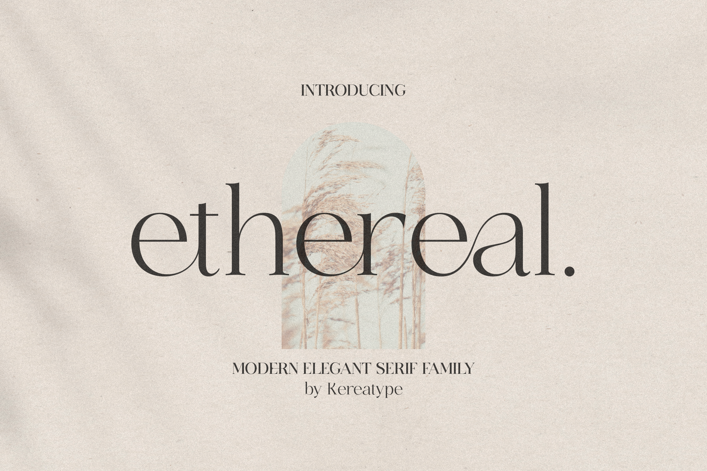
Ethereal is an elegant display serif with a light, airy quality. Its refined details make it a good fit for fashion, beauty, and lifestyle interfaces that need a soft editorial tone. It works best in large headlines and hero text, where its delicate structure can stay clear.
Best for: display headlines, fashion UI, soft editorial pages. By: kereatype
22. Olivia Serif
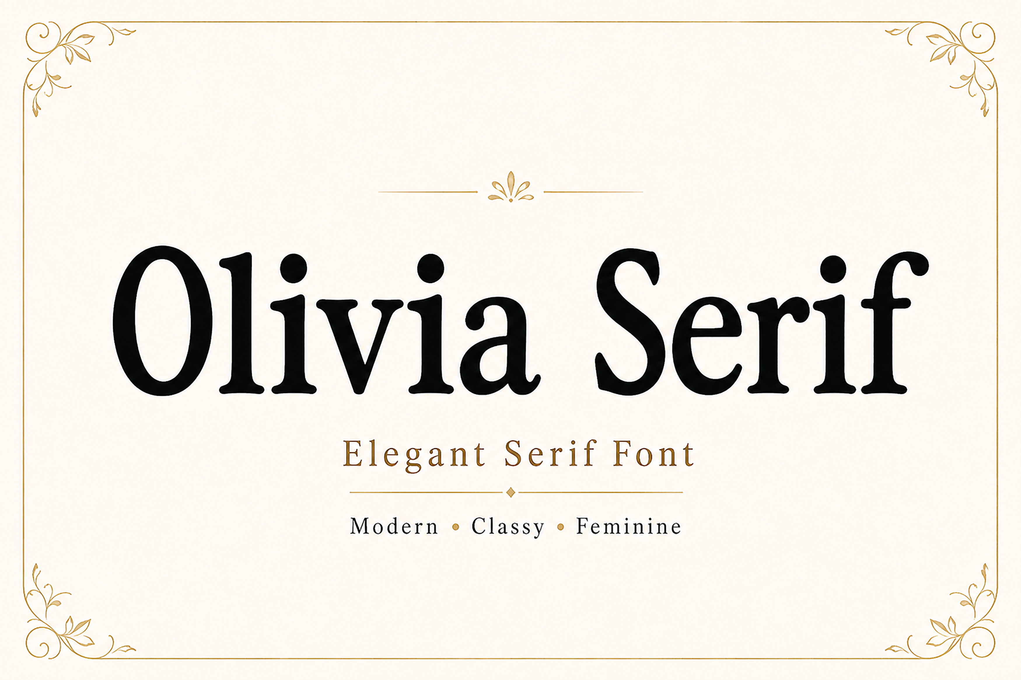
Olivia Serif is a soft editorial serif with a gentle, lifestyle-friendly tone. Its rounded warmth makes it a good option for web interfaces that want an editorial feel without becoming too formal. It works well for lifestyle brands, wellness products, and landing pages that need a calm, human headline voice.
Best for: lifestyle brands, wellness UI, soft landing pages. By: Wow Magic
Serif vs Sans Serif in UI: When to Use Which
Sans serif fonts still win for dense data, forms, tables, and long body text. Their neutral shapes reduce visual effort, which is why they remain the default for interface copy.
Serif fonts work best when they carry hierarchy, brand tone, or emotional weight. In practice, the best UI typography uses both.
The most reliable pairing I have seen is a serif headline with a sans body font. The serif gives the page a distinct voice, while the sans keeps the supporting text easy to scan. To make the pair feel cohesive, look for a shared skeleton: similar x-height, similar letter spacing, and a similar sense of width. A slab serif can pair well with a humanist sans, while a modern serif often works with a clean grotesque.
Do not rely on a single preview size. Test the pair at 14px, 16px, 20px, and 32px. Check it in dark mode, where thin serifs can become harder to read. If the serif looks too sharp at small sizes, move it to display roles and keep the sans for labels, buttons, and data.
The goal is not to choose one typeface family over the other. The goal is to give each font a job it can do well.
Another practical rule: limit the serif to roles where it can be seen. Headlines, hero text, section titles, and brand labels are safe. Dense tables, form fields, and microcopy are usually better in sans. If you are building a dashboard, let the serif define the product name or the main heading, then let the sans handle the numbers, filters, and status text. This keeps the interface warm without making it hard to use.
Try Studio AI on Your Own Design
Want to see a font in a real design before downloading it? Creative Fabrica Studio is a browser-based tool with AI features — test fonts on your own text, generate matching graphics, remove backgrounds, and export finished designs for print or social media.
Try Studio AI Free →Where to Download Serif Fonts for UI
Creative Fabrica is a strong starting point for finding serif fonts for UI design. The platform includes preview images, designer information, and commercial license details on product pages, which makes it easier to evaluate a font before adding it to a project. Many listings also include multiple weights, which helps when you need a serif system rather than a single display face.
If you want a broader range of options, browse the Creative Fabrica font library and check the FontPro blog for more typography resources. For free readable serif fonts, Google Fonts offers Merriweather, Playfair Display, and Source Serif as solid starting points. They are readable and widely used, but they may feel less distinctive in a competitive product UI.
Before shipping a font, verify the license on the product page. Check whether the license covers web use, app use, client work, or embedded use in a product. A beautiful serif is only useful if you can actually use it in the interface you are building. When comparing paid and free options, also consider how the font behaves in your design system. A free serif can be a great prototype, but a paid family with more weights may save you from awkward substitutions later.