· fonts · 15 min read
20 Best Serif Fonts for Designers, Branding & Editorial in 2026
Discover the 20 best serif fonts for branding, editorial, and web design. From elegant luxury to bold slab serifs — download free and premium options.
Pick the wrong serif font and your luxury brand looks dated. Pick the right one and your design communicates authority, elegance, or warmth before anyone reads a single word. Serifs do a lot of heavy lifting.
This list covers 20 of the best serif fonts for branding, editorial, and web design in 2026, organized into four style groups so you can skip straight to what your project actually needs. Every font links directly to Creative Fabrica where you can download and use it commercially. One of them (Rodin, #18) is completely free.
What Makes a Great Serif Font?
A serif font has small strokes, called serifs, extending from the ends of each letterform. That is the mechanical answer. The more useful answer is that serifs have carried print typography for centuries because those strokes guide the eye along a line of text and add visual rhythm that sans-serifs cannot replicate.
The difference between serif and sans-serif fonts is not just aesthetic. Serifs carry brand associations with tradition, authority, and premium positioning. That is why law firms, publishers, universities, and luxury brands reach for serifs by default. Sans-serifs feel modern and minimal. Serifs feel trustworthy and established.
Three things separate a great serif from a generic one: personality, legibility at multiple sizes, and versatility across contexts. A great serif has a distinct visual character that fits the mood of the project. It stays readable at both 9pt body text and 72pt headlines. And it works across print, screen, and physical media without falling apart.
Right now, the fonts getting the most attention are expressive variable serifs that span hairline to ultra-bold in a single file, and warm editorial serifs drawn from 18th and 19th century historical cuts. Both push toward character over neutrality, which is exactly where serif typography should be heading.
Best Elegant & Luxury Serif Fonts
When your project calls for elegance, the font has to hold its own against expensive photography and premium materials. Luxury brand identity, high-end editorial, fashion photography, wedding stationery: these six serif fonts all occupy that territory, but each has a distinct emotional signature. Do not treat them as interchangeable.
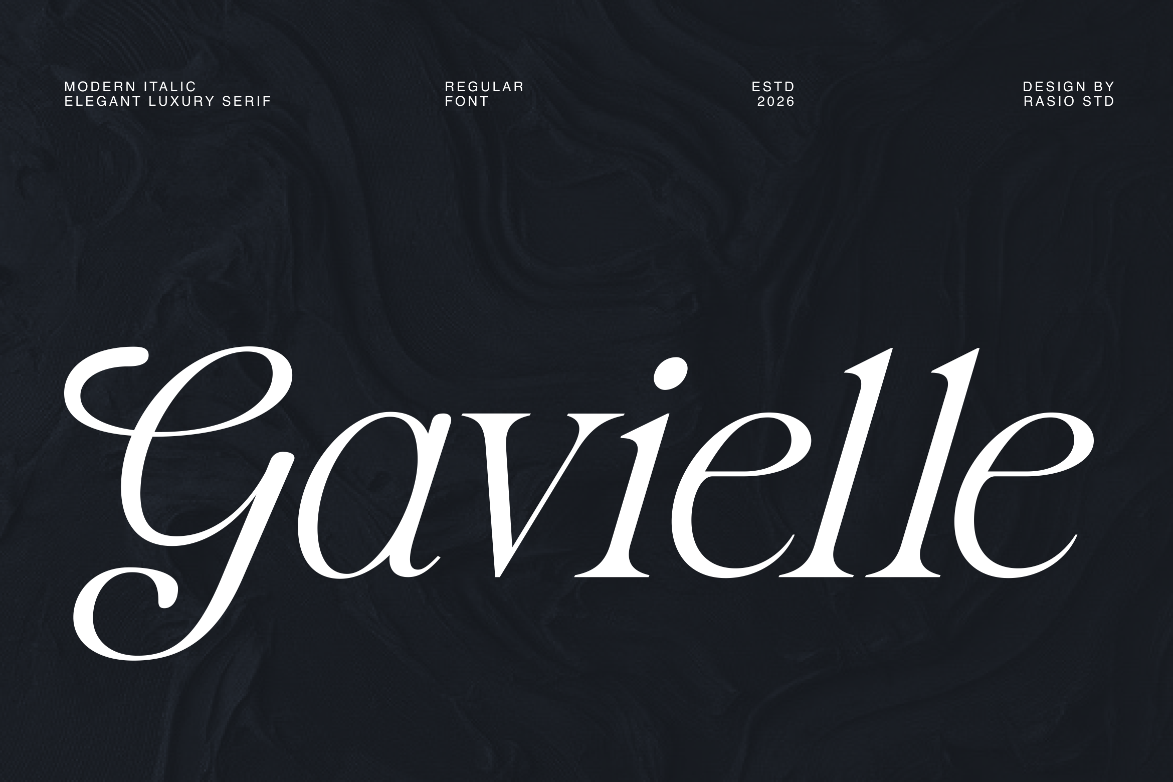
1. Gavielle
Gavielle is an italic-only luxury serif with deeply curved letterforms and high stroke contrast. The all-italic design is its defining feature: every character carries forward momentum. Think Milanese fashion houses, haute couture editorials, and invitation suites where the first impression is everything. Negative space feels expensive here.
Best for: luxury branding, magazine covers, wedding invitations. By: rasiostudio
2. Higuen
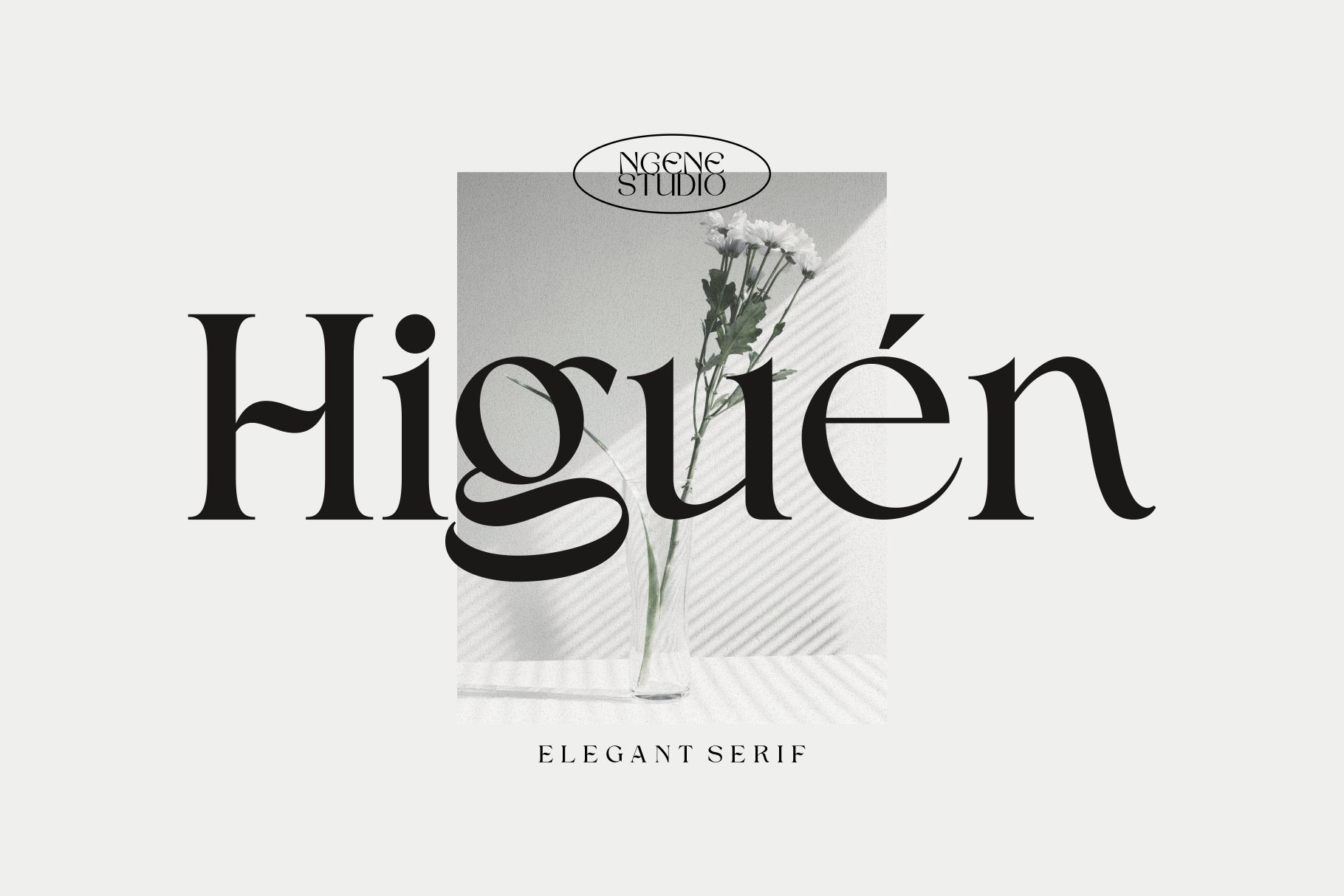
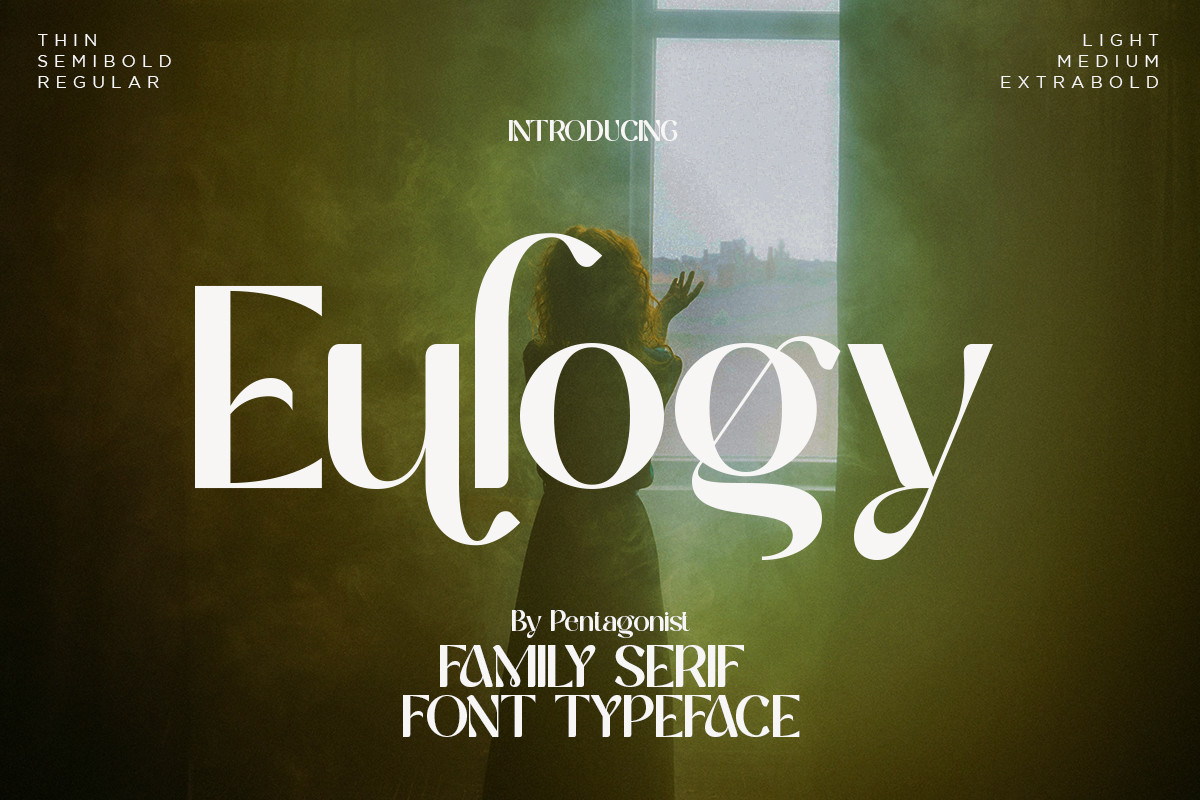
Higuen is a modern elegant serif built for large display sizes. The expressive stroke contrast catches the eye at magazine-cover scale without feeling overwrought at smaller applications. If Gavielle is intimate Italian glamour, Higuen is the confident headline serif that dominates a hero section or event poster.
Best for: editorial headlines, fashion branding, event posters. By: Ngene
3. Garolia
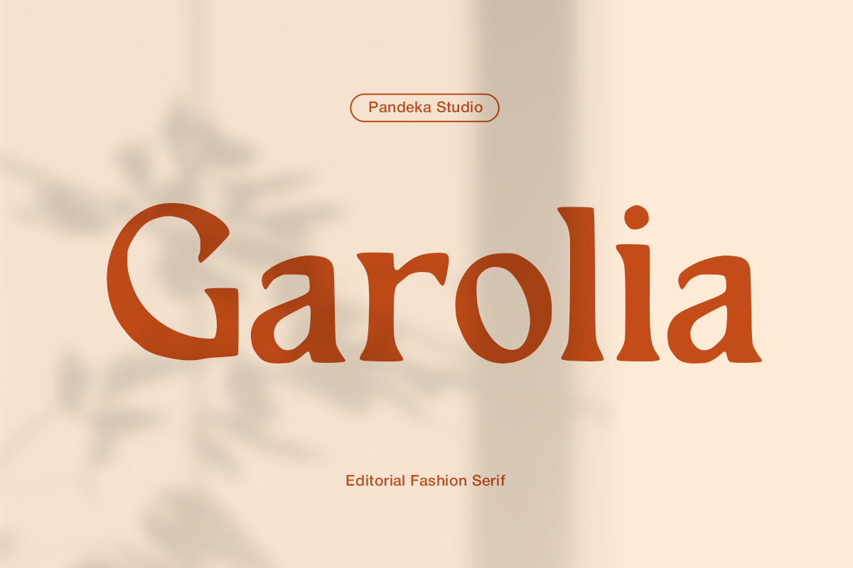
Garolia is a warm editorial luxury serif from pandekastudio with high-contrast strokes and graceful proportions. Where many luxury serifs run cold and severe, Garolia’s curves soften the high-fashion edge into something more grounded and approachable. It is the slow-luxury option: premium packaging, thoughtful brand identities, book covers that feel considered rather than ostentatious.
Best for: premium packaging, brand identity, book covers. By: pandekastudio
4. Charnoir
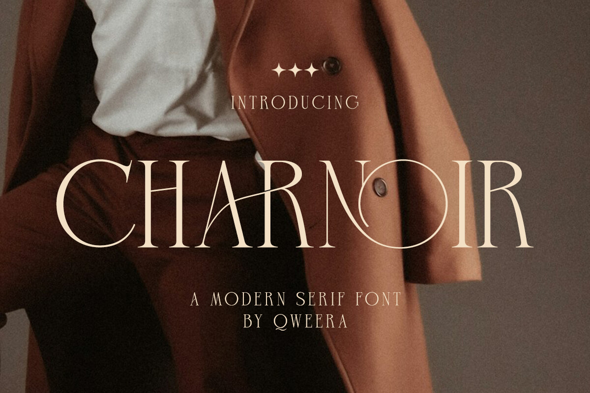
Charnoir is the darkest, most dramatic serif in this collection. High-contrast letterforms, strong feminine personality, and PUA encoding that gives Canva users full access to glyph alternates and swashes without OpenType-aware software. This one belongs on mystery thriller covers, noir-adjacent perfume brands, and dark romance editorial. It is not a boutique skincare label font.
Best for: dark luxury branding, mystery book covers, editorial headers. By: Qweera Studio
5. Welp Clair
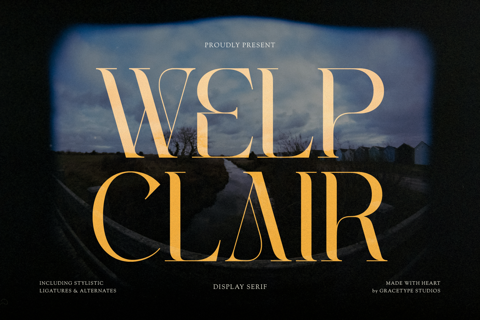
Welp Clair bridges vintage and contemporary through its most distinctive feature: dramatic sweeping terminals that give each character sculptural presence. It is not as dark as Charnoir and not as smooth as Gavielle. The stylistic alternates push it further into stationery and cosmetics territory, where the delicate terminal detail reads as handcrafted quality rather than digital precision.
Best for: cosmetics branding, boutique shops, stationery design. By: Gracetypestudio
6. Atfagis
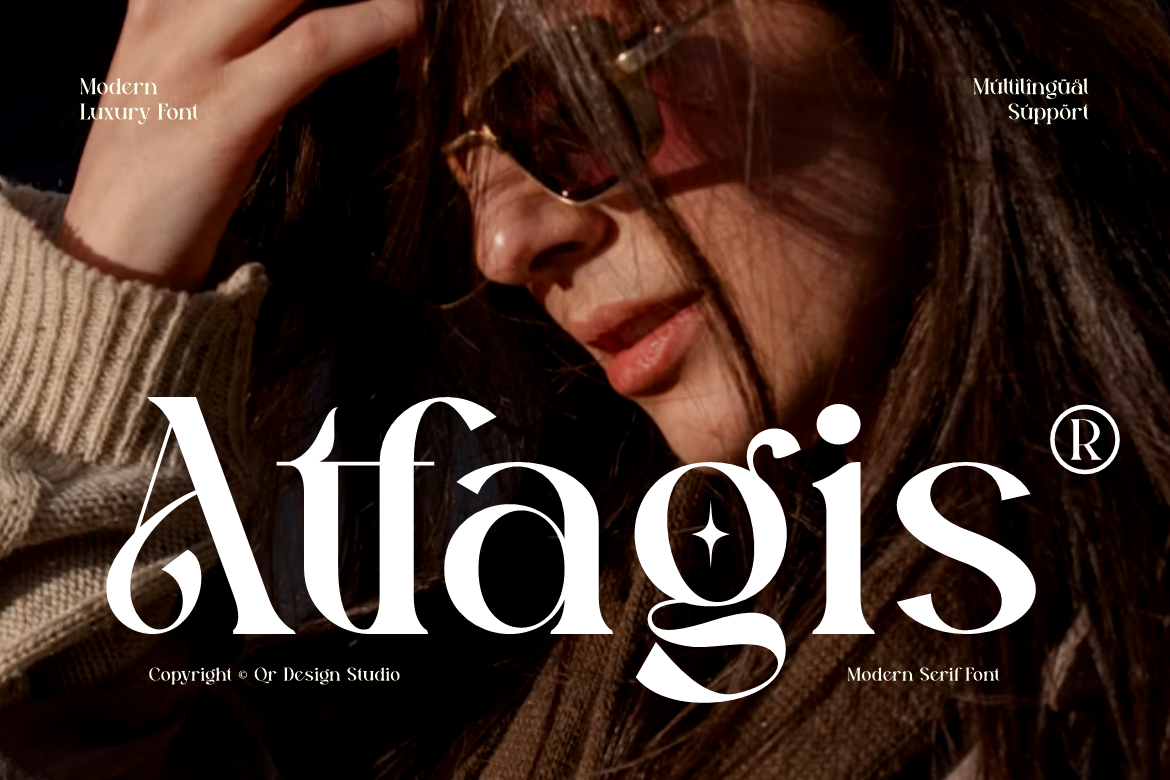
Atfagis is the most aggressively fashion-forward serif in the collection. It distorts traditional Roman proportions into contemporary territory with hard-edged geometry and comprehensive multilingual support for global design workflows. Where Gavielle is smooth Italian luxury, Atfagis is avant-garde fashion editorial: sharper, more architectural, designed for minimalist layouts that need structure without decoration.
Best for: architectural branding, creative agencies, editorial layout. By: qrdesignstd
Best Classic & Traditional Serif Fonts
Classic and traditional serifs have been the backbone of book typesetting, newspaper layout, and heritage brand identity for centuries. They balance readability with character in a way that display serifs never quite manage for long-form text. Use these when the project calls for credibility and longevity over trend-chasing.
7. Giveny
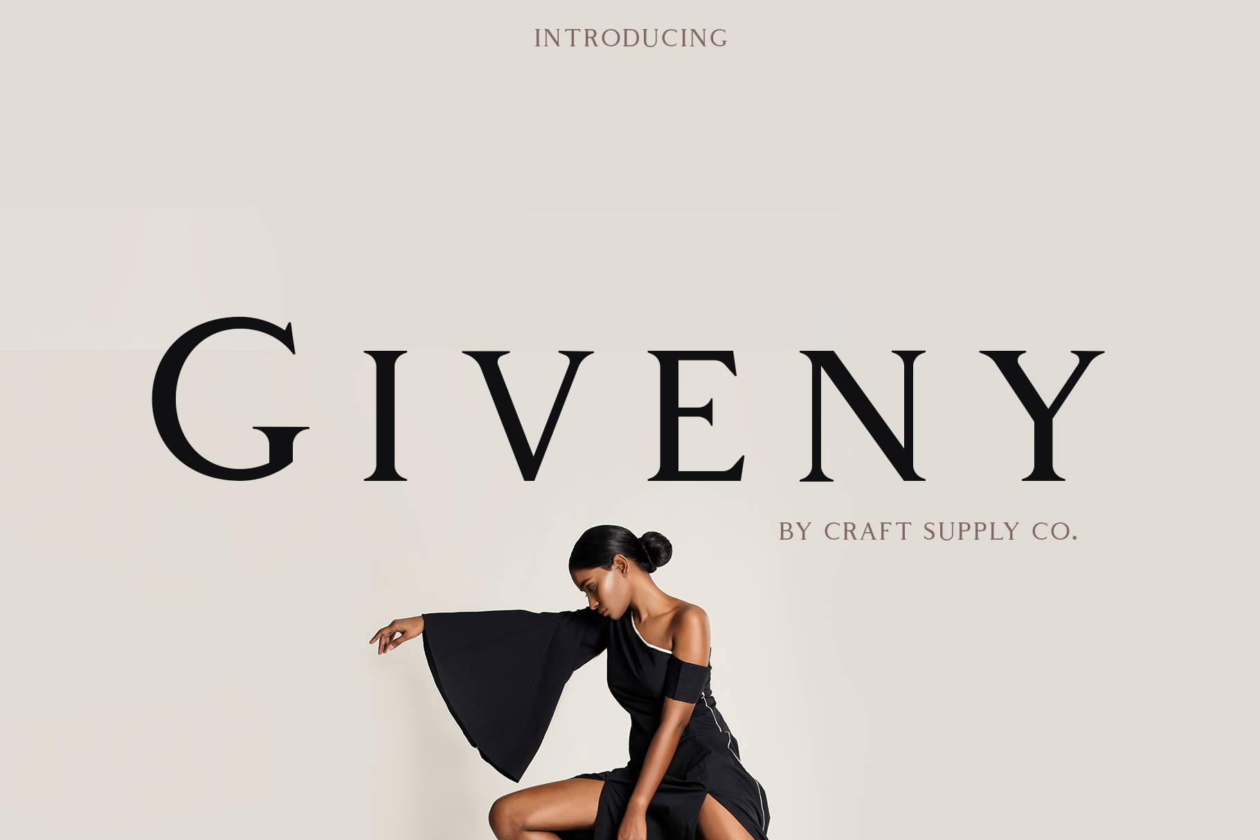
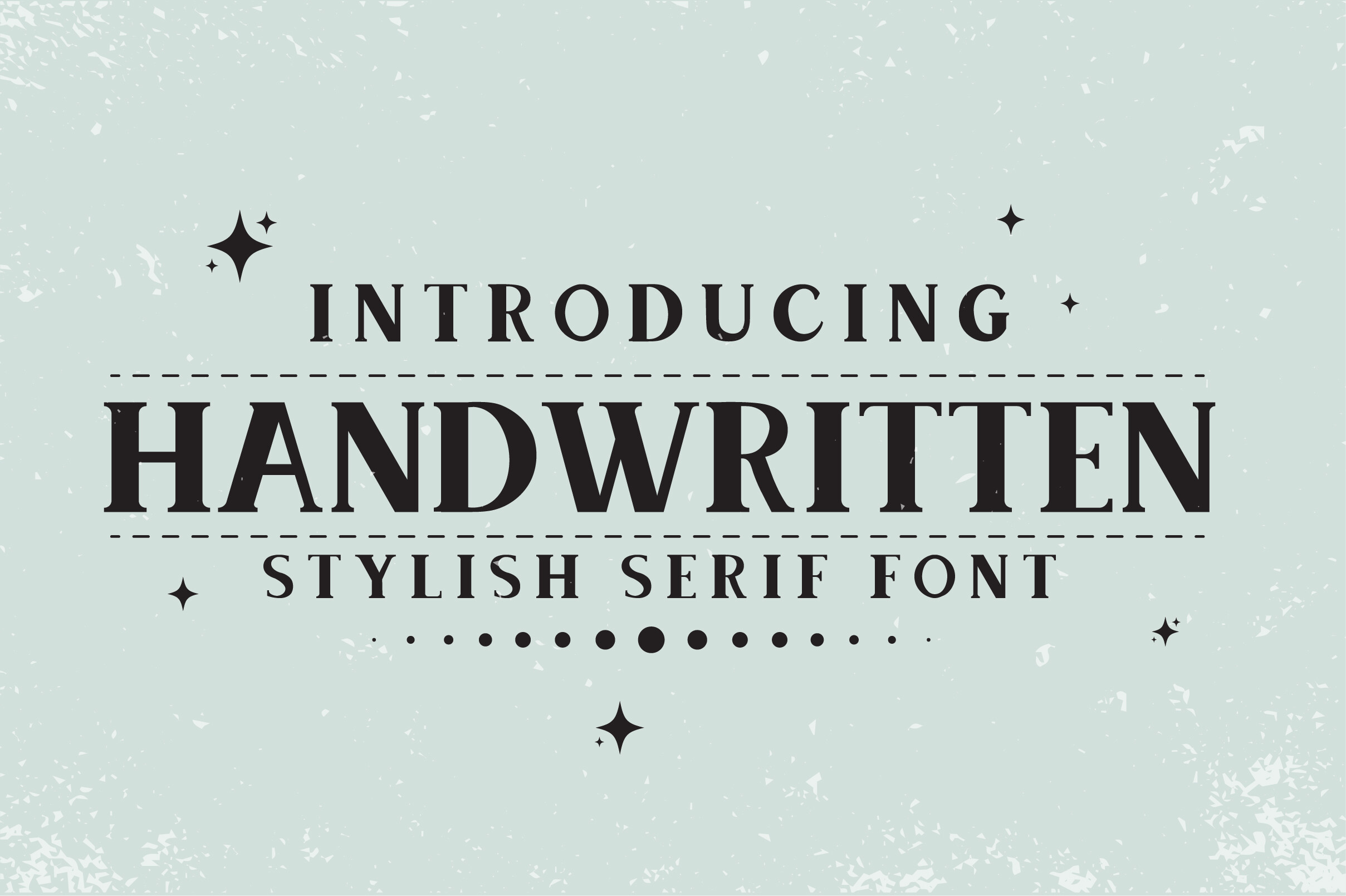
Giveny is a transitional serif with low-to-moderate stroke contrast and slightly squarish round characters, an unusual geometric solidity that most transitionals lack. It is the most broadly functional serif in this list. Book interiors, heritage brand identities, editorial body text, greeting cards: Giveny handles them all without demanding attention it does not need. That restraint is a feature, not a limitation.
Best for: book interiors, heritage brand identity, editorial body text. By: craftsupplyco
8. Quirino
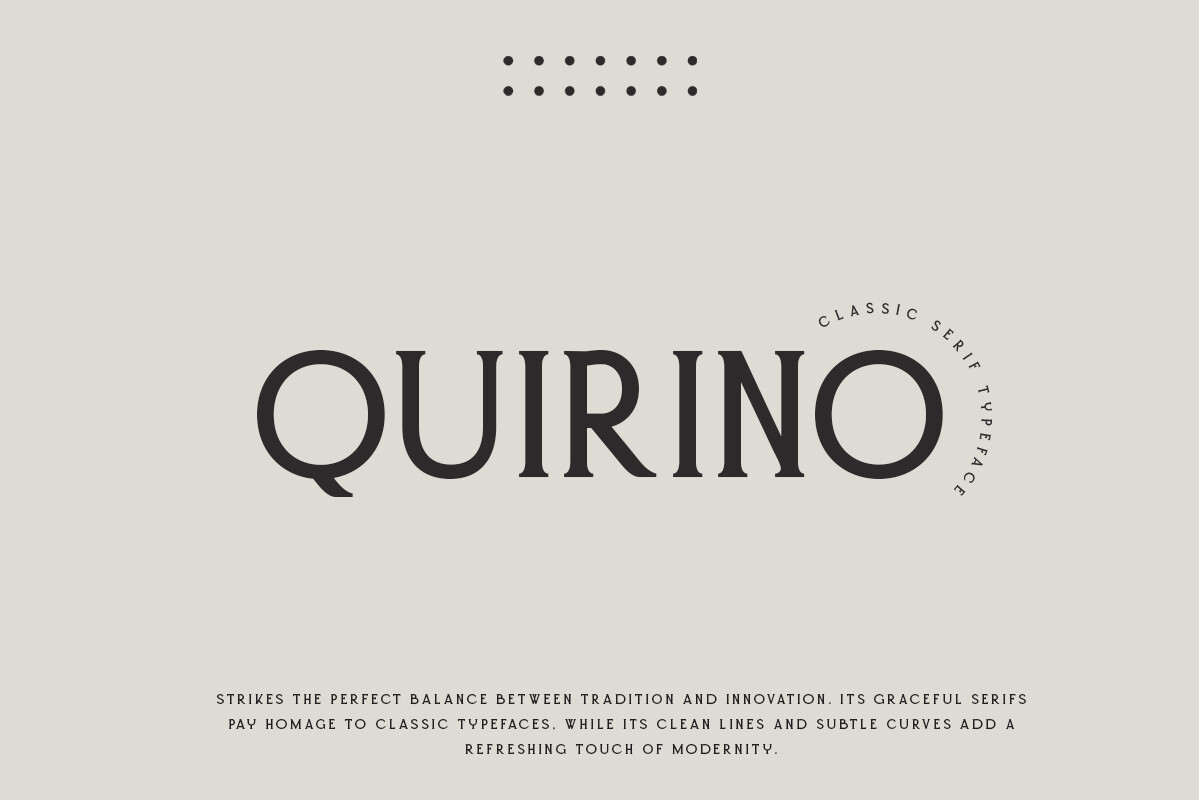
Quirino sits between purely functional and high-fashion: a bridge serif with classical roots and modern proportions. Clean lines and precise curves give it enough character to hold a headline while remaining neutral enough for body copy. It is a strong all-rounder for magazine editorials, certificates, and brand identities that need historical credibility without feeling dated.
Best for: magazine editorials, brand identities with historical roots, certificates. By: roomspace
9. The Oldentime
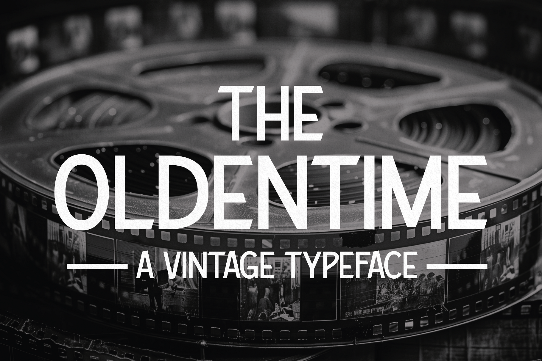
The Oldentime draws from 1920s Hollywood cinema and Art Deco period typography. The nonuniform serifs and high contrast recall theatrical printed ephemera from the roaring twenties: movie posters, event programs, silent-era title cards. Of the vintage serifs here, it is the most era-locked. Use it when the project needs cinematic period specificity, not just a vague sense of nostalgia.
Best for: vintage editorial, antique branding, historical book covers. By: HipFonts
10. American Vintage
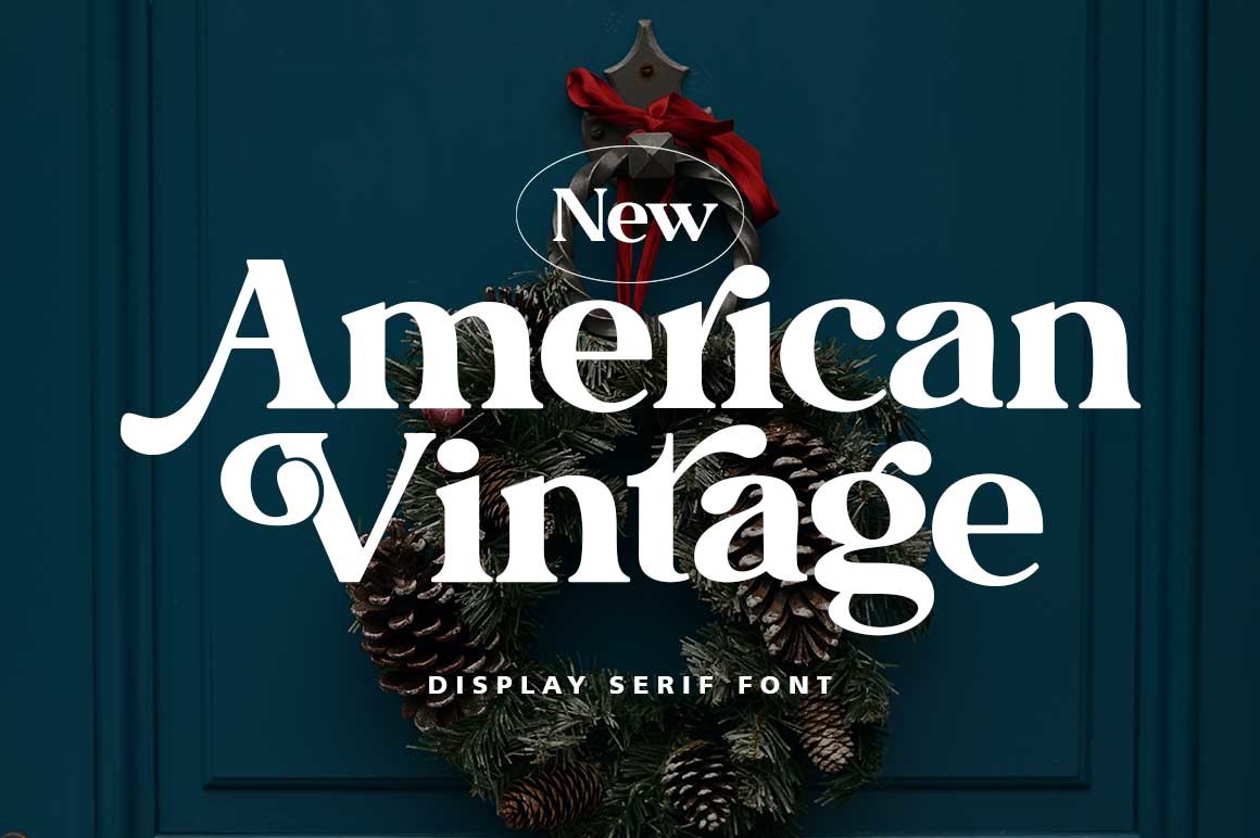
American Vintage references early 20th-century American newspaper typography: warm, approachable nostalgia rather than theatrical period drama. Where The Oldentime is cinematic and formal, American Vintage is the Main Street version. Craft beer labels, artisan food packaging, retro poster design for brands selling authenticity and hand-crafted identity. Refined curves keep it legible at both headline and logo scales.
Best for: Americana branding, craft beer labels, retro poster design. By: luckytype.font
Best Display Serif Fonts
Display serifs are built for large sizes: headlines, covers, wordmarks, posters. They are not body-text fonts. The stroke contrast, letterform complexity, and detail that make them striking at 60pt will make them illegible at 10pt. Use them where size and visual impact are the priorities, not readability at reading scale.
11. Refined Society
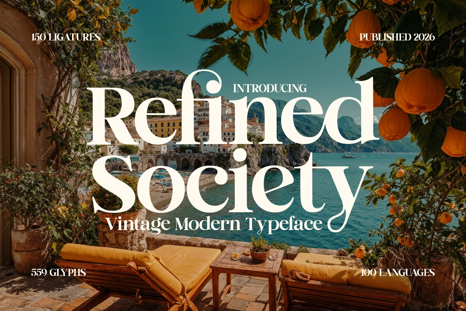
Refined Society brings Mediterranean editorial warmth to the display serif category. High-contrast serifs and a vintage-refined aesthetic position it somewhere between the cool Parisian noir of Charnoir and the sleek Milanese gloss of Gavielle. Think sun-washed architecture, lifestyle editorial, and luxury travel rather than fashion week front rows. It earns its place in the display section through large-scale visual authority.
Best for: high-end fashion branding, editorial headlines, luxury packaging. By: HipFonts
12. Avifan
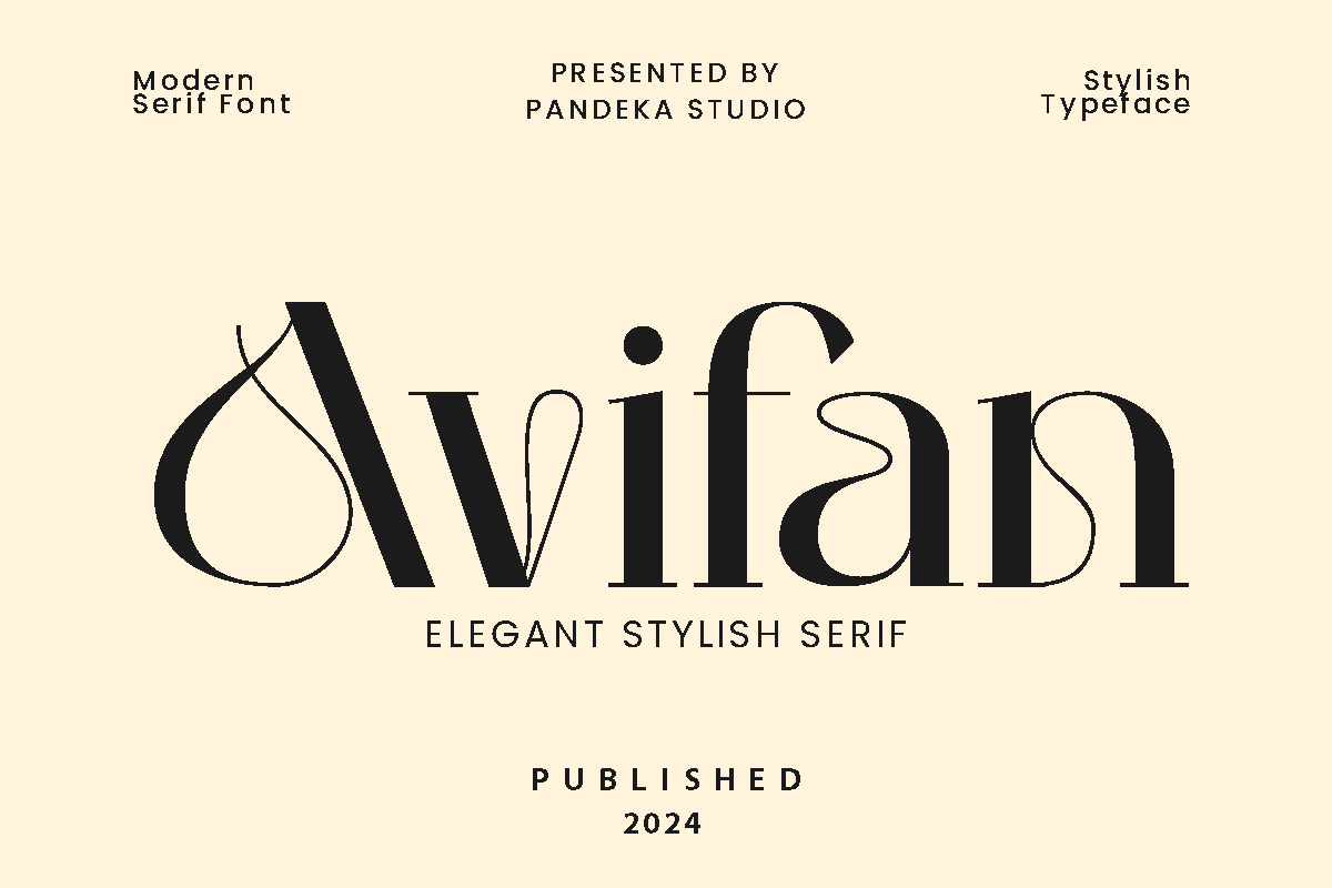
Avifan is the second font from pandekastudio on this list (Garolia is the other), and the two are worth distinguishing. Garolia is warmer, more editorial, and higher contrast. Avifan is cleaner, smoother, and more versatile: the approachable modern elegance option of the pair. Same designer, two different projects. Avifan works across creative agency branding, book covers, and poster design without the editorial specificity that Garolia demands.
Best for: creative agency branding, book covers, poster design. By: pandekastudio
13. Retrofans
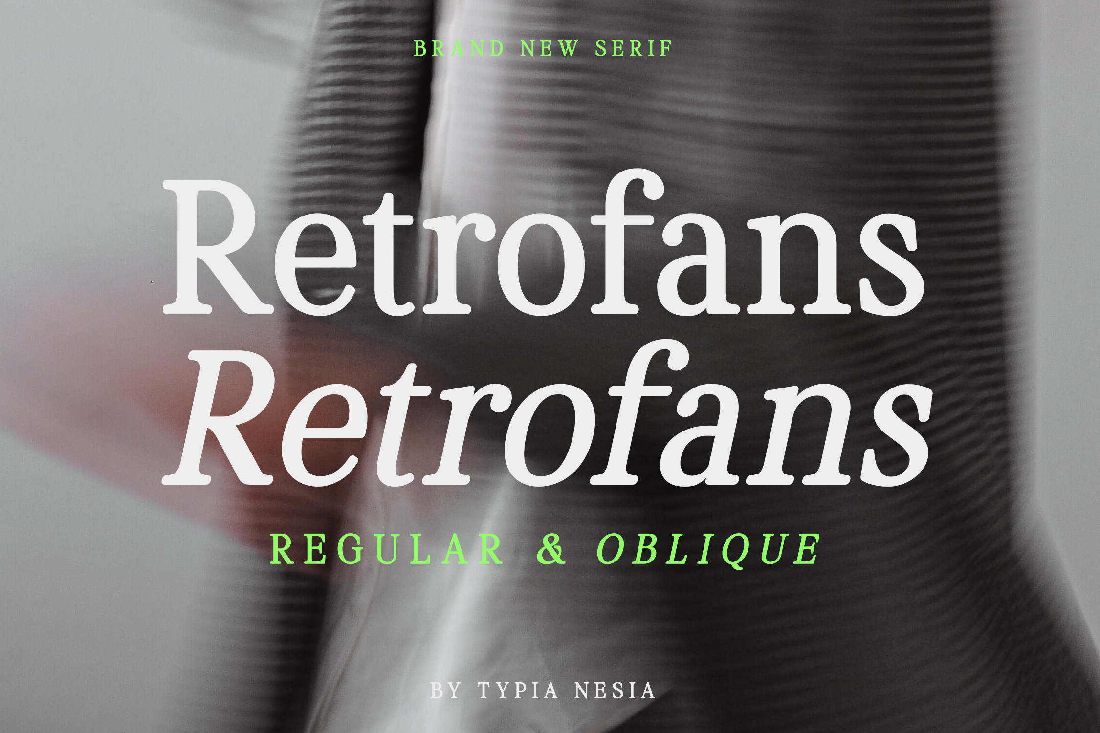
Retrofans channels 1980s and 90s display typography with bold letterforms, playful curves, and a distinct Oblique style that adds slanted dynamic energy unavailable elsewhere in this list. That Oblique is significant: most display serifs are upright-only. This makes Retrofans the right pick for sports merchandise, music posters, and retro branding projects that need movement as well as weight. Pairs well with distress textures.
Best for: retro branding, music posters, sports merchandise. By: Typia Nesia
14. Aubrey
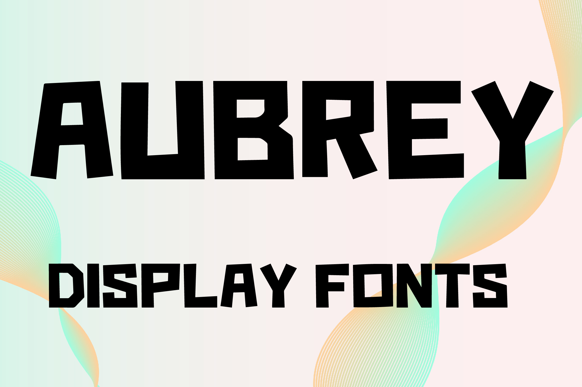
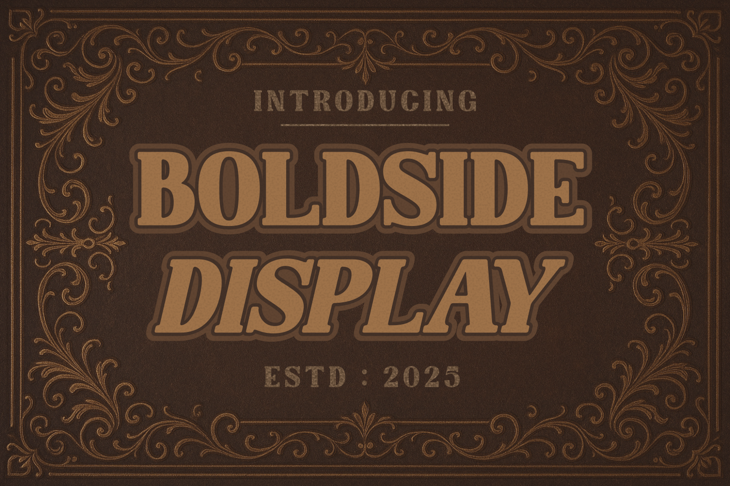
Aubrey is worth being honest about: Creative Fabrica classifies it as a display font, not a traditional serif. Its uppercase-only character set (A-Z plus 0-9), thick letterforms, and geometric cuts with slightly irregular edges make it the most graphic and least conventional serif on this list. Think of it as a display-weight font with serif character. That irregularity gives it handcrafted energy that pure geometric display fonts lack, which makes it strong for bold wordmarks and magazine headers where you want personality, not polish.
Best for: magazine headers, brand wordmarks, art direction projects. By: MOMAT THIRTYONE
15. Gibme Foggie
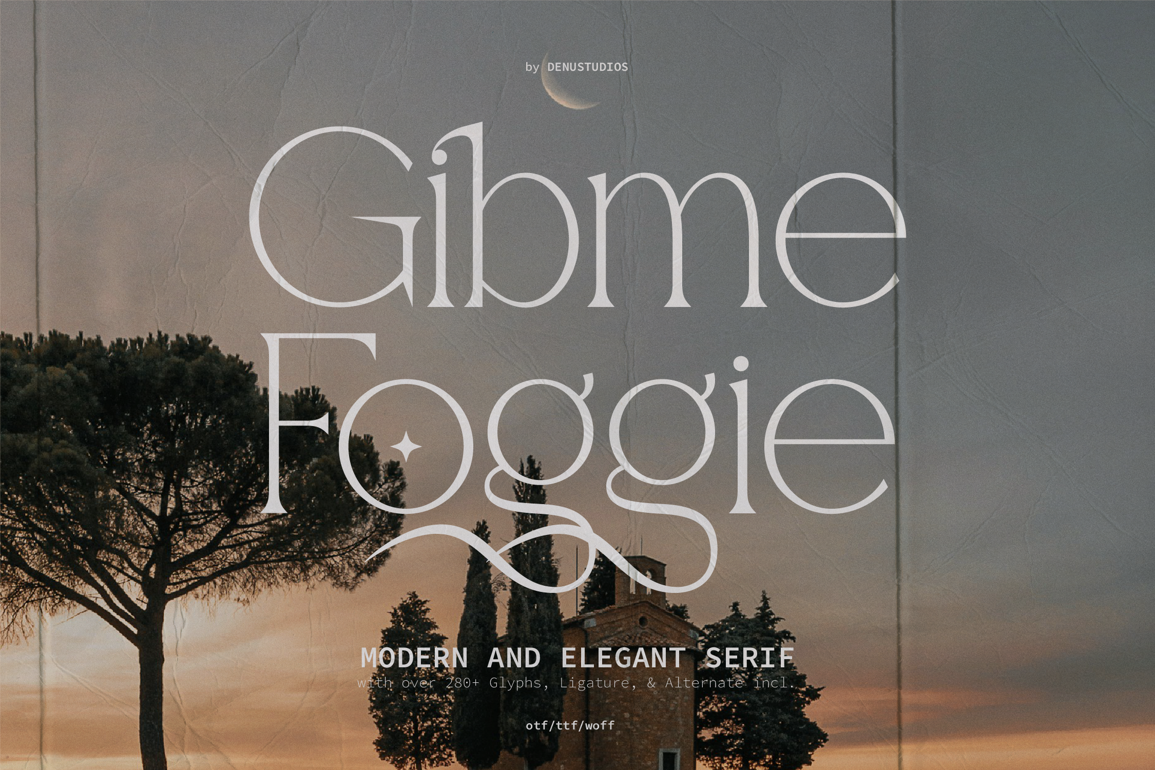
Gibme Foggie is the most technically feature-rich serif in this list. With 280+ glyphs, ligatures, and stylistic alternates, it gives designers real flexibility for complex typesetting work. The academic clarity of its serifs sits alongside contemporary proportions, and the result is an expensive-magazine feel without excessive decoration. If you need a display serif that also handles nuanced typographic detail, this is the pick.
Best for: modern editorial, lifestyle branding, blog headers. By: Denustudios
Best Slab Serif Fonts
Slab serifs replace the angled or tapered serifs of traditional typefaces with heavy rectangular blocks. The result is low stroke contrast, sturdy letterforms, and strong readability even at small sizes. Slab serifs originated in 19th-century advertising and signage: they were designed to shout. Today they signal reliability, strength, and confident straightforwardness. A good slab serif answers the question “what is a slab serif and when should I use one?” with its presence: reach for slabs when you need authority without elegance.
16. Full Slab
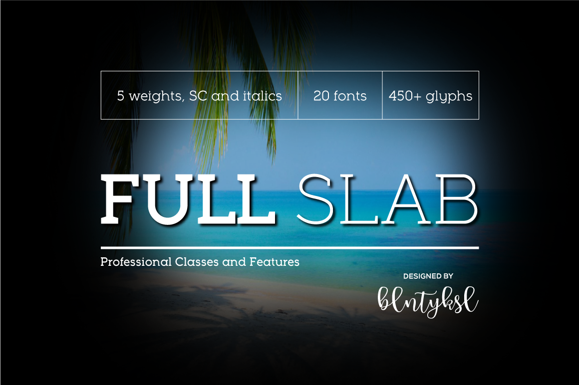
Full Slab is the corporate workhorse of this section. Five weights plus small caps plus italics equals 20 fonts in a single package, with 450+ glyphs. That is the most comprehensive type system in this entire list. Brands or organizations that need a complete serif toolkit rather than a single display font will get the most value here. Structured, built for advertising scale and editorial application alike, it is the kind of purchase you make once and reach for constantly.
Best for: bold advertising headlines, product packaging, outdoor signage. By: blntyksl
17. Slaborn
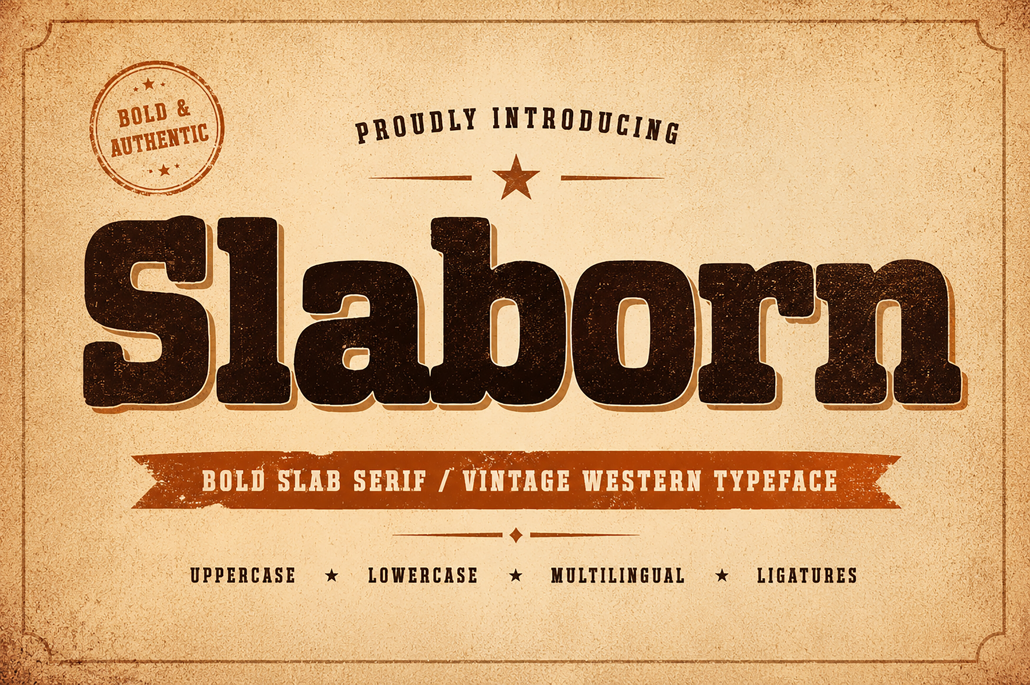
Slaborn is the raw, character-driven counterpart to Full Slab’s polish. Heavy strokes, strong serifs, rugged curves, and western signage inspiration give it an authenticity that refined slab serifs cannot fake. This one was made for whiskey labels, craft coffee packaging, BBQ branding, and any project where looking hand-finished and honest is more valuable than looking corporate. Full Slab is systematic. Slaborn has grit.
Best for: craft branding, food packaging, masculine brand identities. By: Bundle
18. Rodin

Rodin is available for free ($0) on Creative Fabrica, the only font on this list with a zero price tag. That makes it the natural starting point for designers who want to test slab serif in their workflow before committing to a premium option. Beyond the price, Rodin earns its place with bold sculptural letterforms where each character reads as a distinct form. The name fits: this is a slab serif with the presence of carved stone.
Best for: posters, social media posts, packaging design. By: Minimalistartstudio
19. Floralith Slab
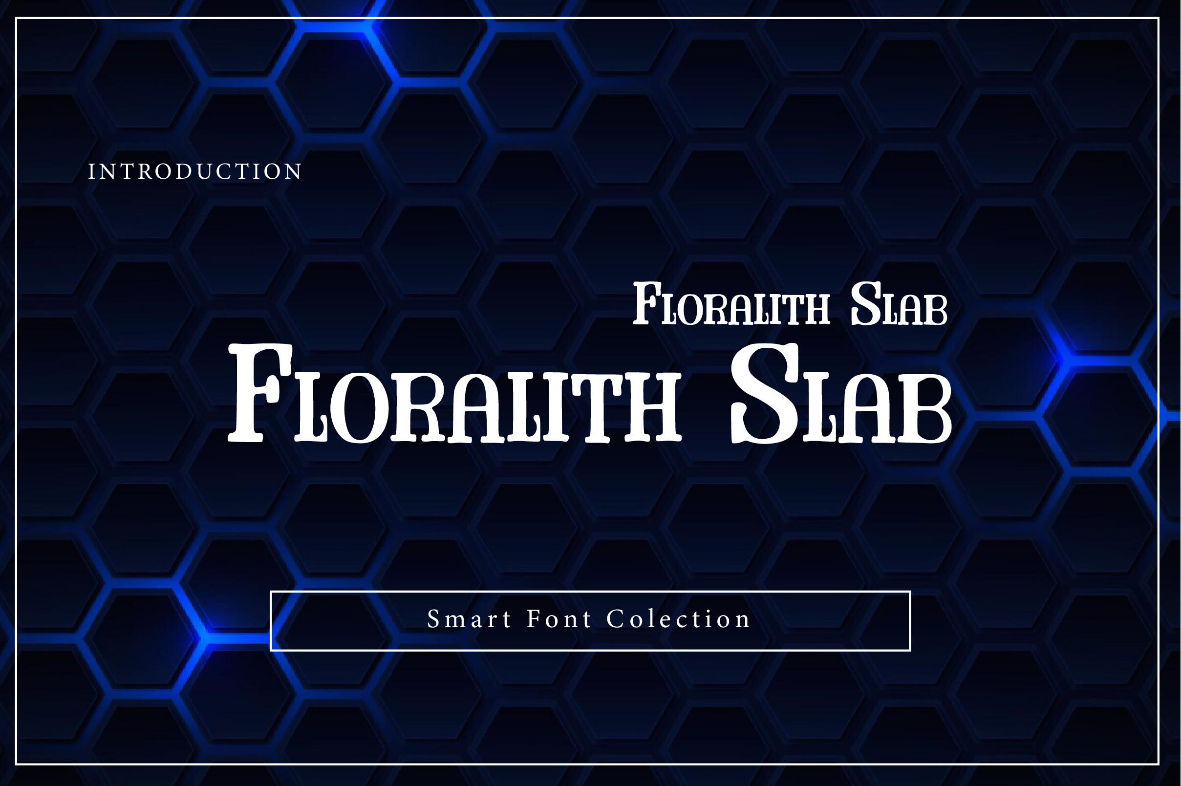
Floralith Slab is the most unexpected entry in the slab section. Decorative curves woven into the slab structure soften the industrial hardness typical of the category, making it ideal for wellness brands, organic product packaging, and botanical editorial where slab serif authority is needed but ruggedness is not. It pairs especially well with monoline scripts: that combination carries a natural, artisanal quality that Slaborn and Full Slab cannot reach.
Best for: nature-inspired branding, wellness products, botanical editorial. By: Wow Magic
20. Selebor
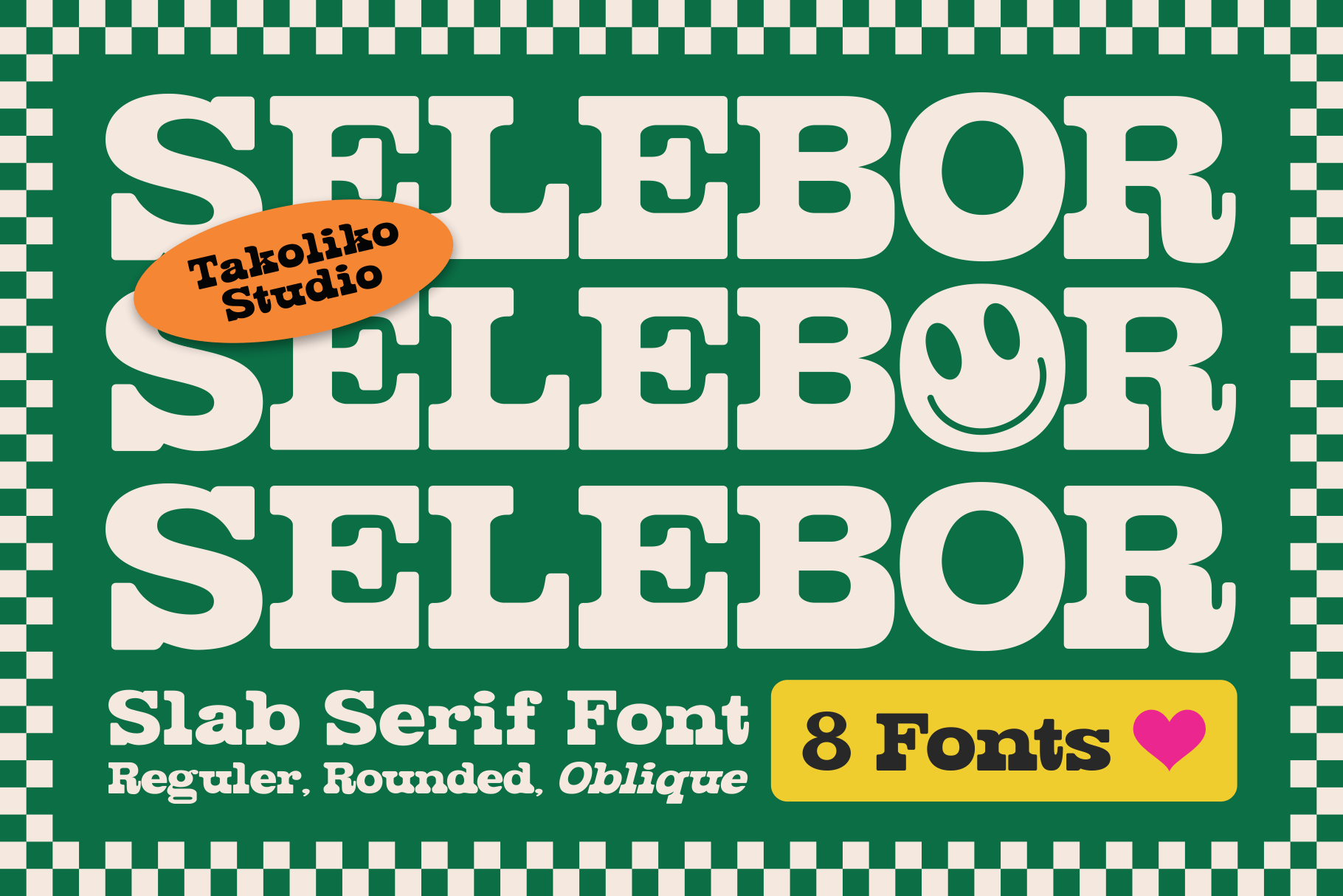
Selebor rounds out the list with a 1980s and 90s retro-cartoon aesthetic that stands out more than expected. It flexes between playful and structured depending on context. Where Retrofans is bold and headline-forward, Selebor is more approachable and product-focused: stickers, apparel graphics, food logos, retro-branded merchandise. The vintage cartoon vibe is unique in this collection. It can flex between fun and formal in a way that heavier slab serifs resist.
Best for: stickers, apparel, food logos, retro branding. By: takoliko
How to Use Serif Fonts in Your Designs
The first practical question is size. High-contrast serifs, the Didone-influenced ones with hairline horizontal strokes, lose their hairlines on low-resolution screens. They are display-only. Use them at 40px and above in digital contexts. Transitional and slab serifs are safer choices for web body text: aim for 16 to 20px on screen, 9 to 12pt in print, with 1.5 to 1.7x line height and 60 to 80 characters per line. At those settings, reading speed and comprehension match what you get from sans-serifs.
The second question is pairing. The reliable rule is to pair fonts from different classification categories. A transitional serif heading with a humanist sans-serif body is one of the most tested combinations in editorial design. Concrete pairs that work: Playfair Display + Inter for luxury-editorial, Lora + Manrope for modern-warm, Merriweather + Open Sans for maximum accessibility, Cormorant Garamond + Lato for premium-understated. The pattern is consistent: a characterful serif at large size, a neutral sans at reading size.
For digital design, serifs work well in two contexts: display headings and long-form body copy (blogs, articles). They struggle in dense UI elements and small-screen navigation menus. In print, they are safe at nearly any size because print resolution eliminates the hairline-dropout problem that digital contexts create.
Tip: In tools like Figma, Canva, Adobe Illustrator, and Cricut Design Space, test your chosen serif at multiple sizes before committing. A font that looks perfect on a mockup at 200% zoom can disappoint at actual print or screen size.
Contemporary branding increasingly runs a dual-layer system: an expressive display serif for hero headlines, then a quieter editorial serif for body copy. It gives projects both visual impact and sustained readability, without one fighting the other.
Tips for Choosing the Right Serif Font
Define the project style before opening a font browser. A luxury cosmetics brand and a craft brewery both need a serif, but they need completely different serifs. Write down two or three adjectives that describe the intended feeling before you start scrolling.
Test at small sizes. A font that looks elegant at 72pt may lose its personality or become difficult to read at 10pt. If the font will be used for body copy or small logos, test it there first.
Check the license. Commercial use means you can use the font in client work, on products, and in published designs. Personal use means you cannot. Every font on Creative Fabrica comes with a commercial license, which is a significant practical advantage over free-font repositories where license terms vary wildly. If you are doing client work, this matters.
Note: Never rely on the preview image alone. Download the font, place it in your actual layout, and check it against your real colors, sizing, and surrounding elements. Fonts behave differently in context than they do against white space.
Consider the font family depth. A font with Regular, Bold, and Italic variants gives you flexibility for headlines, body copy, emphasis, and pull quotes within a single cohesive style. A font with only one weight limits your options. Full Slab’s 20-font package is the extreme example of why family depth matters for complex projects.
Where to Download Serif Fonts
Creative Fabrica is the strongest single source for the fonts in this list. Every font above links directly to its Creative Fabrica product page with a commercial license included. The platform has hundreds of serif options across styles, and you can browse the full serif category at Creative Fabrica’s serif fonts collection. If you want free options to test before committing, Rodin (#18) is available there at no cost.
Google Fonts is the best free resource for web-ready serif fonts. Fonts like Merriweather, Lora, and Playfair Display are open-source, self-hosting friendly, and well-optimized for screen rendering.
DaFont and Font Squirrel are useful for experimentation and personal projects. DaFont has a large catalog of free decorative and display serifs. Font Squirrel filters specifically for commercial-use-safe free fonts, which makes it more reliable than DaFont for anything beyond personal use. Neither matches Creative Fabrica for quality consistency or licensing clarity, but they are solid starting points for designers exploring the category before investing in premium options.
For more typography guides and font roundups, visit the FontPro blog.