· fonts · 13 min read
13 Best Fonts for Logos and Brand Identity in 2026
Discover 13 logo fonts for modern, luxury, bold, and personal brands, with practical tips for readability, pairing, licensing, and brand identity design.
A logo is the smallest version of your brand. It has to work on a favicon, a business card, a storefront sign, and a social profile. The best fonts for logos need clear letterforms, a strong silhouette, and a style that matches the personality you want customers to feel.
I have seen too many beautiful wordmarks fail because nobody checked them at 16 pixels. The type looked great in the mockup, but it turned into a blurry shape in the browser tab. That is the first test I run.
Recent rebrands show how much type can change a brand. Pepsi updated its wordmark in 2023 with a bold capital-letter style. Burberry brought back a serif to add personality after years of a stripped sans-serif. RE/MAX moved to an ultra-bold, compressed look in 2025, while Pixiv shifted to a cleaner sans-serif with thicker lines. Typography for branding is a strategic choice. It shapes how people read the brand before they read a single word.
What Makes a Great Font for a Logo?
A great logo font balances readability, legibility, and personality. Readability is about the message. Legibility is about the letters. A logo needs both, especially when it shrinks.
Size is the first test. Text becomes hard to read below about 32x32 pixels, and at 16x16 a logo usually needs a single character or icon version. A useful favicon checklist includes 16x16 for browser tabs, 32x32 for taskbars, 48x48 for search results, 180x180 for Apple touch icons, and 192x192 for Android. If your wordmark turns into a muddy shape at these sizes, the typeface may be too detailed.
Tip: Put the wordmark next to a 16x16 square before you fall in love with it. If the letters disappear, the style is doing too much work.
Scalability matters just as much. A font that looks sharp on a business card should still hold up on a billboard. Look for open counters, clear spacing, and a silhouette that remains recognizable when reduced. A unique letterform can help your mark stand out, but it should not sacrifice clarity.
Style also carries meaning. Serif logo fonts often signal trust, authority, tradition, and luxury. Sans-serif logo fonts feel modern, clean, and minimal, but they can feel cold without color, spacing, or a custom touch. Bold display fonts create impact. Monogram fonts for logos feel personal, boutique, or ceremonial. The right answer depends on your brand. Trends can be a starting point, but they should not make the decision.
Recent rebrands prove the point. Reddit, Western Union, Nokia, Ocean Spray, and Later all updated their logo fonts or marks in 2023 or 2024 to sharpen clarity, personality, or brand direction.
A logo font should age well. Avoid trend-heavy details or extreme distortion. A neutral structure with one memorable detail is safer. I would rather choose a font that still works in five years than one that looks clever today.
13 Best Fonts for Logos and Brand Identity
The list below groups the best fonts for logo design and fonts for brand identity by the brand personality they support. Start with the style that matches your business, then test the typeface at small and large sizes before you commit.
I grouped them by the job they do best. That makes it easier to skip the styles that do not fit your brand and focus on the ones that do.
Sans-Serif & Geometric Fonts for Modern Logos
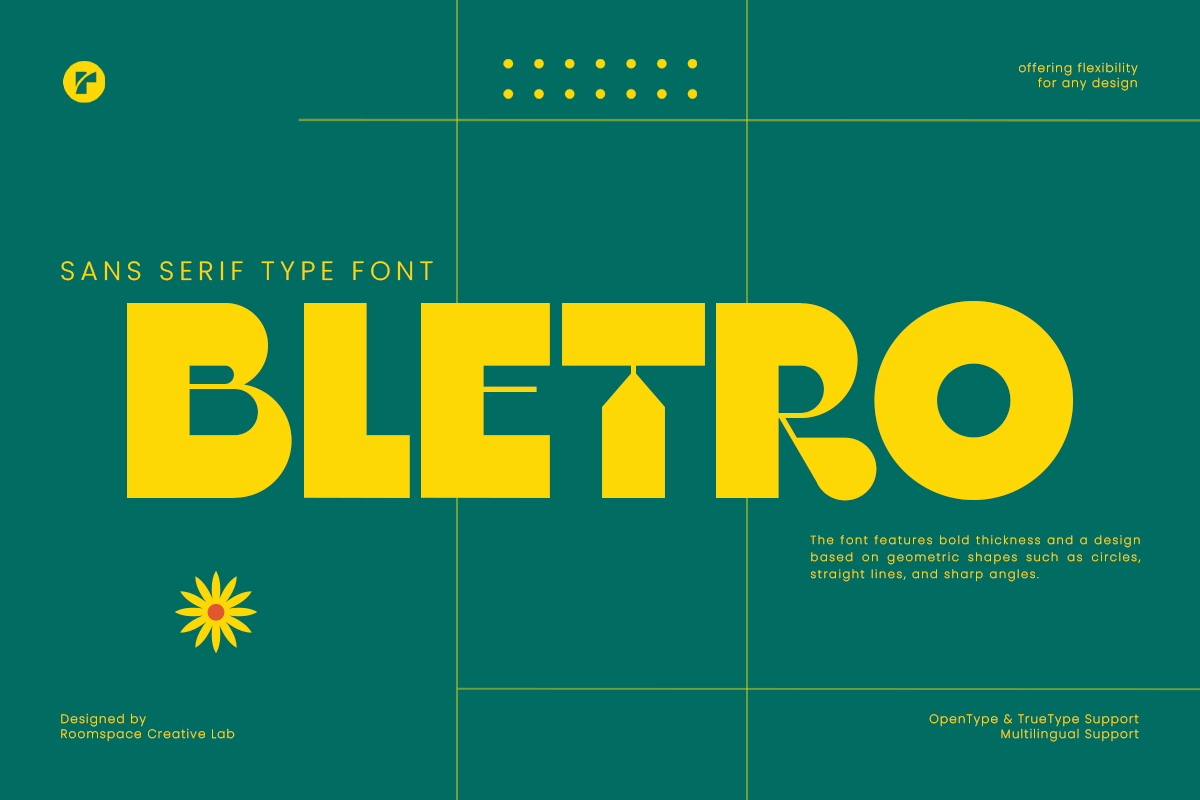
These modern logo fonts suit tech, startup, SaaS, and minimal brands. They favor clean lines, even spacing, and a calm, confident look. If your brand needs to feel current without shouting, start here.
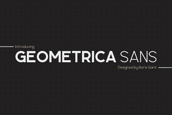
1. Geometrica Sans
Geometrica Sans has a structured, geometric feel that works well when a brand wants to look precise and current. Its clean forms are useful for wordmarks that need to stay legible in digital spaces, from app icons to website headers. I like it for app style marks where the name needs to look neat in a small header.
Best for: tech logos, startup wordmarks, minimal app branding. By: Boris Garic
2. Keratus
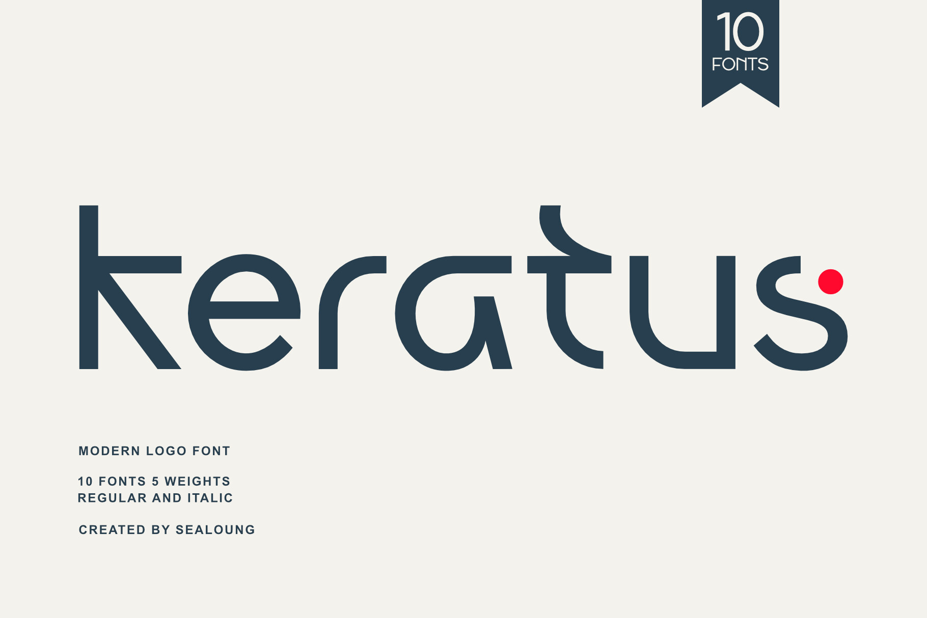
Keratus is a modern sans with a flexible, scalable shape. It is a strong choice for minimalist logo fonts when the name needs to look clean on a website, a label, or a small social avatar. It also helps when the brand name is short and the logo needs to feel calm.
Best for: minimal wordmarks, modern service brands, clean label logos. By: Sealoung
3. Propaganda
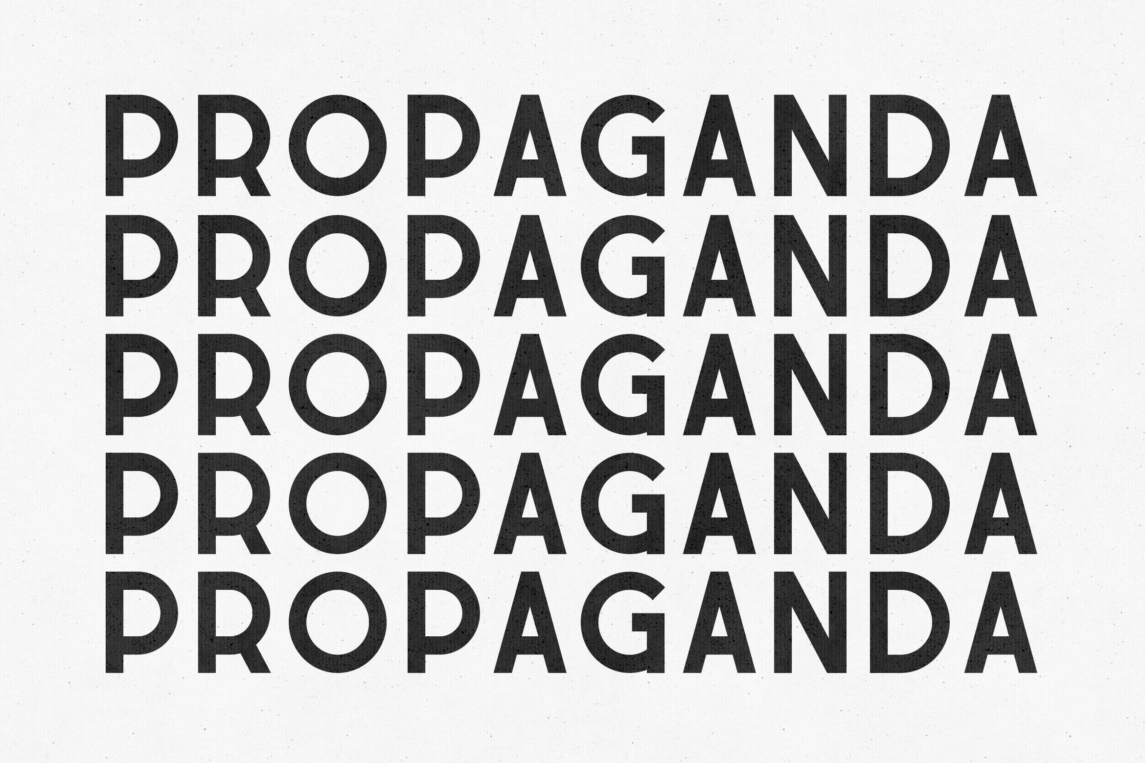
Propaganda brings more attitude to the geometric sans category. It feels confident and visible, which makes it useful for brands that want a modern logo font with a little extra presence. It gives a wordmark more presence without turning it into a poster type.
Best for: bold startup logos, modern agency marks, confident wordmarks. By: vladfedotovv
4. Moste
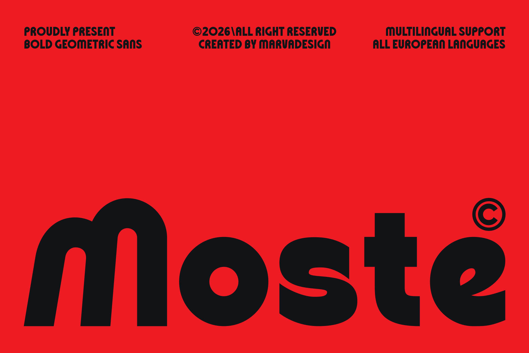
Moste is a neutral, contemporary sans that can fit a wide range of logo projects. Its calm tone makes it a practical option when you want a modern look without a strong stylistic statement. If the brand is still finding its voice, this is a safe place to start.
Best for: versatile wordmarks, small business logos, clean brand identity. By: Marvadesign
Serif & Luxury Fonts for Elegant Brands
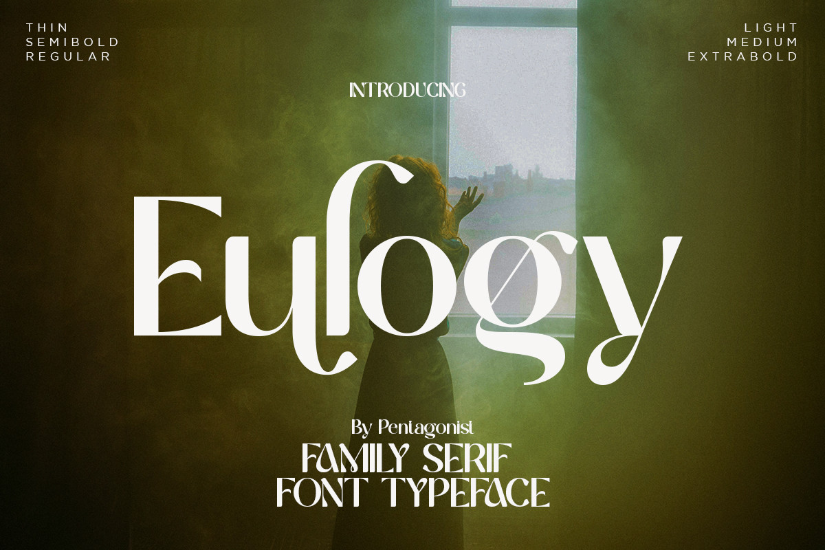
These serif logo fonts are built for fashion, beauty, hospitality, and premium brands. They add authority, refinement, and a sense of tradition without needing extra decoration. They carry weight in the letterforms, so the brand does not need extra ornament to feel premium.
5. Agenova
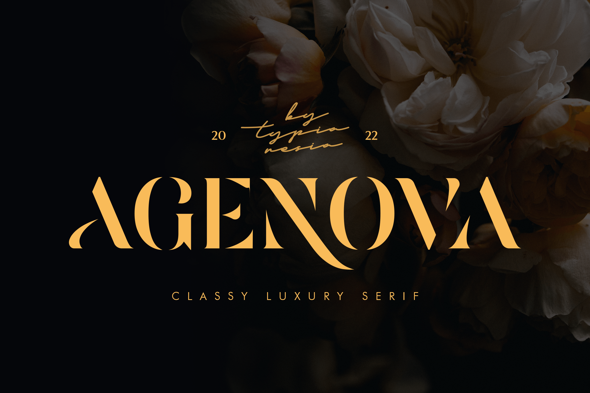
Agenova has an elegant serif structure with a high-contrast feel. It suits brands that want to look polished and premium, especially when the logo is used in fashion, beauty, or upscale service settings. The contrast gives it a premium feel, but I would still check the thin strokes at small sizes.
Best for: fashion logos, premium beauty brands, elegant wordmarks. By: Typia Nesia
6. Aostora
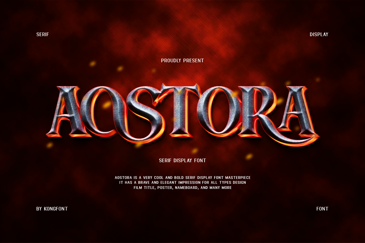
Aostora carries a refined, luxury character that works well for brands aiming for a sophisticated impression. It is a good fit for beauty, hospitality, and boutique identities where elegance is part of the message. It works well when the brand wants to feel established, even if it is young.
Best for: beauty logos, hospitality brands, boutique wordmarks. By: fontkong
7. Delove
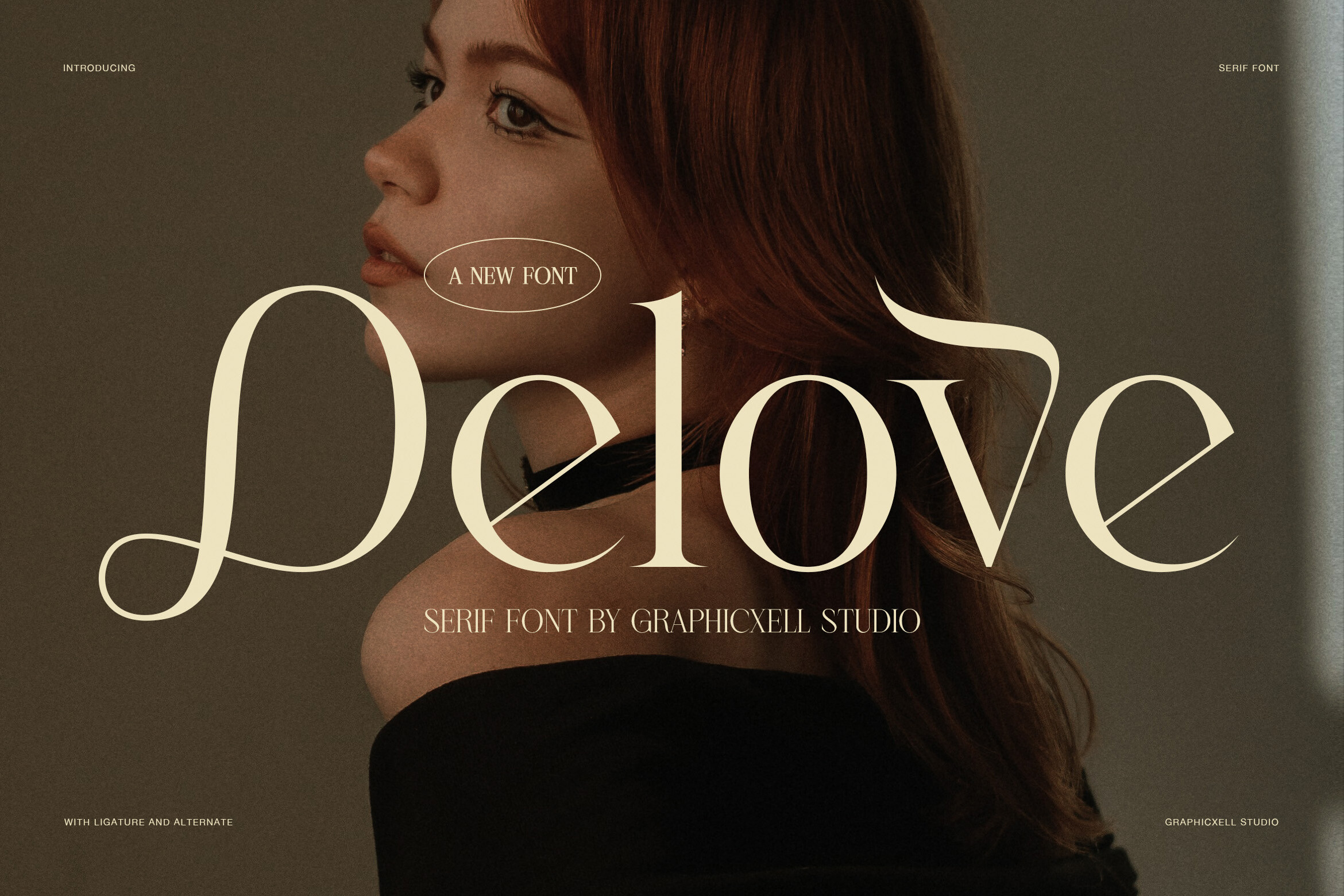
Delove has a romantic serif feel with softer details. It works for boutique brands, wedding-adjacent studios, and personal brands that want warmth and charm while staying polished. The softer details make it feel warmer than a classic serif, but it still needs enough contrast on light backgrounds.
Best for: boutique logos, wedding studio marks, warm personal brands. By: Graphicxell
8. Crown Monarch
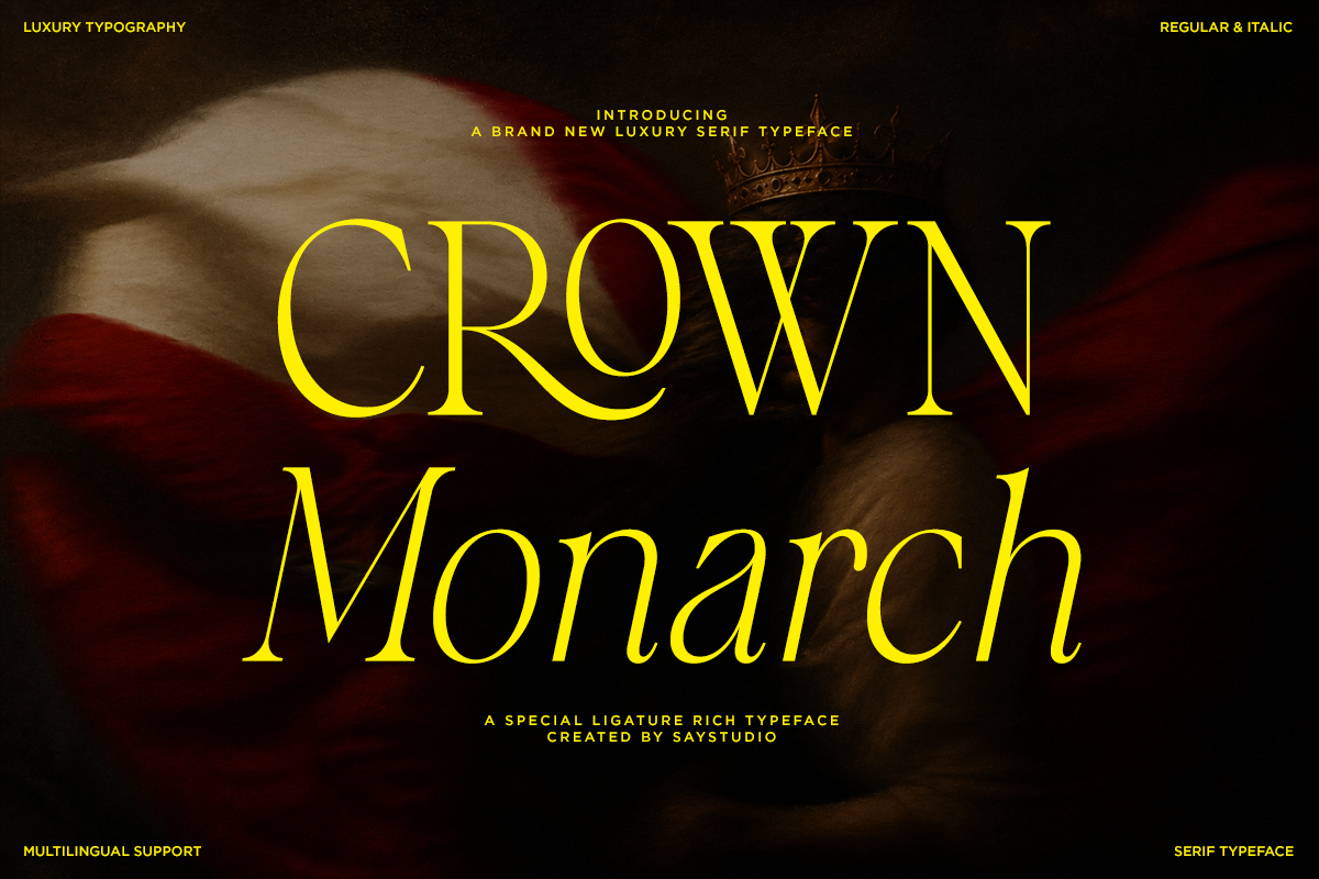
Crown Monarch has a status-driven serif character that feels authoritative and upscale. It is useful for luxury brands that want a wordmark with a regal, established impression. It suits brands that want to feel established and a little formal.
Best for: luxury logos, authority brands, premium wordmarks. By: SayStudio
Bold Display Fonts for Standout Logos
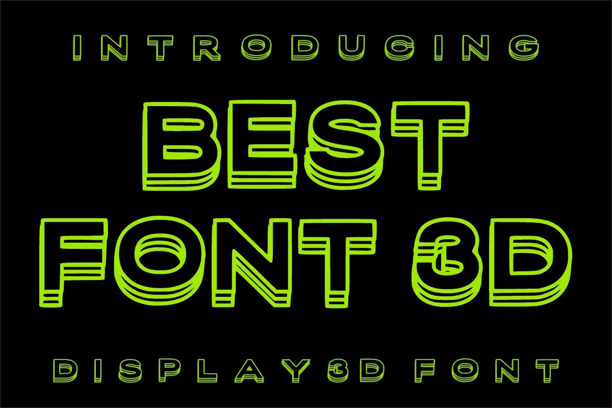
Bold display fonts for logos are for brands that need visual impact. They suit sports, food, entertainment, and bold startups that want to be noticed quickly. Use them when the logo has to stop a scroll or read from across a room.
9. Roxhela
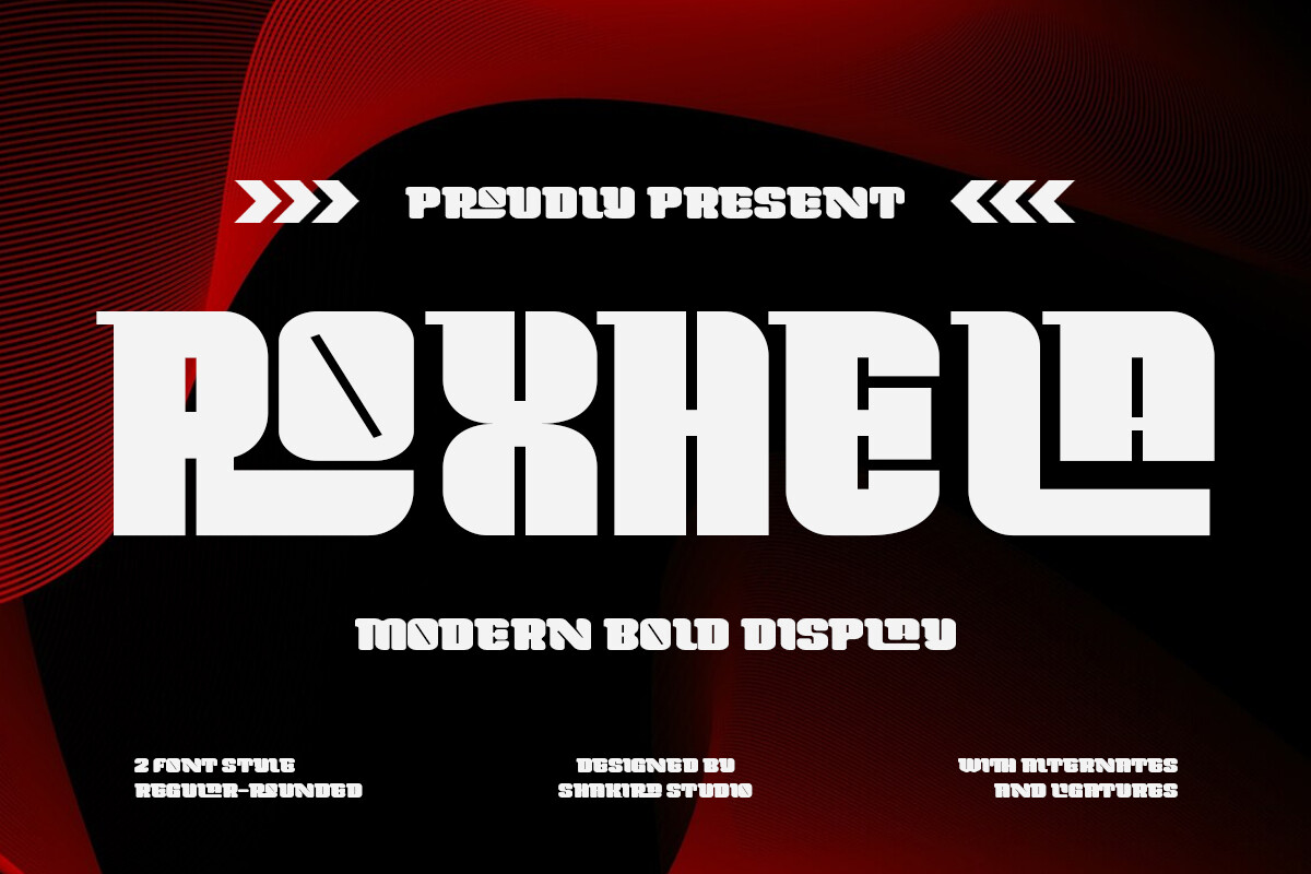
Roxhela is a bold display font with strong energy. Its heavy presence helps a logo stand out, even when the mark is reduced for social profiles or small print. It is the kind of font that can carry a short brand name with confidence.
Best for: sports logos, food brands, high-energy startup marks. By: Shakira Studio
10. Monarch
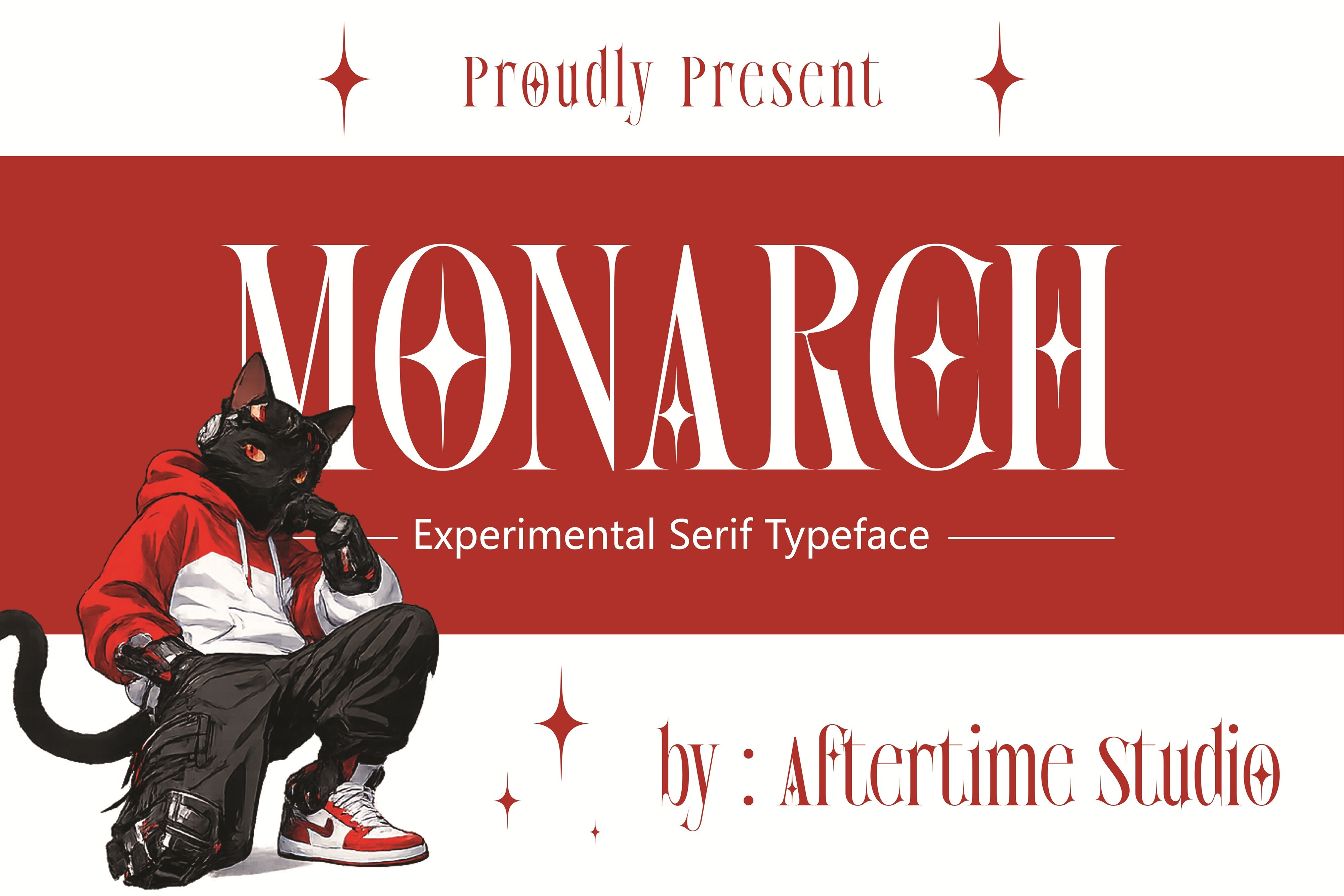
Monarch is a powerful display typeface with a strong silhouette. This is a different option from Crown Monarch above, which is a serif luxury style. Monarch is built for distance and impact, making it useful for marks that need to read clearly from far away. I would use it when the mark needs to be read from a distance, not just admired up close.
Best for: bold brand marks, entertainment logos, impactful wordmarks. By: AftertimeStudio
11. Calios
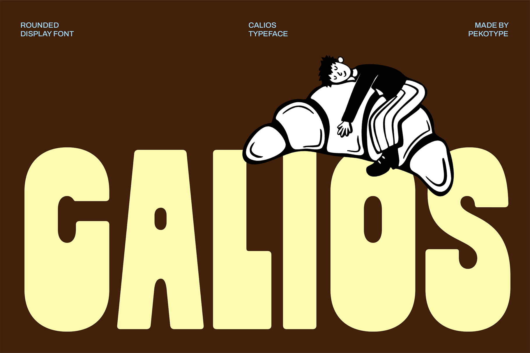
Calios is a bold display font with a memorable visual accent. It suits brands that want a distinctive mark without losing the clarity needed for everyday use. The accent gives it a memory point, which helps when the logo has to compete in a crowded feed.
Best for: standout logos, creative brands, memorable wordmarks. By: pekotype
Monogram & Decorative Fonts for Personal Brands
Monogram fonts for logos are ideal for initials, boutique identities, and personal brands. They can feel ceremonial, elegant, or handcrafted, depending on the details. They are also useful when the full name is too long for a small mark.
12. Sylvaris Split Monogram
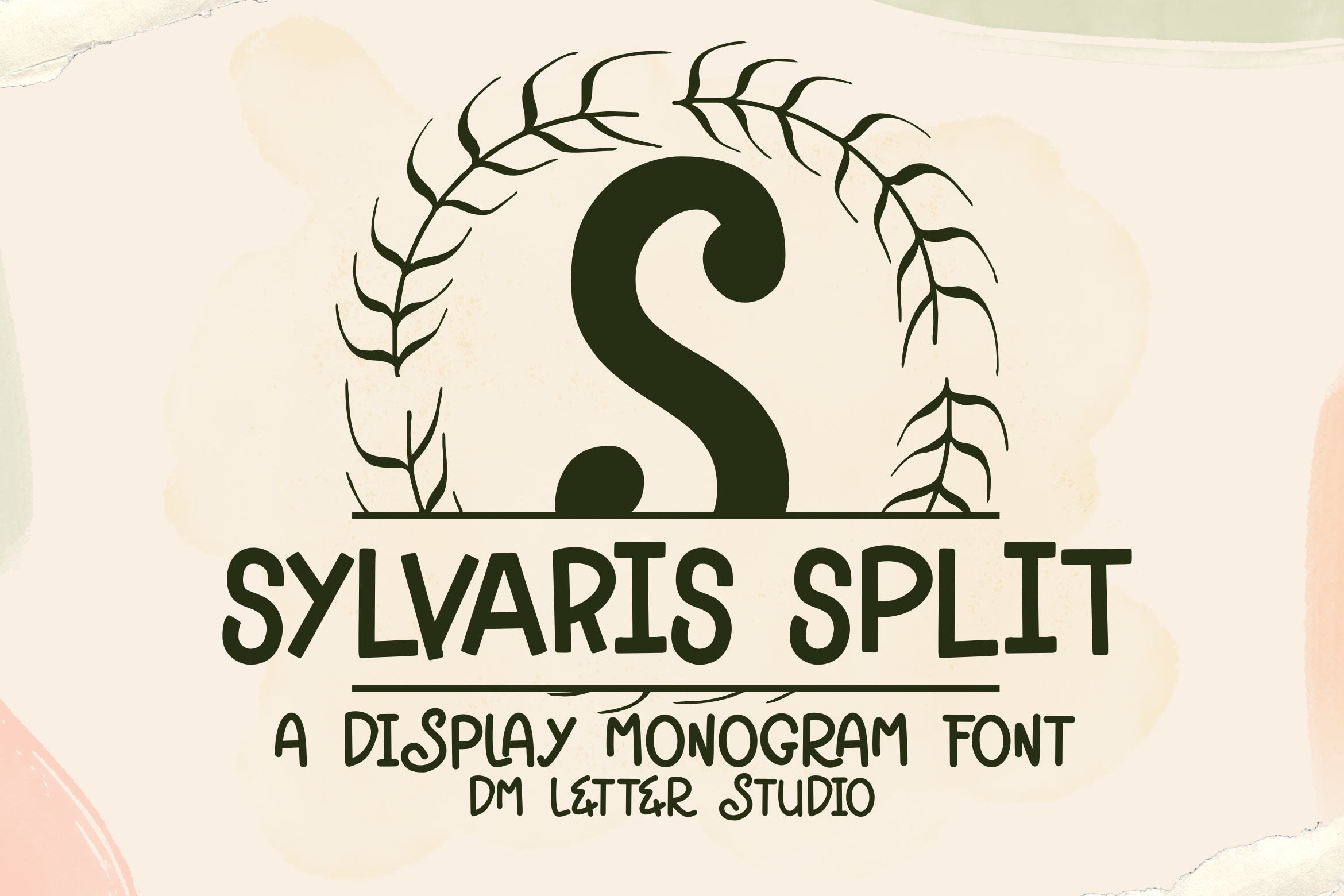
Sylvaris Split Monogram uses a split, two-part construction that makes initials feel structured and intentional. It is a strong choice for boutique brands, personal logos, and wedding studios that want a mark with a crafted feel. The split structure gives initials a little more architecture than a simple stacked monogram.
Best for: initial logos, boutique brands, wedding studio marks. By: Sharon (DmStudio)
Download Sylvaris Split Monogram
13. Vinetta Monogram
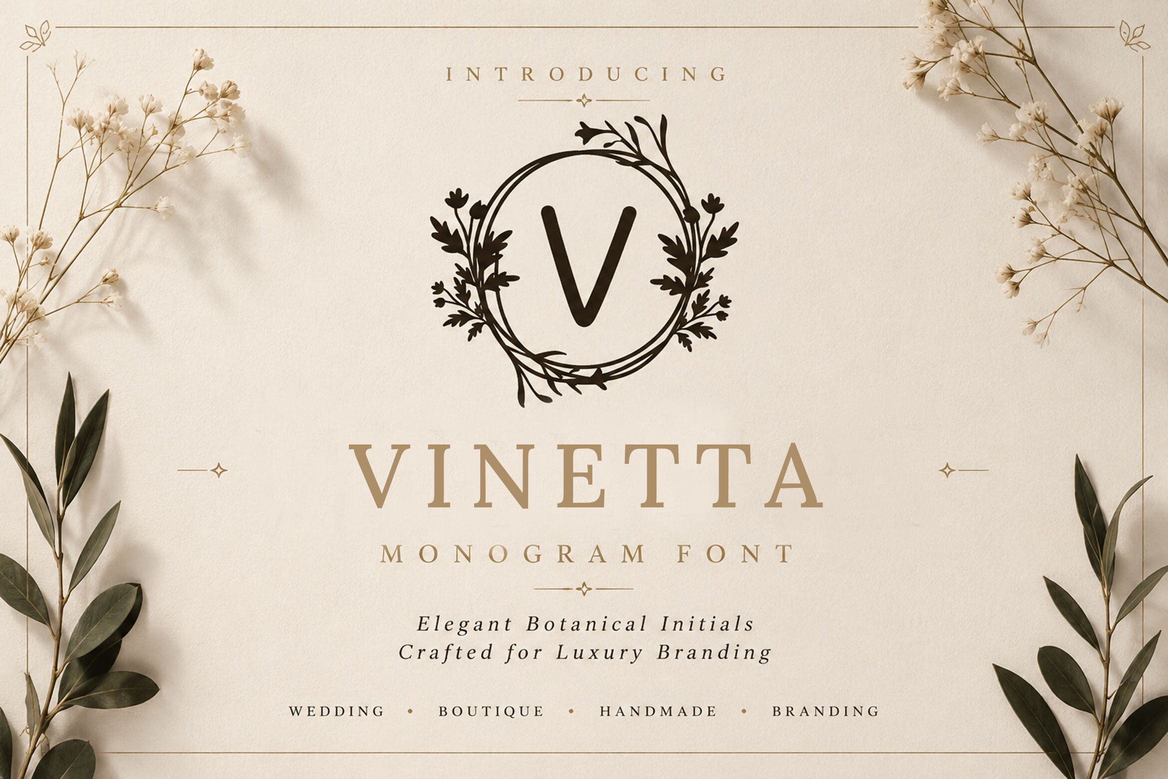
Vinetta Monogram is a single decorative form with an elegant, ornamental feel. Unlike the split construction of Sylvaris Split Monogram, it is better for brands that want one refined monogram shape rather than a divided initial mark. It feels more like a finished badge element than a plain set of initials.
Best for: luxury monograms, boutique identities, elegant personal brands. By: handles creative
How to Use Logo Fonts in Your Branding Projects
Start with one statement font for the wordmark. If you need a second typeface, keep it neutral and let it support the tagline, descriptor, or category line. I usually match x-heights first. Fonts with similar x-heights often feel balanced, even when their letterforms are different.
Test the logo in three environments. First, shrink it to favicon sizes and social avatar sizes. Second, enlarge it to billboard or storefront scale. Third, check it in black and white. If the mark loses clarity without color, the letterforms may be too dependent on contrast.
Standard desktop font files usually work in Canva, Adobe Illustrator, and Figma after you install or upload them. In vector tools, convert text to outlines before final delivery if you need to protect the exact shape. In Canva, keep a text layer if you plan to edit the name later.
Create a small brand guideline page with primary color, black, white, and minimum size. Note what not to do, such as stretching the wordmark or using low-contrast backgrounds. I like to make a tiny test sheet with the wordmark, the initials, and the category line. It keeps the brand consistent without turning into a full manual.
If you use a monogram, test the initials alone. They should work on favicons, stamps, and packaging seals without the full brand name.
A simple workflow helps:
- Choose one primary logo font.
- Add one supporting font only if the layout needs hierarchy.
- Test at 16x16, 32x32, 48x48, 180x180, and 192x192.
- Check readability in grayscale.
- Save the final logo as a vector file when possible.
Tips for Choosing the Right Font for Your Logo
The best font style for a logo depends on the personality you want to communicate. If your brand feels traditional, authoritative, or luxury, start with serif logo fonts. If it feels modern, clean, or tech-forward, start with sans-serif logo fonts. If it needs energy and attention, look at bold display fonts. If it is personal, boutique, or initials-based, consider monogram fonts.
These fonts are not automatically free for commercial logo use. A standard desktop license does not always cover logo or trademark use. Some foundries require separate negotiation for logo rights, and reported one-time logo licensing fees can run from $500 to $2,000 or more, depending on the foundry and the size of the company. Always read the specific license before using a typeface in a commercial logo.
Note: If the license says desktop use only, do not assume the logo is covered. Logo use can be a separate category.
If you are searching for free commercial fonts for logos, check the license on each product page. A free download does not always mean free commercial use, and a free font may still have restrictions on logo or trademark use. For the Creative Fabrica fonts above, verify the terms on the product page before launch.
Compatibility is usually straightforward. Most desktop fonts work in common design tools, but you should still test the file in your workflow. If you are building a wordmark in Figma, Canva, or Adobe Illustrator, make sure the font installs correctly and that your spacing remains stable at small sizes.
You do not need multiple typefaces. Explore contrast, weight, spacing, and case within one family before adding a second font. A quick way to check personality is to say the brand name out loud in the typeface. If the letters feel too busy, the name will feel busy too.
A supporting font should come from the same general design planet. It should not fight the wordmark. A neutral sans often supports a geometric or serif primary font.
Finally, keep the brand message consistent. A logo font should match the voice of the business. A law firm, a coffee shop, and a SaaS startup can all use clean type, but the details of the letterforms should reflect the feeling each brand wants to create.
Where to Download Fonts for Logos
Creative Fabrica is a strong source for premium logo fonts, especially when you want a larger library and clear product pages for checking style and license details. The fonts in this list are available there, and each product page gives you the preview, designer credit, and download link. I also check the product page for the designer name, because a consistent designer can help you find related styles.
For free options, you can also browse libraries such as Google Fonts and DaFont. They are useful for quick tests and low-budget projects, but you should still verify commercial and logo use before putting a typeface into a real brand identity.
Before downloading, zoom out until the preview looks like a favicon. If details disappear, choose a simpler style.
If you want more typography for branding examples, workflow tips, and font comparisons, see the FontPro blog.