· fonts · 13 min read
16 Best Fonts for Packaging Design in 2026
Discover the 16 best fonts for packaging design, from cozy food scripts to luxury serifs and bold retail type. Download free and premium label options.
Choosing the right fonts for packaging design can make or break your product on the shelf. A label has only seconds to catch attention, communicate quality, and build trust with shoppers. Whether you are designing a food package, luxury cosmetic box, or retail product, the typeface you select matters as much as the colors and images you pair it with.
What Makes a Great Font for Packaging Design?
Packaging is a silent salesperson. It has to stop a shopper from across the aisle, then earn trust when they pick up the box, jar, or bottle. Your type needs shelf appeal at distance and readability up close, where ingredient lists, weights, and barcodes live.
A great packaging design font must survive real production. Thin hairlines can soften on uncoated cardboard, foil stamping can break delicate serifs, and plastic labels can make tight letterforms muddy.
There is no single best font for packaging design. The right choice depends on product, brand voice, and shelf context. In 2026, retro and vintage packaging typography is still doing heavy lifting because it feels familiar, handmade, and hard to fake.
I would not start with a pretty typeface. Start with the job the label has to do. Below, 16 fonts are grouped by brand type, making it easier to find fonts for product boxes, product labels, food packaging fonts, luxury packaging fonts, retail packaging fonts, and vintage packaging fonts.
Best Fonts for Food & Organic Packaging
Organic and food brands benefit from warm, friendly, slightly handwritten forms. These labels feel handmade and approachable. The next four picks cover different textures for different product moods.
For food packaging fonts, the goal is not to look fancy. It is to look like someone made it with care.
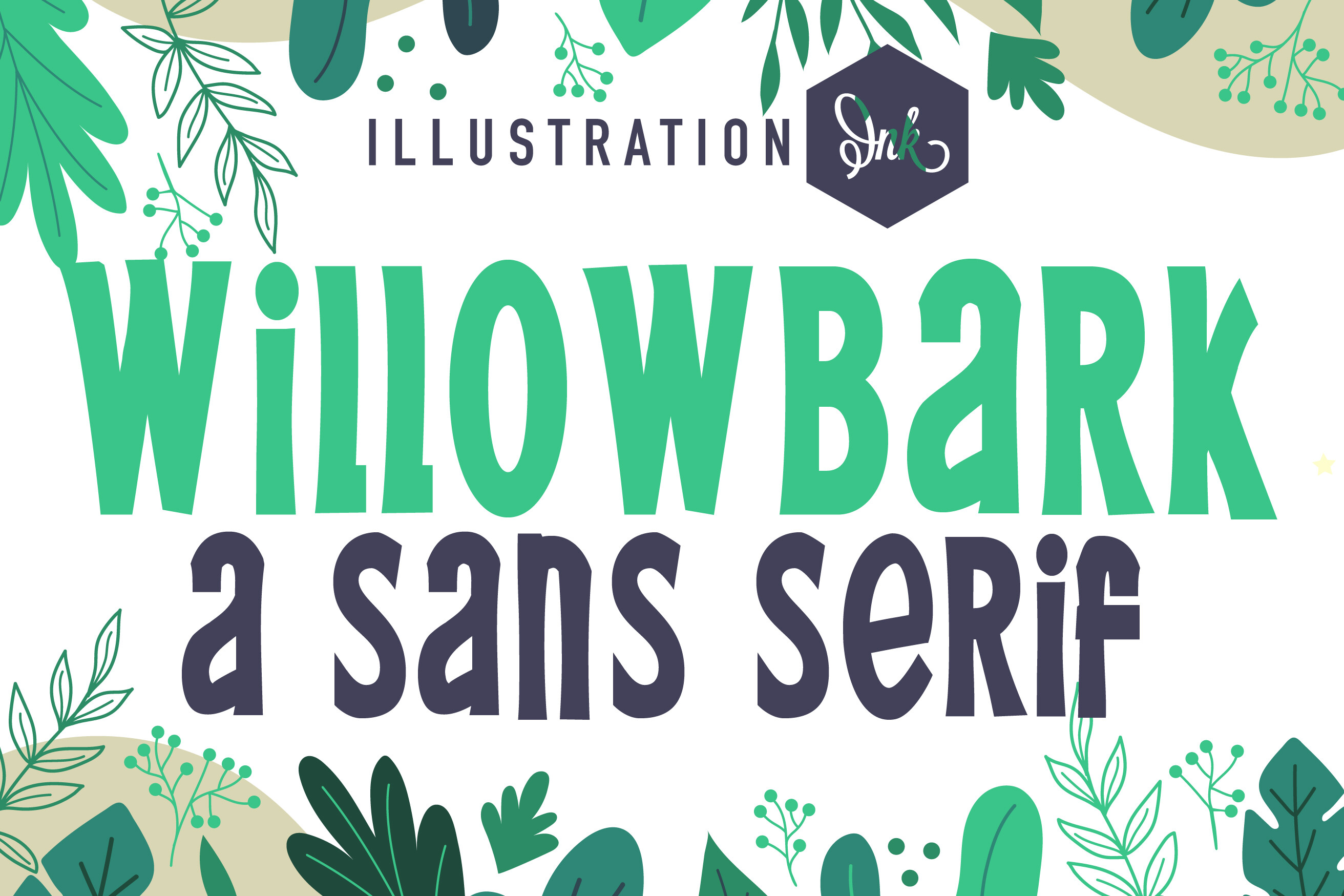
1. Willowbark
Willowbark feels like a brush-written label on kraft paper. Its ink texture gives it a handmade, low-chemistry feel that suits organic skincare, herbal tea, and natural food branding. It works best when the brand name is the main visual anchor. Pair it with a simple sans-serif for ingredient text.
If your label already has botanical illustrations or earthy colors, this one will not fight them.
Best for: organic skincare labels, herbal tea packaging, natural food branding. By: Illustration Ink
2. Honey
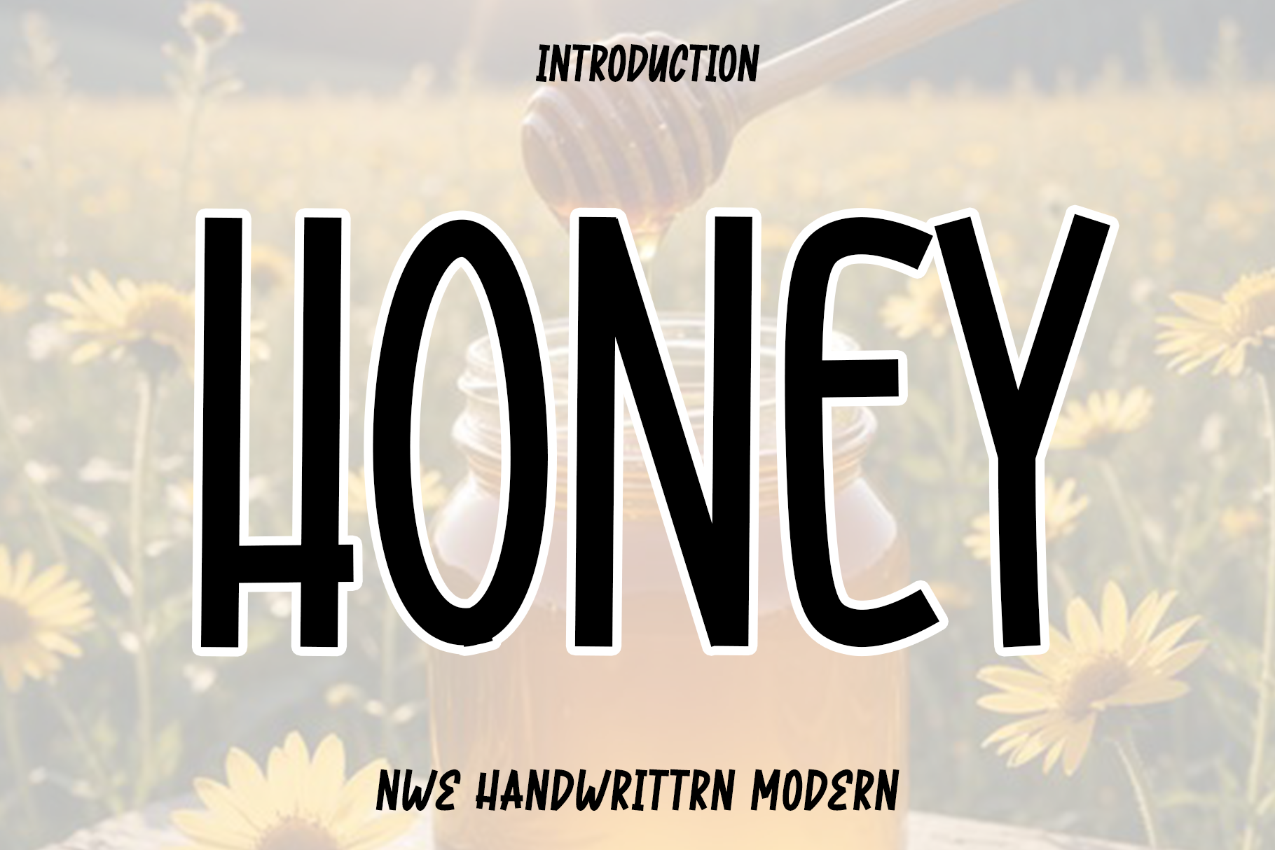
Honey is soft, rounded, and sweet in the best way. It reads as cozy and familiar, which makes it a natural fit for honey jar labels, bakery packaging, desserts, and homemade-style goods. It is smoother and more inviting than a brushy script. Keep body copy in a neutral, easy-to-read face.
I would use it for brands that want to feel like a small bakery, not a corporate dessert line.
Best for: honey jar labels, bakery packaging, sweet/dessert branding. By: Preketek texs
3. Farmer Market
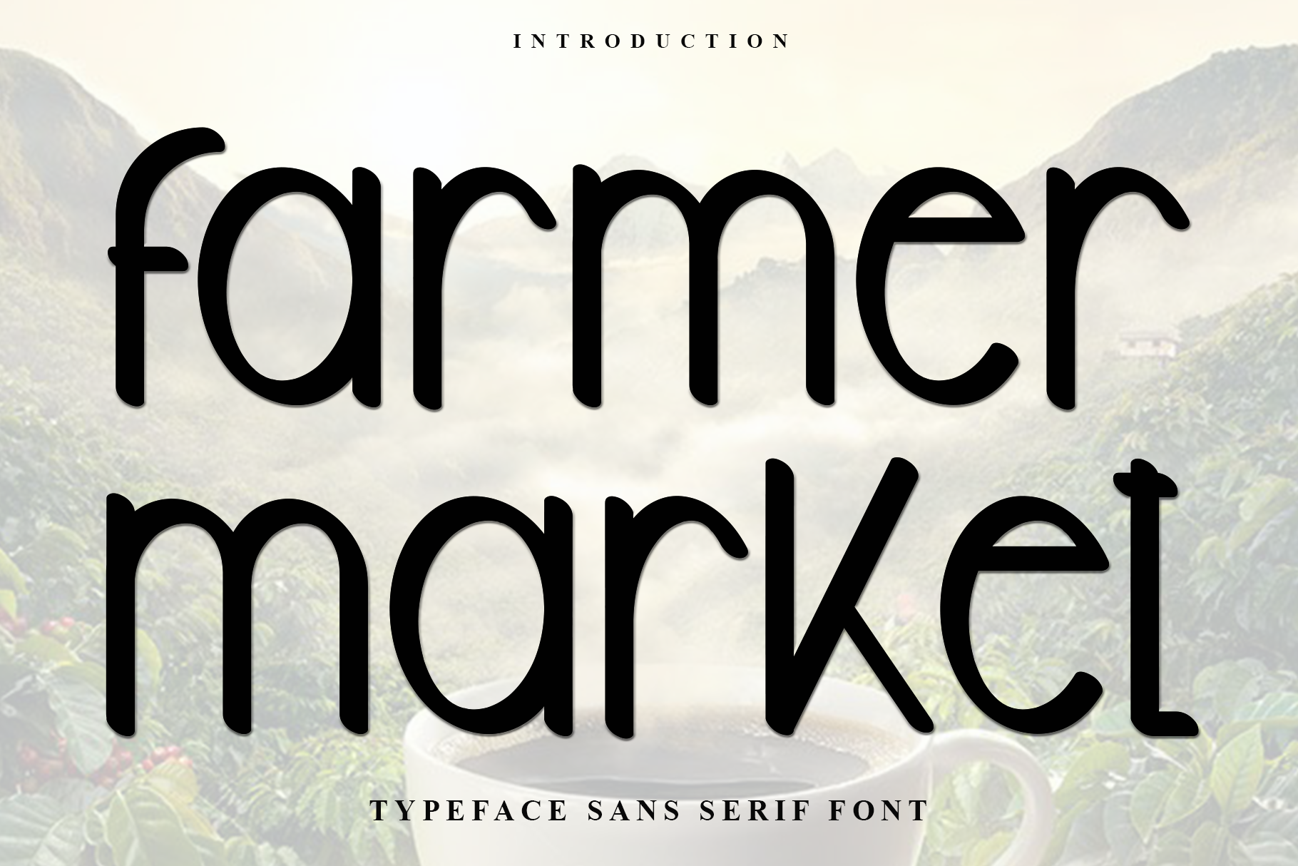
Farmer Market has the plain, honest look of a hand-painted sign at a local market. It is rustic and utilitarian, not ornate, which makes it a strong choice for farm-to-table produce, market stall signage, and packaging that says straight from the garden. It can carry a short brand name with confidence.
It works when the product story is simple: fresh, local, no fuss.
Best for: farm-to-table produce labels, market stall signage, farmers market packaging. By: Inermedia STUDIO
4. Kindel Rounded
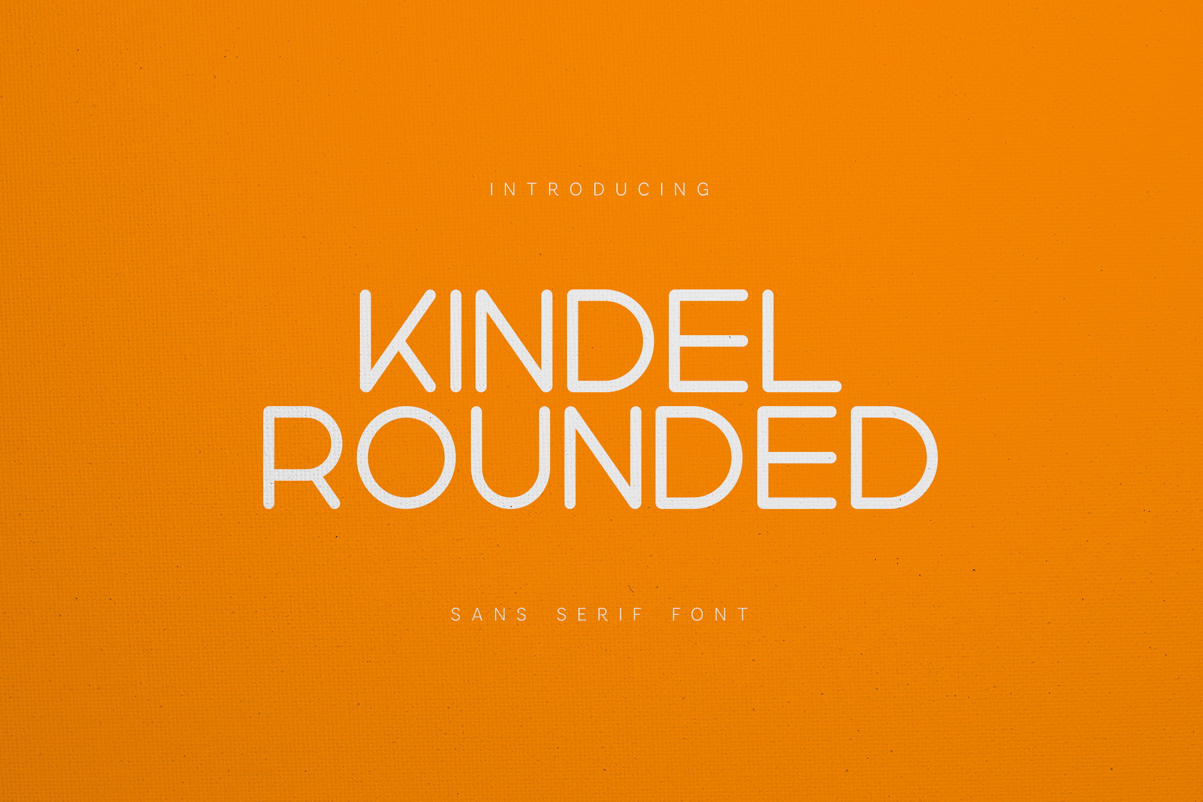
Kindel Rounded is a friendly sans-serif with soft corners and no sharp edges. It feels safe, approachable, and easy to read, which makes it useful for children’s food packaging, dairy labels, snacks, and family-oriented organic brands. It can handle a brand name and short product descriptors without feeling too decorative.
For kids and family brands, this is the kind of type that does not feel threatening.
Best for: children’s food packaging, dairy and snack labels, friendly organic branding. By: vladfedotovv
Best Fonts for Luxury & Cosmetics Packaging
Luxury beauty, skincare, and boutique brands often lean on elegant serifs with high stroke contrast. The look borrows from classic Didot and Garamond style type, but the best modern luxury packaging fonts add a cleaner, contemporary feel for cosmetic packaging fonts.
The trick is restraint. One refined detail can do more than a crowded label.
5. Fairmont Fishtail
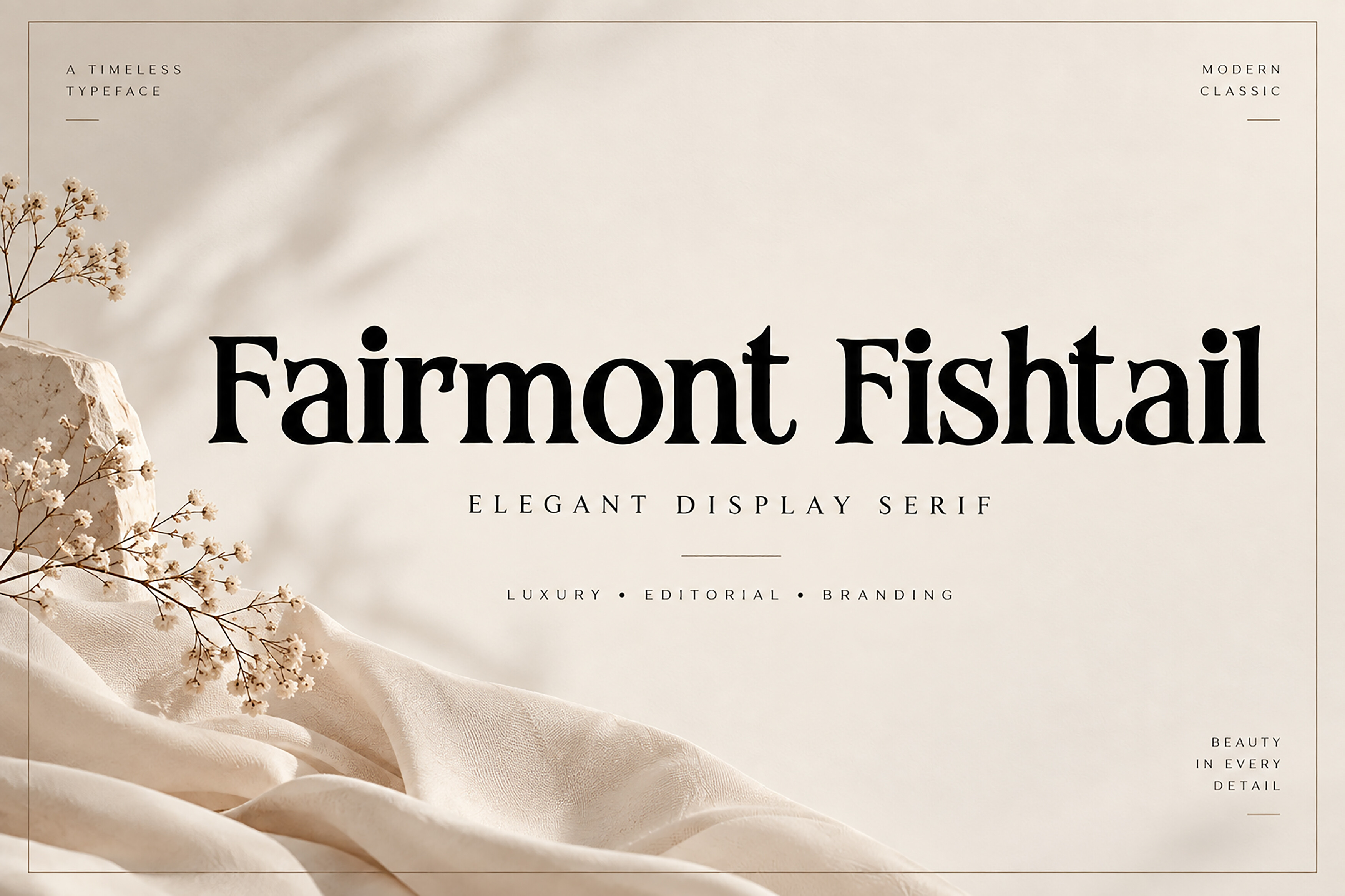
Fairmont Fishtail is an elegant serif with a distinctive fishtail detail. That decorative touch reads as premium immediately, especially on perfume boxes, luxury cosmetics, and boutique gift packaging. It works well on small labels where a refined detail can make the brand feel more expensive. Keep supporting text simple so the ornament does not compete.
I would not use it for dense legal copy. Let it carry the name, then step back.
Best for: perfume box packaging, luxury cosmetics, boutique gift packaging. By: BILLI
6. Evelisse
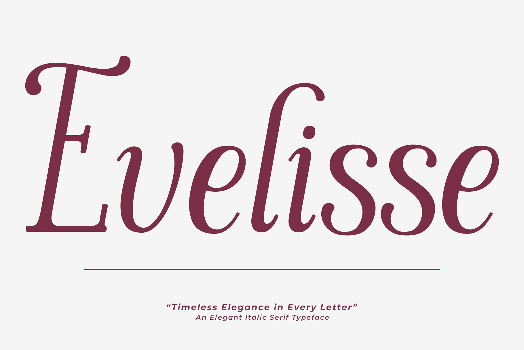
Evelisse has an editorial, magazine-like quality. Its thin strokes and refined proportions make it feel like a page from a beauty editorial rather than a crowded mass-market shelf. It suits skincare packaging, beauty box labels, and cosmetic branding that wants to feel polished. For ingredient lists and legal text, switch to a clean, neutral typeface.
It can look fragile if the print quality is poor, so test it on your actual label stock.
Best for: skincare packaging, beauty box labels, editorial-style cosmetic branding. By: rhegajuliandy
7. Caelvin Modern Serif
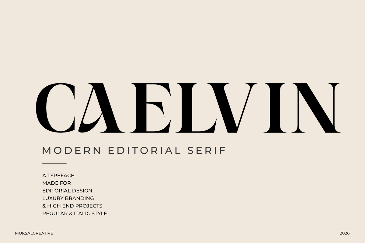
Caelvin Modern Serif balances classic elegance with a cleaner, more minimal structure. It feels precise and contemporary, which makes it a strong choice for premium skincare, modern beauty labels, and wellness packaging that wants to look refined without heavy ornament. It is a good option for labels that need a calm, high-end feel while staying easy to read.
This is the type I would reach for when a brand wants to feel expensive but not old-fashioned.
Best for: premium skincare branding, modern beauty labels, wellness packaging. By: Muksal Creative
8. Rasquin
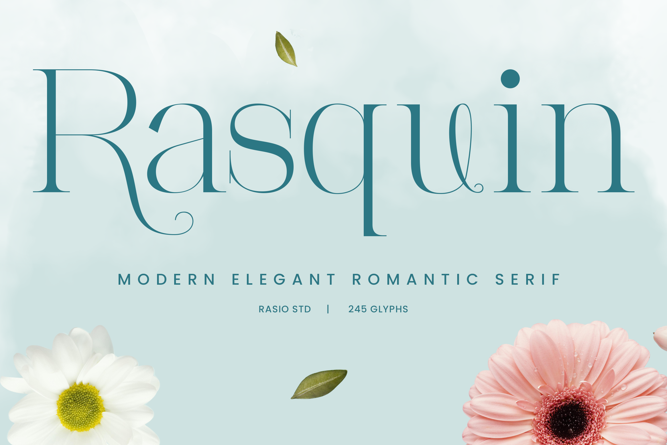
Rasquin is a soft but confident serif with a refined, boutique feel. It suits small-format labels where every detail matters, including boutique product labels, candle packaging, and small-batch luxury goods. It has enough presence to feel special without becoming hard to read. Use it for brands that want a quiet, upscale identity rather than a loud statement.
If you are searching for fonts for candle labels, this is a safe boutique option. It is not trying to shout. That is exactly why it works on small candles, soaps, and gift sets.
Best for: boutique product labels, candle packaging, small-batch luxury goods. By: product.rasiostudio
Best Fonts for Bold Retail Packaging
Retail and shelf-ready products compete for a fraction of a second. The type needs to be visible from a distance, hold up on promo labels, and make the product name impossible to miss.
In this group, clarity beats subtlety.
9. Balok Bold
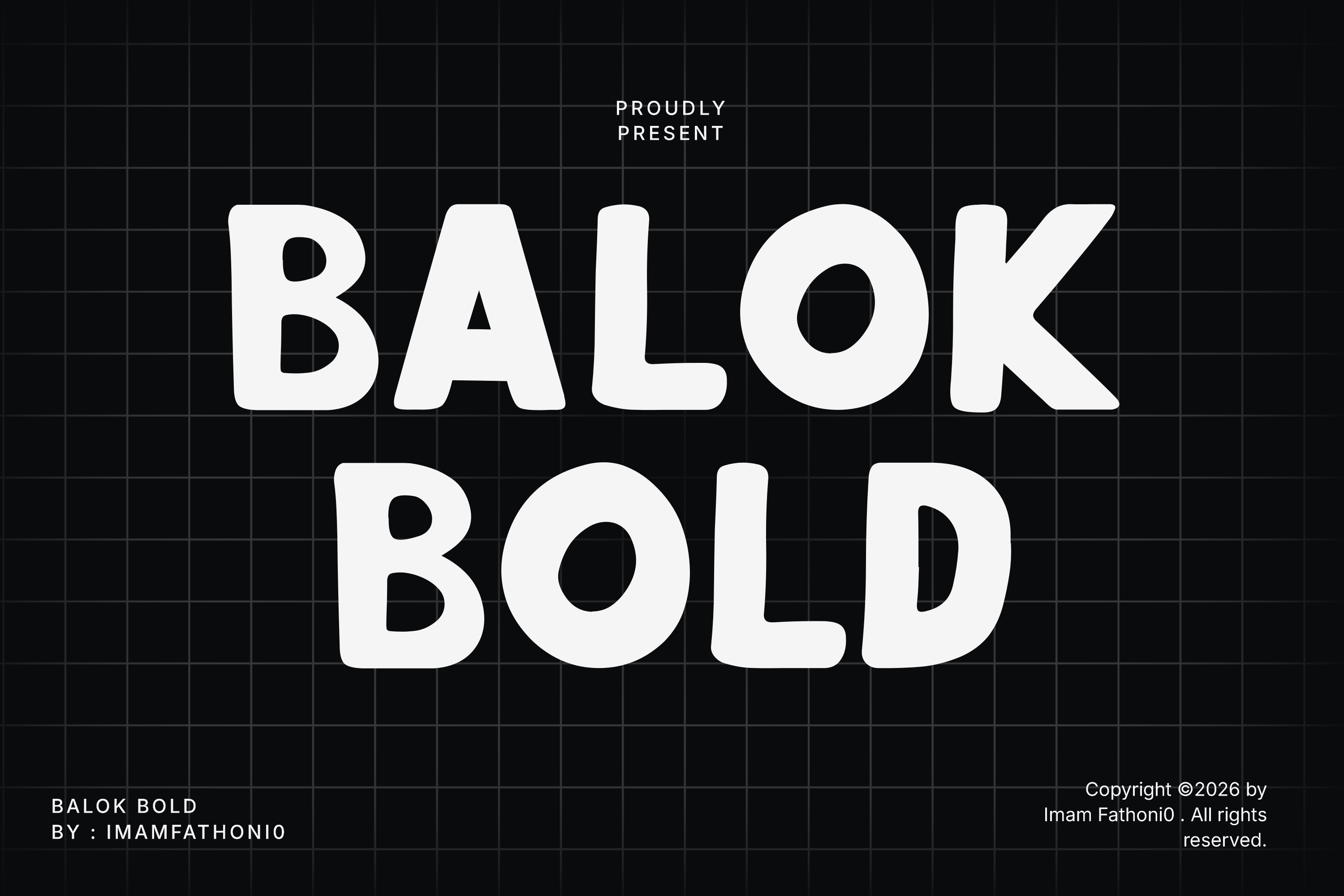
Balok Bold is a heavy, dense display face made for shelf visibility. It gives product names a solid, confident presence, which is useful for snack packaging, shelf-ready product names, and bold retail branding in a supermarket aisle. It works best when the brand name is short and the background is simple.
If your label has a lot of color or pattern, this face can get noisy fast.
Best for: shelf-ready product names, snack packaging, bold retail branding. By: setiawanarief111
10. Distorter
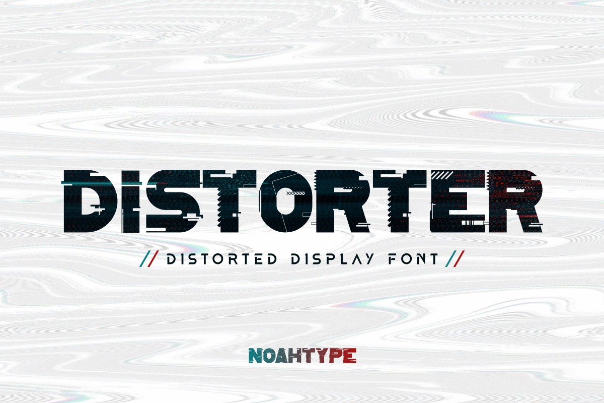
Distorter brings a distorted, street-culture energy to the label. Its broken, aggressive shapes suit energy drink cans, streetwear-adjacent snack brands, and bold limited editions. It is a strong font for beverage packaging when the product needs to stand out with an edgy visual identity. Keep the supporting text in a neutral face so the label stays usable.
This is a personality font. Use it for the name or a short burst, not for the whole label.
Best for: energy drink cans, streetwear-adjacent snack brands, bold limited editions. By: NoahType
11. Price Tag
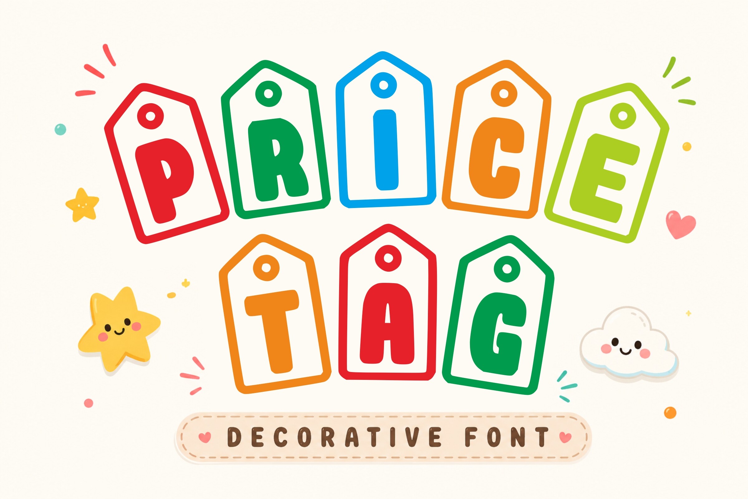
Price Tag is the one handwritten, sticker-style font in this bold retail group. Its shop-sign texture creates a hot-deal mood that reads instantly as retail. It works well for sale stickers, promo packaging inserts, and retail price tags where the message is about value or urgency. It adds a different texture from the heavier display faces here.
It feels like a sticker someone slapped on the box, and that is the point.
Best for: sale stickers, promo packaging inserts, retail price tags. By: 29Graphic
12. Logreto
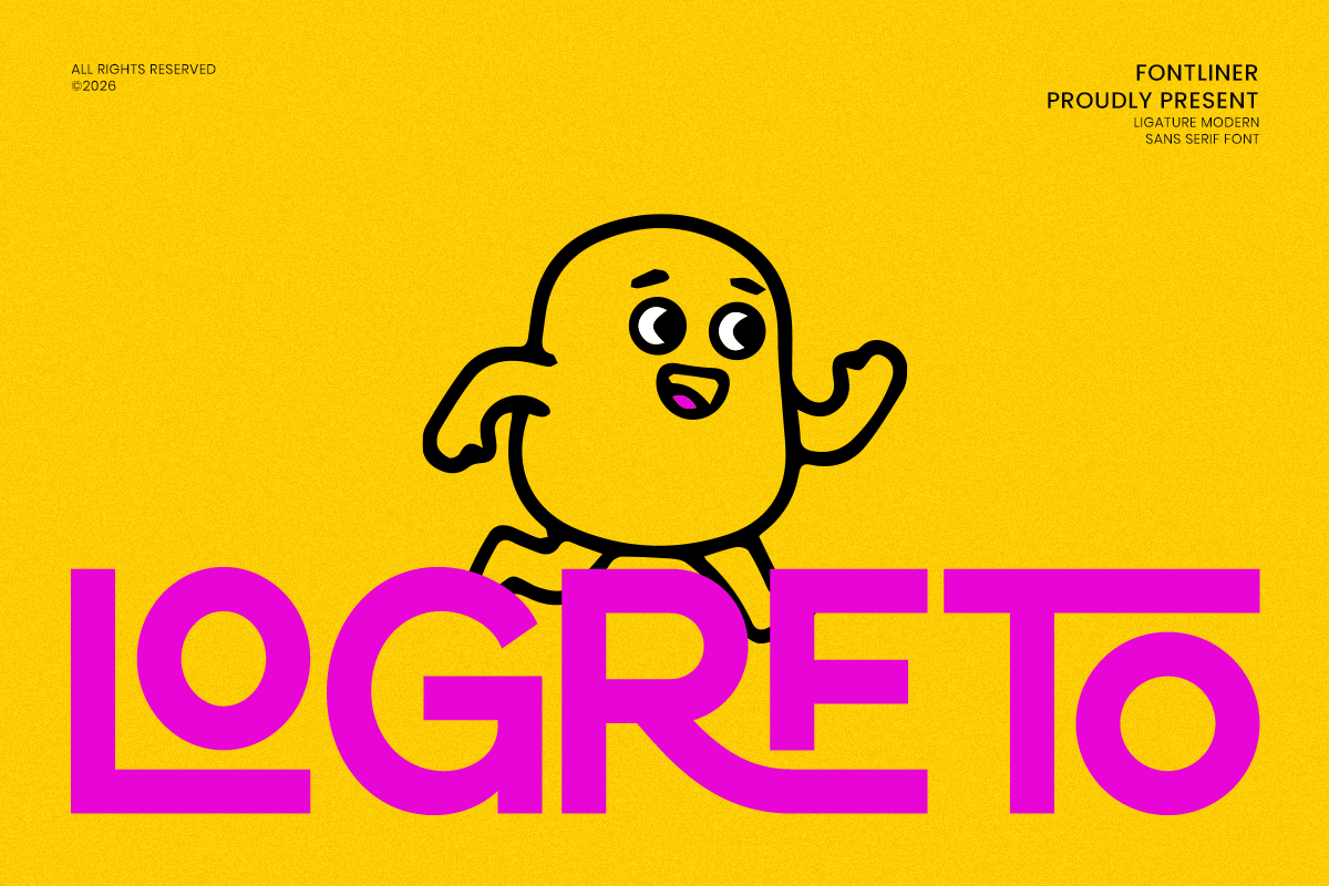
Logreto is a dense display face with a confident, compact structure. It is useful when you need to fit a large product name into a limited label area, such as condensed product names, bold logo lockups, and impactful shelf labels. This is a good pick for packaging where the name must be big, but the label is small.
For narrow jars or small front panels, this one saves space without losing punch.
Best for: condensed product names, bold logo lockups, impactful shelf labels. By: Font Liner
Best Fonts for Vintage & Craft Packaging
Retro and vintage packaging typography is one of the strongest packaging design trends for 2026. It signals heritage, craftsmanship, and trust. These vintage packaging fonts suit craft beverages, rustic food goods, apothecary-style labels, and handmade product lines.
It works because shoppers trust labels that look like they have been around a while.
13. Heritage
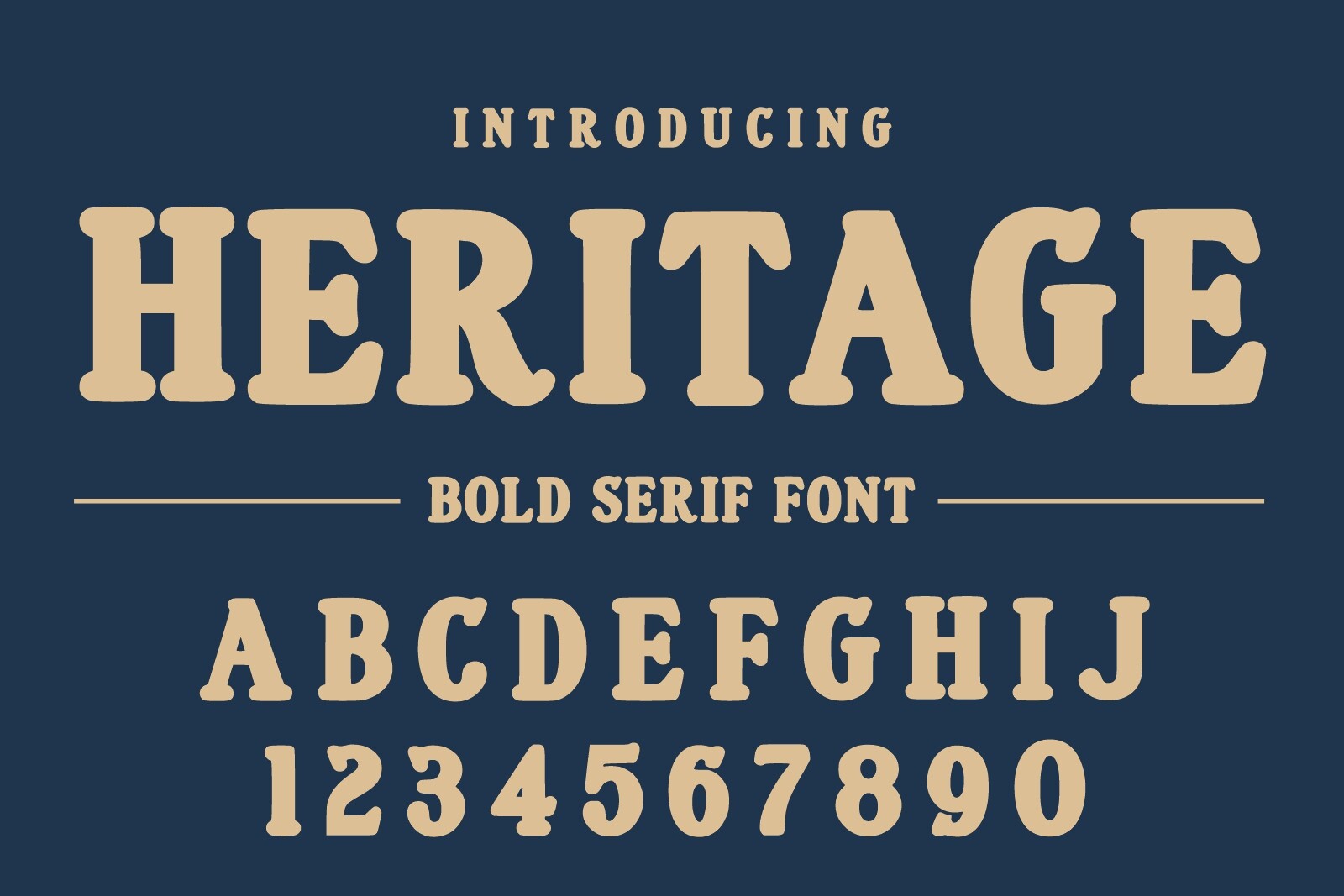
Heritage has the spirit of old badges, seals, and heritage brand marks. It is a strong fit for craft beer labels, heritage brand packaging, and badge-style logos. Even if your brand is new, it can support a story that feels established, trusted, and rooted in tradition. It works well when the label includes a circular badge, a founding year, or a short phrase that needs to feel official.
A new brand can use it without lying, as long as the story is about craft, not fake history.
Best for: craft beer labels, heritage brand packaging, badge-style logos. By: Infinity art Studio
14. Rustic Frontier
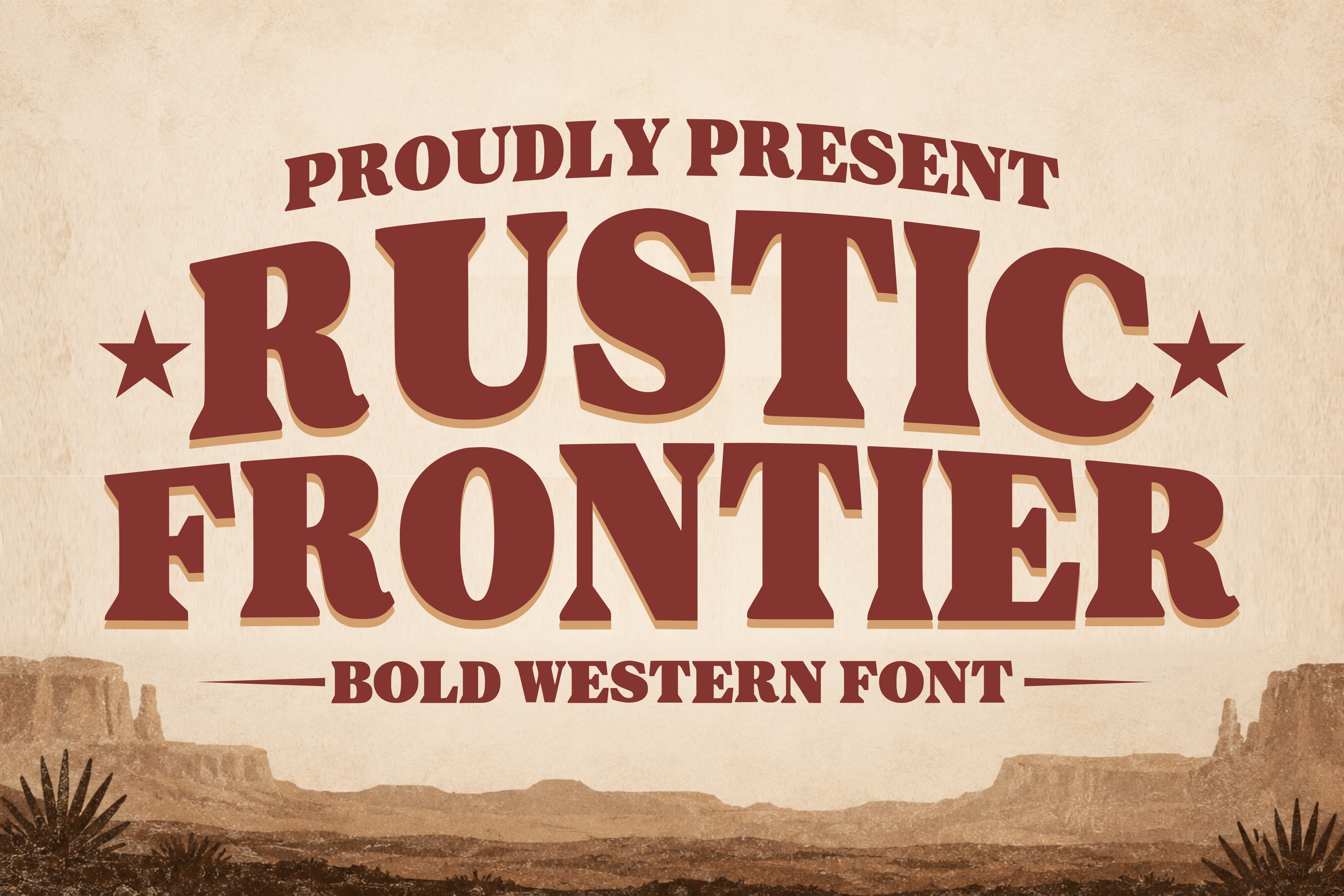
Rustic Frontier brings an old Wild West display feel to the label. Its rough serifs and weathered character suit whiskey and spirits labels, western-themed packaging, and rustic food goods. It is a good match for brands with a rugged, outdoorsy, or masculine positioning. Use it when the product story is about strength, heritage, and a bit of frontier grit.
It can feel a little loud if the label is already busy, so keep the layout clean.
Best for: whiskey and spirits labels, western-themed packaging, rustic food goods. By: Soho Studio
15. Artemisia
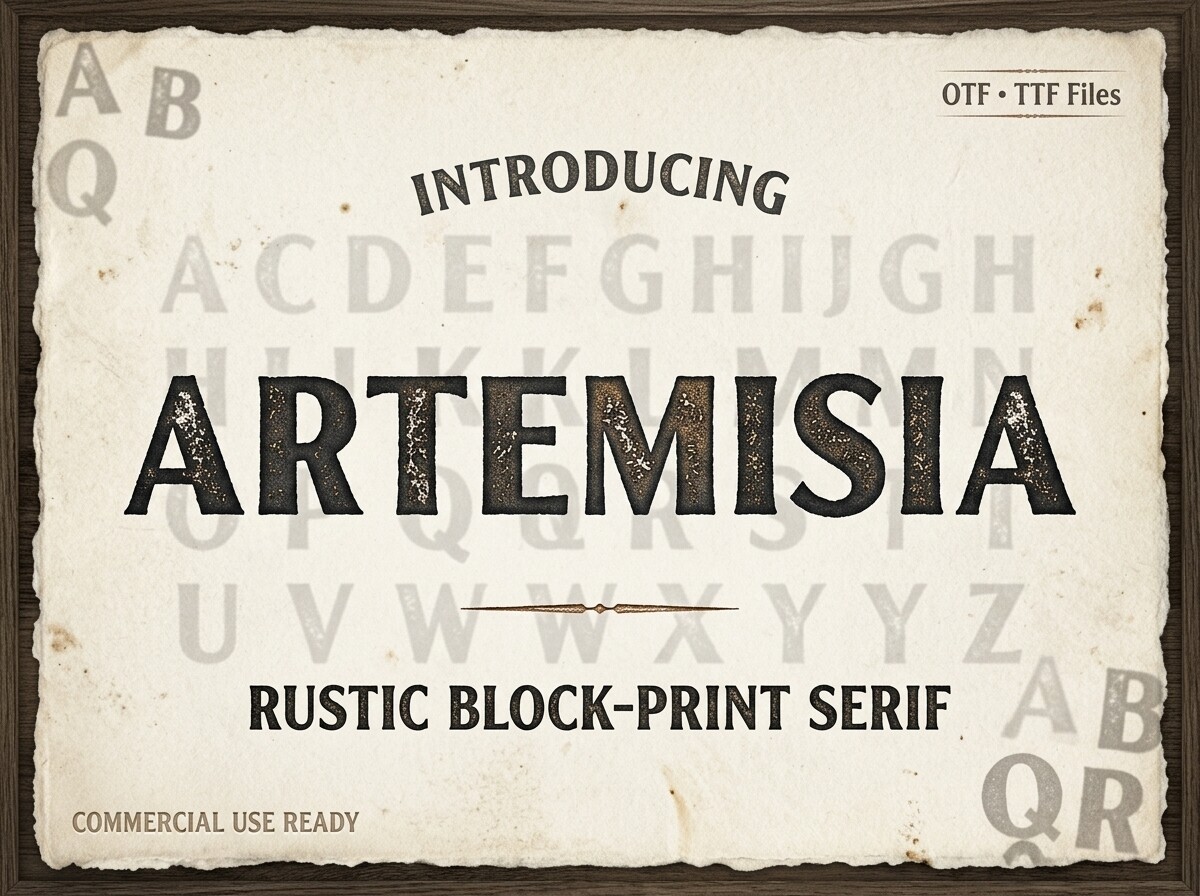
Artemisia is a vintage serif with a botanical, almost apothecary-like character. It evokes old herbal remedies, natural tonics, and plant-based products. That makes it a useful choice for apothecary-style labels, herbal remedy packaging, and botanical product branding. It works especially well when the label includes plant names, botanical illustrations, or a calm, natural wellness story.
I would pair it with a simple sans-serif so the plant names stay readable.
Best for: apothecary-style labels, herbal remedy packaging, botanical product branding. By: Raholco
16. Terra Craft Duo
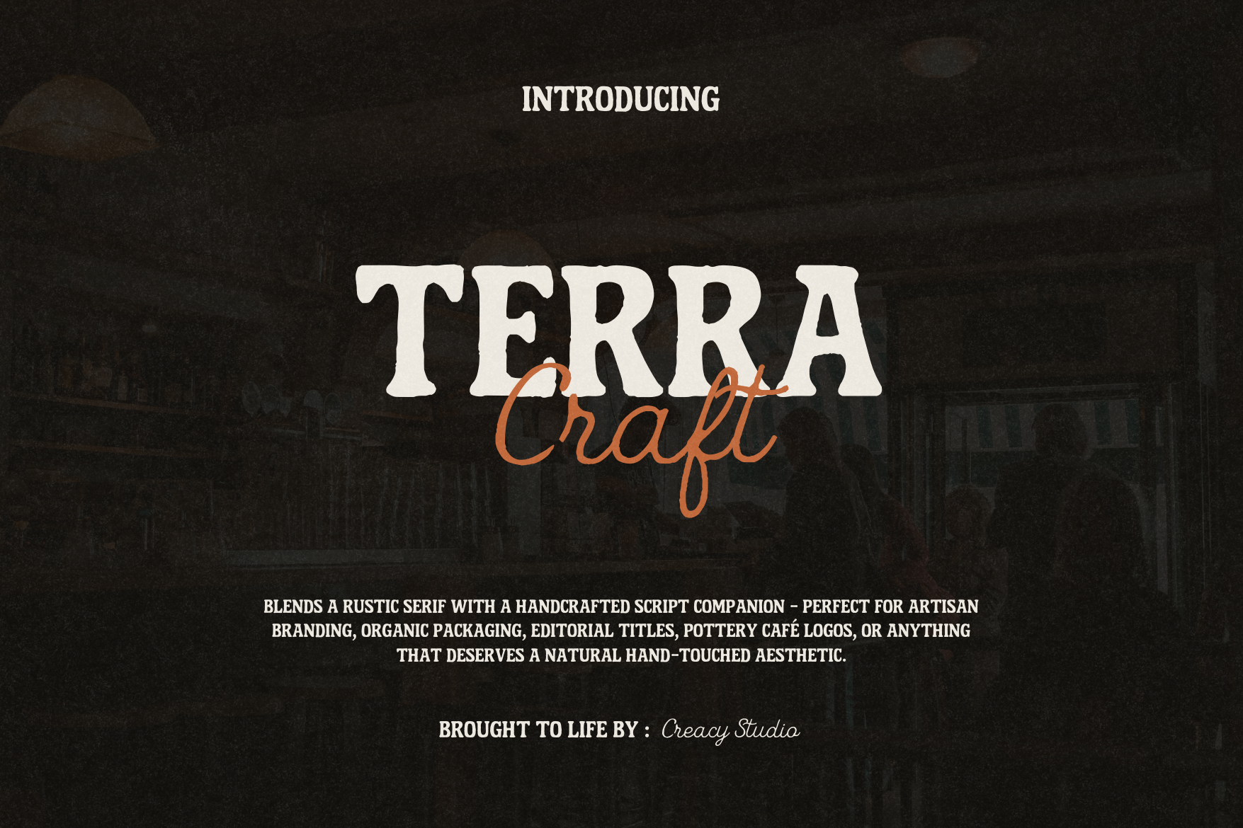
Terra Craft Duo is the only font-duo product in this list. It pairs a display face with a companion script, which makes it a handy shortcut for small-batch product labels. You can use the display face for the brand name and the script for a tagline without hunting for a separate pairing. It is a practical option for artisan soap and candle labels, handmade goods labels, and packaging design projects where you want a cohesive look quickly.
For Etsy sellers and small-batch makers, this is the kind of shortcut that saves a lot of back and forth.
Best for: artisan soap and candle packaging, small-batch product duos (name + tagline), handmade goods labels. By: Creacy Studio
How to Use Fonts in Your Packaging Design Projects
Start with hierarchy. The brand name should be the largest and most confident element on the label. Product type, flavor, or key benefit can come next. Ingredient lists, weight, barcodes, and legal text should be set in a neutral, readable typeface, never in a decorative display face.
Packaging font pairing usually works in one of two ways. You can use one dominant typeface for the whole label, or pair an expressive font for the brand name with a neutral font for supporting text. A script or display face can carry the mood, while a simple sans-serif keeps the details clear.
Think about print durability. As Fontsarena’s Kossi Adzo notes, very thin strokes may disappear in CMYK printing, especially on uncoated paper, and foil stamping and embossing also have limits, since delicate scripts or hairline serifs can break up. For small print like ingredient lists, choose letterforms with clear shapes, open counters, and enough spacing so the text does not turn into a blur.
Tip: print a test label at final size before you commit. A font that looks clean on screen can turn into a smudge on cheap paper.
Most of these fonts can be used in standard design tools such as Adobe Illustrator, Canva, and Photoshop for label design, mockups, and print files. Keep the final artwork clean, export at the right resolution, and check that the type remains legible after scaling.
Tips for Choosing the Right Packaging Font
First, define the brand character before you search for a font. A natural food brand, a luxury skincare line, a bold retail product, and a vintage craft label all need different typography. If you start with the brand story, choosing fonts for food labels, luxury packaging fonts, or retro packaging fonts becomes much easier.
Test the font at real label size. A typeface can look beautiful on a full-screen preview and still fail on a small jar label. Check the brand name, product name, and small print together. Long words, numbers, and dense ingredient lists should remain readable.
Check the license before you print. These Creative Fabrica fonts are available with commercial use licenses, but you should always confirm the specific license for your project. Not every font is free, and many web or desktop font licenses exclude packaging and commercial print. If you are looking for free packaging fonts, many Google Fonts are released under the SIL Open Font License and can be used commercially, but DaFont and other free font sites still require careful license review.
Keep the total number of fonts low. One accent typeface and one text typeface is usually enough. More than two fonts can make the label feel busy and can weaken the brand message.
Finally, match the font to the material. A modern sans-serif can feel luxurious on a soft-touch matte box, while a warm, textured serif suits rustic craft packaging. The right packaging typography is about whether the label still works after printing, folding, and sitting on the shelf.
Where to Download Fonts for Packaging Design
The fastest way to get these packaging design fonts is through Creative Fabrica, where you can preview the type, download the files, and check the commercial use license before adding it to a product label. For more packaging typography ideas, label design fonts, and font pairing examples, browse the FontPro blog.
If you want extra options for experiments or personal projects, Google Fonts and DaFont are useful places to explore. Just remember that commercial packaging use always depends on the license, not just the font name.