· fonts · 10 min read
16 Best Fonts for Funeral Brochures in 2026
16 fonts for tri-fold funeral brochure panels, headline hierarchy and contact details. Free trial and premium options, organized by role.
A funeral brochure ends up in someone’s hands at a difficult moment. The person holding it is not in a state to squint at tiny type or hunt for a phone number buried in a paragraph. The brochure needs to be clear, calm, and easy to read on the first pass. This guide walks through how to choose and set type for a folded funeral home brochure, with 16 font picks organized by the role each one plays in the layout.
What Makes a Great Font for a Funeral Brochure?
The right typeface for a funeral home brochure has to do three things well. It needs a clear hierarchy across short panels. It needs to keep contact details and opening hours legible at small sizes. And it needs a restrained character that sits comfortably next to the funeral home’s logo and the rest of its printed materials.
A folded brochure is a different animal from a single-page announcement or a multi-page booklet. The reading order follows the fold: a front cover, an inner spread, and a back panel with contact information. Each panel holds only one or two lines rather than long paragraphs, so the type has to carry the structure on its own.
One honest note before the list: none of the fonts below is marketed on Creative Fabrica as a funeral or memorial typeface. They are general-purpose serif, script, sans, and display fonts, mostly positioned for editorial, branding, or publishing work. Some suit a cover headline only. Pick them for how they behave in a short-panel layout, not because they are “designed for” grief materials.
16 Best Fonts for Funeral Brochures
The list is grouped by the role a font plays in the brochure: headlines and panel text, a name or short line, contact details, and a cover headline only. Each entry is a brief review with a link to the product page, the style, the role, and a practical note. For a few fonts the available detail is thin, so the entry stays short and points to the product page to confirm the style.
Best Serif Fonts for Headlines and Panel Text
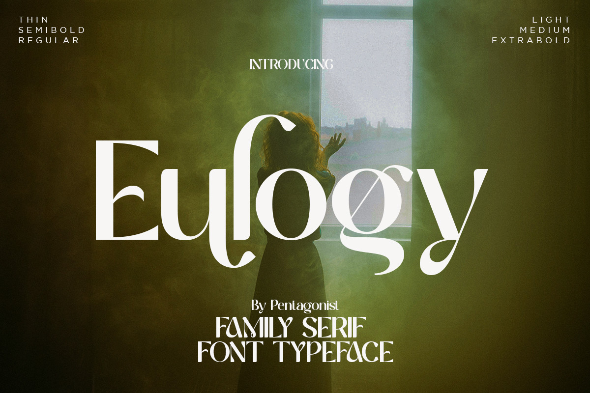
1. Eulogy Font
A serif with delicate curves and thin serifs, aimed at high-end branding and editorial work. It is PUA-encoded for access to swash variants and is available by subscription only. It suits a funeral home name or a cover headline. As a general rule, thin strokes are worth checking on a printed proof before committing to a run.
Best for: funeral home name, cover headline. By: Creative Fabrica
2. Brosse Font
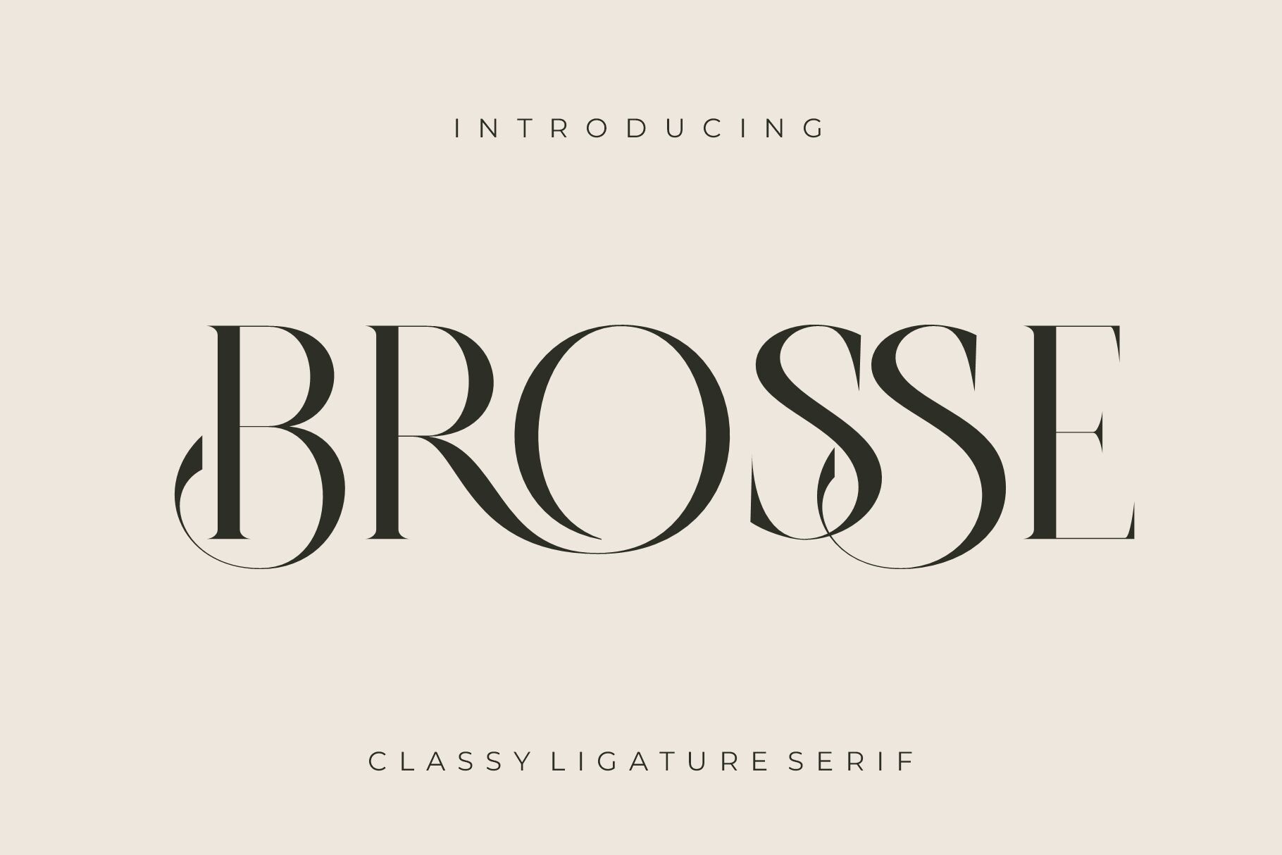
A ligature serif with a classic look. Its listing on Creative Fabrica names brochures as a use, which makes it the most directly format-relevant pick in this list. It offers a free trial with 10 free downloads. That is a trial period, not a permanently free font, so keep that distinction in mind.
Best for: panel text, brochure body. By: Creative Fabrica
3. Mediqa Font
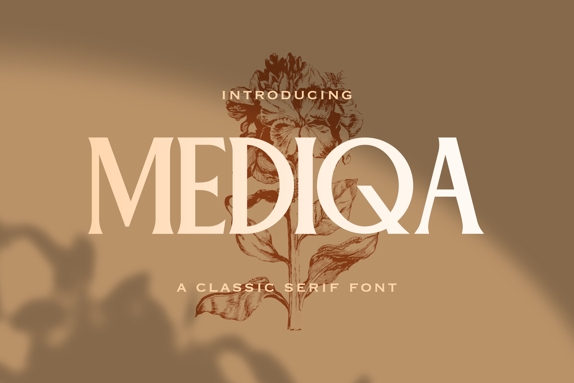
A classic serif with balanced letterforms and neat serifs, listed for editorial layouts and headlines. It is available by subscription only. Because it is listed for headlines, it is a reasonable candidate for panel headings above smaller body text.
Best for: panel headings, editorial layouts. By: Creative Fabrica
4. Bufing Font
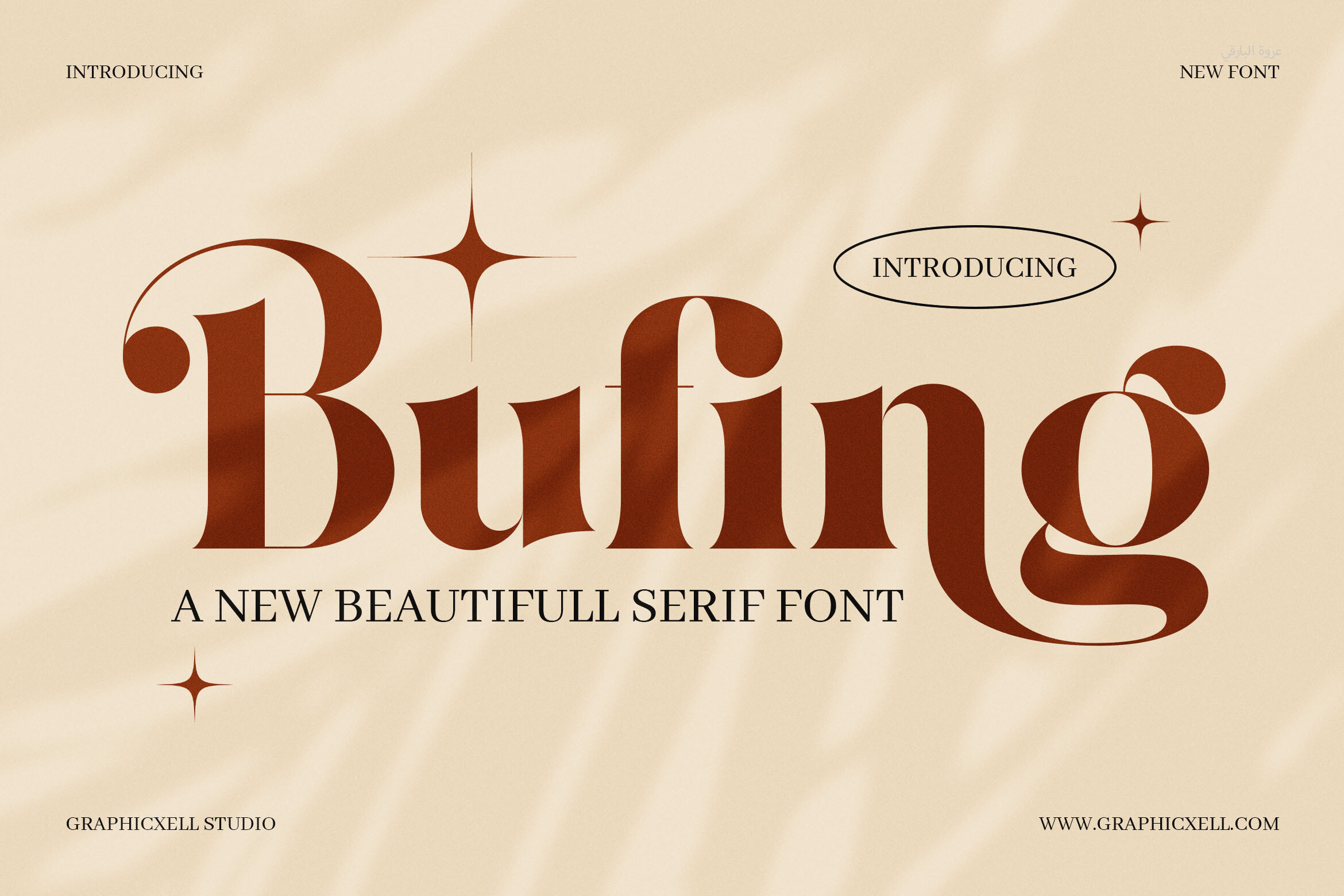
A classic-look serif recommended for headlines and body text, with magazine layouts mentioned in its listing. That dual role makes it a candidate for the main panel text in a tri-fold funeral brochure, where one font could carry both a heading and the supporting line beneath it.
Best for: panel body text, headlines. By: Creative Fabrica
5. Classma Font
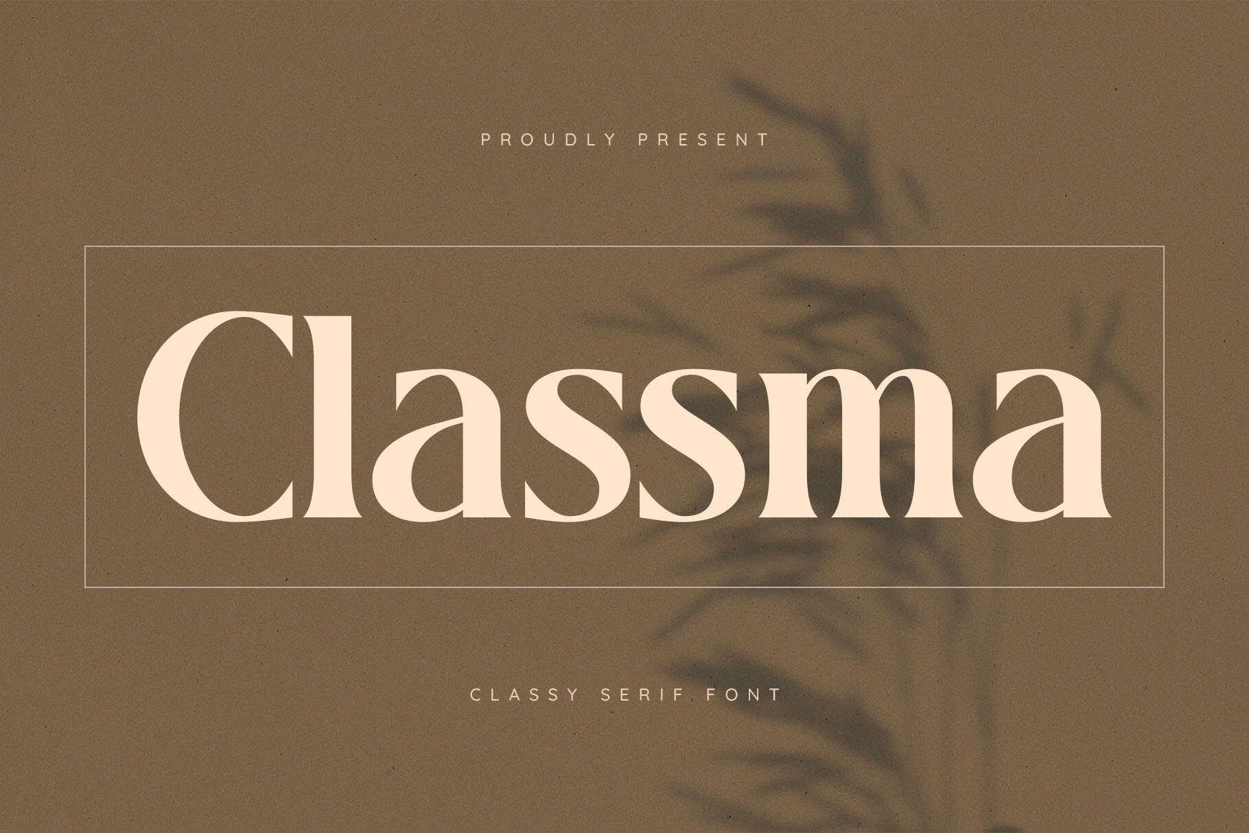
This font appeared in a classic serif search, but the available snippet gives no description, so the style is not confirmed. Check the product page to see the letterforms and weights before choosing it for a funeral brochure.
Best for: to be confirmed on the product page. By: Creative Fabrica
6. Lettertype Font
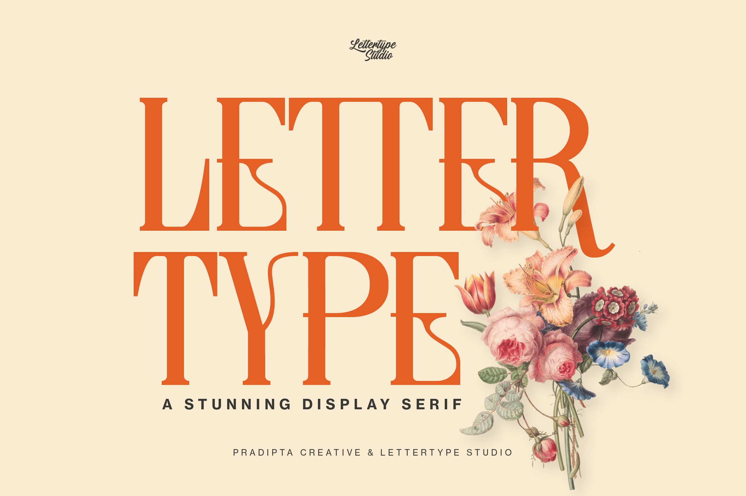
Like Classma, this font appeared in a classic serif search with no description in the snippet, so the style is unconfirmed. Verify the letterforms and available weights on the product page before using it in a memorial service brochure.
Best for: to be confirmed on the product page. By: Creative Fabrica
For a general editorial baseline, classic serifs such as Garamond, Baskerville, and Palatino are commonly cited for body text in printed materials. They are not part of this list, but they are a useful reference point when comparing serif choices for funeral brochure fonts.
Best Script Fonts for a Name or Short Line
7. Patrilya Script Font
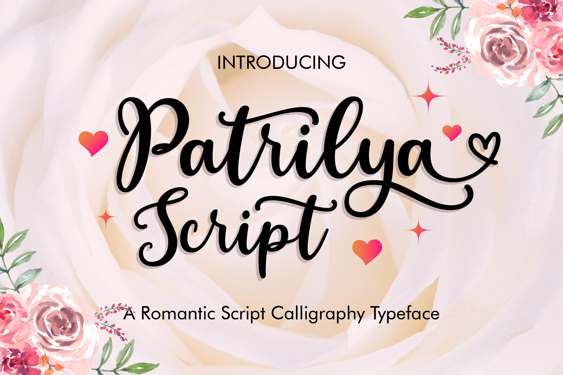
A calligraphy typeface presented as romantic and elegant, aimed at wedding invitations and greeting cards. The celebratory tone means it should be used with caution in a funeral brochure. If used at all, limit it to a single short line such as a motto or a brief quote. A more restrained script would be the safer default here.
Best for: a single short line, a motto. By: Creative Fabrica
8. Calligraph Font
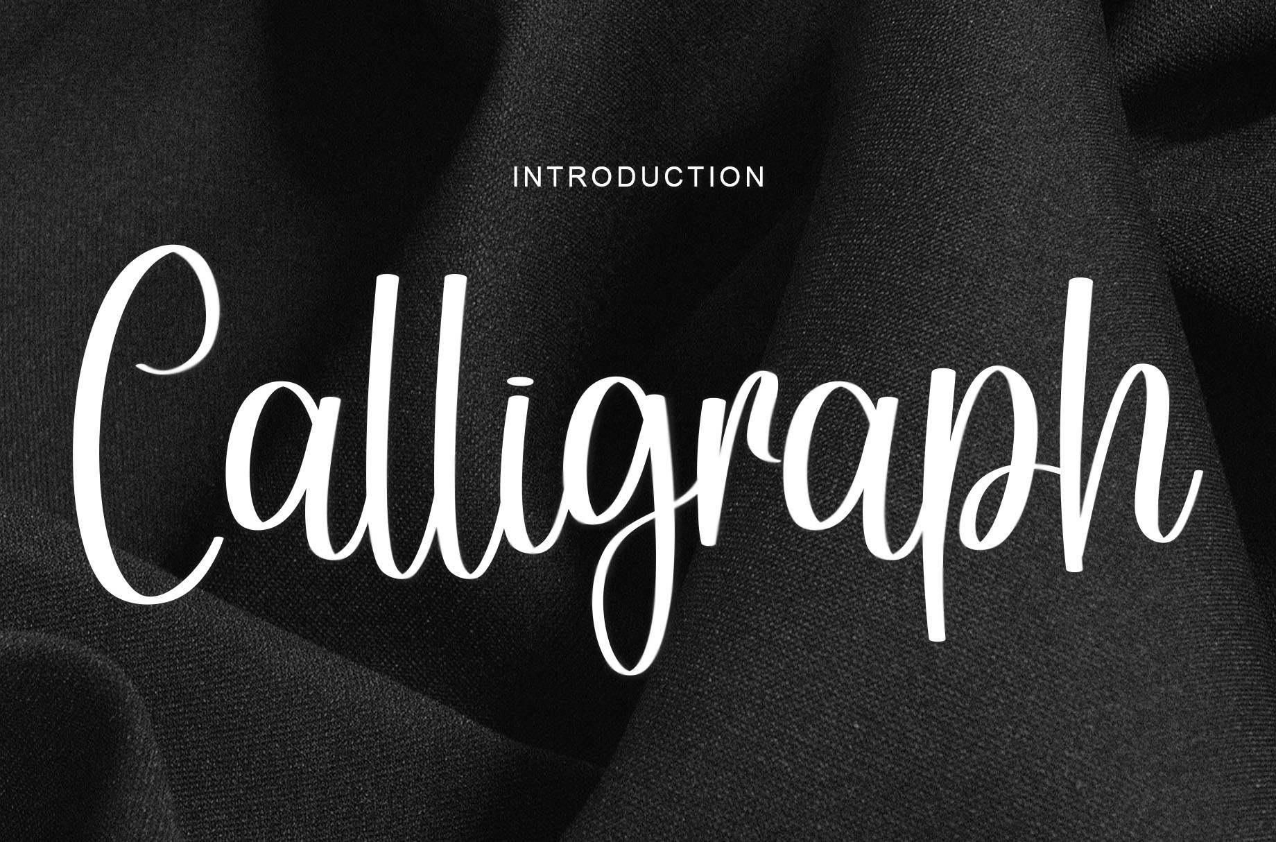
A handwritten script with a wide range of uses, from greeting cards to headlines. It is available by subscription only and reads as more neutral than Patrilya Script. Use it for a name or a short headline, and keep it off service times, addresses, and phone numbers.
Best for: a name, a short headline. By: Creative Fabrica
Best Sans-Serif Fonts for Contact Details and Service Information
9. Bronye Font
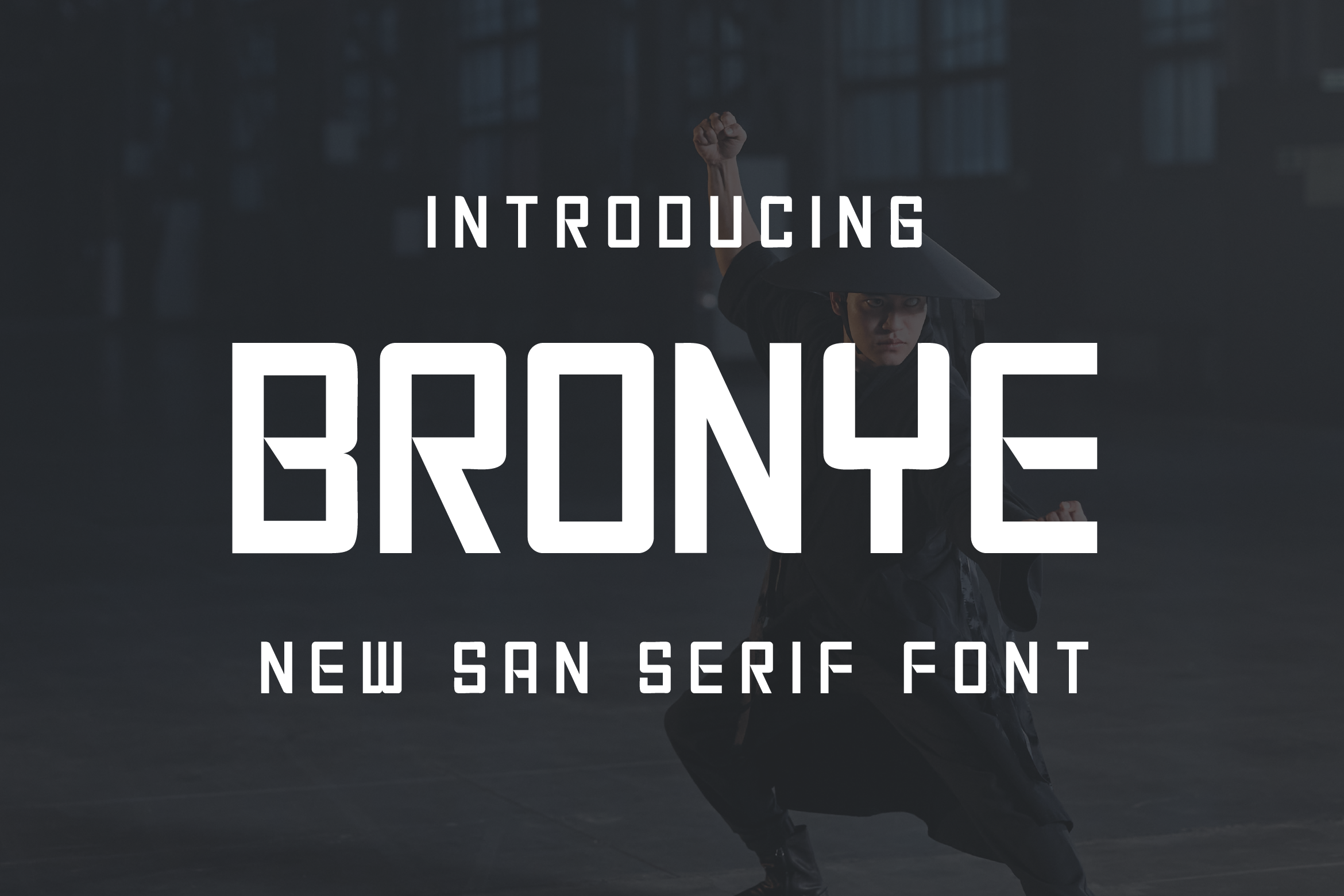
A contemporary sans serif with smooth curves and generous spacing, aimed at editorial layouts and clean presentations. It is available by subscription only. The generous spacing suggests it may suit a block of contact details, though a printed proof is the way to confirm that.
Best for: contact block, service information. By: Creative Fabrica
10. Brogman Font
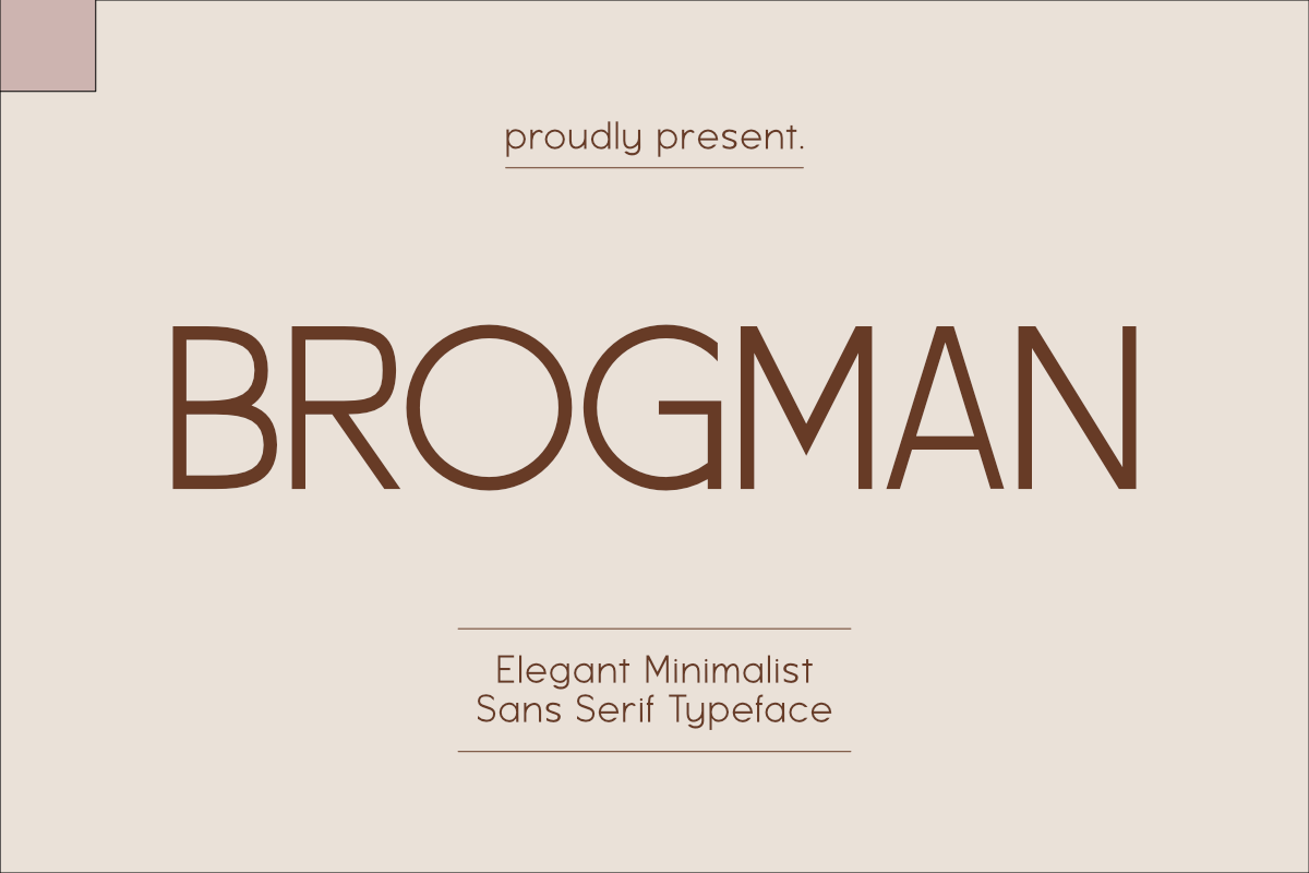
A minimalist sans serif with balanced proportions, suited to corporate branding and editorial content. It is available by subscription only. The balanced proportions make it a fit for a funeral home’s branding, where the brochure should feel like part of a larger set of materials rather than a standalone piece.
Best for: branding, service information. By: Creative Fabrica
11. Brocle Font
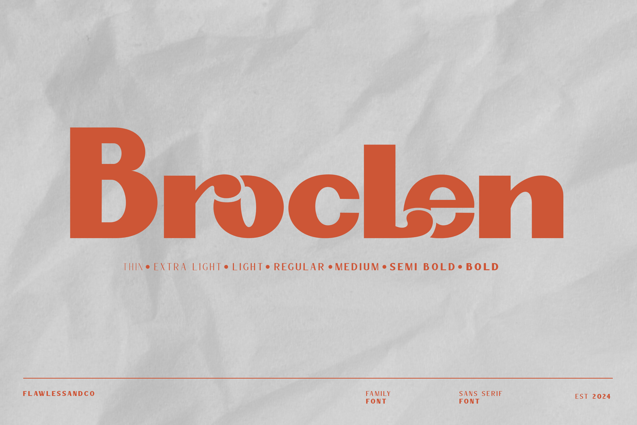
A sans serif with geometric shapes and stroke variation, with weights from thin to bold. It is listed in search as Brocle, so confirm the name on the product page. The range of weights is useful for building a hierarchy within a single typeface family, which keeps the layout unified.
Best for: hierarchy, service information. By: Creative Fabrica
12. Gerrano Font
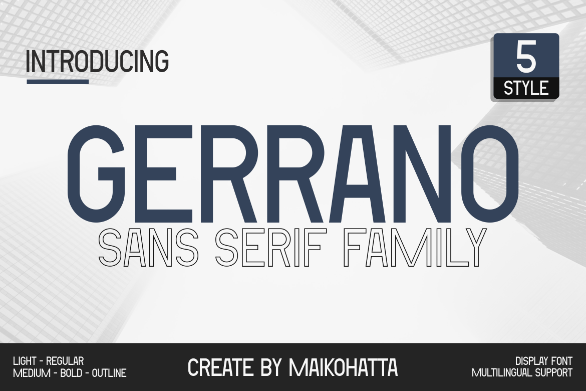
A sans serif family offered in multiple styles. The available detail is limited, so check the product page to see the specific styles and weights. Having several styles in one family can support a headline hierarchy without switching typefaces.
Best for: hierarchy, service information. By: Creative Fabrica
13. Frela Font
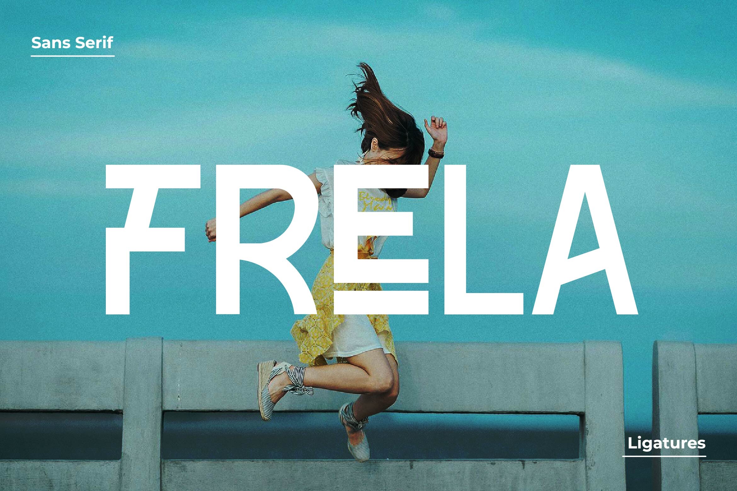
A sans serif family with no further detail in the available snippet. Check the product page to confirm the styles, weights, and overall character before selecting it for a funeral home brochure.
Best for: to be confirmed on the product page. By: Creative Fabrica
14. Sendja Font
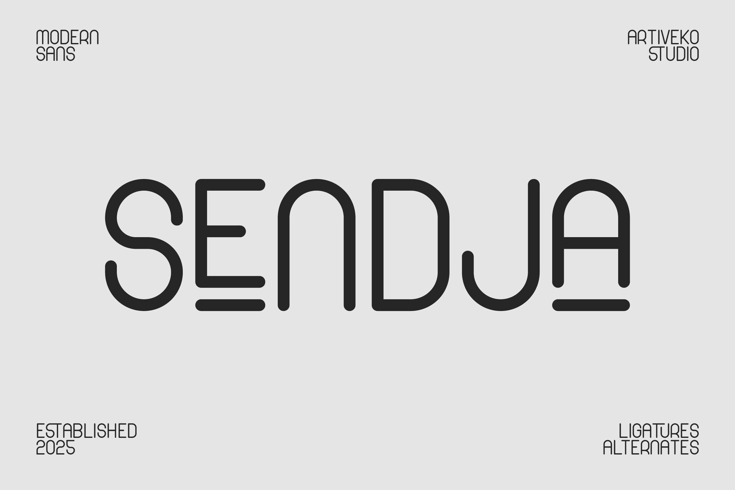
A rounded sans serif with a softer, friendlier feel. It suits an approachable tone more than a formal brochure. It may fit less formal materials, such as a grief support notice or pre-planning information, but use it with care in a formal funeral brochure.
Best for: grief support, pre-planning information. By: Creative Fabrica
For a neutral reference point, sans serifs such as Montserrat and Lato are often suggested for schedules and addresses in print. They are not part of this list, but they are a common benchmark when choosing readable fonts for contact details.
Bold Display Fonts for the Cover Headline Only
15. Brotipe Font
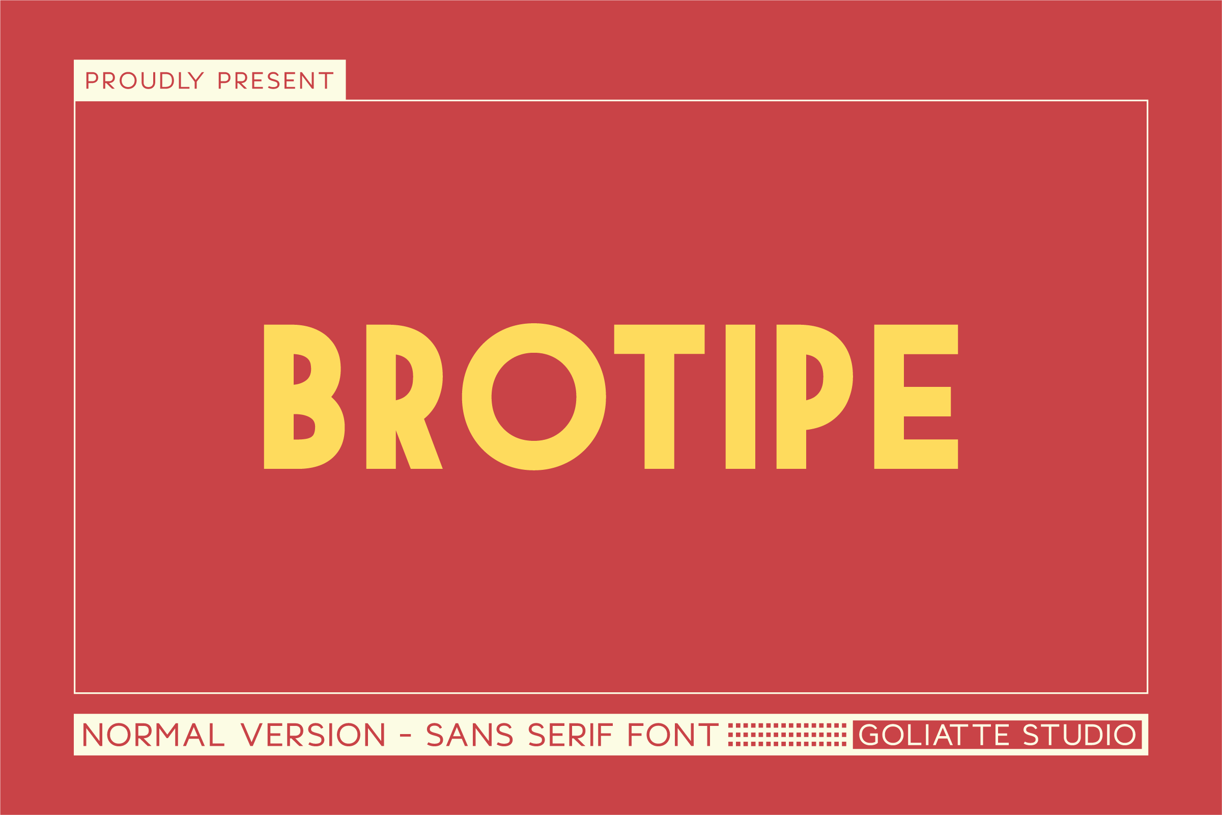
A bold all-caps sans serif suited to headlines rather than body text. A heavy caps headline can read as sharp, so use it sparingly, on a single short line only. It is not a candidate for panel text or contact details.
Best for: cover headline, one short line. By: Creative Fabrica
16. Prettier Font
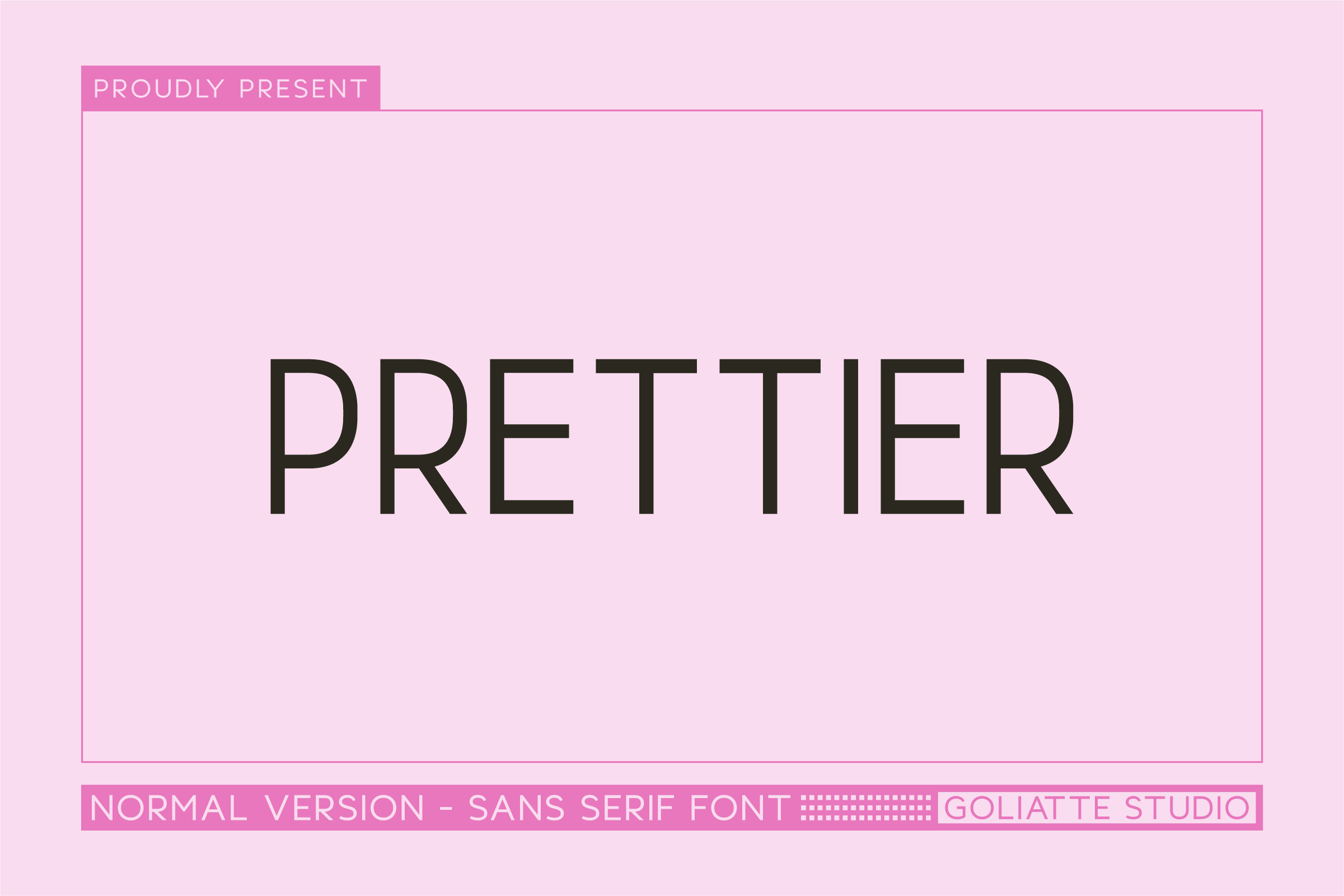
A bold all-caps sans serif suited to headlines rather than body text. As with Brotipe, the heavy caps treatment can sound blunt, so limit it to a single short line on the cover. It is not intended for body text or contact details.
Best for: cover headline, one short line. By: Creative Fabrica
How to Set Type in a Tri-Fold Funeral Brochure
Tri-fold funeral brochure typography works best when each panel has a clear job. The cover carries the funeral home name. The inner panels carry services and short answers. The back panel carries contact information. Keep the layout to no more than two typefaces, and three only in a rare case.
Build the headline hierarchy through size and weight rather than by switching typefaces. A funeral home name, a panel heading, a subheading, and body text can be distinguished with three or four levels of size and weight. This keeps the layout calm and reduces the chance that a panel looks busy.
For contact details, set phone, address, opening hours, and website in a sans serif or a readable serif, never in a script. Give the phone number its own line, and keep the size and contrast high enough to read quickly. As a general guide, body text around 10 to 12 pt and headings 16 pt or larger is a workable starting point, not a fixed rule.
On narrow panels, keep lines short and use moderate leading. Avoid breaking words inside a heading, and leave safe margins away from the fold lines so that text does not land on a crease. Consistency with the funeral home’s logo, business cards, and letterhead matters. Dark gray or black text on a white or cream background is the most reliable pairing for print, and it keeps the brochure calm and easy to read for families under stress.
Before committing to a run, print a proof at full size and fold it by hand. Check the phone numbers, addresses, and opening hours for typos, and confirm that thin strokes hold up on the paper you will use. When sending files to a printer, embed the fonts or export outlines, whether the layout is built in Canva, Word, or Illustrator.
How to Choose the Right Font for Your Brochure
The right choice depends on the brochure’s purpose. For a funeral home services brochure, a serif for the name and panel headings paired with a clean sans for contact details is a safe, formal combination. For pre-planning materials or a grief support notice, a softer tone is acceptable, and a rounded sans such as Sendja can work if used with care.
Licensing needs attention because funeral homes print brochures for commercial use. Several fonts in this list, including Eulogy, Mediqa, Calligraph, Bronye, and Brogman, are available by subscription only, so confirm the commercial use terms on the Creative Fabrica product page before printing. No free fonts are confirmed in this selection, so do not assume any entry is free. For the fonts with thin descriptions, such as Classma, Lettertype, Frela, and Gerrano, check the product page to verify the style and the license before use.
Where to Download Fonts for Funeral Brochures
Creative Fabrica is the primary source for the fonts in this list, with most available through a subscription. For additional options, free and open sources such as Google Fonts, DaFont, and Font Squirrel are worth checking, though none of those specific fonts are part of this selection. For more type and print guides, see the FontPro blog.