· fonts · 11 min read
13 Best Fonts for Funeral Invitations in 2026
Calm, readable choices for a funeral invitation card. Compare serif, script, and sans options for name, date, venue, tone, and download before printing.
What Makes a Great Font for a Funeral Invitation?
A funeral invitation card lands in someone’s hands during a hard moment. The guest needs to absorb who is being remembered, when the service is, and where to go, all in a few seconds. The best font for funeral invitation design is not the most decorative option on the page. It is the one that keeps the name, date, and venue hierarchy clear while matching the tone of the service.
Three things matter most here. Clarity: the card should show who, when, and where without any guesswork. Tone: a traditional service often calls for a quiet serif, while a celebration of life may lean toward a softer sans or a light script. Readability: guests may include older adults, so the type should be large enough and simple enough to read at a glance.
A funeral invitation is one card. That is different from a funeral announcement, a booklet, or a brochure. There is a short opening line, a name, a date and time, a venue, and perhaps a note. No room for long paragraphs. Each line carries its own level.
One honest note: none of the fonts in this list is positioned on Creative Fabrica as a funeral or memorial font. They are general serif, script, and sans choices. Some are described for wedding invitations, fashion, or branding, and this article says so directly. Elegant fonts for memorial invitations should stay quiet, because the card’s job is to inform, not to decorate.
Traditional Service or Celebration of Life: Choosing the Tone
Deciding on the tone before picking a font saves a lot of back and forth. A traditional funeral service often uses serif fonts for funeral invitations because serifs feel formal and familiar. The name might appear in a restrained script or in small capitals, while the date, time, and venue stay in a readable serif.
A celebration of life invitation often feels softer. A clean sans for the details paired with a light script for the name can work well. The date and address should still remain in a readable font, not in a decorative script. Garamond, Baskerville, and Palatino are common serif references for formal printed materials. Montserrat and Lato are common sans references for modern, less formal cards.
Among the 13 fonts below, the serif group leans toward traditional services. The script group works better for a name or a short line. The sans group may suit celebration of life invitation fonts, especially when the family wants a calm, modern card.
13 Best Fonts for Funeral Invitations
These funeral invitation fonts are organized by role on the card. Serif fonts come first for the name and service details, script fonts next for a name or short line, and sans fonts last for date, time, and venue. Each entry includes the product details shown on Creative Fabrica.
Best Serif Fonts for the Name and Service Details
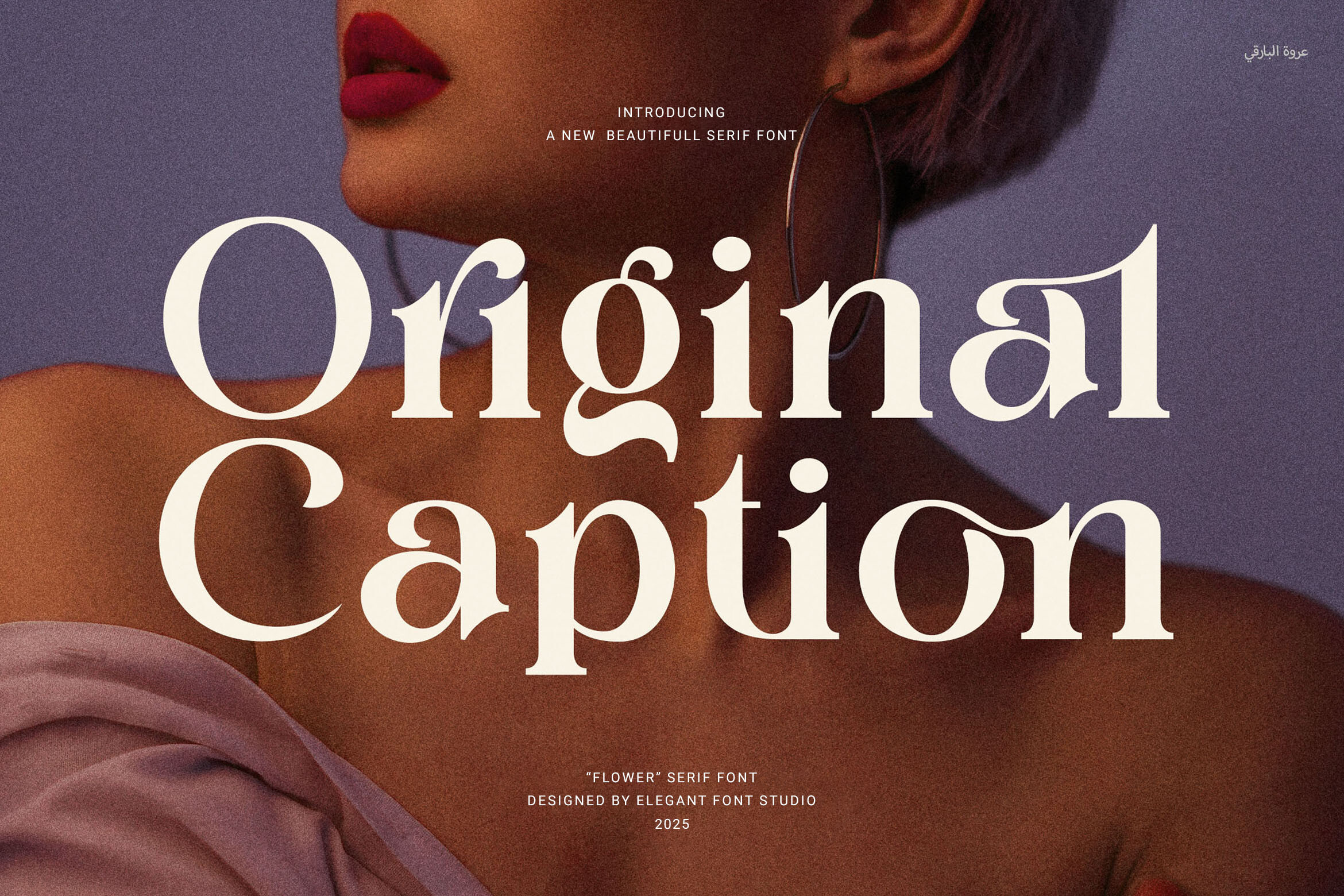
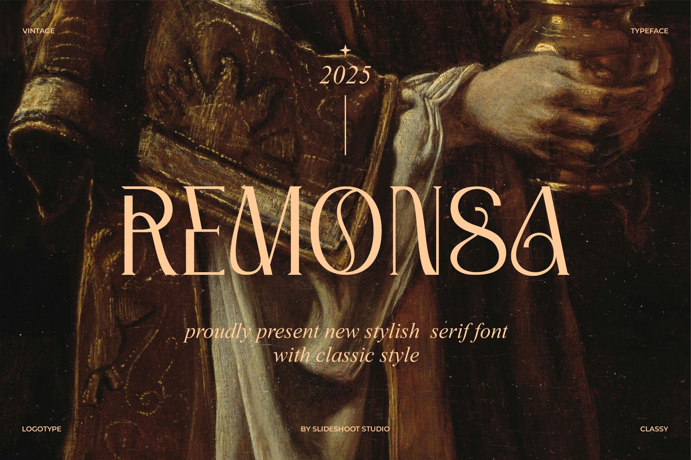
1. Remonsa
Remonsa is a classic serif suited to invitations, logos, and book titles. It is available through a Creative Fabrica subscription. A separate demo of the same name on BeFonts is attributed to SlideShoot and is personal-use only, so check the designer and license on the product page before downloading.
Best for: a name line, service details, or a traditional card. By: Creative Fabrica
2. Erial
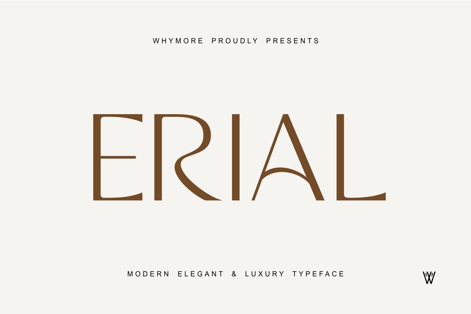
Erial is a modern serif for invitations, branding, and crafting. It includes uppercase, lowercase, and punctuation, and is compatible with Cricut, Procreate, and Canva. It is subscription-only. The listed Canva compatibility makes it a candidate for a self-made card, though the product page should be checked.
Best for: a name line, service details, or a self-made card. By: Creative Fabrica
3. Brigetha
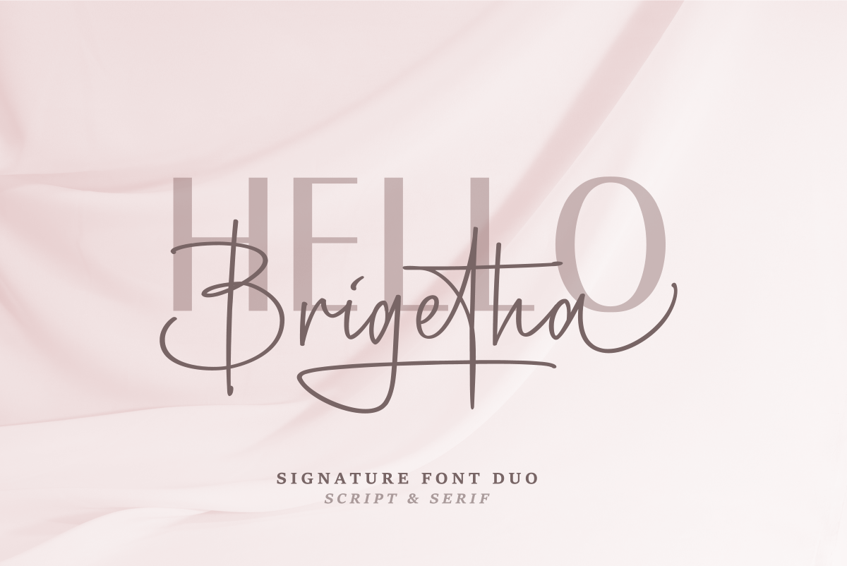
Brigetha is a serif paired with a cursive companion. Creative Fabrica positions it for wedding invitations, logos, and place cards, so use it with restraint on a memorial card. It is subscription-only. A different Brigetha handwritten font exists on BeFonts, so check the designer before downloading.
Best for: a short name line, a service title, or a paired card. By: Creative Fabrica
4. Falenca
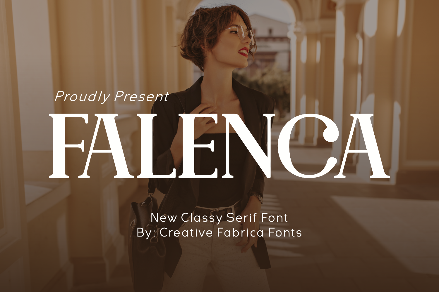
Falenca is a serif aimed at fashion and luxury packaging. The designer did not make it available for single sale, so it is subscription-only. Its luxury positioning may not suit every funeral card. It could suit a service title or a name line if the family wants a refined, less casual tone.
Best for: a service title, a name line, or a refined card. By: Creative Fabrica
5. Clyra
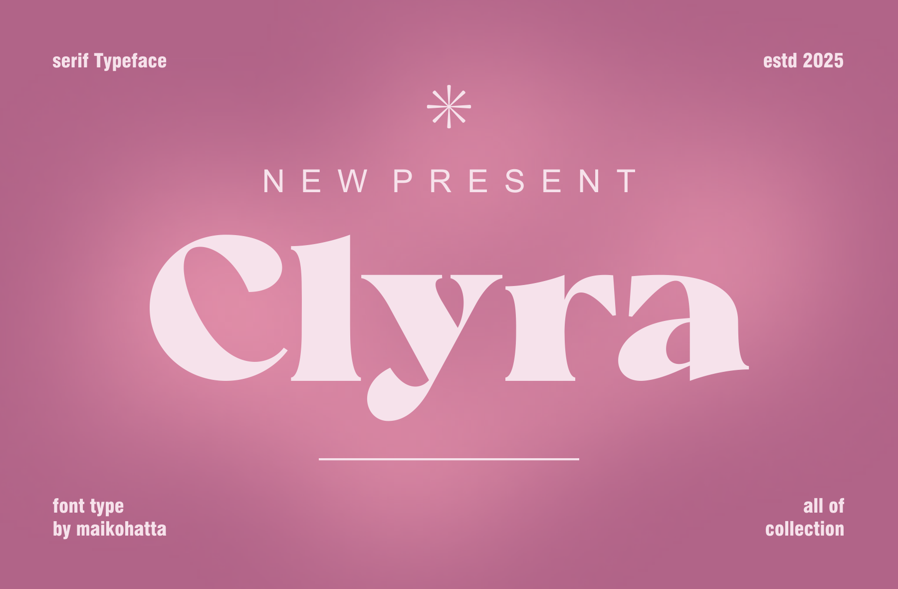
Clyra is a refined serif for branding and editorial use. It is available through a Creative Fabrica subscription. The product description does not mention funeral or memorial materials, so treat it as a general serif choice. It could suit a name line or a service title on a traditional card.
Best for: a name line, a service title, or a traditional card. By: Creative Fabrica
6. Classo
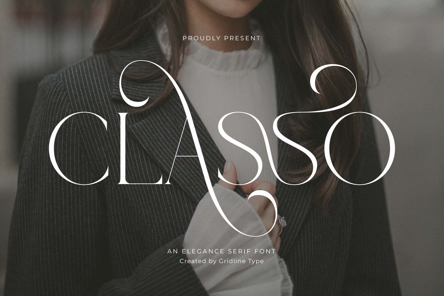
Classo is a refined serif for branding and editorial use. It is subscription-only. Like Clyra, its description does not position it for funeral invitations, so use it as a general serif option. It may suit a name line, a service title, or a quiet heading on a printed card.
Best for: a name line, a service title, or a quiet heading. By: Creative Fabrica
Best Script Fonts for a Name or Short Line
7. Gresilya
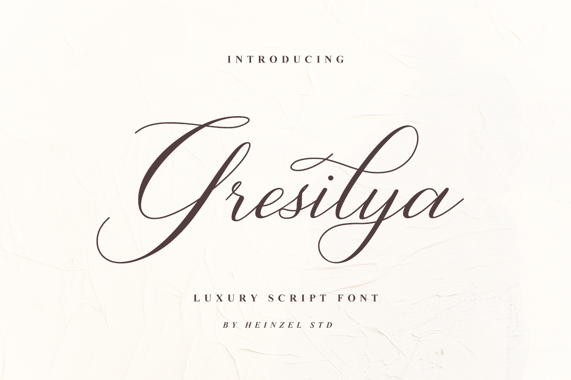
Gresilya is a script font described as classy, elegant, and modern. It is subscription-only. A script font for a name on a memorial card should stay short, so this style may suit the deceased’s name or a brief service line. Keep the date, time, and venue in a separate readable typeface.
Best for: a name line, a short service line, or a quiet title. By: Creative Fabrica
8. Gresya Script
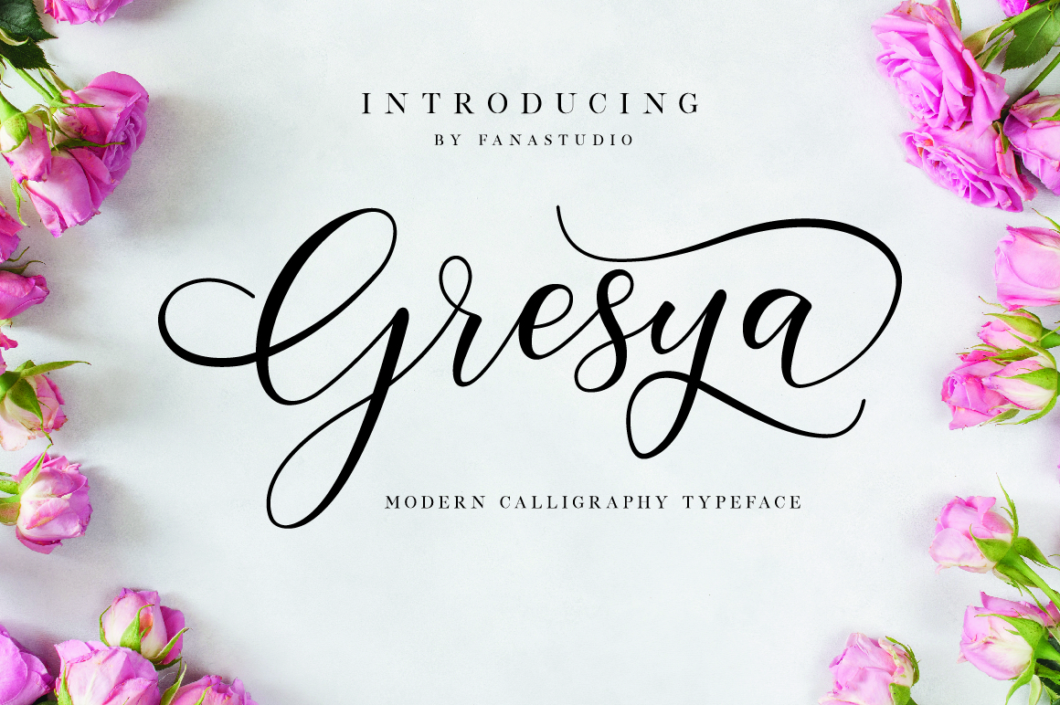
Gresya Script is a feminine script with swashes. It is subscription-only. Swashes and a feminine character may not suit every service, so use it only for a name or a short line. Keep the date, time, and venue in a separate readable typeface.
Best for: a name line, a short quote, or a gentle title. By: Creative Fabrica
9. Gresia
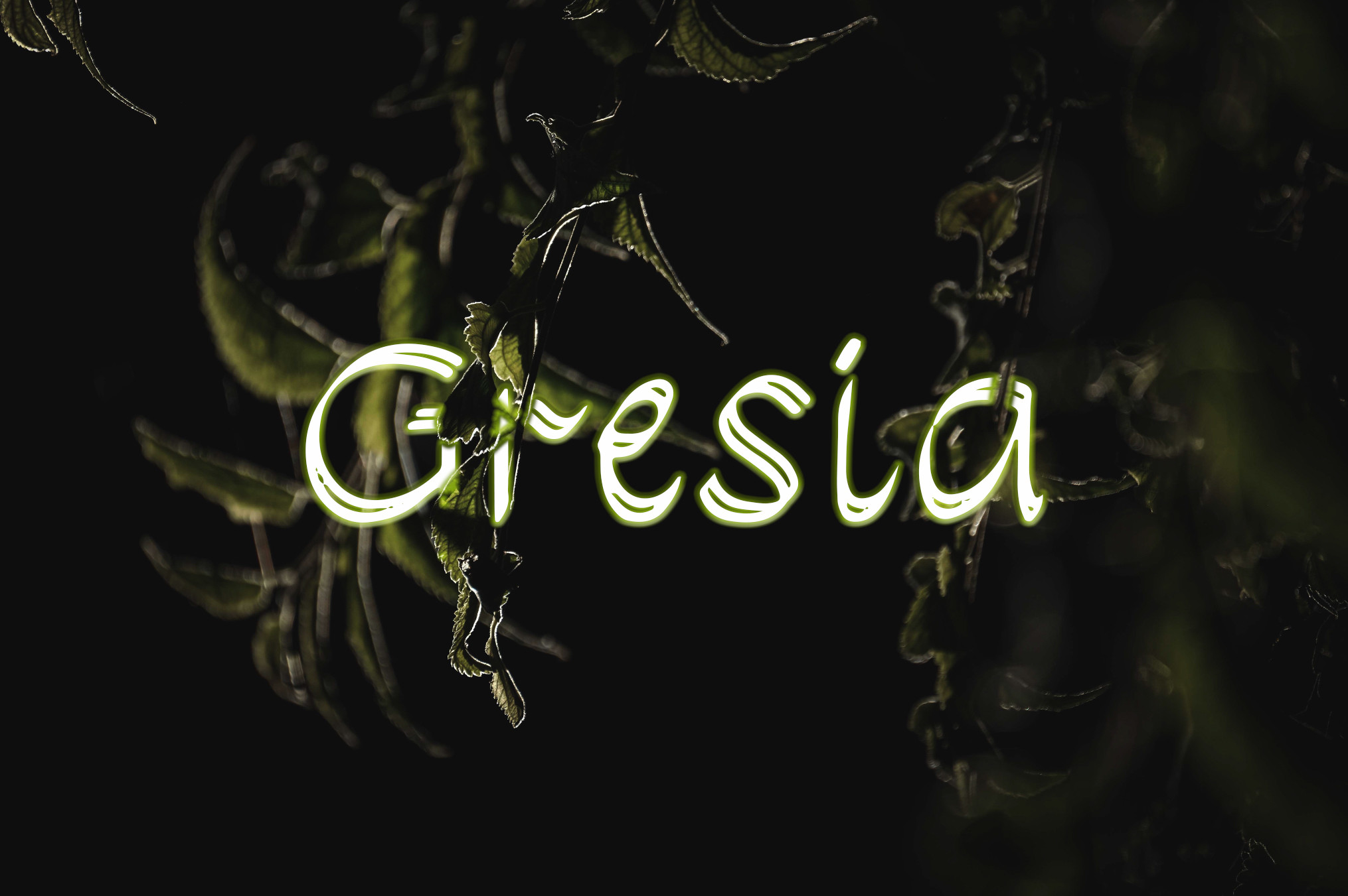
Gresia is a handwritten font for personalized designs such as wedding invitations. The product details do not confirm a subscription status, so check the Creative Fabrica page before use. It may suit a short personal line, such as a family note, but the style should be reviewed on the product page.
Best for: a short personal line, a family note, or a gentle title. By: Creative Fabrica
10. Avida
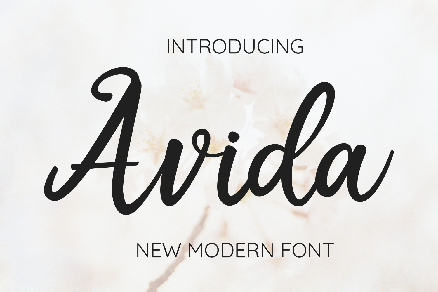
Avida is a modern script with smooth flowing strokes and contrast between thick and thin lines. The product details do not state a subscription status. Thin lines can be hard to check on a small proof, so print a test at full size. It may suit a name line or a short service line.
Best for: a name line, a short service line, or a gentle title. By: Creative Fabrica
11. SC Shinta
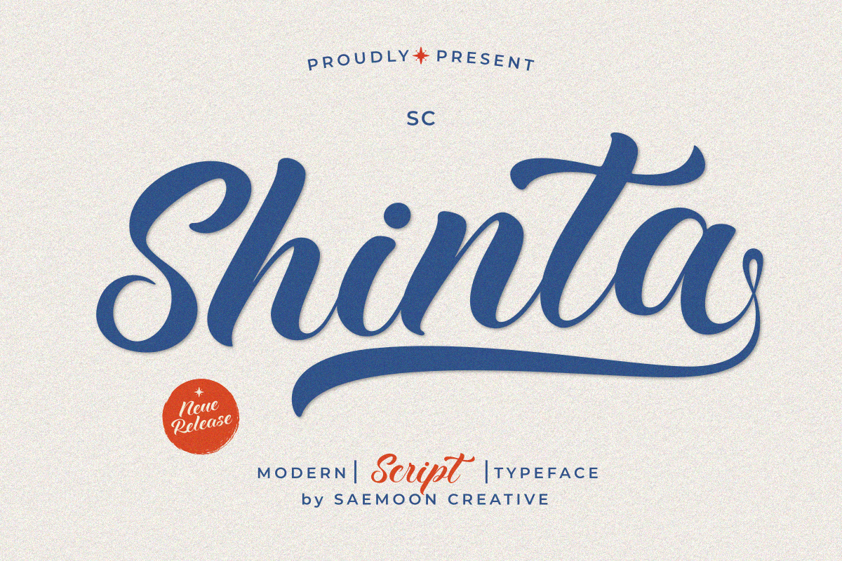
SC Shinta is a modern script font. It is subscription-only. The product details are brief, so review the style, weights, and license on the Creative Fabrica page before choosing it. It could suit a name line or a short service line if the preview matches the card’s tone.
Best for: a name line, a short service line, or a quiet title. By: Creative Fabrica
Best Sans-Serif Fonts for Date, Time and Venue
12. Devasia Sans
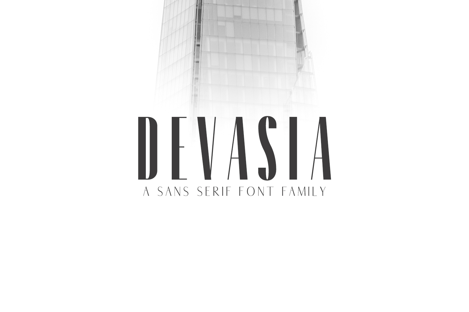
Devasia Sans is a rounded sans serif with five weights, intended for logos and presentations. It works with Cricut and Silhouette and is subscription-only. Its rounded forms may give a softer tone for a celebration of life invitation, while a traditional service may need a more formal serif.
Best for: supporting details or a celebration of life card. By: Creative Fabrica
13. Gresley
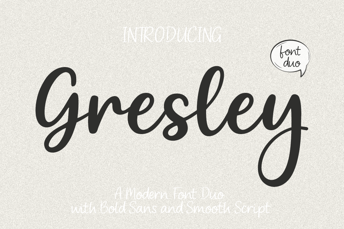
Gresley is a contemporary typeface duo: a sans for headlines plus a handwritten script variant. The product details do not state a subscription status, so check the Creative Fabrica page. The two styles are offered as a matched duo, which may make pairing easier, but the handwritten variant is best kept for a name or short line.
Best for: a service title, a name line, or a paired card. By: Creative Fabrica
How to Set Type on a Funeral Invitation Card
A single card usually needs four levels: an opening line, the name, the date and time, and the venue or note. “In loving memory” or “Celebrating the life of” can open the card. The name should be the largest or most prominent line. The date and time should be clear, and the venue should be easy to find. A short RSVP or note can sit at the bottom.
Use size and weight to create hierarchy, not too many typefaces. As a general guide, two fonts are usually enough, and three is the upper limit. A script font for a name on a memorial card should be limited to one or two words. A script font is better kept off the date and address, which should use readable fonts for date and address lines.
As a general guide, body text can sit around 10 to 12 pt, while the name or service title can be 16 pt or larger. A medium weight is often easier to read than an ultra-thin or ultra-bold style. Leave space around the name. The card should feel quiet, not crowded. Invitation typography for a service should feel calm, with clear spacing and a simple layout.
Contrast matters. Dark gray or black text on white or cream paper is a common choice. Light text on a dark background can work, but it should be checked on a printed proof. For a digital invitation, the guest may view the card on a phone, so the date and address should still be clear at a small screen size.
Before printing, make a test print at 100% size. Check the date, time, address, and spelling of the name. If the family uses Canva, Word, Cricut, or Illustrator, the same principle applies: review the card at full size. Erial is noted as compatible with Cricut, Procreate, and Canva, and Devasia Sans is noted as working with Cricut and Silhouette.
How to Choose the Right Font for Your Invitation
Start with the type of service. For a traditional funeral, a serif for the name and details is a common direction. A restrained script can be used for the name, but the date, time, and venue should remain in a readable serif. Remonsa, Erial, Clyra, and Classo are the serif options in this list, and each should be checked against the card’s tone.
For a small memorial service in a close family setting, the card can be simpler. One serif and one script may be enough. The name can carry the emotional weight, while the details stay plain. A script font for a name on a memorial card should not compete with the address.
For a celebration of life, a softer sans may feel more appropriate. Devasia Sans could suit the date, time, and venue if the family wants a calm, modern card. A light script can be used for the name, but the details should stay readable. Gresley may be useful because it includes both a sans and a handwritten variant.
Licensing matters. Most fonts in this list are subscription-only on Creative Fabrica. Gresia, Avida, and Gresley do not have a confirmed subscription status in the product details, so check the page before use. If a funeral home or print shop is producing the card, review the license for commercial use fonts for printed invitations. Free fonts are not confirmed in this selection, so do not assume any of these are free. Whether a font may be used commercially depends on its license, so check each product page instead of assuming.
Where to Download Fonts for Funeral Invitations
Creative Fabrica is the main source for the fonts above. Most entries are available through a subscription, and each product page shows the license, style, and download options. Before choosing a font for a funeral invitation card, review the preview, the included weights, and the license.
Google Fonts, DaFont, and Font Squirrel can be useful for free alternatives, but they are not part of this selection. For a memorial service invitation font, the safest approach is to confirm the license before printing, especially if a funeral home, print shop, or designer is producing the card. A calm, readable card is easier to share when the type choices are simple and the license is clear.
For more typography guidance, see the FontPro blog.