· fonts · 14 min read
18 Best Gothic Fonts for Bold, Dark Designs in 2026
Discover the best gothic fonts for dark, dramatic designs. From classic blackletter to bold metal display type. Download free and premium options today.
Looking for gothic fonts that actually pull their weight? You’ve probably searched best gothic fonts and landed on a wall of dripping blood horror type, only to realize you needed a clean blackletter for a wedding invite. Or maybe you wanted a metal band font and got a delicate academic serif instead.
I have seen this mismatch a lot. The search term is broad, and the results are often more extreme than the project needs.
The word gothic covers a huge range. Some of these typefaces are historically grounded blackletter, legible enough for real text. Others are pure dark display, built to scream at you from a logo. This list of 18 best gothic fonts splits the difference, so you can match the typeface to the job.
What Makes a Font “Gothic”?
First, a quick terminology check, because gothic gets used two very different ways.
In typography, gothic and blackletter point to the same family: the dense, angular scripts that dominated Northern European printing from the 12th century onward. Scribes first developed them as a faster, parchment-saving alternative to Carolingian Minuscule. The name gothic is actually a Renaissance insult. Humanist scholars, obsessed with classical Roman letterforms, dismissed these medieval scripts as barbaric. The slur stuck.
Blackletter breaks into four main historical families: Textura, the formal grid-like style, plus Fraktur, Schwabacher, and Rotunda. All share the same DNA: tall, narrow letters, sharp angular strokes, and the high contrast you get from a broad-nib pen. That density is why the style reads as black on the page.
Here’s the catch. There’s a separate gothic in Scandinavian and Northern European naming, and it means something else entirely. Bank Gothic, Franklin Gothic, and News Gothic are grotesque sans-serifs, not blackletter at all. They’re clean, modern, and out of scope here.
So when we talk about gothic fonts in this article, we mean blackletter derivatives and dark display type. That’s the gothic of metal posters, Halloween designs, tattoo lettering, and moody luxury branding. Not the gothic of a newspaper body font.
18 Best Gothic Fonts for Every Project
I’ve grouped these 18 into three tiers so you can see the range at a glance. Classic blackletter up front for legible, historical work, bold display in the middle for loud branding, and decorative dark type at the end for maximum atmosphere.
Best Classic & Blackletter Gothic Fonts
Start here if you need gothic that still reads. These gothic blackletter fonts keep historical accuracy and legibility, which makes them right for certificates, wedding invitations, book covers, and beer or wine labels.
I would usually begin with this group when the project needs a dark tone but still has to feel polished.
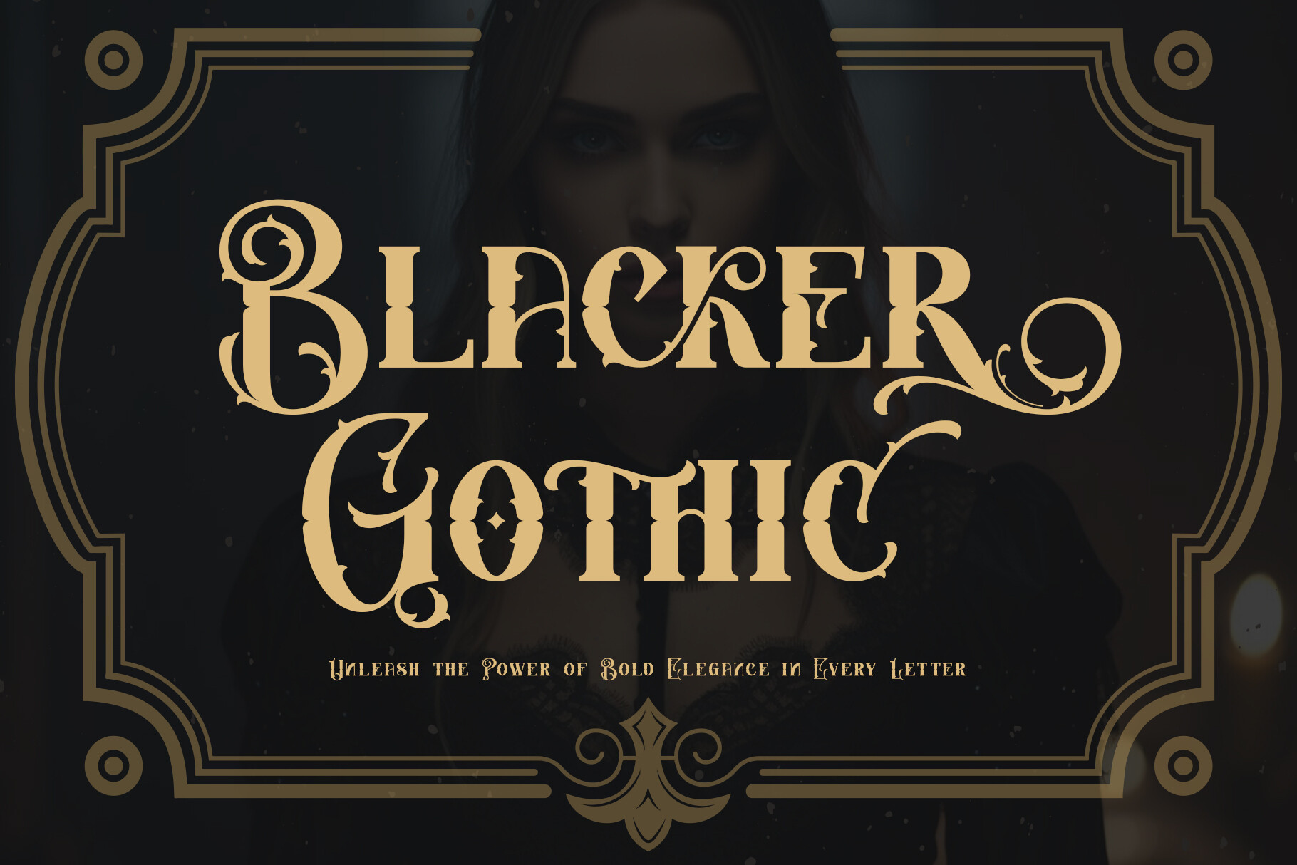
1. Blacker Gothic
A bold, confident blackletter with clean, even strokes and strong vertical rhythm. It reads as classic old English type without fraying edges, so it holds up at small sizes better than most here. The weight gives it real presence on a cover or label.
If your project needs to feel established without looking like a Halloween prop, this is a safe first pick.
Best for: book covers, certificate headers, heritage brand logos. By: thomasaradea
2. Nightmare Gothic
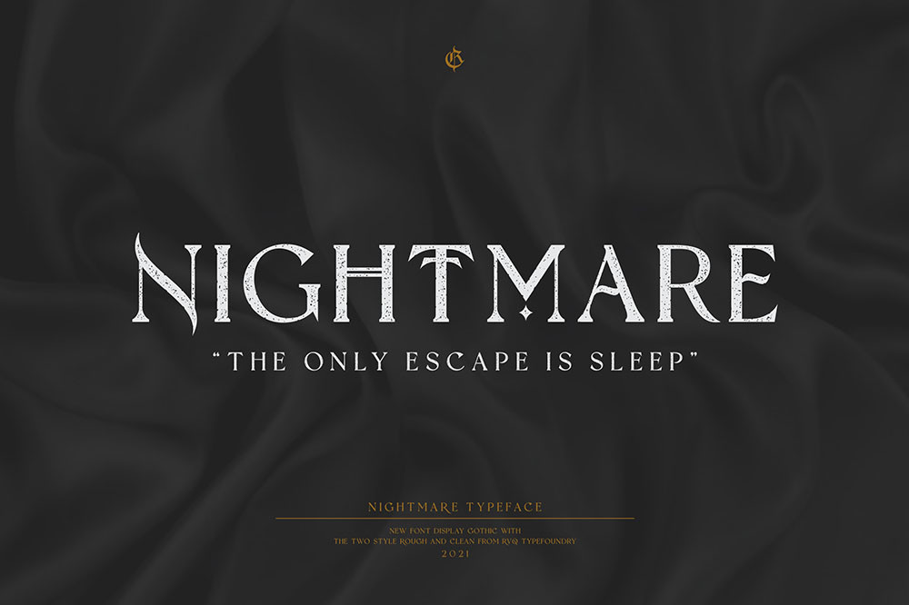
Nightmare Gothic leans darker and more ornate, with extra flourish and a slightly twisted edge. It carries a haunted, gothic-subculture mood, like type pulled from a candlelit crypt rather than a library.
It is more theatrical than the first two, so use it where the mood matters more than clean reading.
Best for: dark event posters, gothic brand identity, album art. By: Rvq Type Foundry
3. Minimal Blackletter
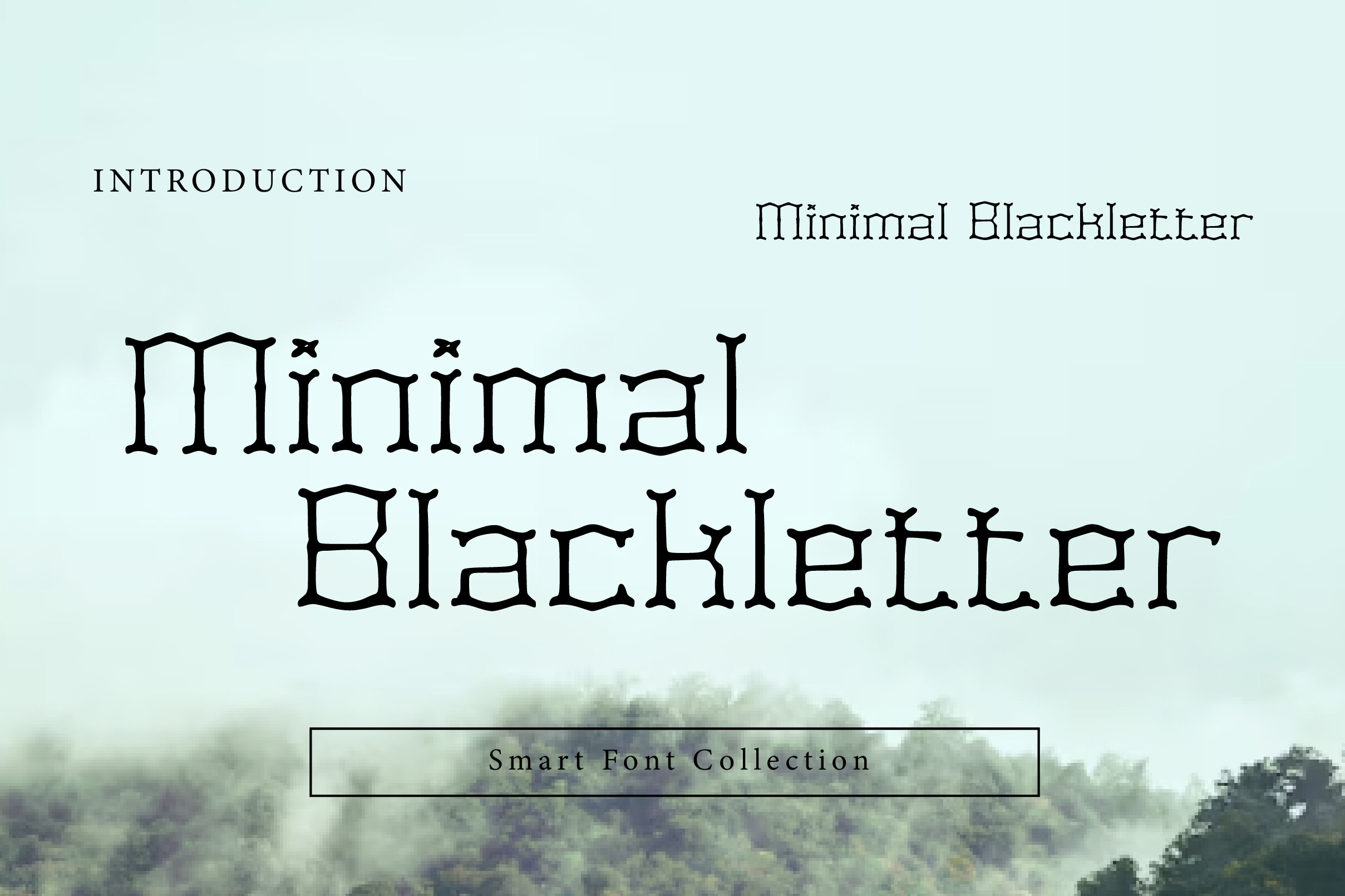
Wow Magic strips the style back to its core, removing most ornament for a simplified, modern blackletter. It’s the most legible font in this list, the rare gothic you can actually use for subheads or short body copy.
This is the one I would test first if the brief says gothic but the client still wants the text to be readable.
Best for: subheadings, modern gothic branding, short body text. By: Wow Magic
4. Midnight Blackletter
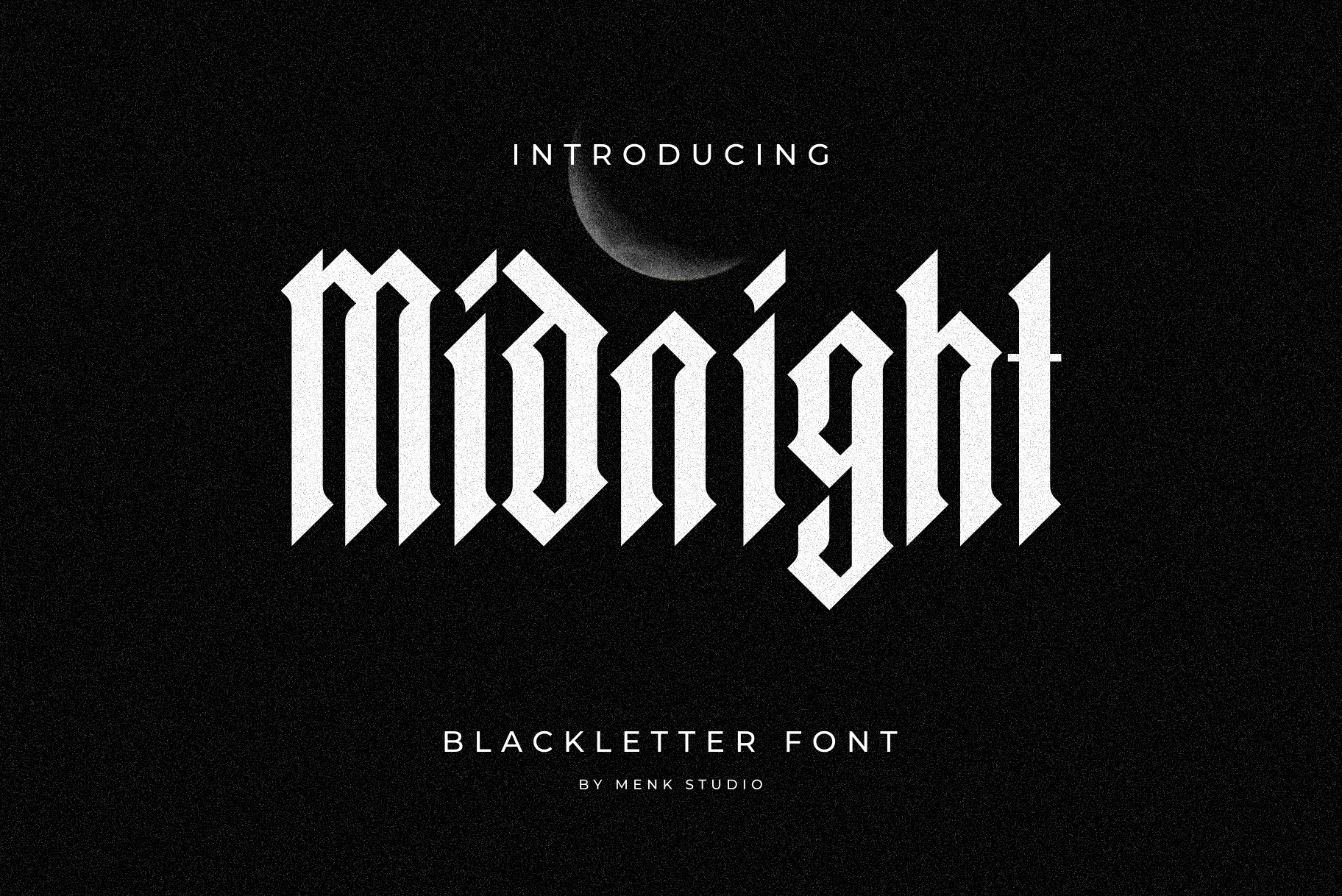
Sharp, traditional gothic letterforms tightened into a crisp, high-contrast shape. It feels formal and a little severe, which suits anything that needs to look established and old-world. Clean edges keep it readable where ornate styles get muddy.
For wedding invitations, it has a nice sense of ceremony without tipping into horror.
Best for: wedding invitations, academic covers, premium labels. By: MENK Studio
5. Cambridge
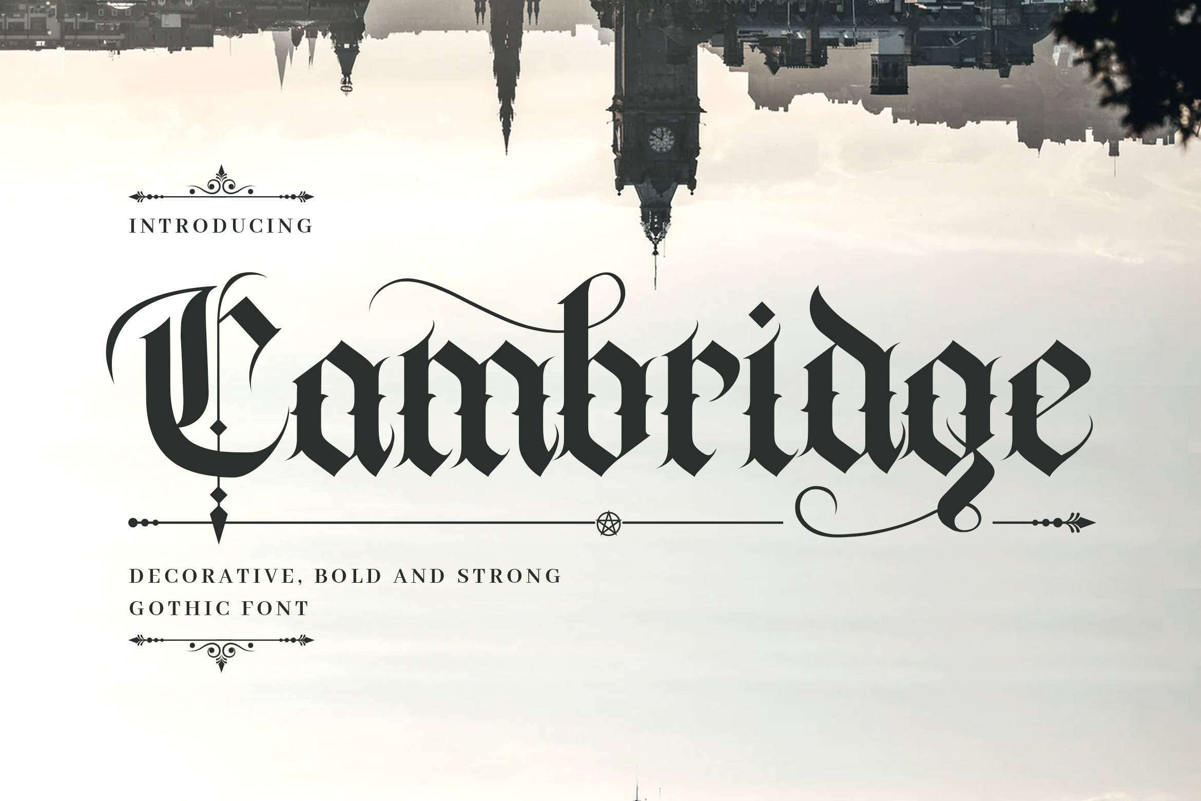
The elegant, academic end of gothic. Refined, balanced letterforms with a scholarly calm that suits institutions, universities, and heritage brands. If you need an old English font that looks prestigious rather than scary, this is it.
It is the least dramatic of the classic group, and that is its strength.
Best for: university branding, certificates, classic book titles. By: naulicrea
6. Medieval Blackletter
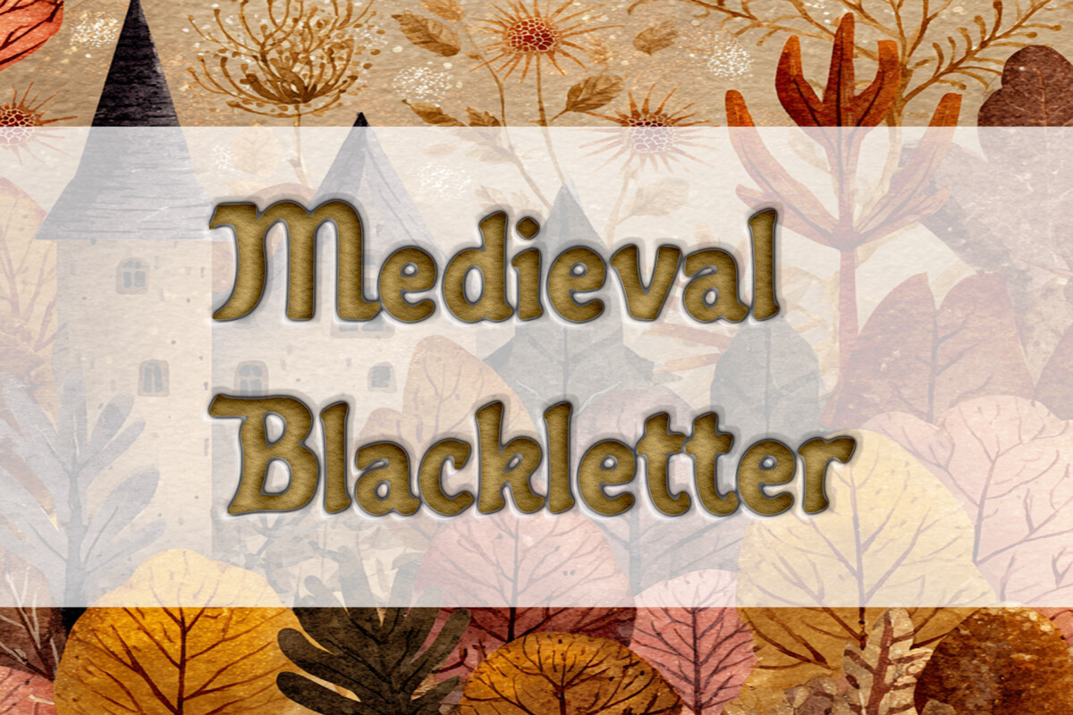
Authentic manuscript style with the hand-drawn irregularity of a real scribe’s work, the most historically grounded option here. It also ships SVG files, a strong fit for Cricut Design Space and laser-cut projects that need clean vector paths.
If you are making cut vinyl, wood, or metal pieces, the SVG files make this one of the more practical picks.
Best for: medieval gothic designs, SVG cut files, vintage labels. By: Heidi Vargas-Smith
7. Old English Grunge
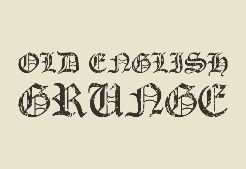
The deliberate outlier in this group. A distressed, textured blackletter with worn, eroded edges that pushes it toward the grittier end. Use it when you want old English type that feels weathered and street-ready rather than pristine.
It has a worn-in feel that works well on merch, but it can look messy if the design is already busy.
Best for: grunge merch, tattoo lettering, edgy brand marks. By: GraphicsNinja
Best Bold Display Gothic Fonts
Now the loud end. These bold display gothic fonts mix blackletter with chunky, heavy shapes. They’re built for logos, covers, and streaming branding where you need the type to shout. Sporty and street aesthetics work well here too.
These are the fonts I reach for when the project needs to feel immediate, not refined.
Note: these are display faces. Keep them to short headlines and logotypes, not paragraphs.
8. Big Fat Gothic
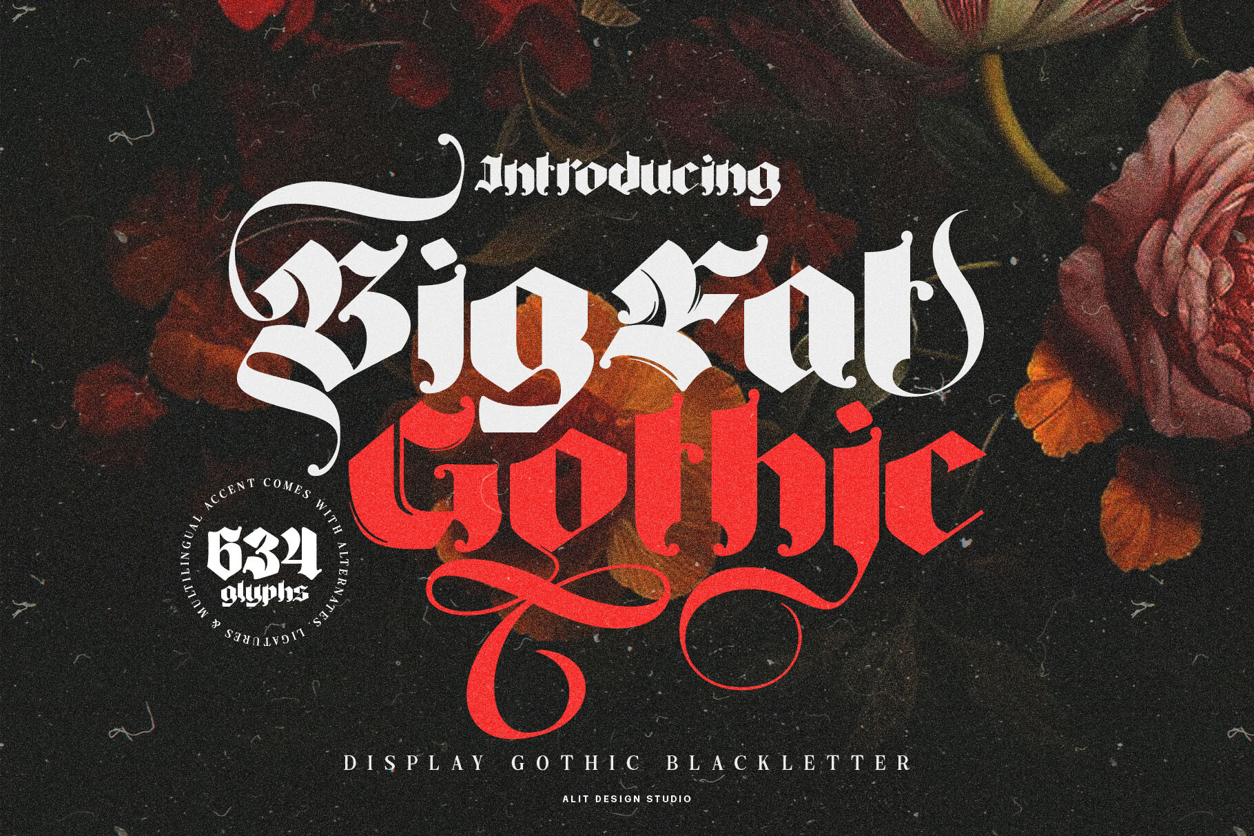
Lives up to the name. An extra-bold, chunky gothic display font with thick, almost cartoonish weight. The heavy strokes fill space fast, so it works best with a few words and a lot of room, a logo that lands with a thud.
It is playful enough for streetwear, but still heavy enough to read as gothic.
Best for: bold logos, t-shirt graphics, poster headlines. By: Alit Design
9. Stackwin
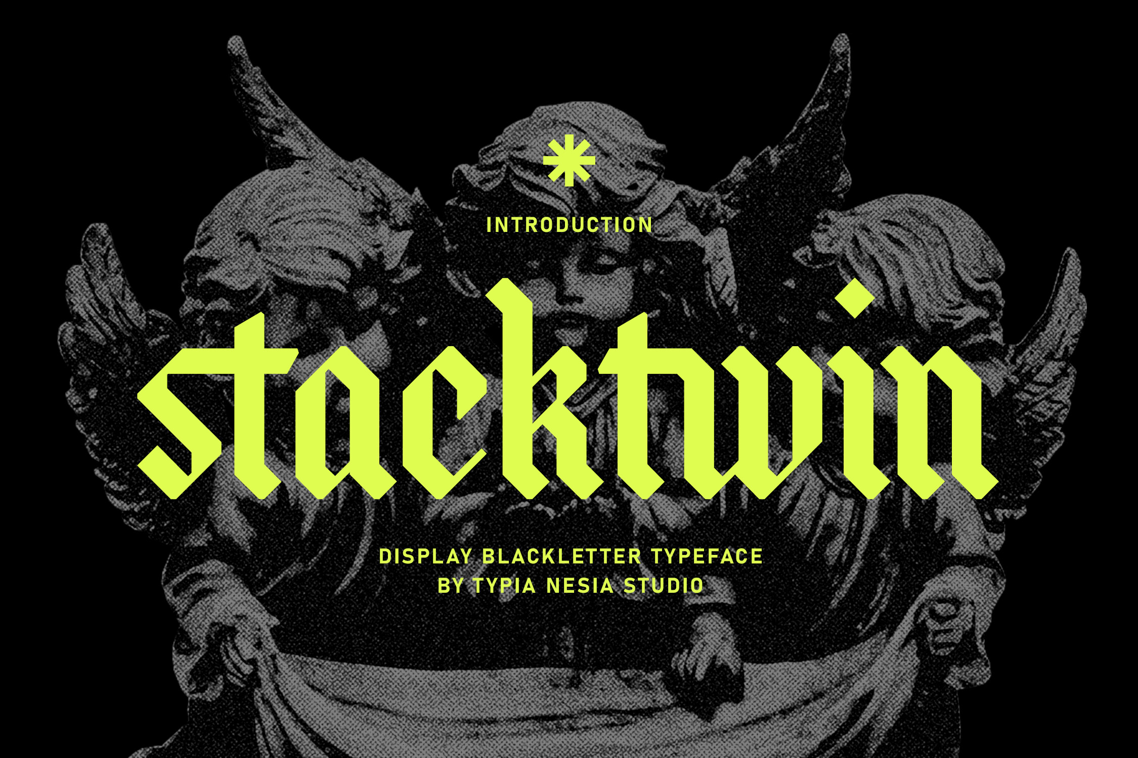
A stacked, bold gothic display typeface with a compressed, vertical build. The tight stacking gives it a dense, aggressive look that reads like a metal band font or gaming brand mark, a strong pick for music, tattoo, and streaming audiences.
The vertical compression makes it useful when the logo needs to fit into a narrow space without losing weight.
Best for: metal band logos, gaming branding, tattoo flash. By: Typia Nesia
10. Medieval Times
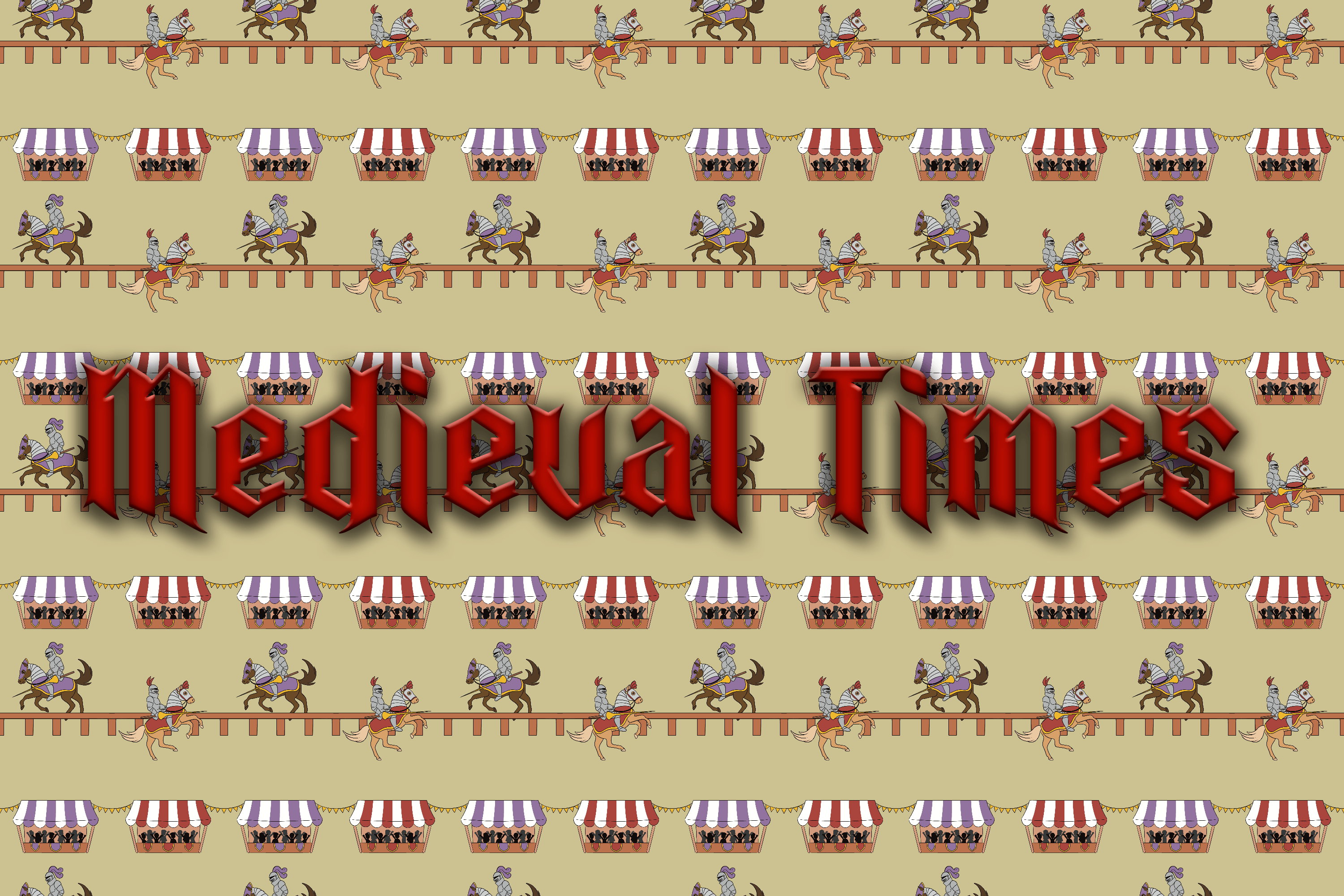
A heavy, medieval-inspired display gothic and the most affordable font in this list. It carries a generic, bold historical vibe rather than a specific mood, a flexible workhorse for fantasy titles, tavern signage, and anything that just needs to say medieval.
It is not the most refined option here, but it is a useful budget pick when the job is simple.
Best for: fantasy titles, event banners, casual medieval branding. By: little_red_studio
11. Monastery
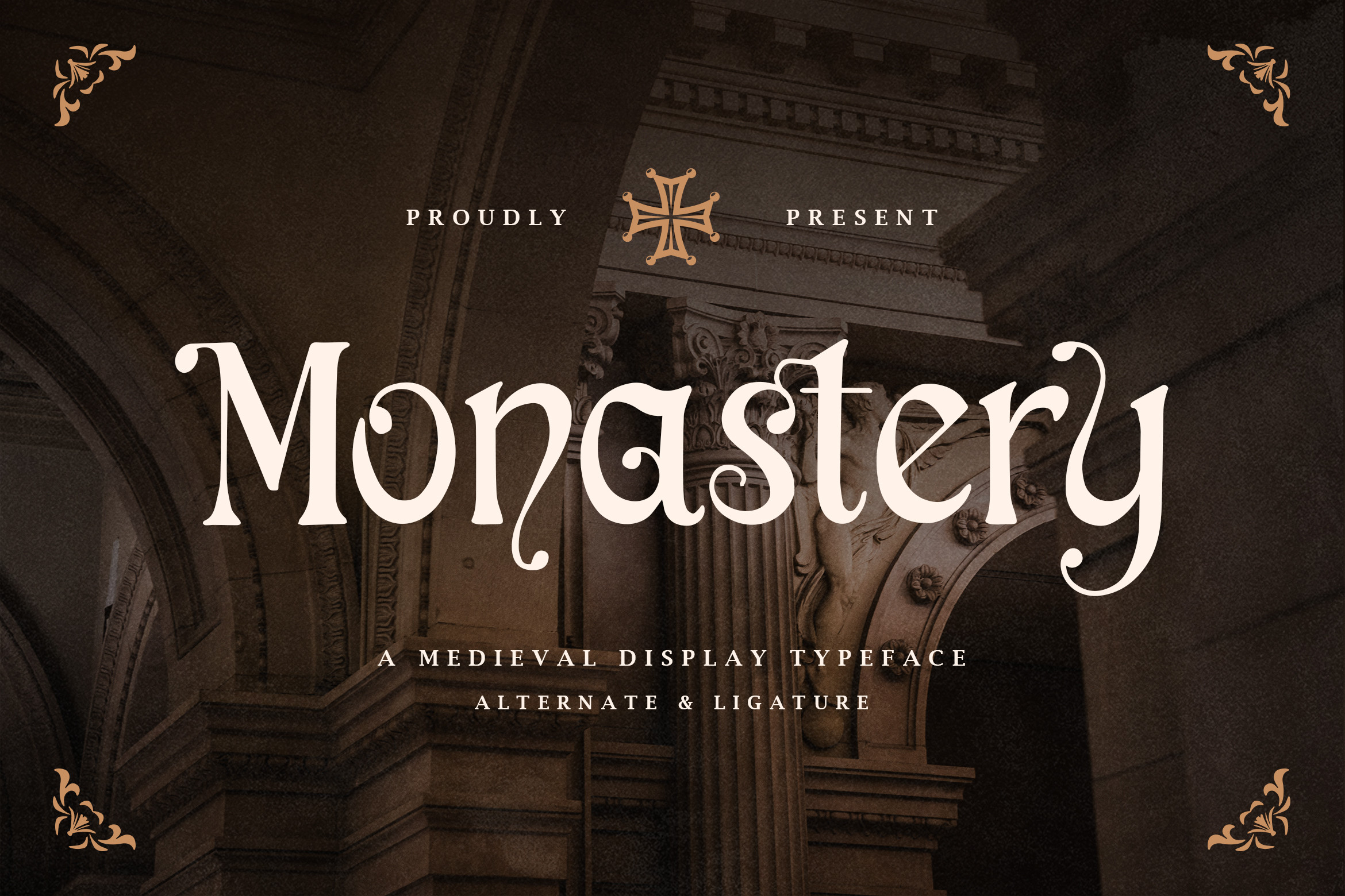
Same bold gothic territory, but with a distinct monastic, ecclesiastical character. Where Medieval Times reads as generic history, Monastery feels like it belongs on a cathedral door or monastery seal, solemn and stone-carved.
If the project has a religious, institutional, or dark-fantasy angle, this one feels more specific.
Best for: religious branding, dark fantasy titles, heritage seals. By: TypeFactory
12. Gritty Medieval
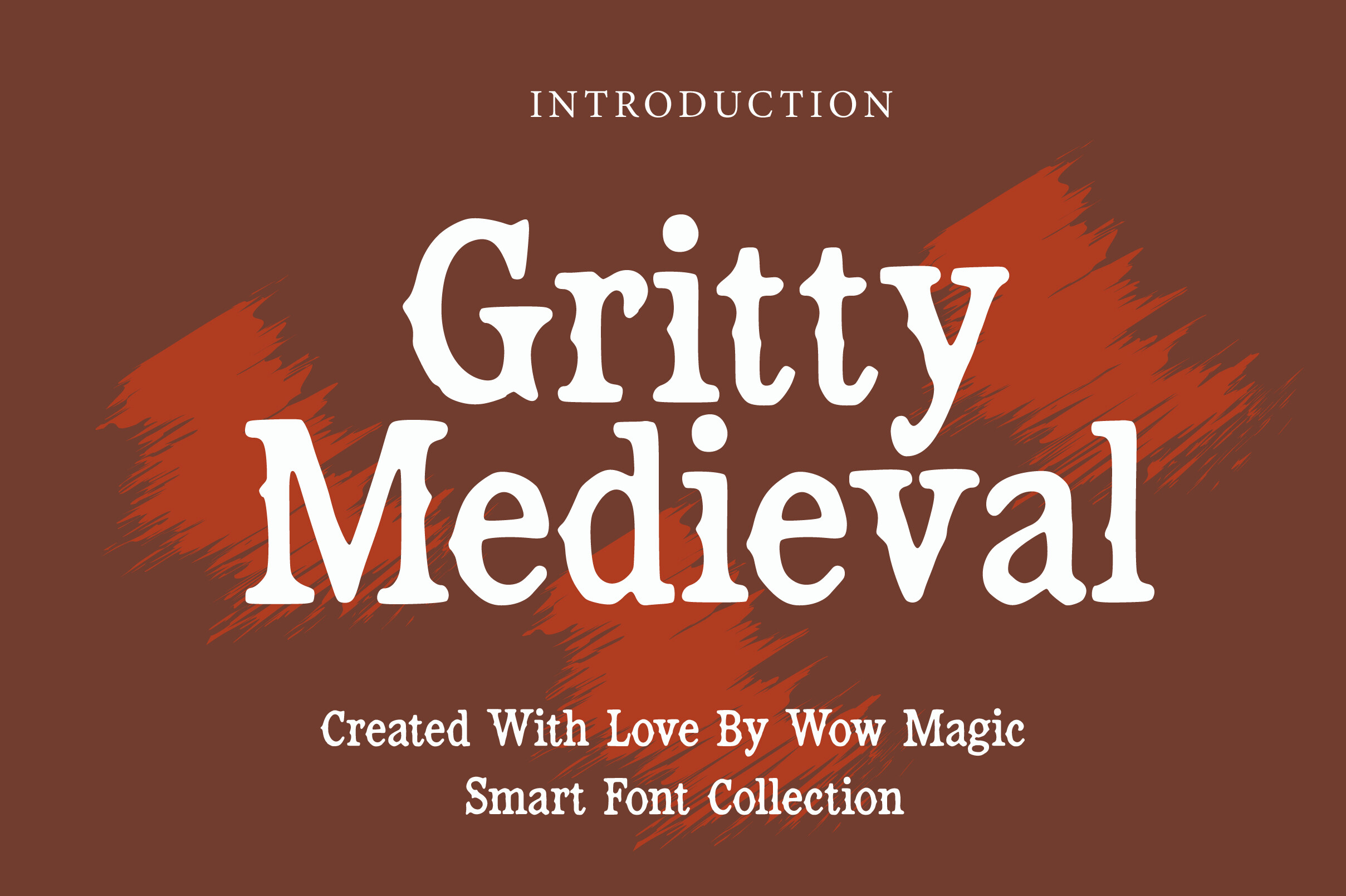
A rough, textured surface over a bold gothic base. The worn, gritty edges give it a used, battle-worn feel that suits streetwear, metal, and anything that needs to look lived-in, sitting between clean blackletter and full horror type.
The texture does a lot of the work, so it can look great on a poster but may need cleanup for small logos.
Best for: streetwear graphics, metal posters, rugged brand marks. By: Wow Magic
13. Metal Gothic
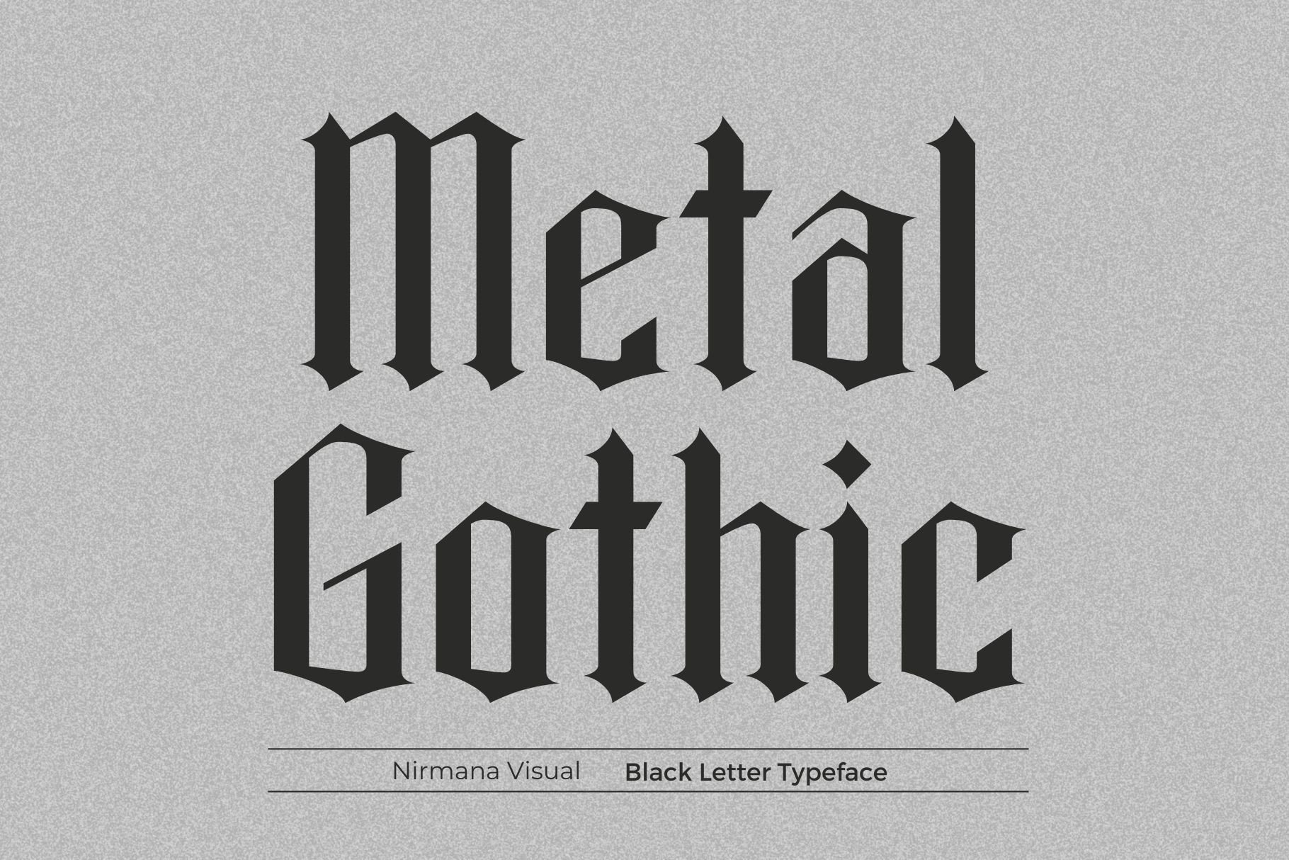
Exactly what it says. A heavy metal band-style gothic display font with sharp, aggressive terminals and weight built for an album cover or tour poster. Designing for the metal or gothic music scene? This is your metal band font.
It is one of the most direct picks in the list if the brief mentions metal, band logos, or tour posters.
Best for: album covers, band logos, tour posters. By: Sigit Dwipa
Best Decorative & Dark Gothic Fonts
Finally, the atmospheric end. These dark gothic fonts are maximally stylized and built for mood. They’re perfect for Halloween, tattoo, album covers, and dark fantasy branding.
This is where the style gets the most dramatic, and also the hardest to use in long text.
Note: use these only for short headlines and logotypes. The heavy ornamentation falls apart in long text, so keep them to a few words at a time.
14. Bleeding Vampire
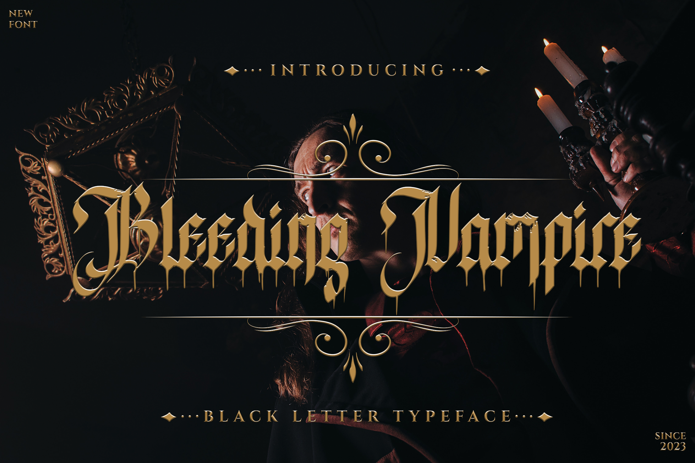
A dripping, horror-style gothic font. The letters literally drip, making it a one-trick pony in the best way. It’s the obvious pick for Halloween fonts gothic and horror work, but skip it anywhere that needs to feel tasteful.
It is a seasonal font, and that is fine. For a haunted house flyer or Halloween merch drop, it does the job quickly.
Best for: Halloween designs, horror posters, spooky event flyers. By: meizzalunadesign
15. Grimoire Noir
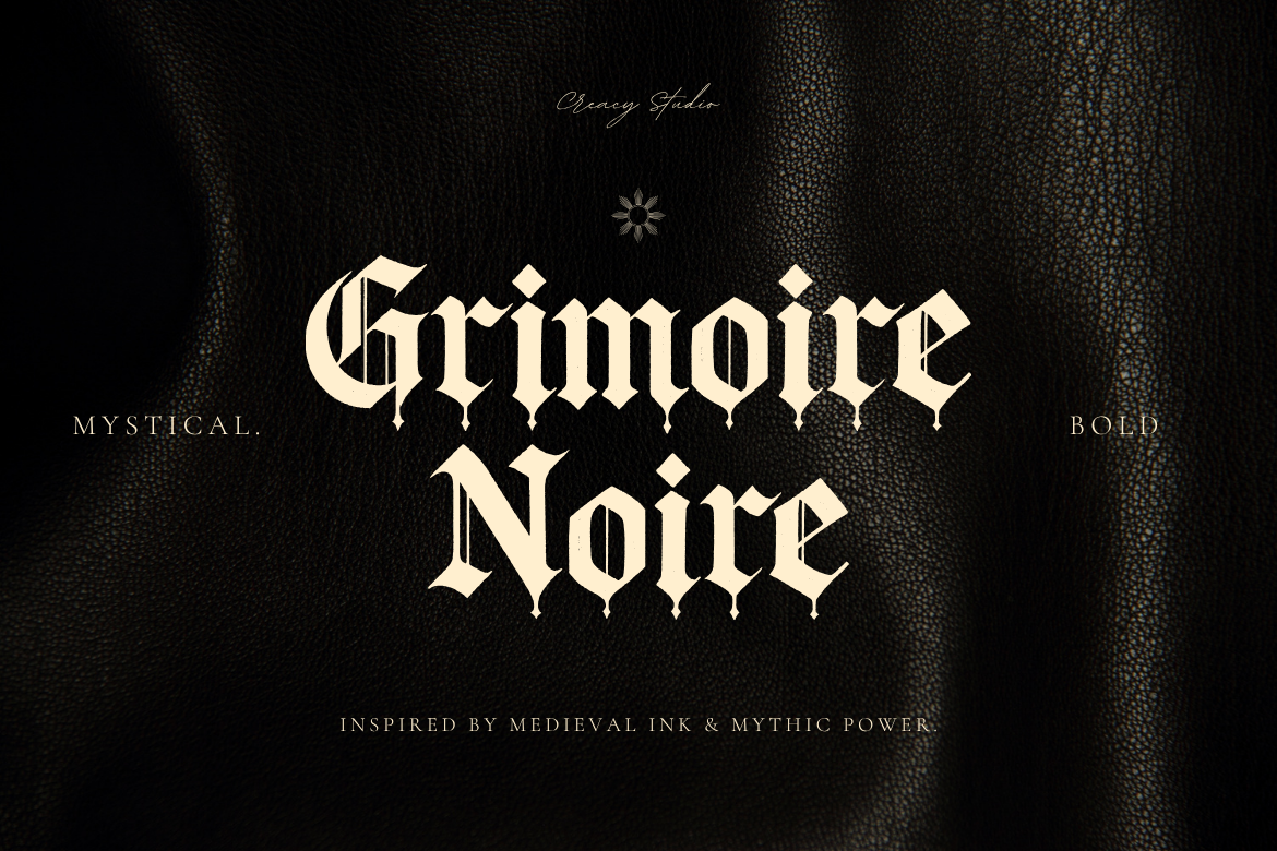
A dark fantasy ornate gothic font with a manuscript and cathedral feel. The dense, decorative detail gives it a retro-branding, old-grimoire mood, the pick when you want dark fantasy fonts that read like a spellbook cover, not a horror poster.
It feels more like a book cover or premium label than a cheap horror prop.
Best for: dark fantasy branding, spellbook covers, retro gothic labels. By: Creacy Studio
16. Velgravia
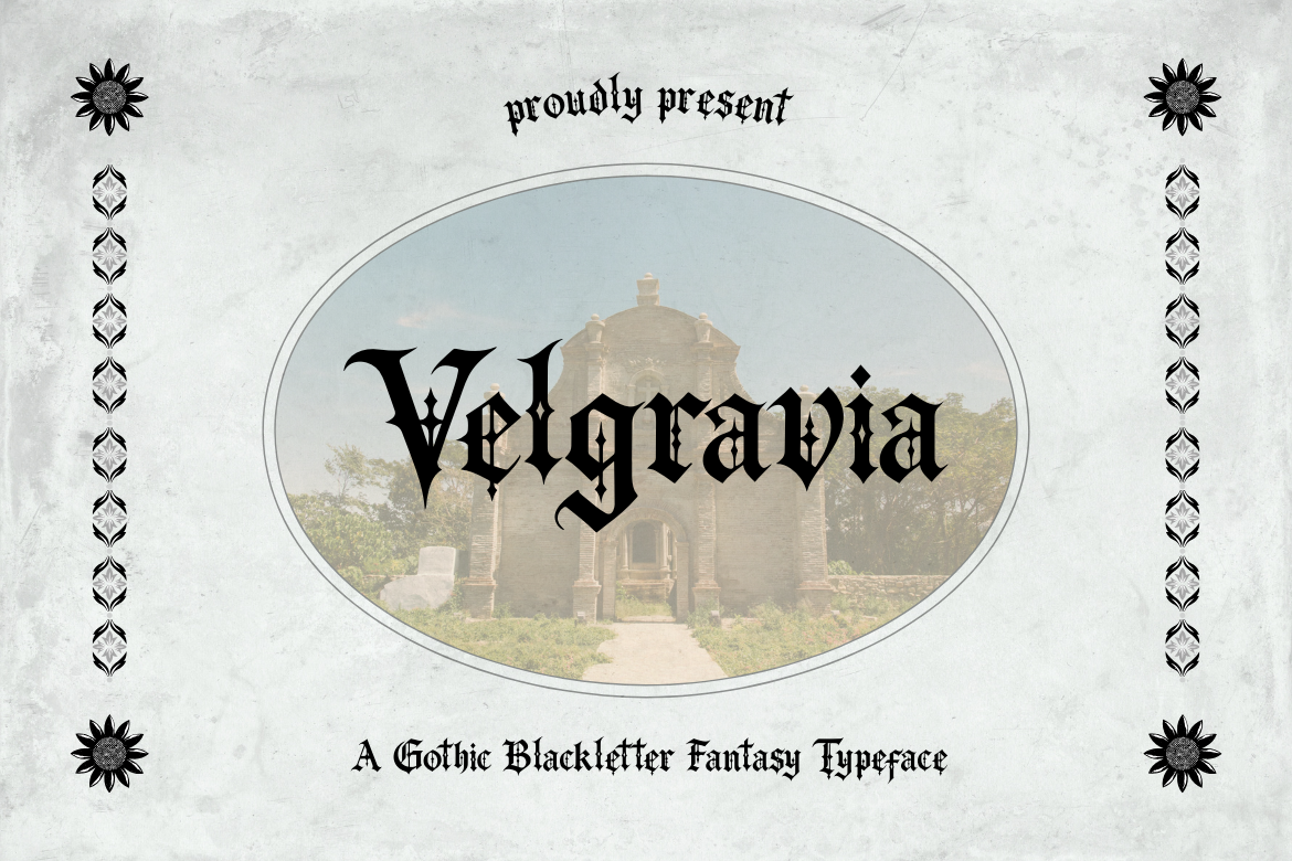
From the same studio as Grimoire Noir but a different direction. An elegant dark gothic display typeface with sharp terminals and diamond-shaped decorations. The mood is dark luxury rather than pure fantasy, a strong choice for premium, high-end branding.
If the project needs to feel expensive and a little mysterious, this is a better fit than the more ornate options.
Best for: dark luxury branding, premium labels, elegant gothic logos. By: Creacy Studio
17. Conthic
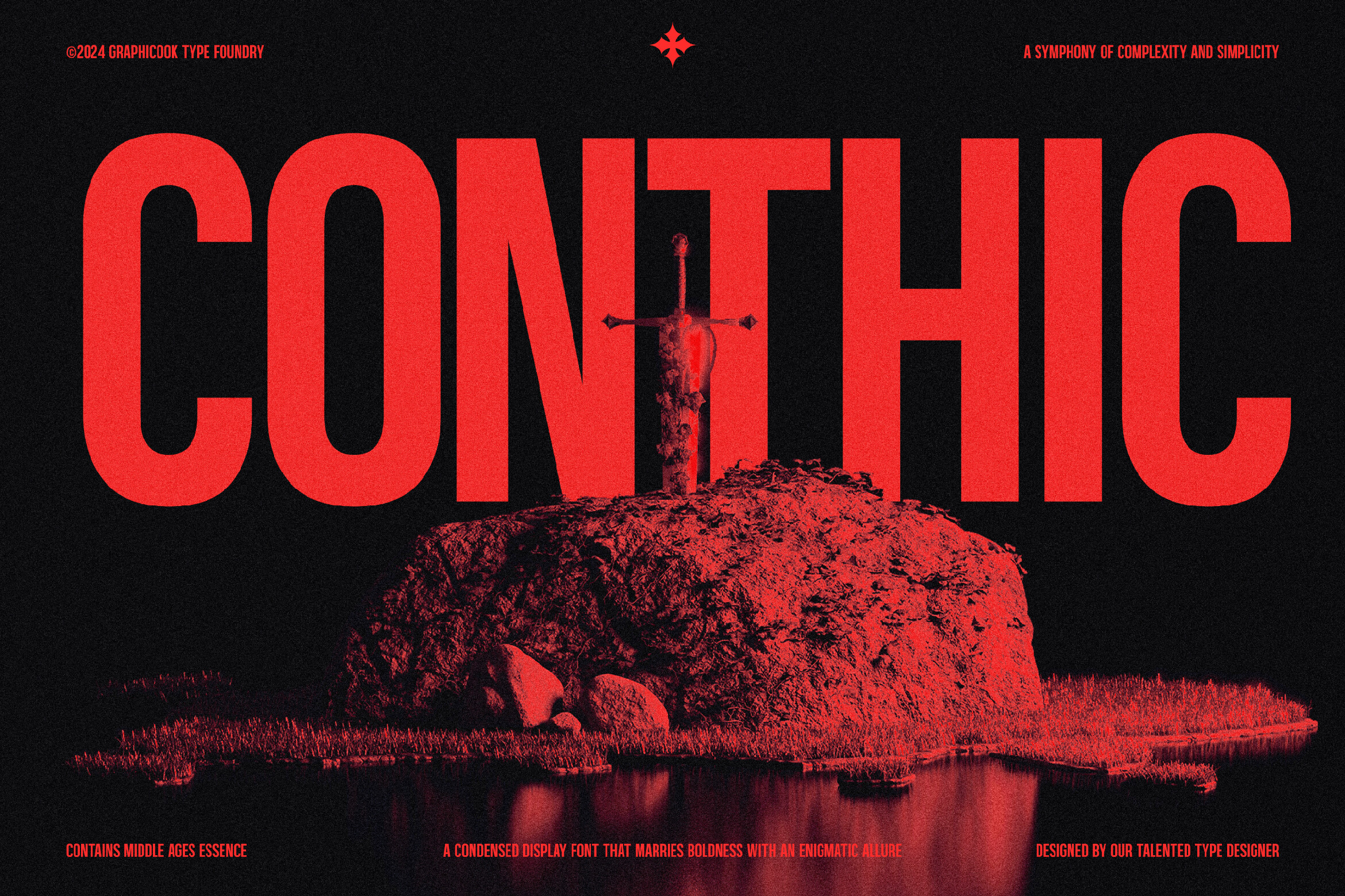
The structural outlier here. A condensed decorative gothic typeface, much narrower than the wider, heavier blackletter entries around it. That tight, vertical build suits tall spaces, stacked layouts, and logos that need gothic character in a slim footprint.
It is useful when the layout is tight and the wider gothic faces would crowd the design.
Best for: condensed logos, vertical layouts, tight brand marks. By: Graphicook
18. Grimvault
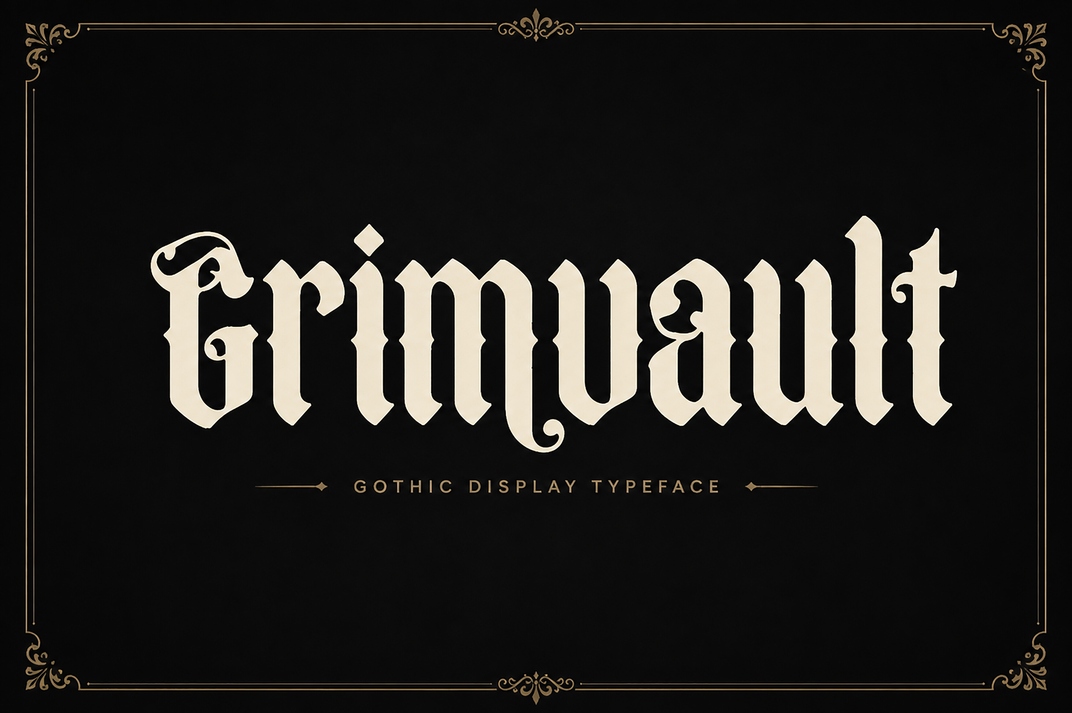
An ominous, decorative gothic display font. Dark, dense, atmospheric letterforms with a foreboding weight that suits dark fantasy and horror-adjacent work, the strongest pick when you want gothic that feels like it’s guarding a vault of secrets.
It has a heavy, sealed-door feeling, so it works best when the design already has a dark, mysterious tone.
Best for: dark fantasy titles, ominous branding, gothic album art. By: Wow Magic
How to Use Gothic Fonts in Your Design Projects
Pairing is the single biggest factor in whether gothic type looks intentional or like a costume.
Pair gothic with a clean sans-serif for body copy if you want a contemporary, legible contrast. The gothic carries the accent, the sans handles the reading. If you want a more classic, traditional feel, pair it with a simple serif instead. Either way, let the gothic do the shouting and the body font do the talking.
Keep gothic to headlines and logos, not main text. The ornate strokes lose legibility at small sizes, so resist the urge to set a whole paragraph in blackletter. That said, a highly legible face like Minimal Blackletter is a genuine exception and can carry subheads or short body copy.
Scale matters. Gothic details only reveal themselves at larger sizes. Give the type room to breathe and the sharp terminals and dense strokes will read as intentional rather than muddy.
When in doubt, zoom out. If the letterforms start to look like a dark blur, the size is too small.
Here’s how that plays out by project:
- Album covers and band logos: go with the bold display and dark group. Stackwin, Metal Gothic, Grimoire Noir, Velgravia, and Grimvault all serve the metal, tattoo, and gaming crowd.
- Tattoo flash: a gothic font for tattoo works best when it’s bold and clean. Minimal Blackletter or Old English Grunge give you legibility with edge.
- Wedding invitations: stick to the classic blackletter group. Midnight Blackletter and Cambridge keep it old-world without tipping into horror.
- Halloween merch: Bleeding Vampire and the decorative dark group are your seasonal weapons.
- Streaming and gaming branding: Stackwin and Conthic give you a tight, modern-aggressive mark.
- Beer and wine labels: Blacker Gothic and Medieval Blackletter read premium and heritage.
Tips for Choosing the Right Gothic Font
Licensing first. Are gothic fonts free for commercial use? It depends on the font, and a free download does not automatically mean free commercial rights. Some free fonts carry open licenses like SIL OFL or Apache, others are restricted. All 18 fonts in this list are premium Creative Fabrica products, and each listed price includes a commercial license. The range runs from $2.50 to $25.00. Note that Creative Fabrica’s 100% free banner refers to free-trial and subscription download access, not a free commercial license. If you’re building a logo or selling a product, buy the license.
This is the part I would not skip. A logo can look great in a mockup and still create a licensing problem later.
A quick answer on the gothic font for logo question: for a logo you want legibility and a clean silhouette, so a classic blackletter like Blacker Gothic or a bold display like Stackwin usually beats a dripping decorative face.
On the difference between gothic and blackletter: in practice they overlap heavily. Blackletter is the precise typographic term for the historical script family, while gothic is the broader, looser label that also covers modern dark display type.
Software compatibility matters for the decorative end. What software works best with decorative gothic fonts? Procreate, Photoshop, Illustrator, Cricut Design Space, and Canva all handle them, but check OpenType feature support for the more ornate faces. If you’re cutting with a Cricut, look for fonts that ship SVG files, like Medieval Blackletter.
Finally, match the tier to the job. Classic blackletter for historical, legible work. Bold display for loud branding. Decorative dark for short, atmospheric headlines. Don’t cross those lines.
A simple test is to set the same headline in three tiers. The right one will match the tone of the project without fighting the layout.
Where to Download Gothic Fonts
Creative Fabrica is the primary source for this list. All 18 fonts above live there, and each product page includes the commercial license and preview files you need before you buy.
For additional free gothic fonts and a blackletter font download option, these three are worth a look:
- Google Fonts: a large library of free, open-licensed typefaces. Search blackletter or gothic for a few solid options.
- DaFont: a big free font archive with a long history of gothic and horror faces. Always check the individual license.
- Font Squirrel: a curated, license-friendly collection that’s easier to trust than a random download.
If you want more typeface breakdowns and design resources, browse the rest of the FontPro blog.
Pick the tier that matches your project, check the license, and give the type some room. That’s most of the battle won.