· fonts · 14 min read
18 Best Futuristic Sci-Fi Fonts in 2026
Discover best futuristic sci-fi fonts for game titles, tech logos, esports and space posters: sleek space display, cyberpunk, bold tech and clean sans picks.
A futuristic font is not one look. It can be a clean orbital interface, a neon alley, a heavy mech logo, or a blocky headline for a kids’ space craft. That is why the best futuristic sci-fi fonts cover more than one mood. Some are space fonts for posters and game titles. Some are cyberpunk fonts for streaming overlays and techno releases. Some are bold tech fonts for esports graphics. Some are clean futuristic sans serif faces that keep body text readable.
What Makes a Font Look Futuristic?
A font looks futuristic when it feels engineered rather than historical. The strongest sci-fi fonts use wide proportions, geometric shapes, sharp angles, cut corners, stencil breaks, or rounded capsule forms. Many are uppercase only. That gives them the feel of mission patches, HUD labels, or space program signage. Some add monospaced or technical details, like tick marks, brackets, and squared terminals, to suggest data, code, or machine interfaces.
I usually look at the caps first. If the uppercase forms feel too soft, the face will lose its sci-fi edge. If they feel too sharp, the face may become hard to read in a UI. A good futuristic font should survive a quick glance.
Cyberpunk fonts push that idea further. They add aggression, neon energy, and decorative cuts that read like damaged screens, street signage, or high-speed interfaces. If you want a softer future, look for clean futuristic sans serif faces with open counters and calm geometry.
For free starting points, Google Fonts has a few reliable names. Orbitron is often treated as the default free cyberpunk display font. Space Grotesk is technical and contemporary, slightly futuristic without being aggressively sci-fi. Bruno Ace has gained traction for cyberpunk-adjacent work because it is slightly geometric and slightly stenciled.
The practical rule is simple: use a futuristic display font for the headline, and pair it with a clean sans for body text. That keeps the future loud where it matters and readable everywhere else.
Space & Sci-Fi Display Fonts
Space fonts are the classic answer to what font looks futuristic. They suit posters, game titles, book covers, event titles, and kids’ space crafts. This group leans toward adventure, retro-futurism, and clean cosmic energy. Some are bold enough for sci-fi movie fonts, while others are smooth enough for a planetarium flyer or a tech event sign.
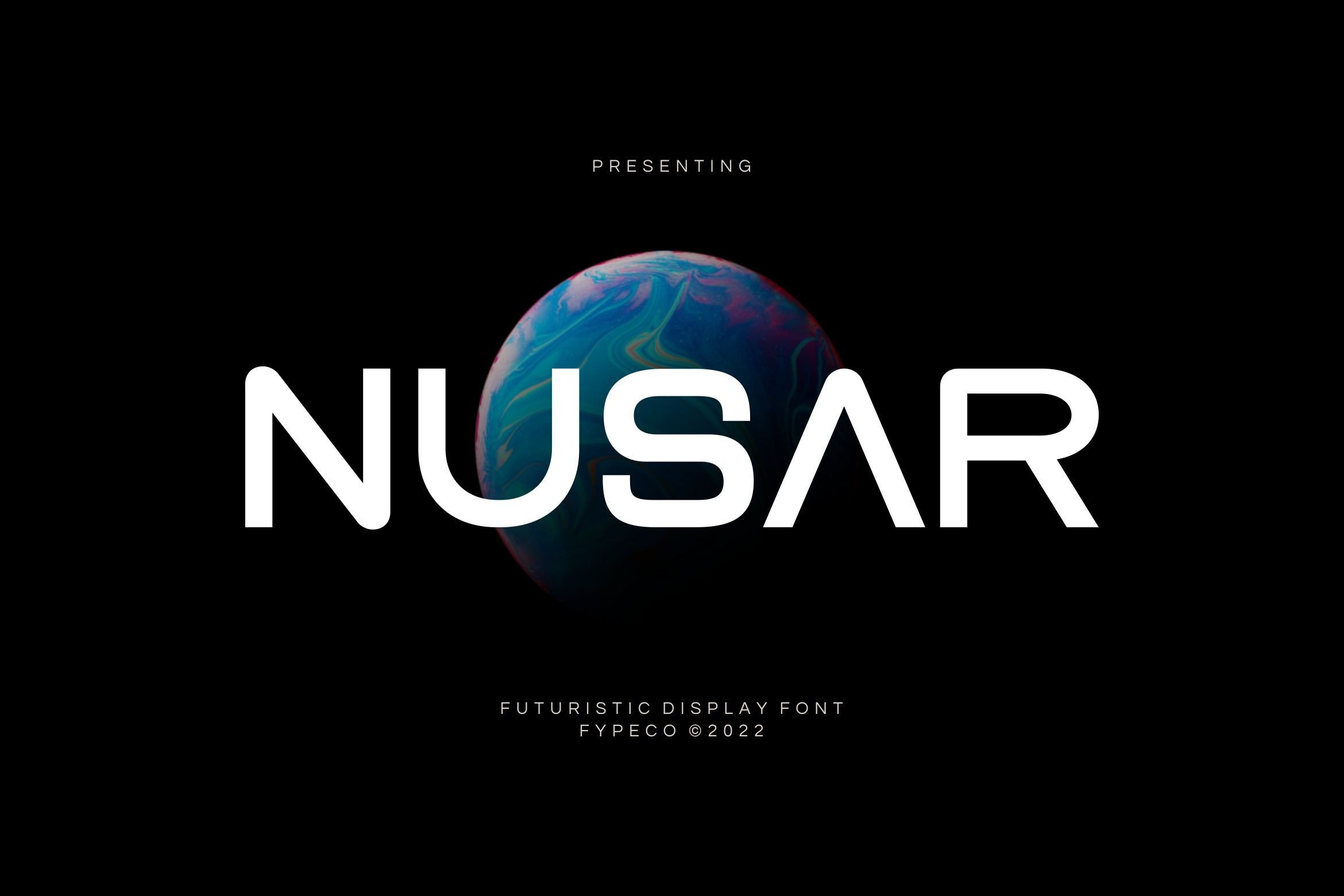
1. Nusar
This futuristic display font has a bold, sci-fi-inspired look that grabs attention. I would use it when the type itself needs to be the visual hook, like a poster title, album cover, or event name. It is a strong first impression, but it is also the kind of face that should not be used for long paragraphs.
Best for: sci-fi posters, album covers, event titles. By: Fype Co.
2. Return Space
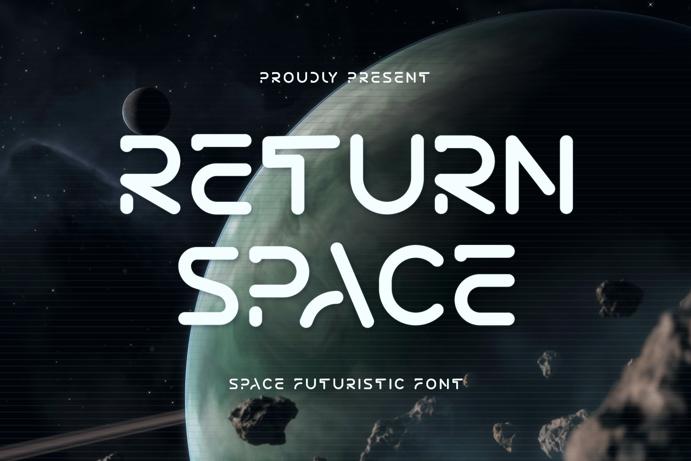
A space-themed futuristic font in a modern style, this face is suggested for games, sci-fi themes, and space adventures. It works when a title needs to feel current and cinematic without turning into a heavy retro sign. I like it for game titles where the layout already has a lot of visual noise.
Best for: game titles, space adventure covers, sci-fi themes. By: TypeFactory
3. Space Future
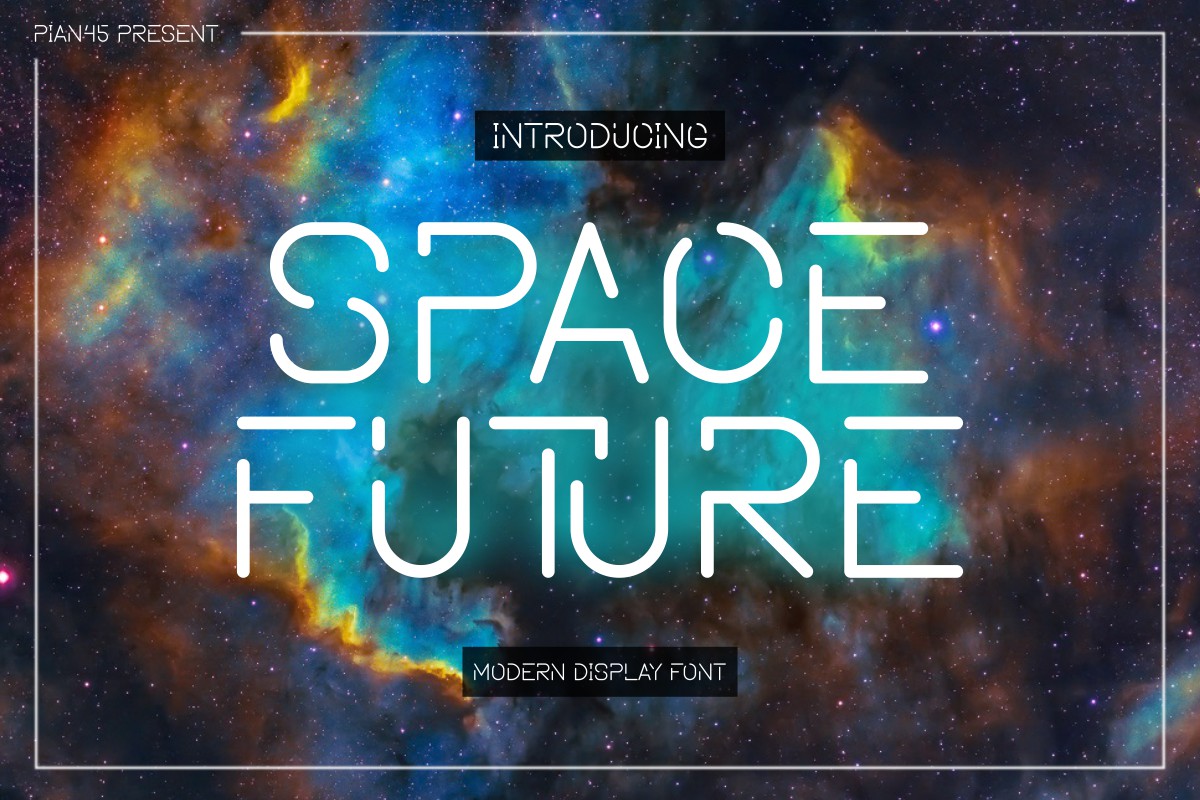
This face combines a futuristic aesthetic with elements inspired by outer space. It is aimed at technology and sci-fi themes, making it a useful pick for event branding, posters, and science fair signs that need a clean cosmic signal. It is less aggressive than cyberpunk, which makes it easier to pair with simple icons and technical graphics.
Best for: tech event branding, space-themed posters, science fair signs. By: Pian45
4. Space Gome
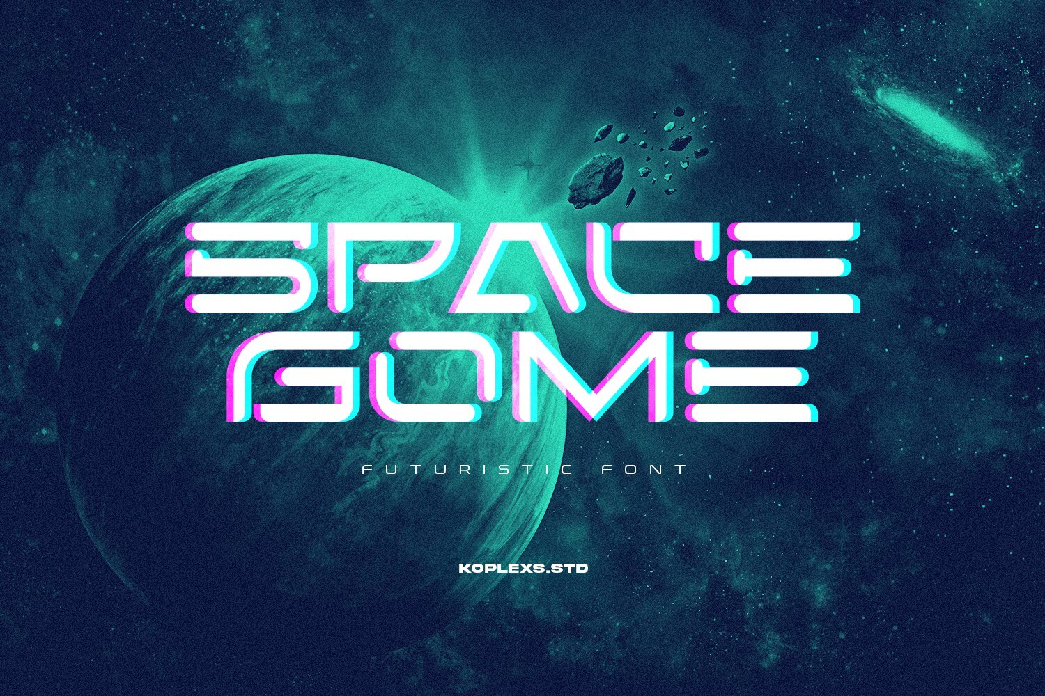
A futuristic font with rounded edges, this one feels futuristic and elegant. The softer geometry makes it a good fit for tech branding, app splash screens, and planetarium flyers where the future should look polished rather than hostile. I would reach for it when a project needs a friendly space feel, not a warning label.
Best for: elegant tech branding, app splash screens, planetarium flyers. By: Koplexs Studio
5. Space Adventure
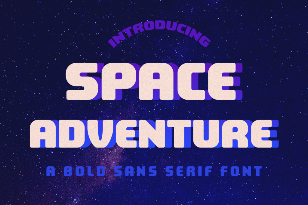
This futuristic, blocky sans serif is made to look great in headlines. Its chunky structure is easy to read at large sizes and works well for kids’ space crafts, Silhouette projects, and any layout that needs a confident headline. If you are cutting vinyl or cardstock, the blocky shapes are a plus because they hold up better than thin, decorative details.
Best for: headlines, kids’ space crafts, Silhouette projects. By: Silhouette America, Inc.
Cyberpunk Fonts
Cyberpunk fonts are the answer when a design needs neon streets, mechs, hackers, and high-speed digital culture. These faces usually bring sharper edges, more decoration, and a louder attitude than clean space fonts. They work well for games, book covers, streaming overlays, esports graphics, and techno fonts for electronic music releases. If you are asking what font is used for cyberpunk designs, the short answer is a display face with aggressive geometry, cut shapes, or neon-ready structure.
6. Cybersonr
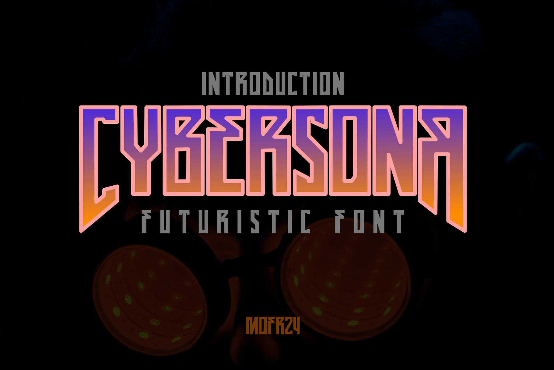
A display font with bold, strong, sharp edges, this face is made for futuristic themes such as action, mecha, and cyberpunk. It has the kind of hard structure that suits game titles, action posters, and merch that needs to feel forceful at a glance. I would test it at thumbnail size before committing, because sharp display faces can get busy when scaled down.
Best for: mecha game titles, action posters, cyberpunk merch. By: Mofr24 Studio
7. Rakitek
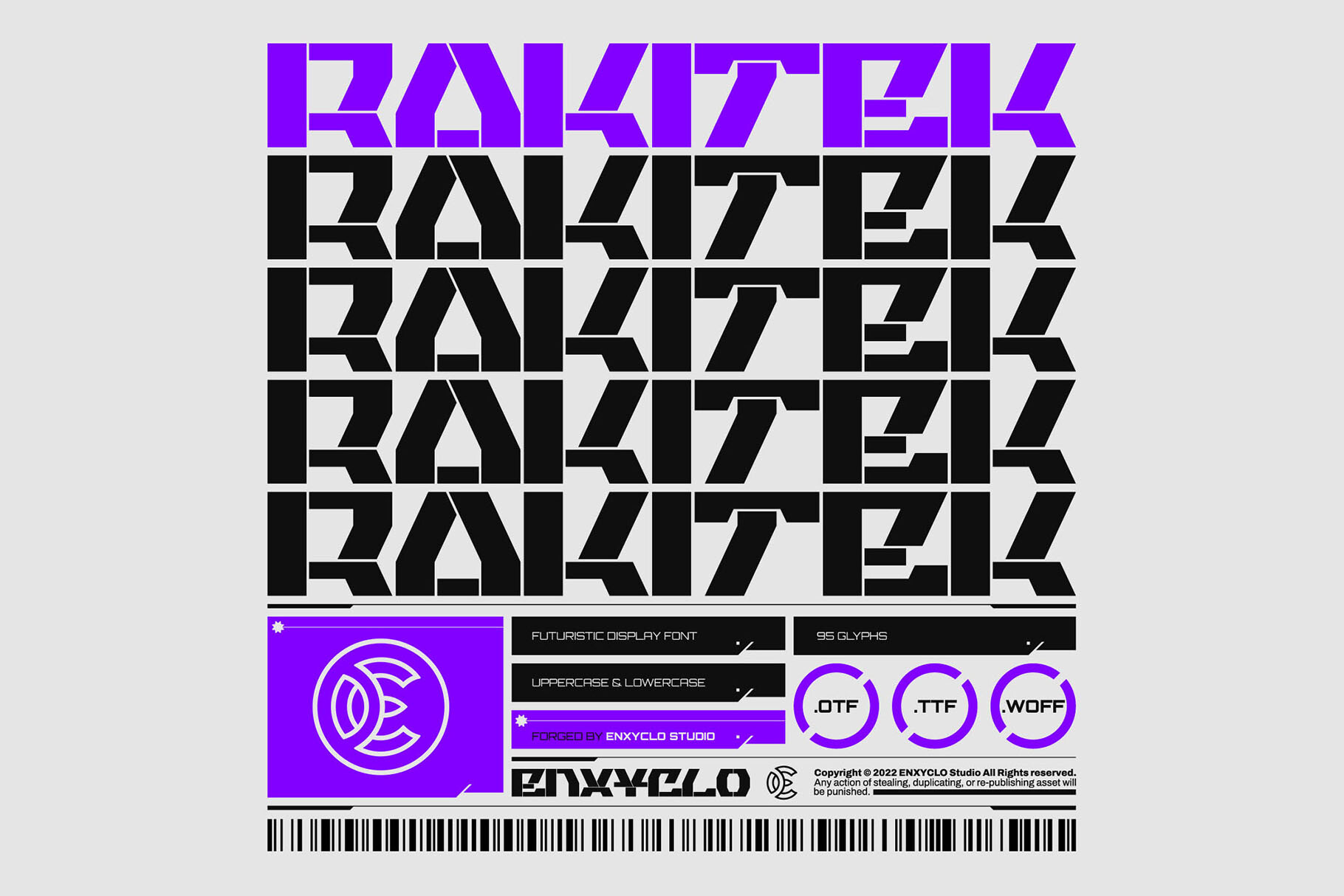
A neo-futuristic, industrial cyberpunk display font, this one leans into machine-like structure and technical tension. It is a strong choice for industrial tech brands, techno event flyers, and game UI headers that need a controlled, engineered feel. It is less flashy than some cyberpunk faces, which helps when the layout already has neon or metal textures.
Best for: industrial tech brands, techno event flyers, game UI headers. By: Enxyclo
8. Hackd
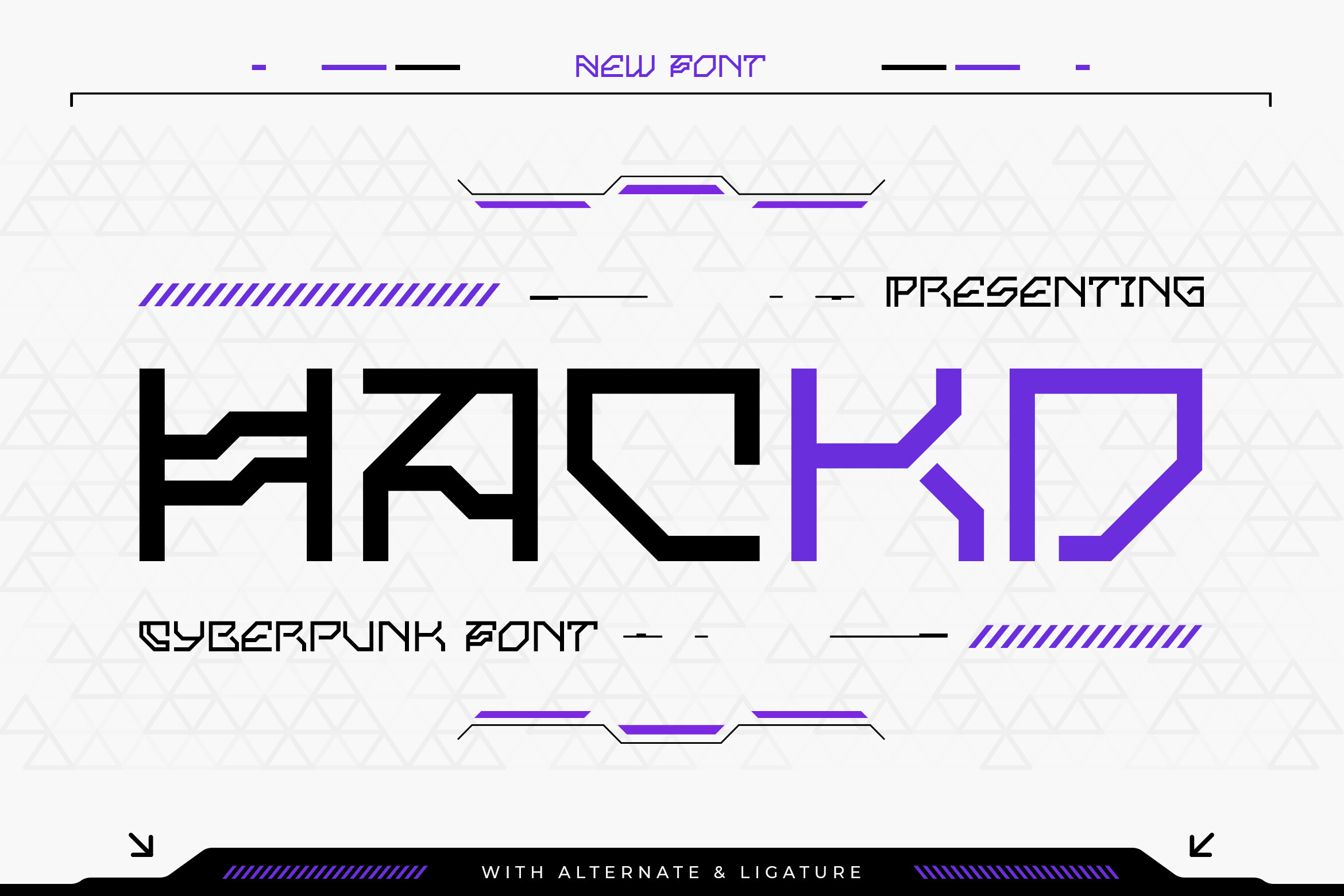
A cyberpunk font with sleek lines and a bold, dynamic futuristic look, this face evokes neon-lit futuristic streets. It is useful for hacker-themed titles, neon posters, and streaming overlays where the type should feel fast, digital, and slightly dangerous. I like it for overlays because the sleek lines keep it from looking like a pure blocky logo.
Best for: hacker-themed titles, neon posters, streaming overlays. By: TypeFactory
9. Quantum Cyberpunk
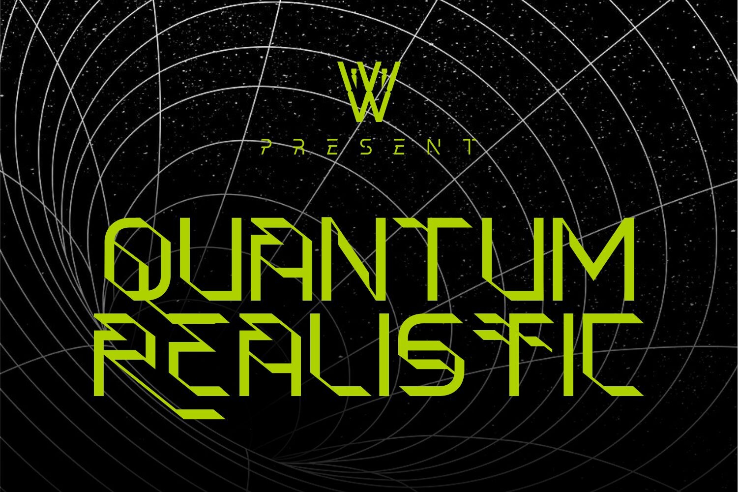
Themed around space, technological progress, and cyberpunk, this font brings sharpness and decorative details into the design. It suits sci-fi book covers, tech product launches, and space-tech logos that need a more elaborate future than a plain sans. It is a good pick when the design needs a little more story in the lettering.
Best for: sci-fi book covers, tech product launches, space-tech logos. By: Whymore
10. Cyber-Tribal
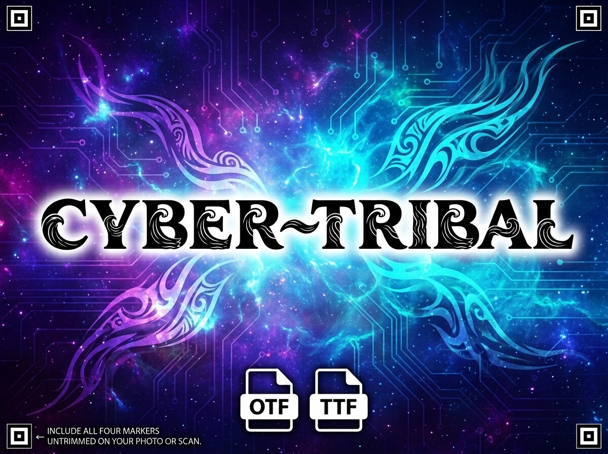
A high-impact display font with bold uppercase block shapes curved into dramatic waves and tribal flourishes, this face has a strong emblem-like presence. It works for esports emblems, cyberpunk book covers, and band logos where the lettering should feel emblem-like rather than plain text. I would use it sparingly, because the wave shapes can dominate a layout if the rest is too busy.
Best for: esports emblems, cyberpunk book covers, band logos. By: pavel
Bold Tech & Game Fonts
Bold tech and game fonts are built to carry a title without losing legibility. They are the heavy, readable choices for game logos, esports fonts, YouTube thumbnails, sports graphics, and tech merch. If you want a heavier display option, see our best bold display fonts for more options. The faces below keep their weight even at smaller sizes, which matters for thumbnails, UI headers, and quick-read titles.
11. Futurina
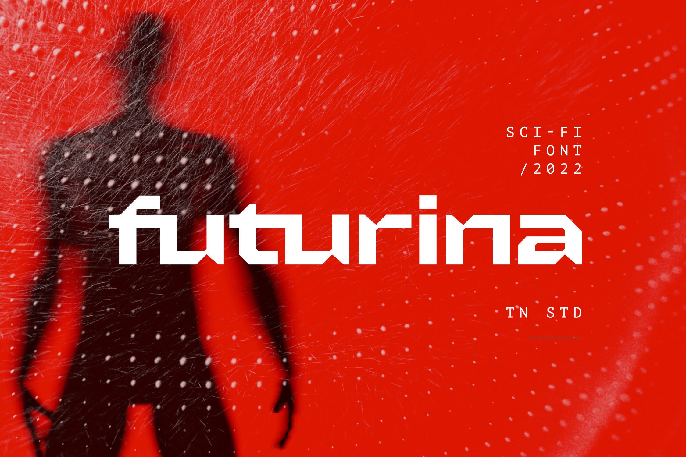
A techno-futuristic sci-fi game font with bold/black display sans serif styling, this face is built for titles that need to feel powerful and modern. It suits sci-fi game logos, esports team names, and bold headers where the type has to stand out in a crowded layout. I would pair it with a neutral sans for anything that needs more than one line.
Best for: sci-fi game logos, esports team names, bold headers. By: Typia Nesia
12. Super Ultra Supra
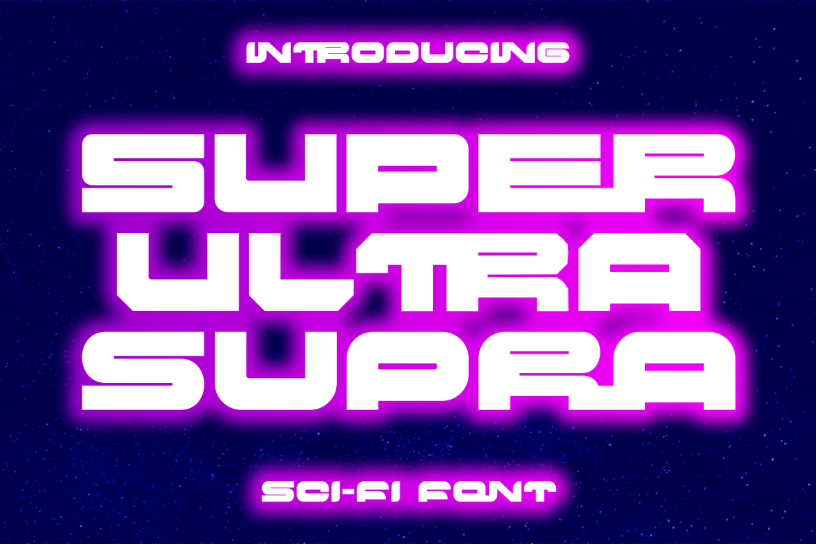
A bold, rigid, thick typeface with a distinct sci-fi, futuristic vibe, this one has a solid, machine-like presence. It is a good fit for robot and mecha titles, gaming thumbnails, and tech merch where the lettering needs to feel heavy and dependable. The thick structure is useful when the background is dark or detailed.
Best for: robot and mecha titles, gaming thumbnails, tech merch. By: putracetol
13. Sonic Surge
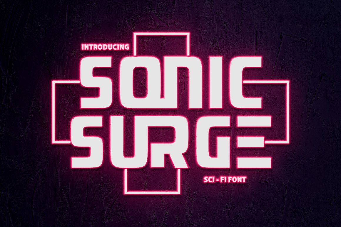
A bold display font with a cool, futuristic vibe, this face is made for projects that need a sci-fi touch without becoming too decorative. It works for electronic music releases, energy drink labels, and trailer titles where speed and energy are the main message. I like it for single-word titles that need to feel fast without relying on effects.
Best for: electronic music releases, energy drink labels, trailer titles. By: putracetol
14. Cyberpunk
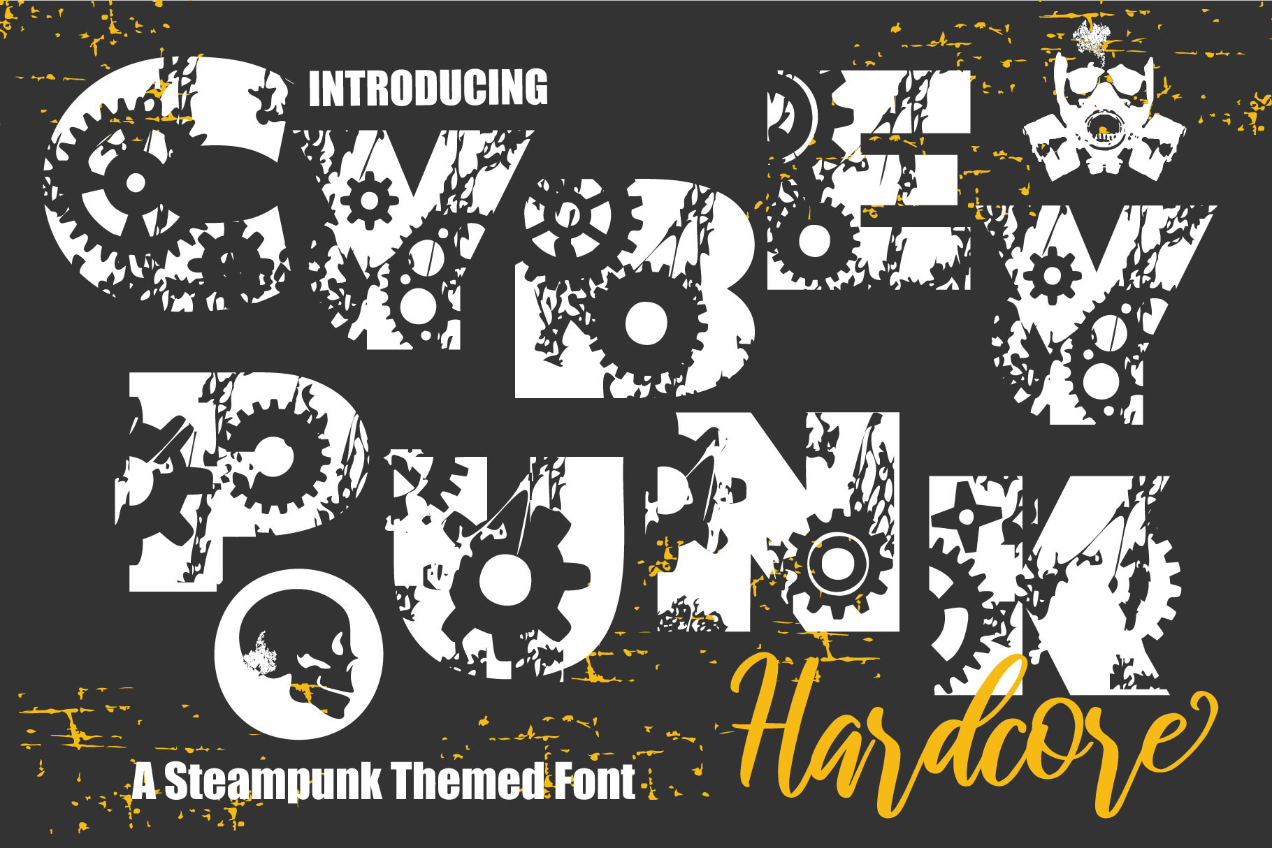
A bold, lively decorative display font, this one is suggested for urban art, music, and concerts. It brings more personality to a layout, making it useful for concert posters, music branding, and urban art pieces that need a loud, energetic future. It is less corporate than the cleaner tech faces, which is a good thing for music and street style.
Best for: urban art, concert posters, music branding. By: KtwoP
15. Robot 9000
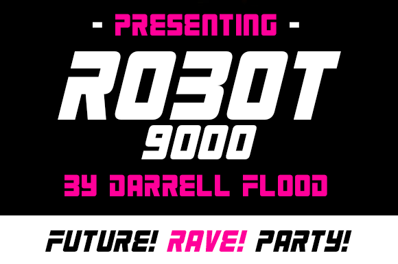
A futuristic font in a slick, smooth style, this face is aimed at alien encounters, tech presentations, and general sci-fi use. It works as a robot font for alien-themed designs, tech presentations, and kids’ robot crafts where the tone can be playful. I would use it when the project needs a friendly sci-fi feel rather than a hard industrial one.
Best for: alien-themed designs, tech presentations, kids’ robot crafts. By: Dadiomouse
Clean Futuristic Sans Fonts
Clean futuristic sans fonts are the quiet side of the future. They are minimalist tech-sans for branding, UI, presentations, and body text that needs to sit next to an aggressive display headline without fighting it. If you want more restrained options, our best minimalist fonts is a useful companion. These faces are ideal when the design should feel advanced, calm, and professional rather than loud.
16. Futuristic
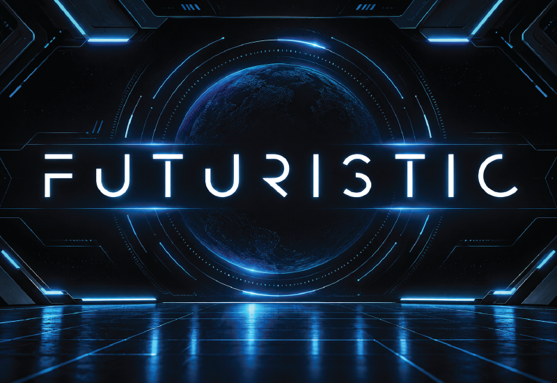
A cool, modern sans serif font, this one keeps the future simple and usable. It suits startup logos, tech presentations, and clean UI headings where the type should feel current without adding visual noise. I like it for small headings and labels where a display font would be too much.
Best for: startup logos, tech presentations, clean UI headings. By: GraphicsNinja
17. Space Comet
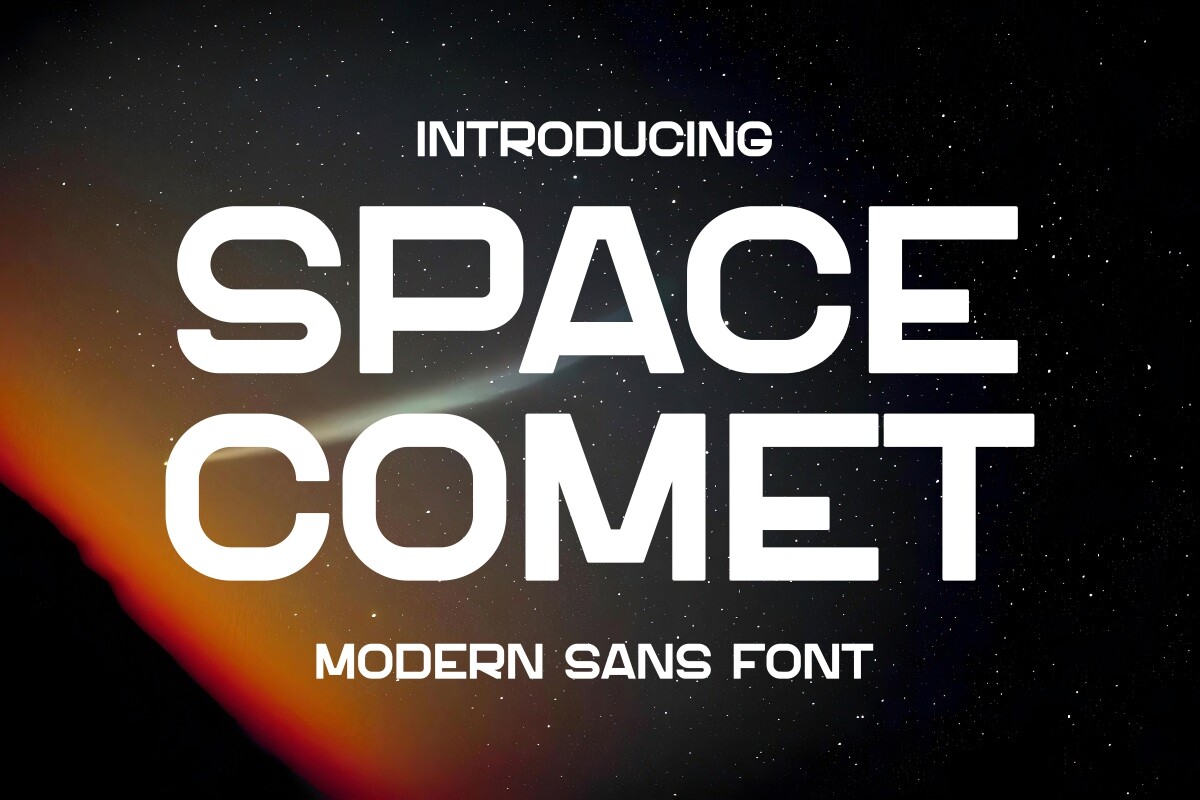
A modern, sleek sans serif with a cosmic theme, this face brings a lighter, smoother feel to space-inspired projects. It works for cosmic branding, app interfaces, and product labels where the design needs a clean orbital signal. It is a good companion for a bold space display font when the layout needs a calmer second voice.
Best for: cosmic branding, app interfaces, product labels. By: Pian45
18. Space
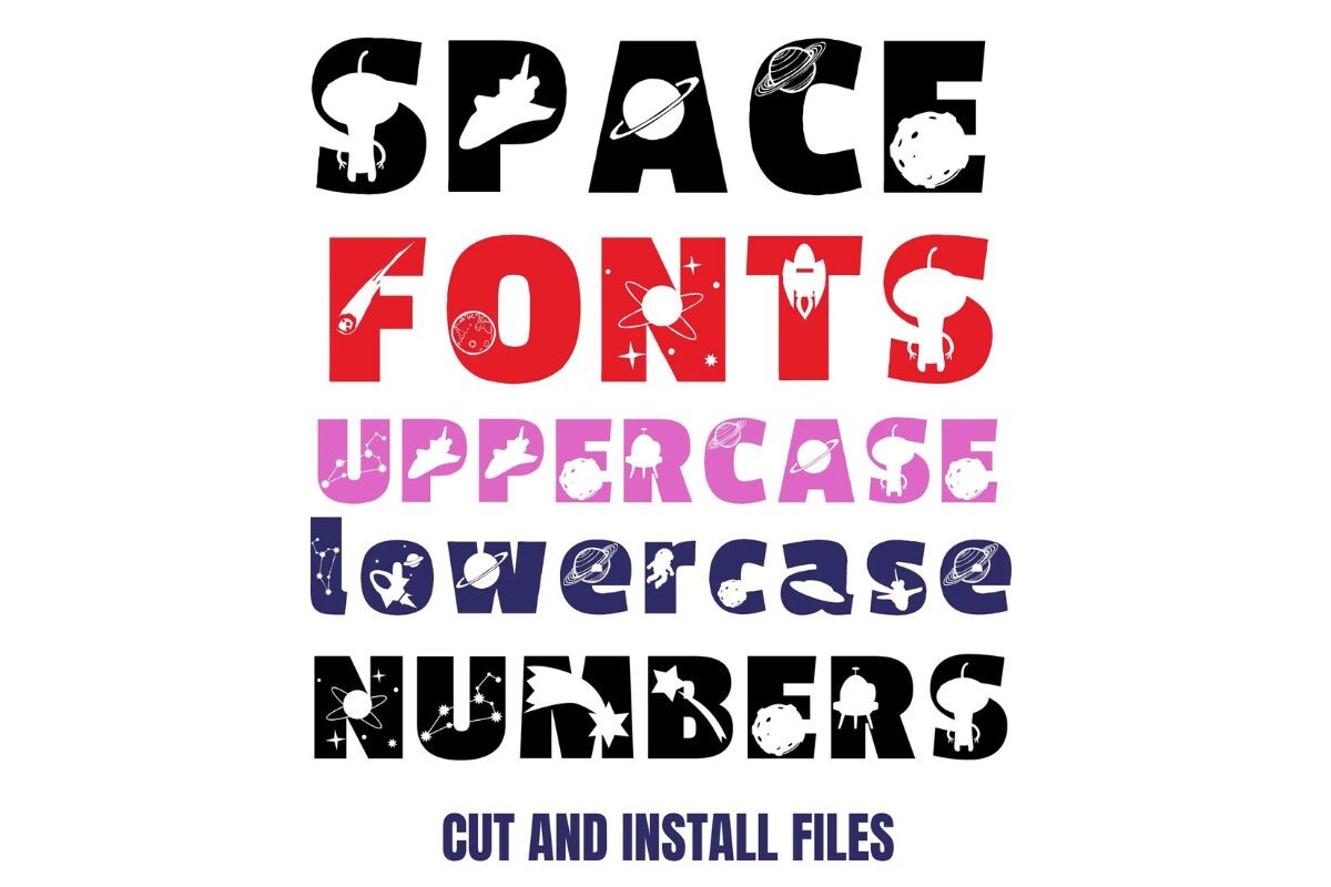
A font aimed at sci-fi projects, futuristic designs, and cosmic branding, this one is a straightforward choice for layouts that need a clean future. It suits cosmic branding, sci-fi projects, and futuristic designs where the type should support the image rather than dominate it. I would use it for body copy or secondary labels when the main headline already has a lot of personality.
Best for: cosmic branding, sci-fi projects, futuristic designs. By: Crea8tivedezines
How to Use Futuristic Fonts in Games, Branding and Posters
The fastest way to make a futuristic design work is to keep the type system simple. Use one futuristic display font for the headline and one clean sans for supporting text. If you want a free pairing, a bold display face from this list works well with Space Grotesk for body copy. It keeps the layout technical without turning every line into a sci-fi poster.
For branding, the same rule applies. A futuristic logo needs a readable companion for menus, labels, and product copy. If you are building a logo, see best fonts for logos for more direction.
Here are the practical moves:
- Add wide letter spacing to uppercase display type. This is a classic sci-fi trick. It makes the headline feel like a HUD label or a mission patch, and it improves readability for short titles.
- Choose a palette that matches the future. Black with neon cyan or magenta suits cyberpunk. White, silver, and blue suit space and tech branding.
- Use effects with restraint. Glow, scanlines, and a light chromatic aberration can help, but the font should do most of the work. Heavy effects can make a title look dated fast.
- Test numbers and small sizes. Games, UI, and posters often use timers, versions, scores, and labels. Check that 0, 1, 8, and punctuation stay clear.
- Check the license before embedding. Using a font inside a distributed game or app often requires an embedding or app license, separate from a standard desktop license. Check the product page terms before shipping.
- For craft projects, blocky fonts cut cleanly in Silhouette or Cricut. Cricut Design Space uses fonts installed on your computer, while Canva Pro users can upload custom fonts through Brand Kit. This is also handy if you are looking for futuristic fonts for Canva, because the same headline can move from screen to vinyl, cardstock, or a kids’ space craft.
Tip: If you are designing a game UI, test the font with a fake HUD layout. Put numbers, labels, and a title together before you commit. A font that looks great in a poster mockup can feel clumsy in a menu.
Tips for Choosing the Right Sci-Fi Font
Start with the kind of future you are designing. A space adventure needs a different tone than a neon cyberpunk city, a mecha game, or a clean tech startup. The right sci-fi font should match the mood before you add color or effects.
Test the font with numbers and special characters. Sci-fi designs often include version numbers, timers, coordinates, and labels. A font that looks great in NEBULA may fail when it has to show v2.4 or 00:00.
Keep the type system small. One display font and one text font is usually enough. Adding a third decorative face can make the design feel busy and less professional.
Check the license for your actual use. Commercial merch, app icons, and game packaging may need different permissions. If the font will be embedded in a game or app, look for an embedding license on the product page.
Finally, do not overwork the effects. A strong futuristic font already says future. If you need glow, distortion, or texture to make it feel sci-fi, the type may not be doing its job. A clean pairing, like a bold display face with a neutral sans, often looks more confident than a stack of effects.
Where to Download Futuristic Fonts
Creative Fabrica is the main source for the fonts in this list, and each product page includes the license details you need before using a face in a project. For free sci-fi fonts, Google Fonts is a practical starting point, with names like Orbitron, Space Grotesk, and Bruno Ace covering cyberpunk display, technical sans, and stenciled futuristic work. I recommend checking the license before you buy, especially if the font will be used in a game, app, or merch line. The product page is the place to confirm what is allowed. For more font recommendations and design resources, browse the FontPro blog.