· fonts · 14 min read
31 Best Fonts for Banners in 2026
Bold, readable picks for print, vinyl, web, and party banners, plus practical tips on size, contrast, pairing, and licensing for banner headings.
A banner gets a couple of seconds before a passerby walks on or scrolls past. The typeface decides whether that window works. Below is a set of bold, readable faces grouped by style, plus practical notes on sizing, contrast, and licensing, so your next banner actually gets read.
What Makes a Great Font for Banners?
The best fonts for banners share a few traits. First, large, open letter shapes with even strokes stay legible from a distance, while thin or tightly packed faces blur together. Second, a solid weight and strong contrast against the background make the headline pop without shouting. Third, comfortable letter spacing keeps words separate so the eye can track them quickly.
Why does the typeface decide whether anyone notices your banner? Because the headline does the selling before the image or the fine print gets a look. A loud, confident headline paired with a quieter subtitle creates a clear visual hierarchy, and that is what readers register in those first two seconds.
Bold Sans-Serif and Condensed Fonts for Banners
These are the most versatile headline faces for banners. They are meant for short, punchy titles across print, vinyl, and web, which is why they come first.
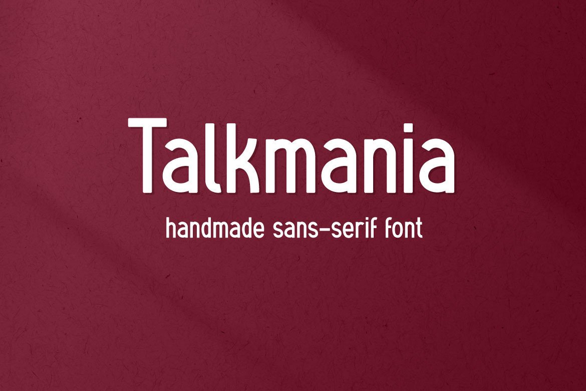
1. Talkmania
Talkmania, by Mightyfire, sits in the bold condensed sans group. Its narrow build is a natural match for short headline words on a banner. A bold condensed sans designed by Mightyfire. Its tight, upright forms suit short headline words that need to fill a banner without crowding.
Best for: sale banners, event titles, store signage. By: Mightyfire
2. Mammoth Sans
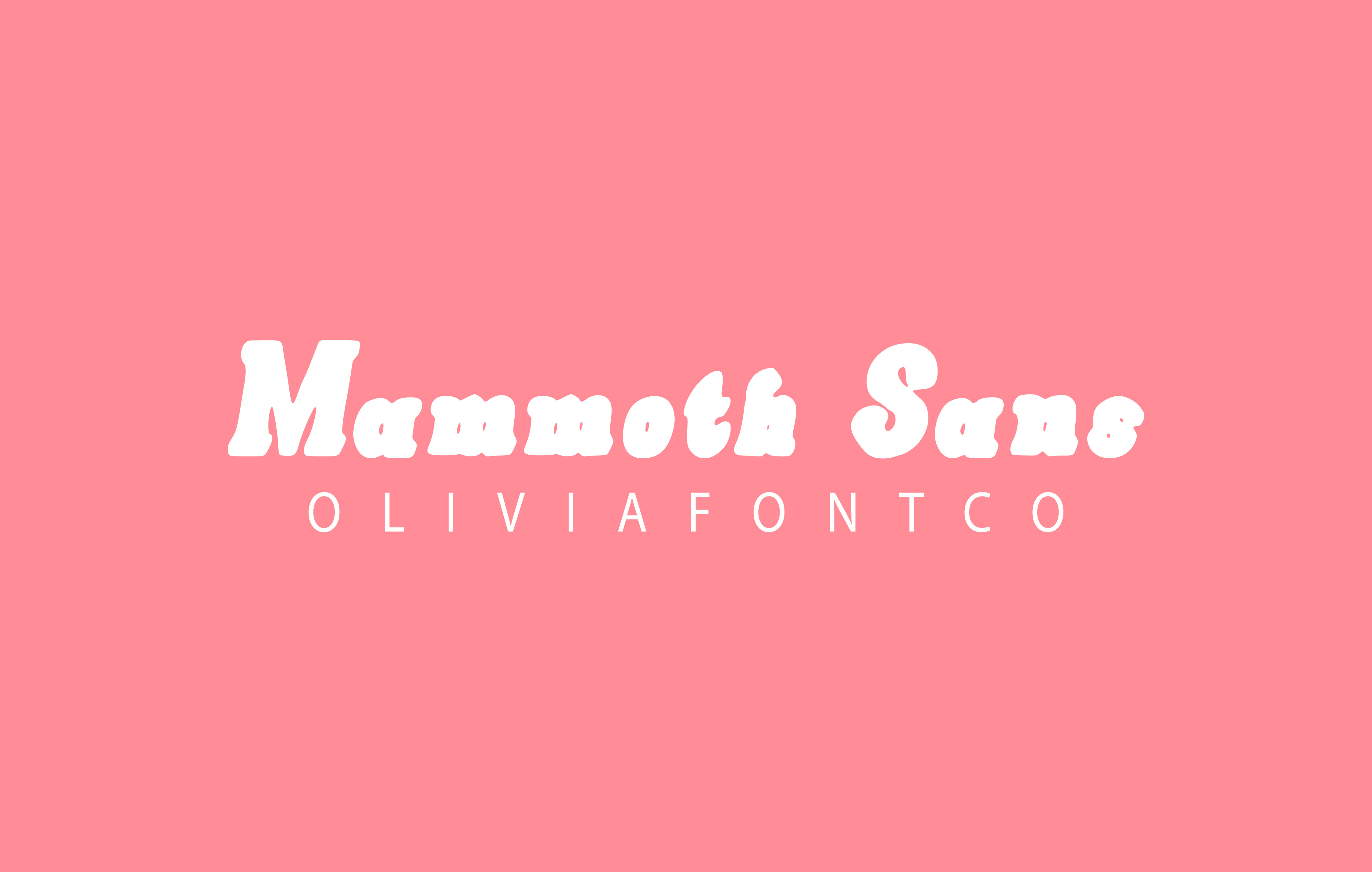 Mammoth Sans from OliviaFontCo is a bold sans pick for headline-first layouts. Try it when the title is the main event and everything else plays support. Mammoth Sans from OliviaFontCo brings a heavy, confident presence. It works well when the headline is the main event on the banner.
Best for: bold banner headings, promotional posters, vinyl signs. By: OliviaFontCo
3. Krisle - Bold Chunky Typeface
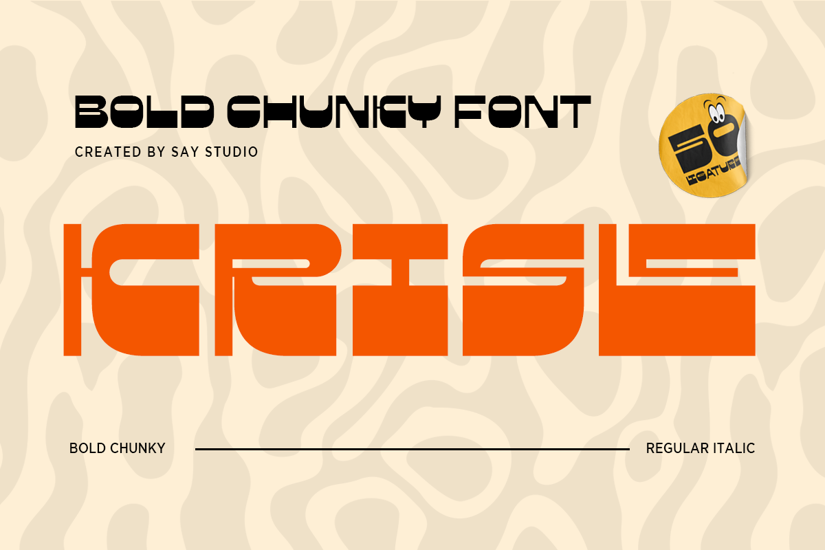 Krisle is a chunky typeface from SayStudio. That styling suits short, friendly titles. Krisle is a bold chunky typeface by SayStudio. Its thick, rounded forms give a friendly yet assertive look for short titles.
Best for: party banners, kids events, playful promos. By: SayStudio
Download Krisle - Bold Chunky Typeface
4. Clear Anchor
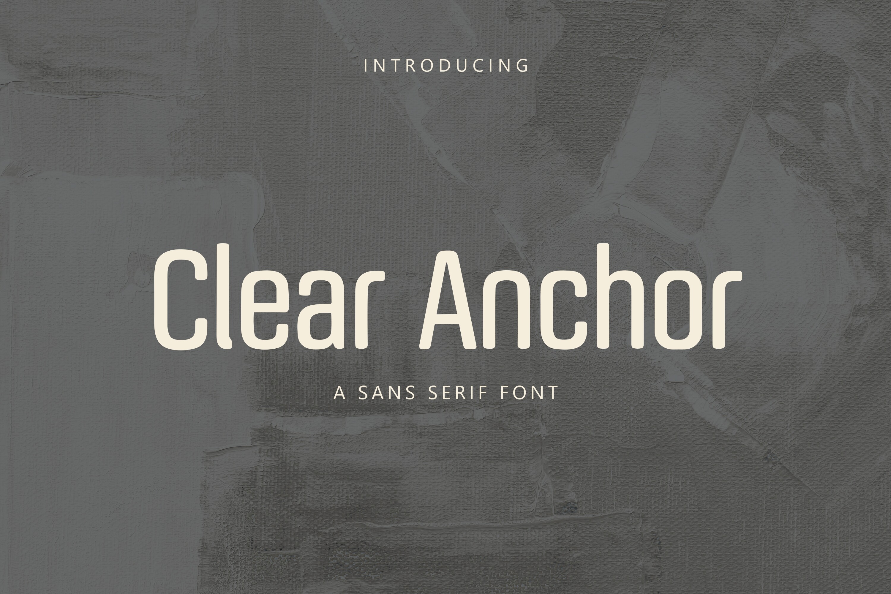 Designer TriDraw made Clear Anchor, a bold sans for banners where clarity comes first. It is worth testing for business and directional signage. Clear Anchor by TriDraw leans on clean, sturdy letterforms. It is a dependable pick when clarity matters more than decoration.
Best for: business banners, directional signs, web headers. By: TriDraw
5. Fattura
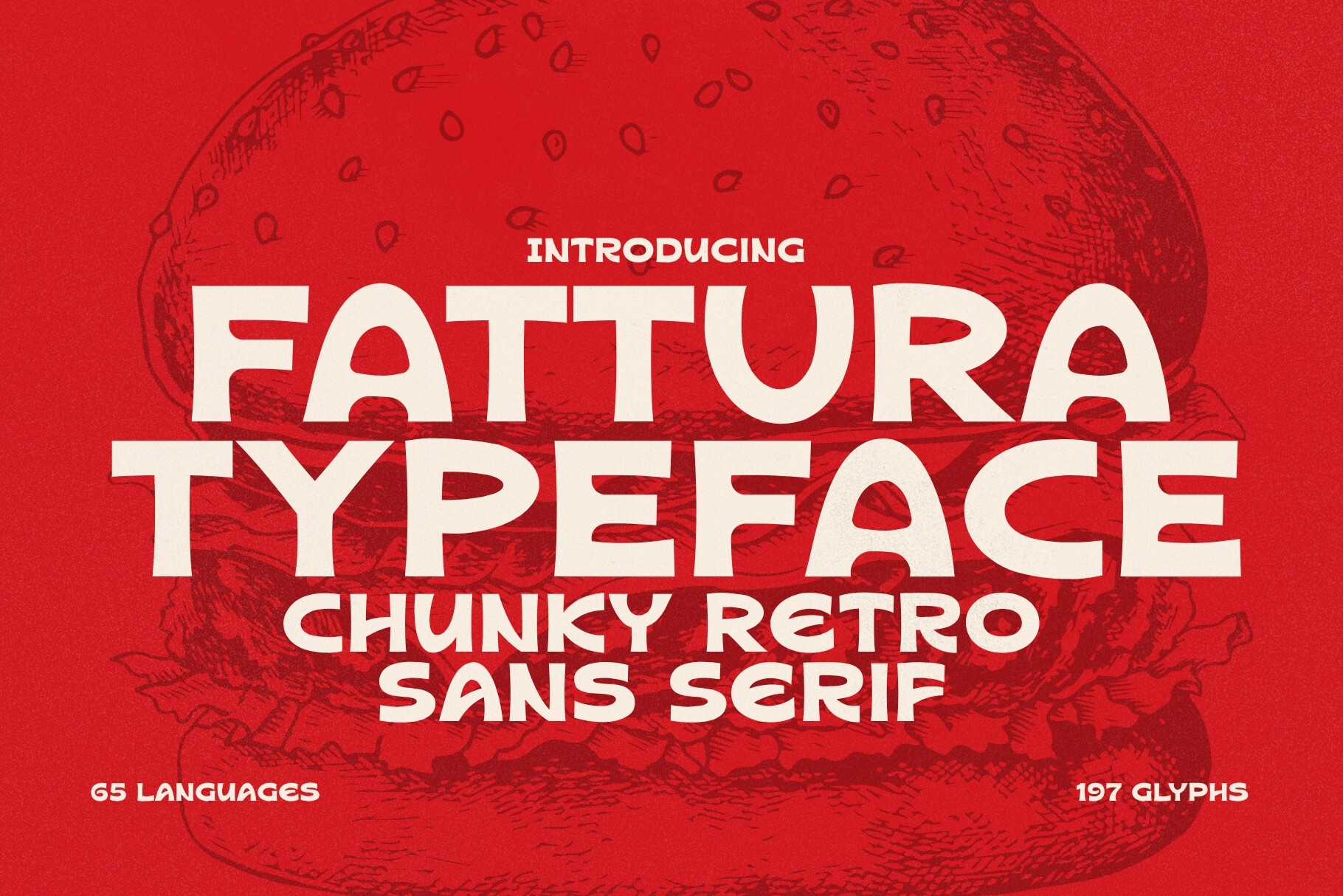 Fattura, by HipFonts, is a bold sans option for headlines. Test it at the top of a sports or retail banner. Fattura from HipFonts packs a thick, graphic punch. It suits headlines that need to command the top of the banner.
Best for: banner title fonts, sports events, retail promos. By: HipFonts
6. Caleron
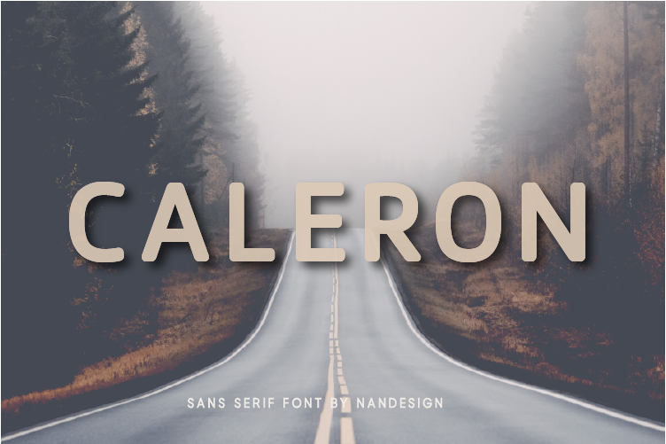 Nan Design’s Caleron is a bold display choice for banner headlines. Pair it with a simple subtitle face, which is what most layouts need. Caleron by Nan Design offers a bold, structured display look. It holds up well when paired with a simple subtitle face.
Best for: event posters, banners for Canva, brand headlines. By: Nan Design
7. Mega Buns
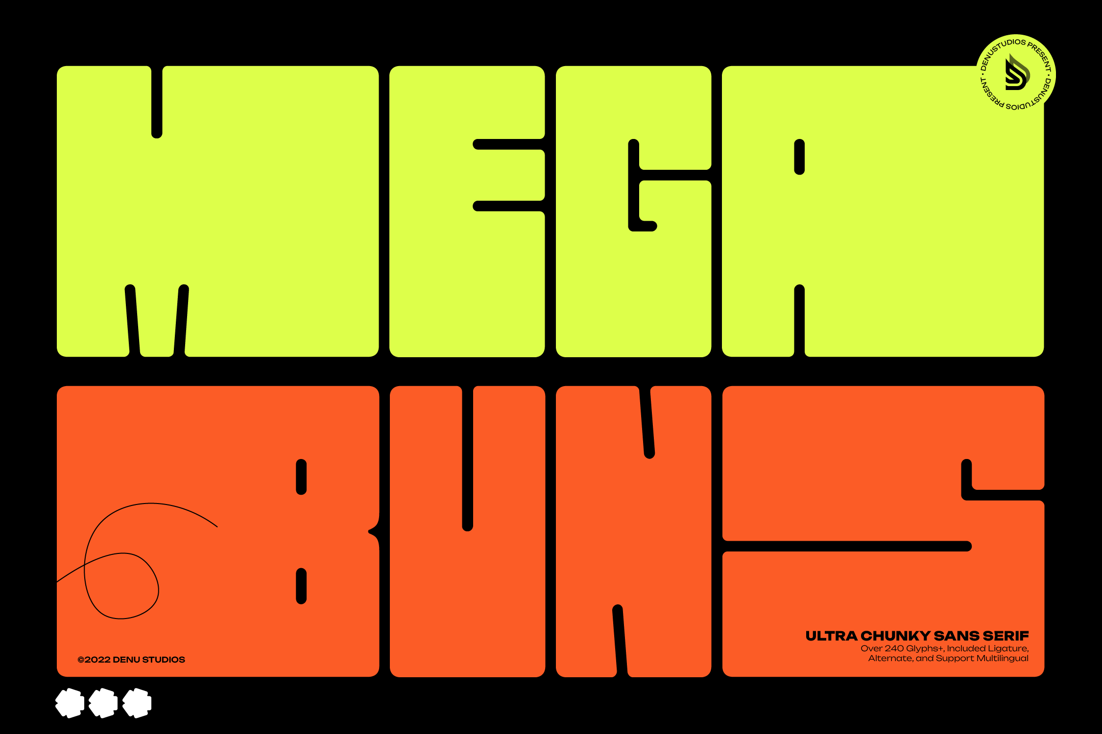 Mega Buns by Denustudios is a chunky pick for lighter, playful banners. Keep the words short and let the shapes carry the mood. Mega Buns from Denustudios has a chunky, rounded character. It brings a warm, approachable energy to shorter headline words.
Best for: party banners, food promos, children events. By: Denustudios
8. Rannoon
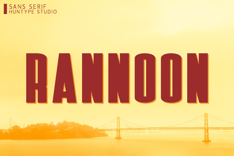 Rannoon, from Huntype, is a bold sans that suits web and YouTube banner headings. Preview it on a phone screen before you commit. Rannoon by Huntype is a bold sans with a confident, modern edge. It works for headlines that need to feel current and clean.
Best for: web banners, YouTube banners, tech promos. By: Huntype
9. New Bartons
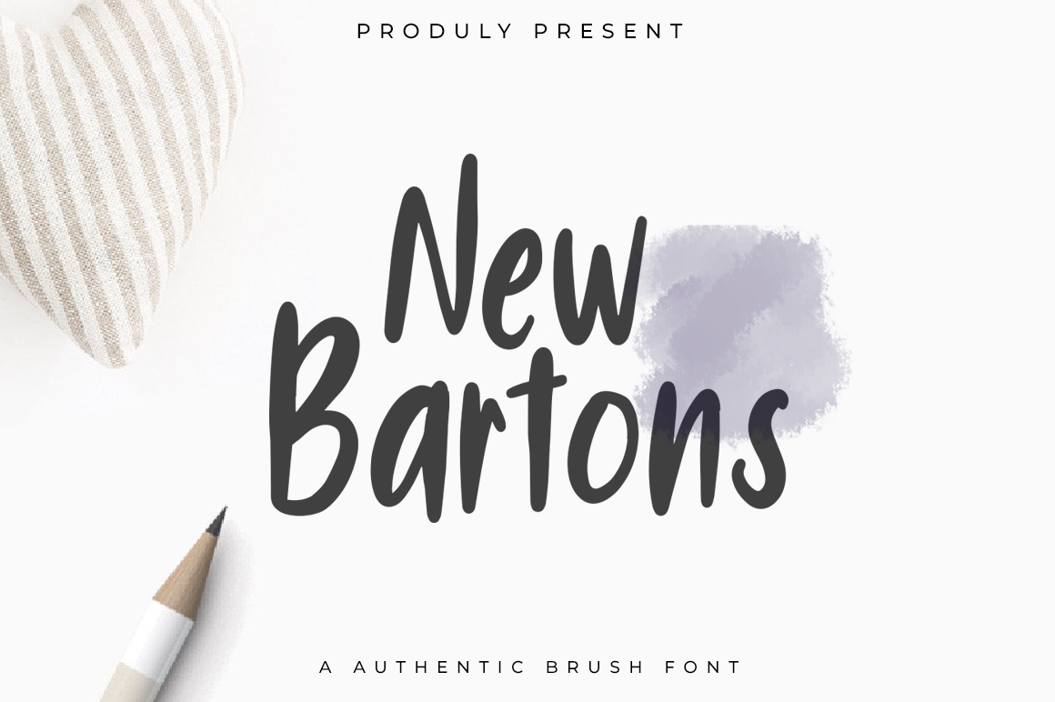 indotitas created New Bartons, a bold display option. It can carry a headline alone when there is no room for a second font. New Bartons from indotitas delivers a heavy, blocky display feel. It is a strong choice when the headline carries the whole message.
Best for: banner headings, street signs, large format print. By: indotitas
10. Zucho
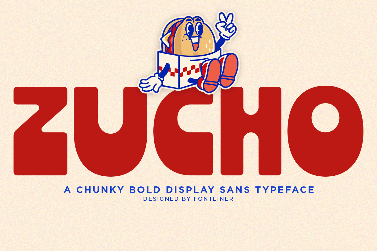 Zucho comes from Font Liner and belongs to the condensed group. Try it when a long brand name has to fit across the banner width. Zucho by Font Liner has a bold, condensed energy. It helps long brand names fit neatly across a banner width.
Best for: sports banners, team names, event titles. By: Font Liner
11. Norva
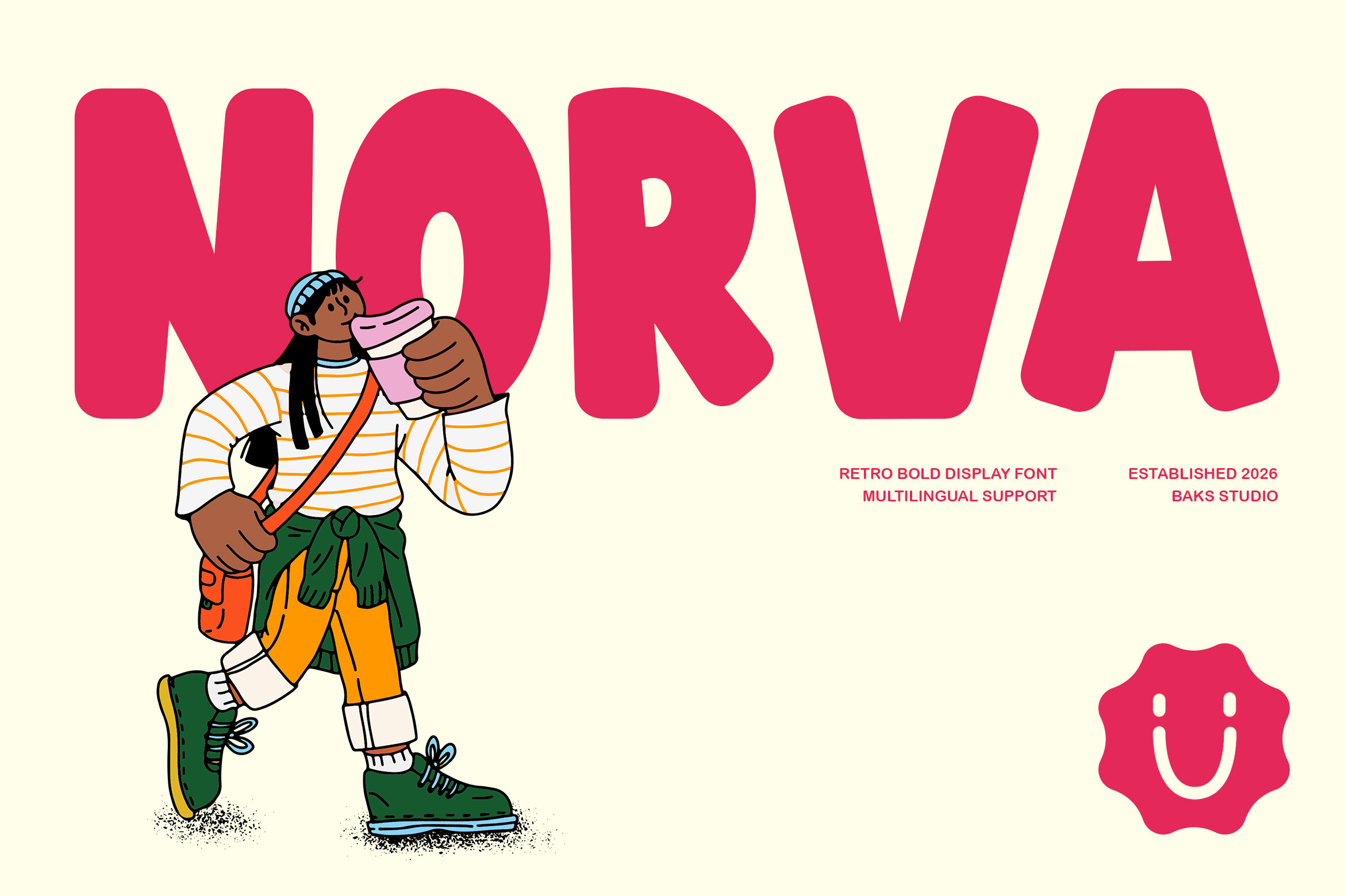 Norva, by Bagus Kunstler, is a bold sans for everyday banner work. Treat it as a default to test when you are unsure which direction to take. Norva from Bagus Kunstler offers a bold, no fuss sans look. It is a safe, readable option for a wide range of banner types.
Best for: commercial banners, store fronts, web headers. By: Bagus Kunstler
Slab Serif, Varsity and Vintage Sign Fonts for Banners
This group brings a sign, school, and sports feel. Think retro shops, campus events, and vintage styled banners.
12. Boldriven
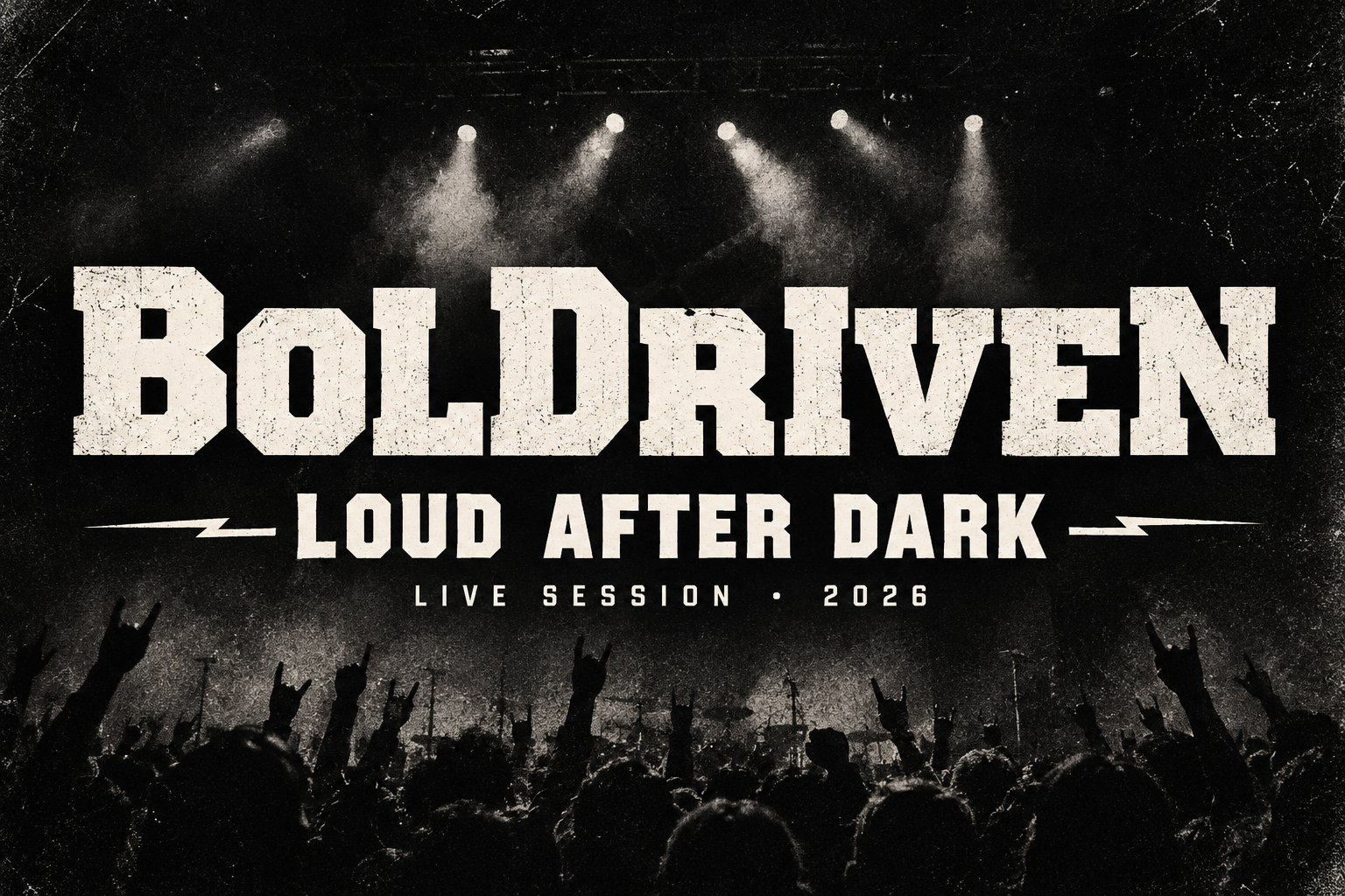 Boldriven is a bold slab from Retro. It fits vintage signs and retro shop headlines. Boldriven by Retro is a bold slab with a sturdy, grounded look. It suits headlines that need a classic, dependable feel.
Best for: vintage signs, banner headings, retro shops. By: Retro
13. Split Slab Serif
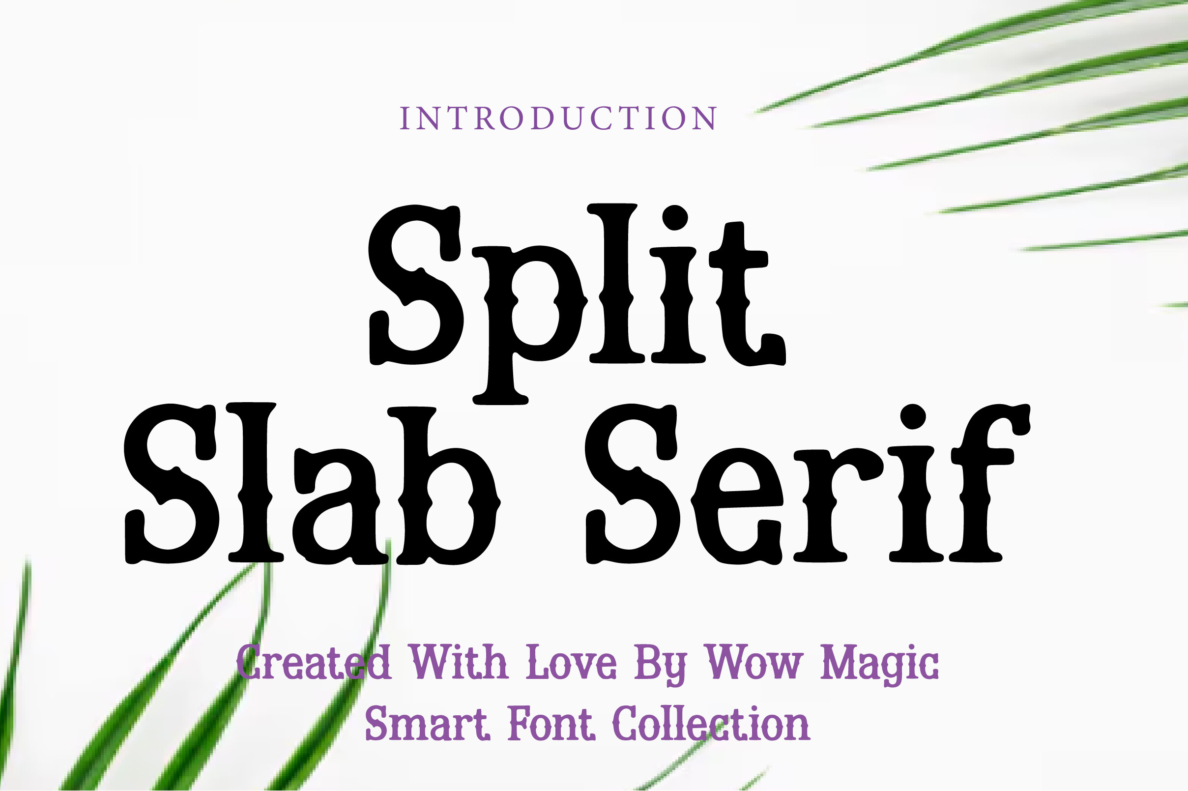 Wow Magic designed Split Slab Serif for the slab and varsity group. Test it on event banners and retro posters. Split Slab Serif from Wow Magic has a distinctive split slab character. It adds visual interest without sacrificing headline clarity.
Best for: event banners, retro posters, brand titles. By: Wow Magic
14. The Oldridge
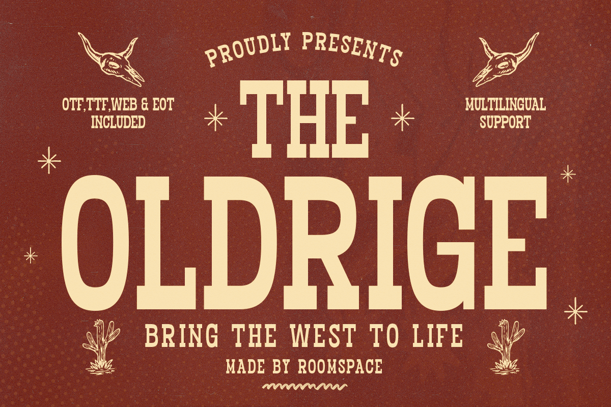 The Oldridge, by roomspace, leans toward the vintage sign look. It suits heritage styled banners where mood matters as much as the message. The Oldridge by roomspace evokes an old timey sign aesthetic. It is a natural fit for vintage and heritage styled banners.
Best for: vintage banners, shop signs, retro ads. By: roomspace
15. Sports Emblem
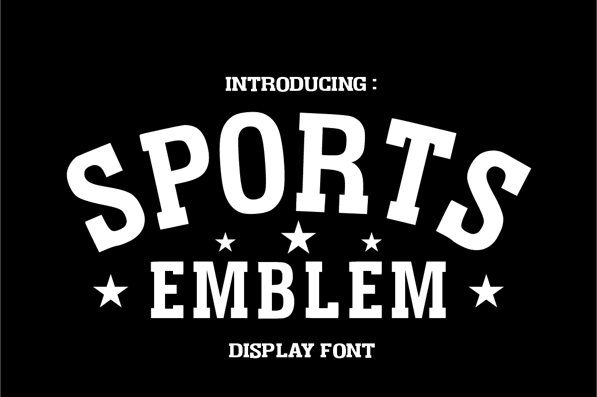 TaralArt’s Sports Emblem points toward team and varsity styling. Use it for campus and sports banners. Sports Emblem from TaralArt leans into a varsity, emblem style. It is a strong pick for team and campus themed banners.
Best for: sports banners, team events, school promos. By: TaralArt
16. Varsity College Sport Army
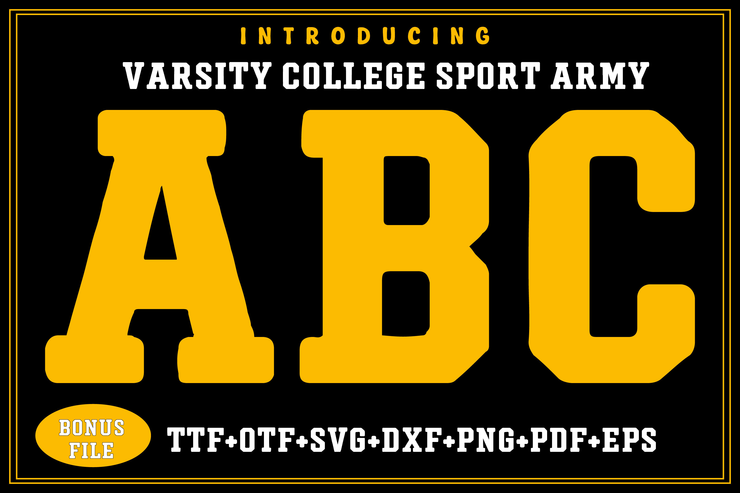 Quirkify’s Varsity College Sport Army has the collegiate sports feel its name suggests. Try it for short team names and rally signs. Varsity College Sport Army by Quirkify brings a collegiate, athletic energy. It suits short team names and event titles.
Best for: college banners, sports events, rally signs. By: Quirkify
Download Varsity College Sport Army
17. Red Ridge
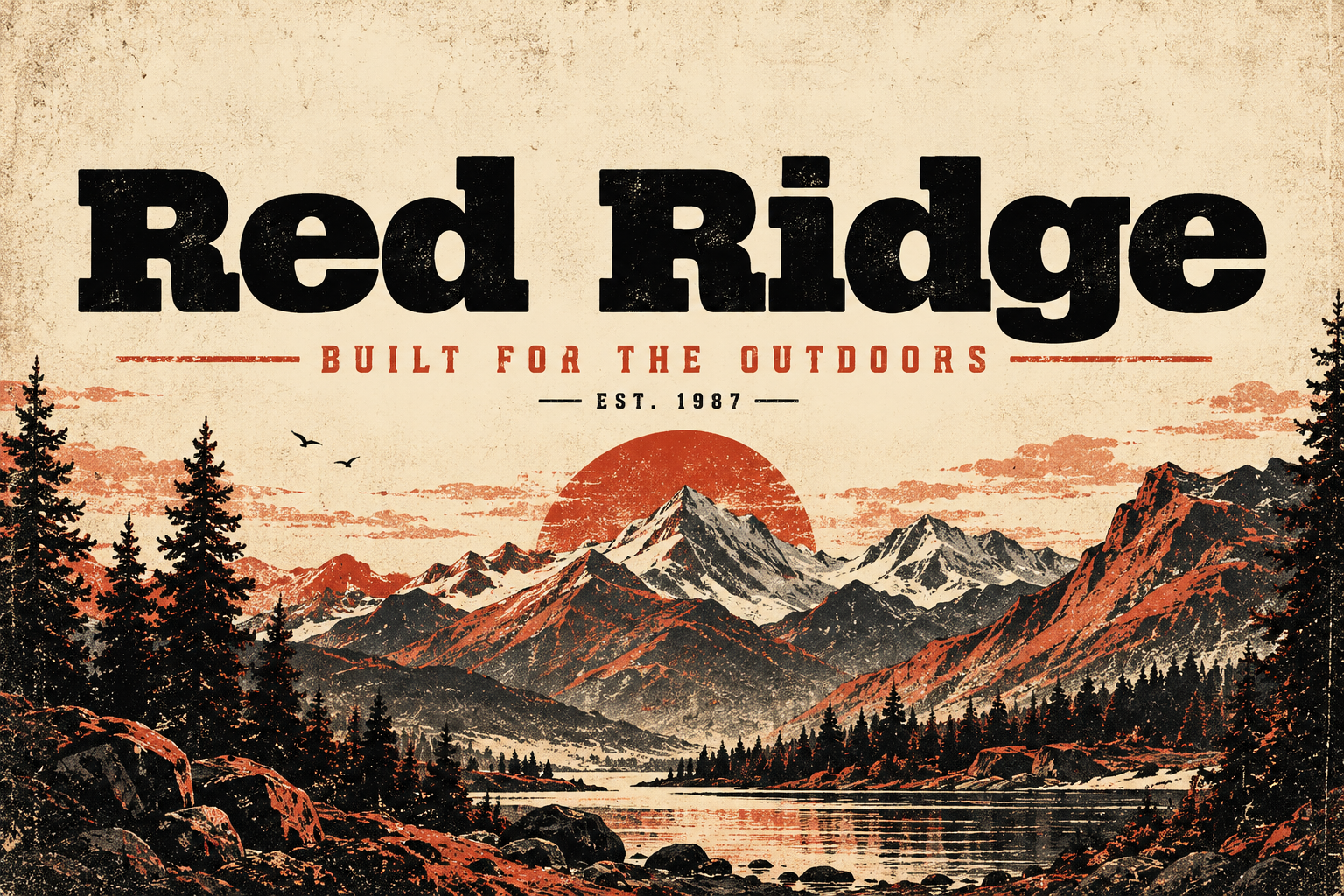 Red Ridge comes from DREAM and fits the slab group. It could suit outdoor and adventure event banners. Red Ridge from DREAM has a bold, rugged slab feel. It works well for outdoor and rugged themed banner headlines.
Best for: outdoor banners, adventure events, sports signs. By: DREAM
18. Pegone
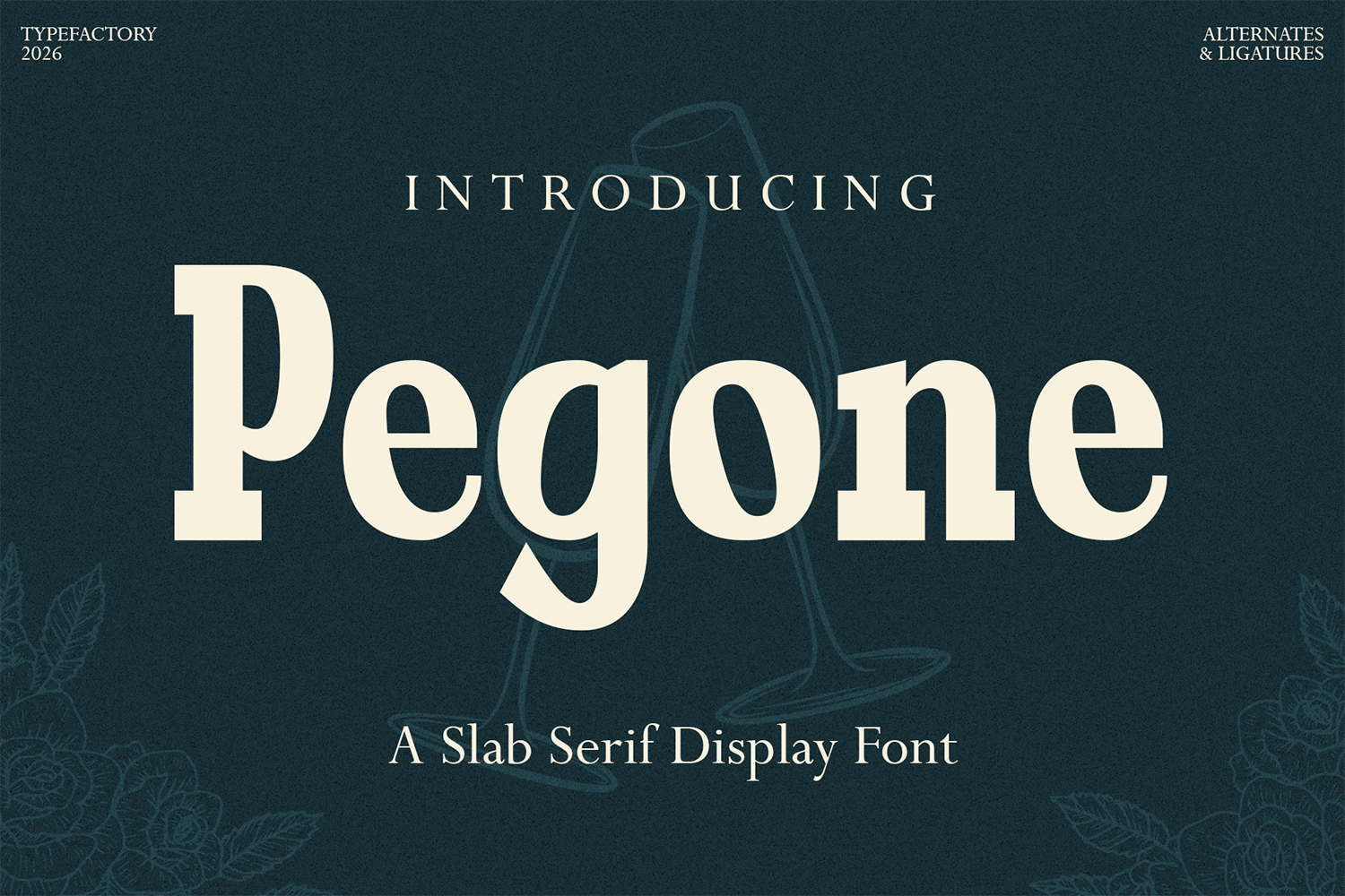 Pegone, by TypeFactory, is a bold slab option for headlines. Check how it holds up on both print and screen banners. Pegone by TypeFactory offers a bold, chunky slab look. It is a versatile headline face for both print and screen banners.
Best for: banner title fonts, event posters, retail signs. By: TypeFactory
19. Medhorn
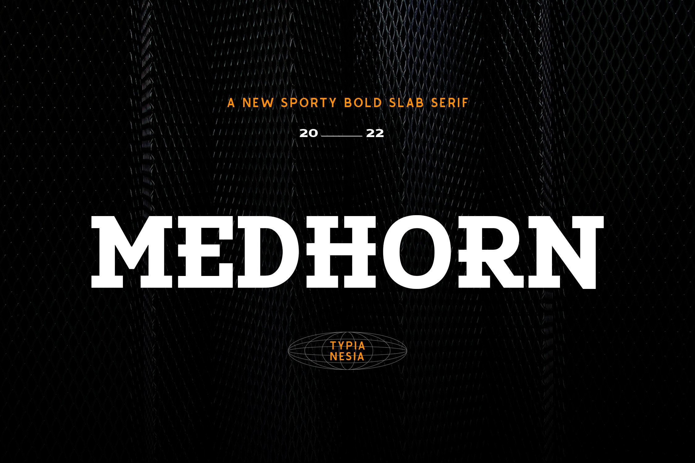 Medhorn from Typia Nesia is a display pick for the vintage sign group. Try it for event banners and brand titles. Medhorn from Typia Nesia has a bold, slightly stylized display character. It adds personality to headlines that need to stand out.
Best for: event banners, brand titles, vinyl signs. By: Typia Nesia
Bold Display and Party Fonts for Banners
These playful, large display faces are for parties, holidays, school events, and promos. Keep the text brief and let the headline do the work.
20. Thick Stacked
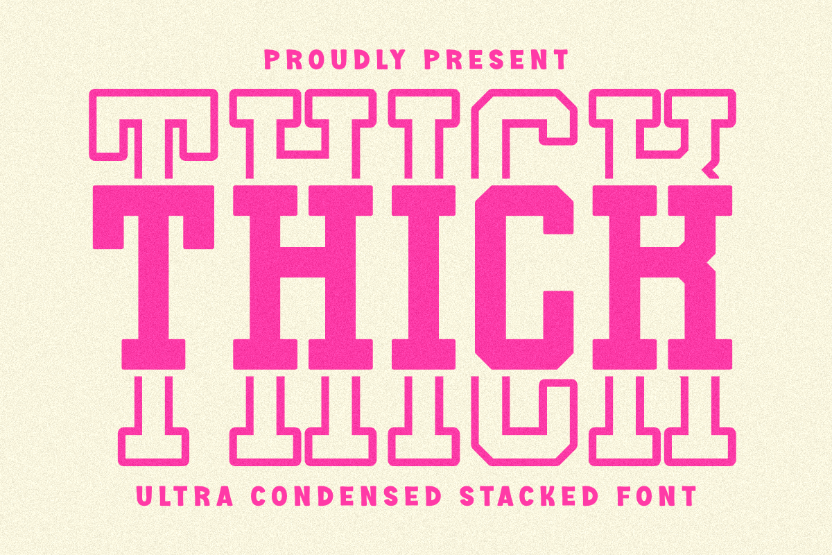 Pian45 made Thick Stacked for the bold display and party group. Its stacked styling suits party and holiday banners with short text. Thick Stacked by Pian45 is a chunky, stacked display face. It brings a fun, bold energy to party and event banners.
Best for: party banners, holiday promos, kids events. By: Pian45
21. Bold Analogue
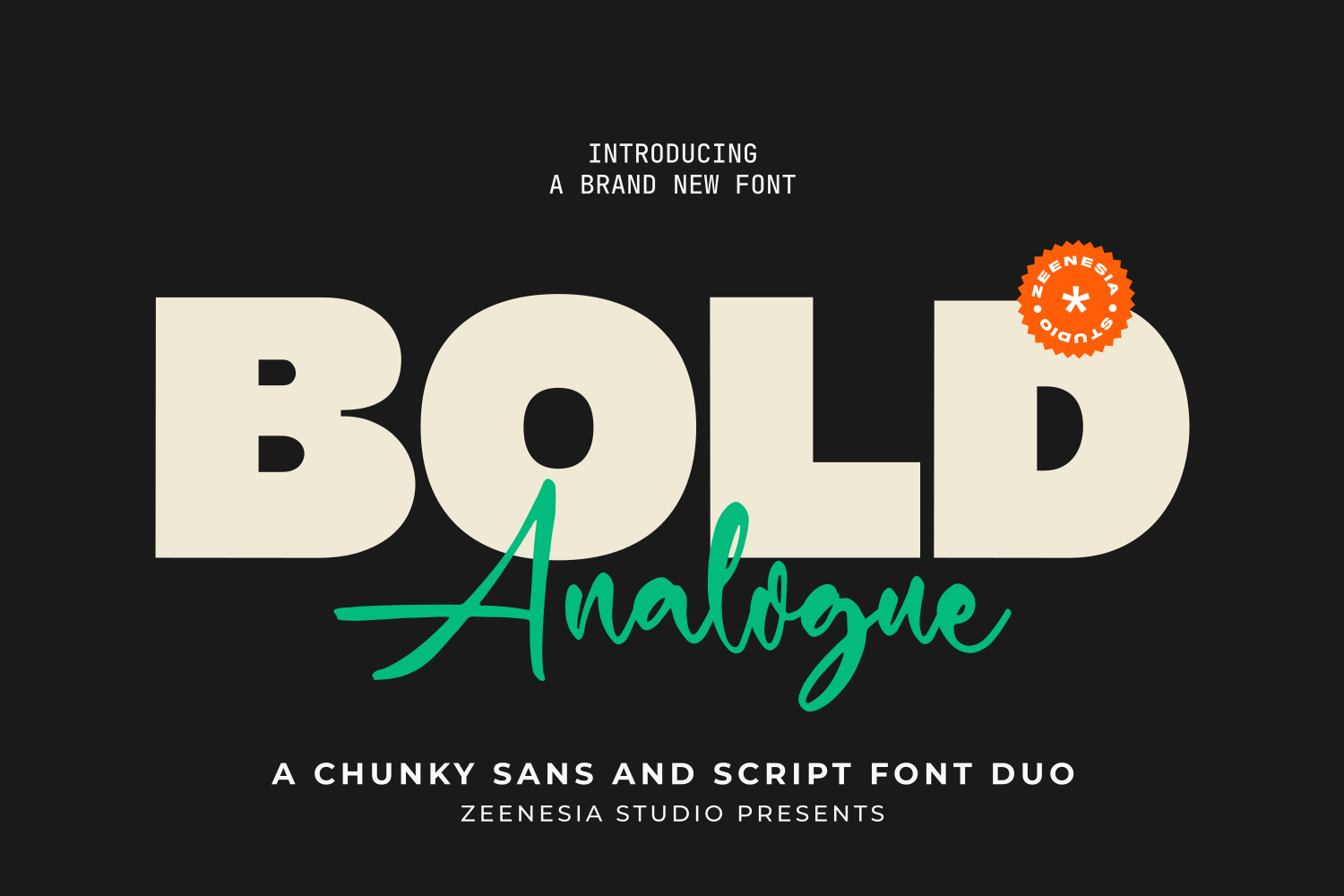 Bold Analogue, by zeenesia, is a bold display option for cafe promos and neighborhood events. Keep the headline to a few words. Bold Analogue from zeenesia has a bold, slightly retro display feel. It suits headlines that need warmth and character.
Best for: event banners, cafe promos, party signs. By: zeenesia
22. Maximal
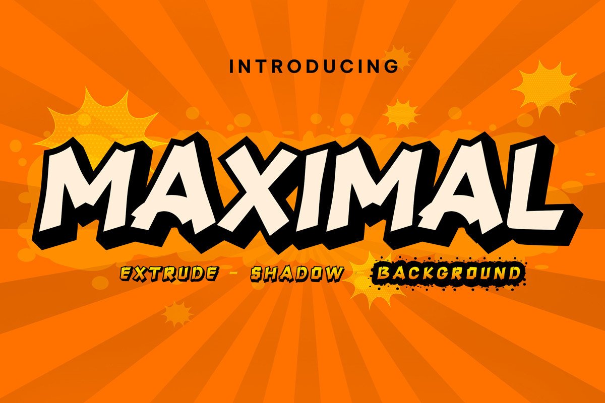 Maximal from FontCastle is a display pick for promo banners. Use it where the headline is meant to fill the space. Maximal by FontCastle is a bold, confident display face. It works well when the headline needs to fill the banner with energy.
Best for: promo banners, event titles, bold headlines. By: FontCastle
23. Carnival Wild
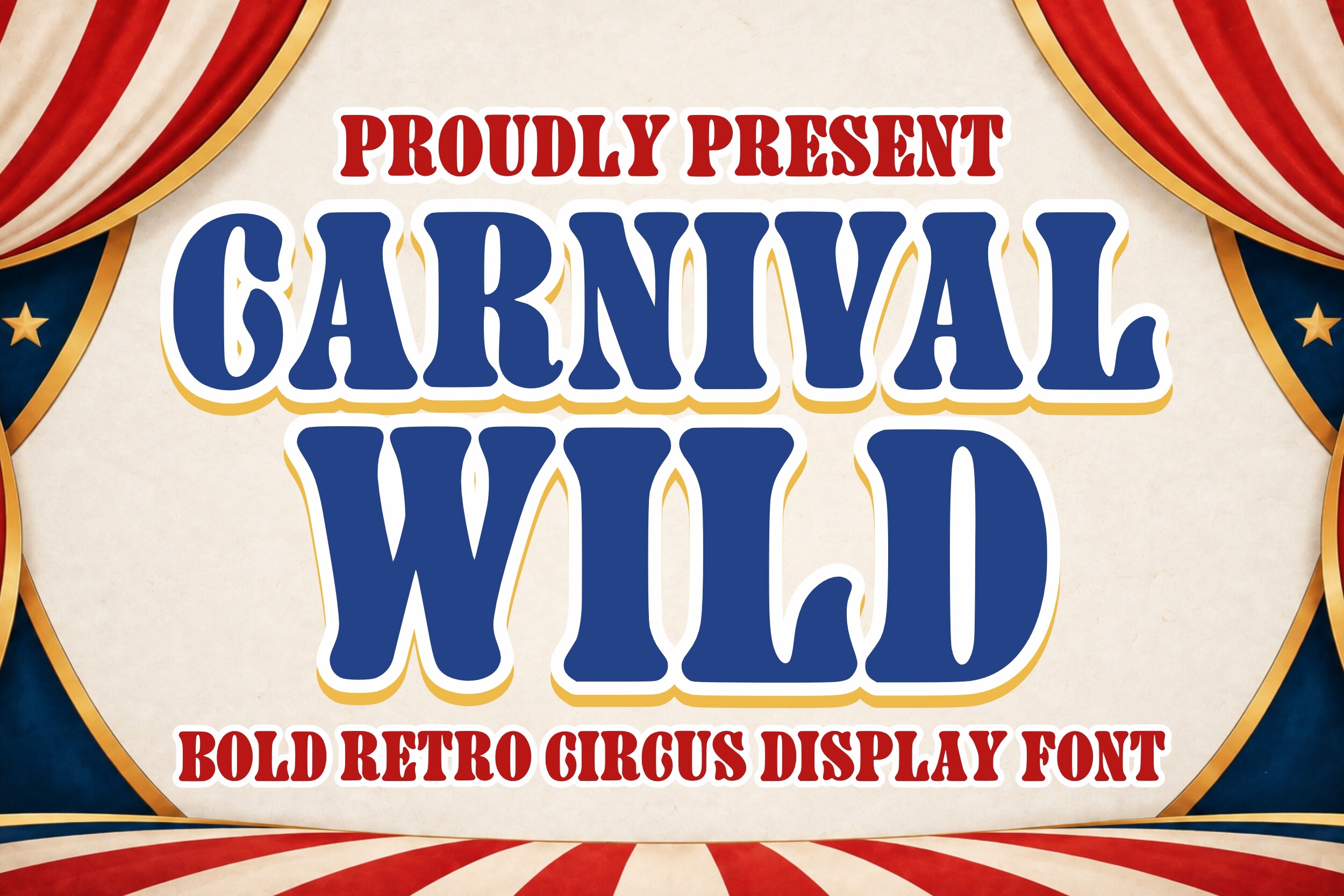 Carnival Wild by Soho Studio suggests festive fairs and parties. Let it do the talking on a short headline. Carnival Wild from Soho Studio brings a lively, carnival feel. It is a great match for festive and playful banner designs.
Best for: party banners, fair events, holiday promos. By: Soho Studio
24. Cheeky Chunky
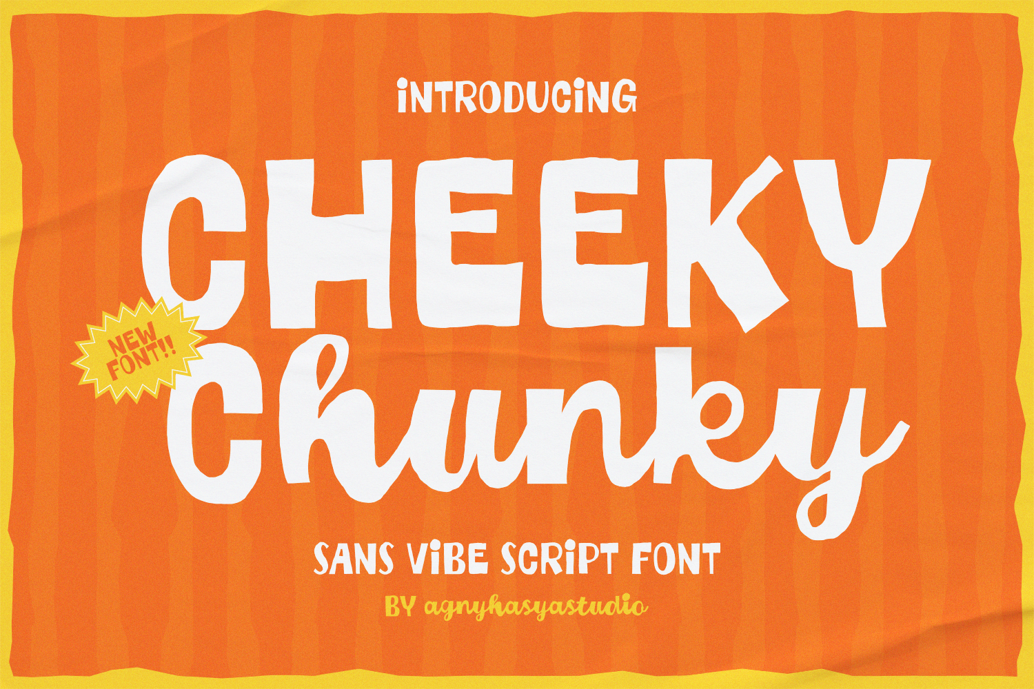 agnyhasyastudio designed Cheeky Chunky for playful, chunky headlines. It suits kids events and casual promos. Cheeky Chunky by agnyhasyastudio has a playful, chunky character. It adds a lighthearted tone to short headline words.
Best for: kids events, party banners, fun promos. By: agnyhasyastudio
25. Campus Rally
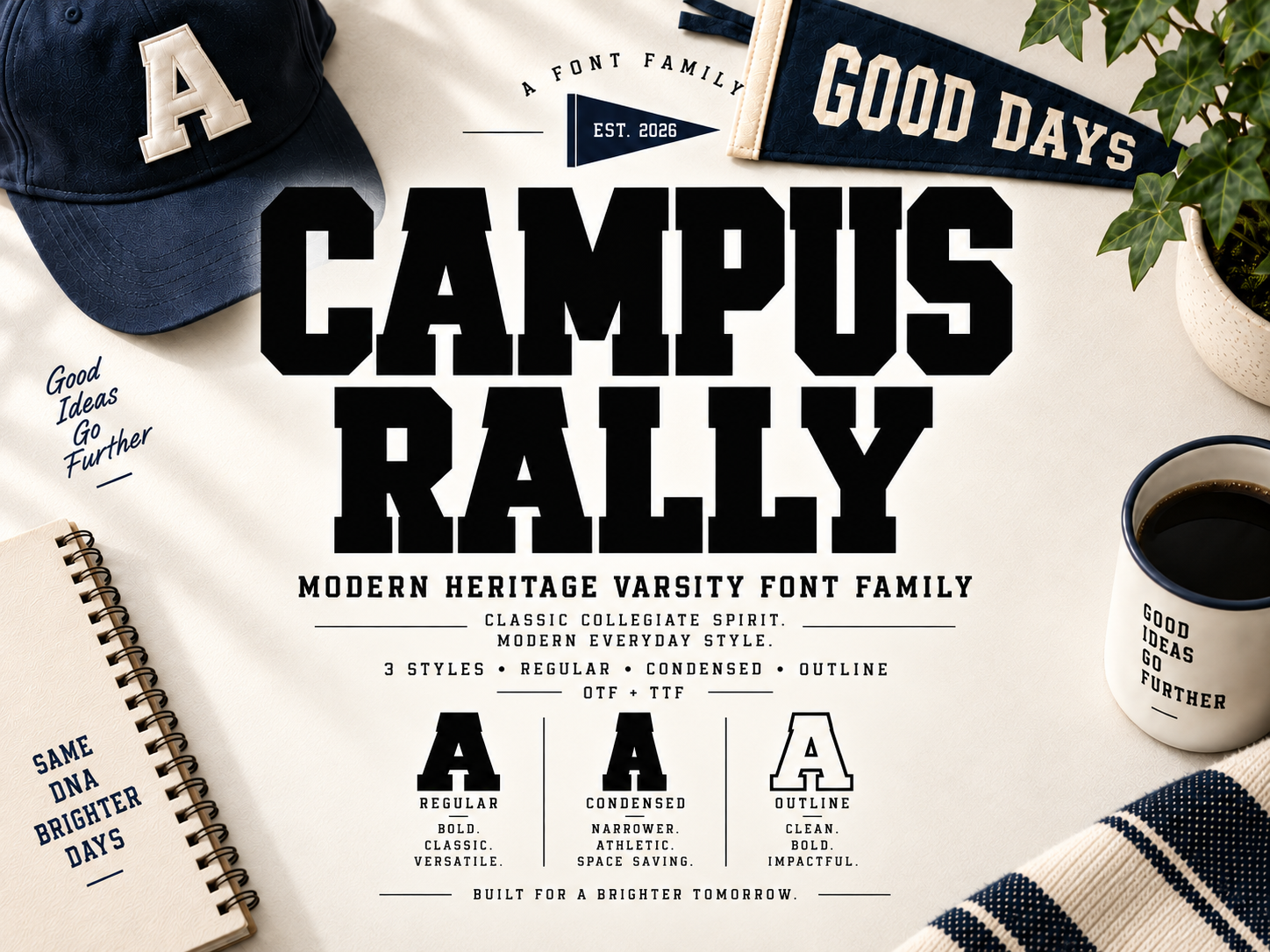 Campus Rally, from Marty Letter Studio, is aimed at school and sports rallies. Test it on team names and event titles. Campus Rally from Marty Letter Studio evokes a campus rally energy. It suits team names and school event banners.
Best for: school banners, sports rallies, team events. By: Marty Letter Studio
26. Scholar Stacked
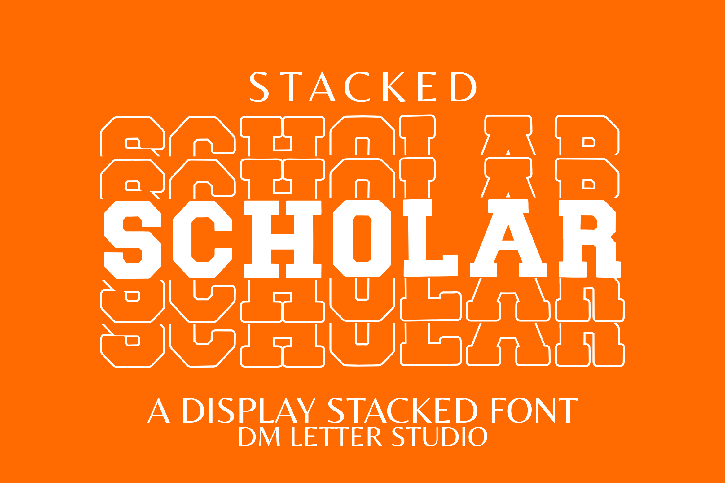 Scholar Stacked by Sharon (DmStudio) fits school and campus themes. Try it for academic promos and event banners. Scholar Stacked by Sharon (DmStudio) has a stacked, academic display feel. It is a fun pick for school and campus themed banners.
Best for: school events, campus banners, academic promos. By: Sharon (DmStudio)
27. Crash Alert
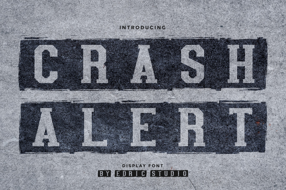 Crash Alert from EdricStudio suits urgent messages. Consider it for flash sales and last minute announcements. Crash Alert from EdricStudio brings a bold, urgent display energy. It works well for headlines that need to grab attention fast.
Best for: sale banners, urgency promos, event titles. By: EdricStudio
28. Chunky Marker
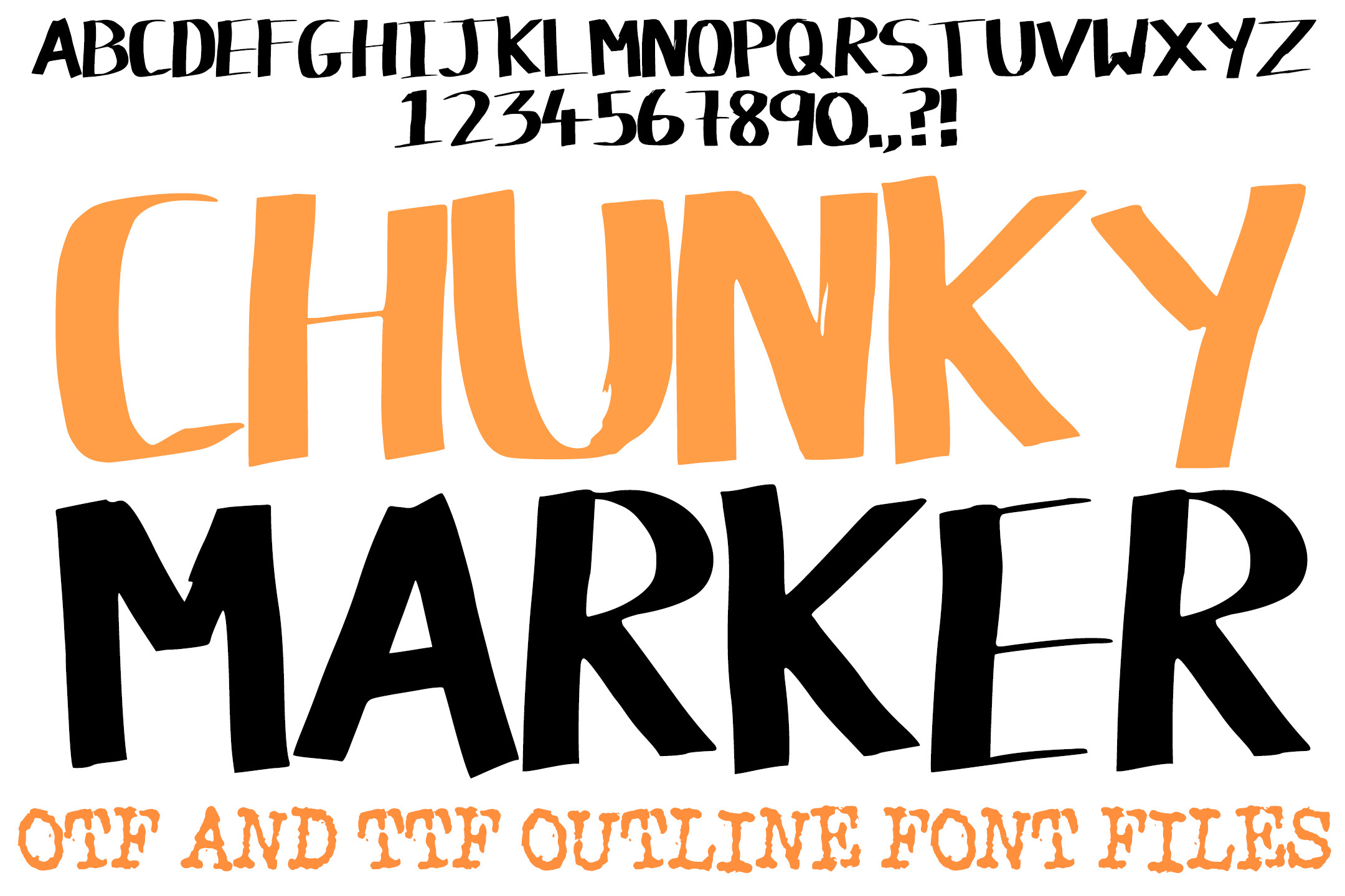 squeebcreative’s Chunky Marker has a marker style and an informal tone. It fits casual events and social posts. Chunky Marker by squeebcreative has a marker like, hand drawn feel. It adds a casual, approachable tone to banner headlines.
Best for: party banners, casual events, social posts. By: squeebcreative
Brush and Script Accent Fonts for Banners
Brush and script faces work best as accents. Use them for a name or one short word, not for long lines, since connected and thin strokes can lose legibility at a distance.
29. Prime Brush
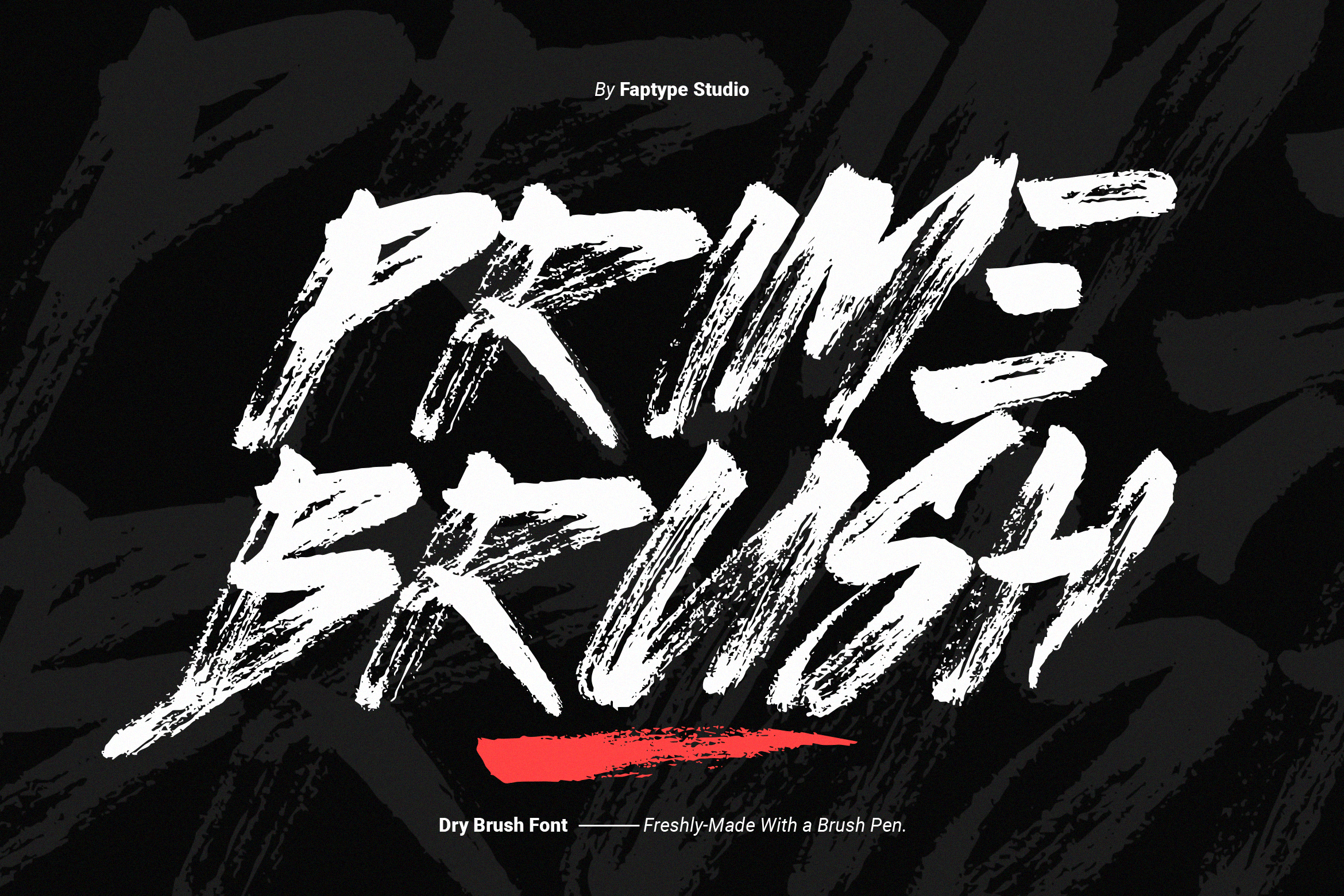 Prime Brush, by Ardana Creative, belongs to the brush script group. Use it as an accent on one short word. Prime Brush by Ardana Creative is a brush script with a confident, flowing feel. It is a nice accent for a short headline word.
Best for: accent words, event titles, brand names. By: Ardana Creative
30. Rimbrush
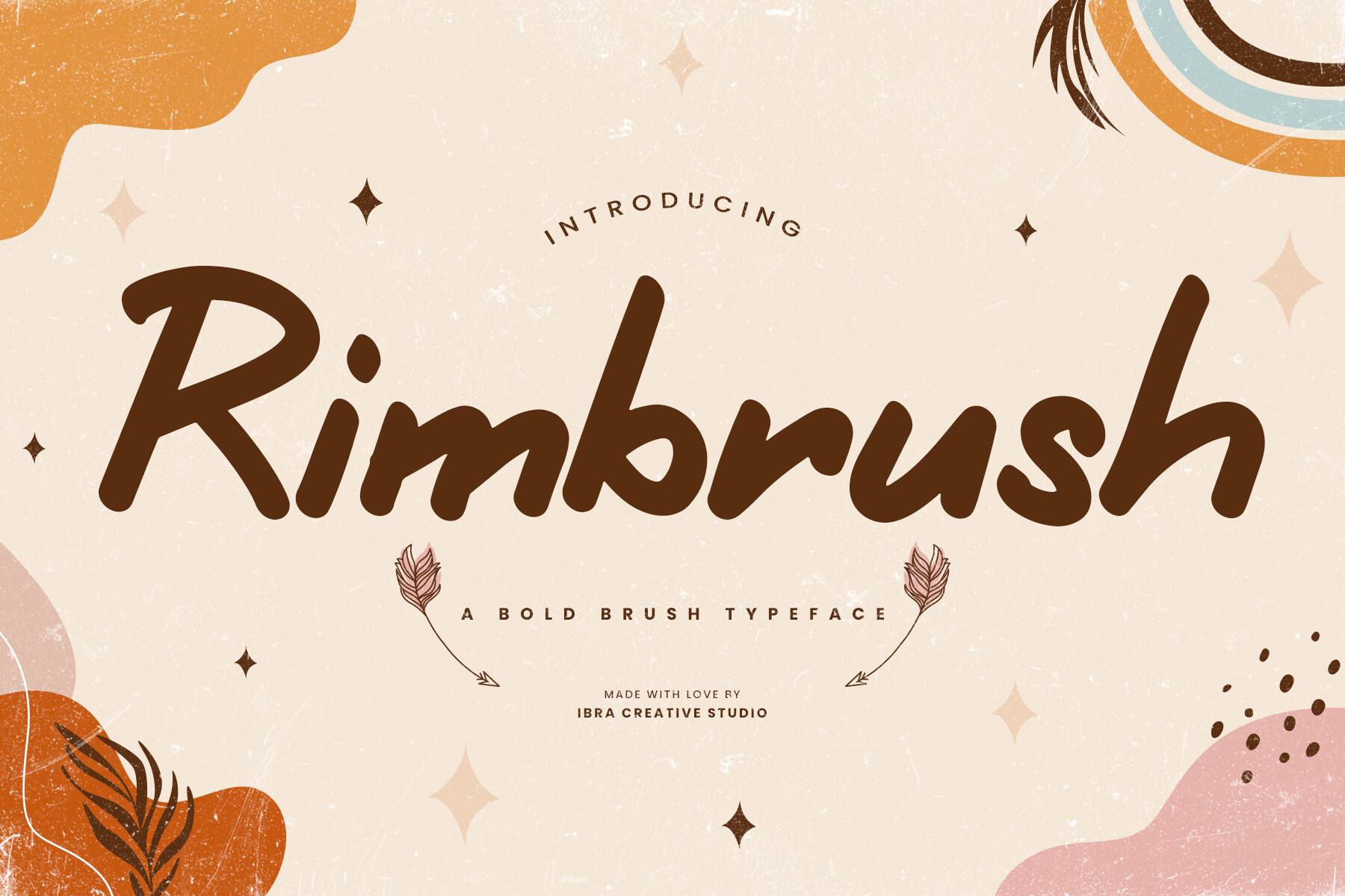 Rimbrush from ibracreative is a brush option for accent text. Try it on cafe banners or artisan brand names. Rimbrush from ibracreative offers a textured brush look. It adds a hand made, organic touch to a banner accent.
Best for: accent text, cafe banners, artisan brands. By: ibracreative
31. Hadley Brush
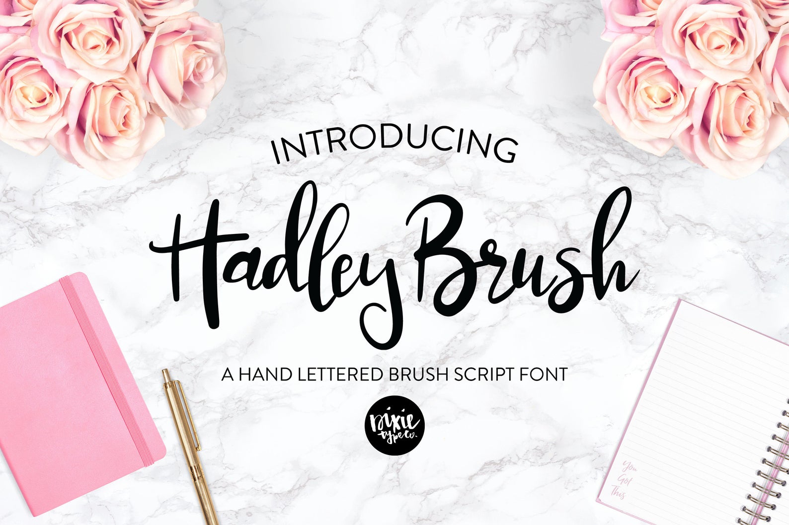 Hadley Brush by blushfontco is a brush script accent. It suits wedding banners and personal events, on a single line of text. Hadley Brush by blushfontco brings a soft, flowing brush character. It is a gentle accent for warm, personal banner designs.
Best for: accent words, wedding banners, personal events. By: blushfontco
How to Use Fonts in Your Banner Designs
Start with a distance test. Shrink your layout down or step back from the screen and see if the headline still reads clearly. If you have to squint, the typeface or size is not working.
Sizing is a common question. Some printers quote a rough rule of thumb of about one inch of letter height for every ten feet of viewing distance, but treat that as a loose guide, since it varies by setting. What matters is letter height, not point size, so check the actual cap height against your expected viewing distance and confirm with your printer.
Build a clear hierarchy. Make the headline the biggest and boldest element, keep the subtitle smaller and lighter, and include just one call to action. Too many competing elements confuse the eye.
Contrast is non negotiable. Go dark on light or light on dark, and avoid dark on dark or pale on white. If the background is busy, add an outline or a subtle shadow to lift the text.
For vinyl and print banners, choose faces with dense, solid shapes and leave room for hems and grommets. Work at full size in a vector program, convert text to outlines before export, and always ask for a proof. Check your printer’s specific specs before you send files.
For web and YouTube banners, platforms crop and overlay elements, so keep your text in a central safe area. Preview the banner on a phone, and check the current platform specs rather than relying on old dimensions.
For party banners, lean into playful display faces and keep the word count very low. One expressive font for the headline plus a simple supporting face for details is usually enough.
On pairing, stick to two fonts maximum. A bold, expressive headline paired with a plain sans for the subtitle reads cleanly and feels intentional.
If you design in Canva, you can upload your own fonts, though custom font upload typically requires a paid plan, so check Canva’s current help pages for the latest details. Uploading a font does not change its license, so you still need the rights to use it in your final banner.
For Cricut and similar cutters, simpler shapes with fewer tiny details are generally easier to weed. Check how connected script letters behave in your cutting software, and always do a test cut on a scrap before committing to vinyl.
Tips for Choosing the Right Banner Font
Licensing is the part most people skip, so do not. Personal and commercial use are different things, and they vary from font to font. Before you print a banner for a shop, event, or ad, read the license on the product page. If you are unsure whether a face covers commercial use banner fonts, reach out to the seller.
Terms can depend on the product and on your plan, and redistributing font files is generally not allowed. Read the license on each product page, and do not assume a single license covers every project, especially commercial print.
Check compatibility with your tools. Make sure the font installs and displays correctly in Canva, Illustrator, or Cricut Design Space, and test it with your real banner text, not a placeholder. If your project needs a specific language or diacritics, confirm the face supports them before you commit, but check only if that is actually a requirement for your design.
Where to Download Banner Fonts
The faces in this article come from Creative Fabrica. Browse the linked products above to preview them and read the license terms on each product page before you download.
You will also find plenty of options on Google Fonts, DaFont, and Font Squirrel, which are other places to look for banner fonts. Just remember to verify the license on any face you plan to use in a commercial banner.
For more practical typography tips, font pairing ideas, and design walkthroughs, take a look at the FontPro blog.