· fonts · 14 min read
16 Best Blackletter Fonts for Logos, Posters, and Headlines in 2026
Find 16 best blackletter fonts for logos, posters, and headlines in 2026. Compare Fraktur, Old English, and Gothic styles with free and premium downloads.
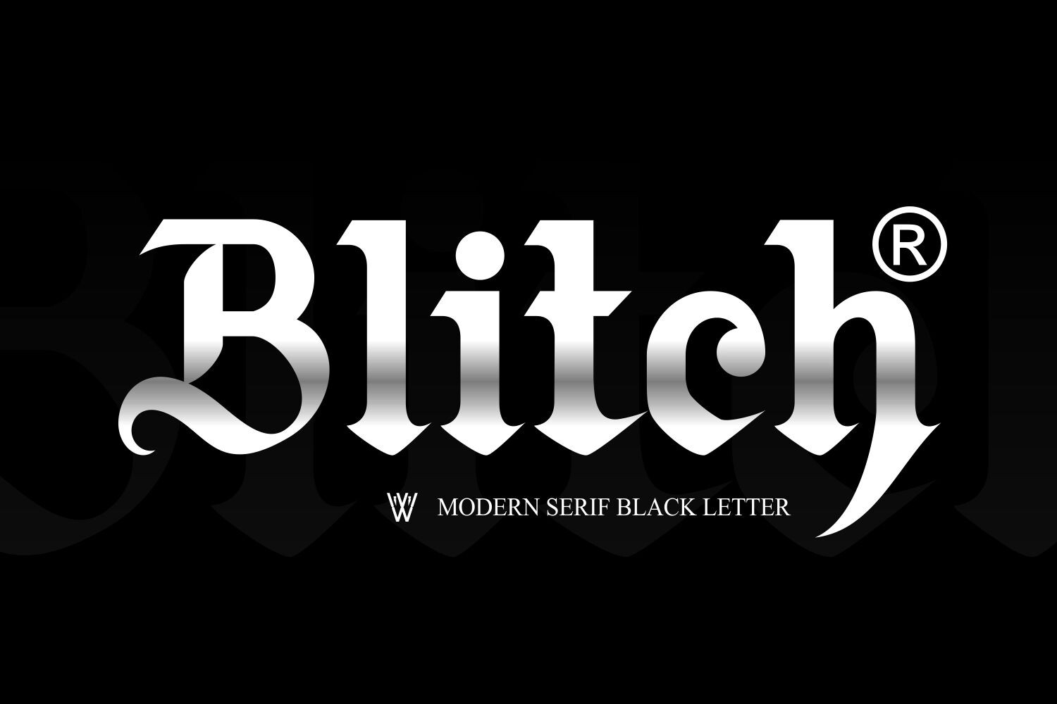
If you want a headline that feels carved, heavy, and a little dangerous, blackletter is the style. It works best as a display tool for logos, posters, album covers, tattoo lettering, certificates, and streetwear. This list covers 16 best blackletter fonts for 2026, grouped by style. Each pick includes a download link and a practical use case.
What Are Blackletter Fonts? (Understanding the Style)
Blackletter began as the dense medieval book hand used across Western Europe from the late 12th to the 17th century. Gutenberg printed his famous 42 line Bible in a blackletter style, and historians estimate he produced around 180 copies, of which roughly 49 survive today, according to the Library of Congress.
The style is built from thick verticals, sharp angles, and broken or interlocking letterforms. That is why a blackletter alphabet often looks like a dark, ornate grid. It can feel historic, authoritative, and a little aggressive, which is why it still shows up in gothic branding, metal posters, and vintage packaging.
A quick terminology note: in Europe, “Gothic” often means blackletter. In the United States, “Gothic” can also mean a sans serif family such as Franklin Gothic or Century Gothic, which has no real blackletter connection. “Old English” as a font name is a display style label, not a reference to the Anglo-Saxon language. Many fonts called Old English are blackletter display faces, even though the name is a branding term.
So if you search for an old english font, you may get blackletter, but the name is not a linguistic claim. It is a visual shorthand.
What Makes a Great Blackletter Font for Logos and Headlines?
The best blackletter fonts for logos balance drama with legibility. A logo mark can be dense, but the name still needs to be readable at small sizes. If a face turns into a knot of strokes at 12 pixels, it may look great on a poster but fail on a business card.
Look for clean counters, clear lowercase forms, and a full character set. A strong blackletter font should include uppercase, lowercase, numerals, punctuation, and enough diacritics for your language. If you are designing for a German, Scandinavian, or French market, check accent support before you fall in love with the look.
For 2026, screen readability matters more than ever. Many modern releases keep the historic weight of a textura font or fraktur font while opening letter spacing and stroke contrast so the type still works on phones and social thumbnails.
Use blackletter for the accent, not the paragraph. Readers parse text in chunks of about 6 to 9 characters at a time, according to WebAIM, and dense letterforms can slow that process. The University of Central Florida’s Readability Consortium found that switching to a more appropriate typeface can boost reading speed by up to 35 percent.
My rule is simple: if the type is doing the talking, keep it short.
16 Best Blackletter Fonts for Logos, Posters, and Headlines
These picks cover three practical lanes: classic blackletter, historic Fraktur revivals, and bolder Old English display faces. I grouped them by mood, because a Fraktur face and a horror Gothic face can both be blackletter and still feel like different projects. Use the group labels to match the mood you need.
Blackletter / Fraktur Classic
1. Midnight Blackletter
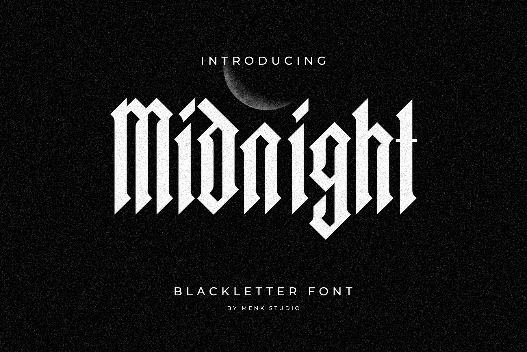
Midnight Blackletter is a heavy, bold face with sharp angular edges and fluid curves. It has a contemporary Gothic twist, so it feels darker than a museum piece while keeping classic blackletter structure. I like it when a project needs more edge than a traditional blackletter face, but not so much that the letterforms lose shape.
Best for: bold statement designs, vintage branding, modern Gothic projects. By: MENK Studio
2. Classic Blackletter
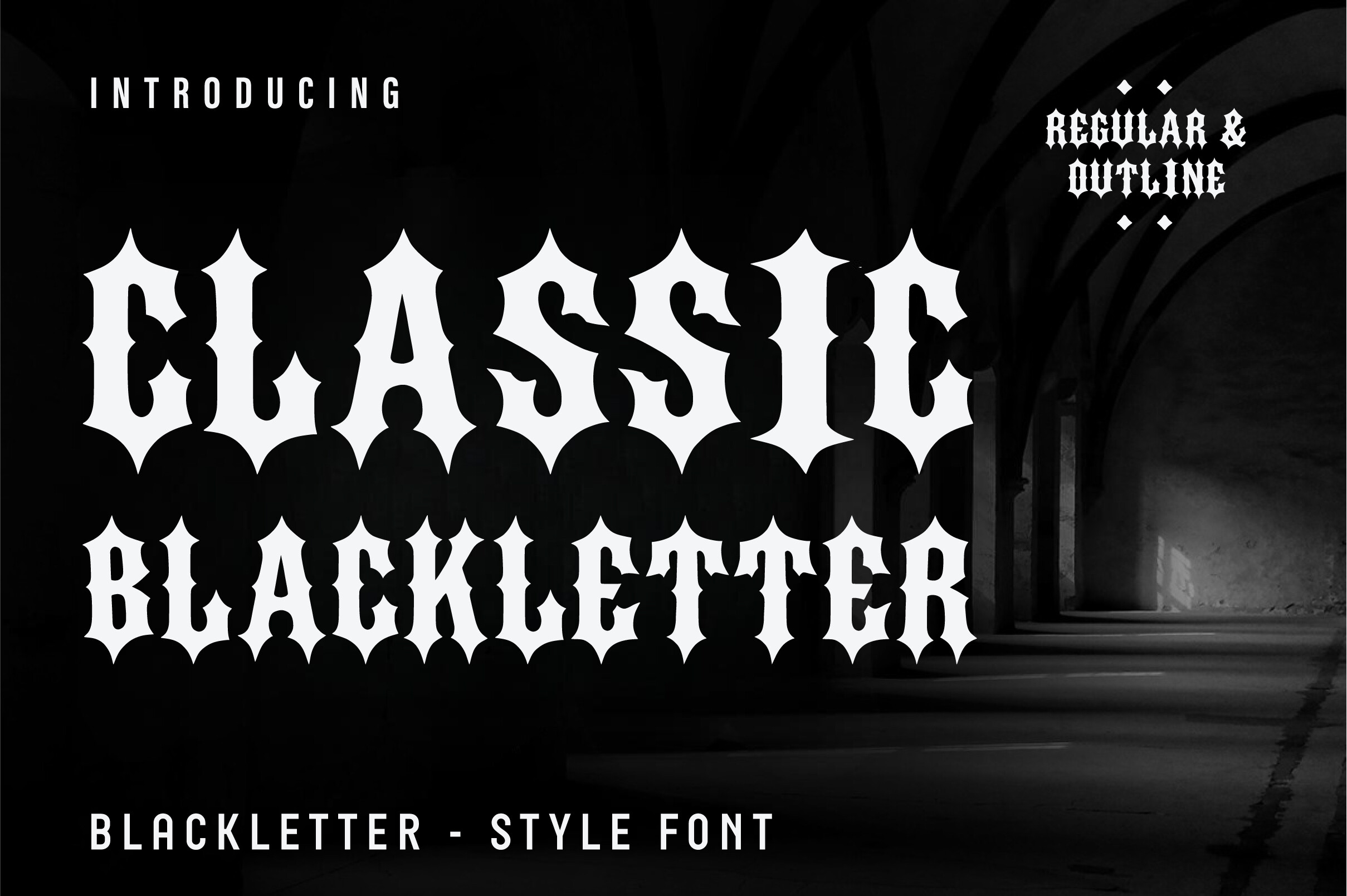
Classic Blackletter is a bold, Old English inspired face that stays clean enough for everyday logo work. It includes Regular and Outline versions, which help with layering, stenciling, or simple brand marks. The outline version is useful when you need a second layer without adding a separate font file.
Best for: streetwear, tattoos, band logos. By: Aura Design
3. Odgar Blackletter
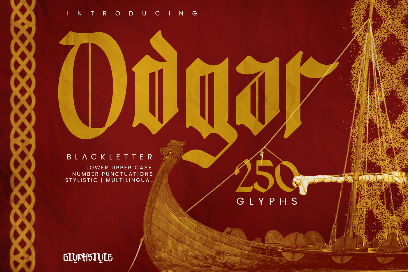
Odgar Blackletter leans into Viking and Norse heritage with bold strokes and classic medieval proportions. It is a true blackletter direction, not a loose fantasy script, so it works well for epic branding without losing type structure. It reads more like a medieval font with a modern cut than a decorative script.
Best for: Viking themes, fantasy artwork, historical branding. By: glyphstyle
4. Secrilka Blackletter Typeface
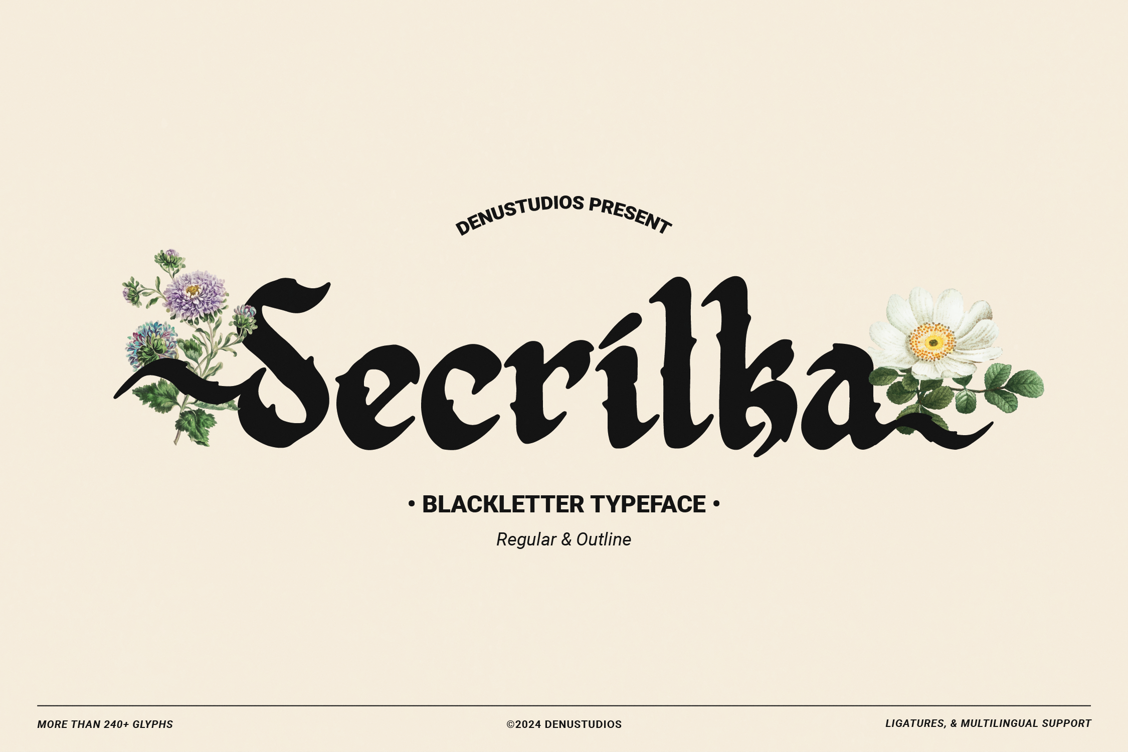
Secrilka Blackletter Typeface is the most technically complete option here. It supports PUA encoding, multilingual text, alternates, and ligatures, and it works across Illustrator, Photoshop, InDesign, and Word. That makes it a strong choice for tattoo lettering, premium labels, and packaging. If you need a tattoo lettering font that can handle custom glyph swaps, this is the one I would test first.
Best for: logos, packaging, tattoo lettering. By: Denustudios
Download Secrilka Blackletter Typeface
5. Universal Blackletter
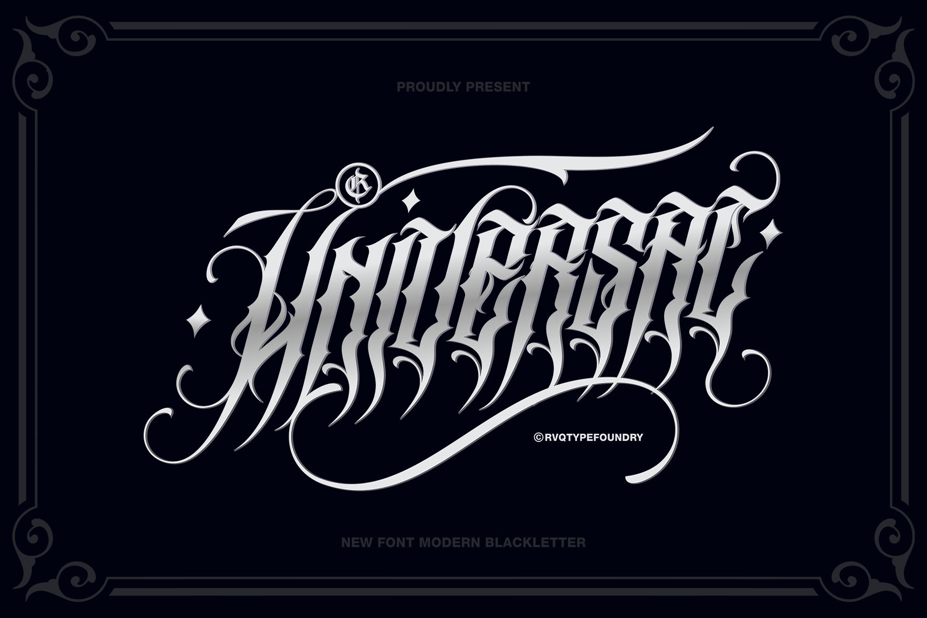
Universal Blackletter is an all purpose workhorse with full uppercase and lowercase, multilingual support, and extra glyphs for customizable combinations. It is a practical starting point when you want one blackletter font for logos, posters, and product labels. The name earns its keep.
Best for: branding, posters, product labels. By: Rvq Type Foundry
Download Universal Blackletter
6. Bruce Blackletter
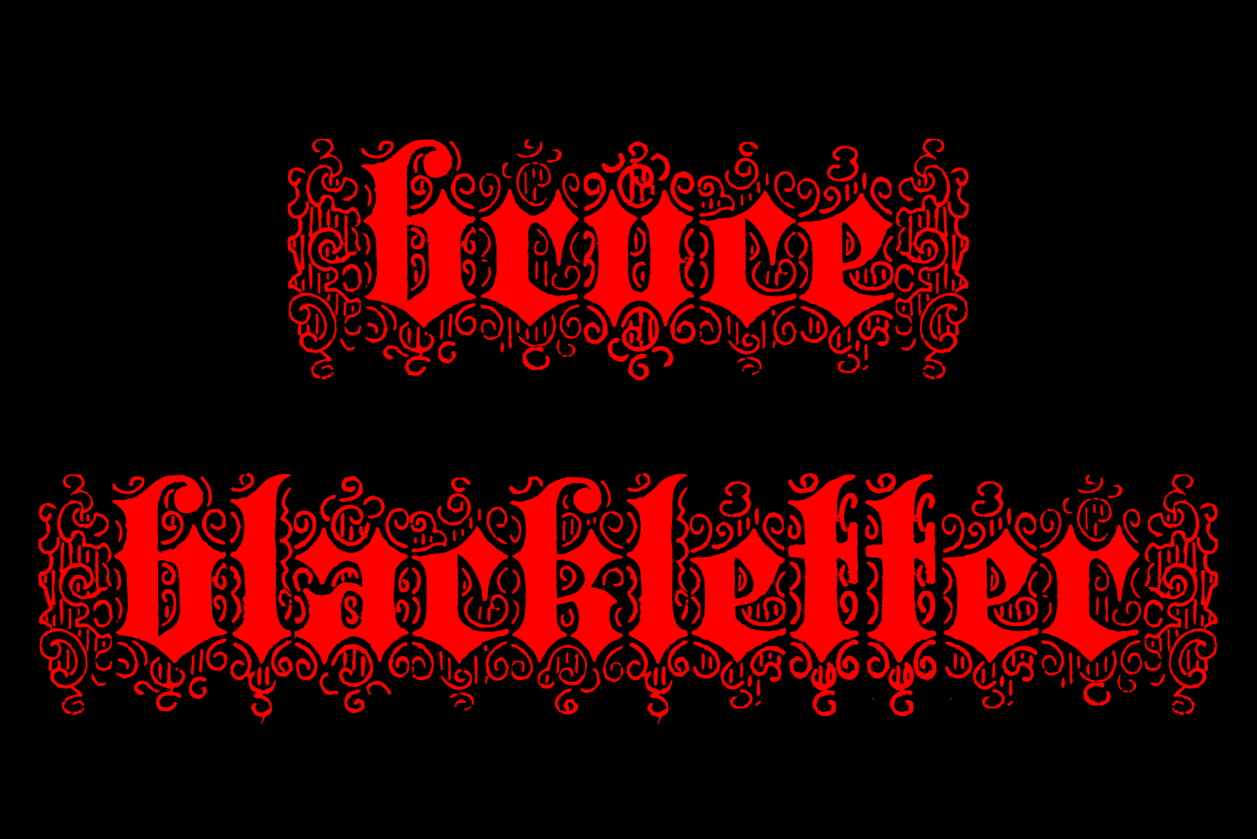
Bruce Blackletter revives a New York type foundry style from around 1882. It has a distressed, vintage feel and alternate fleuron ornaments. The tone is antique and refined, making it a good fit for heritage brands and old world packaging. The ornaments are optional, but they help when a label needs a little period flavor.
Best for: display headlines, vintage branding, antique packaging. By: Intellecta Design
Fraktur / Historic Revival
7. Leipzig Fraktur
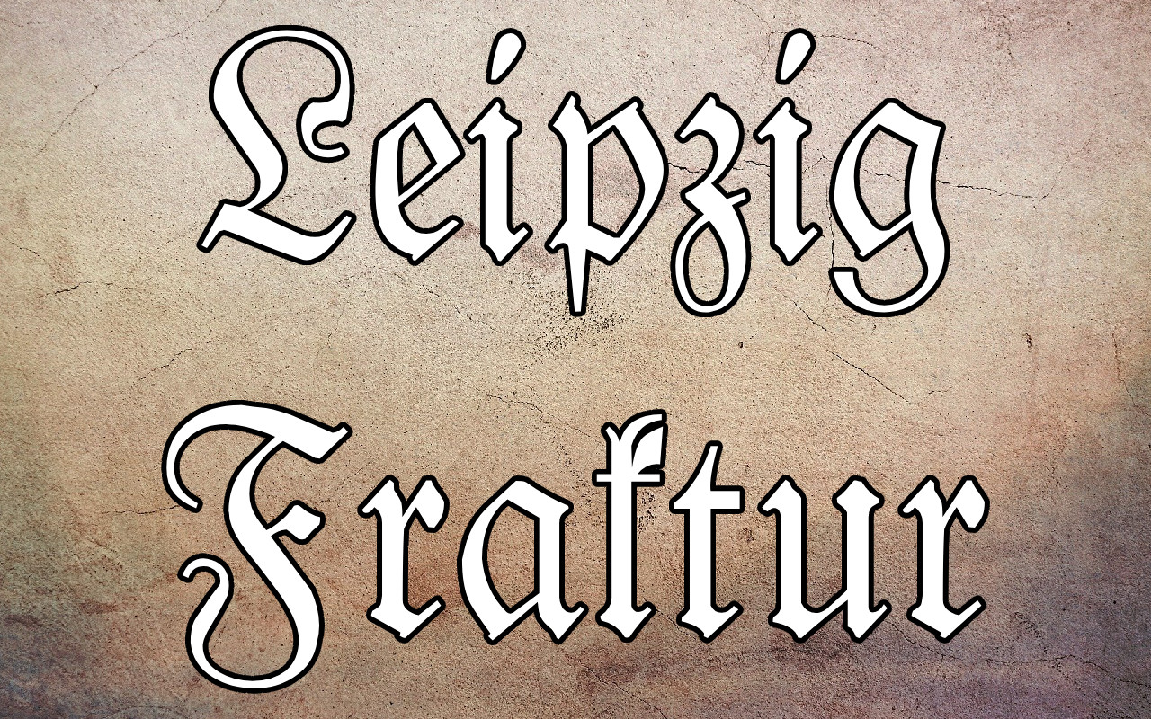
Leipzig Fraktur is a free fraktur font with a well balanced, authentic look. It avoids extreme distortion, so it can work in historic branding and cleaner modern layouts. If you want a blackletter font free of charge, this is an easy pick. It is a good first download if you are new to Fraktur.
Best for: certificates, vintage branding, German style posters. By: Peter Wiegel
8. Wieynck Fraktur
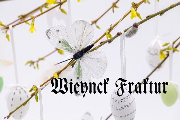
Wieynck Fraktur is also free and comes from the same designer as Leipzig Fraktur, but its standout feature is PUA encoded access to extra glyphs and swashes. It has a softer, more elegant feel than many hard Fraktur faces, which helps it work in invitations and formal documents. The swashes are easy to reach, which saves time when you are styling a certificate.
Best for: certificates, invitations, elegant packaging. By: Peter Wiegel
9. Drude Fraktur
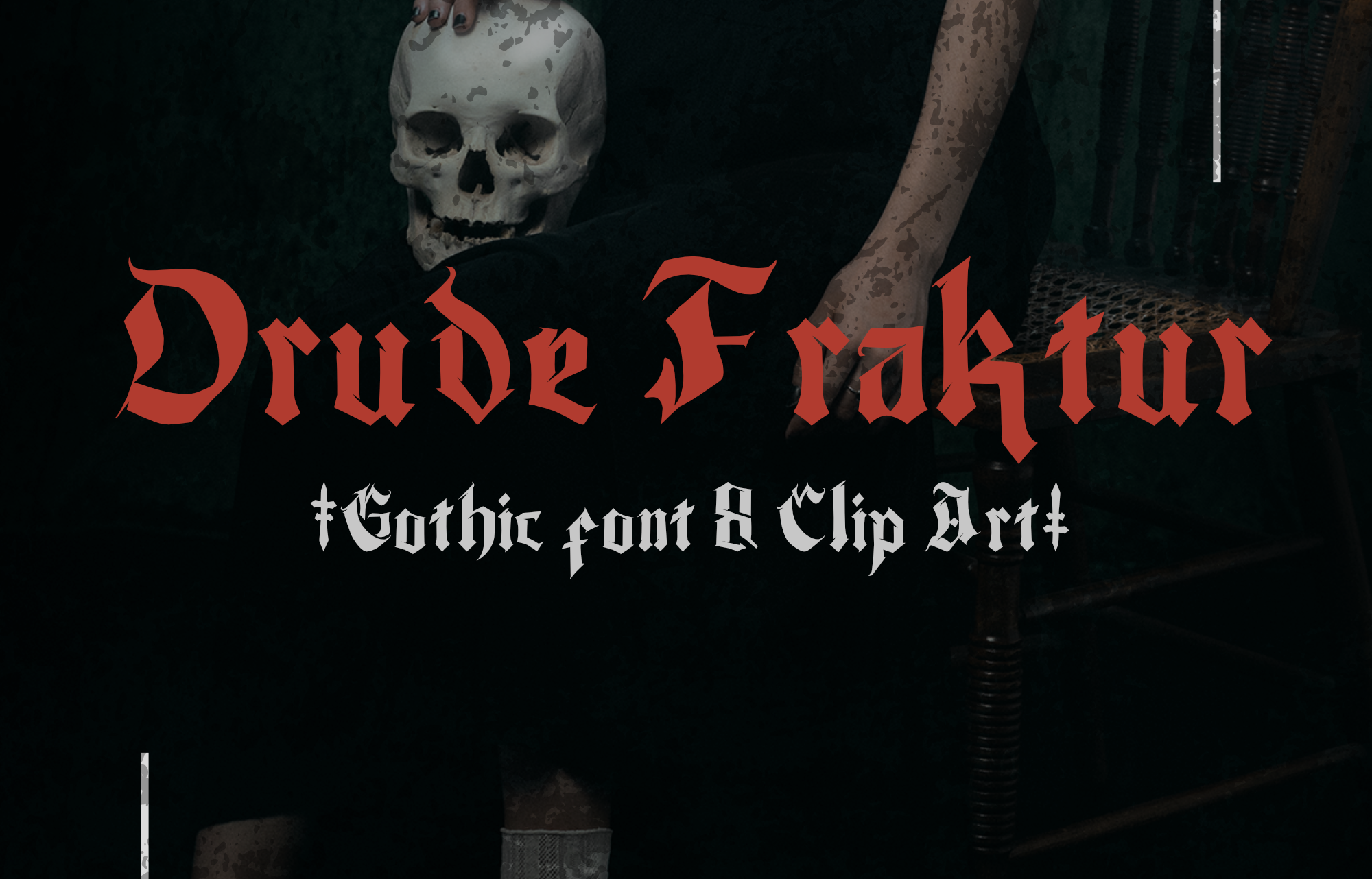
Drude Fraktur is a classic revival style with a formal, historic feel. It includes bundled Gothic clip art elements, which is handy if you need quick ornaments for a poster or label. The face works well when you want a fraktur font that feels ceremonial, not cartoonish. The bundled ornaments keep the composition from feeling bare.
Best for: packaging, branding, witchy posters. By: Mofr24 Studio
10. Faber Fraktur
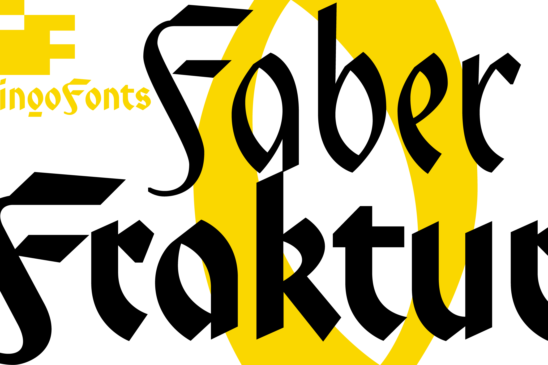
Faber Fraktur is a bold, direct option from ingoFonts. It comes in multiple bundled versions and weights, so you can push the look from a clean headline to a heavier display treatment. It is less about quiet body text and more about making a statement.
Best for: posters, album covers, bold display headlines. By: ingoFonts
11. Tricycle Fraktur
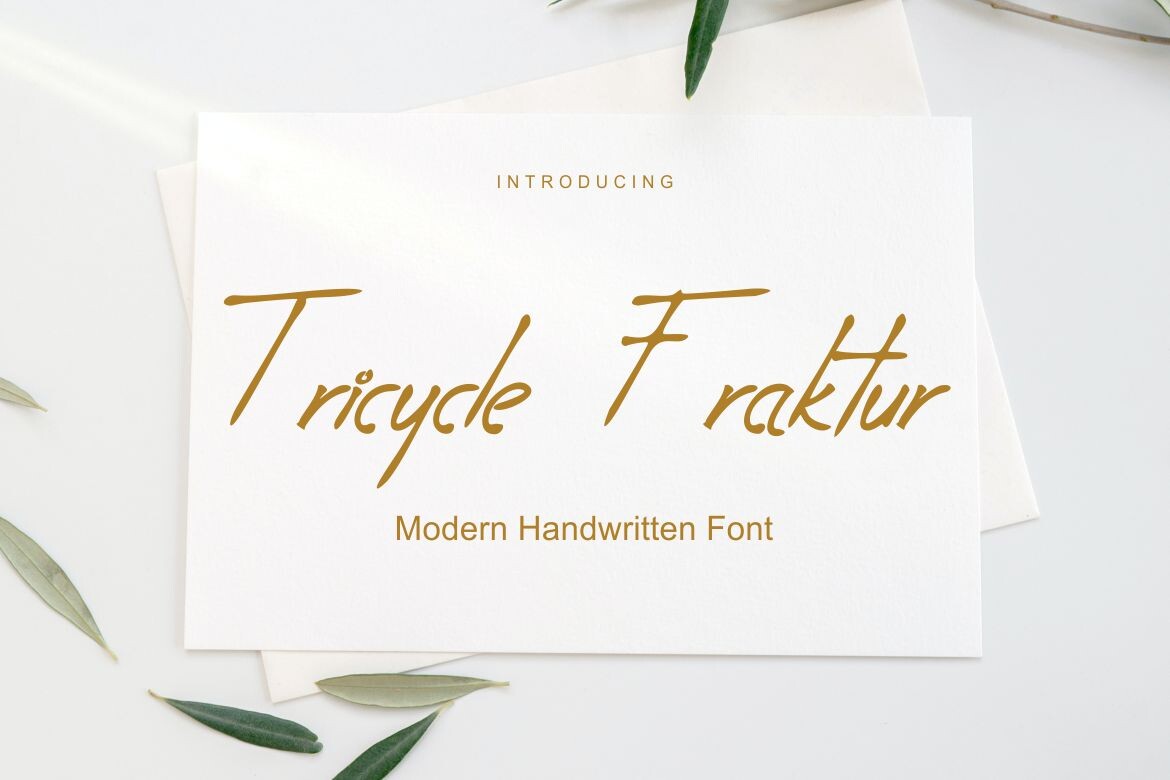
Tricycle Fraktur is a useful reminder that font names can be misleading. It is classified as a script font on Creative Fabrica, not a hard blackletter face. The look is delicate, connected, and closer to wedding or luxury stationery lettering. Use it for a softer, elegant accent. Do not expect a gothic blackletter font download here. This one is for a lighter hand.
Best for: weddings, luxury stationery, elegant packaging. By: Kenrichi
Gothic / Old English Display
12. Bloodforge Gothic
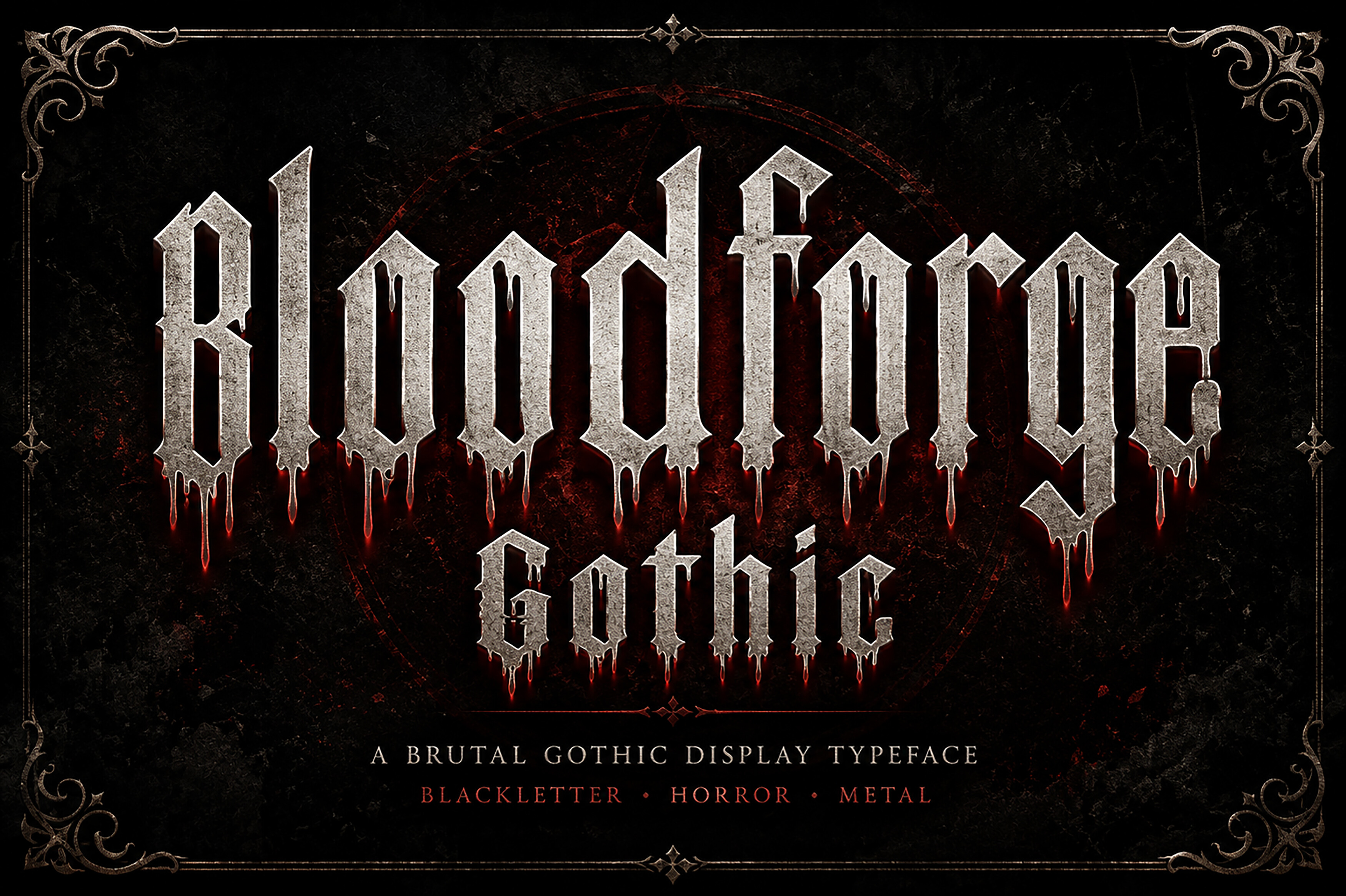
Bloodforge Gothic is the most explicitly horror themed face in this list. It uses dripping blood details and weathered stone texture to create a brutal, high impact display look. It is a gothic font for Halloween posters, horror covers, metal band logos, and occult branding. It is loud, and that is the point.
Best for: Halloween posters, horror covers, metal band logos. By: Wow Magic
13. Old English
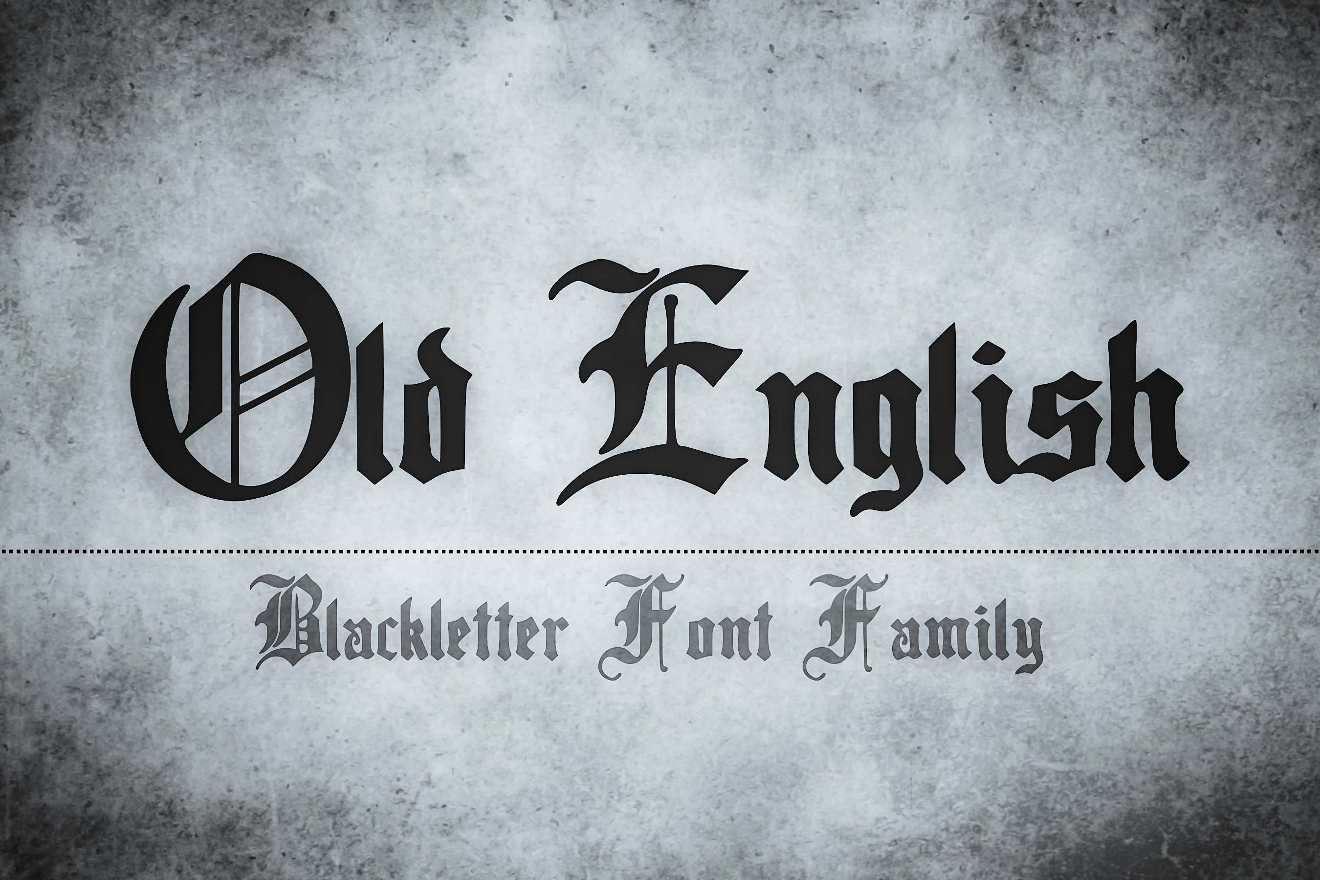
Old English is the most recognizable silhouette in the group. It has the antique, medieval look that many people expect when they search for an old english font, and it is a common base for tattoo lettering and classic logos. Because the style is so familiar, it can feel safe, which is useful when you need instant recognition. It is the default when a client asks for something “old English” without explaining what they mean.
Best for: tattoo lettering, classic logos, vintage posters. By: The Tenacious Type Studio
14. Old English Texas
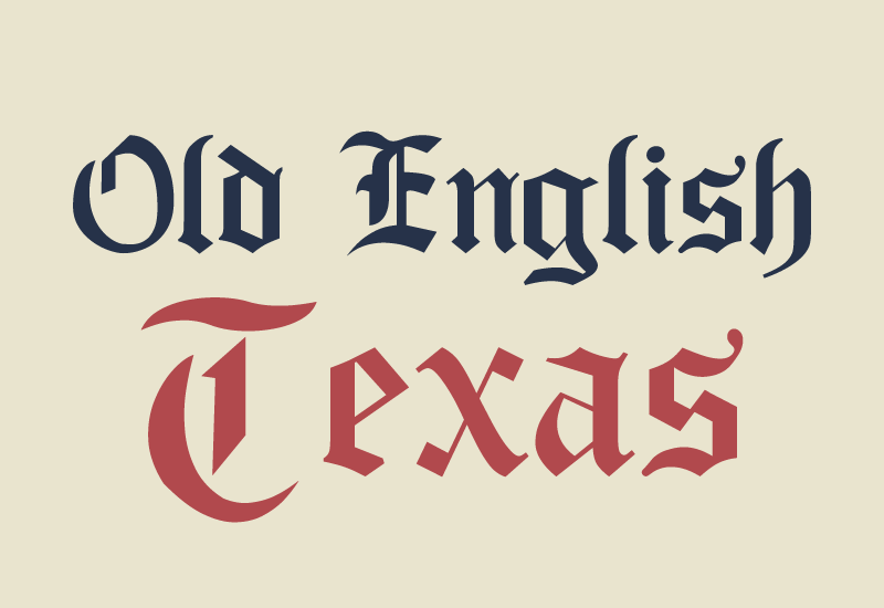
Old English Texas takes the familiar Old English silhouette and adds a bold, wider Texas twist. The proportions are more expansive, which helps the face hold up in large poster layouts and Western style branding. It is a good contrast to the tighter classic look. The wider spacing gives the letters more room to breathe.
Best for: Western branding, posters, rugged logos. By: GraphicsNinja
15. Ragnar Gothic
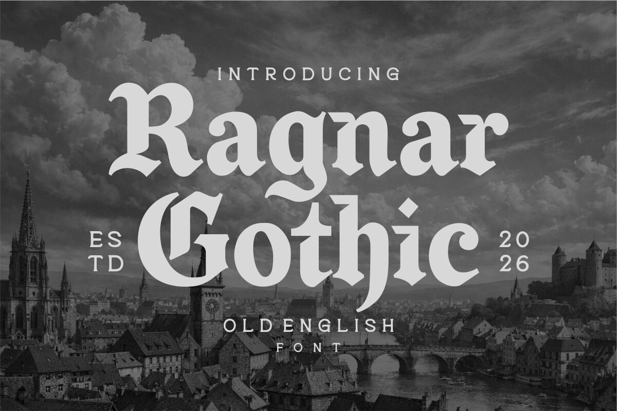
Ragnar Gothic is a 2026 release that balances historic weight with modern legibility. It sits in the Old English and Gothic display lane, but it is more brand agnostic than a pure Viking themed face. It is a strong option for streetwear, breweries, and heavy metal aesthetics. It feels current without turning into a costume.
Best for: branding, streetwear, breweries. By: Eko Kurniawan
16. Tattered Gothic
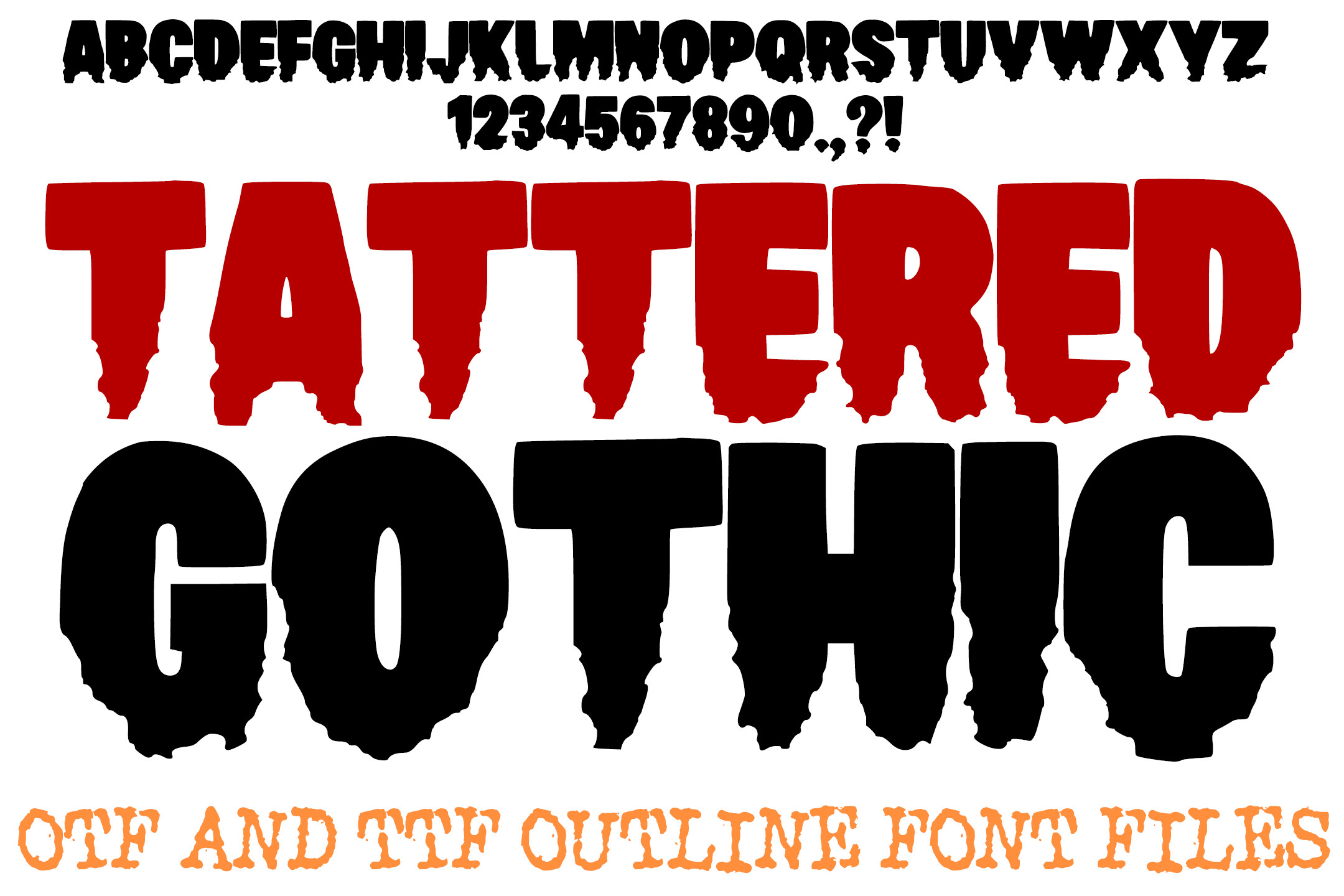
Tattered Gothic is dark, hand drawn, and deliberately rough. The letters look jagged and shredded, giving the face a punk, horror, or distressed metal vibe. It is caps only, with no lowercase, so use it for short, punchy titles rather than longer text. The rough edges do a lot of work, so keep the message short.
Best for: metal album covers, streetwear, horror titles. By: squeebcreative
How to Use Blackletter Fonts in Your Design Projects
Keep blackletter short. One word, a brand name, initials, or a headline is enough. Avoid setting paragraphs in a dense medieval font, because broken strokes and tight counters make long text tiring.
Tip: If a logo needs to shrink to a favicon or app icon, test it at small sizes before you approve the design.
Pair it with a quiet partner. A neutral sans serif is the safest choice for body copy, captions, and UI labels. An old style serif such as Garamond, Caslon, or Libre Baskerville can also work well because it shares calligraphic DNA with blackletter. The Los Angeles Times masthead is a real example.
Avoid pairing blackletter with another decorative script or a heavy slab serif. Two ornate faces will fight for attention, and the result can look muddy.
Use mixed case when the font supports lowercase. ALL CAPS can look powerful, but it also removes the shape variation that helps readers scan. If you are using a caps only face, keep the message very short and give the letters room to breathe.
Leave space around the type. Blackletter needs air. Increase leading and tracking, especially on dark backgrounds, because thick to thin stroke variation can fall below the 4.5 to 1 contrast ratio recommended by WCAG.
Tip: For laser cut or SVG work, check that the letters do not close into tiny holes that will not survive cutting.
Good uses include logos, posters, album covers, tattoo lettering, certificates, invitations, packaging, and streetwear merch. If a project needs history, authority, or a little menace, blackletter is the accent that does that job.
Blackletter Styles Explained: Textura, Fraktur, Rotunda, and Bastarda
Textura is the oldest and most rigid of the major blackletter families. It has sharp angles, dense verticals, and a formal, almost architectural look. Gutenberg’s Bible used a textura style, and many classic blackletter fonts are based on this tradition.
Rotunda is rounder and more open. It developed in Italy and Spain and tends to be easier to read than Textura. If you want a medieval font with a softer, more approachable feel, look for Rotunda inspired letterforms.
Bastarda, also called Schwabacher, sits between the angular and the rounded. It has softer curves and a more handwritten energy. It was a common everyday print style in Germany around the late 15th and early 16th centuries.
Fraktur is the German blackletter tradition that became dominant by the mid 16th century. The name means broken, and the letterforms often show broken or fragmented strokes. Fraktur remained common in German printing long after other regions moved to Roman type. More than half of German books in the early 20th century still used blackletter, according to Communication Arts.
The style’s history took a dark turn on January 3, 1941, when Martin Bormann issued the Normalschrifterlass, which banned Fraktur and falsely labeled it Jewish letters. The real motivation was practical: occupied territories could not read Fraktur easily, and there were not enough blackletter presses outside German speaking regions. That history matters because it explains why the style still carries weight.
Tips for Choosing the Right Blackletter Font
Check the license before you download. Some blackletter fonts are free, but free can still mean personal use only. Always confirm whether the license covers commercial use, logos, packaging, or merchandise. In this list, Leipzig Fraktur and Wieynck Fraktur are free, while the other Creative Fabrica fonts are paid options, so review their licensing terms.
Test readability at small sizes. A gothic blackletter font download can look strong in a poster preview and unreadable on a favicon, business card, or app icon. Zoom out, put it on a dark background, and check whether the letterforms still separate.
Match the font to the tool you will use. If you work in Canva, Photoshop, Illustrator, or Procreate, make sure the font installs cleanly. In Photoshop or Illustrator, install the font on your operating system, restart the app, and it should appear in the font menu. In Canva, use fonts from the Canva library or upload supported fonts through your Brand Kit. If you are sketching tattoo designs, Procreate is a good place to test a tattoo lettering font before you commit to a final line.
If you only need a quick mockup, a blackletter font generator can help you preview a name fast. For final client work, use a licensed typeface and keep the file organized.
Finally, choose the style that fits the message. Fraktur is best for German, historic, or ceremonial projects. Old English display faces are strong for tattoos, metal, and vintage logos. Rounder blackletter forms are usually easier to read when the design needs a softer tone.
Where to Download Blackletter Fonts
Creative Fabrica is the main source for all 16 fonts in this article. It is a practical place to browse gothic blackletter font download options, compare previews, and license typefaces for commercial projects.
You can also find free or open source blackletter options on Google Fonts, DaFont, and 1001 Fonts. Just check each license carefully, especially if you are using the font in a logo, album cover, or product label.
For more typography breakdowns, font pairing ideas, and design resource guides, visit the FontPro blog.