· fonts · 13 min read
18 Best Graffiti Fonts for Bold Street-Style Designs in 2026
Explore 18 best graffiti fonts for logos, streetwear, posters, and stickers. Compare bold tag, urban, and drip styles with free and premium options now.
If you need a bold graffiti typeface that actually reads on a tee, poster, or album cover, the right style matters more than raw chaos. I have seen too many streetwear designs where the type looks like a sticker slapped on top. The best graffiti fonts do not just scream. They hold their shape when the print gets small, the color gets limited, or the layout gets tight.
A great street art font should feel loud, but it still needs clean letter spacing, usable weights, and a shape that survives small sizes. This list rounds up 18 of the best graffiti fonts you can download for logos, streetwear fonts, stickers, and social graphics. I grouped them by visual energy: bold tag and display faces, urban street display faces, and drip or spray paint decorative styles.
What Makes a Great Graffiti Font?
Graffiti lettering has a recognizable vocabulary. A tag is loose and signature-like. Bubble or throw-up letters are rounded, inflated, and easy to read. Wildstyle letters interlock with arrows and extensions, so they look intense but can be hard to decode. Blockbuster fills are thick and chunky. Stencil faces borrow a cutout look. Calligraffiti blends calligraphy with street lettering.
If you are new to the scene, do not worry about naming every style. You only need to know what the font should do for your project. A logo needs recognition at a small size. A poster can carry more chaos. A sticker can survive less detail than you think.
For design work, the best graffiti fonts usually balance attitude with readability. They can have rough edges, drips, or spray paint texture, but the core letterforms should still identify quickly. That is why a wildstyle graffiti font can work on album art or a poster, while a cleaner tag lettering font is better for a logo or a streetwear chest print.
A useful real-world example is Stussy. Shawn Stussy started with a marker-style tag on custom surfboards in the early 1980s, then carried that signature into t-shirts and hats. That is one of the cleanest examples of street lettering becoming a brand. The tag did not need to be complicated. It needed to be repeatable.
Fonts can still look fake next to real graffiti. Real pieces interact with brick, concrete, weather, and surrounding tags. A font is uniform, and every letter repeats the same shape. The trick is to choose a face with enough character, then support it with color, texture, and layout instead of forcing every letter to look hand-painted. A little texture, a strong color, and a confident layout can make the type feel more real.
I would rather use a slightly imperfect font and a clean layout than a heavy effect that turns the letters into noise.
18 Best Graffiti Fonts for Bold Street-Style Designs
The fonts below are split into three groups. The first group is built for bold tag and display work, where you want maximum street energy. The second group leans into urban display faces that are cleaner and more brand-ready. The third group focuses on drip and spray paint effects, which are great for stickers, covers, and graphic-heavy posters.
I put the most usable ones first in each group, but the right pick depends on your project.
Bold Tag & Display Graffiti Fonts
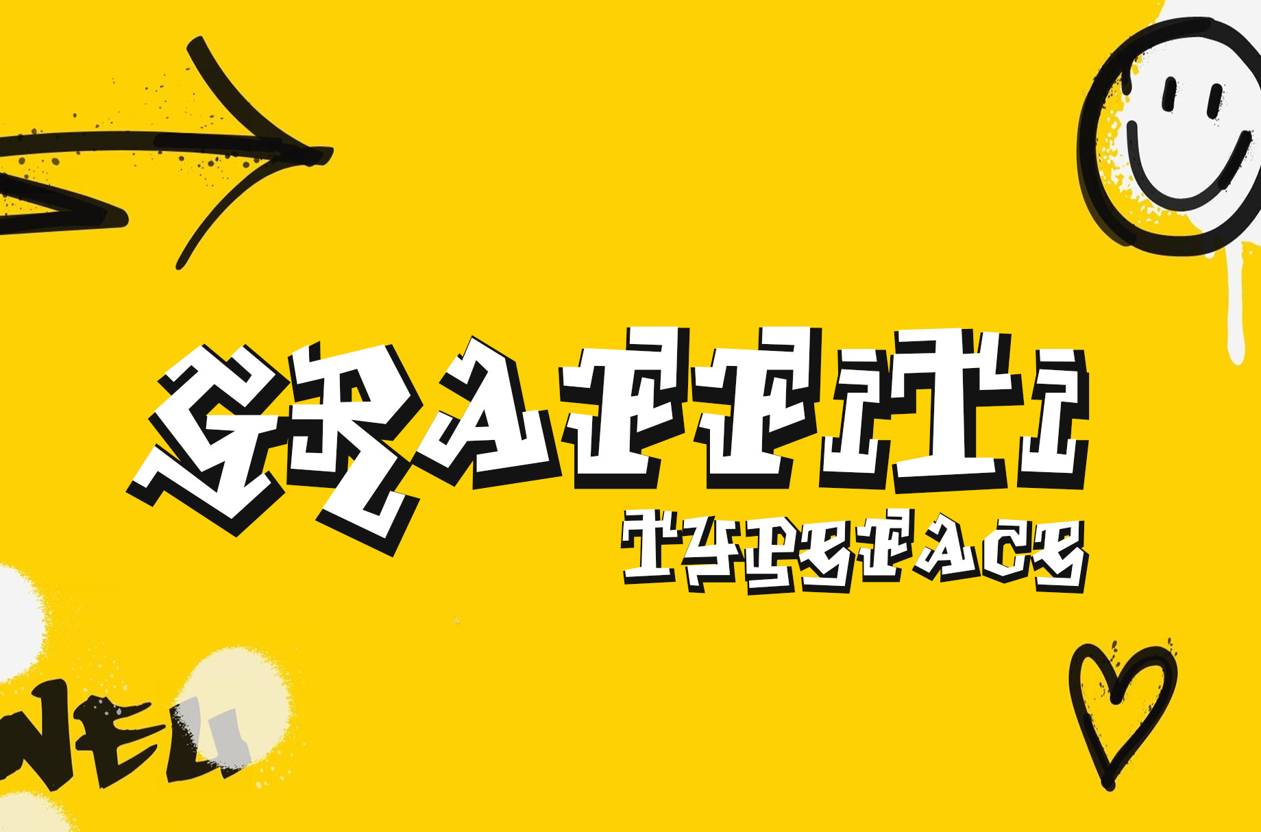
1. Graffiti (denestudios)
This one feels like it has been through a few street corners. The distressed edges give it a spray paint feel, but the letters stay connected enough for a tight logo or a chest print. If you want a bold graffiti typeface that does not turn into a separate illustration for every character, this is a safe starting point.
Best for: t-shirts, sportswear, logos. By: denestudios
2. Graffiti (MistyDesigns)
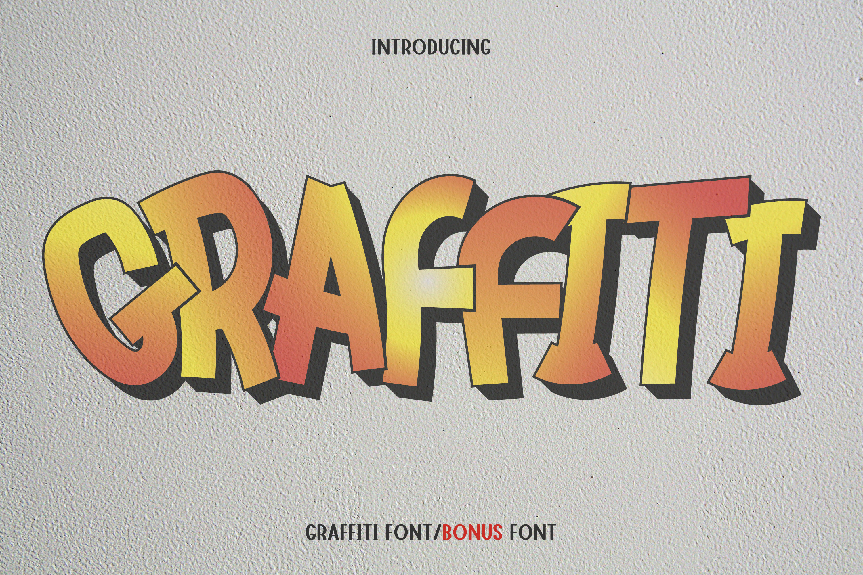
This face leans on heavy line weight and high contrast. It reads like a headline that has already been painted on a wall, which is useful when the design needs to stop a scroll. The letterforms are commercial enough for ads, posters, and logo lockups, but they still keep a street edge.
Best for: headlines, logos, advertising. By: MistyDesigns
3. The Graffiti (Arendxstudio)
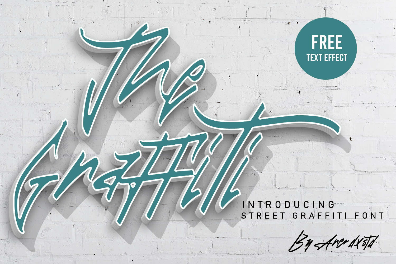
This is the friendlier option in the group. The brush-pen character keeps the street feel casual, so it pairs better with modern layouts than a heavily distorted tag face. If your brand needs urban energy but still wants to look approachable on social media, this one is easier to live with.
Best for: logos, branding, social media. By: Arendxstudio
4. Don Graffiti (DonMarciano)
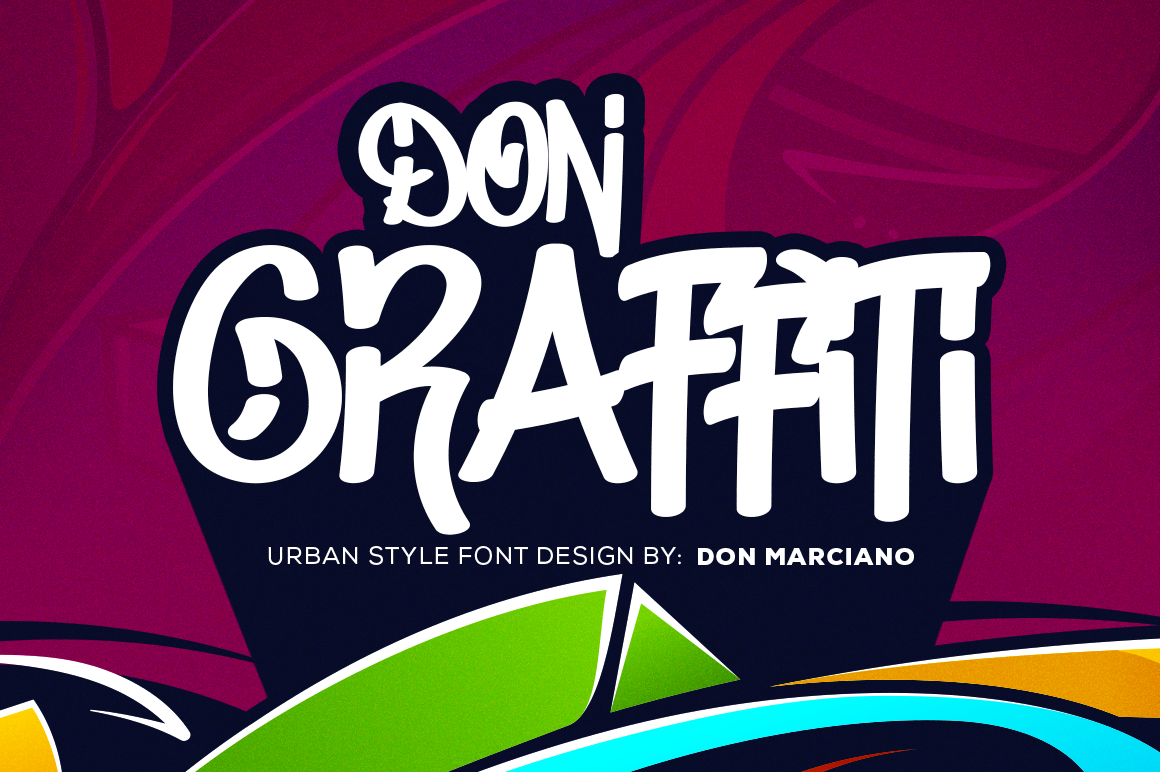
Don Graffiti gives short headlines and brand marks a thick, urban feel. The letters are confident enough to stand alone, but they do not fight a simple color palette. I would reach for this when I want street art fonts that feel branded, not just decorative.
Best for: urban branding, posters, apparel. By: DonMarciano
5. Bombskid (memetxsaputra)
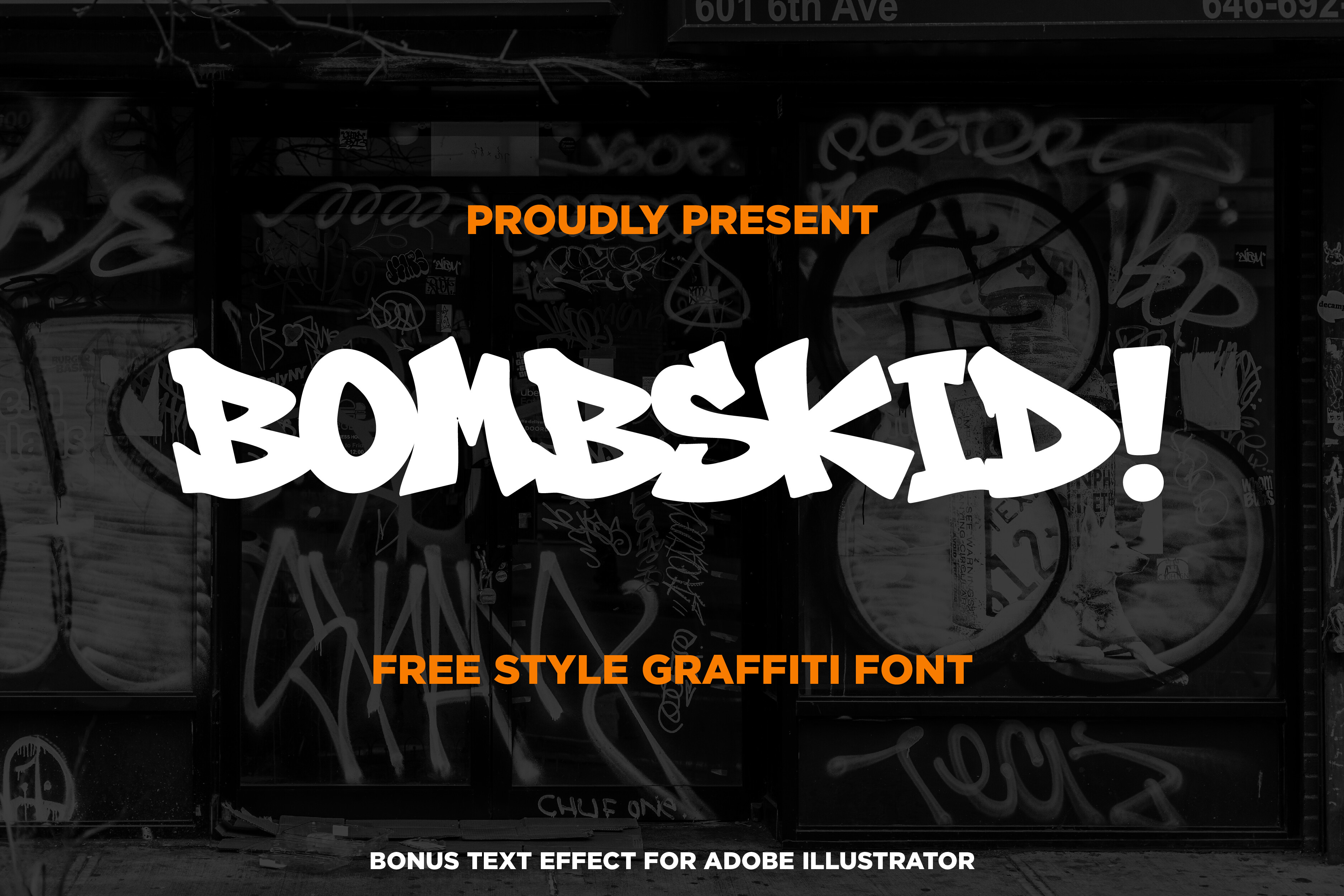
Bombskid is one of the most street-authentic faces here. The freestyle shapes and hip-hop energy make it feel like a real tag instead of a generic bold display font. Use it when the project needs raw attitude: a streetwear drop, an album cover, or a poster that wants to feel loud before the viewer reads the words.
Best for: streetwear, album covers, posters. By: memetxsaputra
6. Streetfunk Graffiti (fontkong)
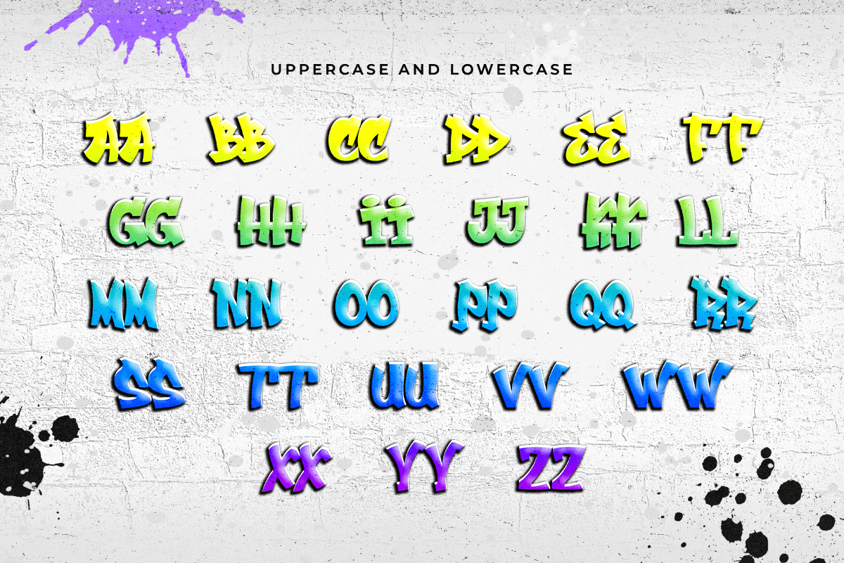
Streetfunk Graffiti uses bold strokes to create a lively, urban-art rhythm. The letters feel energetic, but they do not collapse into unreadable tag chaos. That makes it useful for event posters, music graphics, and youth-focused branding. It sits in a handy middle ground between pure street noise and clean display type.
Best for: music posters, event flyers, streetwear. By: fontkong
7. Tagging Empires (semuthitam)
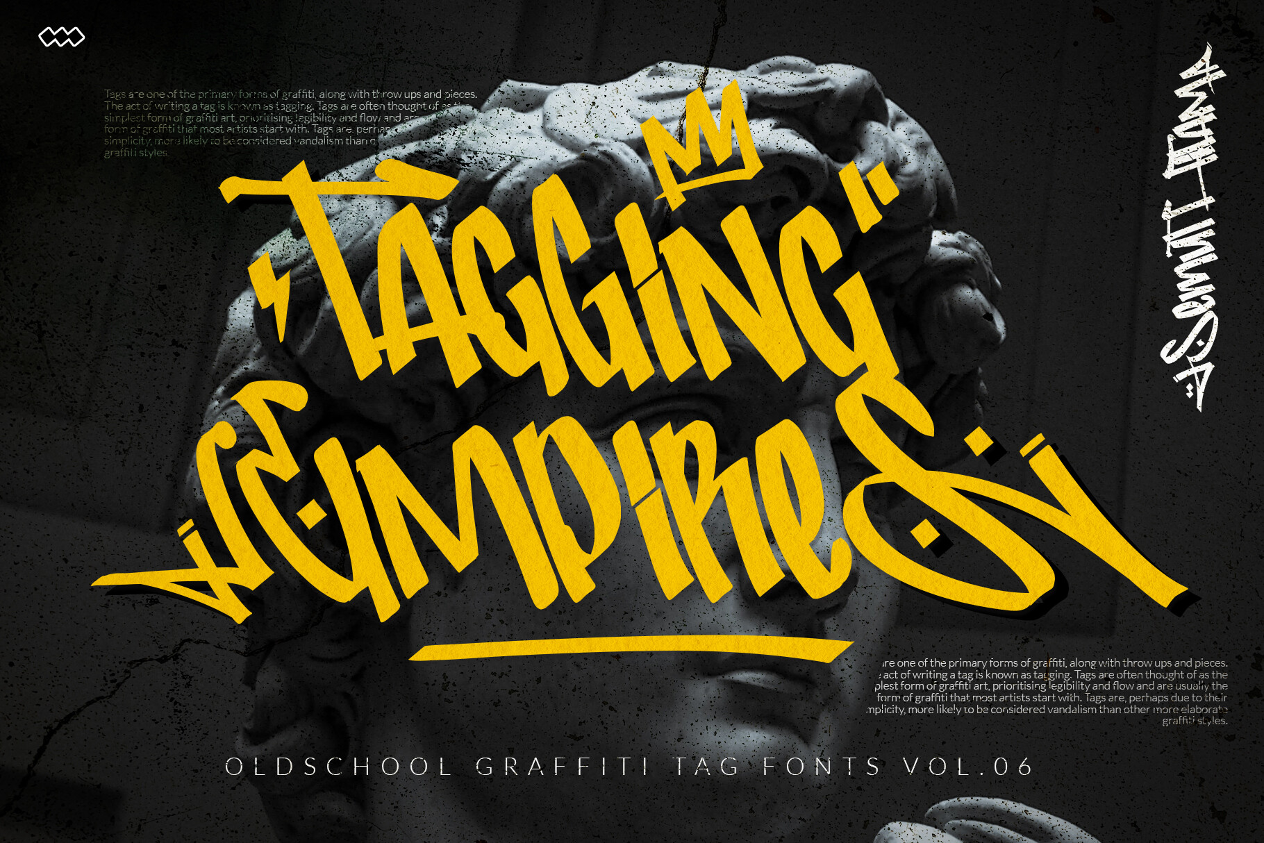
Tagging Empires has a tag-inspired display look, but the finish is smoother than many faces in this category. That makes it useful when the name should suggest street culture while the design still feels polished. It can work for brand names, campaign titles, and social graphics that need a bit of edge without heavy distortion.
Best for: brand names, campaign titles, social graphics. By: semuthitam
8. Street Bugger (Cikareotype)
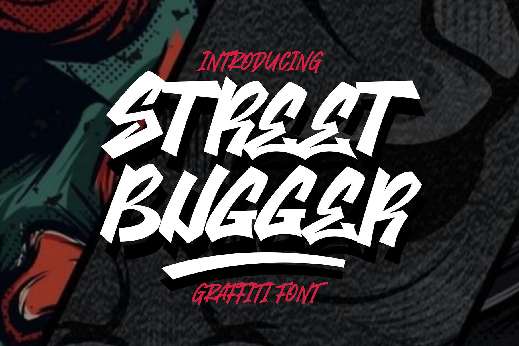
Street Bugger has a rough, layered texture that gives it a gritty street-tag character. The stacked weight makes it feel like the letters were built from multiple passes of marker or spray paint. It is a strong choice for edgy headlines, sticker sheets, and apparel that needs a worn, urban feel.
Best for: edgy headlines, stickers, apparel. By: Cikareotype
Urban & Street Display Graffiti Fonts
9. Simple Graffiti (Jasm / 7NTypes)
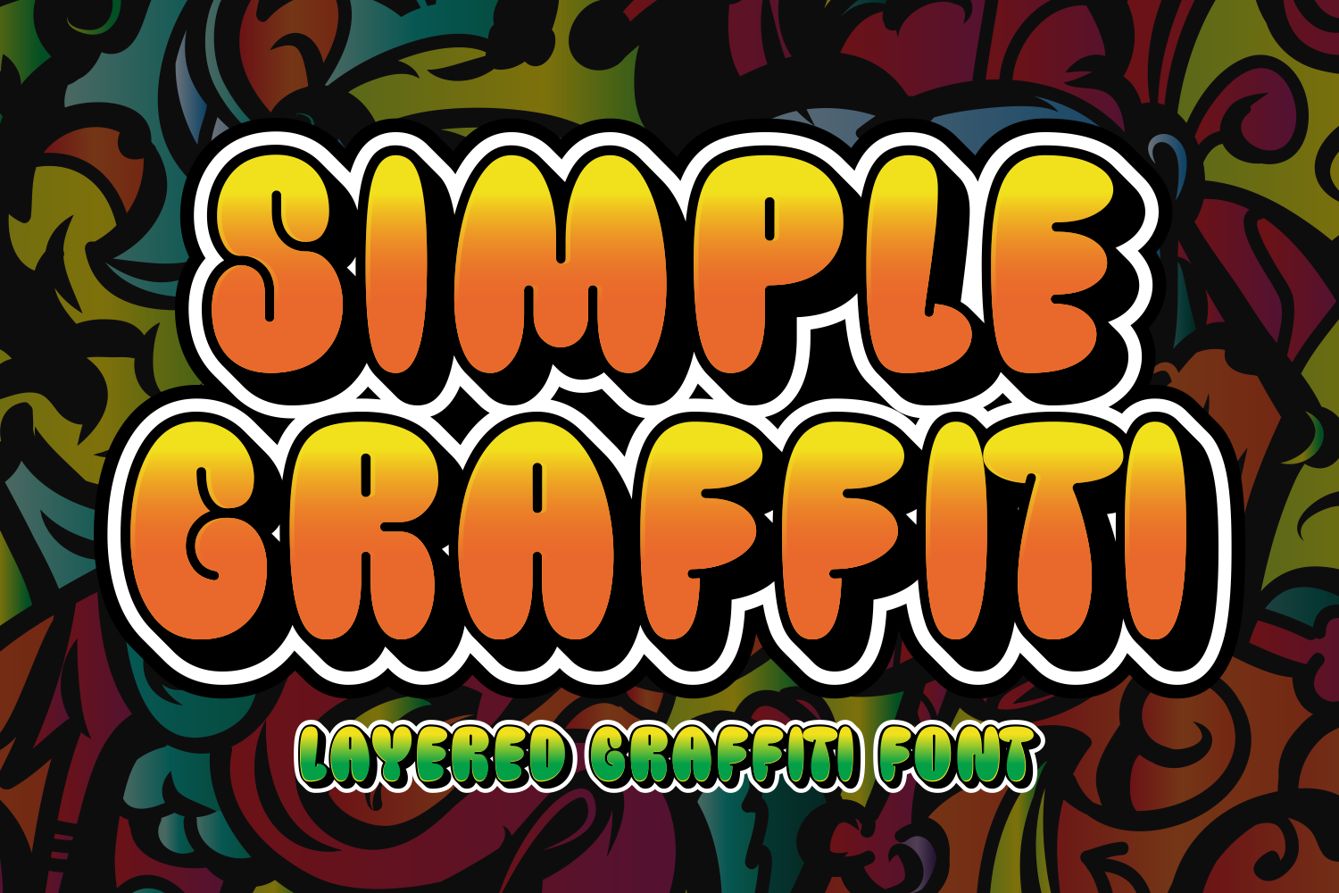
Simple Graffiti proves that urban display fonts do not need to be noisy to feel strong. The bold, minimal letterforms keep the street attitude clean, which is ideal for logos and brand marks that need to scale down. This is one of my go-to picks for graffiti fonts for logos when the design must stay sharp at small sizes.
Best for: logos, brand marks, minimal streetwear. By: Jasm / 7NTypes
10. Sprite Graffiti (MistyDesigns)
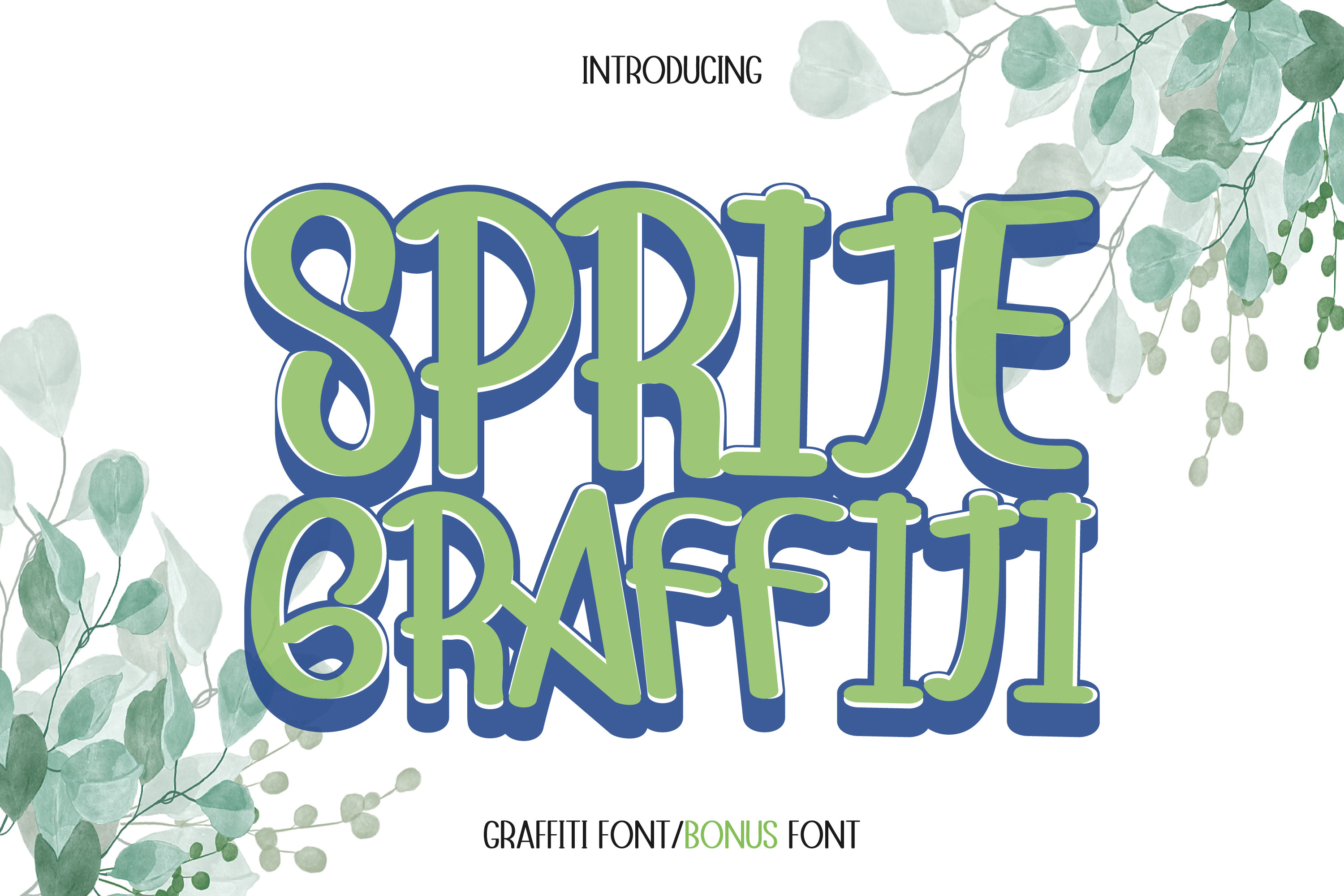
Sprite Graffiti is another MistyDesigns display face, but it reads more compact and headline-driven. The tighter spacing and bold line work give it a punchy, commercial feel. I like it for short campaign words, poster titles, and logo concepts that need instant impact.
Best for: headlines, poster titles, logo concepts. By: MistyDesigns
11. Urban Black (Subectype)
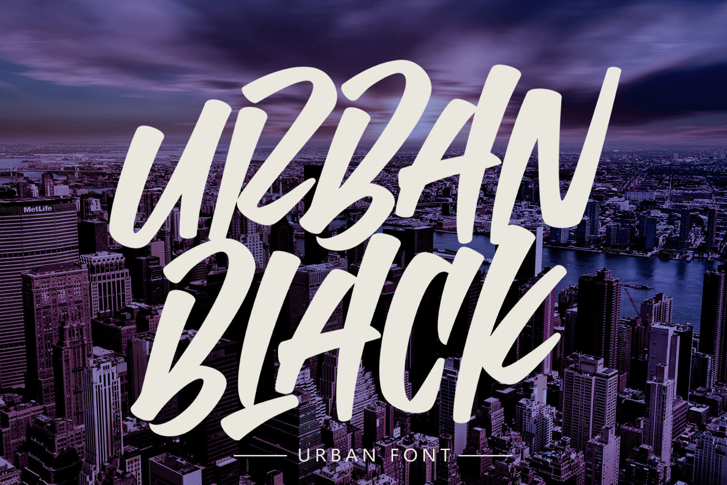
Urban Black brings a brushed, confident weight to urban display work. The strokes feel dynamic, but the overall shape stays controlled enough for branding. It is a good match for sports graphics, streetwear drops, and bold titles that need movement without losing clarity.
Best for: sports graphics, streetwear, bold titles. By: Subectype
12. Boorden Street (asf-graphics)
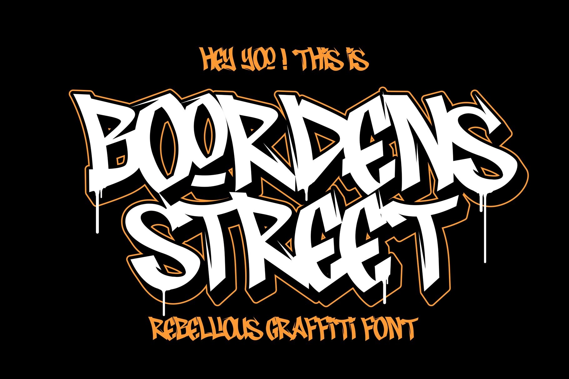
Boorden Street has a strong street-style attitude and a handcrafted rawness that feels more personal than a generic display face. The letterforms carry enough edge for music, fashion, and poster work. If you want a bold graffiti typeface that still looks intentional, this is a standout.
Best for: fashion graphics, music covers, posters. By: asf-graphics
13. Urban Jungle (Cute Cat)
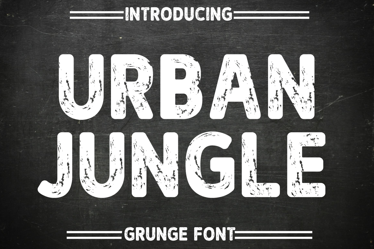
Urban Jungle pairs bold structure with a rough grunge finish. The distressed texture gives it an urban mood that works well for posters, event flyers, and graphic tees. I would not use it for a long caption, but for a headline it has enough texture to feel lived in.
Best for: posters, event flyers, graphic tees. By: Cute Cat
14. Junky Style (sipanji figuree)
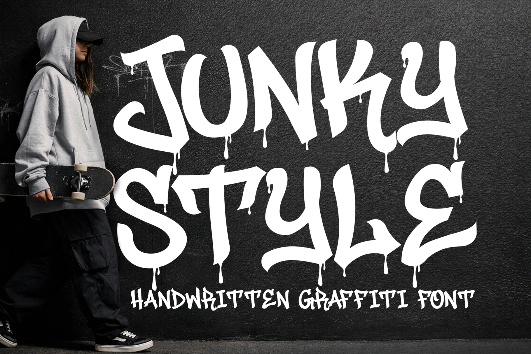
Junky Style feels like a fresh marker tag that has not had time to dry. The thick, aggressive strokes and paint-drip terminals give it a raw, hand-made energy. It is especially strong for stickers, t-shirt graphics, and bold titles where the texture is part of the message.
Best for: stickers, t-shirt graphics, bold titles. By: sipanji figuree
Drip & Spray-Paint Decorative Graffiti Fonts
15. Graffiti Dripes (Sigit Dwipa)
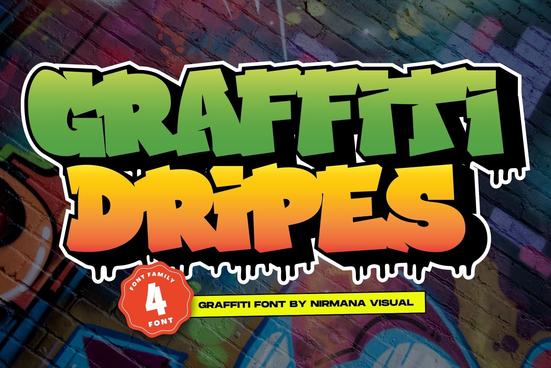
Graffiti Dripes leans into the spray paint drip effect with a bold display shape. The drips add movement and a wet-paint feel, which makes it ideal for album covers, posters, and graphic-heavy social posts. The drips are decorative, but they do not swallow the letters, so the headline stays readable.
Best for: album covers, posters, social posts. By: Sigit Dwipa
16. Dripping Marker (MVMET)
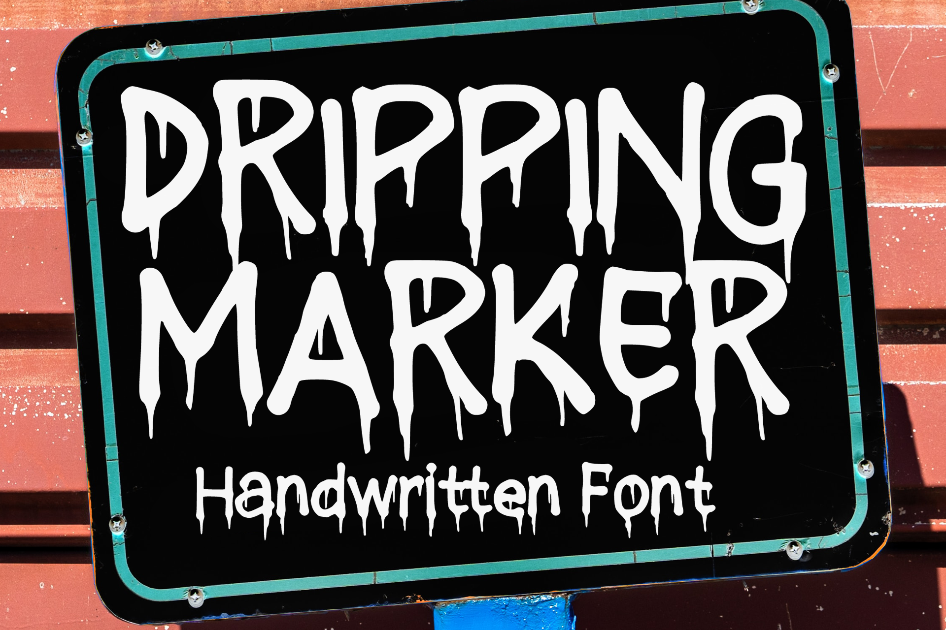
Dripping Marker has a painted marker look that feels playful, bold, and easy to apply to small formats. The drips are decorative, but the letterforms stay clear enough for stickers, tees, and simple logo marks. It works well when the design needs a graffiti font for t-shirts without becoming too complex.
Best for: stickers, tees, simple logos. By: MVMET
17. Raw Paint (tanondesign)
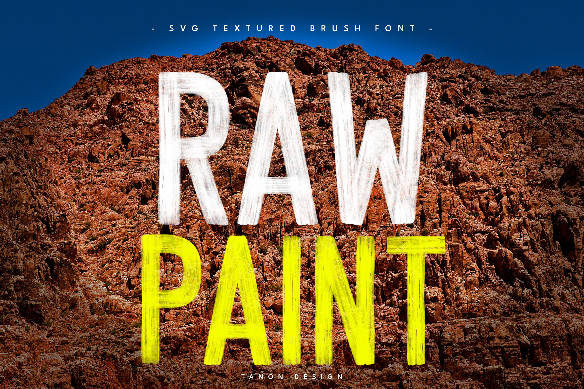
Raw Paint focuses on texture and a handwritten brush feel. The strokes look applied by hand, which gives the type a raw, expressive quality. It is less about drips and more about the mess of the brush, which makes it useful for titles, stickers, and poster accents where you want paint-like character without a fully wildstyle layout.
Best for: titles, stickers, poster accents. By: tanondesign
18. Dripping (Apple Craft)
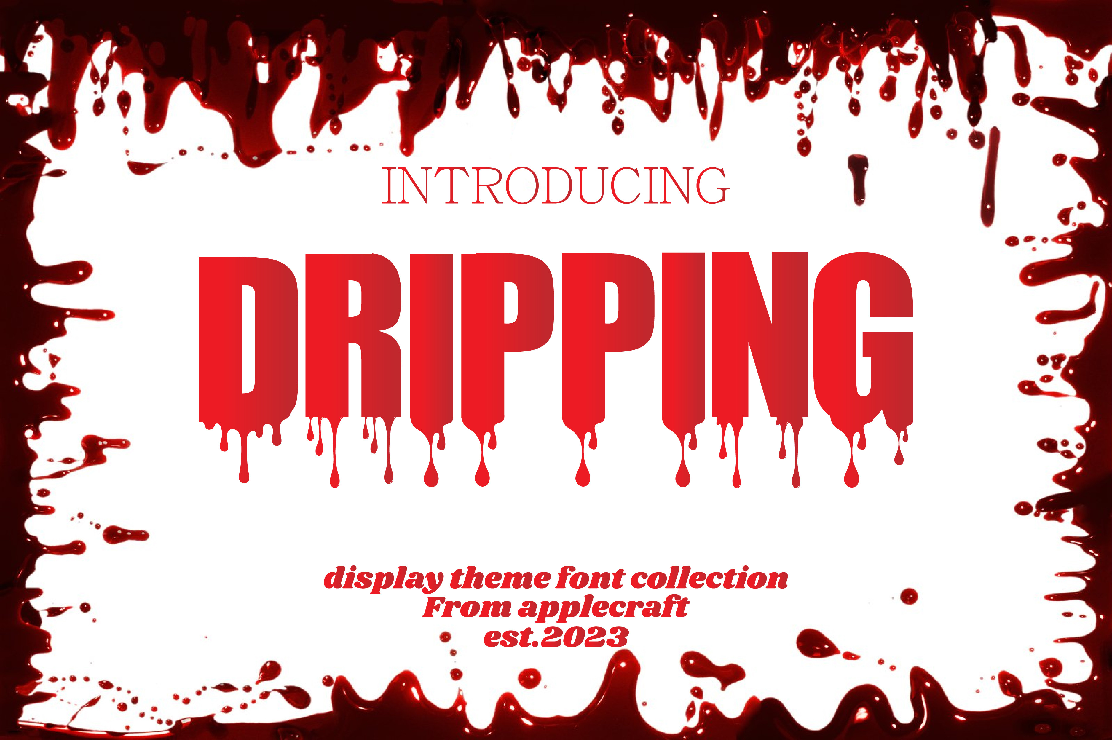
Dripping uses thick letterforms and a realistic paint-drip look to create a heavy, graphic impact. The drips feel integrated into the letter shapes, so the face still works as a display typeface rather than a loose effect. It is a strong option for covers, posters, and bold brand moments.
Best for: covers, posters, bold brand moments. By: Apple Craft
How to Use Graffiti Fonts in Your Design Projects
Graffiti fonts are display-first. I use them for short, high-impact text: logos, headlines, album covers, stickers, and t-shirt graphics. They are not ideal for long body copy because irregular shapes, drips, and tight letter spacing can make paragraphs hard to read. If you need a full paragraph, pair the graffiti face with a clean sans-serif or a calm serif. The graffiti type gets the attention. The neutral type does the explaining.
For logos and streetwear fonts, I usually start with a clean shape first. Simple Graffiti, Bombskid, and Boorden Street are good starting points because they have strong identity without becoming impossible to read at small sizes. Once the mark works, you can add color, texture, or a spray paint effect around it. Do not start with the drips. Start with the letter skeleton.
The style you choose should match the message. Tag lettering fonts feel personal and signature-like. Bubble letters feel friendly and inflated, which suits posters, stickers, and youth-oriented branding. Wildstyle faces are more abstract and intense, so they work best when visual impact matters more than instant legibility. If the viewer needs to read the brand name immediately, skip the wildstyle and choose a cleaner tag or urban display face.
In Photoshop or Illustrator, install the TTF or OTF file, then type your text and adjust tracking if needed. In Canva, upload the font file and use it for headline layers. For Cricut Design Space, install the font at the operating system level, then restart the app so it appears in the font list. Note that some OpenType features, such as ligatures or alternates, may not carry over in Cricut. If the font looks different in the cut file, check the version and the file format before blaming the design.
Tips for Choosing the Right Graffiti Font
Check the license before you download. If you are looking for a graffiti font free download, start with the license, not the style. Many free graffiti fonts on DaFont are free for personal use only, while commercial use requires a separate license. A small number are free for both personal and commercial use, but you should verify each font. Creative Fabrica fonts generally include a commercial license, which makes them easier to use for client work, merch, and products for sale. I would not put a personal-use font on a product I plan to sell, even if the design feels perfect.
Test readability at the size you will actually use. A drip font can look amazing on a poster but disappear on a sticker or a small logo lockup. Zoom out, print a small sample, and check the letterforms on a phone screen. If the word is not clear in two seconds, simplify the type or choose a cleaner urban display font. This is where many streetwear designs fail: the type looks cool at 100% zoom, then turns into a smudge on a tag.
Match the font to the audience and context. Aggressive street art fonts and spray paint fonts can be perfect for music, skate, streetwear, and event posters, but they may not fit a professional service brand. If the brand needs trust, use a graffiti face for one accent word and keep the rest of the layout calm. A single loud word can add personality without making the whole brand feel chaotic.
Also consider the time factor. A clean hand-drawn tag can take months of daily practice to develop, while throw-ups and bubble letters come faster. Fonts give you a shortcut to that aesthetic, but the best results still come from choosing a face that fits the project instead of applying the loudest option by default. The font should serve the message, not the other way around.
Where to Download Graffiti Fonts
All 18 fonts in this article are available on Creative Fabrica, where you can preview the style, download the file, and use it in your design workflow. For more type resources, see the FontPro blog.
You can also explore additional free options on DaFont, 1001 Fonts, and Google Fonts. These are useful for inspiration and quick tests, but always check the license before using a font in a commercial project. If you are building a brand, I would keep the license file with the project notes so you do not have to track it down later.