· fonts · 14 min read
17 Best Glitch Fonts in 2026
Find the best glitch fonts for posters, gaming graphics, music covers and cyberpunk projects: distorted display, VHS, pixel glitch and modern digital picks.
A glitch font is not just broken text. It can be a lo-fi VHS signal, a corrupted system display, a pixel displacement effect, or a sharp cyberpunk slice through a headline. That is why the best glitch fonts cover more than one kind of digital damage. Some are distorted fonts for posters and album covers. Some are VHS fonts for retro synthwave work. Some are cyberpunk fonts for game titles and streaming overlays. Some are modern digital glitch effect fonts that feel like a screen error turned into art.
What Makes a Font Look Glitched?
A font looks glitched when it feels corrupted rather than clean. The strongest glitch fonts use horizontal slicing, pixel displacement, scan-line artifacts, fragmented letterforms, or wave distortion. Many are uppercase only. That gives them the feel of a broken monitor, a degraded tape, or a crashed system log.
I usually look at the distortion first. If the effect is too subtle, the font will just look like a messy sans serif. If the effect is too heavy, the letters become unreadable at small sizes. A good glitch font should be clearly broken but still legible at a quick glance.
Distorted fonts push the idea further. They add RGB splits, chromatic aberration, and noise textures that read like damaged screens or corrupted data streams. If you want a cleaner digital look, search for fonts with horizontal line-based distortion rather than full pixel chaos.
For free starting points, Google Fonts does not have many dedicated glitch faces, but you can simulate light glitch effects with geometric sans serifs and CSS tricks. For authentic glitch typography, purpose-built display fonts from foundries like GraphicsBam, Dadiomouse, and TypeFactory give you the full effect right out of the box.
The practical rule is simple: use a glitch display font for the headline, and pair it with a clean sans for body text. That keeps the distortion loud where it matters and readable everywhere else. If you are working on a futuristic or sci-fi project, glitch fonts pair well with clean space-themed faces for contrast.
Classic Glitch and Distorted Fonts
Classic glitch fonts are the core of the style. They simulate the look of corrupted screens, broken signals, and digital malfunction through sliced, fragmented, or displaced letterforms. These are the faces you reach for when the design needs to feel like something went wrong on purpose. They work for posters, logos, banners, magazine covers, and any project that needs a strong visual disruption.
1. Beauty Glitch
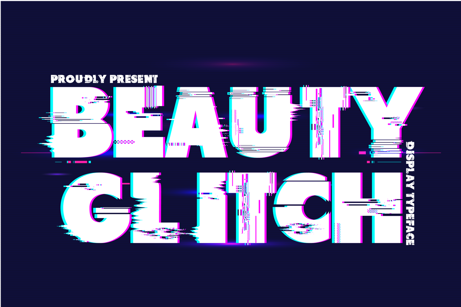
Beauty Glitch is a bold, italic display font with horizontal slicing that creates a convincing digital corruption effect. Each letter has been individually distorted in stages, inspired by science fiction movies and games. I would use it when the type itself needs to carry the visual punch, like a poster title or album cover where no additional effects are needed.
Best for: posters, logos, magazine covers, sci-fi themed projects. By: 177Studio
2. Super Glitch
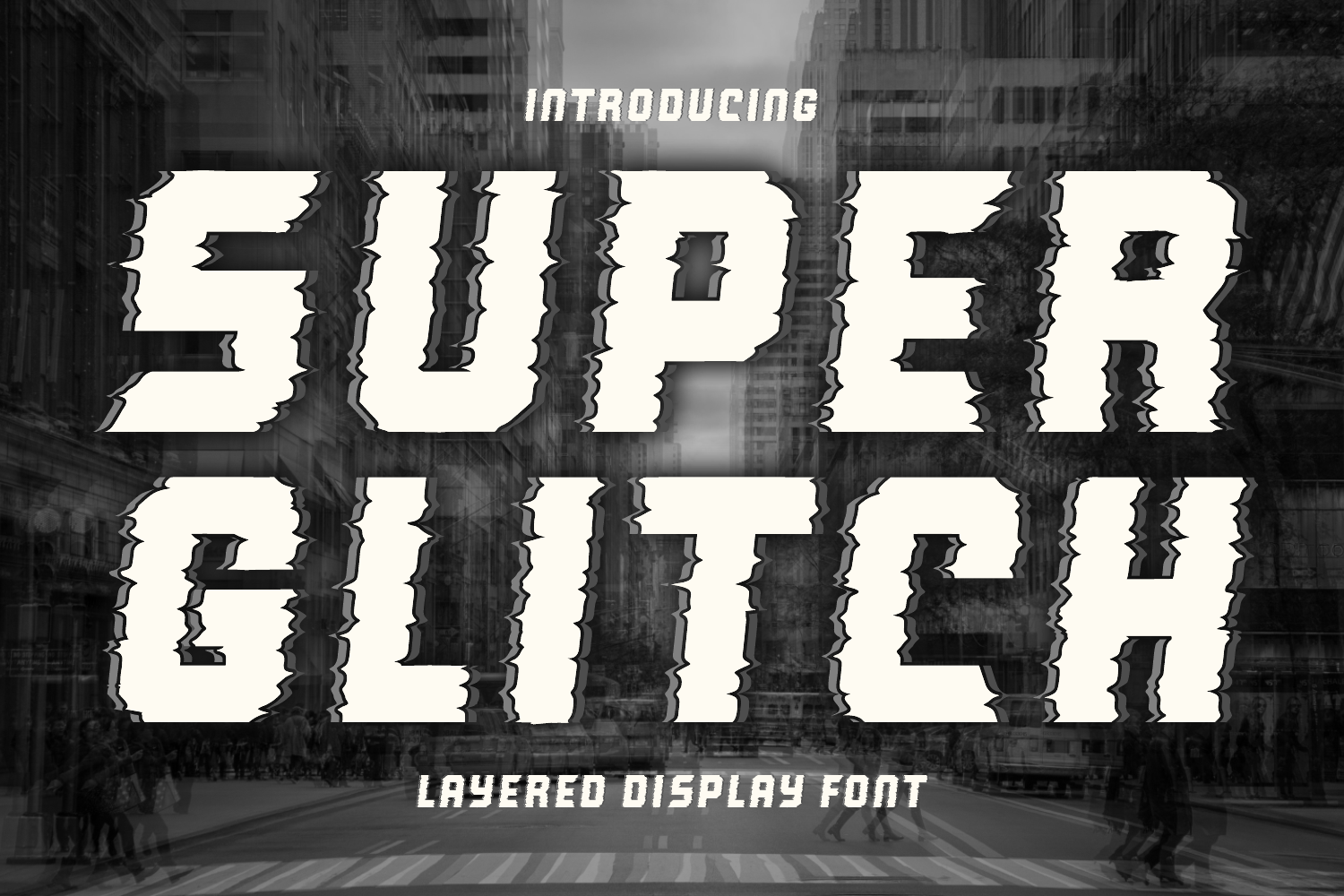
Super Glitch is a bold, edgy display font with fragmented characters that give projects a glitchy, futuristic vibe. It features both uppercase and lowercase with strong visual impact at large sizes. The fragmentation is aggressive enough to read as intentional but still clean enough to hold up in thumbnails and social media headers.
Best for: gaming graphics, tech branding, YouTube thumbnails, album art. By: Faris (7NTypes)
3. Glitch System
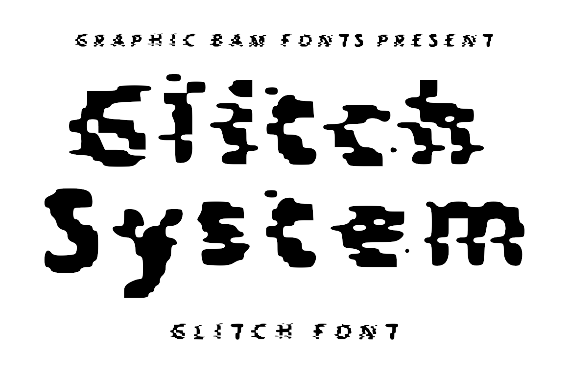
Glitch System is a glitched screen typeface that simulates the look of a corrupted system display. Available in both uppercase and lowercase versions, it has the kind of lo-fi digital breakdown that suits hacker-themed projects and tech presentations. I like it for designs that need to feel like a terminal screen mid-crash.
Best for: hacker-themed projects, tech presentations, digital art, app interfaces. By: GraphicsBam Fonts
4. Uncracked
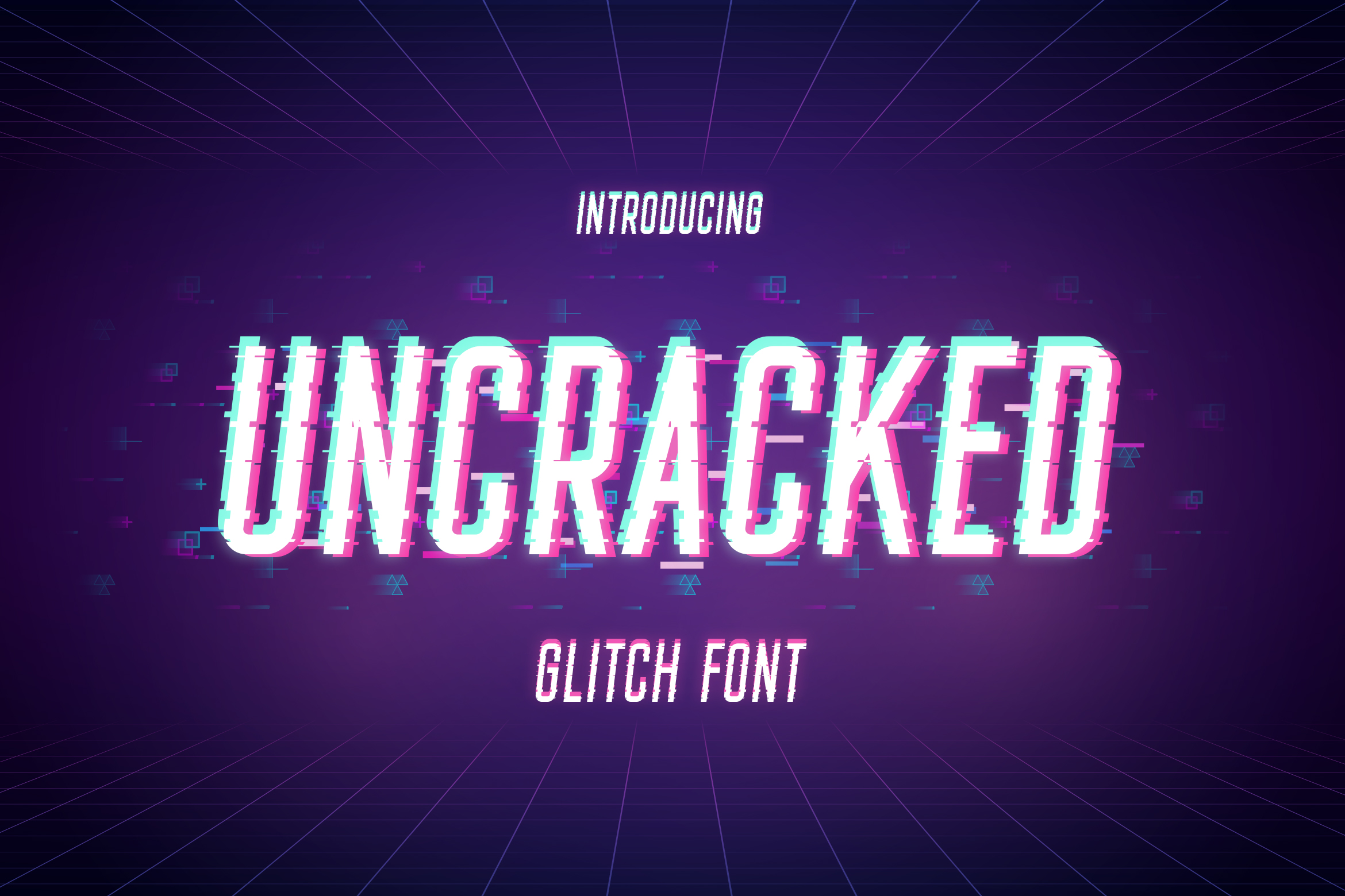
Uncracked is a powerful, detailed glitch-style display font optimized for any size. It includes uppercase, lowercase, numerals, punctuation, alternates, ligatures, and multilingual support. That feature set makes it more versatile than most glitch faces, which tend to be uppercase-only with limited character sets.
Best for: gaming posters, movie posters, logo design, merchandise. By: TypeFactory
Cyberpunk and VHS Glitch Fonts
Cyberpunk and VHS glitch fonts bring retro analog distortion into digital design. These faces capture the look of degraded VHS tape, analog signal noise, and neon-lit cyberpunk streets. They work well for synthwave posters, vaporwave art, retro-themed projects, streaming overlays, and esports graphics. If you are building designs with a retro 80s aesthetic, these glitch fonts pair naturally with that era’s visual language.
5. VHS Glitch Family
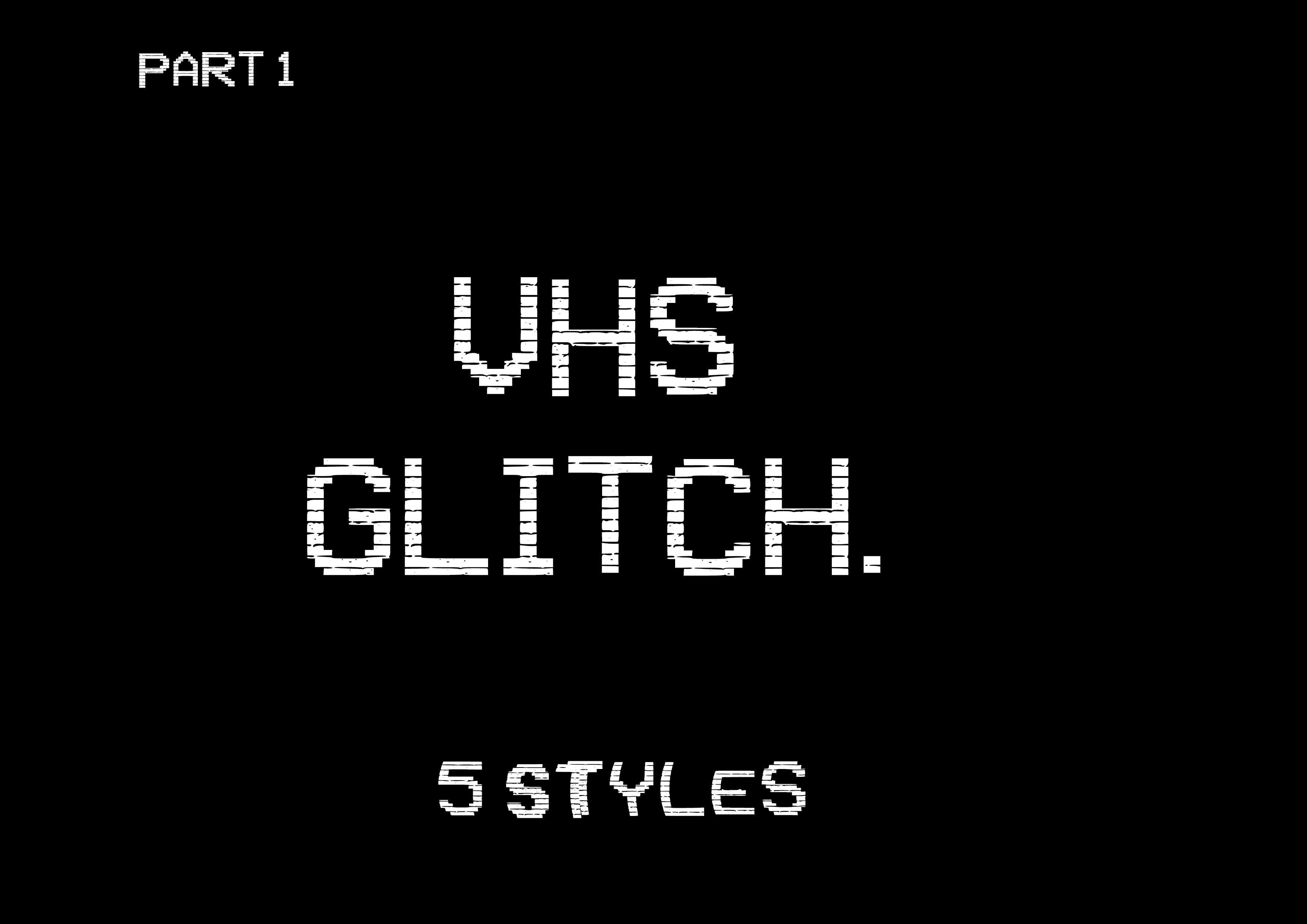
VHS Glitch Family is a retro screen typeface font family with a distorted lo-fi feel. It captures the look of degraded VHS tape playback, complete with the horizontal tracking lines and signal noise that defined analog-era video. I reach for this one when a design needs to feel like it was recorded on a worn-out tape in 1987.
Best for: retro-themed projects, VHS aesthetic designs, vaporwave art, music videos. By: GraphicsBam Fonts
6. VHS Wave
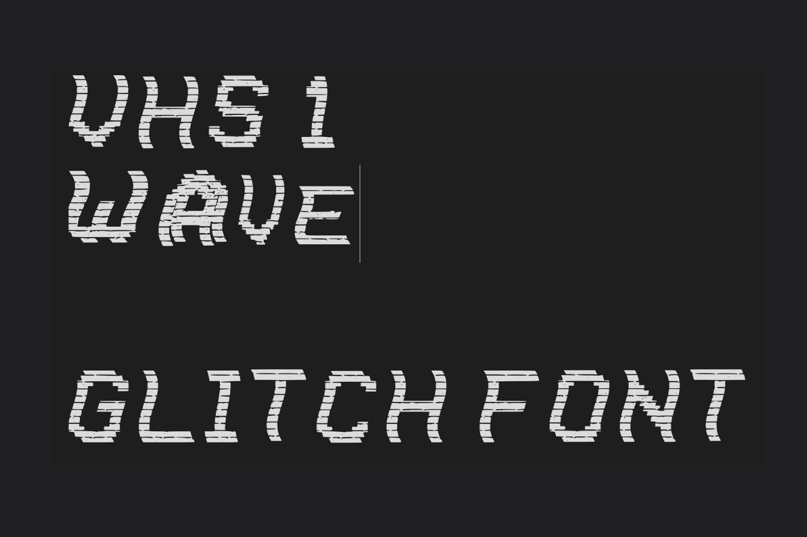
VHS Wave is a glitched screen display font with two sets of uppercase letters, each featuring unique glitched characteristics. The wave interference pattern gives it a distinctive analog signal feel that separates it from purely digital glitch faces. It works well for synthwave designs, retro posters, and event flyers where the distortion should feel wavy rather than sharp.
Best for: synthwave designs, retro posters, vaporwave aesthetics, streetwear graphics. By: GraphicsBam Fonts
7. VHS Glitch 3 Wave
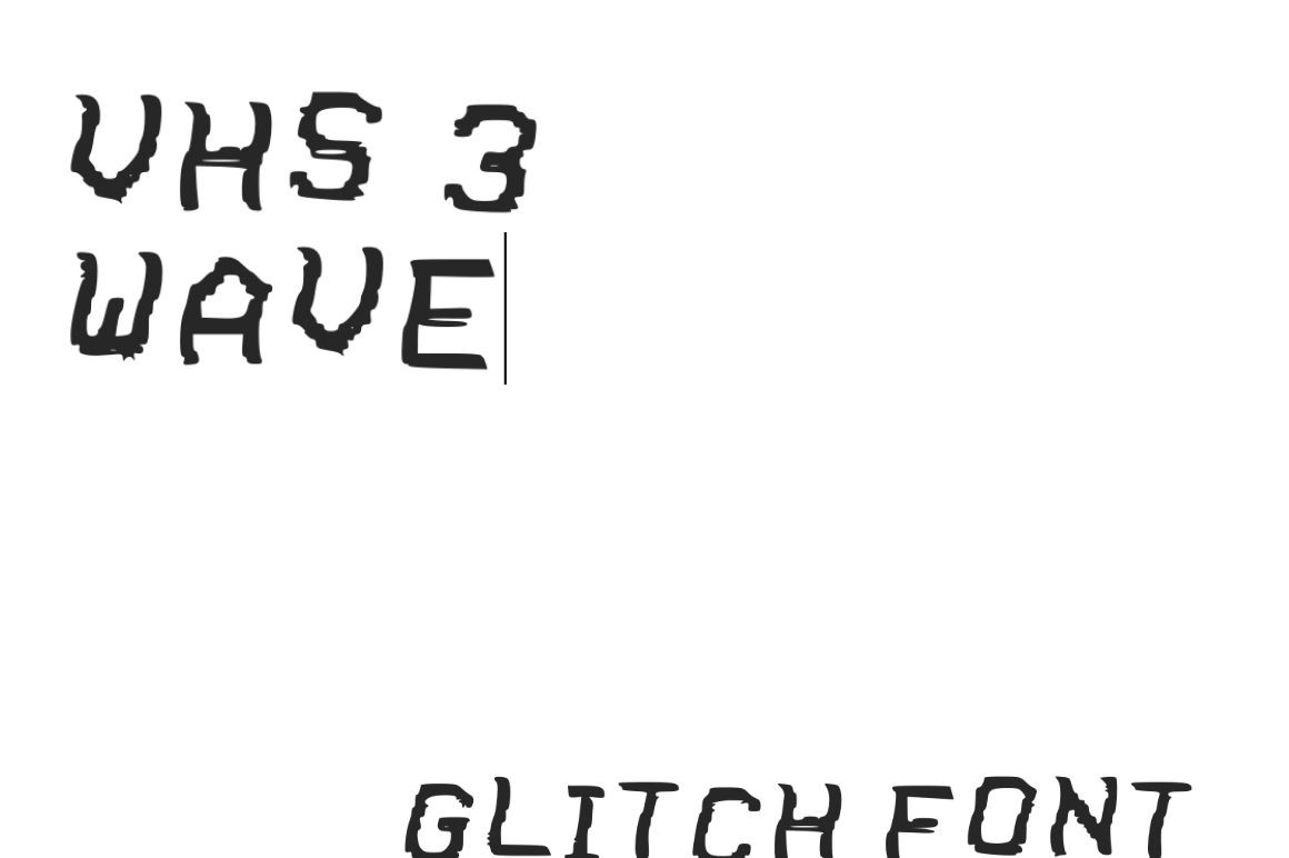
VHS Glitch 3 Wave is part of the popular VHS Glitch font series. This display font features a distorted, destructive style based on the look of a retro TV bitmap screen typeface with wave-like glitch artifacts. The bitmap texture adds a layer of authenticity that cleaner glitch fonts lack, making it ideal for retro gaming projects and streaming overlays.
Best for: TV show graphics, retro gaming projects, poster design, streaming overlays. By: GraphicsBam Fonts
8. Cybernetic
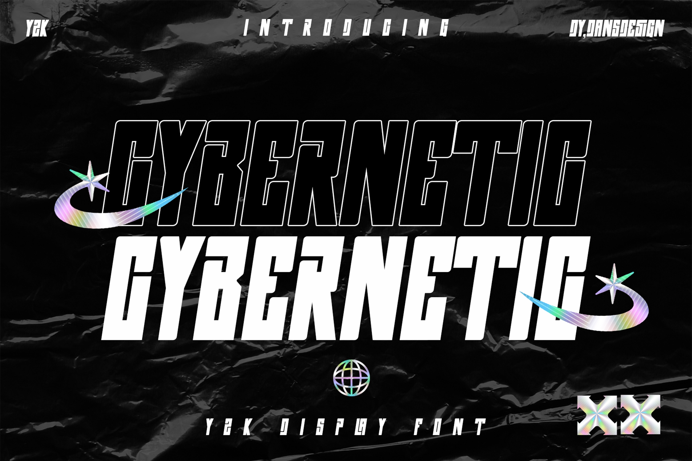
Cybernetic is a detailed, slick blackletter-inspired font with cyberpunk design elements. It blends Gothic letterforms with digital corruption for a striking tech aesthetic that feels both old and futuristic at once. I would use it for esports graphics, sports branding, and logos where the design needs to carry weight and edge in equal measure.
Best for: sports branding, logos, cyberpunk-themed projects, esports graphics. By: Dansdesign
9. Punk Cyber
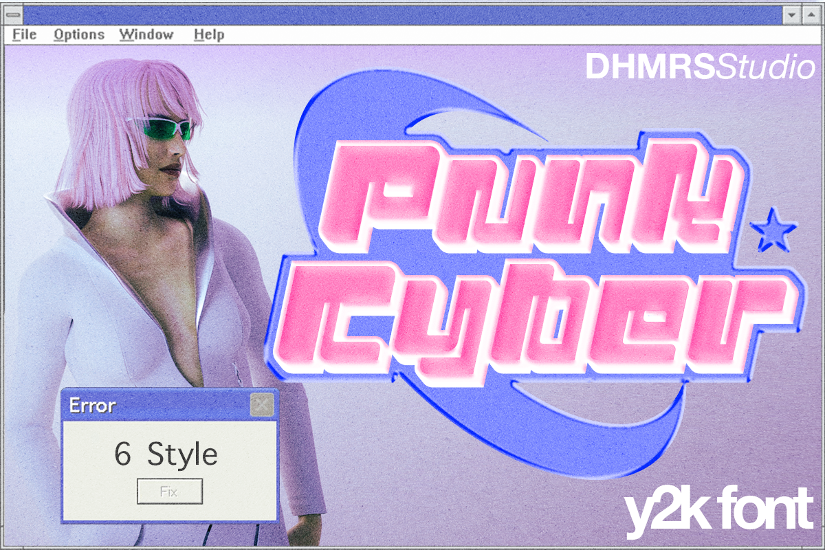
Punk Cyber is a versatile cyberpunk display font offering six different styles. It combines punk attitude with digital futurism, which gives you more range than a single-weight glitch face. The multiple styles let you build a full type system within one font family, useful for branding projects that need consistency across headlines, subheads, and accent text.
Best for: branding, prints, posters, magazines, headlines, music projects. By: Dharmas Studio
Glitch Display Fonts for Posters and Music
Glitch display fonts built for posters and music projects tend to be bolder, louder, and more aggressive than their VHS and cyberpunk cousins. These are the faces that need to work at large scale on walls, stages, and screens. They suit concert posters, event flyers, album covers, gaming interfaces, and any layout where the type has to command a room. The distortion here is designed to look intentional and powerful, not subtle.
10. New Glitch
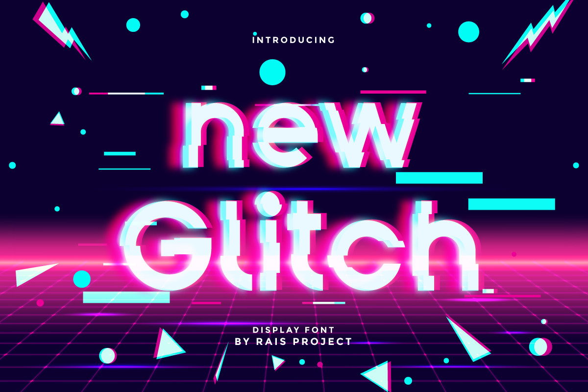
New Glitch is a techno display font featuring bold characters with sharp digital distortion effects. It commands attention in large format display, which makes it a natural choice for sci-fi movie covers, action game titles, and club posters. The sharp edges read well even at distance, so it holds up on physical print and stage backdrops.
Best for: sci-fi movie covers, action game titles, club posters, event branding. By: RaisProject
11. Glitch Pixel
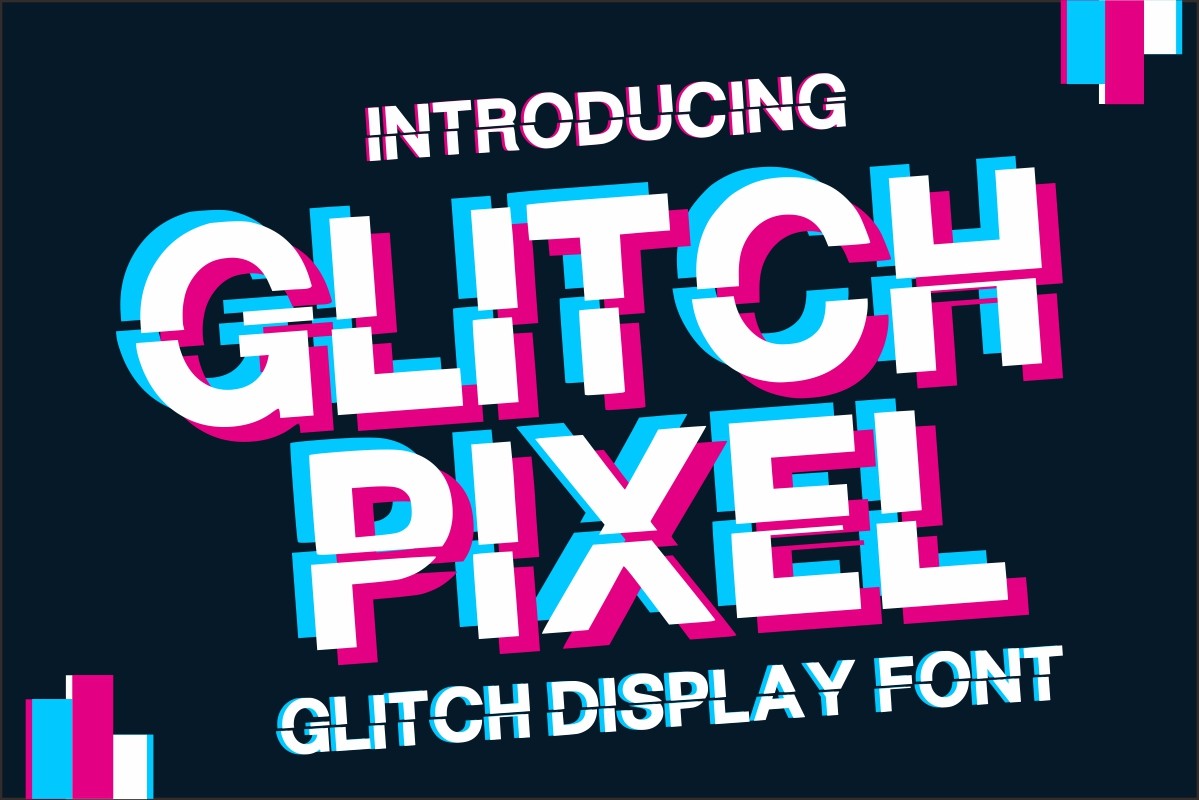
Glitch Pixel is a bold display font with a dynamic pixelated glitch effect. It combines retro pixel aesthetics with modern glitch distortion, creating a hybrid that feels both nostalgic and current. I like it for gaming interfaces and sporting event graphics where the pixel texture adds a layer of digital energy.
Best for: headlines, sporting event graphics, automotive posters, logos, gaming interfaces. By: Infinity art Studio
12. Block Glitch
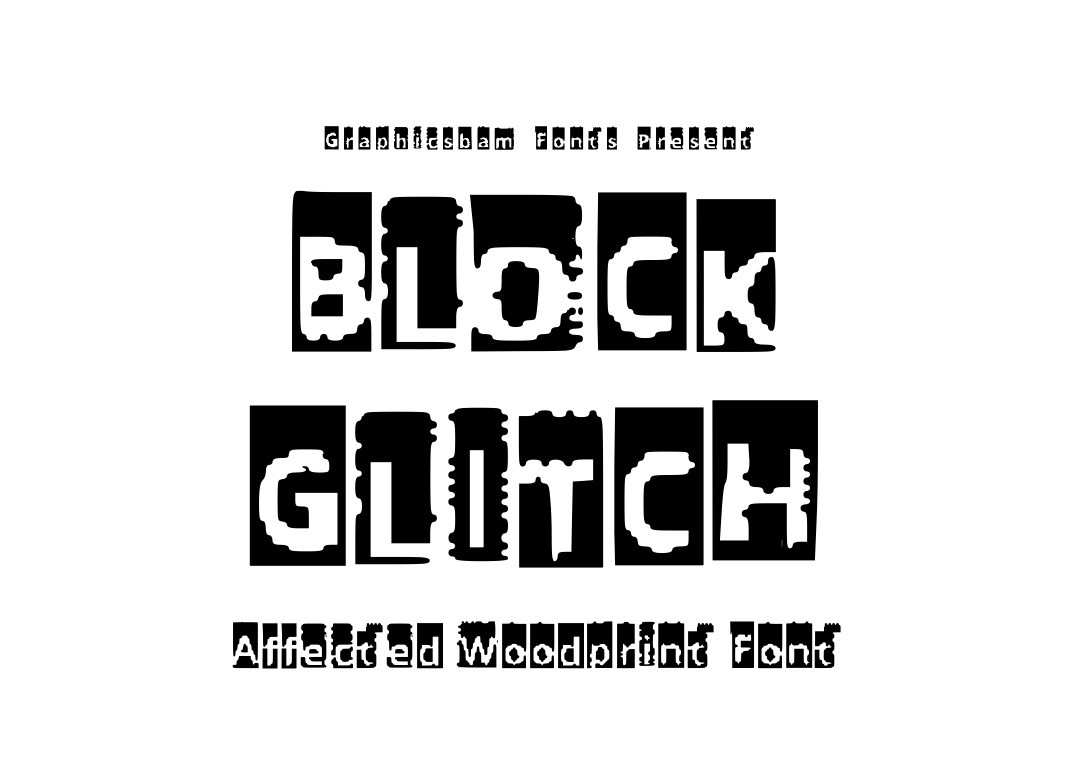
Block Glitch is a glitched screen typeface with blocky, bold letterforms that appear to be breaking apart from digital corruption. Available in both uppercase and lowercase, it has the structural weight needed for tech posters, web banners, and promotional materials. The blocky shapes make it easier to read than more chaotic glitch fonts, which is a plus for layouts that need quick legibility.
Best for: tech posters, digital art, web banners, promotional materials. By: GraphicsBam Fonts
13. Son of a Glitch
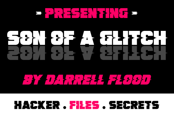
Son of a Glitch is a modern, bold font with a visual glitch line running through each character. The sliced appearance suggests digital malfunction without making the letters unreadable, which is a balance many glitch fonts fail to hit. I would use it for music event flyers, streetwear design, and brand identity work where the glitch should feel controlled rather than chaotic.
Best for: music event flyers, streetwear design, brand identity, social media graphics. By: Dadiomouse
14. Noise Machine
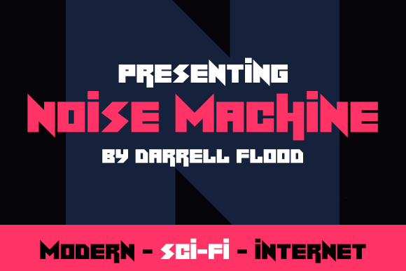
Noise Machine is a modern, angular font in an electric, sci-fi style perfect for space and robotic themes. The sharp edges and digital noise-inspired letterforms give it an energetic, mechanical quality. It works well for electronic music branding, tech interfaces, and robot or AI themed content where the type needs to feel like it came from a machine.
Best for: sci-fi projects, electronic music branding, tech interfaces, AI themed content. By: Dadiomouse
Modern Digital Glitch Fonts
Modern digital glitch fonts take the glitch concept into newer territory. These faces explore internet culture, organic distortion, and screen-scan aesthetics. They range from creepy zalgo-inspired corruption to clean horizontal line effects to handmade brush distortion. Use them when your design needs a contemporary twist on the glitch look, or when the standard sliced-and-fragmented style feels too expected.
15. Social Glitch
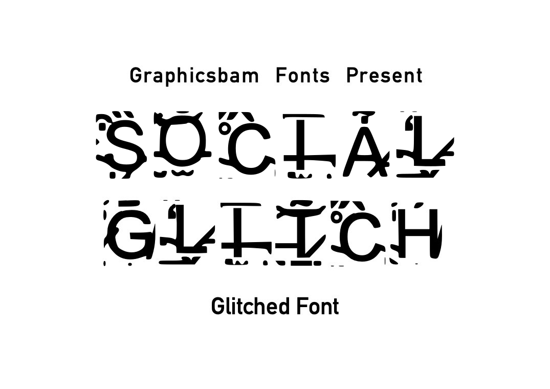
Social Glitch is a display font based on the creepy zalgo aesthetic used in dark memes and internet culture. The characters appear corrupted with stacking diacritical marks and digital artifacts, creating an unsettling visual effect. I would use it for horror designs, Halloween projects, and social media shock graphics where the type should feel genuinely eerie.
Best for: dark memes, horror designs, creepypasta content, Halloween projects. By: GraphicsBam Fonts
16. Glitch Lines
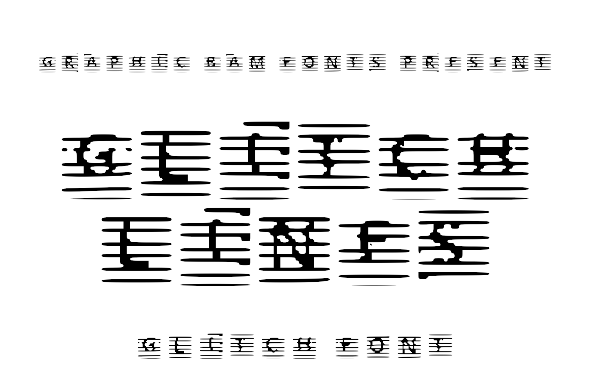
Glitch Lines is a glitched display typeface with horizontal line-based distortion effects that give text a screen-scan appearance. Available in both uppercase and lowercase, it achieves its glitch look through clean parallel lines rather than messy pixel chaos. That makes it one of the more refined options in this list, and a good pick for hacker-themed projects and digital portfolios that need a polished glitch feel.
Best for: hacker-themed projects, web design, glitch art, digital portfolios. By: GraphicsBam Fonts
17. Errorism
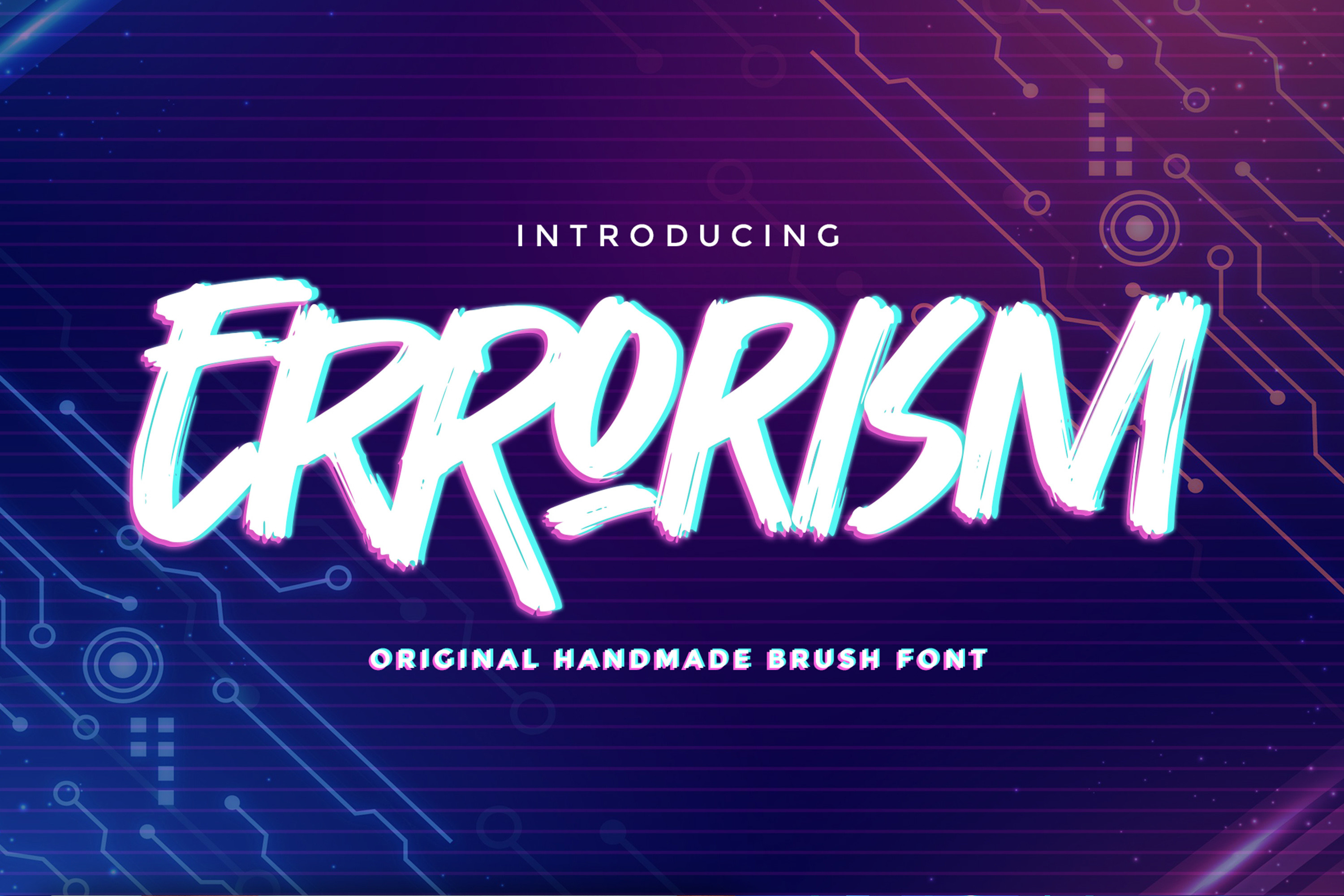
Errorism is an original handmade brush font written casually and quickly. The rough, authentic characters create a more natural, organic glitch look compared to purely digital distortion fonts. It is an unusual pick for a glitch list, but that organic roughness makes it perfect for street art designs, punk aesthetics, concert posters, and DIY zine layouts where a digital-only glitch font would feel too polished.
Best for: street art designs, punk aesthetics, concert posters, DIY zine layouts. By: Gassstype Studio
How to Use Glitch Fonts in Your Designs
The fastest way to make a glitch font work is to keep the rest of the design simple. The distortion in the type is already doing the heavy lifting, so adding too many effects on top can turn the layout into visual noise. Here are the practical moves:
- Pair a glitch display font with a clean sans serif for body text. The contrast between broken and clean makes both work harder. A standard geometric sans like Inter, DM Sans, or Space Grotesk will balance the chaos.
- Match the glitch style to the project mood. VHS fonts suit retro and synthwave work. Pixel glitch fonts suit gaming. Cyberpunk glitch fonts suit tech branding and esports. A horror project calls for something like zalgo-inspired distortion.
- Use dark backgrounds. Glitch fonts read best against dark or black backgrounds, where the distortion pops and the letterforms stay clear. Light backgrounds can wash out the corrupted details.
- Test at the size you will actually use. A glitch font that looks great in a mockup at 200px can become a mess at 16px. Most of these faces are designed for headlines and titles, not body copy.
- Add effects with restraint. A slight RGB split, a subtle scanline overlay, or a soft glow can enhance the effect. But the font should do most of the work. If you need heavy post-processing to make it look glitched, the font may not be doing its job.
- Check the character set before committing. Some glitch fonts are uppercase only or have limited punctuation. If your layout includes numbers, special characters, or lowercase text, verify the font covers them.
Tip: If you are layering a glitch font in Photoshop or Illustrator, try duplicating the text layer, shifting it a few pixels in red and cyan, and setting the blend mode to Screen. This simple chromatic aberration trick adds depth to any glitch typeface without heavy plugins.
Tips for Choosing the Right Glitch Font
Start with the kind of distortion your project needs. A music poster needs a different energy than a horror game title, a tech startup logo, or a retro VHS tribute. The right glitch font should match the mood before you add color or texture.
Consider legibility at your target size. Glitch fonts sit on a spectrum from “slightly broken” to “barely readable.” For thumbnails, social media headers, and UI elements, lean toward the cleaner end of the spectrum. For posters and album covers where the viewer has time to look, you can push toward more aggressive distortion.
Keep the type system small. One glitch display font and one clean text font is usually enough. Adding a second decorative face will compete with the glitch effect and make the layout feel cluttered.
Check the license for your actual use case. Commercial merch, app packaging, and embedded game fonts may each need different permissions. The product page on Creative Fabrica lists the license details for each font.
Finally, consider whether you need a font or an effect. If you only need glitch text for one headline, a Photoshop glitch action or a CSS effect might be enough. But if glitch typography is a core part of your brand or project, investing in a proper glitch font gives you consistency across all your materials.
Where to Download Glitch Fonts
Creative Fabrica is the main source for the fonts in this list, and each product page includes the license details you need before using a face in a project. For more distorted and futuristic font options, we have a dedicated list that covers space, cyberpunk, and tech display faces. If you are looking for fonts with a retro 80s feel to complement your VHS glitch work, that list is worth a look too.
I recommend checking the license before you buy, especially if the font will be used in a game, app, or merchandise line. The product page is the place to confirm what is allowed. For more font recommendations and design resources, browse the FontPro blog.