· fonts · 14 min read
23 Best Japanese Style Fonts in 2026
The best Japanese style fonts for logos, posters, merch and branding: brush calligraphy, bold display, anime, and modern kanji-inspired Latin typefaces.
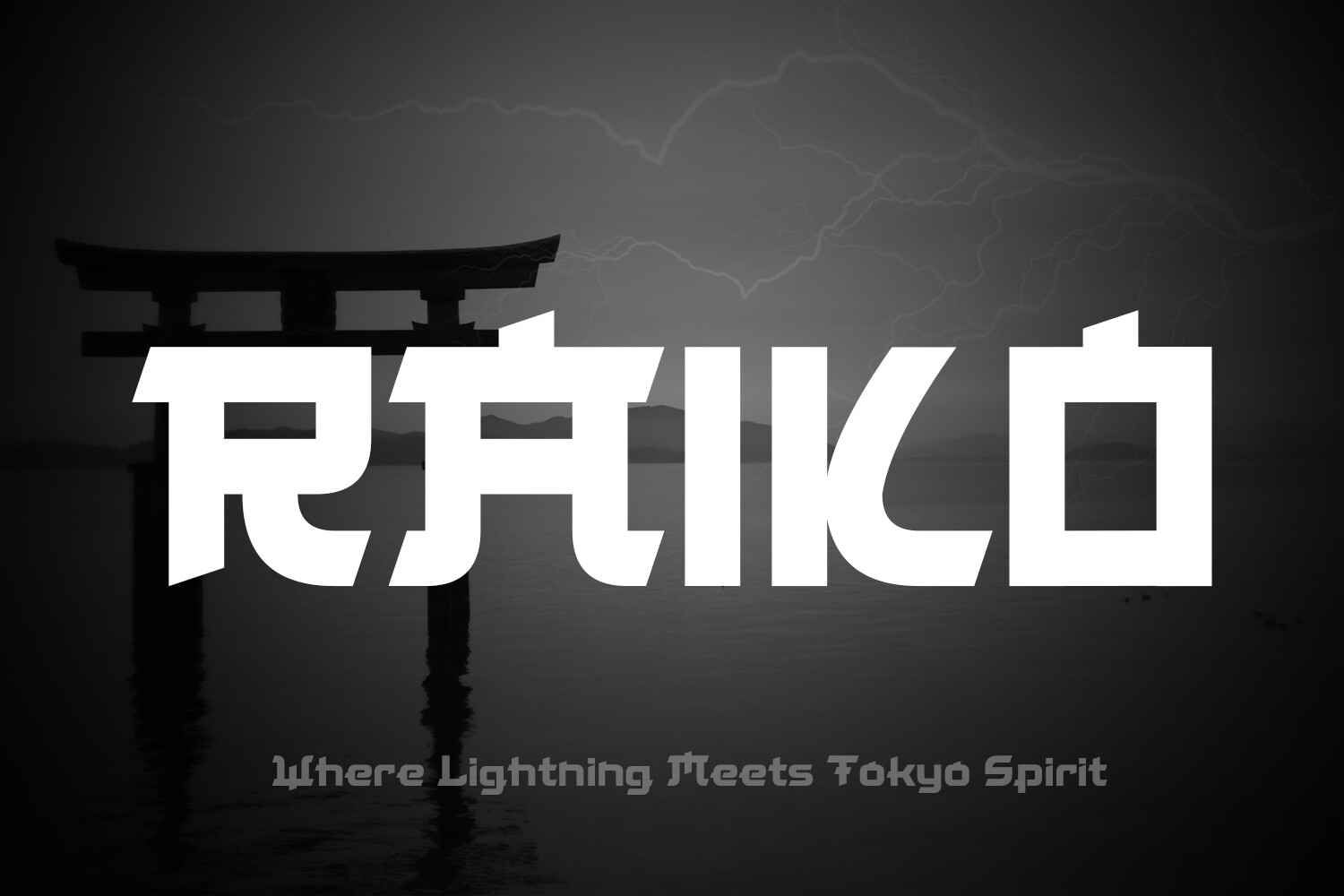
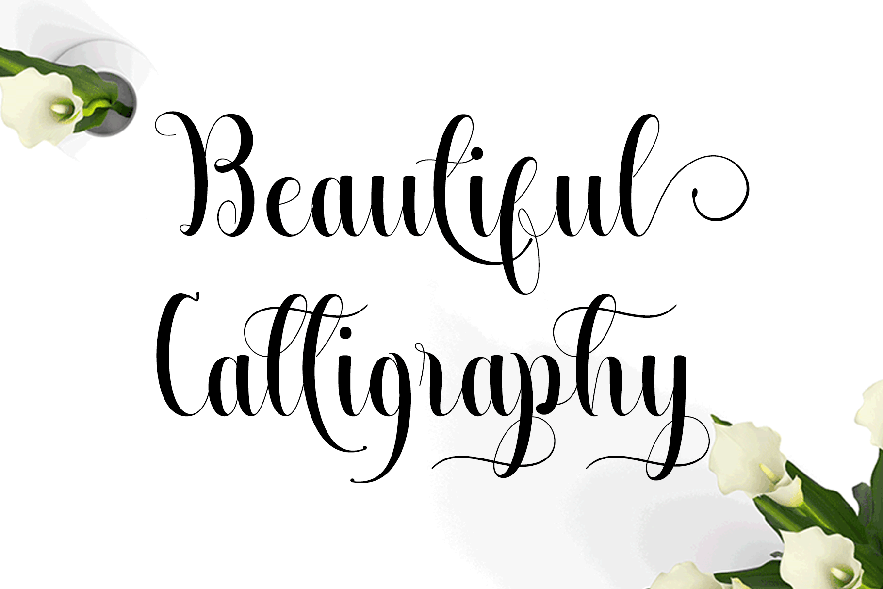
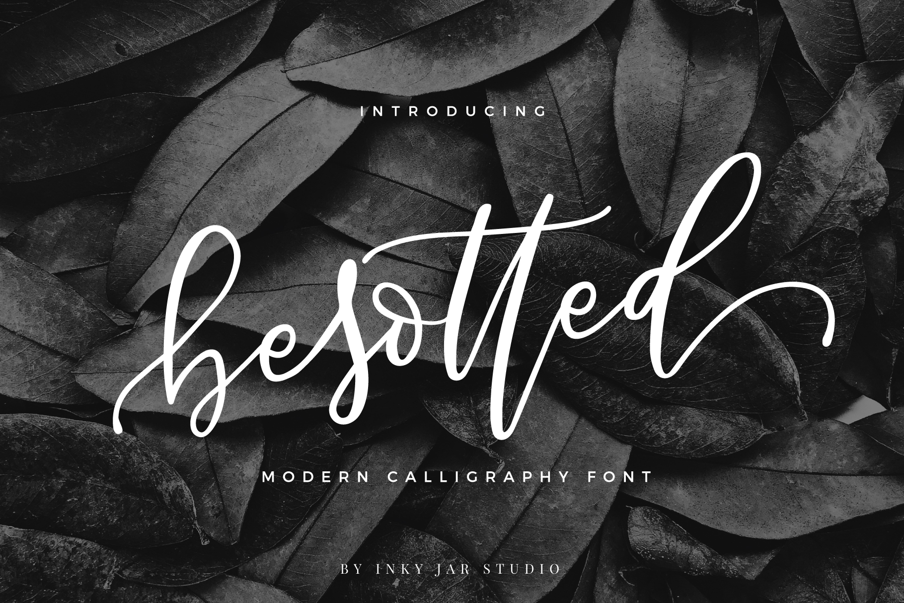
The best Japanese style fonts bring brush calligraphy, kanji structure, and anime energy to Latin letters. Here are 23 of them from Creative Fabrica, sorted by style, plus tips for using them in logos, posters, and merch.
What Makes a Font Look Japanese?
Japanese-style fonts draw from a few visual traditions that Western audiences recognize immediately. Brush calligraphy fonts borrow from shodo, the Japanese art of ink brush writing, where every stroke has visible pressure changes and organic movement. Display fonts channel the angular, architectural weight of kanji characters, translating those thick horizontals and sharp corners into the Latin alphabet. And anime-inspired fonts carry the bold, energetic feeling of Japanese pop culture, from manga panels to game title screens.
An important note: the fonts in this list are English and Latin character fonts designed to look Japanese-inspired. They do not contain actual Japanese characters like kanji, hiragana, or katakana. If you need a font with real Japanese glyphs, you will want a bilingual typeface instead. These fonts are built for designers who want a Japanese aesthetic in English-language projects like restaurant branding, event posters, apparel, and packaging.
The “faux Japanese” approach is popular because it lets Western audiences read the text while still feeling the cultural style. Brush strokes, angular geometry, and calligraphic flourishes do the heavy lifting. Whether you need a samurai font for a game logo or a clean kanji-inspired face for product packaging, the right Japanese style font sets the mood without sacrificing readability.
Traditional Japanese Brush Fonts
Brush fonts are the most popular subcategory in Japanese-style typography. They pull from the shodo tradition, where the brush, ink, and paper interact to create natural, imperfect strokes. If you are designing for a Japanese restaurant, cultural event, or wellness brand, these are the fonts I would reach for first. For more brush-style options beyond the Japanese aesthetic, see best brush fonts.
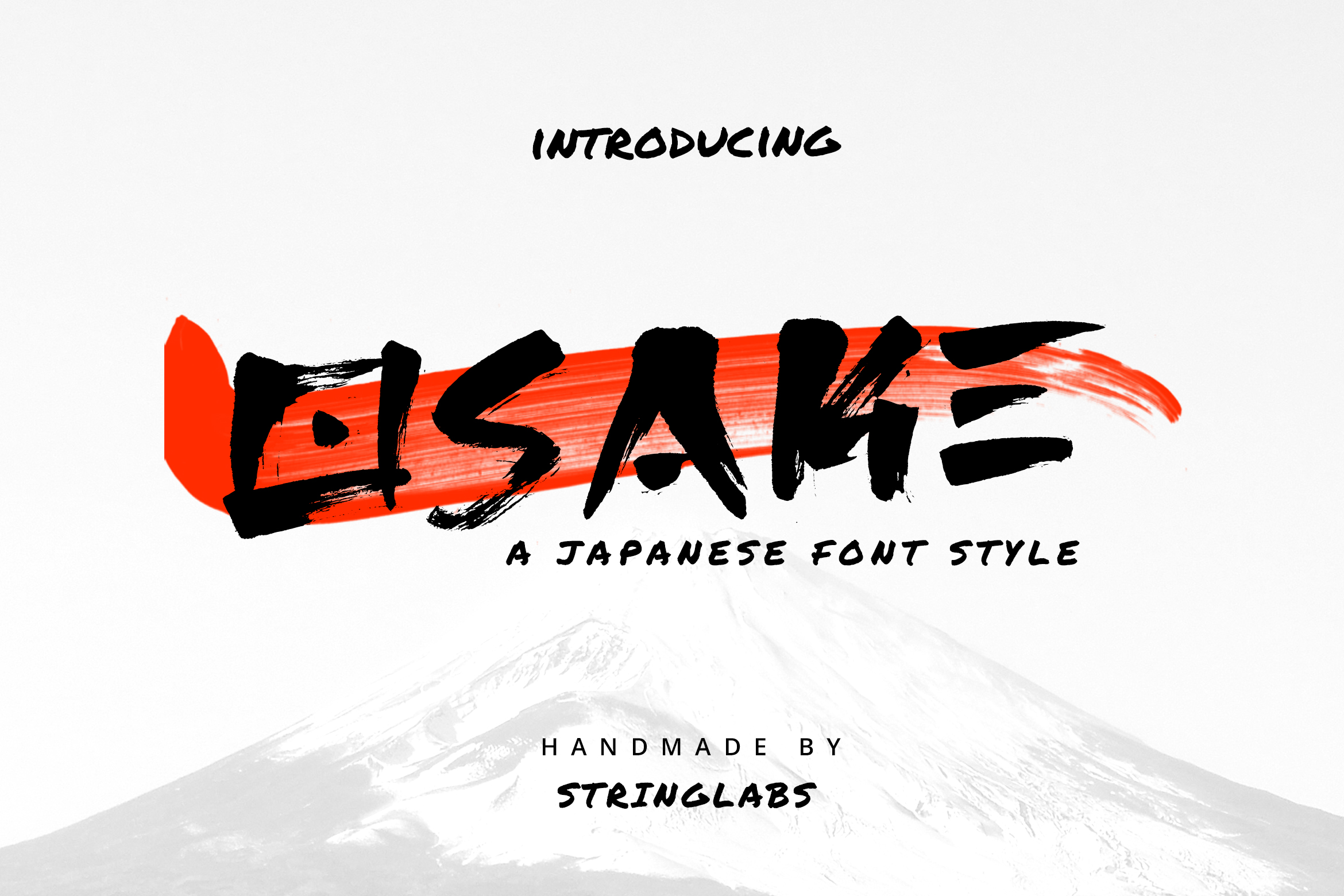
1. Osake
Osake is a decorative brush font created with a brush pen, combining the traditional style of Japanese calligraphy with a modern minimalist touch. Each glyph carries ethnic and cultural elements while staying cleaner and less ornamental than typical brush fonts.
I like it when the design needs to feel authentically Japanese without becoming too busy. It works well at large sizes where the brush texture can breathe.
Best for: Japanese restaurant branding, logos, social media graphics. By: StringLabs
2. Japanese Sumi
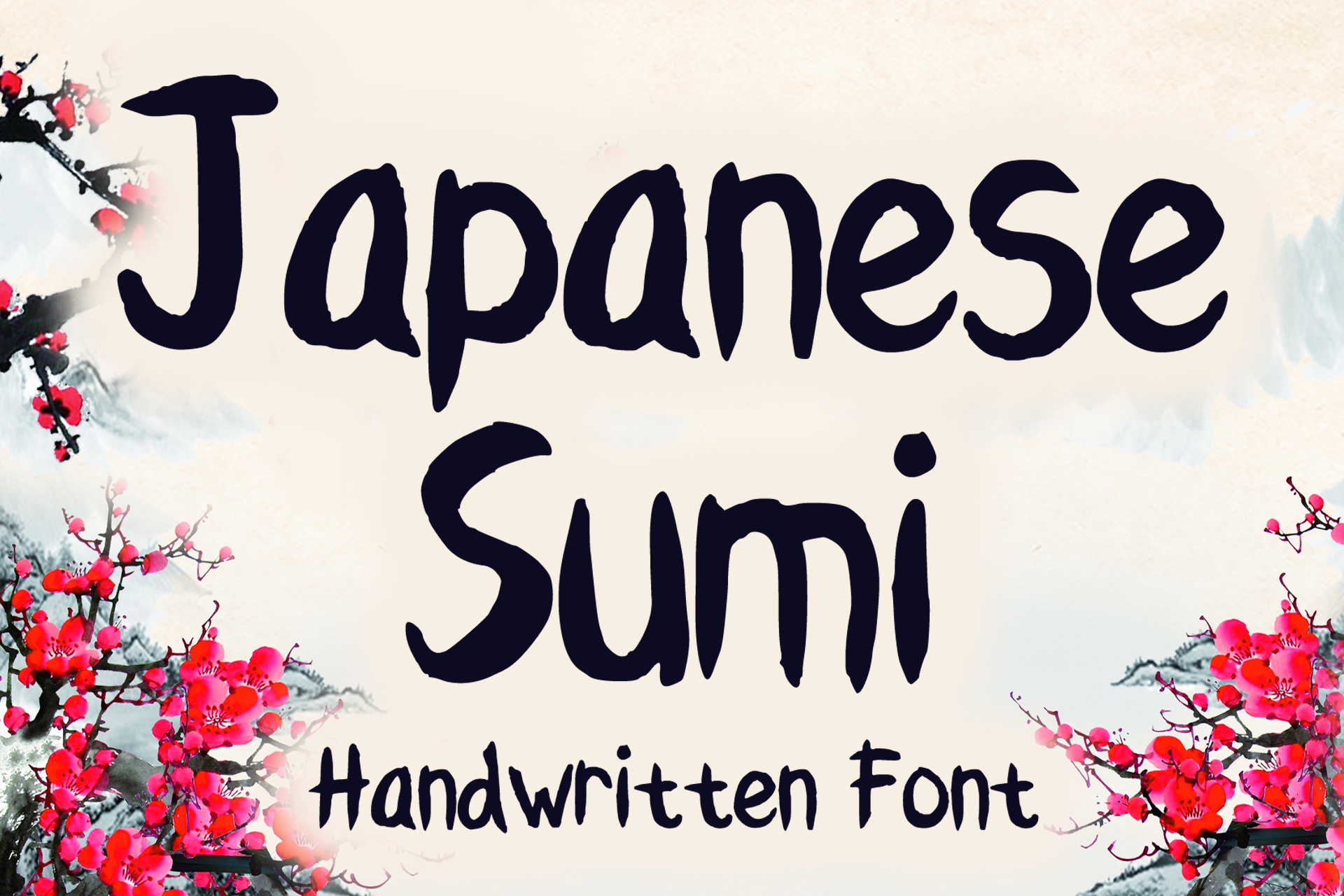
Japanese Sumi is a handwritten display brush font with authentic sumi ink aesthetics. It evokes the feel of traditional sumi-e (ink wash) painting, where the brush meets paper with natural, flowing strokes.
Use it when the project needs a casual, handcrafted Japanese touch. It works well on t-shirts, book designs, greeting cards, and packaging where organic texture adds character.
Best for: t-shirt designs, book covers, greeting cards. By: MVMET
3. Kenoya
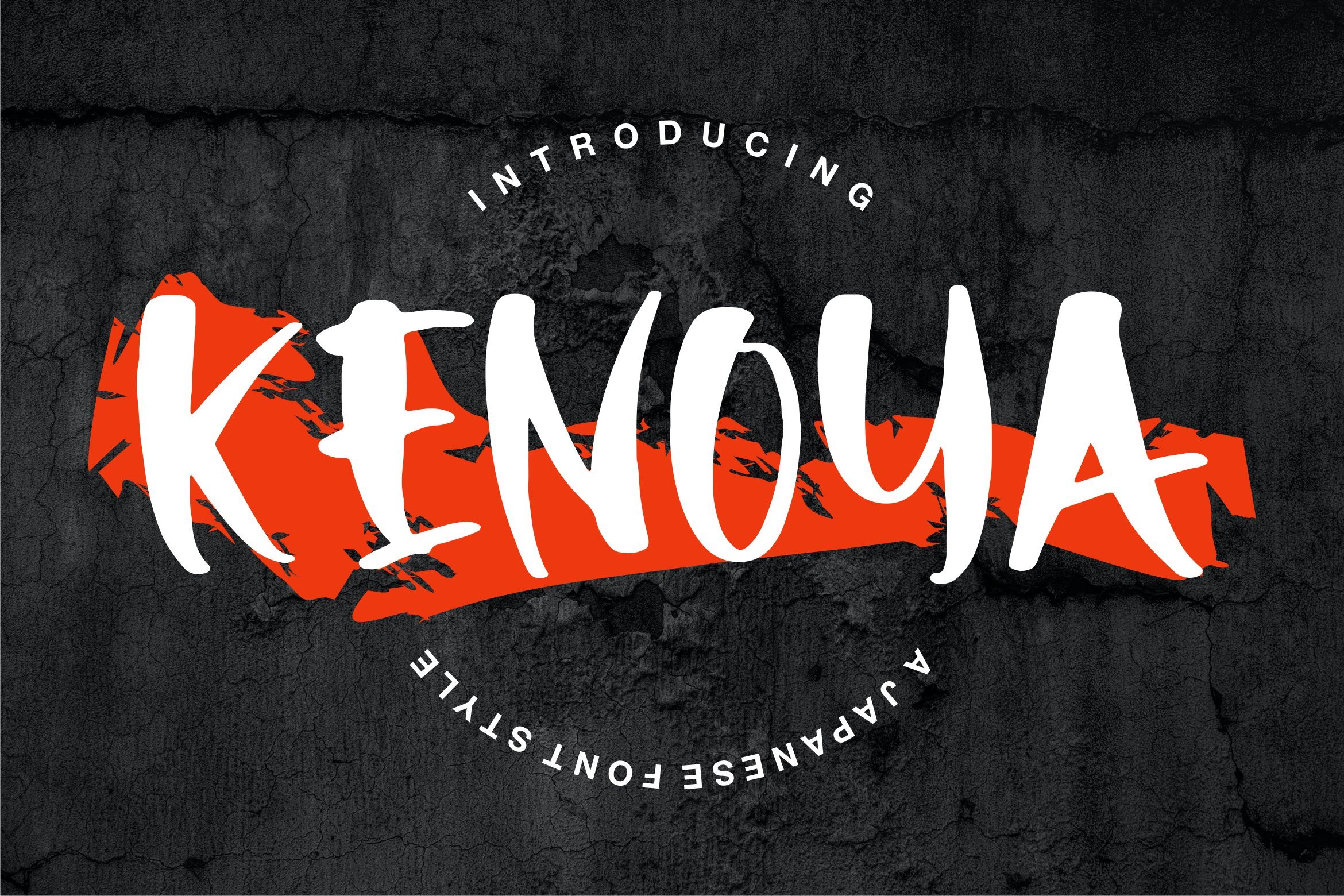
Kenoya is a display font inspired by Japanese calligraphy, with PUA encoded extra characters for full glyph access. The Vunira team designed it with an elegantly feminine style that feels refined and intentional.
It is a strong pick for greeting cards, wedding invitations, and branding materials where the Japanese calligraphy influence needs to stay graceful. If you like calligraphy fonts in general, Kenoya is a good place to start for a Japanese flavor.
Best for: greeting cards, wedding invitations, branding materials. By: Vunira
4. Samurai Blade
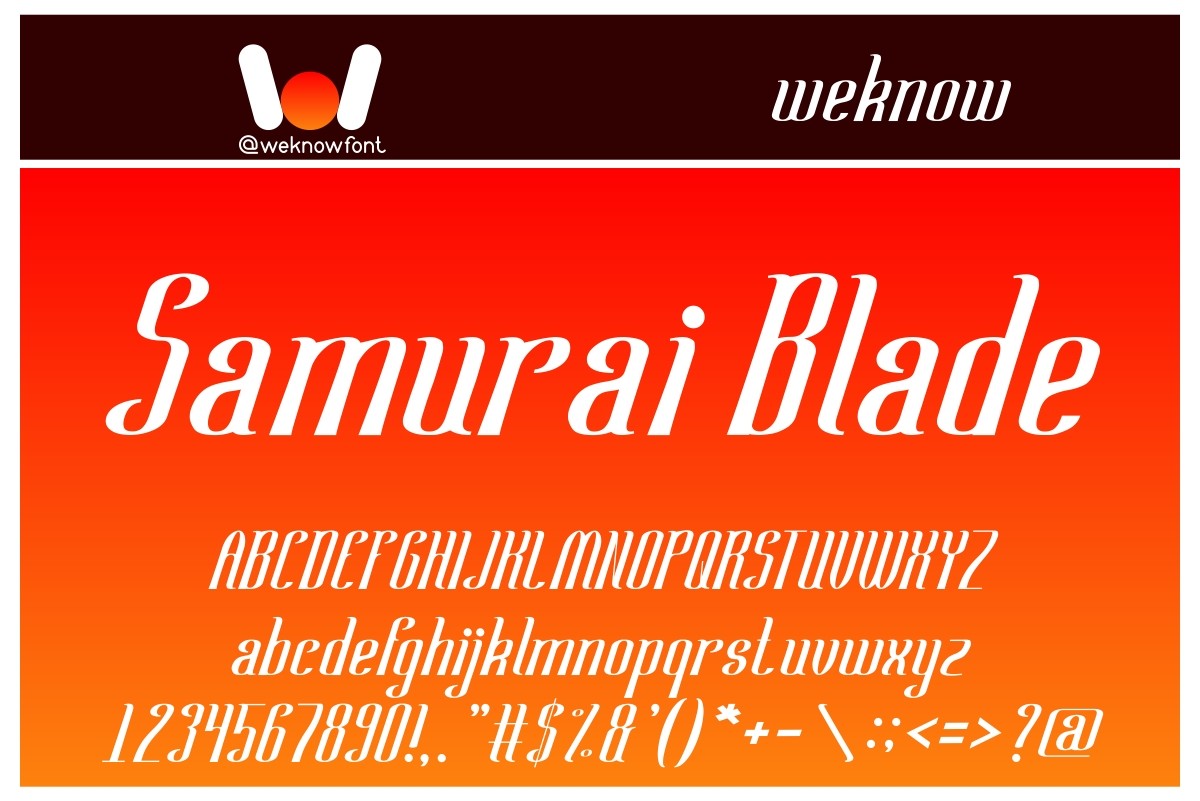
Samurai Blade is a well-balanced script font with Japanese warrior energy. Its flowing brush strokes suggest the precision of a blade, with sweeping letterforms that carry both elegance and force.
It works well for logos, apparel, posters, and game branding where the design needs to feel sharp and dynamic. I would pair it with a clean sans serif for supporting text so the script can take center stage.
Best for: logos, apparel, game branding, movie titles. By: weknow
5. Sakayume
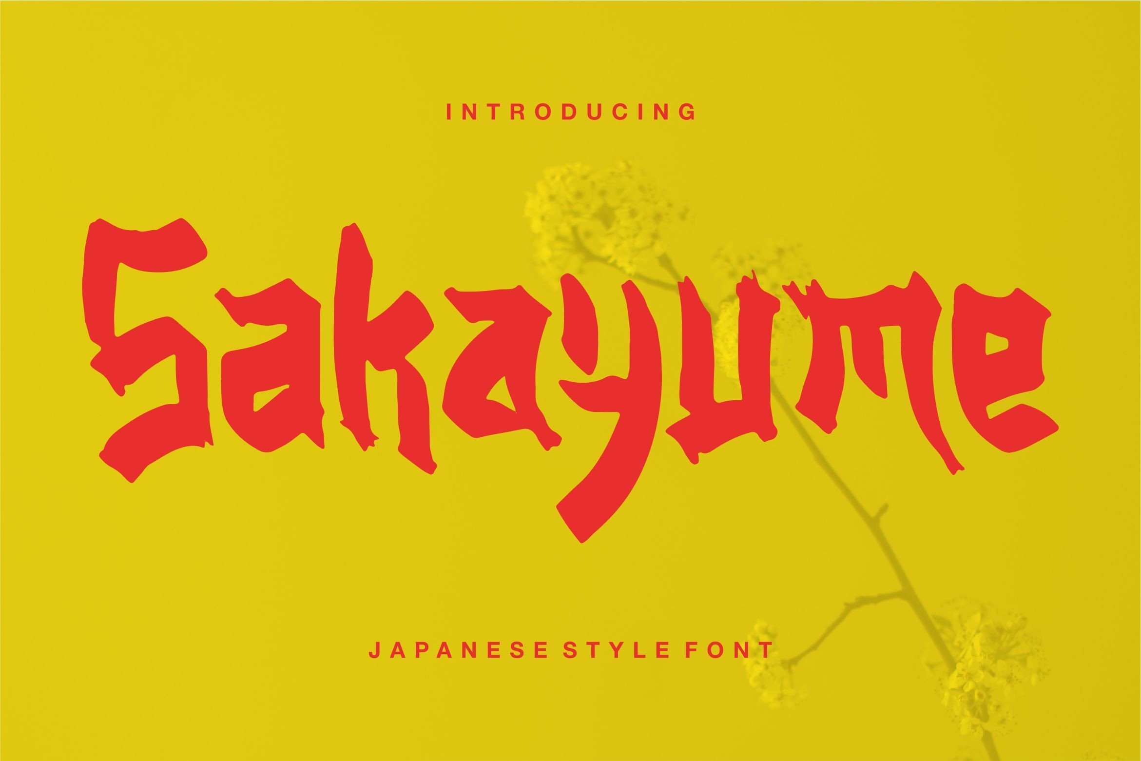
Sakayume is an original display font with a Japanese style that looks beautiful and authentic. Its clean, graceful character shapes sit in a comfortable space between brush calligraphy and modern type design.
Use it for invitations, branding materials, and posters where you want the Japanese influence to be present but not overwhelming. Every download includes a commercial license for personal and commercial use.
Best for: invitations, branding materials, posters. By: Vunira
6. Kimono
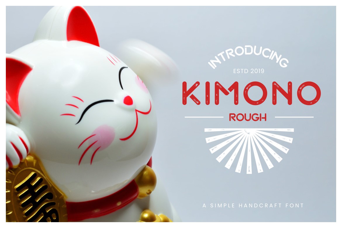
Kimono is a bold display font inspired by Japanese kimono culture. Created by naulicrea, the same designer behind Kyoto and Yukimi Shoji, it carries an authentic Japanese presence with strong, confident letterforms.
It suits branding, headings, labels, and product packaging. I reach for it when the design needs to feel culturally grounded and the headline needs weight.
Best for: branding, headings, product packaging, restaurant menus. By: naulicrea
Bold Japanese Display Fonts
Bold display fonts take the weight and structure of traditional Japanese architecture and translate it into heavy, solid letterforms. These are the fonts for headlines, logos, and packaging where the type needs to command attention. They work well for ramen shop branding, food packaging, and event posters where readability at a distance matters.
7. Kyoto
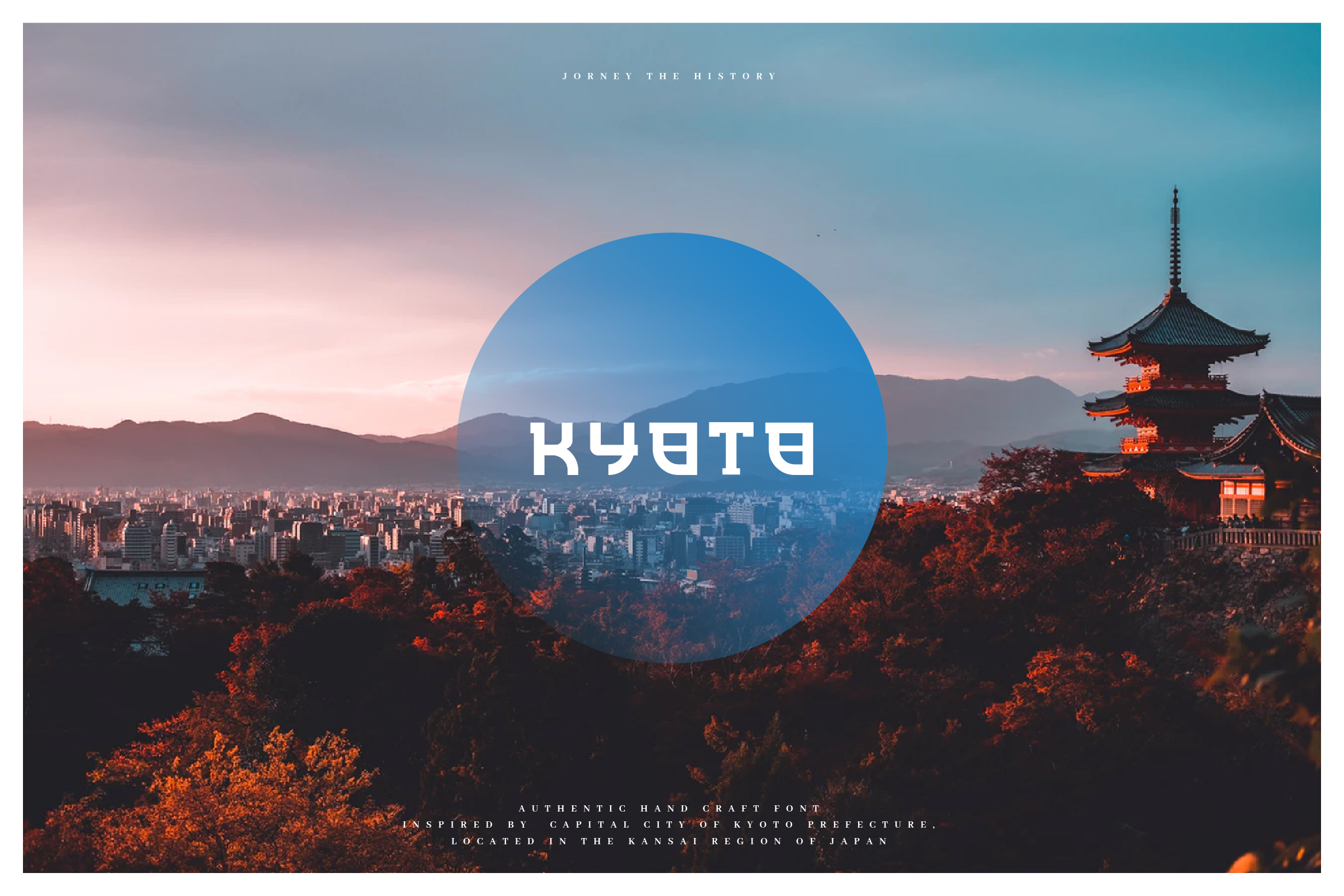
Kyoto is a bold, solid display font with an authentic Japanese traditional feeling. Its thick, strong letterforms channel the gravitas of Kyoto’s historic temples and cultural heritage.
Use it for branding, headings, logos, and product packaging. It is the kind of face that can carry a large headline without losing its character, and it pairs well with lighter script fonts for contrast.
Best for: branding, headings, logos, product packaging. By: naulicrea
8. Yukimi Shoji
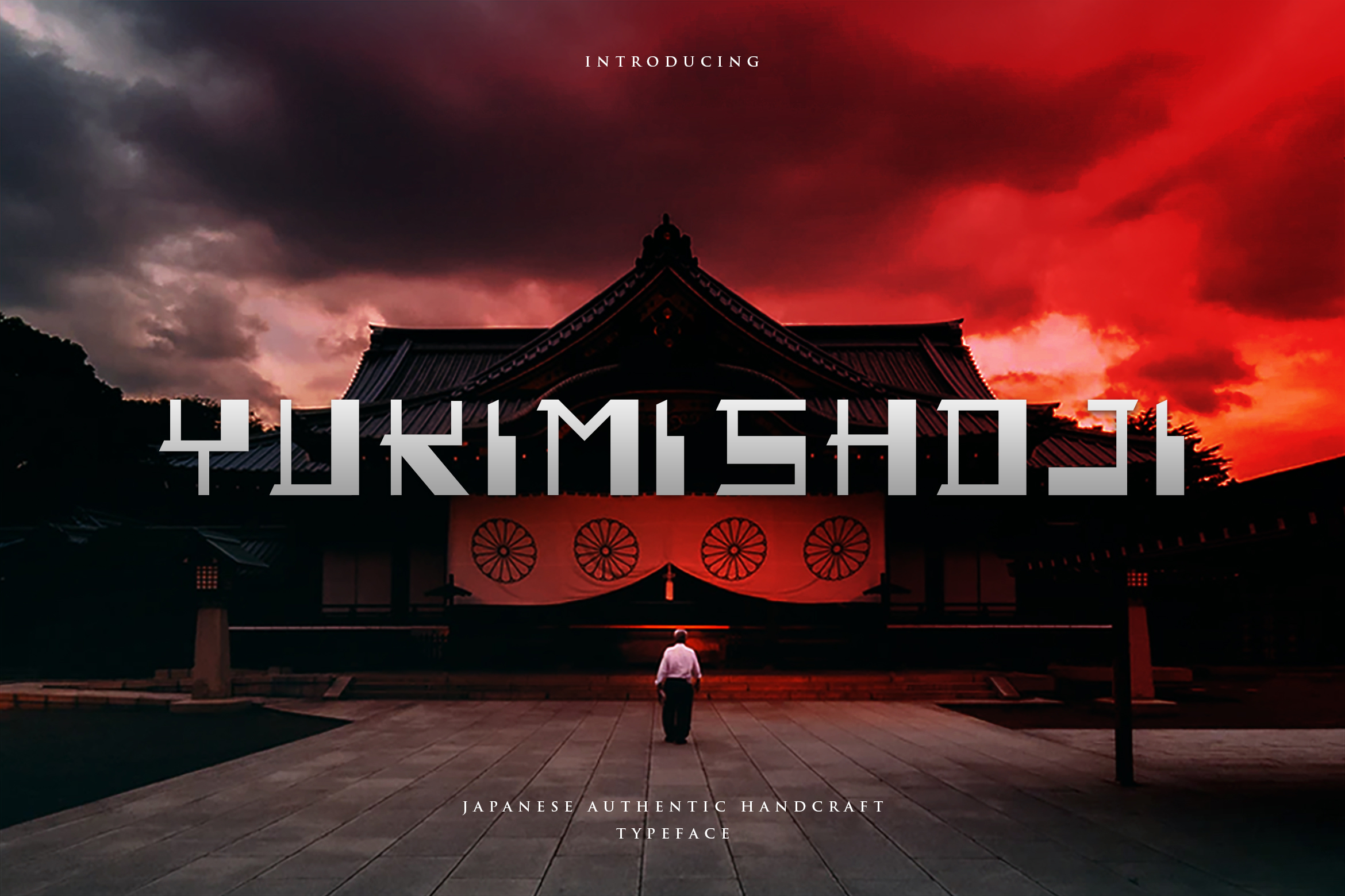
Yukimi Shoji is a bold display font named after the traditional snow-viewing lanterns found in Japanese gardens. Every letterform carries architectural strength, and the overall feel is rooted in Japanese tradition.
It works well for restaurant menus, cultural event promotions, and product packaging. If you are building a brand around Japanese food or culture, this font gives your headlines a solid foundation.
Best for: Japanese restaurant menus, cultural event promotions, labels. By: naulicrea
9. Hirosaki
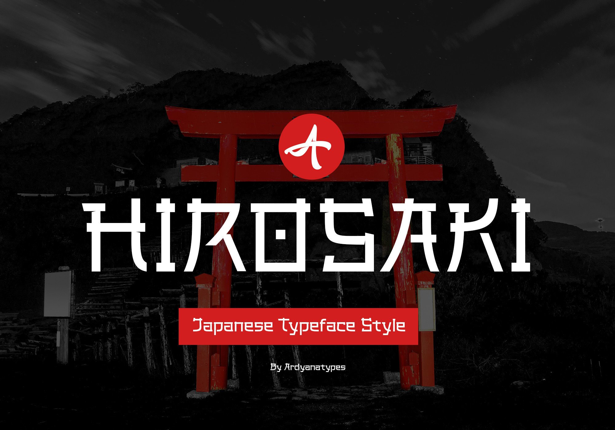
Hirosaki is a Japanese style display font with very unique, thick characters. It features ligatures for an interactive design feel and supports multiple languages, making it versatile for international projects.
I like it for book covers, film posters, logos, and branding where the letters need to feel distinctly Japanese. The thick strokes make it readable even at smaller display sizes.
Best for: book covers, film posters, logos, branding. By: ardyanatypes
10. Hashira Senju
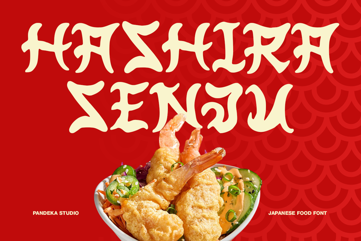
Hashira Senju is a bold, expressive display font inspired by traditional Japanese calligraphy and modern street food culture. Its sharp strokes and dynamic forms bring a strong oriental character with a handcrafted feel.
It is a natural fit for ramen shops, sushi brands, street food packaging, and festival posters. If the design needs to capture an authentic Japanese food atmosphere, this font delivers it well.
Best for: ramen shop branding, sushi brands, street food packaging. By: pandekastudio
11. Keitaro
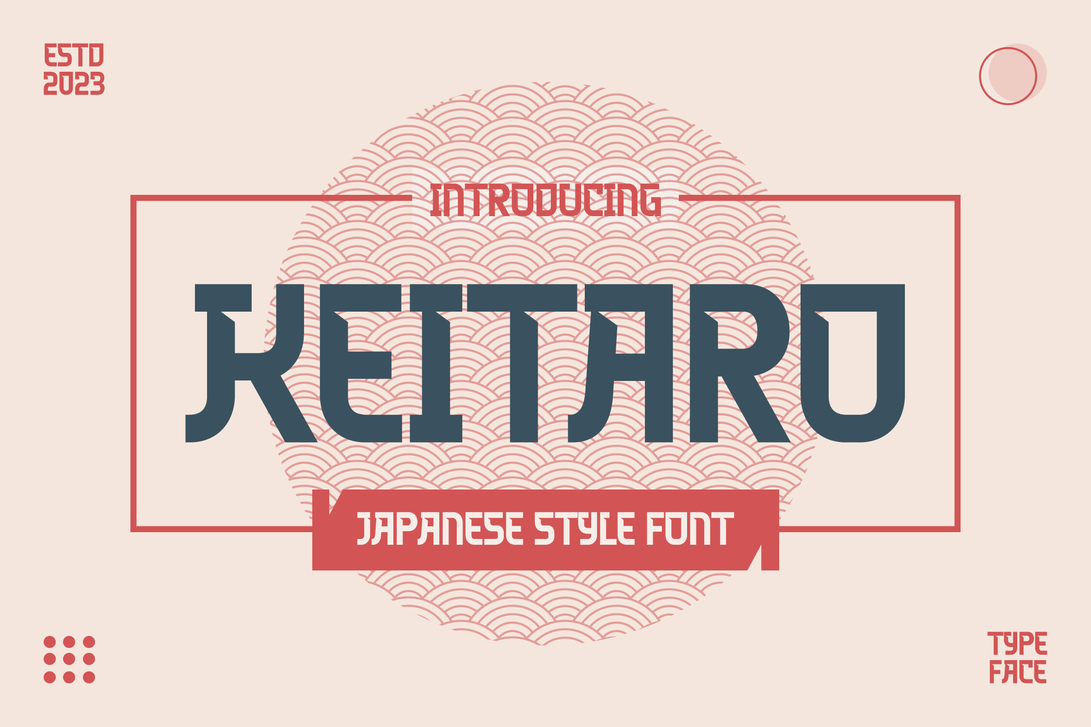
Keitaro is a Japanese style font with uppercase, lowercase, numerals, punctuation, and OpenType features. It is PUA encoded for easy glyph and ligature access, giving you flexibility across different design contexts.
Use it for logos, advertising, product packaging, and magazine designs. The range of included characters makes it practical for projects that need more than just headline letters.
Best for: logos, advertising, product packaging, magazine designs. By: agnyhasyastudio
12. Kapital Kanji
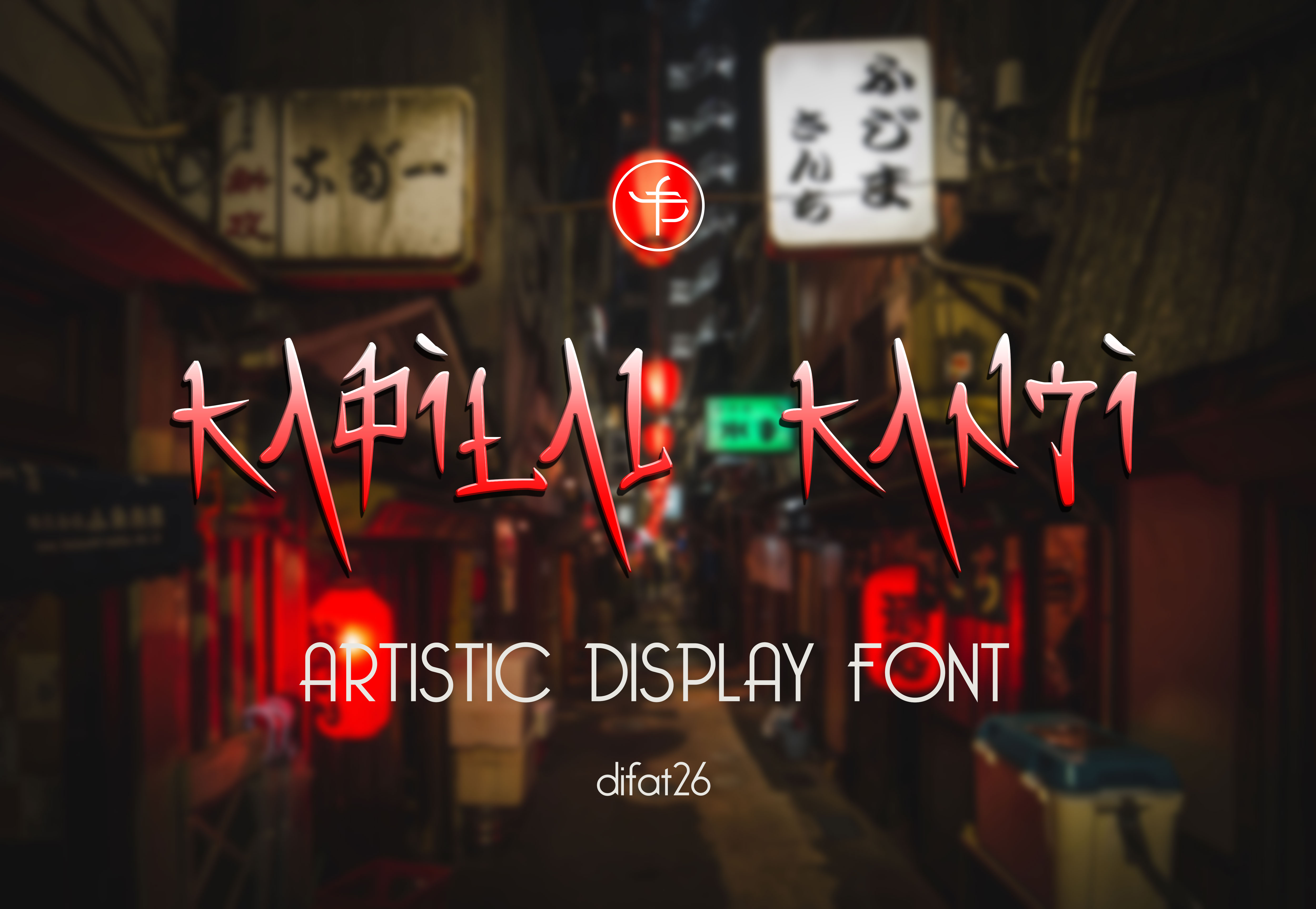
Kapital Kanji is a unique Japanese-inspired display font that draws heavily from kanji character structure while keeping Latin alphabet readability. The result is letterforms that feel like kanji at a glance but remain fully legible in English.
It is a strong choice for food menus, poster flyers, and Japanese restaurant branding. I would use it when the design goal is to make English text feel as Japanese as possible without switching scripts.
Best for: food menus, poster flyers, Japanese restaurant branding. By: sketsadraw
Anime and Manga Display Fonts
Anime fonts bring the playful, high-energy feel of Japanese animation and manga to Latin characters. They tend to be bold, rounded, or sharply dynamic, and they work best for entertainment projects, gaming, YouTube content, and merch aimed at younger audiences. If the project needs to feel fun and pop-culture-forward, this is the right group.
13. Mangaka
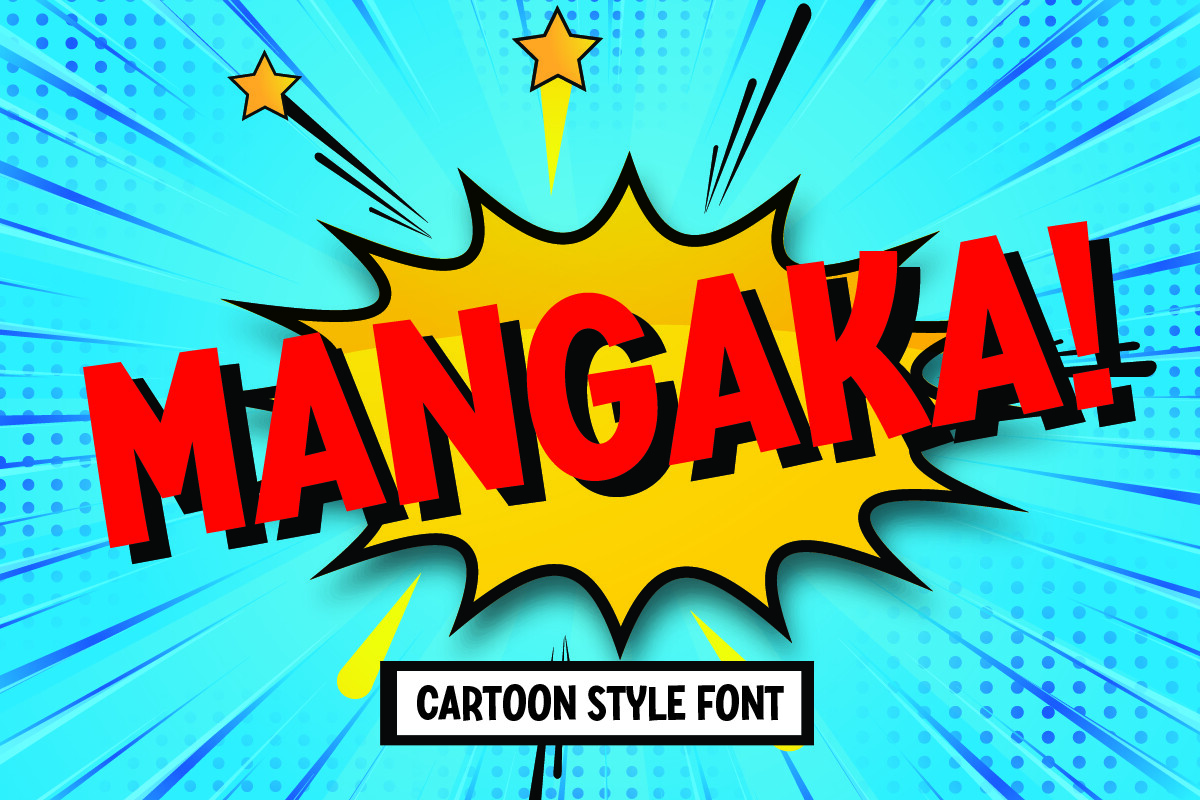
Mangaka is a fun, lively cartoon font designed for kids’ comics and manga headlines. Its bold, playful style instantly grabs attention, and the energetic letterforms add excitement to any project they appear in.
Use it for comics, manga covers, posters, and merchandise. It is best at large sizes where its personality can shine, and I would keep the surrounding design colorful to match.
Best for: comics, manga covers, posters, merchandise. By: sensatype
14. Nijikon Japan
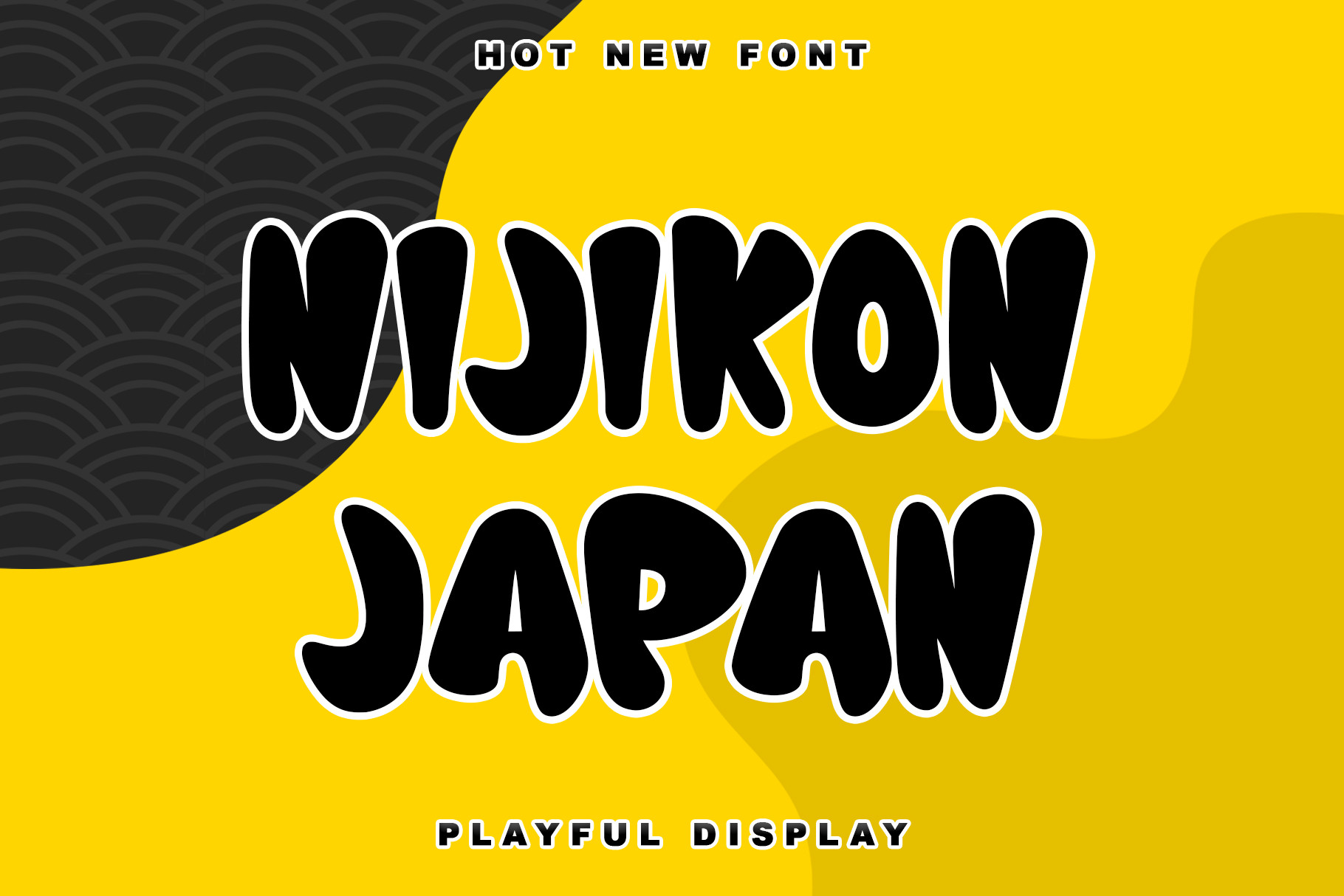
Nijikon Japan is a cool, friendly display font inspired by Japanese cartoons, with childlike charm designed for fun and energetic designs. It captures the playful spirit of anime and Japanese pop culture.
It works well for anime-themed projects, children’s content, YouTube thumbnails, and social media graphics. If you need a font that feels like it belongs on a character introduction screen, this is it.
Best for: anime-themed projects, YouTube thumbnails, social media graphics. By: thomasaradea
15. Ninja Attack
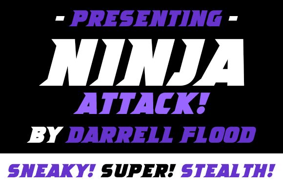
Ninja Attack is a bold serif font full of movement and impact. Its dynamic letterforms suggest action and martial arts energy, making every headline feel like it belongs on a battle sequence title card.
Use it for action-themed designs, gaming logos, martial arts event posters, and comic books. It pairs well with a simple body font so the display face can carry all the intensity.
Best for: gaming logos, martial arts event posters, comic books. By: Dadiomouse
16. Funny Samurai
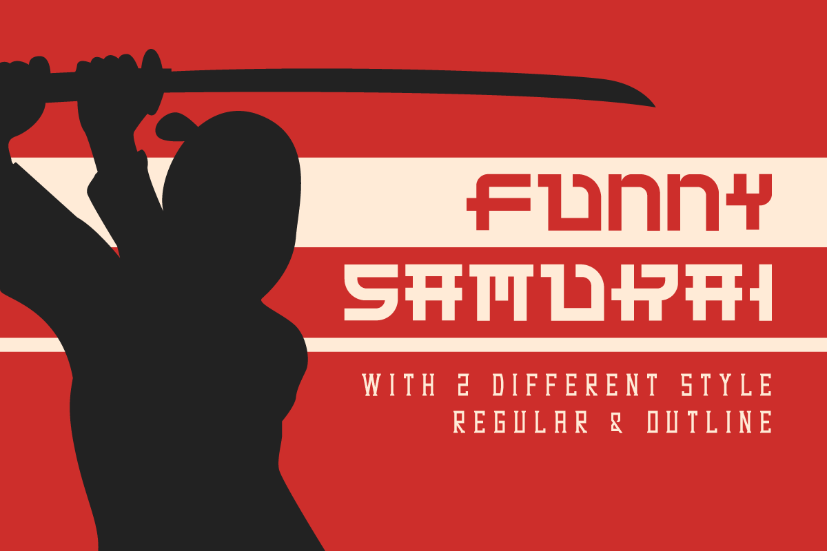
Funny Samurai is a unique sans serif font with a bold twist and Eastern feel. It reimagines Japanese-inspired letterforms through a playful, geometric lens that feels remarkably current, bridging retro gaming aesthetics and modern tech branding.
It is a good fit for game branding, tech logos, merchandise, and social media content. The geometric structure keeps it clean enough for smaller applications while the Japanese flavor stays intact.
Best for: game branding, tech logos, merchandise, social media. By: EdricStudio
17. Kansei
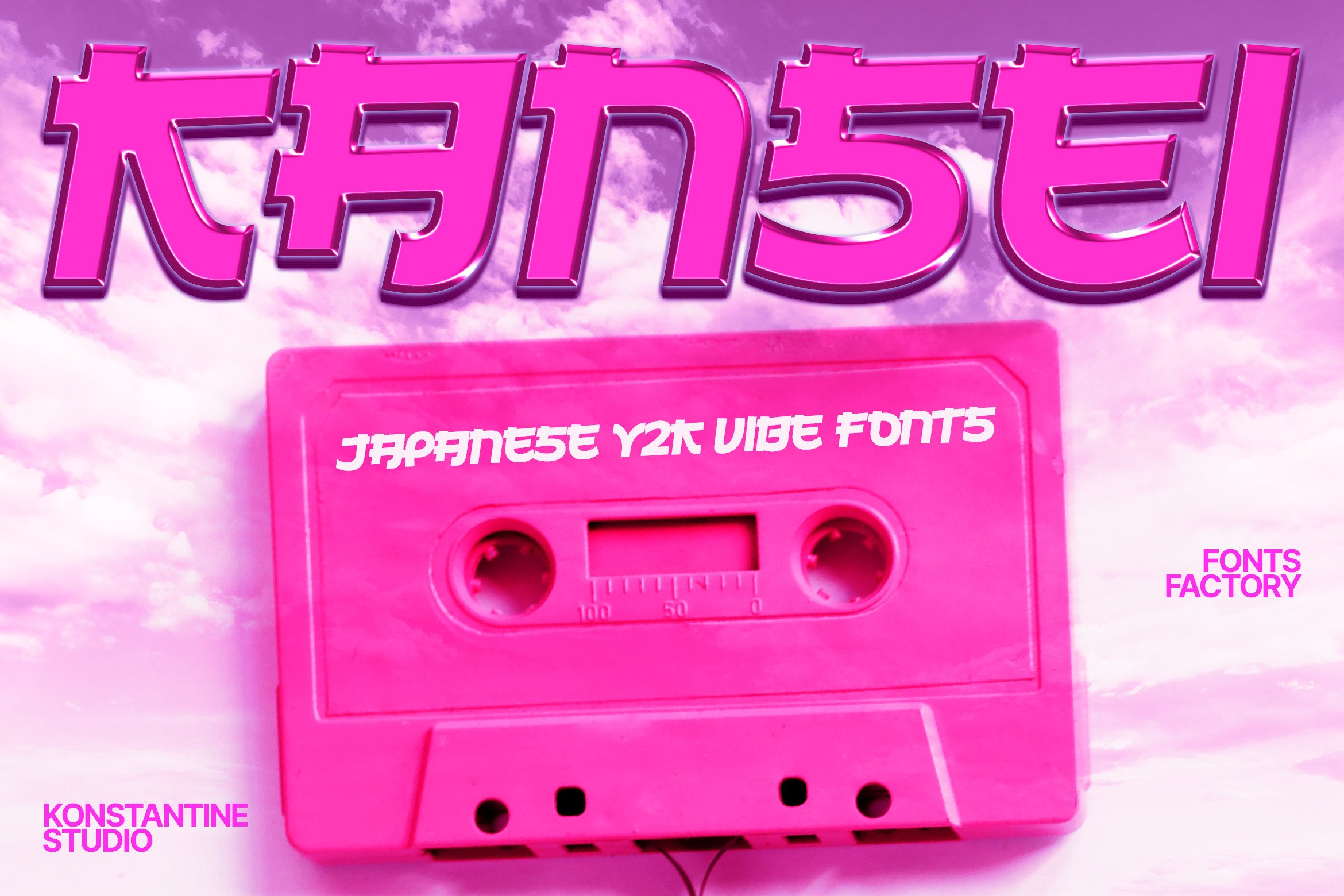
Kansei is a Japanese vibes font with a touch of Y2K era aesthetics that has been trending across design communities. It is an all-caps font where uppercase and lowercase remain the same, blending Japanese cultural elements with a retro-futuristic style.
Use it for logos, esports branding, posters, and merchandise where the design needs to feel both nostalgic and forward-looking. The Y2K angle makes it especially relevant in 2026, where that aesthetic continues to be popular.
Best for: logos, esports branding, posters, Y2K-themed merchandise. By: konstantinestudio
Modern Japanese-Inspired Fonts
Modern Japanese-inspired fonts take a more refined approach. Instead of brush textures or manga energy, they use the structural principles of kanji and Japanese design, clean grids, geometric rhythm, and precise angles, to create Latin letterforms that feel contemporary and urban. These are the fonts for tech branding, editorial design, and sleek product packaging.
18. Shizuko
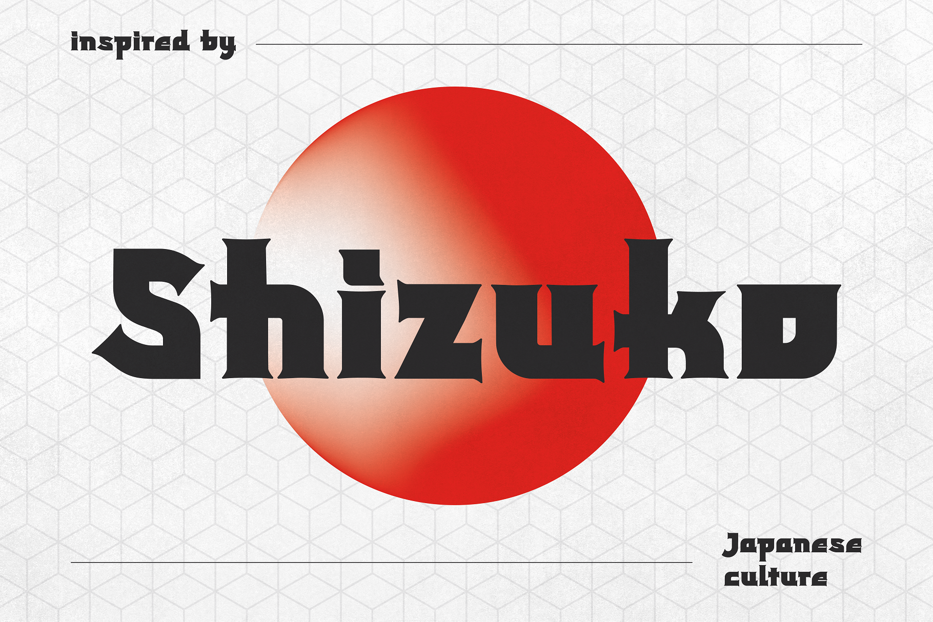
Shizuko is a modern display typeface inspired by Japanese kanji fonts, available in English style only. It is an attention-grabbing headline font that channels kanji energy without including actual Japanese characters.
Use it for headlines, wordmarks, editorial design, and packaging where you want a clean, modern Japanese feel. It works especially well for brands that draw from Tokyo’s design precision without leaning on traditional brush aesthetics.
Best for: headlines, wordmarks, editorial design, packaging. By: HipFonts
19. Jarene
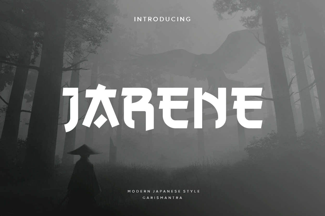
Jarene is a cool display font inspired by Japanese kanji fonts with a modern English style. The dynamic shape between straight and curved lines makes it look professional, reminiscent of a ninja’s precision.
It is a unique blend of Eastern structure and Western readability. Use it for logos, branding, advertising, and apparel design where the font needs to feel sharp, modern, and culturally layered.
Best for: logos, branding, advertising, apparel design. By: Letterna
20. Akisa Faux Japanese
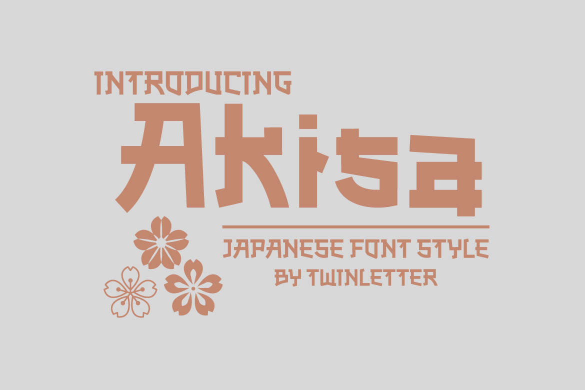
Akisa Faux Japanese is a faux Japanese display typeface that makes Latin letters look Japanese without using actual Japanese characters. This approach is popular with Western audiences who want Japanese-style aesthetics in readable English text.
Use it for restaurant menus, travel posters, merchandise, and t-shirt designs. It is especially effective when the design needs to signal “Japanese” at first glance while remaining fully accessible to English readers.
Best for: restaurant menus, travel posters, t-shirt designs, merchandise. By: twinletter
21. Akiro
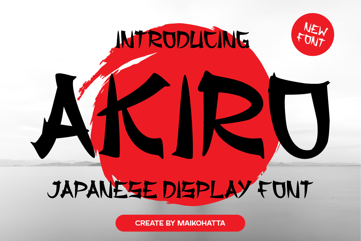
Akiro is a decorative Japanese font that combines beautiful aesthetics with rich cultural history and versatility. It holds a 5.0-star rating on Creative Fabrica, which speaks to how well it works across different projects.
It is a solid choice for branding, editorial design, cultural projects, and packaging. The design is detailed enough to feel special at display sizes but structured enough to stay professional.
Best for: branding, editorial design, cultural projects, packaging. By: maikofarazhatta
22. Wakatta
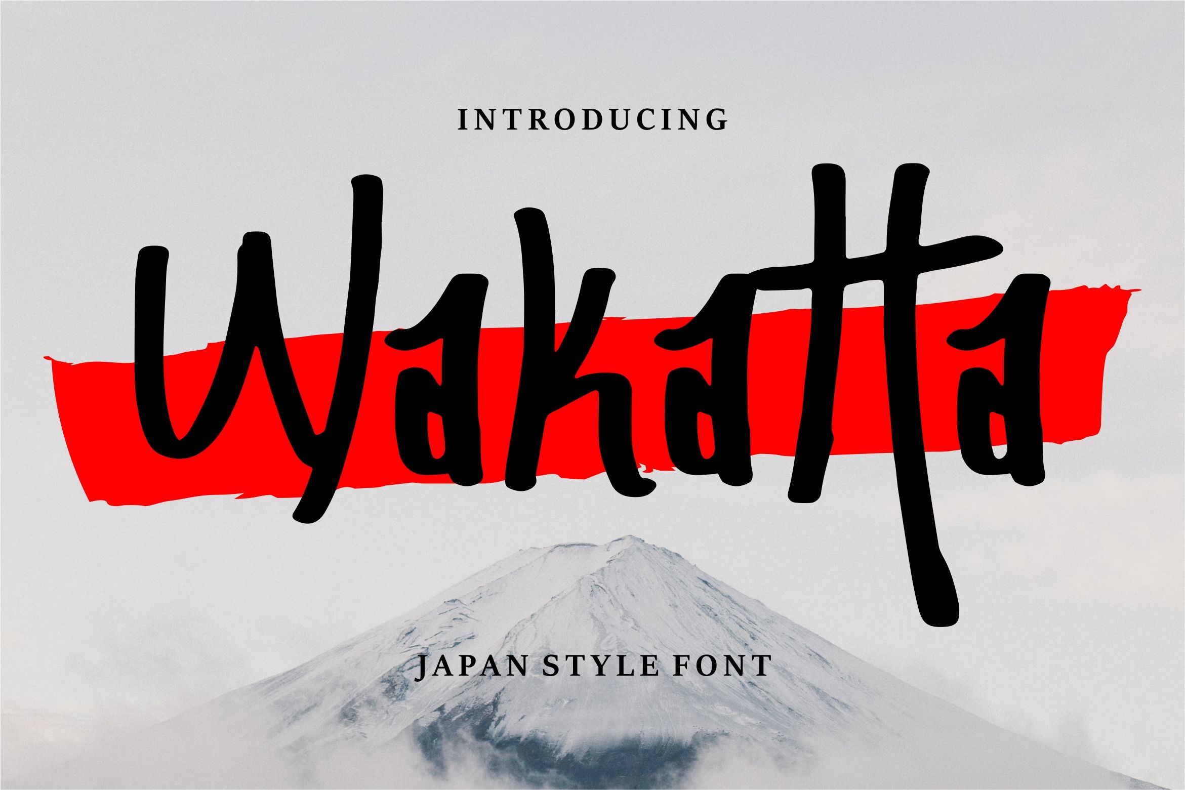
Wakatta is a unique display font with a realistic Japanese style. The name means “I understand” in Japanese, adding a layer of cultural authenticity to the design. Its clean, balanced letterforms include Japanese-inspired structural elements that feel intentional.
Use it for invitations, branding materials, business cards, and posters. If you want a Japanese-style font that feels polished and restrained rather than loud, Wakatta is a good direction.
Best for: invitations, branding materials, business cards, posters. By: Vunira
23. Tokyo Night
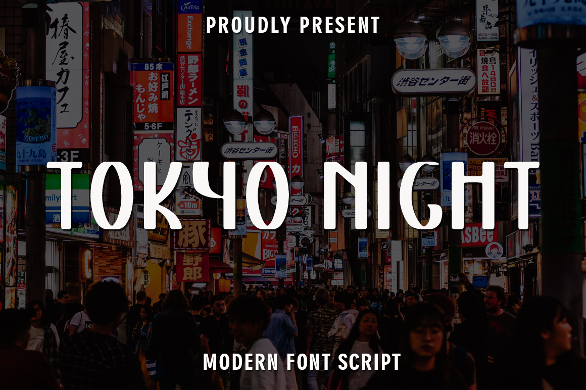
Tokyo Night is a unique display font with casual charm that feels down-to-earth, readable, and versatile. It captures the neon-lit energy of Tokyo after dark with modern, urban character shapes that feel alive.
Use it for urban branding, nightlife promotions, social media content, YouTube channel art, and apparel. It is a fitting closer for this list because it represents where Japanese-inspired type is headed: modern, metropolitan, and rooted in the energy of real Japanese cities.
Best for: urban branding, nightlife promotions, social media, apparel. By: rangkaiaksara
Tips for Choosing the Right Japanese Font
Start with the project type. Brush calligraphy fonts work well for restaurant branding, cultural events, and wellness brands where organic texture matters. Bold display fonts suit headlines, packaging, and signage where readability at a distance is the priority. Anime and manga fonts fit entertainment, gaming, and youth-oriented content. And modern kanji-inspired fonts work for tech branding, editorial design, and contemporary packaging.
Think about where the design will live. A poster or banner can carry more decorative weight than a logo. A logo needs to work at small sizes, so choose a font with enough clarity to survive a favicon or a business card. For shirts and merch, bold letterforms print more cleanly than thin, textured brush strokes.
A good pairing rule: use one Japanese-style display font for the headline and one clean sans serif or simple serif for supporting text. The display font carries the mood, and the supporting font keeps everything readable. Two decorative Japanese fonts in the same layout will compete with each other.
If you are working in Canva, Pro users can upload custom fonts through Brand Kit. In Cricut Design Space, install the font on your computer first, then select it in the software. For Adobe Illustrator or Photoshop, install the font files (usually TTF or OTF) and they will appear in your font menu.
Before selling anything with a Japanese style font, check the license on the product page. All fonts on Creative Fabrica include a commercial license, but it is always worth confirming the specifics for your use case, especially for print-on-demand products, client work, and large-scale merchandise runs.
Tip: Test your chosen font at the actual size it will appear in the final design. Japanese-style fonts with fine brush detail or complex structure can lose their character at small sizes. If the details blur, either increase the size or switch to a bolder option.
Where to Download Japanese Style Fonts
Creative Fabrica is the primary source for all the fonts in this list, and each product page includes a license overview. For more font recommendations, design resources, and practical tips, visit the FontPro blog.