· fonts · 13 min read
19 Best Art Deco Fonts — Geometric & Ornamental Styles
Discover 19 best Art Deco fonts for logos, invitations, and luxury branding. Bold geometric and ornamental styles, free and premium downloads.
What Makes a Great Art Deco Font?
Art Deco isn’t a mood, it’s a movement with a birth certificate. The style takes its name from the 1925 “Exposition internationale des arts décoratifs et industriels modernes” in Paris, and it built its identity around geometric symmetry, sunburst motifs, and a machine-age confidence that “vintage” or “retro” fonts don’t try to claim.
Design historian Bevis Hillier described the era as one of “luxury, glamour, exuberance, and faith in social and technological progress.” That’s the brief every genuine art deco font style is answering: tall geometric capitals, strong vertical strokes, sharp angles, and extreme thick-thin stroke contrast, all built on strict bilateral symmetry around a central axis.
So what actually separates an art deco display font from a generic vintage one? Vintage describes an authentic period object with its own patina, usually skewing soft and floral. Retro describes new work imitating a past decade with no formal ruleset. Art Deco is dated, named, and rule-bound: chevrons, zigzags, stepped pyramid forms, and above all the sunburst, a motif that surged in popularity after Tutankhamun’s tomb was discovered in 1922 and flooded design culture with Egyptian-inspired sun imagery.
One practical note before you start browsing: many 1920s font style typefaces are caps-only. A.M. Cassandre’s 1928 typeface Bifur, widely credited as the first true art deco typeface, had no lowercase at all, and that convention carried into plenty of modern revivals. Always check the character set before you commit a display font to anything longer than a headline.
19 Best Art Deco Fonts for Logos, Invitations & Luxury Branding
This list is organized into four groups so you can jump straight to what you need: geometric sans fonts for logos and headlines, luxury ornamental serifs for premium branding, script pairings for invitations, and decorative lettering for posters and signage. Every font links to its Creative Fabrica product page.
Best Geometric & Sans Art Deco Fonts
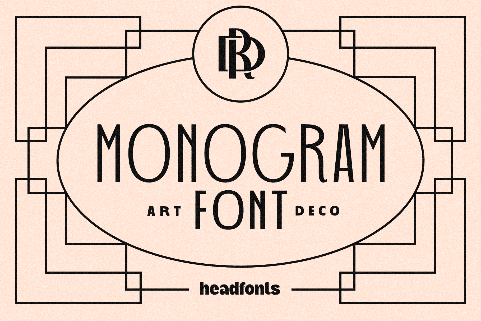
1. Art Deco Monogram
Art Deco Monogram is a modern display font built specifically for initials and monogram lockups. The geometric structure and even symmetry give it that early-twentieth-century luxury feel without leaning on period decoration. It’s a purpose-built tool rather than a general typeface, so drop in two or three initials and let the spacing do the rest.
Best for: monogram logos, wedding initials, boutique branding. By: Headfonts
2. Digital Deco
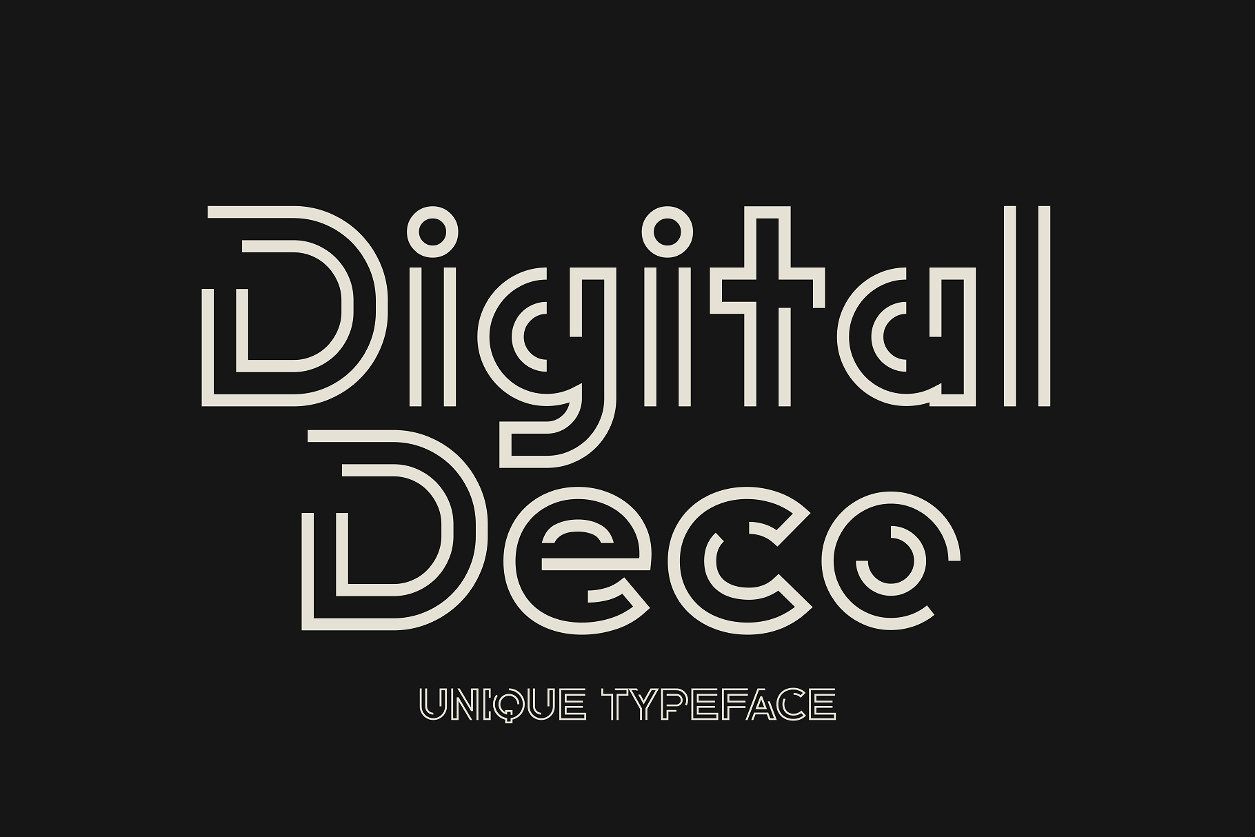
Digital Deco pairs 1920s luxury cues with a stripped-back, almost technical geometry. It reads as art deco without the heavier ornamentation, which is exactly why it works on screens for a brand that wants a wink at the Gatsby era while staying modern and minimal.
Best for: modern branding, digital products, minimalist logos. By: HipFonts
3. Dekart
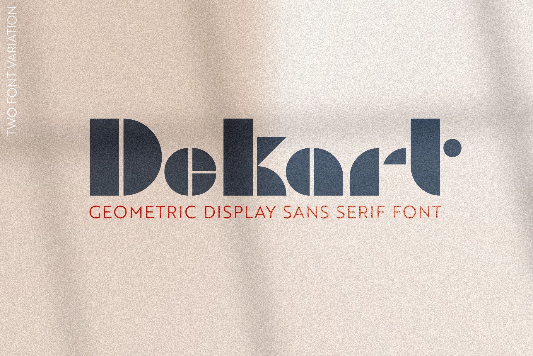
Dekart sits at the intersection of Bauhaus rigor and art deco geometry, built from clean circles and straight lines that give it real architectural presence at large sizes. It’s PUA-encoded, so open it as an OTF in Illustrator to get full access to its alternate glyphs and ligatures.
Best for: posters, editorial headlines, architectural branding. By: kandellaart
4. Decola
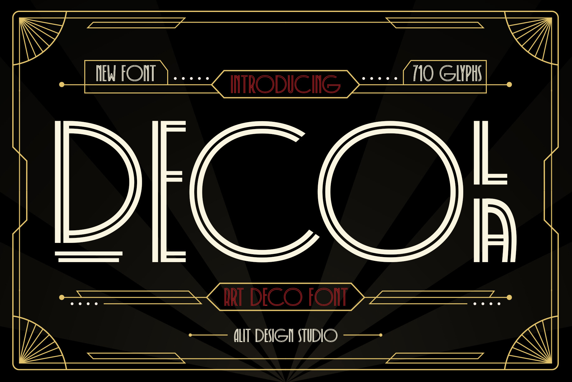
Decola keeps things simple: a clean geometric display face with no unnecessary flourishes. That restraint makes it easy to drop into a logo lockup or packaging label, and it stays legible even at small sizes where busier geometric deco fonts start to blur.
Best for: logos, headline branding, packaging. By: Alit Design
5. Deco by Aommy Design
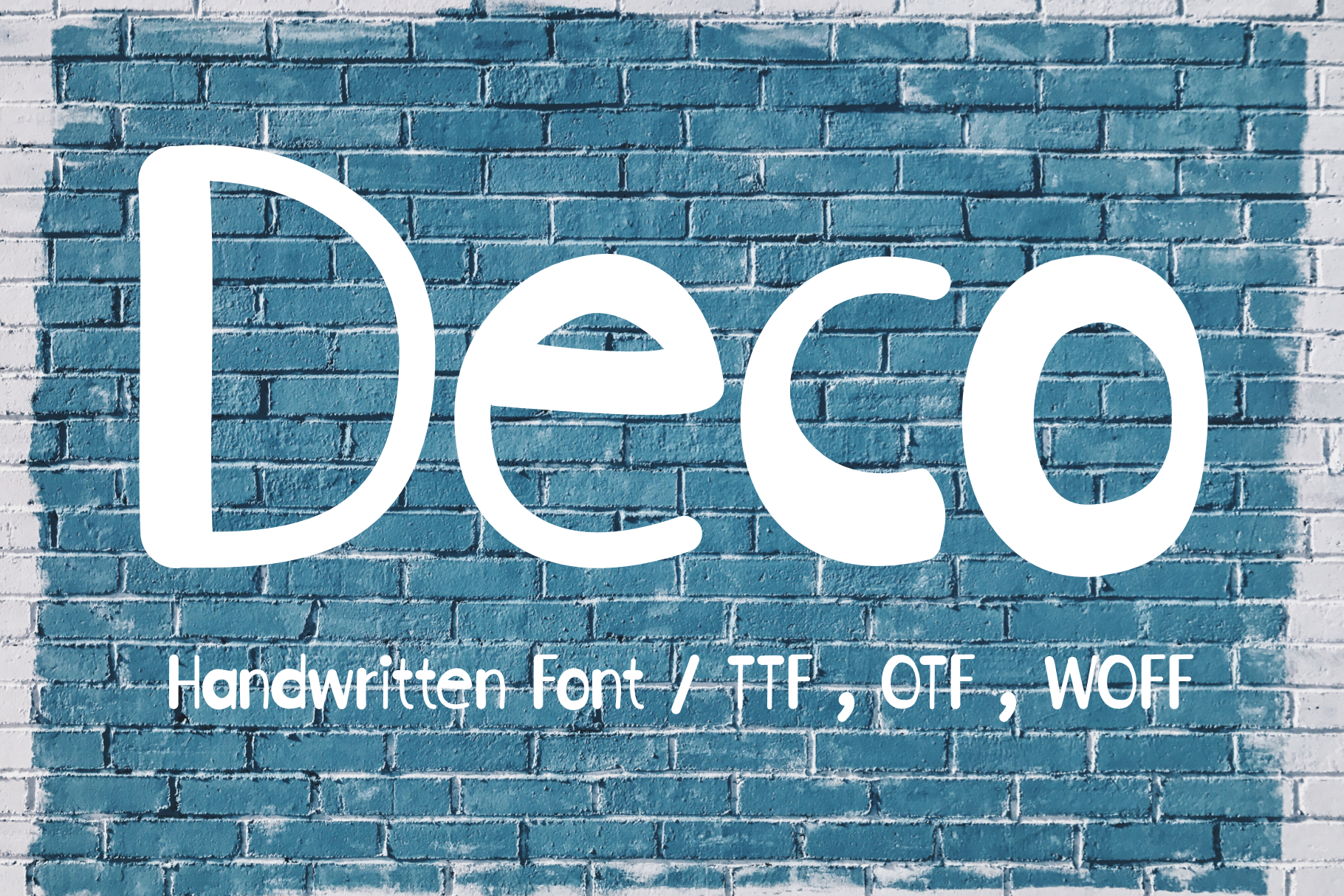
Worth a clear callout: Deco by Aommy Design isn’t a period-accurate art deco font. Creative Fabrica describes it as cute and friendly, and that’s exactly what it is: a rounded, playful sans with just a hint of geometric structure.
It works as a softer complement inside a broader deco-themed brand system, especially anywhere you want warmth instead of glamour. Just don’t reach for it expecting sunburst-era drama.
Best for: playful branding, social media graphics, product labels. By: Aommy Design
6. Deco by Good Gravy Type
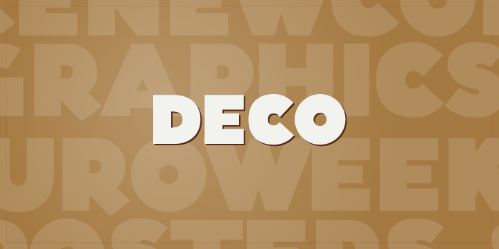
Not to be confused with the entry above, Deco by Good Gravy Type is a genuinely art deco face: chunky, assured, and built with a slight hand-drawn irregularity that keeps it from feeling stiff.
That mix of classic geometric elegance and a human touch makes it feel closer to a hand-painted 1930s shop sign than a digital font.
Best for: vintage posters, retro packaging, hand-crafted branding. By: Good Gravy Type
Download Deco by Good Gravy Type
7. Alpha Strada
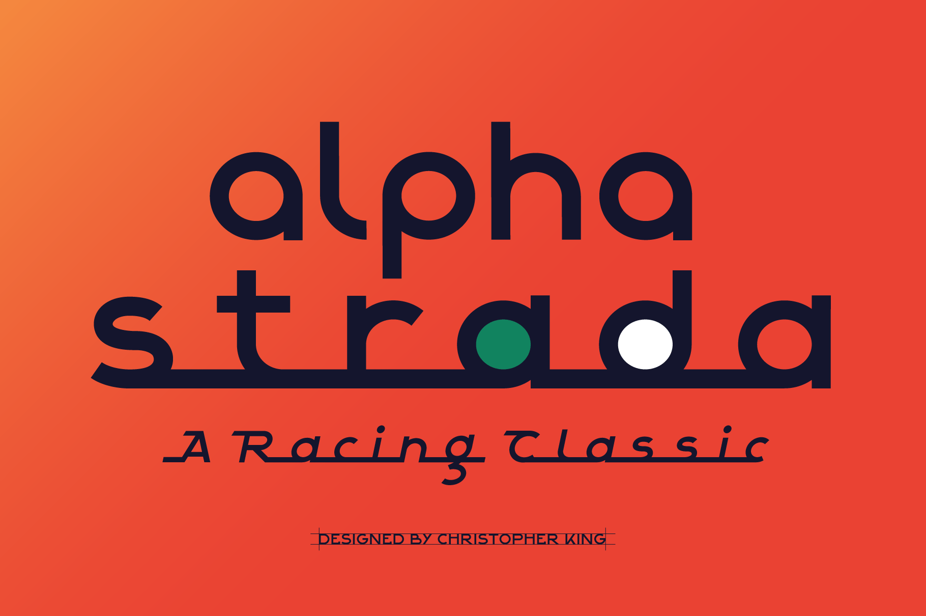
Alpha Strada draws its geometry from Italian automotive badges and the sharp, purposeful lines of art deco design. It has a mechanical precision that reads more masculine than most deco script font pairings on this list. Think chrome trim and racing plaques rather than ballroom invitations.
Best for: automotive branding, badges, masculine logos. By: wingsart
8. Jabberz Display
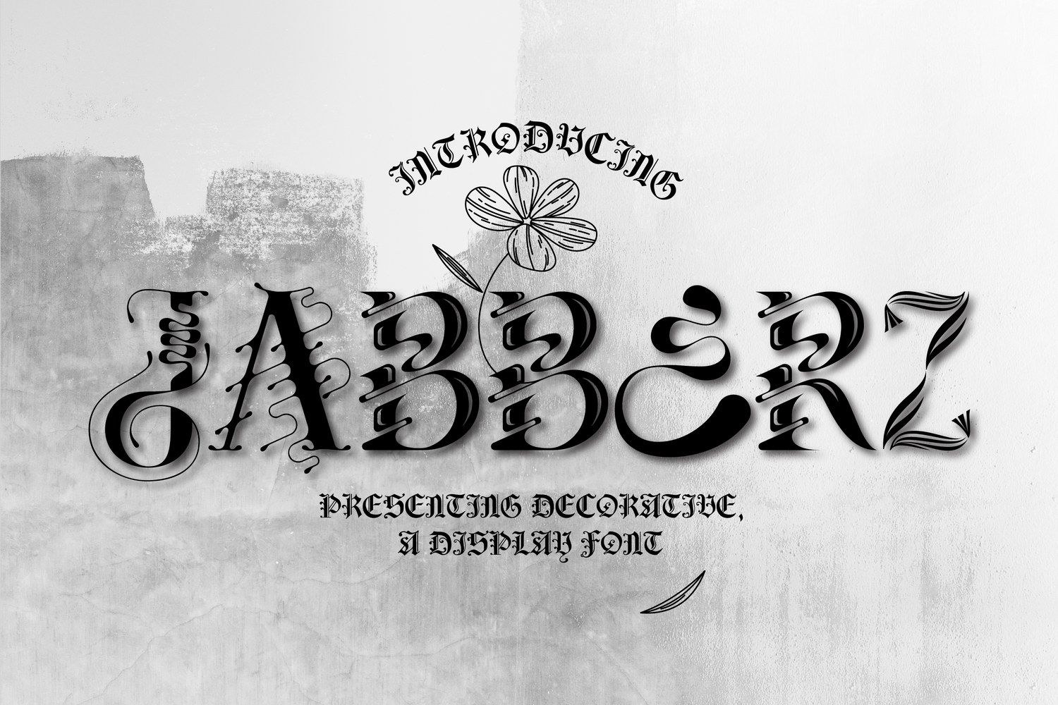
Jabberz Display leans into unusual letterforms that give it real presence on a poster or event flyer. It’s bolder and more decorative than the other geometric sans options here, closer to statement typography than a workhorse logo font, so use it where a headline needs to do the heavy lifting.
Best for: bold headlines, event posters, statement branding. By: 177Studio
Best Luxury & Ornamental Serif Art Deco Fonts
9. Fatima
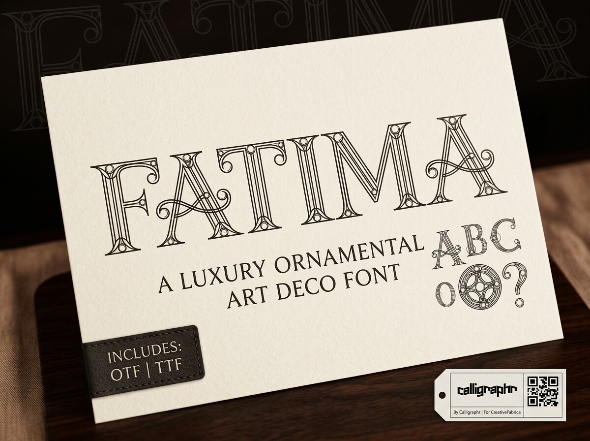
Fatima is an ornamental display font (Creative Fabrica files it as display, not serif) built on high-contrast strokes and circular motifs that echo the sunburst patterns of Roaring Twenties glamour. That circular detailing gives it a distinct silhouette, about as close as this list gets to genuine Gatsby-era jazz-age shine.
Best for: luxury hospitality branding, premium packaging, editorial covers. By: Raholco
10. Monsante
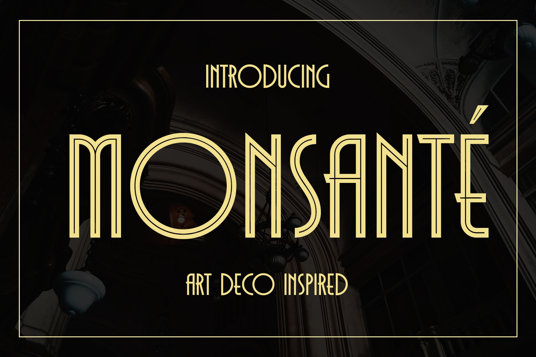
Monsante is one of the more historically grounded fonts on this list, directly inspired by 1920s typography with genuine geometric precision and a light modernist edge. It ships in Regular and Inline styles and is PUA-encoded, so ligatures and alternate glyphs are easy to reach through the glyphs panel.
Quick clarification since it shares a designer with Delauney later in this list: Monsante is the geometric serif-style display font built for logos and headlines, while Delauney is the all-caps sans serif meant for pairing.
Best for: logo and headline branding, film titles and awards, wedding invitations. By: Arterfak Project
11. The Oldentime
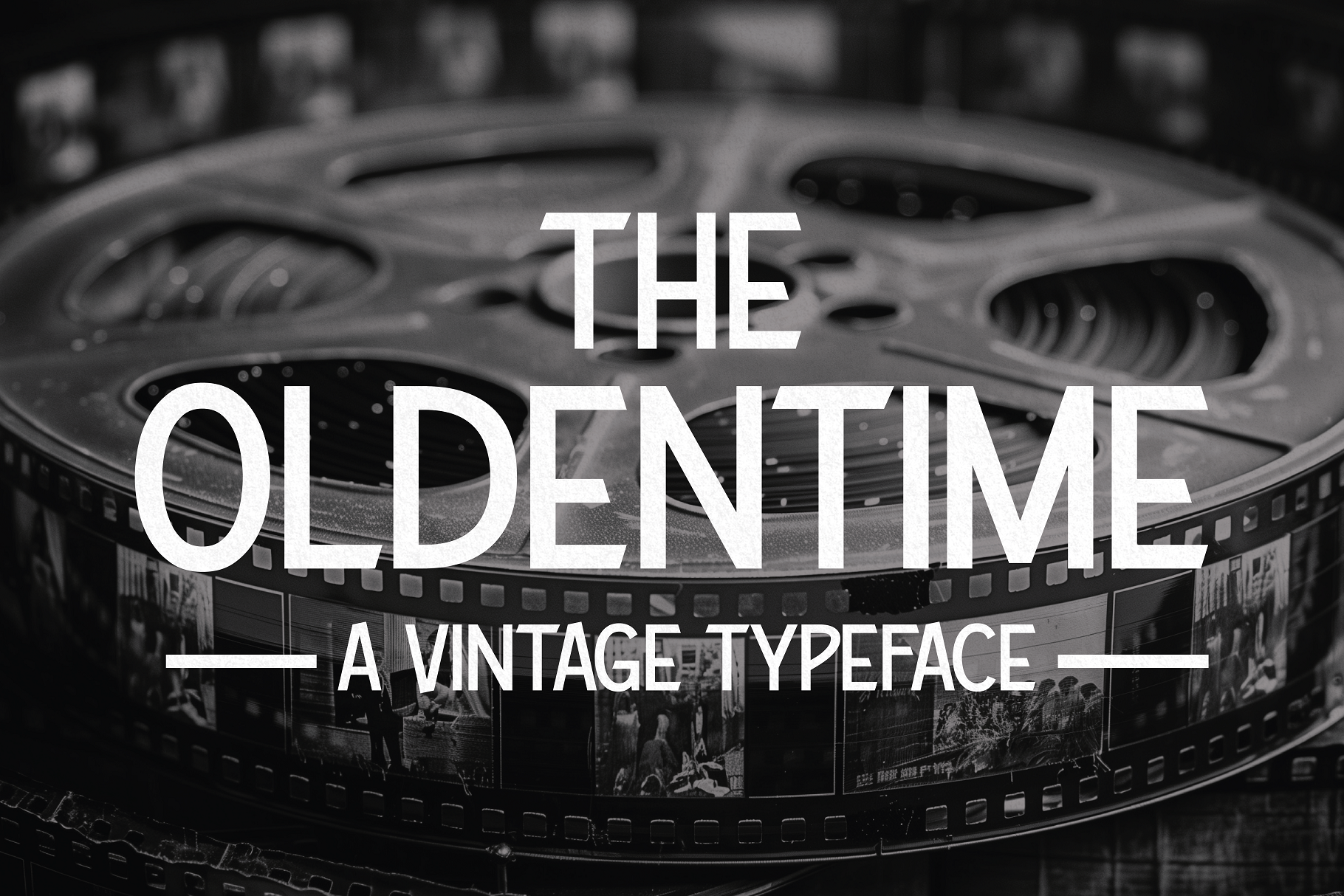
The Oldentime pulls its inspiration straight from 1920s Hollywood movie title cards. Creative Fabrica classifies it as a display font rather than a serif, and the letterforms lean into cinematic, larger-than-life presence rather than fine serif detailing, the kind of headline that belongs on a silent-film marquee.
Best for: film titles, cinematic branding, retro Hollywood themes. By: HipFonts
12. Luxe
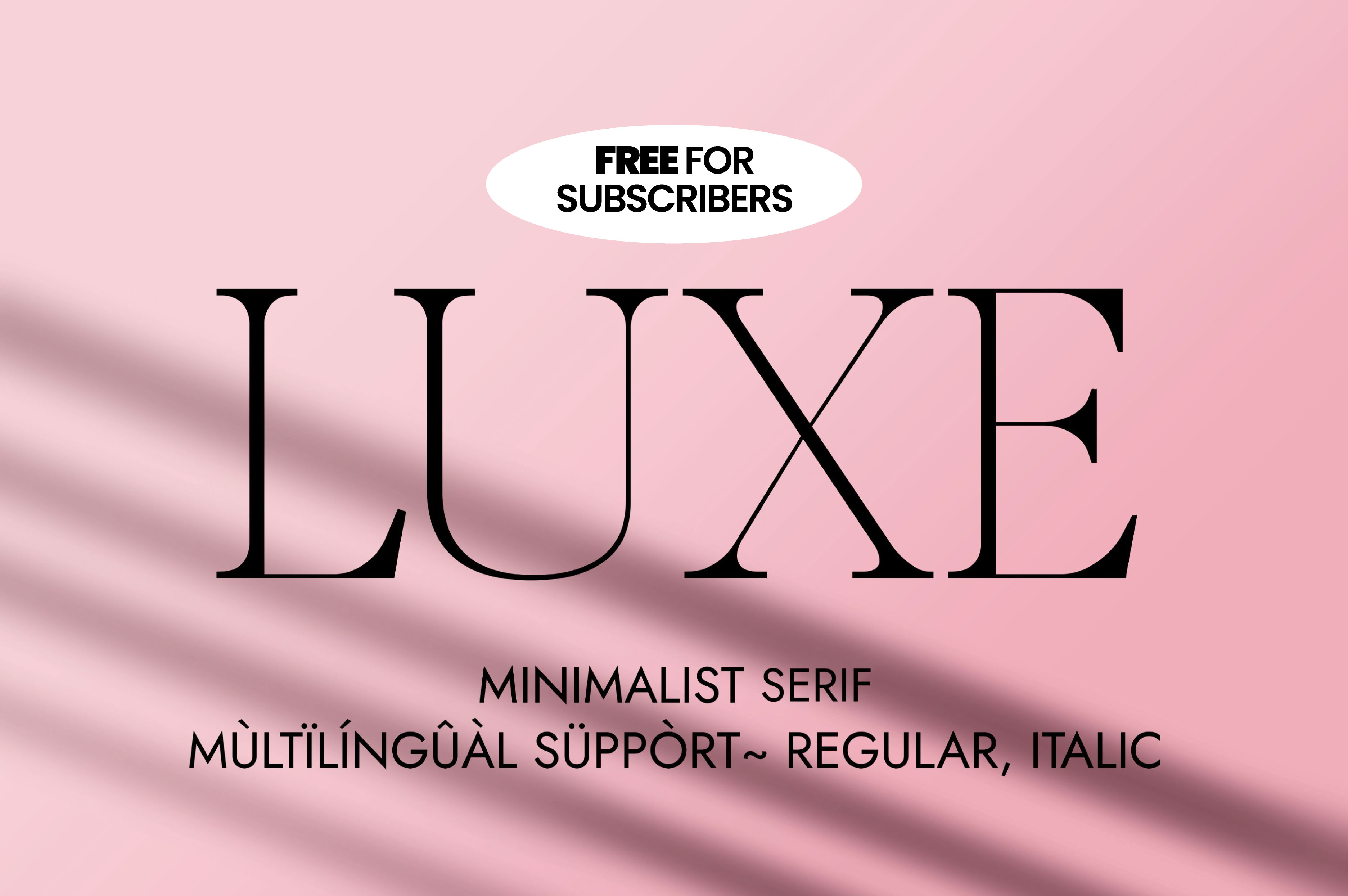
Luxe is an elegant, high-end serif with detailing that nods to the early twentieth century without spelling out “art deco” in its own copy. The refined proportions and substantial weight make it feel expensive on the page: ideal wherever the brief calls for understated wealth rather than loud glamour.
Best for: luxury branding, fashion labels, premium invitations. By: Minimalistartstudio
13. Giglio
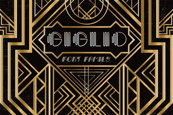
Giglio is filed by Creative Fabrica as a sans serif, and its own description never uses the phrase “art deco” either. What it does have is elegant, elongated proportions that echo the geometric confidence of the era, and it reads especially well set large, the way a magazine masthead would use it.
Best for: magazine covers, editorial headlines, fashion branding. By: Anastasiia Macaluso
14. Capires
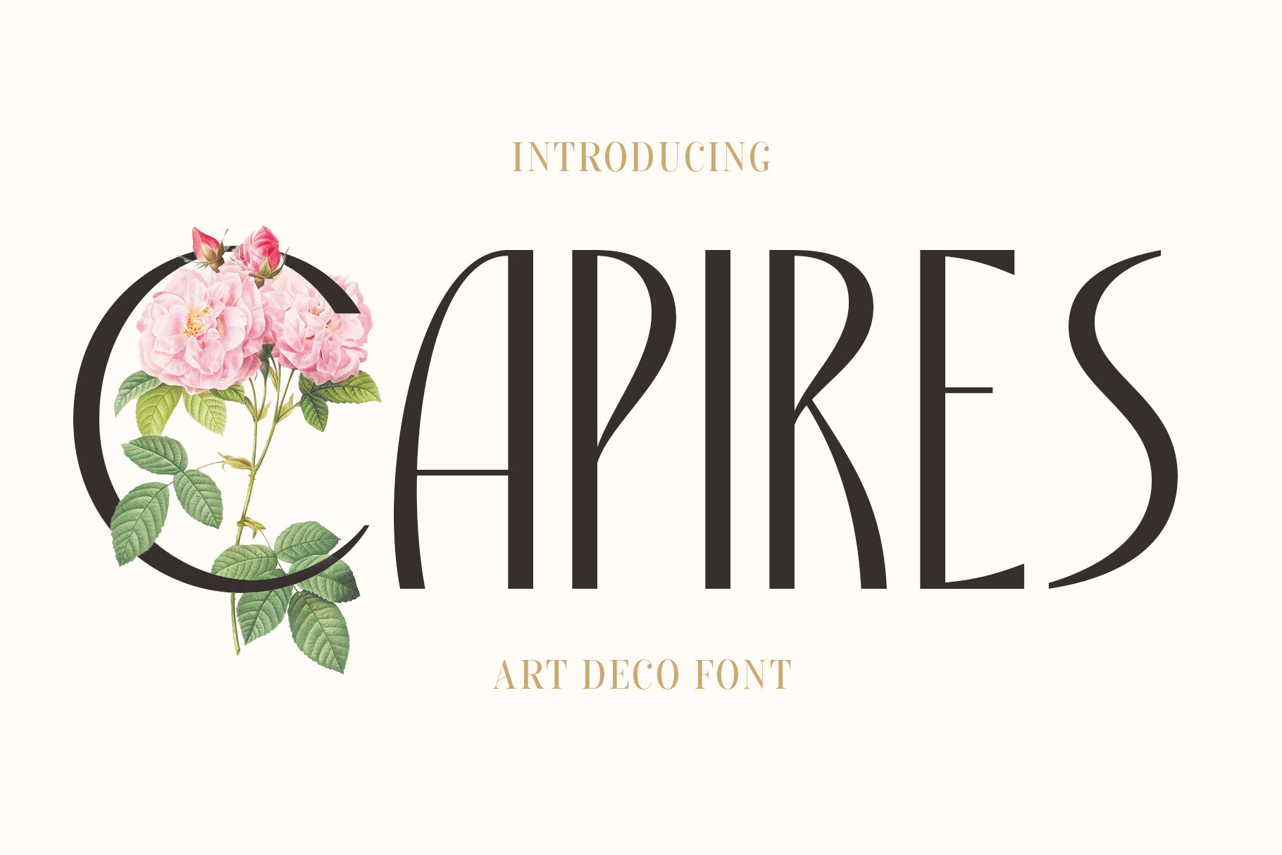
Capires blends two design languages, art deco geometric precision and the more organic, flowing ornament of art nouveau. The result is a display font with structure but also movement, a good fit anywhere you want ornamental richness without going fully rigid and architectural.
Best for: ornamental branding, art prints, boutique packaging. By: craftsupplyco
Best Script & Elegant Art Deco Font Pairings
15. Gatsby Prelude
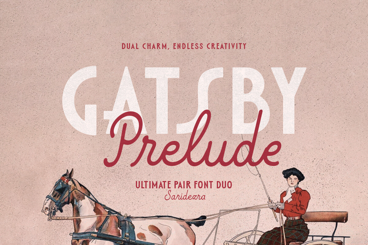
If you’re only bookmarking one entry from this list for a wedding project, make it Gatsby Prelude. It’s a duo, a tall art deco sans paired with a monospaced script, and Creative Fabrica’s own copy names both logotypes and wedding invitations as intended uses.
That built-in pairing saves you the guesswork of matching a display face to a script yourself, which is normally the hardest part of an art deco wedding font.
Best for: wedding invitations, logotypes, Gatsby-themed events. By: saridezra
16. Burgundy
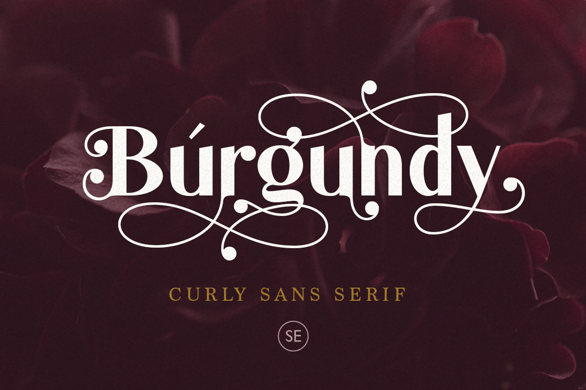
Burgundy is an elegant, vintage-luxury deco script font, complete with the kind of flourishes formal stationery calls for. It doesn’t market itself with the words “art deco” directly, but the flared serifs and sweeping swashes place it firmly in that adjacent luxury category. It pairs naturally with a plainer geometric sans for the supporting details on an invitation suite.
Best for: formal invitations, save-the-dates, luxury stationery. By: saridezra
17. Delauney
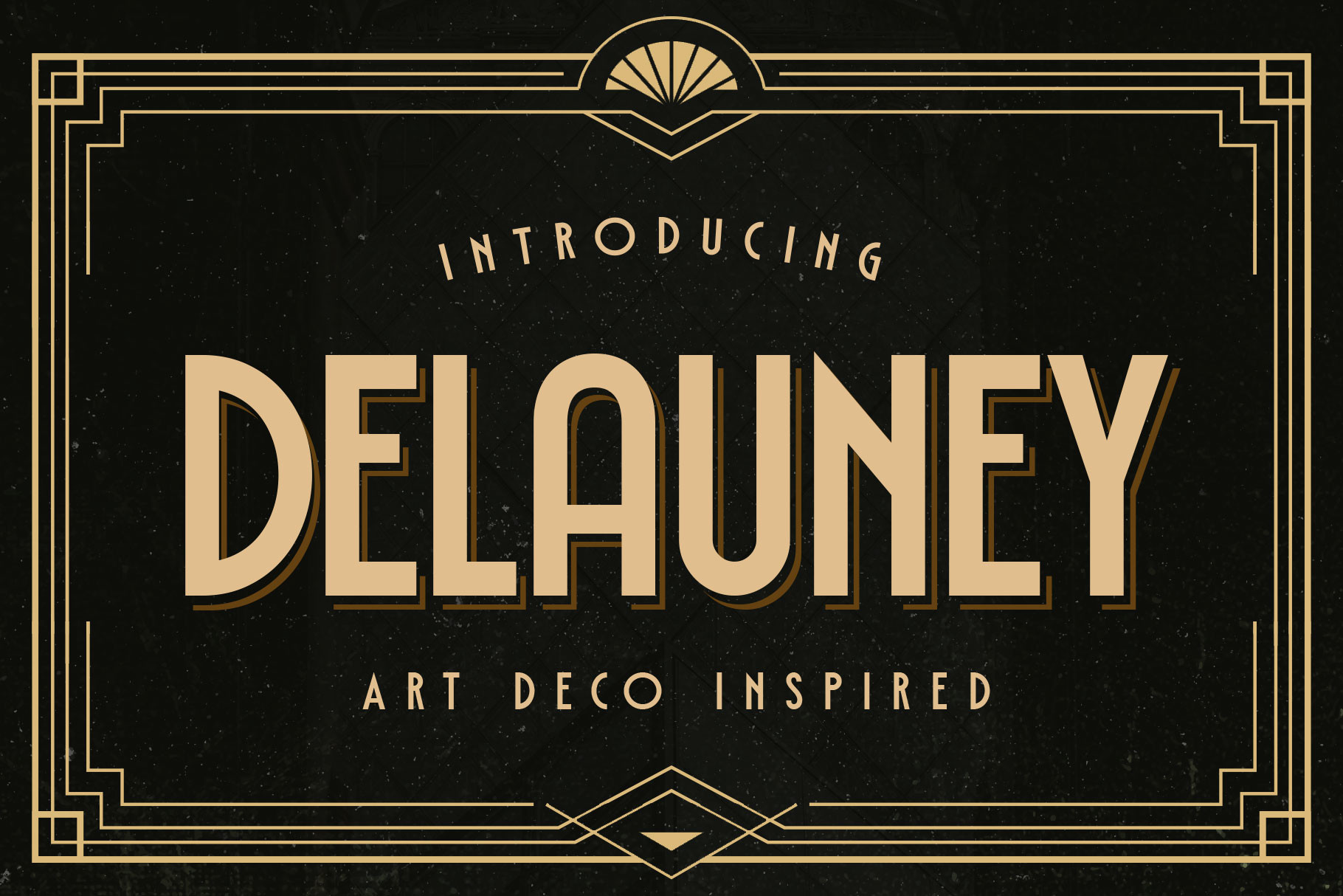
Delauney is an elegant sans serif inspired directly by 1920s Art Deco, and it’s caps-only with no lowercase set. That makes it a headline and branding-mark font, not something to set body copy or long invitation text in.
As noted above under Monsante, the two fonts share a designer but play different roles: Monsante carries the display headline work, Delauney handles the clean, all-caps pairing text.
Best for: elegant branding marks, editorial layouts, invitation pairing. By: Arterfak Project
Best Decorative & Display Art Deco Lettering
18. Strip Deco
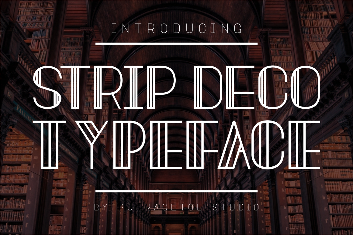
Strip Deco is built from strict, clean geometric lines that keep it firmly in classic art deco territory. There’s very little ornament here, just assured structure, the kind of reliable choice that commands attention without competing with other elements.
Best for: posters, signage, bold headline typography. By: putracetol
19. Lettering Deco
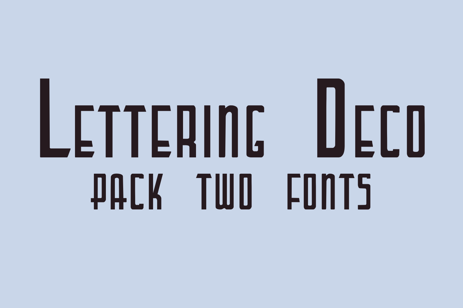
Lettering Deco closes out the list as a genuinely classic piece of art deco lettering, available in both a flat regular version and a dimensional shadow version. The shadow variant is especially useful for signage, the kind of font that looks right stenciled on a storefront window.
Best for: signage, badges, decorative headline treatments. By: Intellecta Design
How to Use Art Deco Fonts in Your Projects
Here’s the safest pairing rule I keep coming back to: pick one expressive art deco display font for headlines, then pair it with a clean, neutral sans or serif for body text. Never stack two decorative deco fonts against each other. They’ll fight for attention. And if you do want two display faces together, match geometric to geometric rather than pairing a rigid deco face with something humanist or organic.
Watch the character set. Several fonts on this list, including Delauney, are caps-only, following the same convention as Cassandre’s 1928 Bifur, widely credited as the first true art deco typeface. Check the glyph set in Creative Fabrica’s preview before you buy if your project needs lowercase or long-form text.
For color, stick close to the period’s machine-age materials: black and gold as the anchor pair, ivory or cream as neutral space, jewel tones like emerald, sapphire, and ruby as accents, and metallics like chrome or brass for extra shine. A rough 60/30/10 split (dominant neutral, secondary jewel tone, small accent pop) keeps a vintage luxury font palette looking intentional rather than costume-y.
Match the font to the job. Wedding invitations want a script-and-ornamental pairing: think Gatsby Prelude with Fatima or Burgundy. Logos lean toward a geometric sans or monogram font like Art Deco Monogram or Decola. Posters and signage are where bolder decorative lettering (Strip Deco or Lettering Deco) gets to shine.
Software-wise, Canva, Illustrator, and Photoshop all handle these fonts fine. But if one advertises ligatures or PUA-encoded glyphs, like Dekart or Monsante, open it as OTF rather than TTF so those OpenType features render correctly.
Tips for Choosing the Right Art Deco Font
Picked a favorite already? Before you download anything, run through these four checks.
Check the license before you design anything. Fonts are licensed, not owned outright. A license grants specific permitted uses. Personal use covers non-monetized projects and evaluation, while commercial use covers anything tied to income, including logos and branding. Most Creative Fabrica fonts include a commercial license on purchase, but always confirm the exact terms on the product page rather than assuming an art deco font free download covers business use.
Confirm software compatibility. Canva, Illustrator, Cricut Design Space, and Silhouette Studio all accept standard OTF and TTF files, so compatibility is rarely the blocker. What matters more is whether decorative details survive at your working size. Test at the actual dimensions you’ll print or display before committing.
Verify the character set matches your project. A caps-only art deco display font is perfect for a logo mark and useless for a paragraph of invitation copy. Preview the full glyph set before you buy.
Choose by project type, not just looks. A monogram font like Art Deco Monogram solves a logo problem a script duo like Gatsby Prelude never will, and vice versa for a wedding suite. Start from the use case, then narrow the style.
Where to Download Art Deco Fonts
Once you know which font (or three) you want, here’s where to actually get them. Every font in this roundup comes from Creative Fabrica, the most reliable source for a genuine geometric deco font with a clear commercial license attached. Browsing by category there also surfaces alternate weights and companion fonts from the same designers.
If you want a free starting point before committing to a paid license, Google Fonts has a handful of geometric and deco-adjacent typefaces worth testing in a rough layout, though the selection is thinner and less period-accurate than a dedicated art deco library.
Beyond those two, general type marketplaces occasionally carry deco revivals, but treat them as a secondary stop. License terms and font quality vary far more than on a curated platform. For more curated roundups like this one, browse the FontPro blog.