· fonts · 13 min read
19 Best Retro 70s Fonts in 2026
Find the best retro 70s fonts for posters, album covers, shirts and branding: groovy display letters, soft chunky serifs, psychedelic type and disco scripts.
The best retro 70s fonts come in more flavors than just “groovy.” There are puffy melting display letters, soft magazine serifs, flower-power psychedelic type and smooth disco scripts. Here are 19 of them from Creative Fabrica, grouped by which 70s you are after.
What Makes a Font Look Like the 70s?
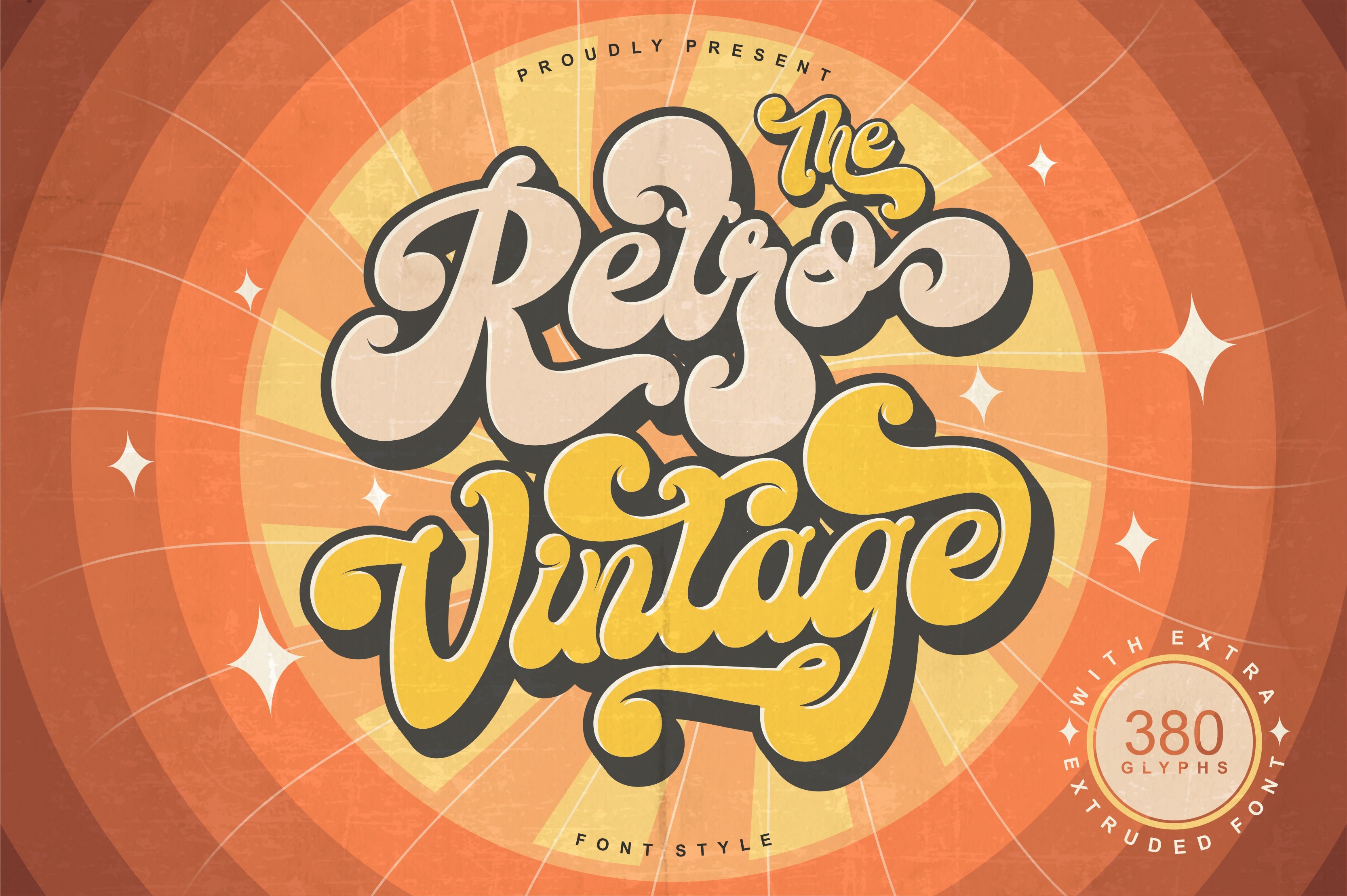
The 70s keep showing up in design, and they are not always subtle. They show up in mustard orange, avocado green, warm browns, and letterforms that feel soft, confident, and a little playful. If you want the best retro 70s fonts, you are not chasing one look. You are choosing a mood.
I look for rounded, heavy shapes first. The curves should feel exaggerated, and the tracking should be tight enough that the letters almost lean into each other. Many 70s serif fonts borrow from the warm, bulbous style of ITC Souvenir, a rounded serif that was widely used in magazines, book covers, and advertisements. Other 70s fonts lean into disco geometry, like the bold, thick strokes of Blippo, or the hand-drawn, wavy lettering that appeared on rock concert posters.
The names that keep coming up are ITC Souvenir, Cooper Black-style type, and Blippo. They shaped the friendly, bold, and slightly surreal look of the decade. If you want a deeper look at vintage fonts for branding, see our guide to best vintage retro fonts for branding and design.
A groovy font is a display typeface with soft, curvy, or melting forms. I use it for headlines, logos, and merch, not for long paragraphs. That is why the list below is grouped by mood, so you can match the right 70s fonts to your project.
Groovy 70s Display Fonts
These are the loudest, roundest, and easiest to recognize. Think puffy curves, melting edges, and letterforms that want to be printed big on a poster, a tee, or a sticker. I reach for these fonts when a project needs instant 70s energy. If you want more bold display options, browse our best bold display fonts.
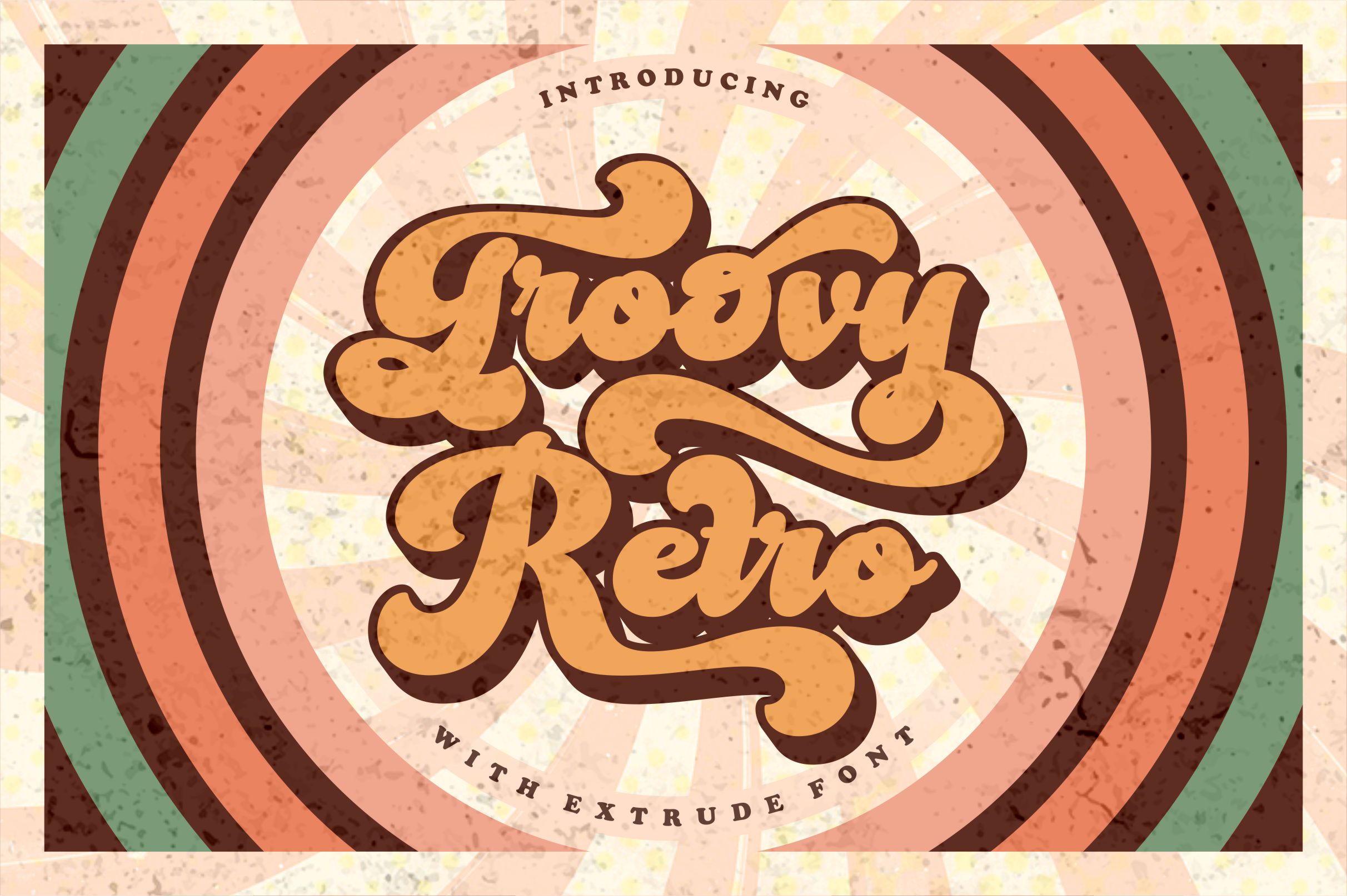
1. Groovy Retro
I like Groovy Retro for quick retro projects. It has a playfully nostalgic feel and a vintage retro aesthetic that does not need much help. A simple slogan starts to look like it came from a thrift store rack, a summer festival, or a retro social post.
Best for: retro tees, sticker packs, throwback social posts. By: Tedha Studio
2. Groovy Melt
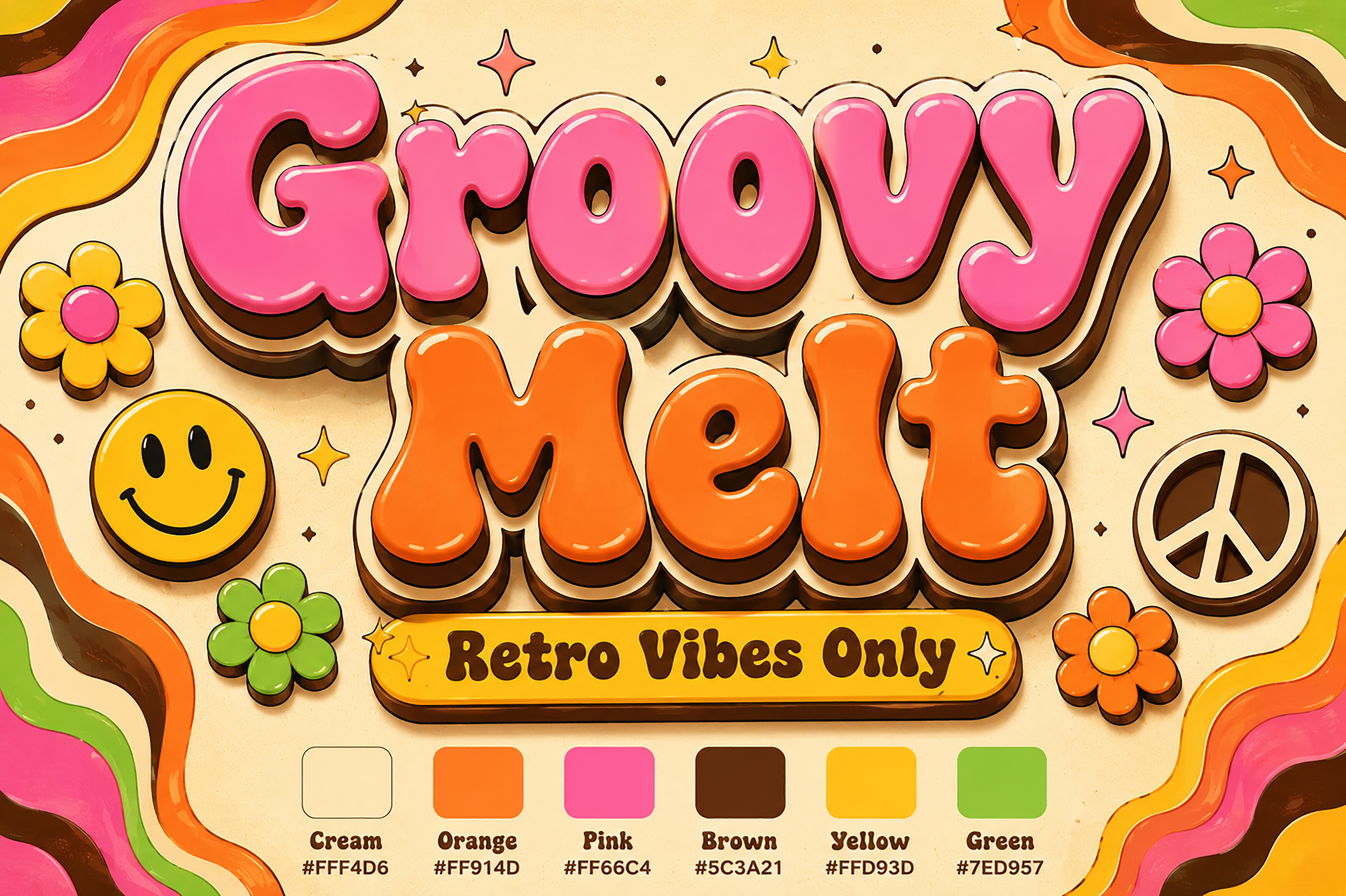
Groovy Melt is premium display type with a strong 1970s nostalgia. The volumetric script letterforms feel thick and dimensional, so the headline can carry the whole design. I would use it when I want a soft, melted quality that still feels confident.
Best for: headline art, psychedelic posters, candle and beauty labels. By: Bundle
3. Bobogie Groovy
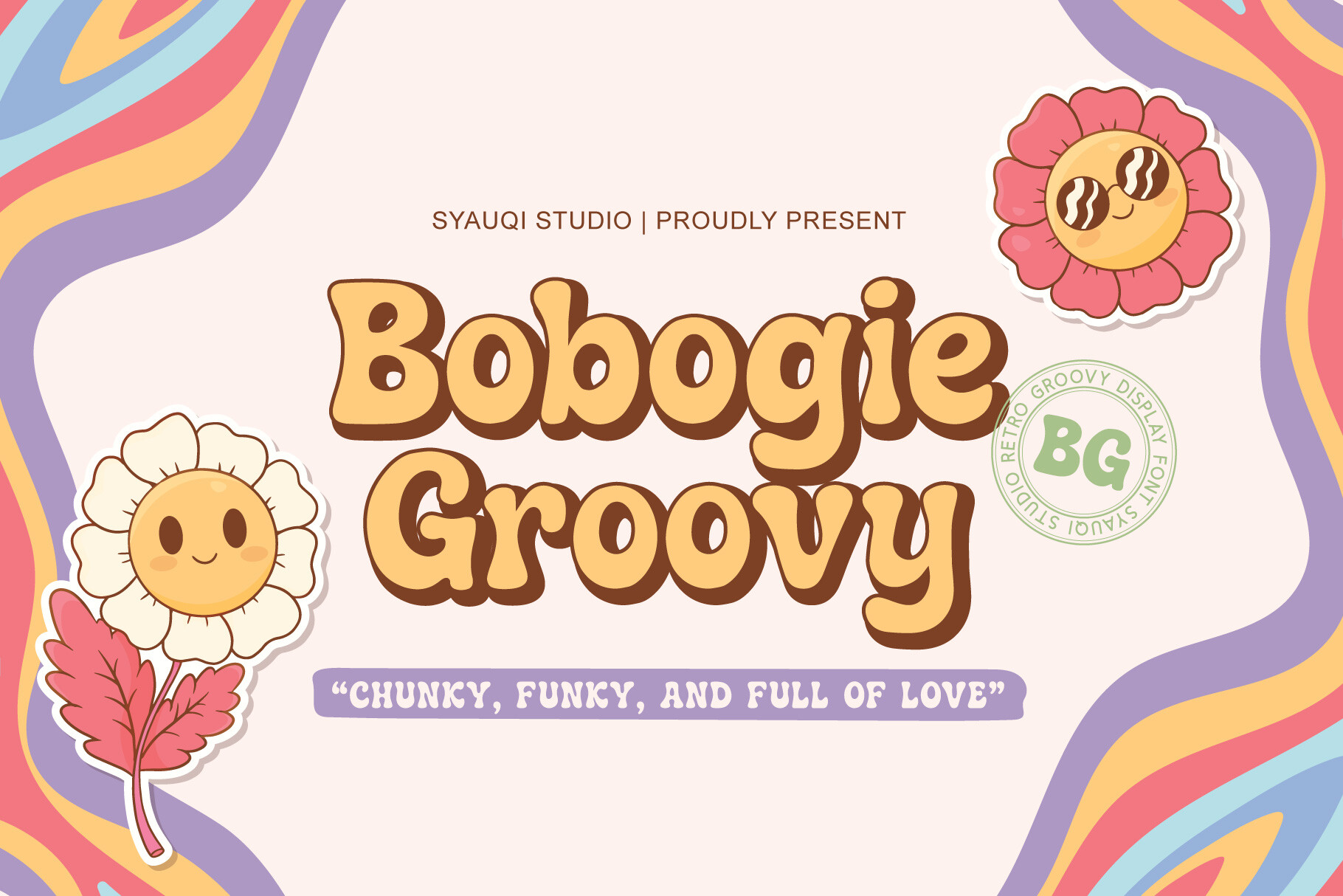
Bobogie Groovy is a bold retro display font inspired by the golden age of the 60s and 70s. It has a funky, high-energy feel that works well when the design needs to feel alive. The letterforms are playful enough for colorful branding, but strong enough for music event posters and packaging.
Best for: colorful branding, music event posters, funky packaging. By: Syauqi Studio
4. Retro Groovy Bundle
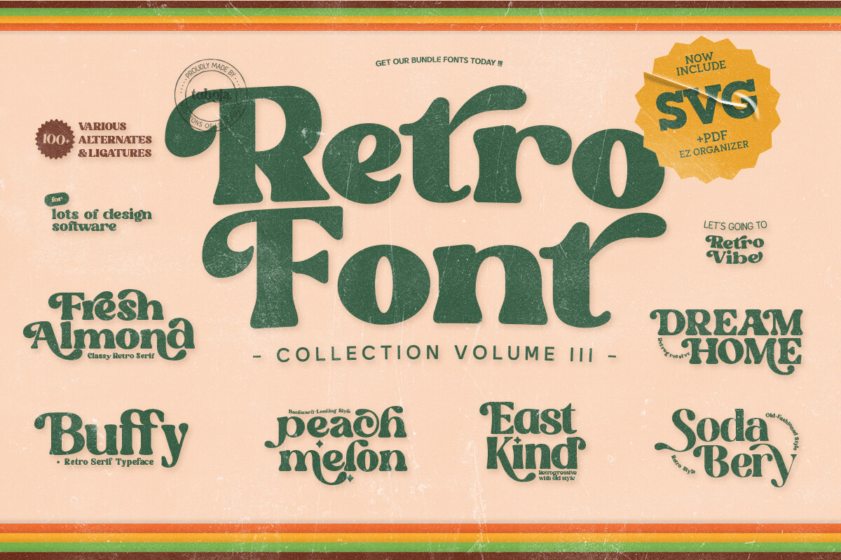
This is a collection of seven funky, playful, bold display fonts inspired by the 60s and 70s. Each one has handcrafted curves, which makes the bundle feel more finished than a random set of downloads. It is a practical retro font bundle for a full brand kit or a multi-design merch line.
Best for: building a full retro brand kit, multi-design merch lines. By: Taboja Studio
5. 70s Vibes
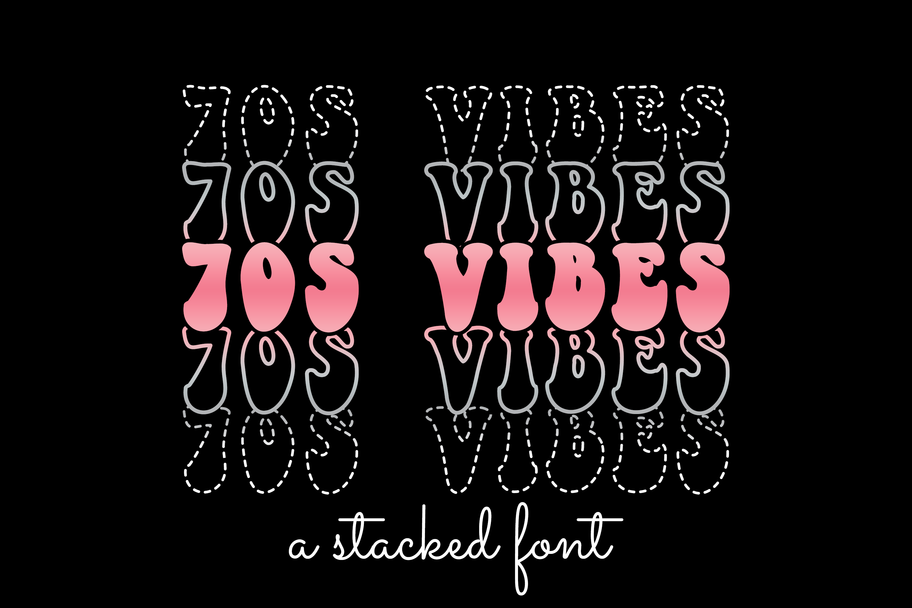
70s Vibes is a cool font with a bold touch. The designer suggests it for custom designs and DIY crafts, and I can see why. The vibe is straightforward and energetic, so it fits shirt slogans, stickers, and small craft projects without trying too hard.
Best for: DIY crafts, bold shirt slogans, custom stickers. By: WADLEN
6. Groovy Disco
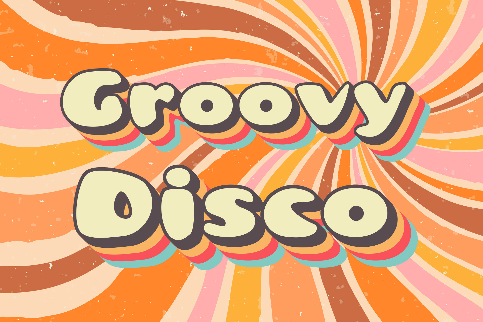
Groovy Disco is a display font with retro vibes, and it leans into the party side of the decade. I would use it for disco night posters, playlist covers, and party banners where the type needs to feel fun and immediate. The style is less about fine detail and more about quick visual impact.
Best for: disco night posters, retro playlist covers, party banners. By: Vladimir Carrer
Soft Serif & Chunky 70s Fonts
This group brings the magazine, book cover, and vintage ad side of the decade. The letters have the warm, rounded, bulbous feel of ITC Souvenir and Cooper Black-style type, but they leave more room for longer headlines and editorial layouts. I like these 70s serif fonts when I want nostalgia that still reads cleanly.
7. Sugar Peachy
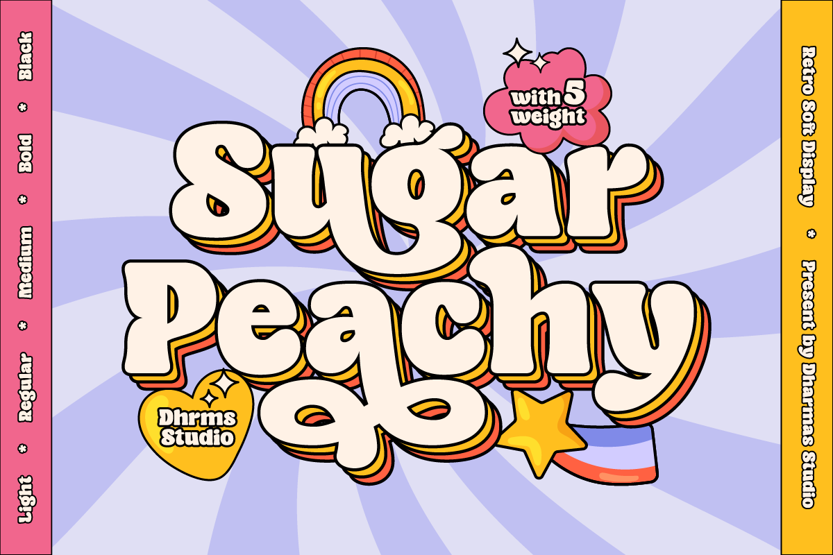
Sugar Peachy is a groovy display font with a retro 70s style and soft, chewy characteristics. The designer suggests it for display, titling, logos, and headers. The mood is friendly and a little sweet, so it works well for bakery branding, cosmetics, and small business logos.
Best for: logos, headers, bakery and cosmetics branding. By: Dharmas Studio
8. Milgraph
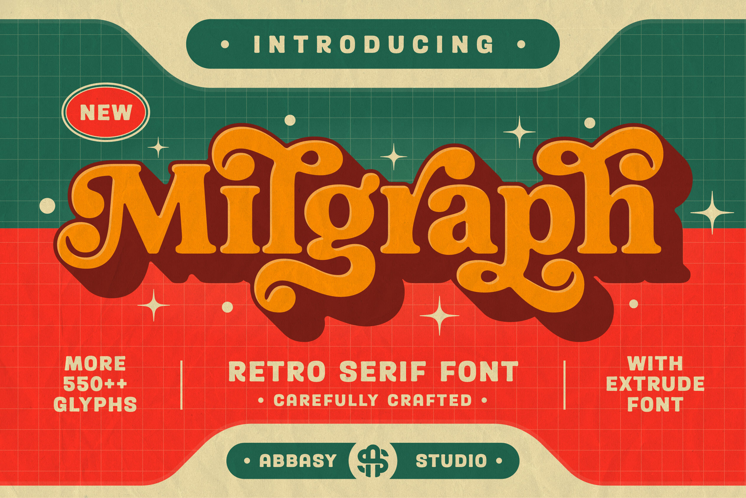
Milgraph is a bold, classic retro display serif with a 70s feel. It has the weight of a vintage magazine headline, so it feels established and confident on the page. I would use it for book covers, magazine headlines, and vintage ads.
Best for: book covers, magazine headlines, vintage ads. By: abbasystudio
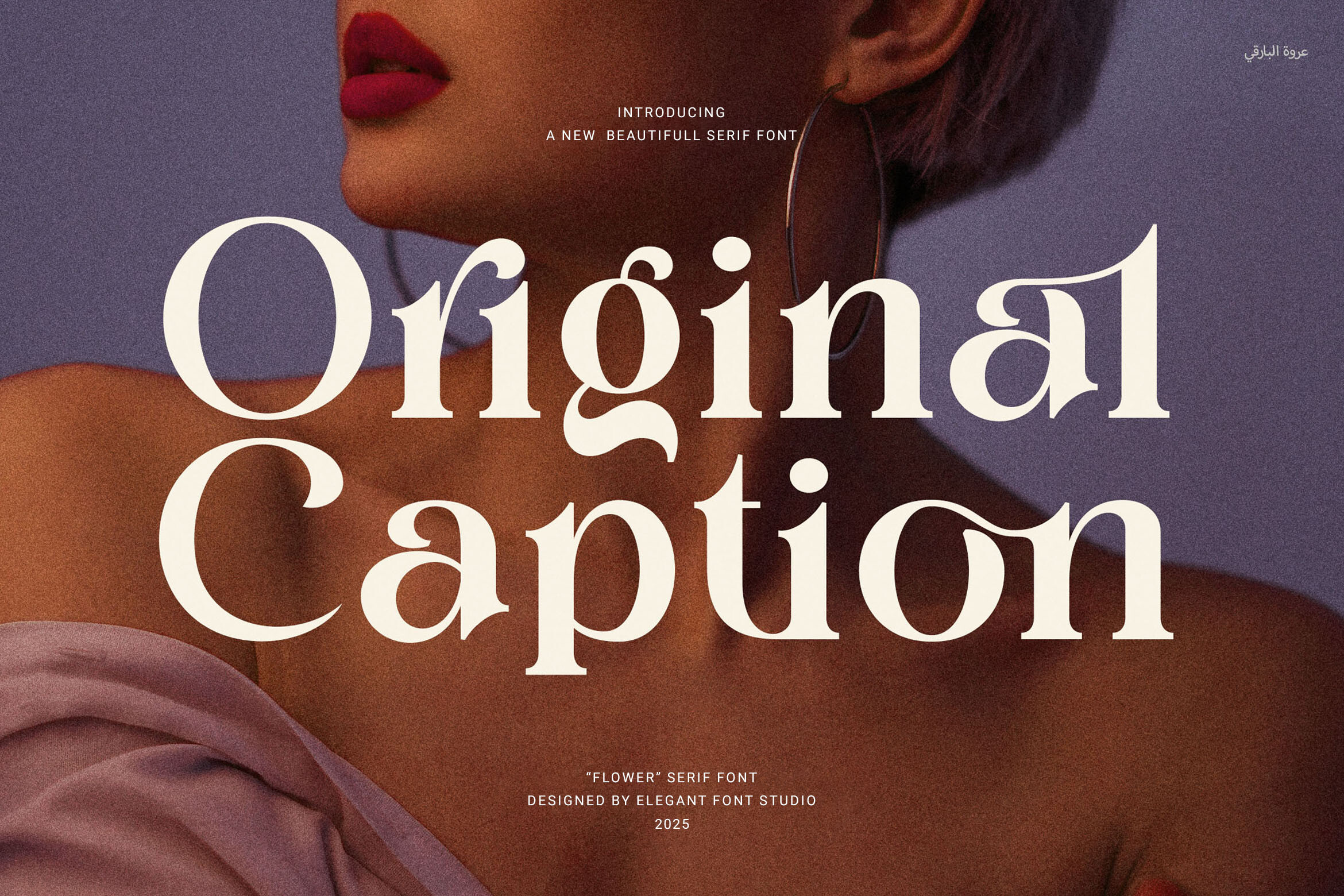
9. Qestero
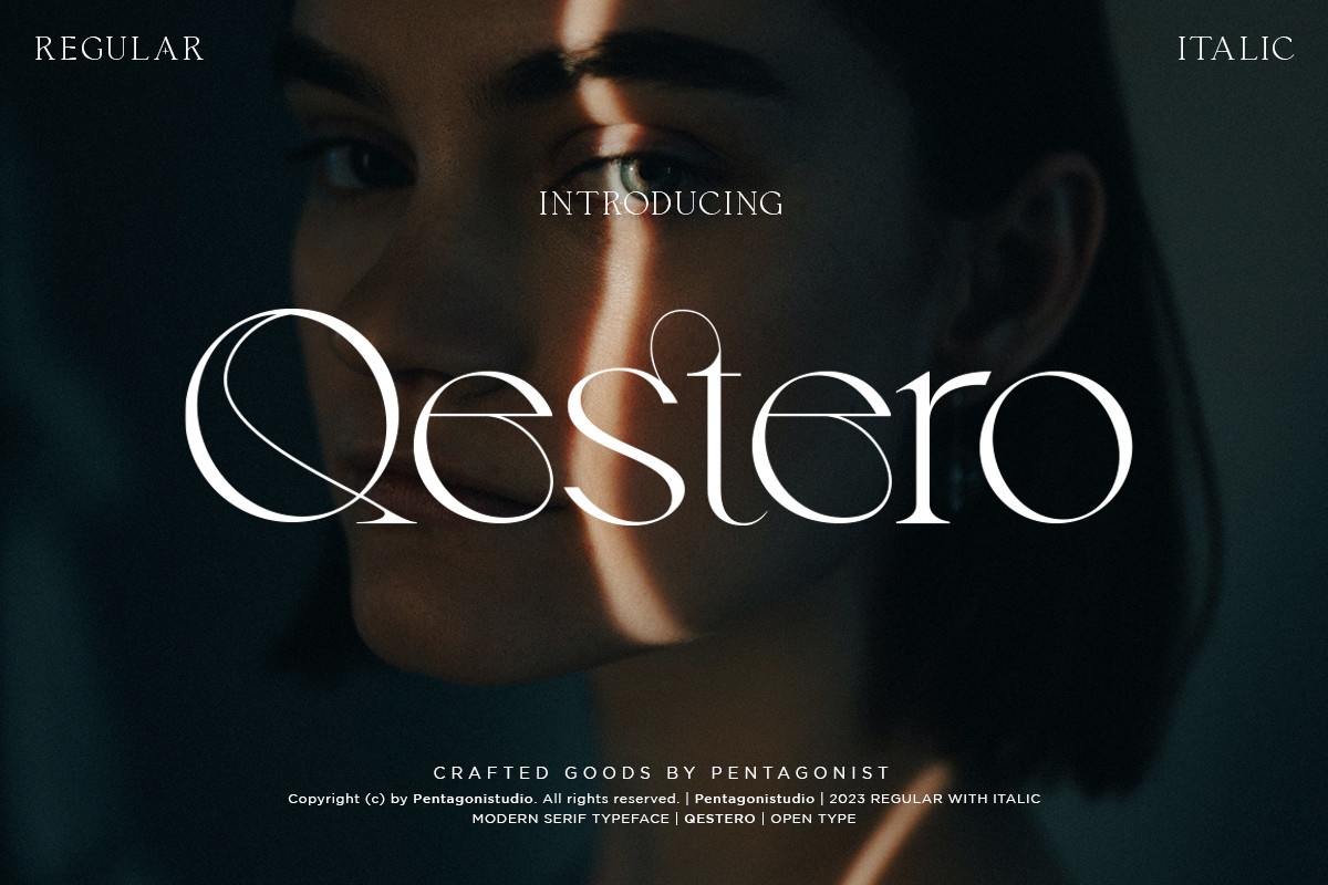
Qestero is a stylish, luxurious serif with a 70s bold styling and a sense of sophistication. It sits between retro and upscale, which makes it useful for boutique branding, beauty packaging, and editorial titles that need a polished feel. I would pick it when I want 70s fonts that still feel premium rather than purely playful.
Best for: boutique branding, beauty packaging, editorial titles. By: Pentagonistudio
10. Amderais
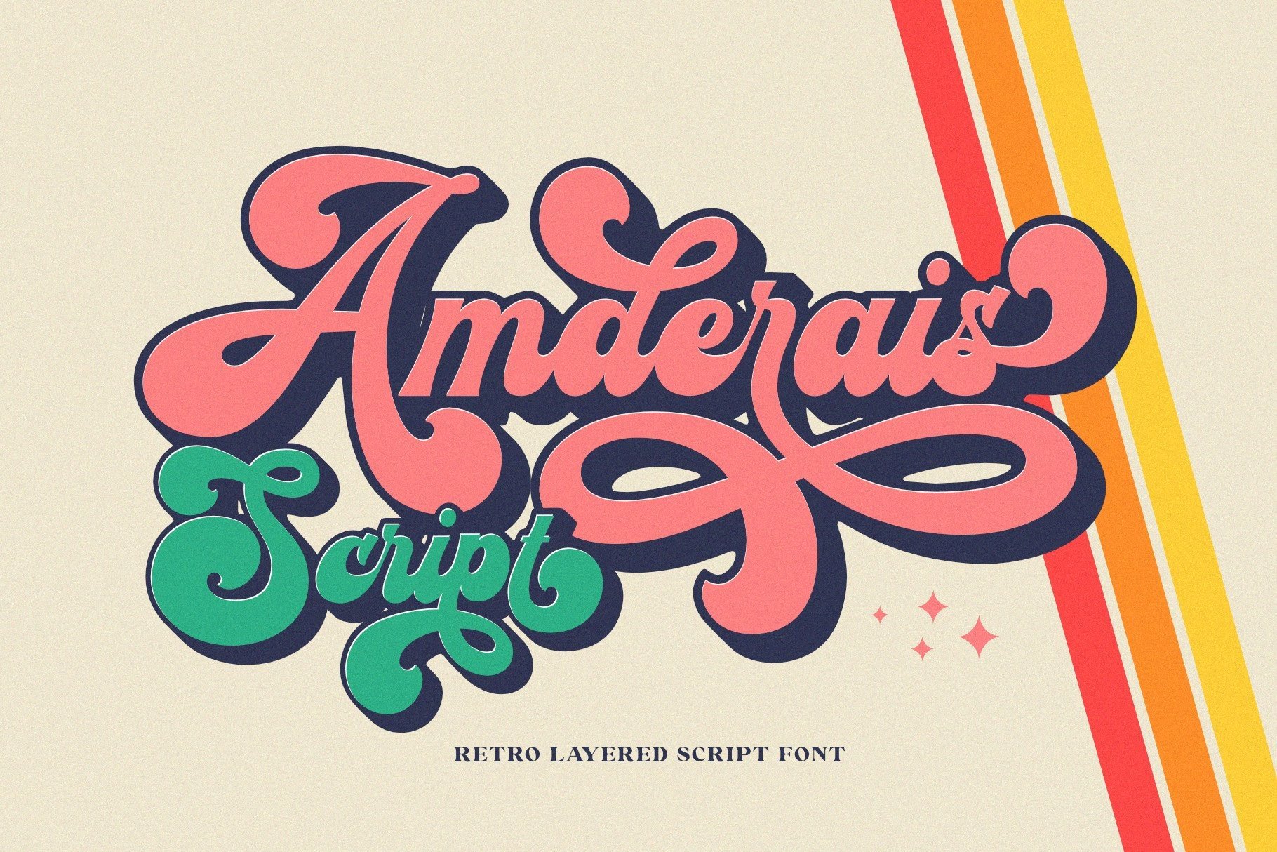
Amderais is a display font inspired by retro typographic designs of the late 60s to 70s. It has a nostalgic, commercial feel that works well on retro product labels, record store signs, and posters. The style is straightforward, so it can fit into branding without overwhelming the layout.
Best for: retro product labels, record store signs, posters. By: Sealoung
11. Souvenir
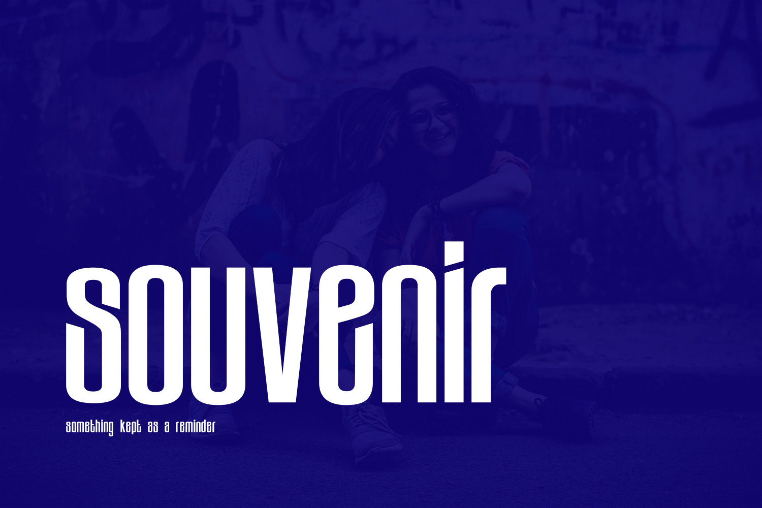
Souvenir is a modern, authentic display font. The designer suggests it for web designs, business cards, and projects that need a minimal, trendy touch. It captures the friendly, rounded spirit of classic 70s serif type while staying clean enough for digital use. I would use it for web headers, business cards, and minimal retro branding.
Best for: web headers, business cards, minimal retro branding. By: BeeType
Psychedelic 70s Fonts
This is where flowers, swirls, waves, and bright color take over. Psychedelic 70s fonts are the natural choice for concerts, festivals, album covers, and merch that needs a flower power vibe or hippie fonts. Use them large, give them room to breathe, and pair them with bold palettes.
12. Psychedelic Bubble Two

Psychedelic Bubble Two is a retro, hippie sans serif inspired by 60s and 70s counterculture. It has bold lines and playful curves, and the style feels like a festival poster that has been through a few decades of love. It is a good match for hippie-style posters, festival merch, and playful logos that need a warm, communal vibe.
Best for: hippie-style posters, festival merch, playful logos. By: deardarlingdesignstudio
Download Psychedelic Bubble Two
13. Morgan Flower
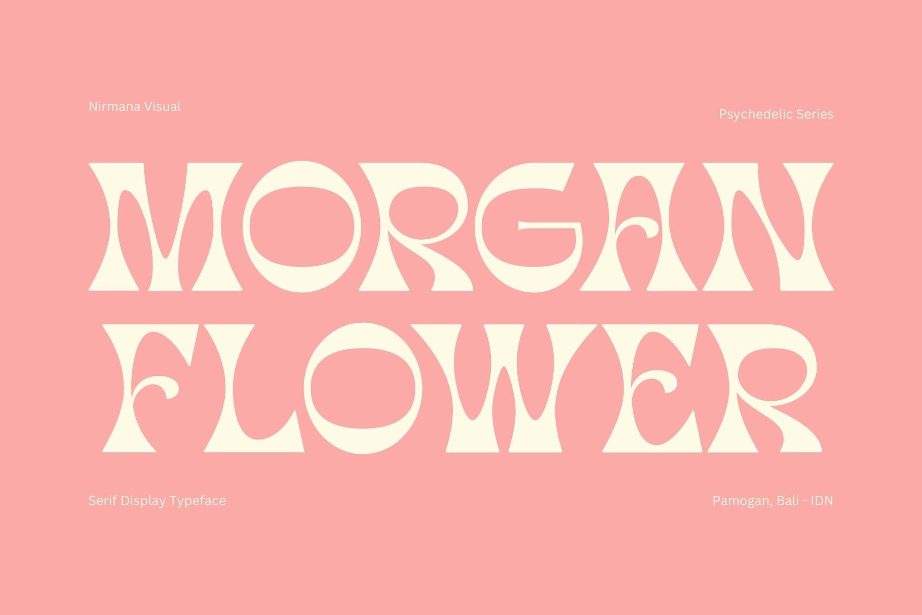
Morgan Flower is a retro psychedelic display font with bold groovy letters featuring swirls, flowers, and other psychedelic elements. It is built to be decorative, so I would let the lettering become part of the illustration. It works well on flower power posters, boutique signs, and album art.
Best for: flower power posters, boutique signs, album art. By: Sigit Dwipa
14. Lemon Funky
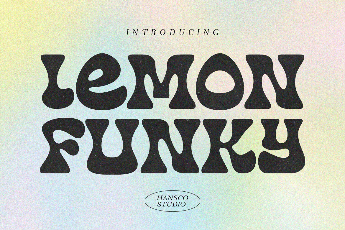
Lemon Funky is a retro psychedelic font with a rounded touch and complete characters for multilingual support. That makes it useful when a project needs more than basic Latin letters. The rounded feel keeps it friendly, while the psychedelic styling gives it a strong 70s identity. I would use it for multilingual retro branding, drink labels, and posters.
Best for: multilingual retro branding, drink labels, posters. By: HansCo
15. Makeba
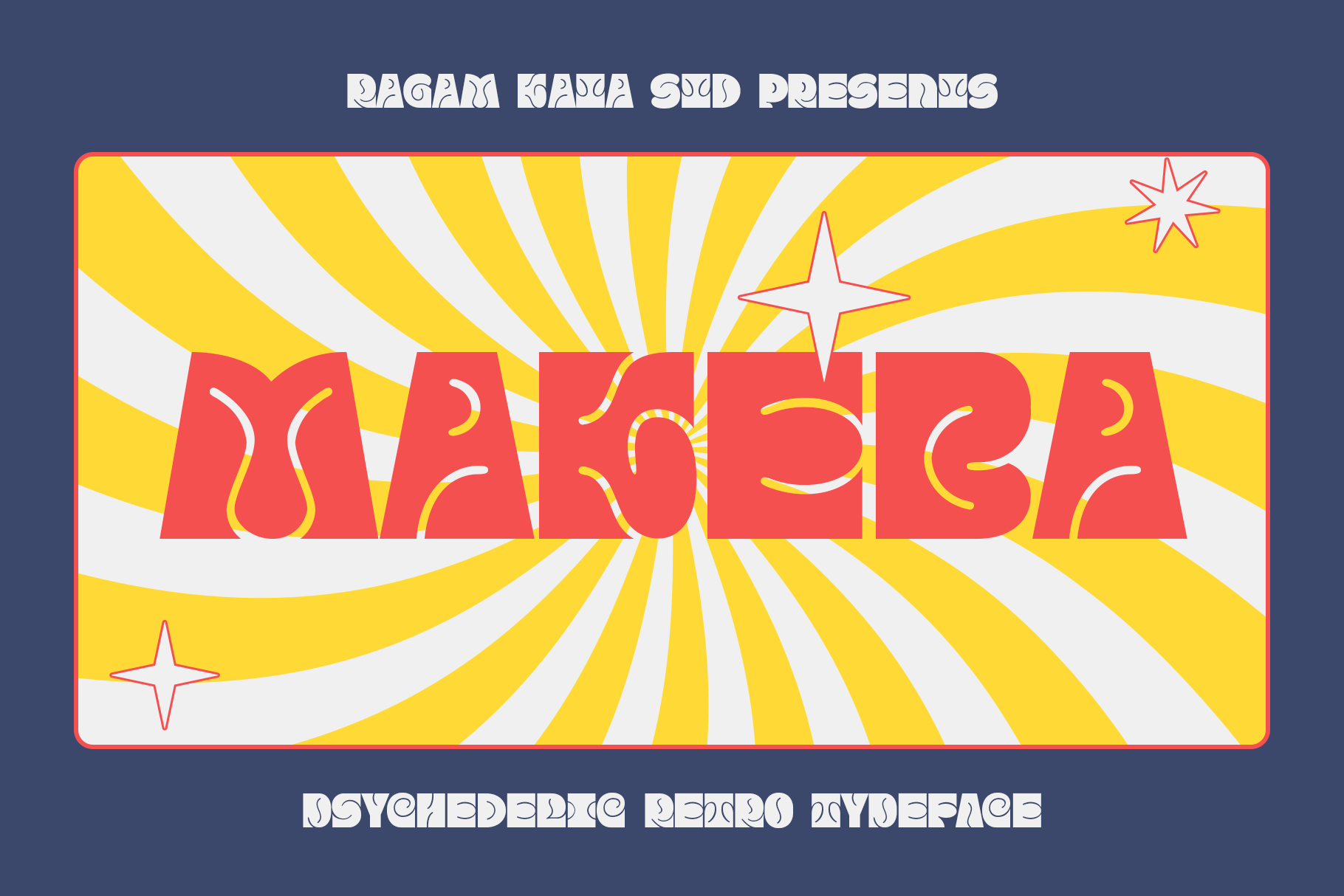
Makeba is a powerful yet funky psychedelic style typeface. It has a strong presence on the page, so it works well for concert posters, music merch, and bold headlines that need to feel energetic and a little rebellious.
Best for: concert posters, music merch, bold headlines. By: RagamKata Studio
16. Peculiar People
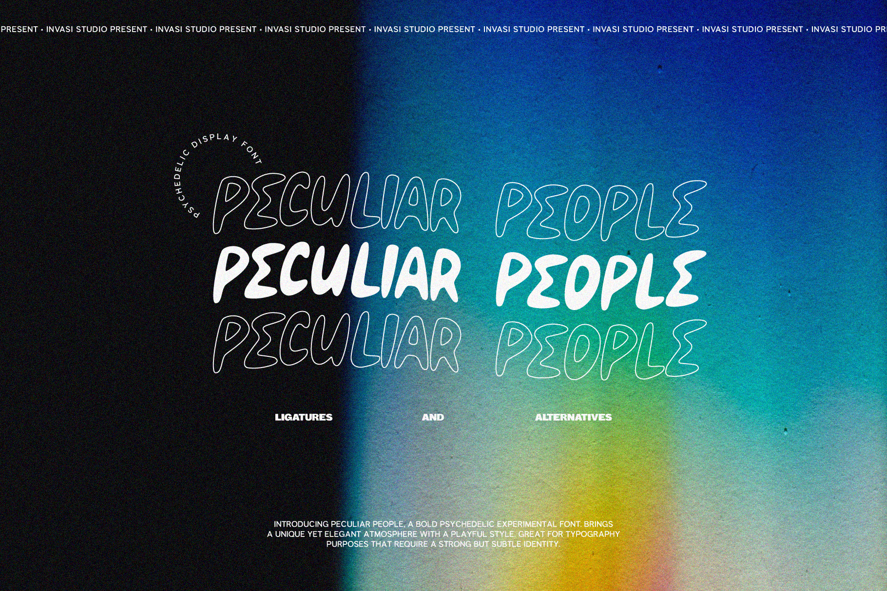
Peculiar People is a psychedelic hand-drawn display font. It has a loose, expressive quality that feels more personal than polished. I would use it for band posters, zine covers, and weird and wonderful merch where the type can feel a little off-kilter.
Best for: band posters, zine covers, weird and wonderful merch. By: invasistudio
Disco & Script 70s Fonts
Disco and script 70s fonts are about movement, glow, and late-night energy. They fit disco parties, retro weddings, cocktail menus, and event branding that needs a smooth, flowing feel. These disco fonts work best when the lettering can stretch, curve, and connect. They are also a good match for neon palettes and reflective backgrounds.
17. Moonlight
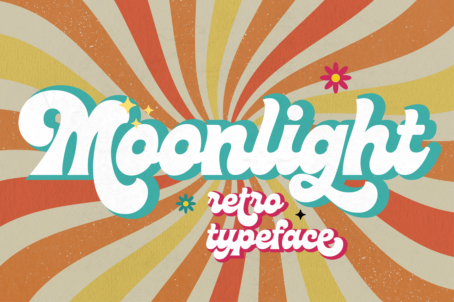
Moonlight is a script font inspired by the groovy disco era of the 1970s. It has smooth, flowing connections between letters, and the mood is elegant but party-ready. I would use it for disco party invites, retro wedding signage, and cocktail menus.
Best for: disco party invites, retro wedding signage, cocktail menus. By: HipFonts
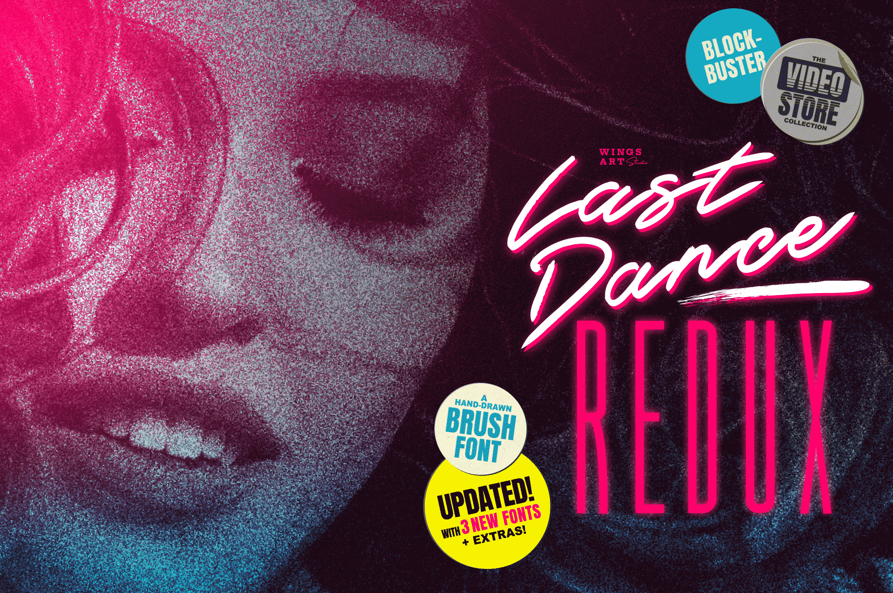
18. Disco Rendezvous
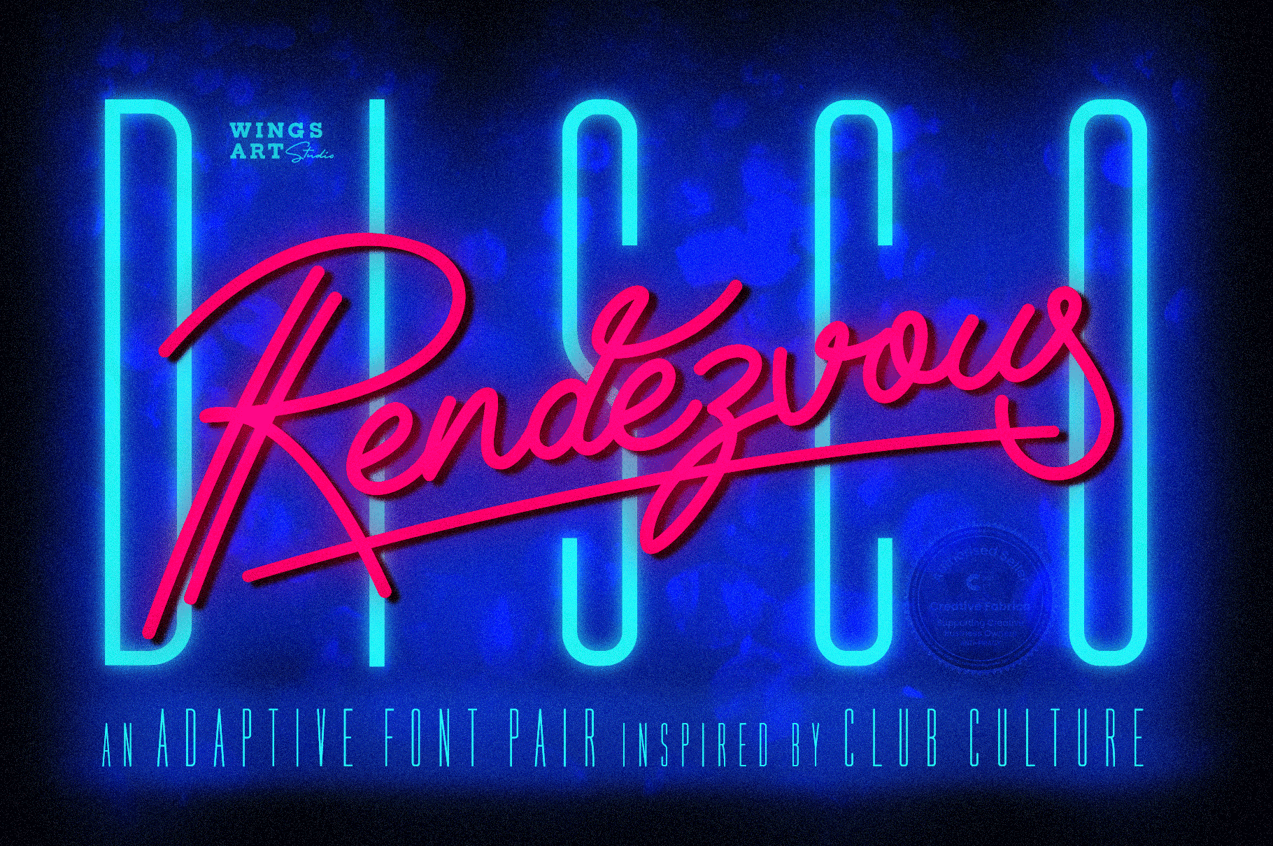
Disco Rendezvous is a script and display font duo. It gives you a matching headline and body option for event branding, which is useful for disco night flyers, merch, and any project where you need more than one typeface but want the look to stay cohesive.
Best for: event branding with headline and body, disco night flyers, merch. By: wingsart
19. Minebold
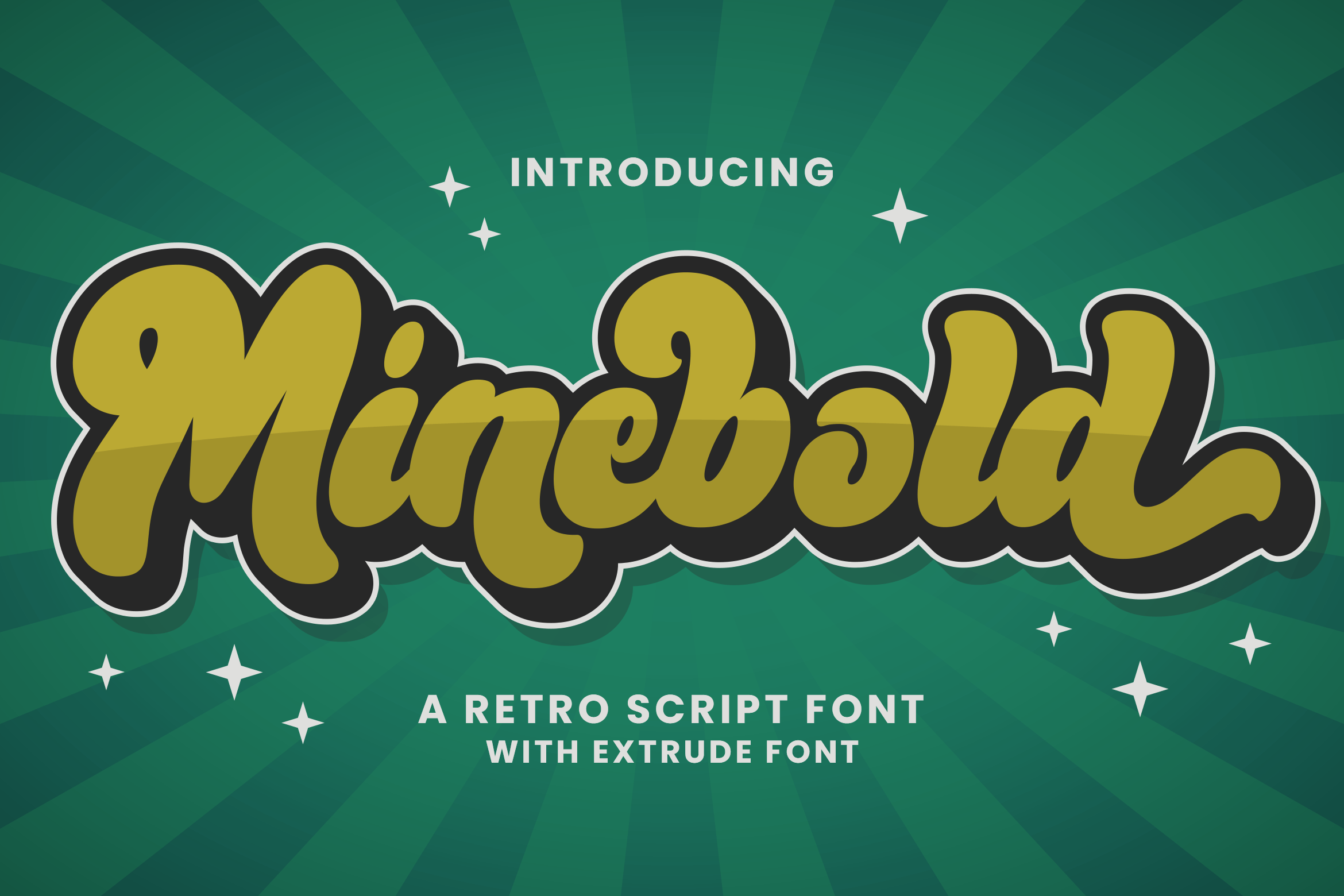
Minebold is a retro, bold handwritten font with a 70s feel. It has a casual, personal look that works well for retro handwritten logos, t-shirts, and stickers where the type should feel like it was drawn by hand. The bold strokes make it easy to read at a glance, even when the style is loose.
Best for: retro handwritten logos, t-shirts, stickers. By: ahweproject
How to Use 70s Fonts in Posters, Merch and Branding
70s fonts work best when you treat them like a style system, not a single typeface. The palette matters as much as the letterforms. I start with mustard, orange, brown, avocado green, and cream. Those colors make a simple retro headline feel intentionally dated.
For posters and merch, I use tight tracking and stacked headlines. Many groovy fonts are designed to sit close together, so I do not add extra letter spacing unless the design feels loose. Keep the display type large. If you need body text, pair it with a soft serif or a clean sans serif. A soft serif keeps the warmth. A clean sans keeps the layout readable.
For t-shirts and stickers, thick groovy letters usually cut well. If you are testing groovy fonts for Cricut projects, remember that Cricut Design Space uses fonts installed on your computer. Connected script letters need to be welded so they cut as one piece. Canva Pro users can upload custom fonts through Brand Kit, which is handy for retro fonts for Canva projects. If you are building a merch line, see our guide to best fonts for T-shirt design.
For 70s album cover fonts and podcast art, let the type do the heavy lifting. A short title in a groovy display font can replace a lot of illustration. If the cover has a lot of color, keep the lettering in one or two colors. For cafe, candle, or cosmetics branding, a soft serif or chunky 70s font often feels more premium than a psychedelic script. It gives the brand a friendly face without making every label feel like a festival poster.
Tip: If you are making 70s designs for shirts, test the design at arm’s length. If the slogan is not readable from a few feet away, simplify the type or increase the size.
A few quick styling moves I use often:
- Add a subtle grain or paper texture to posters for a vintage print feel.
- Use rainbow stripes or outline strokes for accents, but keep them behind the type.
- Pair one loud display font with one quiet supporting font.
- Use stacked words for festival names, band names, and short slogans.
- Keep psychedelic fonts large, because detailed curves can get muddy at small sizes.
Tips for Choosing the Right 70s Font
Choosing the right 70s font starts with deciding which 70s you want. Disco, hippie, magazine ads, and rock posters all feel different. A disco font should feel smooth and party-ready. A hippie font should feel loose, floral, and communal. A magazine-style serif should feel warm, rounded, and confident.
If you are using psychedelic fonts, keep them large. Detailed swirls and flower details can become hard to read at small sizes. For shirts, stickers, and posters, test the type at the size you plan to print it.
Use no more than two retro fonts in one design. One display font and one supporting font is usually enough. If you need more variety, change color, weight, or layout instead of adding another typeface.
What font pairs well with a groovy display font? I usually pair it with a soft serif or a clean sans. The display font carries the nostalgia, while the supporting font keeps the message clear. For branding, keep the supporting font simple. For posters, you can be a little bolder, but still avoid competing curves.
Before you sell retro shirts or merch made with these fonts, check the license on the product page. Some fonts allow commercial use, while others have restrictions. If the project needs multilingual support, check the character set first. Lemon Funky, for example, is noted for complete characters for multilingual support.
Where to Download 70s Fonts
Creative Fabrica is the main source for the fonts in this list. Each product page lists the license details, so check them before using a font in a commercial project.
If you want free 70s fonts for experiments, Google Fonts has options like Shrikhand and Righteous that bring a retro character without a purchase. For more font recommendations and design resources, visit the FontPro blog.