· fonts · 12 min read
23 Best Typewriter Fonts for Vintage and Retro Design in 2026
Discover 23 typewriter fonts for vintage branding, journaling, posters, and retro design, with free and premium options that feel worn, personal, and authentic.
What Makes a Great Typewriter Font?
A typewriter font works when it feels like a machine made it. The core clue is monospacing: every letter occupies the same width, a mechanical limit of real typewriters rather than a modern design trend. Add a slightly uneven baseline, soft corners, uneven ink pressure, and a little paper texture, and the effect becomes believable.
The history explains why the style feels familiar. Christopher Latham Sholes, Carlos Glidden, and Samuel W. Soule patented the first practical typewriter in 1868, and Remington began commercial production in 1874. By 1891, more than 100,000 QWERTY typewriters were in use across the United States. The Remington No. 2 in 1878 added the first Shift key, making upper and lower case practical on one machine.
Courier was designed in 1955 by Howard “Bud” Kettler for IBM, and the IBM Selectric in 1961 became a bestseller, selling roughly 13 million units over about 25 years. That mechanical background is why a great typewriter style font is not just a regular monospace font. A clean monospace face can be perfectly even. A typewriter font usually adds small flaws: a heavy strike here, a faded letter there, a baseline that drifts just enough to feel alive.
The style you choose changes the message. A clean classic typewriter font feels like a typed letter. A distressed typewriter font feels like an archive document. A script typewriter font feels more personal. If you need a typewriter font for logo work or branding, match the wear level to the story. For the best vintage design, choose visible ink variation with readable letterforms.
23 Best Typewriter Fonts for Vintage and Retro Design
The list below is grouped by style, so you can jump to the kind of typewriter effect you need. Each font is a Creative Fabrica product, and the preview image shows the general character before you download it.
Serif & Classic Typewriter Fonts
These are the closest to a real typed page. They keep the letterforms readable and the wear subtle.
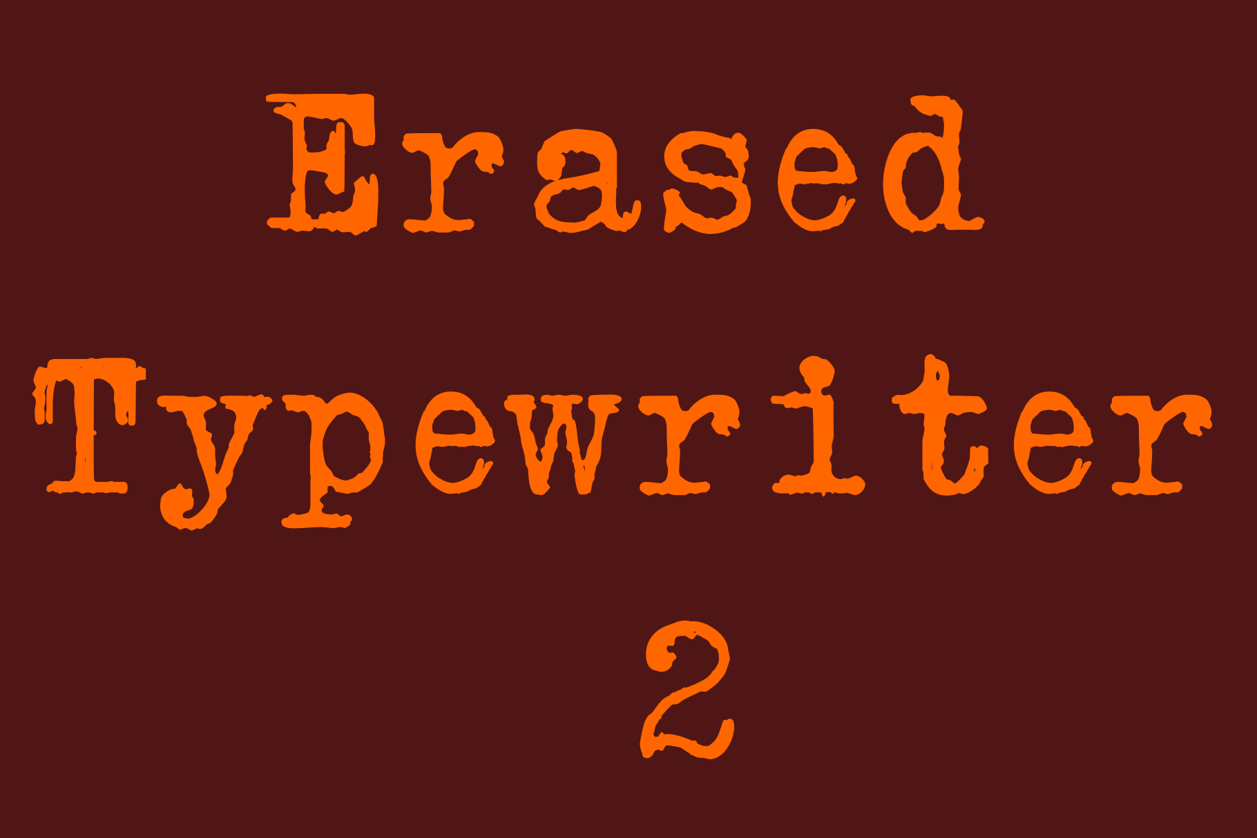
1. Erased Typewriter 2
A classic serif silhouette with softened ink, as if the page has been handled too many times. It still reads cleanly, so it is useful when you want age without losing clarity.
Best for: letters, journal covers, vintage labels. By: Intellecta Design
2. Western Typewriter
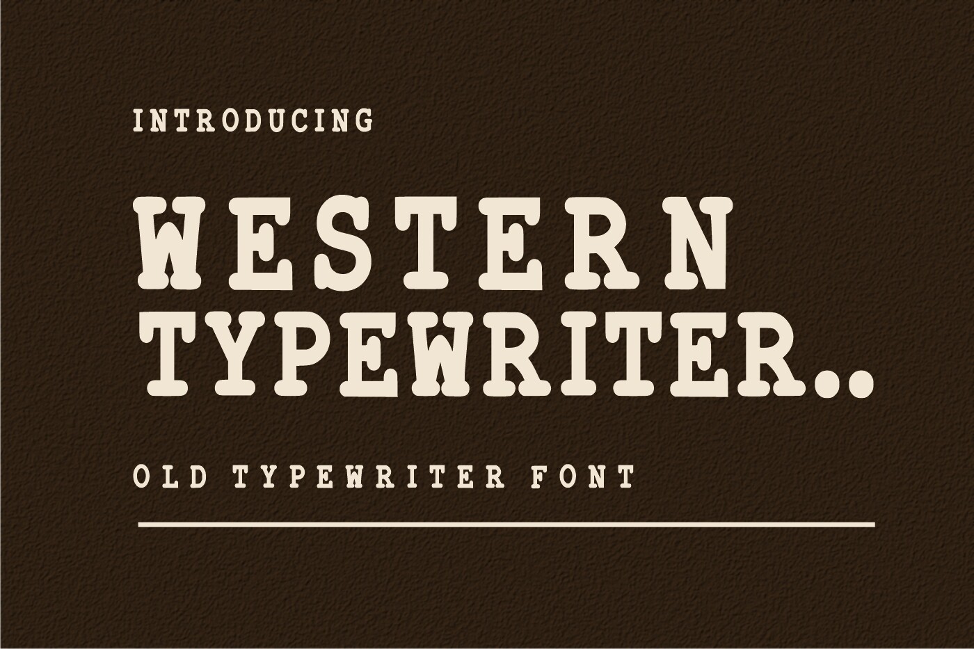
A bold, rugged take on classic typewriter type with a western charm. It suits projects that need a bit of frontier attitude without becoming a full decorative display face.
Best for: themed posters, packaging, logo. By: WNIdesign
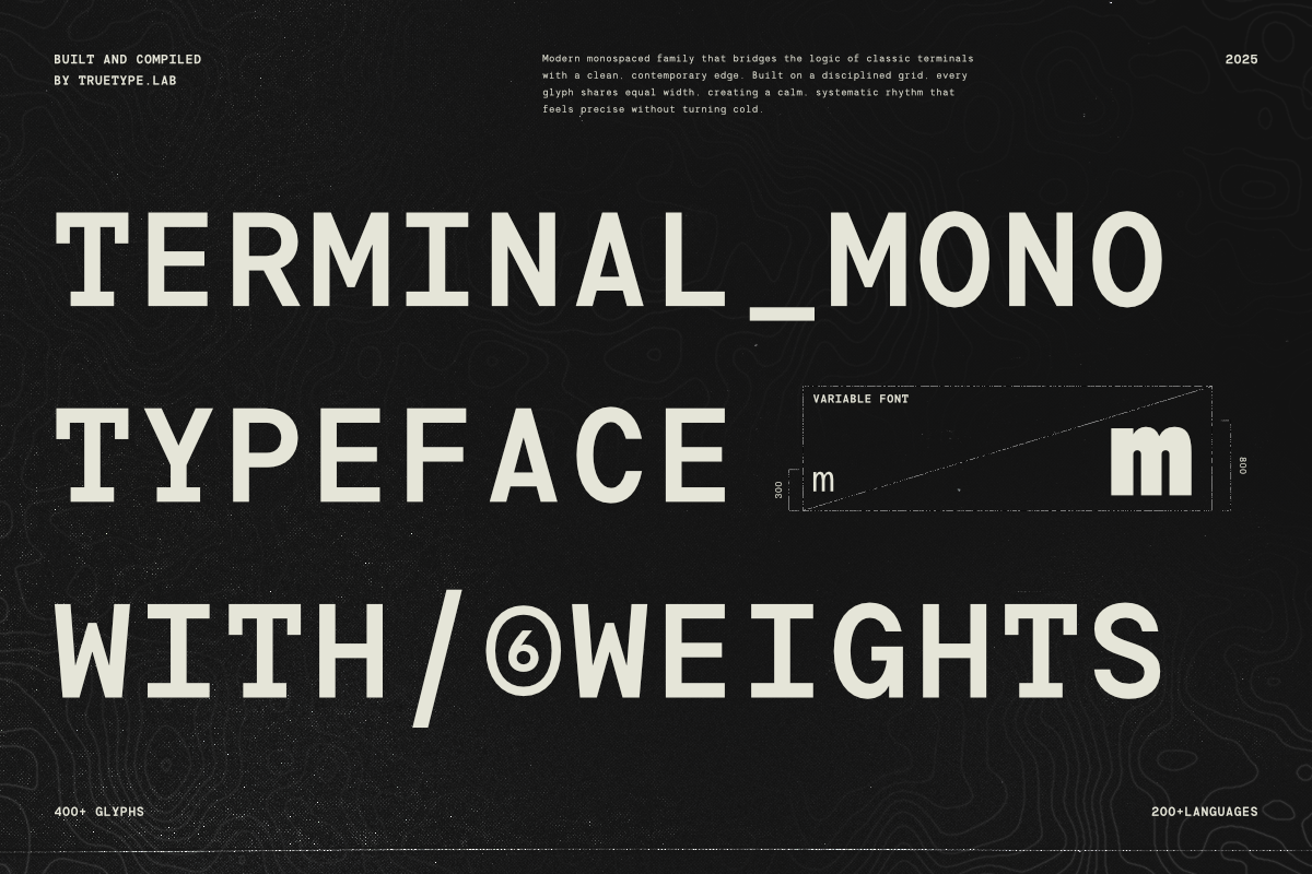
3. Modern Typewriter
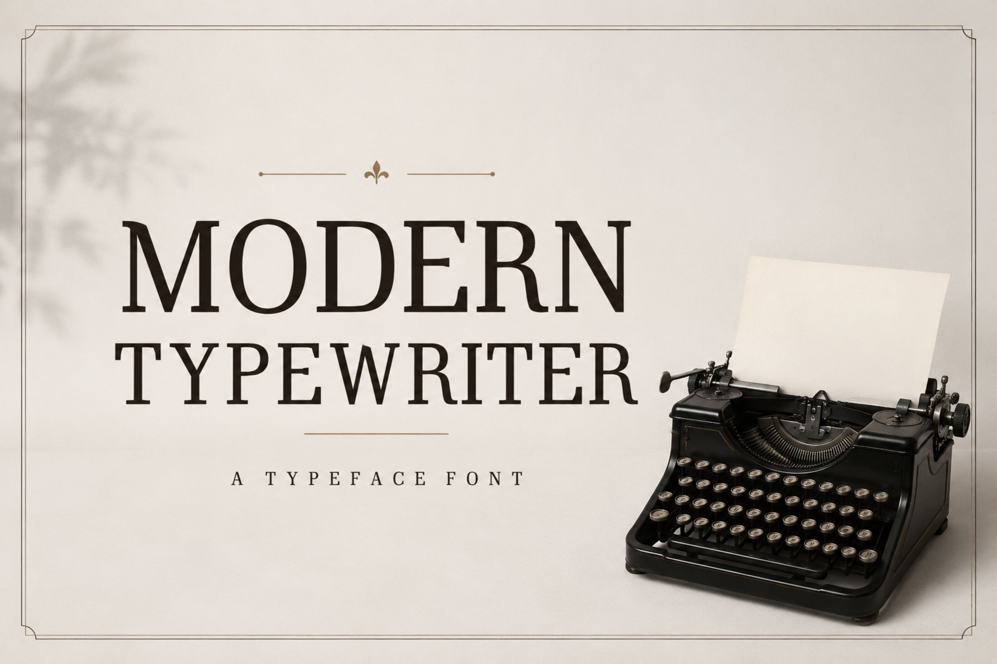
A cleaner, more contemporary version of the typewriter look. Spacing stays even and the mechanical feel holds up, but it never leans hard into grunge. That restraint is what makes it useful for branding that wants a light vintage accent, not a costume.
Best for: modern logos, packaging, branding. By: riki.studio
4. The Old Typewriter
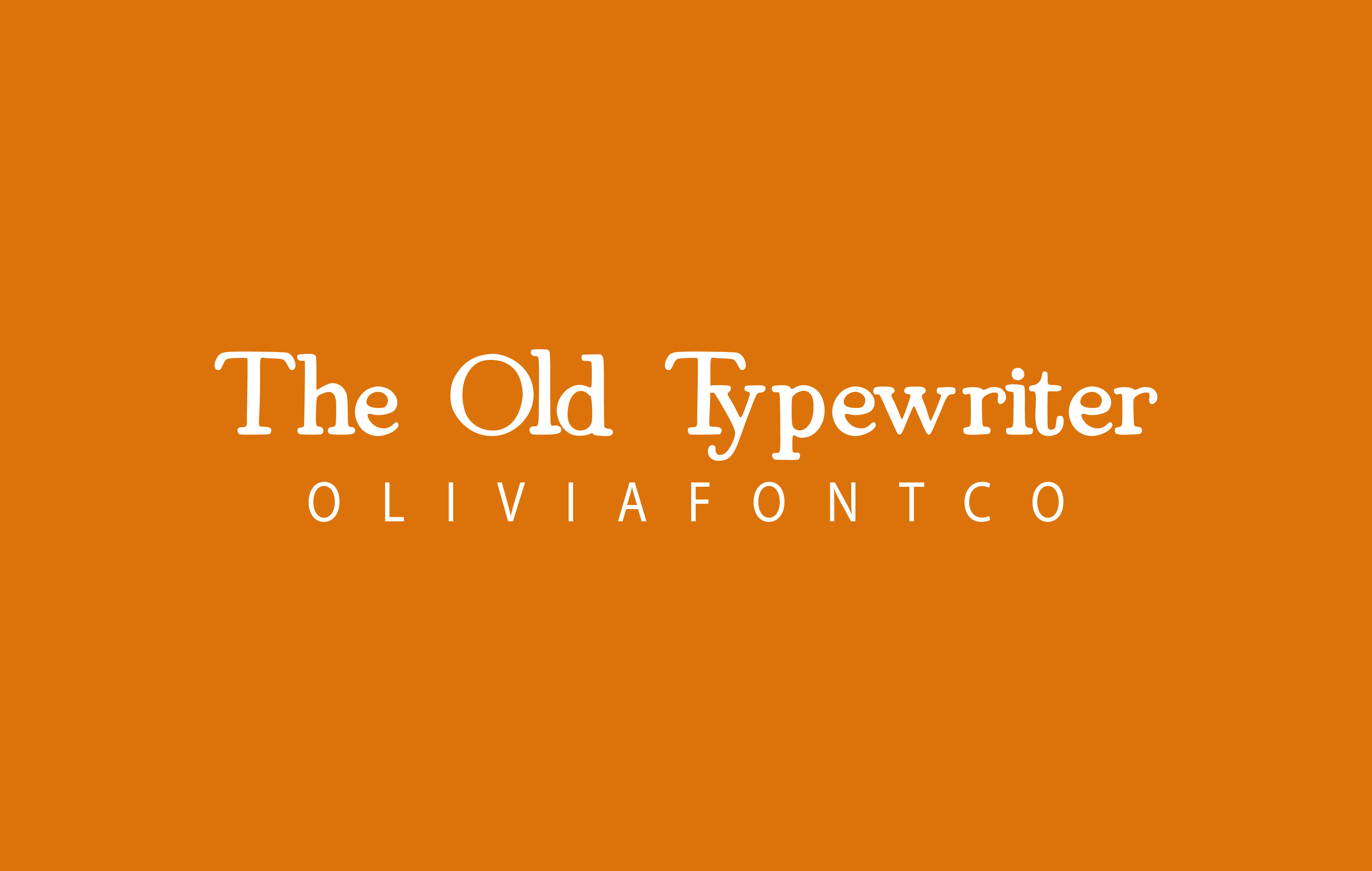
A simple old-school typewriter look with a familiar, everyday feel. It is not trying to be dramatic. Reach for it when you want a quiet vintage note rather than a loud poster.
Best for: letters, cards, short notes. By: OliviaFontCo
5. Unexpected Typewriter
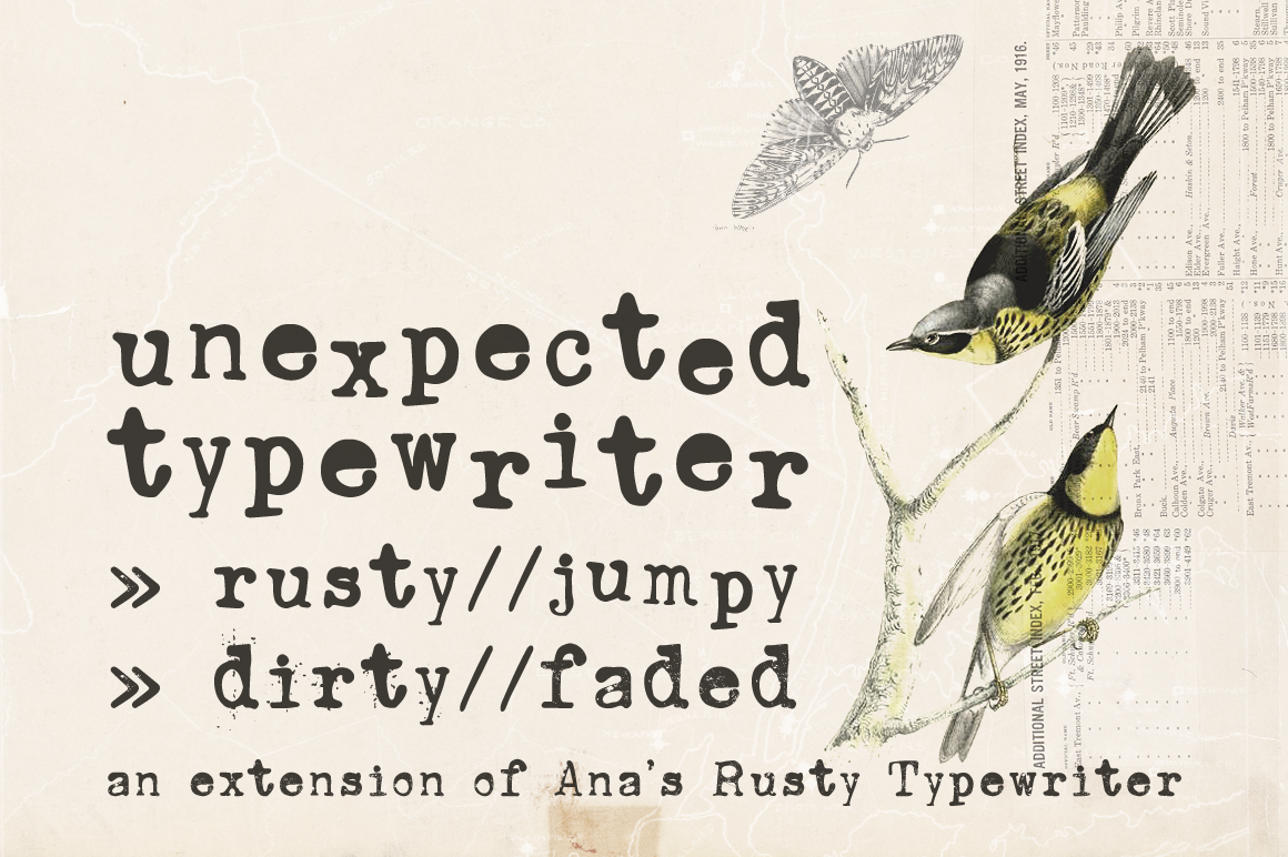
Hand-drawn details on an old Underwood-inspired base make the letters feel less factory-perfect and more human. It is a good pick for projects that need personality without losing the typewriter identity.
Best for: creative projects, social graphics, zines. By: anasfonts
Download Unexpected Typewriter
Slab Serif Typewriter Fonts
Slab serif typewriter fonts have heavier, blockier letterforms. They hold up well in headlines and on textured backgrounds.
6. Thin Typewriter
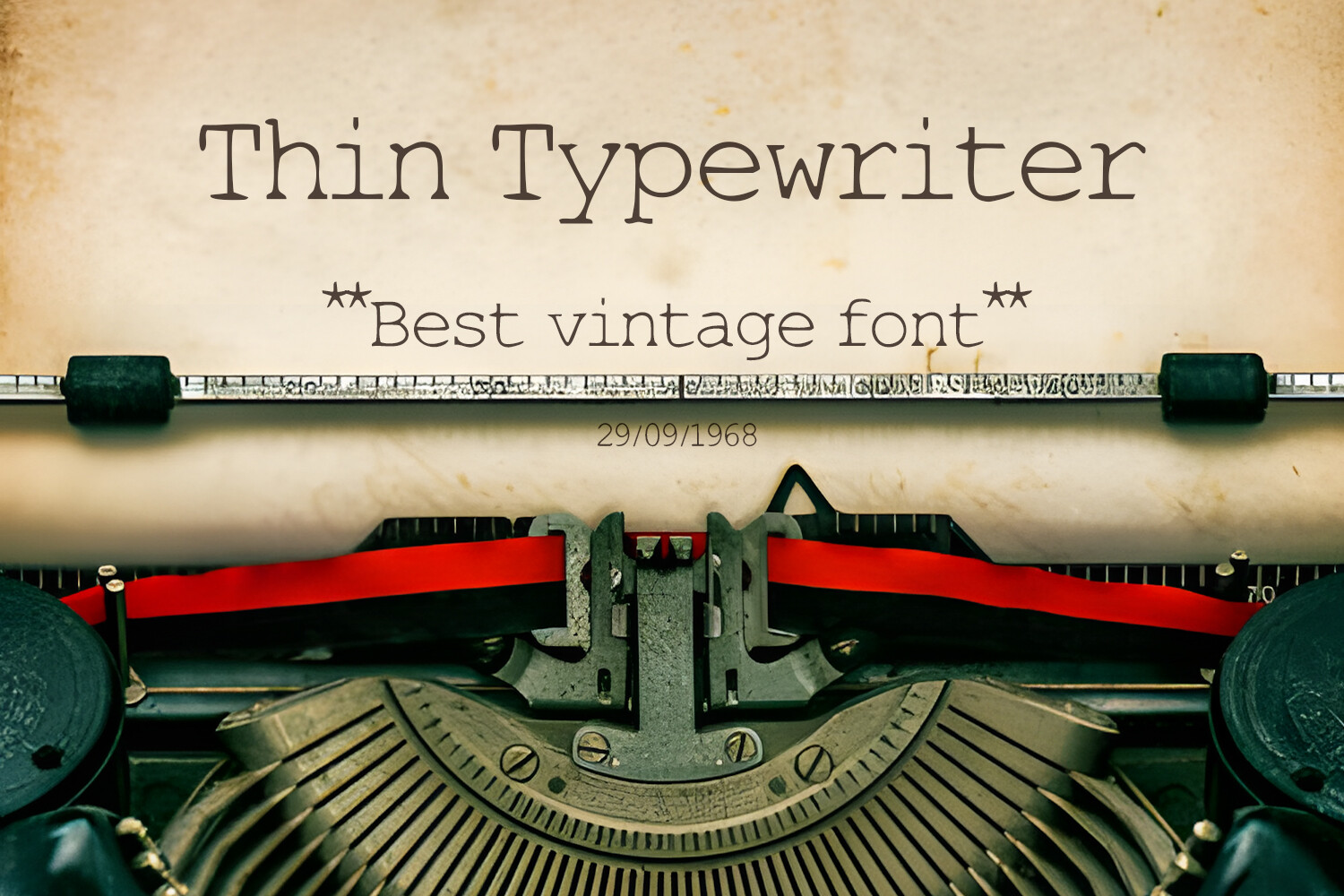
A worn, textured typewriter style that leans on grain and distress rather than heavy strokes. Reach for it when you want visible wear without weighing down the whole layout.
Best for: captions, labels, layered typography. By: OWPictures
7. Paperstrike Typewriter
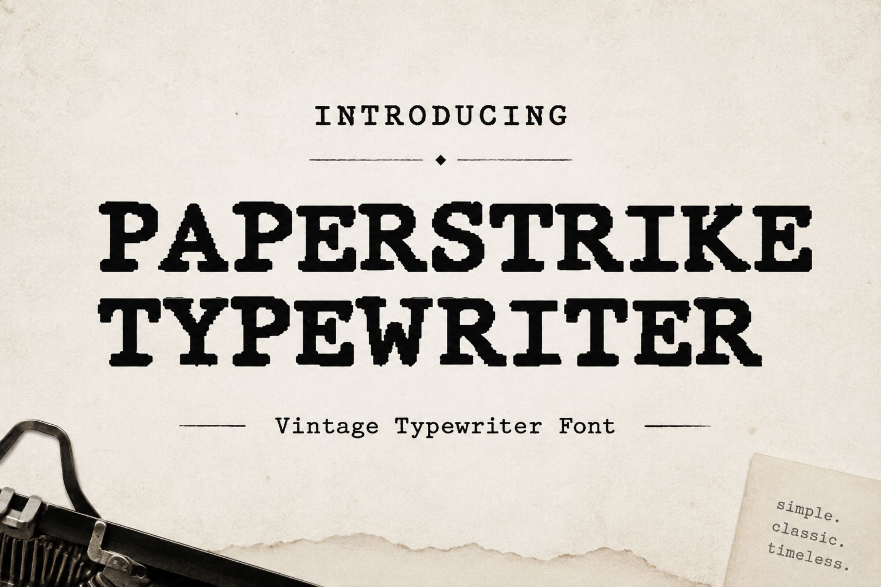
A bold slab serif with a strong key-strike-on-paper feel. The letters look pressed into the page, almost dented, and that gives the type a tactile, journal-cover quality.
Best for: magazine covers, zines, posters. By: creativelabstd
Download Paperstrike Typewriter
8. Rusty Typewriter
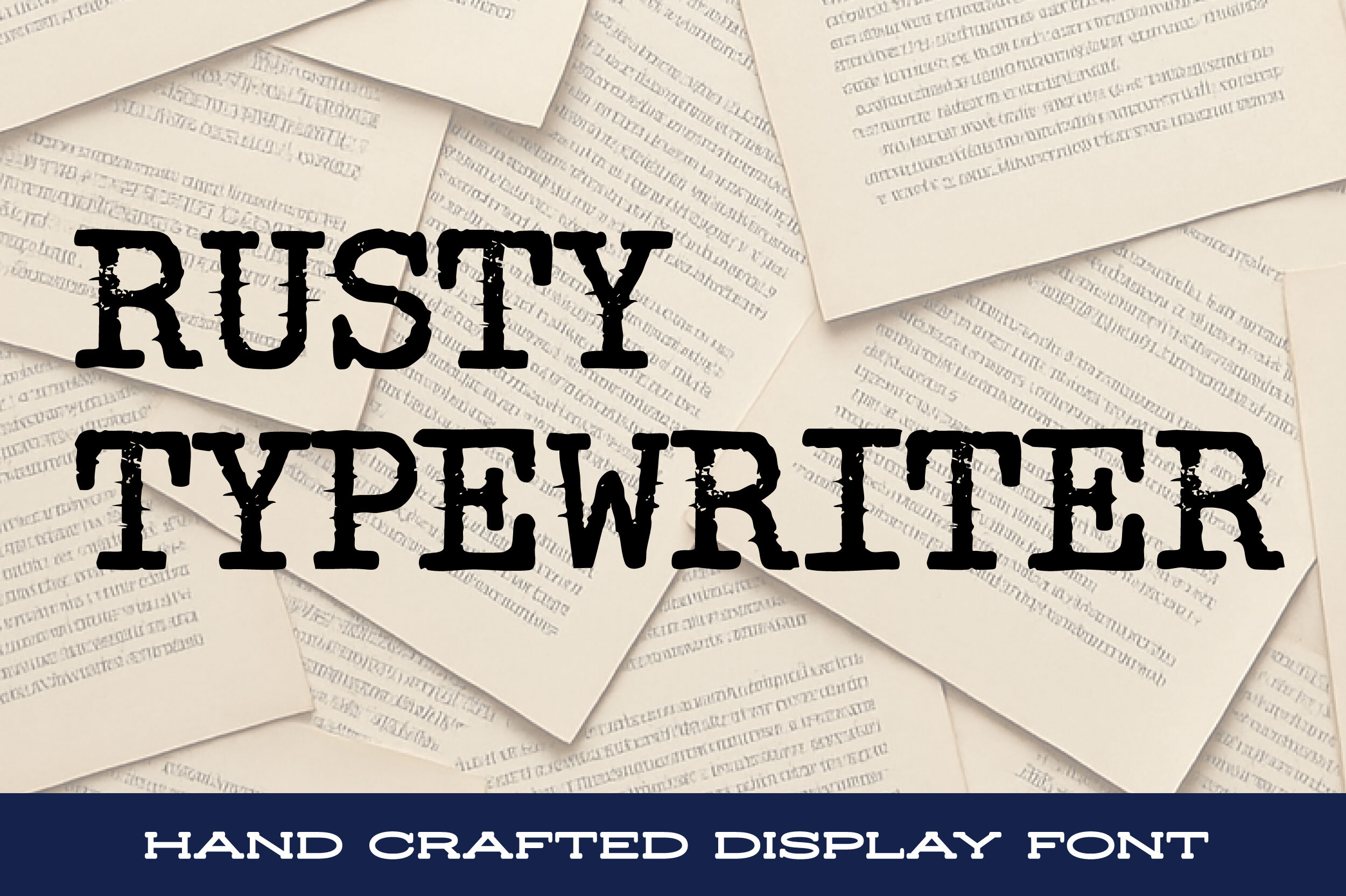
A gritty, worn typewriter style with a rough, human edge. It brings a rustic, industrial mood to a layout without needing extra textures to do the work.
Best for: posters, labels, grunge projects. By: stompstock
9. Classic Typewriter
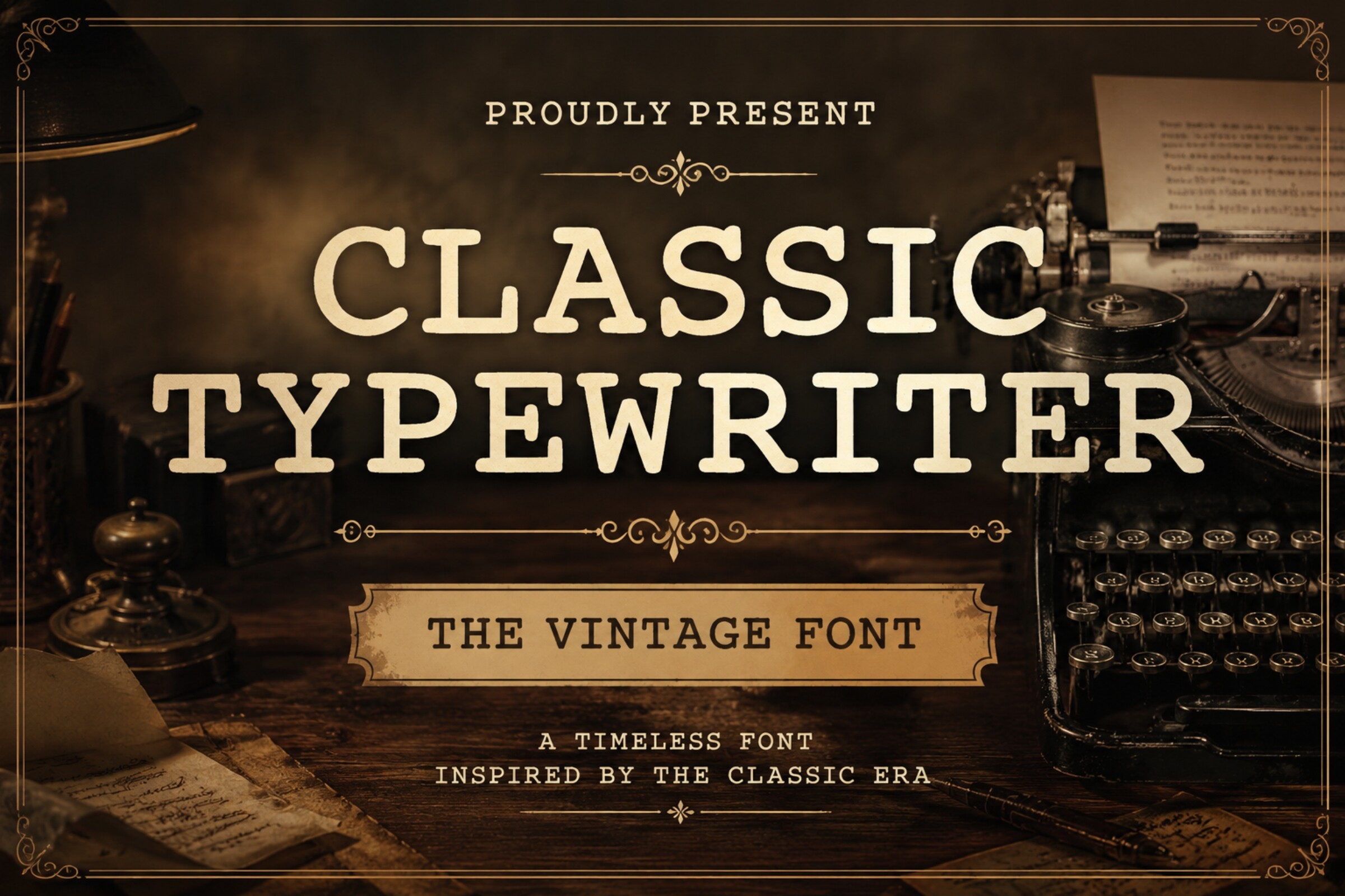
A safe, versatile slab serif option for basic vintage text. It keeps the familiar typewriter feel without pushing the style too far, so it pairs easily with other elements in a layout.
Best for: general layouts, headings, packaging. By: Dreamspace.studio
Display, Distressed & Vintage Typewriter Fonts
This is the most expressive group. These fonts lean into wear, grain, and old-paper character, so they are best for large headlines and accents.
10. Typewriter Distressed
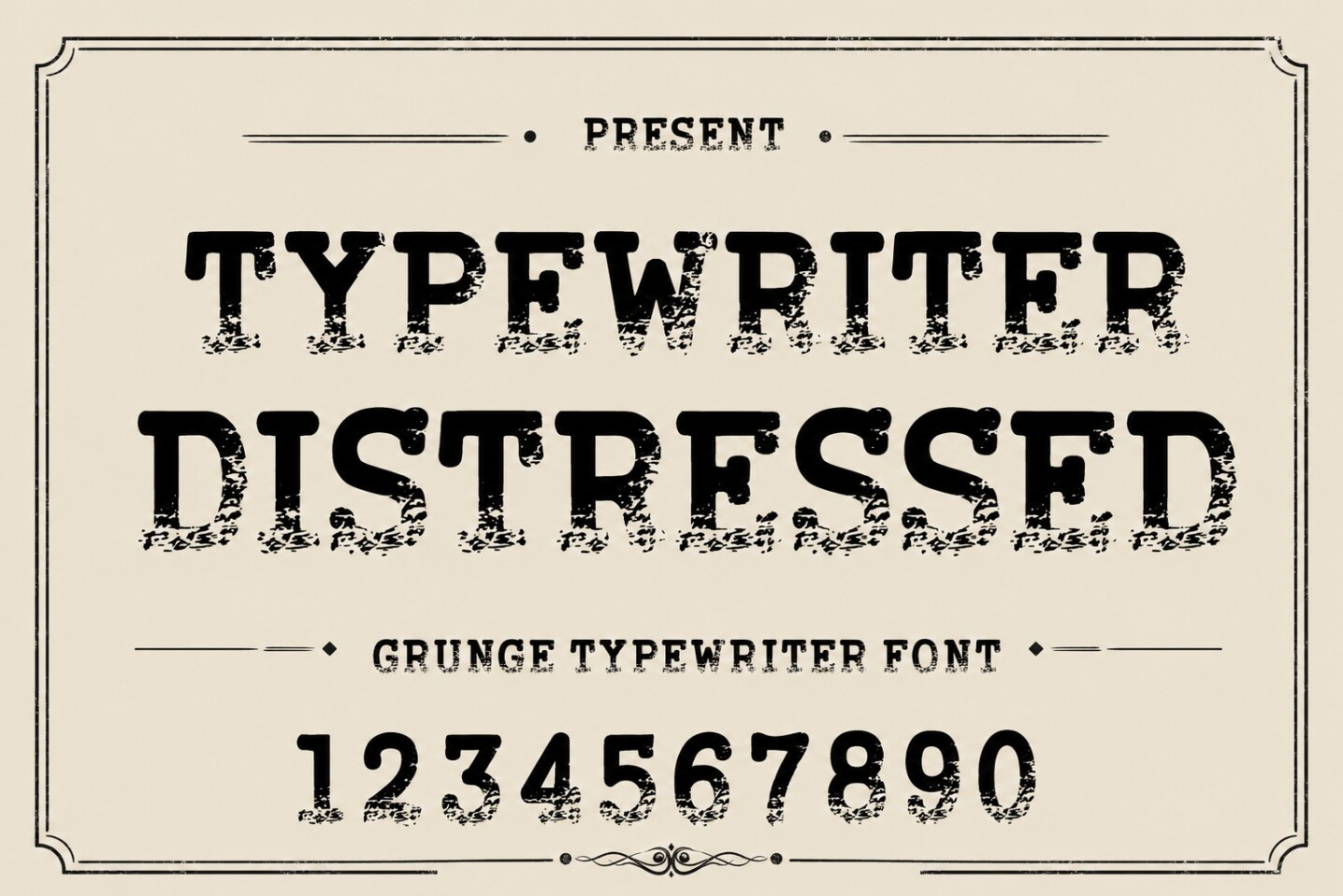
A strong, deliberate wear effect that makes text look like it came from an old document or archive file. Of every distressed typewriter font here, this one leans hardest into the damage.
Best for: archive documents, newspaper designs, posters. By: WNIdesign
Download Typewriter Distressed
11. Remington Weather
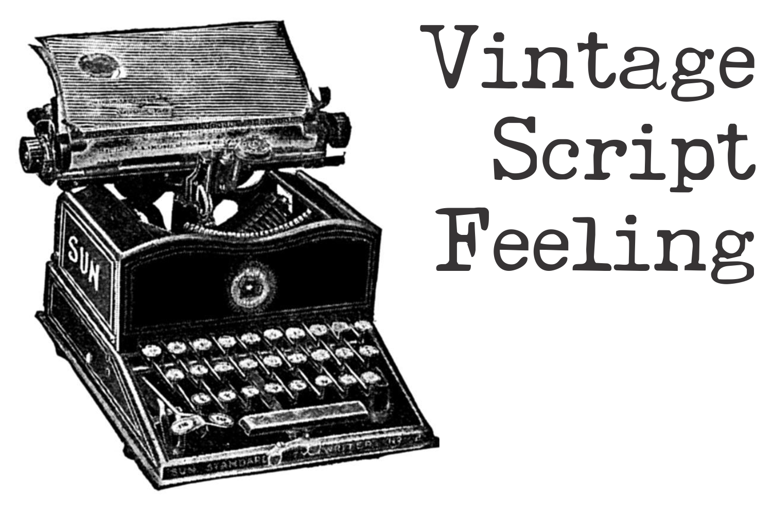
The name nods to the Remington machines that helped define the typewriter era. The style feels atmospheric and historical, useful when a brand wants to suggest heritage without a literal machine illustration.
Best for: heritage brands, retro packaging, posters. By: Intellecta Design
12. Archive Typewriter
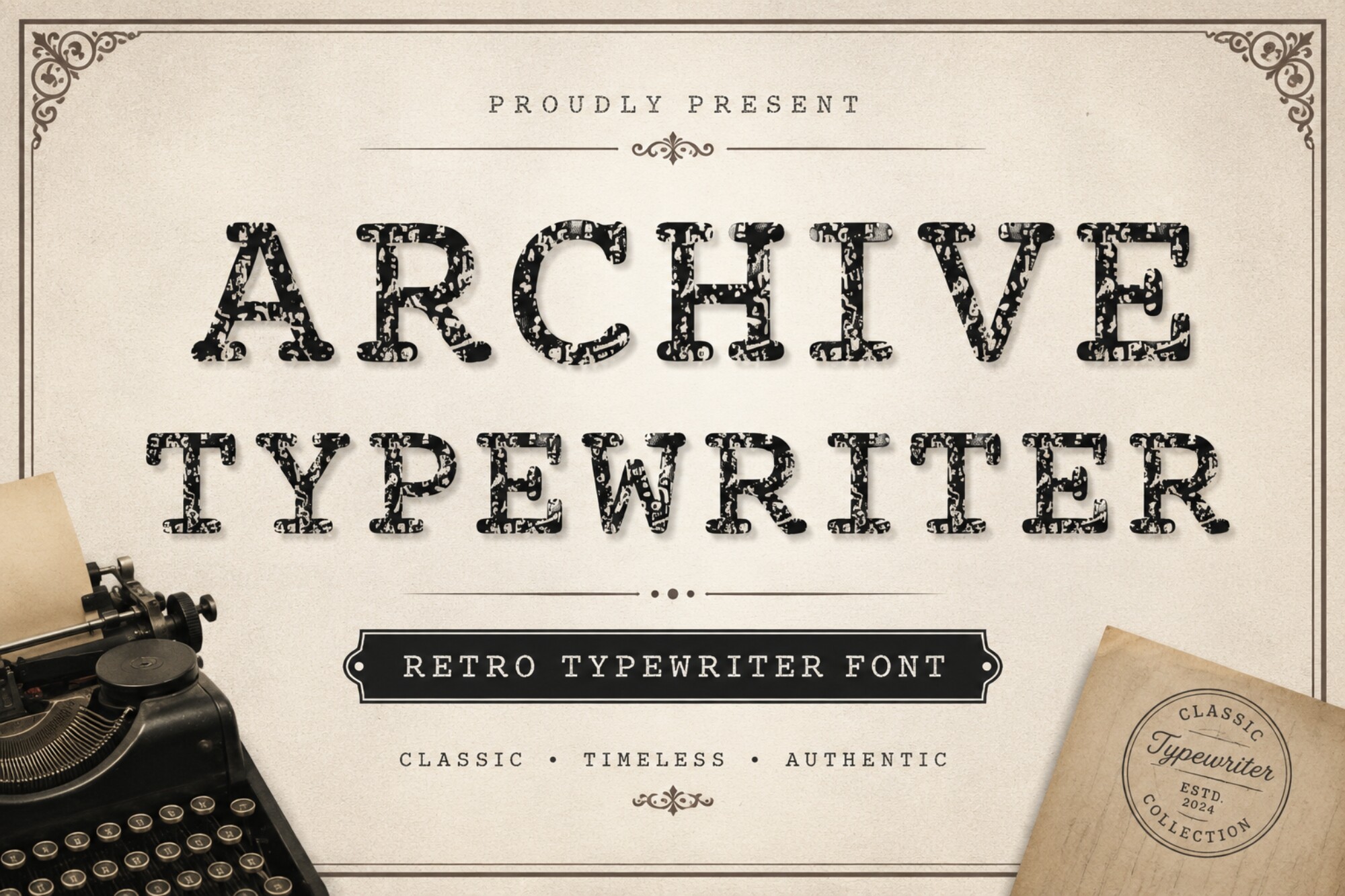
This font is built for the look of stored records, catalog pages, and retro documents. Reach for it when the design needs a sense of filing, sorting, and quiet institutional history.
Best for: dossiers, catalogs, retro documents. By: 29Graphic
13. Vintage Typewriter
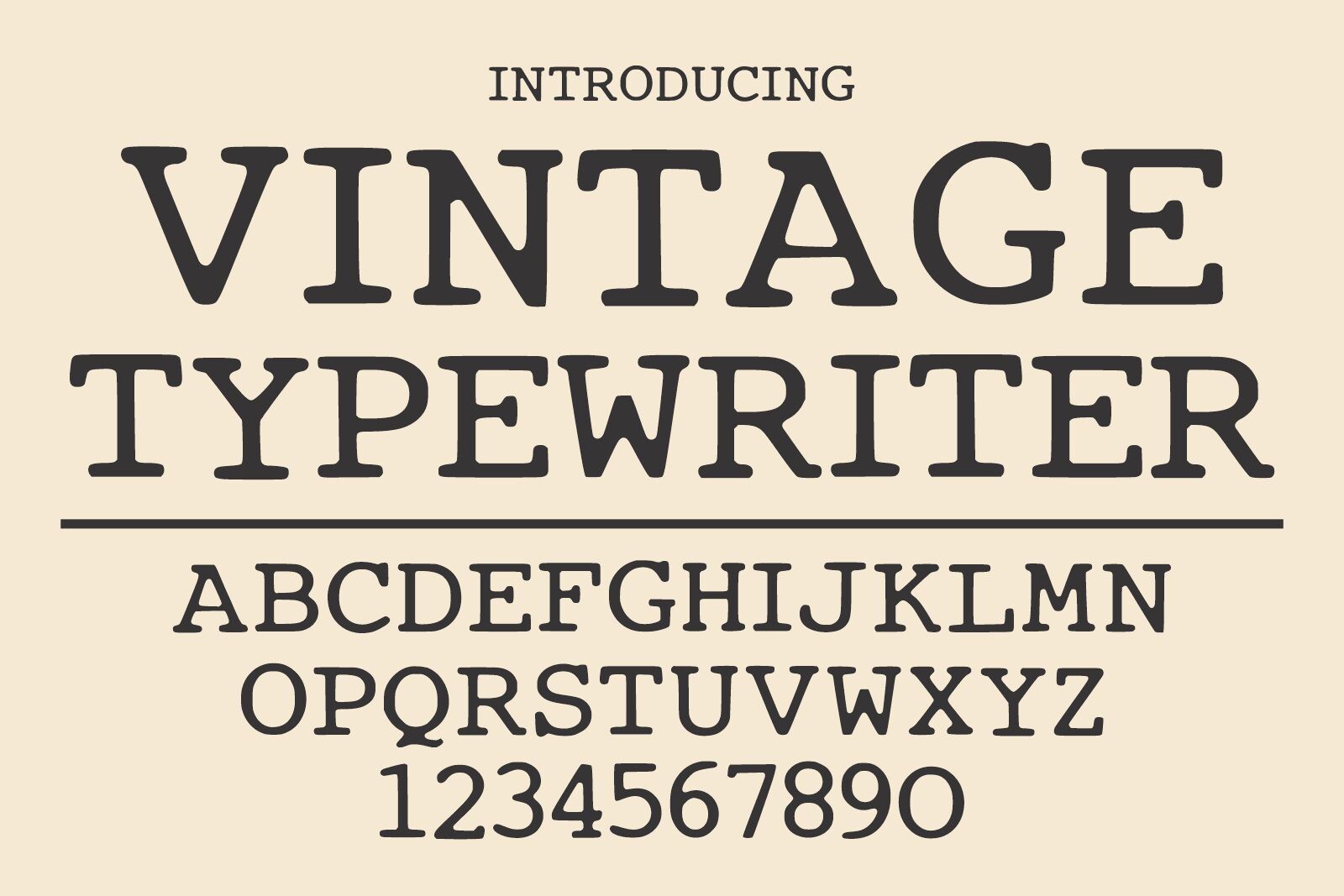
A clean editorial serif style with balanced readability. It feels vintage through structure and spacing, not damage, so it works when you want a classic old typewriter font look that still feels polished.
Best for: book covers, editorial layouts, branding. By: Infinity art Studio
14. Retro Typewriter
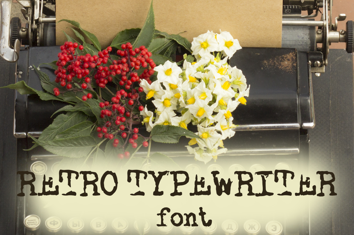
A warm retro typewriter font with a friendly, easy-to-read feel. It works well when you want a nostalgic mood without making the letterforms too busy or too hard to read.
Best for: retro layouts, social graphics, labels. By: Ana Babi
15. Glitch Typewriter
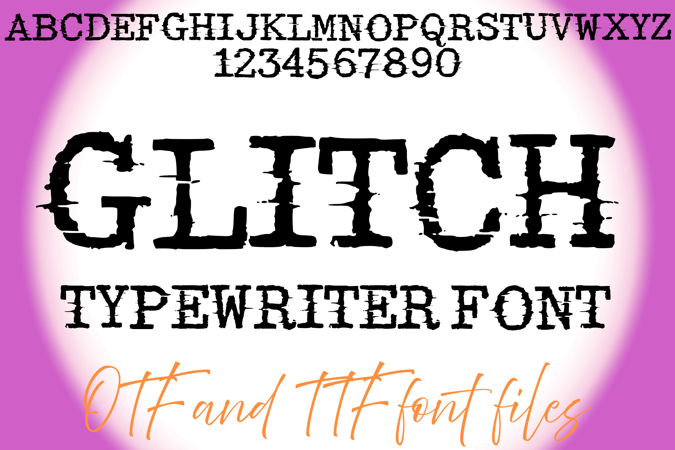
An analog typewriter feel with a modern, corrupted twist. It keeps the mechanical spacing but adds a digital-age sense of interference. That mix is what makes it interesting for experimental projects.
Best for: experimental posters, digital art, retro projects. By: squeebcreative
16. Old Typewriter
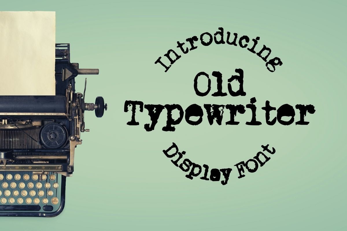
A basic old workhorse font that is versatile for most vintage layouts. It does not try to be overly specific. That is exactly what makes it a practical, dependable typewriter look to fall back on.
Best for: general layouts, notes, posters. By: design.steiner
Script & Handwritten Typewriter Fonts
These fonts blend the mechanical feel of a typewriter with the softness of handwriting. They are warmer and more personal.
17. Handmade Typewriter
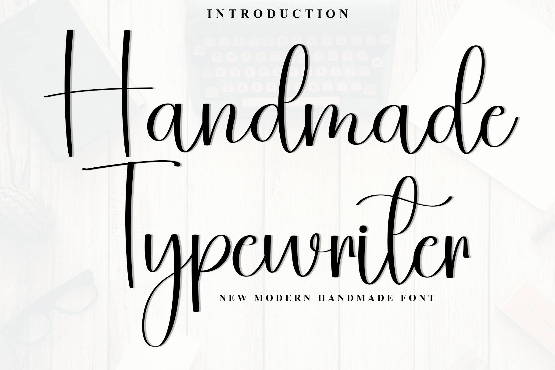
A script and handwritten style that feels like a personal note typed with care. Warm and a little imperfect, it keeps the typewriter connection without ever feeling cold.
Best for: greeting cards, packaging, personal branding. By: PiPi Creative
18. Typewriter Royale
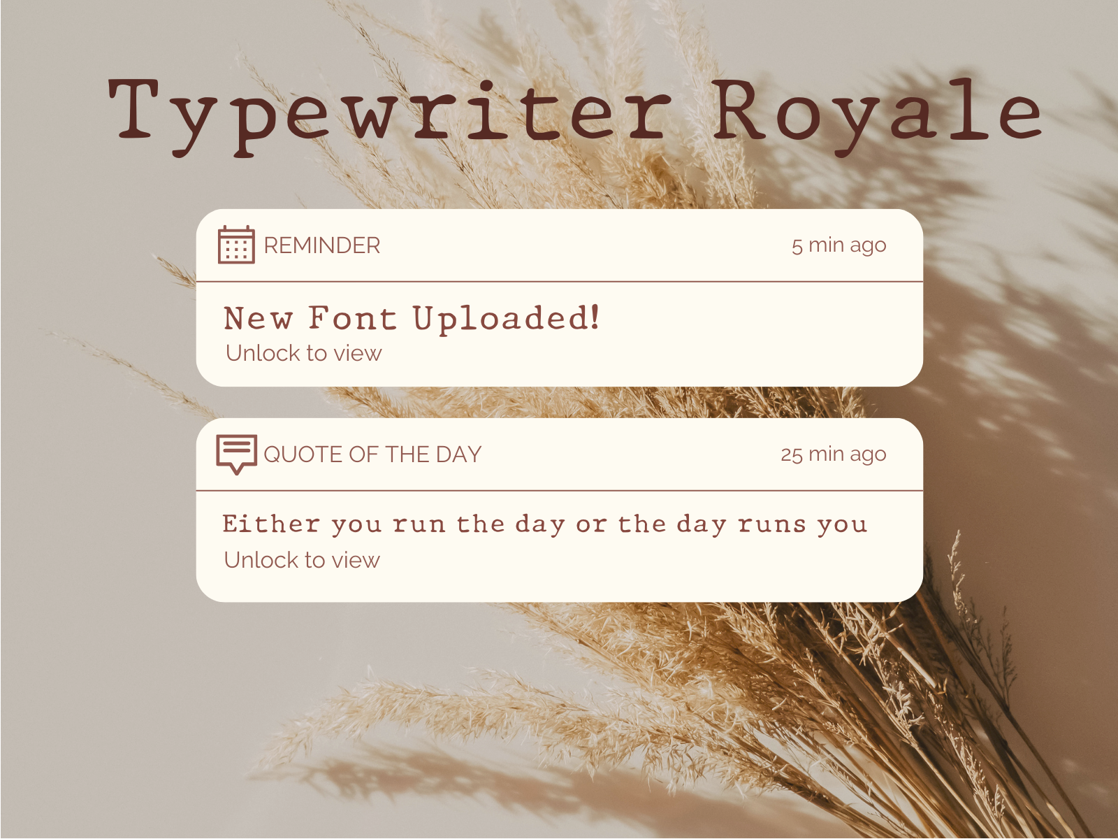
A refined script-leaning typewriter style with a polished, elegant feel. It works when you want a typewriter accent that still looks formal enough for invitations or premium packaging.
Best for: invitations, premium packaging, elegant labels. By: fonts.ness
19. Hotcake Typewriter
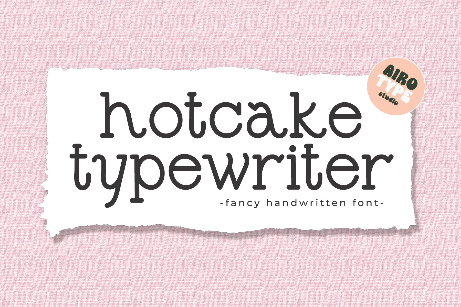
A monoline, casual typewriter style with a cute, friendly character. Approachable and a little playful, it is a good fit for social media and consumer goods packaging.
Best for: social graphics, food packaging, home goods. By: airotype
20. Wanderlust Typewriter
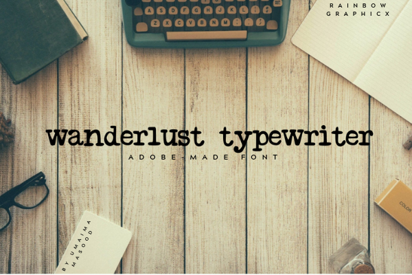
A travel-inspired typewriter style with a journal-like mood. Note: this font is all lowercase and does not include uppercase glyphs, so it works best for short phrases, captions, and lowercase-only designs.
Best for: travel blogs, postcards, lowercase captions. By: RainbowGraphicx
Download Wanderlust Typewriter
21. Vintage Typewriter
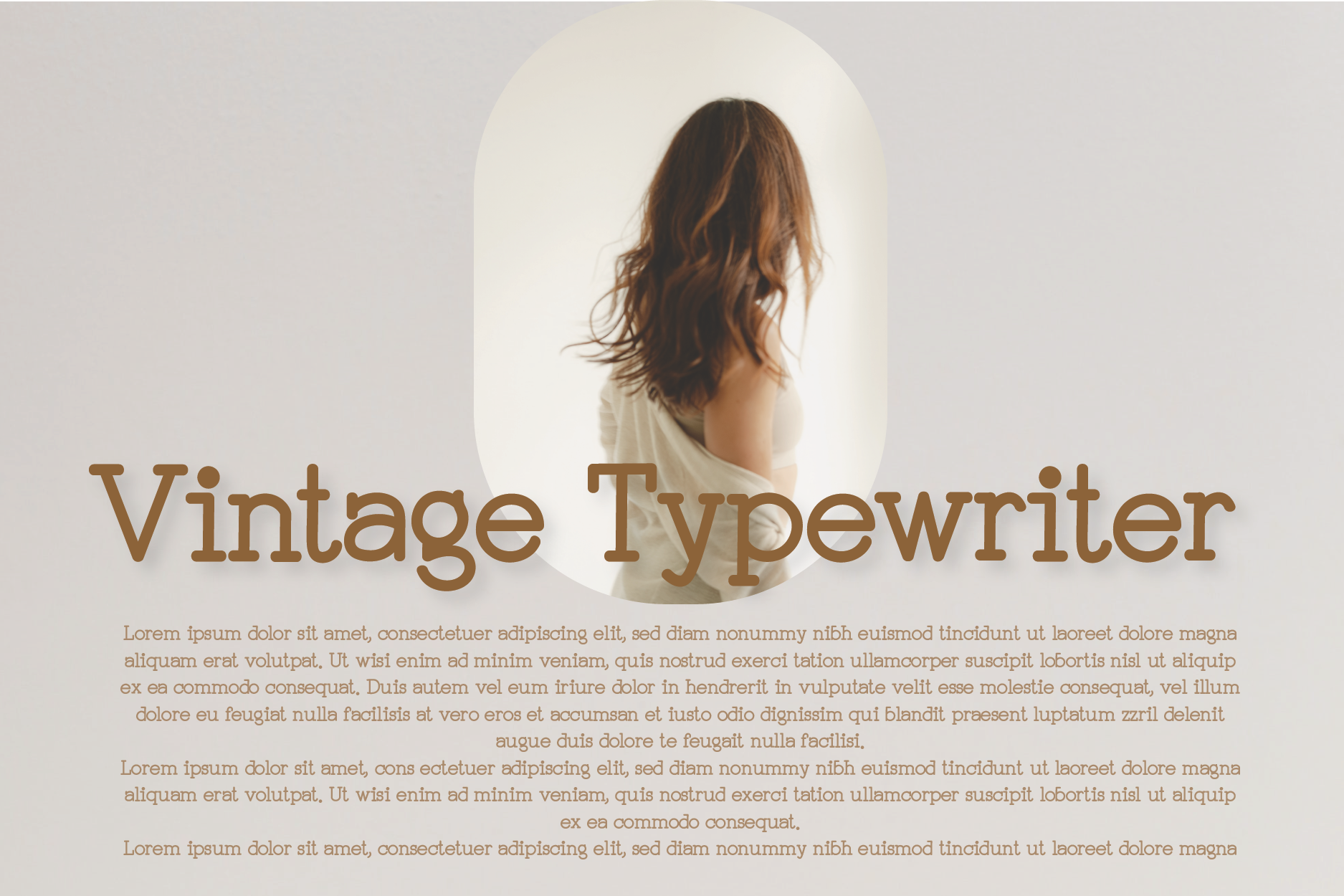
This is a different Vintage Typewriter from the earlier entry. It has an elegant handwritten style with a soft, romantic feel, making it a better fit for weddings, greeting cards, and personal stationery.
Best for: wedding invitations, greeting cards, stationery. By: hl_studio
Decorative Typewriter Fonts
These are the boldest options. They are best for headlines, badges, stickers, and creative accents, not long text.
22. Typewriter Frame
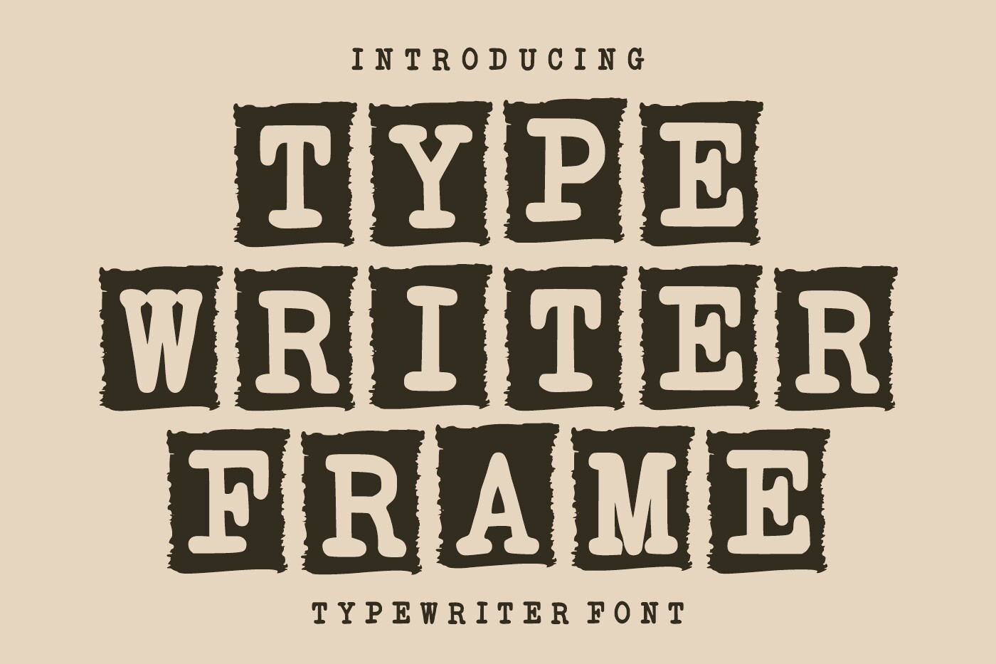
A decorative typewriter style with frame-like borders built around the letterforms. It gives text a badge-like quality, handy when you want a typewriter look that also feels like a label or sticker.
Best for: badges, stickers, tags. By: Infinity art Studio
23. Broken Typewriter
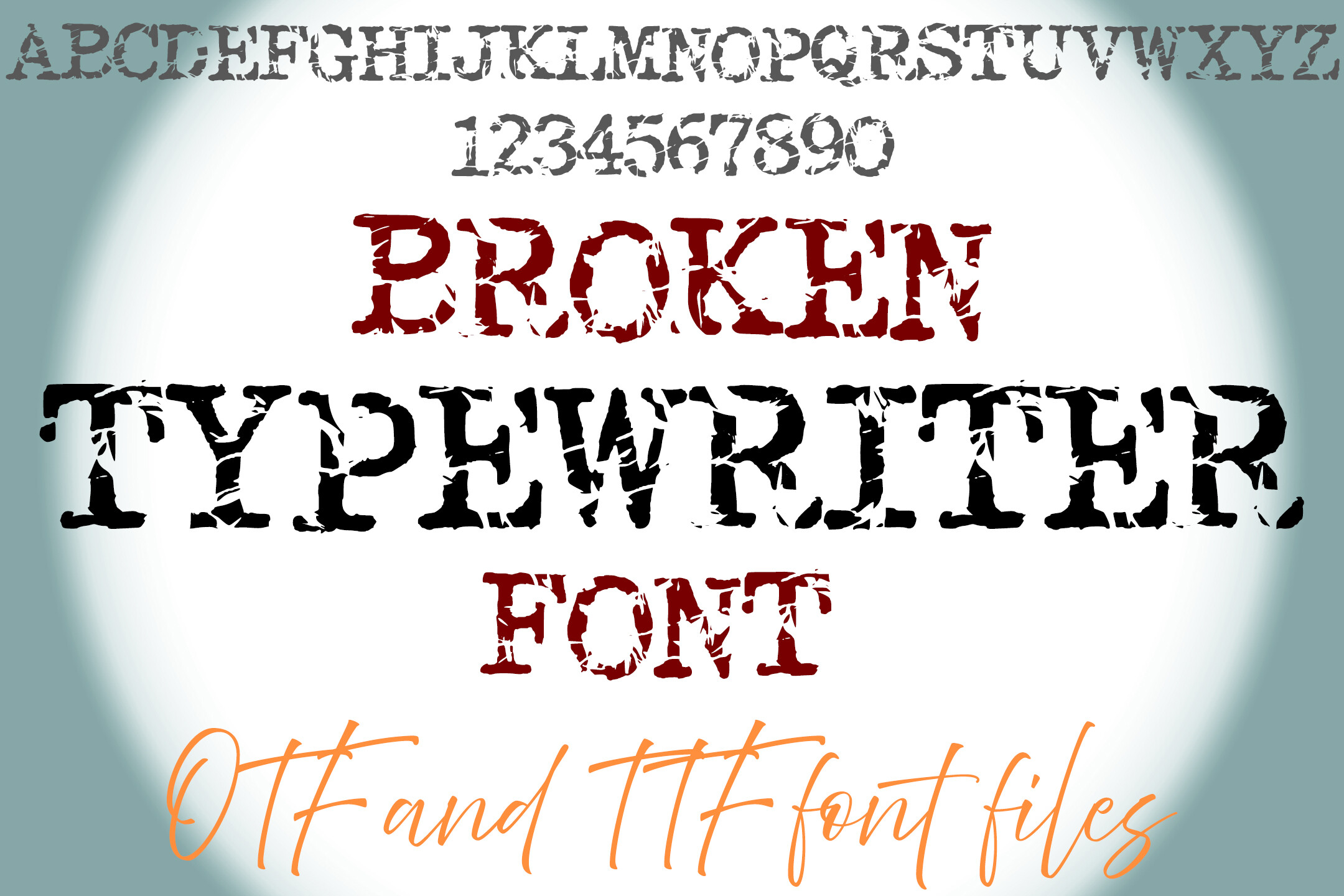
A heavily distressed, chipped-edge typewriter style with a rough, broken feel. It is one of the most intense grunge typewriter font options here, so it works best when the design needs a strong edge.
Best for: grunge posters, bold accents, experimental designs. By: squeebcreative
How to Use Typewriter Fonts in Your Design Projects
Use typewriter fonts where the mechanical feel adds meaning. Headlines, quotes, captions, labels, and short document-style blocks are the safest places. For longer body copy, pair the typewriter font with a clean proportional font. Matthew Butterick, the typographer behind Practical Typography, puts it plainly: “In standard body text, there are no good reasons to use monospaced fonts. So don’t.” That does not mean typewriter fonts are useless. It means they work best as accents.
A good pairing keeps the layout readable. Use a distressed typewriter font for the headline, then set the body in a neutral sans-serif or a simple serif. The typewriter face carries the mood, while the body font handles clarity. For a screenplay-style layout, 12-point Courier, single-spaced, is the traditional reference, but for most branding work you can use a modern typewriter font for the title and a clean text face for the rest.
In Canva, Photoshop, or Illustrator, you can add a worn-in effect without changing the font itself. Canva is the easiest starting point because you can drop the font into a template and test it against paper textures quickly. Photoshop and Illustrator give you more control over masks, blend modes, and vector cleanup. Place a paper texture over the text, set the texture to multiply or overlay, and lower the opacity until the letters look slightly faded. You can also add a subtle noise layer, mask out a few ink spots, or reduce the contrast on the type. In Cricut Design Space or Silhouette Studio, keep the letters connected and test the cut before using a heavily distressed font. Thin broken edges can separate during cutting, so choose a cleaner typewriter style for vinyl, cardstock, or laser-cut projects. For social posts, keep the distressed effect strong enough to read on a phone screen.
Tip: If you are designing a logo, start with a less distressed option. A typewriter font for logo work needs to stay legible at small sizes. Save the broken, rusted, or heavily grunged faces for posters, packaging accents, and social graphics where the text can be larger.
Tips for Choosing the Right Typewriter Font
Start with the job. If the font will appear in a logo, choose a typewriter font with clear letter spacing and minimal damage. If it will appear on a poster, you can afford more texture. If it will appear in a Cricut or Silhouette project, avoid fonts with very thin broken edges unless you are comfortable doing extra cleanup.
Check the license before you use a font commercially. Some typewriter fonts are free for personal use only, while others include commercial rights. The fonts in this list are Creative Fabrica products, so review the product page for the exact license before using them in a logo, packaging, client project, or product for sale. If a free option from Google Fonts, DaFont, Font Squirrel, or Adobe Fonts looks right, read its license too. “Free to download” does not always mean “free for commercial use.”
Look at readability at different sizes. A distressed typewriter font can look great at 72 points and disappear at 10 points. Zoom out, shrink the text, and check the lowercase letters, especially i, l, t, and r. Also decide how much wear the project needs. A vintage typewriter font for a wedding invitation should feel softer than a grunge typewriter font for a punk poster.
Also check the character set. Some typewriter fonts include only basic Latin letters, while others add accents, punctuation, and small caps. If your project uses diacritics, numbers, or a long list of labels, open the font in your design tool and type the full text before committing. A beautiful preview can hide missing glyphs, and that is a common problem with decorative typewriter faces.
Finally, match the font to the medium. Screen designs can handle more subtle texture, while printed paper may need stronger contrast. For a typewriter font for branding, choose a style that still looks intentional at small sizes. For an aesthetic typewriter font in social media, you can be bolder, because the text usually appears larger and for a shorter time.
Where to Download Typewriter Fonts
Creative Fabrica is the main source for the fonts in this list. It is a good place to browse premium typewriter fonts, vintage typewriter font styles, distressed options, and script-based typewriter faces in one place. You can also search by mood, such as retro, grunge, handwritten, or archive, to narrow the list quickly. This is especially useful when you are comparing a clean typewriter font with a distressed one. Each product page includes a preview, designer name, and download link, so you can compare the style before adding it to your project.
If you want free alternatives, you can also look at Google Fonts, DaFont, Font Squirrel, and Adobe Fonts. Just check the license carefully, especially if the font will be used in a logo, packaging, or client work. For more font pairing ideas and typography resources, visit the FontPro blog.