· fonts · 14 min read
22 Best Vintage & Retro Fonts for Branding & Design in 2026
Discover 22 best vintage and retro fonts for logos, posters, and branding. Bold, groovy, and nostalgic styles. Download free and premium options today.
What Makes a Great Vintage or Retro Font?
Nothing sets an era faster than a typeface. One glance at a swirling script or a chunky, bubble-shaped headline and your brain already knows: diner, 1955. Neon and grid lines? Straight to 1985. That instant recognition is exactly why vintage typography still drives so much branding, packaging, and poster design today.
But “vintage” and “retro” get used interchangeably, and they’re not the same thing. A vintage font is a historically accurate reproduction, a digitized version of a typeface that genuinely existed in a past era, usually somewhere between 20 and 99 years old. A retro font is a modern design newly created to evoke that same past decade without literally copying it. Retro fonts are built with today’s tools, so they typically come with cleaner kerning, more weights, and better hinting than the period-original type they’re inspired by.
Both share the same goal: instant nostalgia. What makes either one work is a mix of distinctive letterforms (bubble shapes, sharp Art Deco angles, looping cursive tails), decorative effects like shadows, outlines, and worn “distressed” texture, and the emotional pull of familiarity. A good vintage or retro font does more than look old. It makes the viewer feel a specific time period in under a second, often before they’ve consciously registered why. That’s why the font you pick for a logo, poster, or product label matters more than almost any other design choice you’ll make.
22 Best Vintage & Retro Fonts for Branding & Design
Most roundups sort fonts by decade: 50s, 60s, 70s, 80s. We’re grouping these 22 fonts by visual style instead, because that’s closer to how you actually choose a typeface. You’re not thinking “I need something from 1962,” you’re thinking “I need something handwritten” or “I need something bold enough to read across a room.” Here’s the lineup, organized by look and use case.
Best Vintage Script & Cursive Fonts
Flowing and hand-drawn, these five script and cursive fonts work well for labels, packaging, and any brand that wants a romantic, old-fashioned feel.
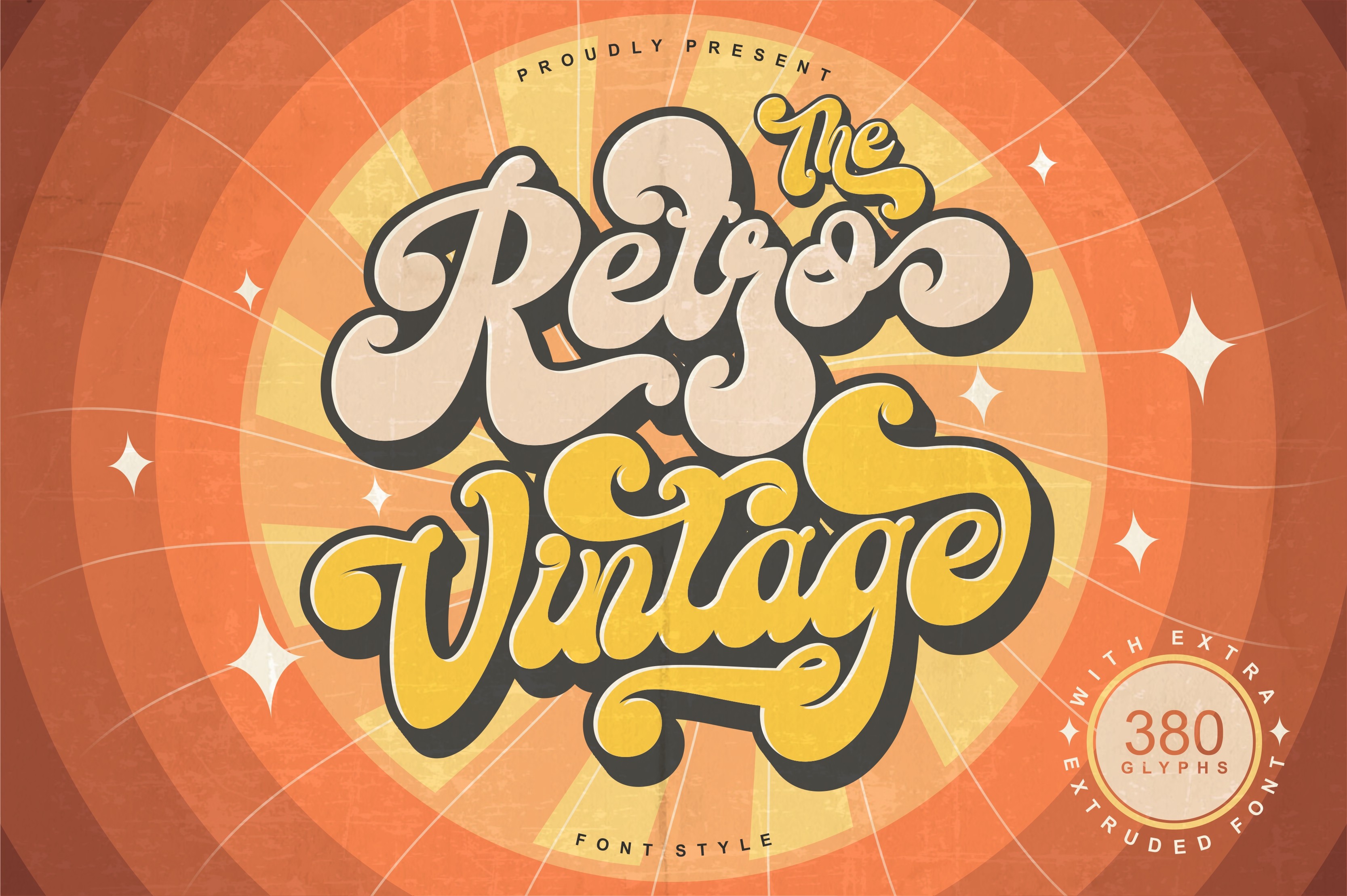
1. Retro Vintage Font
Tedha Studio built this one with a loose, bouncy baseline that leans into old hand-painted signage rather than tidy calligraphy. The letters tilt slightly as they connect, giving it the feel of a shopfront sign painted by hand.
Best for: vintage labels, retro logos. By: Tedha Studio
2. Back to Vintage Font
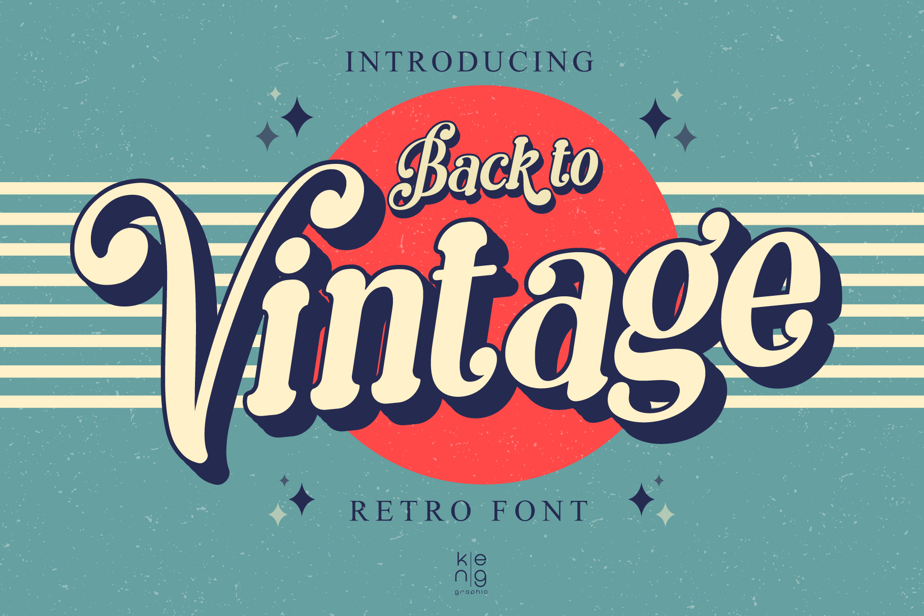
Where the previous entry leans loose and hand-painted, this one from keng graphic is softer and rounder, sitting closer to retro display lettering than a strict cursive script. That gives it a friendlier read, good for nostalgia without heavy formality.
Best for: packaging, invitations. By: keng graphic
3. Realro Font
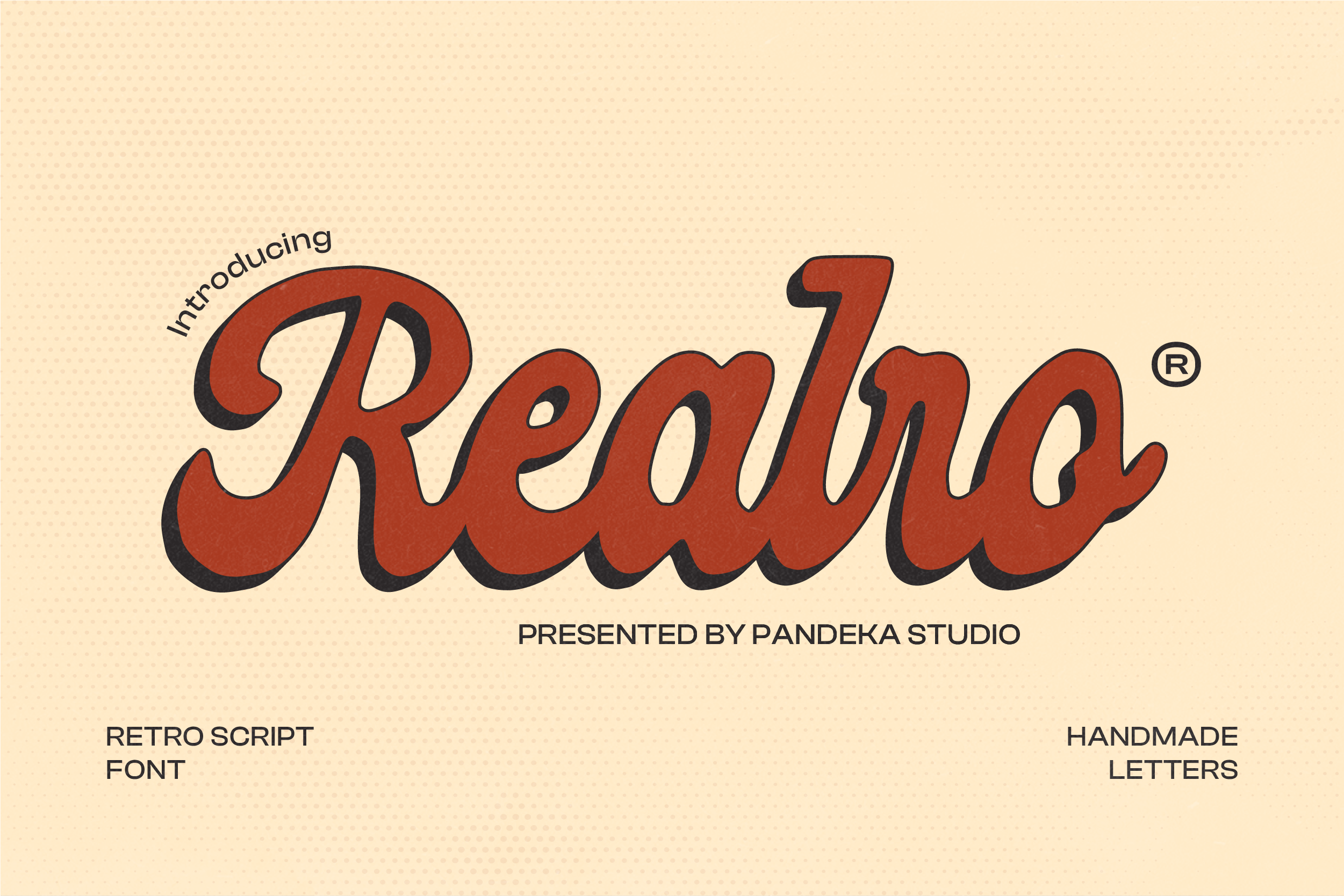
Pandekastudio’s Realro is a soft, modern-leaning script that still reads as retro without going full 1950s diner. It translates well to a phone screen, making it a smart choice for brands that need nostalgia across print and social content.
Best for: social media graphics, café branding, packaging. By: pandekastudio
4. Retro Script Font
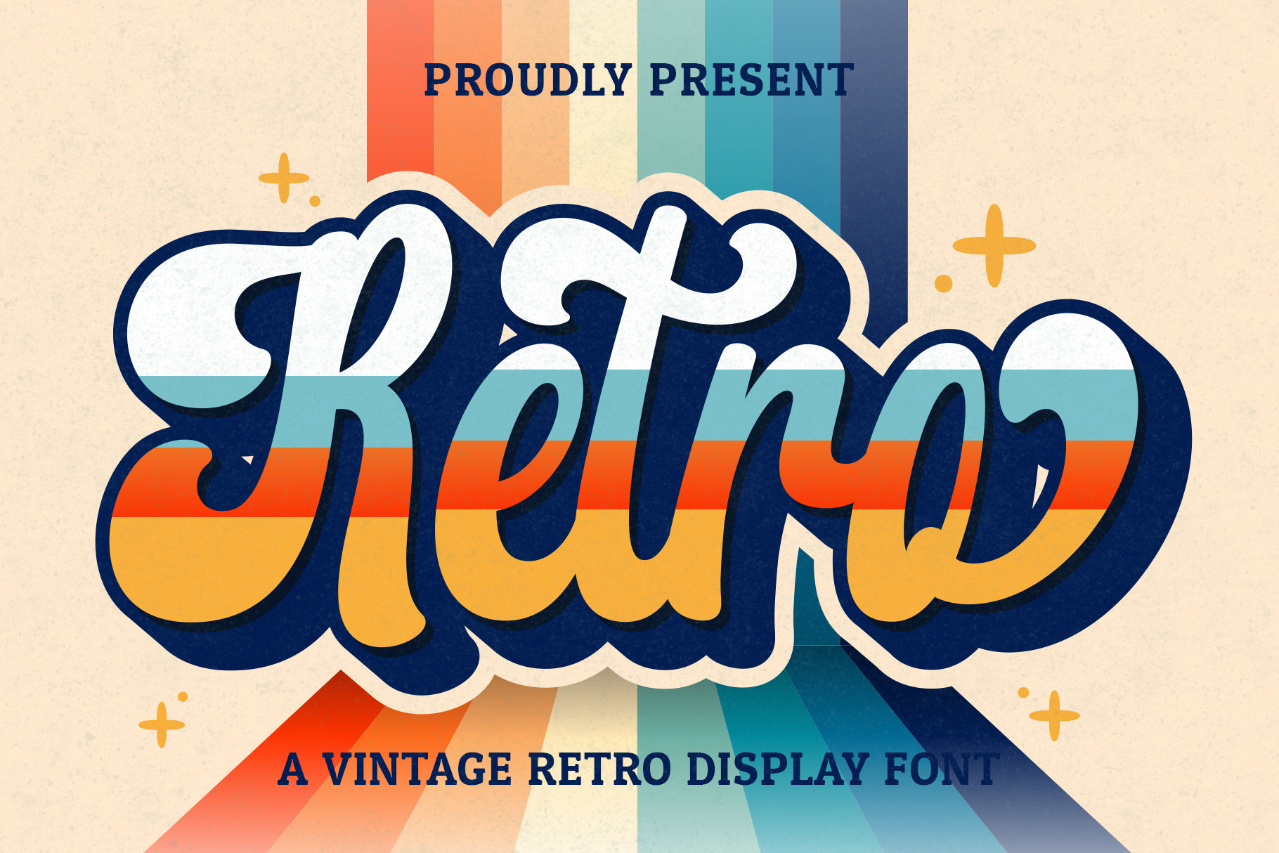
Hoperative Design’s entry reads as a classic 1950s advertising script, all connected strokes and confident loops, even though Creative Fabrica files it under display rather than script. The letterforms are handwritten in spirit and pair well with a bold display font for contrast.
Best for: diner-style signage, product labels. By: Hoperative Design
5. Groovy Font
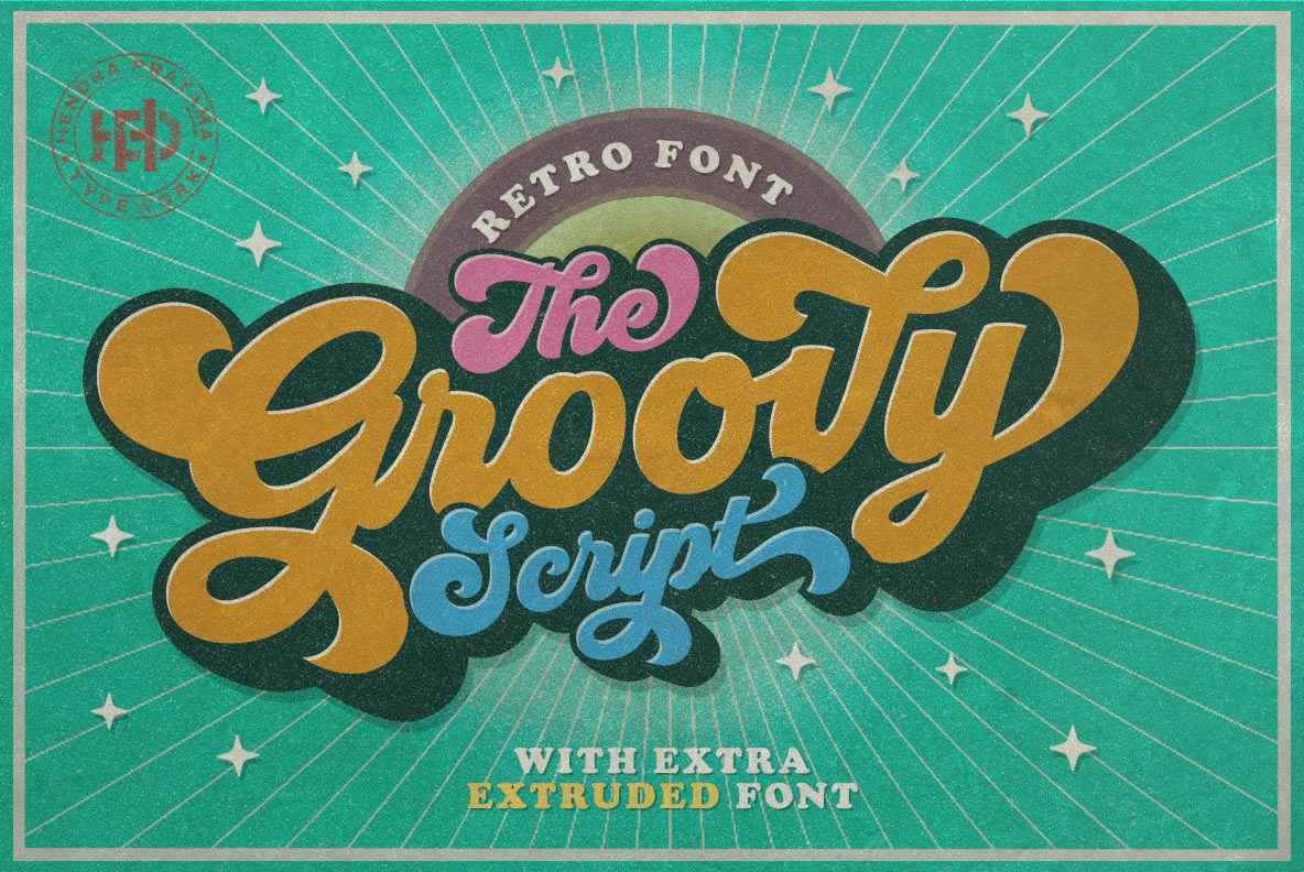
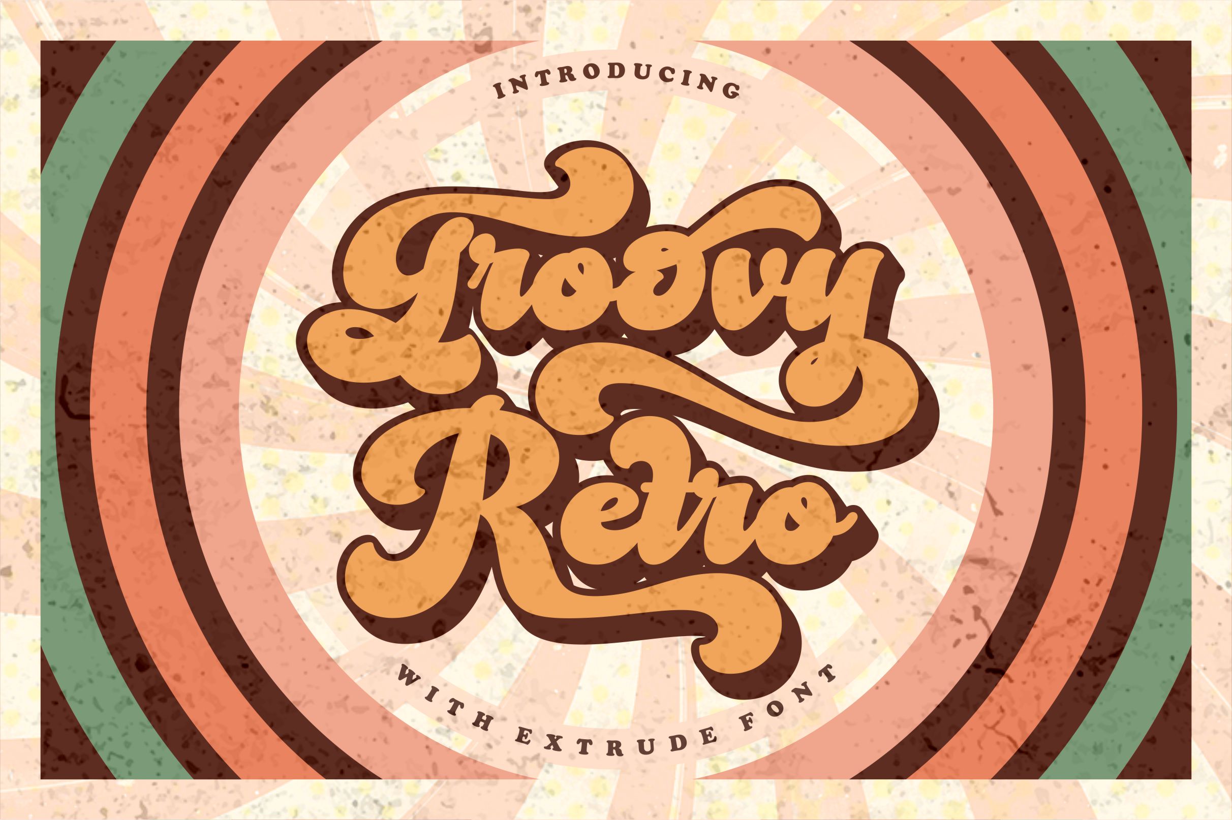
Hptypework’s Groovy Font brings a wavy, freeform cursive that feels like 1970s counterculture at a glance. It’s a flexible base font, so we’d suggest it for music posters, boho branding, or anywhere you want a loose, hand-lettered feel without committing to a heavier display typeface.
Best for: music posters, boho branding. By: hptypework
Best Bold Retro Display Fonts
Big and impossible to miss, these six display fonts carry the “groovy” 60s and 70s energy that works best in headlines and logos that need to grab attention fast.
6. Funky Retro Font
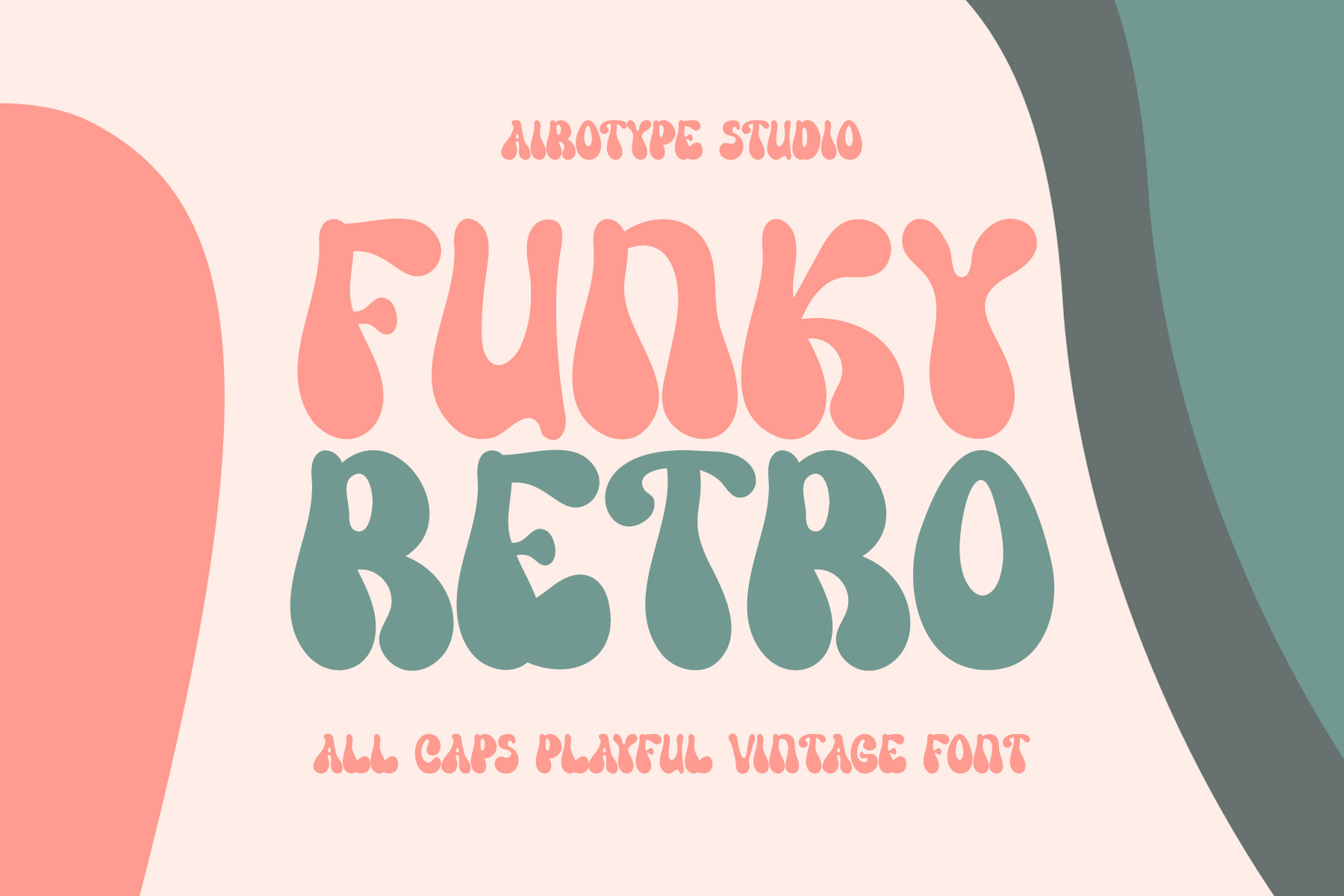
Airotype’s Funky Retro is a bold, rounded display font with a playful funk-and-disco energy. It’s built to command attention at headline size, and its bubbly weight could also work nicely on album art or event flyers looking for a retro pop.
Best for: poster headlines, event flyers. By: airotype
7. Raphila Retro Font
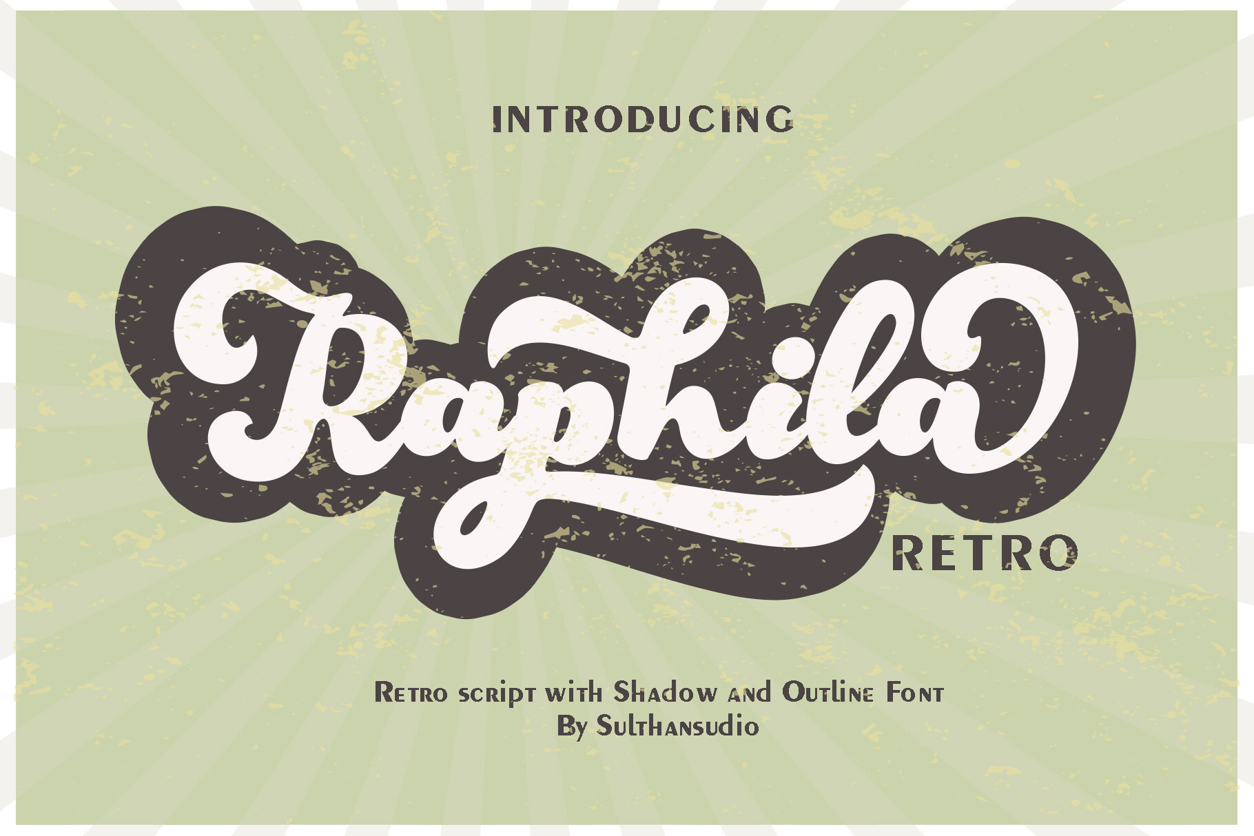
Sulthan Studio’s Raphila takes a crisper, more geometric approach than Retro Vintage Font above, trading loose hand-painted charm for tighter, more controlled letterforms. That extra structure pays off when you need retro flavor but still want your logo or merch design to look intentional rather than sketchy.
Best for: logos, merch design. By: Sulthan Studio
8. Super Groovy Font
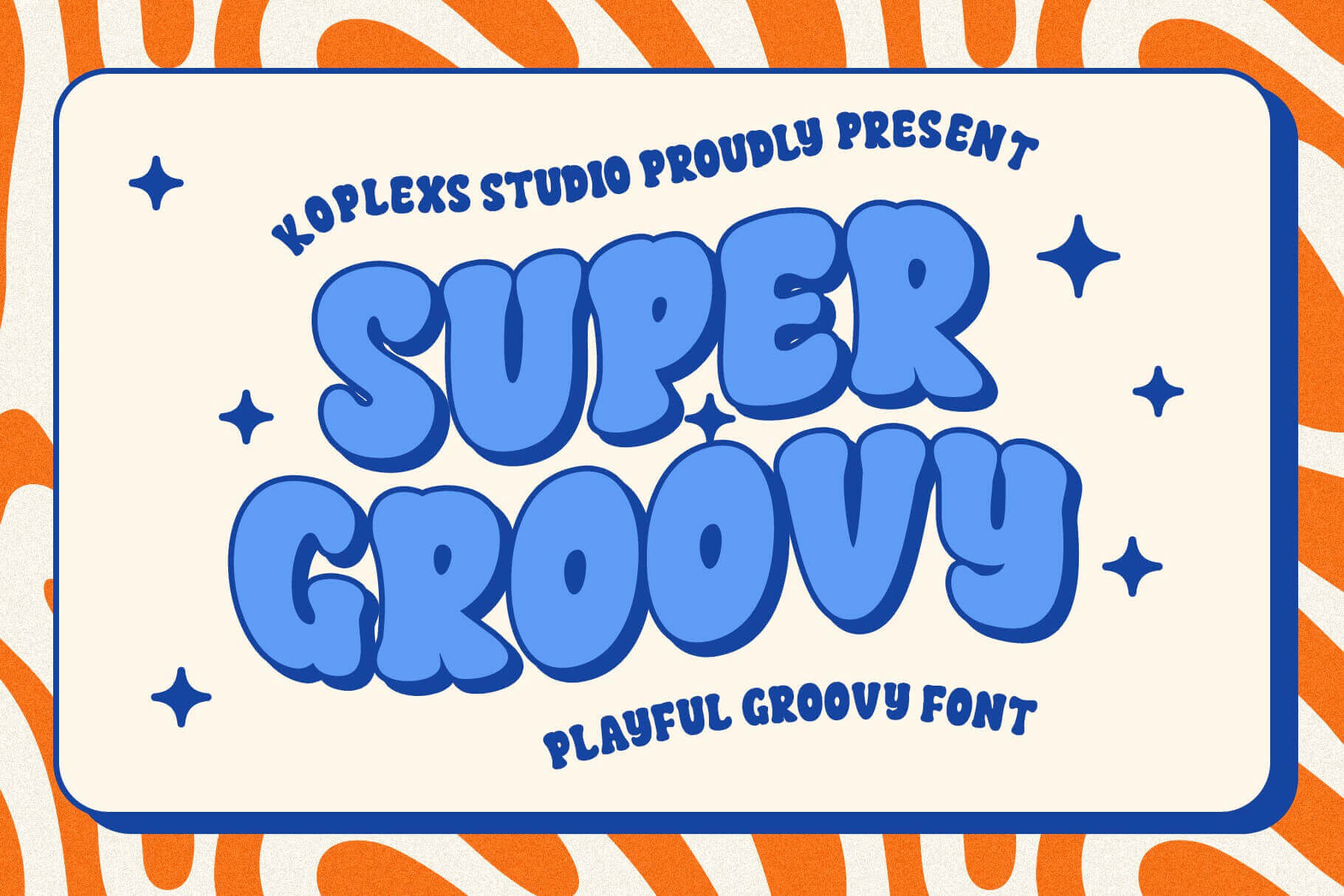
Koplexs Studio didn’t hold back on this one. Thick, rounded, and unapologetically 70s, Super Groovy Font is the pick when you want maximum groovy fonts energy without second-guessing whether it reads clearly on a t-shirt or poster.
Best for: t-shirt designs, event posters. By: Koplexs Studio
9. Retro Groove Font
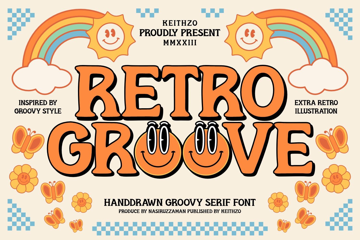
Keithzo’s (7NTypes) Retro Groove is the most versatile display font in this group, bold enough to anchor a headline but restrained enough to still read cleanly at smaller sizes. That balance is exactly what you want when you’re not sure yet exactly how loud the design should be.
Best for: branding headlines, packaging. By: Keithzo (7NTypes)
10. 70’s Retro Groovy Font
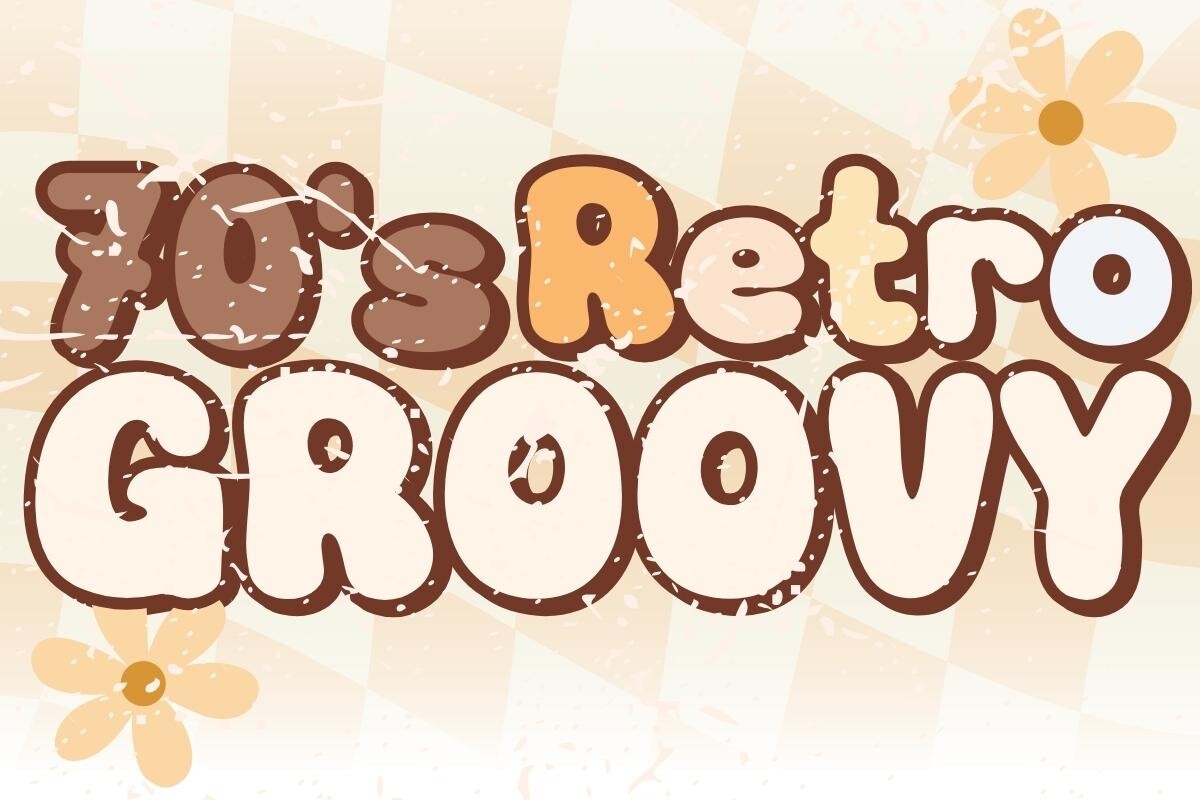
The name says 1970s, and the rounded letterforms back that up visually, even though the designer’s own description keeps things more general (“timeless elegance, modern flair”). That means it’s flexible: lean into the groovy read for themed projects, or use it as a plain bold retro headline elsewhere.
Best for: 70s-themed events, retro campaigns. By: charmingbear59.design
Download 70’s Retro Groovy Font
11. Retrowave Font
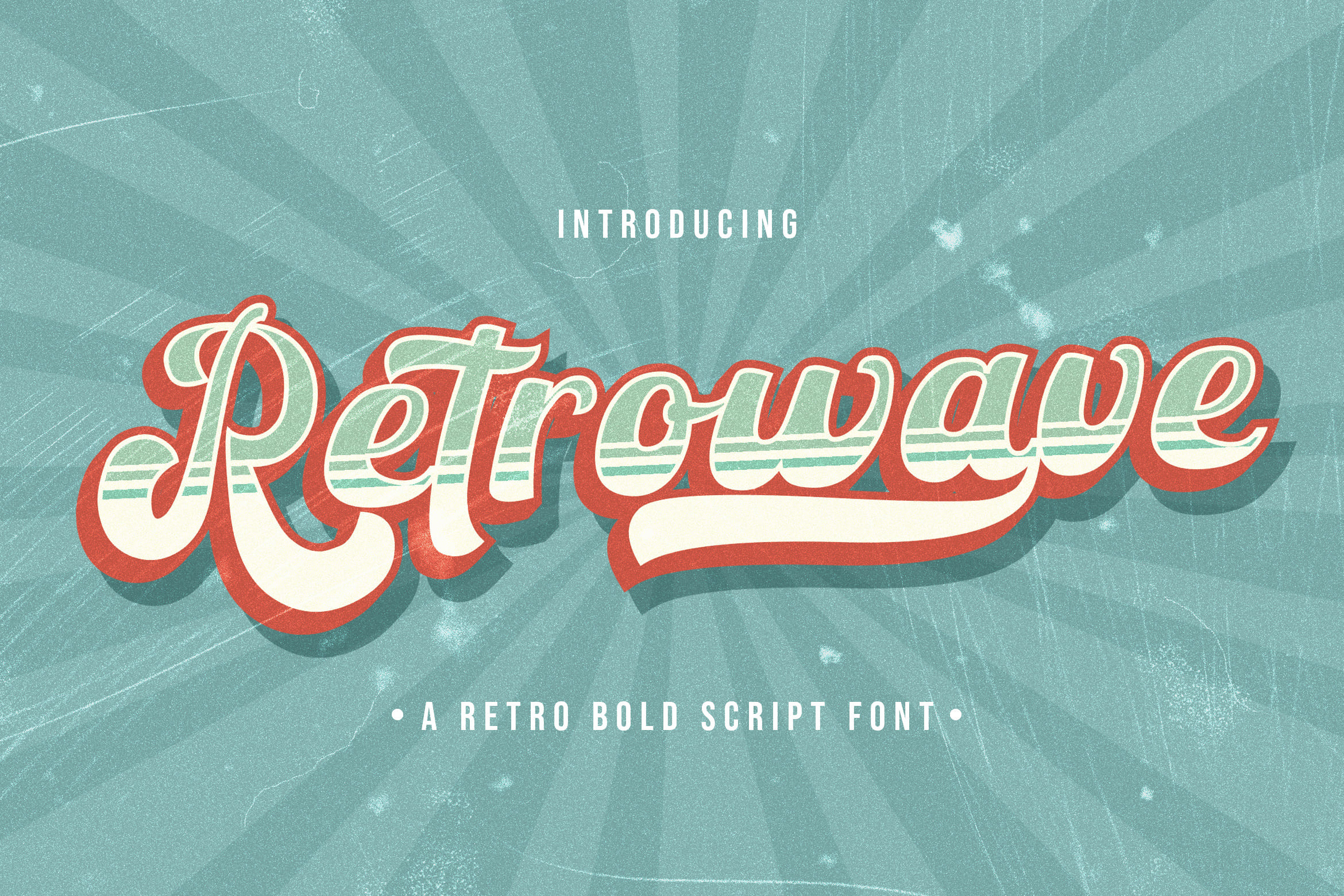
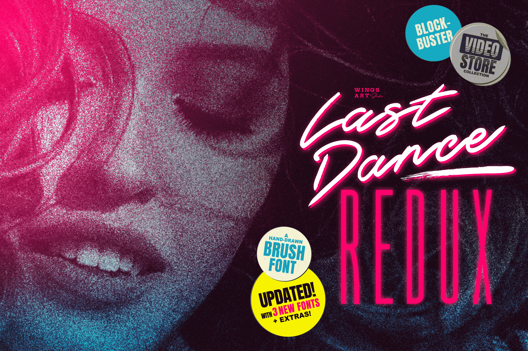
StringLabs named this one Retrowave, and the strong, angular strokes evoke that synthwave, neon-grid nostalgia at a glance, though the font itself is a straightforward bold script built for general branding rather than a gaming-specific typeface. Treat the name as a style cue: pair it with a dark background and bright accent color and it leans right into that 80s mood.
Best for: bold branding, retro-styled headlines. By: StringLabs
Best Western & Wood-Type Fonts
These four fonts pull from old wood-type posters and saloon signage, the rough letterforms you’d expect on a Wild West wanted poster or frontier-town storefront.
12. Western Font
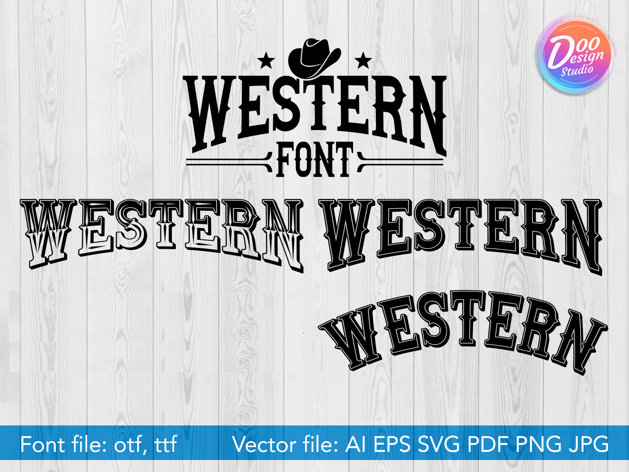
Doo Design Studio’s Western Font is a textbook wood-type design, thick slab serifs with the slightly rough edges you’d expect from a hand-carved printing block. It’s the most literal “Wild West” option on this list, ideal when you want zero ambiguity about the theme.
Best for: western-themed logos, saloon signage. By: Doo Design Studio
13. Wild Western Font
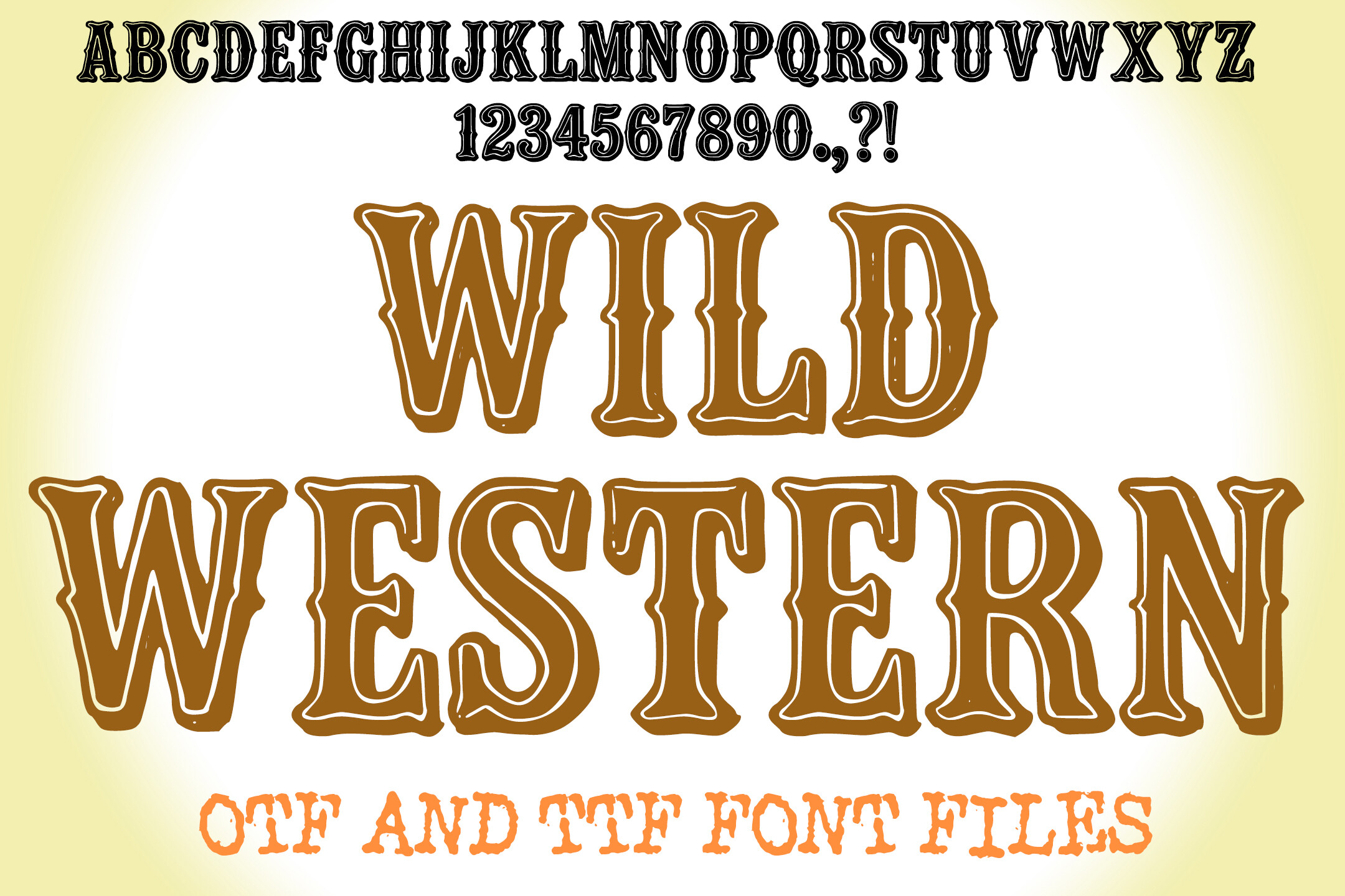
Squeebcreative’s Wild Western Font is the standout of this group, a rugged, expressive display font that comes with the designer’s own pairing and tracking guidance built into the product page. If you want western fonts that feel professionally finished rather than DIY, start here.
Best for: rodeo posters, rustic branding. By: squeebcreative
14. Western Bounty Font
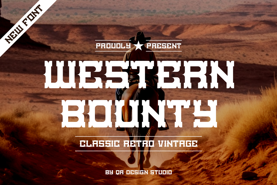
Qrdesignstd describes Western Bounty Font as built for “saloons and dusty trails,” and the condensed, weathered letterforms deliver on that promise. It also has an easy second life as a wanted-poster style pick for themed events or packaging that wants a frontier feel.
Best for: themed event branding, rustic packaging. By: qrdesignstd
15. Groovy Western Font
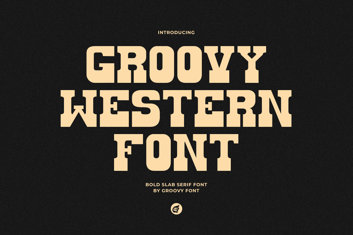
Despite the name, this one from Groovy Font isn’t a 70s groovy hybrid, it’s a bold slab serif that blends old vintage typewriting with a Western twist. That typewriter-meets-frontier combination is genuinely unusual and earns it a spot for brands that want a western feel with a document-authentic edge.
Best for: niche branding, novelty products. By: Groovy Font
Best Art Deco Fonts
Geometric and unmistakably 1920s-30s, these three art deco fonts bring instant luxury to branding, invitations, and anything wanting a Gatsby-era polish.
16. Decola Font
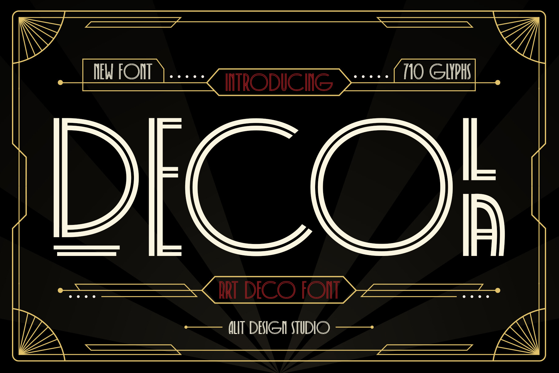
Alit Design built Decola around the sharp, symmetrical geometry that defines Art Deco fonts, with clean, confident lines that read as luxury without needing extra embellishment. It’s a strong choice whenever a brand needs to feel established and polished rather than trendy.
Best for: luxury branding, event invitations. By: Alit Design
17. Deco Font
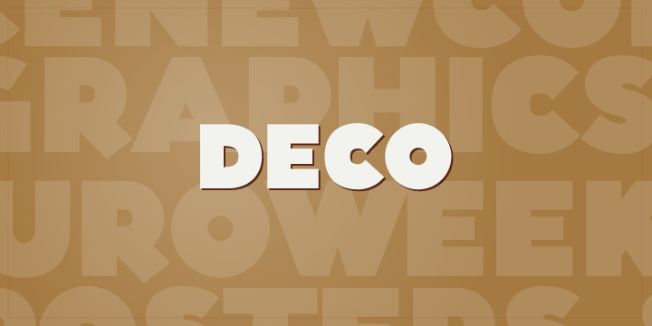
Good Gravy Type’s Deco Font has a chunky, hand-drawn charm that sets it apart from stricter geometric Art Deco fonts, more character, less precision. That warmth makes it a natural fit for 1920s-themed design work and movie-poster-style lettering where a little imperfection actually helps sell the era.
Best for: 1920s-themed design, movie posters. By: Good Gravy Type
18. Digital Deco Font
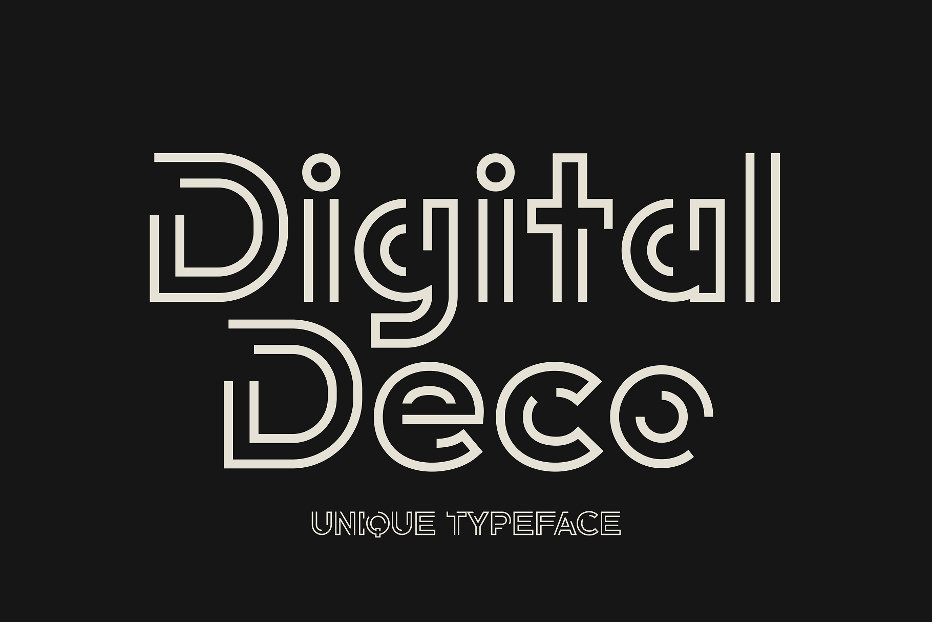
HipFonts took the Art Deco formula and gave it a cleaner, more contemporary finish, geometric enough to feel like the era but crisp enough for a screen-first brand. If you want that vintage typography luxury cue without looking dated, this is the pick.
Best for: digital branding, premium packaging. By: HipFonts
Best Distressed & Typewriter Fonts
Worn and full of texture, these four distressed fonts and typewriter font options add authentic age to any design, no digital filter required.
19. Old Typewriter Font
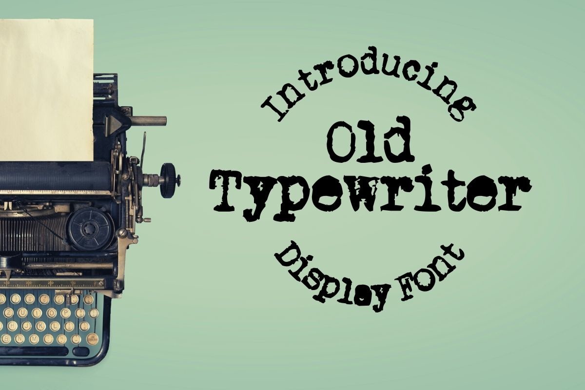
Design.steiner’s Old Typewriter Font is a faithful, no-frills recreation of classic typewriter type, complete with the slight ink-strike irregularity that sells authenticity. It’s a natural fit for anything meant to look like a genuine vintage document, from journaling layouts to aged letters and props.
Best for: vintage documents, journaling. By: design.steiner
20. Erased Typewriter 2 Font
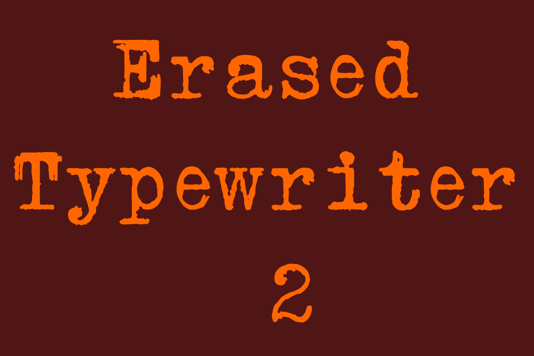
Intellecta Design’s Erased Typewriter 2 has the worn, half-faded strike marks of an old ribbon typewriter, but the vibe is bright and fun rather than somber, it’s designed with food and candy packaging in mind just as much as vintage stationery. That playful edge makes it more versatile than a typical typewriter font.
Best for: food and candy packaging, playful vintage branding. By: Intellecta Design
Download Erased Typewriter 2 Font
21. College Distressed Font
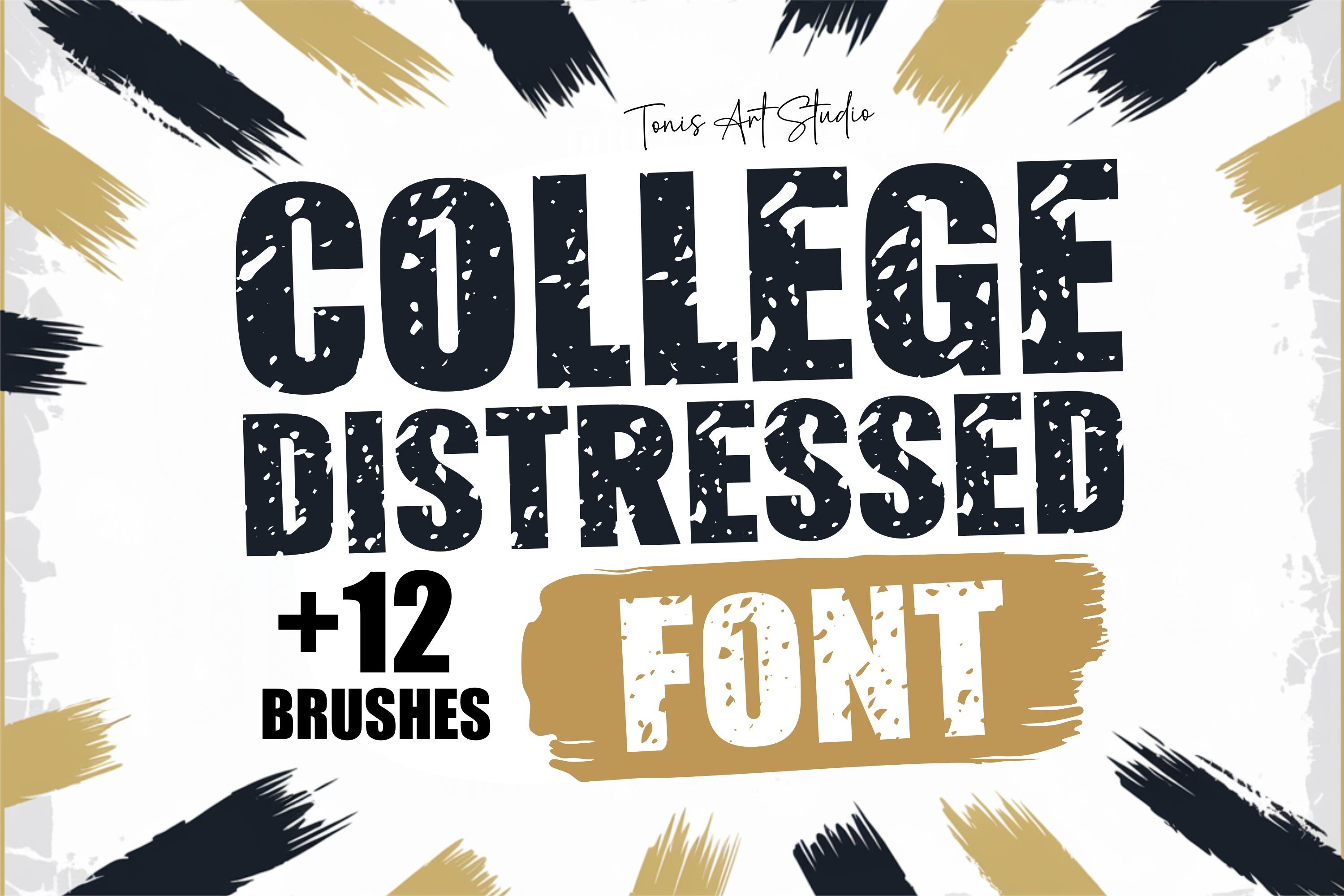
TonisArtStudio’s College Distressed Font is the most feature-packed entry on this list, with 12 bonus grunge brushes and ready-to-use Cricut and Silhouette cut files. If you’re making collegiate merch or sportswear branding, this distressed font is worth building the whole product line around.
Best for: collegiate merch, sportswear branding. By: TonisArtStudio
Download College Distressed Font
22. Sunday Grunge Font
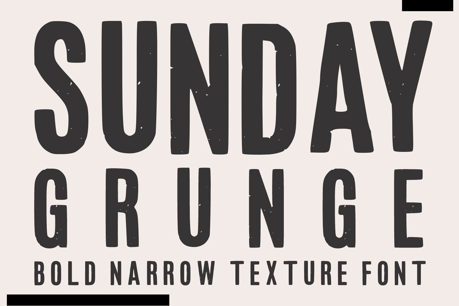
Mardanimirza12’s Sunday Grunge closes out the list with a heavily textured, worn-in display font built for apparel and t-shirt design. The rough edges and scratchy fill are exactly what streetwear graphics or a grunge poster need for that “uneven ink” look, straight out of the box.
Best for: streetwear graphics, grunge posters. By: mardanimirza12
How to Use Vintage & Retro Fonts in Your Design Projects
Picking the right font from that list is only half the job. The fastest way to make a retro design look amateur is to pile on too many decorative fonts at once. The classic pairing formula still works best: one serif or clean sans for structure and readability, paired with one script or display font as an accent. Two typefaces, used with intention, beats five typefaces fighting for attention every time. For more pairing inspiration, browse the FontPro blog.
That pairing logic actually shifts a bit by era. For 1920s Art Deco projects, pair a geometric sans or serif with a period-appropriate script for contrast. For 1950s designs, a rounded, playful script alongside a clean sans hits that postwar advertising look. For 1970s groovy fonts, a bold, chunky display headline paired with a loose, hand-lettered script captures that counterculture energy without clashing.
Tip: In Photoshop, two methods cover most needs. Use a layer mask with a grain or spatter brush to selectively “erase” parts of the text and simulate worn ink, or clip a paper or grunge texture to your text layer with the blend mode set to Multiply or Linear Burn, the go-to modes for layering distressed textures over type. In Canva, pick a period font, shift your palette to muted tones, apply the built-in shadow, outline, or curve text effects, add a touch of blur or grain from the Effects tab, tighten letter spacing, and layer in a few Grunge elements.
Color tells the era as much as the font does. Think jade green, rich red, and gold jewel tones for the 1920s. The 1950s split between pastel Mamie pink and mint on one side and vivid color-blocked orange on the other. By the 1960s everything goes psychedelic: neon fuchsia, chartreuse, no restraint.
The 1970s can’t quite decide between earthy avocado and harvest gold or chrome-and-glitter disco excess, and honestly, that indecision is part of the charm. Then the 1980s show up in neon and pixels. Most retro fonts draw from somewhere in this 1920s-to-1980s stretch, moving from Art Deco elegance through postwar script and playful advertising type to bubble-shaped 70s groovy lettering and neon 80s arcade styles.
Whichever era you’re chasing, keep the background simple. A muted, tonal color or a subtly aged cream or parchment texture lets a decorative vintage font do its job. A busy photo background will fight it every time.
Tips for Choosing the Right Vintage or Retro Font
Style and pairing aside, there’s a practical side to all this too. Before you build a brand around a font, check the license. Fonts are licensed, not purchased outright, and “free to download” isn’t the same as “free for commercial use.” Personal use covers anything not intended to generate income. Commercial use covers business branding, client work, and any product you plan to sell, including merch made with a Cricut or Silhouette. The fonts featured above are available on Creative Fabrica with commercial licensing included, but always confirm the terms before shipping a paid product.
Software compatibility matters too. All 22 fonts here work in Adobe Photoshop and Illustrator, and most import cleanly into Canva. If you’re working with a laser cutter or cutting machine, check that your font comes with (or converts to) SVG files for Cricut Design Space or Silhouette Studio, several fonts in the distressed and Western groups already include those files.
Finally, resist the urge to pick “whatever looks cool.” Match the font to the actual era or mood your project needs. A brand aiming for 1950s diner nostalgia and a brand aiming for 1970s boho warmth need two very different fonts, even though both technically qualify as “vintage.”
Where to Download Vintage & Retro Fonts
Once you’ve settled on an era and a style, sourcing the actual font file is the easy part. Creative Fabrica is the primary source for every font in this article, and all 22 come with commercial licensing suitable for logos, packaging, and merch. Beyond Creative Fabrica, a few other places are worth bookmarking. Google Fonts offers roughly 1,358 fonts free for personal and commercial use under libre licenses like the SIL Open Font License, a reliable option when you need retro fonts free of licensing headaches. Adobe Fonts comes with a Creative Cloud subscription. DaFont has a huge free library too, though license terms vary font by font.
If you’re hunting for vintage fonts free of cost, there’s no single “best” free vintage font, it depends on the mood and era you’re chasing. Start with Google Fonts for a commercially-cleared baseline, and browse RetroSupply Co.’s roundup of the best free retro and vintage fonts for more curated options. For a real branding project, the licensing clarity on Creative Fabrica is usually worth the small investment.