· fonts · 14 min read
19 Best Minimalist Fonts for Branding and Design in 2026
Discover the best minimalist fonts for branding and design. Clean, modern typefaces for logos, websites, and print. Download free and premium options.
Minimalist fonts work because they get out of the way. When a logo, website, or package has fewer visual elements, the typeface carries more of the personality. The best minimalist fonts are more than thin or plain. They have clean letterforms, balanced proportions, and enough character to feel intentional at small sizes and large scales.
This list covers 19 options for logos, websites, packaging, and print, including geometric sans serifs, elegant serifs, restrained scripts, and display accents. A startup may need a crisp app icon, a boutique may want a quiet luxury feel, and a studio may need a clean face that still has a bit of edge.
I have grouped them by style, so you can jump to the type that fits your project.
What Makes a Great Minimalist Font?
A minimalist font looks simple, but the simplicity is engineered. The letterforms are usually built from clear shapes, with little decoration, even stroke contrast, and generous negative space. The goal is not to remove everything, but to keep only what helps the message read clearly.
A good minimalist face feels calm but not boring, with enough contrast in weight and spacing to stay interesting.
That is why minimalism is an approach, not a single category. A geometric sans serif font can feel minimalist because its letters are drawn from circles, squares, and straight lines. A minimalist serif font can work too, when the serifs are thin, the details are restrained, and the proportions stay airy. Even a script can be minimalist if it avoids heavy flourishes and keeps its lines clean.
The roots of this look go back to the Bauhaus school and the Swiss International Typographic Style. Designers like Herbert Bayer explored geometric, lowercase-only alphabets built from simple arcs and lines. That logic of reduction helped shape the clean, objective typefaces we now associate with modern branding.
For branding, that matters. Studies suggest that simple logos can improve brand perception, and many well-known brands reportedly use straightforward marks. But minimalism is not a magic fix. Brands like Peugeot, Intel, and Warner Bros. have faced recognition problems after stripping away distinctive elements during redesigns. Reduce clutter, but keep the part of your identity that makes you recognizable.
So when people ask what makes a font look minimalist, the answer is restraint plus function. The font should stay legible at small sizes, scale up without feeling empty, and pair well with other typefaces. It should not need ornament to feel designed.
Sans-Serif & Geometric Minimalist Fonts
Sans serif faces are the classic home of minimalist typography. They are often the first choice for clean fonts for logos, websites, and UI text because they read clearly on screens and in print. This group includes geometric and grotesque options, from quiet workhorses to bolder display-leaning faces.
These are the faces I would test first for a logo or website that needs to look modern without a lot of visual noise.
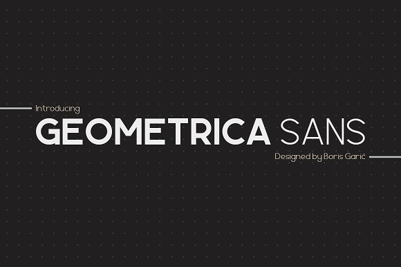
1. Minimalist Sans
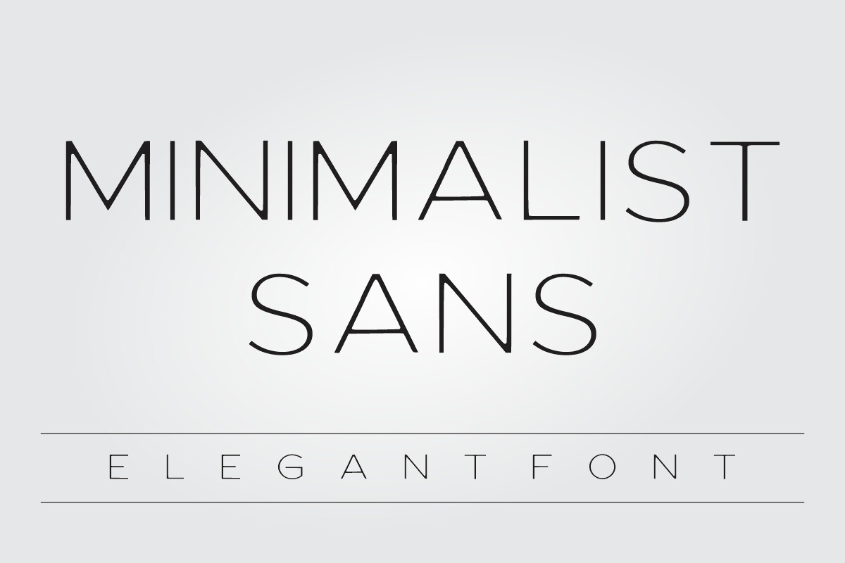
Minimalist Sans is a clean geometric sans serif with calm, modern proportions. Its open letterforms stay readable at small sizes, so it works well for interface labels, navigation, and body copy on a minimalist website. I would reach for it when the design needs to feel organized without trying too hard.
Best for: UI text, website body copy, clean logo lockups. By: Infinity art Studio
2. Montilla
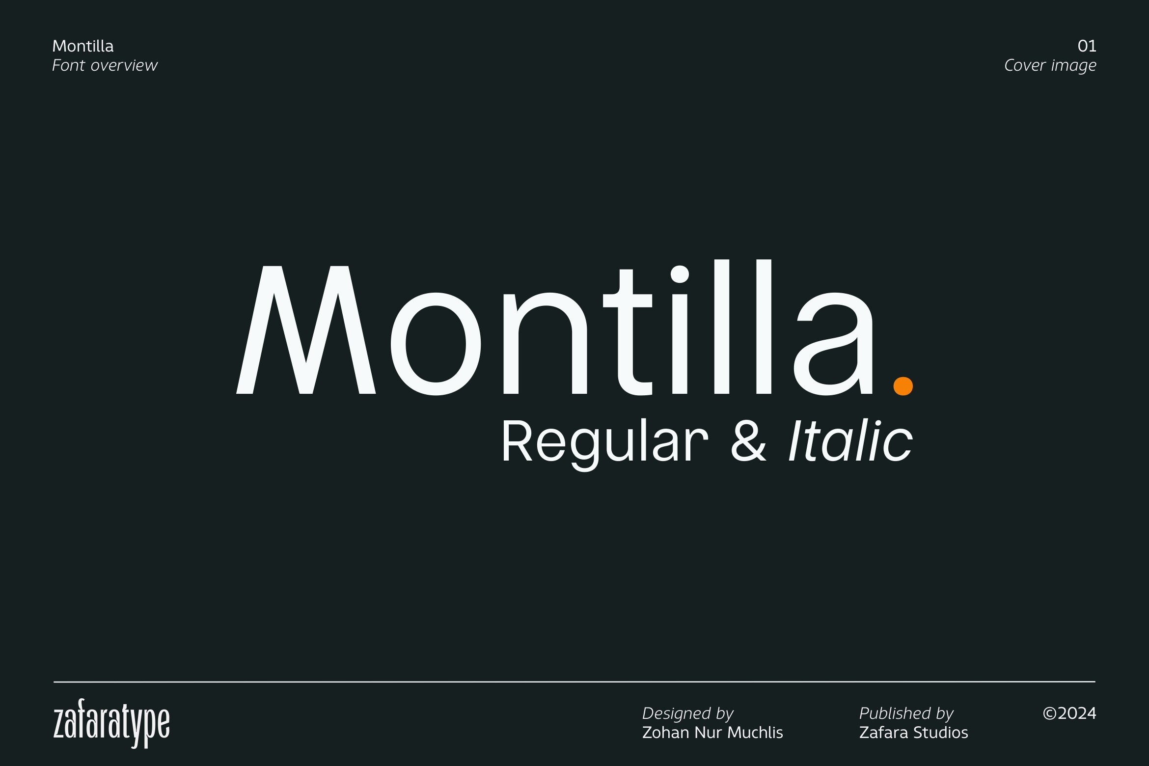
Montilla brings fresh, contemporary proportions to a minimal sans serif style. It feels current without trying too hard, which suits startup branding, product names, and simple app screens. There is a light, confident edge to it that works well when the brand voice is direct.
Best for: startup branding, app interfaces, modern logo text. By: Zafara Studios
3. Broad Well
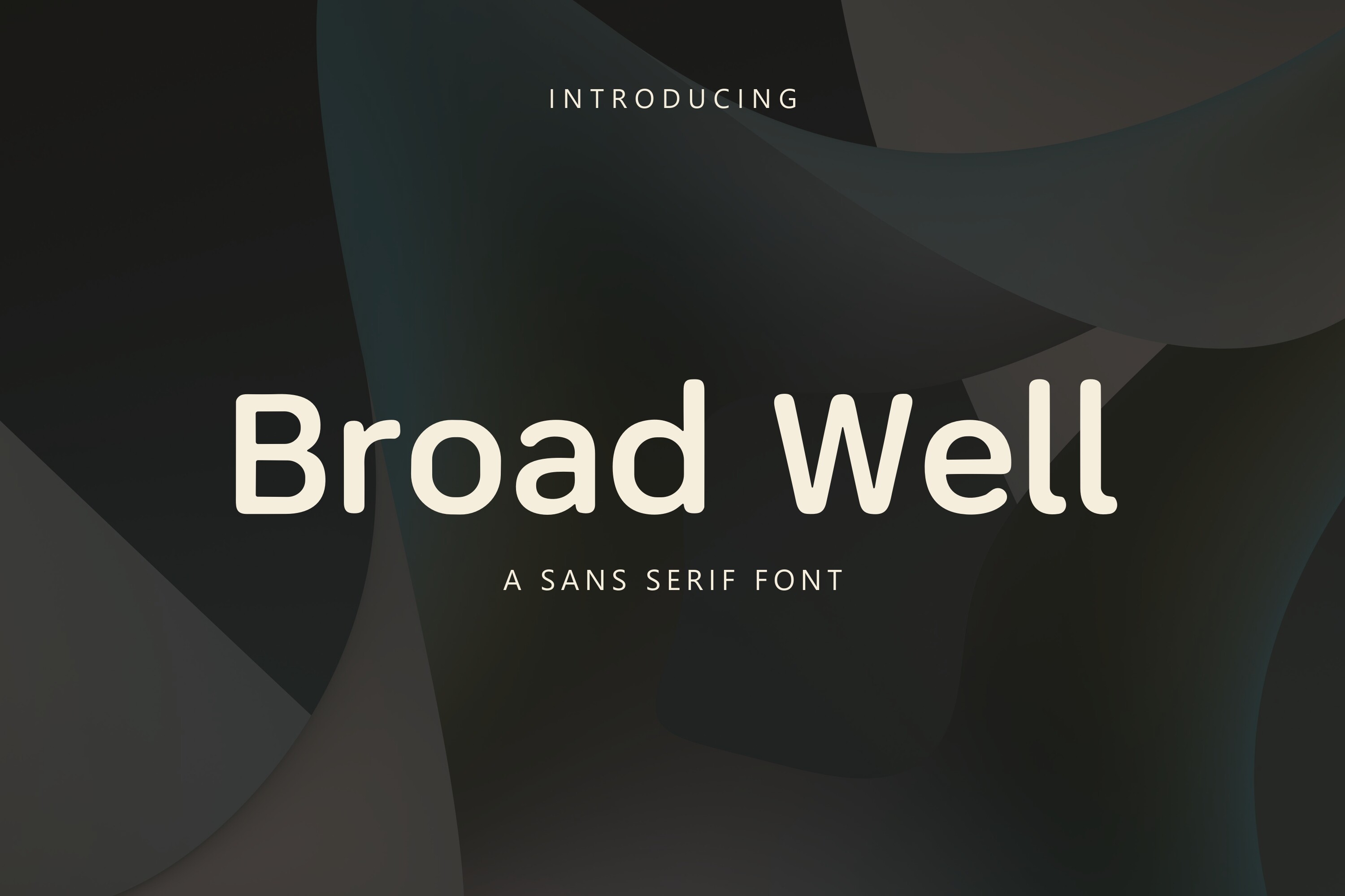
Broad Well is a bold minimalist sans serif with wider proportions and a confident presence. It works well when a logo needs to stand out on a storefront, business card, or social profile. If your brand needs a little more weight than a quiet neutral face, this is a good option.
Best for: headlines, logo wordmarks, packaging titles. By: TriDraw
4. Moda
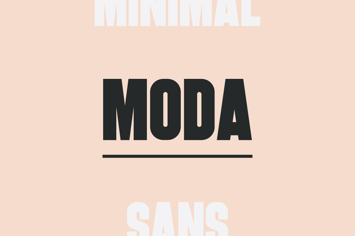
Moda adds elegance to a minimal sans serif font with a lighter, refined mood. It suits fashion, beauty, and boutique brands that want a premium feel without decorative details. The letterforms stay clean, but the overall impression is softer and more polished.
Best for: fashion brands, beauty packaging, elegant web headers. By: Surplus Type Co.
5. Aquire
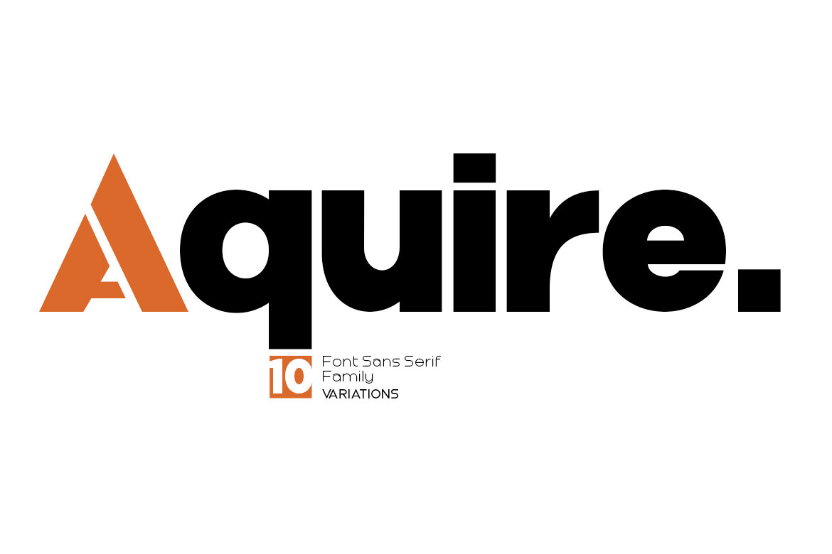
Aquire is a geometric display face with a strong, modern presence. It is best used at larger sizes, where its clean shapes can carry headlines, covers, and bold logo accents. I would not use it for long body text. If your project needs a strong headline moment, this is the kind of face to test.
Best for: large headlines, cover titles, bold logo accents. By: Artisans
6. Nerona
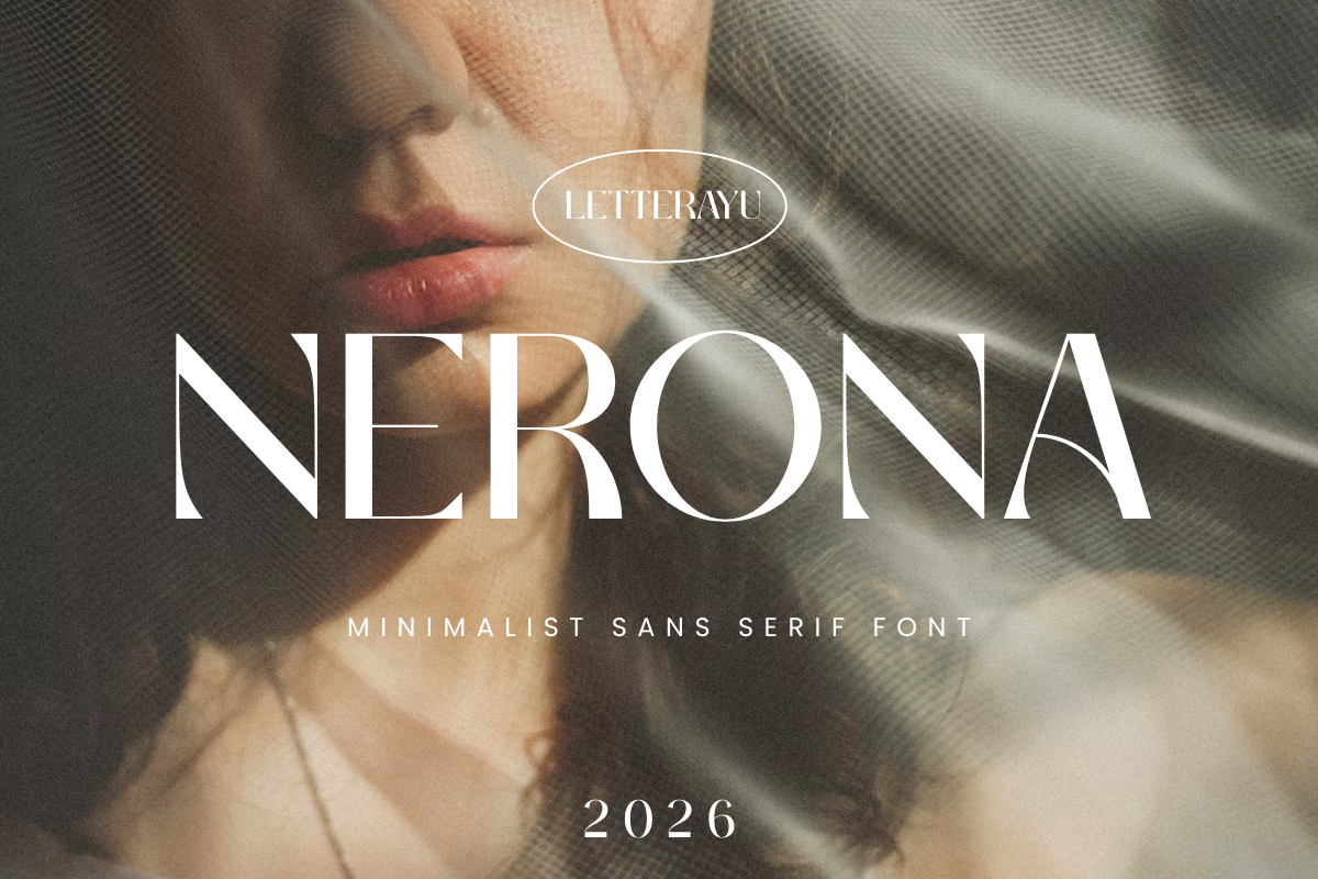
Nerona is a clean grotesque with a neutral, professional character. It stays out of the way, a trait that suits corporate branding, reports, and website systems. When a client asks for something clean, modern, and not too trendy, this is the kind of face that fits.
Best for: corporate branding, website typography, document design. By: Letterayu
7. Kulture
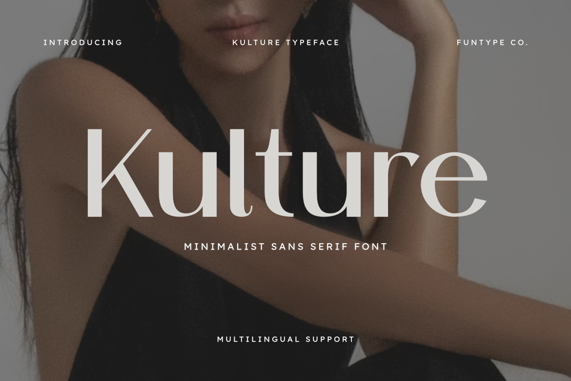
Kulture has a modern, slightly urban feel that fits lifestyle brands, studios, and creative services. It is minimal enough for clean layouts, with a bit more personality than a neutral grotesque. It is a good middle ground for brands that want to feel current but not loud.
Best for: lifestyle branding, studio logos, social media graphics. By: Funtype Co.
Serif & Elegant Minimalist Fonts
Serif fonts are often considered minimalist when their details are quiet and their proportions stay balanced. They are a good answer to the question of whether serif fonts can ever be minimalist: yes, when the serifs are thin, the spacing is generous, and the overall feel is restrained rather than ornate.
These faces work well when a brand wants a bit of classic polish without turning into a heavy editorial look.
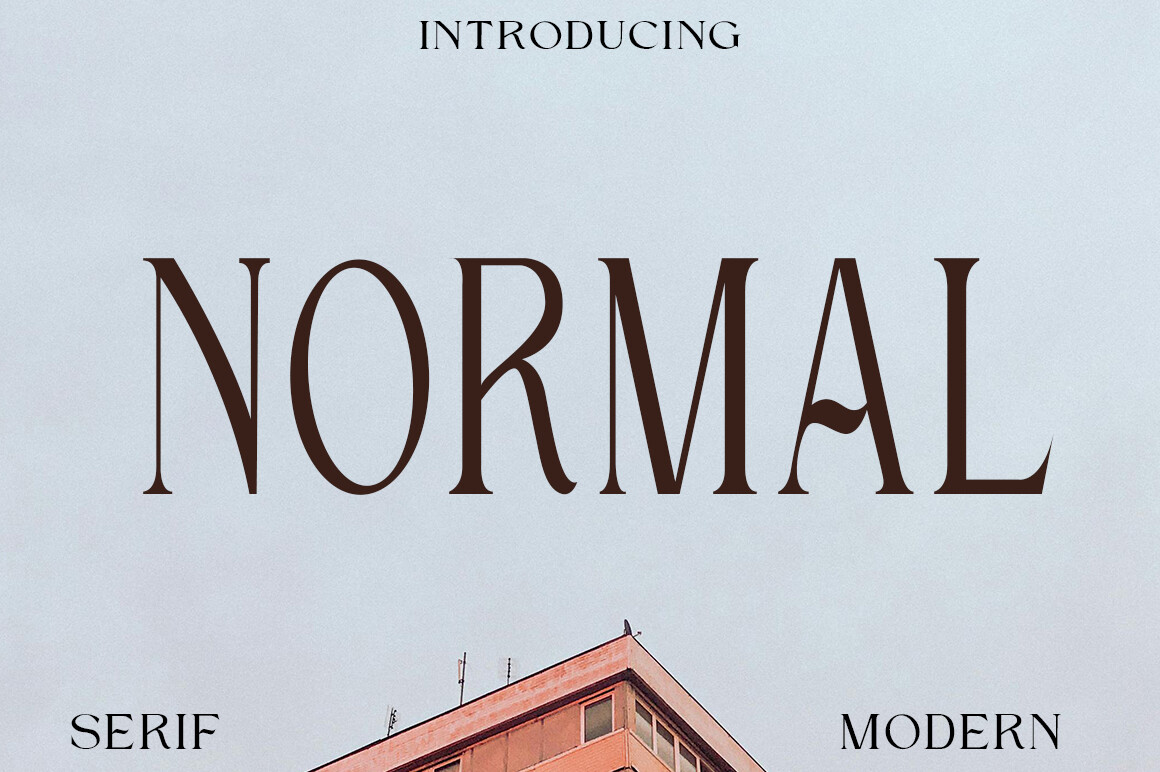
8. Electra

Electra is a minimal elegant serif with thin details and airy proportions. Its fashion-forward mood works well for beauty brands, boutique labels, and editorial layouts. It has a quiet luxury feel that can make packaging or invitations look more expensive.
Best for: fashion branding, beauty packaging, elegant invitations. By: Minimalistartstudio
9. Cantilos
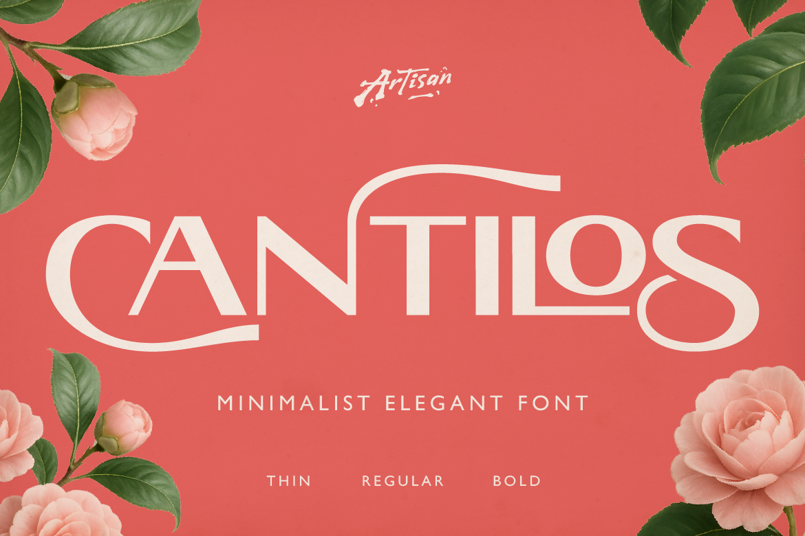
Cantilos is a restrained serif with a modern character. It suits editorial design, where type should feel polished without distracting from the content. I like it for article headers and brand guidelines that need to look clean but still have a bit of structure.
Best for: editorial design, brand guidelines, website article headers. By: Artisan Themes
10. The Paloma
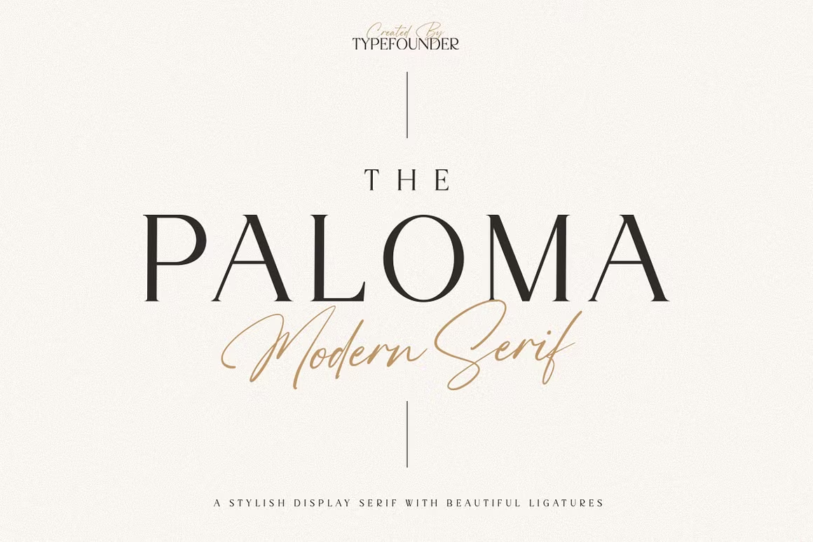
The Paloma brings soft details to an elegant minimal serif style. It feels warm and refined, making it a good match for invitations, wedding stationery, and premium packaging. It is the kind of serif that feels personal without becoming decorative.
Best for: invitations, packaging, boutique stationery. By: Chocotype
11. Virey
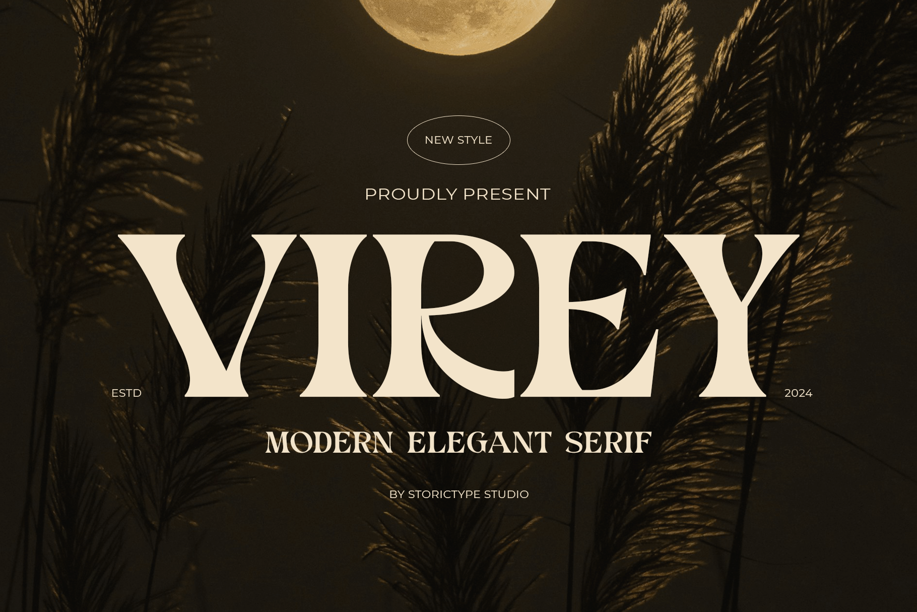
Virey is a display serif with clean forms and a confident headline presence. It is a good choice for website headers, campaign titles, and brand moments that need a modern serif feel. Use it where the type can take up space and set the tone.
Best for: website headlines, campaign titles, brand posters. By: Storic
12. Arches
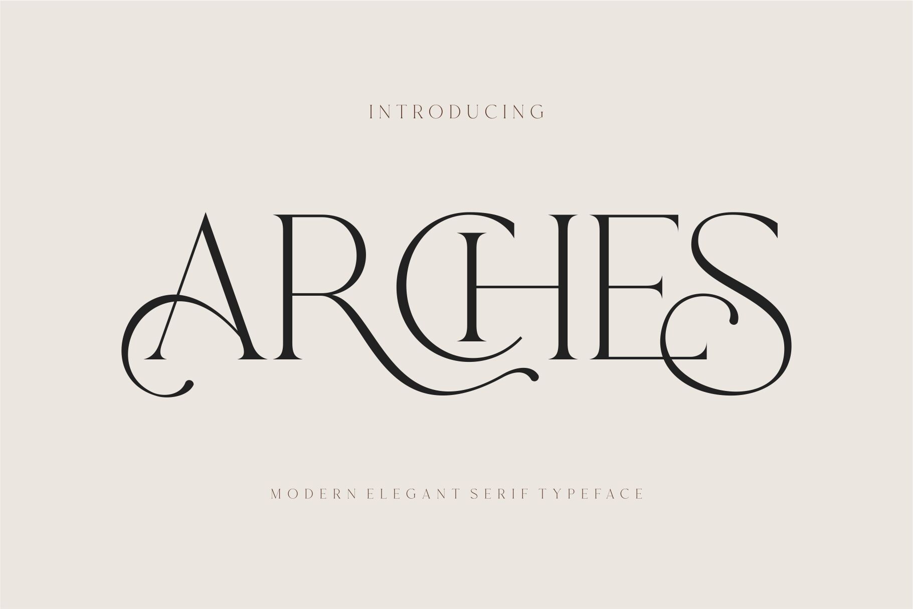
Arches is a calm, balanced serif that feels at home in print. It has a steady character that works for brochures, reports, booklets, and other materials where readability matters. If your project needs a serif that does not pull attention away from the layout, this is a solid pick.
Best for: print materials, brochures, brand reports. By: dylla studio
Script & Handwritten Minimalist Fonts
Minimal scripts focus on keeping handwriting simple enough to feel personal without breaking the clean structure of a brand. These faces work best as accents, not as the main typeface for long copy.
Use them for a short line, a signature, or a small detail that adds warmth.
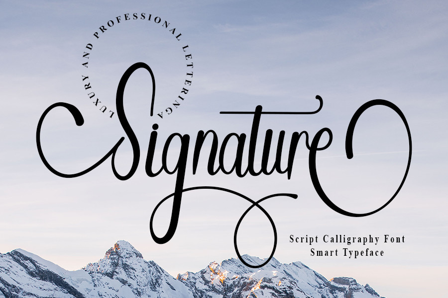
13. Minimal Signature
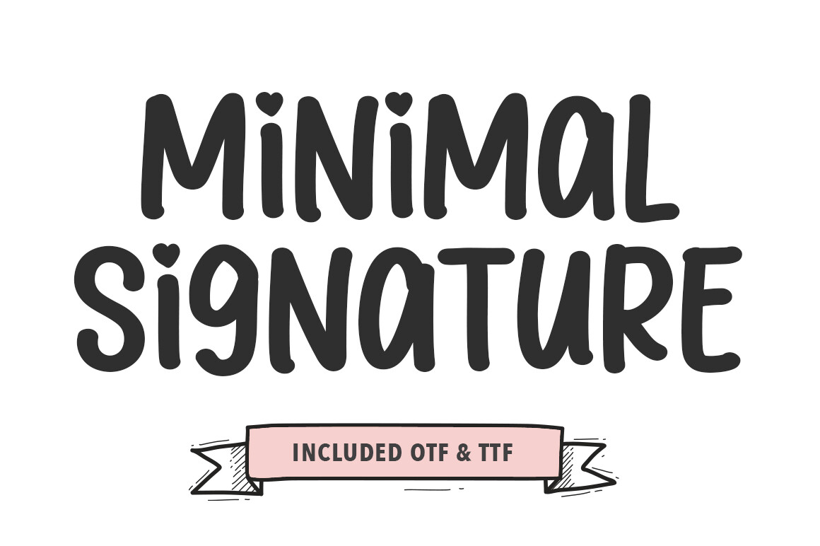
Minimal Signature is a polished autograph-style script with clean lines. It is designed to feel like a signature, which makes it useful for logo lockups, founder names, and packaging details. It gives a brand a human touch without looking messy.
Best for: logo signatures, founder names, packaging accents. By: Pretty Glyphs
14. Simple Handwriting

Simple Handwriting has a natural, low-key handwritten style. It feels friendly and personal, a good fit for personal brands, Etsy shops, and small business stationery. It is especially useful when the brand voice is casual and approachable.
Best for: personal brands, Etsy packaging, handwritten notes. By: FreshTypeINK
15. Phillia
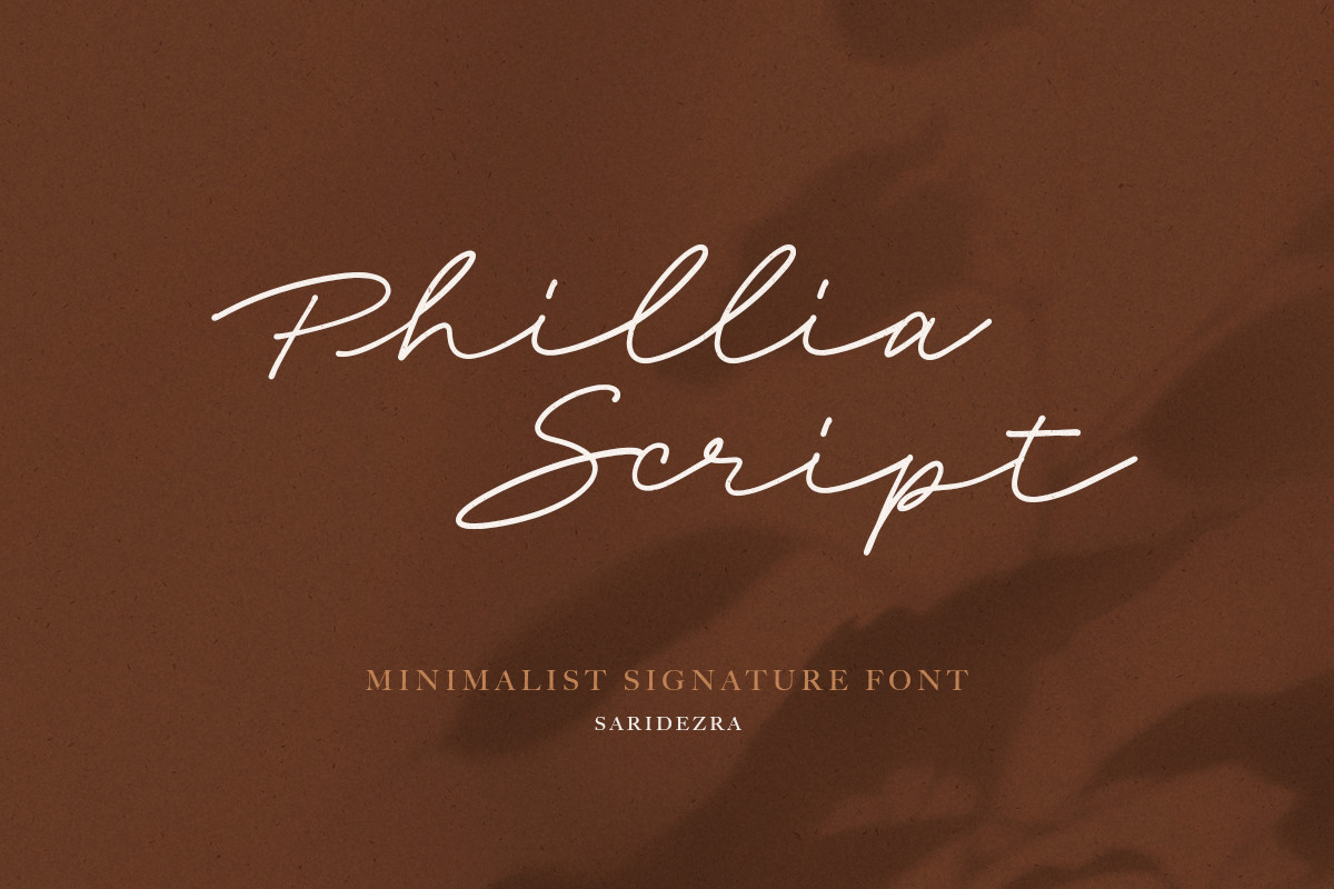
Phillia is a soft script with minimal decoration. It has a slightly more traditional feel, which makes it useful for invitations, greeting cards, and event stationery. It is a good option when you want a script that feels classic but still clean.
Best for: invitations, greeting cards, event branding. By: saridezra
Display & Geometric Accent Minimalist Fonts
Display and accent faces give a minimalist brand a point of interest. They are usually meant for short lines, not body text. They add a memorable mark, a headline moment, or a final signature touch to a logo block.
Treat these as supporting players. They can make a clean identity more memorable when used in the right size and place.
16. Lumina Inline
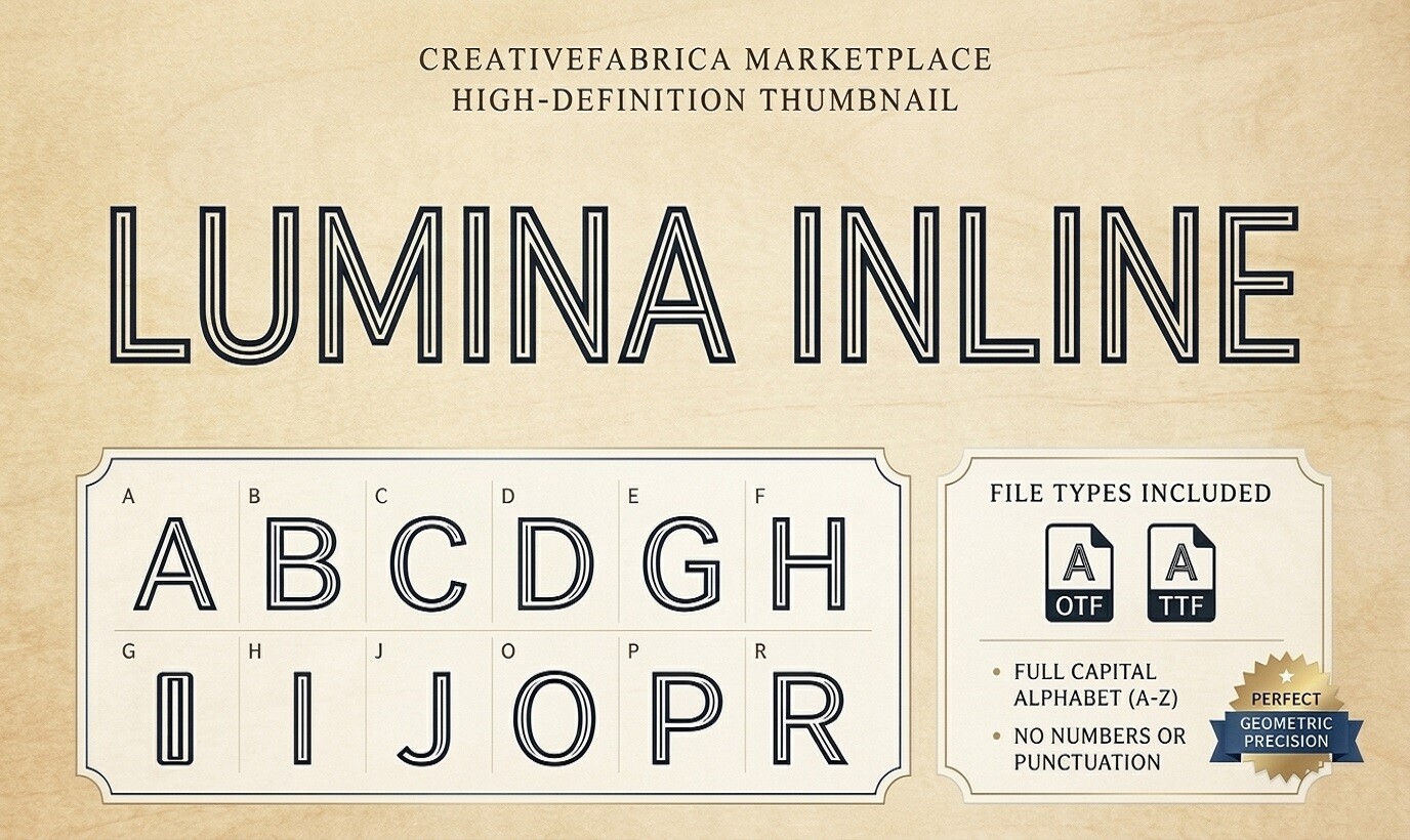
Lumina Inline uses an inline effect to add lightness without breaking the minimalist look. It feels delicate and modern, useful for logos, packaging, and brand marks. The inline detail gives it a bit of visual interest while keeping the overall shape clean.
Best for: logo marks, packaging, brand accents. By: Raholco
17. Humble Request
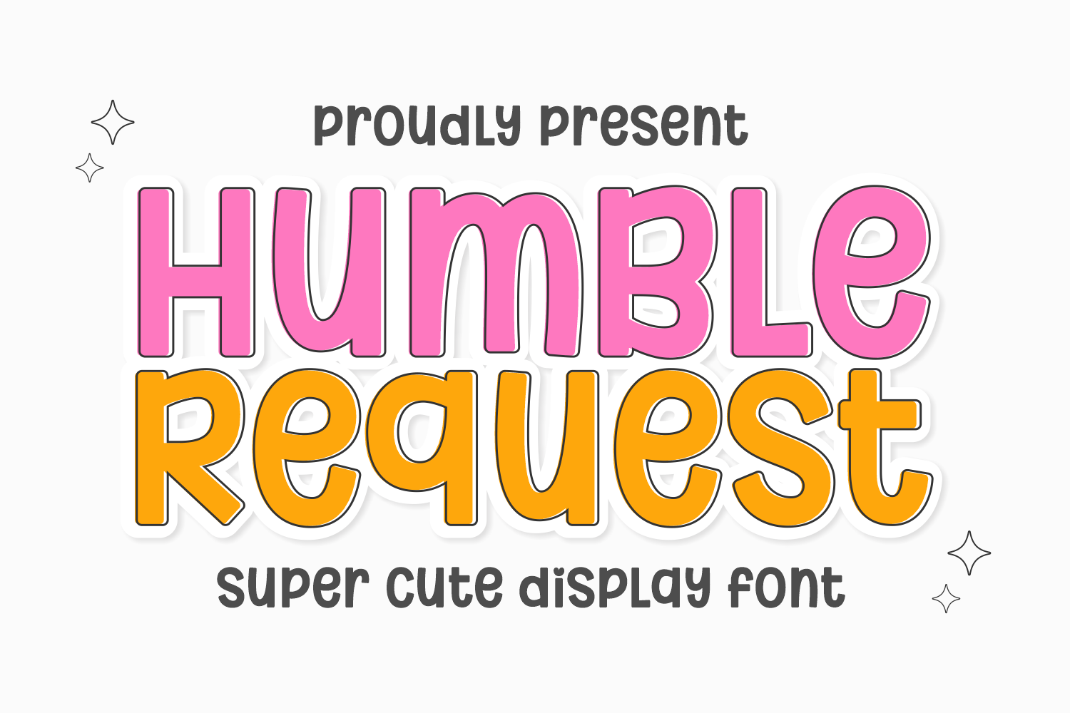
Humble Request is a restrained display face with a warm character. It works well for hospitality, welcome branding, and brands that want to feel inviting rather than cold. It has a friendly tone that can make signage or a welcome screen feel less corporate.
Best for: hospitality branding, welcome signage, boutique hotels. By: Riman (7NTypes)
18. Vectra
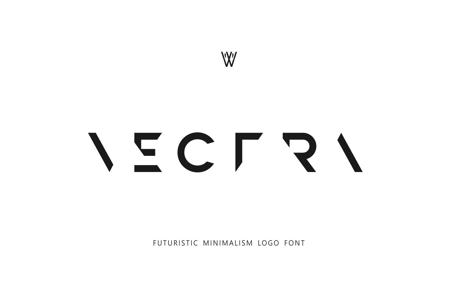
Vectra has a clear geometric structure that suits tech, SaaS, and product brands. It feels precise and modern, with clean lines that work well for app screens, dashboards, and startup logos. If your brand needs to feel engineered, this is a strong choice.
Best for: tech branding, SaaS logos, product interfaces. By: Whymore
19. Signature
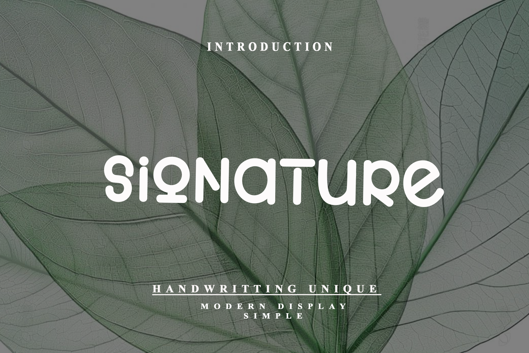
Signature is a concise signature-style accent rather than a full script system. It is best used as a final mark in a logo block, a small brand detail, or a closing line on packaging. It is a subtle way to add a personal finish without changing the whole type system.
Best for: logo accents, brand signatures, packaging details. By: Sansana
How to Use Minimalist Fonts in Your Branding and Design Projects
The best minimalist fonts are easiest to use when you give them room. White space is part of the design, not empty space. Increase the letter spacing and a clean typeface can feel more elegant and expensive; tighten it and the same face can feel bolder and more direct.
For a minimalist font pairing, start with one strong face and one supporting face. For many brands, sans serif fonts for branding work well with a quiet serif accent. Another modern option is a double sans serif pairing, where both the heading and body type are sans serif, but one is slightly more expressive or has a different weight.
Keep the total number of typefaces low, one or two is usually enough. If you need more contrast, use weight, size, and spacing before adding another font. A light weight can feel refined, a regular weight can handle body copy, and a bold weight can carry headlines. Simple fonts for branding should stay clear across a website, logo, and social templates.
For logos, test the type at small sizes. There is no single best minimalist font for a logo, but the best fonts for minimalist logo work stay readable as favicons, app icons, and embroidered marks. Minimalist website fonts should stay clear in navigation, buttons, and long body text. For packaging, make sure the type stays clear on curved surfaces, small labels, and low-resolution prints.
For invitations, a script accent can add warmth. Pair a clean sans serif body with a minimal script display line. Keep the script short, and let the sans serif handle the details.
A good rule is to let the layout do some of the work. Minimalist branding often relies on typography as the main storyteller, so the type should not fight with busy graphics. If the design feels flat, try changing the scale, spacing, or color contrast before replacing the font, and test it on a white background, a dark background, and a photo.
Tip: If a logo feels weak, do not add a second font first. Try changing the weight, size, or spacing of the same face.
Tips for Choosing the Right Minimalist Font
Before you download a font, check the license. This is especially important if you are designing a logo for a client or building a brand that will live for years. A standard desktop or end-user license usually covers installing the font on your computer and using it in static images or print. A logo license, sometimes called a brand or permanent identity license, may be needed when the type becomes part of a long-lived, high-visibility mark.
Garrick Webster, a freelance copywriter and branding specialist, puts it plainly: “To use a font in your logo you’ll typically want a desktop font license, sometimes called an end-user license.” For a logo that lives for years, check whether a separate logo license is needed.
If you ask whether minimalist fonts are free for commercial use, the answer depends on the specific font. Some free fonts allow commercial use, but you still need to check the license for restrictions on redistribution, logo use, or number of users. Premium fonts from Creative Fabrica often include clearer commercial terms, worth the cost for client work.
Note: A free font can be commercial-friendly, but that does not automatically mean it can be used in a logo.
Also check compatibility. Most modern fonts work in Canva, Adobe Illustrator, Photoshop, Figma, and Procreate, but test the file in your actual tools. For web and packaging projects, confirm the font supports the languages, diacritics, and numerals your brand needs.
A quick checklist: confirm users, check logo use, verify language support, and test the font in your actual files. If the license is unclear, ask the seller before you commit, and keep a record for client work.
Look for readability at small sizes. A font that looks beautiful at 72 points may become muddy at 10 points. If you need body text, choose a face with open counters and clear letterforms. For a logo only, a display face that works at your actual size is fine.
Where to Download Minimalist Fonts
Creative Fabrica is a strong source for premium and exclusive minimalist fonts, especially when you need clean typefaces for branding, logos, and commercial projects. The platform offers a wide range of modern minimalist typography, from geometric sans serifs to elegant serifs and restrained scripts, many with commercial-friendly options so you can move from inspiration to a finished brand system without guessing about usage rights.
For quick drafts, you can also look at free options from Google Fonts or DaFont. These sources work for testing layouts, mood boards, and early concepts, but for a final logo, website, or packaging system, check the license carefully and choose a font that supports the full scope of your project.
If you are comparing options, save a few favorites and test them in a real logo lockup, a website header, and a social post. The font that works across all three is usually the safer choice for a full brand system, whether you are weighing a geometric sans serif or a minimalist serif font.
If you want more practical typography advice, browse the FontPro blog for guides on font pairing, logo design, and clean typography design. The right minimalist font is the one that fits your brand, stays readable across formats, and gives you a clean foundation you can build on.