· fonts · 13 min read
19 Best Condensed Fonts for Headlines, Logos & Bold Designs in 2026
Discover 19 best condensed fonts for headlines, logos, and bold branding in 2026. Sans-serif, serif, script, and display styles. Download free options.
If you have ever tried to fit a long headline into a narrow badge, you know the problem. Condensed fonts solve it. They let you fit more words into less horizontal space without shrinking the type height. That makes them useful for headlines, logos, packaging, signage, and bold branding where width is limited.
This list covers 19 best condensed fonts across four styles. The goal is to help you choose the right mood for the job, not just the narrowest face you find.
What Makes a Great Condensed Font?
A condensed font is a typeface with narrower letterforms than its regular width, while cap height and x-height stay close to normal. In Adalbert-Rudolph Frutiger’s numeric classification, the second digit 7 denotes a condensed font and 8 denotes condensed italic, so Helvetica 67 means Helvetica Bold Condensed.
That width axis is separate from weight. That is why you can see condensed light, condensed regular, and condensed bold versions of the same family.
The payoff is space. A full page of text set in a condensed typeface can compress to roughly half a page compared with the same text in a regular or expanded width. That is why condensed fonts for headlines are common in posters, narrow newspaper columns, mobile app headers, and packaging labels.
They also help narrow fonts for logos stay legible when the wordmark must fit beside an icon or inside a small badge.
Condensed, narrow, and compressed are often used loosely. In type terminology, narrower widths include compressed, condensed, and narrow, while wider widths include wide, extended, and expanded. Prefixes like ultra or extra can sharpen the degree, as in ultra condensed.
There is no single hard line between condensed and narrow. I judge the actual spacing and counter shapes in the project.
Compression is not just squeezing. A good condensed face thins strokes proportionally and may make capitals straight-sided to preserve legibility. Sans serif and slab serif structures are easier to compress, while true condensed serif text faces are less common.
Movie poster billing blocks often use extremely condensed type because credit blocks must fit a fixed area. In the metal type era, The New York Times commissioned custom single-sort condensed characters for long surnames like Eisenhower, Chamberlain, and Rockefeller. Times New Roman was designed narrow to fit newspaper columns, while Palatino uses wider proportions for readability.
Use condensed fonts when you need impact in a tight space. Avoid them for long body copy, low resolution screens, or laser-cut designs where tight counters can clog.
If you are unsure, set a sample line at the smallest size you will actually use. If the letters feel crowded, switch to a regular width face or increase tracking.
19 Best Condensed Fonts for Headlines, Logos & Bold Designs
I grouped these by mood because a condensed face can feel very different depending on its structure. Bold condensed sans serif fonts handle headlines and UI. Condensed serif fonts add editorial polish. Condensed script fonts bring handwritten energy. Condensed display fonts and stencil styles make statements on posters, merch, and signage.
Bold Sans-Serif Condensed Fonts
This is the most versatile group. These bold condensed fonts work for headlines, packaging, sports branding, and clean wordmarks. Keep them at display sizes for maximum clarity.
If you only need one safe condensed family, start here.
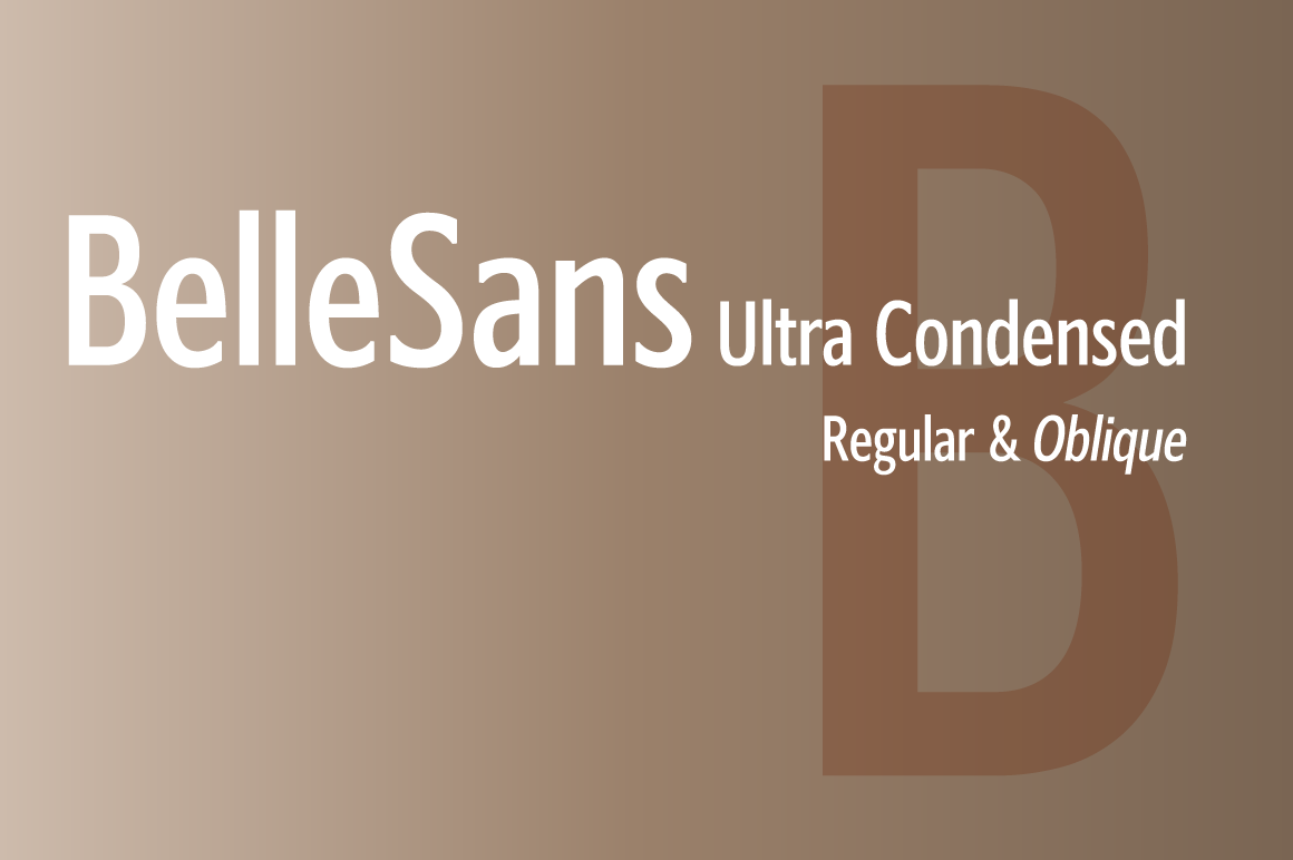
1. BelleSans Ultra Condensed Regular and Oblique
A tight, confident sans serif face that saves width without feeling cramped. The oblique style adds a useful second voice for subheads, labels, and angled accents.
I like the oblique because it gives you a quick way to add direction without switching families.
Best for: dense headlines, subheads, and packaging labels. By: BluHead Studio
Download BelleSans Ultra Condensed Regular and Oblique
2. Molday Condensed
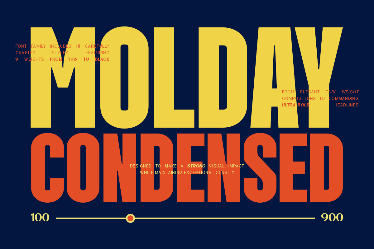
A modern, clean condensed sans serif with a calm, brand-safe feel. Its even spacing makes it easy to use for packaging, app headers, and short logo lines.
It is the kind of face I would reach for when the brand needs to look organized, not flashy.
Best for: modern branding, packaging, and UI labels. By: roomspace
3. Glorious Condensed
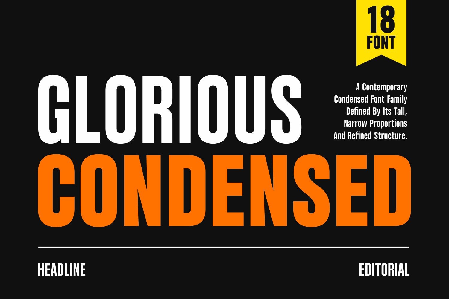
A heavy, urgent condensed display sans serif that reads like a poster headline. The bold weight creates strong contrast against thin body type and small icons.
Use it when the headline needs to stop the scroll.
Best for: posters, event titles, and bold headlines. By: Umitype
4. Structures Condensed
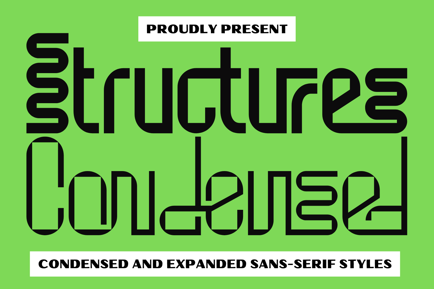
A geometric condensed sans serif with a technical, slightly playful edge. Its structured forms suit industrial branding, product labels, and modern corporate wordmarks.
It has a bit of personality without becoming decorative.
Best for: corporate branding, packaging, and signage. By: 177Studio
5. Cogswell Condensed
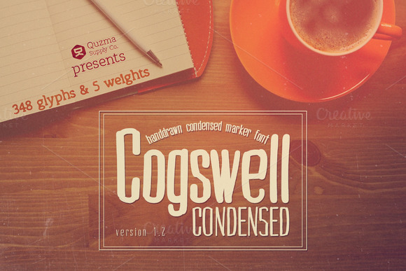
A classic condensed sans serif with a dependable, editorial feel. Its familiar proportions make it a safe choice for long headlines, magazine covers, and narrow columns.
When in doubt, this is the one I test first for newspaper style layouts.
Best for: long headlines, editorial titles, and labels. By: Quzma Supply Co.
6. Gosans Condensed
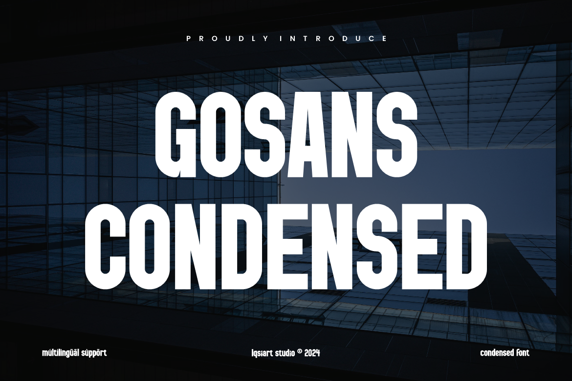
A minimalist condensed sans serif that stays readable at smaller sizes. Its clean terminals and open spacing suit UI headers, app screens, and compact product labels.
For Canva projects, this is a good pick when the text has to stay legible on a phone.
Best for: UI headers, app labels, and packaging. By: IqsiartStudio
7. Essential Gothic Condensed
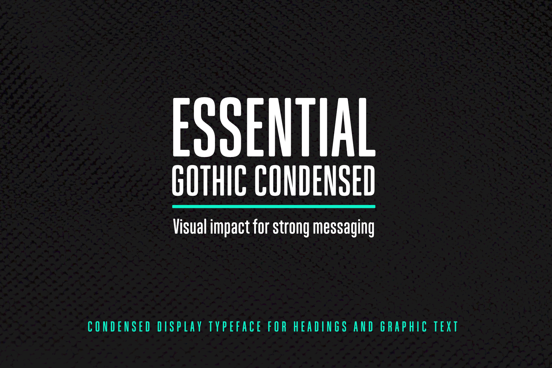
A condensed gothic face with a grotesque character and strong editorial presence. It feels tighter and more graphic than a standard sans serif, which helps it stand out in magazine layouts.
I like it for covers where the headline needs to feel designed, not just set.
Best for: editorial headlines, magazine covers, and posters. By: janinaa
Download Essential Gothic Condensed
8. Winchester Condensed
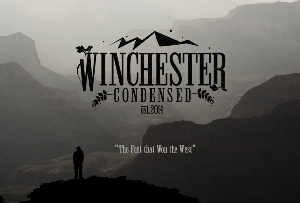
A handcrafted condensed slab serif with a retro, textured personality. The slab details give it more character than a plain sans serif, while the narrow width keeps it compact for badges and craft branding.
It works well when the project needs a bit of workshop charm.
Best for: retro branding, badges, and craft labels. By: DesignSomething
Serif Condensed Fonts
Condensed serif fonts are less common, but they add refinement when you need a narrow width with a more formal or editorial tone. They are also useful when a sans serif feels too plain for the brand.
9. Elegant Condensed Bundle Vol IV
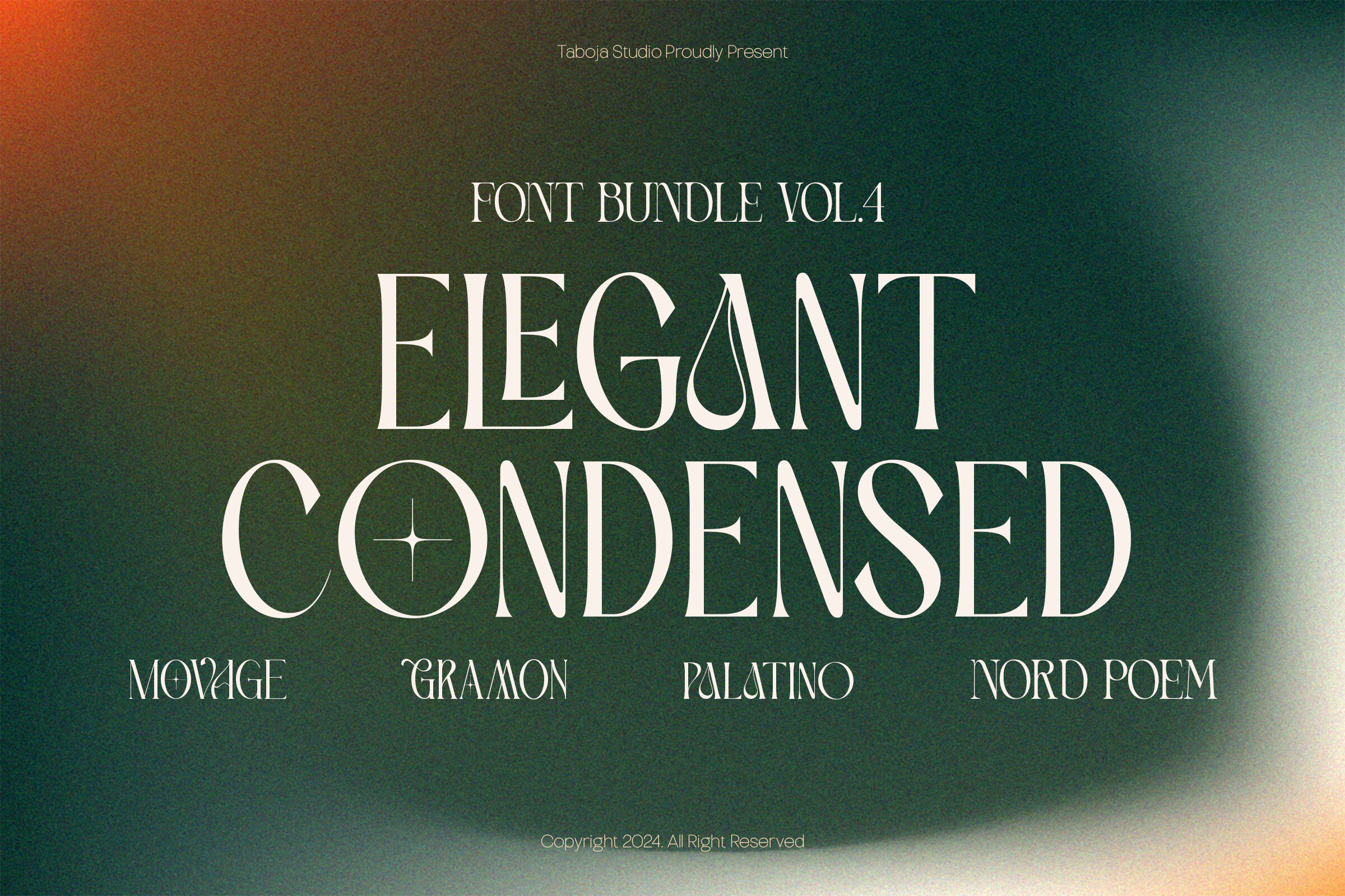
An elegant condensed serif set with a clean, invitation-ready look. The refined details make it useful for premium branding, wedding stationery, and boutique packaging where width is limited.
I would use it for a small label that still needs to feel expensive.
Best for: invitations, premium branding, and packaging. By: Taboja Studio
Download Elegant Condensed Bundle Vol IV
10. Megafon
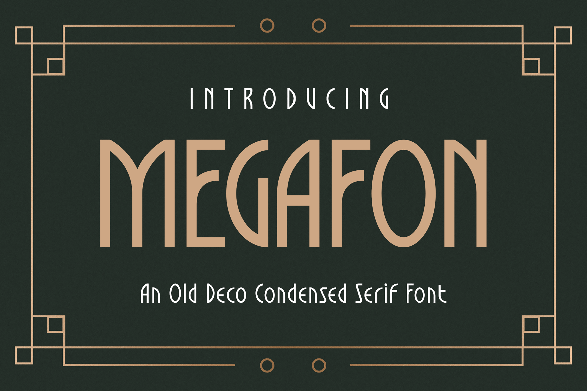
A condensed serif display face with a strong magazine headline feel. Its expressive width contrast gives it presence on covers, posters, and editorial titles without losing readability.
It has punch, but it still reads like print.
Best for: magazine headlines, covers, and posters. By: TypeFactory
11. Zarello
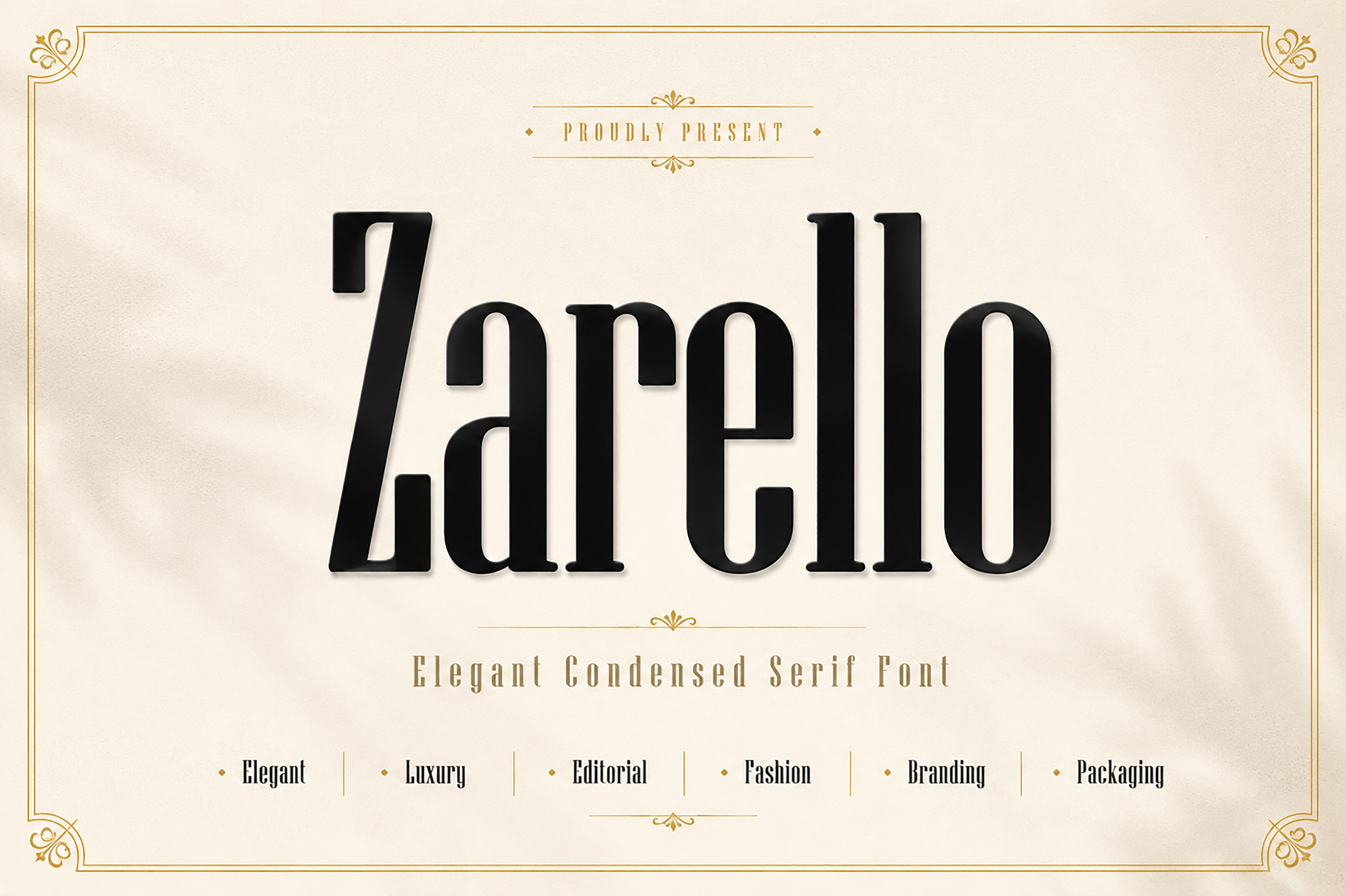
A stylish condensed serif with noticeable stroke contrast. Its fashion-forward shape suits lifestyle branding, boutique logos, and editorial layouts that need a narrow but elegant voice.
This one leans more fashion than corporate.
Best for: fashion branding, boutique logos, and editorial design. By: Wow Magic
12. Athelya
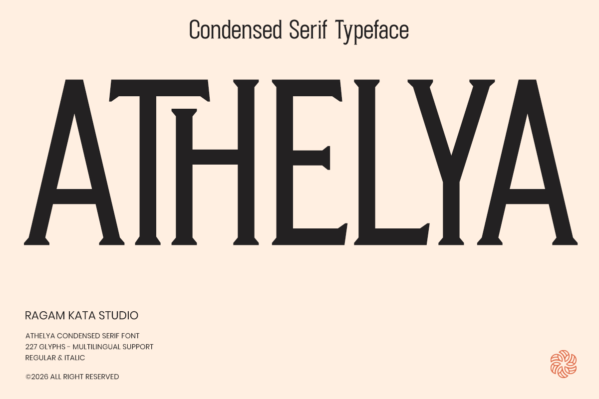
A refined condensed serif with a calm, editorial character. It works well for boutique logos, magazine section titles, and invitation suites where you want elegance without excessive width.
It is quieter than Megafon, which makes it easier to pair with simple body type.
Best for: boutique logos, editorial titles, and invitations. By: RagamKata Studio
Script & Handwritten Condensed Fonts
Condensed script fonts bring a handwritten feel to tight spaces. They are best for short phrases, packaging accents, cards, and personalized merch where width matters but personality should stay alive.
I avoid them for long text because the narrow letterforms can get busy fast.
13. Wastelands
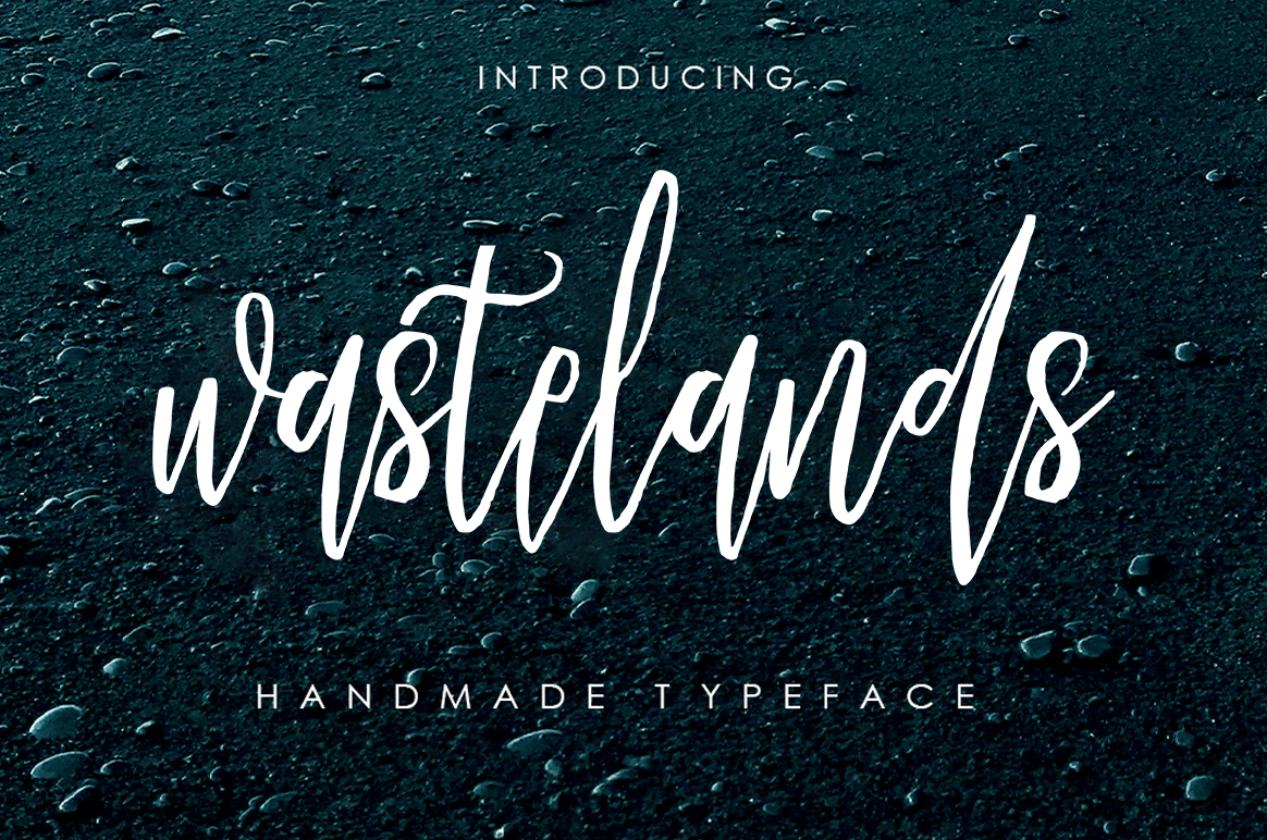
A rough, tall calligraphic script with a grunge edge. Its condensed letterforms keep the phrase narrow, while the textured strokes add street style energy to posters, merch, and urban branding.
It is best for a short accent, not a full paragraph.
Best for: grunge posters, streetwear merch, and urban branding. By: Youngtype
14. Dwarf Signature
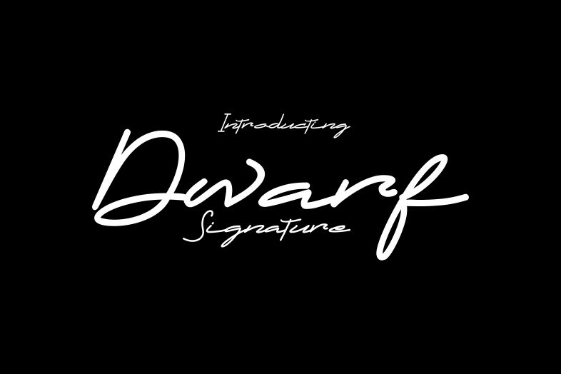
A sleek, monoline signature style script that feels fast and personal. The narrow, dynamic forms are useful for brand signatures, logo accents, and short phrases that need a handwritten touch.
I like it for a signature line under a logo.
Best for: brand signatures, logo accents, and short phrases. By: Arip Santoso
15. Melancolie
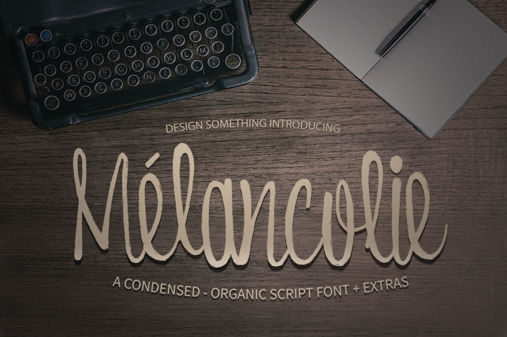
A soft, organic handcrafted script with a perfectly imperfect texture. Its condensed shape keeps it compact for cards, packaging, and small brand moments where a gentle handwritten feel is needed.
It feels handmade without looking messy.
Best for: greeting cards, packaging accents, and soft branding. By: DesignSomething
Display & Stencil Condensed Fonts
Condensed display fonts and stencil styles are built for impact. Use them for posters, signage, sports merch, and bold headlines where the type is the main visual element.
These are the faces I save for moments when the headline is the whole design.
16. Vancouver - Condensed Display
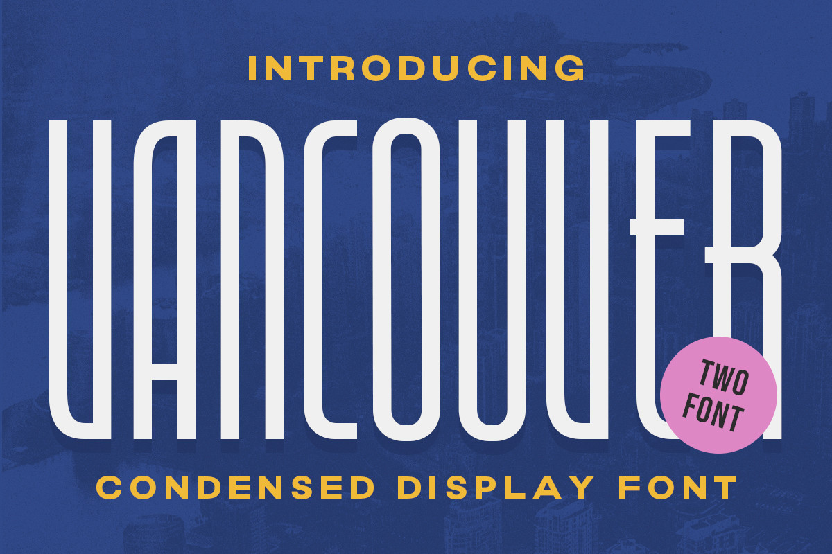
A bold, narrow display face with a strong poster presence. Its compact width helps long titles stay on one line, while the heavy forms create a confident look for signage and event graphics.
It is a good pick when the title is long but the space is not.
Best for: posters, large signage, and event titles. By: letterhend
Download Vancouver - Condensed Display
17. Hormesis - Condensed Display
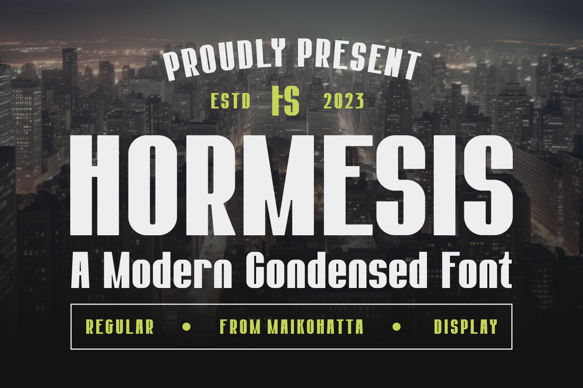
An edgy condensed display typeface with a modern, high-energy character. Its sharp forms suit streaming brands, gaming graphics, and bold digital headlines that need to feel current and assertive.
I would not use it for a calm brand, but it works when the project needs edge.
Best for: gaming branding, streaming graphics, and digital headlines. By: maikofarazhatta
Download Hormesis - Condensed Display
18. Hoston Runejay | Condensed Display
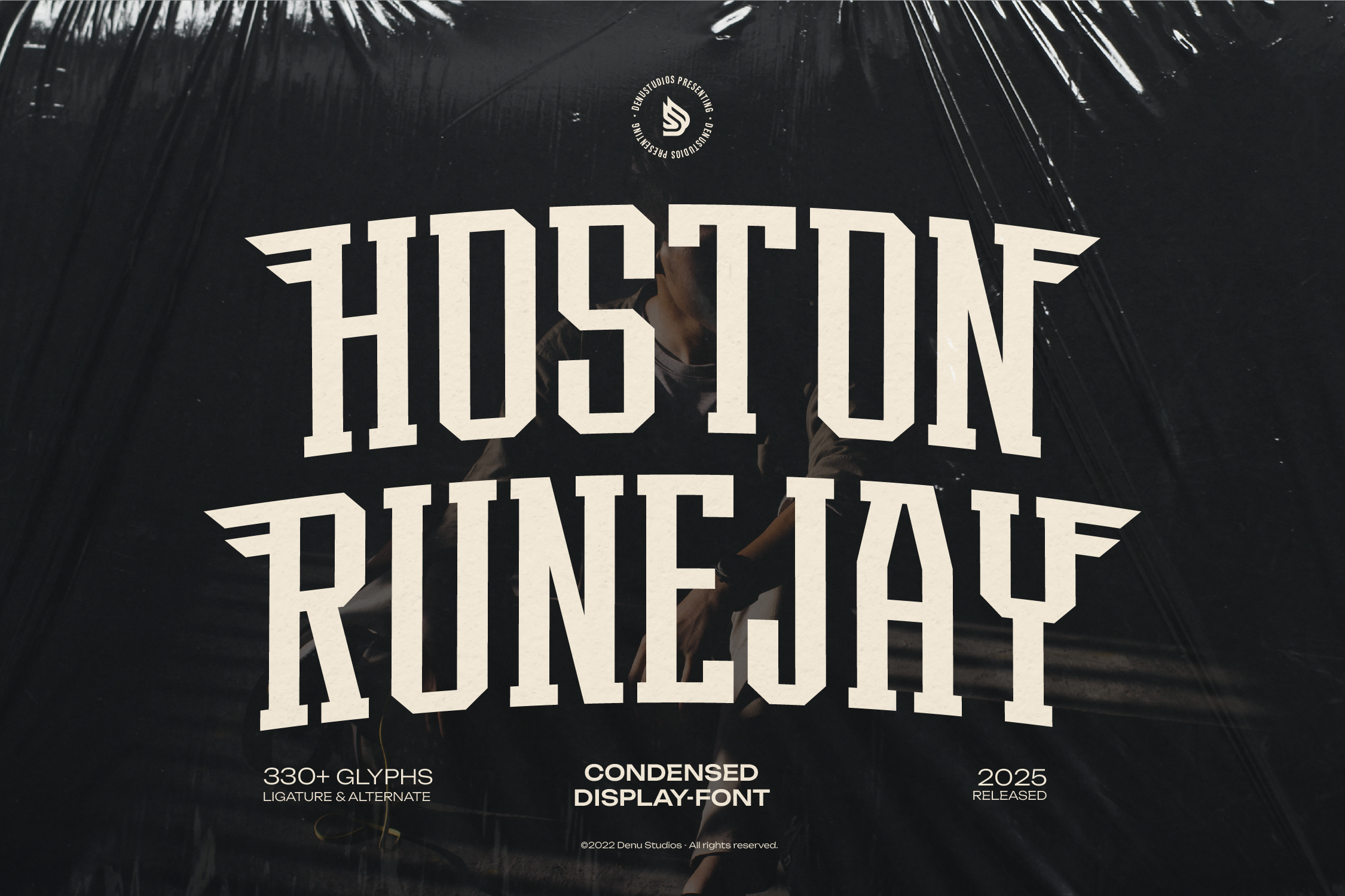
A decorative condensed display face with a condensed slab serif structure. Its stylized details make it a strong choice for themed posters, merch, and bold titles that need a distinctive visual hook.
It is more decorative than the other display faces here, so keep the copy short.
Best for: themed posters, merch, and bold titles. By: Denustudios
Download Hoston Runejay | Condensed Display
19. Blocky Varsity
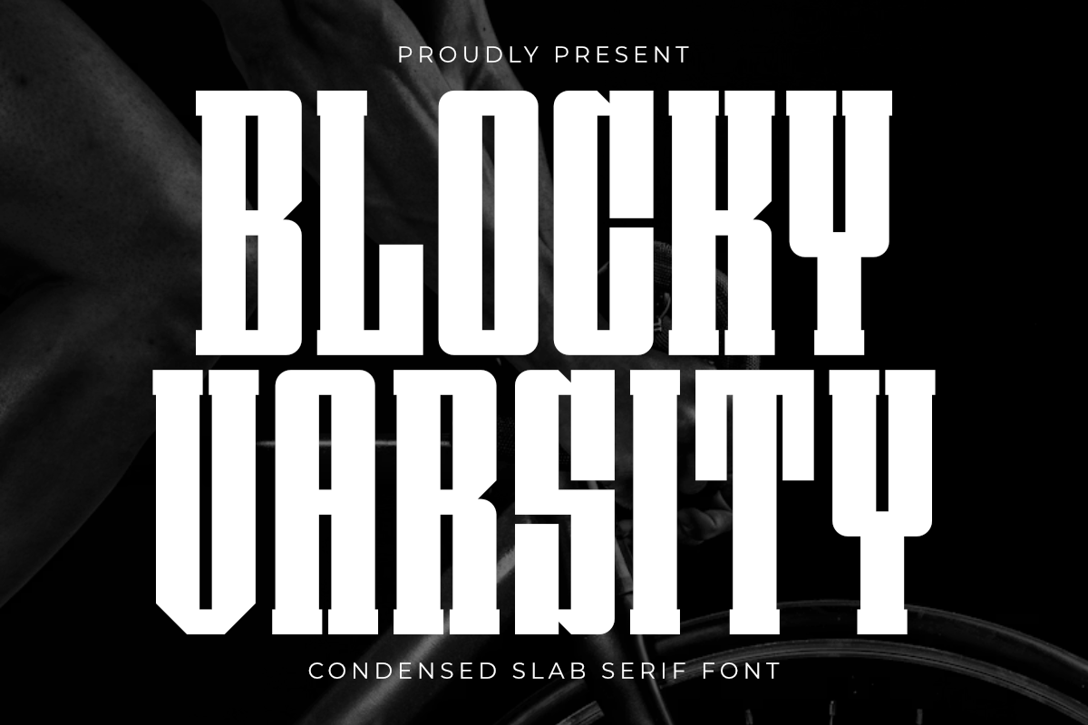
A bold condensed slab serif with a varsity and stencil-inspired look. Its blocky forms are ideal for team branding, patches, sports merch, and short logo lines that need a sporty, compact feel.
For Cricut or laser cut projects, check the small enclosed spaces before you cut.
Best for: sports merch, patches, and team branding. By: Pian45
How to Use Condensed Fonts in Your Design Projects
I usually pair a bold condensed headline font with a regular width body face. The width difference gives the layout a clear hierarchy. A condensed sans serif or slab serif headline works well with a neutral serif or sans serif body.
Avoid pairing two condensed faces. The width contrast disappears, and the layout can feel flat.
For logos, use condensed type when the wordmark must fit beside an icon, inside a badge, or on a narrow label. For long headlines, choose a condensed face with open counters and even spacing, then test it at the smallest size you will print or display.
Tip: If the headline has many capital letters, check the spacing between W, M, and V. Tight pairs can look crowded in condensed faces.
Most of the fonts here come as OTF or TTF files, and some variable fonts include an adjustable width axis. They generally install and work normally in Adobe Illustrator, Adobe Photoshop, Canva, and Cricut Design Space.
In Canva, upload the font file through the custom font area, then select it from the font list. For condensed fonts for Canva, test the export before sending it to print. In Illustrator or Photoshop, install the font on your system or use the app font manager. In Cricut Design Space, uploaded fonts appear for text, but check your machine settings for very tight details.
For print, check the file at 100 percent and zoom in on thin strokes. For digital, test on a phone screen, not just a desktop monitor. For laser-cut or Cricut projects, avoid ultra condensed faces with tiny enclosed spaces unless your material and blade can handle them.
If a condensed font looks sharp on screen but weak in print, increase tracking slightly or switch to a less extreme width.
Tips for Choosing the Right Condensed Font
Check the license before using condensed fonts for commercial use. The fonts in this list are available through Creative Fabrica, but pricing and license terms can vary by product, bundle, or subscription.
If you plan to use a condensed font for a logo, packaging, merchandise, or client work, read the specific product page and confirm that commercial use is covered. Do not assume a free condensed font download from another site gives you the same rights.
I always check the product page before I send a file to a client.
Match the style to the project mood. A clean condensed sans serif feels modern and efficient. A condensed serif feels editorial or premium. A condensed script feels personal and handmade. A condensed display or stencil face feels loud, sporty, or decorative.
If you are building a brand, choose one condensed face for headlines and one regular width face for body text, then keep that pair consistent across your assets.
Test the font in your actual workflow. If you design in Canva, make sure the file uploads cleanly and the preview matches the final export. If you work in Adobe Illustrator or Photoshop, check kerning on capital letters and tight pairs. If you use Cricut Design Space, test a small sample on the material you plan to cut.
A condensed font that looks great in a thumbnail can behave differently at final size.
Where to Download Condensed Fonts
The featured condensed fonts in this list are available on Creative Fabrica. It is a good place to browse bold condensed fonts, condensed serif fonts, condensed script fonts, and condensed display fonts in one catalog.
Each product page includes preview images, designer information, and license details, so you can compare options before downloading. You can search by style, such as condensed sans serif fonts or narrow fonts for logos, to narrow your choices.
If you want a condensed font free download, Google Fonts offers a large library of open licensed typefaces, including several condensed families. DaFont is useful for browsing display and decorative styles, while Font Squirrel focuses on fonts with clear licensing. Always check the license before using a free font in commercial work.
If you want more practical font guides, browse the FontPro blog for tutorials on pairing, licensing, and typography for small business projects.