· fonts · 12 min read
18 Best Neon Fonts in 2026
Find the best neon fonts for signs, posters, social media and crafts: glowing scripts, bold display faces, retro synthwave styles and LED-inspired lettering.
Whether you are designing a bar sign, a party flyer, or a late-night Instagram post, a good neon font can make your text look like it is actually glowing. The trick is picking a typeface that captures the feel of bent glass tubing and soft electric light without looking cheap or overdone.
What Makes a Good Neon Font?
The best neon fonts share a few traits with real neon signage. They use consistent stroke widths, because actual neon tubes maintain the same thickness as they curve. Open letterforms, smooth joins, and rounded terminals all help sell the illusion.
Script fonts dominate the neon sign world. Data from custom sign shops shows that script faces account for roughly 68% of all neon sign orders, so it makes sense that many neon typefaces lean toward flowing, connected letterforms. Sans serifs with uniform strokes are the other major category, especially for bold headlines and storefront lettering.
Color and context matter just as much as the font itself. Neon text looks best on dark backgrounds where the glow has room to breathe. If you are adding glow effects in Photoshop or Illustrator, start with an outer glow layer style and keep the spread tight. Too much glow washes out the letters.
For LED sign fonts, the approach is slightly different. LED faces tend to have a more digital, segmented feel compared to the smooth curves of traditional neon. Both styles work for modern signage, but traditional neon fonts carry a warmer, more nostalgic tone.
This list groups 19 neon fonts by the style they solve: sign-ready scripts, bold display headlines, retro synthwave faces, and social-friendly craft fonts. Every pick links to its Creative Fabrica product page with license details. If you want more retro options, check out our best 80s fonts.
Neon Sign and Script Fonts
Script fonts are the bread and butter of neon sign design. Their flowing, connected strokes mimic hand-bent neon tubing, and they work for everything from wedding signs to cafe window lettering. When choosing a neon script font, look for smooth connections between letters and consistent stroke weight.
These five picks range from sweet handwritten styles to polished modern scripts. Each one is designed to look natural when you add a glow effect, but they also hold up as clean type on their own.
1. Neon Bines
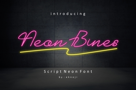
Neon Bines is a flowing handwritten font with a neon-inspired style. The letterforms have a casual, organic quality that mimics hand-bent neon tubing, making it feel authentic without being too polished. It works well at larger sizes where the curves can breathe.
Best for: wedding neon signs, event signage, social media quotes. By: EKNOJI
2. Neon Love
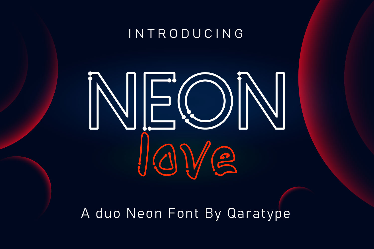
Neon Love is a display handwritten script font built with neon sign aesthetics in mind. The smooth, connected letterforms lean into a romantic quality that suits decorative projects and event branding. It pairs nicely with a subtle outer glow on a dark background.
Best for: wedding invitations, neon sign mockups, Valentine’s Day designs. By: Crafty Files
3. Neonsign
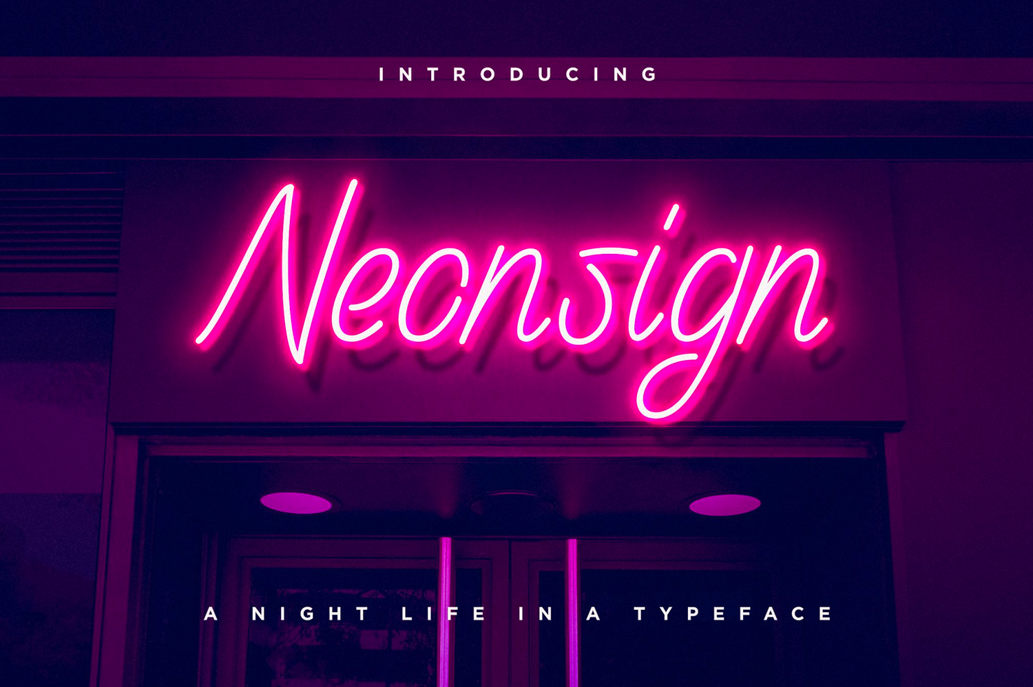
Neonsign is designed to replicate authentic neon signage lettering. The strokes are consistent and the joins are clean, which makes it a practical choice for mockups and actual sign fabrication files. It is available for Windows, Mac, and Linux with a commercial license.
Best for: bar and restaurant signage, storefront neon signs, poster design. By: konstantinestudio
4. Freehand Neon
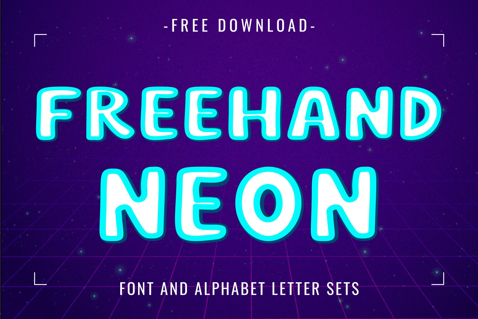
Freehand Neon was created with inspiration from colorful neon lights at night. The hand-drawn quality gives it a raw, urban character that separates it from more polished script fonts. It captures the energy of city neon without looking too refined.
Best for: nightlife flyers, urban-themed designs, streetwear branding. By: Font Craft Studio
5. Homegirl
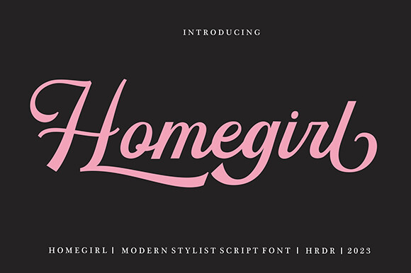
Homegirl is a stylish modern script with flowing letterforms that translate well to neon sign design. It has a contemporary feel that keeps it from looking dated, and the stroke weight is heavy enough to hold glow effects without losing readability. A solid choice for branding, photography watermarks, and blog headers.
Best for: neon sign design, wedding branding, photography watermarks. By: HRDR
Neon Display and Headline Fonts
Display fonts are what you reach for when the neon script is too casual and you need something that reads from across the room. These neon display fonts use clean geometry, bold strokes, and rounded corners to capture the look of illuminated signage at headline scale.
Several of these fonts follow a design principle borrowed from real neon tubes: lines with open start and end points, just like actual glass tubing that is sealed at both ends. That small detail makes them feel more authentic than a standard sans serif with a glow effect slapped on top.
6. Neon World
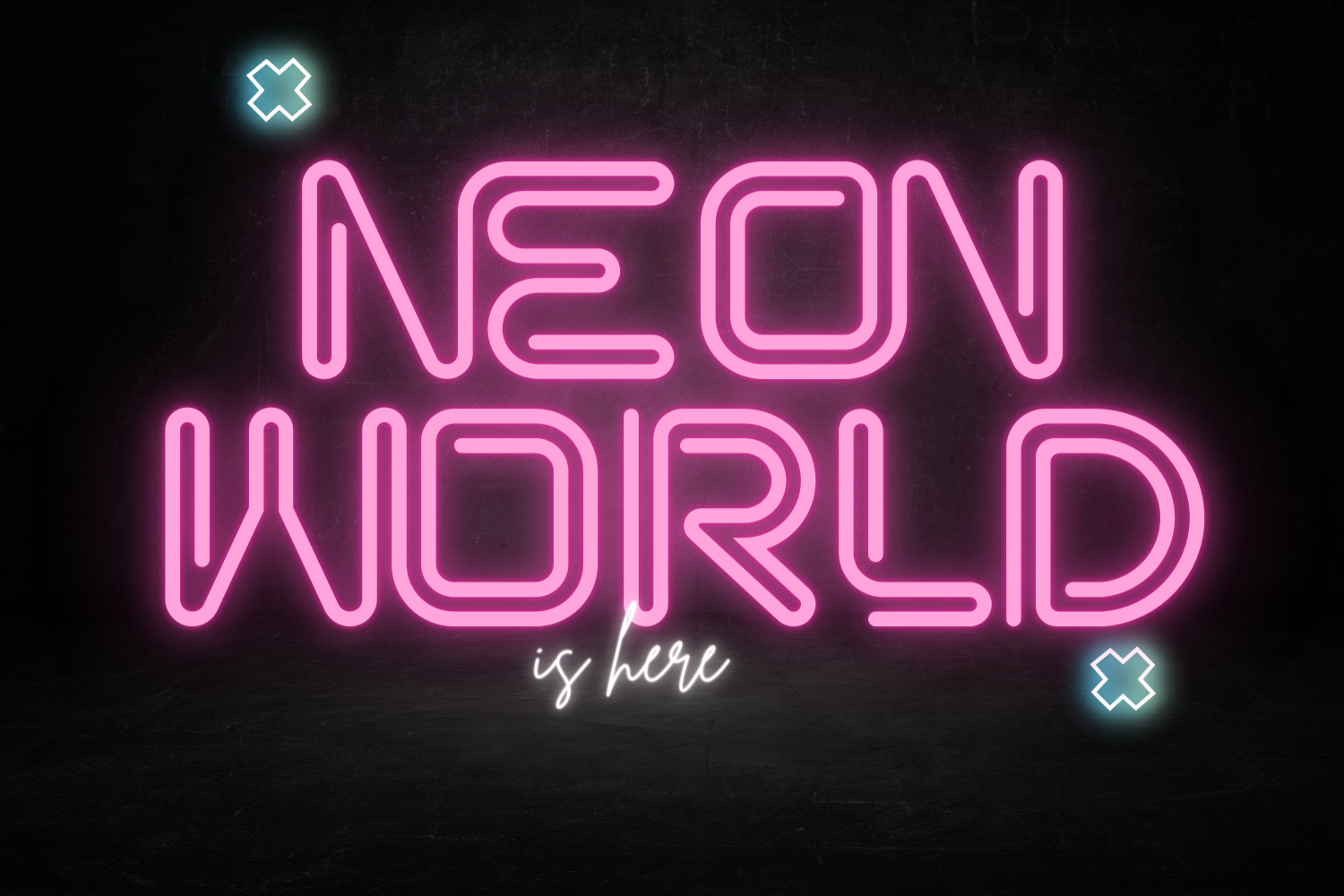
Neon World features minimal letterforms with smooth rounded corners. True to real neon tubes, it strictly uses lines with open start and end points, which gives the type an honest, sign-ready quality. You can use it to design actual neon signs or to create realistic mockups.
Best for: neon sign fabrication, poster headlines, neon mockups. By: 177Studio
7. Neon Stencil
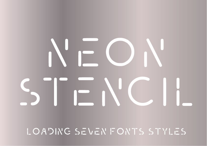
Neon Stencil is a rounded sans serif inspired by street art and stencils with a neo-futurist edge. The stencil cuts give it a layered, graphic quality that sets it apart from smoother neon fonts. It is a natural fit for festival flyers, urban branding, and edgy merchandise. For more sci-fi display options, see our best futuristic sci-fi fonts.
Best for: street art projects, urban branding, festival flyers. By: GraphicsBam Fonts
8. Neon Light by erik studio
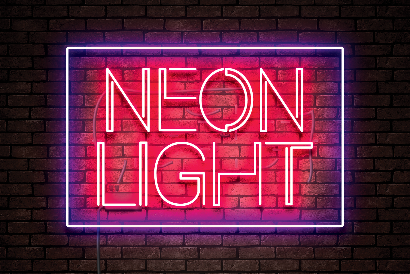
Neon Light by erik studio is a bold display font that looks modern and futuristic. The clean geometry and consistent stroke weight make it easy to pair with other elements in a layout. It works well for tech branding, app UI headers, and website hero sections where you want a glowing headline that still feels polished.
Best for: tech branding, app UI headers, website hero sections. By: erik studio
9. Neon Light by Abodaniel
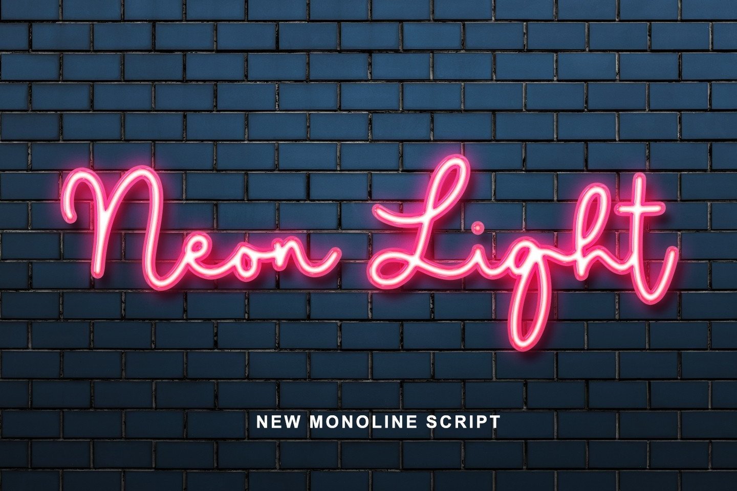
This version of Neon Light by Abodaniel brings clean geometry and a steady stroke weight to neon-inspired display lettering. The even proportions make it a reliable choice for headline typography where you want the neon effect to feel controlled and professional.
Best for: neon sign mockups, headline typography, packaging design. By: Abodaniel
Retro Neon and Synthwave Fonts
Neon and retro go hand in hand. The 1980s gave us neon-lit arcades, synthwave music, and the disco-to-digital transition, and all of that energy lives on in these retro neon fonts. They are great for album covers, party flyers, and any design that needs a nostalgic glow.
If you are designing synthwave or retrowave artwork, these fonts pair naturally with sunset grids, chrome accents, and dark purple backgrounds. For a deeper dive into the decade’s typography, check our best 80s fonts.
10. Neon 80s
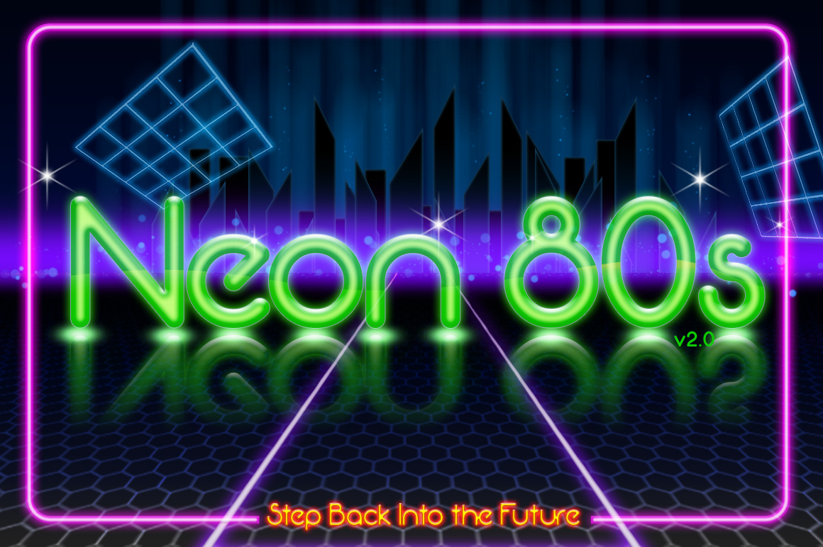
Neon 80s is a sans serif font that feels playfully nostalgic, delivering a vintage aesthetic tied to 1980s neon signage and arcade culture. It reads clearly at both headline and subhead sizes, which makes it more versatile than many retro display faces. A useful pick for throwback social media content and retro-themed party graphics.
Best for: retro-themed parties, synthwave album covers, arcade-style graphics. By: Essque Productions
11. Cyberwave 2000
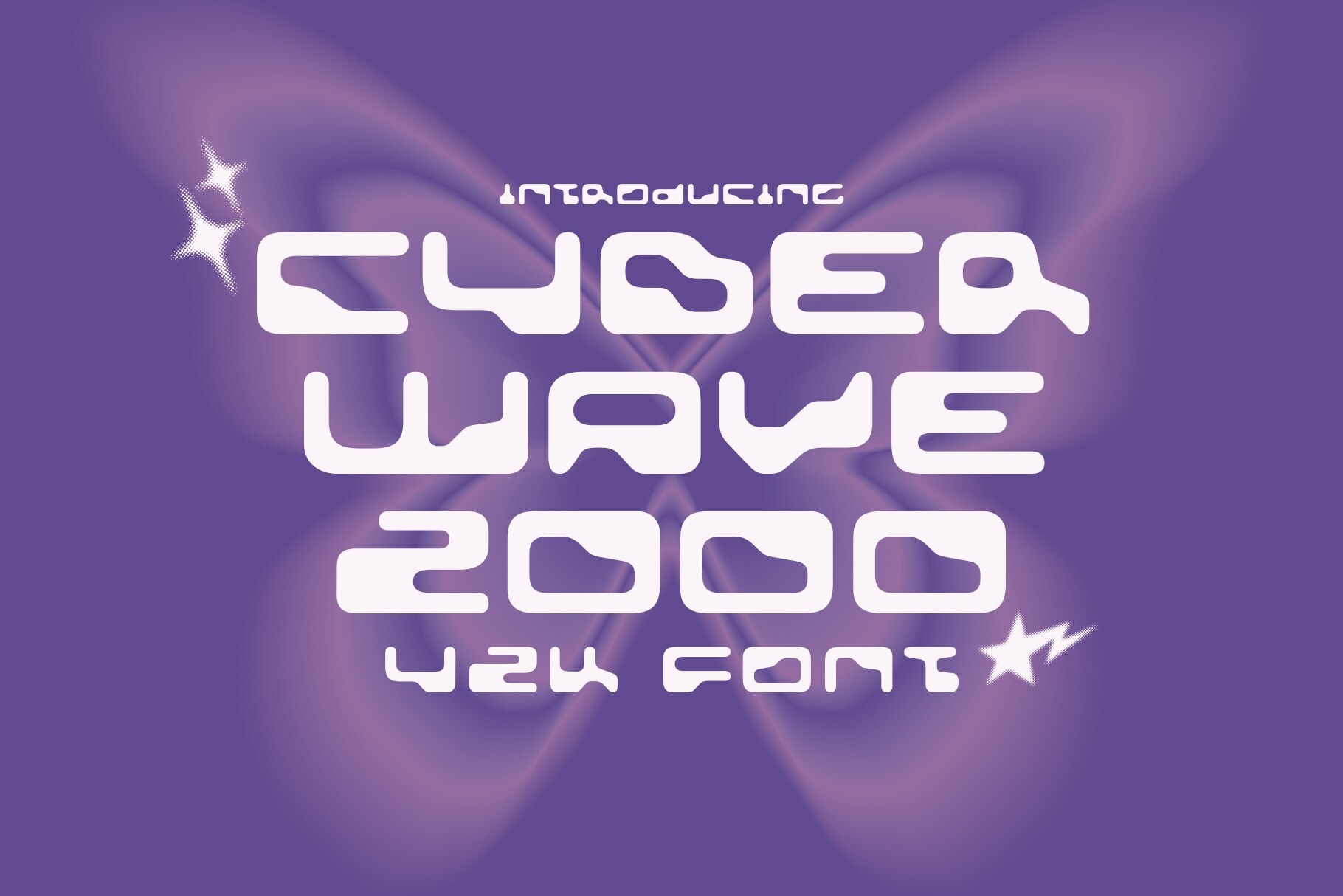
Cyberwave 2000 is a bold Y2K-inspired typeface that captures the glitchcore glamour and futuristic optimism of the early internet era. It sits at the intersection of synthwave and cyberpunk, which gives it range across both retro and forward-looking projects. The weight is heavy enough to anchor a poster or social banner.
Best for: Y2K revival designs, synthwave artwork, cyberpunk branding. By: HipFonts
12. Spac3 Neon
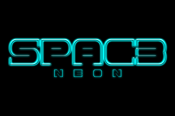
Spac3 Neon is a display font that pushes neon into outer space. The letterforms carry a sci-fi edge that makes them feel right at home on movie posters, game graphics, and futuristic UI designs. It adds a forward-looking quality that separates it from more traditional neon styles.
Best for: sci-fi movie posters, space-themed branding, gaming graphics. By: Qbotype Fonts
13. Disco Neon Sign
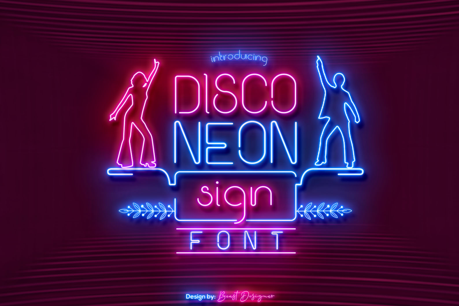
Disco Neon Sign is a nostalgic sans serif carefully handcrafted to carry the energy of the disco era. It evokes dance floors, mirror balls, and warm neon light. The letterforms are clean enough to use at smaller sizes for event details, not just headlines.
Best for: disco and dance event flyers, nightclub promotions, vintage poster design. By: Beast Designer
14. Flami Neon
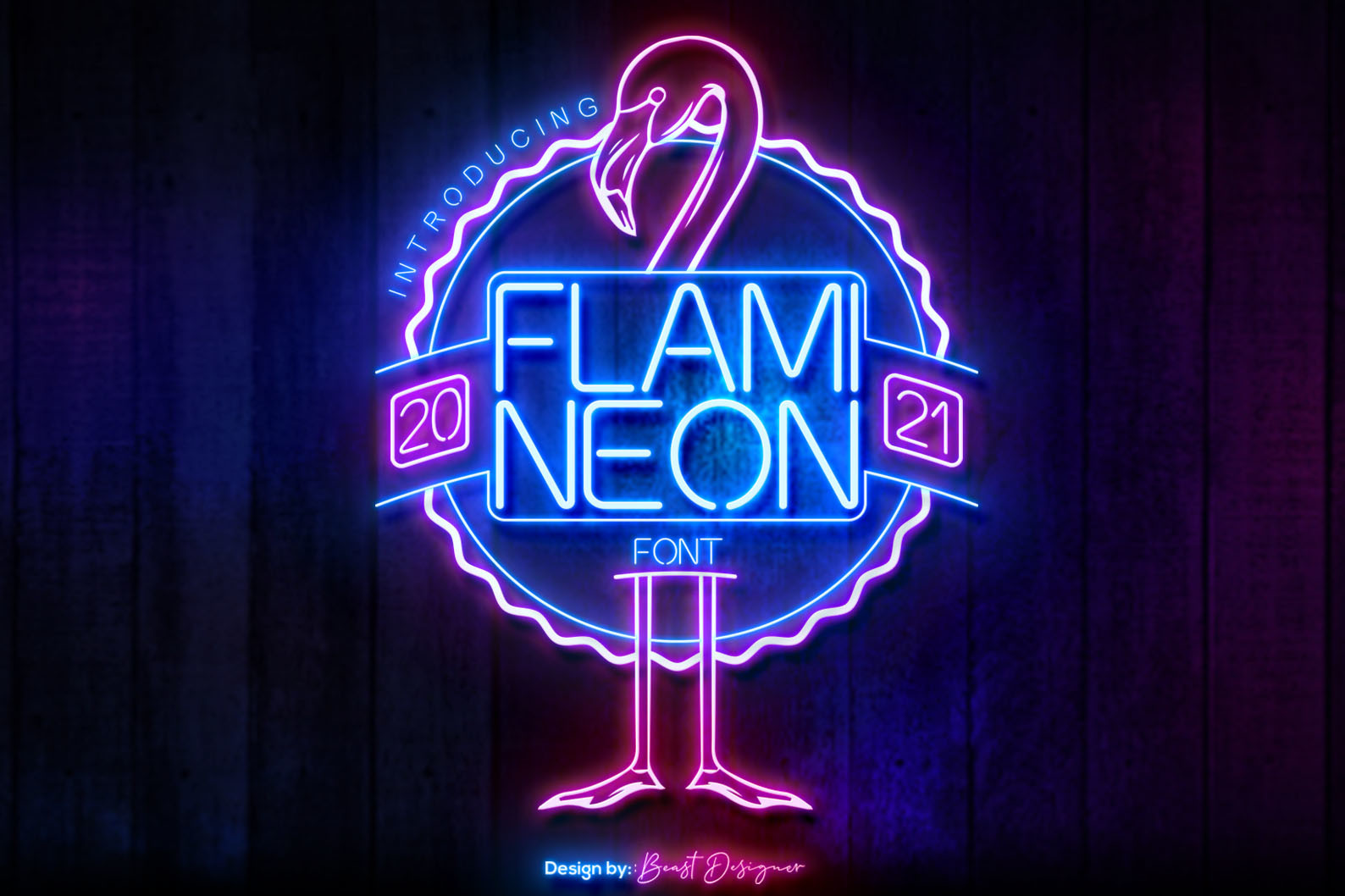
Flami Neon is a cool, simple retro display font with clean neon-inspired lines. It strikes a balance between minimalism and retro charm, which makes it adaptable to both loud party graphics and quieter cafe signage. The straightforward letterforms mean it pairs well with busier backgrounds.
Best for: retro branding, vintage-inspired posters, cafe and bar signage. By: Beast Designer
Neon Fonts for Social Media and Crafts
Not every neon font needs to go on a poster or a sign. These four picks are designed to work in social media templates, Canva projects, Cricut cutting files, and other craft workflows where ease of use matters as much as the look.
If you are building Instagram stories, YouTube thumbnails, or quick social graphics, a neon font with clean edges and good readability at small sizes will save you time. Color fonts like Neon Kit even have the glow effect built in, so you do not need to add it manually.
15. Neon City
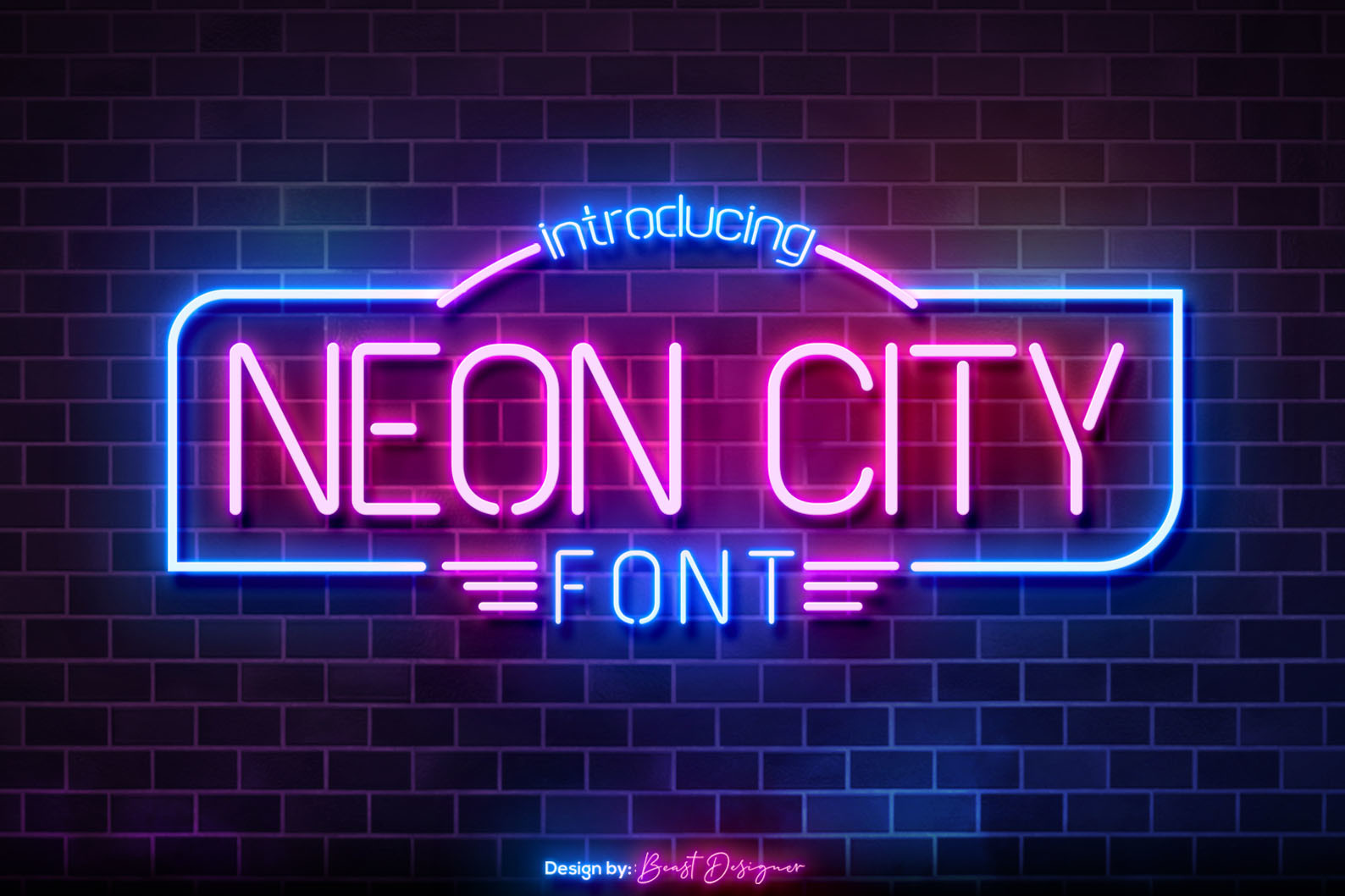
Neon City is a display font built to capture the urban nightlife feel of glowing city signage. The letterforms are clean and metropolitan, which means they scale down to social media story sizes without losing detail. It also works well for Cricut and craft projects where you need clean cut paths.
Best for: city-themed designs, nightlife event promotions, Cricut craft projects. By: Beast Designer
16. Neon Glow
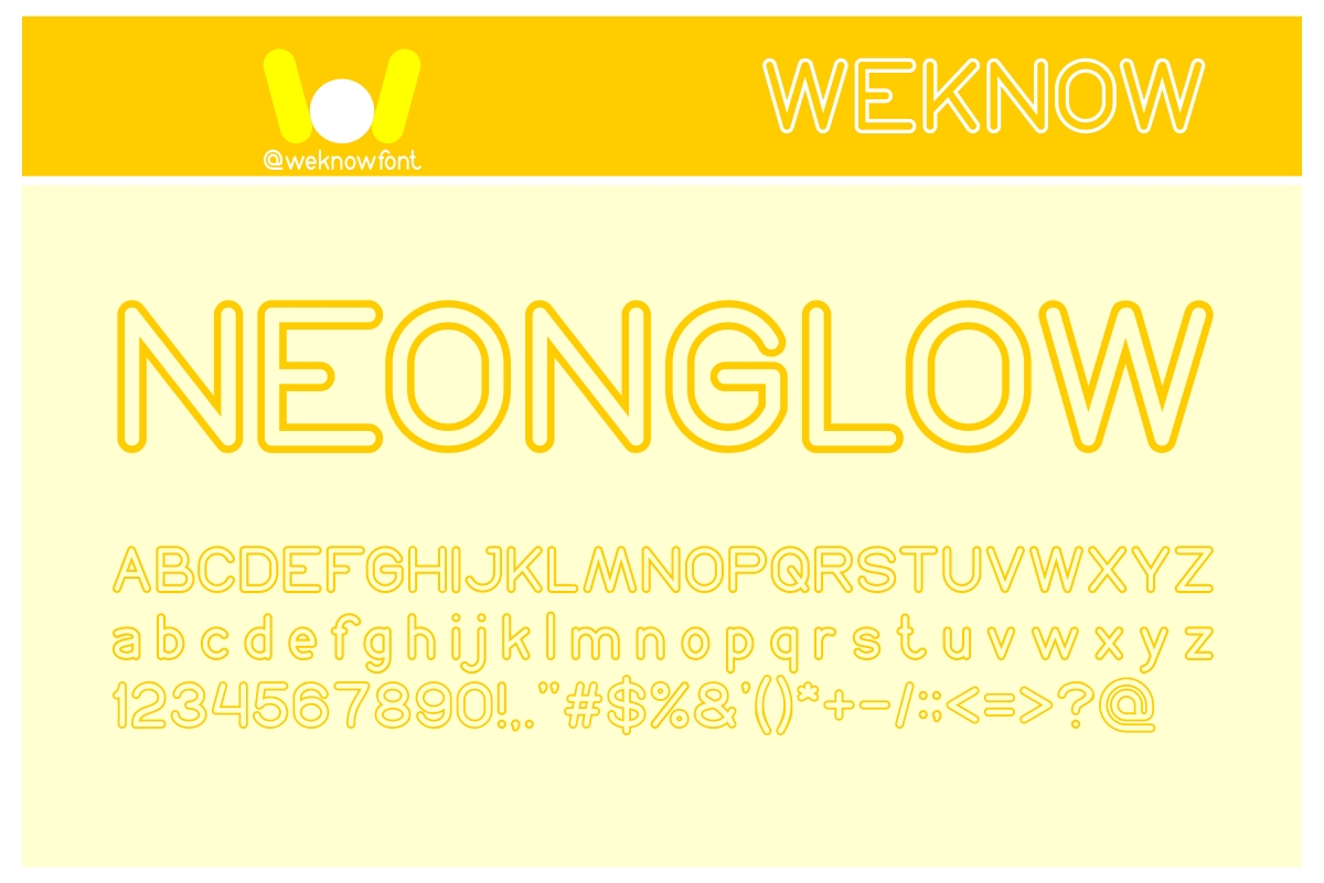
Neon Glow is designed to create an authentic glowing effect. The letterforms mimic the soft luminescence of gas-filled glass tubes, and the result is a font that looks lit even without adding glow effects in your editor. It is a practical choice for social media graphics, Canva templates, and Instagram highlights.
Best for: social media graphics, Canva templates, DIY craft projects. By: weknow
17. Neon Schema
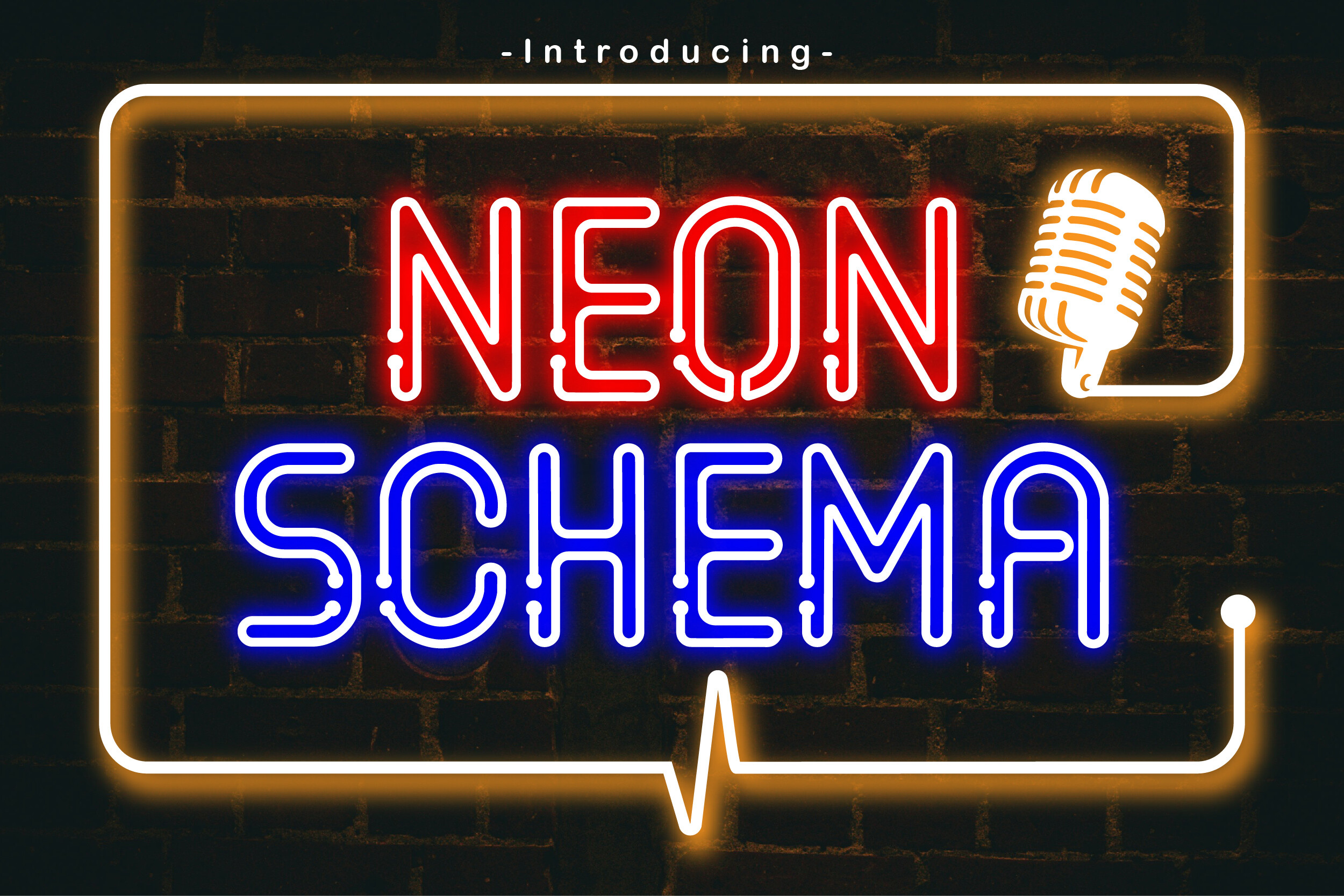
Neon Schema is a display typeface that takes a structured, schematic approach to neon-style lettering. It injects sharp energy into creative layouts without relying on heavy effects. The geometric precision makes it a strong fit for tech branding, infographic headers, and presentation titles.
Best for: tech branding, infographic headers, presentation titles. By: Patlot Digital.Studio
18. Neon Kit
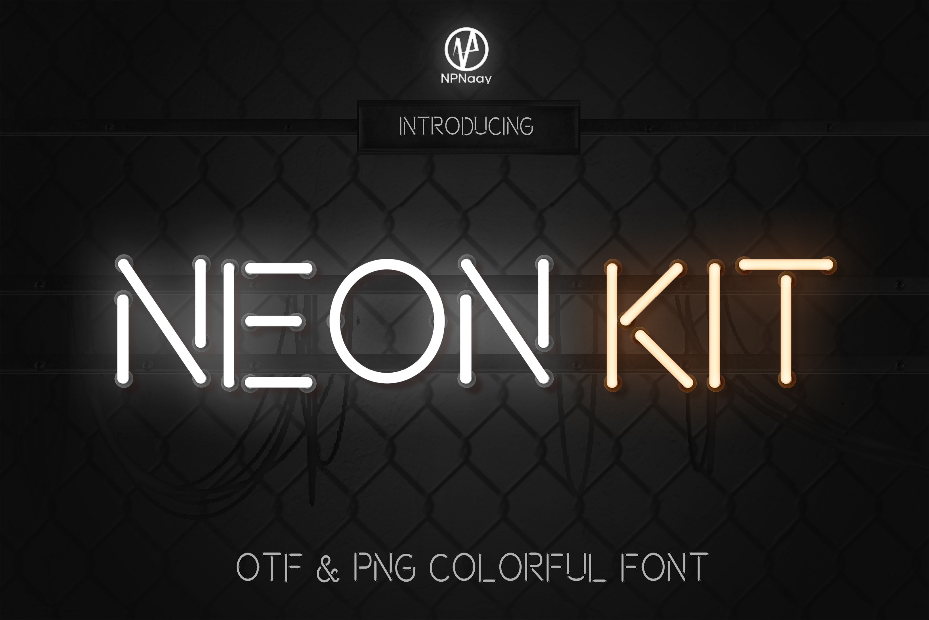
Neon Kit is a neon sign display color font. The glow effects are built directly into the font file, which means you get a realistic neon look the moment you type. No layer styles, no outer glow settings. Just type and go. It is ideal for quick social media posts and blog headers where you want the neon effect with zero extra work.
Best for: quick social media posts, no-setup neon effects, Instagram stories. By: NPNaay
How to Use Neon Fonts in Your Projects
A neon font on a white background does not look like neon. It looks like a regular font. The dark background is what makes the effect work.
Start with black, deep navy, or dark purple. Then set your text in the neon font and add a glow. In Photoshop, use Layer Style > Outer Glow with a matching neon color (pink, blue, green, or warm white). Keep the spread between 5% and 15% and adjust the size until the glow feels soft, not blurry.
In Canva, you can use the Glow effect under text options, but it offers less control than Photoshop. For more precision, design the neon text in Illustrator or Figma and export it as a PNG with a transparent background, then place it in Canva.
Pairing tip: Use a neon script for the main headline and a clean sans serif (not neon) for supporting text. Two neon fonts competing in the same layout tends to look cluttered. Keep the glow on the headline and let the body text stay flat.
For Cricut users, neon fonts with clean, consistent strokes cut better than fonts with lots of thin details. Weld connected script letters in Cricut Design Space so they cut as one piece instead of separate characters.
If you are making LED sign files, choose a font with uniform stroke width. Uneven strokes can cause brightness inconsistencies in actual LED channel letters.
Tip: Test your neon text at thumbnail size before finalizing. If the glow eats the letters at small sizes, reduce the glow spread or increase the font weight.
Where to Download Neon Fonts
Creative Fabrica is the main source for the fonts in this list. Each product page includes the license details, so review those before using a font in a client project, on merchandise, or for commercial signage.
If you want to test free neon-style fonts first, Google Fonts has a few options. Monoton offers a multiline neon look, and Press Start 2P works for a retro arcade feel. DaFont and Font Squirrel also have free neon fonts, but always check the license before using them in paid work.
When adding neon fonts to your toolkit, keep a few options across styles: one flowing script for signs and invitations, one bold display face for posters and headlines, and one retro face for synthwave or nostalgic projects. That range will cover most neon design needs.
For more font recommendations and design resources, visit the FontPro blog.