· fonts · 14 min read
27 Best Fonts for T-Shirt Design in 2026
Discover 27 best fonts for t-shirt design, from bold streetwear to vintage varsity and script styles. Download free and premium options for custom apparel.
Choosing the right t-shirt fonts can make a design look professional or cheap in seconds. Pretty type can disappear on fabric, so this list focuses on fonts that can carry a message, fit the garment, and survive the printing process. It brings together 27 best fonts for t-shirt design and fonts for custom shirts, grouped by style so you can find the right mood for graphic tee fonts, streetwear, vintage, boutique, grunge, or motivational prints. Each pick includes a clear use case and a direct download link.
What Makes a Great Font for T-Shirt Design?
Custom apparel is a crowded market, with the industry projected to exceed $7 billion. In that space, typography does the heavy lifting. It is the first thing a buyer reads, and often the reason they stop scrolling. A font that looks crisp on screen can fail on fabric because cloth stretches, absorbs ink, and has texture. Thin strokes, delicate serifs, and fine script swashes can blur, bleed, or disappear once printed.
For screen printing, choose bold, simple fonts for screen printing with uniform stroke weight. Ink has to pass through a mesh screen, so hairline details can break apart. DTG printing is more forgiving, especially for detailed fonts for DTG printing, because ink lands directly on the fibers, while DTF handles a wide range of weights and details. I usually recommend a clean sans-serif with strong contrast and open counters for most apparel.
Readability matters more than beauty. A shirt is often read from two or three meters away, so cap height should be large enough to scan quickly. As a directional rule, small text should stay around 14pt, or roughly 5mm cap height, for clean fabric printing, and distance reading benefits from bigger lettering. If the message is meant to be read from across a room, increase the size.
Keep the font count low. One leading display font and one supporting font create hierarchy. Two is the cleanest approach, and three is the practical ceiling before a design feels cluttered. The best font for t-shirt printing depends on the print method, the message, and the distance at which the shirt will be read.
Bold Streetwear / Urban Fonts for T-Shirts
Streetwear fonts need attitude, but they also need structure. These picks work well for drop-shoulder tees, oversized fits, and hype-brand style graphics. I look for lettering that has edge without turning into noise.
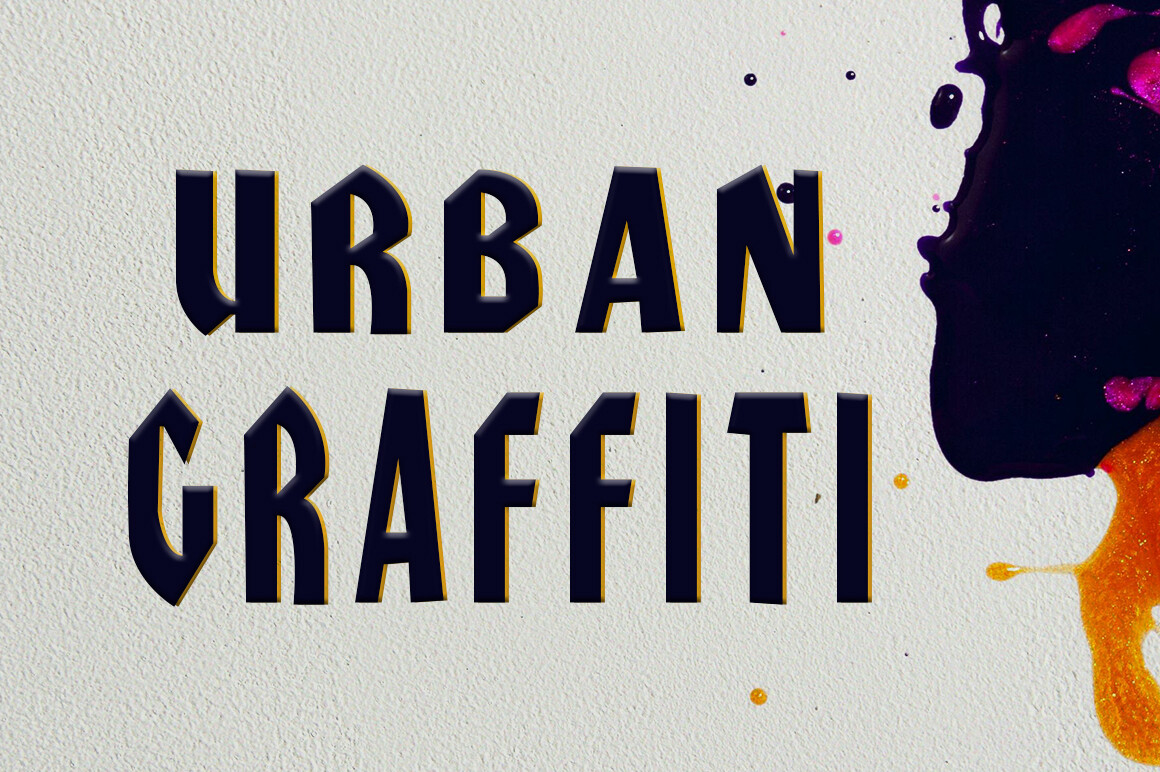
1. Urbangraffiti
Urbangraffiti has a sharp, angular cut that feels controlled rather than chaotic. Its geometric edges give it a modern streetwear edge while keeping the message readable on chest prints.
Best for: drop-shoulder tees, hype-brand slogans, urban graphic prints. By: Hendrik studio
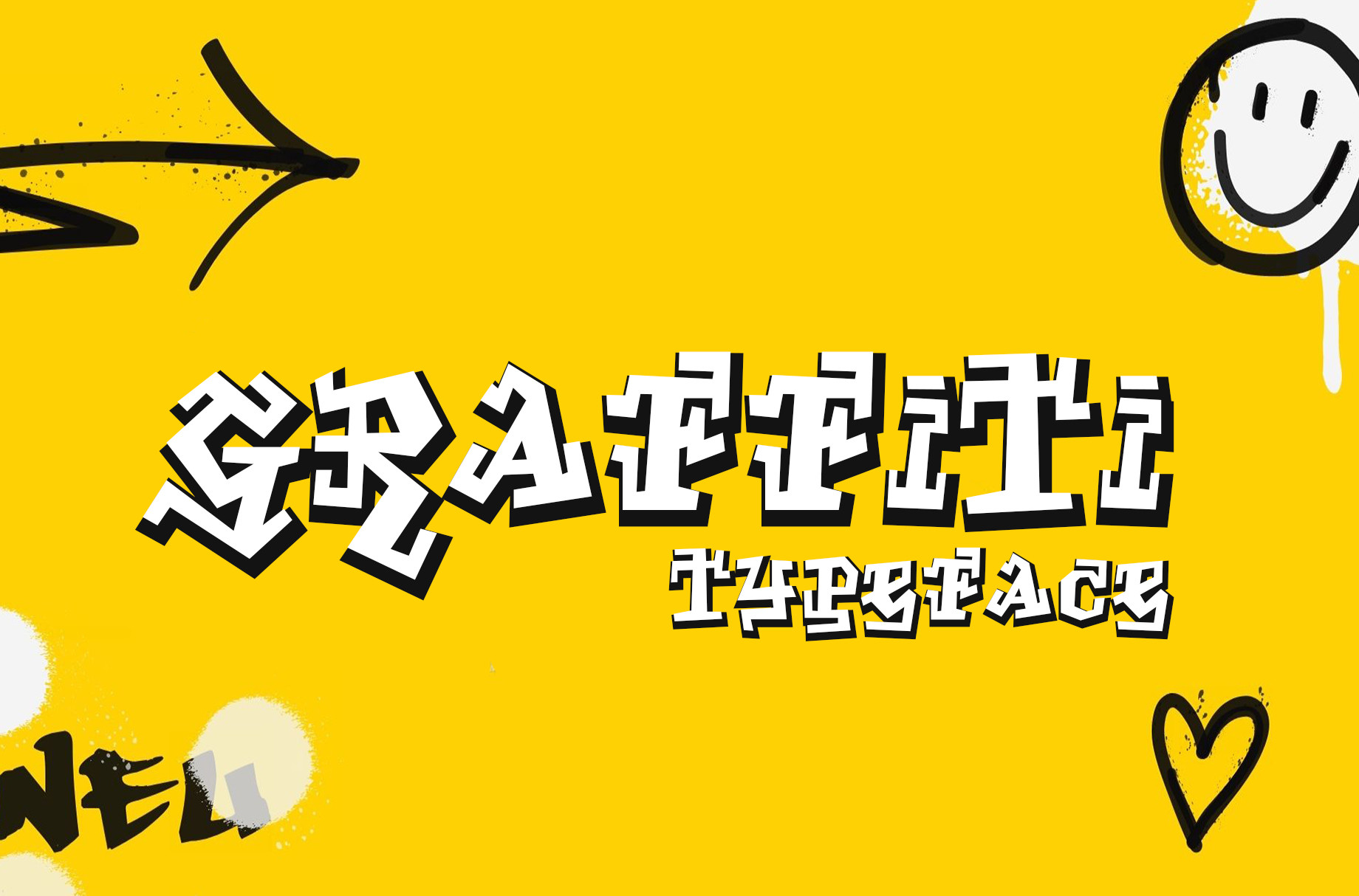
2. Bold Graffiti
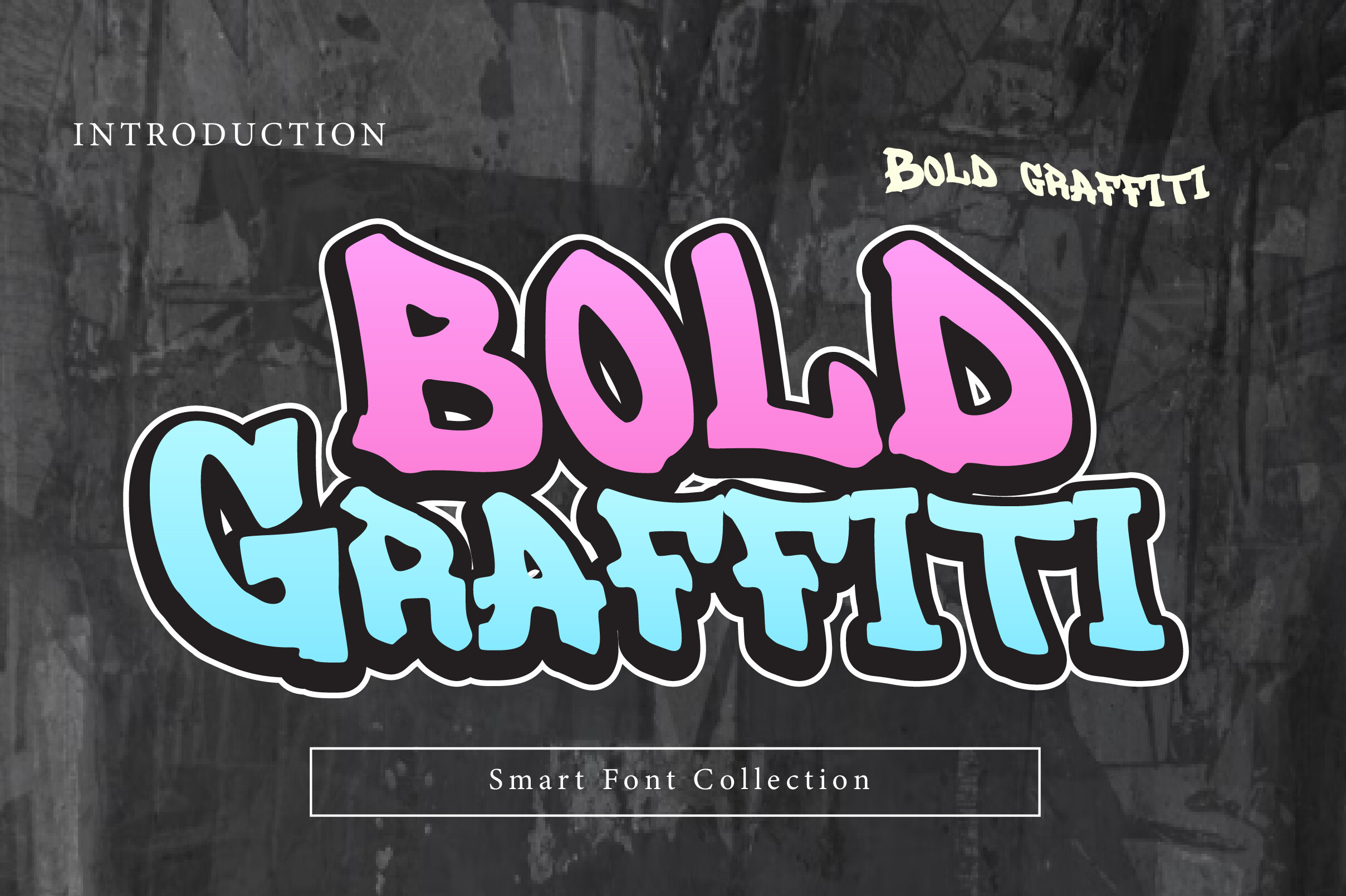
Bold Graffiti uses thick, filled letterforms with freehand curves and a playful street feel. Its heavy weight holds its shape well during screen printing, making it a solid pick for loud slogans.
Best for: loud slogans, band-style tees, high-visibility street prints. By: Wow Magic
3. Baggy Pants
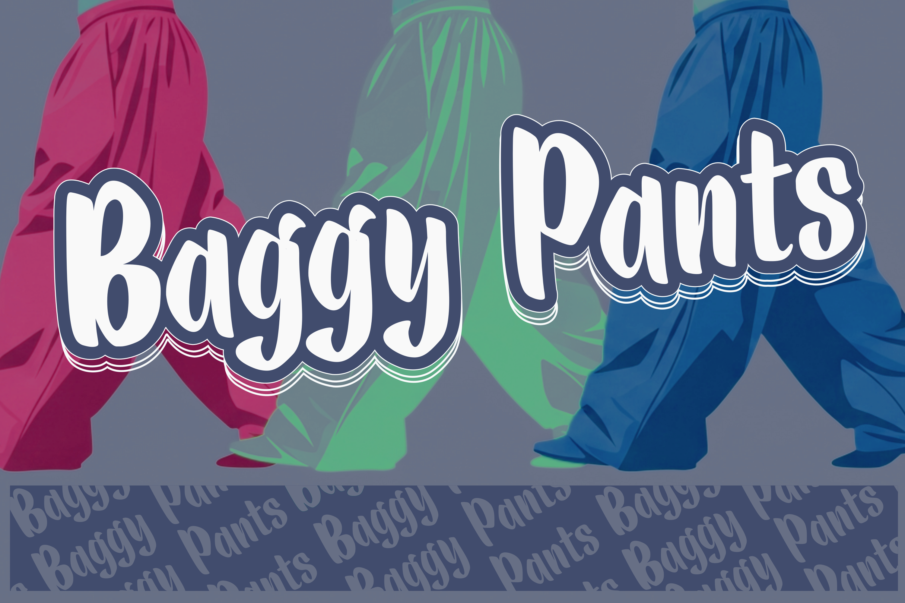
Baggy Pants carries a Y2K street vibe with a loose, retro-urban feel. It suits early 2000s fashion, skate graphics, and casual oversized tees that need relaxed but recognizable lettering.
Best for: early 2000s fashion, skate graphics, oversized tees. By: Deedeetype
4. Hustle Drips
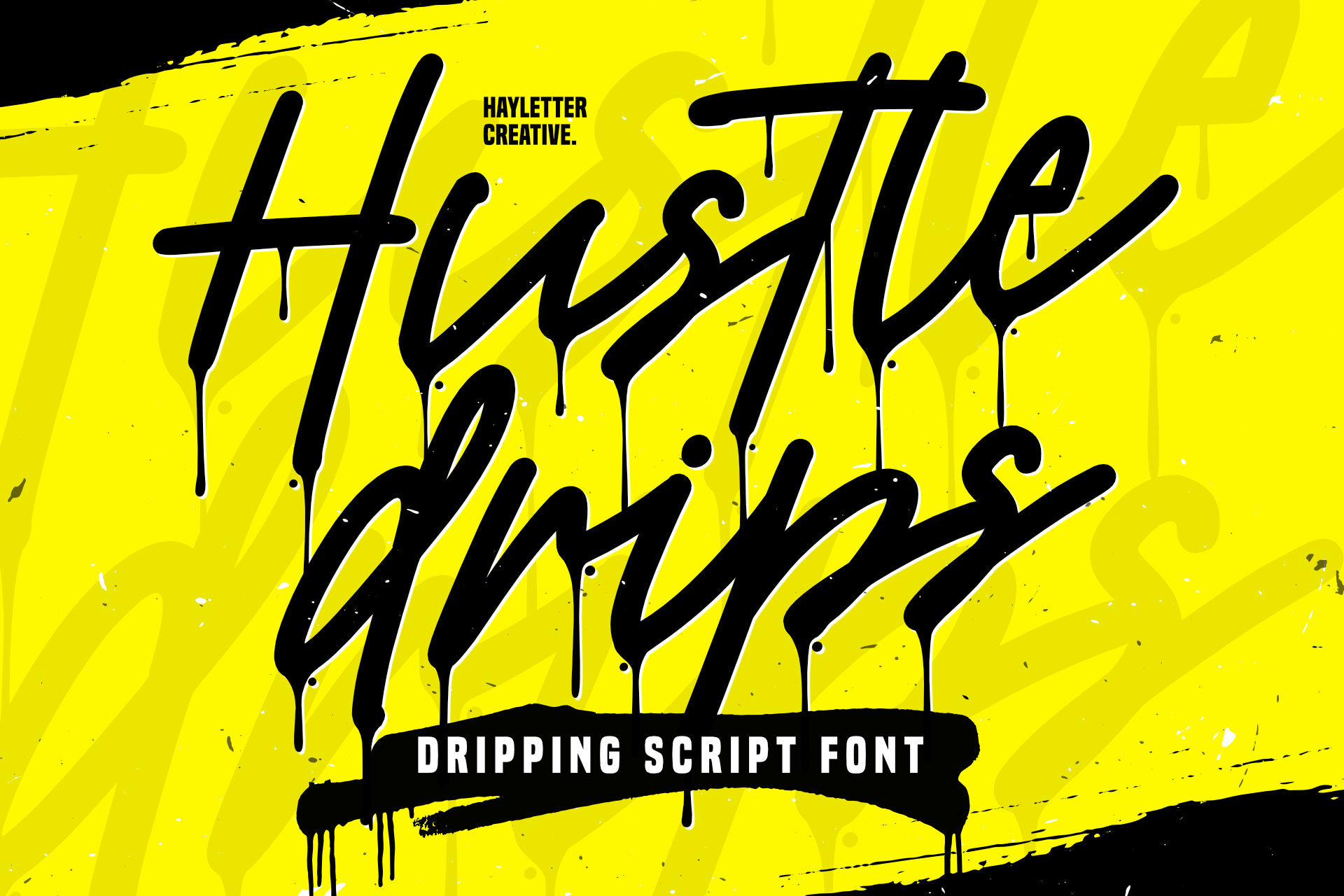
Hustle Drips adds a dripping ink effect that gives motivational phrases a raw, urban finish. It works well for hustle culture, gym motivation, and street-style quote prints.
Best for: hustle culture, gym motivation, street-style quote prints. By: Hayletter Creative
5. Menace
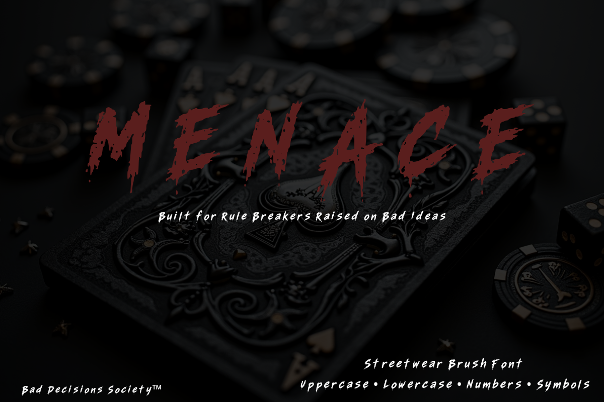
Menace is an aggressive display typeface built for bold slogans and high-contrast graphic tees. Its hard edges create a warning-label feel, so use it for short phrases at large sizes.
Best for: bold slogans, high-contrast graphic tees, short phrases. By: LuxXpression
Retro / Vintage & Varsity Fonts for T-Shirts
Vintage varsity fonts bring nostalgia, team spirit, and a worn-in feel. These picks suit college-style merch, sports-inspired graphics, and retro labels that feel collected rather than new. They are the easiest way to make a tee feel like it came from a team locker room.
6. Varsity Universe
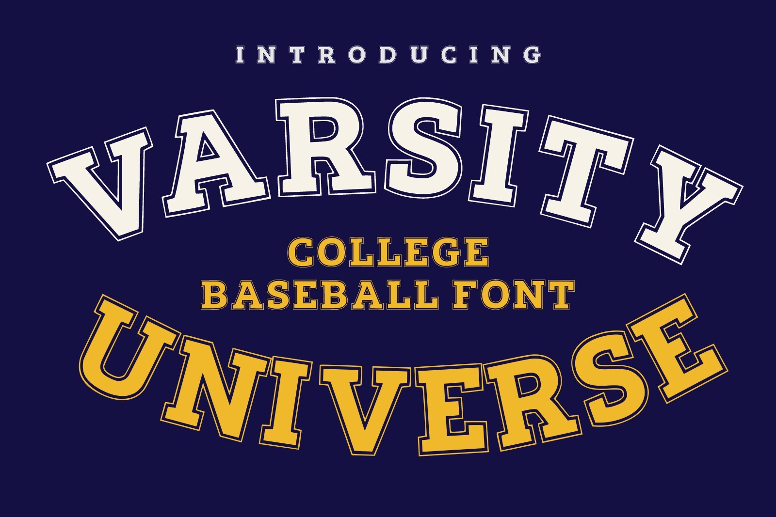
Varsity Universe delivers a classic college look with strong, familiar letterforms. It is a dependable choice for athletic merch, campus-style tees, team names, and seasonal sports slogans.
Best for: athletic merch, campus-style tees, team names. By: Infinity art Studio
7. College Retro
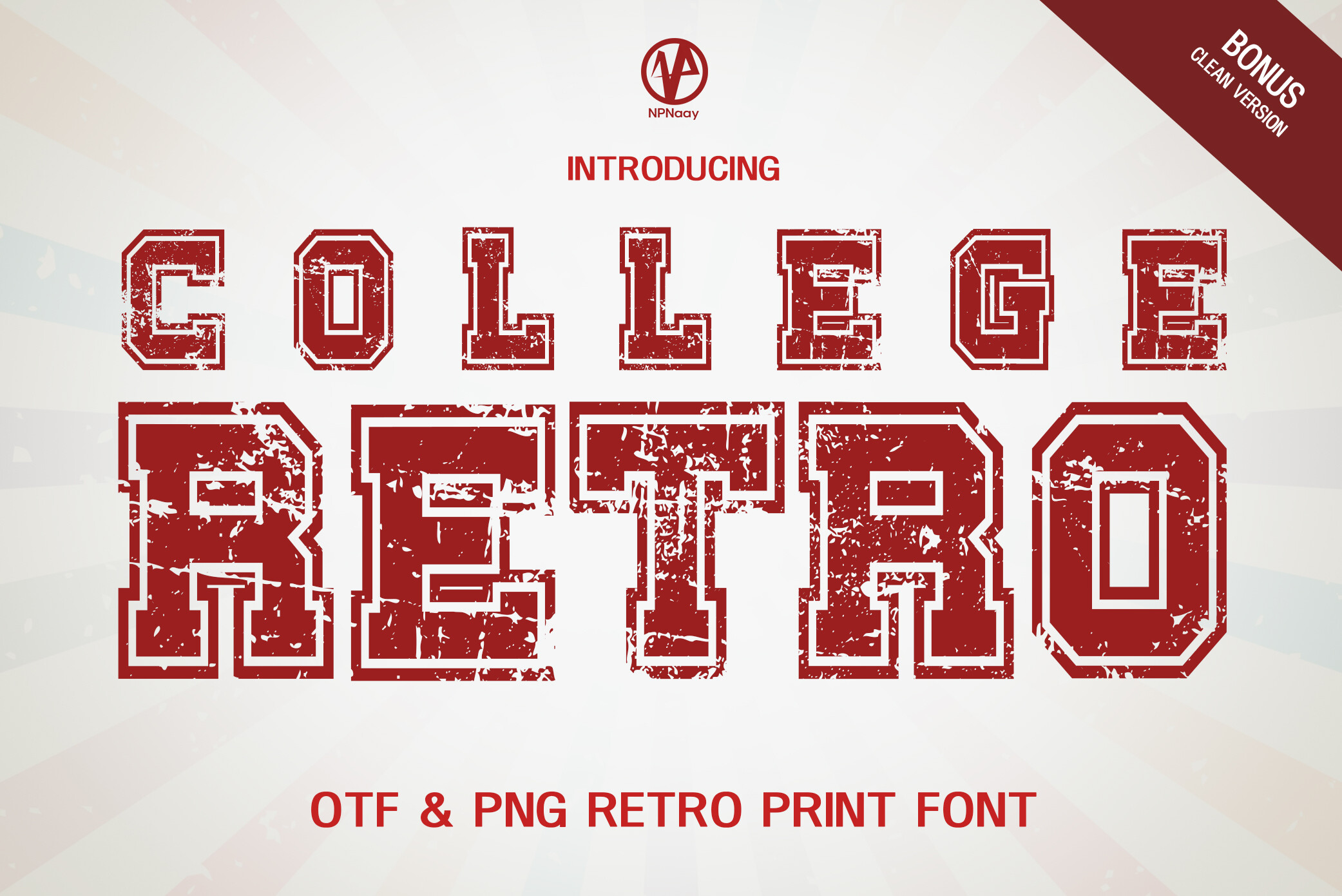
College Retro focuses on the college aesthetic with a clean structure that works well for team names and jersey numbers. It has a nostalgic sports feel without getting overly decorative.
Best for: team names, jersey numbers, retro athletic designs. By: NPNaay
8. Vintage Block
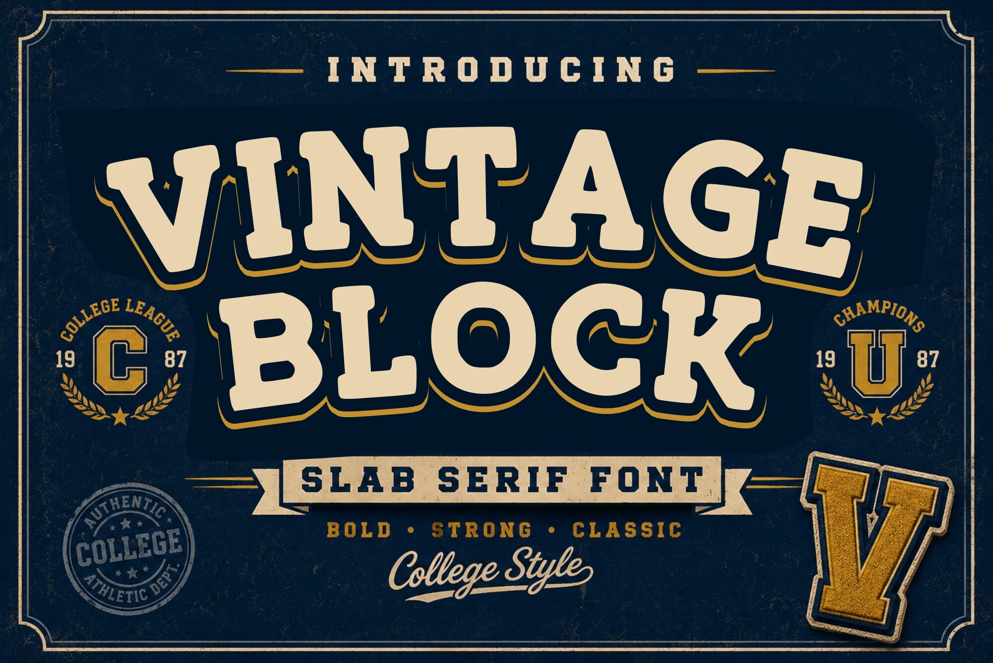
Vintage Block uses chunky block letters with a retro badge feel. It suits vintage labels, patch-style graphics, and designs that need a stamped, worn look with strong screen printing potential.
Best for: vintage labels, patch-style graphics, stamped worn looks. By: 29Graphic
9. University Spirit
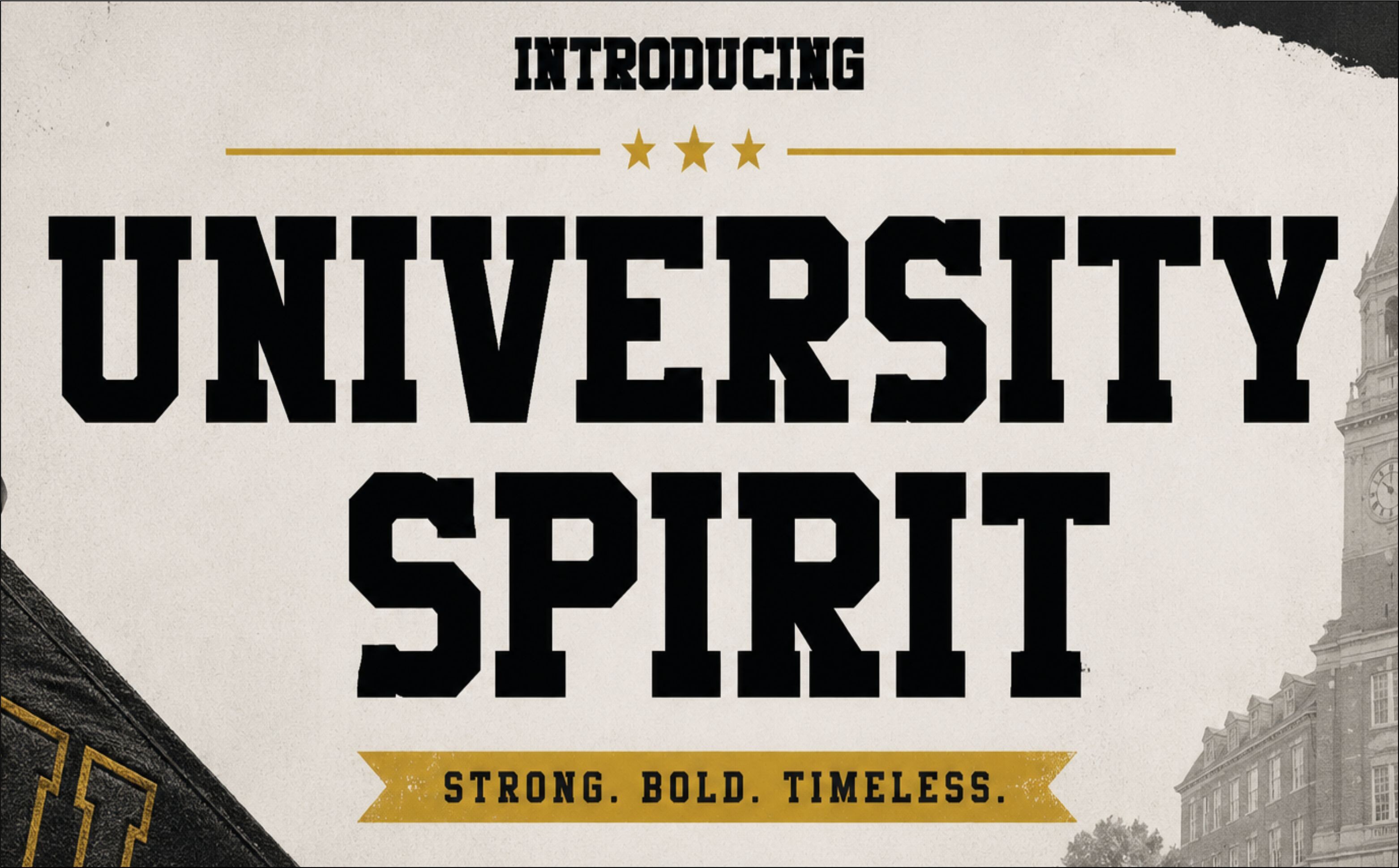
University Spirit softens the varsity look with rounded forms and a friendlier campus mood. It works well for approachable college merch, spirit-week graphics, and casual tees that feel warm.
Best for: approachable college merch, spirit-week graphics, casual tees. By: creativelabstd
10. Groovy Star
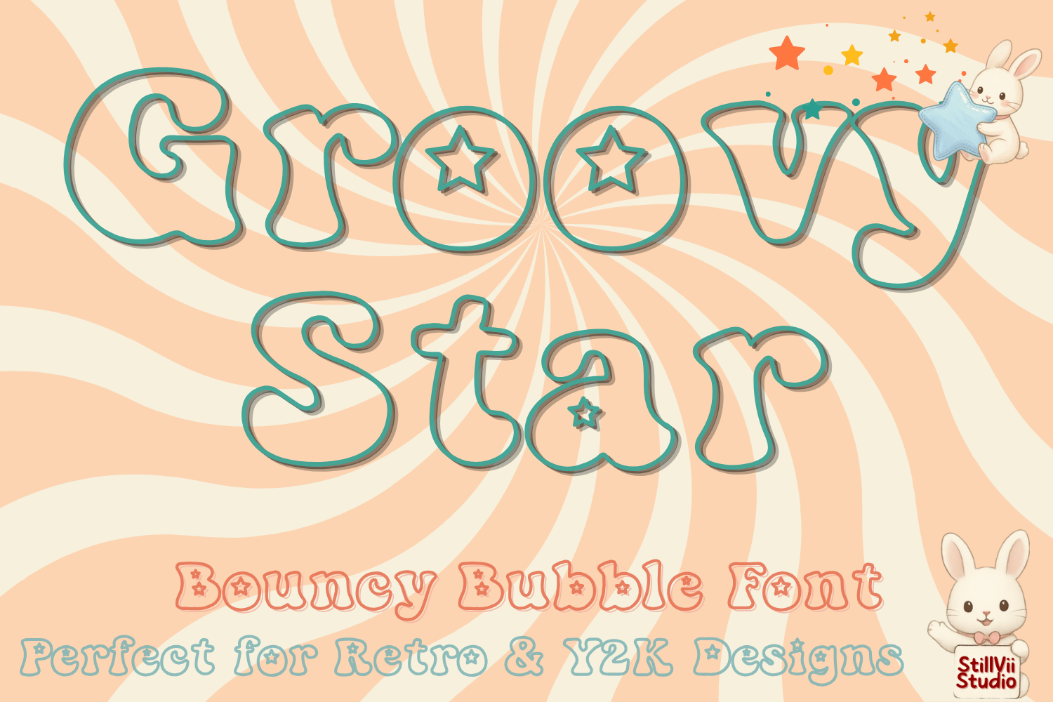
Groovy Star taps into 1970s disco and groovy aesthetics with a playful retro shape. It is a good match for vintage music tees, festival merch, and nostalgic graphic prints.
Best for: vintage music tees, festival merch, nostalgic graphic prints. By: StillViiStudio
Minimal / Clean Sans-Serif Fonts for T-Shirts
Minimalist fonts for apparel rely on clean lines, balanced spacing, and quiet confidence. These sans-serif picks work well for fashion brands, capsule collections, and small chest prints that need to look polished. They are the quiet option when the brand mark should do the talking.
11. Hélène
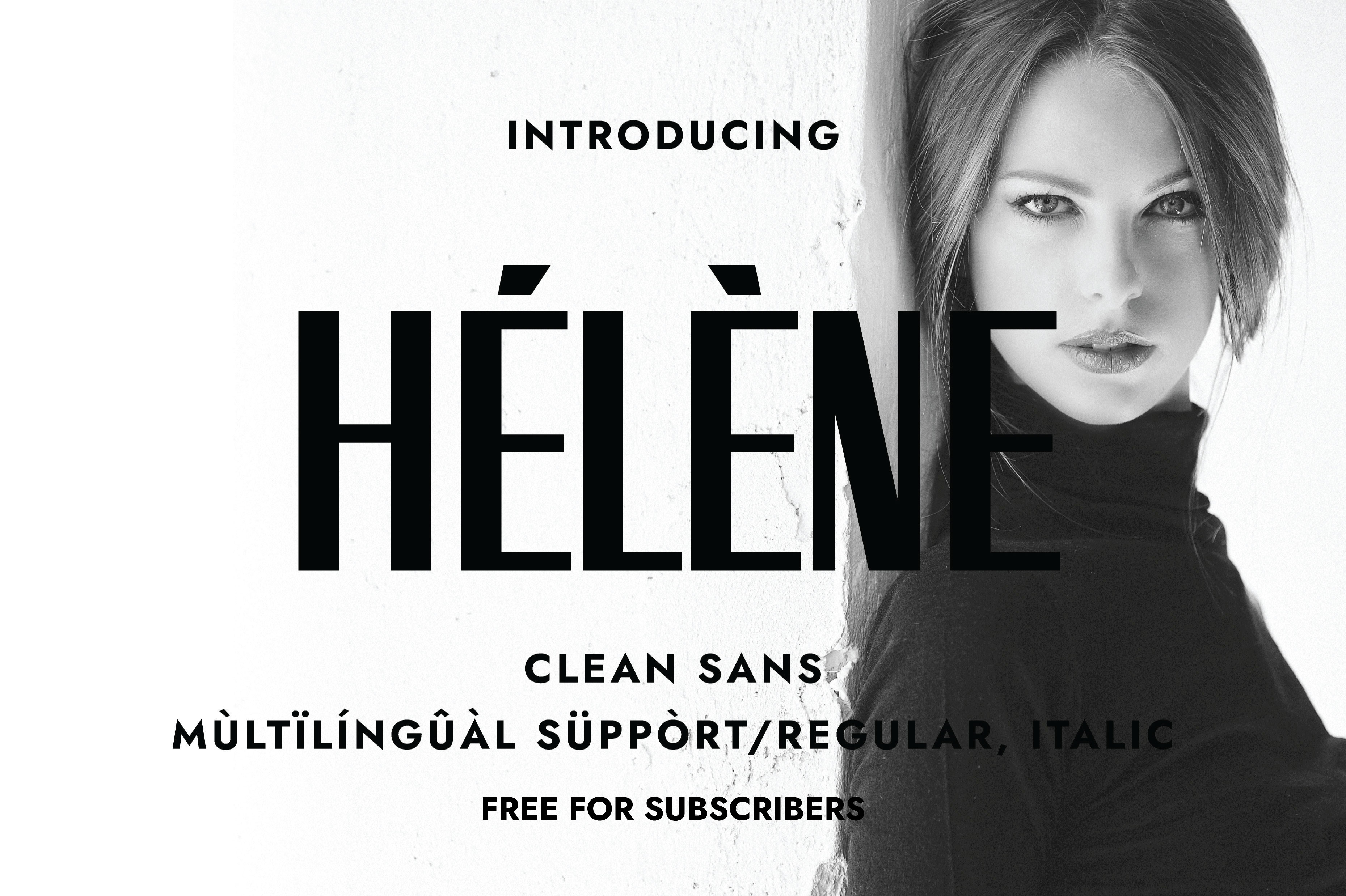
Hélène is a clean geometric sans with a calm, modern feel. Its even strokes make it a reliable choice for minimalist capsule collections, small chest logos, and understated apparel designs.
Best for: minimalist capsule collections, small chest logos, understated apparel designs. By: Minimalistartstudio
12. Honetle
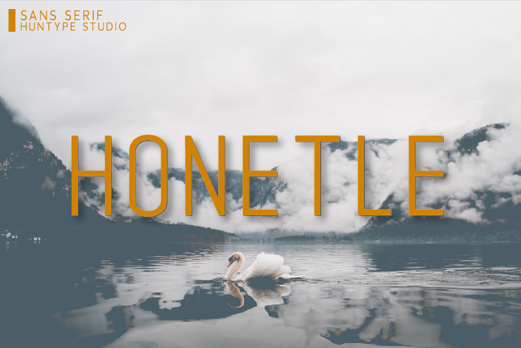
Honetle is a versatile sans-serif with a practical, easy-to-read structure. It performs well on smaller prints where clarity matters more than decoration, making it a safe option for custom shirts.
Best for: smaller prints, custom shirts, everyday brand messaging. By: Huntype
13. Speed Up
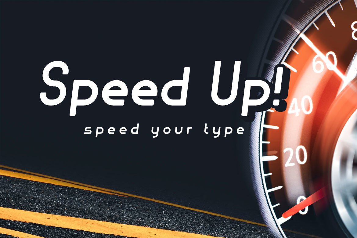
Speed Up is a dynamic narrow sans that feels active and forward-moving. It suits sporty brands, running clubs, and performance-inspired apparel, especially when long words need to fit neatly.
Best for: sporty brands, running clubs, performance-inspired apparel. By: Mightyfire
14. Katten
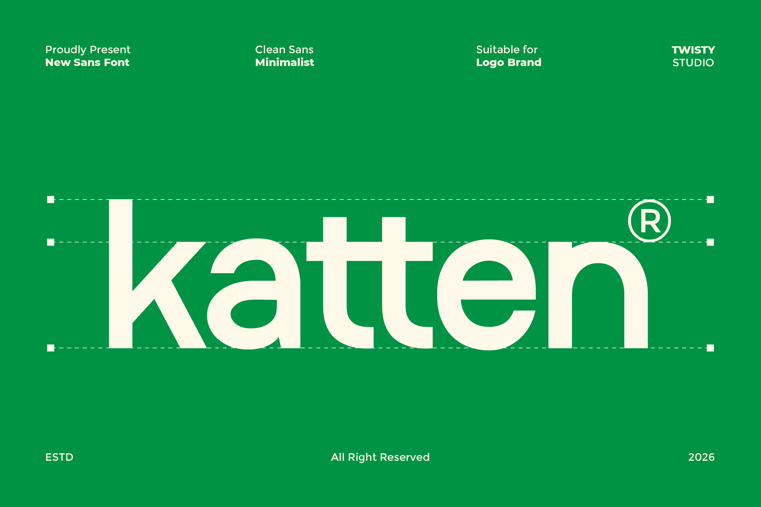
Katten is a modern, clean typeface with a simple logo-friendly structure. It works well for minimal chest logos, brand marks, and short apparel phrases that need a polished but quiet feel.
Best for: minimal chest logos, brand marks, short apparel phrases. By: Twistystd
Hand-Drawn / Script Fonts for Boutique T-Shirt Brands
Script fonts for apparel can make a boutique brand feel personal, warm, or polished. These hand-drawn and calligraphy-inspired picks are best for smaller, softer messages, and they often work better with DTG or DTF than with screen printing. I use them when the design needs a human touch.
15. Hafwen
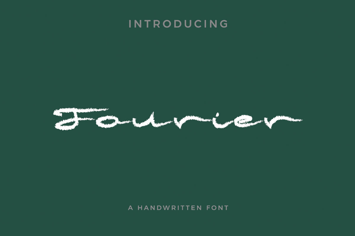
Hafwen has a soft handwritten character that feels personal and approachable. It is a good fit for niche boutique prints, gentle quotes, and small business apparel that needs warmth.
Best for: niche boutique prints, gentle quotes, small business apparel. By: Pixova Creative
16. Harst Glory
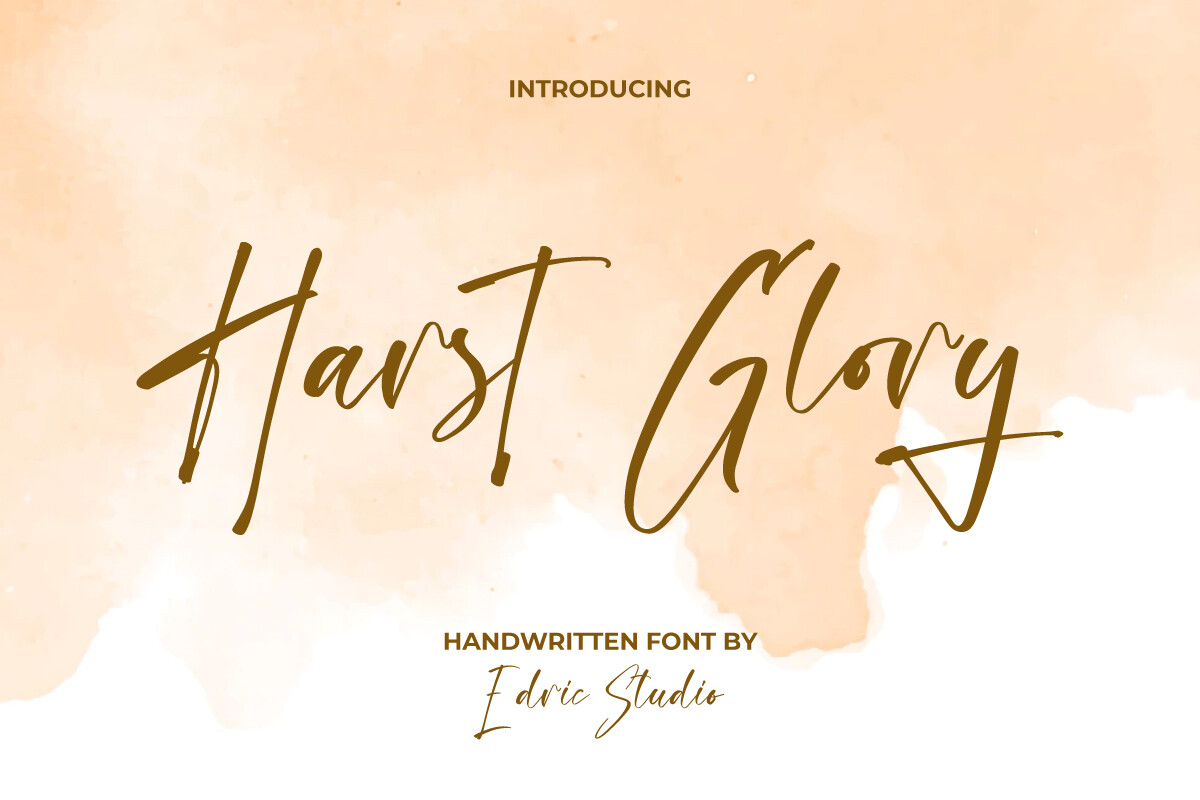
Harst Glory is an expressive script with strong thick and thin contrast. Its signature-like energy suits brand slogans and boutique apparel, but its fine details make DTG or DTF a safer choice.
Best for: brand slogans, personal names, boutique apparel. By: EdricStudio
17. Magnoline Boutique
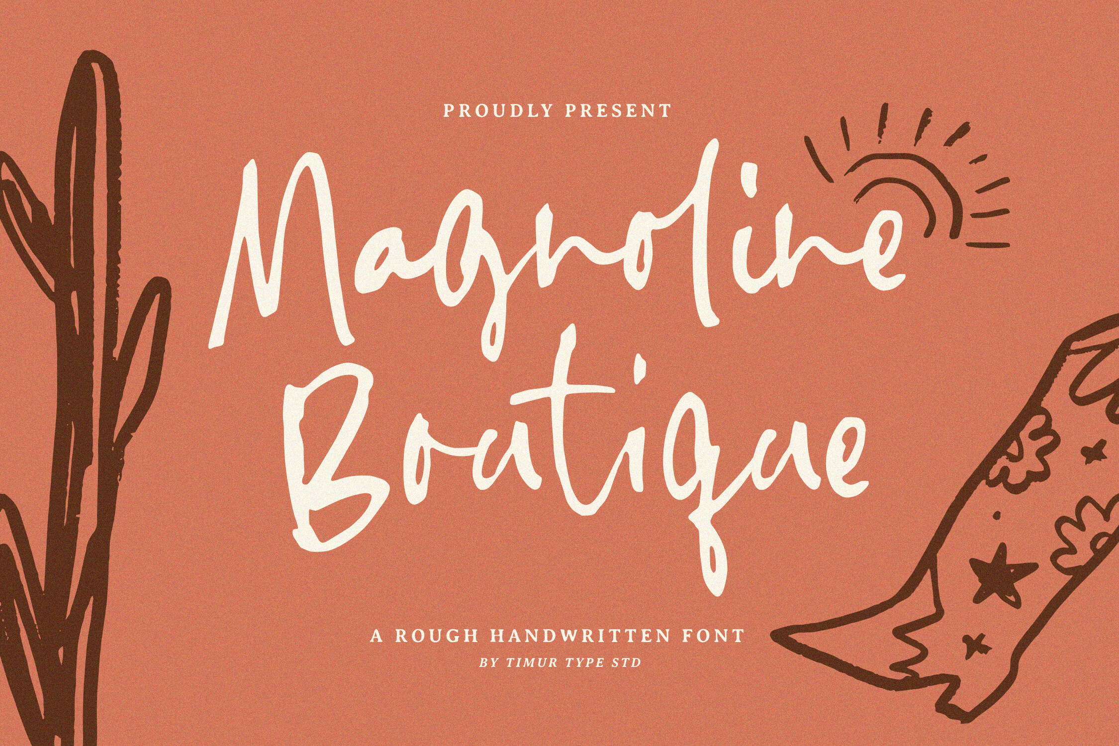
Magnoline Boutique brings an elegant calligraphic feel to boutique lines. Its refined strokes suit luxury-inspired apparel, bridal merch, and short brand phrases where lettering defines the identity.
Best for: luxury-inspired apparel, bridal merch, short brand phrases. By: Timur type
18. Swirly Whimsy
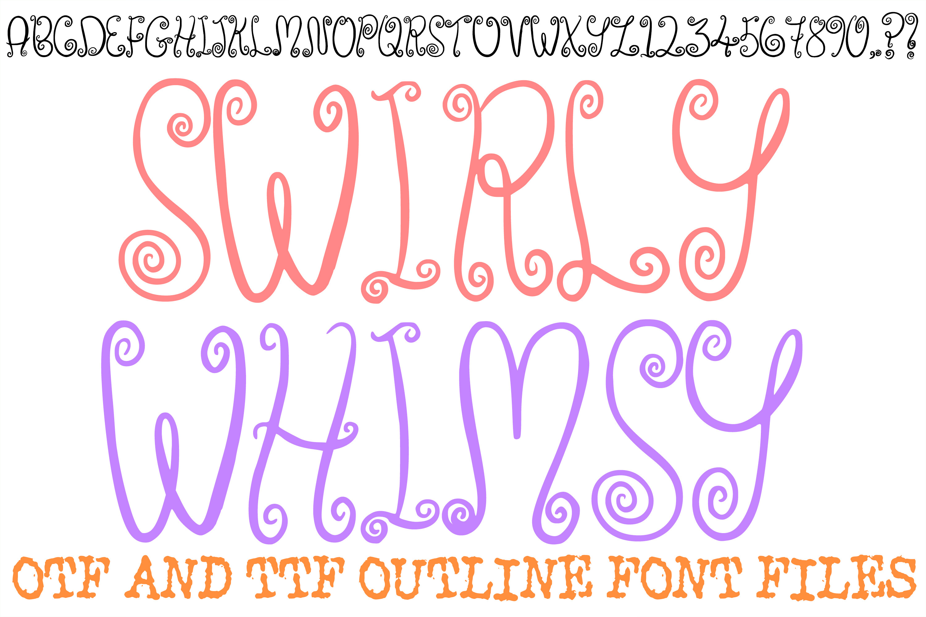
Swirly Whimsy is a playful handwritten font with decorative swirls and a cozy, friendly mood. It works well for warm prints, family merch, and boutique pieces that need a soft feel.
Best for: warm prints, family merch, boutique pieces. By: squeebcreative
19. Lettering Miner
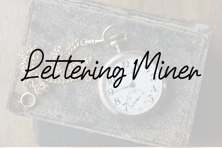
Lettering Miner has a handcrafted lettering style that feels artisanal and textured. It suits handmade merch, craft brands, and short expressive phrases that should feel made by a person.
Best for: handmade merch, craft brands, short expressive phrases. By: Eric Kusuma
Distressed / Grunge Fonts for Vintage T-Shirt Prints
Distressed grunge fonts add wear, texture, and a lived-in feel. They are strong for band tees, vintage poster prints, and retro merch that should look like it has history. The goal is age, not mess.
20. Tearmark Brush
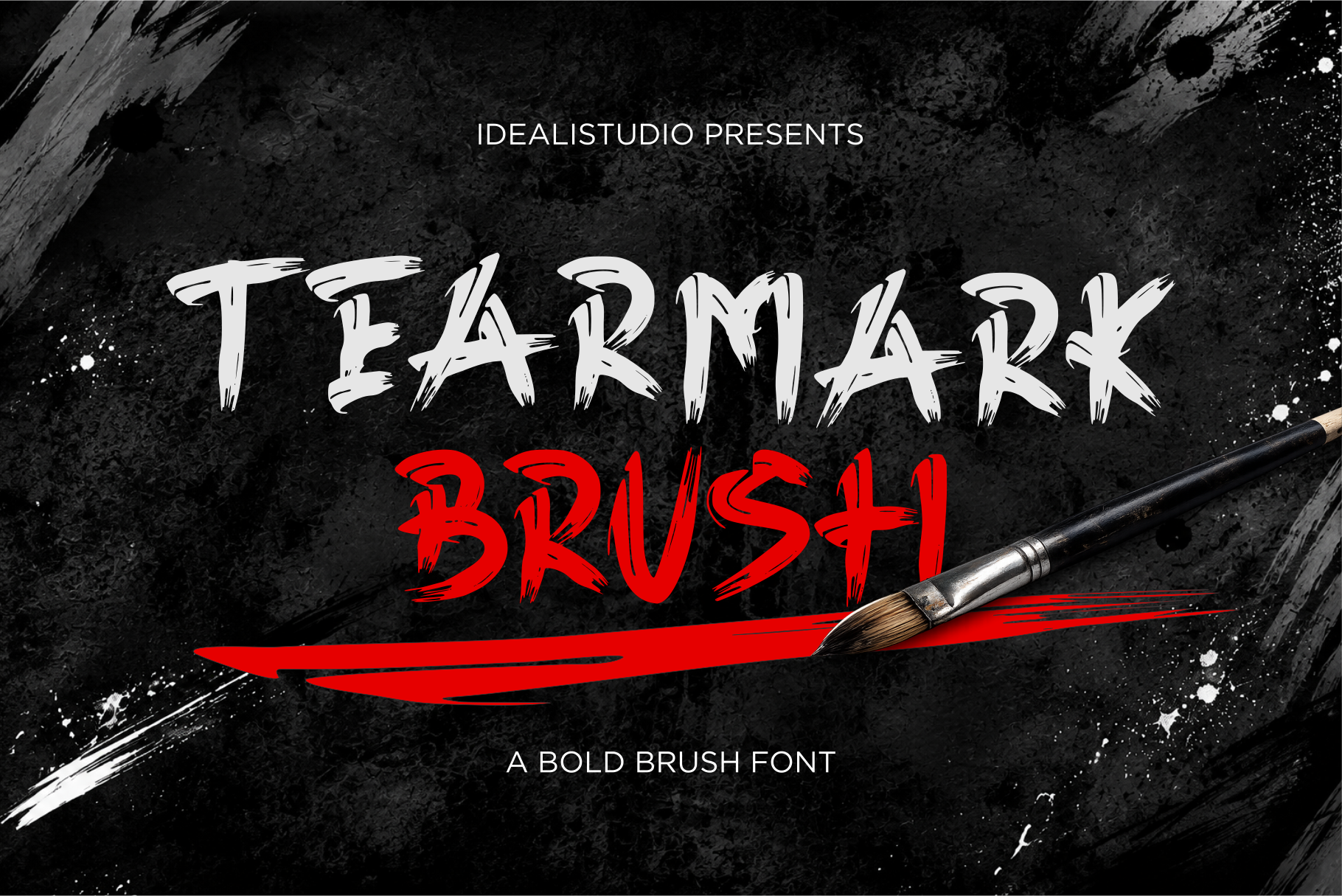
Tearmark Brush uses a worn brush texture to create a distressed, band-tee look. It is a solid choice for rock merch, music-inspired prints, and vintage-style slogans with character.
Best for: rock merch, music-inspired prints, vintage-style slogans. By: Idealistudio
21. Rustic Grunge
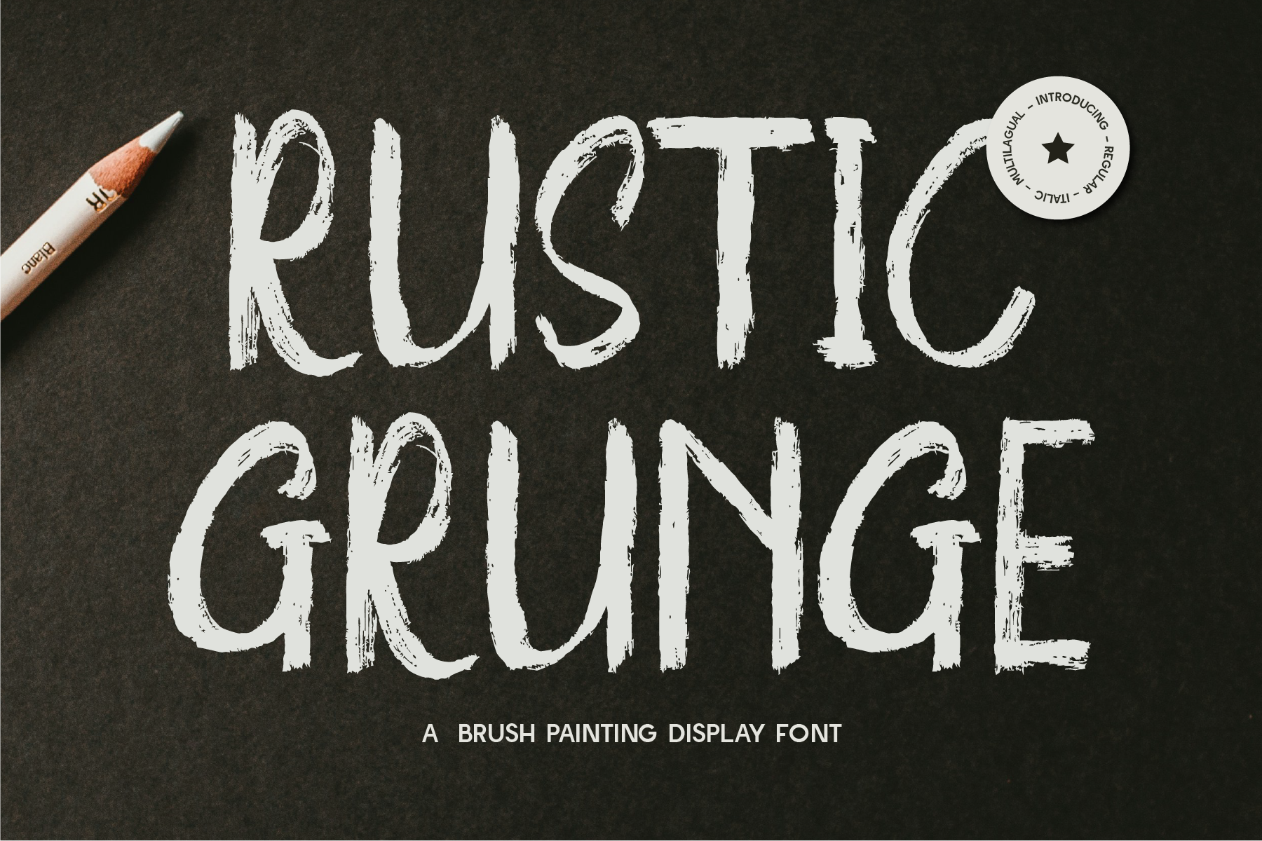
Rustic Grunge has a coarse, weathered texture that feels rural, retro, and intentionally rough. It works well for farmhouse-style prints, vintage outdoor merch, and worn-in personality.
Best for: farmhouse-style prints, vintage outdoor merch, worn-in personality. By: Indotype Foundry
22. Black Brush
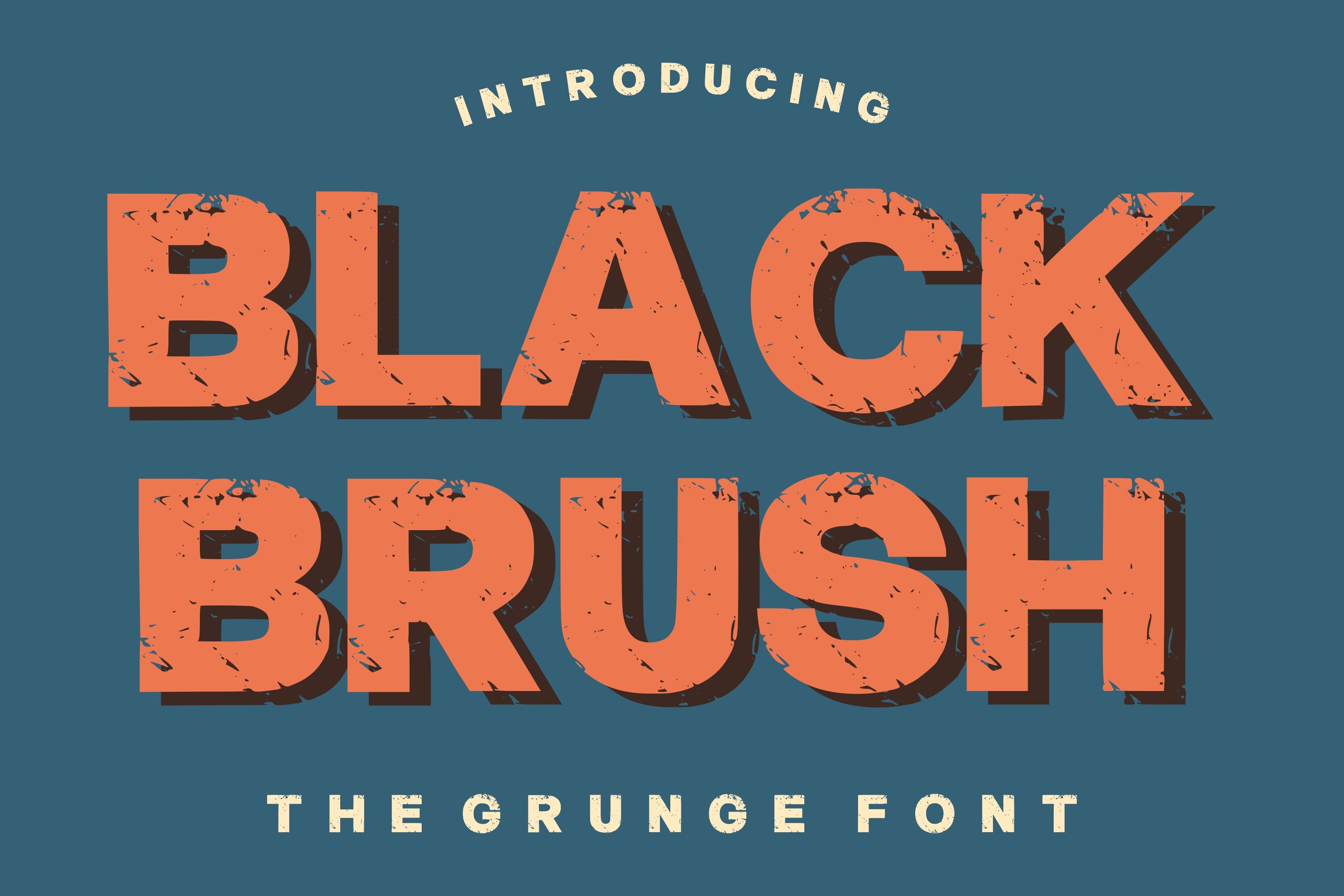
Black Brush is a bold brush font with dark, confident strokes and a rugged texture. It is a good screen printing pick because it stays readable despite its rough edges.
Best for: high-contrast slogans, street-style prints, raw ink-heavy designs. By: riki.studio
23. Inkbrute
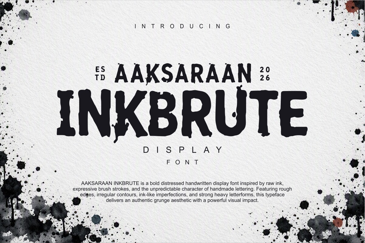
Inkbrute is a rough ink-based typeface with a brutal, grunge-inspired energy. It suits aggressive graphic tees, band merch, and short phrases that should feel stamped or hand-pulled.
Best for: aggressive graphic tees, band merch, short stamped phrases. By: Eko Kurniawan
24. Rexbel
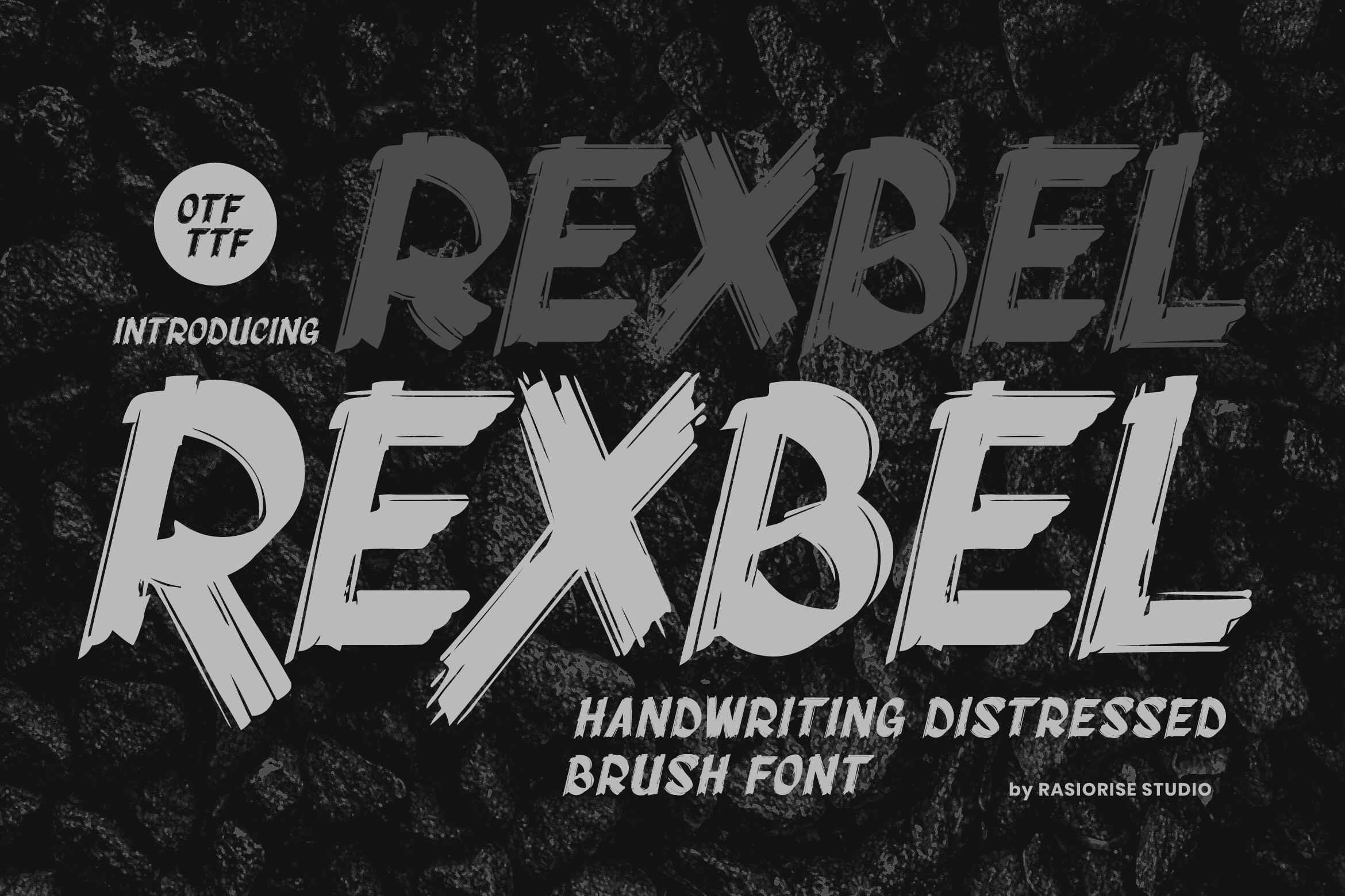
Rexbel has a worn display look that feels like a vintage poster printed on an old tee. It suits retro poster prints, music merch, and nostalgic streetwear with aged attitude.
Best for: retro poster prints, music merch, nostalgic streetwear. By: Rasiorise Studio
Playful / Quote Lettering Fonts for Motivational T-Shirt Prints
Playful quote lettering fonts are ideal for motivational prints, gifts, and family or BFF merch. These picks keep the message warm, readable, and easy to pair with simple graphics. They work best when the phrase is short and the tone is friendly.
25. Love Quote
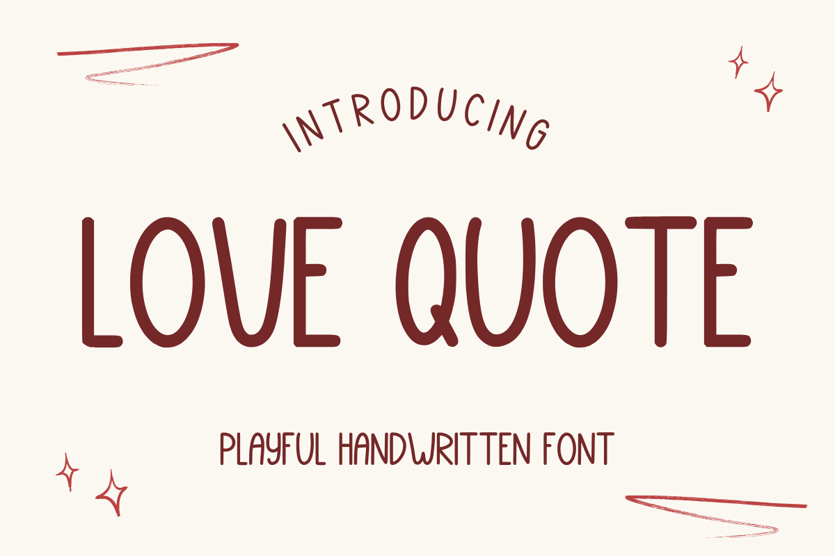
Love Quote has a warm handwritten feel that works well for quotes, gifts, and sentimental prints. It leans toward paper crafts, planners, and stickers, but can work on short tee messages.
Best for: quotes, gifts, sentimental prints. By: Letterayu
26. Lovelly Quote
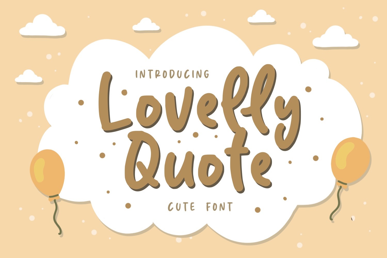
Lovelly Quote is a playful lettering style with a stronger t-shirt fit. It suits motivational phrases, seasonal prints, and cheerful branding that needs an approachable, quote-based feel.
Best for: motivational phrases, seasonal prints, cheerful branding. By: Typefar
27. Mandy
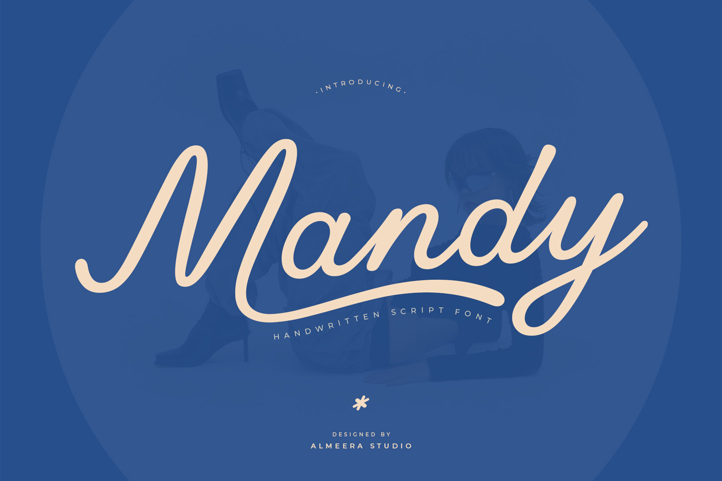
Mandy is a friendly handwritten font with a positive, easygoing mood. It works well for positive slogans, family prints, and casual gift tees that should sound warm rather than formal.
Best for: positive slogans, family prints, casual gift tees. By: Almeera Studio
How to Use T-Shirt Fonts in Your Design Projects
I start with the message, not the font. If the design is a bold slogan, choose one of the bold display fonts for shirts with strong weight. If it is a brand name, choose a clean sans-serif. If it is a quote, a handwritten or script style may fit better.
For a two-line design, pair a bold display font with a simple supporting font. A clean sans-serif is usually the safest partner because it does not fight the main typeface. A light script can work for a signature line, but only if the print method can handle the thin strokes.
Keep the text size practical. Small print can look elegant in a mockup, but it may disappear on fabric. As a working guideline, keep secondary text around 14pt or larger at standard resolution, and increase the size if the shirt will be viewed from a distance. For large-distance reading, bigger cap height is better. A rough rule of thumb is that a viewer at about six feet needs roughly 1.5 inch cap height to read a word comfortably, while jersey text read from 10 to 30 feet often uses 3 to 4 inch lettering. A simple pre-production test is to print the design on paper at 100% scale and check it from a few steps away.
Match the font to the print method. Screen printing favors bold, simple fonts for screen printing with open counters and no hairline details. DTG printing is more forgiving for scripts and finer details. DTF is also flexible and works well across many fabric types. If you are unsure, choose a font with uniform stroke weight and test it at the final size.
Finally, check the layout on a real garment shape. Chest prints, back prints, and pocket prints all need different spacing. Leave room for the fabric to move, and make sure the type does not sit too close to seams or edges.
Tips for Choosing the Right Font for T-Shirts
I check the license before I sell. Free fonts are not always free for commercial use on t-shirts you sell. Some licenses cover personal use only, while others allow apparel but not marketplace listings, digital downloads, or large production runs. If you are selling on Etsy, Printful, or Printify, verify that the license covers physical products and the way you list them. Using a font without proper commercial licensing can lead to DMCA takedowns, and repeat violations can put a shop at risk.
Creative Fabrica is a useful source for premium fonts with commercial licensing options, but always read the specific license attached to the font you download. A license that covers printed shirts may not cover selling the same design as a digital file. That physical versus digital distinction matters for POD sellers.
Test the font in the tools you actually use. Canva, Adobe Illustrator, Cricut Design Space, and Silhouette Studio all handle type differently. A font that looks clean in one app may render with thin edges in another. Export the design at the size you plan to print, then zoom out to check readability.
Also test the font on a mockup. Place it on a real t-shirt shape instead of a white rectangle. Check the contrast against dark and light fabrics, and make sure the letterforms do not get lost in the texture. If a script or distressed font feels fragile, increase the size or switch to a bolder alternative.
Where to Download Fonts for T-Shirt Design
Creative Fabrica is a strong starting point for t-shirt fonts because it offers a large library of display, script, grunge, and sans-serif styles with clear commercial licensing options. It is especially useful when you need a font that can be used in custom apparel, POD listings, and small business branding.
If you are looking for free options, Google Fonts, DaFont, and Font Squirrel are common places to browse. Always check the license before using a free font in a product you sell. Some free fonts are safe for commercial use, while others are limited to personal projects.
For more typography resources, font pairing ideas, and practical design guides, see the FontPro blog.