· fonts · 13 min read
17 Best Fonts for Business Cards in 2026
Discover the 17 best fonts for business cards, from elegant serifs and clean sans-serifs to signature scripts. Download free and premium options today.
A business card is small, but it has to do a lot of work. You have a few seconds to make someone think you are competent, credible, and worth calling. The best fonts for business cards are not the flashiest ones. They are the ones that stay clear at 8 points, fit the industry, and survive print.
Whether you are designing for a law firm, tech startup, or creative service, the right typeface makes the card feel professional. It also helps the name, title, and contact details stay readable when the card is held at arm’s length or dropped in a pocket.
What Makes a Great Font for a Business Card?
The best fonts for business cards do three jobs. They stay legible when the type is tiny. They match the tone of the business. They hold up in print.
Most card text lives between 8 and 16 points. Your name might be 10 to 16 points. Your title can sit around 9 to 11. Contact details usually need 8 to 10. If a face looks sharp in a big preview but turns muddy at 8 points, it will not work on the card.
Industry matters. Legal, finance, and luxury brands often benefit from refined serifs. Tech, startups, and minimalist brands usually do better with clean sans-serif business card fonts. Creative services can add a script or display accent for the name, but not for the phone number.
Print finish changes the rules, too. Thin hairlines can disappear on textured stock, foil, or letterpress. A safe card uses no more than 2 or 3 fonts, with one accent face and one workhorse face. That is why the picks below are grouped by role, not just by style.
Elegant & Luxury Serif Fonts for Business Cards
Legal, finance, consulting, and luxury brands gain from elegant fonts for business cards that carry weight, rhythm, and a sense of tradition. These professional business card fonts work best when the letterforms have enough presence to hold a name at 10 to 14 points while still feeling refined. If your card needs to feel established, start here.
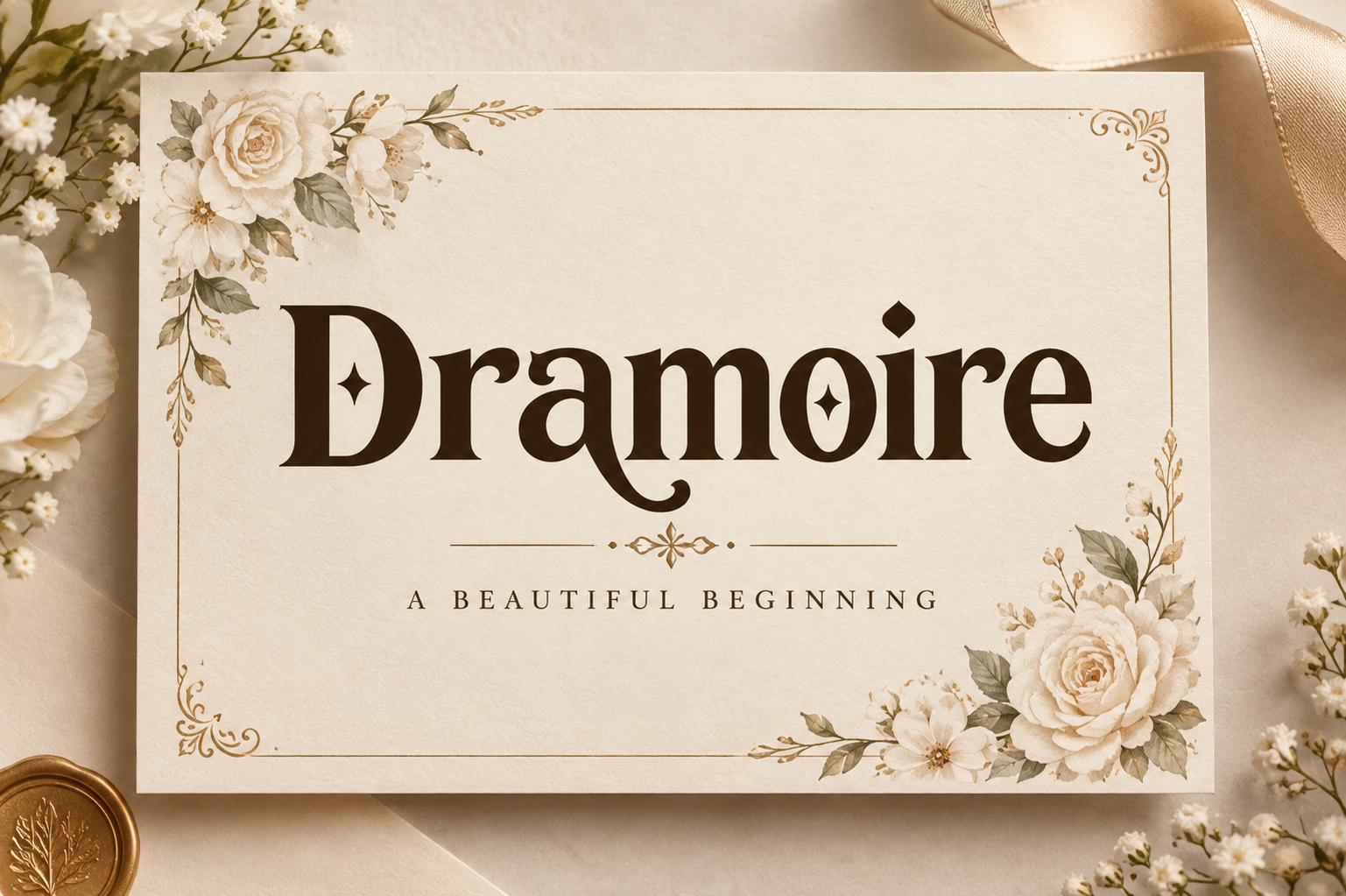
1. Dramoire — by Colourful
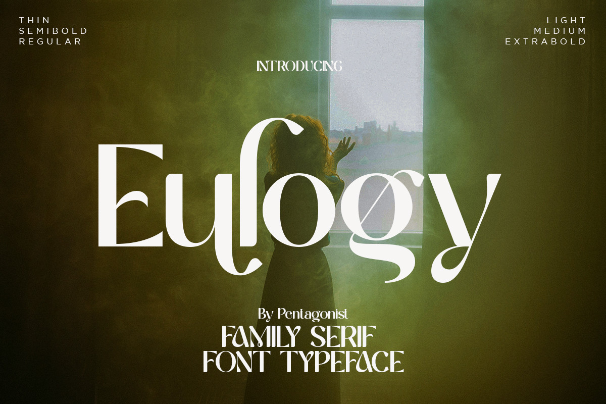
Dramoire has a refined serif character that suits law firm, luxury consulting, and premium real estate cards. The letterforms carry enough presence to make a name feel important on a small printed surface, without getting fussy. It is a good pick when the card should feel premium from the first glance.
Best for: law firm cards, luxury consulting, high-end real estate cards. By: Colourful
2. Shifer Blastone — by SayStudio
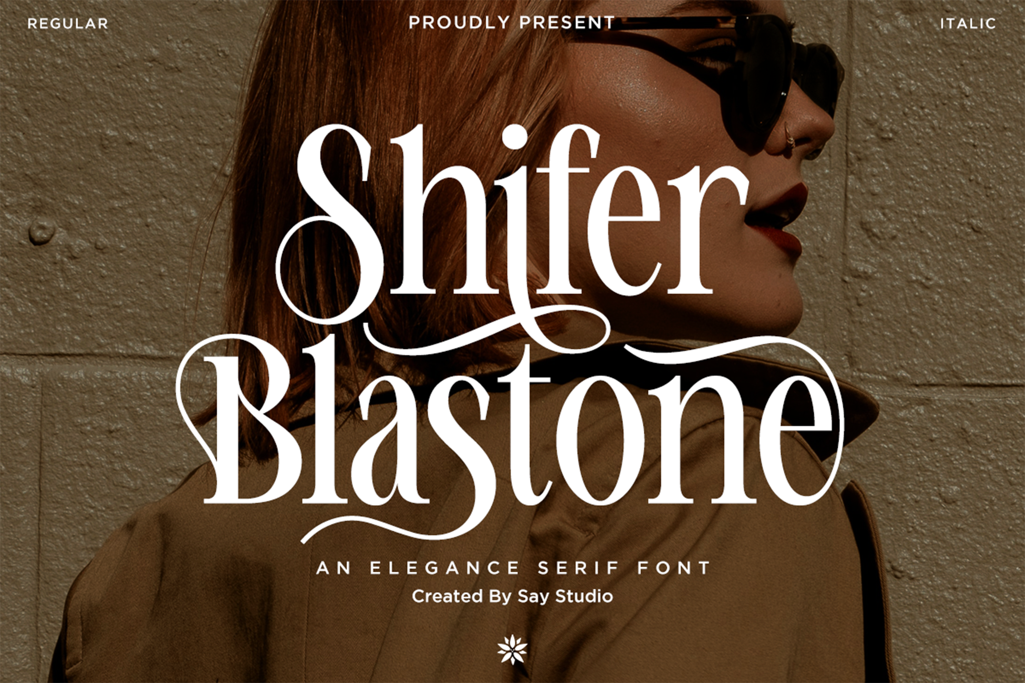
Shifer Blastone has a serious, executive serif rhythm. It suits finance, banking, and boutique agency cards where the name needs to read as dependable. The letterforms feel confident rather than decorative, which helps titles and names look steady. I would not reach for it if the brand is playful, but for a card that needs to feel reliable, it works.
Best for: finance & banking cards, executive titles, boutique agency cards. By: SayStudio
3. Kaglis — by maikofarazhatta
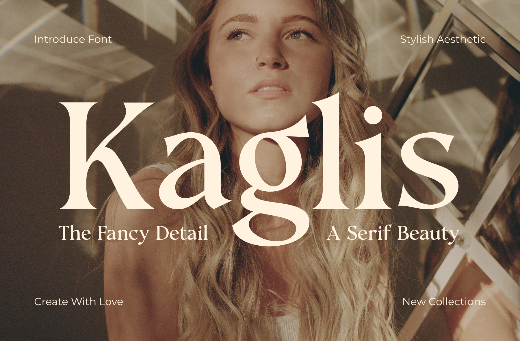
Kaglis balances classic serif elegance with modern proportions. It works for architecture studios, interior design cards, and premium branding. The style is restrained enough for professional services, but it still has a design sensibility for creative consultants. It is a good middle ground between formal and contemporary.
Best for: architecture studios, interior design cards, premium branding. By: maikofarazhatta
4. Betro Vogue — by Qweera Studio
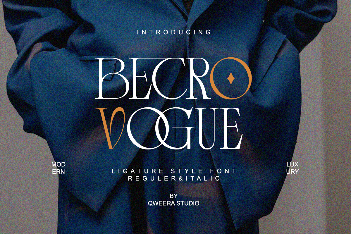
Betro Vogue brings an editorial, glossy feel to fashion boutique cards, beauty consultant branding, and luxury service identities. The serif has a magazine-like confidence that can make a short name or brand title feel carefully styled on a clean layout. It is a good pick when the card should feel like a lookbook, not a ledger.
Best for: fashion boutiques, beauty consultants, editorial-style branding. By: Qweera Studio
5. Perfina — by Font Liner
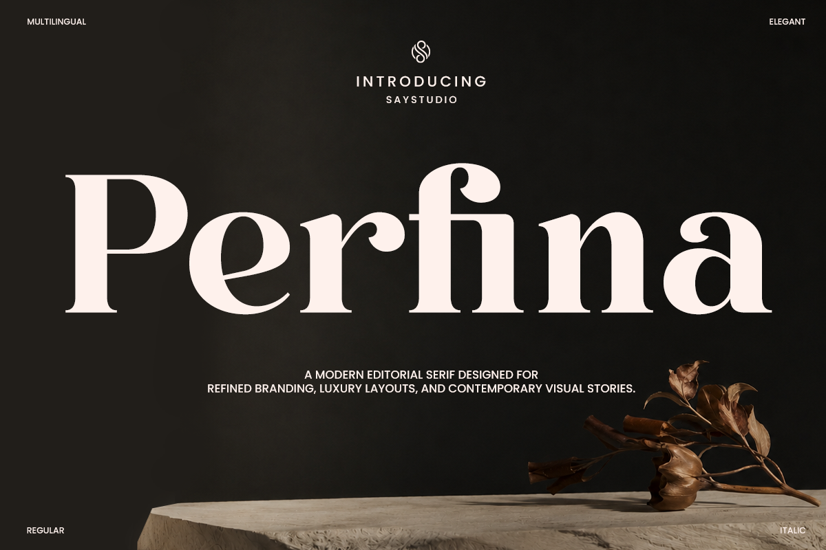
Perfina is a soft, refined serif that stays readable when contact details sit at a smaller size. It suits hospitality cards, boutique hotel branding, and upscale service providers that want warmth without losing polish. If the card needs to feel welcoming rather than formal, this is a strong option.
Best for: hospitality cards, boutique hotel branding, upscale service providers. By: Font Liner
Clean Modern Sans-Serif Fonts for Business Cards
Sans-serif business card fonts are the safest choice when instant legibility matters. They read quickly at small sizes, suit tech, startups, corporate cards, and minimalist brands, and make it easier to keep contact details clear. If you are not sure where to start, this is the section to check first.
6. Bedbag — by product.rasiostudio
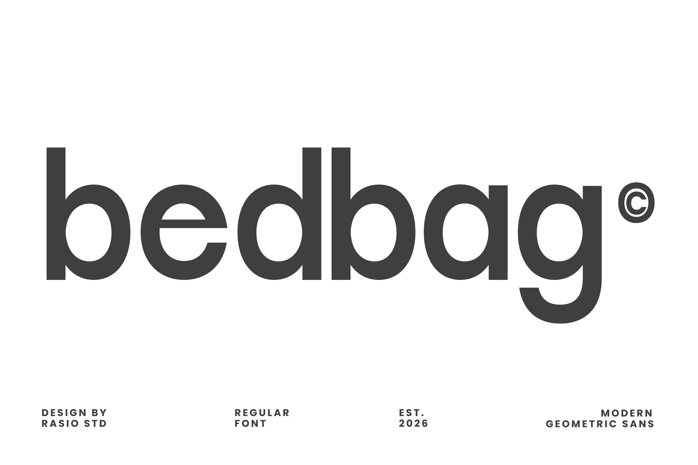
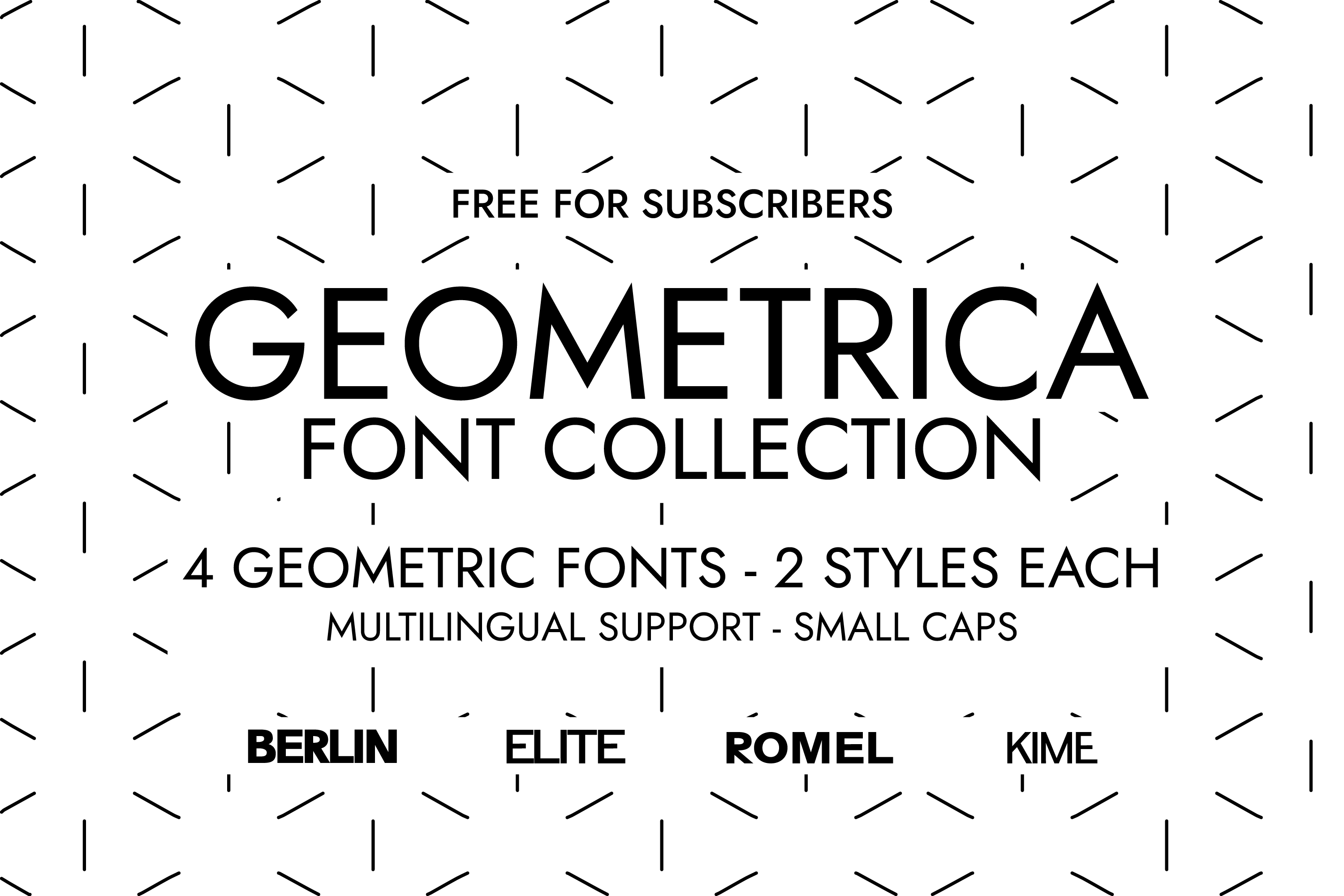
Bedbag is a geometric sans-serif with clean, confident shapes. It suits tech startup cards, SaaS founders, and modern consulting brands. The style reads sharp and current, like part of a digital product ecosystem rather than a generic print template. It works well when the card should feel modern without trying too hard.
Best for: tech startup cards, SaaS founders, modern consulting cards. By: product.rasiostudio
7. Tomat — by pekotype
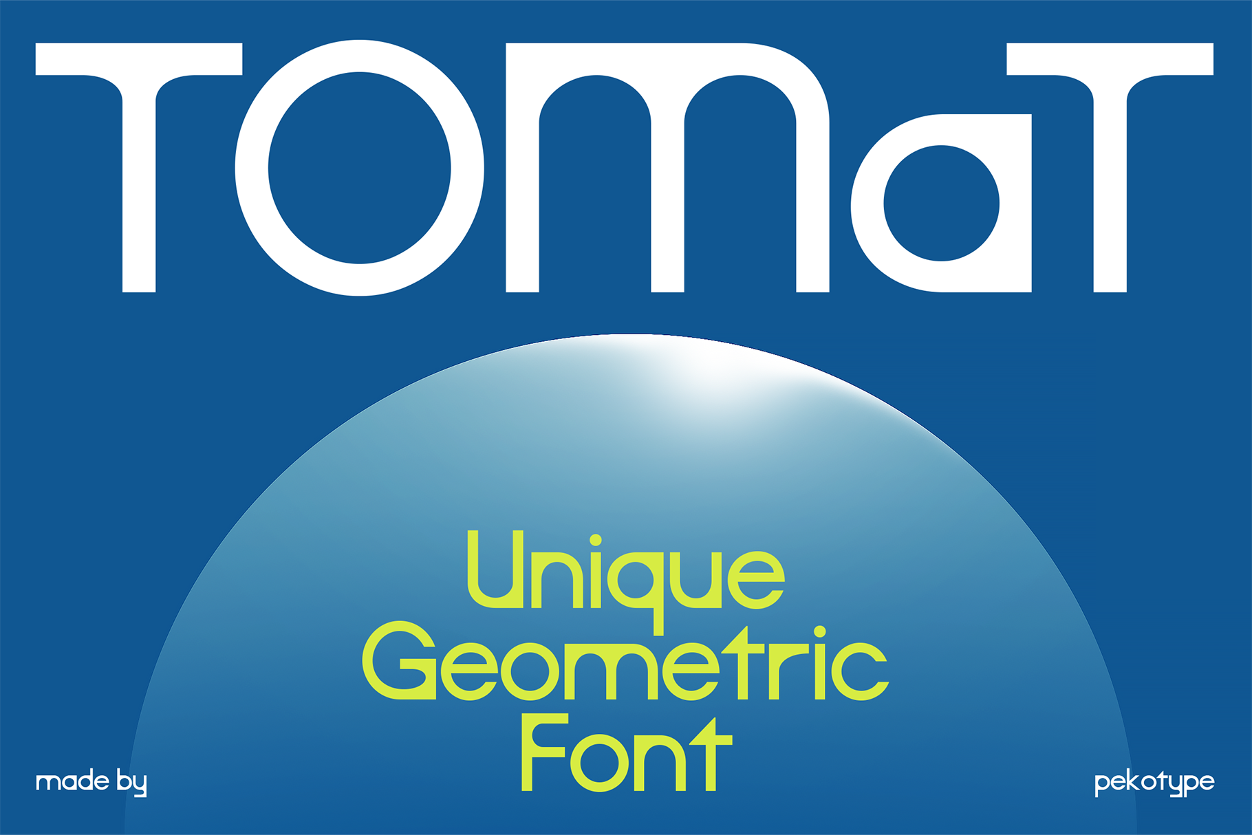
Tomat is a fresh grotesque with a light personality. It works for creative agency cards, freelance designer cards, and modern branding. It avoids the flat look of overly neutral type while staying professional enough for client-facing print. This is a good middle ground if a plain corporate sans feels too cold.
Best for: creative agency cards, freelance designer cards, modern branding. By: pekotype
8. Vaseso — by Artiveko
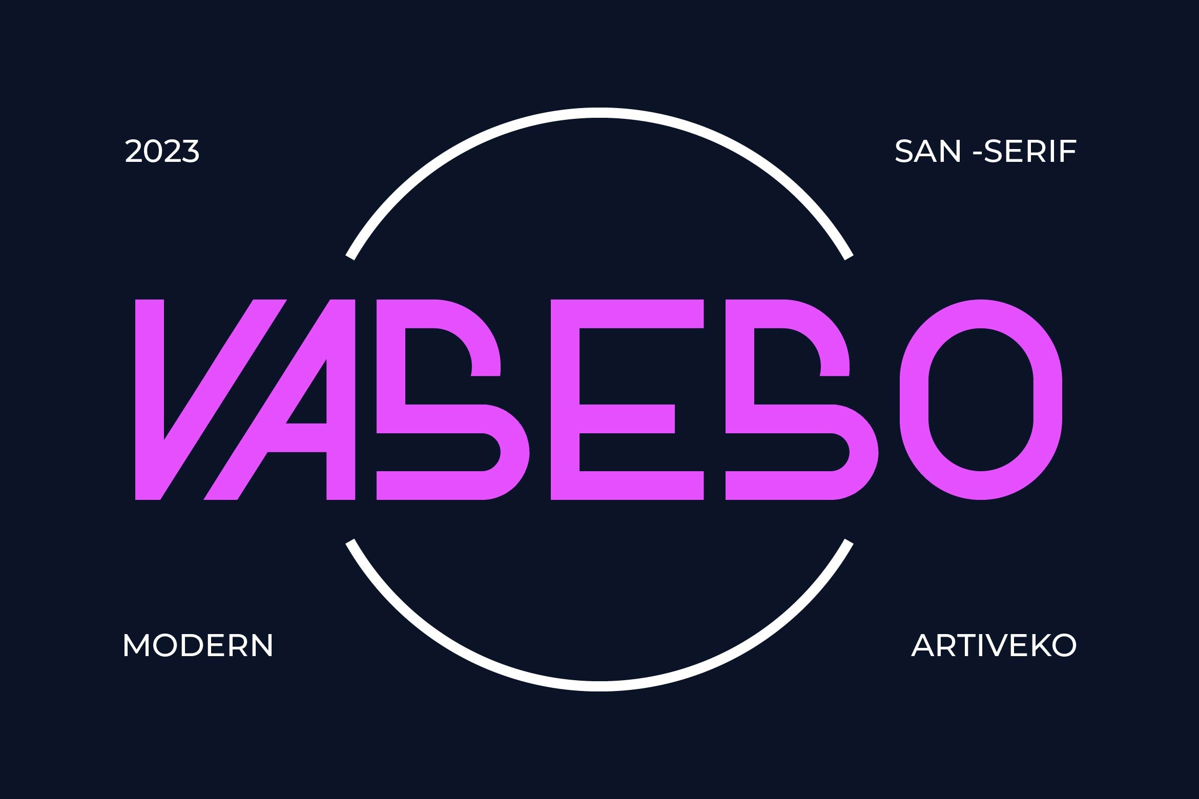
Vaseso is a neutral, well-balanced sans-serif that fits corporate cards, minimalist branding, and professional services. It does not distract from the message, which is useful when the card needs to feel reliable and easy to scan. I would call it the safe pick for a card that should not get in the way.
Best for: corporate cards, minimalist branding, professional services. By: Artiveko
9. Modeone — by Funtype Co.
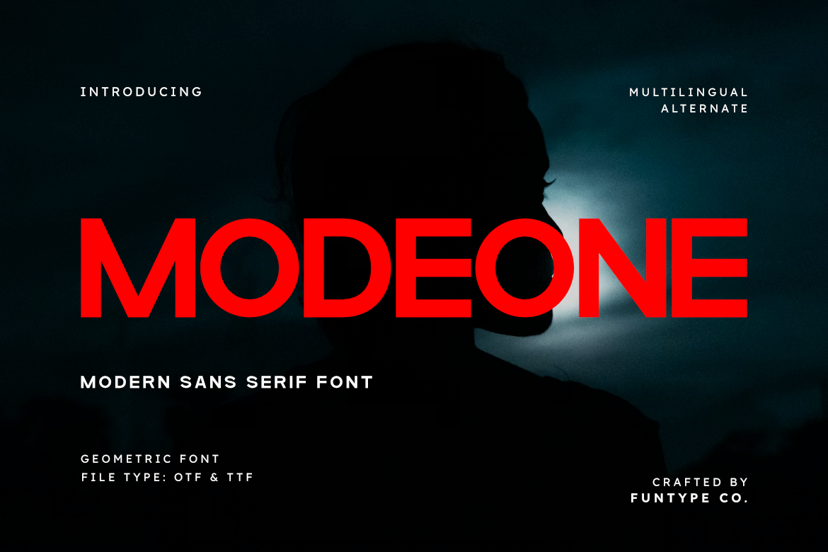
Modeone is a modern grotesque with a touch of geometry. It suits e-commerce brand cards, modern retail, and digital agency cards. It balances structure with friendliness, so the card feels approachable without losing a professional edge. It is a good option when the brand needs to feel current but still businesslike.
Best for: e-commerce brand cards, modern retail, digital agency cards. By: Funtype Co.
10. Montilla — by Zafara Studios
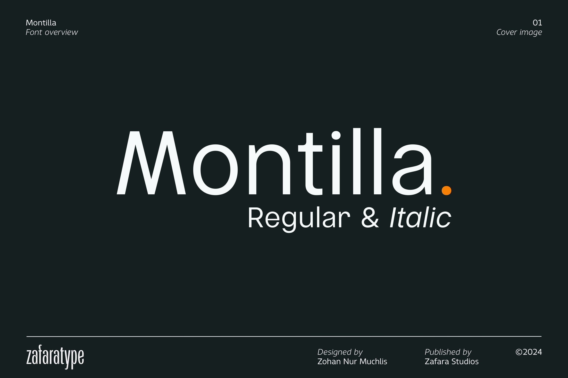
Montilla is a clean sans-serif with softer details. It works for wellness brand cards, coaching business cards, and personal branding. The style feels human and calm, which is helpful when the card should invite trust rather than project hard corporate authority. If your audience responds to warmth, this is a better fit than a strict geometric sans.
Best for: wellness brand cards, coaching business cards, personal branding. By: Zafara Studios
Signature & Script Fonts for Business Cards
Script fonts for business cards work best as accents, not as the main text block. Use them for the owner name, a short slogan, or a title, then switch to a readable sans-serif for phone, email, and address. A script can make a card feel personal, but it should not make the contact details harder to read.
11. Bellama Signatura Font — by bee.genin
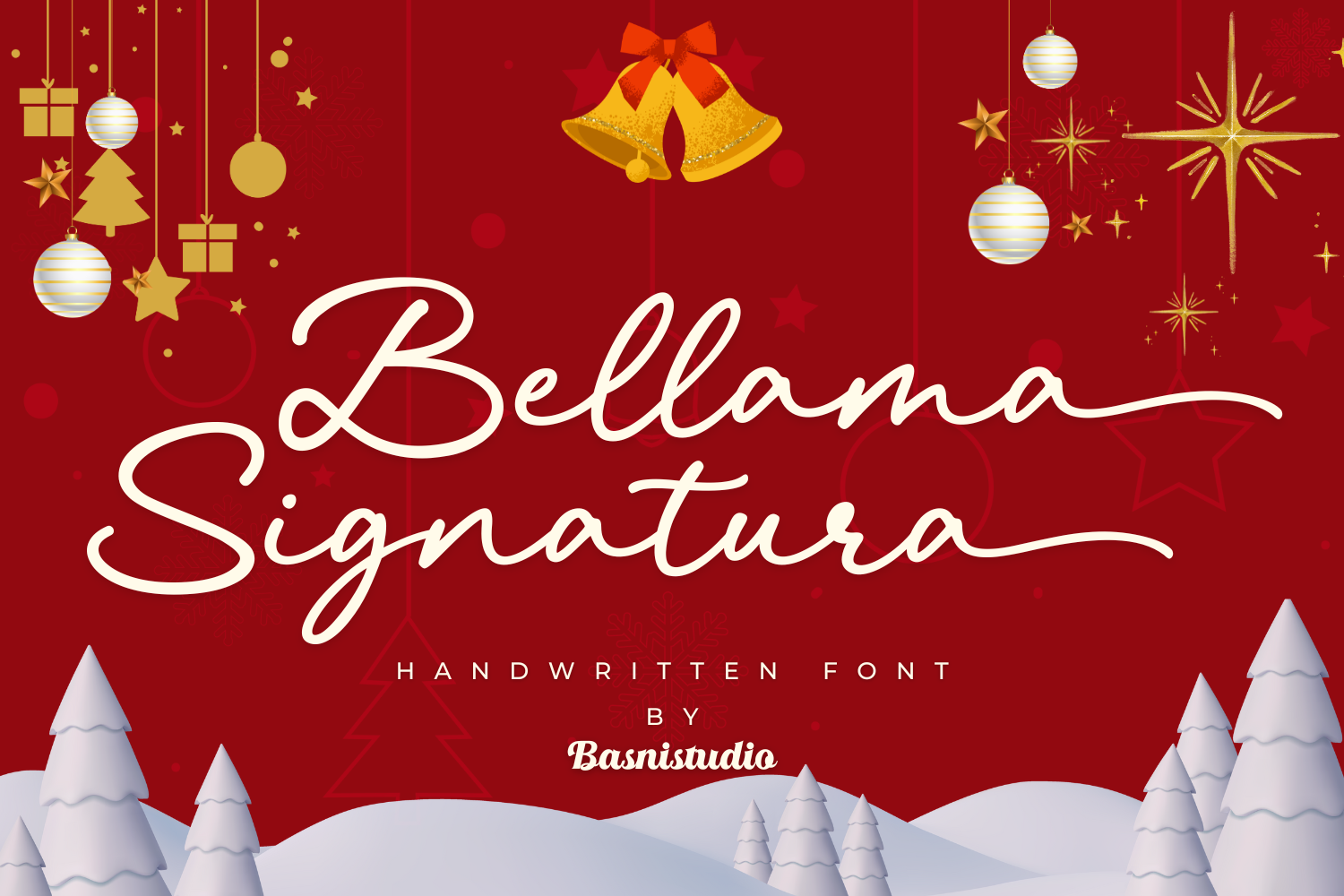
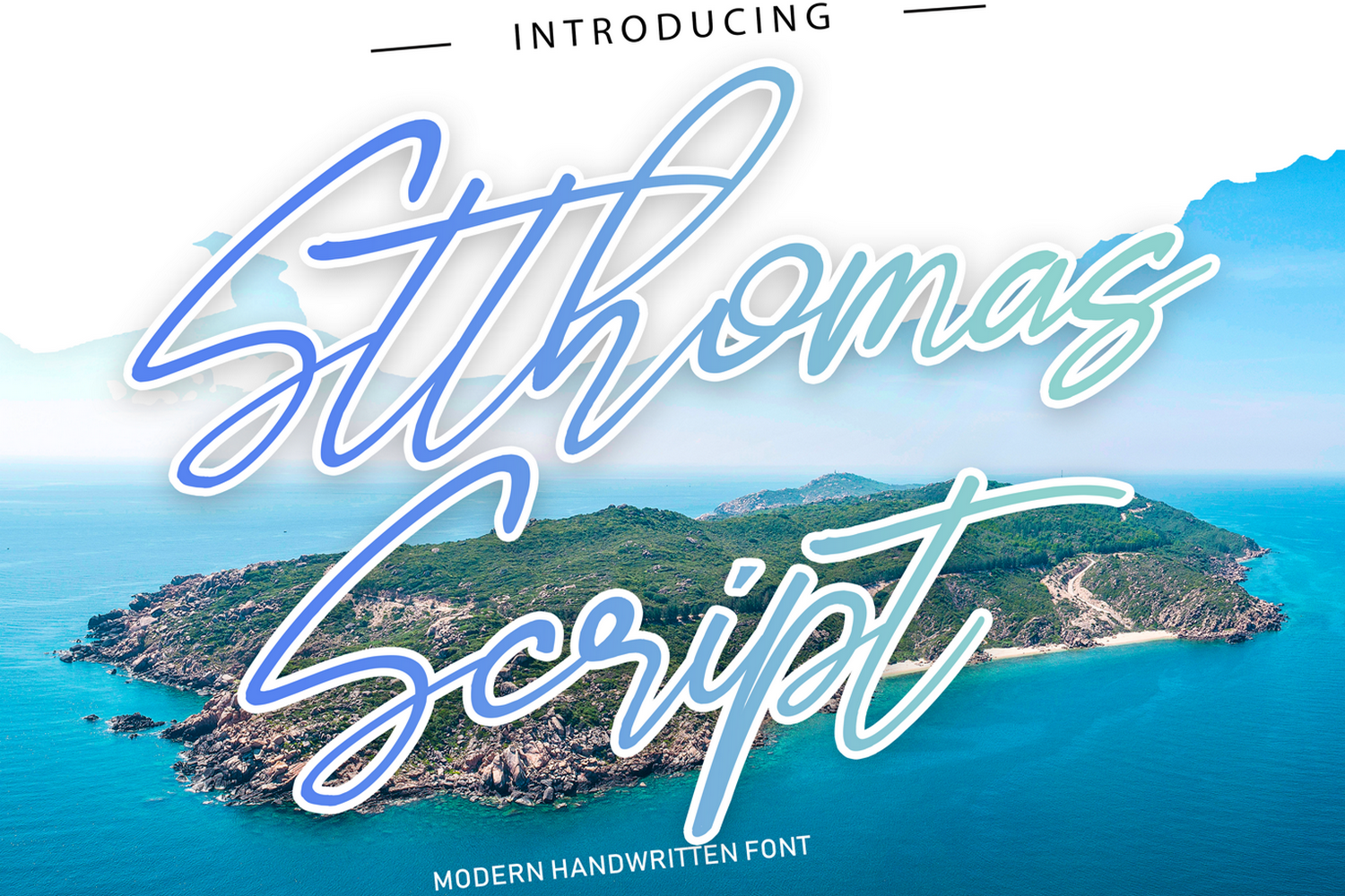
Bellama Signatura Font is a contemporary signature script that adds a personal, hand-signed touch to a card. It suits founder names, personal name accents, and boutique branding where the identity should feel individual rather than mass-produced. It works well when the name is the brand.
Best for: personal name accent on cards, founder signatures, boutique branding. By: bee.genin
Download Bellama Signatura Font
12. Marney Holland — by baletype
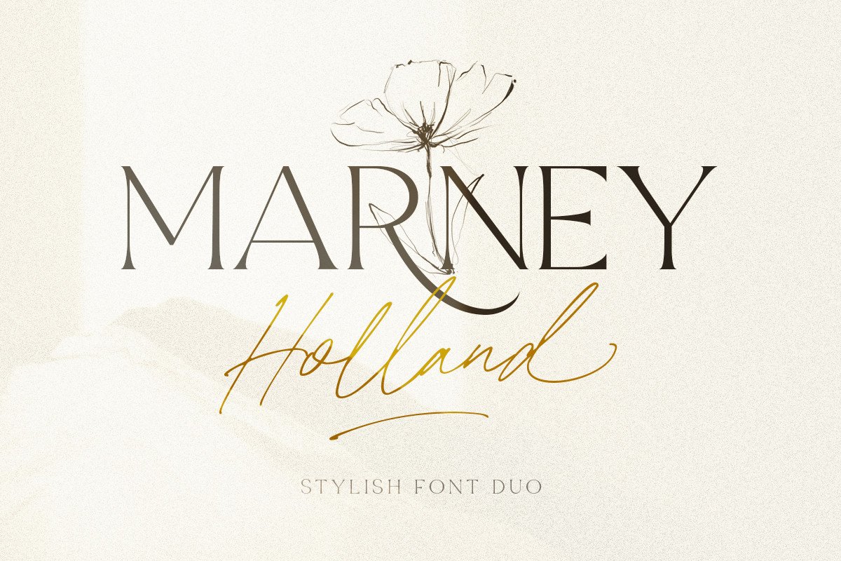
Marney Holland is an elegant handwritten script that suits wedding planners, event stylists, and boutique consultants. It gives accent elements such as a name, slogan, or title a refined, personal feel without taking over the whole card. It is a good choice when the card should feel carefully styled, not mass printed.
Best for: wedding planners, event stylists, boutique consultants. By: baletype
13. Hamilton — by Lettersiro Co.
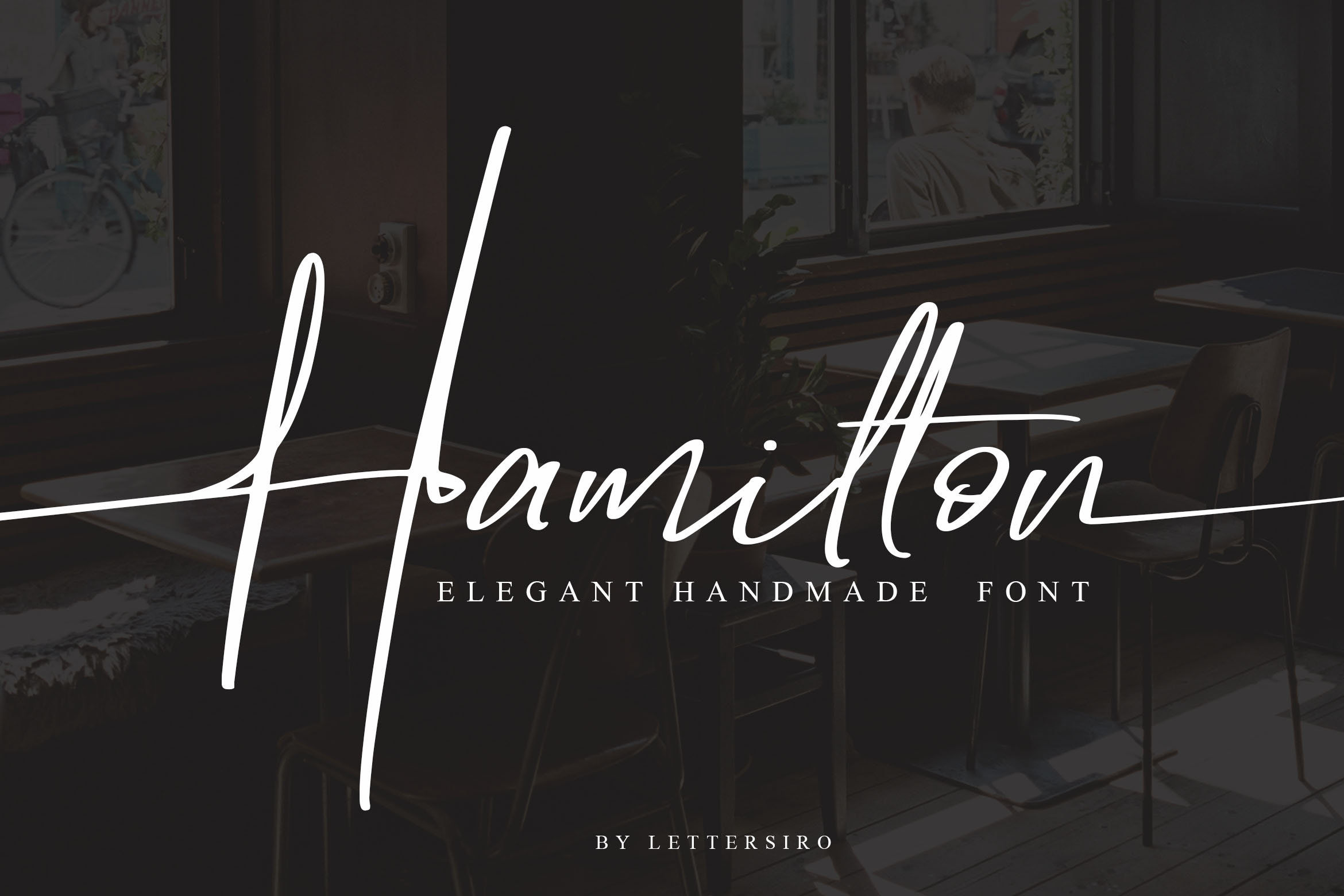
Hamilton is a classic signature style that gives photographer cards, artist branding, and creative freelancer titles a more personal identity. It works well when the name is the brand, and the card should feel like a signature rather than a logo lockup. If you want the card to feel like it was signed by the person on it, this is a strong option.
Best for: photographer cards, artist branding, creative freelancer titles. By: Lettersiro Co.
14. Asita Signature — by madjack.font
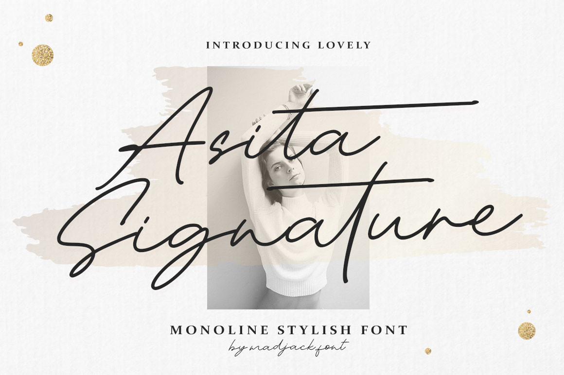
Asita Signature is a light, floating script that works as a name or title accent on beauty and makeup artist cards. It adds movement and softness to boutique service cards, but it should stay away from dense contact information. Use it for the name, not the email address.
Best for: beauty & makeup artist cards, personal brand titles, boutique service cards. By: madjack.font
Creative & Bold Display Fonts for Business Cards
Creative industries and brands that want to stand out in a stack of cards can use a bold display face, but only for short text. Keep it to the brand name, logo, or initials, then use a simpler font for everything else. This is where personality can live, as long as the card still reads clearly.
15. Harrison — by vladfedotovv
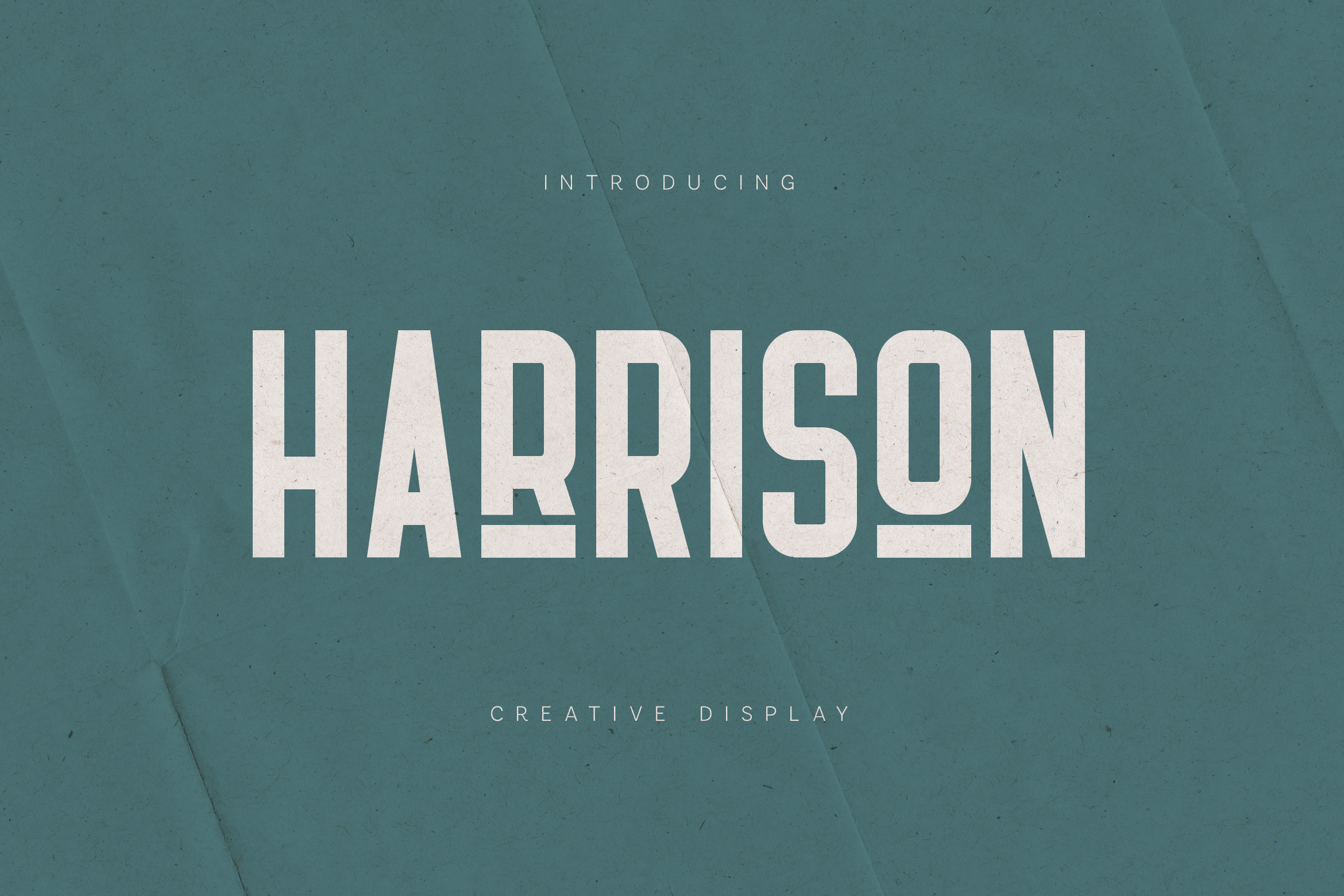
Harrison is a bold display font with strong character. It is useful for a brand name, creative studio branding, or statement logo on a business card. It gives the card a confident visual anchor when the name is short and the layout has room. Do not use it for the full contact block.
Best for: bold brand name on cards, creative studio branding, statement logos. By: vladfedotovv
16. Gareth — by lawboomer
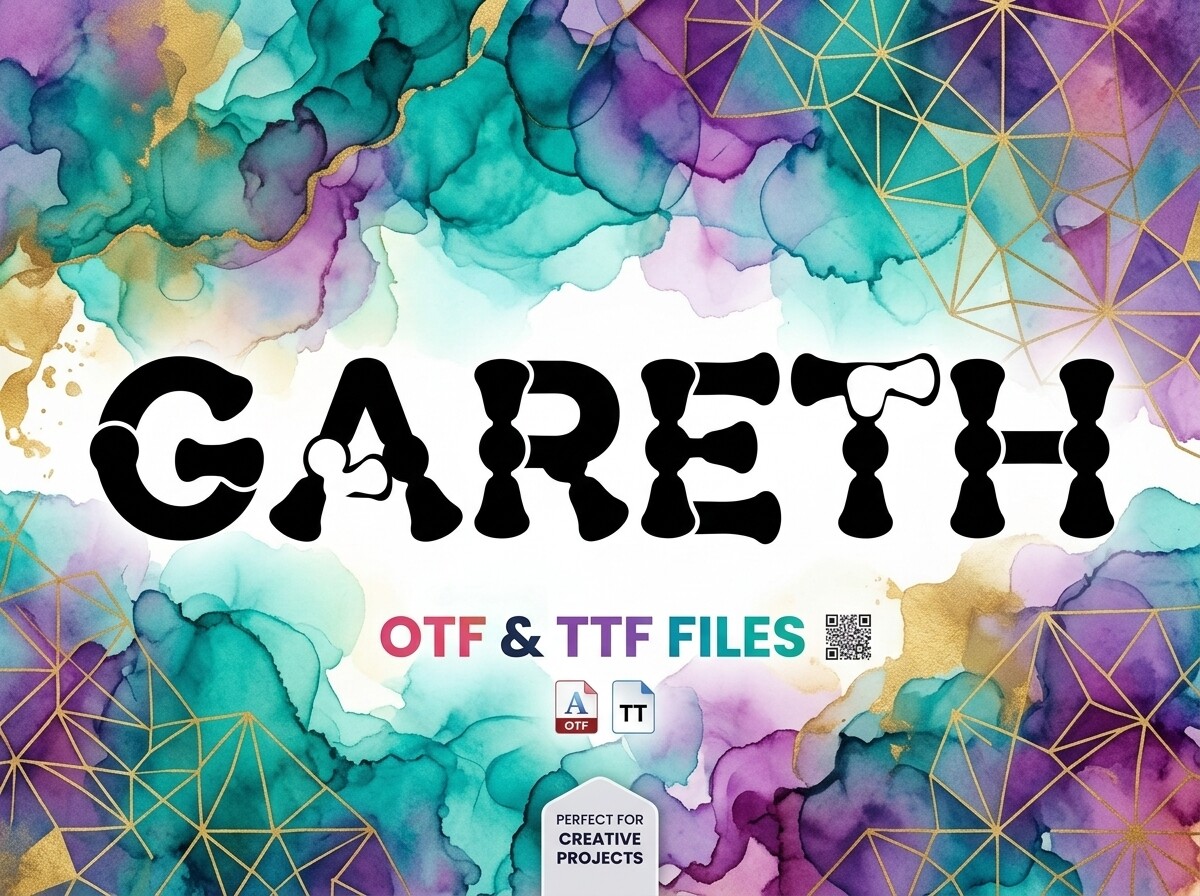
Gareth is a vivid display face with enough individuality to help a creative agency card or entertainment industry card break away from the usual corporate look. It works best when the design is simple, so the type can carry the personality. If the card is already busy, this font will make it harder to read.
Best for: creative agency cards, entertainment industry cards, standout branding. By: lawboomer
17. Diamond — by Creatype Designer
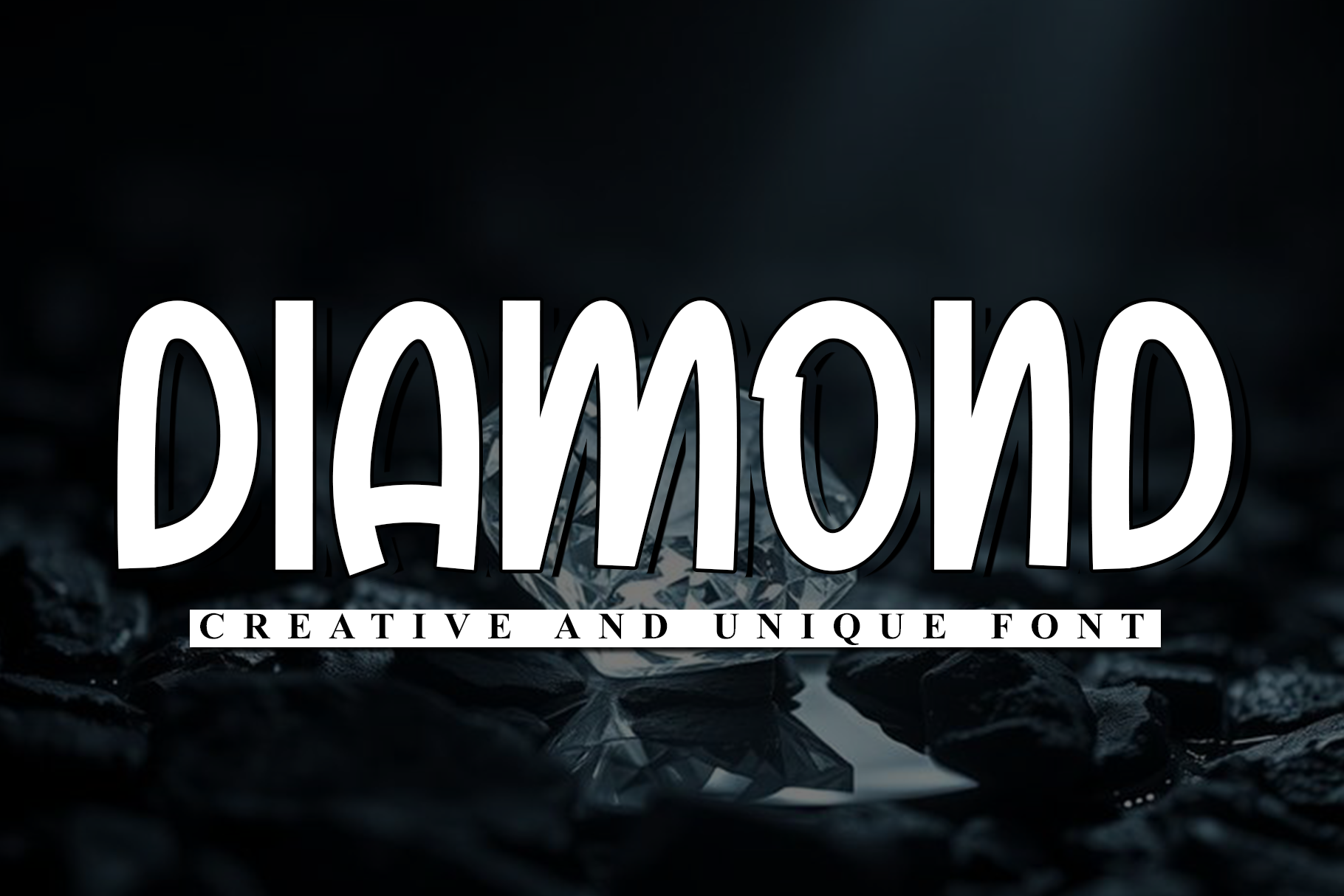
Diamond is a luxury business card font with a precious display character that suits jewelry business cards and premium accent lettering. It can elevate a logo or name on a high-end card, especially when paired with a quiet, readable secondary font. It is a good accent for a card that should feel expensive without using a lot of text.
Best for: luxury brand cards, jewelry business cards, premium accent lettering. By: Creatype Designer
How to Use These Fonts in Your Business Card Designs
Start with hierarchy. Your name should be the largest and boldest element, usually 10 to 16 points. Your title or company name can sit around 9 to 11 points. Contact details can be smaller, but keep them at 8 to 10 points.
If you must go below 8 points, reserve that size for the least important secondary text. Never set a phone number or email that small. As Sofia Ramirez, Design & Templates Editor at 4OVER4.COM, puts it: set the name at 10 to 14 points, contact details at 8 to 10, and never go below 7. Typeface, weight, and finish all move that floor. Good business card typography gives the eye a clear path: who you are, what you do, how to reach you.
For font pairing for business cards, use one accent face and one workhorse face. A serif or script can carry the name, while a neutral sans-serif handles the contact block. If you want a cleaner system, use multiple weights of one family instead of mixing typefaces. Two is the safe ceiling. Three can work, but only when each has a clear job.
Print production matters more than screen preview. Thin serif hairlines and delicate script strokes can fade on uncoated, textured, or cotton stock. Foil and letterpress also punish fragile letterforms. If your card uses foil, keep important text at 8 points or larger and avoid very thin strokes. For letterpress, choose sturdier weights and test whether small details survive the impression.
Always test the layout at real card size, usually 3.5 by 2 inches. Do not judge a font from a full-screen zoom. Print a proof or use a mockup at actual size, then check whether the phone number is still easy to read. I would not trust a font until I see it at that size.
You can use these fonts in Adobe Illustrator, Canva, or Photoshop for card design. Install the desktop version, place the name, title, and contact block, then export a print-ready file. If you are using Canva, make sure the font is available in your workspace and that the final export keeps the text sharp.
Tips for Choosing the Right Business Card Font
Identify the tone of your industry or personal brand. Fonts for consultant business cards often need a professional serif or structured sans-serif. Tech founders and startups usually do better with a clean geometric sans. Photographers, artists, and boutique service providers can use a script or display accent, but only for the name or brand mark.
Test the business card font size at the size you will actually print. A font may look elegant at 48 points and fail at 8. Check open counters, a generous x-height, and enough stroke weight. Tight letters can close up on textured paper where ink spreads.
Check the license before you print. If the card promotes a business, you need the right commercial use license. Webfont licenses usually cover screen use only. Printing typically requires a desktop or print-use license. If you are designing for a client, the client generally needs their own license, not just your file.
Test the font with your longest real text. Use your full name, company name, and job title, not a short demo word. A face can look balanced with “Design” and become cramped with “Creative Director” or a longer surname.
Keep the card simple. One accent font for the name or logo, one readable font for contact details, and maybe one weight variation for hierarchy. That supports minimalist business card fonts and modern business card design fonts without turning the card into a typography sample.
Where to Download Fonts for Business Cards
Creative Fabrica is a good starting point for business card fonts, or fonts for name cards, especially when you need options that can support commercial use after you confirm the license. It is useful for both premium picks and free business card fonts, depending on the product. For more typography ideas, see the FontPro blog.
You can also experiment with Google Fonts and DaFont for personal projects or early layout tests, but always verify the license before printing a client card or a business run. I would not print a client card until the license is clear. The right font is the one that stays clear, licensed, and on-brand when it becomes a real card in someone’s hand.