· fonts · 15 min read
20 Best Monospace Fonts for Coding in 2026
The best monospace fonts for coding, design, and terminal aesthetics. Modern coding fonts, retro arcade, and classic typewriter styles — all on Creative Fabrica.
Choosing a monospace font is one of the most personal decisions a developer makes. You stare at it for hours every day, so it needs to feel right: readable, characterful, and easy on the eyes at 2 AM on a dark theme.
This list covers 20 of the best monospace fonts available on Creative Fabrica in 2026. Clean coding fonts built for long sessions, retro arcade and terminal styles for design projects, and classic typewriter fonts that happen to be the original monospaced typefaces. Something for every use case and aesthetic.
What Makes a Great Monospace Font?
A monospace font gives every character the same horizontal width. That single rule is what makes code readable: columns align, indentation holds, and your eye can scan vertically without jumping around. It’s also why monospace fonts work so well in terminals, README files, and data tables.
For a font to earn regular use in a code editor, it needs to clear a few hurdles. Character disambiguation is the most critical: can you instantly tell 0 from O, 1 from l from I, and : from ;? A single ambiguous pair can cause real bugs. After that comes stroke weight. At 12-16px on a non-HiDPI display, thin details disappear, so the font needs to hold up at small sizes.
Ligatures are a genuinely divisive topic. Some developers love the way == becomes a double bar or -> snaps into an arrow. Others find it confusing — the source code says one thing, the screen shows another. Neither camp is wrong. Test with and without, then go with what helps you think.
Dark themes are the dominant preference among developers, with surveys regularly putting usage above 70%. A font that looks balanced on white will appear heavier and denser on a dark background. Always test in your actual setup before committing.
One historical footnote worth knowing: typewriter fonts are the original monospace. Mechanical typewriters advanced the carriage by a fixed distance per keystroke regardless of character width. That mechanical constraint invented fixed-width typography centuries before the first terminal. It’s why the typewriter section at the end of this list belongs here just as much as any modern coding font.
Best Modern Monospace Fonts for Coding
These ten fonts are built for screens. They range from minimal and utilitarian to bold and characterful, but all of them hold up in a code editor, IDE, or terminal environment.
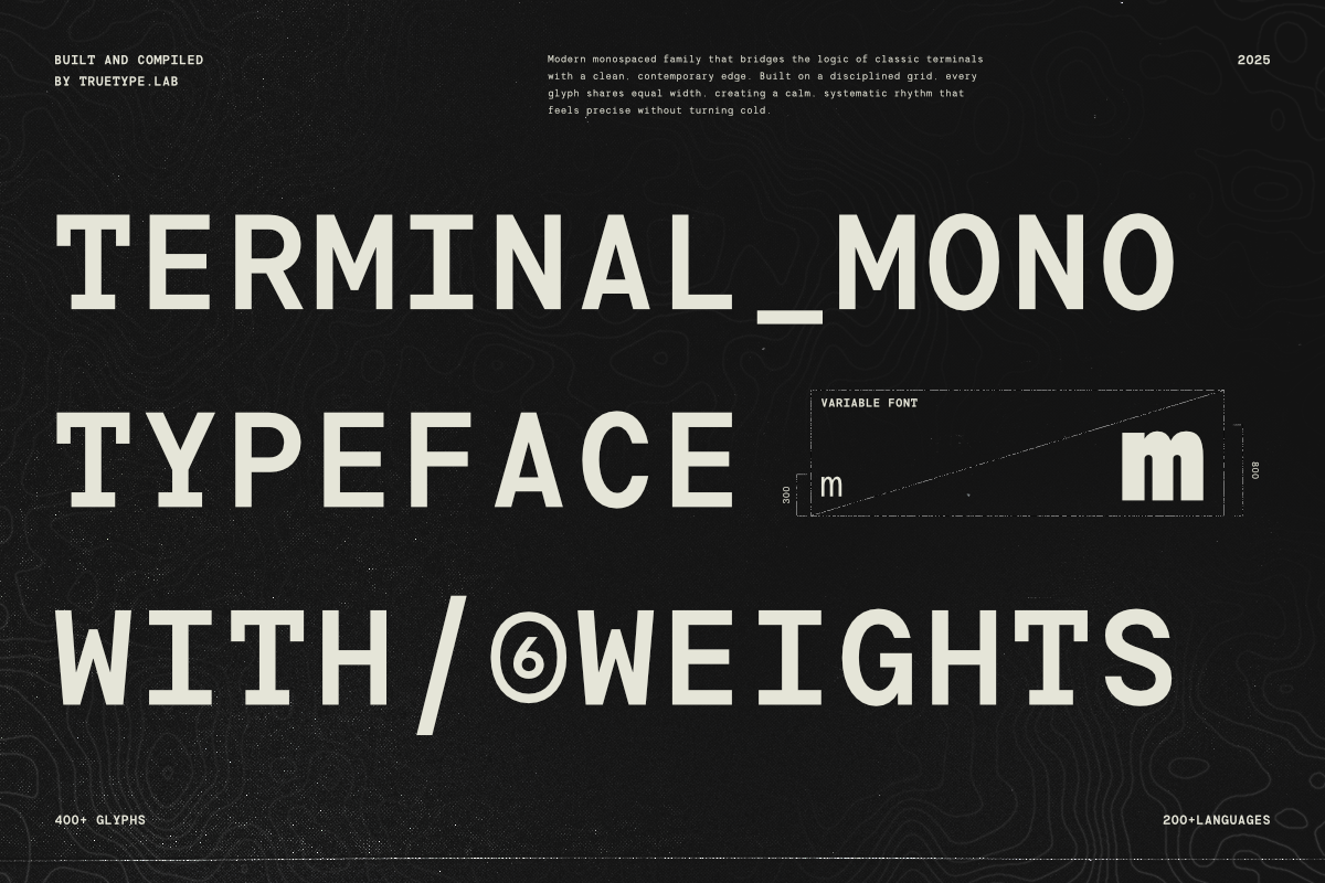
1. Terminal Mono
Terminal Mono looks like it was pulled straight from a Unix terminal circa 1985, except it renders crisp and sharp at any size. The geometric letterforms have a raw, no-nonsense CLI energy that works beautifully on dark themes. A strong pick for VS Code, JetBrains IDEs, and any tech branding project that needs to signal “command line.” Released in January 2026, it’s one of the freshest monospace options in this list.
Best for: VS Code, JetBrains IDEs, terminal UI mockups, tech logos, developer portfolios. By: Not listed
2. Nickota
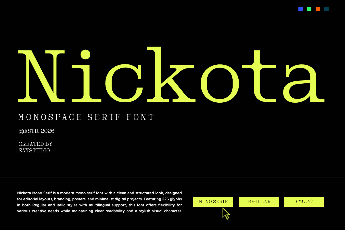
Nickota brings a contemporary geometric construction to the monospace space. Its character rhythm is consistent and clean, making it easy to read across long lines of code without fatigue. Released in May 2026, it’s one of the newest modern monospace fonts on Creative Fabrica and a solid choice for both code editors and UI/UX mockups.
Best for: Code editors, IDE use, UI/UX mockups, tech product branding. By: Not listed
3. Monoglyphic
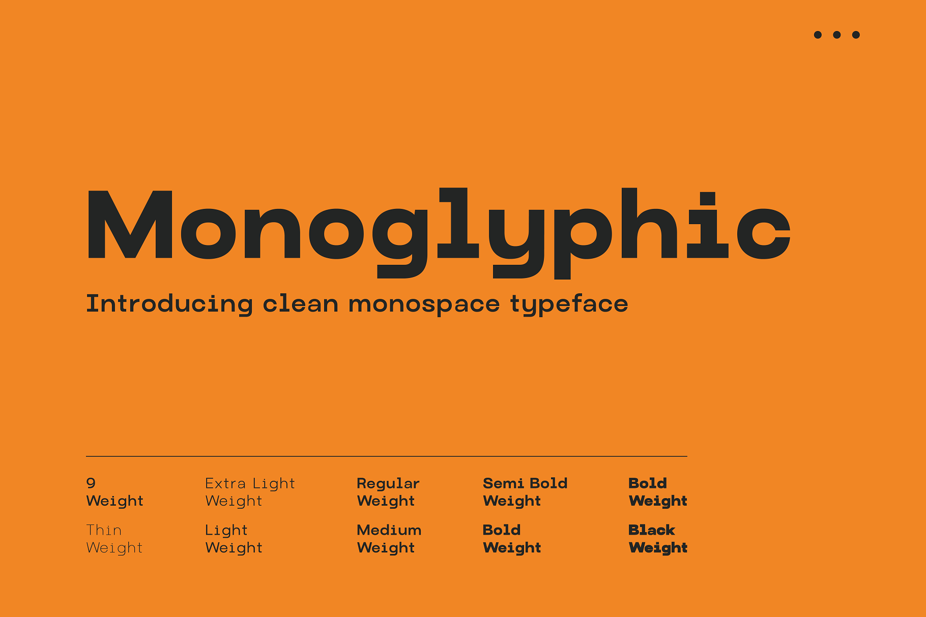
Monoglyphic treats each character as its own design object. The letterforms have strong individual personality, making it more expressive than a utility coding font and better suited to display use than long code sessions. Use it for tech-themed editorial headers, developer branding, or coding-aesthetic posters where the font itself is part of the visual statement.
Best for: Tech headers, coding editorial design, developer branding, display use. By: Not listed
4. Crato Mono
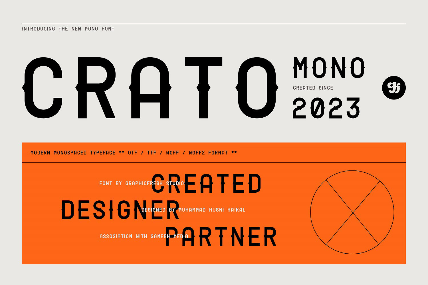
Crato Mono is the clean, professional option for developers who want their font to stay out of the way. The geometric construction keeps it modern, but the proportions are optimized for readability at small sizes. That’s exactly what you need when your IDE is showing 50 lines of dense logic. It’s equally good for README files and technical documentation.
Best for: Code editors, README files, technical documentation, long coding sessions. By: Not listed
5. Monos
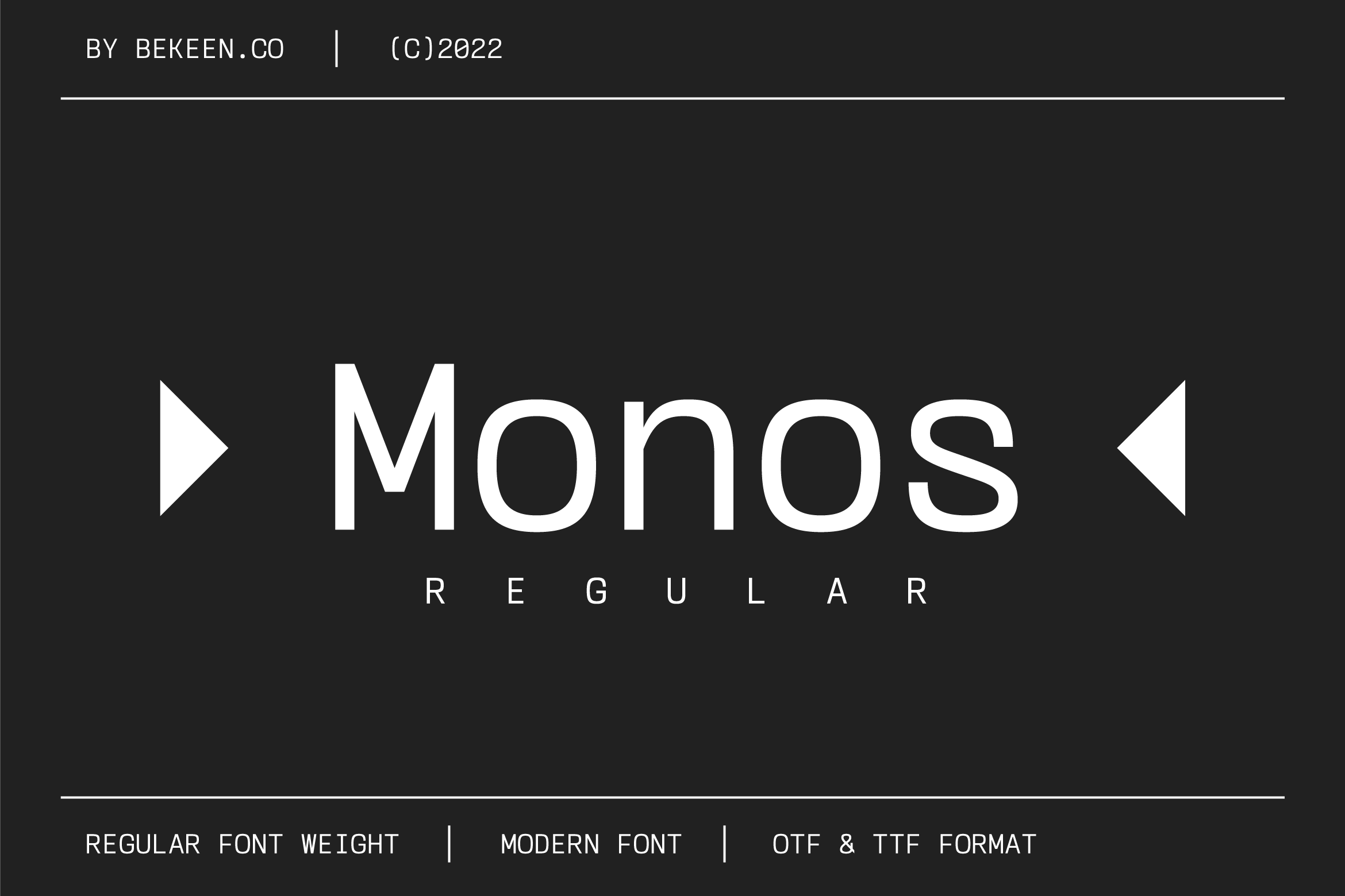
Monos is the minimalist choice. No decorative details, no personality statement, just a clean neutral monospace that disappears into the background so you can focus on the code. It’s the programmer font equivalent of a blank canvas. If you find yourself distracted by the font you’re currently using, Monos is the antidote.
Best for: Long coding sessions, code reviews, tech blogs, developer documentation. By: Not listed
6. Hello Mono
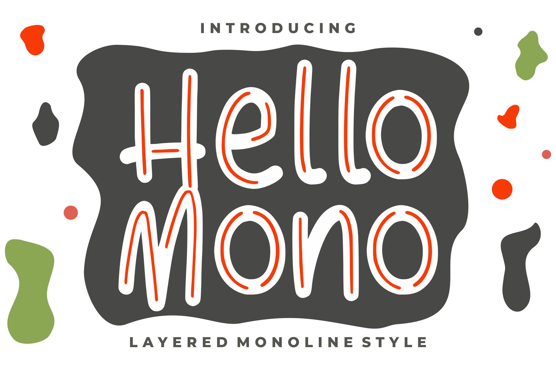
Most coding fonts lean clinical. Hello Mono breaks that pattern with a warm, approachable character that doesn’t feel like it was designed in a sterile lab. It’s not playful, but it’s friendly. The kind of font that makes sense for a coding education platform, a personal dev blog, or any project where you want the tech aesthetic without the cold detachment.
Best for: Coding education platforms, beginner tutorials, personal side projects, friendly tech brand UI. By: Not listed
7. Monogamy
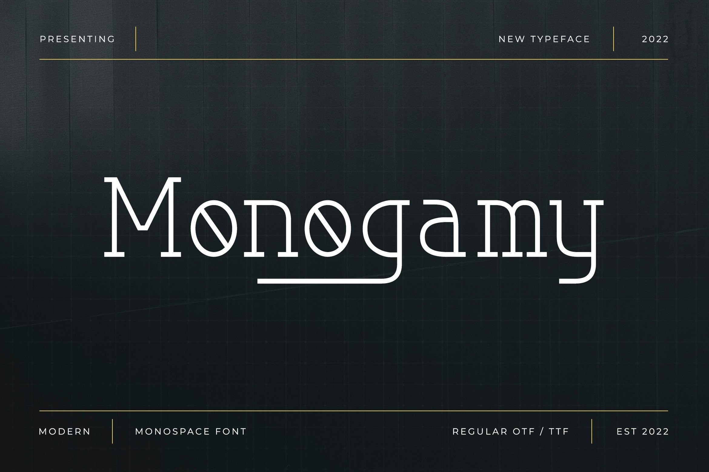
Monogamy sits in the hybrid space between coding utility and display personality. It has the fixed-width spacing of a programmer font, but the visual character of something you’d use for a tech brand headline. Reach for it when you need a monospaced typeface with genuine typographic presence, not just functional spacing.
Best for: Tech-themed branding, coding editorial headlines, developer-facing product headers. By: Not listed
8. Informe
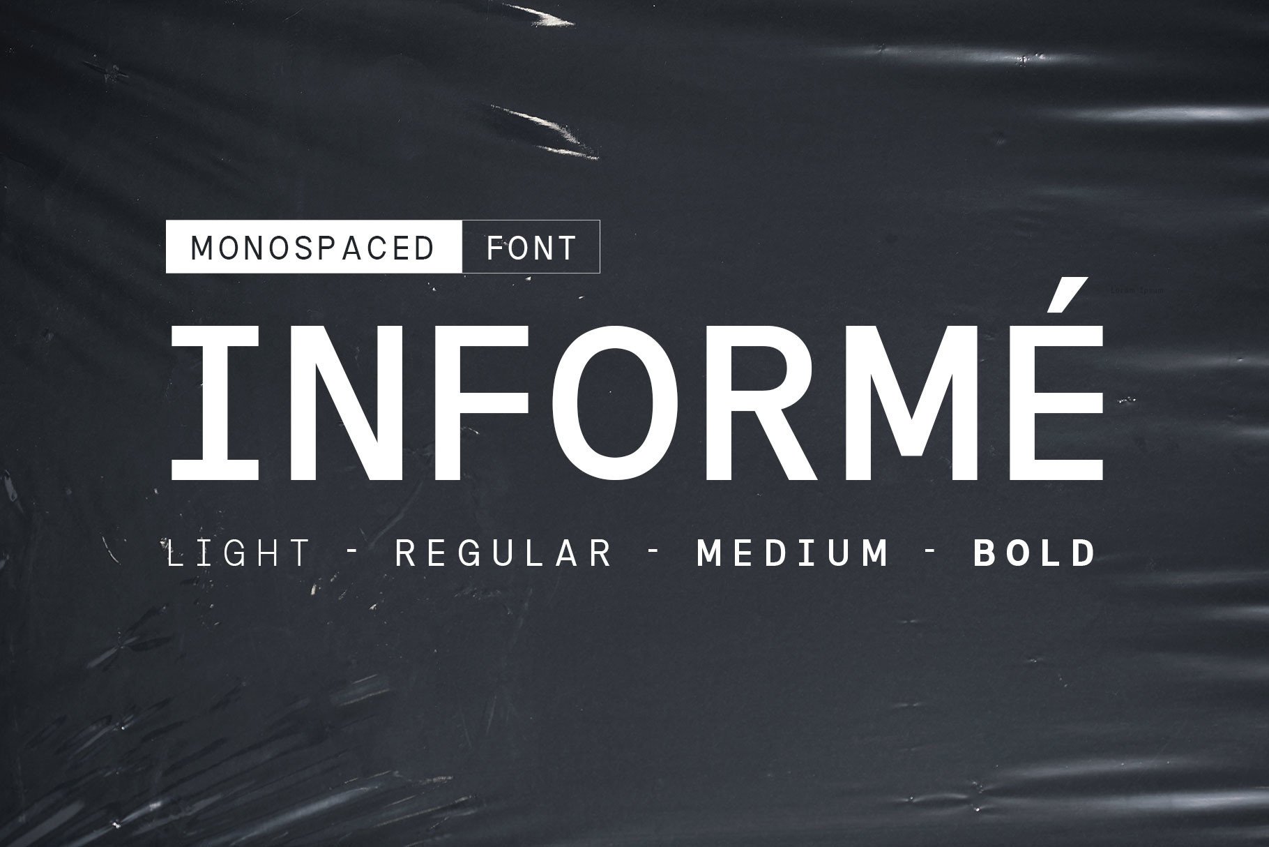
Informe (the name means “report” in Spanish and Portuguese) is built around data. Its numeral design is particularly strong, which matters when you’re staring at log files or rendering a data table in a dashboard UI. It has an informational, editorial quality that makes it a natural fit for documentation sites, developer tool interfaces, and dense technical content.
Best for: Data dashboards, technical documentation, developer tool interfaces, tabular data display. By: Not listed
9. Monospace
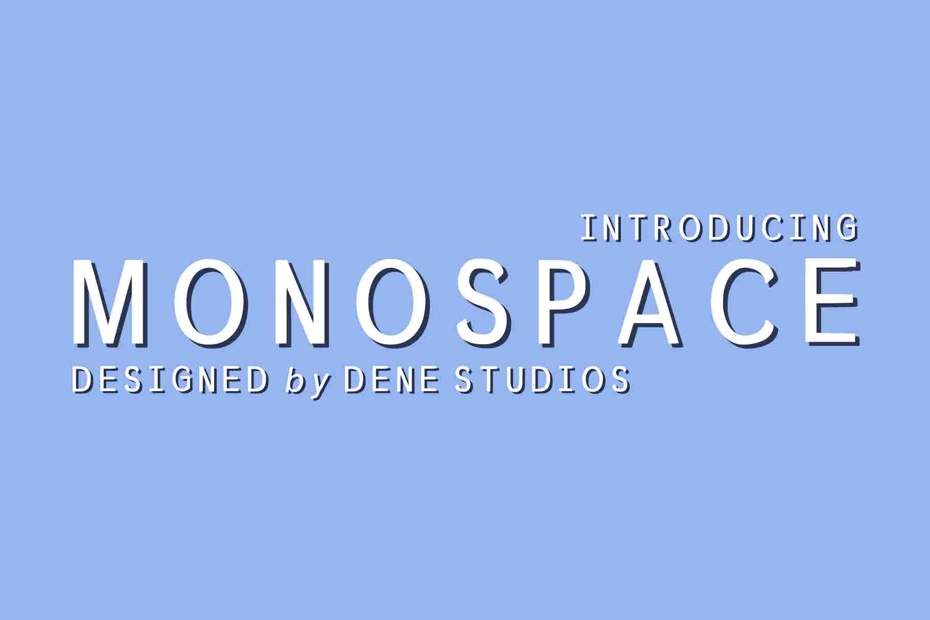
Sometimes the right choice is the straightforward one. Monospace is exactly what the name says: a clean, reliable, no-frills fixed-width font with full ASCII support. No design surprises, maximum compatibility. Available since 2019, it still earns its place when you need a dependable monospaced typeface for code blocks, terminal simulation, or preformatted text in web and print.
Best for: General coding use, terminal simulation, code blocks in web and print, preformatted text. By: Not listed
10. NK57 Monospace
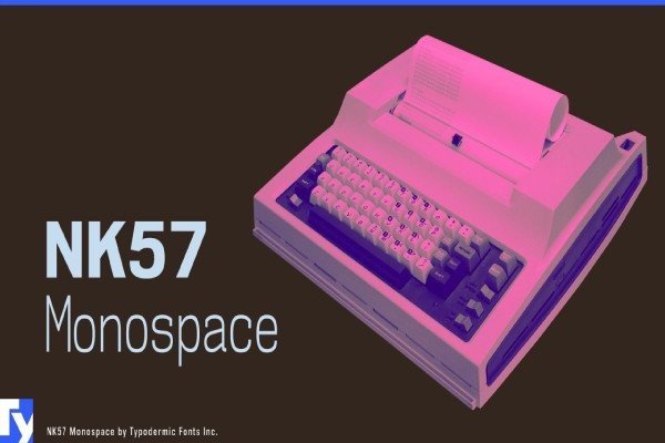
NK57 Monospace has a strong mechanical and industrial personality, with a multi-weight family structure that makes it the best pick in this set for design systems. When you need a monospace that can carry a complete product, from UI text to code blocks to headers and documentation, NK57 delivers the range. It also handles game UI and sci-fi branding well.
Best for: Design systems, developer tool UI, game UI, sci-fi branding, developer portfolio headers. By: Not listed
Best Retro Terminal & Arcade Fonts
Retro aesthetics are genuinely strong right now, from Twitch overlays to indie game development to tech branding. These four fonts cover the full spectrum: arcade culture, early home computing, keyboard hardware, and laboratory sci-fi. None of them are your first choice for daily coding sessions, but in the right design context they’re exactly right.
11. Joystix Monospace
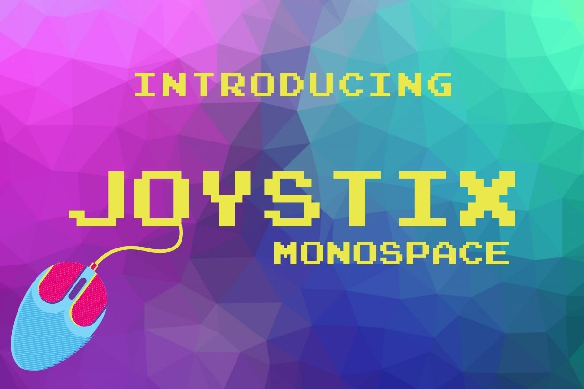
Joystix Monospace channels the energy of the arcade marquee and the coin-op high score screen. The letterforms are bold, rounded, immediately readable, and loaded with 1980s nostalgia. Game halls, cabinet titles, score displays, Twitch overlays. If your project references arcade culture, Joystix is the natural first choice.
Where Joystix is about arcade energy, Retro Byte (next entry) references the quieter world of early home computing. More technical, less playful. Pick Joystix when you want the excitement of the game hall; pick Retro Byte when you want the precision of the screen.
Best for: Game UI and menus, Twitch overlays, retro-themed apps, score displays, game jam assets. By: Not listed
12. Retro Byte
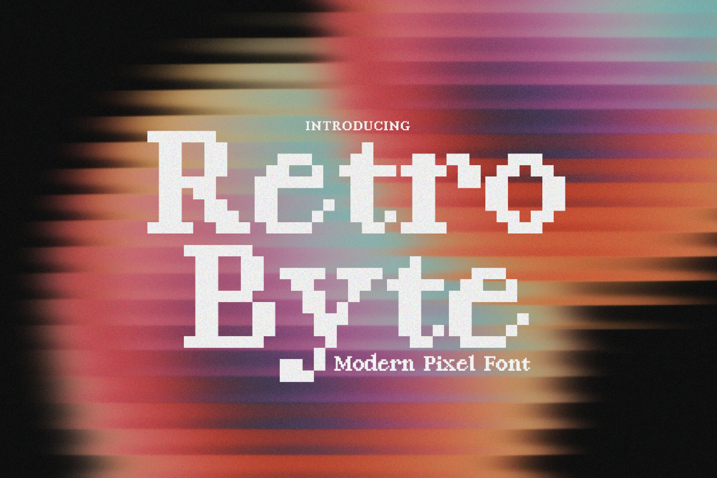
Retro Byte references the byte-level display of early home computers: Commodore 64, ZX Spectrum, Apple II. The aesthetic is more technical and restrained than Joystix, closer to what a programmer actually saw on screen in 1983. That makes it better suited to programming-themed editorial, chiptune and demo scene design, and retro computing projects where precision matters more than pizzazz.
Best for: Retro computing projects, chiptune design, indie game development, 8-bit themed interfaces, vintage tech branding. By: Not listed
13. Retro Keyboard
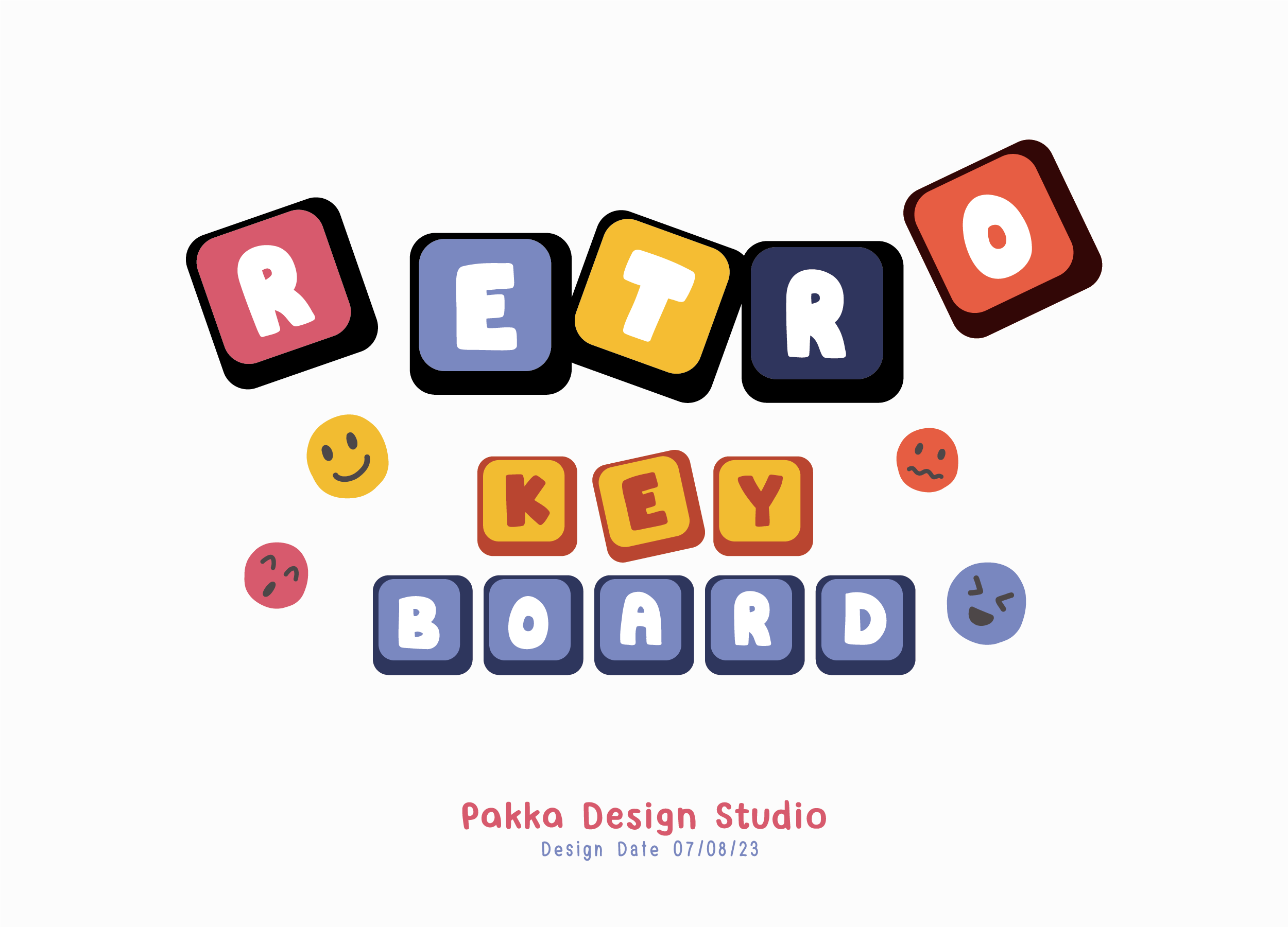
Retro Keyboard takes a different angle from the other retro options here. Instead of referencing a screen, it references the physical keys themselves. The letterforms mimic the legends printed on vintage keycaps, giving it a tactile quality that neither Joystix nor Retro Byte has. Mechanical keyboard enthusiasts, keycap designers, and anyone making keyboard shortcut reference guides will recognize this one immediately.
Best for: Keyboard enthusiast content, developer posters, keycap design mockups, keyboard shortcut guides. By: Not listed
14. Retro Lab
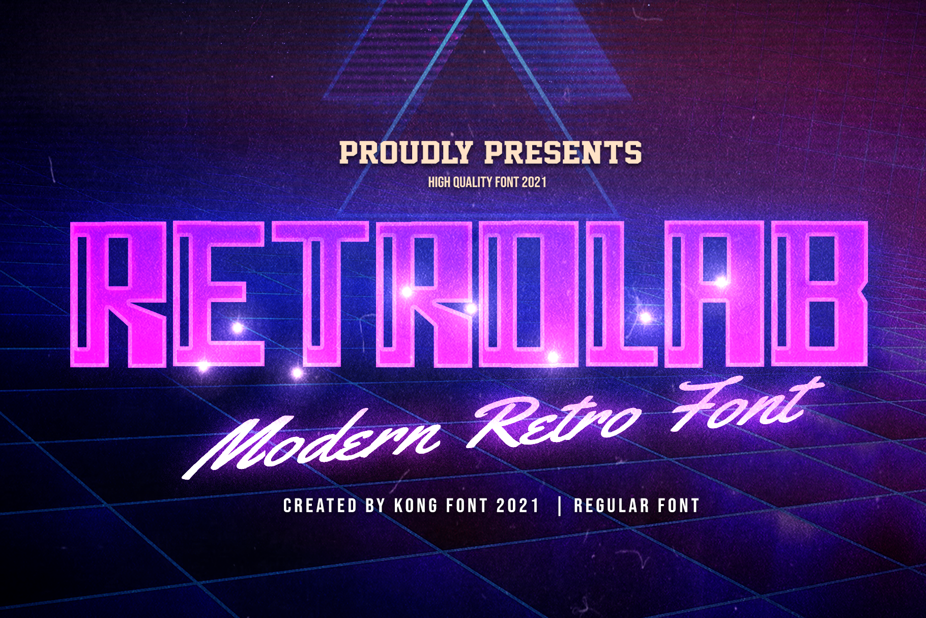
Retro Lab evokes a very specific kind of retro: the research facility, the oscilloscope readout, the equipment label from a 1970s government laboratory. Clinical and nostalgic at the same time, less arcade warmth and more Cold War precision. Use it for sci-fi UI design, cyberpunk projects, or any aesthetic that needs the authority of old institutional technology.
Best for: Sci-fi UI design, tech posters, cyberpunk projects, retro-futurist editorial, lab-themed game UI. By: Not listed
Best Classic Typewriter Fonts
Typewriter fonts are the original monospace. The mechanism that gave them their fixed width, a carriage that advanced the same distance per keystroke regardless of which letter you typed, is the same principle that defines every coding font today. That’s not just a fun fact; it means typewriter fonts are genuinely at home in coding-adjacent design, from developer portfolios to tech editorial to manuscript-style documentation.
15. Olivetti Typewriter Family
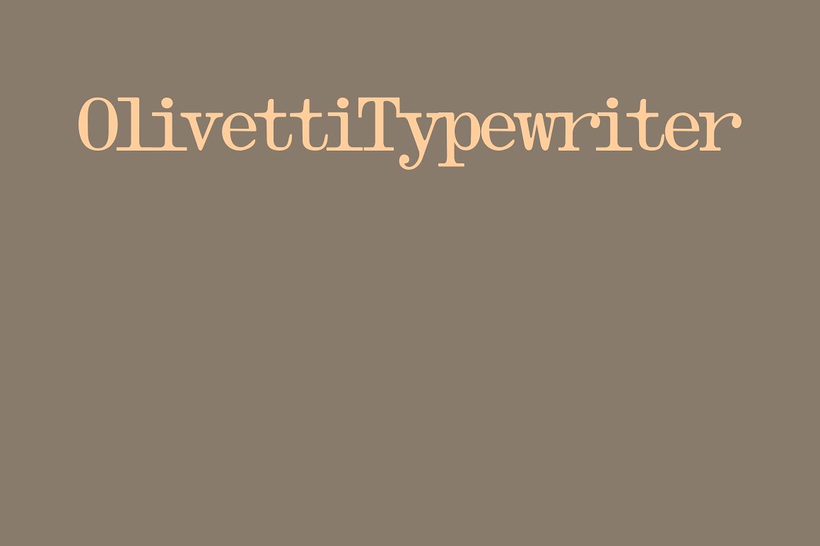
The Olivetti brand was synonymous with Italian design excellence in the mid-twentieth century. Intellecta Design’s Olivetti Typewriter Family captures that heritage and extends it into a multi-weight type system. You get the warmth and craftsmanship of an Italian mechanical typewriter across multiple styles, making it the premium pick when your project needs both character and typographic range.
Best for: Mid-century Italian editorial, book covers, vintage branding, manuscript aesthetics, letterpress-style design. By: Intellecta Design
Download Olivetti Typewriter Family
16. Corona 3 Typewriter
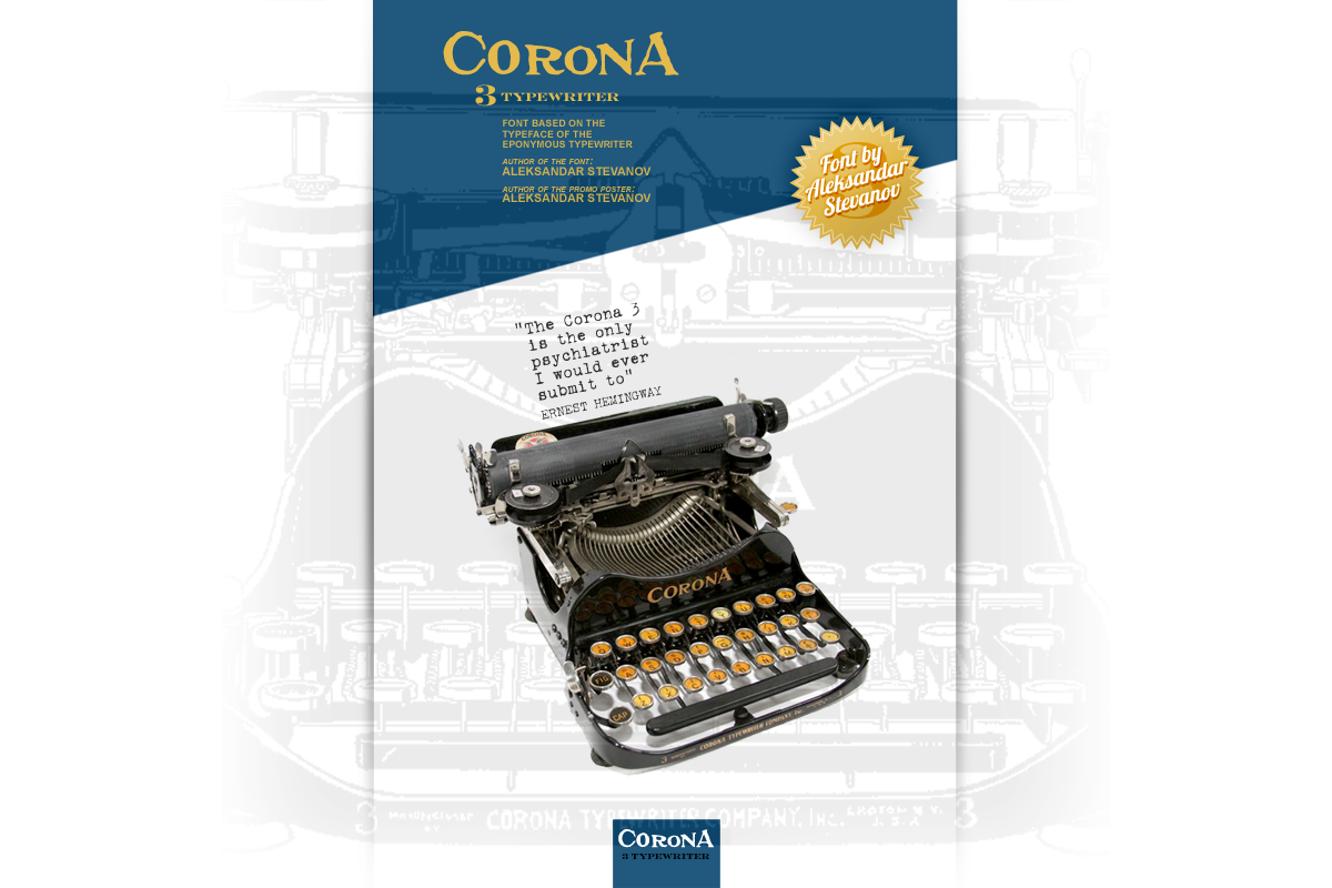
The Corona 3 was one of the first mass-market portable typewriters, lighter and more personal than the big desk machines. This font captures that spirit: a mid-century American mechanical character that feels intimate rather than institutional. The letter spacing is authentic, the ink impression convincing, and it works beautifully for vintage correspondence design and nostalgic editorial projects.
Best for: Vintage correspondence design, historical document recreation, nostalgic editorial, journalistic aesthetics. By: Not listed
17. Standard Typewriter
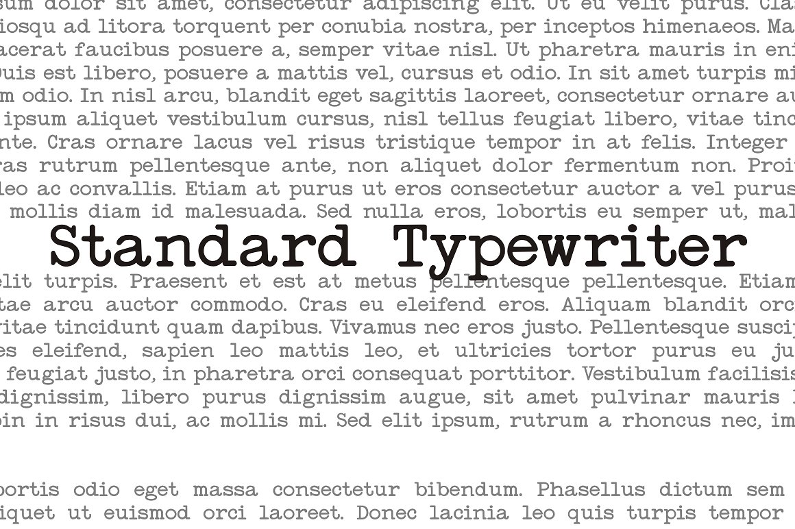
Standard Typewriter is the Helvetica of typewriter fonts. No Italian flair, no expressive decoration, just a neutral, historically generic office typewriter aesthetic from the 1950s to the 1970s. It’s the right choice when authenticity matters more than personality, when the design brief calls for “typed document” and anything with too much character would feel wrong. Workhorse utility, every time.
Best for: Office document recreation, mid-century editorial, memo and bureaucratic design, retro business UI. By: Intellecta Design
18. Intellecta Typewriter
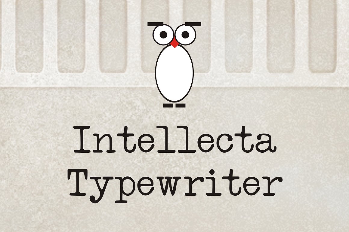
Intellecta Typewriter is the foundry’s most polished and decorative typewriter offering. Where Standard Typewriter gives you office neutrality, Intellecta Typewriter leans ornamental: more refined, more display-ready. This is a headline font, not a body text font. Book covers, vintage posters, editorial headings where you want typewriter aesthetics with genuine typographic presence. Not the one for extended reading.
Best for: Book covers, vintage posters, display headings, editorial headline use, high-quality print design. By: Intellecta Design
Download Intellecta Typewriter
19. Old Typewriter
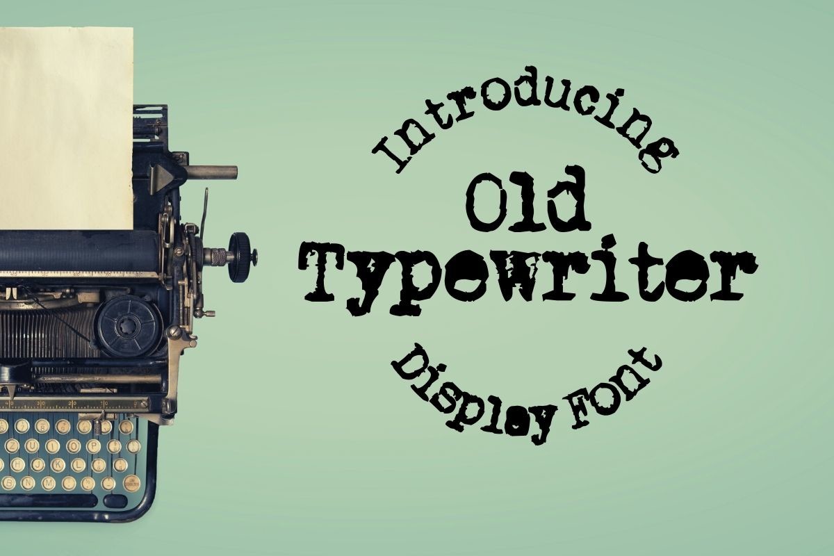
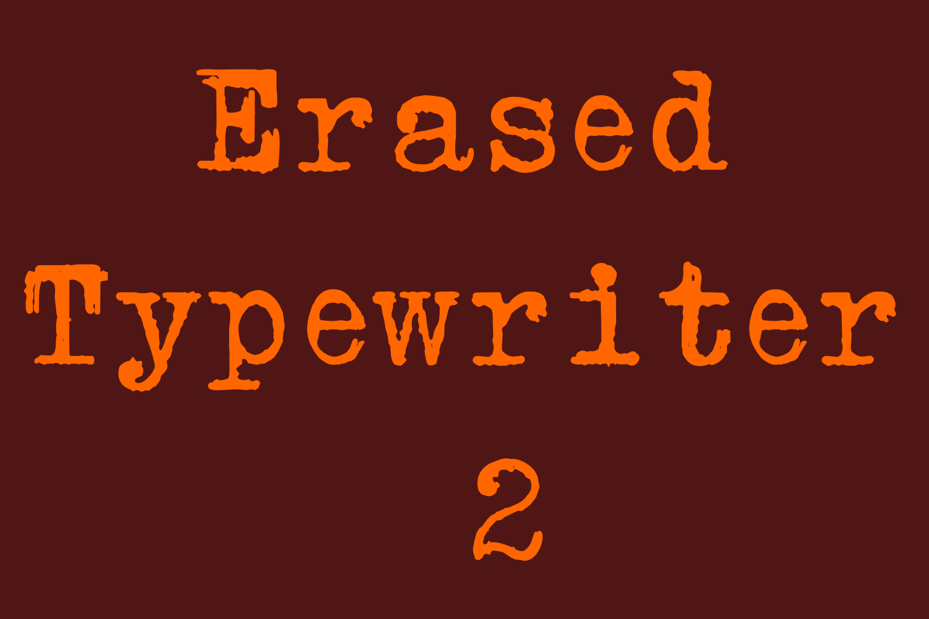
Old Typewriter leans into decay. The ribbon is drying out, the keys are sticking, the ink is uneven, and that’s exactly the point. The heavy distress texture and irregular coverage give it a worn authenticity that no other font in this list can match. Noir, mystery, horror, detective fiction aesthetics: the ransom note, the case file, the aged manuscript. Design that foregrounds imperfection and age.
Best for: Detective fiction and noir aesthetics, mystery or horror book covers, historical document recreation, aged manuscript effects. By: Not listed
20. Retro Writer
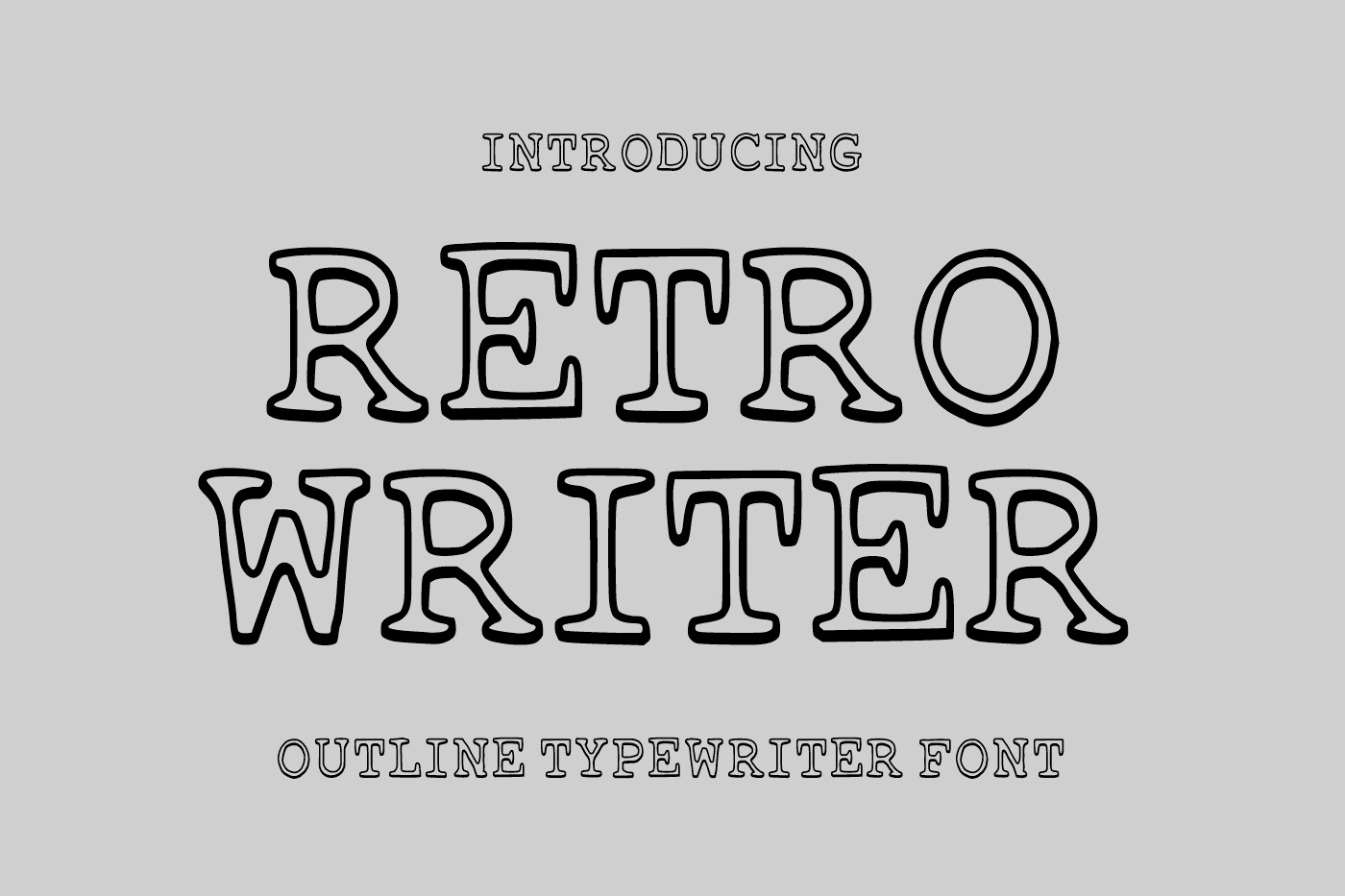
Retro Writer is the newest font in this entire collection, released in July 2026. Where Old Typewriter is defined by authentic decay, Retro Writer is a curated interpretation of typewriter style: cleaner, more controlled, more versatile. Think of it as what a designer in 2026 imagines a typewriter should look like. Retro feeling without the grime. It bridges typewriter aesthetics and retro-digital design, landing perfectly for tech blogs, indie zines, and modern vintage branding.
Best for: Retro editorial headlines, tech blogs, indie zines, retro newsletter design, modern vintage branding. By: Not listed
How to Use Monospace Fonts in Your Projects
Installing a new font in your code editor takes about two minutes. In VS Code, open Settings (Ctrl+, or Cmd+,), search for “Font Family,” and type the font name. Recommended size: 13-15px. Enable or disable ligatures under editor.fontLigatures depending on your preference.
In JetBrains IDEs (IntelliJ, PyCharm, WebStorm), go to Settings > Editor > Font, select your font from the dropdown, and set size to 13-14px. In Neovim or terminal-based editors, font selection happens at the terminal emulator level. iTerm2, Alacritty, Ghostty, and Windows Terminal all have dedicated font settings in their config files.
For web projects, the standard CSS monospace stack looks like this:
font-family: 'Your Font Name', 'Courier New', Courier, monospace;The fallback chain matters. If the custom font fails to load, Courier New covers Windows, Courier covers older systems, and monospace lets the browser decide. Pair your monospace with a clean sans-serif for UI text around code blocks; the contrast helps readers switch context between reading and scanning code.
For the retro and typewriter fonts in this list: save those for design projects rather than daily coding sessions. A font like Joystix or Old Typewriter is spectacular on a poster or a game UI, but you wouldn’t want to debug a stack trace in it.
Tips for Choosing the Right Monospace Font
Run the disambiguation test first. Type 0Ol1I;:{([ in your editor and look hard. If any pair blurs together, the font is out for serious coding use, regardless of how good it looks.
Test in your actual environment. A font that looks perfect in a specimen image may feel wrong at 14px on your specific monitor at your specific brightness setting. Download it, install it, and use it for a real hour of work before committing.
Ligatures: your call. If you’ve never tried them, test Fira Code (free on Google Fonts) for a week. If you find yourself looking at the ligature instead of the code underneath it, turn them off. Many experienced developers disable ligatures entirely.
Dark theme changes everything. Most developers work on dark themes, and a font that looks elegant on white can look heavy and dense on a dark background. Always test on the theme you actually use.
License before you deploy. For editorial or branding use, such as tech blog headers, game UI assets, or product interfaces, verify the font license covers commercial use. Creative Fabrica fonts come with a commercial license, but it’s always worth confirming the specific terms for your use case.
Retro and typewriter fonts are design fonts, not daily coding fonts. Use them for projects, posters, overlays, and branding. Your eyes will thank you.
Where to Download Monospace Fonts
All 20 fonts in this list are available on Creative Fabrica at the links in each entry above. Creative Fabrica offers commercial licenses with each purchase, which matters if you’re using these in client work or product UI.
For free coding fonts, Google Fonts is the first stop. JetBrains Mono is the benchmark free coding font: open source, excellent disambiguation, strong ligature support. Fira Code is the classic choice if ligatures matter to you. Source Code Pro from Adobe is clean and professional. Cascadia Code ships with Windows Terminal and is a solid free option if you’re on Microsoft’s ecosystem.
For retro and display monospace fonts beyond this list, DaFont has a large free selection, though license terms vary widely. Always check before commercial use. Font Squirrel filters for commercially licensed fonts and lets you verify usage rights before downloading.
For reviews, comparisons, and more font roundups, the FontPro blog covers coding fonts, display typefaces, and design-forward typography across all categories.