· fonts · 12 min read
16 Best Fonts Similar to Futura for Logos, Headlines, and Branding in 2026
Browse geometric sans options in the spirit of Futura, with licensing and pairing tips for logos, headlines, and branding projects of every kind.
You already know the look you want. Crisp geometry, a modern feel, a typeface that holds up whether it is set huge on a poster or tiny on a product label. The trouble is that Futura is a trademarked name, and licensing terms can get complicated when you are working on a client project, a small business identity, or a maker product you plan to sell.
So you are looking for fonts similar to Futura that share a similar clean, confident approach. That is what this list is for. I grouped the options by personality so you can jump straight to the vibe you need: crisp corporate, modern and versatile, or softer and friendlier. Each entry links to a Creative Fabrica product page, and the later sections cover pairing, licensing, and how to use these fonts in Canva, Cricut, and Illustrator.
What Makes Futura Distinctive, and What to Look for in an Alternative?
Futura is widely described as a typeface built from basic shapes: circles, triangles, and squares. It is usually noted for even strokes and open forms that read as modern without trying too hard. That kind of construction is what people mean by a geometric sans serif. This is why people keep searching for geometric sans serif fonts when they want a brand to feel precise, current, and easy to read.
A good alternative does not need to copy every detail. It needs to keep the same spirit: clean geometry, strong letter spacing, a confident display presence. If you search for the closest font to Futura, you will find a lot of confident claims out there. I would not call any single typeface “the answer.” Instead, look at the geometry, the mood, the license, and how the typeface actually behaves in your project.
Some people want a crisper, more corporate feel. Others want something rounder and softer for packaging or social media. A few just need a Futura alternative for Canva, a Futura style font for Cricut, or a clean sans serif font for headlines that they can use without untangling a complicated license. The right choice depends on the job, not on a single “perfect” name.
You may also see names like Poppins, Nunito Sans, Century Gothic, Avenir, Twentieth Century, and Brandon Grotesque in discussions about geometric sans fonts. They are reference points only, and the best match for your project will depend on the exact wordmark, headline, or label you are making.
Here is a quick way to narrow things down. Write your real headline in three or four candidates. Look at width, spacing, rhythm. A geometric sans can feel elegant in a short wordmark and then look too wide in a long slogan. The group labels in the sections below help you pick the right personality before you get lost in small details.
Clean Geometric Sans Fonts in the Spirit of Futura
This group is about tidy geometry and a calm, modern look. These clean geometric sans fonts work well for logos, signage, minimal branding, and headlines that need to feel sharp without shouting. If you want a professional identity that still has a human, approachable side, start here.
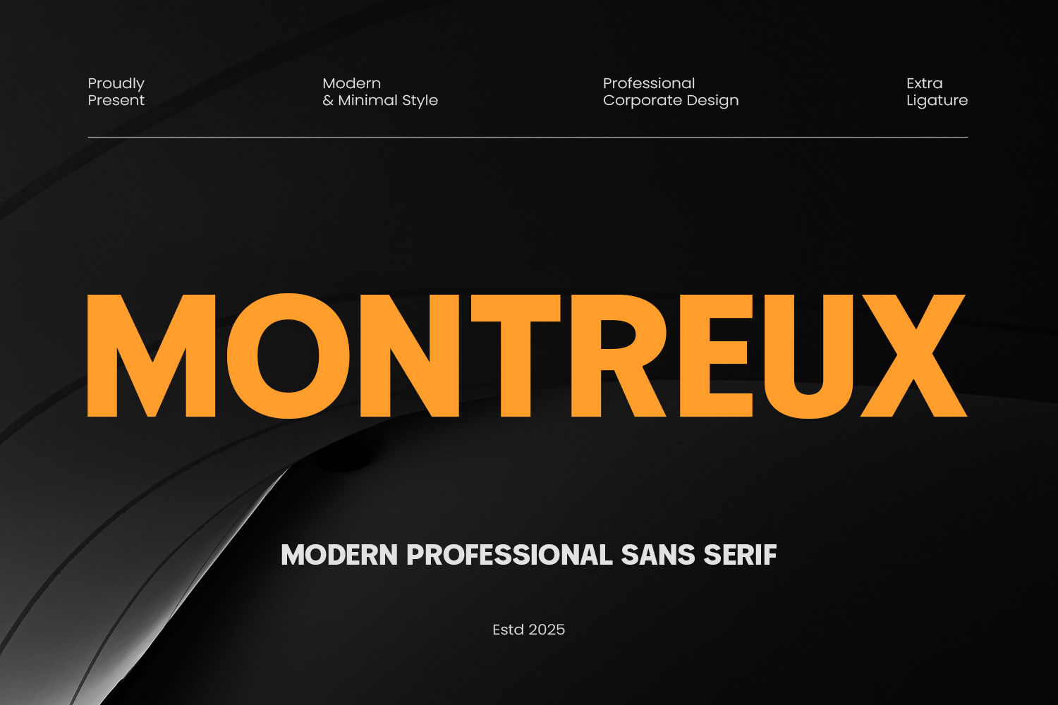
1. Montreux
Montreux is a good place to start if you want a crisp, modern wordmark. As part of the clean geometric group, it suits brands that want to look current and organized. Try it on a short name first and see how it feels.
Best for: logos, minimal branding, and clean headlines. By: Umitype
2. Cenura
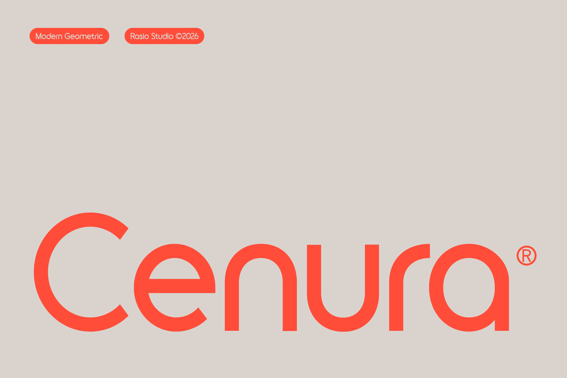
Cenura has a neat, geometric feel that suits brands wanting a modern identity without visual noise. It is worth testing on a short wordmark, a poster headline, or a simple label. Judge the tone for yourself in your own layout.
Best for: wordmarks, posters, and modern packaging. By: product.rasiostudio
3. Geometrica Sans
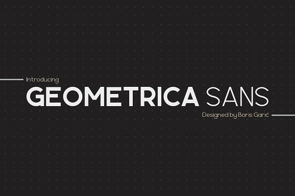
Geometrica Sans sits in the clean geometric group and suits designers who want a structured, modern direction for branding or display text. Preview it on your real copy before you commit.
Best for: branding, signage, and clean display text. By: Boris Garic
4. Korca
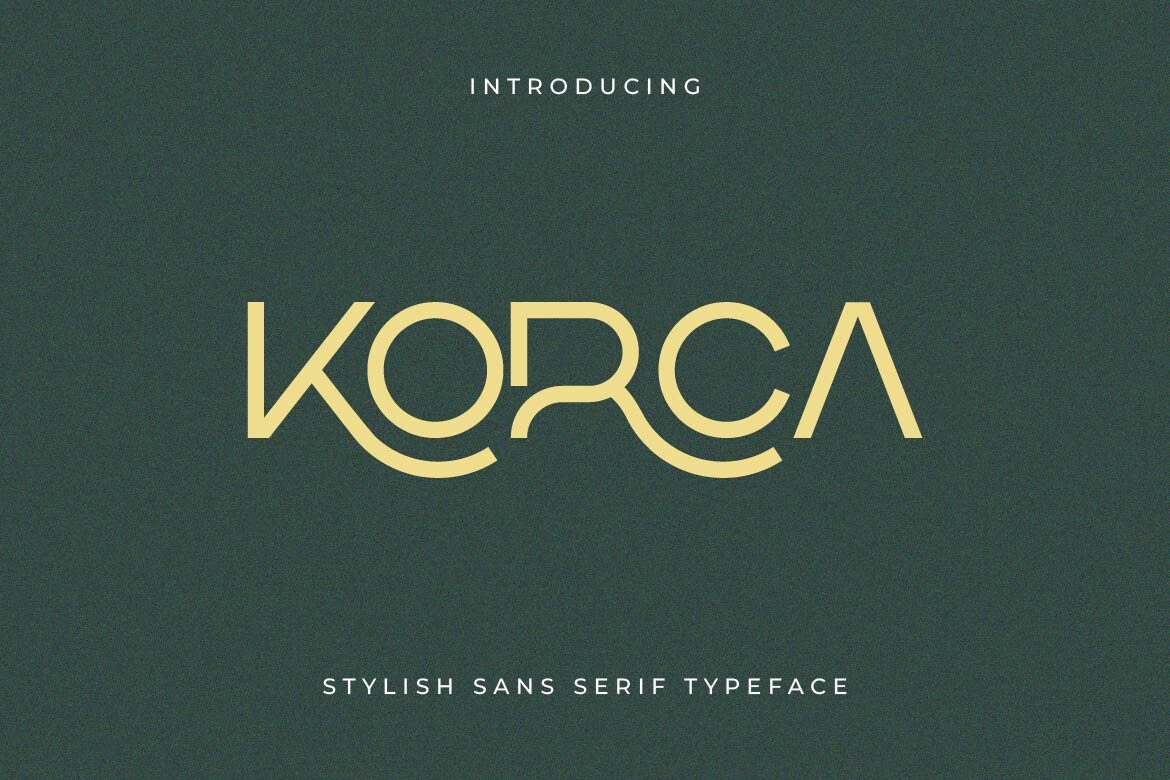
Korca belongs to the clean geometric group and is worth testing on small business logos, interface style text, or headline layouts where clarity matters more than decorative detail.
Best for: logos, UI style text, and modern headlines. By: Artiveko
5. Heiron
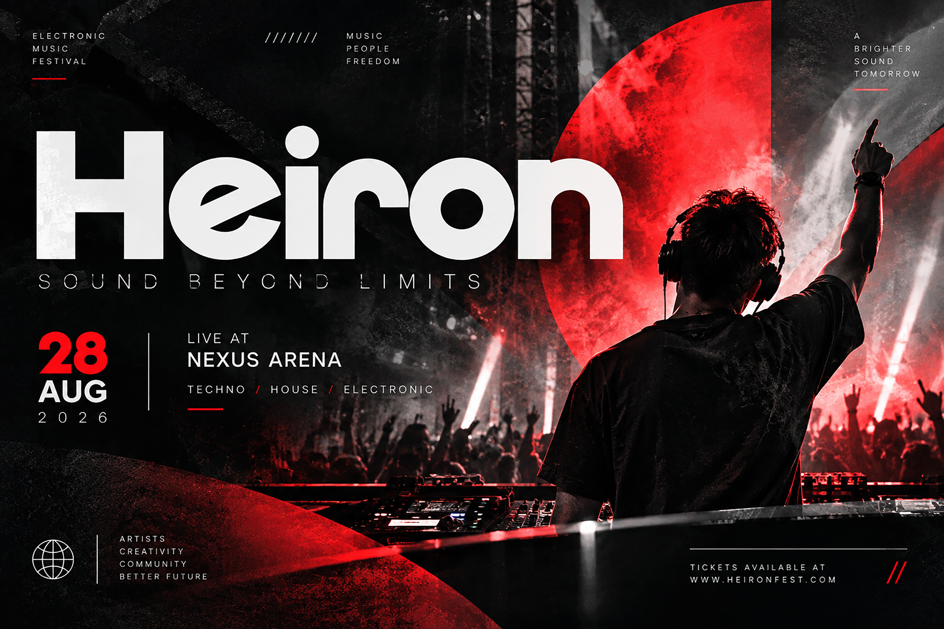
Heiron offers a clean geometric direction. Consider it for wordmarks, product labels, or editorial style headlines where the typeface should support the message rather than compete with it.
Best for: wordmarks, labels, and editorial headlines. By: BILLI
6. Ropan
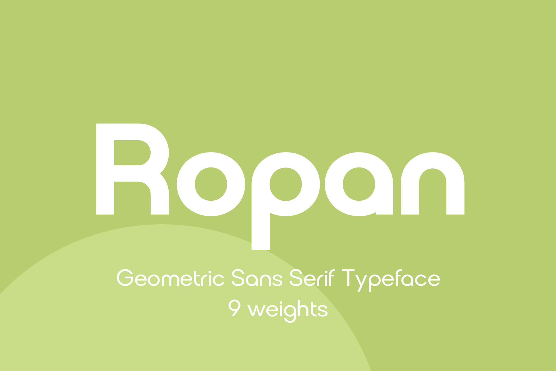
Ropan is a clean geometric sans for projects that need a modern, organized impression. It is a candidate for simple brand systems, short headlines, and maker projects. Test it in your layout to confirm it reads the way you want.
Best for: brand systems, short headlines, and maker projects. By: Pasha Larin
Modern Geometric Sans Families for Branding and Headlines
These modern geometric sans families are built for branding, headlines, and presentation style layouts. They are useful when you want a typeface that can carry a full identity, from a logo to a slide deck to a social post. The focus here is on a contemporary feel that still reads clearly at a glance.
7. Gonelo
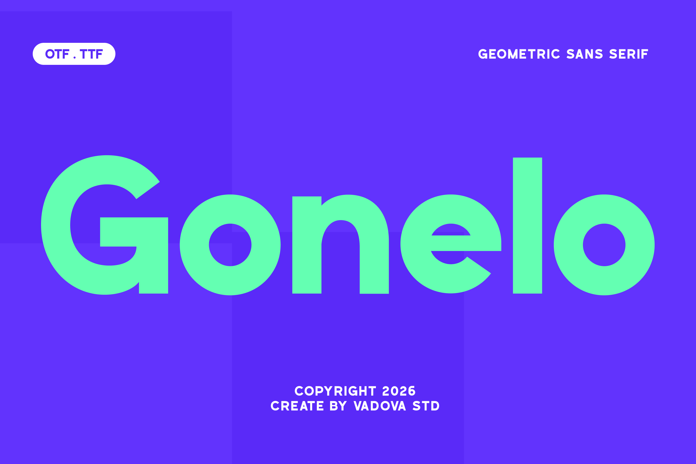
Gonelo belongs to the modern geometric group, which suits brands wanting a current look. Consider it for logos, headline layouts, and presentation materials.
Best for: logos, presentations, and modern branding. By: Vadova Std
8. Cromathin
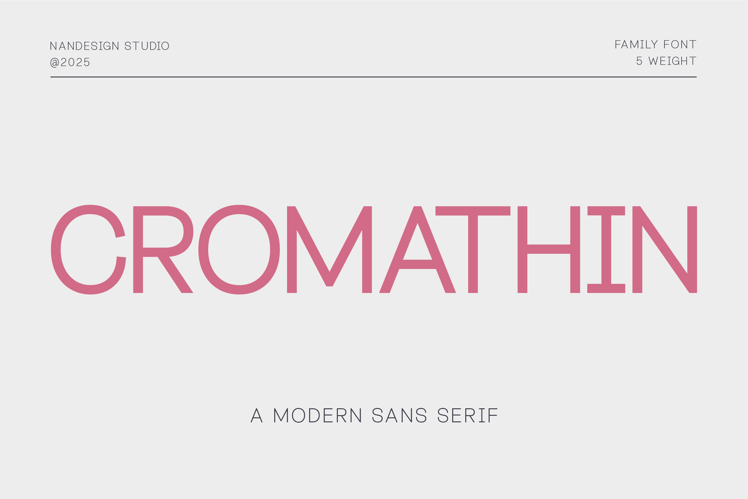
Cromathin brings a modern direction that may suit tech, design, or creative services brands. Try it for wordmarks, campaign headlines, and digital layouts.
Best for: tech branding, campaign headlines, and digital layouts. By: Nan Design
9. Perfect Corporate
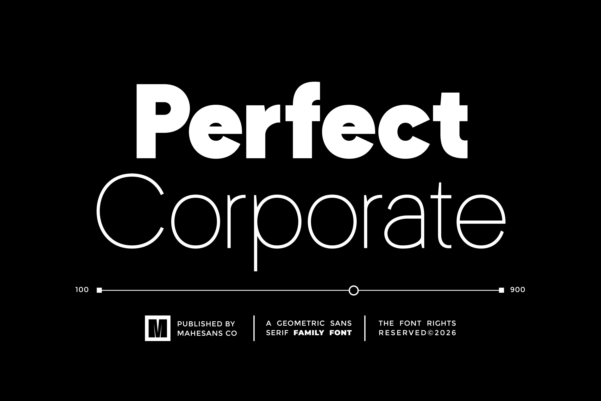
Going by its name, Perfect Corporate points to a business friendly use case. Consider it for consulting, B2B services, and corporate decks, and check it against your brand tone before you commit.
Best for: corporate branding, business decks, and clean wordmarks. By: Mahesans Co
10. Quick Pro
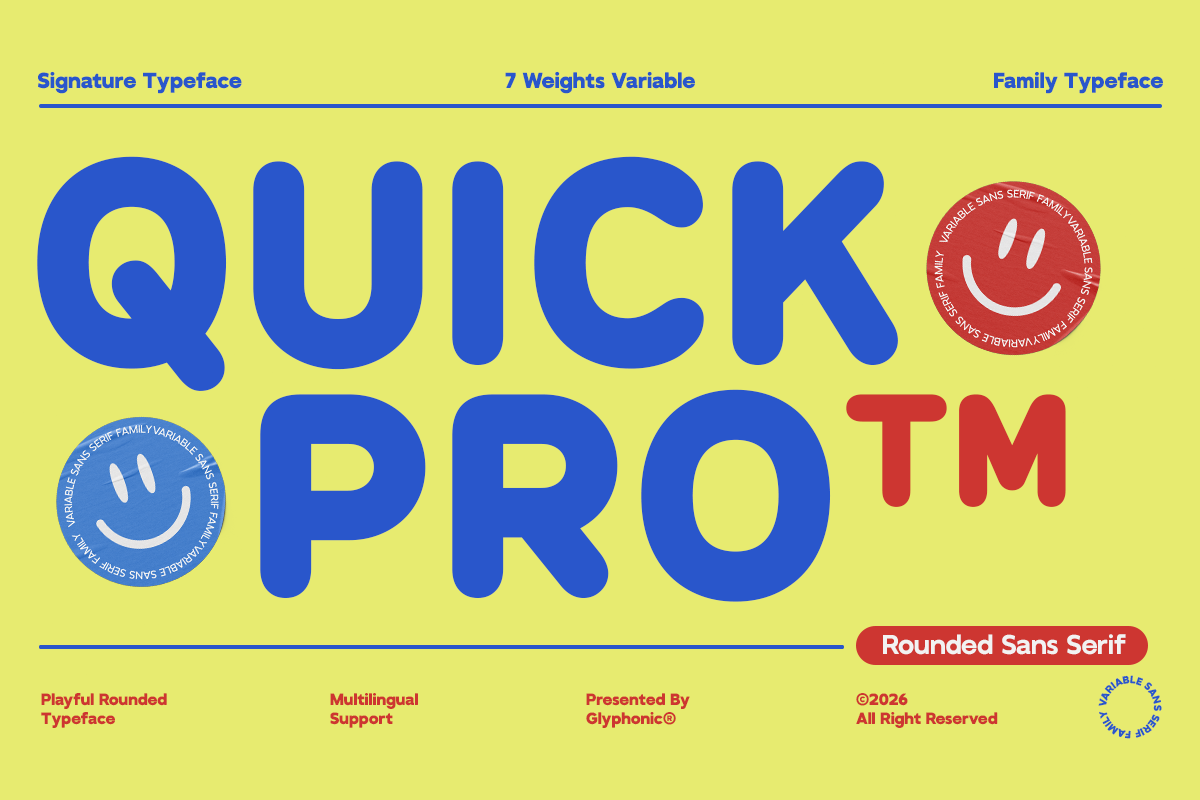
Quick Pro sits in the modern geometric group. It is a candidate for service businesses, startup style identities, and headline designs. Preview it on your own text first.
Best for: service brands, startup identities, and direct headlines. By: Glyphonic
11. Carteny Geometric Sans Family
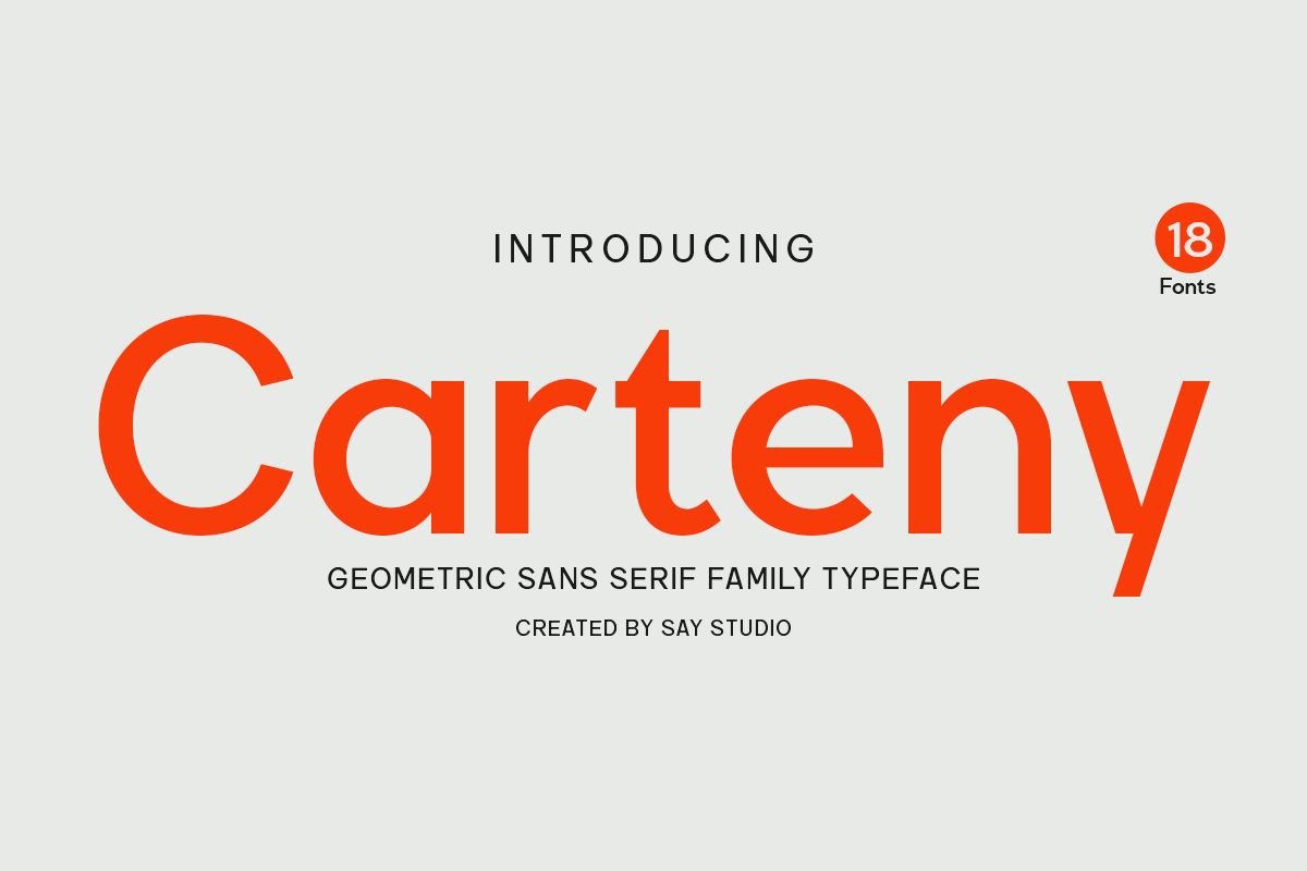
Carteny Geometric Sans Family is a modern geometric option for identities that move from logo to packaging to social graphics. Check the product page for what the family includes.
Best for: full brand systems, packaging, and social graphics. By: SayStudio
Download Carteny Geometric Sans Family
Round and Soft Geometric Sans Fonts for Friendly Designs
This group softens the geometry a little. These round and soft geometric sans fonts are useful when a brand needs to feel approachable, warm, or playful. They work well for friendly businesses, packaging, social media, and designs where a hard geometric look might feel too cold. If your audience is consumers rather than other businesses, this is probably where you want to look.
12. Quasar
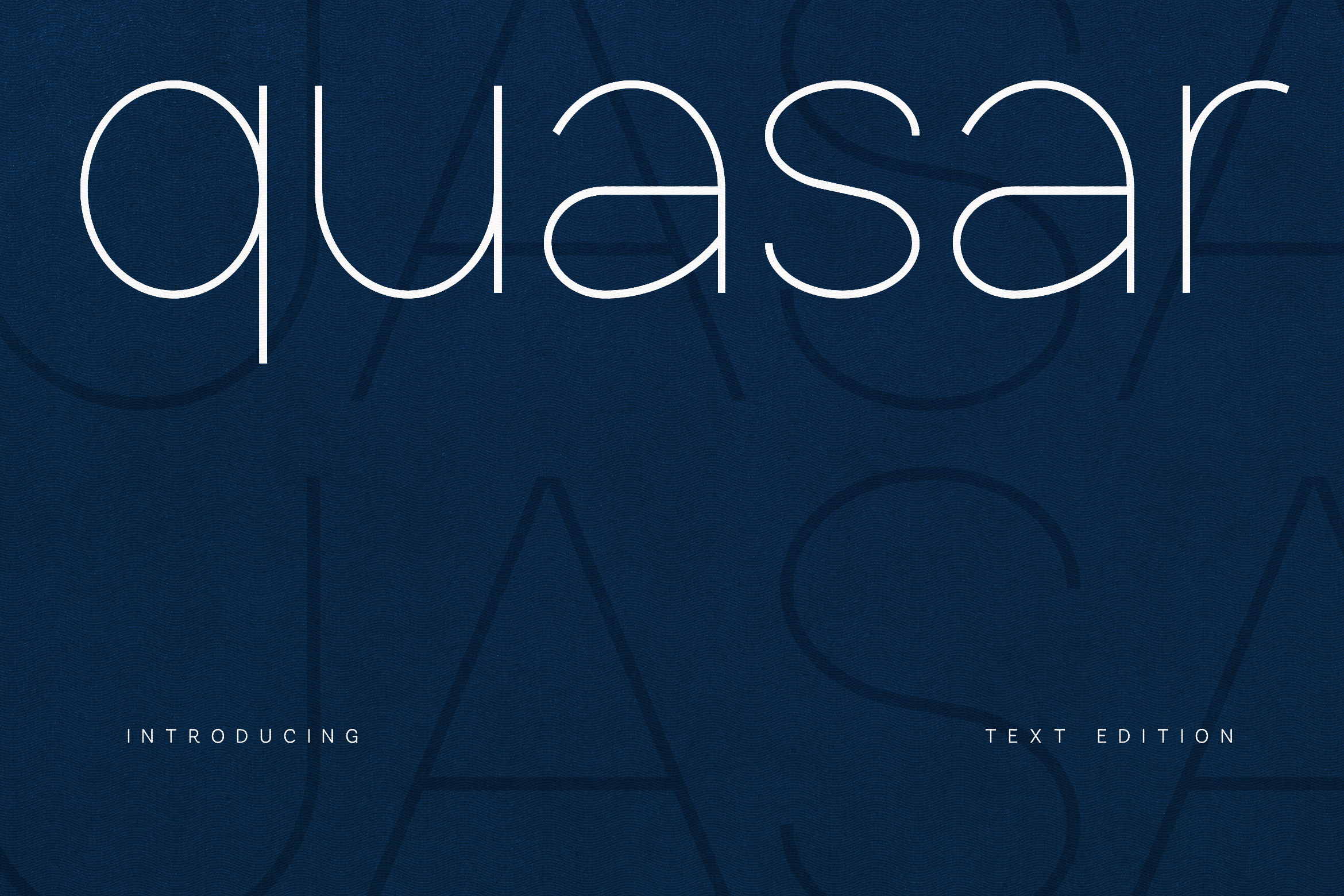
Quasar belongs to the round and soft group, which suits brands wanting a friendly, modern look. Consider it for consumer products, social posts, and welcoming wordmarks.
Best for: friendly brands, consumer packaging, and social posts. By: vladfedotovv
13. Cynzia
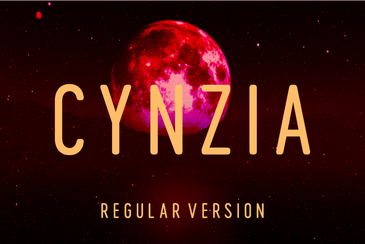
Cynzia brings a soft geometric direction for brands with an approachable personality. Consider it for lifestyle products, small business logos, or headline designs. A simple color palette lets the type lead.
Best for: lifestyle brands, small business logos, and warm headlines. By: Huntype
14. Tarevo
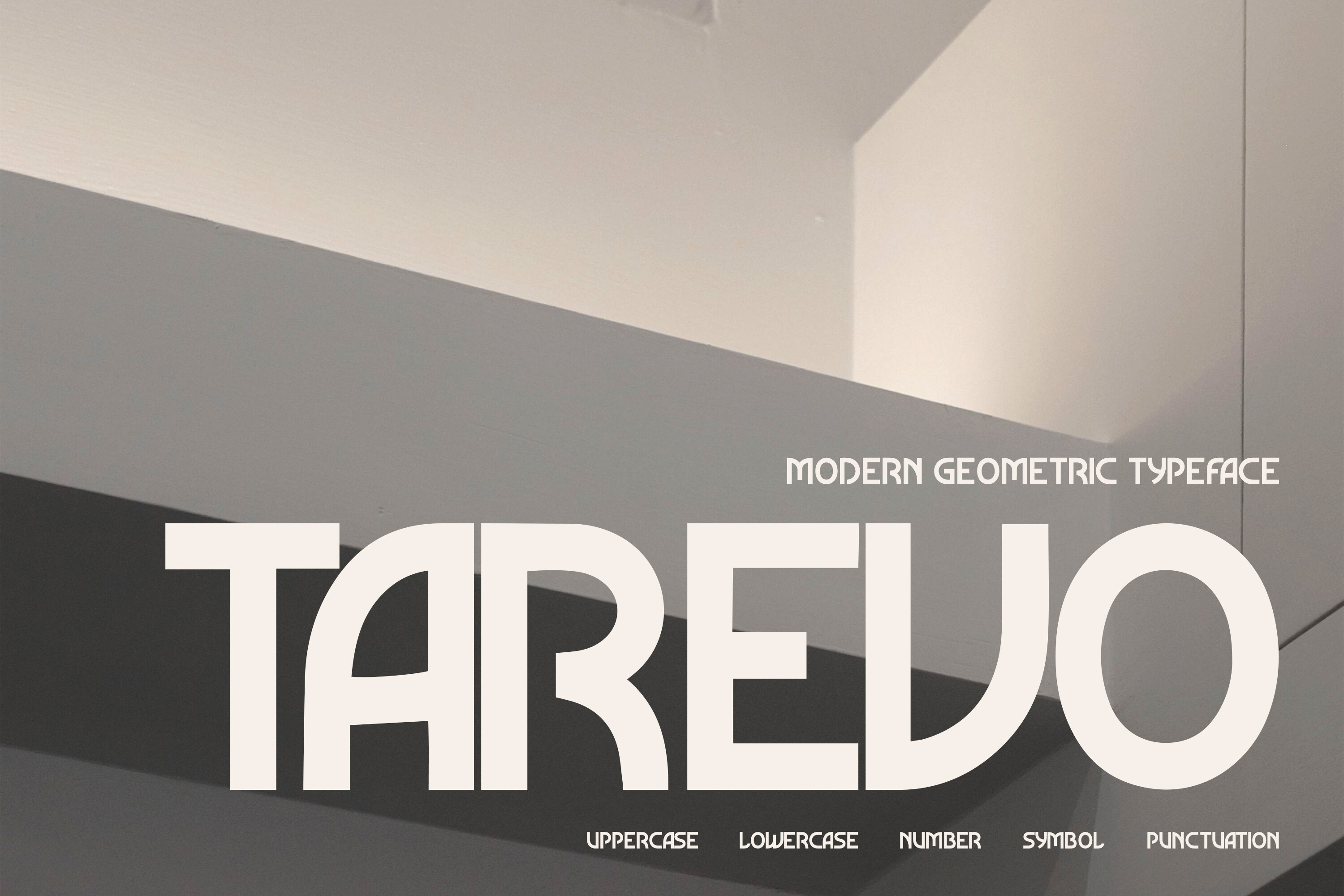
Tarevo sits in the round and soft group. Consider it for friendly wordmarks, product labels, or social media graphics where a softer geometric look suits a conversational brand voice.
Best for: friendly wordmarks, product labels, and social media graphics. By: Pitchlook
15. Nova Klasse
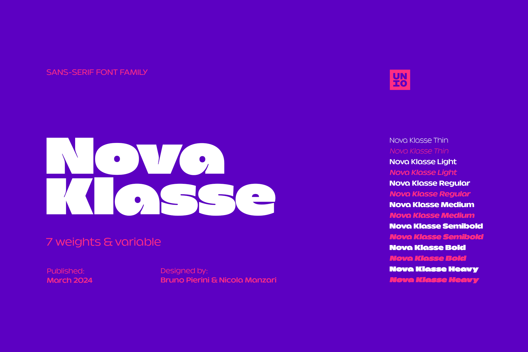
Nova Klasse is part of the round and soft group, aimed at brands that want a modern identity with an approachable tone. It is worth testing for consumer brands, packaging, and headline layouts.
Best for: consumer brands, packaging, and gentle headline layouts. By: unio.creativesolutions
16. Becaure
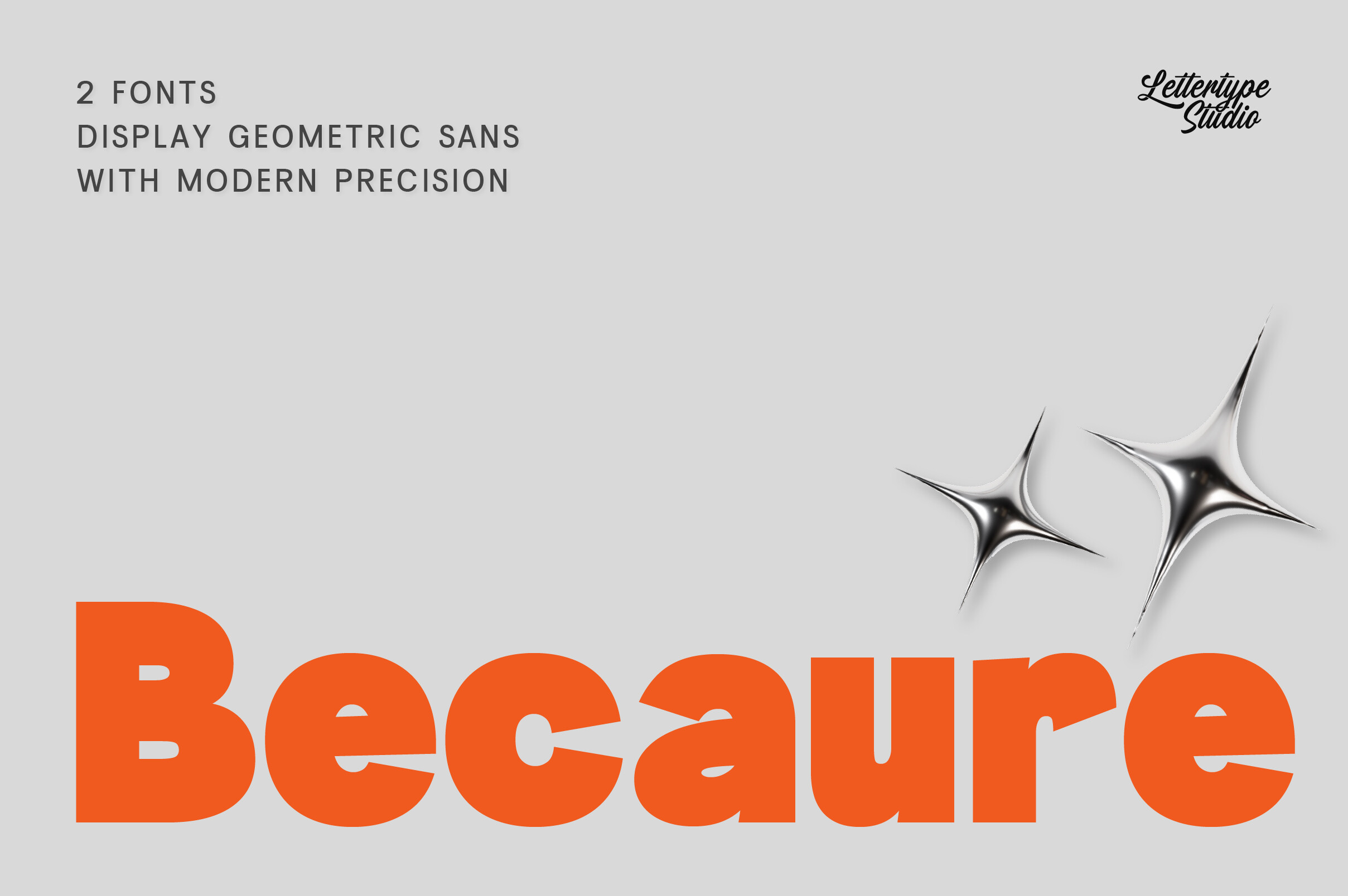
Becaure belongs to the round and soft group. Consider it for small business identities, product packaging, or social graphics, such as a local bakery or a handmade candle shop, where a softer look can feel more personal.
Best for: small business identities, product packaging, and social graphics. By: pradiptacreative
How to Use Geometric Sans Fonts in Logos, Headlines, and Layouts
Geometric sans fonts are strongest when you give them room to breathe. For logos and wordmarks, start with a short name and test the typeface at several sizes. A geometric sans can look sharp in a small favicon, a business card, or a large storefront sign, but the letter shapes need enough space to stay clear.
For headlines, set the typeface large and check the tracking, especially in all caps. Tight spacing can make a clean geometric look feel crowded. A little extra tracking can make the headline feel more confident and open. If you are pairing a geometric sans with body text, a humanist or classic serif often works well. The sans carries the headline, and the serif makes the longer text easier to read.
Canva is a common place where designers look for a Futura alternative for Canva. Canva has offered custom font uploads through its Brand Kit, but availability depends on your plan and the steps can change, so check the current Canva help pages for your account. Confirm that the font license allows this kind of upload. For Cricut projects, install the font on your computer and it should then appear in the Cricut Design Space font list, provided the license covers your intended use. That makes it easier to use Futura style fonts for Cricut on vinyl, labels, or craft projects.
In Adobe Illustrator, you can keep text editable while you explore layouts. When you are ready to deliver a logo, convert the type to outlines if the license allows. This helps the file stay stable when it is sent to a printer, a maker, or a client.
Tip: use no more than two typefaces in a simple brand design. One geometric sans for display and one readable body typeface is usually enough. More than that and the design starts to feel scattered.
Tip: when you are unsure, make a simple test sheet. Put the logo, a headline, a short paragraph, and a small label on one page. This helps you see whether the typeface works across the whole project, not just in the most flattering sample. If the design feels busy, reduce colors and keep the hierarchy simple. Geometric sans fonts often look best with plenty of white space.
Tips for Choosing the Right Futura Alternative
A good alternative to Futura depends on the job. Start with the project. If you need a corporate identity, a clean geometric sans may be the right direction. If you are designing packaging for a friendly product, a rounder option may feel more natural. If you are making a poster, focus on how the typeface looks at large size and how it behaves in short, punchy lines.
Next, check the license. A Futura alternative is only useful if you can actually use it. Look at the product page and the license file before you publish. Ask whether the license covers personal use, commercial use, desktop, web, app, or print. If you are not sure, contact the seller before you build a client project around the typeface.
Test the typeface on real text, not just a sample word. Put your actual business name, slogan, or headline into the design. Check small sizes, long lines, and all caps. Geometric sans fonts can look similar in a preview, but they are not interchangeable. Some may feel too wide, too narrow, too soft, or too rigid for your specific project.
If you are looking for a similar font to Futura, Google Fonts options are worth a quick look. Jost and League Spartan are often mentioned as names that share the geometric direction. Check the license on the source page before using either in a commercial project, and test both in the exact context you need.
Note: geometric sans fonts are similar in spirit, but they are not the same. Compare them side by side in your layout, and choose the one that fits the brand, the size, and the license.
Another practical habit is to save a shortlist. Keep two or three options that pass the license check, then compare them after a day or two. Fresh eyes often catch issues that disappear when you stare at one typeface for too long. Choose the typeface that supports the whole project, not just the first impression.
Where to Download Geometric Sans Fonts
Creative Fabrica is a useful source for modern geometric fonts for branding, clean sans serif fonts for headlines, and geometric sans fonts for logos. The entries above are options in the spirit of Futura, and you can review the preview, the designer, and the license details on each product page.
You can also browse more options on Creative Fabrica. For additional reference points, you may see Google Fonts, DaFont, and Font Squirrel mentioned in font discussions. Use those names as plain text starting points, and always verify the license before using a typeface in a project.
If you want more font recommendations, pairing ideas, and practical design tips, visit the FontPro blog.