· fonts · 13 min read
23 Best Chinese Fonts for Menus, Packaging, and Festive Designs in 2026
Find Chinese style fonts for menus, Lunar New Year designs, packaging, and logos, with practical pairing and licensing tips for designers and makers.
Before you download, a quick note: the fonts in this list are chosen for their Chinese inspired style, and you should not assume they are true Chinese typefaces with thousands of hanzi. If your project needs real Chinese characters, check each product page for language support and character set. For genuine Simplified or Traditional Chinese text, Google Fonts and the Noto family, including Noto Sans SC and Noto Serif SC, are a natural place to look. The styles below are aimed at lettering that echoes brushwork, signage, and festive display forms.
That distinction matters. A true Chinese font supports hanzi. A Chinese style font gives lettering a visual direction inspired by brush, square, or signage forms. You can use this kind of font for menus, posters, packaging, and logos, but confirm what a file actually contains before you buy. If you are searching for fonts that look like Chinese writing, start by deciding whether you need real characters or a decorative look.
What Makes a Great Chinese Font?
A great Chinese style font does one job well: it gives your text a clear visual direction. For menus, you want a face that can carry a restaurant name or section title without becoming hard to read. For packaging, you want enough contrast to survive small sizes. For festive work, you want a mood that feels celebratory without turning into a costume.
Three qualities matter most. First, legibility at small sizes. A decorative display face can look powerful at 72 point, but it may fall apart at 12 point. Second, stroke character. Brush style fonts rely on tapered, uneven strokes. Square and serif influenced fonts rely on structure, weight, and rhythm. Third, respectful fit to context. A Chinese inspired font should support the project, not replace real language with random symbols.
If you need real hanzi, look for a true CJK typeface. Google Fonts and the Noto family, such as Noto Sans SC and Noto Serif SC, are common starting points. For a mixed project, pair a dedicated Latin font with a CJK font, because the Latin glyphs inside some CJK fonts can feel uneven.
How do I check whether a font supports Chinese characters? Open the product page and look for language support, character set, or sample text. Then paste the exact characters you need into a preview. Missing glyphs often appear as empty boxes or a fallback font. That quick test saves you from buying the wrong file.
Best Chinese Brush and Script Fonts
Brush and script styles are the most expressive group in this list. They borrow the feel of calligraphic strokes, with tapered ends, uneven weight, and a hand lettered energy. Use them for headlines, logos, and short phrases where the type can be large.
These chinese brush fonts work best when the message is short. If you need a full menu or paragraph text, pair them with a calm, readable font.
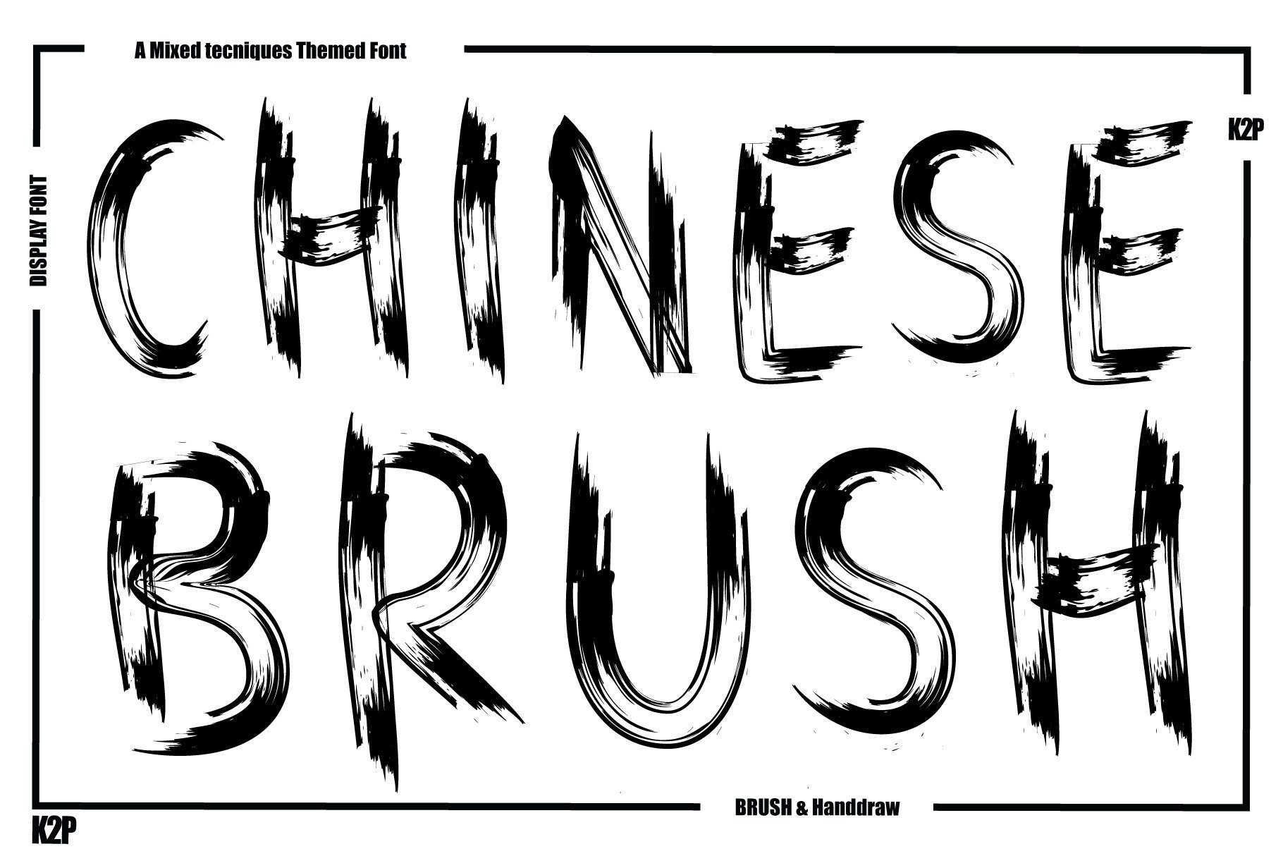
1. Chinese Brush
A brush style pick, and the one that gives this list its lead image. It suits short headlines where the lettering can carry the mood, such as posters, menus, and greeting cards.
Best for: restaurant menus, festive greeting cards, packaging labels. By: KtwoP
2. Dynasty Dash
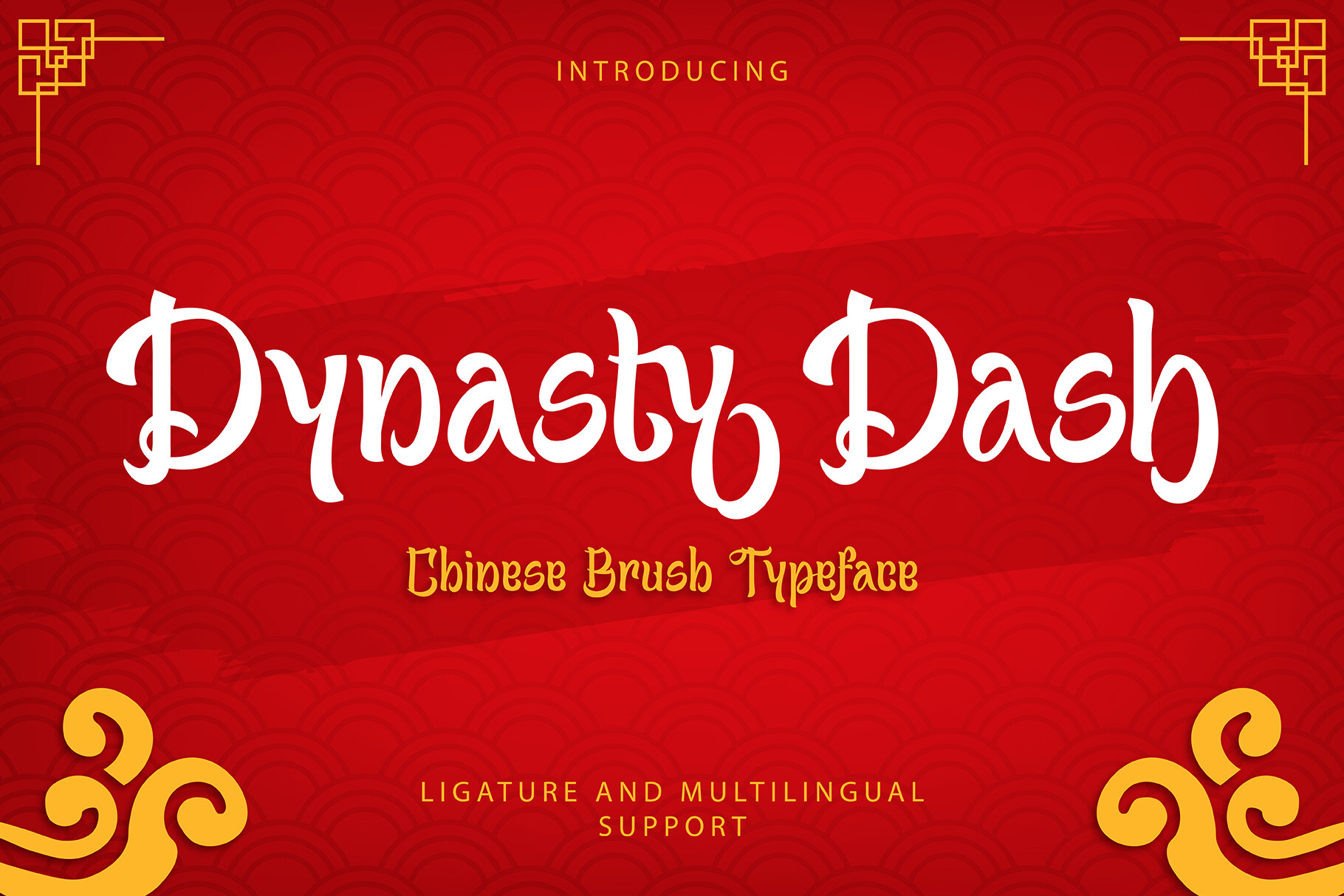
A brush style that the name pairs with movement. It looks suited to display sizes, short phrases, event titles, and bold menu headers.
Best for: posters, restaurant menus, Cricut projects. By: Inviline
3. China Town
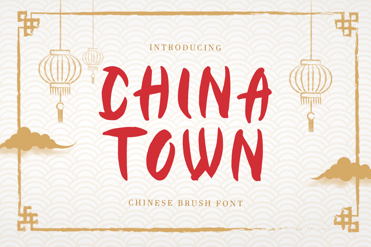
A script style with a signage flavor. Keep the lettering large and the message short, especially for dining themes and local branding.
Best for: signage, menus, packaging labels. By: sensatype
4. Dragon Wave
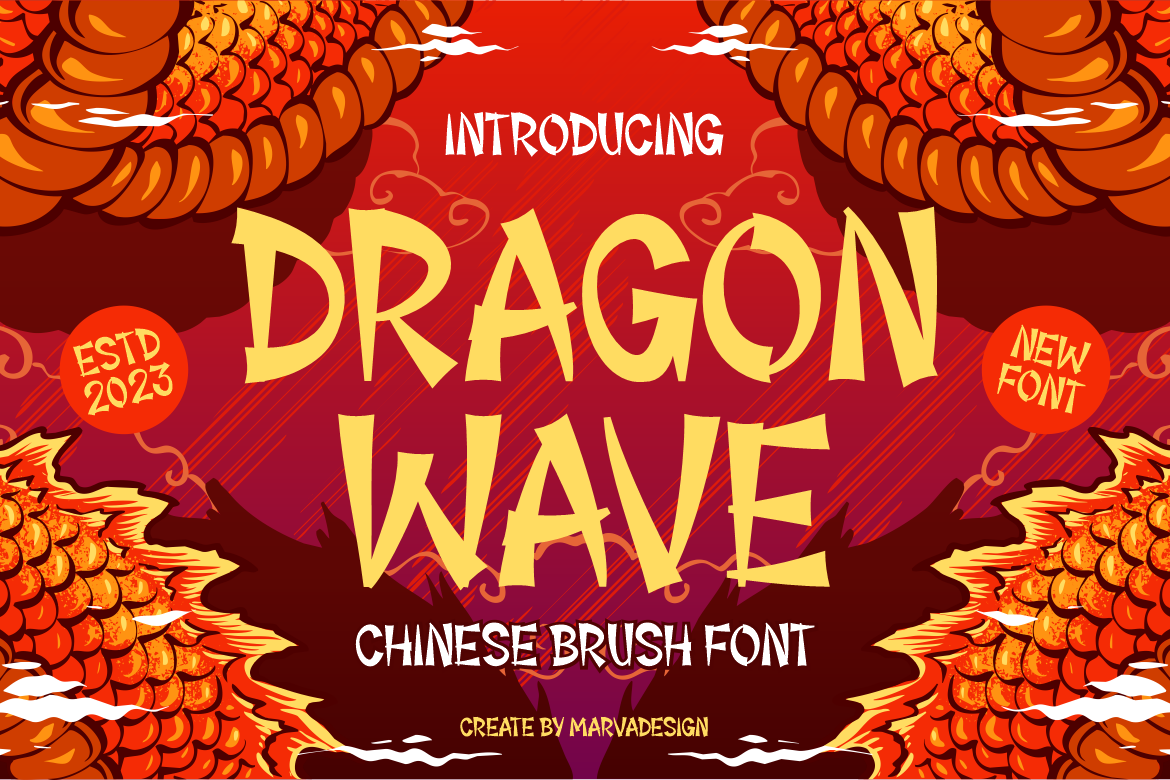
A brush style where the name hints at flowing movement. It points toward posters, titles, and festive campaign work.
Best for: posters, event titles, greeting cards. By: Marvadesign
5. Chinese Takeaway
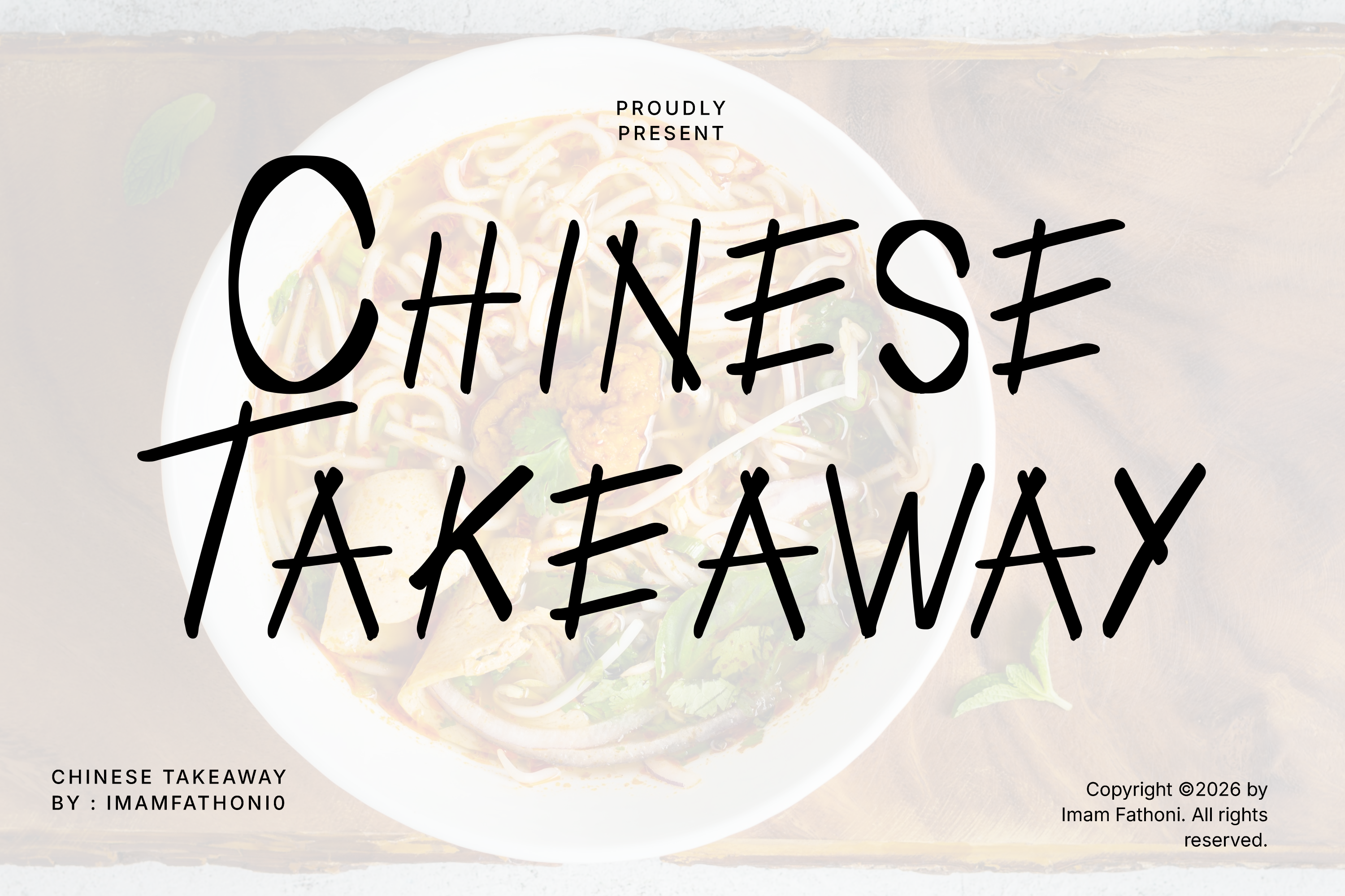
A brush or script style with a casual dining feel. The name suggests menus, takeaway packaging, and short promotional headlines where the type should feel friendly.
Best for: restaurant menus, packaging labels, Canva projects. By: setiawanarief111
6. Laowai
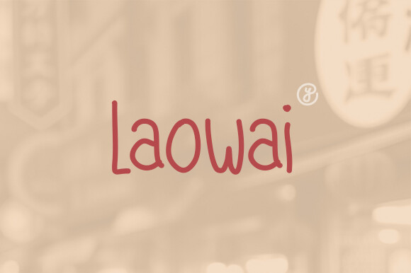
A brush style with a loose, hand lettered direction. It fits short headings that need personality, such as shop names, posters, and small brand marks.
Best for: logos, posters, greeting cards. By: yebhutype
7. Chinese Restaurant
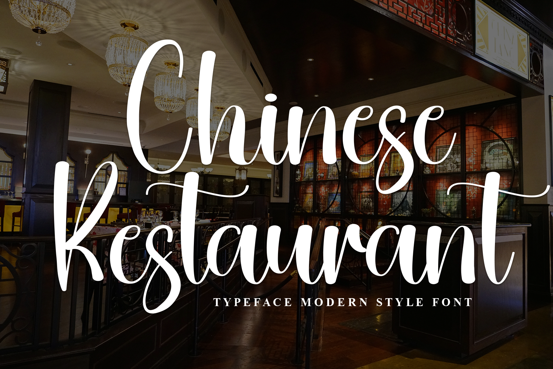
A brush style with a direct dining context. The name points to restaurant menus, posters, and signage where a bold headline can set the tone for the layout.
Best for: restaurant menus, signage, festive cards. By: Creativewhitee
Best Chinese Style Sans-Serif, Serif, and Square Display Fonts
Square, sans, and serif influenced styles bring structure to the list. They are useful when you need a cleaner look for signage, menus, and branding. These faces can feel more graphic and less hand drawn, which makes them easier to pair with body text.
Use this group when the project needs clarity as much as mood.
8. Chinese Market
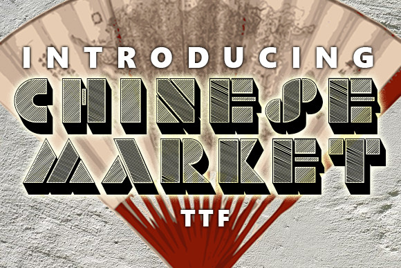
A square display style with a market stall flavor. It suits labels, headers, and short menu sections where the type needs to stay readable.
Best for: packaging labels, menus, signage. By: vladimirnikolic
9. Chinese Shangai
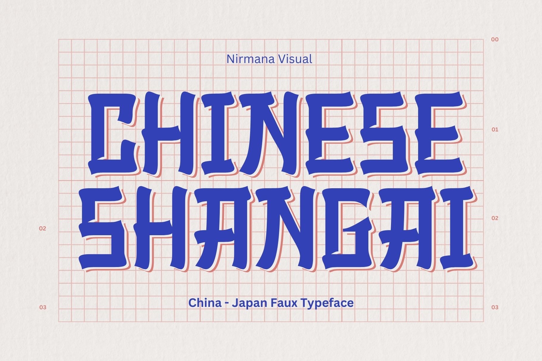
A structured display style with an urban feel. It works as a candidate for signage and branding where shape matters and a headline needs to anchor the layout.
Best for: logos, signage, posters. By: Sigit Dwipa
10. Gold China
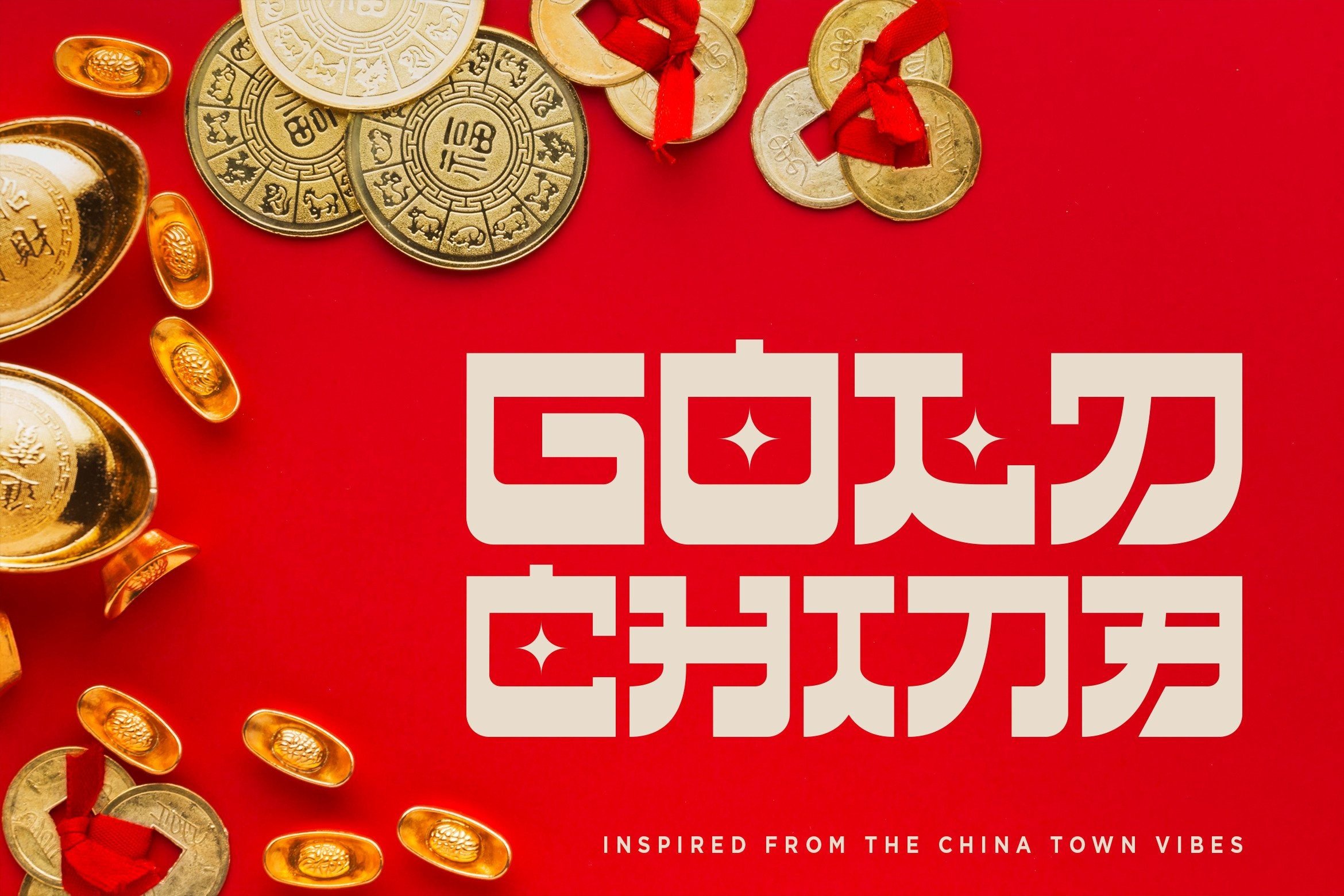
A square or serif influenced display style with a premium feel. It suits packaging and festive headings where the type should look polished.
Best for: packaging, festive cards, logos. By: konstantinestudio
11. Chinese Prodigy
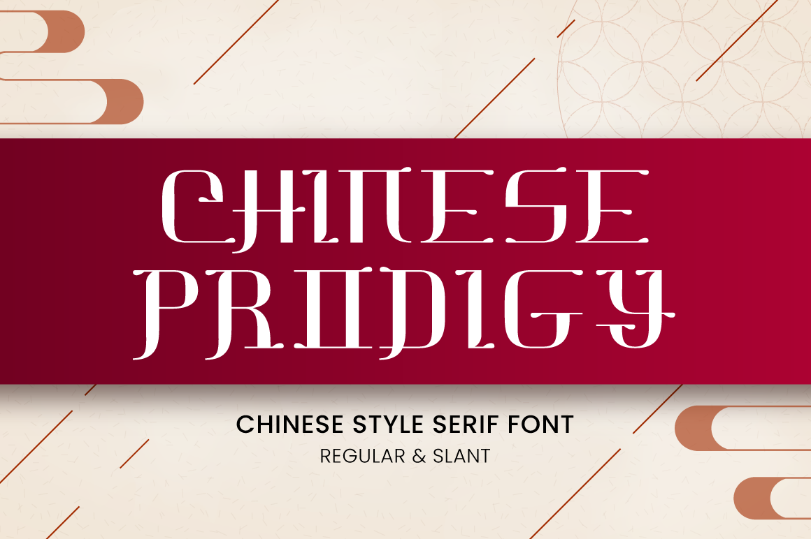
A square display style with a playful edge. It is a candidate for short titles and branding where the lettering can stand out without long paragraphs.
Best for: packaging labels, posters, logos. By: attypestudio
12. Neo China
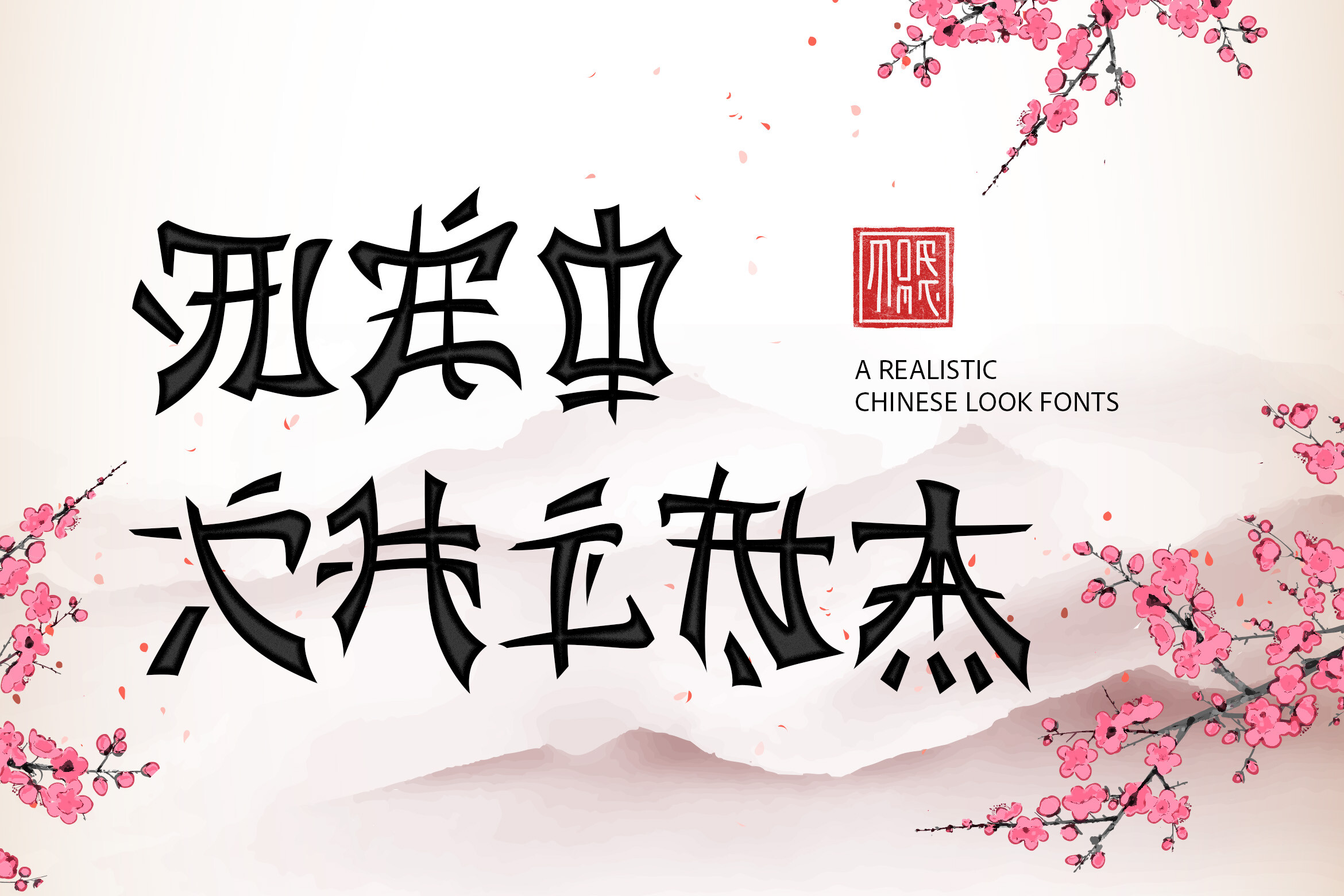
A modern square display style with a contemporary feel. It suits logos and clean packaging where the design needs a sharp, organized look.
Best for: logos, packaging, Canva projects. By: tomatstudio
13. Meifen
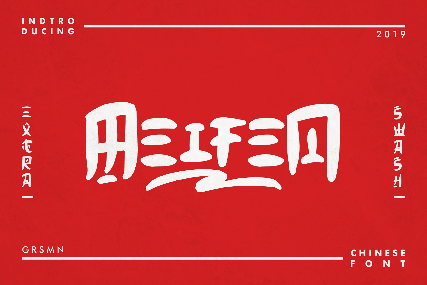
A square display style with a balanced, graphic look. It is worth testing for labels, posters, and short headings where the type should feel stable.
Best for: packaging labels, posters, menus. By: rismanginarwan8
Best Decorative and Themed Chinese Style Fonts
Decorative and themed styles are the most expressive group here. They lean into bold shapes, festive energy, and strong display character. These asian style display fonts are best for short phrases, posters, packaging accents, and seasonal campaigns.
Because they are highly stylized, keep the text short. A few words in a large size will usually look better than a full sentence.
14. Chinese Buffet
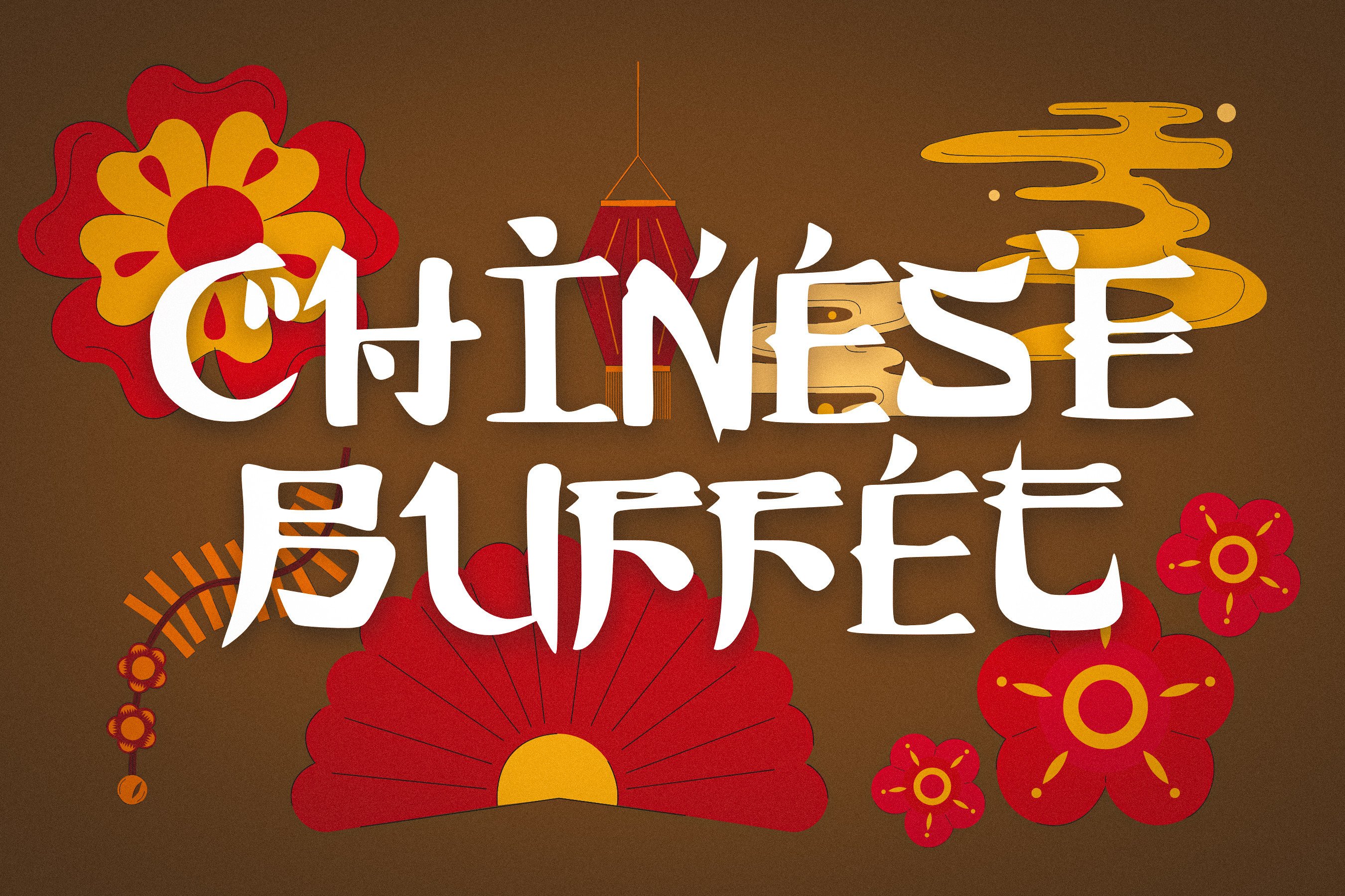
A decorative display style with a festive dining feel. The name suggests menus, posters, and event titles where the type can carry a celebratory mood.
Best for: restaurant menus, posters, greeting cards. By: The Tenacious Type Studio
15. Mandarin Mantis
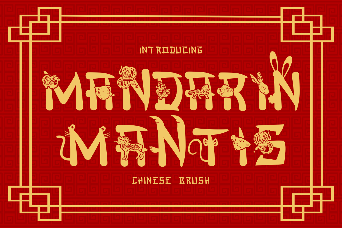
A decorative style with a bold, characterful look. It suits short headlines and themed packaging where the lettering needs to feel distinctive.
Best for: packaging labels, posters, logos. By: putracetol
16. Tiger Clan
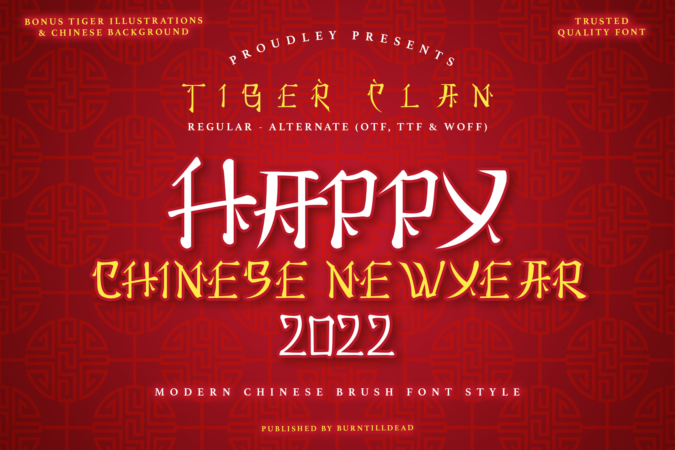
A decorative display style with a strong, bold energy. The name suggests powerful posters, event titles, and short headlines that need visual weight.
Best for: posters, event titles, packaging accents. By: Burntilldead
17. Beth Pao
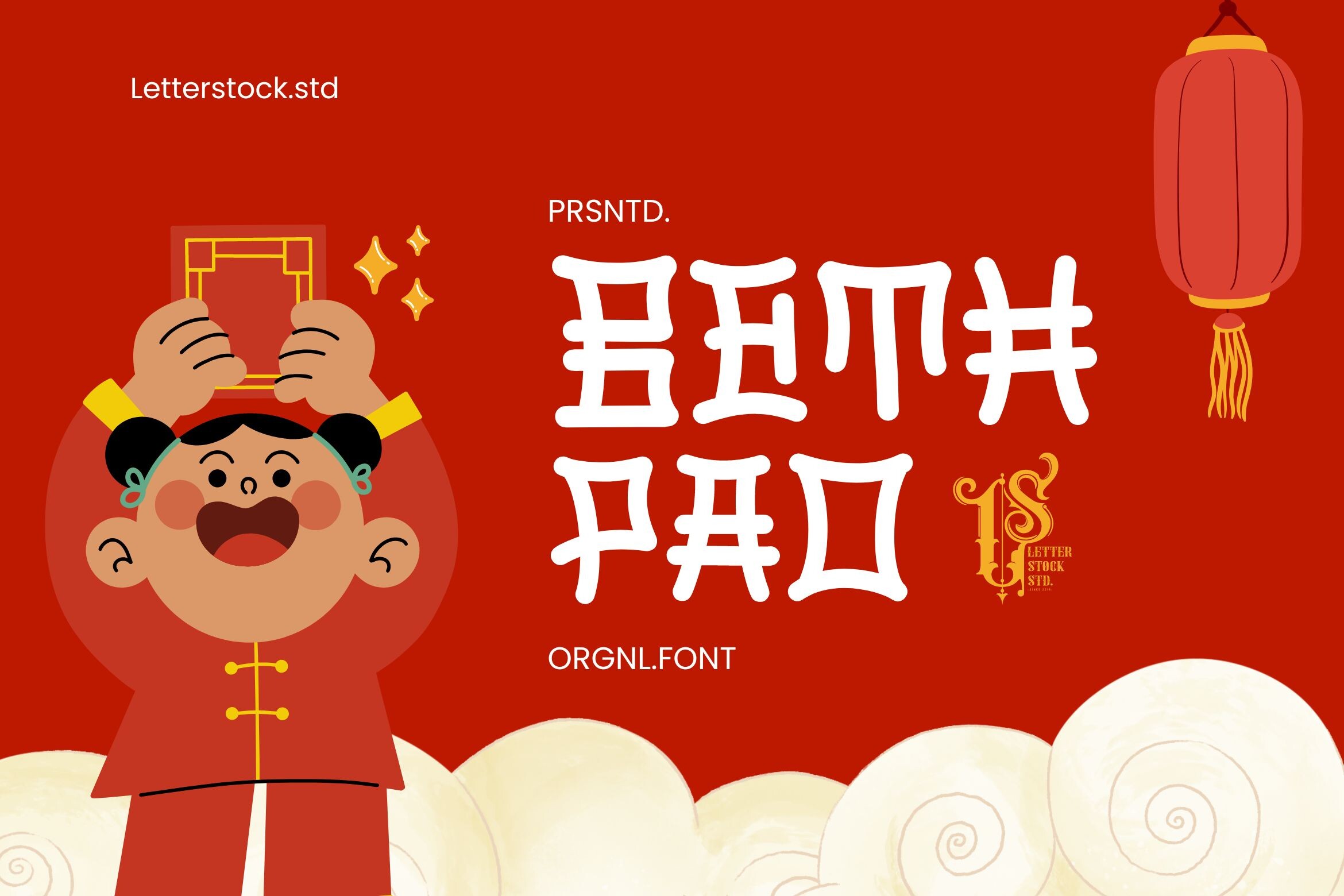
A decorative style with a playful feel. It suits short phrases, labels, and greeting cards where the type can feel friendly and approachable.
Best for: greeting cards, packaging labels, Canva projects. By: Gumacreative
18. Bao Buns
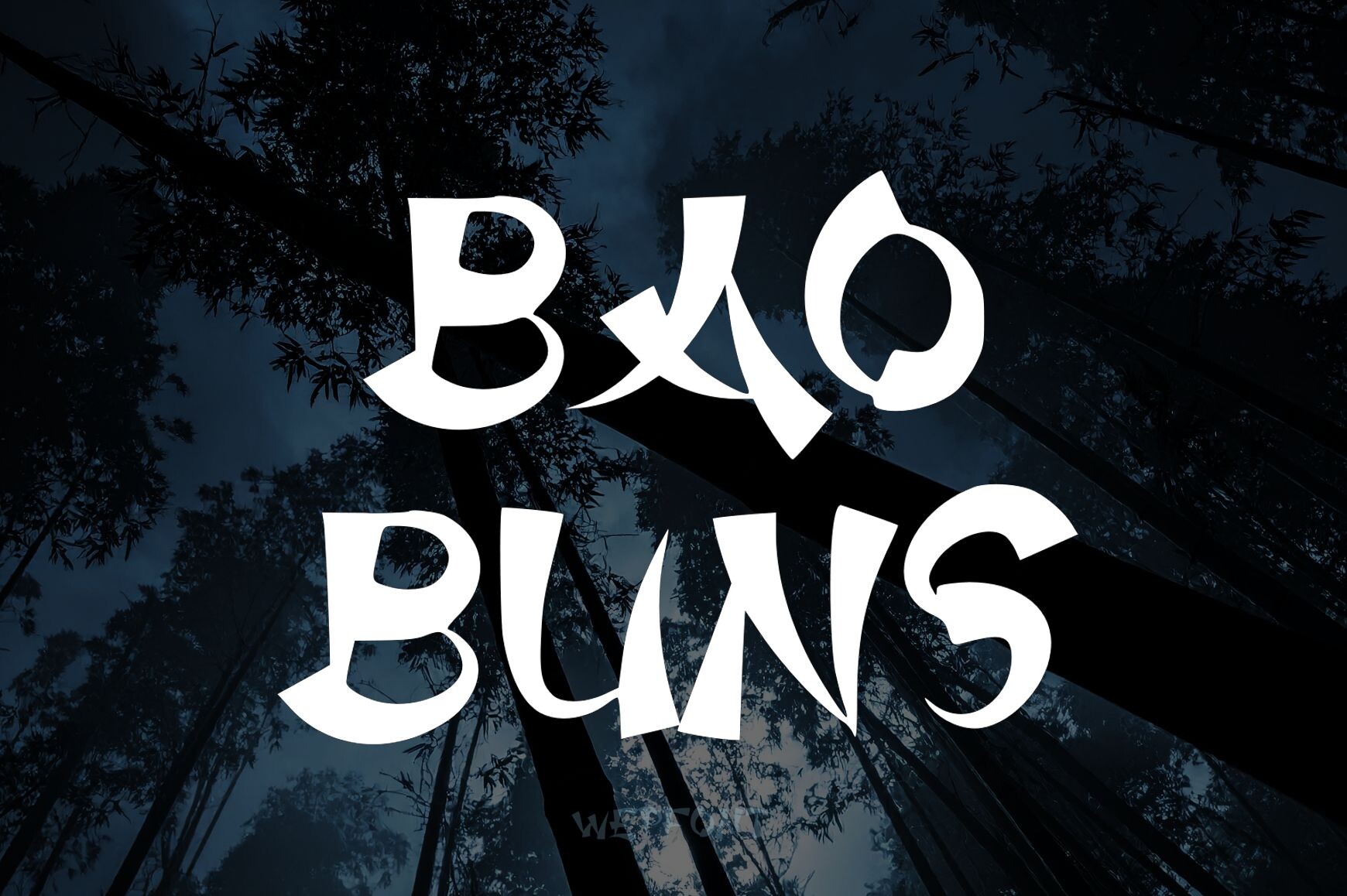
A decorative style with a food friendly look. The name suggests packaging, menus, and casual branding where the type should feel warm and inviting.
Best for: packaging labels, menus, logos. By: wep, Wahyu Eka Prasetya
19. Zilong
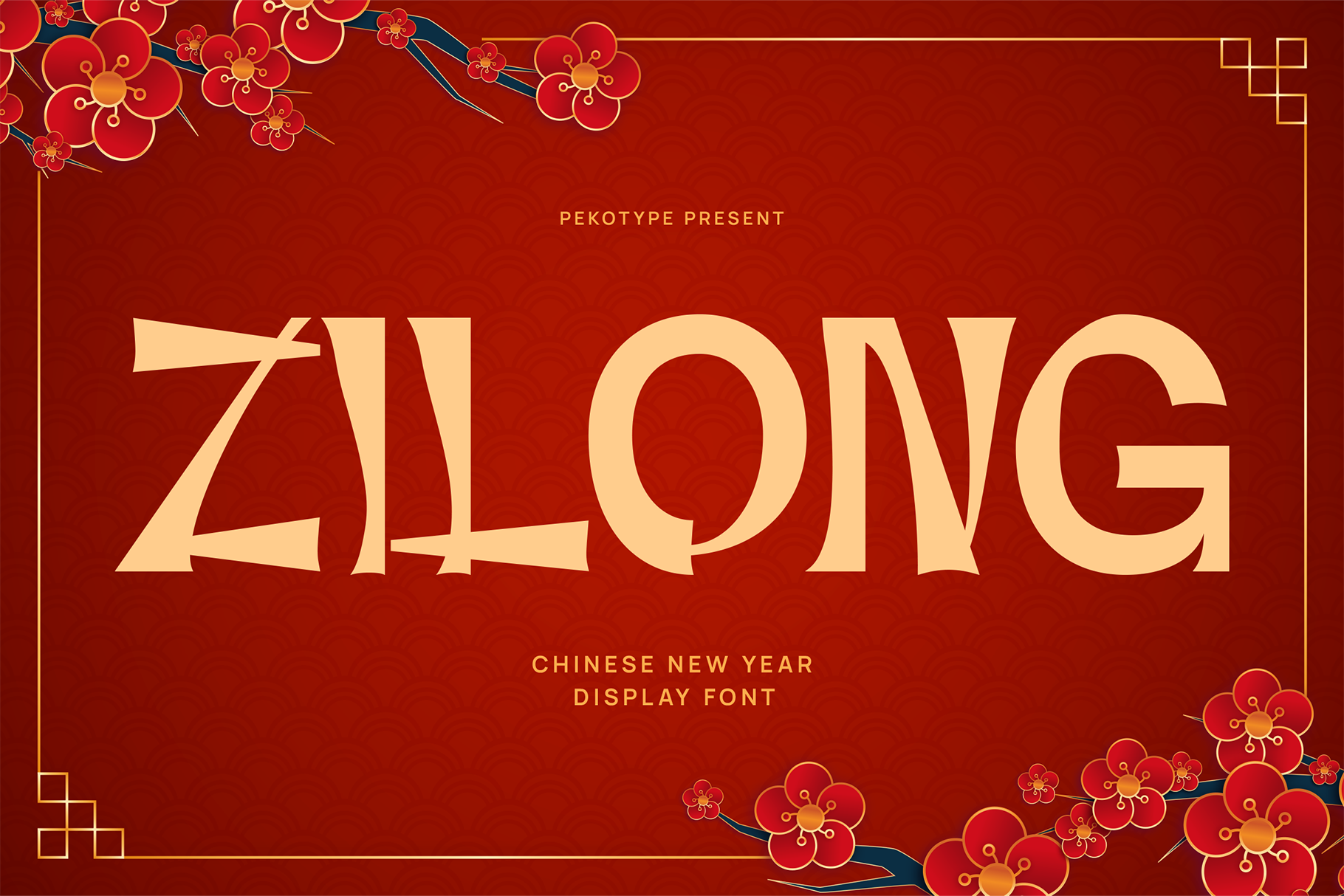
A decorative display style with a bold presence. It points toward strong titles, posters, and short headlines where the type can command attention.
Best for: posters, event titles, packaging labels. By: pekotype
20. Gong Xi Fa Cai
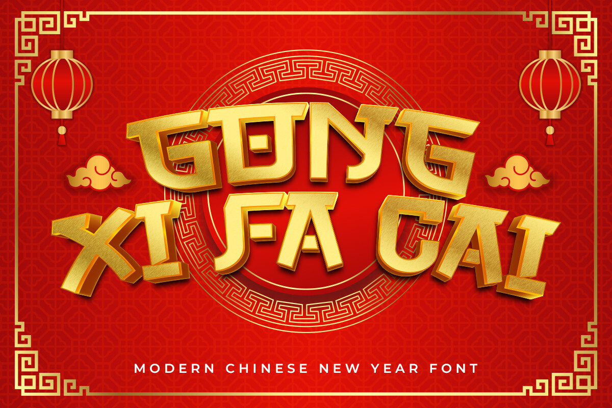
A festive display style with a celebratory feel. The name echoes a Lunar New Year greeting, so think of cards, posters, and short seasonal headlines where the mood matters most.
Best for: greeting cards, posters, packaging labels. By: fontkong
21. Gekkai
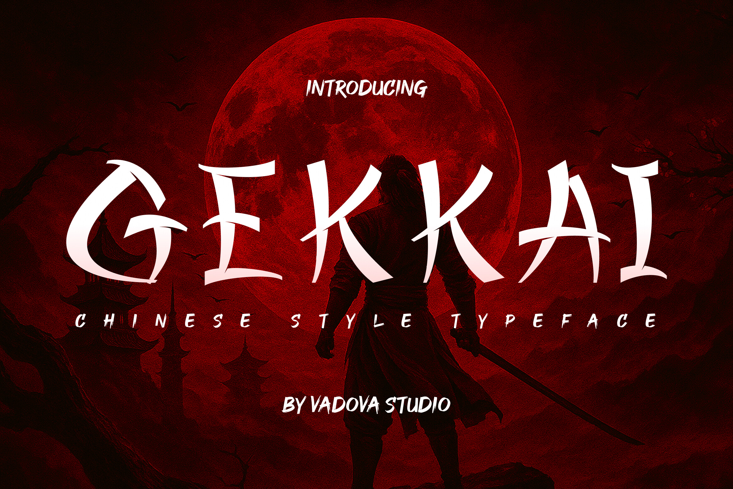
A decorative style with a sharp, dramatic look. It suits short headlines and themed posters where the lettering needs a strong edge.
Best for: posters, event titles, packaging accents. By: Vadova Std
22. Dragons Gravity
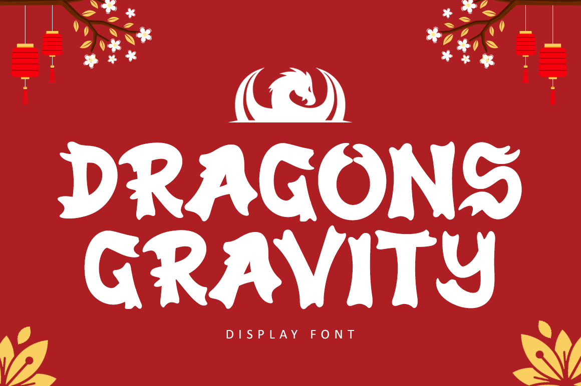
A decorative display style with a heavy, dynamic feel. The name suggests bold titles, event posters, and short phrases that need a powerful presence.
Best for: posters, event titles, logos. By: illushvara
23. Bangow
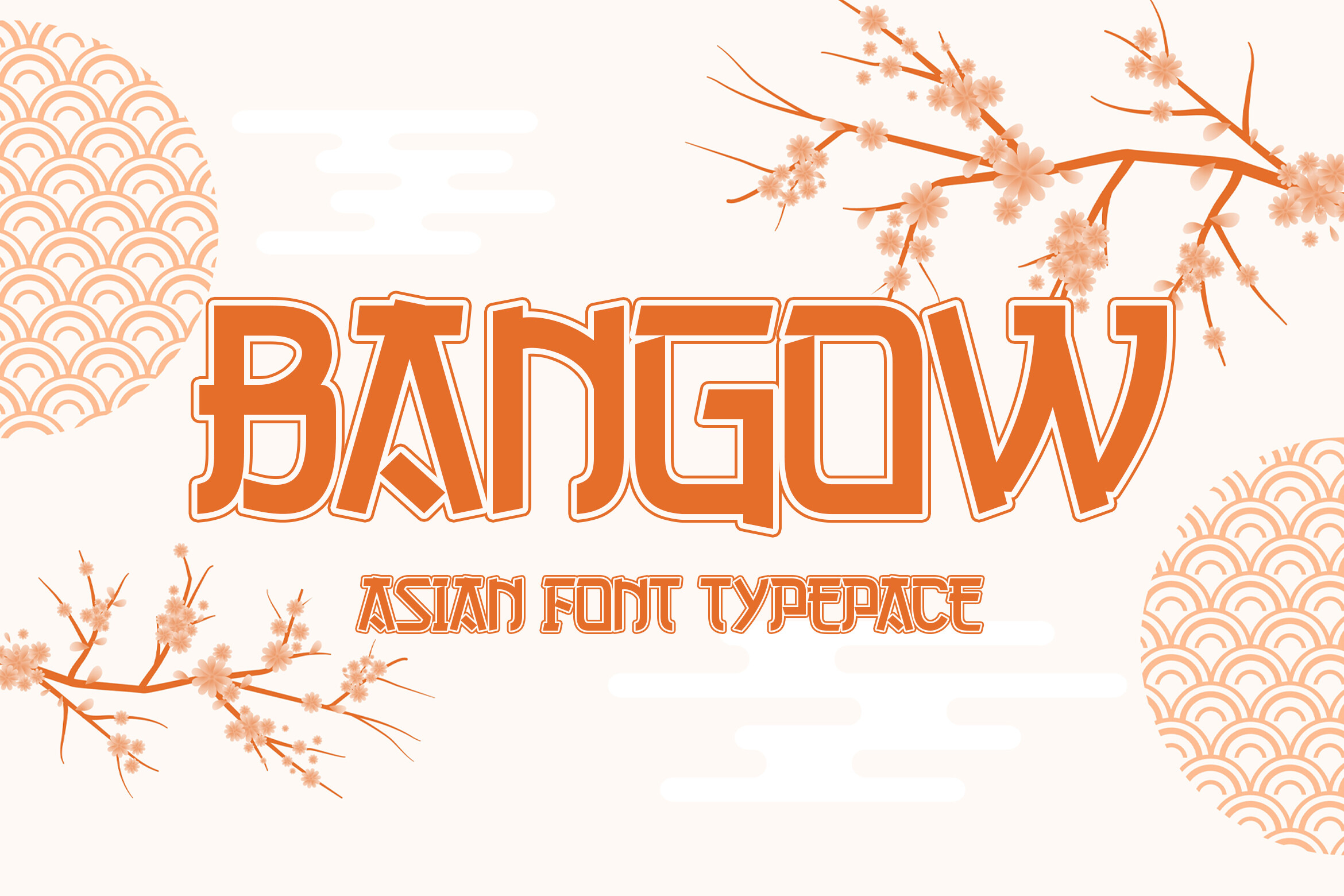
A decorative style with a punchy, street style energy. It suits short headlines and bold packaging where the type can feel direct and confident.
Best for: packaging labels, posters, Cricut projects. By: Ceeskiiw
How to Use Chinese Style Fonts in Your Projects
Restaurant menus and signage are a natural fit. Use a decorative face for the restaurant name, section titles, or a special offer, then switch to a calm, readable font for dish names, prices, and descriptions. If you are choosing between brush and square styles, brush fonts add energy, while square or serif influenced faces can feel more organized.
There is no single best Chinese font for restaurant menus. The right choice depends on the restaurant name, menu density, and the mood you want. A brush style can feel energetic and hand made, while a square display face can feel cleaner and more modern. For a full menu, use the decorative font only where it can be large, and keep the body text in a neutral face.
For Lunar New Year designs, or any project using chinese new year fonts or lunar new year fonts, keep the text short. A greeting, date, or campaign headline works well in a large festive display font. Red and gold are widely associated with good fortune, but you do not need to use both. Two or three colors can keep the layout clean. If you include real Chinese text, have a native reader proofread it. A wrong character in a greeting is worse than no text at all.
Can you use Chinese style fonts for Lunar New Year designs? Yes, especially for short greetings, campaign titles, and decorative accents. The key is to keep the design respectful and the text accurate. If the greeting is in English, a festive display font is enough. If it is in Chinese, confirm the characters and meaning before publishing.
Packaging and labels need a different test. Put the type at the size it will appear on the box, bottle, or sticker. Check contrast against the background, and make sure the most important words remain readable. A decorative font can look great on a large panel, but it may become noisy at small size.
Logos and branding work best with one expressive display font and one calm text font. Keep the total to two typefaces. A brush style heading paired with a clean sans serif or neutral serif body is a safe and effective combination. If you want more pairing ideas, see the FontPro blog.
For software, install the font at the operating system level, then restart your app. Canva’s rules for uploading custom fonts can depend on your plan, so check Canva’s current help pages, and make sure the font license allows the use you plan. In Adobe Illustrator, an installed font should appear in the type panel after a restart. For Cricut Design Space, the way fonts are loaded can change, so check Cricut help for the current method. These chinese fonts for canva and chinese fonts for cricut projects work best when you test them in the actual tool before finalizing a design.
Cultural sensitivity matters. Use the style to support the project, not to imitate real Chinese characters with random symbols. If the design includes a real phrase, confirm the meaning, spelling, and context. A respectful approach is simple: know what the text says, use it where it belongs, and credit the designer when required.
Tips for Choosing the Right Chinese Font
Start with the task. The best chinese fonts for your project depend on whether you need real Chinese characters or a decorative look. If you need real Chinese characters, you need a true CJK font with the right script, usually Simplified or Traditional. If you only need lettering with a Chinese inspired look, the styles in this list are a good starting point. This is the difference between a Chinese font and a Chinese style font, and it changes where you should look.
Next, check licensing. Read the license terms on each product page before using a font on packaging, merch, menus, or client work. Terms can differ from one product to the next, so do not assume every Creative Fabrica font has the same license.
Can I use these fonts commercially? The answer depends on the specific product. Check the license on the product page before you use a font on packaging, merchandise, client work, or menus that will be sold to customers. If the terms are unclear, contact the designer or platform before you commit.
Then test compatibility. Open the font in the tool you will actually use, such as Canva, Adobe Illustrator, or Cricut Design Space. A preview can look perfect in one app and behave differently in another. For craft projects, check that the letters cut cleanly and that thin strokes do not disappear.
Finally, test readability. Set the type at a small size and place it on the real background. If the menu item names, prices, or label details are hard to read, choose a simpler face for the body text and keep the decorative font for the headline. A good rule is simple: one expressive font for attention, one quiet font for information.
Where to Download Chinese Fonts
Creative Fabrica is the source for the styles in this list. You can browse the featured product pages above, or explore the broader Creative Fabrica collection for more chinese calligraphy style fonts, chinese restaurant fonts, and seasonal display faces.
If your project needs real Chinese characters, Google Fonts and the Noto family are a practical place to start. Noto Sans SC and Noto Serif SC are common options for Simplified Chinese text. For Traditional Chinese, look for a typeface that explicitly supports that script.
Whichever route you choose, do the same final checks: confirm the character set, confirm the license, and test the type in your actual layout. A font that looks great in a preview is only useful if it works in the project.