· fonts · 13 min read
12 Best Dia de los Muertos Fonts for Invitations, Altars, and Crafts in 2026
Festive, respectful font picks for Dia de los Muertos invitations, ofrenda printables, shirts, and crafts, from papel picado display faces to scripts.
Planning a Dia de los Muertos invitation, ofrenda printable, shirt, or Cricut project? You probably want a font that feels warm, festive, and respectful, not like a generic Halloween template with a marigold added on top. That is a fair standard, and it takes some care to meet. The best dia de los muertos fonts usually combine bright display lettering, soft scripts, and decorative skull or flower accents that echo the holiday’s visual language.
This guide rounds up a set of Creative Fabrica fonts for dia de los muertos invitations, altar cards, party signage, and craft projects. I am not speaking as a cultural authority. This is a design resource, and I recommend checking with Mexican and Mexican American families, artists, and communities when your work is public or commercial.
If you have searched for a dia de los muertos font name, you may have noticed that there is no single standard typeface. Designers often mix festival display fonts, handwritten scripts, and sugar skull fonts depending on the project. That is why this list is organized by use rather than around a single “best” pick.
What Is Dia de los Muertos, and How Can Designers Use It Respectfully?
Dia de los Muertos is commonly observed on November 1 and 2. It is a living tradition of remembrance and celebration, where families honor loved ones who have died with food, music, flowers, candles, and ofrendas. Customs vary by region and by family, and that variety is part of the tradition.
An ofrenda is a welcome altar with photos, candles, flowers, favorite foods, pan de muerto, and sometimes salt, water, or incense. Marigolds, or cempasuchil, are often said to guide spirits by their color and scent.
It is not Halloween. The two get conflated often in English-language design, so it is worth saying plainly. Dia de los Muertos centers on memory, family, and welcome, while Halloween is a separate tradition with its own history and visual language.
Because this article is a design guide, I am not claiming cultural authority. If your work is public or commercial, consult Mexican and Mexican American creators, families, or community resources for context.
A few practical habits help. Avoid reducing the holiday to costumes, jokes, or Halloween styling. Do not turn calaveras into generic props. Give your work context, support creators from the culture, and keep the tone tender, joyful, and specific.
Typography matters because a font sets the first emotional note. A warm display face can feel celebratory. A soft script can feel personal. A jagged, dark face can feel out of place, which is worth catching before anything goes to print.
What Makes a Great Font for Dia de los Muertos Designs?
A strong Dia de los Muertos font should carry recognizable motifs without becoming noisy. It should stay readable on bright paper, dark backgrounds, or busy craft projects. It should sit comfortably next to papel picado shapes, flower borders, and calavera illustrations.
The best choices balance decoration and clarity. A festival display face can handle an event title. A simple sans serif or readable serif can carry dates, names, and instructions. A script can add warmth for names, dedications, or short quotes.
There is also a difference between text fonts and decorative or illustrative sets. Display fonts are usually meant for headlines, not long paragraphs. Skull dingbat fonts and ornamental sets are best used as accents, icons, borders, or shirt graphics.
Before downloading, check the product page for included glyphs, supported programs, and license terms. That is especially useful if you need accents, diacritics, or a specific character for a name.
Color Palettes and Visual Motifs That Pair With These Fonts
There is no single official color scheme, and color meanings can vary by region and family, so treat these as ideas rather than rules. A marigold color palette is a common starting point. Think orange and yellow marigolds, magenta or pink, purple, turquoise, red, and white or cream for sugar skulls. A dark background can make those colors pop, but all black and red styling can drift toward Halloween.
Papel picado is a useful visual reference. These cut paper banners have bright colors, open patterns, and delicate edges. Papel picado fonts and decorative display faces often echo that cut paper rhythm.
Marigolds, or cempasuchil, are central to the holiday. They are often said to guide spirits to the altar by color and scent. Flower borders, petal paths, and small bloom accents can frame text without overpowering it.
Calavera fonts and sugar skull sets draw on symbols of memory and affection, not fear, so keep the mood tender and bright. They are often decorated with flowers, patterns, and names. Candles, pan de muerto, photos, and small personal details can make a design feel specific and caring.
For readability, test contrast. Bright orange on white may be fine for a large headline, but small body text needs more separation. A cream or white text block on a deep purple or teal background often works well for ofrenda printables.
Best Decorative Papel Picado and Festival Display Fonts
These fonts are built for headlines, posters, banners, and event titles. They bring bright festival energy while leaving room for a simpler body font.
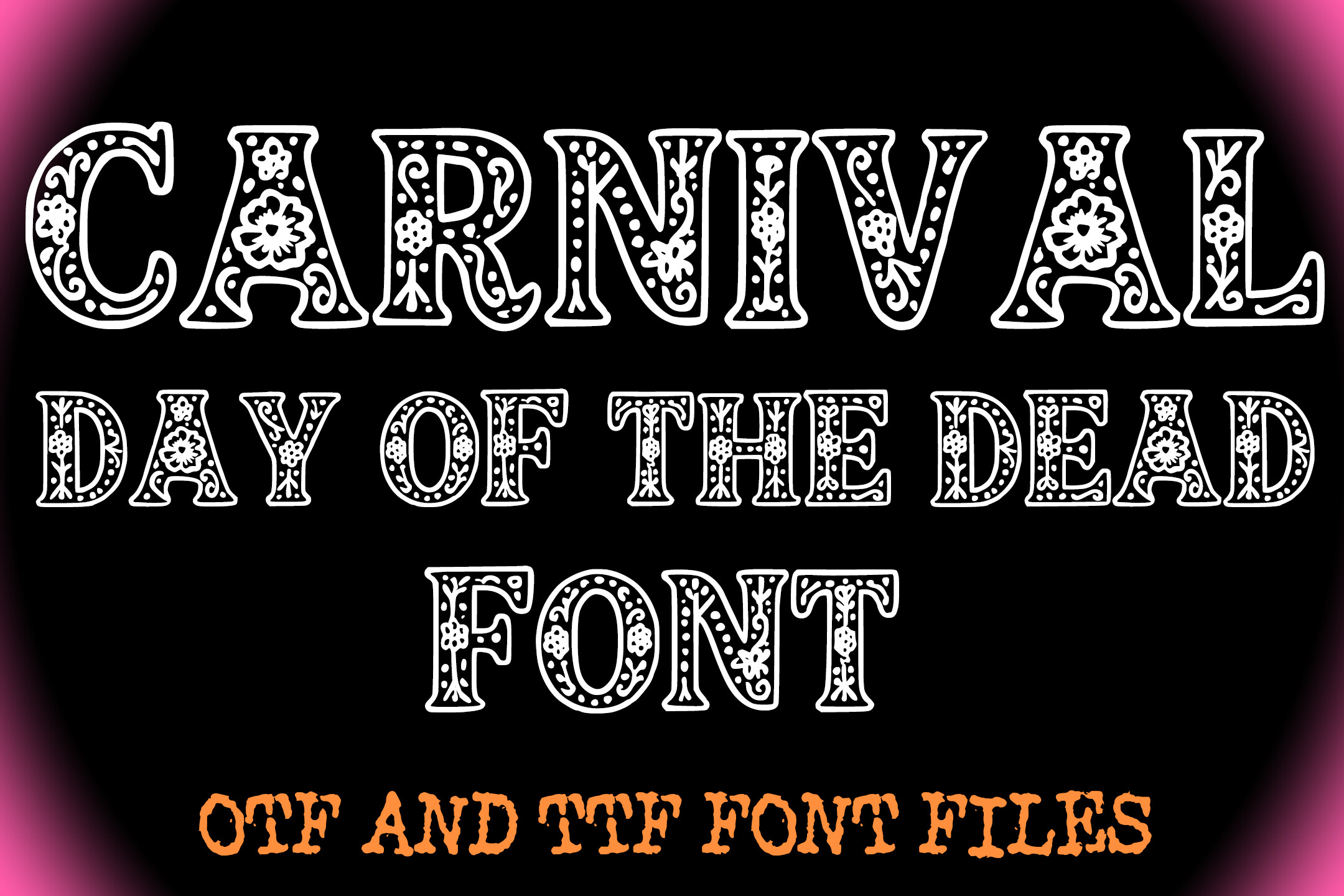
1. Carnival Day of the Dead Font
Carnival Day of the Dead Font is a festive display face for posters, event flyers, and banners. Its name suggests a lively, celebratory tone for party invitations and community event graphics.
Use it for a strong headline, then pair it with a simple sans serif for dates and locations.
Best for: posters, event flyers, banners. By: squeebcreative
Download Carnival Day of the Dead Font
2. Papel Picado
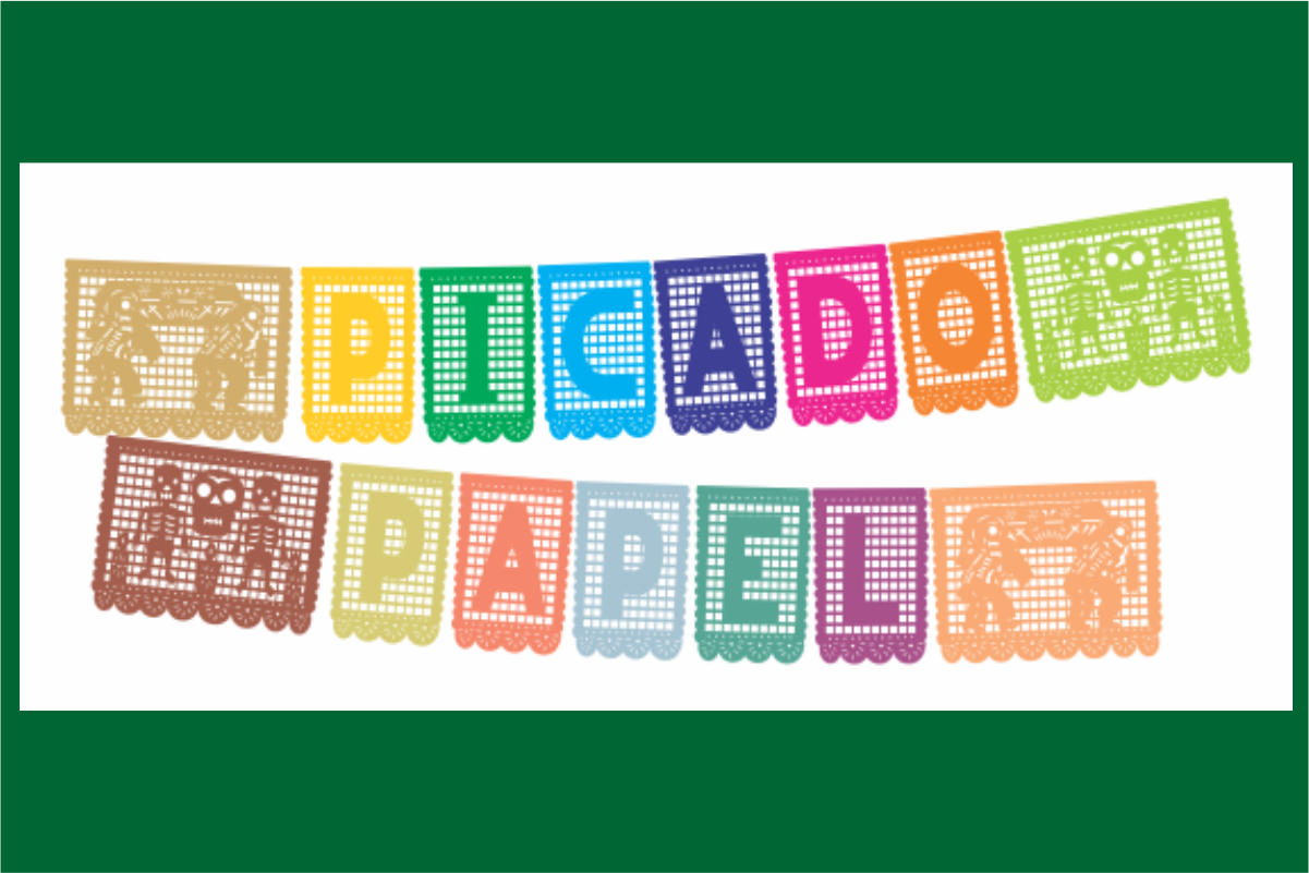
Papel Picado takes its name from the cut paper banners common in Dia de los Muertos celebrations. As a decorative lettering style, it can connect headings to the holiday’s visual language.
Use it for banner graphics, party signage, and invitation titles, then keep body text simple.
Best for: headings, banner graphics, party signage. By: Raul Andres Perez Canseco
3. Fiesta De Los Muertos
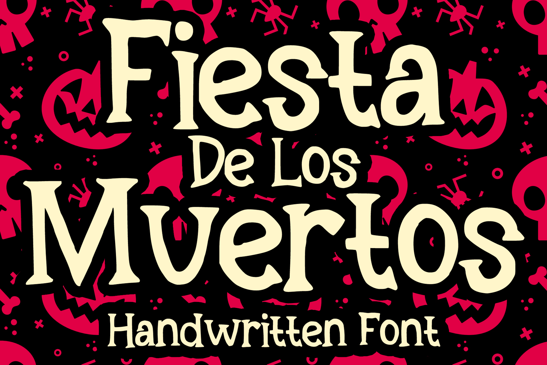
Fiesta De Los Muertos is a festive display option for celebration titles, invitations, and social graphics. The name points to a joyful, event driven mood.
Use it for the main headline or event name, then switch to a readable font for details.
Best for: invitations, event titles, social graphics. By: MVMET
Download Fiesta De Los Muertos
4. Bones of Muertos
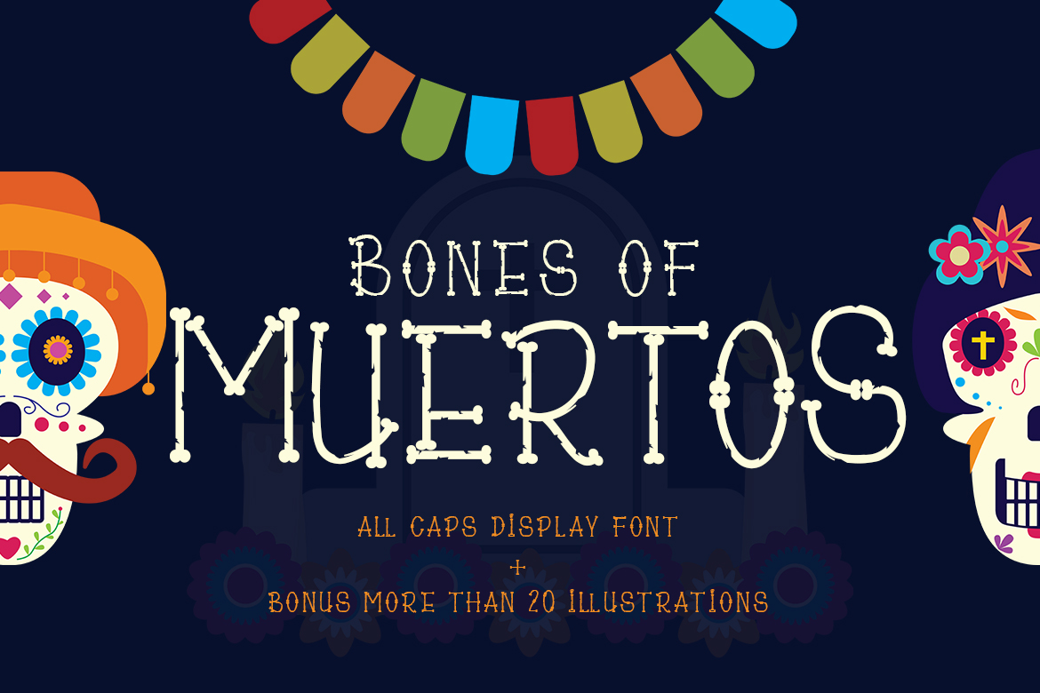
Bones of Muertos is a thematic display face for headlines, shirt graphics, and stickers. Its skeleton inspired look can feel playful and graphic with bright colors.
Use it for short, bold messages, and pair it with a clean text font for longer copy.
Best for: shirt graphics, headlines, stickers. By: Madatype Studio
5. Sonarisa La Fiesta
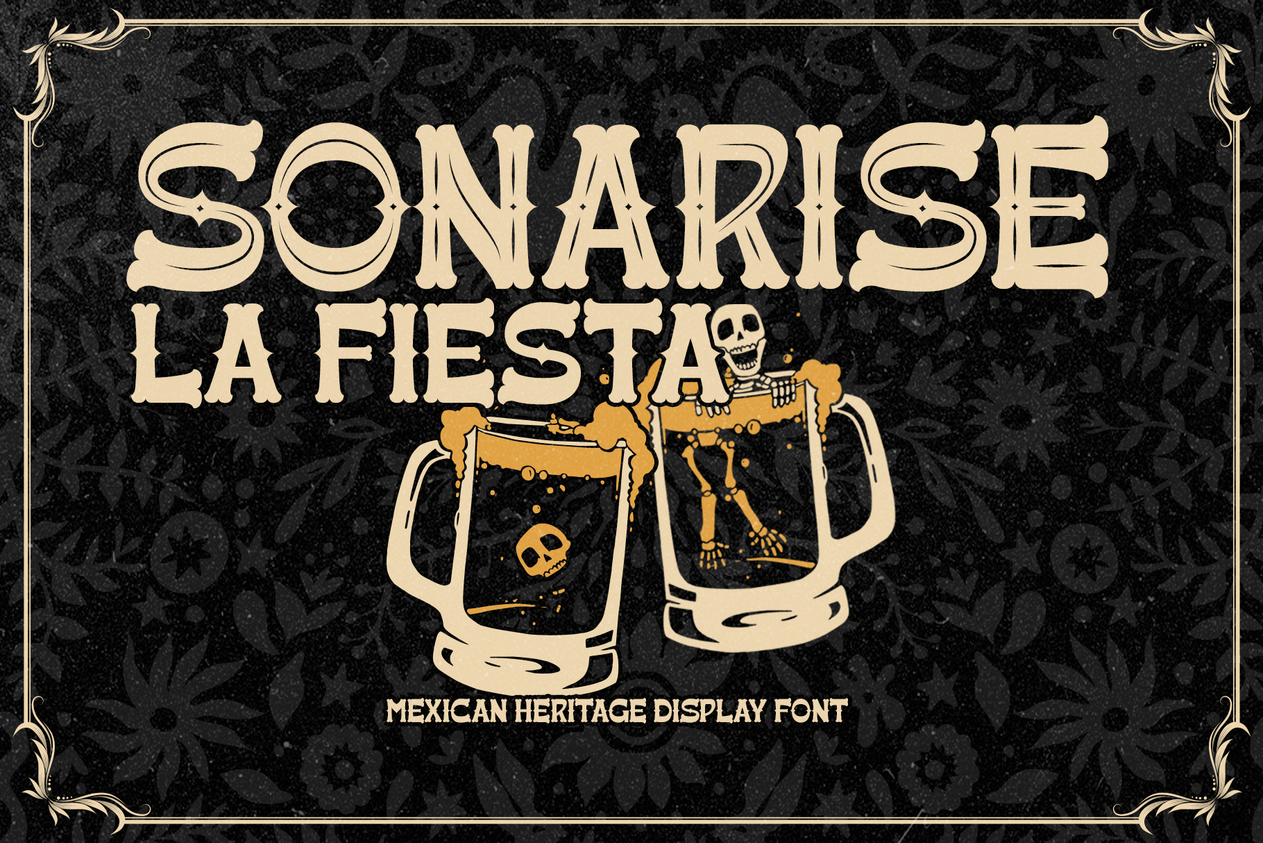
Sonarisa La Fiesta has a lively festival character that suits party invitations, greeting cards, and signage. The name points to a lively party mood.
Use it as a display option for invitations and signage, and keep supporting text simple.
Best for: party invitations, greeting cards, signage. By: Inviline
Best Script and Handwritten Fonts for Dia de los Muertos
Scripts and handwritten styles add a softer, more personal tone. They work well for names on ofrenda cards, short dedications, and invitation accents.
6. Muertos
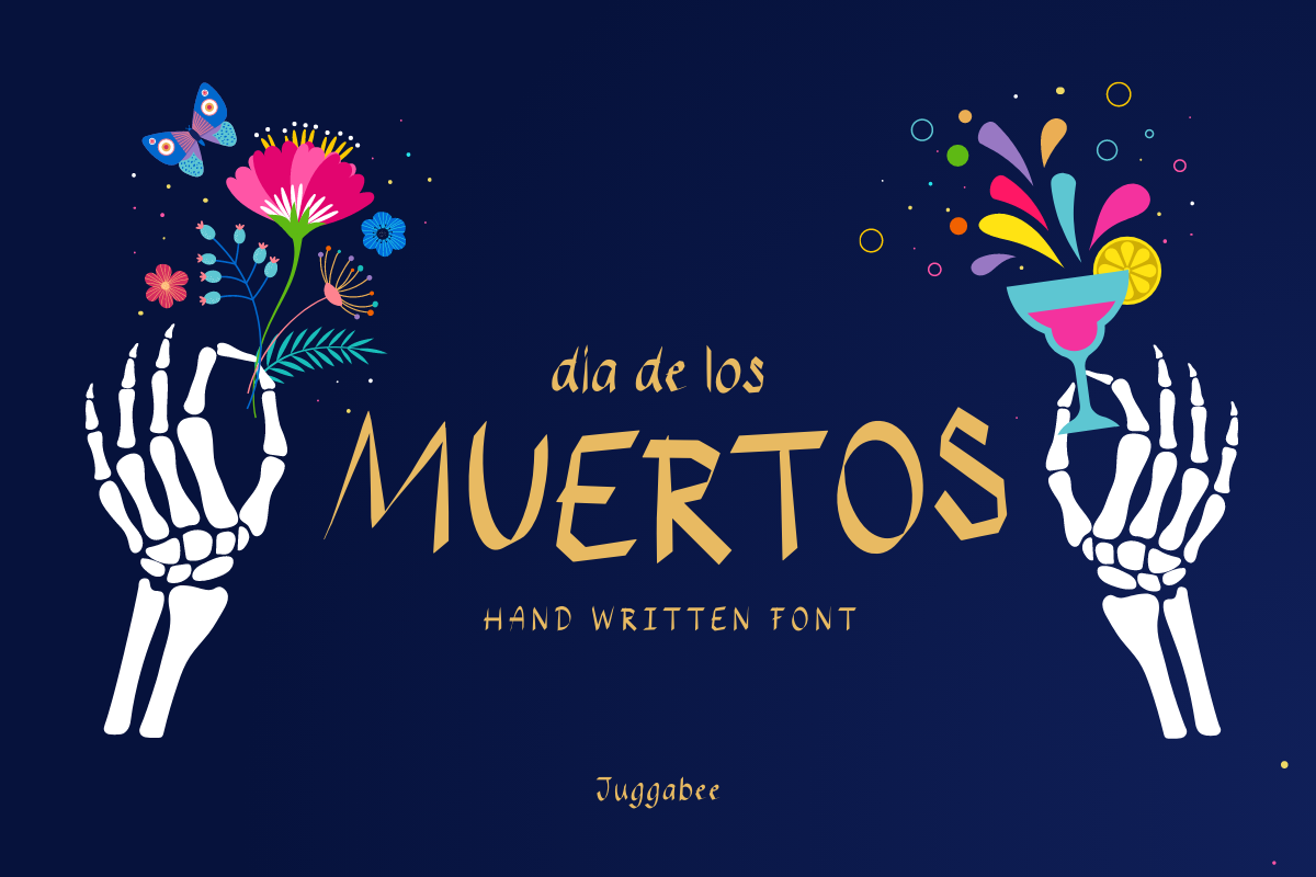
Muertos is an expressive script style for greeting cards, name labels, and quotes. Its script style suits short messages where tone matters.
Use it for names, dedications, or a single line of emphasis, and pair it with a simple text font.
Best for: greeting cards, name labels, quotes. By: Juggabee
7. Catrina Script
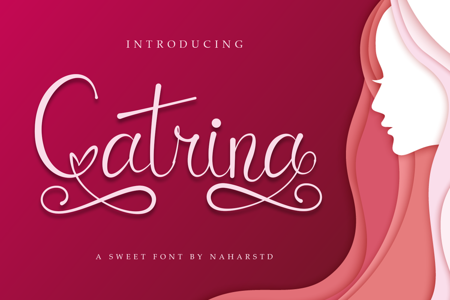
Catrina Script is a script style for invitations, signatures, and memorial cards. Its name suggests a script style, which can work as a quieter accent next to brighter display fonts.
Keep the text short and give the script space. A simple companion font can carry the details.
Best for: invitations, signatures, memorial cards. By: Naharstd
Best Sugar Skull and Illustrative Fonts for Dia de los Muertos
These sets lean more toward illustration and accents than paragraph text. They are useful for stickers, borders, shirt graphics, and themed icons. For longer copy, choose a clean readable font.
8. Day of the Dead
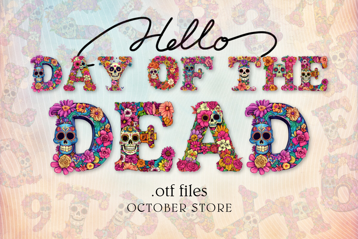
Day of the Dead is a decorative and illustrative option for stickers, printable decor, and themed graphics. Its name and preview suggest a holiday focused look.
Use it for short titles, accents, or decorative elements. Check the product page for included glyphs and license terms.
Best for: stickers, printable decor, themed graphics. By: october.store
9. Picado
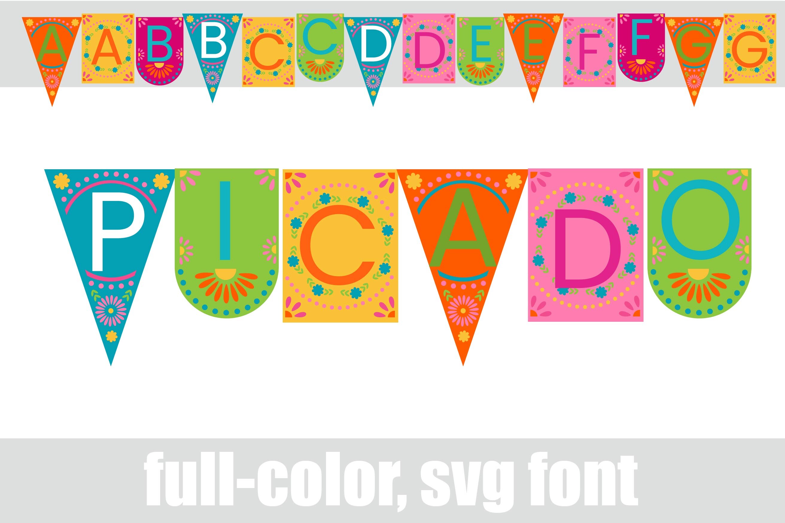
Picado is a decorative set whose name nods to papel picado. It can bring a cut paper feel to banner designs, party decor, and headings.
Use it as an accent for short text and graphic layouts, and pair it with a simple font for longer information.
Best for: banner designs, party decor, headings. By: Illustration Ink
10. Floral Skull
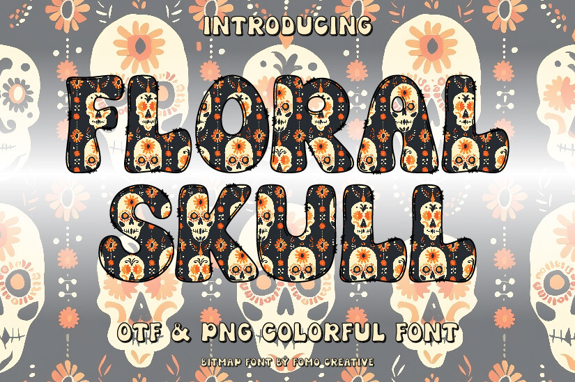
Floral Skull combines skull and flower motifs in a decorative, illustrative style. It can echo the marigold and calavera language of the holiday.
Use it for shirt prints, stickers, and invitation accents. Choose a clean companion font for body text.
Best for: shirt prints, stickers, invitation accents. By: Fomo Creative
11. Dia De Los Muertos
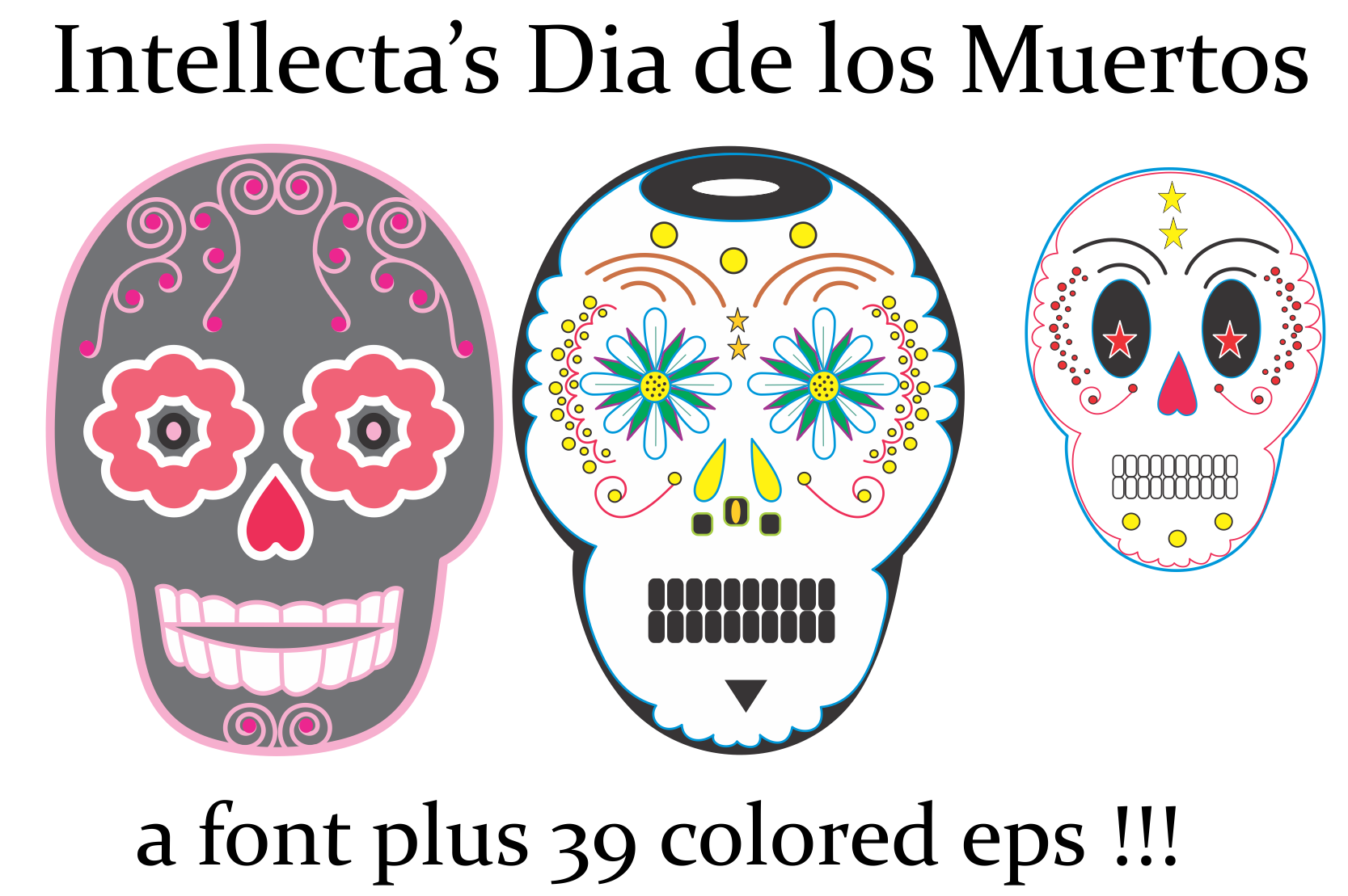
Dia De Los Muertos is a skull glyph decorative set, best used as an illustrative accent rather than a text font. It can add themed icons, borders, or small decorative moments.
Treat it like a dingbat collection: use it for emphasis, not long paragraphs. Check the product page for included symbols and license terms.
Best for: card accents, decorative borders, themed printables. By: Intellecta Design
12. La Catrina Sugar Skull
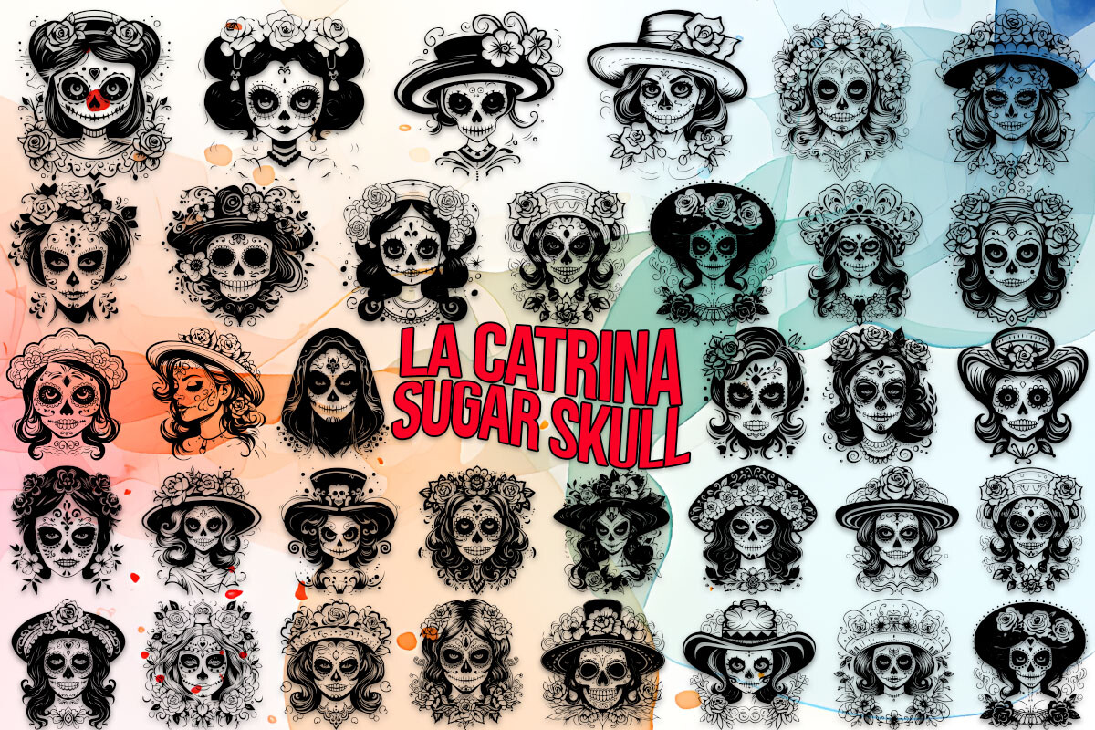
La Catrina Sugar Skull is a sugar skull glyph decorative set for accents, prints, and craft projects. It is designed for illustrative use, not long blocks of text.
Use it for shirt graphics, stickers, and themed decorations. Pair it with a simple readable font for names, dates, or instructions.
Best for: shirt graphics, stickers, craft projects. By: MOMAT THIRTYONE
Download La Catrina Sugar Skull
How to Use Dia de los Muertos Fonts in Your Projects
For dia de los muertos invitations, start with a decorative display font for the event title and a simple readable font for details. A script can carry names or a short dedication. So what fonts work best for Day of the Dead invitations? Usually, one expressive headline plus one clear body font, with a script for a personal line if you like.
For ofrenda printables, keep the tone gentle. Name cards, photo captions, labels, and small altar signs often benefit from a soft script or clean serif. Avoid overly loud display faces for personal names. A name is not a headline.
For tees and hoodies, strong contrast matters. Thick strokes and bold shapes tend to print more cleanly than fine details. A sugar skull font or skull dingbat set can work as an accent beside a bold headline. If the design will be screen printed, test it at the actual size first.
For Cricut and Silhouette projects, simplify fine detail before cutting. Thicker lines usually cut more cleanly, and a preview step can save time. Day of the dead SVG and Cricut fonts should be installed or imported according to your machine software, so check the product page for supported formats and programs.
In Canva, custom font upload is commonly tied to paid plans, but availability can change. Confirm the current feature in your account before planning a whole project around it.
For school and classroom projects, use the fonts to teach about visual motifs, color, and typography. Pair a display font with a readable one, and add context about the holiday. For social posts, keep the layout simple and let one decorative element carry the theme.
How to Pair Fonts for Dia de los Muertos Designs
A safe pairing rule is one decorative font plus one plain text font. You can add a script for names, but keep the total to two or three families.
A festival display font works well with a clean sans serif or readable serif. A script works well with a neutral text font for dates and details. Skull dingbat fonts should stay in the accent role.
When in doubt, type your actual text into the preview. A name, date, and short line will reveal more than a sample alphabet. For invitations, the display font can carry the event name, the script can carry a personal line, and the body font can carry logistics.
Tips for Choosing and Licensing the Right Font
Before downloading, read the license on the product page. Personal and commercial use can differ by product, and terms may vary by font, designer, or bundle. If you are making shirts, stickers, or printables for sale on Etsy or another marketplace, check whether the license covers commercial use before you buy.
If you are wondering whether you can use sugar skull fonts on shirts you sell, the answer depends on the specific license. Do not assume that a decorative font is automatically cleared for merchandise.
Also check compatibility. Look for supported programs, included glyphs, and notes about use in Canva, Illustrator, Cricut Design Space, or other tools. Type the exact text you plan to use, then check readability at small sizes and on your intended background. A font that looks great large can fall apart small.
Finally, keep the presentation thoughtful. Add context when selling or publishing work, credit creators when appropriate, and support Mexican and Mexican American designers whenever possible. When in doubt, ask the seller or designer for clarification before purchasing.
Where to Download Dia de los Muertos Fonts
The fonts in this guide are available on Creative Fabrica, where you can preview the style, check the product page, and download the files you need. Other resources such as Google Fonts, DaFont, and Font Squirrel have different categories and licensing models, so compare terms before commercial use.
If you are building a Dia de los Muertos kit, save your display font, script, and body font in one folder. A consistent folder makes it easier to reuse your palette, fonts, and motifs across a project. For more font guides, pairing ideas, and craft project inspiration, visit the FontPro blog.