· fonts · 13 min read
26 Best Dripping Fonts for Posters, Merch, and Bold Designs in 2026
A hand-picked roundup of dripping fonts, from graffiti paint drips to slime, candy, and melting styles, with practical tips for posters, merch, and album art.
Dripping fonts are display typefaces with paint, ink, slime, or melted material running down the letters. They add movement, drama, and a little edge to posters, album covers, T-shirts, stickers, and social graphics. Instead of a dripping font generator, a real drip font gives you editable text you can resize, recolor, and pair with other type. This list rounds up the best dripping fonts across four styles: paint and graffiti drips, bold and playful drips, slime and liquid drips, and melting, frost, and sweet drips.
What Makes a Great Dripping Font?
Start with the drop shape. Short, neat drops keep letters clean and readable. Long, heavy runs look more dramatic, but they eat into line spacing and can swallow the counters of letters like a, e, and g. If your headline has two lines, long drips from the top line will collide with the second line, so you will need extra leading or a shorter drop.
Stroke weight matters next. Drips hang off the letterforms, so dense, bold letters carry them better than thin ones. A light typeface with a long drip often looks like the letter is breaking apart instead of oozing.
Then test the whole word, not single letters. A drip font can look perfect on an “A” and fall apart on “RIP” or “SLIME”. Type your actual headline, one to three words, and check it at the size you plan to use. Zoom out, squint, and make sure the eye still reads the word as a unit.
Finally, remember that the drip sets the mood. A dirty graffiti drip says street and attitude. A candy drip says sweet and playful. An icy melt says cold and crisp. A toxic slime drip says spooky and gross. The right dripping font is the one whose mood matches your project, not just the one with the longest drops.
Paint, Ink and Graffiti Drips
Paint and graffiti drips are the classic dripping text effect. They read as wet ink, spray paint, or fresh color running down a wall. These styles suit streetwear, music posters, and anything that needs attitude.
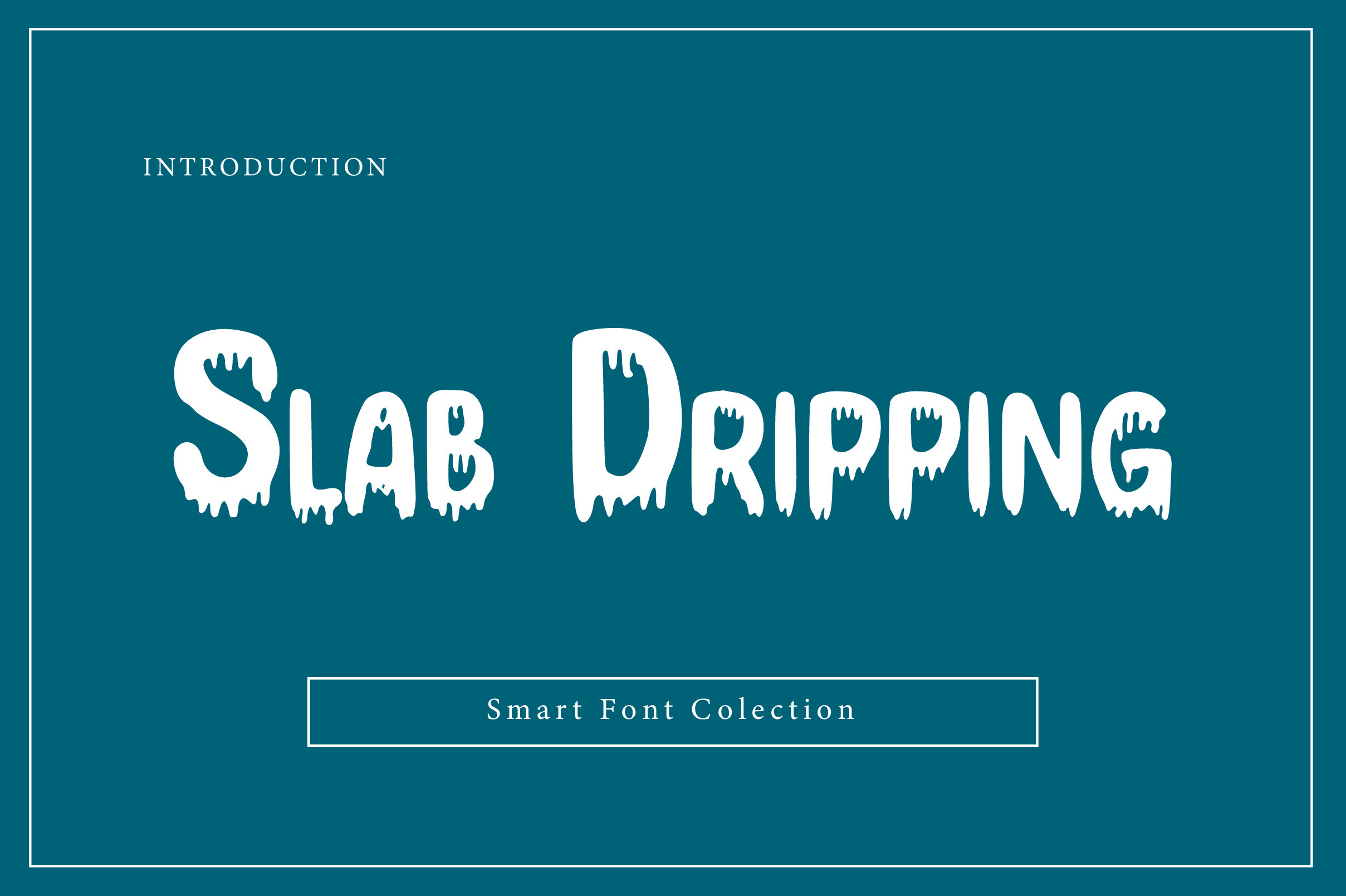
1. Slab Dripping
Dense slab letters carry the drips with real weight, so the drops feel like thick paint rather than a thin outline. The blocky base keeps the word readable even when the runs get long.
Best for: posters, album art, bold headlines. By: Wow Magic
2. Graffiti Dripping
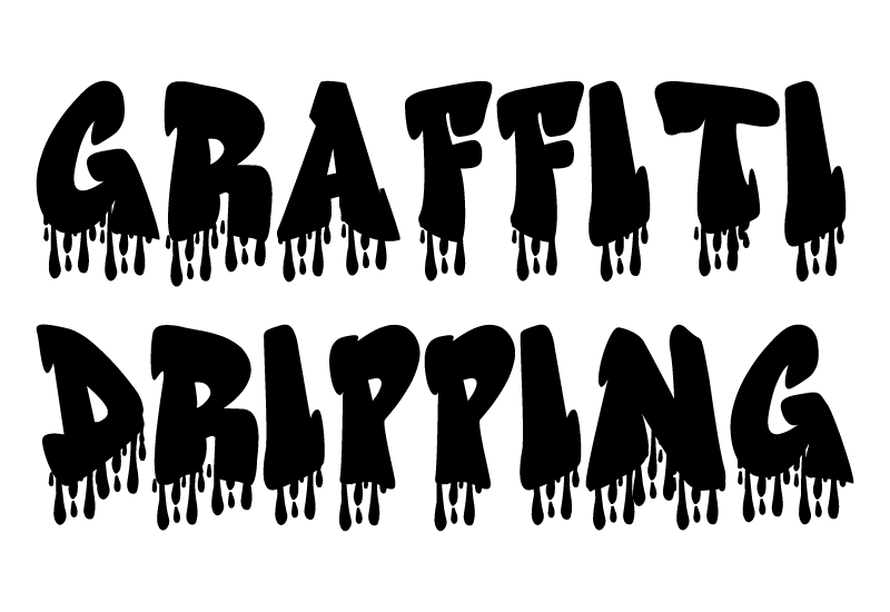
This one leans into the street. The letterforms feel hand tagged, and the drips hang like wet spray paint on a wall. It is a solid pick when you want a graffiti drip font with real edge.
Best for: streetwear tees, event posters, music covers. By: GraphicsNinja
3. Drippy Paint
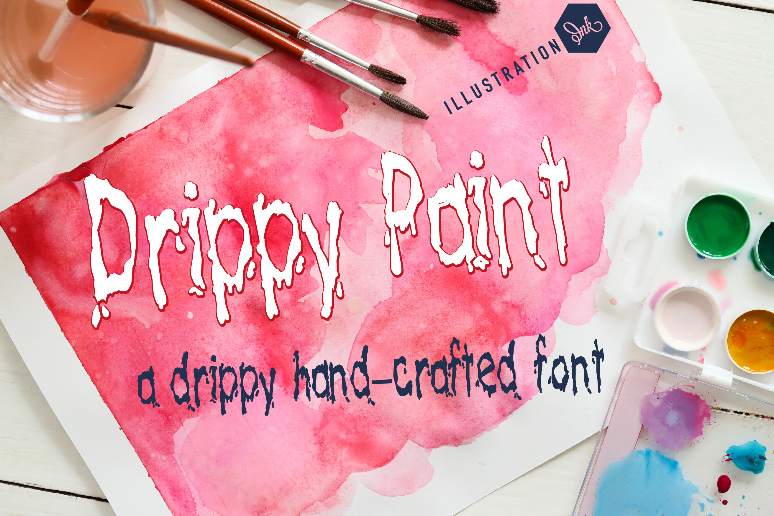
The effect here is fresh paint, still wet and moving. Drips run clean off the letterforms without turning the word into a mess. It works well when you want a paint drip font that stays legible.
Best for: posters, stickers, bold social graphics. By: Illustration Ink
4. Outlined Dripping
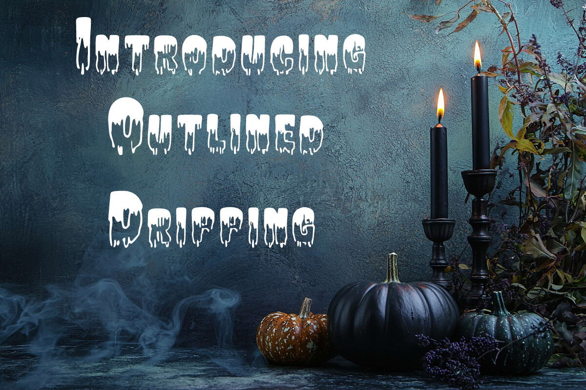
The outlined style gives you a clean shape you can fill with color or texture. The name points to an outline-based drip look, which suits color fills and texture overlays.
Best for: logos, color fills, display headlines. By: Heidi Vargas-Smith
5. Dripping
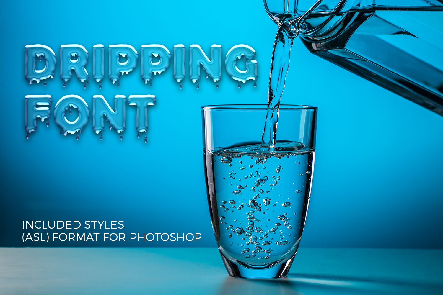
A straightforward classic. The drops are even and controlled, so the word reads clearly from a distance. It is the safe choice when you want a dripping look without extra chaos.
Best for: posters, album art, simple headlines. By: OWPictures
6. Melting Graffiti
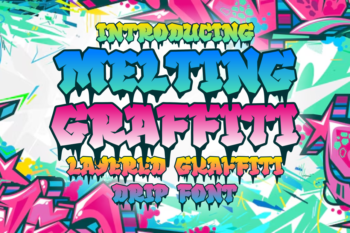
This blends street tagging with a slow melt, so the letters look like they are sliding down the wall. The mood is gritty and loose. It suits projects that want graffiti energy with a softer, gooier finish.
Best for: music covers, streetwear, edgy posters. By: putracetol
7. Crazy Drip
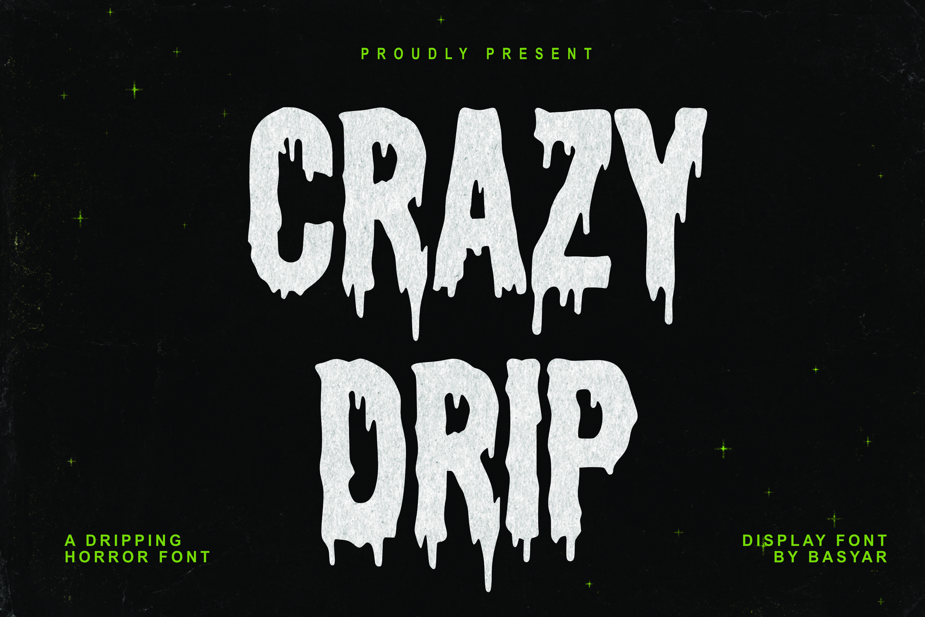
The drips here are long, heavy, and a little unpredictable. That gives the word a lot of energy and movement. Use it when you want the headline to feel loud and chaotic.
Best for: bold posters, event flyers, street graphics. By: basyar
8. Dripping Drops
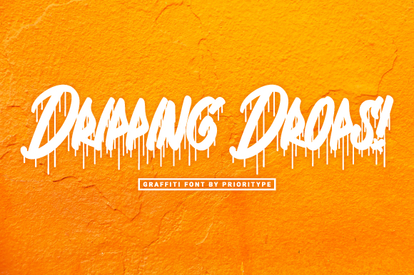
The drops act as a separate accent, falling away from the letters instead of merging into them. That keeps the core word clean and readable. A nice option when you want drips as a detail, not the whole story.
Best for: stickers, social posts, playful headlines. By: Prioritype
Bold, Chunky and Playful Drips
Bold, chunky, and playful drips trade grit for softness. The letters are round, plump, and friendly, so the drips read as candy, slime, or cream instead of paint. These are the dripping fonts for T-shirts and kids projects.
9. Plump Drip
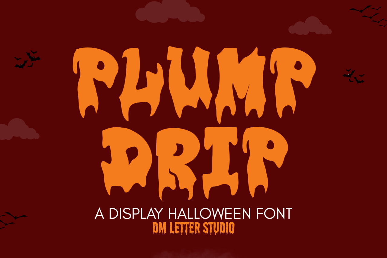
The letters are round and full, so the drips look like they are oozing off a soft surface. The mood is friendly and a little silly. It fits projects that want warmth over edge.
Best for: kids party invites, cute merch, playful logos. By: Sharon (DmStudio)
10. Chubby Drip
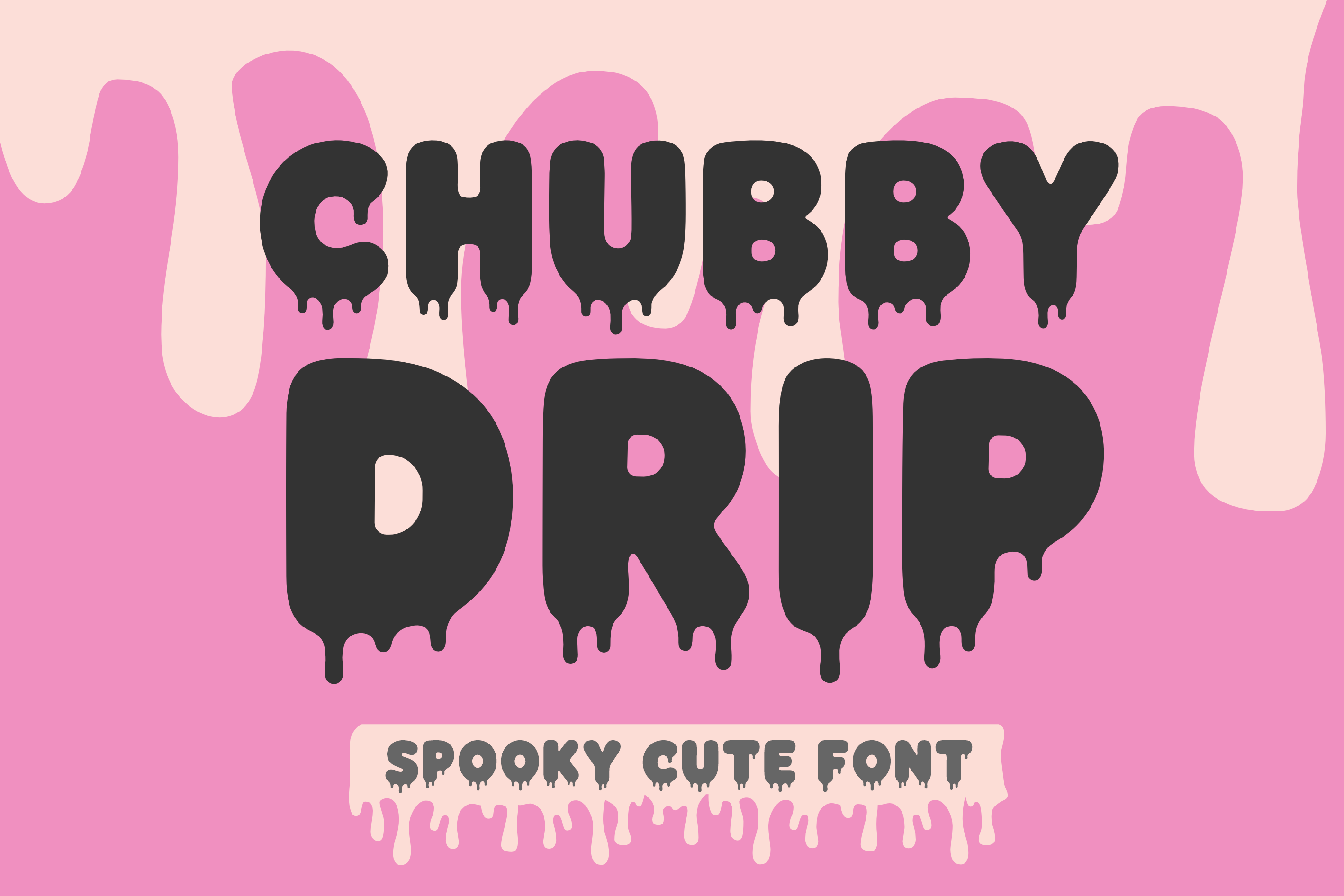
Heavy, friendly letters carry soft drips that stay neat. The chunky shapes suggest a sturdy base for the drips. A good pick when you want chunk without losing clarity.
Best for: T-shirts, stickers, bold headlines. By: wtl.typography
11. Squishy Drips
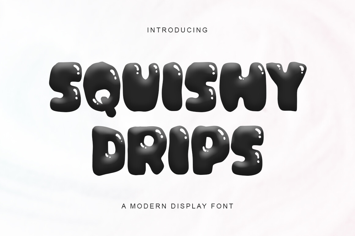
The look is soft and squishy, like the letters were just squeezed. Drips hang in a relaxed, playful way. It suits projects that want a cute, approachable dripping text effect.
Best for: cute merch, kids graphics, social posts. By: Pretty Glyphs
12. Dripbop
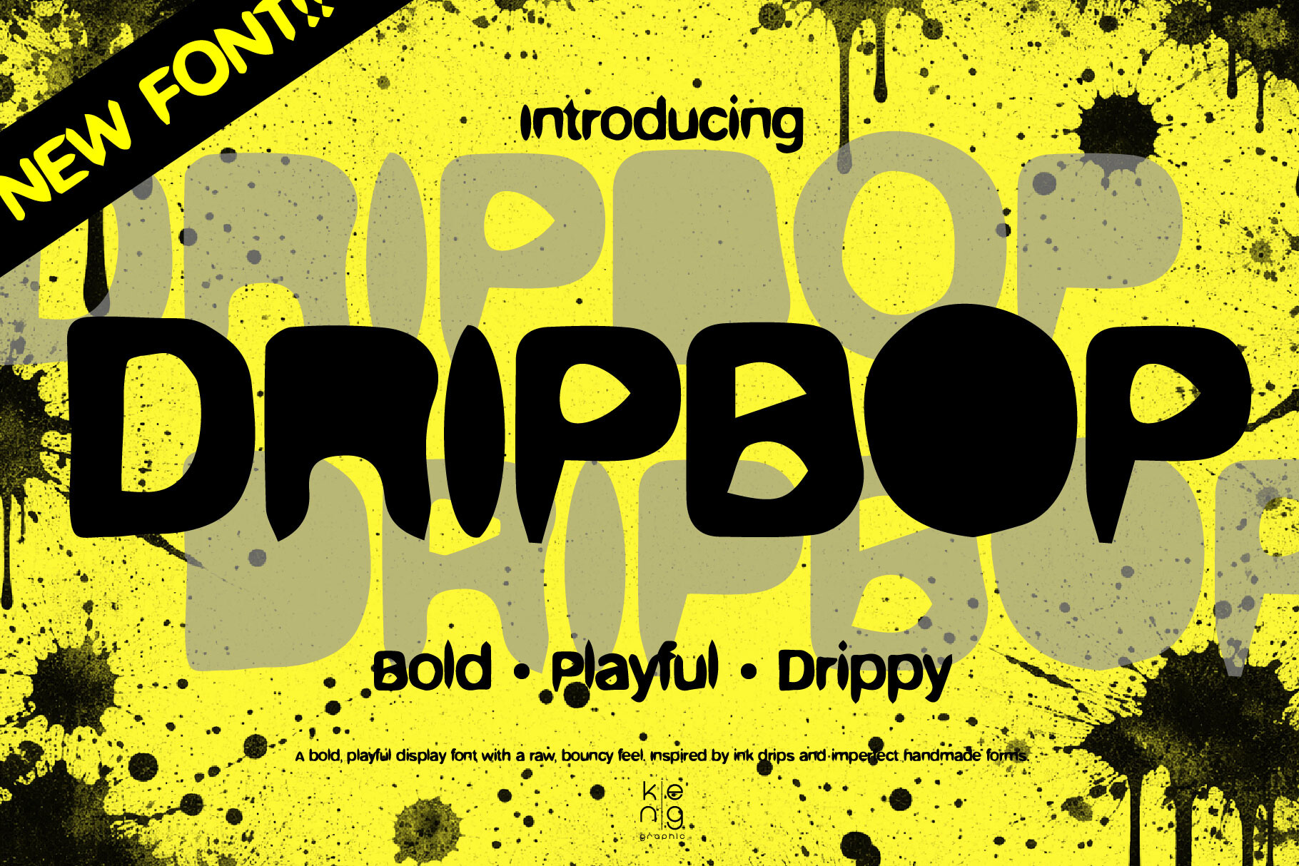
This one has a pop feel. The drips are bouncy and the letters stay bold, so the word feels fun and energetic. It works well for bright, casual projects.
Best for: social graphics, playful posters, casual branding. By: keng graphic
13. Drippy!
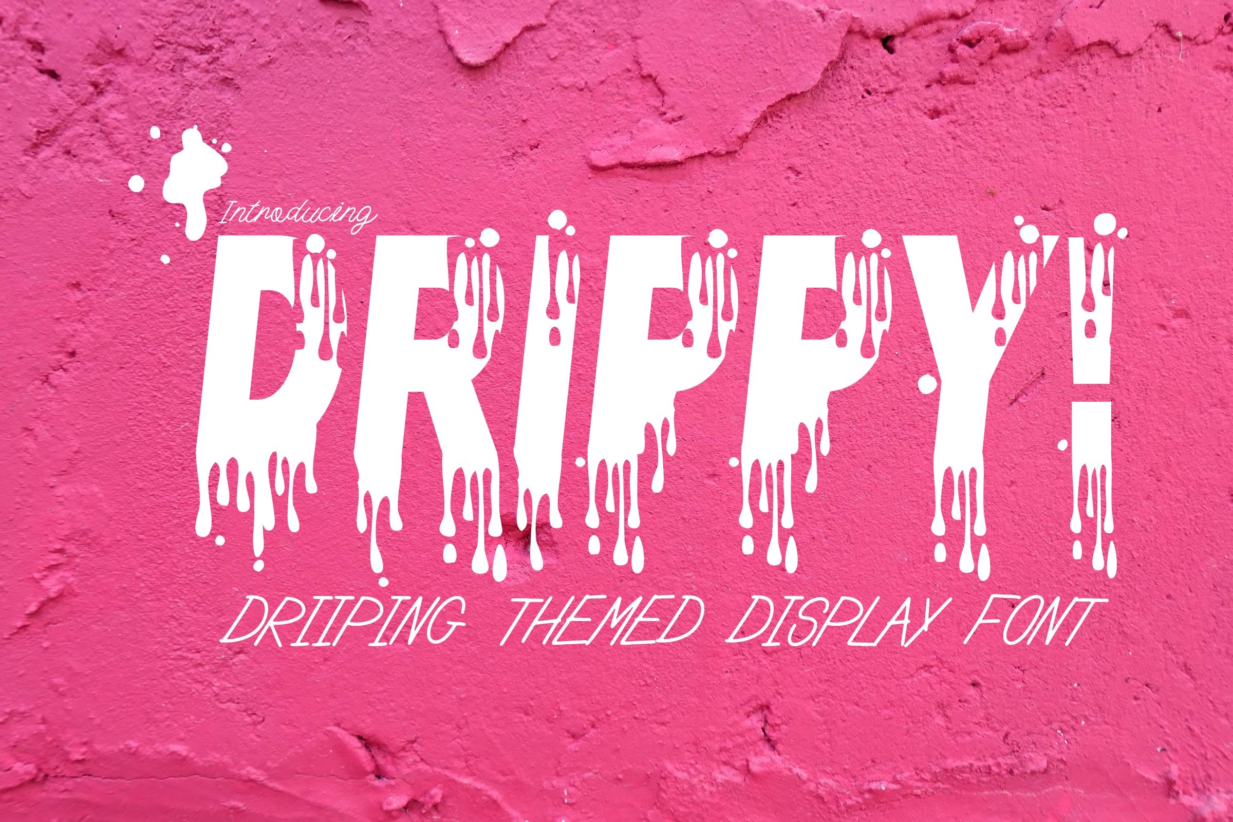
Bold and playful, with drips that add energy without cluttering the word. The letters stay strong, so the effect reads clearly at a glance. A good choice when you want fun with a solid base.
Best for: posters, merch, fun headlines. By: KtwoP
14. Milky Drip
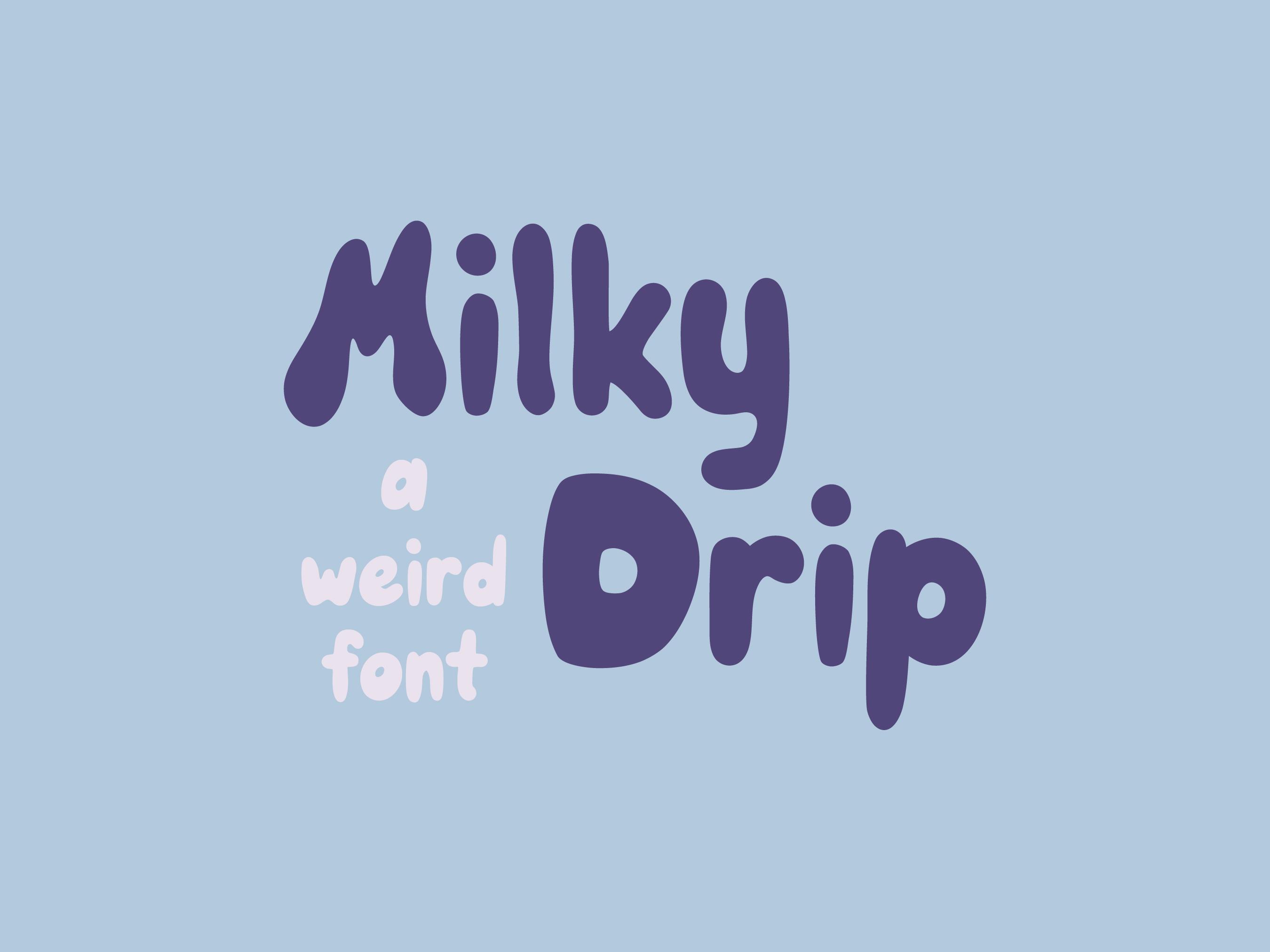
The mood here is smooth and creamy, like milk or cream running down the letters. The drips are soft and even. It suits sweet, gentle projects that want a calm dripping look.
Best for: dessert branding, soft posters, cute logos. By: noonsun
15. Rainbow Dripping
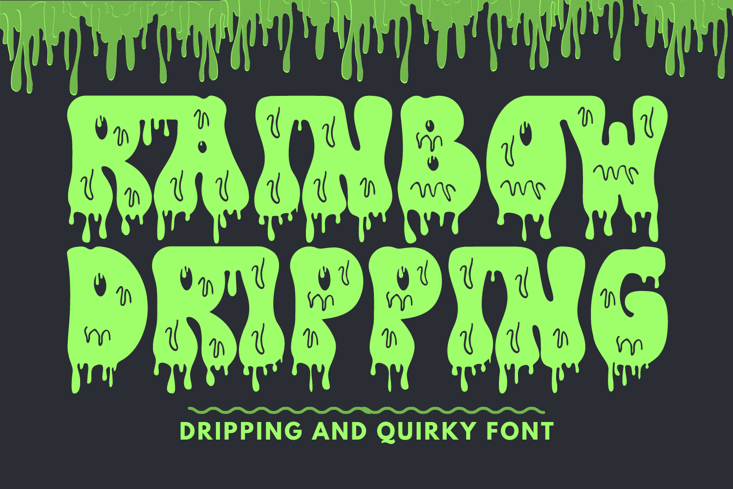
The name and preview point to a bright, cheerful mood. The drips add movement to a display style that feels festive and fun. A good fit for colorful projects that want energy.
Best for: party graphics, colorful posters, playful branding. By: 177Studio
Slime, Goo and Liquid Drips
Slime, goo, and liquid drips go full texture. The letters look wet, sticky, and ready to ooze. These slime fonts and gooey fonts are great for Halloween, horror, and anything that wants a gross, dripping feel.
16. Dripping Slime
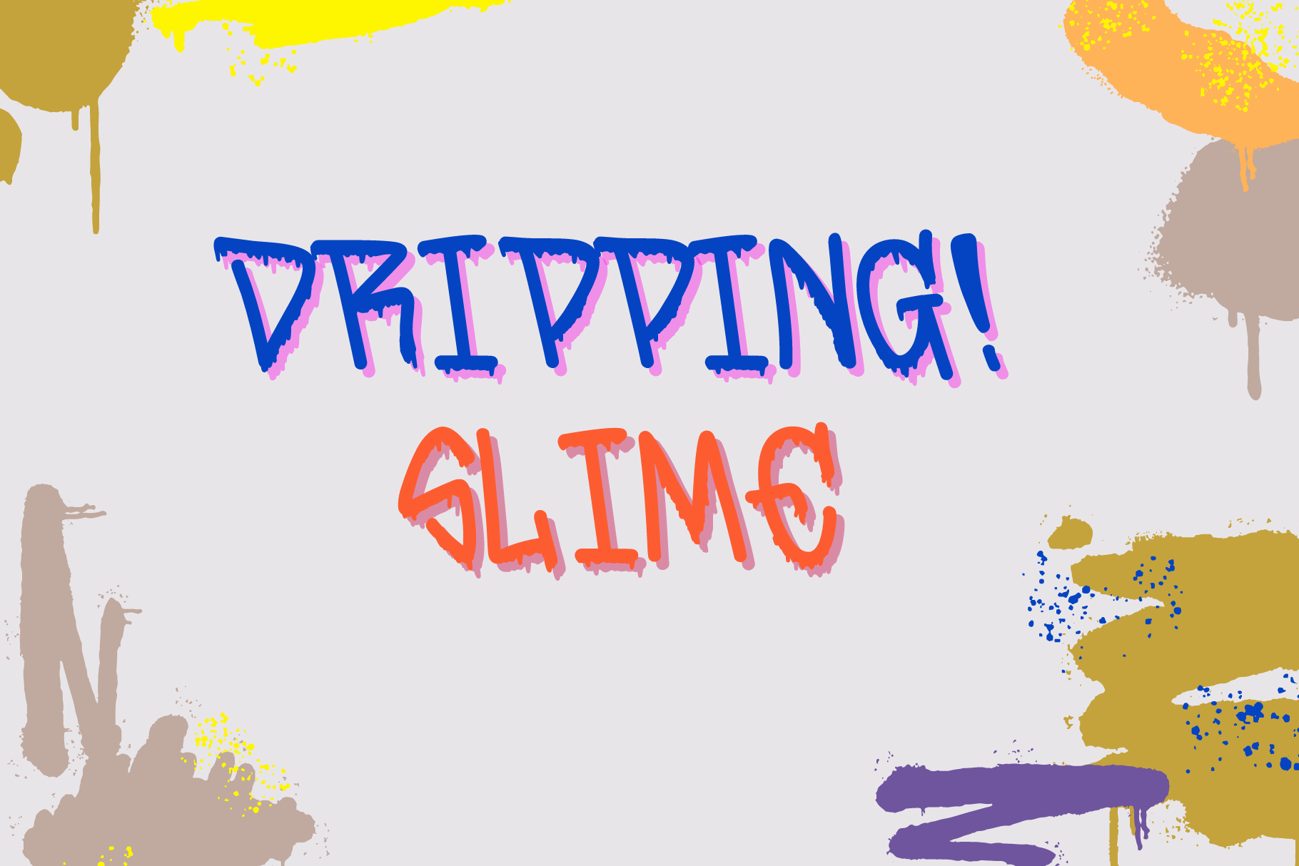
The letters look like thick slime, heavy and sticky. The drips are long and the mood is toxic and fun. A strong pick for Halloween dripping fonts and spooky graphics.
Best for: Halloween posters, horror covers, slime themed merch. By: nstudio design
17. Melt Drop
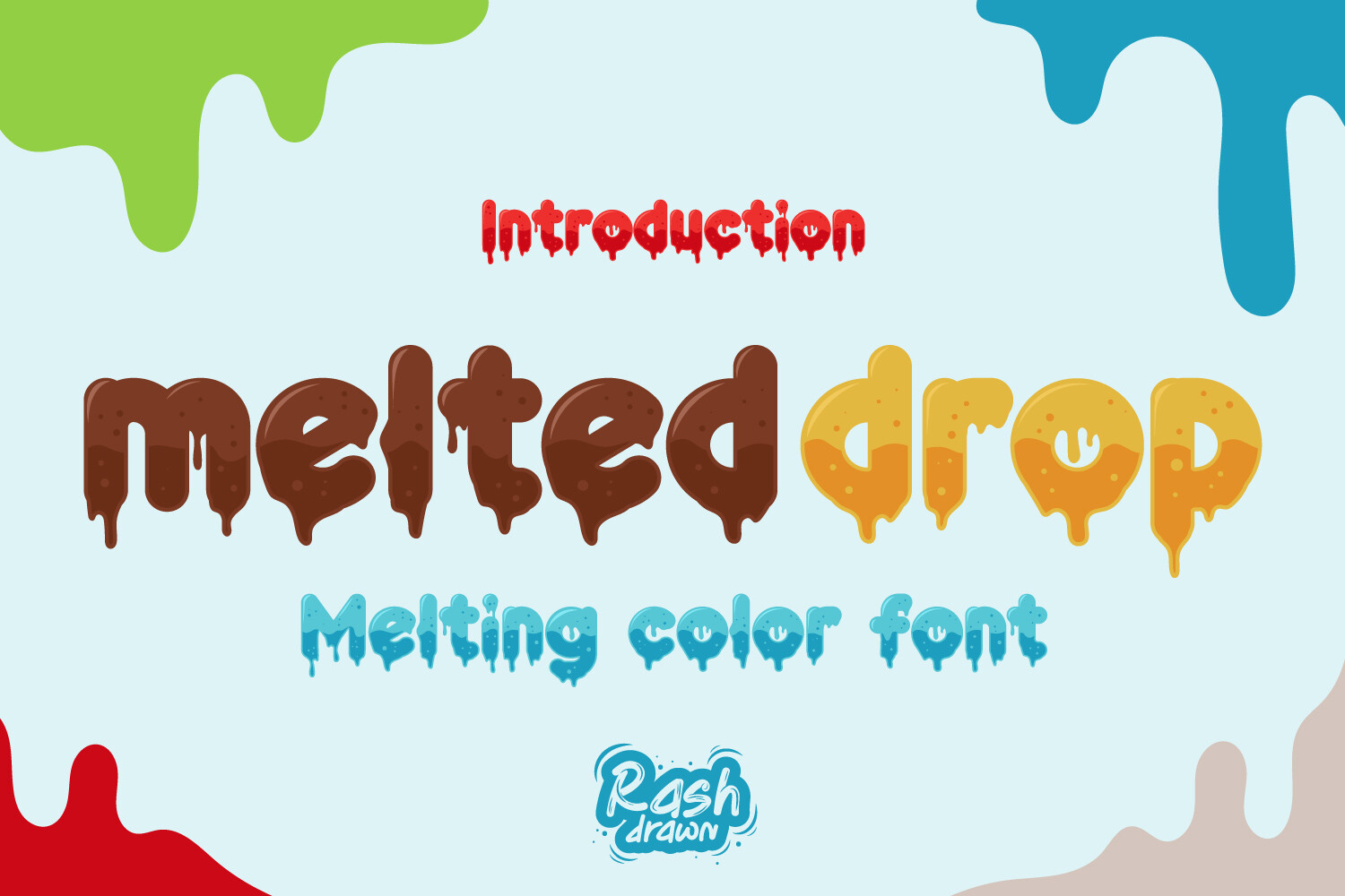
This blends a slow melt with a clean drop. The letters look like they are softening and sliding, but the word stays readable. It suits projects that want a liquid feel without full chaos.
Best for: posters, album art, liquid themed graphics. By: Rashdrawn
18. Drip Haus
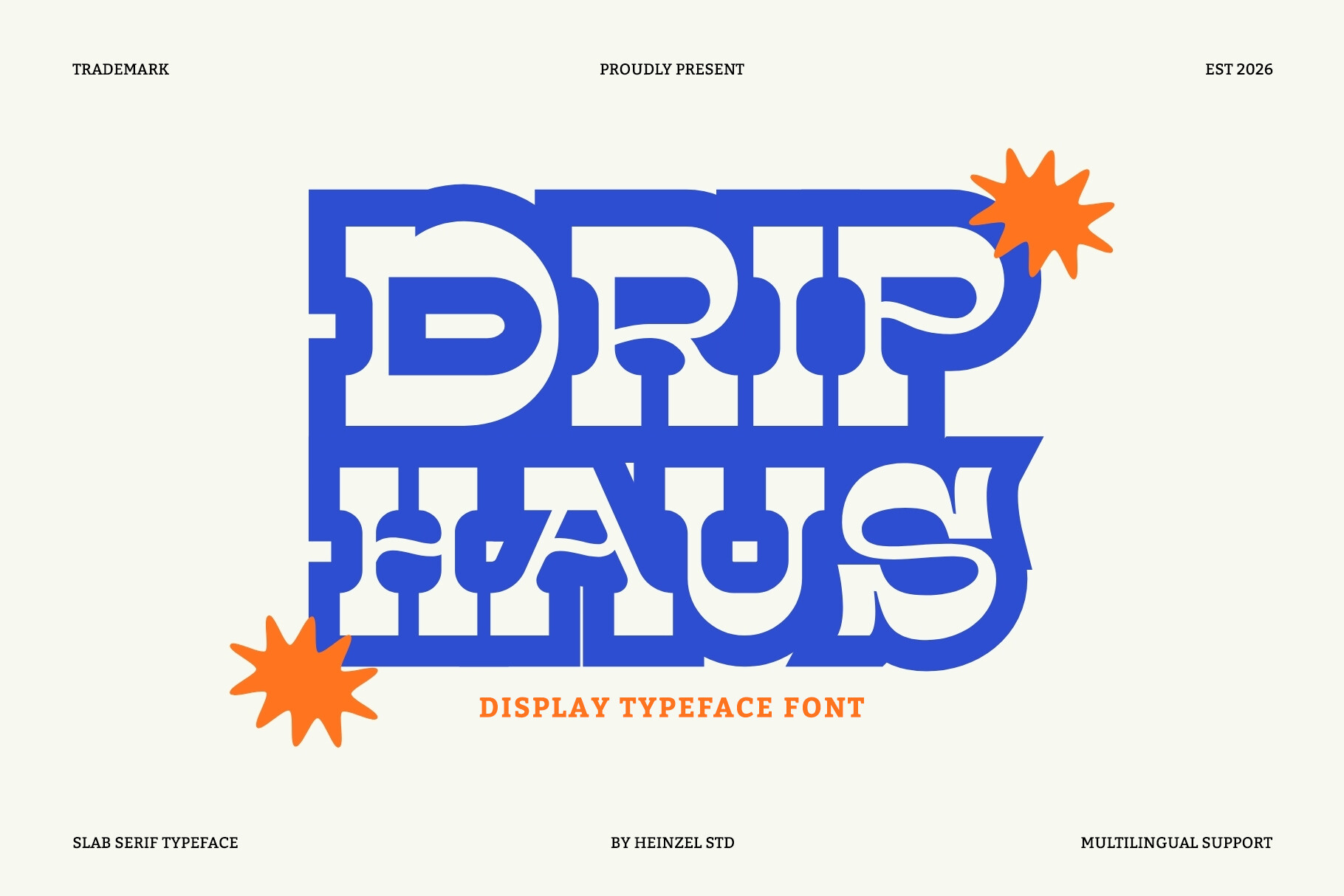
A display style built for headlines. The name and preview suggest a structured, headline-friendly look. It works when you want a dripping look that still feels structured and clean.
Best for: bold headlines, posters, event flyers. By: Heinzel Std
19. Water Drip
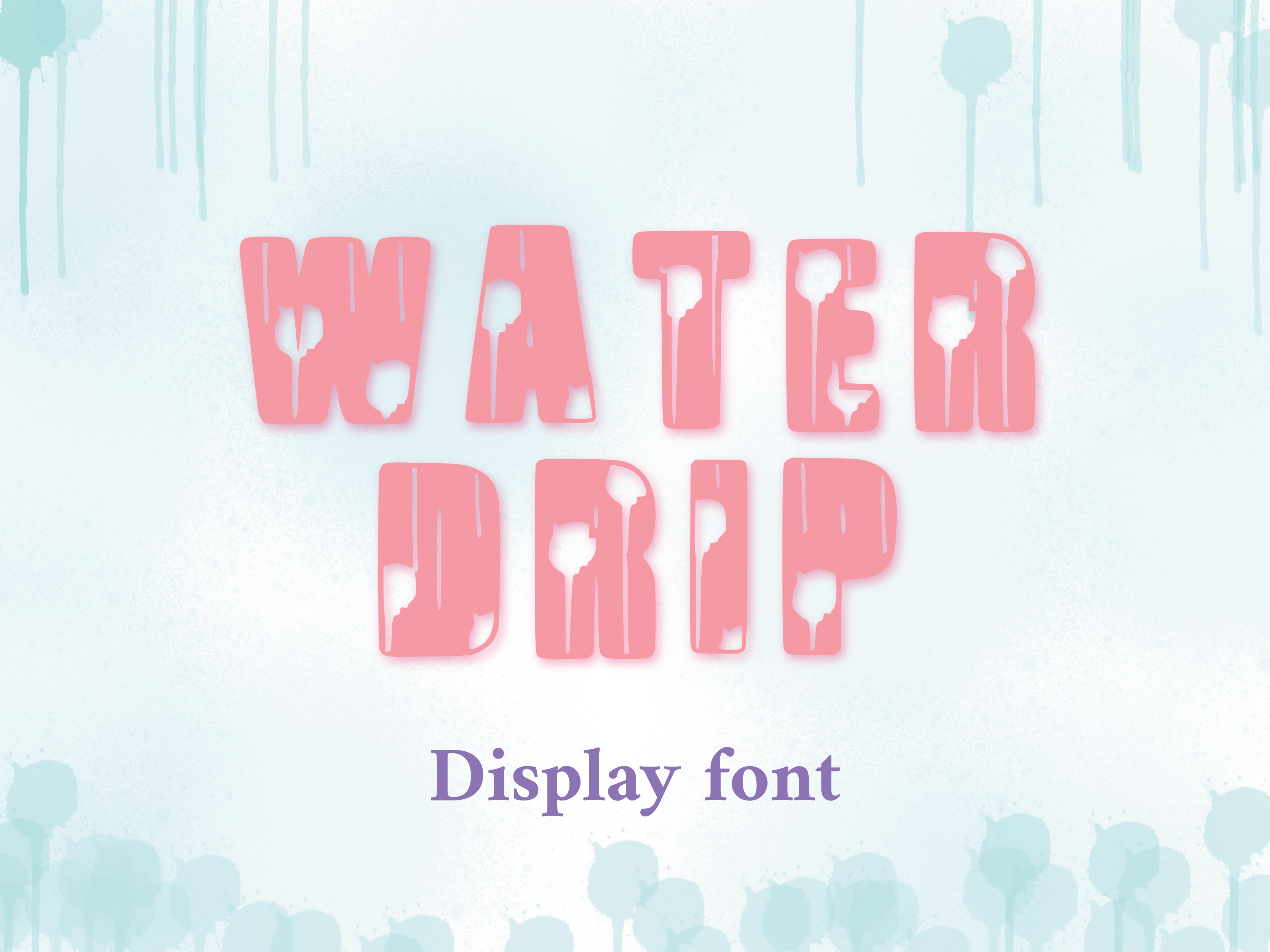
The drips here read as water, clean and fresh. The mood is light and clear, which sets it apart from the heavier slime and paint styles. A nice option for fresh, simple projects.
Best for: clean posters, fresh branding, simple headlines. By: Happy Bamboo
20. Drip Drop
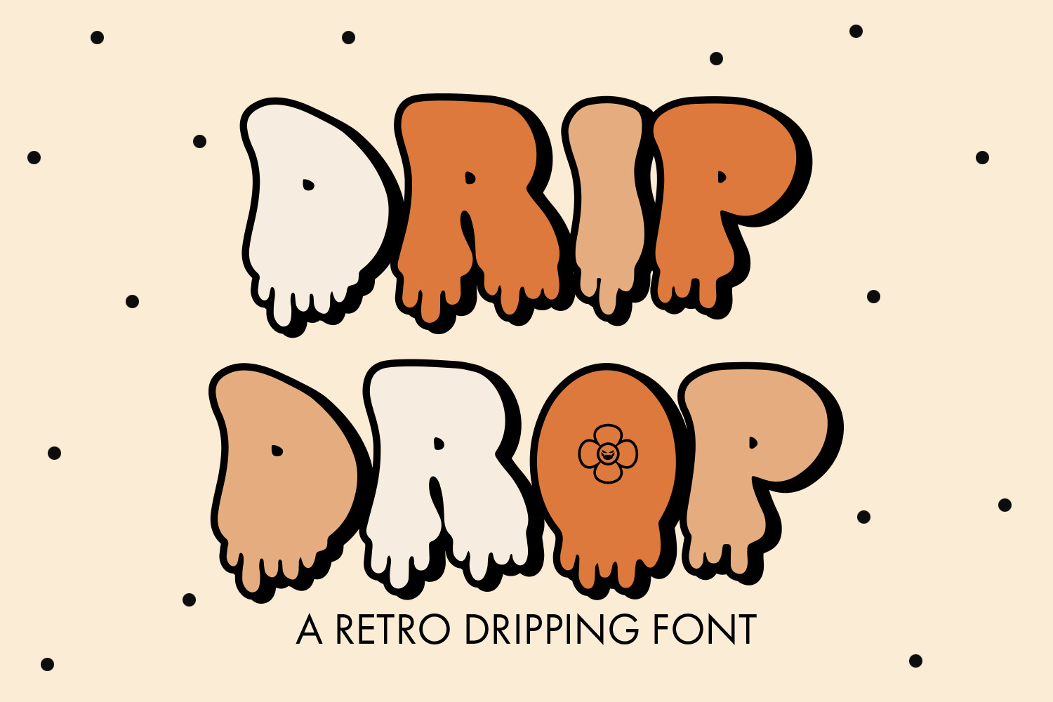
Simple falling drips keep the word clean and easy to read. The effect looks light. A good choice when you want drips as a subtle detail.
Best for: stickers, social posts, light headlines. By: freelingdesignhouse
Melting, Frost and Sweet Drips
Melting, frost, and sweet drips cover the rest of the mood range. Letters look like they are thawing, freezing, or covered in candy. These styles fit desserts, winter themes, and playful branding.
21. Dripping Melting
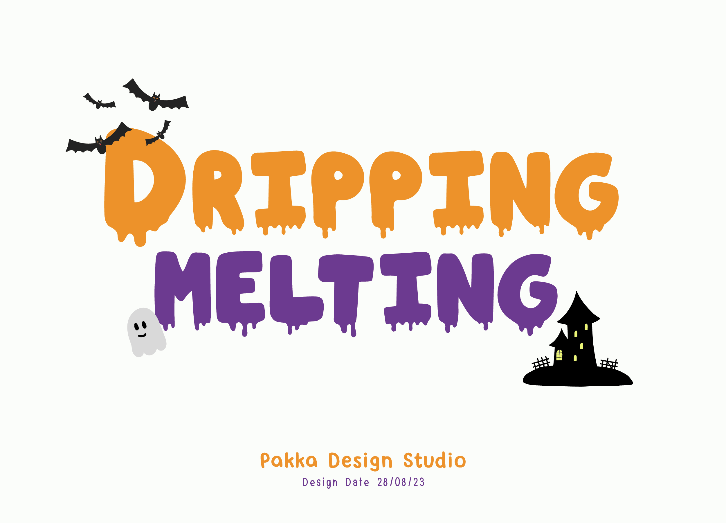
The letters look like they are slowly melting, with drips that follow the soft edges. The mood is warm and a little messy. It suits projects that want a melting fonts look with clear letterforms.
Best for: posters, album art, warm themed graphics. By: Pakka Design Studio
22. Super Melting
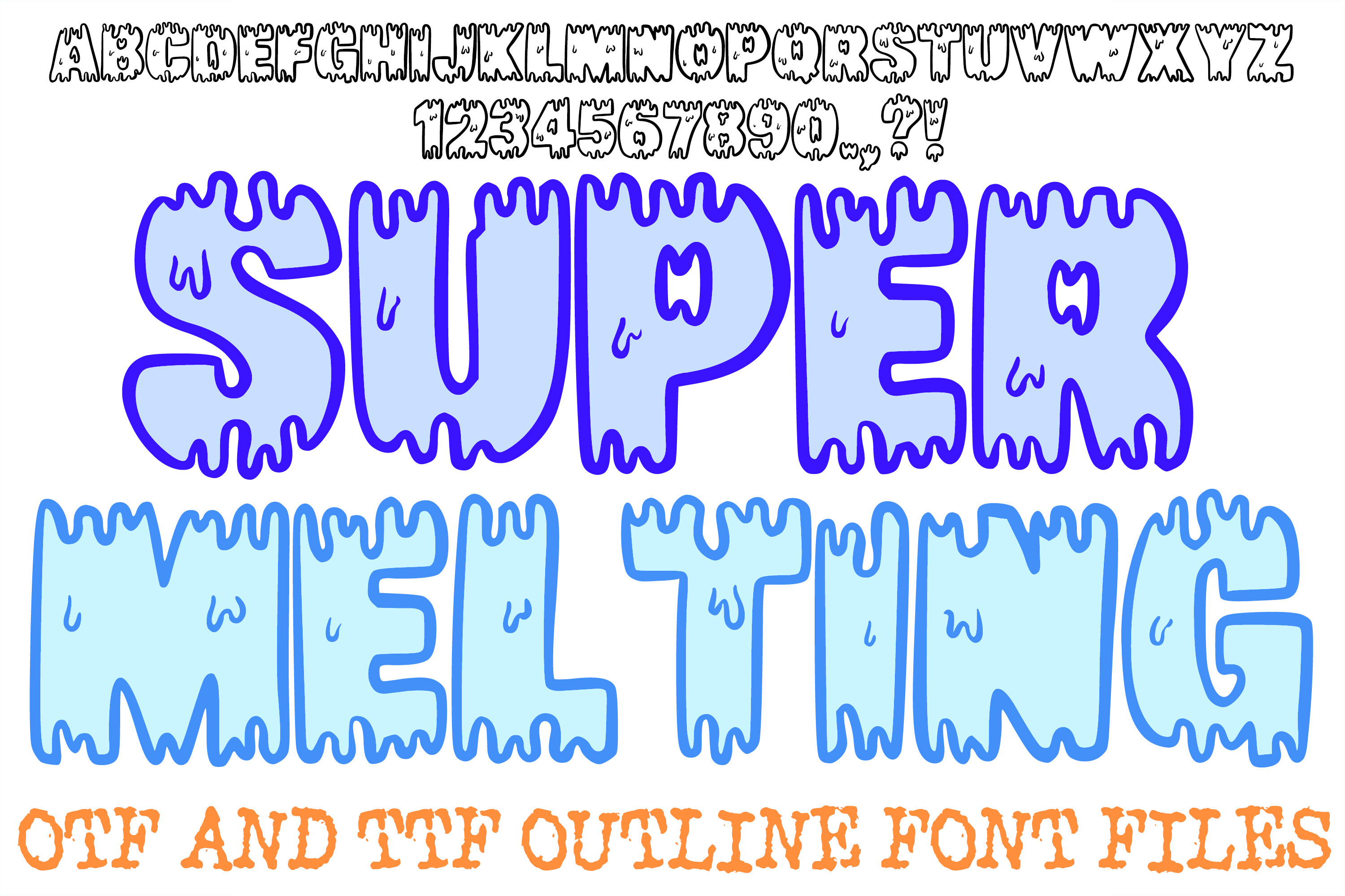
The melt here is heavy, so the letters look like they are sliding down the page. The effect is dramatic and bold. Use it when you want the dripping look to be the main event.
Best for: bold posters, dramatic headlines, event flyers. By: squeebcreative
23. Melting Ice
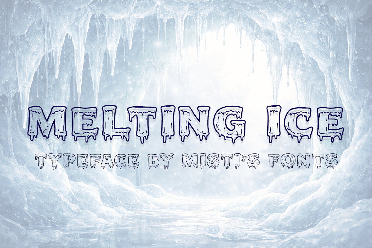
The mood is cold and crisp, like ice starting to thaw. The drips read as water running off a frozen surface. A good fit for winter themes and cool, clean projects.
Best for: winter posters, cold themed branding, clean headlines. By: Misti
24. Frost Drip
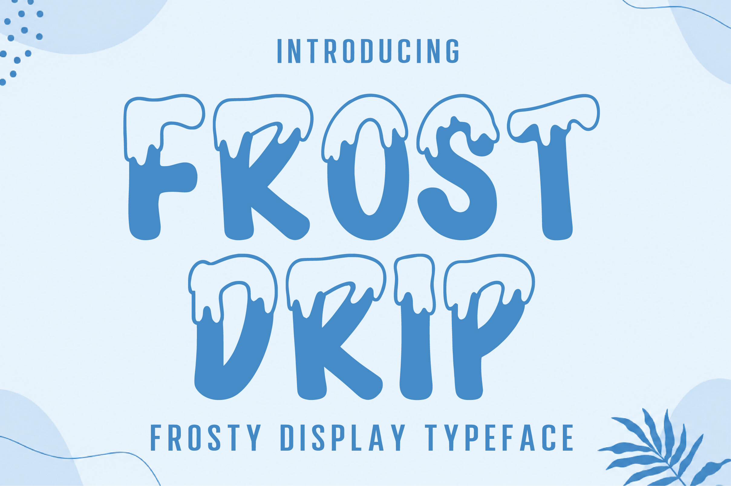
The letters look frosty, with drips that feel like they are forming on a cold surface. The mood is wintry and sharp. It suits seasonal projects that want a frozen, dripping look.
Best for: winter graphics, seasonal posters, cold branding. By: Craft Artist
25. Candy Drip
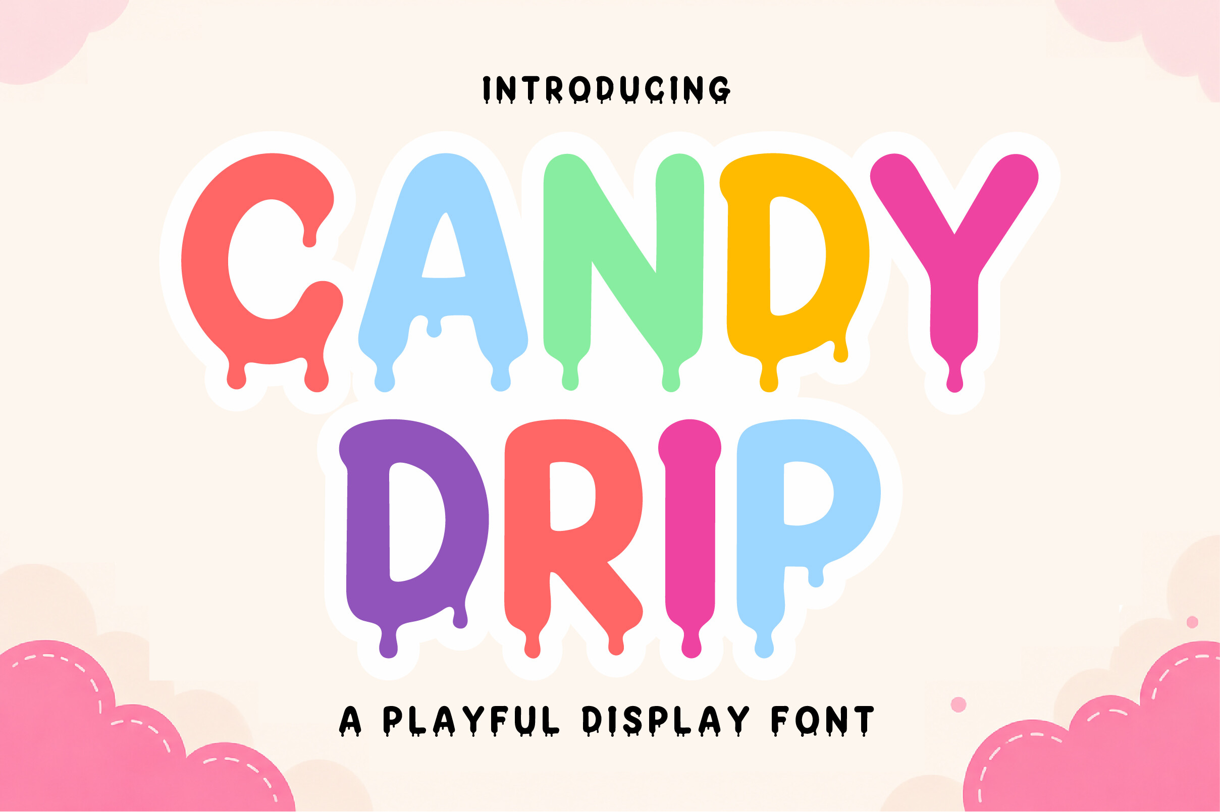
The drips read as candy or frosting, sweet and playful. The mood is festive and fun. A strong pick for dessert branding and party graphics that want a sugary dripping effect.
Best for: dessert branding, party invites, sweet logos. By: Artisan Vibes
26. Choco Melting
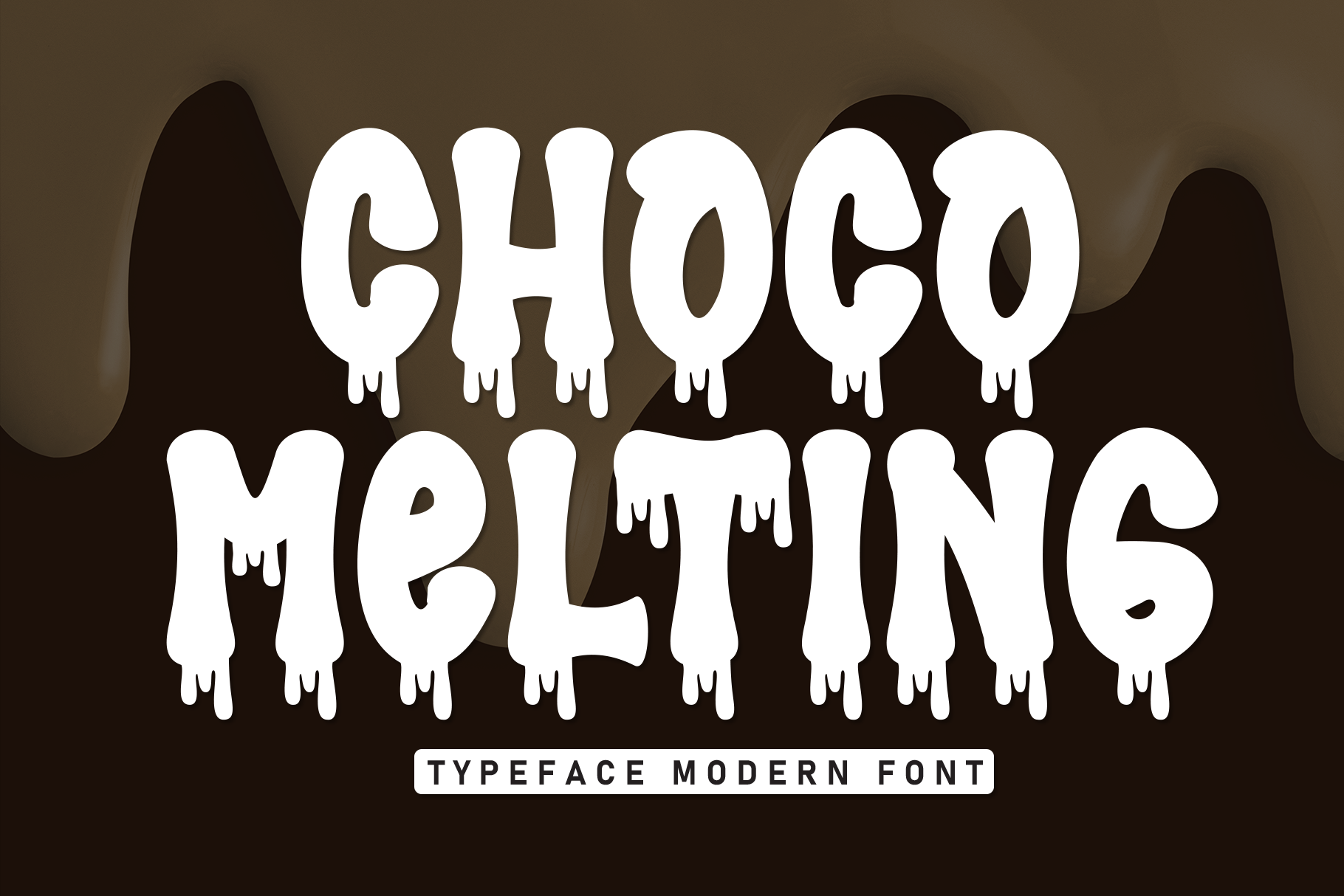
The letters look like warm chocolate, soft and slow. The drips feel thick and rich. It is a natural fit for confectionery branding and dessert projects that want a melting, sweet look.
Best for: confectionery branding, dessert menus, sweet posters. By: Misterletter.co
How to Use Dripping Fonts in Your Projects
Posters and flyers are the natural home for a dripping font. Keep the headline short, one to three words, and give it room to breathe. Long drips need space below the line, so increase your line spacing and make sure the drops do not land on the next line.
For album covers and music graphics, the graffiti and slime styles tend to work best. They carry enough edge to sit against a dark background without getting lost.
On T-shirts and merch, choose the denser, chunkier styles. Bold letters hold their shape through printing and washing better than thin ones. Fine drip tips can blur or break on fabric, so if your design has very delicate drips, consider thickening them before you send the file to print. There is no single best dripping font for posters and T-shirts. The right one depends on your mood and how the print process will treat the drops.
Halloween is the obvious season, but dripping fonts are not only for horror. Slime and melting styles fit candy, desserts, winter themes, kids parties, and streetwear just as well. A candy drip on a birthday invite or a frost drip on a winter sale poster works without any spooky context.
For graffiti and street style projects, keep the background simple. A plain wall, a subtle texture, or a flat color lets the drips do the work. Busy backgrounds fight the effect and make the word harder to read.
If you are cutting vinyl for a Cricut, test first. Thin drip tips and sharp points can tear or lift when you weed, and small enclosed areas become islands you have to remove by hand. Cut a small sample, check the drips, and thicken or simplify the outline if needed. Some dripping fonts for Cricut projects cut cleanly, others do not, so the test cut is the only reliable answer.
In Canva, you can upload a custom font only if your plan and the font license allow it. Check Canva’s current help pages for the upload rules, and make sure the font displays correctly in the editor before you build the design.
For pairing, use one dripping font for the headline and a calm sans serif or simple serif for the body text. Two statement fonts next to each other will fight for attention. A neutral supporting typeface lets the drips be the star.
Finally, watch legibility. Dripping fonts are display type, not body type. Do not use them for long paragraphs, small captions, or interface text. Set your headline at the final size, zoom out, and check that the word still reads clearly. If it does not, pick a font with shorter drops or a heavier base.
Tips for Choosing the Right Dripping Font
Start with the mood you need, then narrow the style. Dirty and gritty points you to paint and graffiti drips. Sweet and playful points you to the chunky and candy styles. Icy and cold points you to frost and melting ice. Toxic and gross points you to slime and goo.
Once you have a shortlist, test each font with your actual text. Type your real headline, not a sample word. Check that capitals, lowercase letters, numbers, and any punctuation you need all look right. A font can look great on “SLIME” and weak on “Slime 2026”.
Before you use a dripping font in a commercial project, on merch, or in a logo, check the license on the product page. Licenses vary between fonts and designers, so there is no single answer to whether a font is safe for commercial use. Read the terms for the specific file you are buying.
Check software compatibility too. Whether a font works in Photoshop, Illustrator, Procreate, Canva, or Cricut Design Space depends on the file format. Look at the product page to confirm the format you need, especially if you are cutting vinyl or building a Canva template.
If the project is for print, lean toward the denser, heavier forms. They survive printing and scaling better than thin, delicate drips. A quick test at your final size will tell you more than any preview.
Where to Download Dripping Fonts
The links in this list point to Creative Fabrica, where you can preview and download each font. Check each product page for the license and file format before you buy.
You can also search Google Fonts, DaFont, and Font Squirrel for dripping options. Free options can turn up, but the dripping selection there is usually smaller, and you still need to check the license before any commercial use.
If you want to explore other display styles beyond drips, the FontPro blog has more font roundups and practical guides for posters, merch, and cutting projects.