· fonts · 13 min read
16 Best Summer Fonts in 2026
Explore the best summer fonts for beach posters, vacation shirts, pool parties and sales: breezy brush letters, sunny scripts, retro surf styles and font duos.
If you are making a beach party poster, a vacation shirt, or a pool party flyer, the right typeface can do half the work. I look for summer fonts that feel relaxed, sunny, and a little playful, but still readable on fabric. That matters more than you think when the text is printed on a tee or viewed on a phone. This list groups 16 picks by style: beach fonts with brush energy, summer script fonts for invitations, retro surf fonts with 50s and 60s charm, and ready-made summer font duos for faster layouts.
If you are wondering what fonts feel like summer, think wavy letterforms, soft brush strokes, uneven edges, and easy scripts that look like they were written on a warm afternoon. These styles work well for beach party fonts, vacation fonts, tropical fonts, and seasonal social posts. My rule is simple: use one bright display line, then pair it with a calm sans for details. That keeps the design readable and still gives it summer energy.
What Makes a Font Feel Like Summer?
Summer typography usually leans into movement and warmth. Brush fonts for summer often have loose strokes, while beach fonts may curve like waves or sand. Tropical fonts can feel bolder and more decorative, and retro summer fonts borrow from surf shops, motels, and old postcards.
I like this mix because it covers the range of summer projects. A luau invitation needs a different energy than a surf shop logo, and a vacation quote on a shirt needs to survive small print.
The best choices depend on the project. If you are asking what is a good font for a beach party invitation, choose one that feels festive but still legible at a glance. For a vacation shirt, you need a style that survives small print and still looks good on fabric. For a café menu or resort branding, a friendly script can feel welcoming without shouting.
A practical approach is to choose one hero typeface and one supporting face. The hero carries the mood. The support handles dates, addresses, prices, or captions. This is especially useful when you are working in Canva, Cricut Design Space, or a poster template. I usually start with the display face, then pick a simple sans for the rest.
Beach & Brush Summer Fonts
Brush and wave styles are the fastest way to add beach energy. They work well for posters, vacation quotes, and shirts that need a relaxed, hand-made feel. This is where I start when the project needs to feel easy and a little sun-worn. If you want more options in this style, see our best brush fonts.
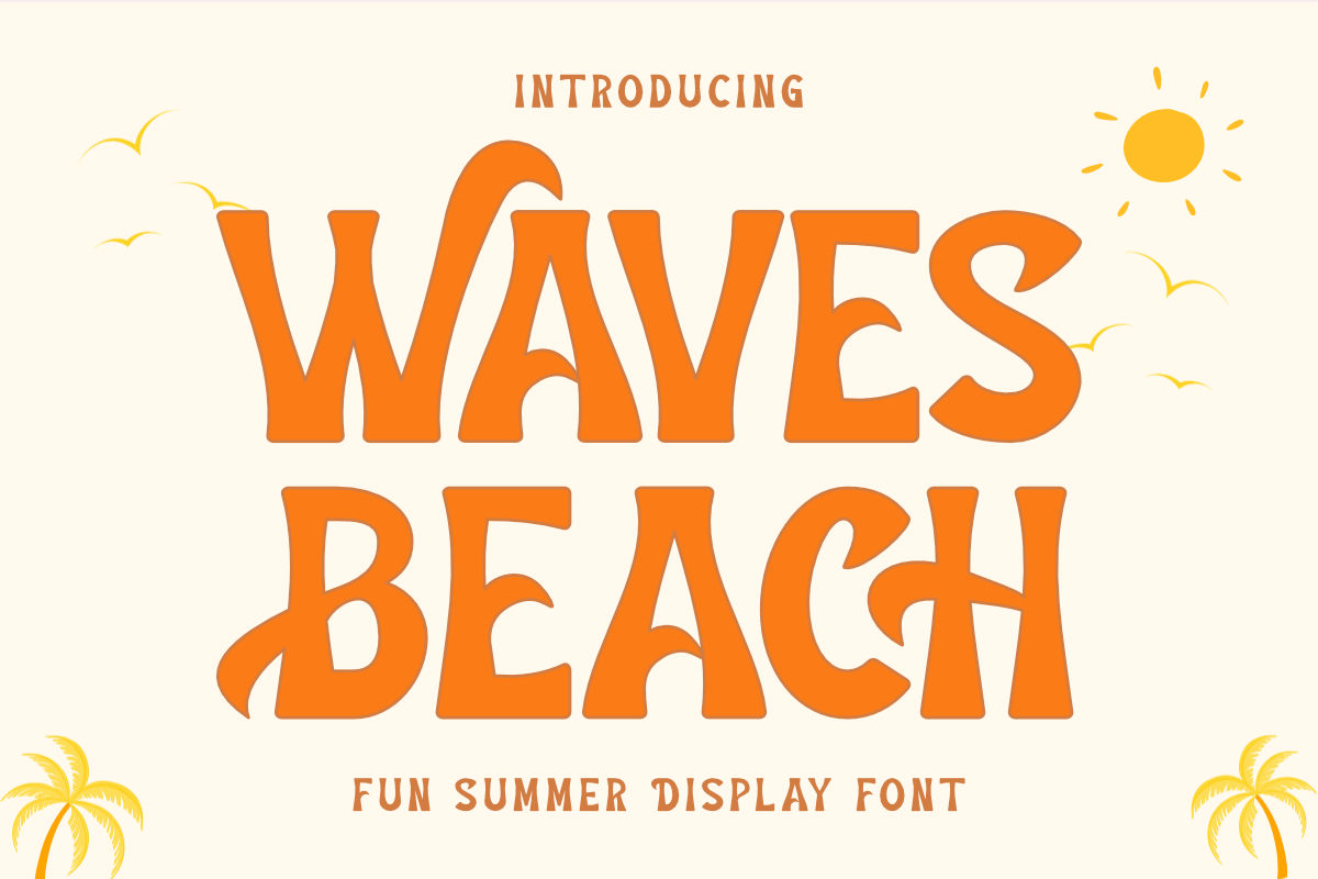
1. Waves Beach
This display face has bold, wavy letterforms and a fun, beach-inspired style. It reads like a summer poster dipped in salt water. The style is strong enough for a headline, but still friendly for casual invitations. I like it for the main line when the rest of the layout is simple.
Best for: beach party invitations, vacation quotes, summer posters. By: Eystore
2. Tropical Sunday
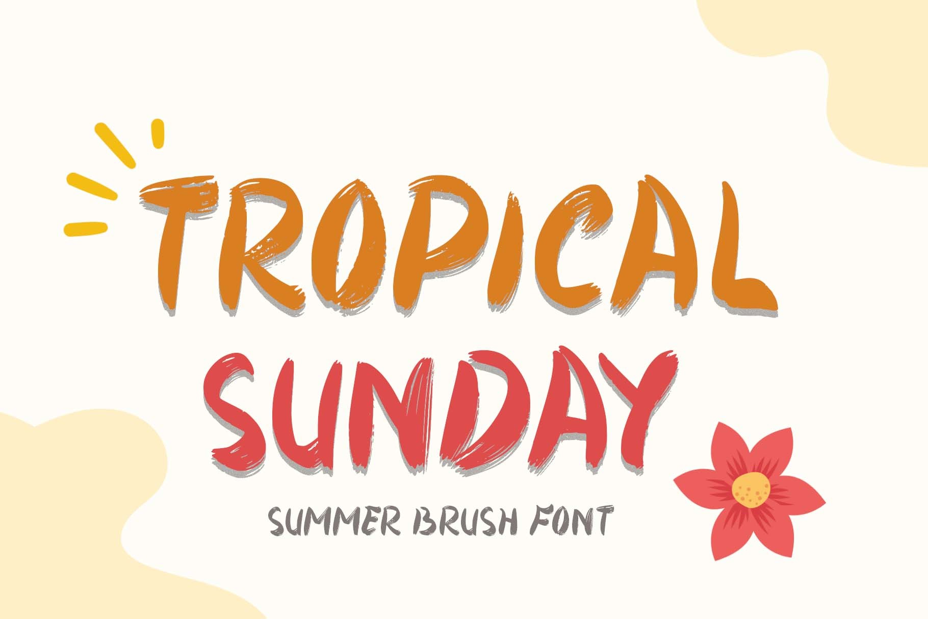
This brush font is made for summer moments, so it is a simple pick for casual layouts. It suits weekend sale posts, brunch menus, and captions that need a warm, easy tone. It is the kind of font I reach for when I want the design to feel friendly without doing too much.
Best for: brunch menus, weekend sale posts, summer captions. By: yogaletter6
3. Tropical Times
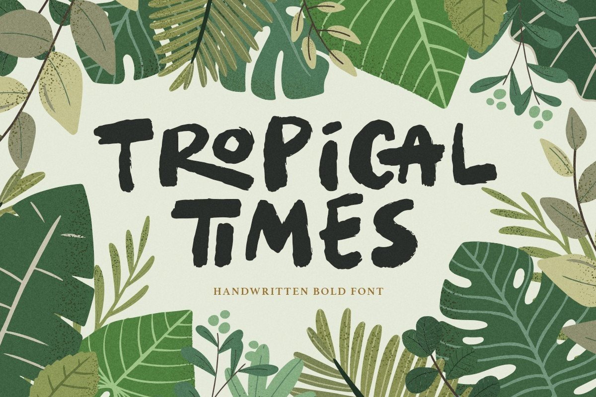
This bold handwritten typeface carries tropical and summer vibes with a confident, social-media-ready look. It works when you want a line to stand out, such as a vacation shirt, beach bar sign, or bold graphic. I would use it for one strong statement, not a whole paragraph.
Best for: vacation shirts, beach bar signs, bold social graphics. By: saridezra
4. Summer Tropical
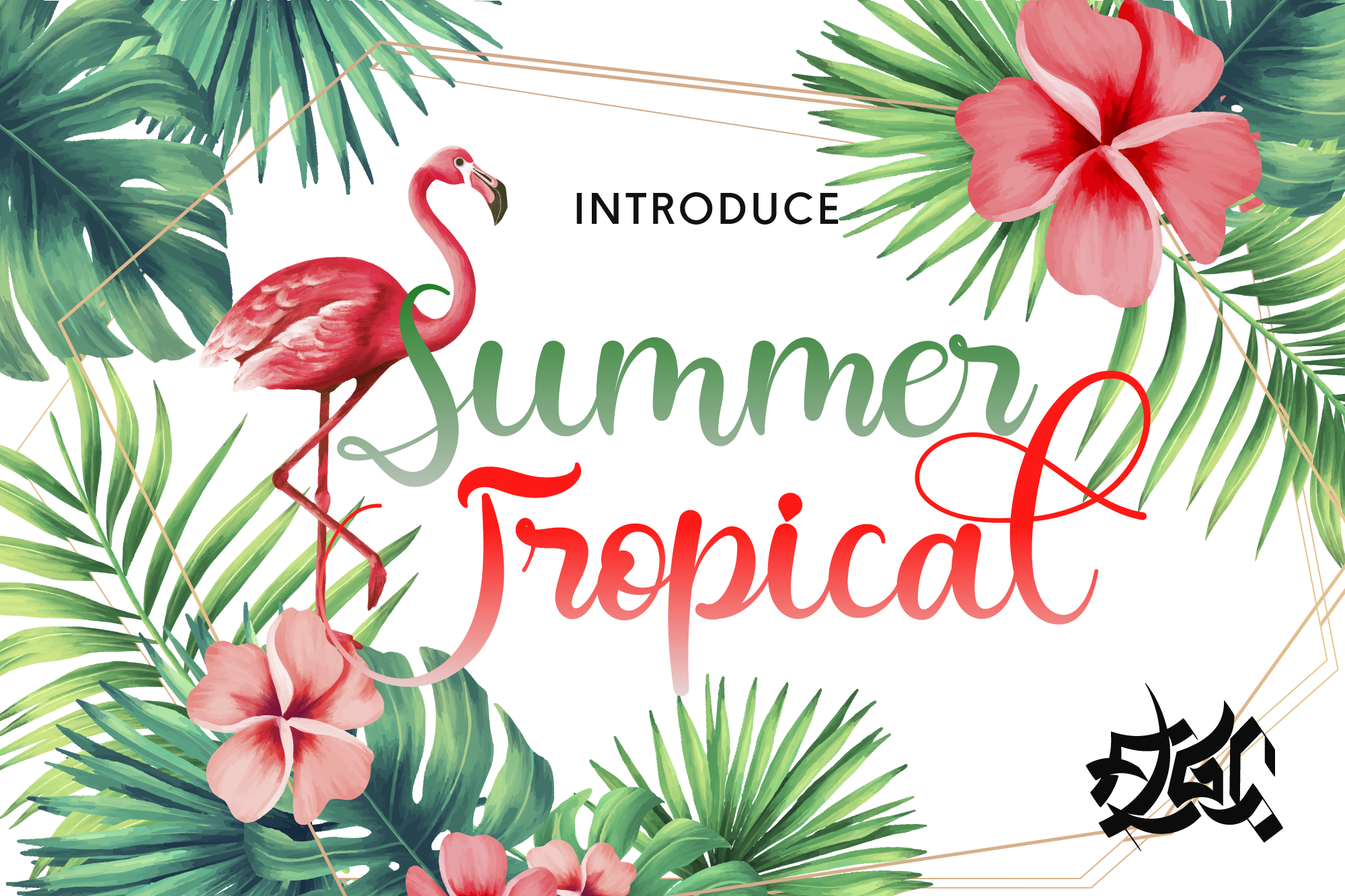
This striking handwritten font has a lovely twist that gives it a bit of personality. It is a good match for pool party flyers, tropical packaging, and headlines that need a playful edge. The twist keeps it from feeling too generic, which helps when the design already has a lot going on.
Best for: pool party flyers, tropical packaging, playful headlines. By: Fallengraphic
Sunny Summer Script Fonts
Script styles bring a softer, more personal feel to summer projects. They are useful for invitations, café menus, resort branding, and packaging that needs a friendly touch. If your project is more elegant than loud, this group is where I start. I like scripts for summer when the design needs warmth, but not the loud energy of a brush display.
5. Summer Beach
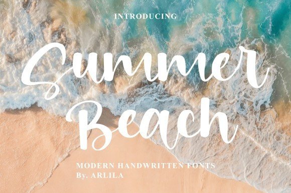
This high-quality script font has fun, friendly characters that feel easy to read. It suits beach wedding invitations, resort branding, and greeting cards where the tone should be warm and polished. I would keep it to the main greeting or brand name, then use a clean sans for the details.
Best for: beach wedding invitations, resort branding, greeting cards. By: ARLILA FOUNDATION
6. Retro Summer
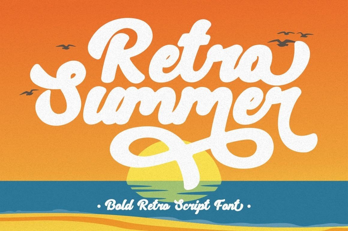
This bold retro script mixes a vintage look with luxury aesthetics. It is a strong choice for boutique logos, swimwear branding, and summer posts that need a more premium feel. It has more polish than a casual brush font, so it works well when the brand needs to feel a little elevated.
Best for: boutique logos, swimwear branding, luxury summer posts. By: putracetol
7. Tropical Summer
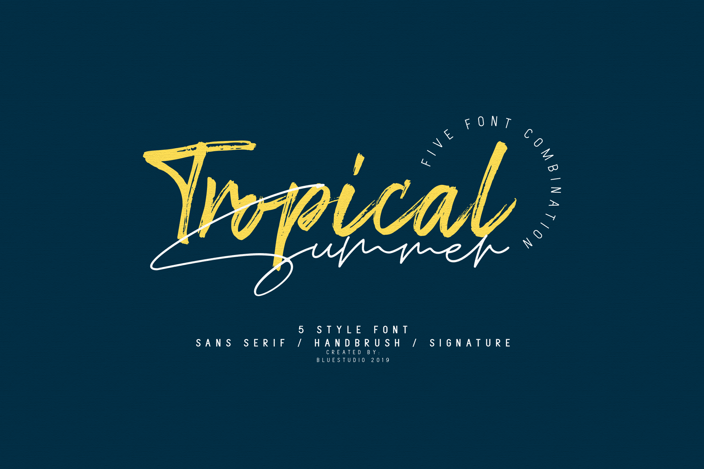
This font collection has a light and charming feel, which makes it useful for softer summer layouts. It works well for light summer stationery, café menus, and travel journals where the design should feel airy. I like it for projects where the type should feel like a note, not a headline.
Best for: light summer stationery, café menus, travel journals. By: Bluestudio
Retro Surf Summer Fonts
These surf fonts tap into 50s and 60s nostalgia, surf culture, beach motels, and mid-century tiki bars. They are great for merch, stickers, and branding that needs a vintage summer story. This group is the easiest to make feel intentional, because the style already carries a story. For more options in this space, check our best vintage retro fonts for branding and design.
8. Surfnik
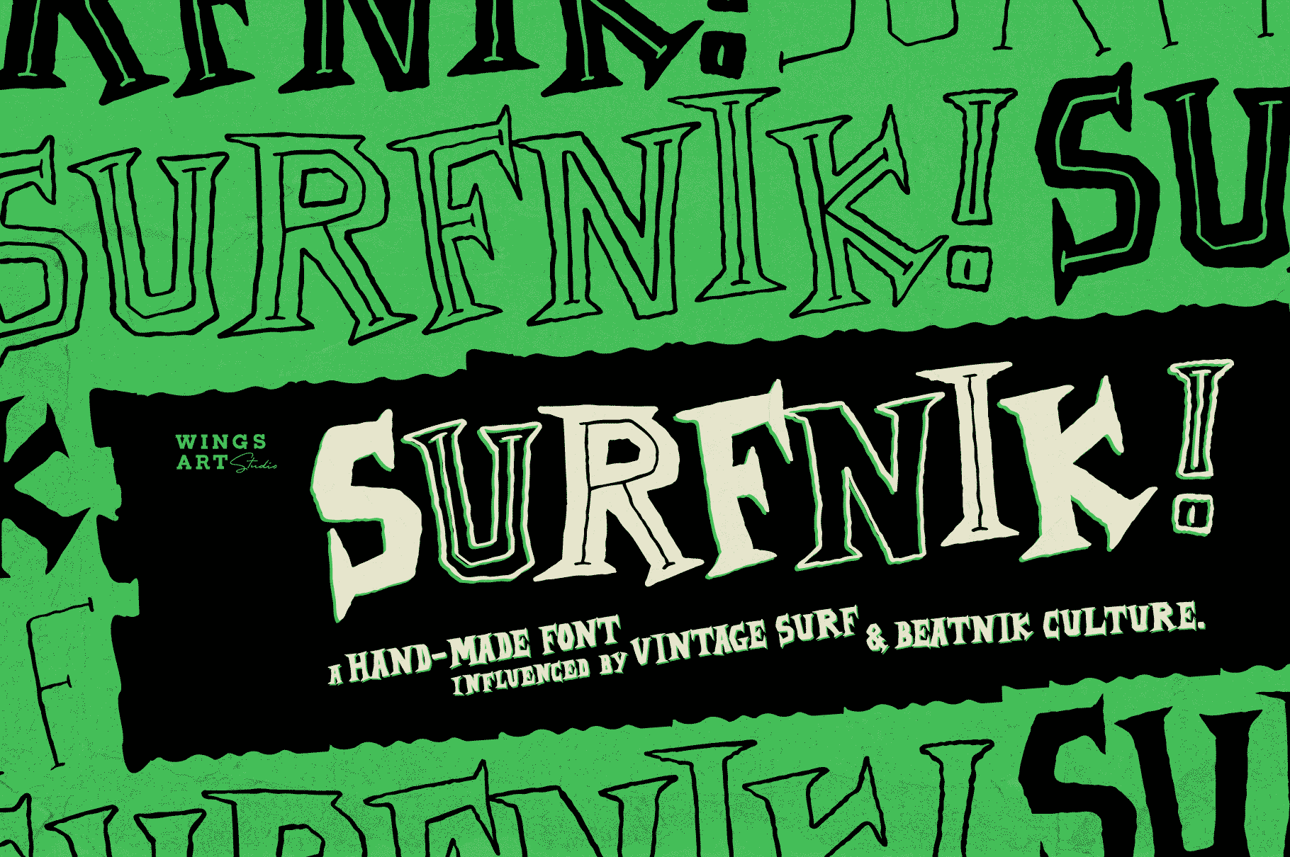
This hand-drawn font is inspired by beatnik and surfing culture from the 1950s and 60s. It feels like a surf shop logo or a retro tee that has lived a few summers. I like it for small logos and patches where the rough edges read as charm.
Best for: surf shop logos, retro tees, 60s-style posters. By: wingsart
9. Beach Retro
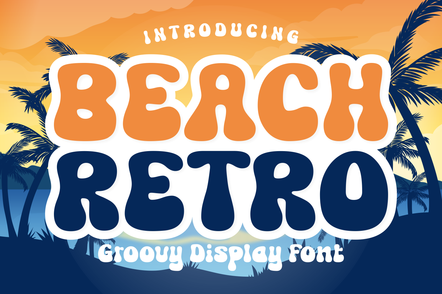
This groovy display font has thick, bouncy letterforms, smooth curves, and a fun vibe. It is a good match for groovy summer shirts, stickers, and ice cream shop signs. The curves keep it playful, but the weight helps it stay readable on a shirt.
Best for: groovy summer shirts, stickers, ice cream shop signs. By: Ade (7NTypes)
10. Sunrise Retro
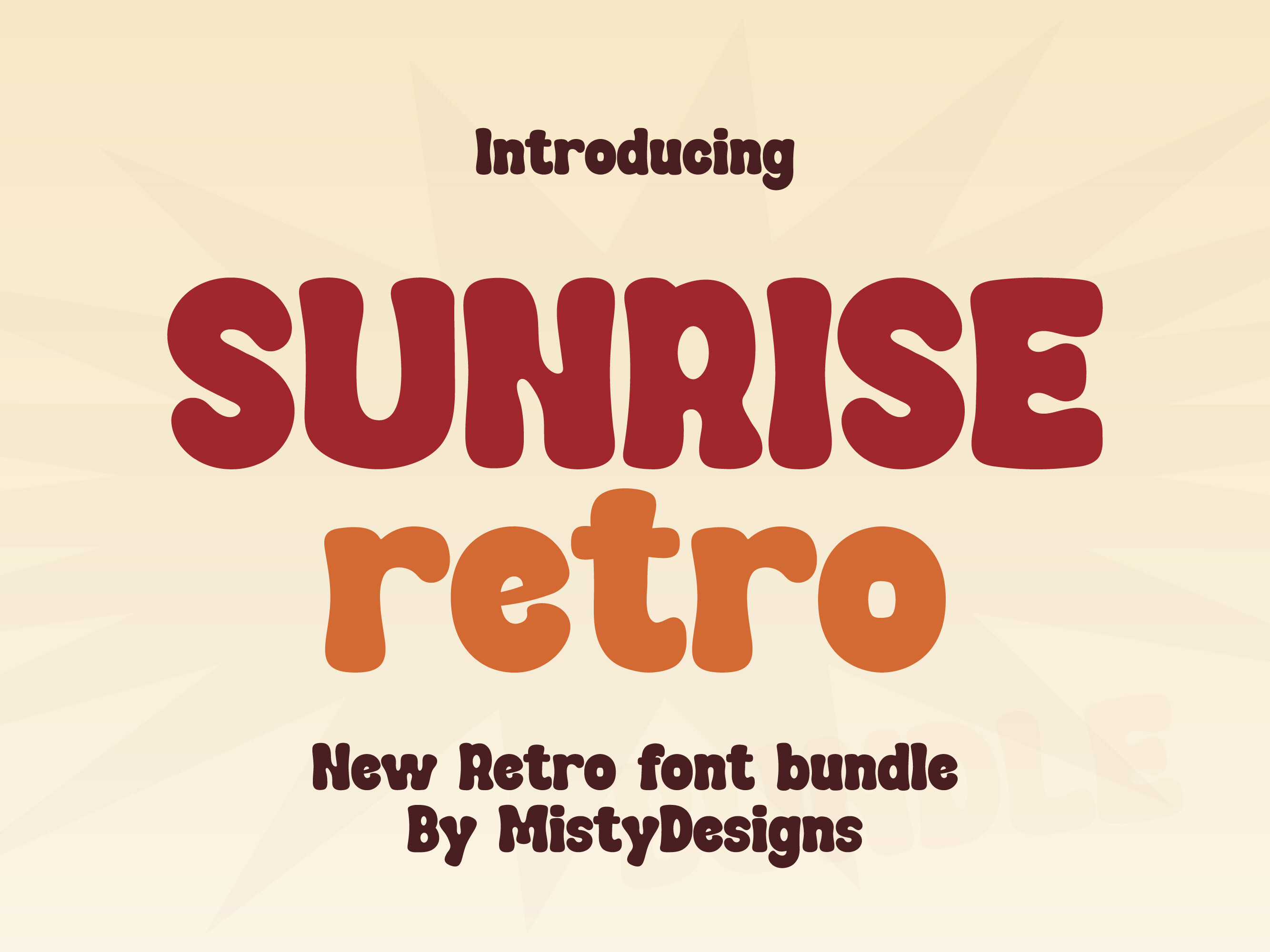
This cute, quirky stacked display font is built for headlines that need a little personality. It works well for stacked headlines, summer camp logos, and sticker designs. I would use it when the layout has room to breathe, because stacked type can get busy in tight spaces.
Best for: stacked headlines, summer camp logos, sticker designs. By: MistyDesigns
11. Tiki Tropical Summer
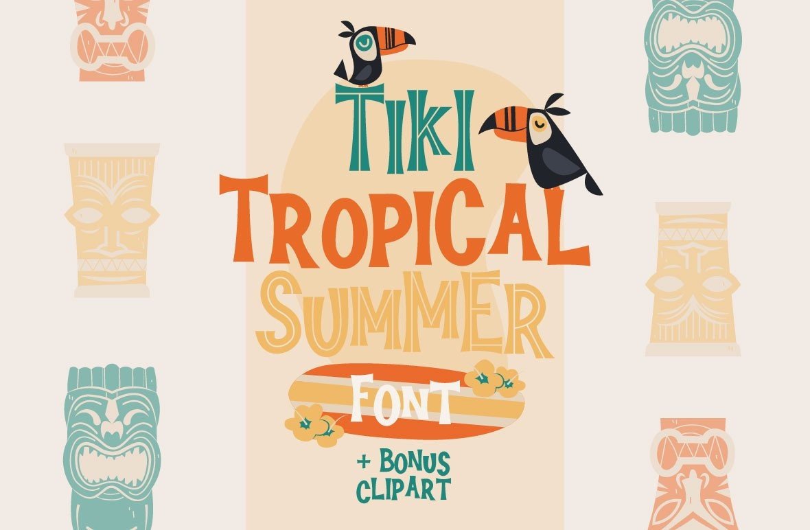
This mid-century retro font duo includes one solid font file and one inline font file. That setup is perfect for layered two-color titles, tiki bar menus, and luau invitations. The inline file makes the two-color effect easy, which is handy when you are working in Canva or a vector editor.
Best for: tiki bar menus, luau invitations, layered two-color titles. By: arausidp
Summer Font Duos and Clean Sans Picks
Font duos save time because the headline and supporting text are already paired. You can use them for social templates, labels, banners, and quick seasonal layouts. A clean sans also helps when you need body text that stays readable next to a decorative summer script. I use duos when I need a consistent look fast, especially for social templates or product labels.
12. Summer Beauty Beach
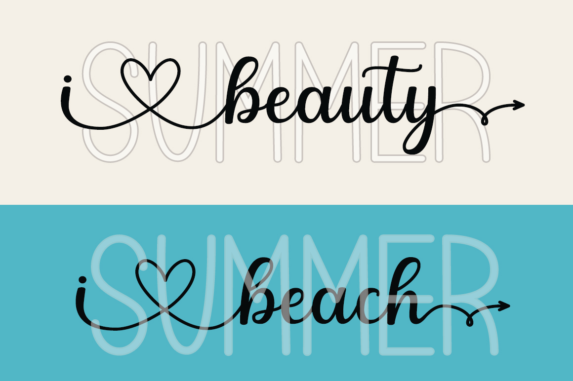
This fun, relaxed duo font pairs a sans serif with a script. It is useful for beach brand kits, social templates, and product labels where you need a complete look in one download. The pairing feels easy to use, which is the point.
Best for: beach brand kits, social templates, product labels. By: cavalera creative
13. More Summer Duo
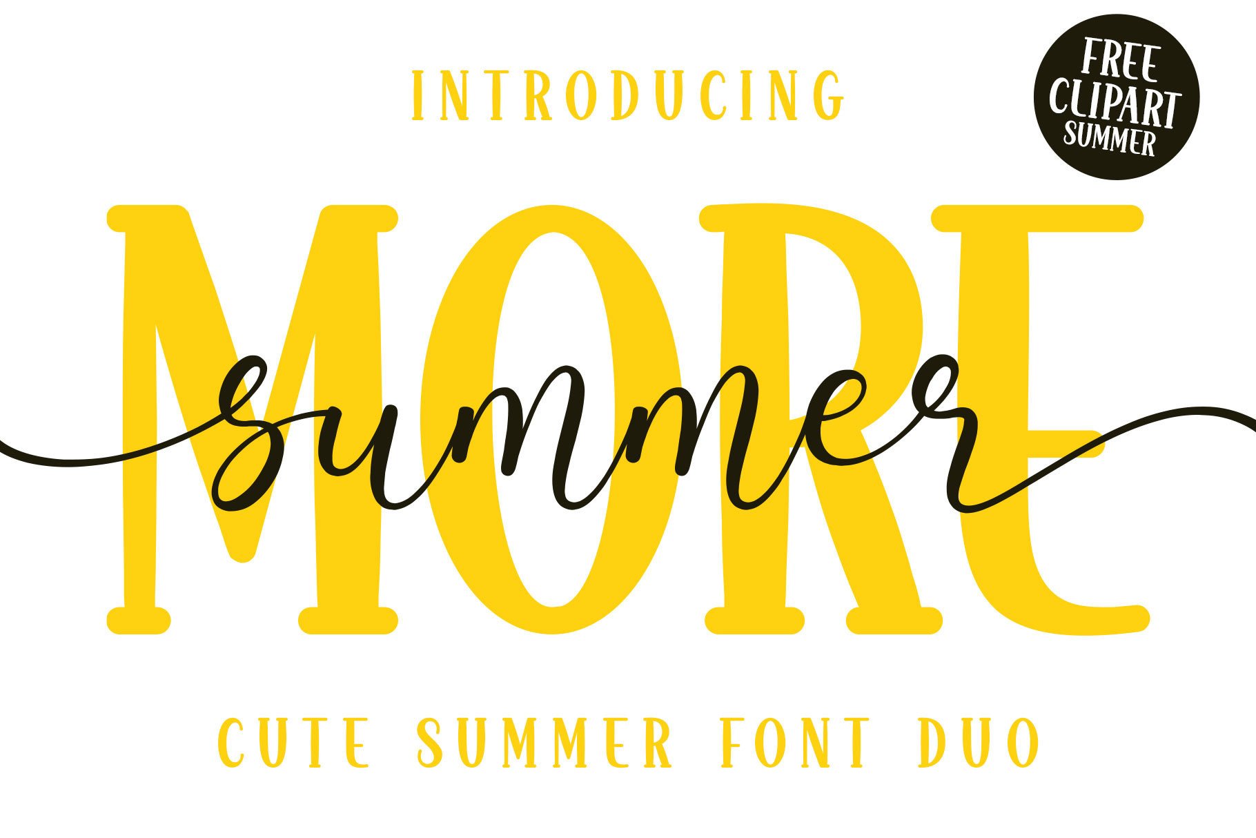
This playful font duo combines a stylish script with a serif display font. It suits summer party invites, shop banners, and event posters that need a bit more structure. The serif gives it a little more formality than a casual sans pairing.
Best for: summer party invites, shop banners, event posters. By: Hoperative Design
14. Laguna Tropic
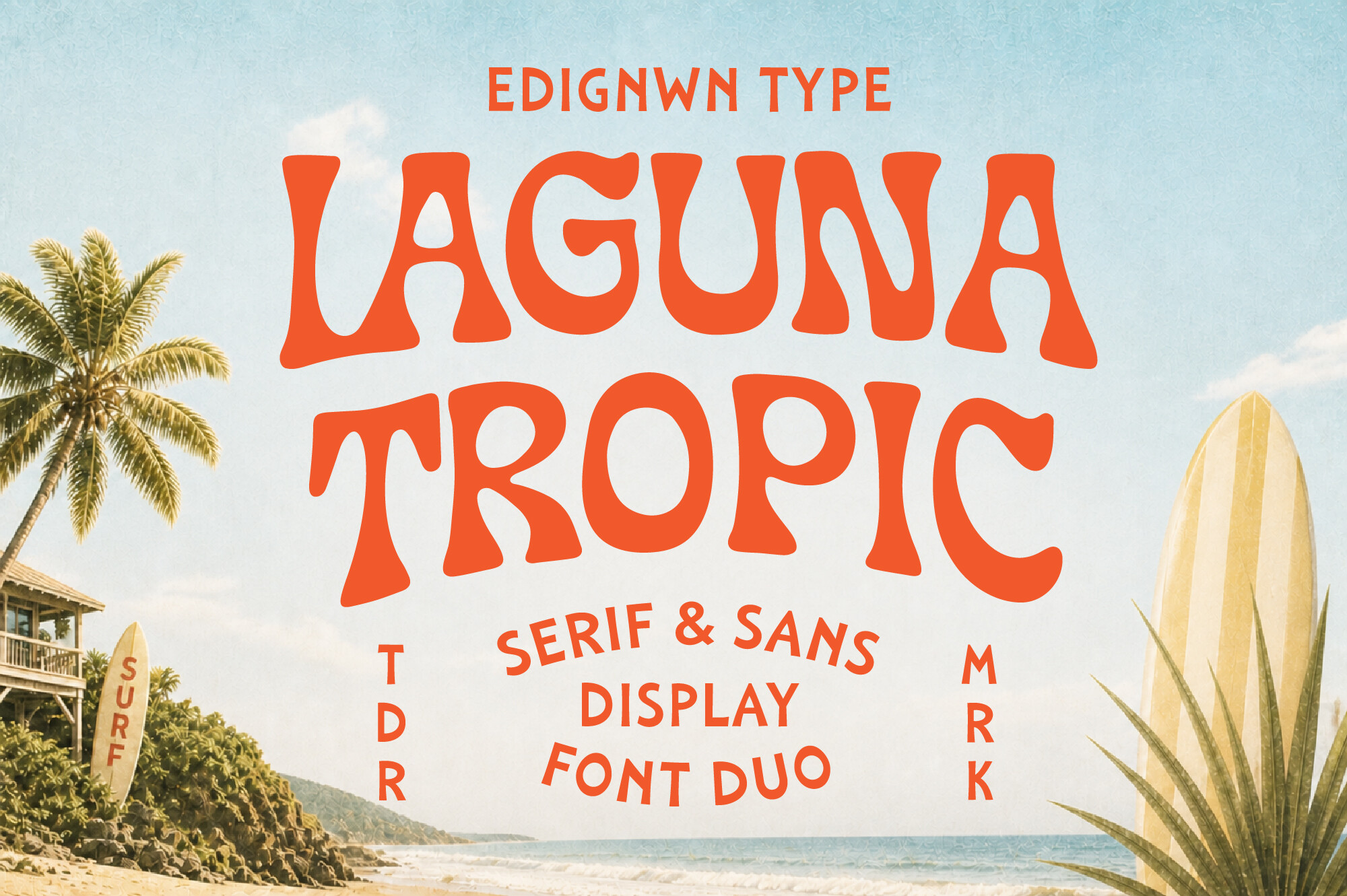
This serif and sans display font duo is inspired by retro surf culture, tropical resorts, vintage beach motels, and endless summer days. It is a strong pick for beach motel branding, resort signage, and travel posters. I like it for signage because the display face has presence, while the sans keeps the details clear.
Best for: beach motel branding, resort signage, travel posters. By: Edignwn Type
15. Summer Surfing
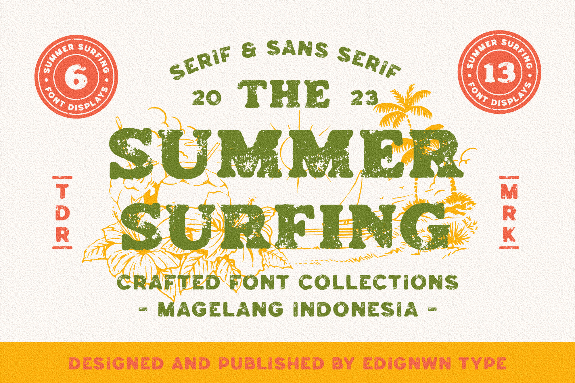
This duo combines a classic serif font with a modern sans serif, with retro and summer themes. It works well for surf school branding, summer camp shirts, and retro flyers. It has a clean, dependable feel, which is useful when the design needs to look finished quickly.
Best for: surf school branding, summer camp shirts, retro flyers. By: Edignwn Type
16. Sun Surf
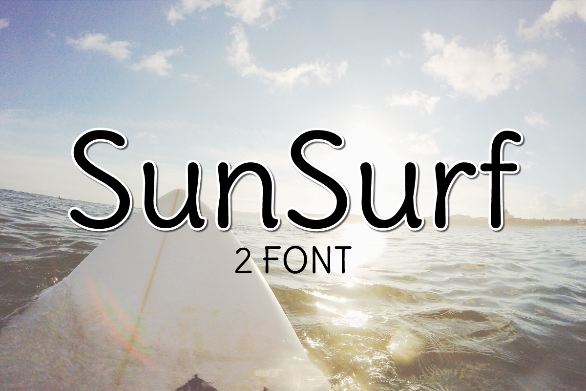
This light sans serif font adds a summery feel to design projects while keeping things clean. It is a good choice for body text pairing, clean summer posts, and minimal labels. I would use it as the quiet partner to a louder display face.
Best for: body text pairing, clean summer posts, minimal labels. By: Great’s St
How to Use Summer Fonts in Posters, Shirts and Social Posts
Start with one bright summer line and one quiet supporting face. The display font should carry the mood, while a clean sans handles dates, prices, locations, and captions. If you are using a summer script, pair it with a simple sans like Sun Surf or a free option from Google Fonts. That combination keeps the design readable and still feels seasonal. I usually set the display face first, then choose the support based on what is left to say.
Color matters as much as type. Turquoise, coral, sand, and sunny yellow are common summer palette choices. Be careful with yellow or pastel text on white, because it can have low contrast. For small text, use a darker shade or place it on a colored background. This matters most for social posts viewed on a phone. If the text disappears on a phone screen, the color is doing more work than the font.
When choosing summer fonts for shirts, thicker brush letters usually cut better than thin scripts. If you are using connected script letters in Cricut Design Space, weld them so they cut as one piece. You can also upload custom fonts to Canva Pro through Brand Kit, which makes it easier to keep summer fonts for Canva templates consistent. I also test the shirt design at a small size before I send it to print. For more shirt-specific advice, see our best fonts for T-shirt design.
If you are using inline versions, such as Tiki Tropical Summer, place the inline file over the solid file in a second color. This creates a layered title without extra vector work. For stories, test the design on a small screen. If the words are hard to read when shrunk, the type is too busy or the contrast is too low. If you are making a beach party poster, test the headline at arm’s length before you print it. That quick check saves a lot of wasted prints.
Tips for Choosing the Right Summer Font
Match the font to the job. For a beach party invitation, choose a beach party font with brush or wave energy. For a beach wedding, a summer script font feels warmer. For merch, retro surf fonts often work best. For a brand identity, a summer font duo saves guessing at pairings. I keep this simple because summer designs can become noisy fast.
Test the font with a long word before you commit. Try phrases like Summer Vacation, Pool Party, or Tropical Escape. If the letters get cramped, the style may be too decorative for your layout. If the word still feels balanced, the font is likely a good fit. I also check how the lowercase looks, because many summer display faces shine in caps but struggle in sentences.
Keep the typeface count low. Two fonts are usually enough: one display face and one supporting face. More than that can make a summer design feel noisy. If you are not sure what font pairs well with a summer script, choose a clean sans with simple letterforms and open spacing. A simple sans does not need to be boring. It just needs to get out of the way.
Check the license before you sell anything. If you plan to make summer shirts, crafts, or products for Etsy, review the license on the product page. Some fonts allow commercial use, but the terms can vary. When in doubt, read the license carefully before you list the product.
Finally, build your summer collection in spring. It is easier to test fonts, create templates, and prepare social posts before the season starts. A small spring test batch can save you from last-minute font swaps when the season gets busy. I like to have three or four go-to summer fonts ready before the first beach party request comes in.
Where to Download Summer Fonts
Creative Fabrica is the main source for the fonts in this list, and each product page includes the details you need before downloading. If you want free summer fonts for quick experiments, Google Fonts is a good place to look, and Rock Salt is a handwritten option often mentioned in summer roundups. I keep a small folder of free fonts for quick tests, but I still check the license before using them in a client or product file. For more font guides, seasonal picks, and practical typography tips, visit the FontPro blog.