· fonts · 13 min read
33 Best Fonts for Certificates in 2026
Formal serifs, elegant scripts and clean sans-serifs for awards, diplomas and recognition certificates, plus practical tips on hierarchy and printing.
A certificate only lands when the type earns trust. The moment a recipient’s name looks off, or the title feels too casual, the whole document loses weight. The right certificate fonts do much of the convincing for you.
Below is a working set of the best fonts for certificates, grouped by the job each one does: bold display lettering for the title, formal serifs for headings and body, scripts for the recipient’s name, and clean sans-serifs for the fine print. You can mix and match, but the goal is always the same: clear hierarchy and a tone that matches the award.
What Makes a Great Font for Certificates?
There is no single best font for a certificate, because the answer depends on the award and on which line of text you are setting. What every good choice shares is the ability to do two things at once: look official and stay readable. The type should carry a sense of formality without getting so decorative that a reader has to squint to parse it. This matters even more for printed versions and PDFs, where thin strokes can vanish and cramped lettering can blur.
Hierarchy is the second piece. A typical certificate stacks a title, a “presented to” line, the recipient’s name, a short body paragraph, and then signature and date lines. The title and the name usually carry the most visual weight, while the body text sits noticeably smaller. As a starting point, body copy often lands around 12 to 14 pt, but treat that as a guideline, not a rule.
Tone should match the type of award. A certificate of employment font works best when it stays restrained, such as a clean serif or sans with plenty of white space. Certificate of recognition fonts and certificate of achievement fonts can run warmer, and a script for the name works well there. A diploma or course completion document leans classic, and a blackletter title can be a fit as long as the rest stays legible.
One caution on blackletter: it can be striking for a short heading, but it may struggle in long lines and at small sizes. If you use it, keep it to the title and avoid setting the recipient’s name or body copy in it, since those need to be read at a glance. A printed proof is the quickest way to check.
Blackletter and Diploma Lettering Fonts for Certificates
These display faces suit short formal titles like “Diploma” or “Certificate.” Keep them to the heading; they are not built for body text or long names.
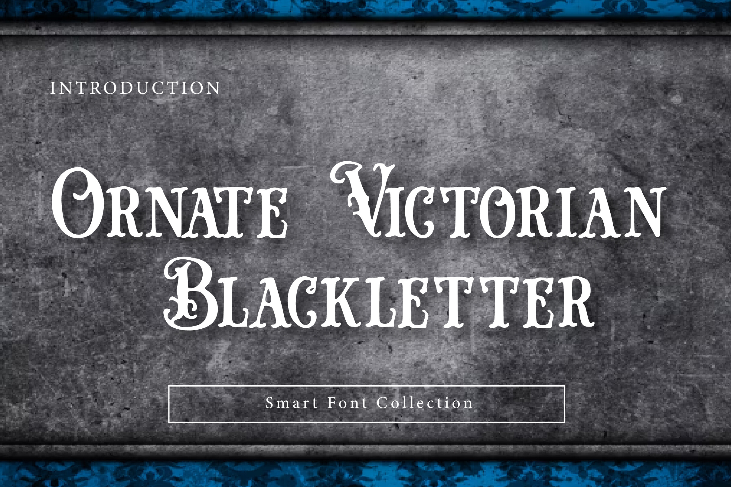
1. Ornate Victorian Blackletter
Ornate Victorian Blackletter is a blackletter option for short diploma titles. Keep it to the heading so the name and body copy stay easy to read.
Best for: diploma titles, formal headings. By: Wow Magic
Download Ornate Victorian Blackletter
2. Moleta
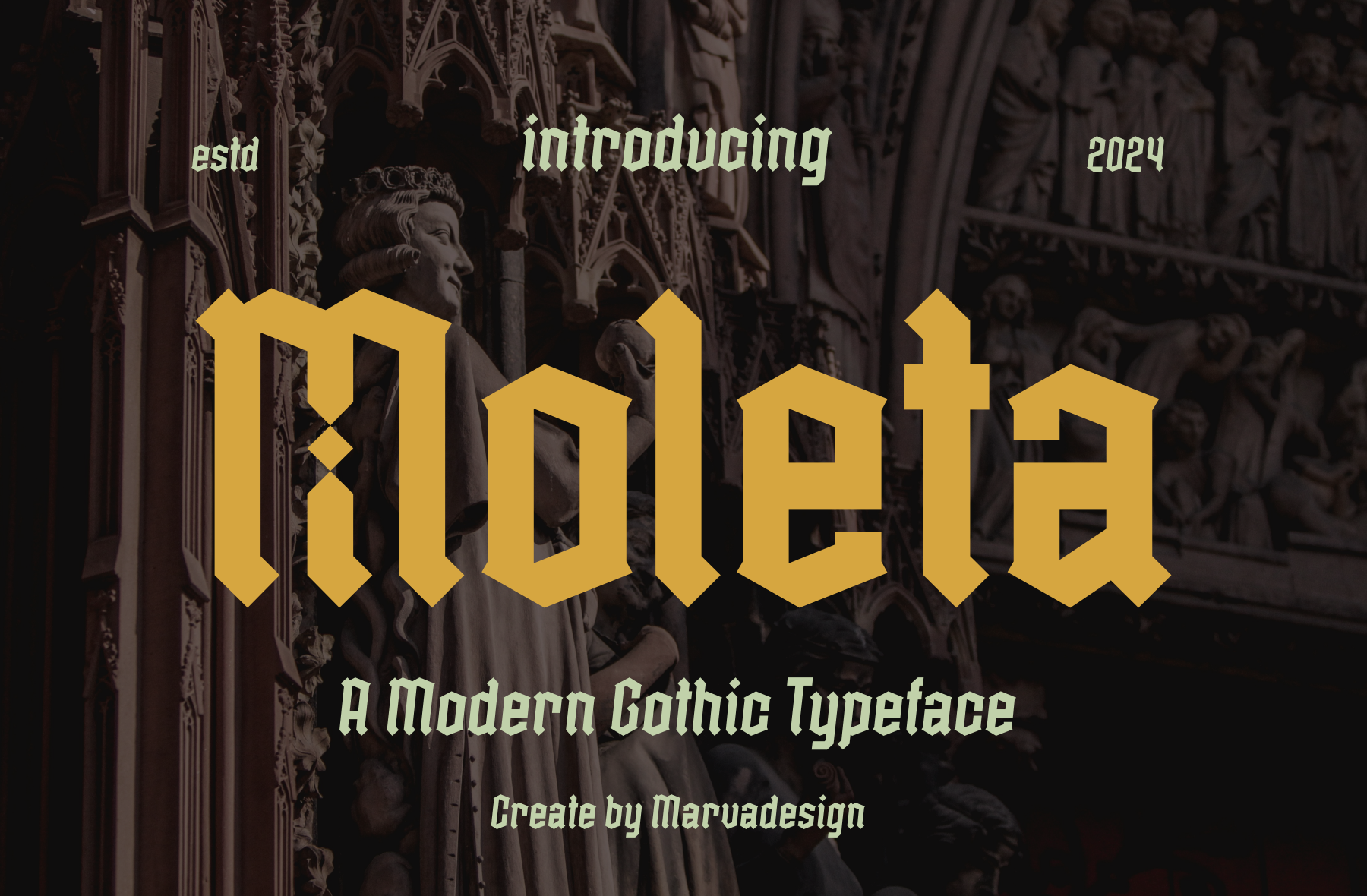
Certificate titles and award headings are where Moleta belongs. A single short word such as “Certificate” is the safest way to use blackletter styling.
Best for: certificate titles, award headings. By: Marvadesign
3. Anggaran Dasar

Anggaran Dasar is another blackletter pick for diploma headings and formal titles. Print a proof of the heading to confirm it reads clearly at your chosen size.
Best for: diploma headings, formal titles. By: wep - Wahyu Eka Prasetya
4. Bavarian Brezen
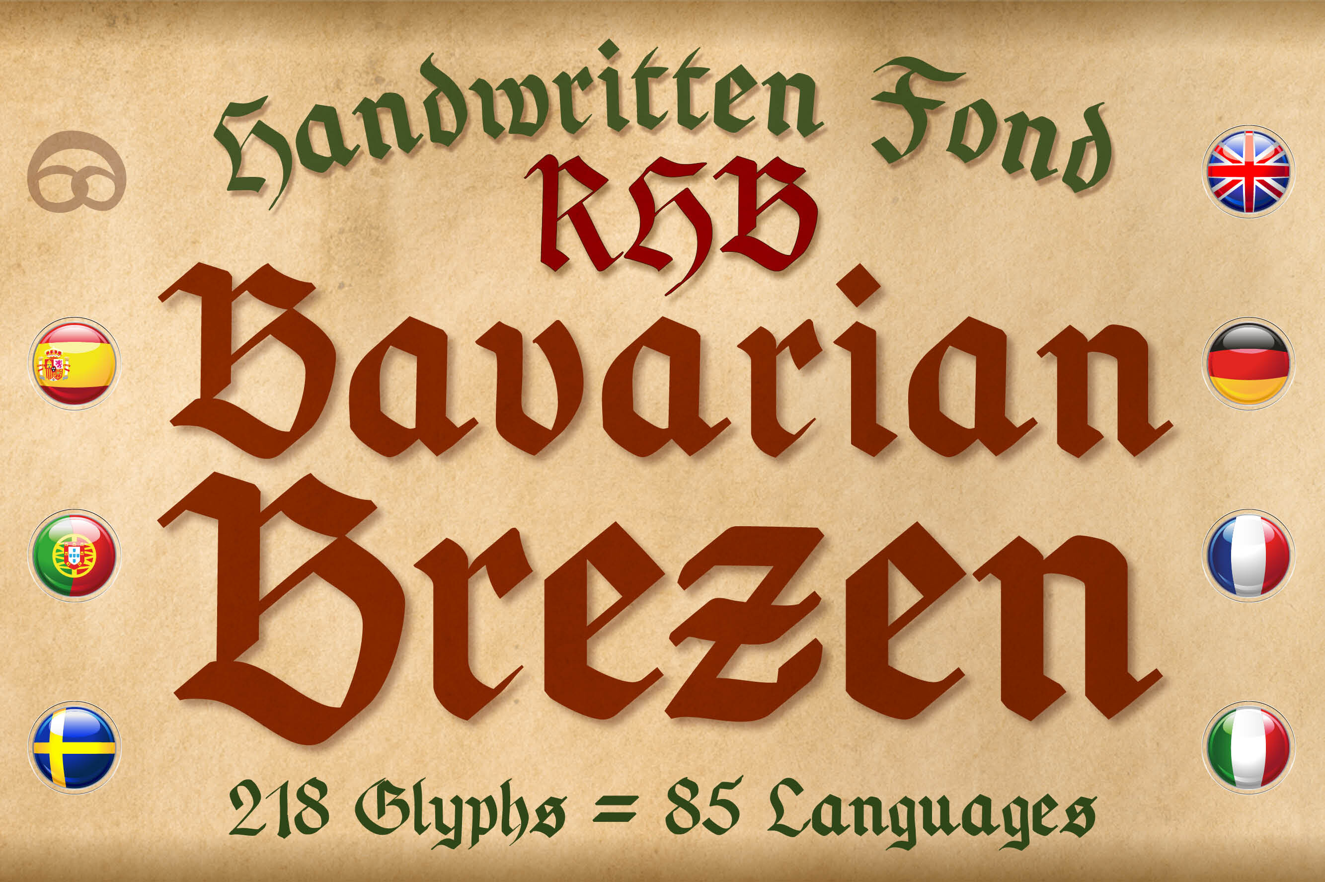
Short titles and ceremonial headings suit Bavarian Brezen. Set it large at the top of the page and leave the lines beneath it to a plainer face.
Best for: short titles, ceremonial headings. By: robert.biedermann.design
5. Diploma

As the name suggests, Diploma belongs in this blackletter and diploma lettering group. It is a natural candidate for graduation certificates and short diploma titles.
Best for: diplomas, graduation certificates. By: Intype Studio
Formal Serif Fonts for Certificate Titles and Body Text
Formal serifs are the classic backbone for employment, recognition, and academic certificates. They hold up well in headings and body copy, and they pair nicely with a script used for the recipient’s name.
6. Veneria
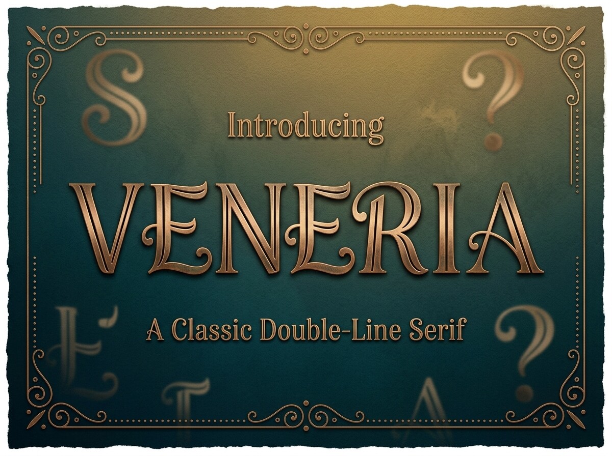
Veneria is a formal serif for certificate titles and recognition awards. Pair it with a script for the recipient’s name.
Best for: certificate titles, recognition awards. By: greenvill
7. Purus
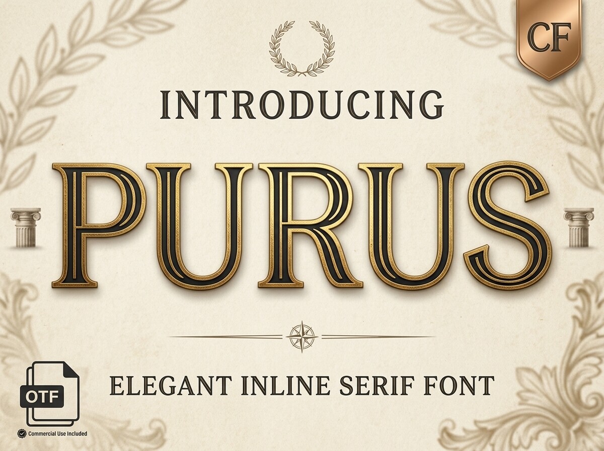
Employment certificates are a good match for Purus, a formal serif that also suits headings. Keep the layout restrained and let white space do the work.
Best for: employment certificates, headings. By: mail.skygroup
8. Chisello
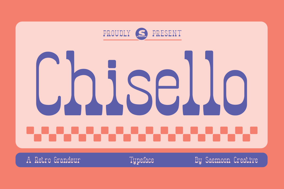
Award titles and formal headings are the natural job for Chisello. Test it against your body font before settling on a pairing.
Best for: award titles, formal headings. By: saemooncreative
9. Nord Poem
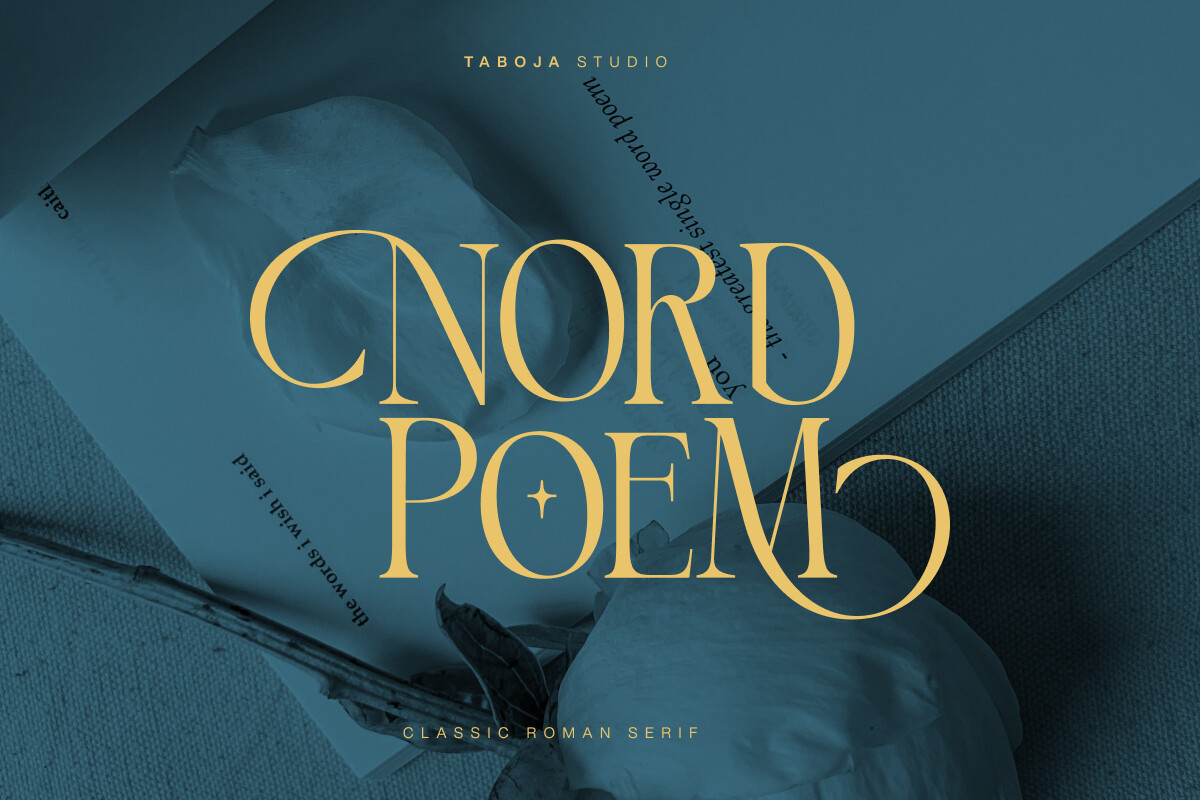
Consider Nord Poem, a formal serif, for writing certificates and titles. Check how it sits beside your chosen script or sans before you commit.
Best for: writing certificates, titles. By: Taboja Studio
10. Perfect Colony

For recognition certificates and headings, Perfect Colony offers a formal serif option. It fits layouts built around a classic serif title.
Best for: recognition certificates, headings. By: Pen Culture
11. Cervelle
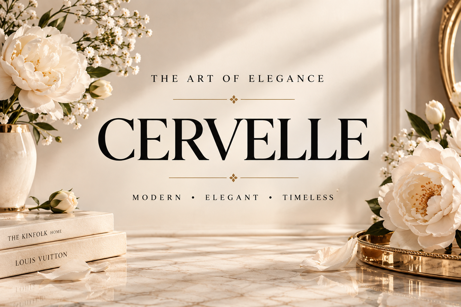
Cervelle is a formal serif suited to achievement certificates and titles. Try it at title size first, then decide whether it also earns a place in the body.
Best for: achievement certificates, titles. By: Colourful
12. Qanduchia
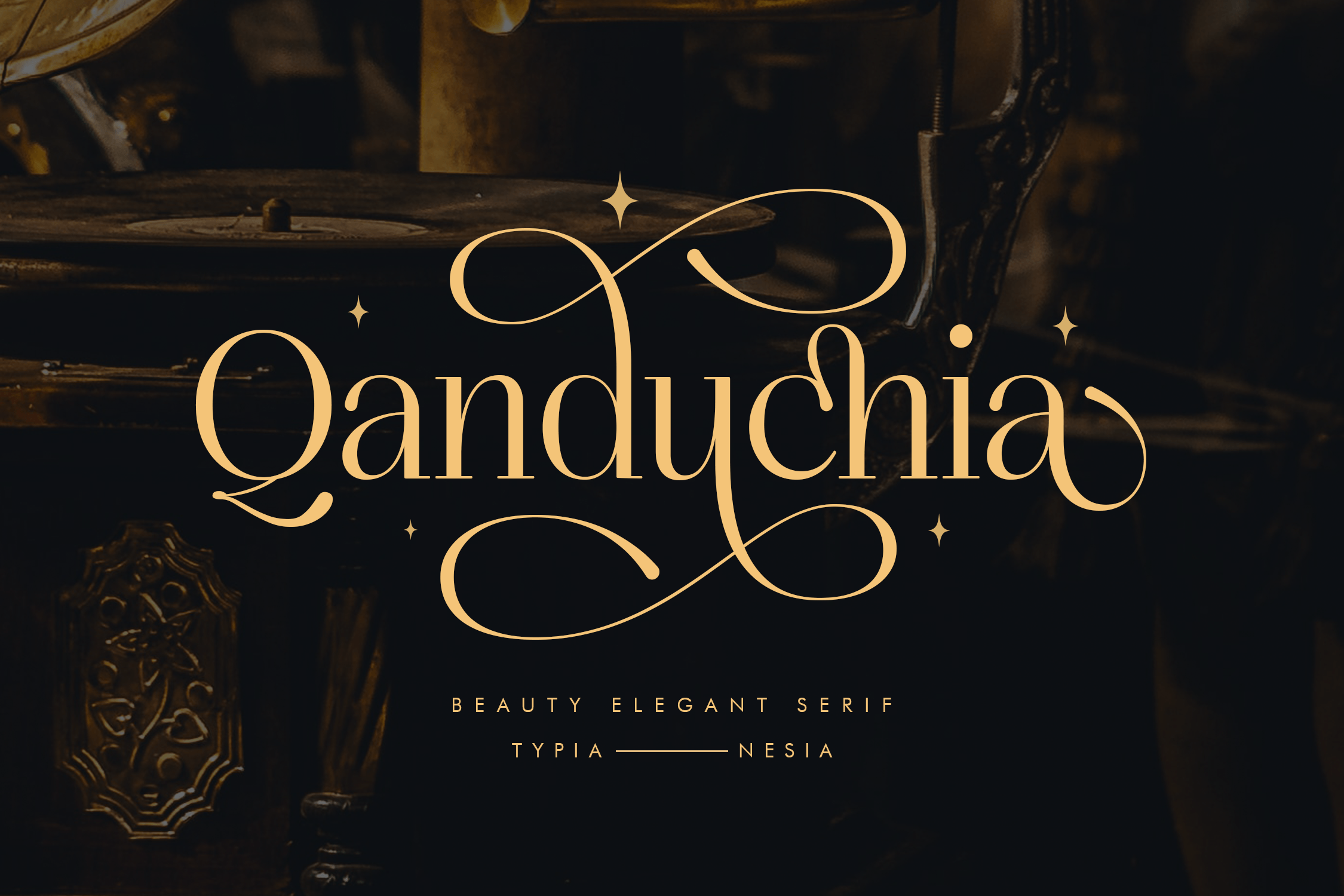
Course completion certificates are a natural home for Qanduchia, a formal serif for headings. Pair it with a clean sans for the details.
Best for: course completion certificates, headings. By: Typia Nesia
13. Royal Hefana
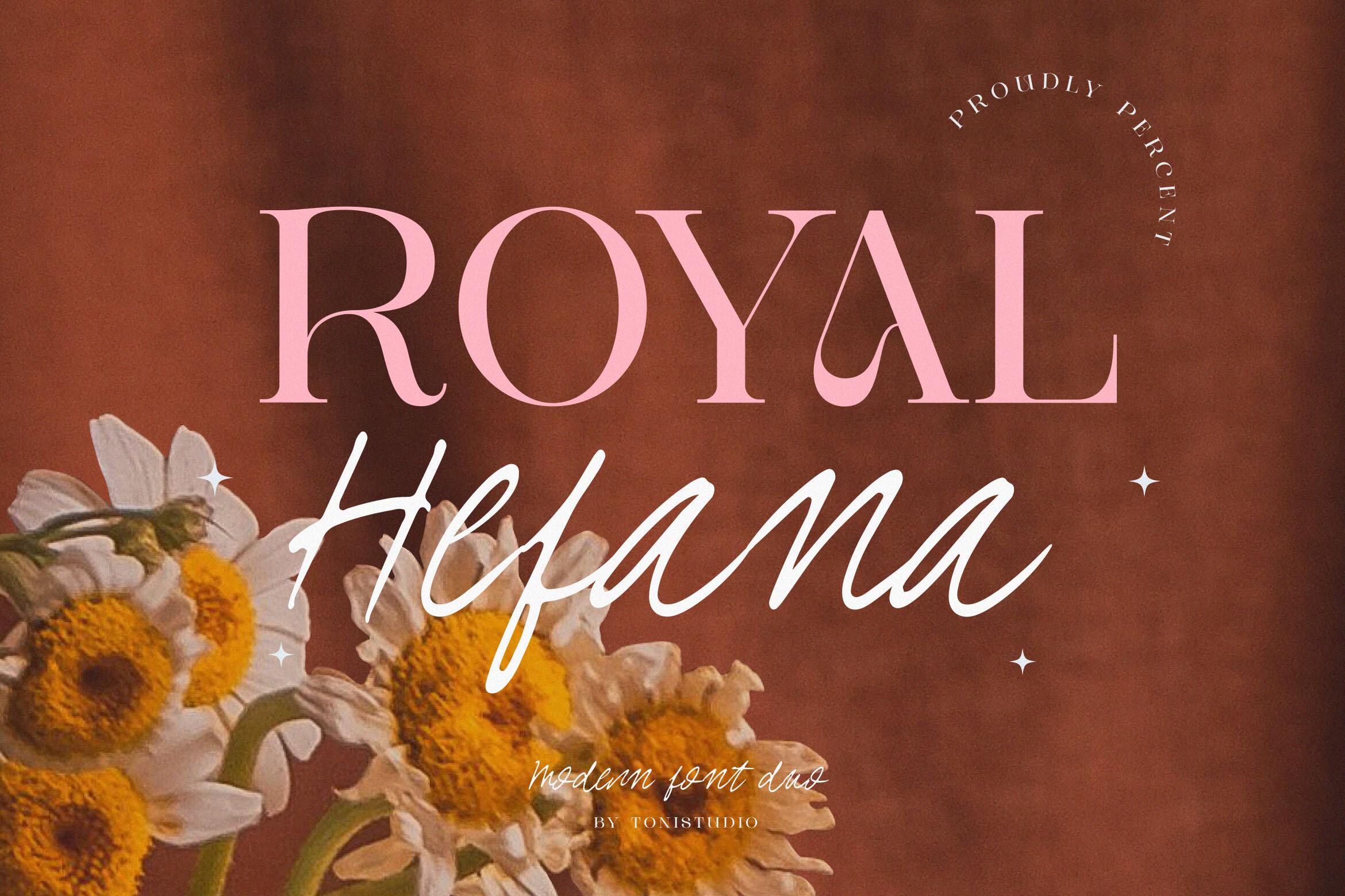
Use Royal Hefana, a formal serif, on award certificates and formal titles. Reserve it for the title line and keep the supporting text simple.
Best for: award certificates, formal titles. By: ToniStudio
14. Nelina
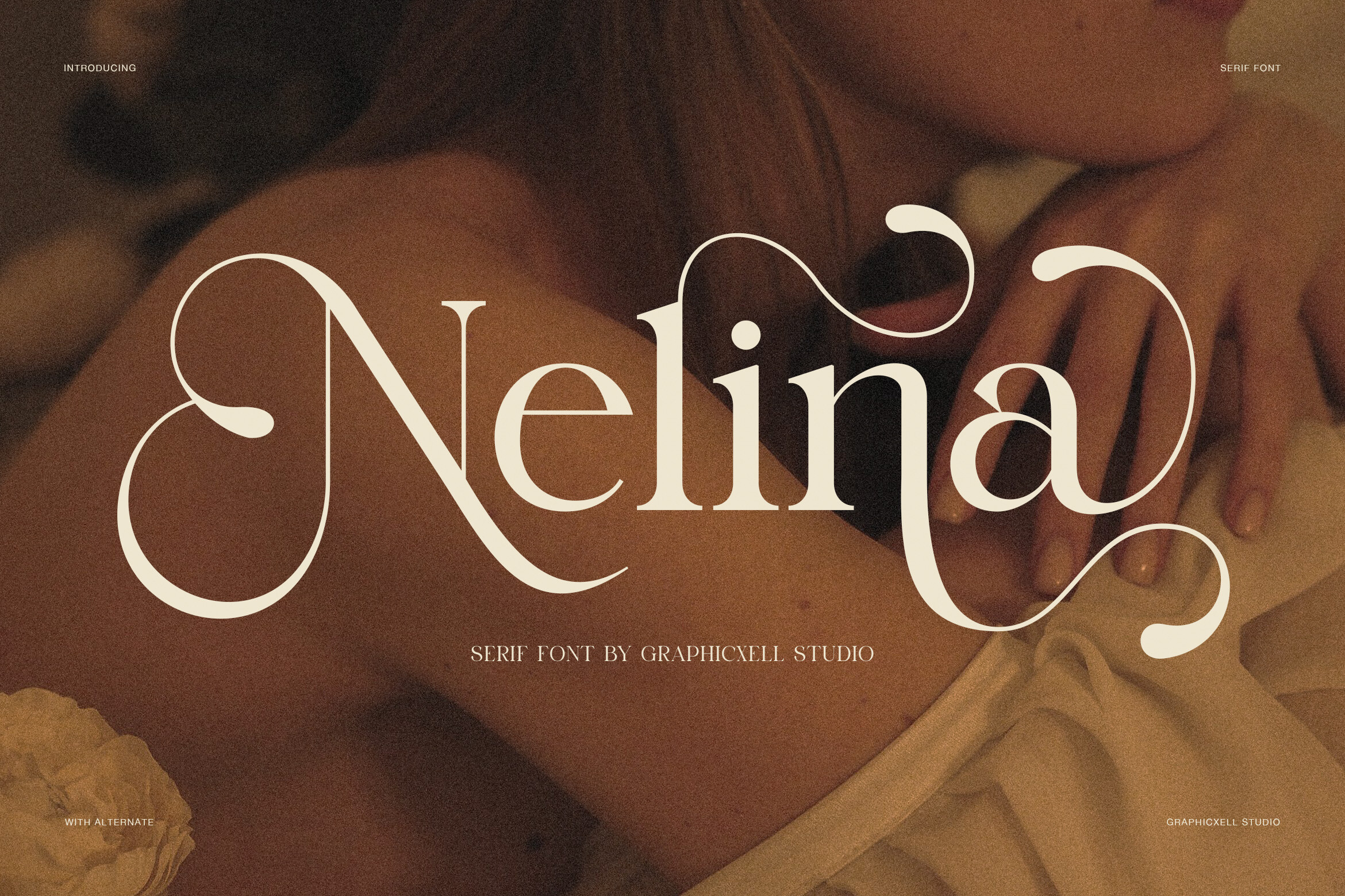
Nelina fills the formal serif slot for recognition certificates and headings. Preview it with your real wording before you lock in a layout.
Best for: recognition certificates, headings. By: Graphicxell
15. Roman Empire

Diploma titles and ceremonial headings are the intended use for Roman Empire, a formal serif. Judge it by how it looks on your own certificate, and treat the name as a label only.
Best for: diploma titles, ceremonial headings. By: Pamlico Creations
16. Scholar

Scholar is a formal serif aimed at academic certificates and titles. Match it with a plain body face to keep school documents tidy.
Best for: academic certificates, titles. By: Heidi Vargas-Smith
Script and Calligraphy Fonts for Recipient Names
Scripts work best on the recipient’s name and signature lines, not on long paragraphs. Give the name a little room and confirm it reads clearly in a printed proof before you commit.
17. Prime Academy
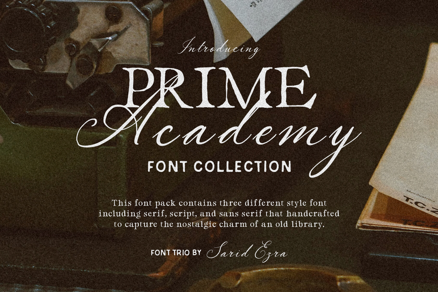
Prime Academy is a script for recipient names on academic certificates. Check that the name stays readable in a printed proof.
Best for: recipient names, academic certificates. By: saridezra
18. Majestic Calligraphy
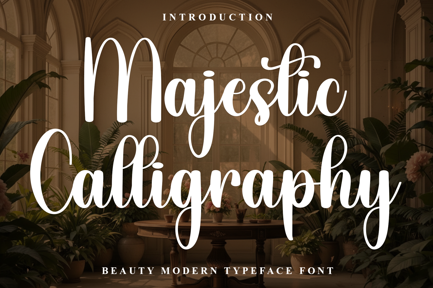
Award certificates can use Majestic Calligraphy, a calligraphy script, for the recipient’s name. Allow extra room if the name is long.
Best for: recipient names, award certificates. By: K_IN Studio
19. Platinum Script
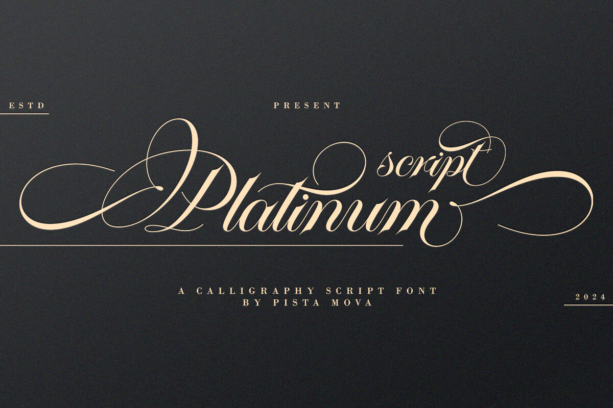
Platinum Script is a script for recipient names on recognition certificates. Set the name larger than the body text and review a printed copy.
Best for: recipient names, recognition certificates. By: Pista Mova
20. Valentina Calligraphy
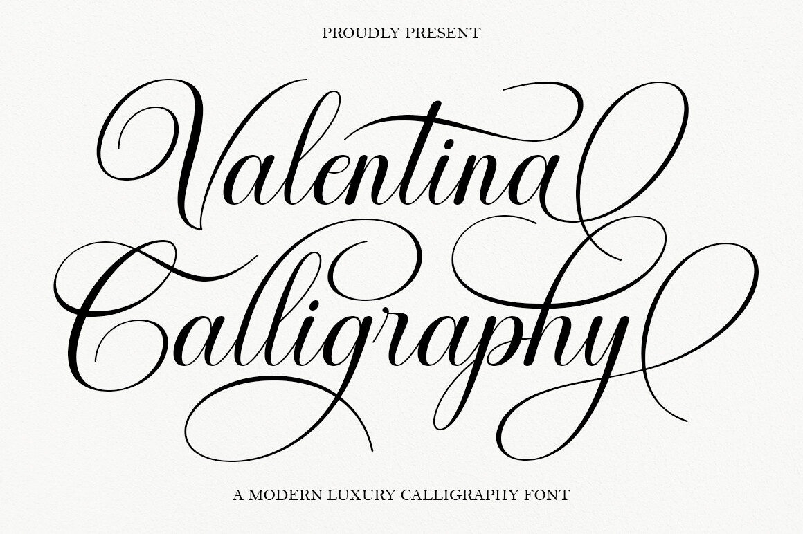
Names on achievement certificates are the job for Valentina Calligraphy. Pair it with a serif title for a balanced hierarchy.
Best for: names, achievement certificates. By: Diorde Studio
Download Valentina Calligraphy
21. Authy
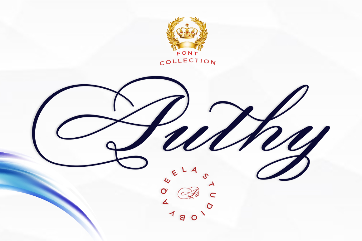
Try Authy, a script, on both recipient names and signature lines. A quick test of each placement will show which one reads better.
Best for: recipient names, signature lines. By: Aqeela Studio
22. Kattalin Osane
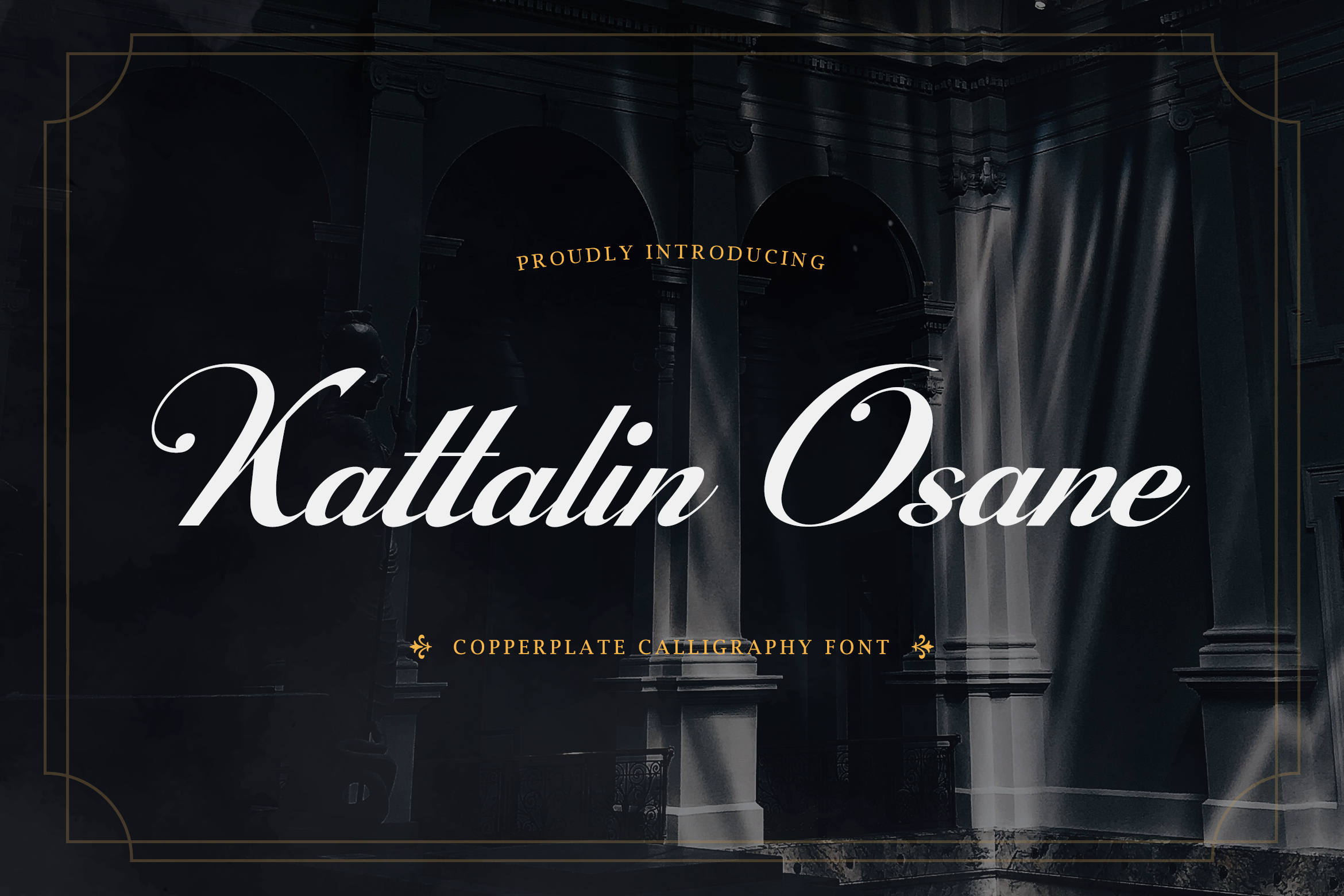
Kattalin Osane is a script option for recipient names on award certificates. Start your test with the longest name on the list.
Best for: recipient names, award certificates. By: TypeFactory
23. Spencerian Palmer
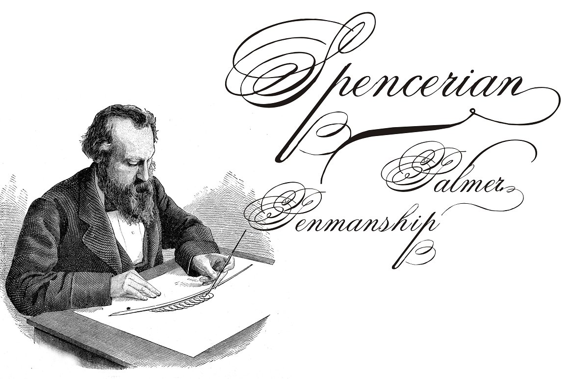
Diploma certificates are where Spencerian Palmer, a script, fits for names. Treat it as a styling choice and confirm the name reads clearly in a printed proof.
Best for: names, diploma certificates. By: Intellecta Design
24. Regalyn
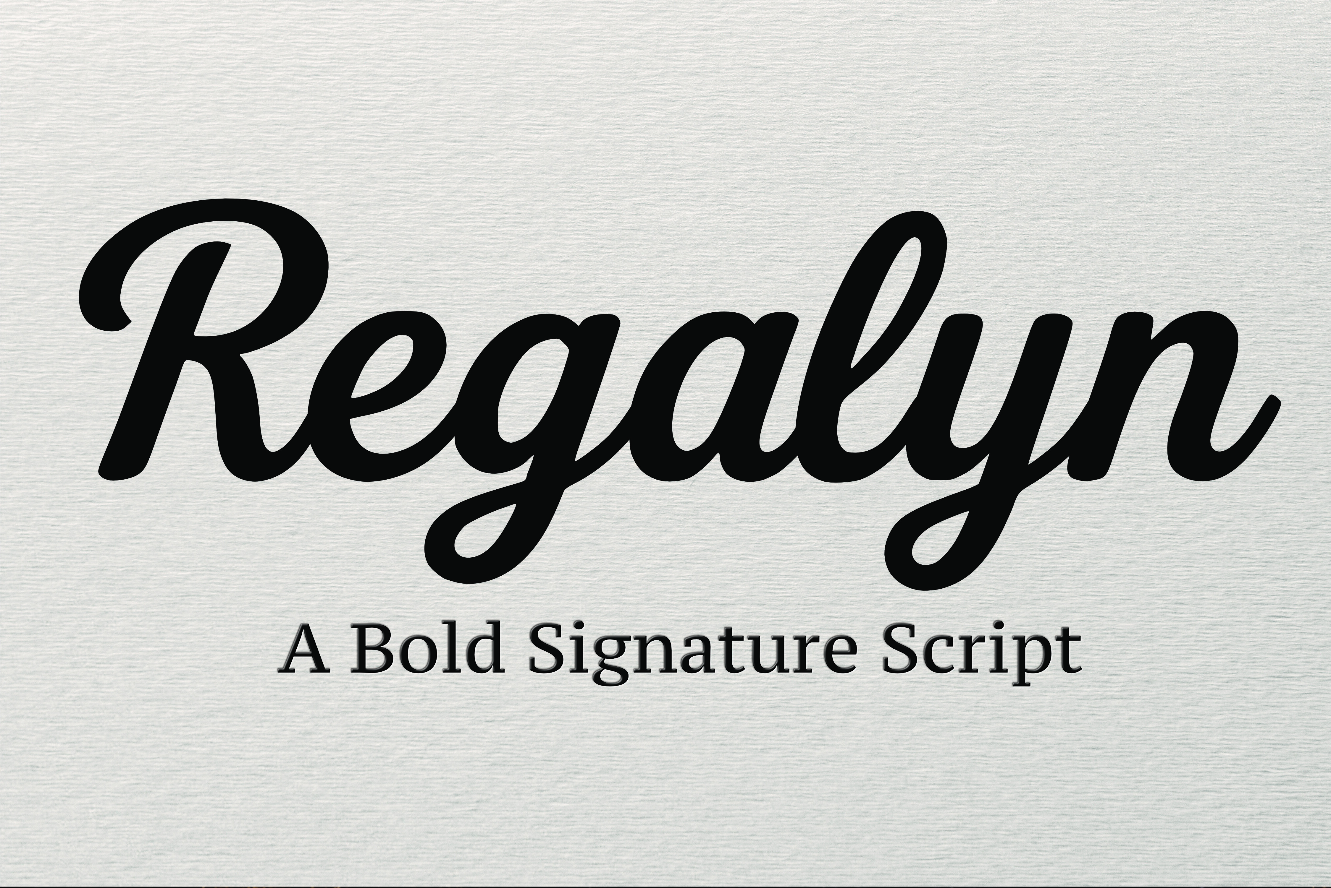
Regalyn is a script for recipient names on recognition certificates. A short test print will show whether the name holds up at your size.
Best for: recipient names, recognition certificates. By: basyar
25. Magellin
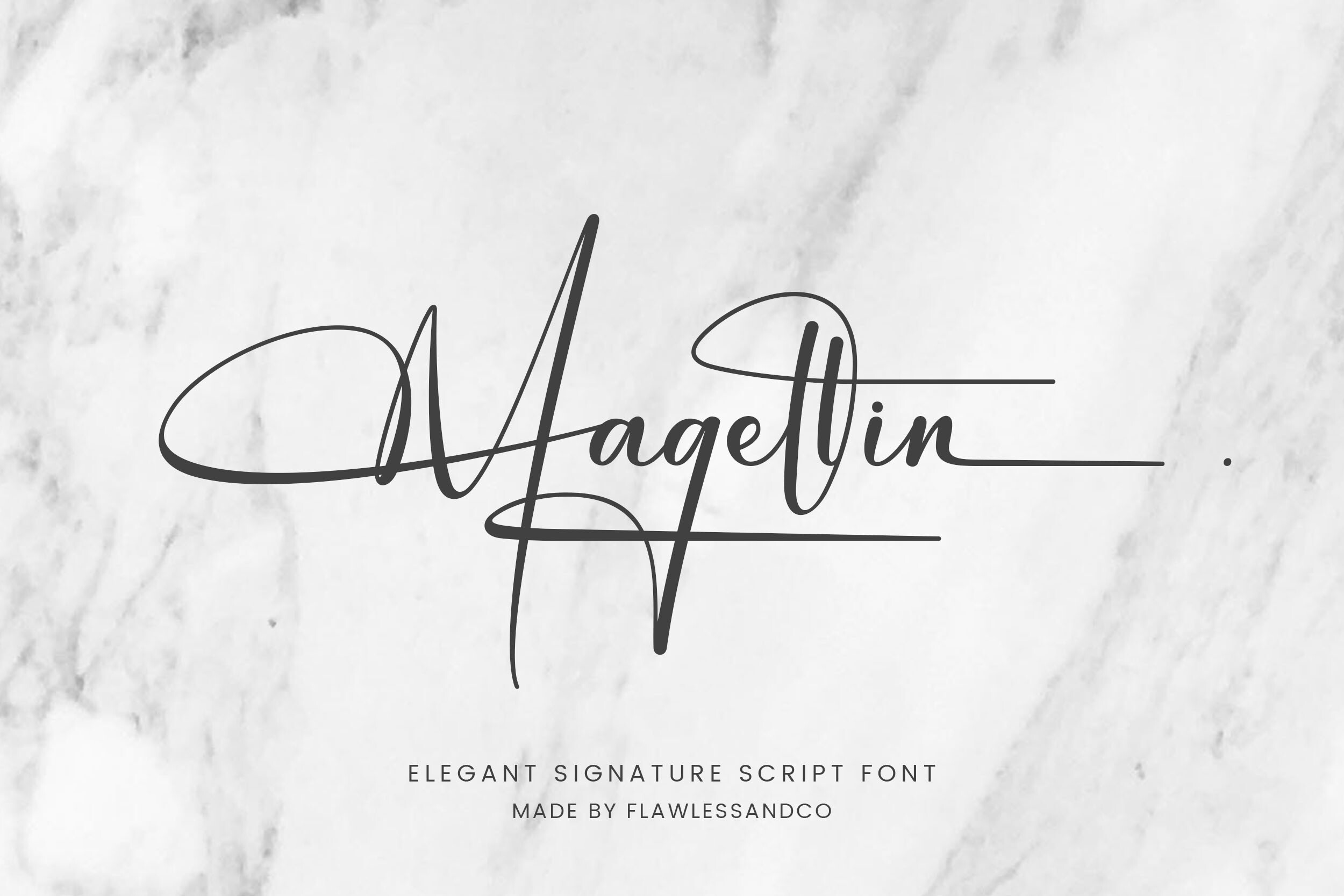
For names on achievement certificates, Magellin is a script worth testing. Pair it with a simple serif or sans for the rest of the text.
Best for: names, achievement certificates. By: Flawless And Co.
26. Joseph Watson - Signature Script
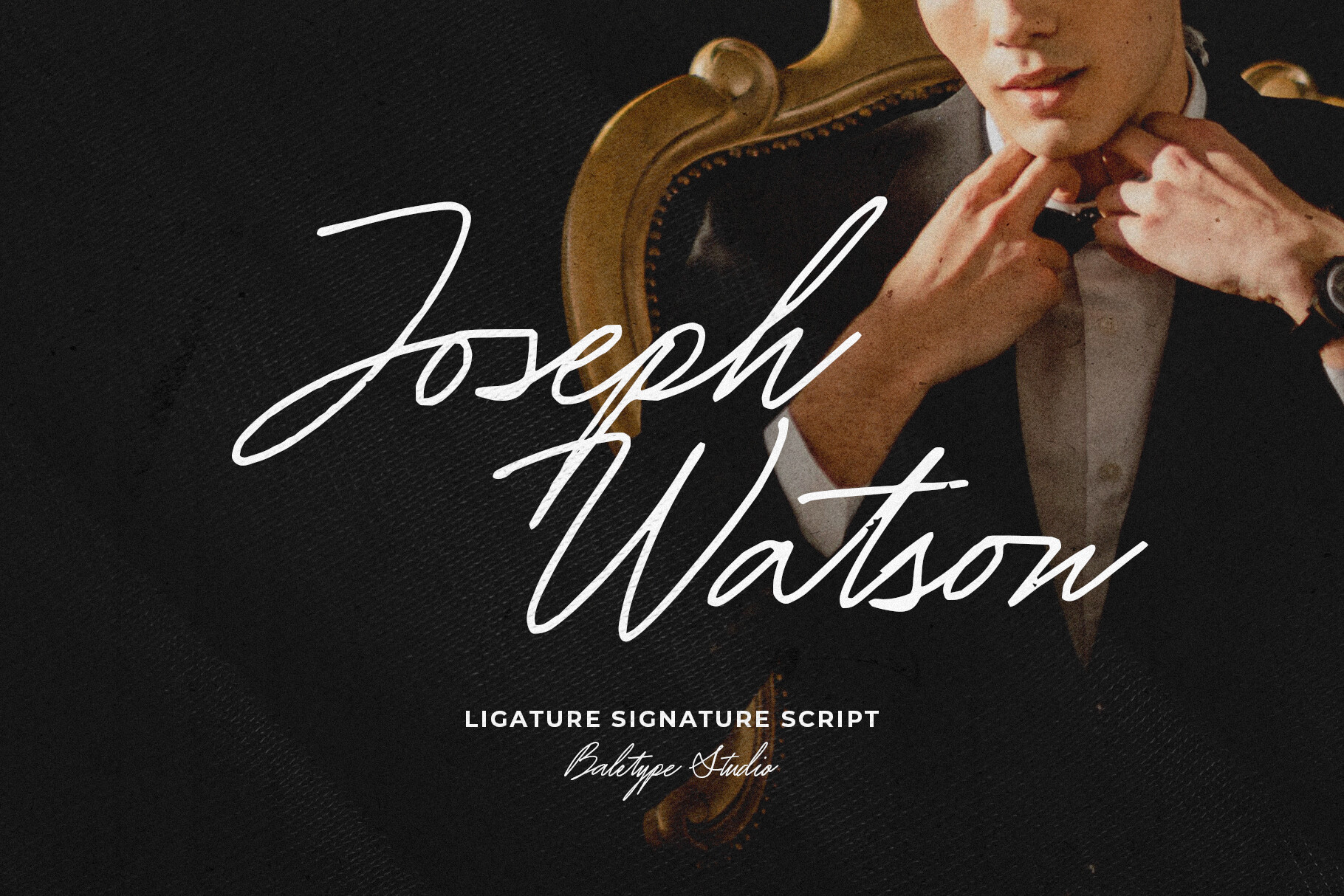
Signature lines and recipient names are the intended uses for this script. Place it where a signature would sit and check the result in print.
Best for: signature lines, recipient names. By: baletype
Download Joseph Watson - Signature Script
27. Mastery Calligraphy
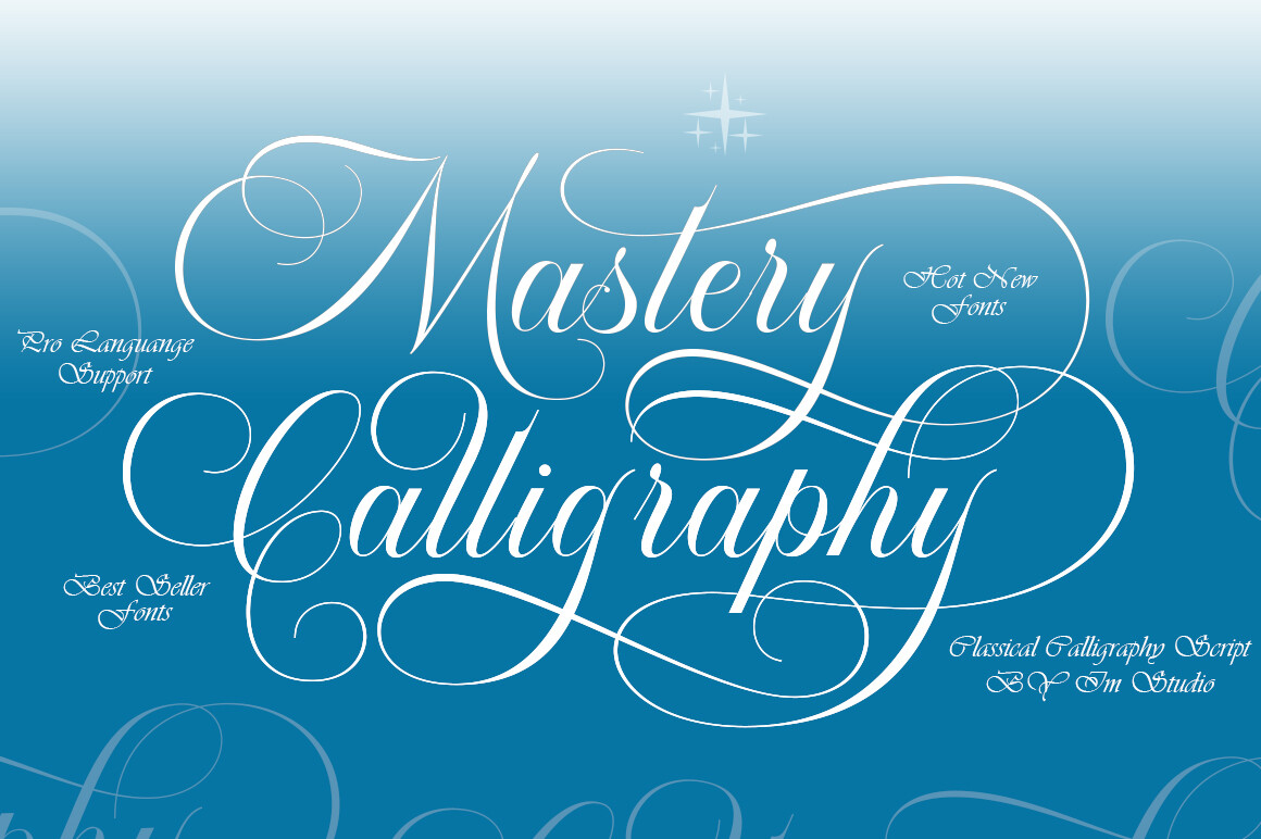
Mastery Calligraphy is a calligraphy script for recipient names on course certificates. Keep the surrounding text plain so the name stands out.
Best for: recipient names, course certificates. By: IM Studio
Clean Sans-Serif Fonts for Certificate Body Text
Neutral sans-serifs carry the description of the achievement, the date, and the role. They provide a calm contrast against a decorative title and keep the fine print easy to read.
28. Affigue
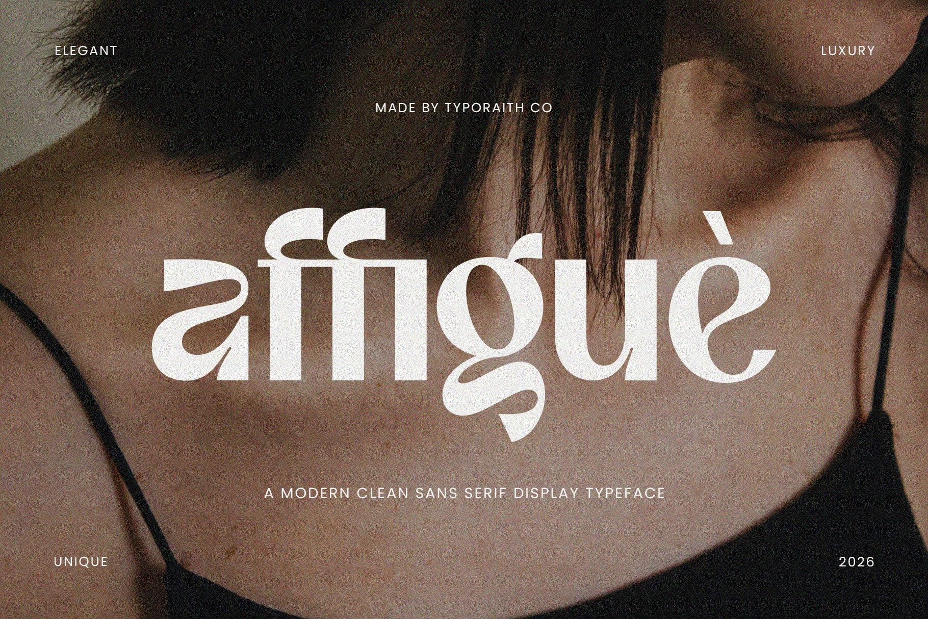
Affigue is a clean sans-serif for body text on employment certificates. It offers a neutral contrast against a decorative title.
Best for: body text, employment certificates. By: Typoraith Co.
29. Bredia
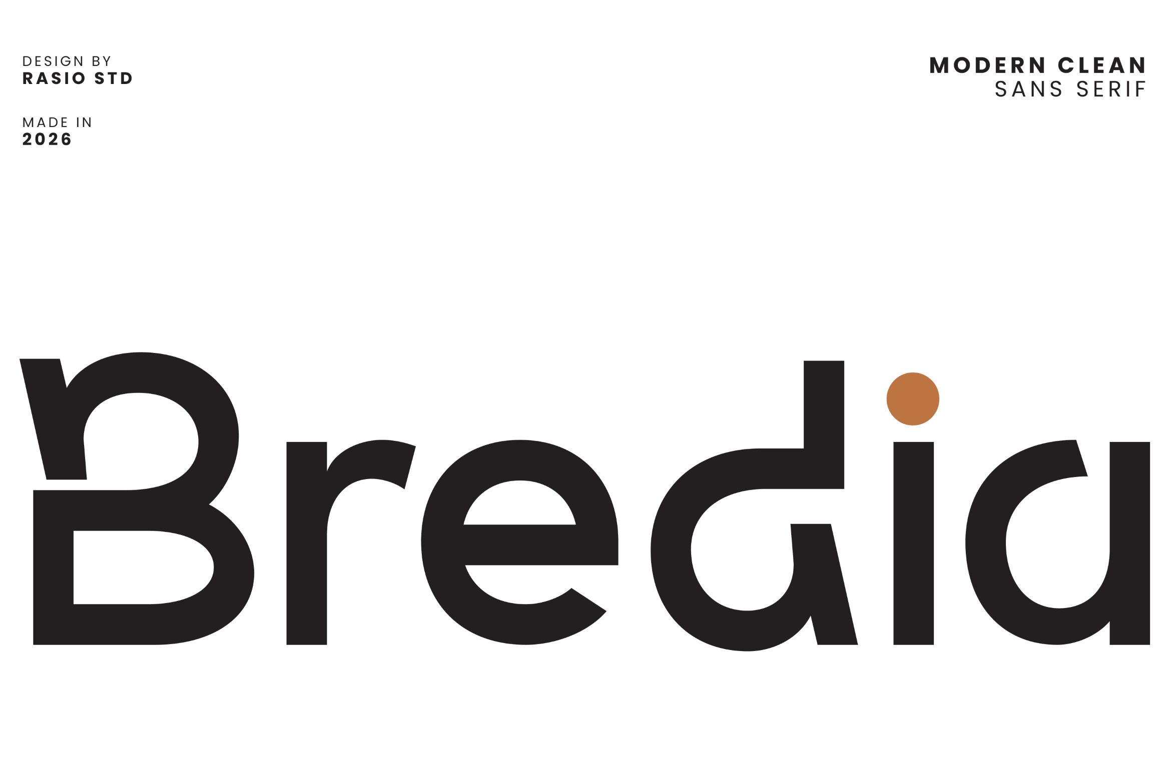
Dates and supporting details are a good fit for Bredia, a clean sans-serif. Use it for the lines a reader scans quickly.
Best for: body text, dates and details. By: product.rasiostudio
30. Neuria
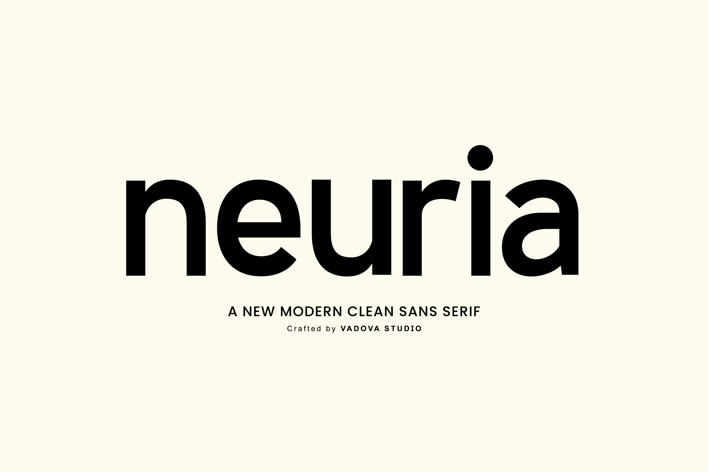
Modern certificates can use Neuria, a clean sans-serif, for body text. Combine it with a more traditional title if you want a mix of old and new.
Best for: body text, modern certificates. By: Vadova Std.
31. Cromel
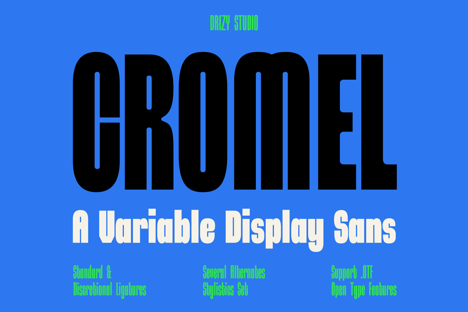
Cromel is a clean sans-serif for body text on corporate certificates. It suits workplace documents where the wording matters more than the styling.
Best for: body text, corporate certificates. By: Drizy Studio
32. Abeja
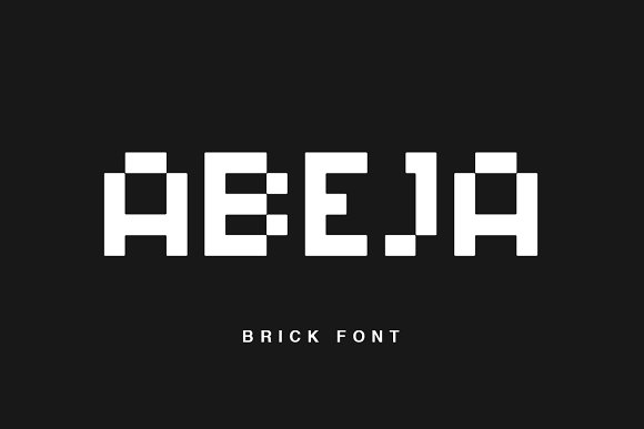
Body text and supporting details can be set in Abeja, a clean sans-serif. Print a sample to confirm the small lines stay legible.
Best for: body text, supporting details. By: Factory738
Decorative Crest Fonts for Certificates
Use a decorative crest face as an accent for emblems, borders, and award touches, not for body copy.
33. Laurel Crest
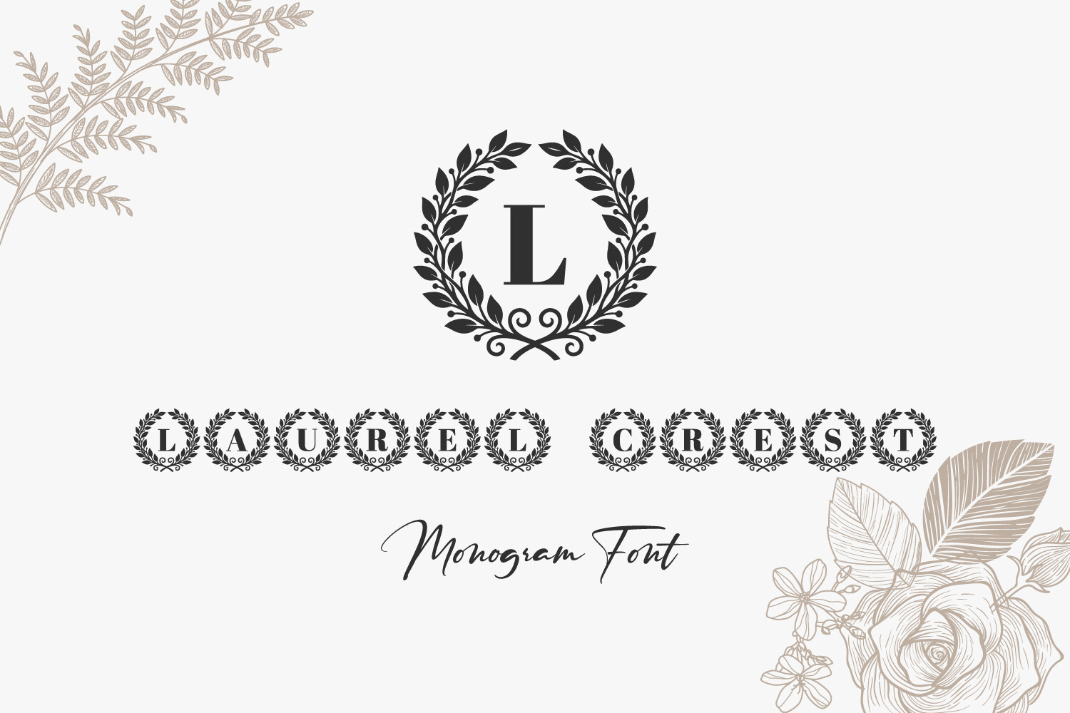
Borders, emblems, and award accents are the job for Laurel Crest, a decorative crest face. Keep it to accent elements rather than body text.
Best for: certificate borders and emblems, award accents. By: The Kazis Kraft
How to Use Fonts in Your Certificate Designs
Start by laying out the hierarchy from top to bottom: the title, a “presented to” line, the recipient’s name, the body paragraph, and finally the signature and date lines. The name often matches or exceeds the title in size, so let it carry the spotlight.
For pairing, a reliable formula is a formal or display title, a script for the name, and a simple serif or sans for the body. Stick to two or three fonts at most, and build the levels with size and weight rather than adding more faces. If the title is a blackletter, keep the rest clean so the document does not get crowded. That same formula answers a common question: yes, a script name pairs well with a serif title and a plain body face.
On sizing, treat numbers as a starting point. Body copy often sits around 12 to 14 pt, the name usually runs larger, and the title can be the biggest element. Avoid hairline weights for anything a reader needs to pick up quickly.
Match the tone to the award. An employment certificate tends to feel best restrained with generous white space, and blackletter can feel out of place there. A recognition or achievement certificate can be warmer, and a script name is a natural fit. A diploma and course completion document leans classic, where a blackletter title can work as a short heading. So yes, blackletter is an option for a diploma certificate, as long as it stays on the title and you check a printed proof.
If you are working in Canva or Word, install the font first, then check the current help pages for your app to see how it picks up newly installed fonts. Always print a test copy of the template at actual size, because what looks fine on screen can shift on paper.
Tips for Choosing the Right Certificate Font
Licensing is the first thing to check. Before you build a design, look at the product page to confirm the license covers commercial use and any printable templates you plan to sell or share. The terms vary by font, so do not assume. The product page is your source of truth.
Readability of the name matters more than you might expect. Print a test page and look at the recipient’s name, especially if it is set in a script or a blackletter. If a viewer has to lean in, swap the face or increase the size.
For print and PDF, check your software’s current help pages on embedding fonts when you export, so they are less likely to be substituted on another machine. Do a test print and look at the thin lines and small text, since those tend to be the first things to disappear. Keep dark text on a light background, and avoid stretching type to fill a space.
On compatibility, tools like Canva, Word, and Illustrator each handle fonts a little differently, and the available format can vary from product to product. Check the format listed on the product page so you know it will load in your software.
Finally, keep the certificate consistent with your organization’s brand. If you already use a house font or a set of colors, let the certificate echo that so it feels like it belongs to you, not to a generic template.
Where to Download Certificate Fonts
The fonts above are available through Creative Fabrica, with a direct link in each entry. If you want to browse more options, Google Fonts, DaFont, and Font Squirrel are popular places to look for additional certificate fonts and fonts for diplomas.
For more practical typography guides and curated font lists, visit the FontPro blog.